35 Lower Long Building
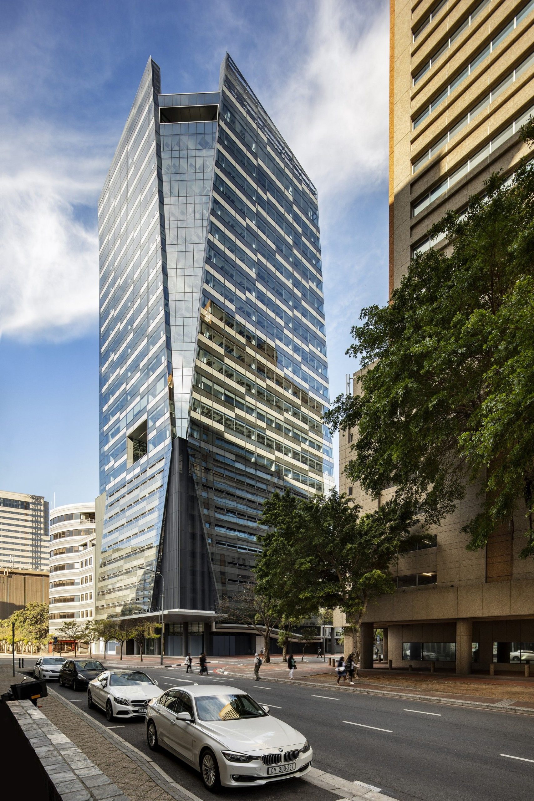
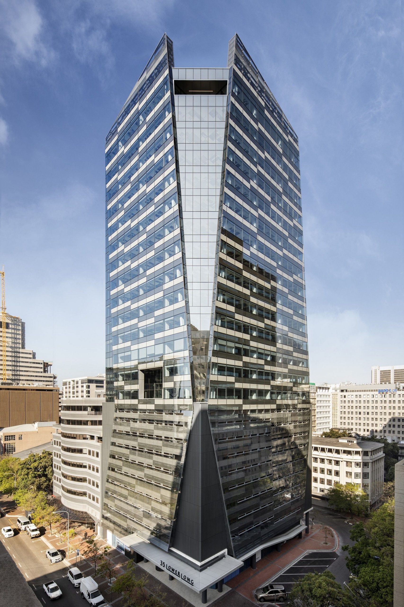
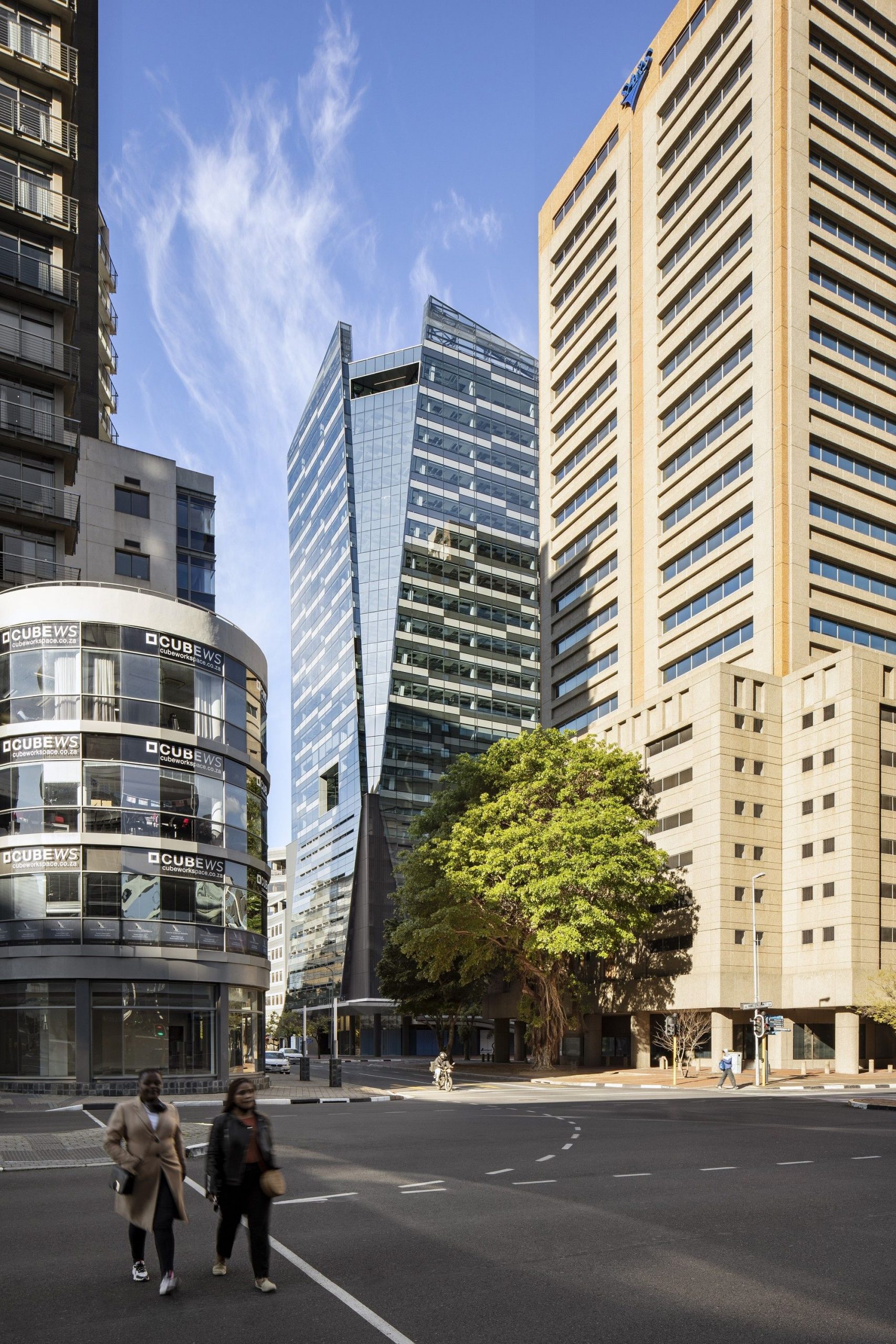
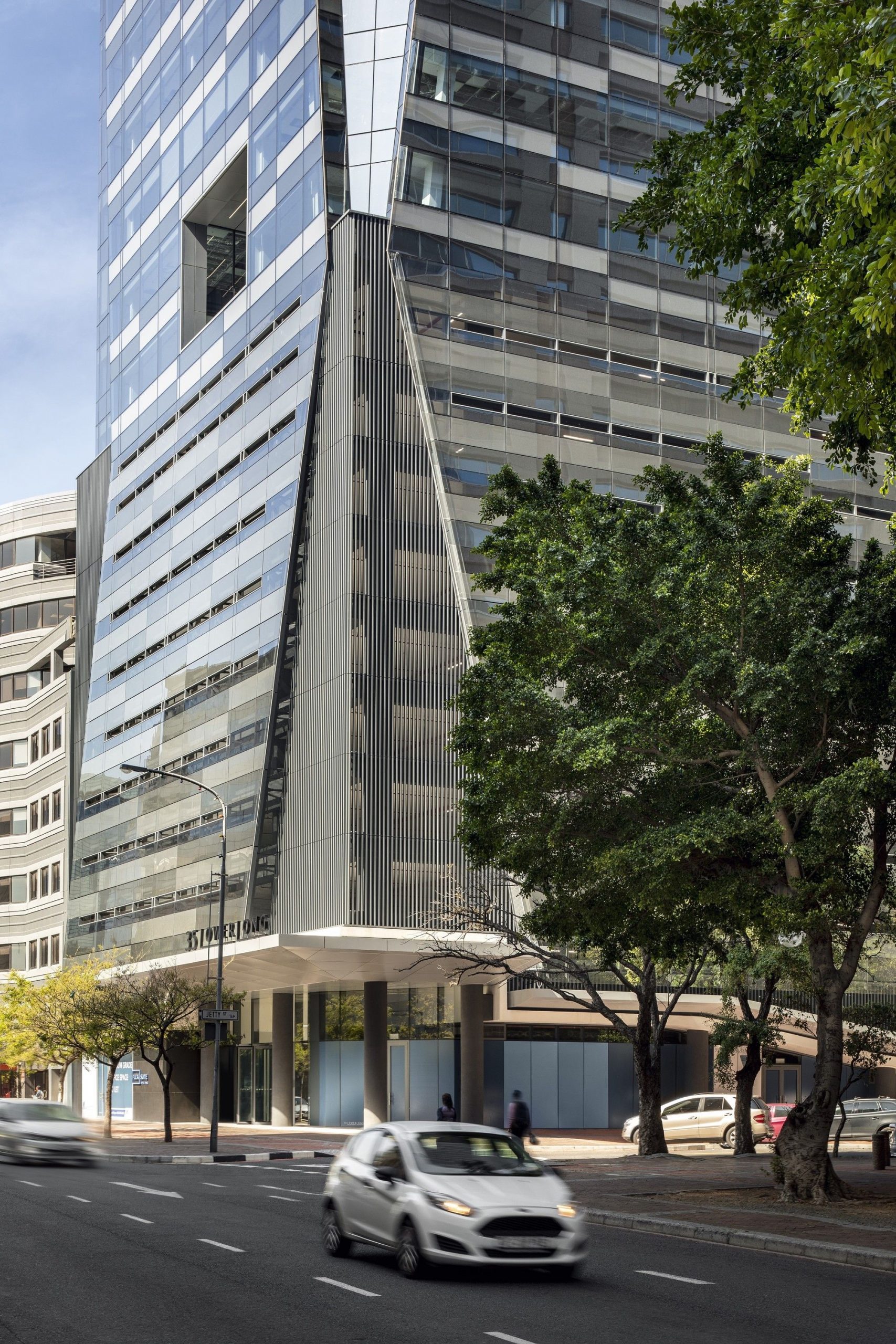
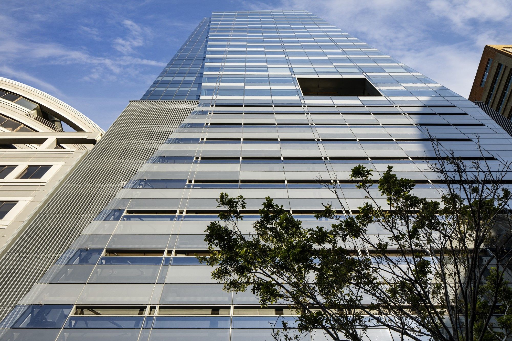
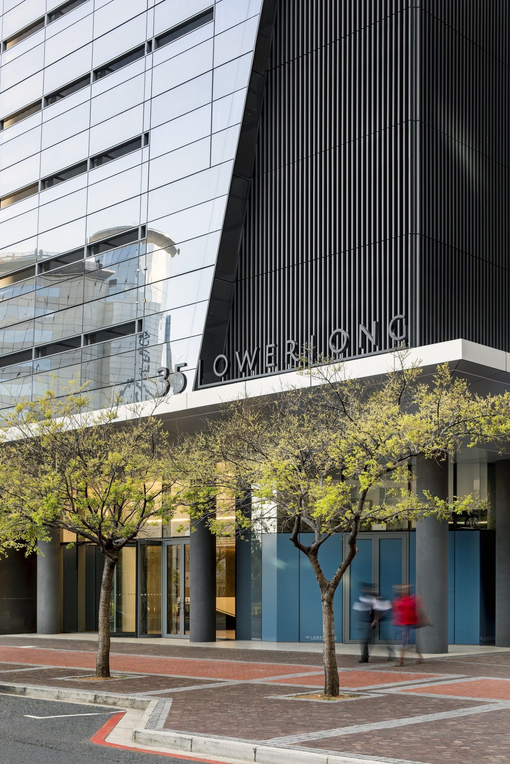
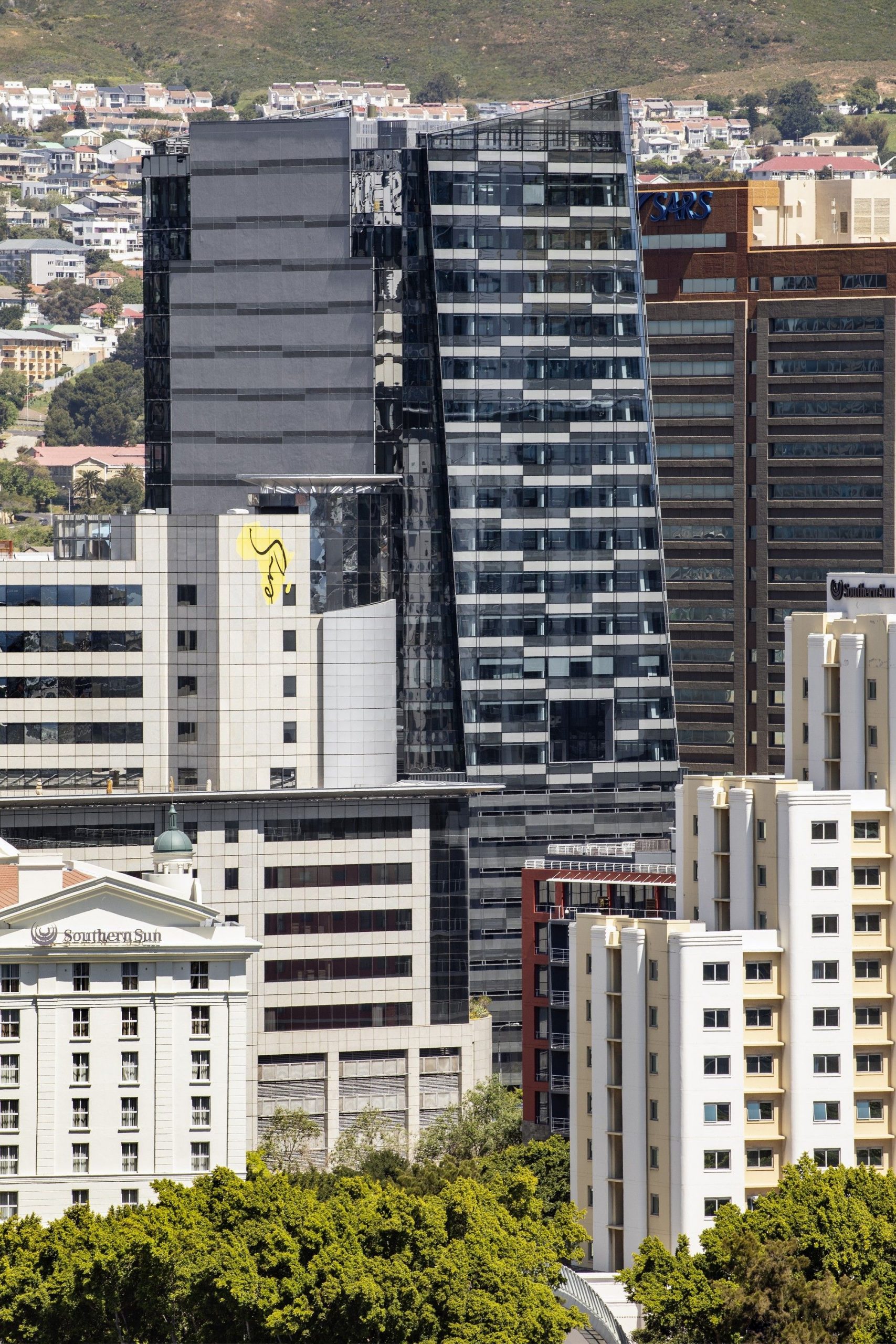
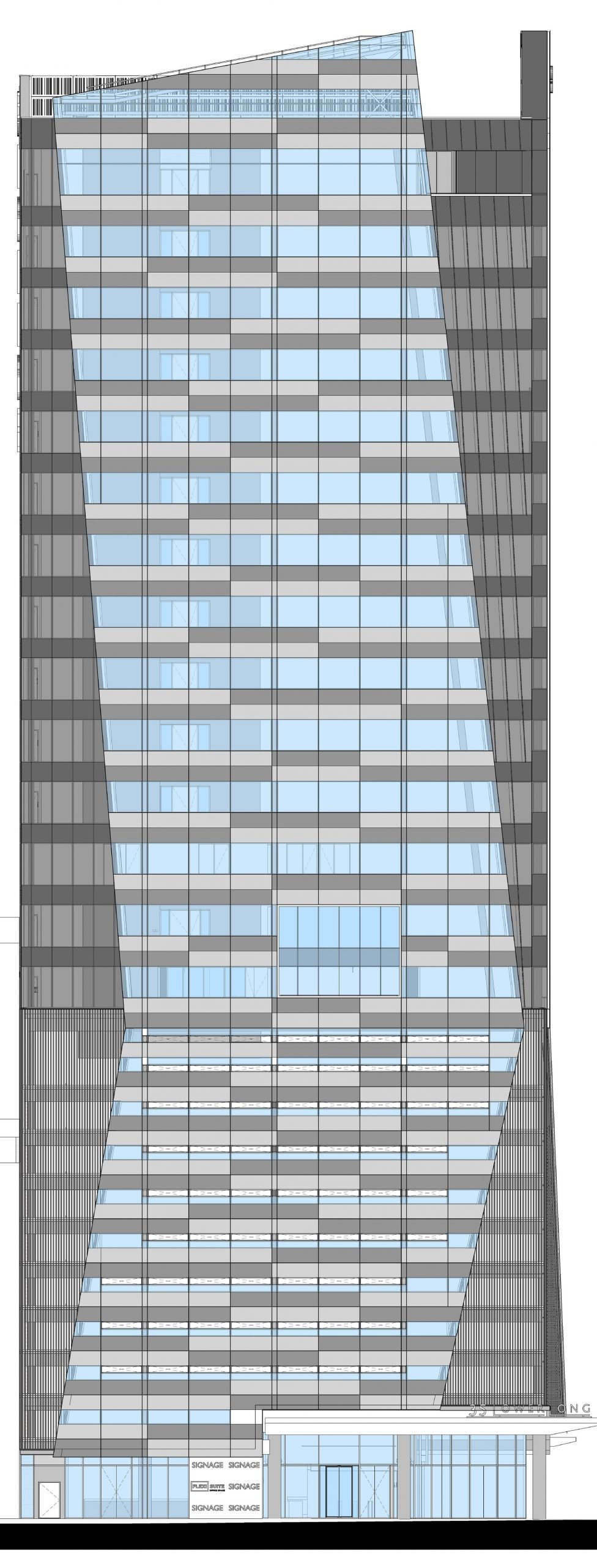
35 Lower Long, an elegant 86-metre glass-clad office tower, has recently been completed which will invigorate Cape Town’s emerging financial and hospitality district. The building, developed by Abland Property Developers and designed by dhk Architects, is characterized by a singular sculpted massing which is transformed via dynamic glazed planes that extend seamlessly over the office and parking levels.

Photography by © Adam Letch
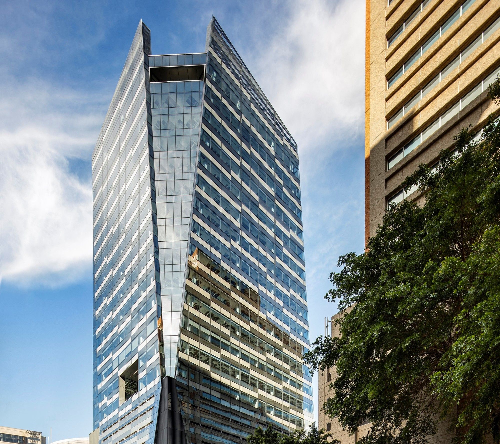
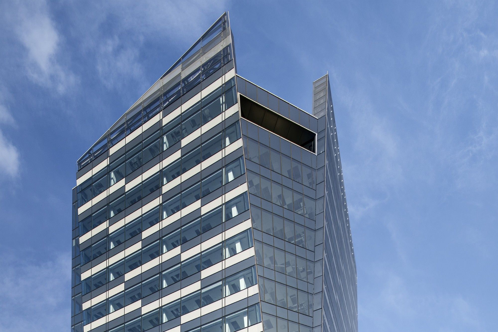
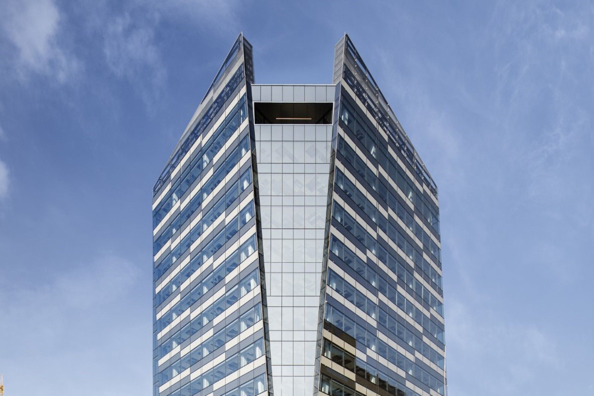
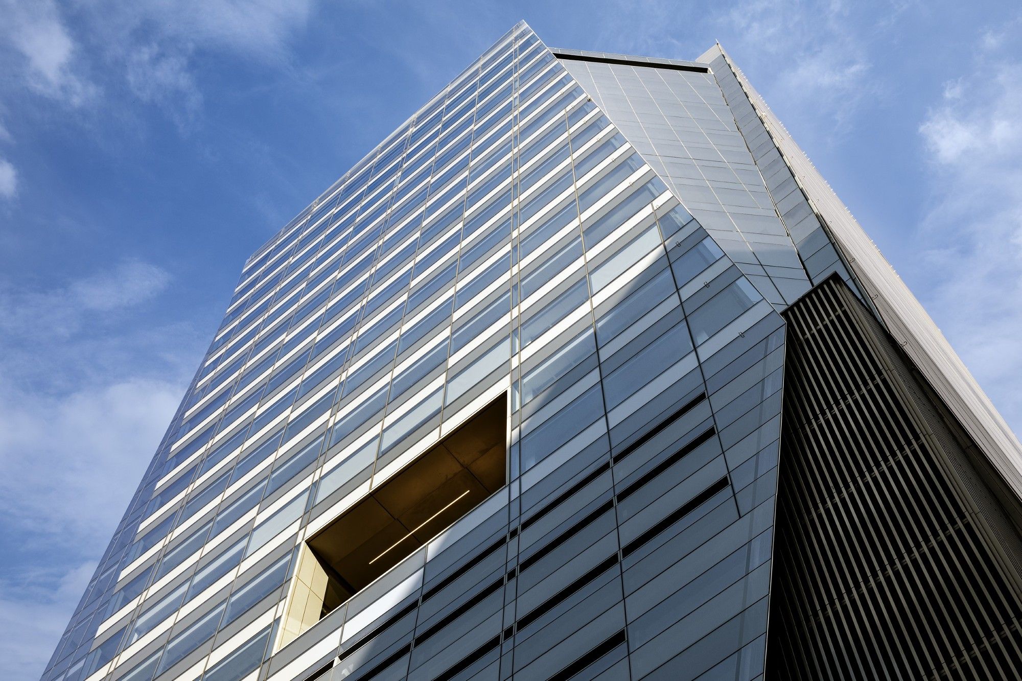
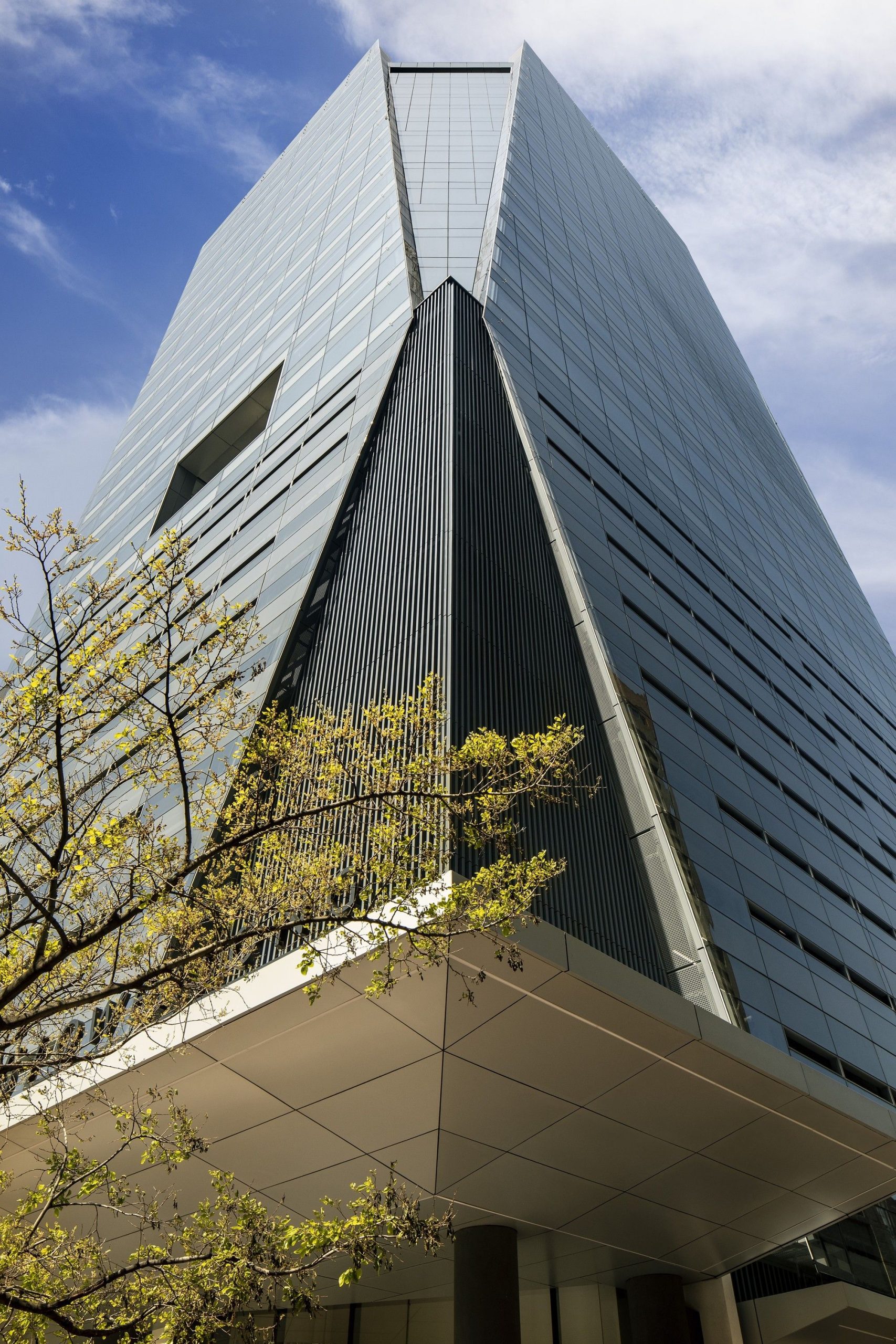
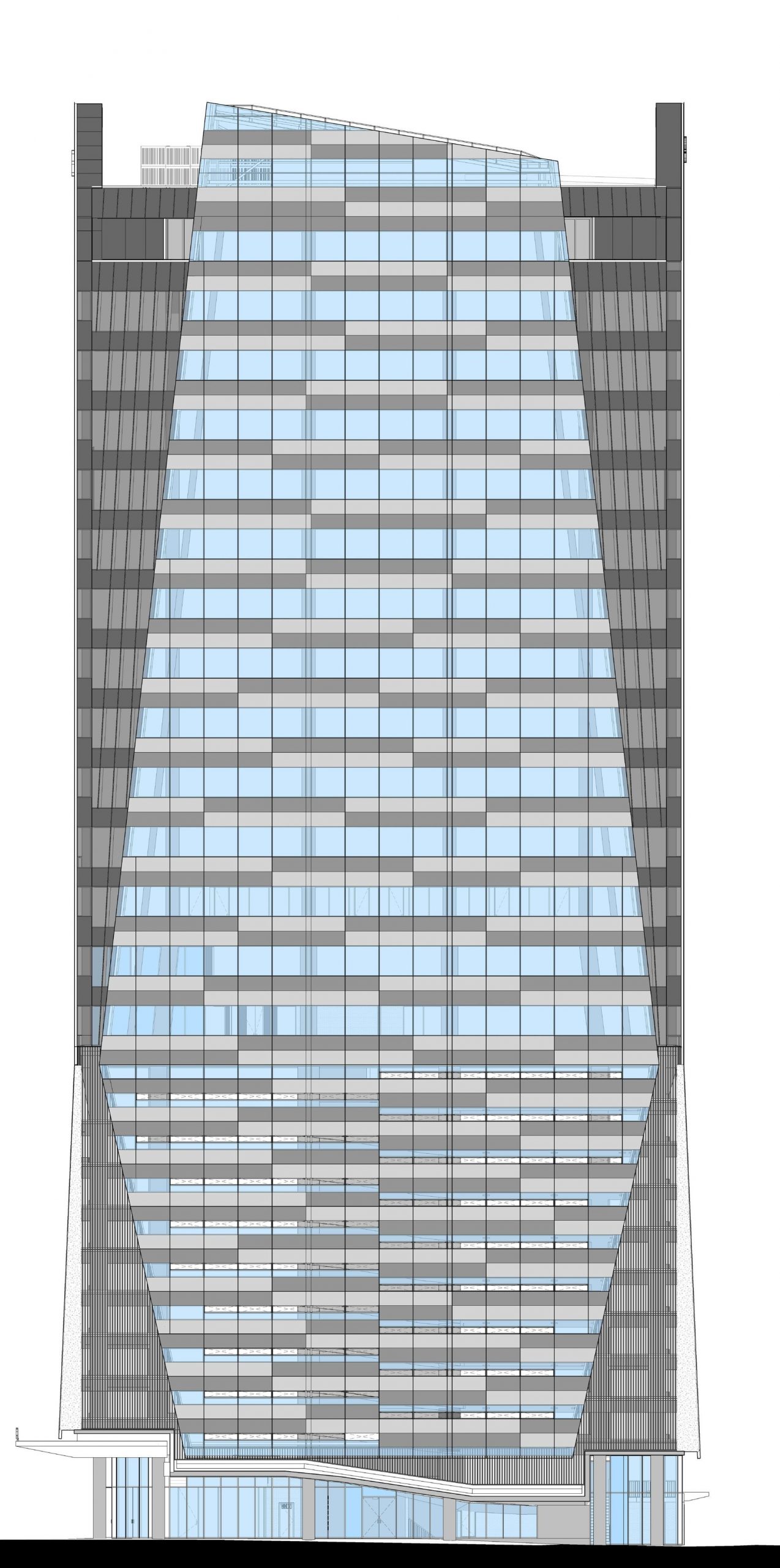
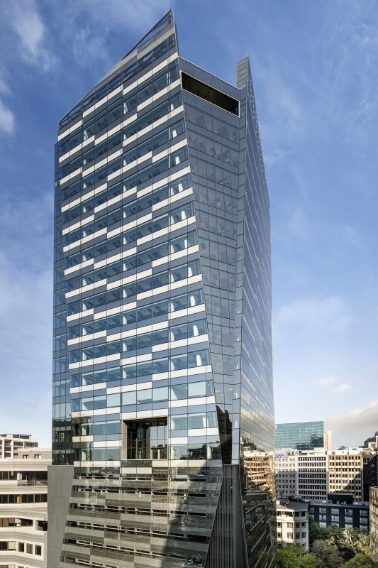
The two main corners of the building are chamfered towards the roofline and soar upwards, forming a striking wing-like effect – resulting in a distinctive, non-orthogonal addition to Cape Town’s skyline.
The initial brief to remodel and extend the existing 1980s building were discarded due to impractical core design, the limitations of adding floors, the need to replace an outdated façade and challenges with long-term viability. The revised brief, by the co-owners Ellerine Bros and Abland, was to offer a more positive medium- to long-term viability, as well as to enhance Cape Town’s skyline with a decidedly taller, inspirational tower building.
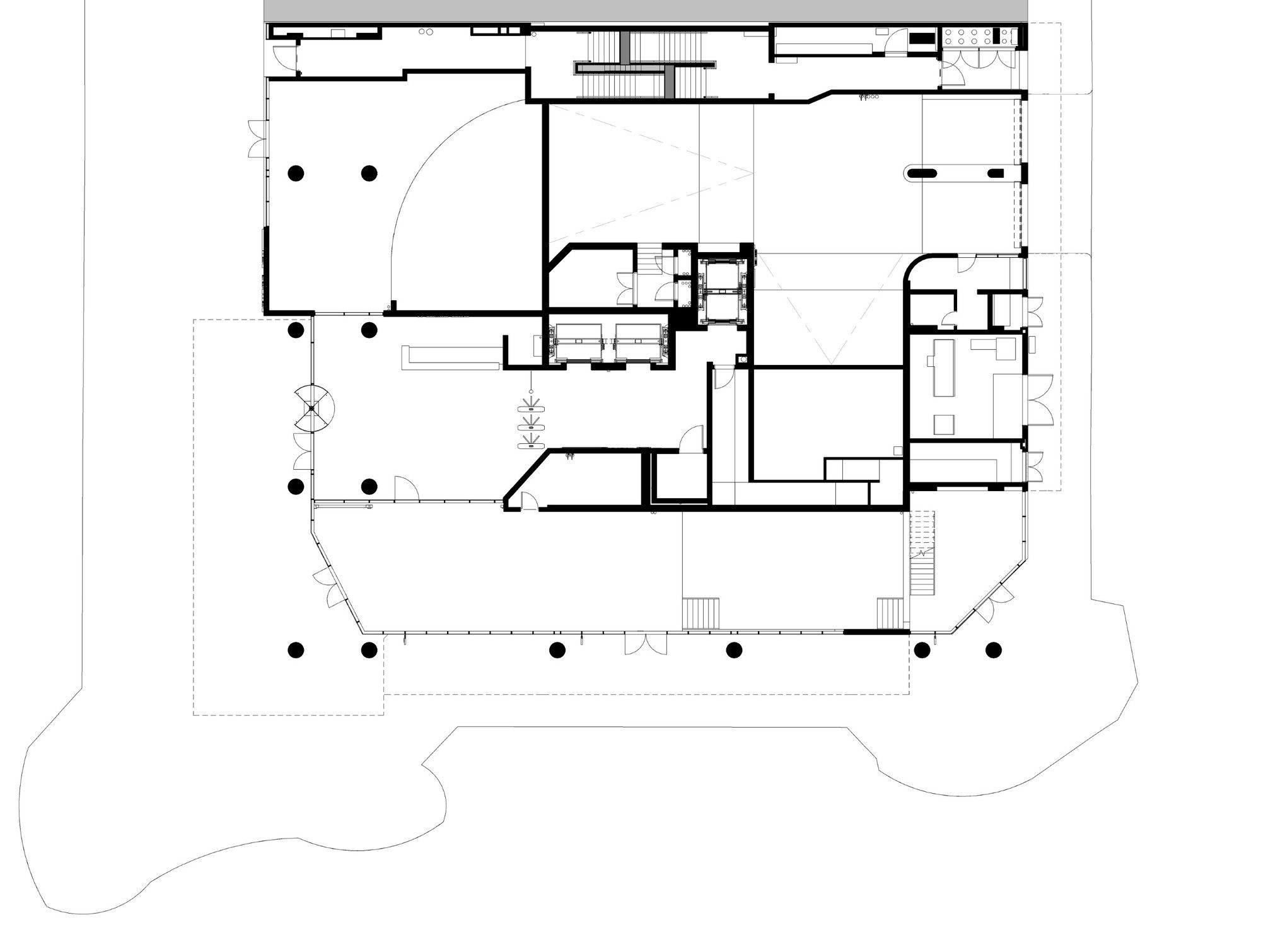
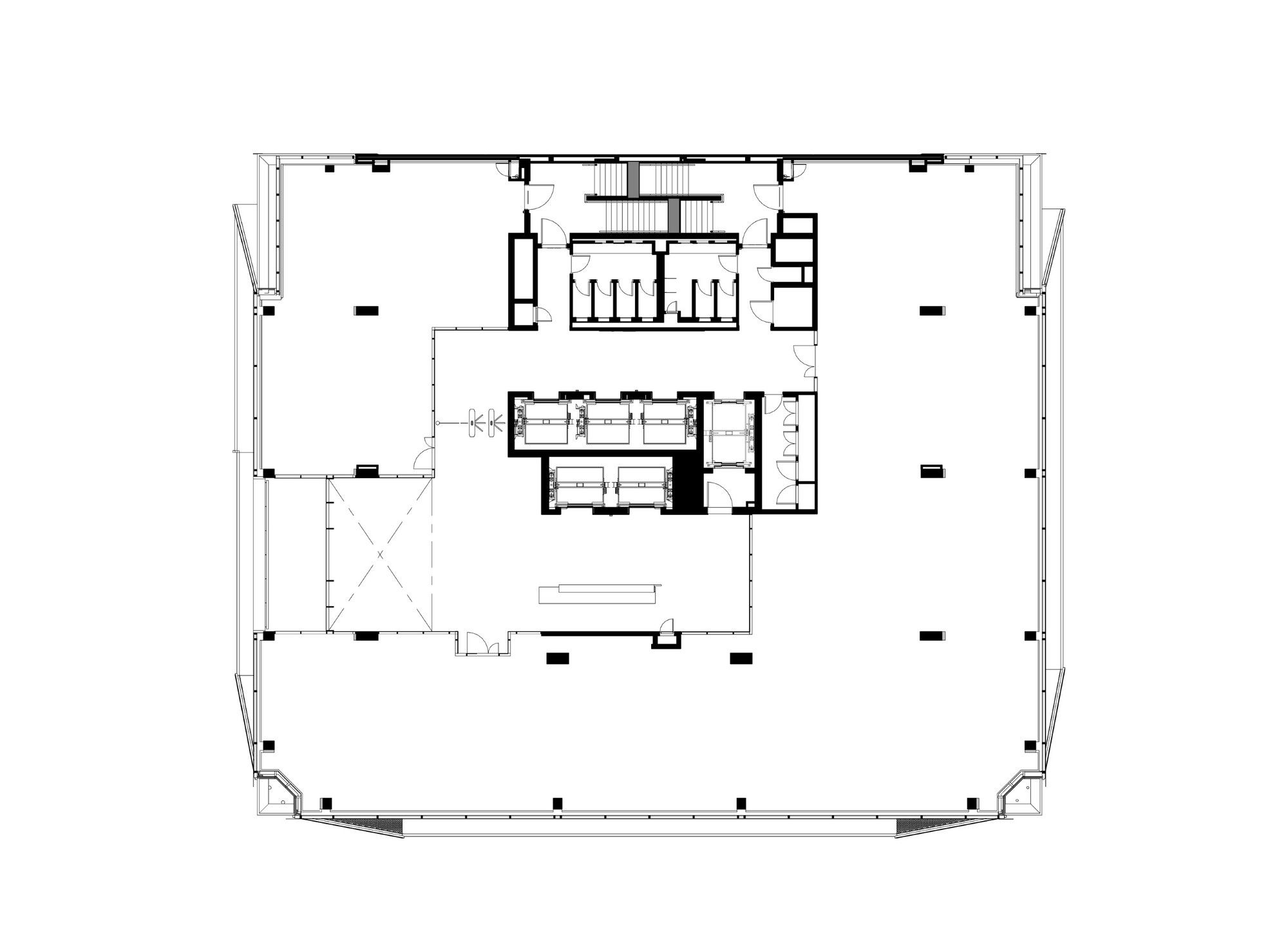
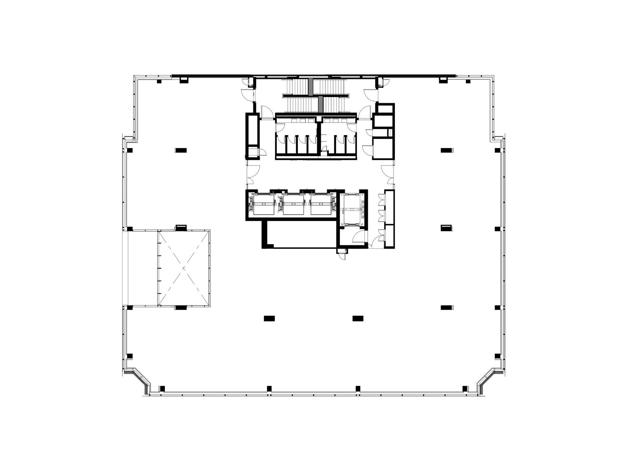
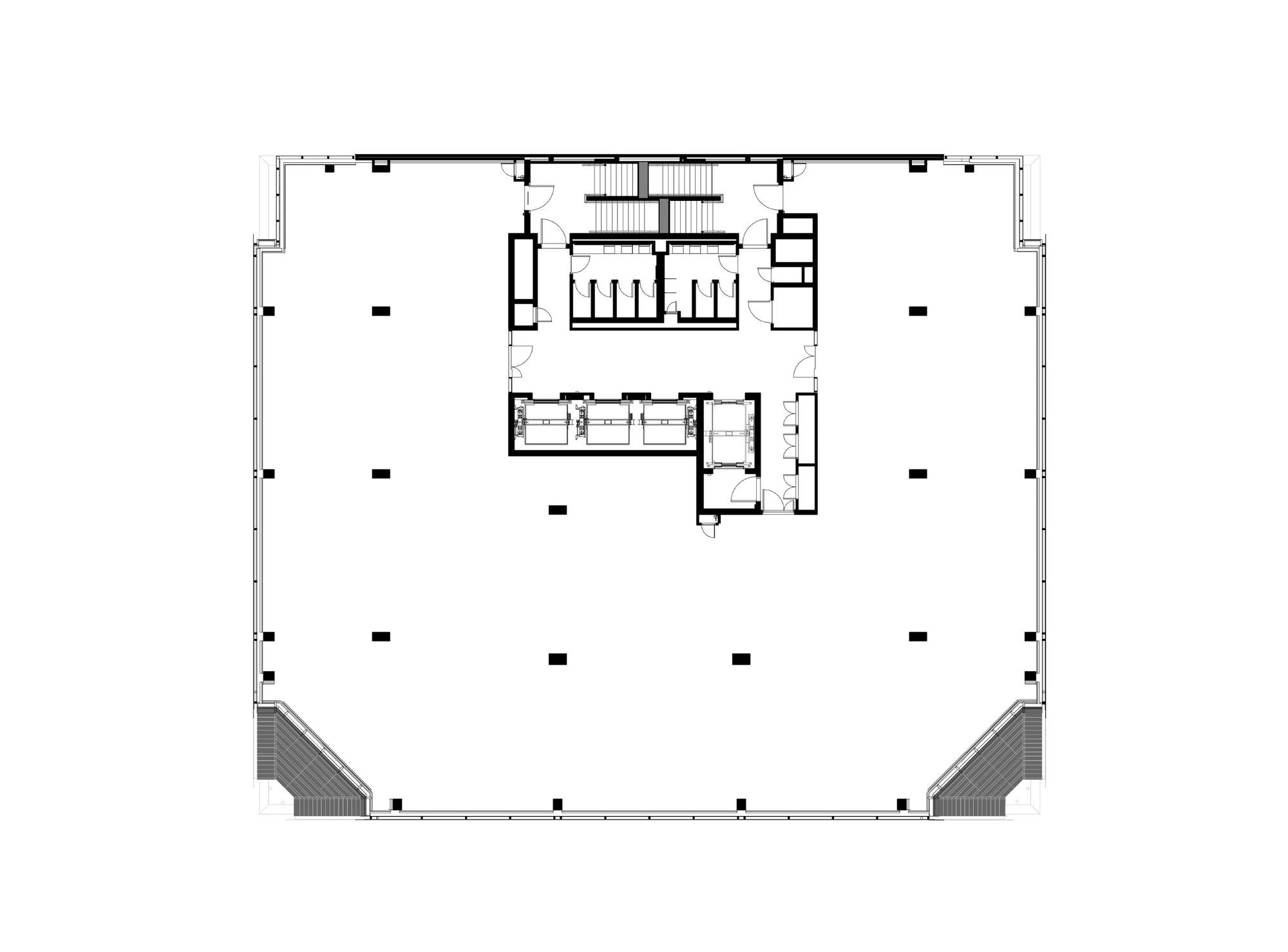
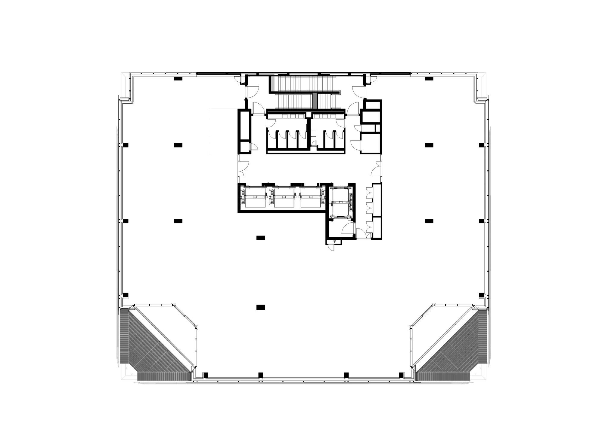
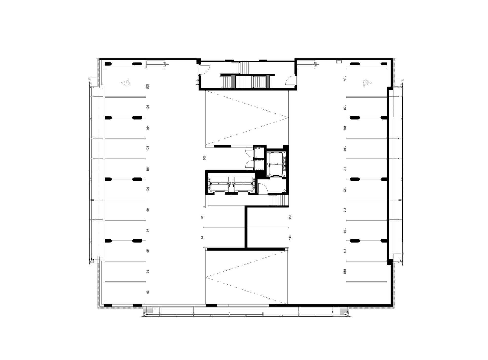
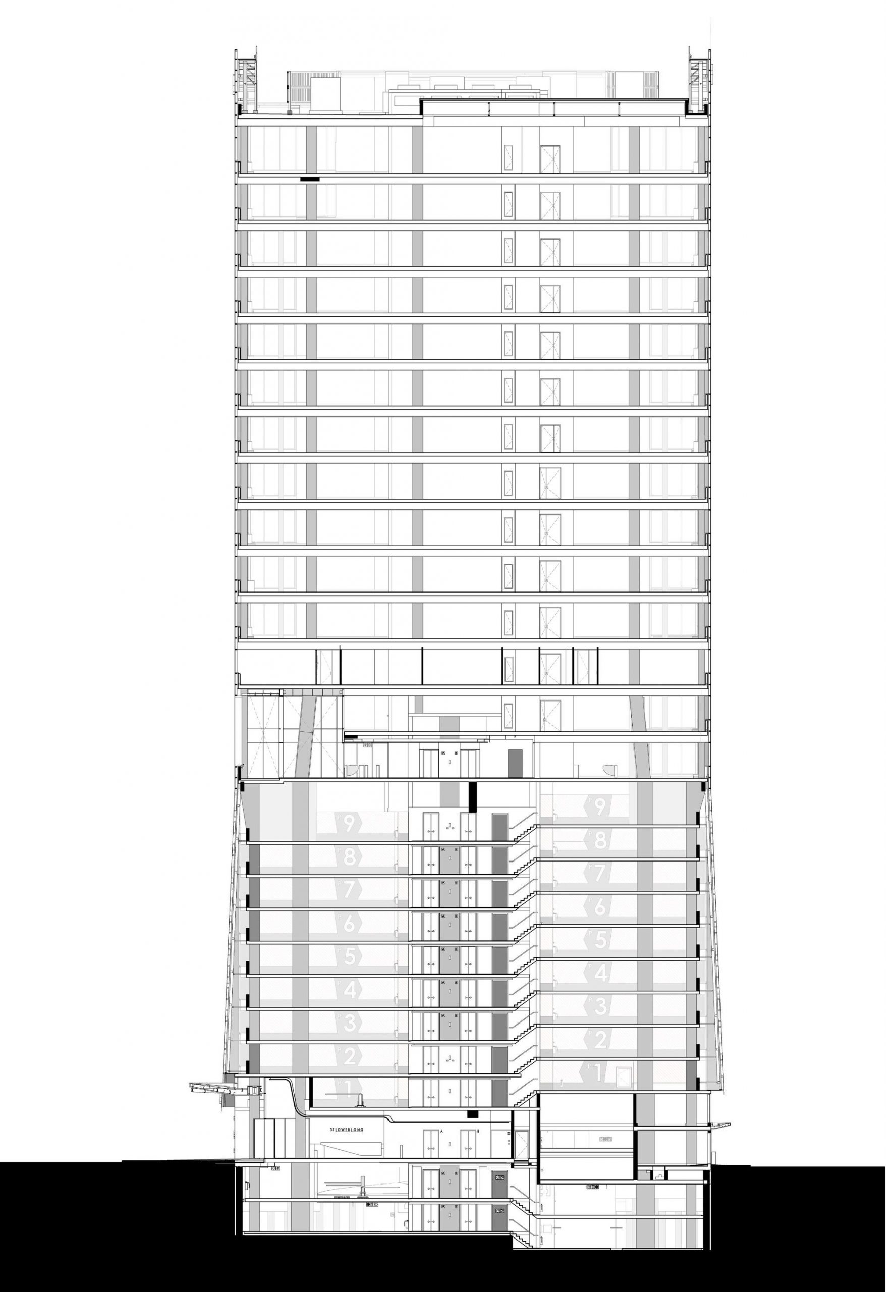
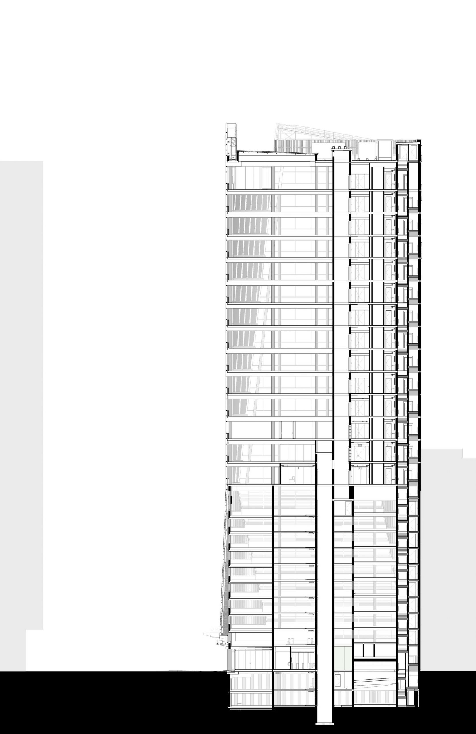
However, the challenge was to maximize the quality multi-tenant commercial space while accommodating core components such as lifts and stairs along with structured basement parking – all within a relatively small floor plate.

Photography by © Adam Letch
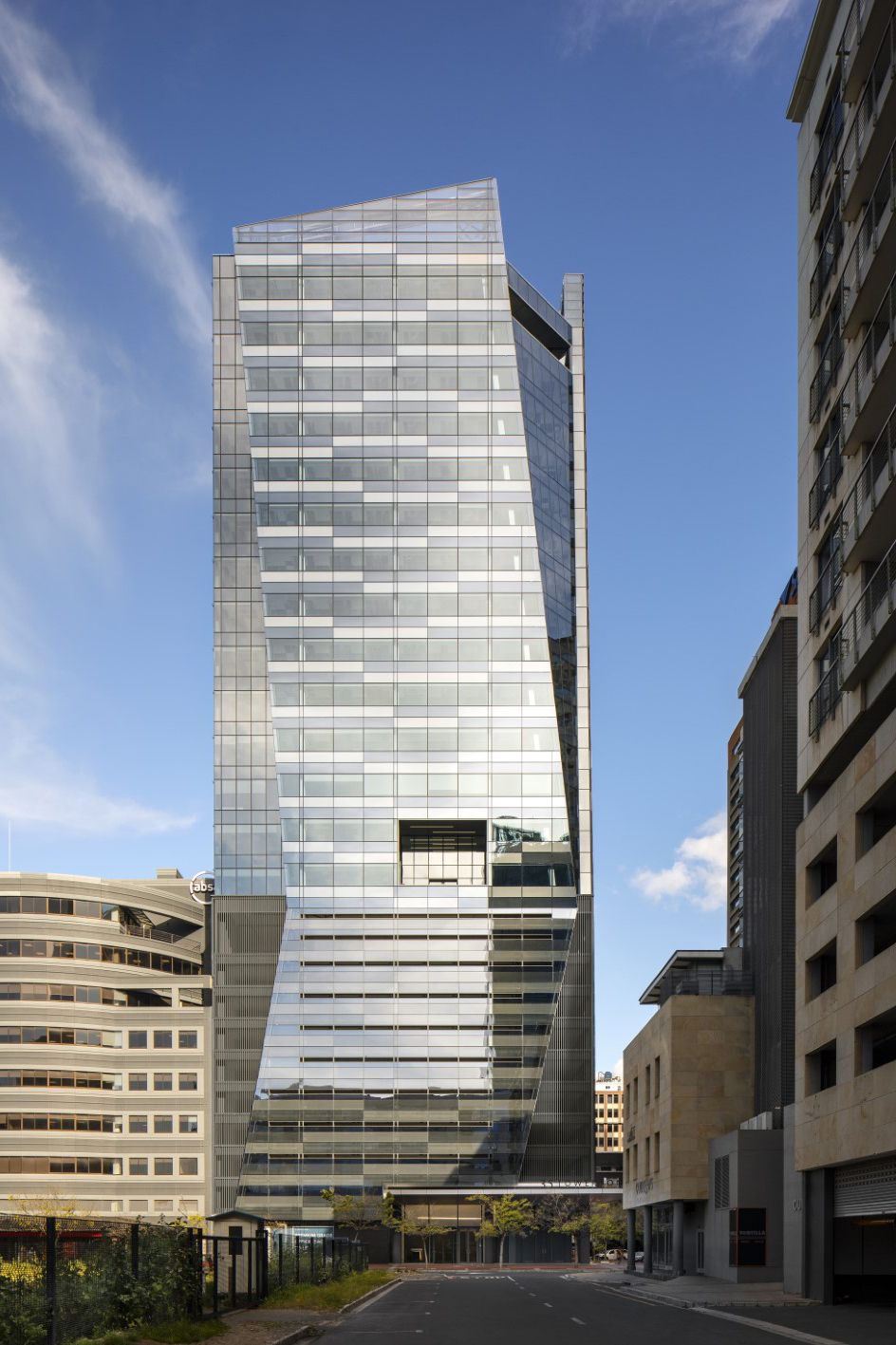
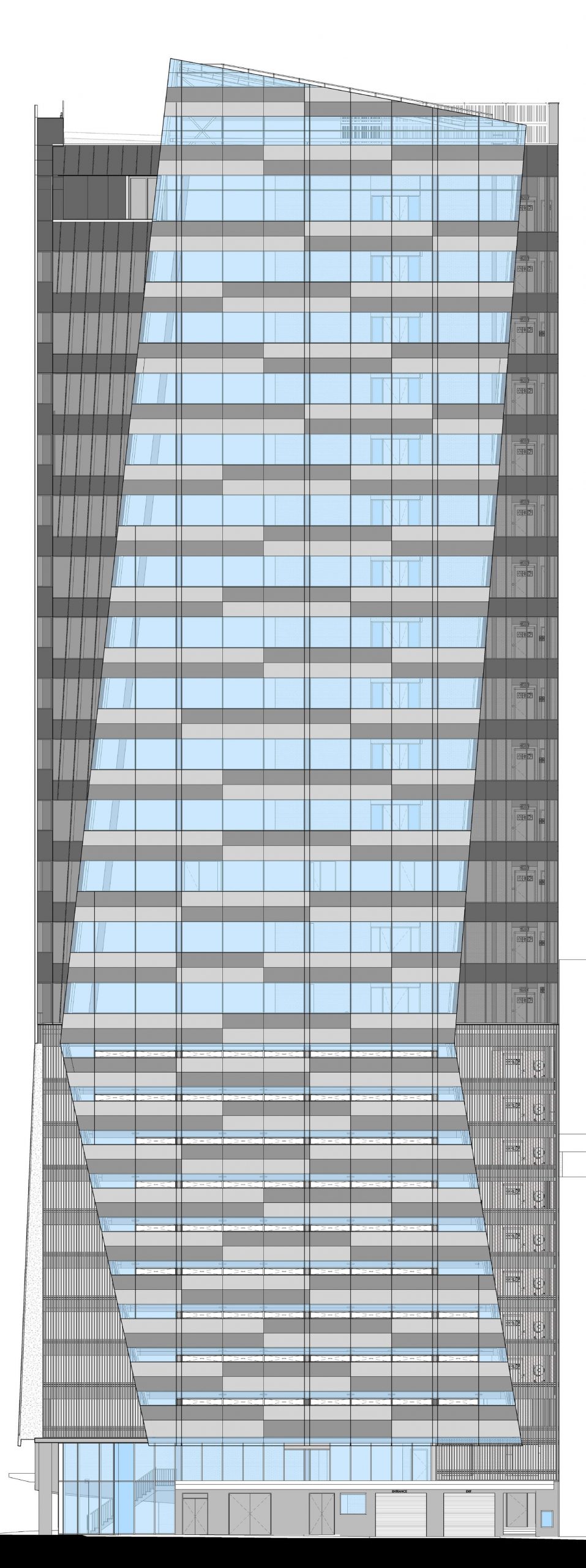
To maximize the floor plates, dhk proposed a simple singular orthogonal massing bar the articulation of the southeastern and southwestern corners. While fundamentally a solid building mass, the appearance of a dynamic, non-orthogonal sculpted mass was created via tapering or cranked façade planes which extend seamlessly over the office and parking levels. This was achieved by chamfering both the southeast and southwest corners of the building at the top of the orthogonal parking base and widening them towards the roof.
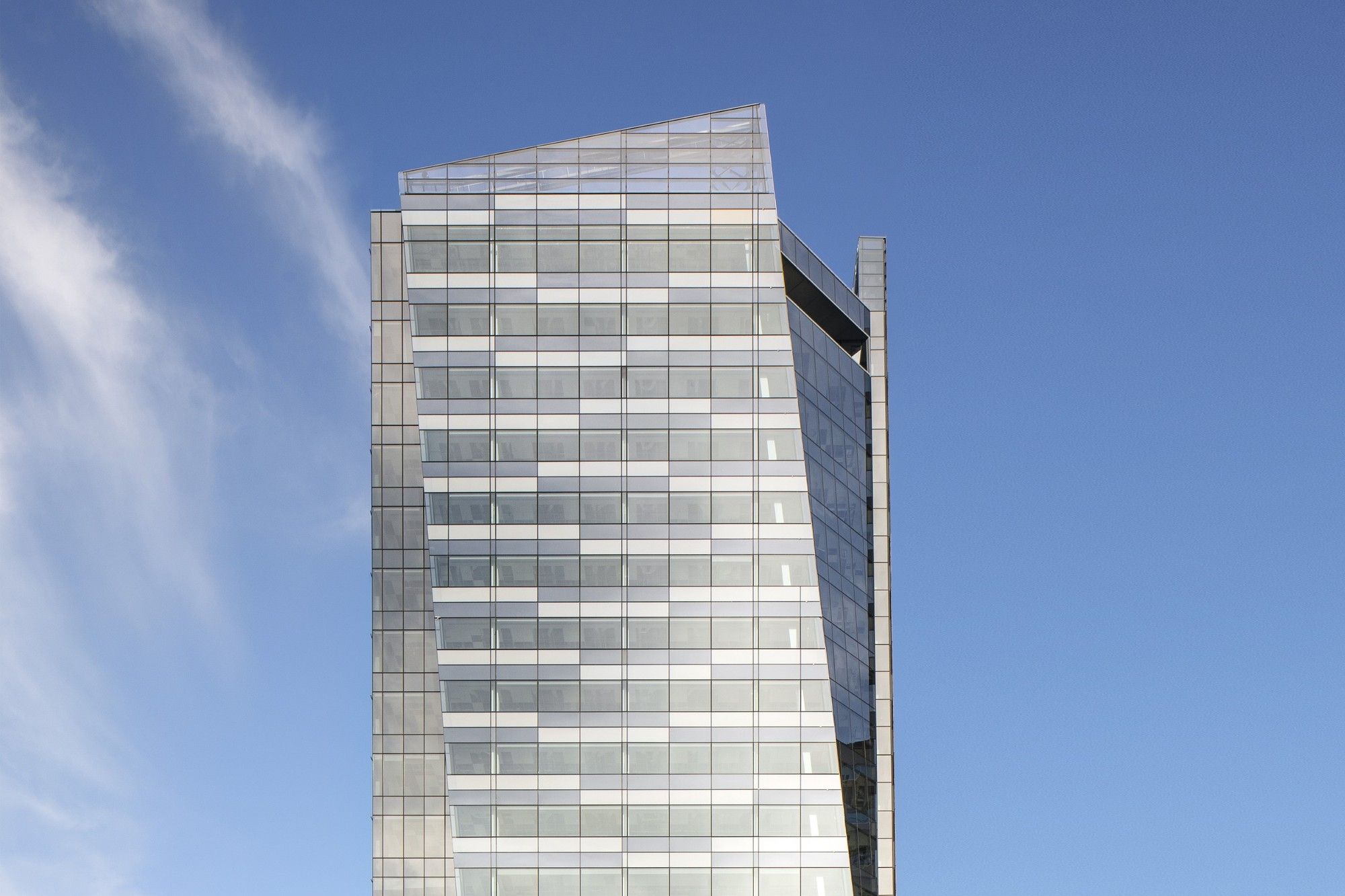
The technique articulates the façade and defragments the solidity of the corners of the building as the wings shape the elevations and extend past the top office floor. By extending the wing-shaped façade screens beyond the roof level with parapet sloping, the appearance of soaring shards is created opposed to an abrupt utilitarian termination.
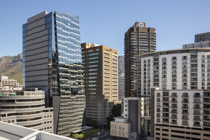
In terms of materiality, a glazed façade was selected due to its flush and sculpted reflective form which is able to conceal both the parking levels and solid spandrels. Not only does glass facilitate an exciting play of light but it allows for an expressive articulation of the building mass in the screen and shard-like elements. The introduction of pixilation on the portions fronting the parking levels, ceiling voids, structure and internal desk height upstands allows the building to conceal both the parking levels and avoid overbearing horizontal bands.
Photography by © Adam Letch
Project Info:
Architects: dhk Architects
Location: Cape Town, South Africa
Area: 14000 m²
Project Year: 2020
Photography: Adam Letch
