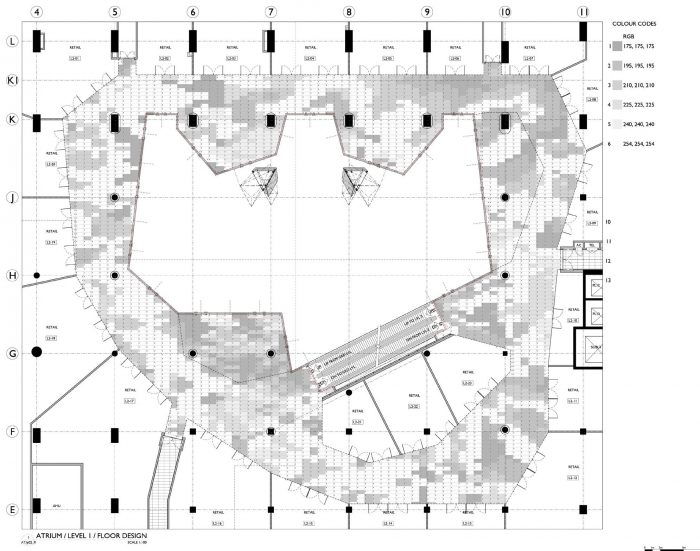
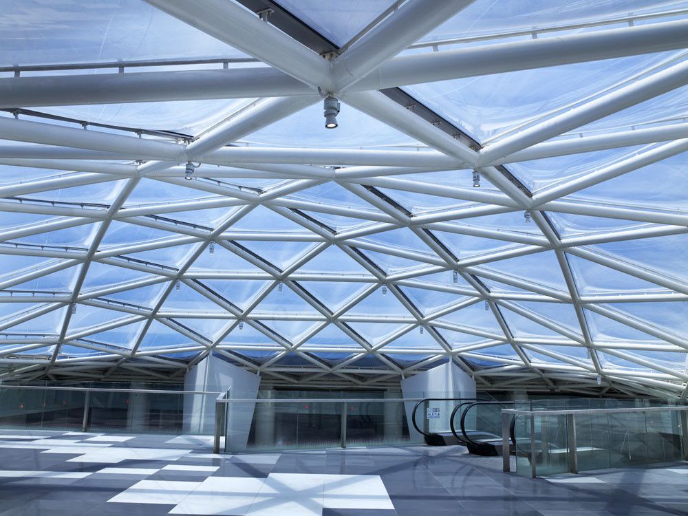
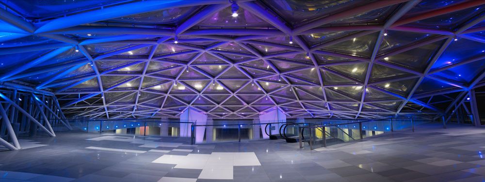
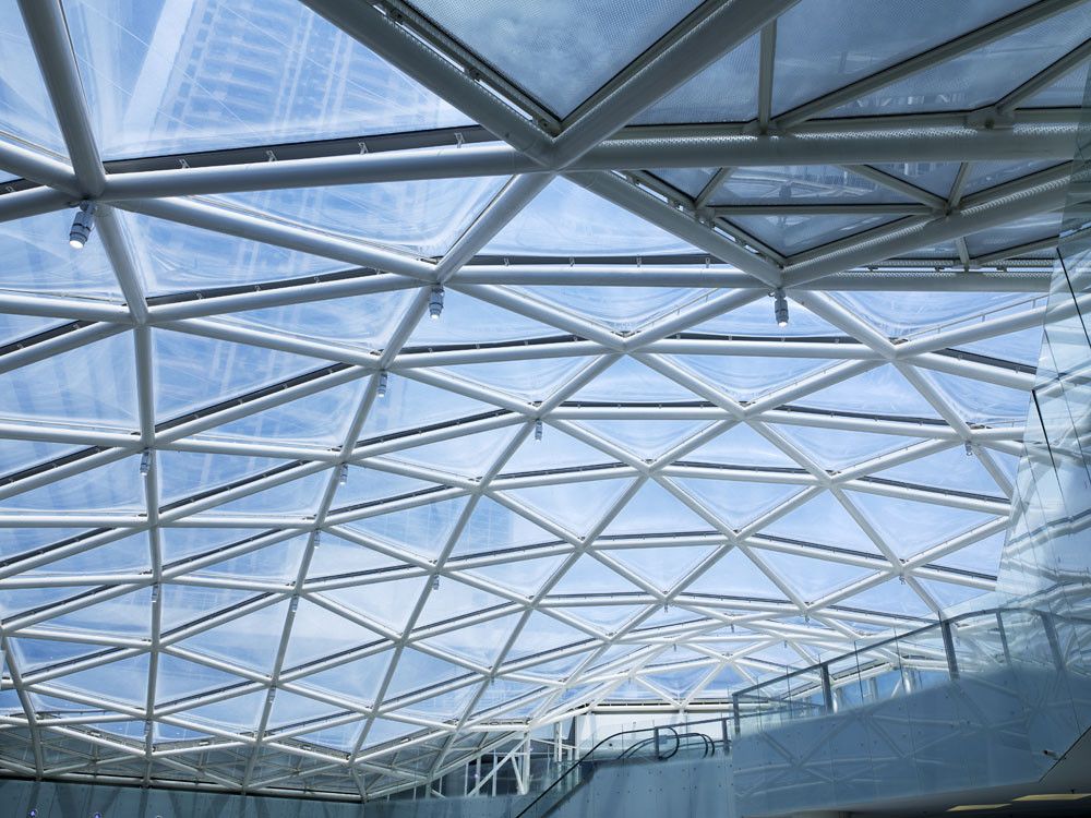
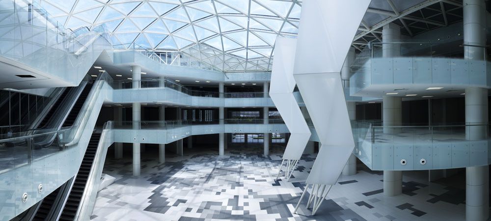
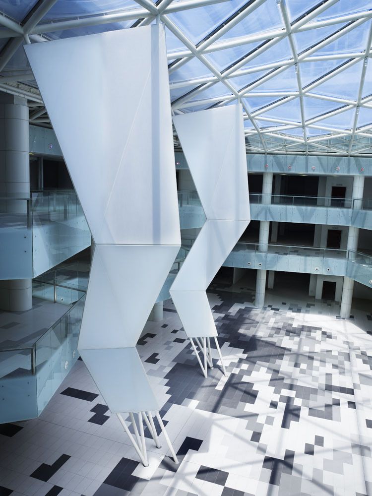
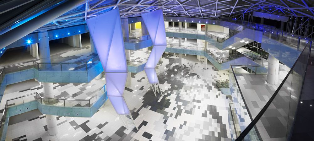
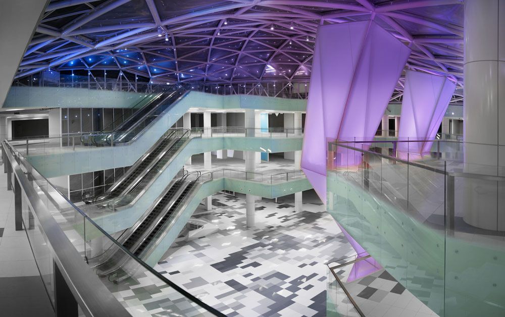
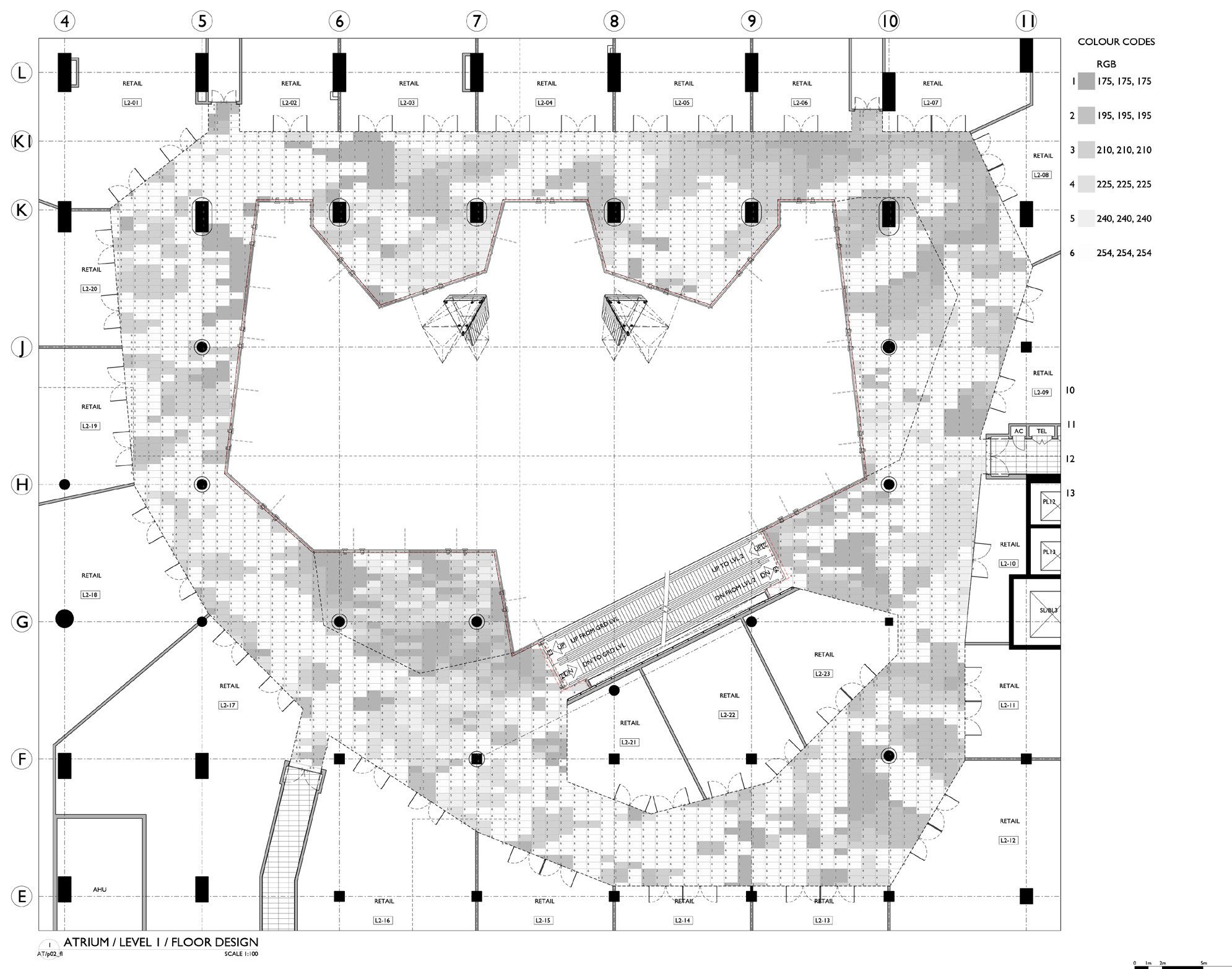
Stephen Pimbley, SPARCH’s founder and director, the ambition is to make a unique and exciting retail destination, standing out among its competitors. Mont Kiara is a predominantly residential neighborhood and is very family orientated. This spirit is captured in the design which uses a ‘friendly’ palette of finishes in feel, color, and texture. Shoppers entering the atrium will step into natural light cascading onto a pixelated ‘floral’ floor surface, providing the space with a unique identity and paying homage to the buildings tropical context. The floor surface depicts an abstract image of the hibiscus flower which is used as a device to guide shoppers into the atrium and identifies zones for events and displays. The energy and geometry of the floor pattern are carried into the structure of the roof that vaults the atrium; a steel shell supporting an ETFE pillow roof. Hereunder themed events, activities and cultural performances will be staged to engage and entertain visitors.
Key to achieving the ambition to make a unique and exciting retail destination is based on the following design principles: Stimulate the senses and provide an attractive environment to move through. Deploy a circulation strategy as a continuous loop, this making easy orientation and all shops equally accessible.
Locate visual and physical attractions enticing shoppers to explore all areas. Provide well-proportioned shops through the entire mall.
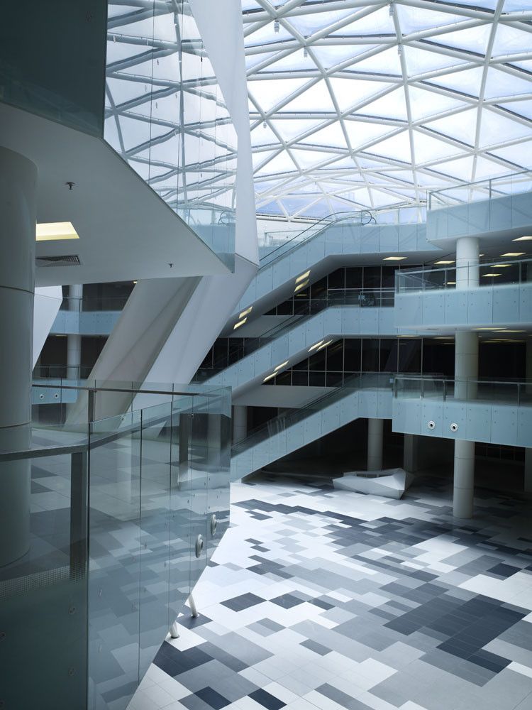
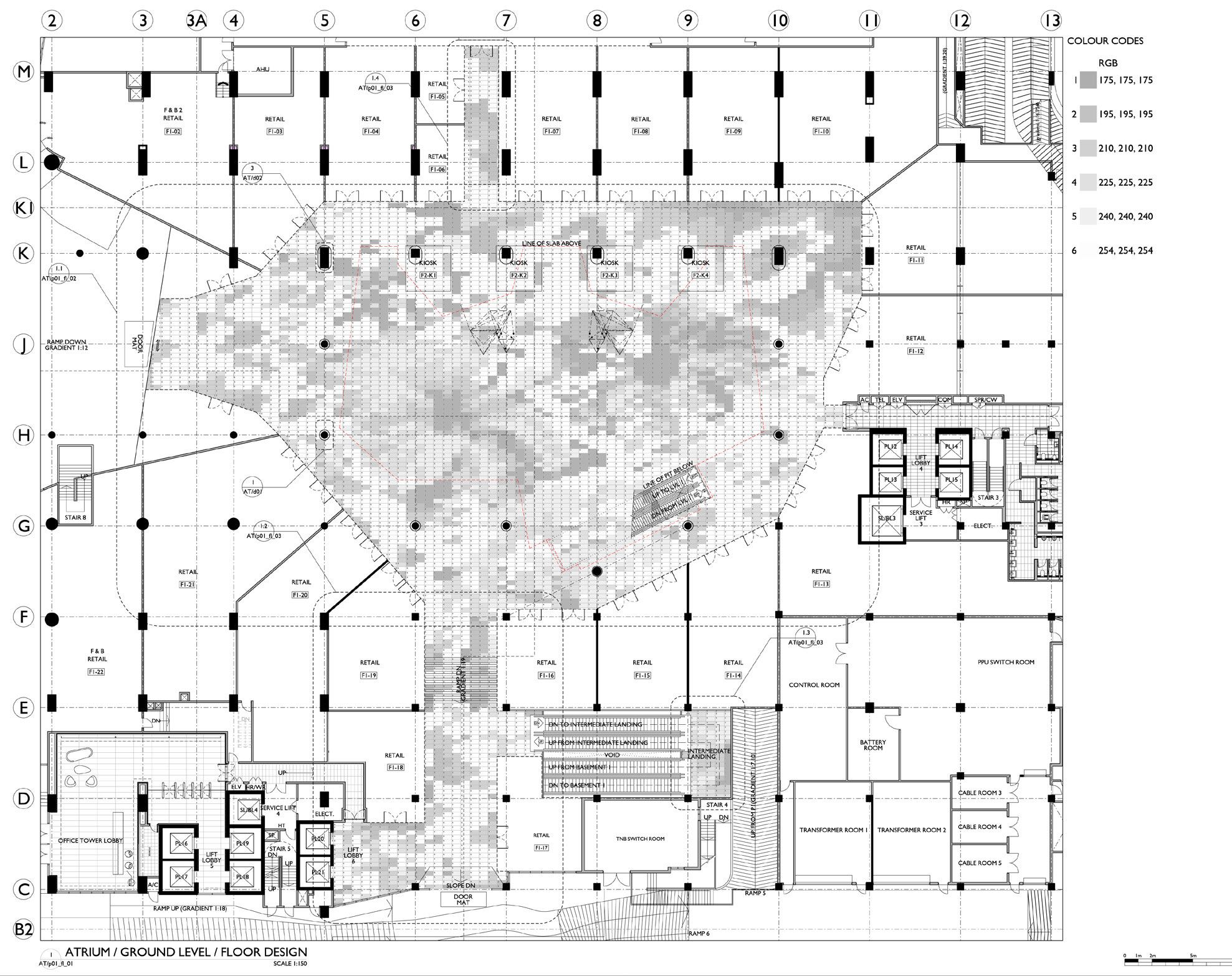
The scale of the ground floor public area demands for an eye-catching surface that provides the space with an identity while at the same time establishing a connection to its context. The floor depicts an abstract image of the hibiscus flower, guiding shoppers towards different zones of interest. Thus the differentiated floor design becomes part of the strategy of enticing the shoppers’ sense of exploration and bringing them to the upper floors.
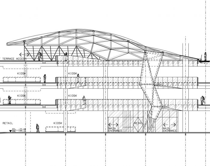
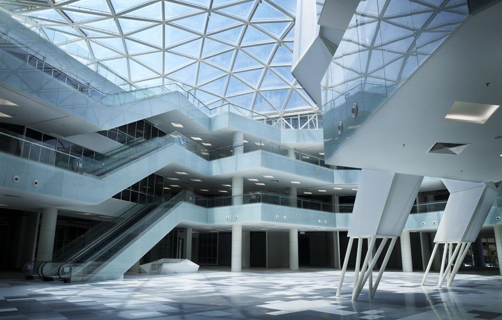
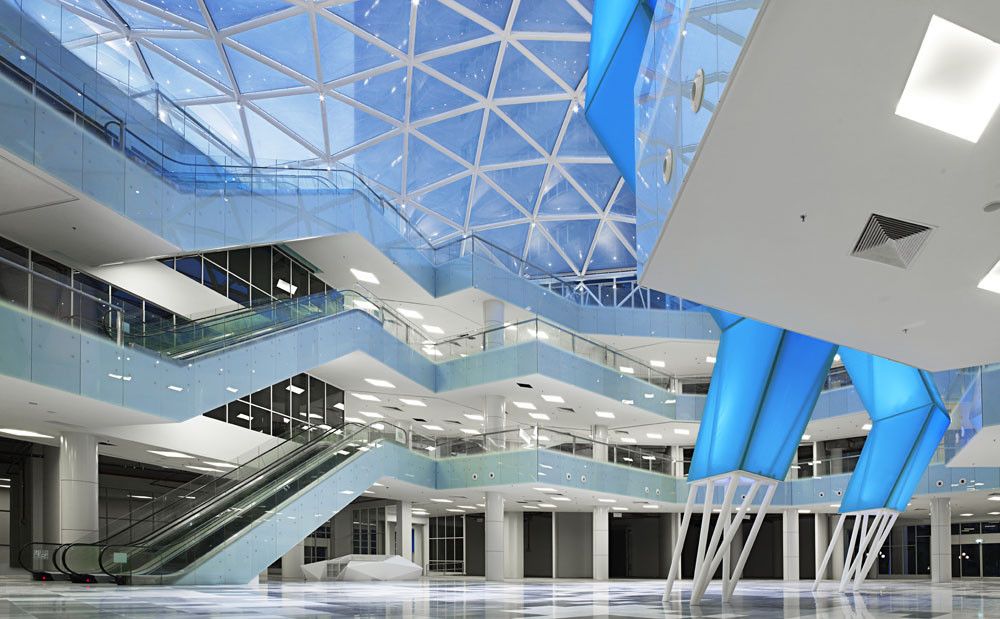
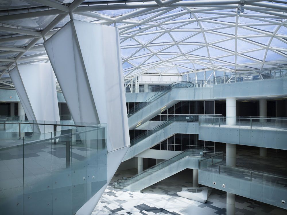
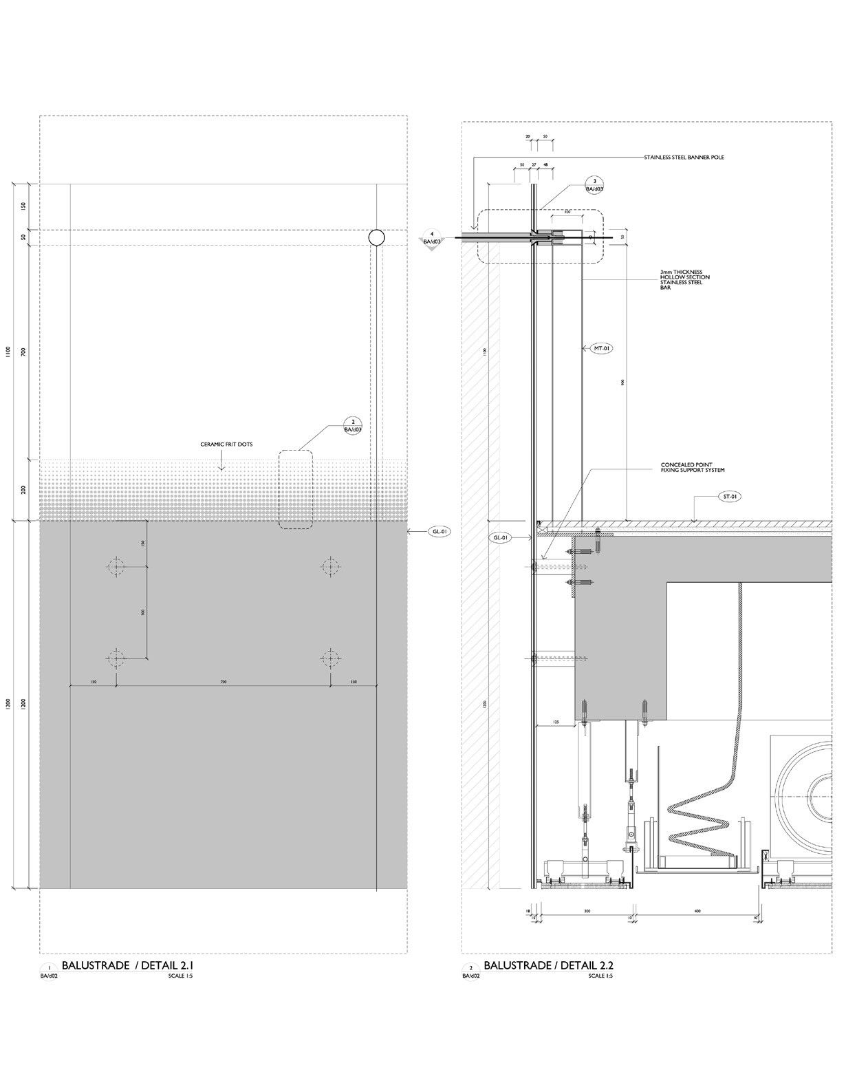
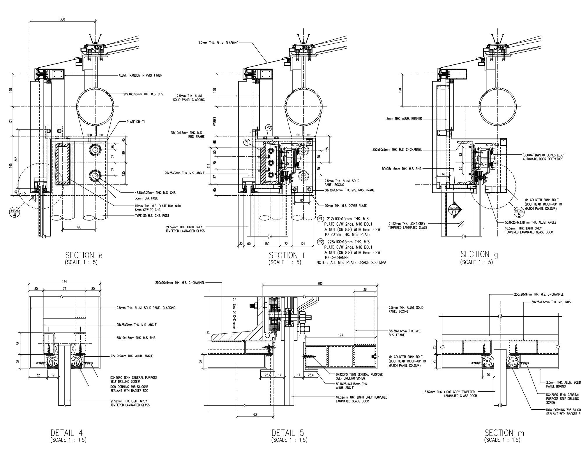
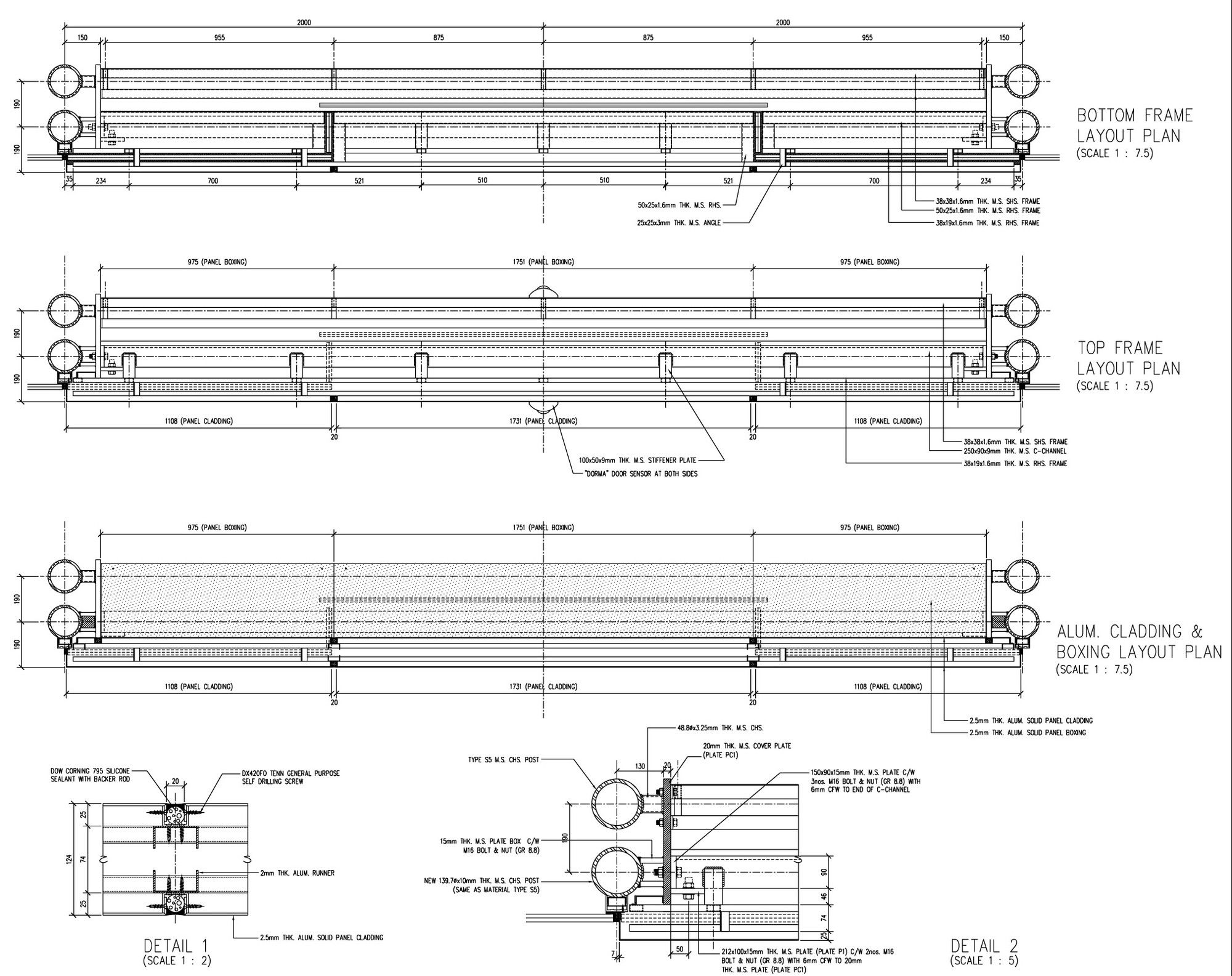
There is one set of escalators in the main atrium linking all commercial floors. It provides a direct link to the roof terrace from within the retail area. The choice of inverting the escalators is a reflection of maximizing the shoppers’ exposure to shop frontage at all levels. The escalators are clad with a glass screen to match the gallery balustrades. Hence the floors appear to be part of a continuous upward spiraling movement, directing the eye throughout the atrium.
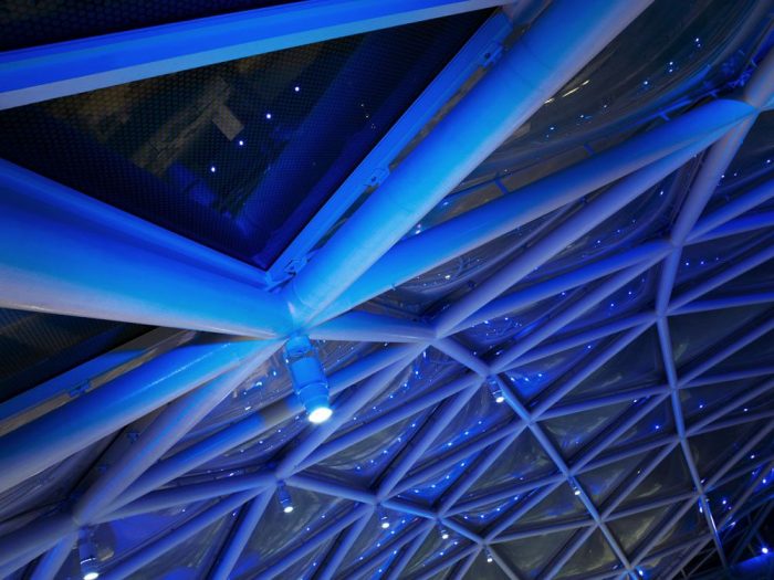
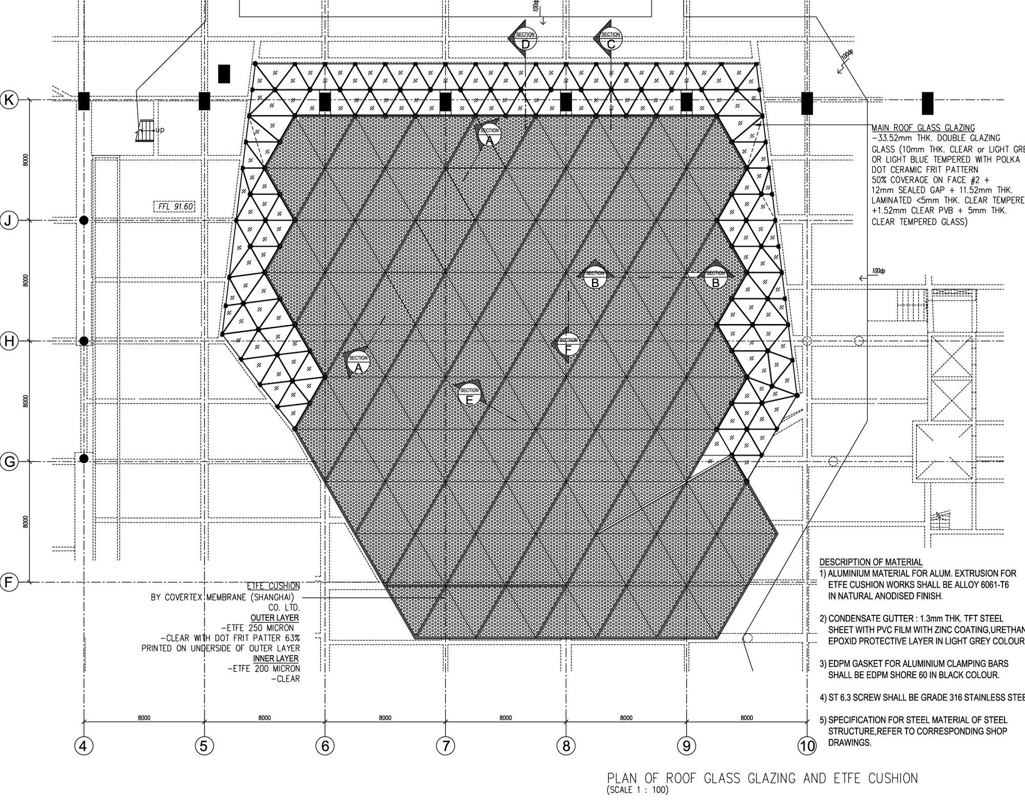
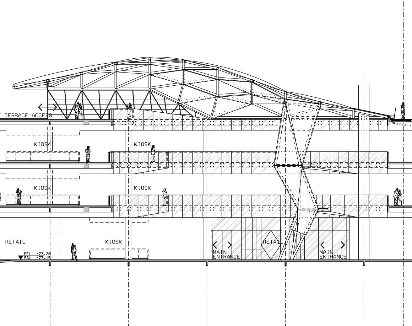
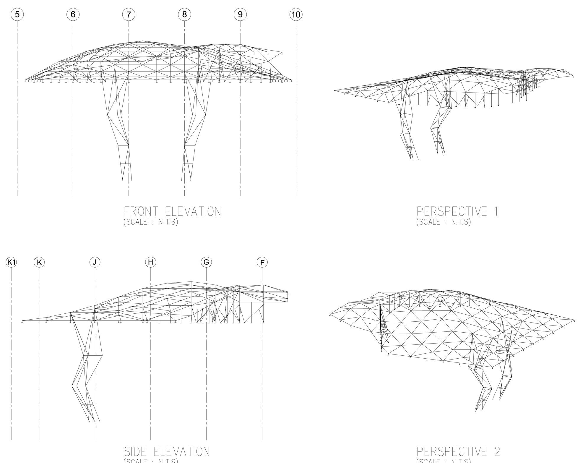
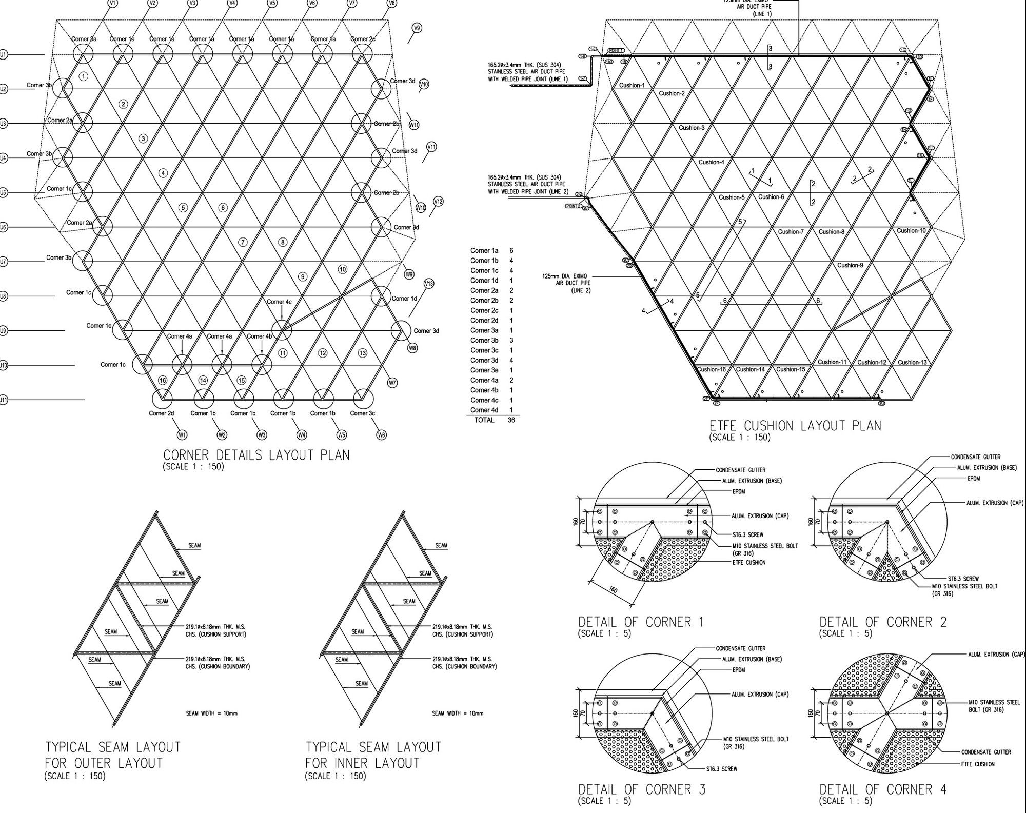
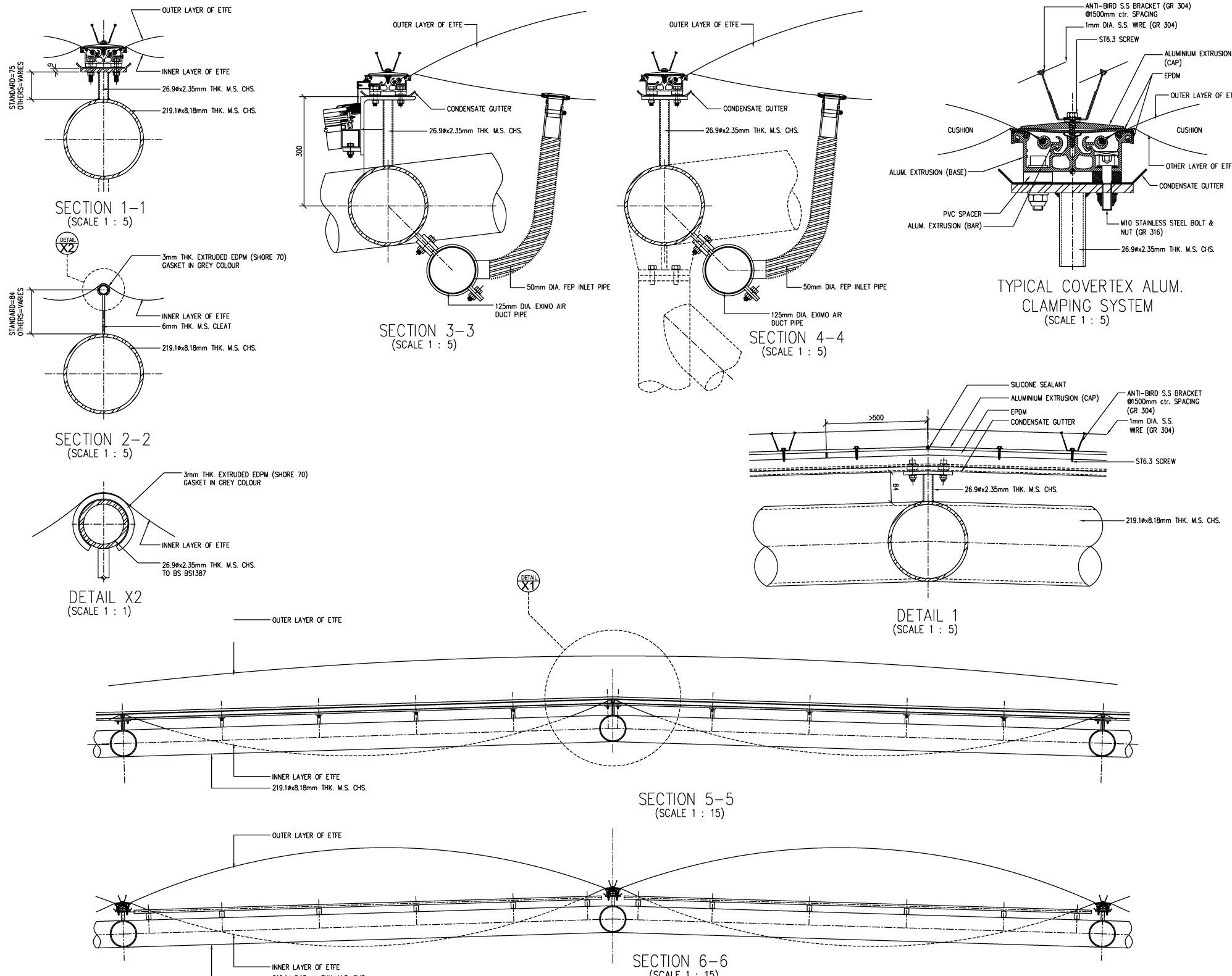
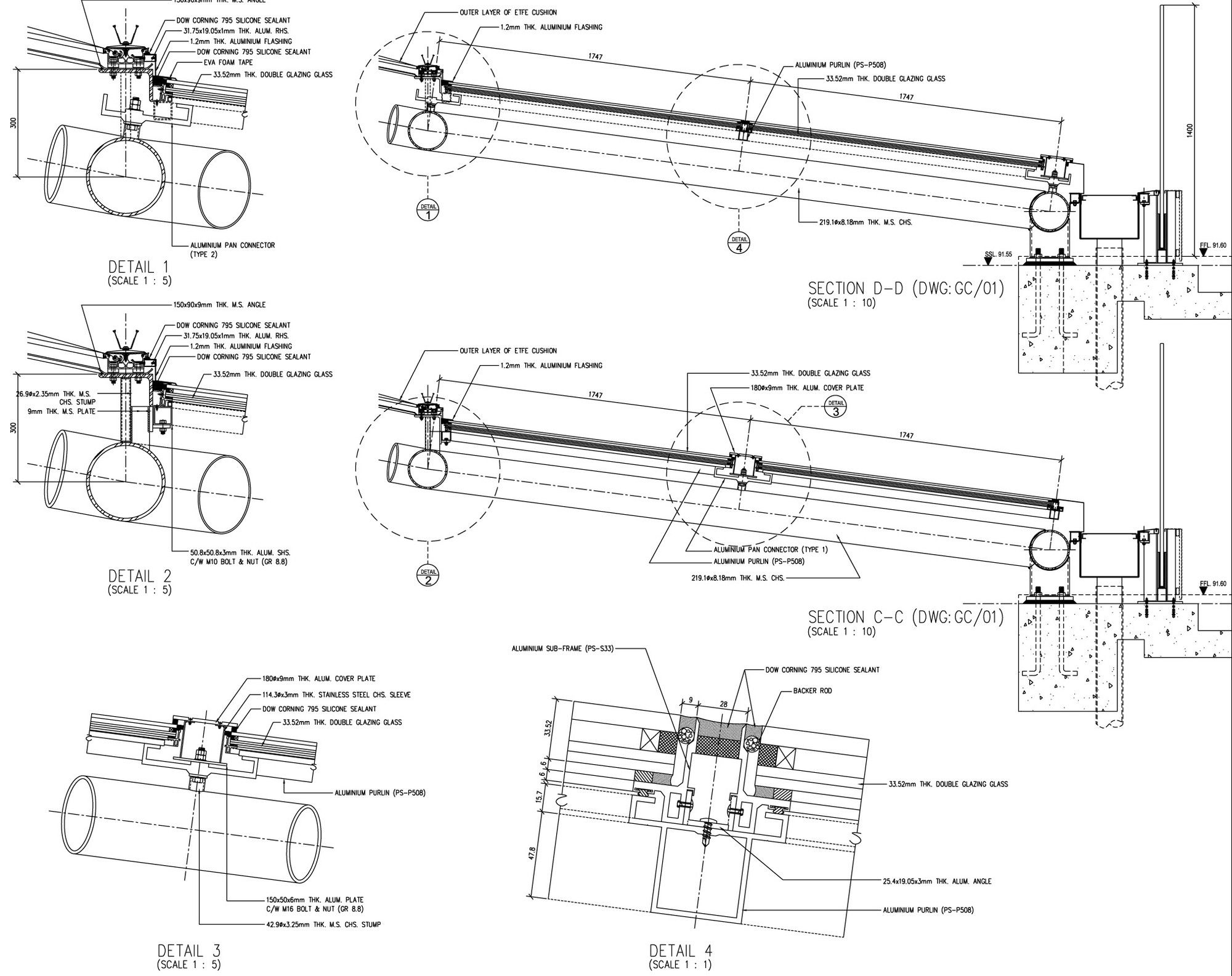
The choice of ETFE as a lightweight cladding material is in tune with the desire for a light steel structure that performs over a large span. The form of the atrium roof is determined by its surrounding building elements: it starts flush with the roof level on the north side and folds up on the south side to allow for an access area to the rooftop terrace. Its self-cleaning properties can be utilized thanks to frequent tropical rainfalls.
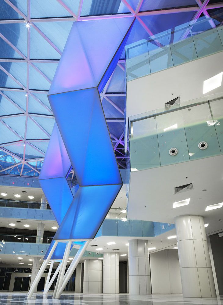
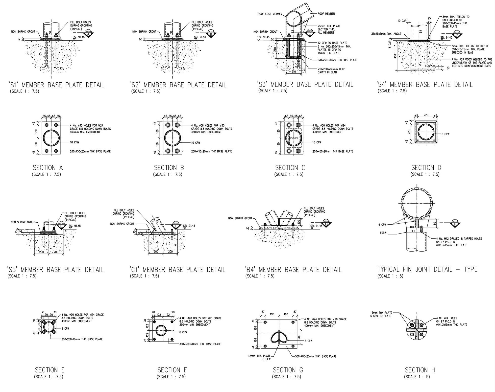
The triangulated roof structure is supported by two raking space frame columns within the central atrium space. These “legs” have the double task of reducing the roof span as well as supporting the atrium balconies described below.
Part of the strategy of increasing the atrium void was to compensate the wider space with elements of interests within it. The design of large-sized balconies within the atrium is intended to either provide a support seating area to smaller F+B units or to accommodate small retail units. These balconies are supported by the main concrete structural frame and by the roof structural columns.
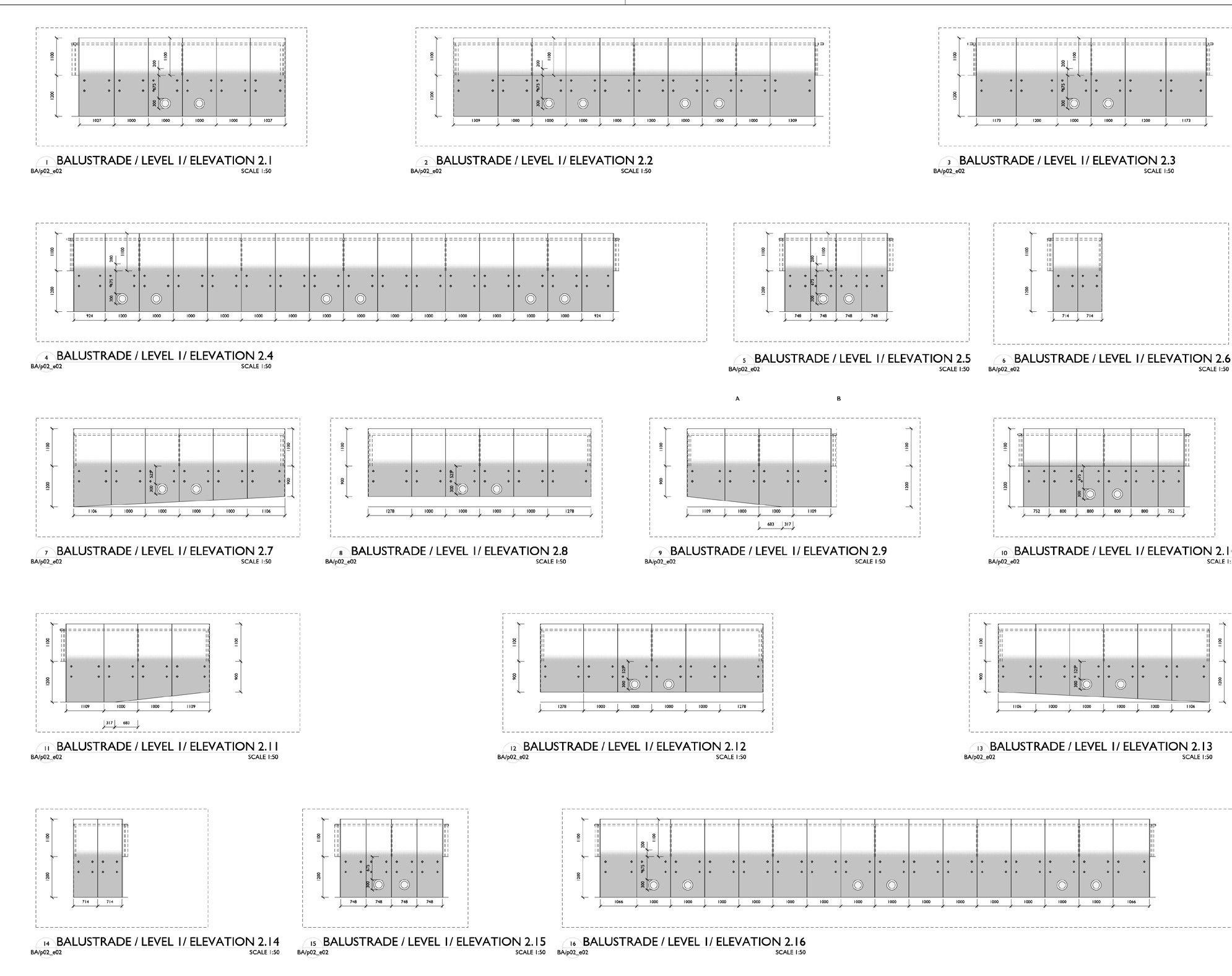
In order to achieve better-proportioned shop areas, the shop front line is moved backward generating ‘plazas’ within the gallery space. The proposal of integrating ‘island kiosks’ within the gallery is an effective way to maintain a visual connection to all shop fronts and to create extra points of interests on the shopping circuit as well as providing smaller rentable units.
Project Info:
Architects: SPARCH
Location: Kuala Lumpur, Federal Territory of Kuala Lumpur, Malaysia
Interior Design: SPARCH
Design Director: Stephen Pimbley Team: Jan Clostermann, Darmaganda, Sofia David, Michael Gibert, Sevena Lee, RenJie Li, Suchon Pongsopitsin, KimLee Tan
Local Architect: Veritas
Architects Quantity Surveyor: YSCA Consultancy
M&E Engineer: Norman Disney & Young
Specialist Structural Engineer: Tensys
Lighting Design: Lumino Design Consultants
C&S Engineer: Jurutera Perunding Riz
Area: 40000.0 m2
Project Year: 2010
Photographs: Milk Photographie
Manufacturers: PFEIFER Fabritec Structures
Project Name: 1 Mont’ Kiara Retail Mall
photography by © Milk
photography by © Milk
photography by © Milk
photography by © Milk
photography by © Milk
photography by © Milk
photography by © Milk
photography by © Milk
photography by © Milk
photography by © Milk
photography by © Milk
photography by © Milk
photography by © Milk
photography by © Milk
photography by © Milk
plan
plan
plan
section
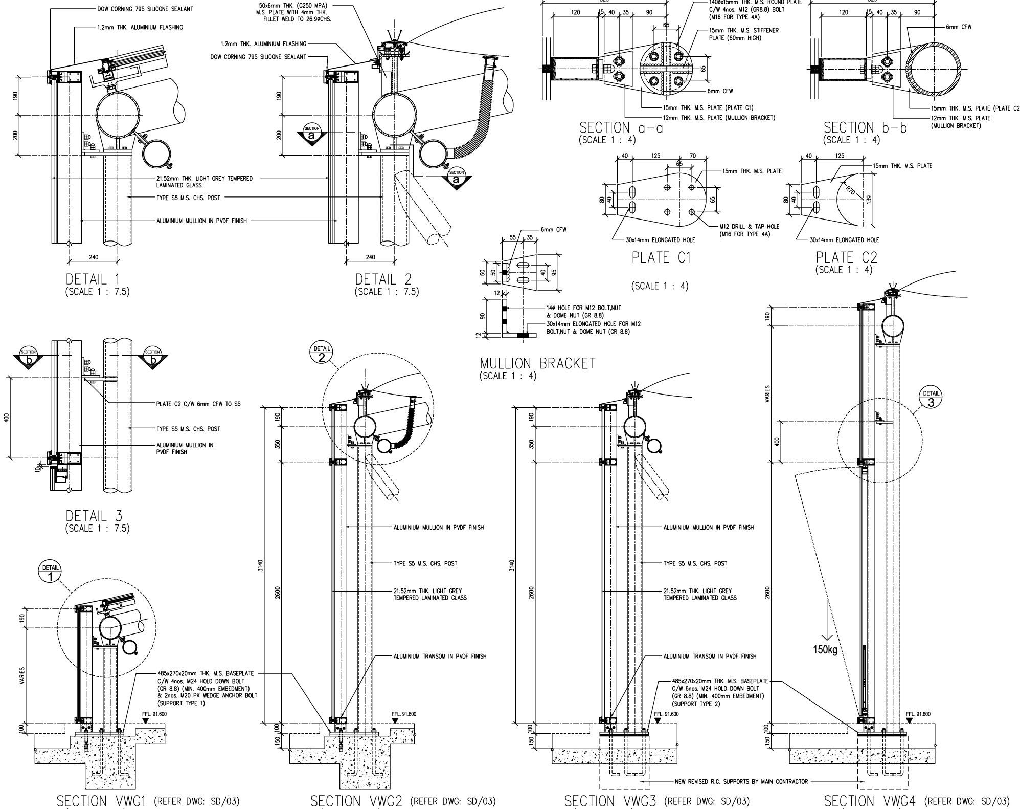
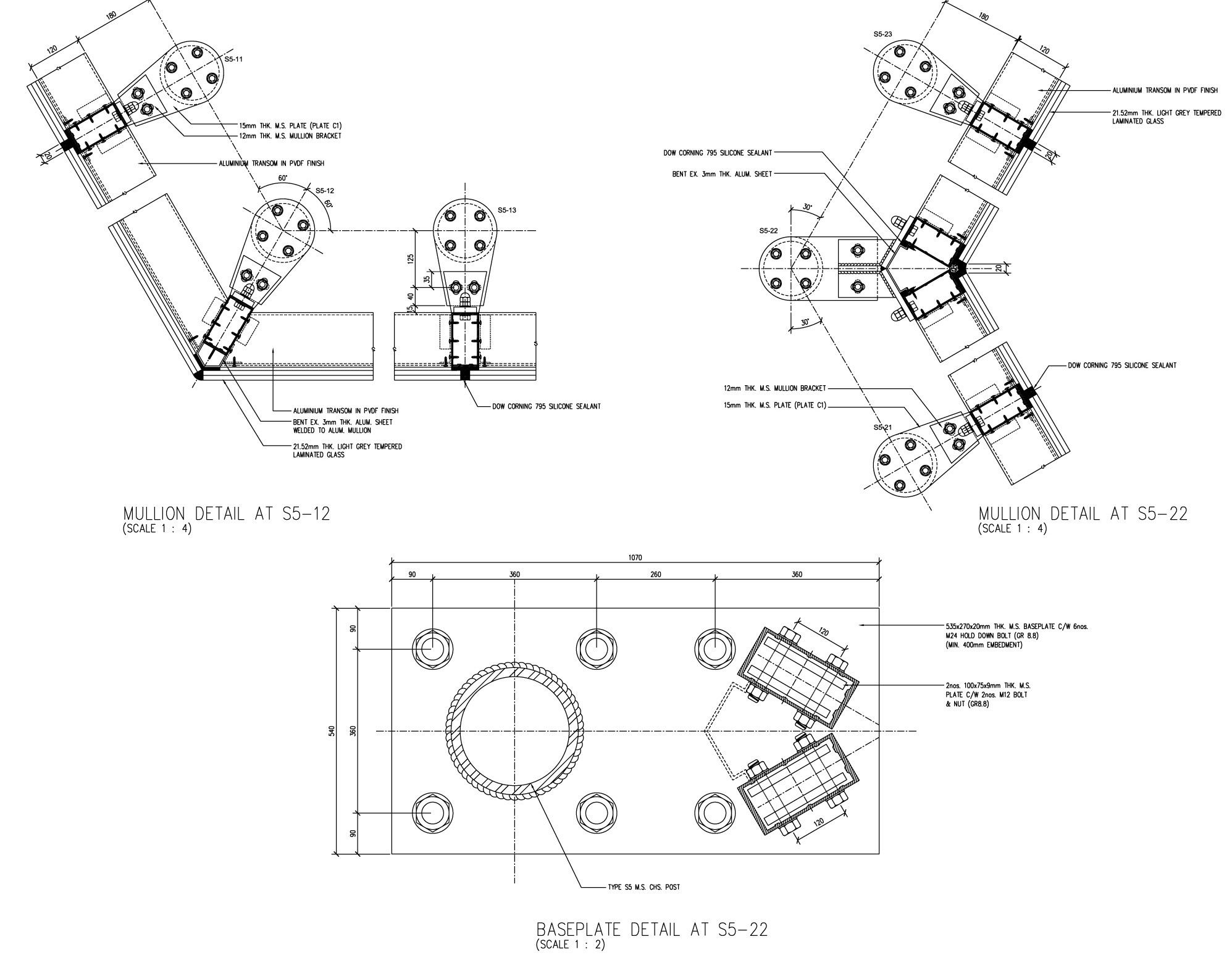
detailed section
sketch
sketch
sketch
sketch
sketch
sketch
sketch
sketch
sketch
sketch
sketch


