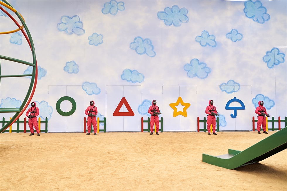
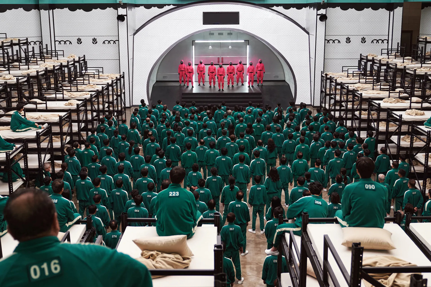
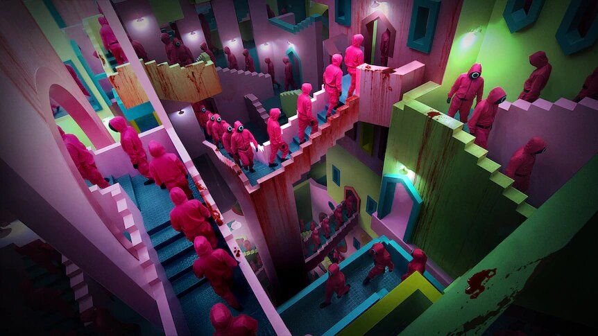
In a nutshell, Squid Game has people murdered in spaces that basically look like kids’ playing fields but they just get creepier the more you look. Whether the game itself, the sets, or even watching the hitting Korean Drama—all are both tempting and intimidating.
In only one month, the Netflix series Squid Game reached 111 million fans! According to the platform’s co-CEO and Head of Content, it has “a very good chance it’s going to be our biggest show ever,”. Telling the story of a group of 456 people who are troubled because of their debt agree to be part of some “games” to win 45.6 billion won (around €33 million, $38 million), the show is proof of what human beings are capable of doing to win a competition—it is a story about survival.
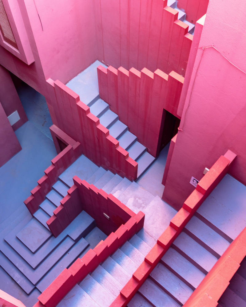
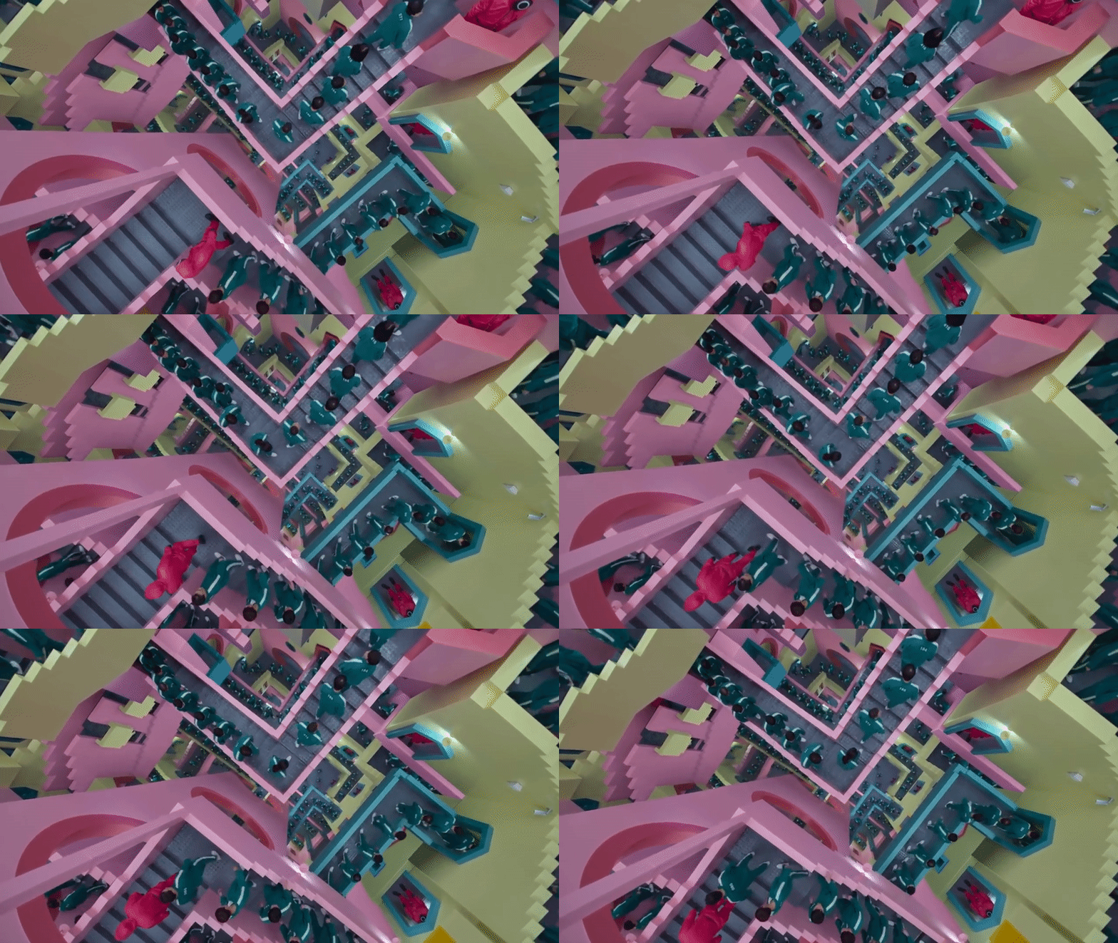
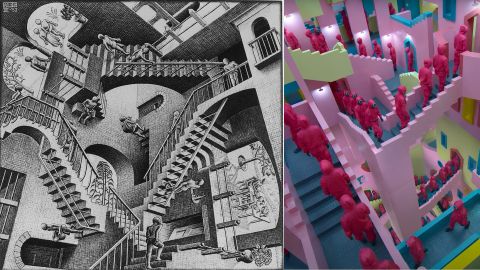
There are some TV shows and movies that all architects should watch, and we think Squid Game is among them. Besides the twisted plot, on-point scenario, and complicated characters, the perfectly curated sets are a key reason Squid Game is such an appealing show. People are actually talking about the beauty and accuracy of the sets’ design. The architectural atmosphere of the show is designed to bring back collective childhood memories in a completely different -even more, brutal- context.
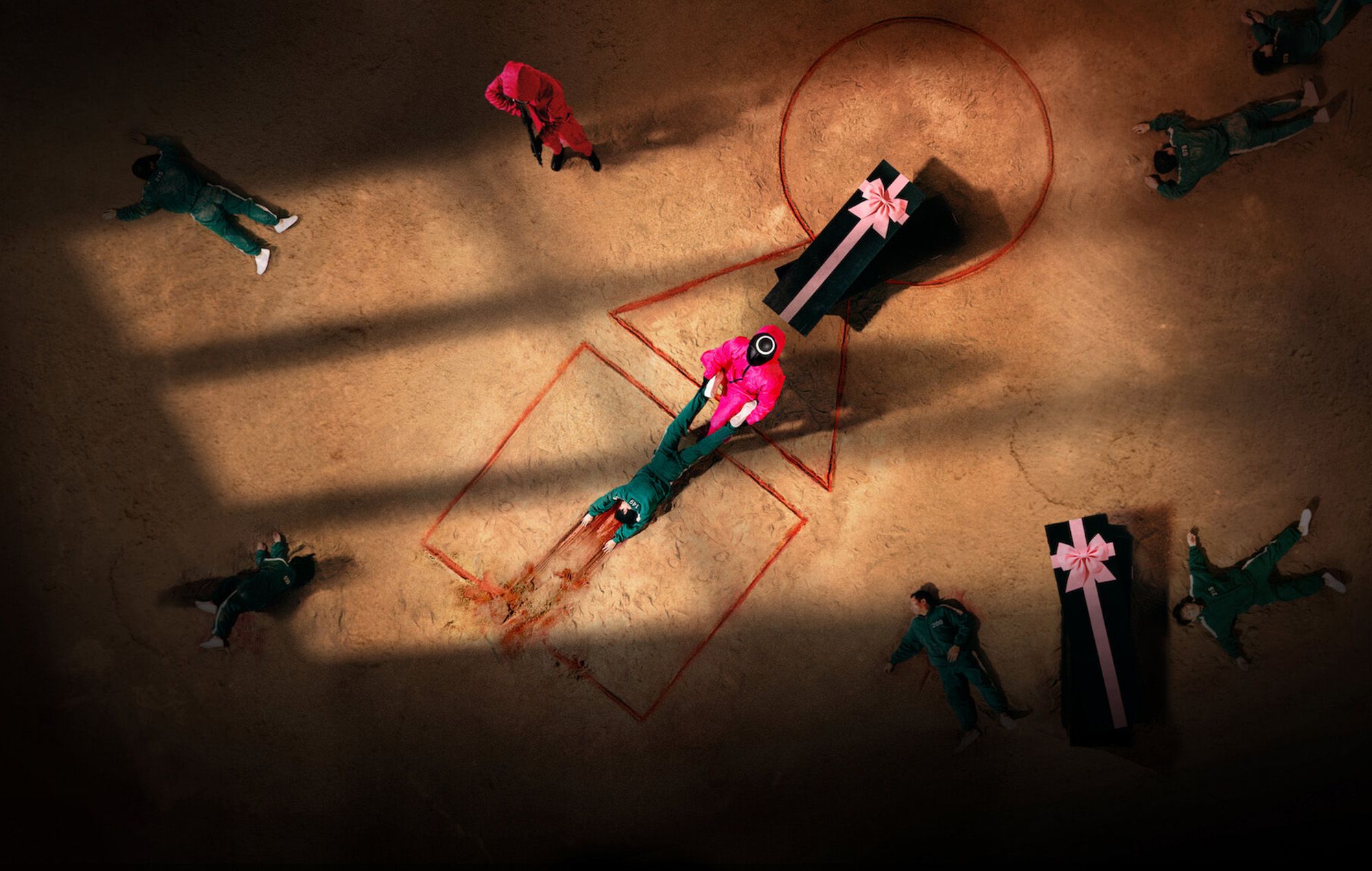
The playing fields you knew existed for you to have fun and be safe, are here and now a place where people are manipulated and murdered—where blood is just casually scattered around, and people are actually still PLAYING!
The mastermind behind the sets of Netflix Korea‘s dystopian original hit ″Squid Game″ is the brilliant Art Director Chae Kyung-sun. The Korea-based artist wanted to bring back feelings of the innocence of childhood to people who are filled with greed and violence and are all -except one person- death-bound.
The architectural elements in Squid Game play a huge part in conveying these emotions of being trapped. The architecture was cleverly used to tell a story and make it attractive enough to binge watch and, at the same time, evoke the thoughts of the fans and intimidate them from their own thoughts and memories.
“Our first goal was to create a childlike and fairytale-like atmosphere, so it wasn’t a matter of intentionally inserting disturbing and creepy details, but adding movie props that viewers would not expect to see in a thriller where deadly games are being played, like bright, vivid colors or the gift-wrapped coffins.”
-Said Chae Kyung-sun in an interview with Korea JoongAng Daily
To understand more about the metaphors behind the design elements of Squid Game’s filming sets, the following illustrates the design of the sets of all 6 games.
6 Gripping Squid Games and the Art of Dystopian Architecture
-
Red Light, Green Light and Squid Game
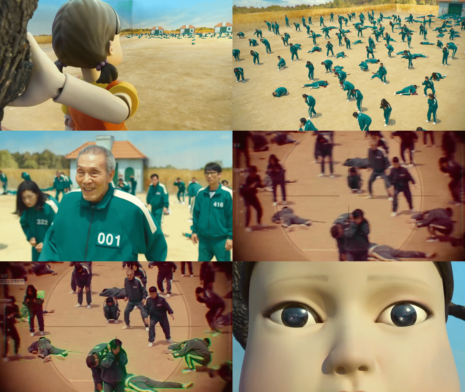
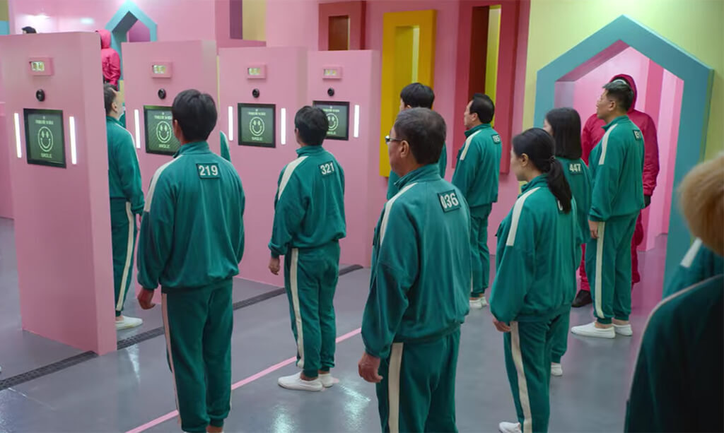
The set of the first game -and the last as well- actually sets the feels for the rest of the show. The art director explained that she “deliberately put a tree without any leaves behind the Young-hee robot to imply that this place was “lifeless.” And the set represents confusion among the players about distinguishing reality and fiction, like the film “The Truman Show” [1998]. Most players at first tend to think that this isn’t reality. Everything seems fake and artificial, so they’re denying the fact that people are actually going to die here.”
-
Sugar Honey Combs
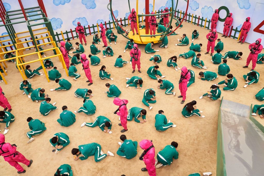
The second game takes place in a playground, where players are forced to play the Honeycomb Game. To bring back the feeling of being too small besides everything when we were kids, the playground and its elements including slides and wings were outsized—giant even for adults. According to the show’s Director, when we were young, the playground seemed very big, so they built a giant playground for adults. Moreover, the surrounding walls look like they are painted by children to ease the players from their original reality into the creepier world of Squid Game.
-
The Waiting Room
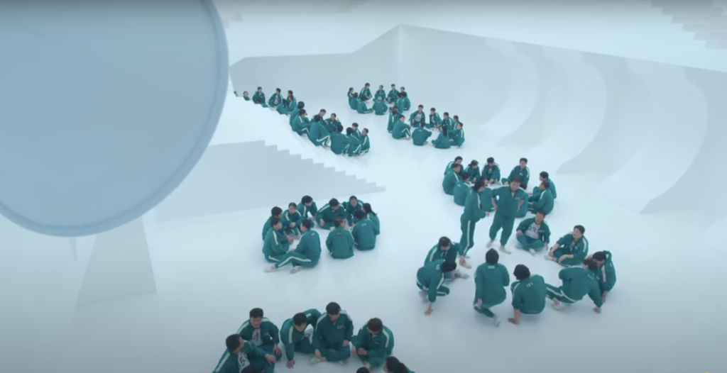
Unlike all the previous sets full of details and color, the waiting lounge where players should wait before the third and fourth games is plain white, with no end or beginning on sight. They wanted to create a dreamlike space—a one when the players pass through, feel like they entered some kind of a different world. Chae Kyung-sun explained that were attempting to create some kind of uneasy feeling that comes from a white room, not knowing what will happen next. We wanted to create an unknown space.
-
Tug Of War
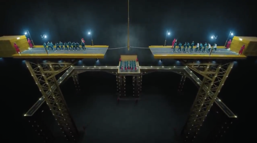
The third game’s filming set is one of the largest ones in Squid Game. Unlike the previous two games with playground-like arenas, this one is rather industrial and dark. However, the yellow gantries on the sides of the platform look like colorful construction toys kids play with. The art director says that they “had a fixed theme from the start — people who are abandoned and forced to live on the streets. These people have mountains of debt, they have families to care for, but they have nowhere to go. So we decided to go with a disconnected blacktop roadway for the set.”
-
Marbles
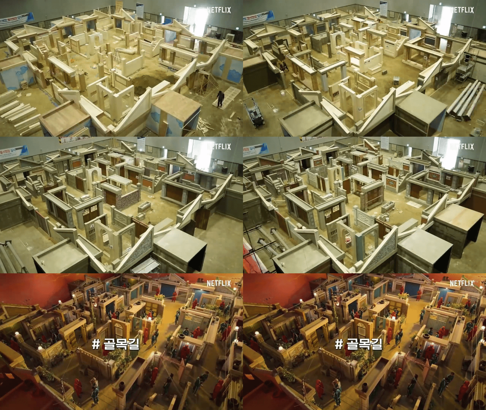
This set is the one that took the most work—through it, the art director wanted to convey “the coexistence of life and death, fiction and reality”. A lot of small details were put into the film set to create a sense of really being in the 1970s to confuse the players. Besides the fake sunset, other details were added including the window sills, the glass panels of the windows, the lighting on the front porches, and even the milk baskets. They went too far and planted weeds beneath walls themselves!
-
Glass Stepping Stones
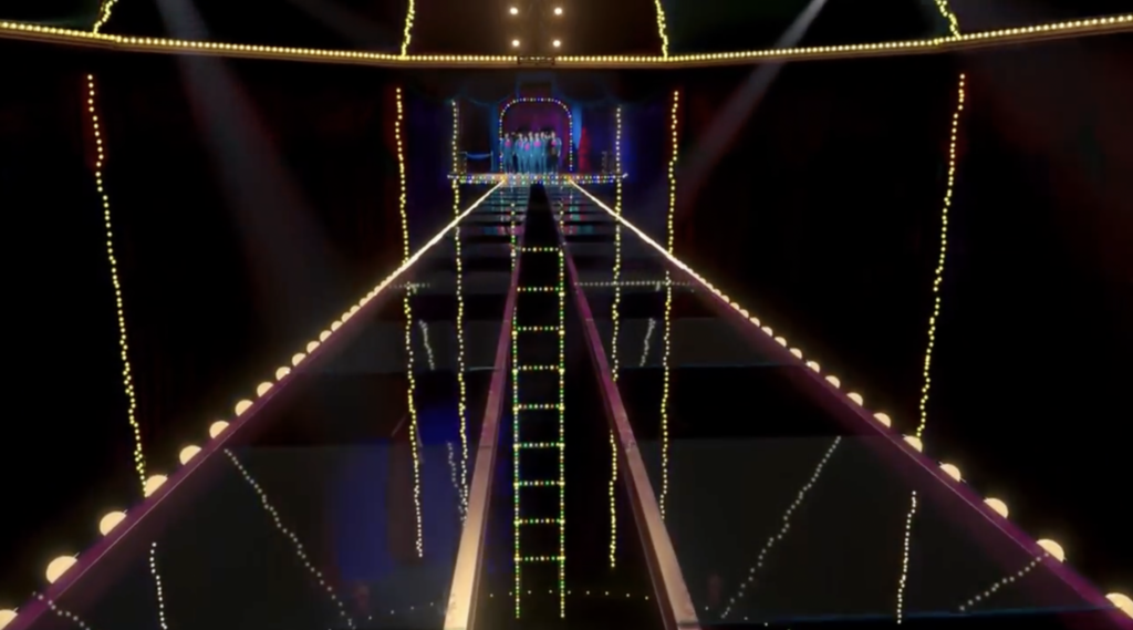
In the fifth game, players are forced to cross a bridge walking on glass panels, with only half of the panels being tempered. If a player steps on a non-tempered glass panel, they fall and die. The architecture in this set is designed to make this suicidal walk look like a theatrical performance in a circus—with the suspended bridge, flashing lights, VIP spectators, and everything. The art director wanted to “design a space that’s dangerous and scary; a space where you can think of life and death at once.”
courtesy of creative blog
All GIFs and Images via Netflix
All GIFs and Images via Netflix
All GIFs and Images via Netflix
All GIFs and Images via Netflix
All GIFs and Images via Netflix
All GIFs and Images via Netflix
All GIFs and Images via Netflix
All GIFs and Images via Netflix
All GIFs and Images via Netflix
All GIFs and Images via Netflix
All GIFs and Images via Netflix
All GIFs and Images via Netflix


