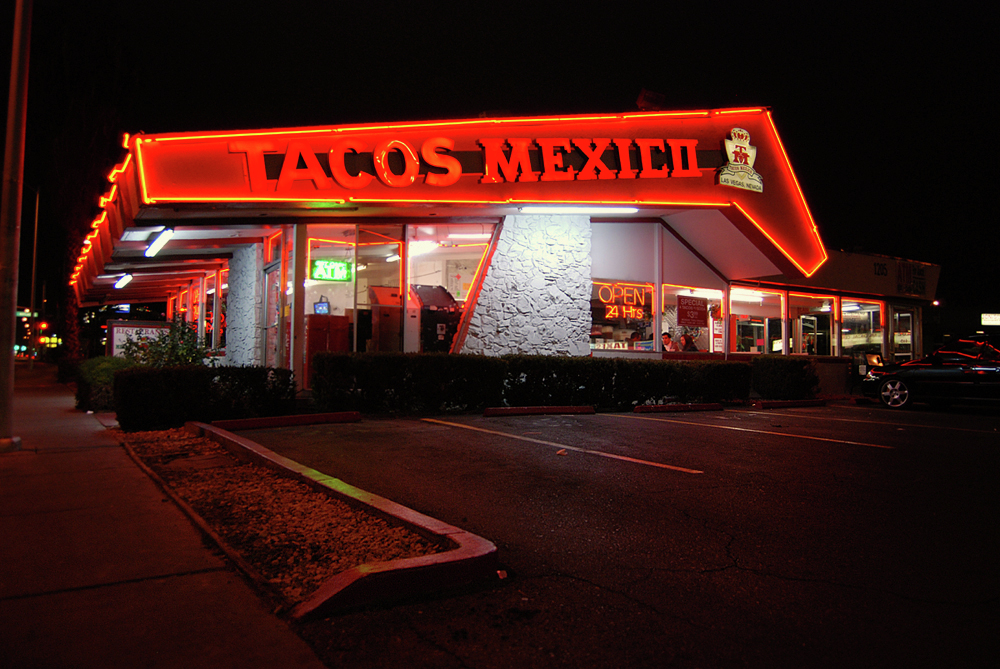
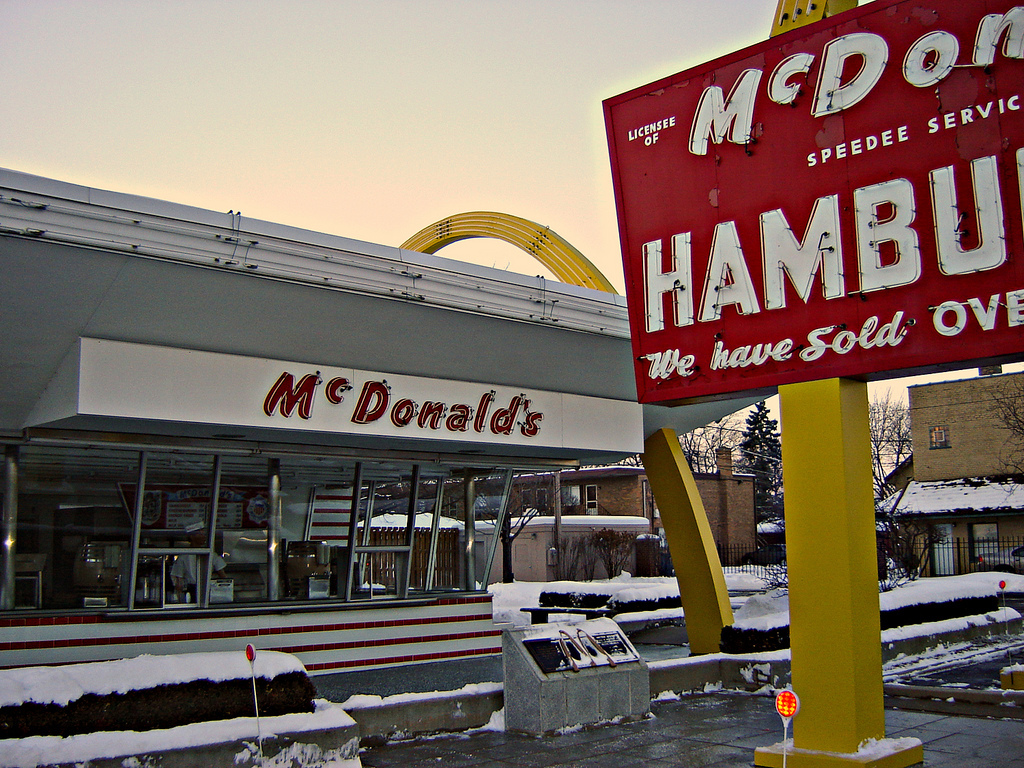
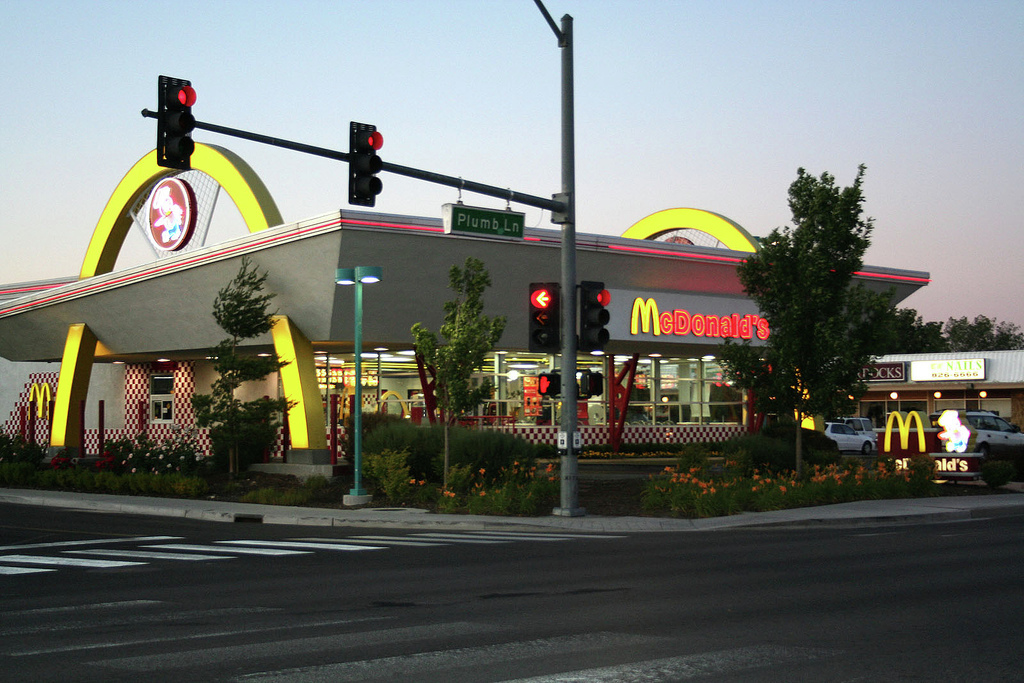
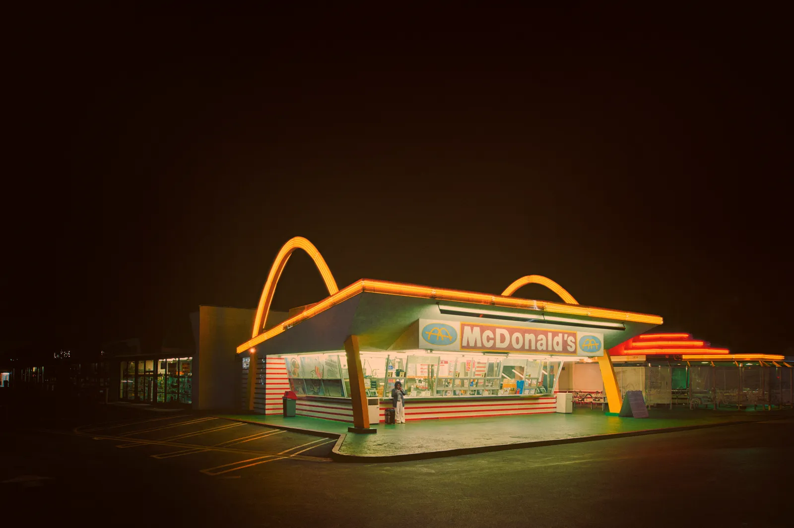
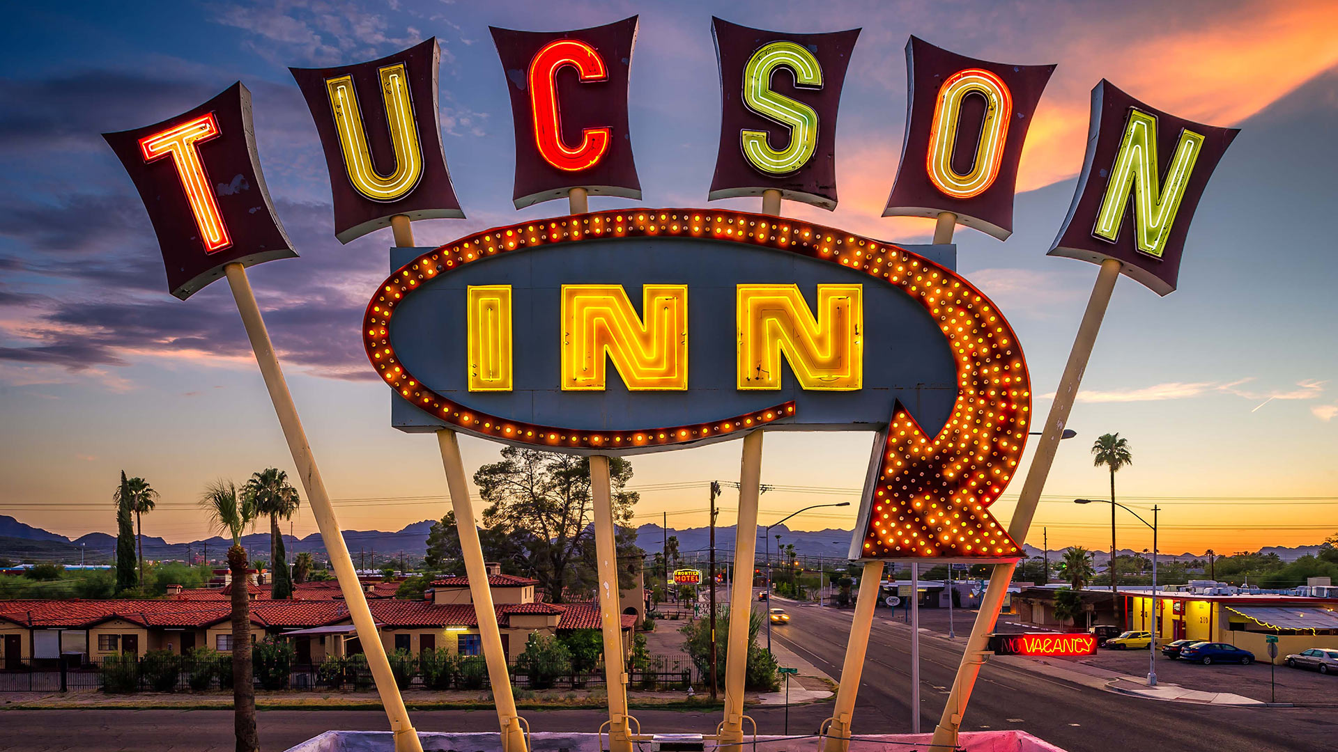
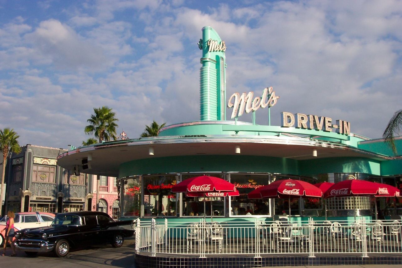
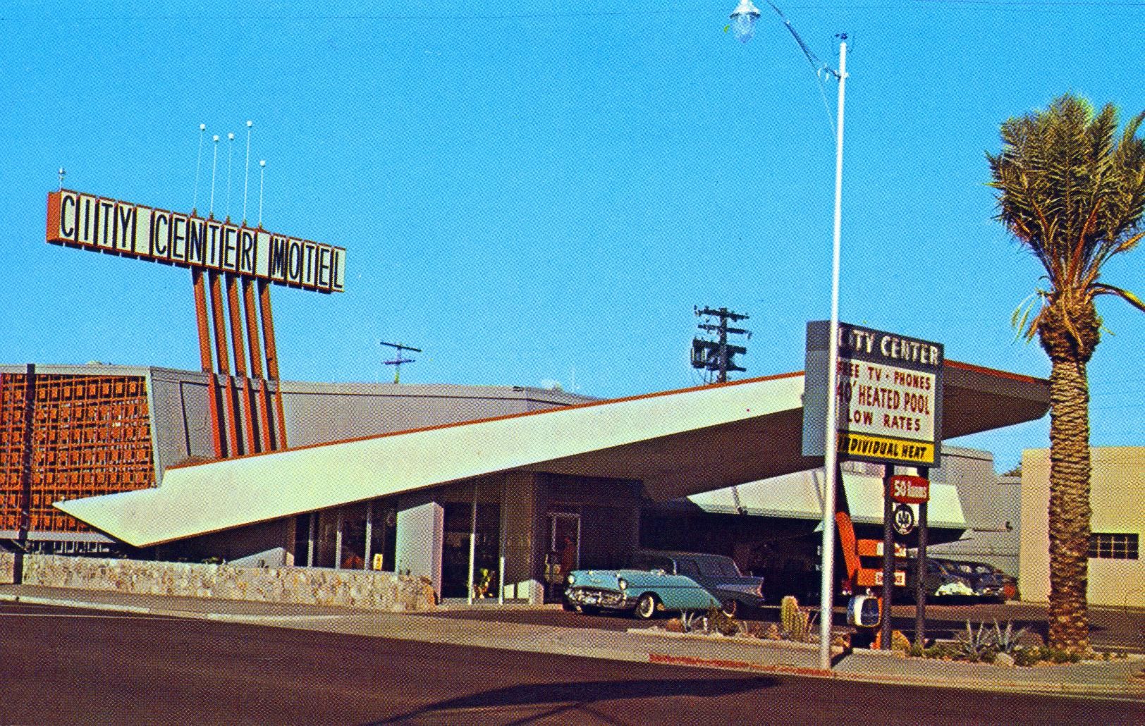
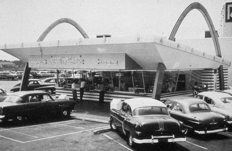
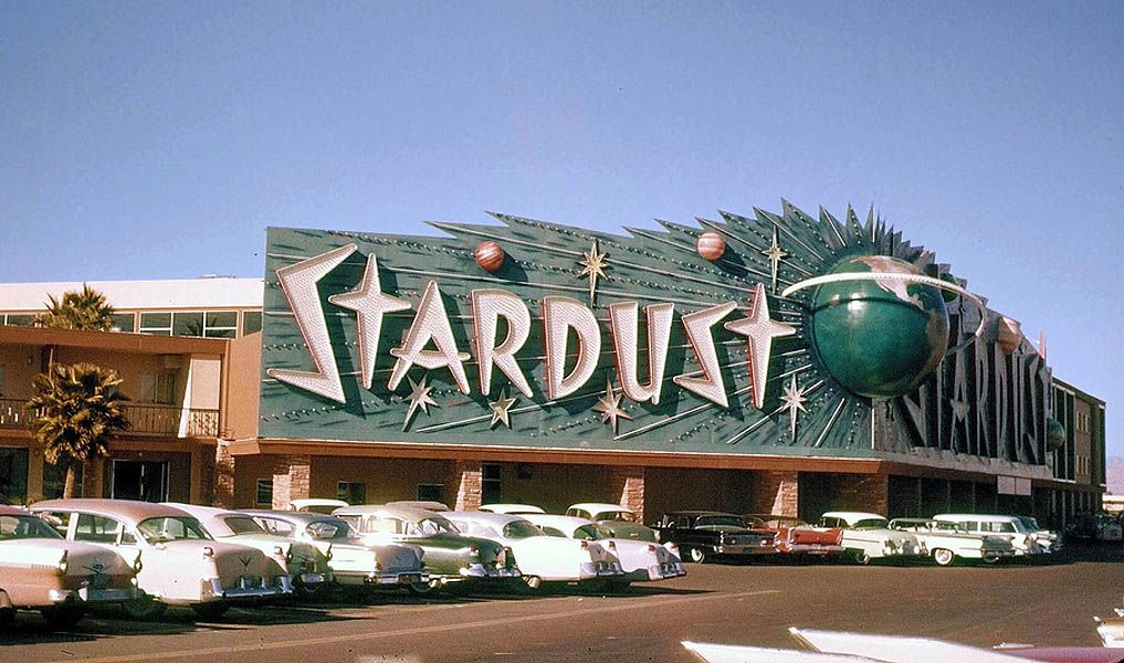
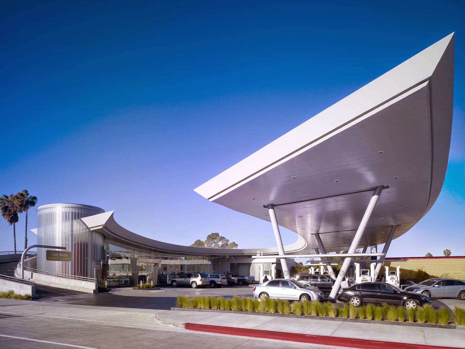
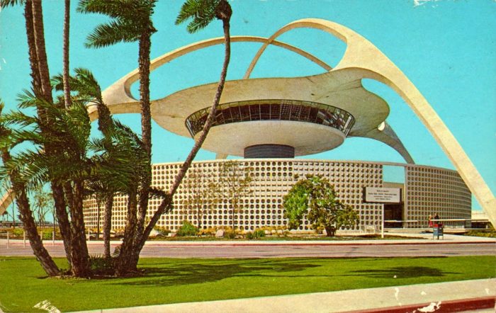
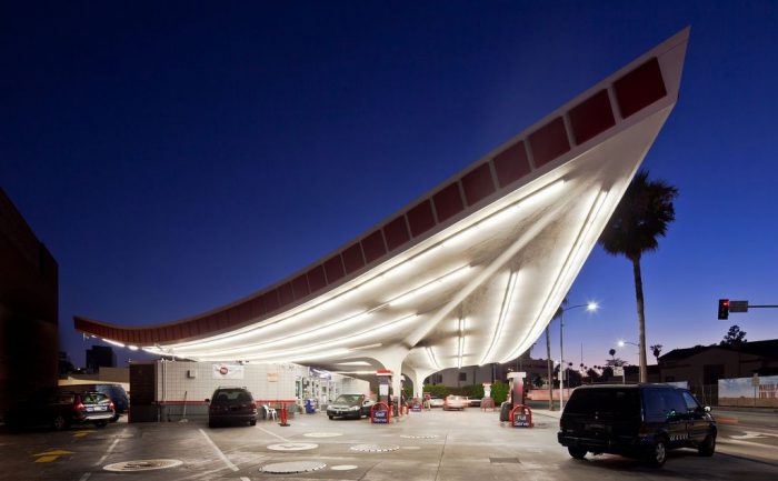
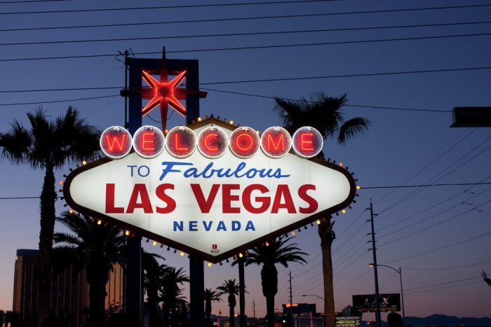
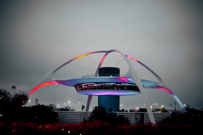
Built on extravagance, sharp angles, plastic and steel, neon and wide-eyed technical cheerfulness, borrowing inspiration from Space Age concepts and spaceship fantasies. That’s how Americans have always known the Googie style, but what is this architectural style genuinely attempting to convey?
What is the Googie style?
The mid-twentieth century represents a significant period in American architecture due to the abundance of buildings inspired by industrial growth, automotive culture, and the space era. A particularly distinctive architectural style known as the Googie style was born out of mid-century design in several areas of the country, most notably Southern California.
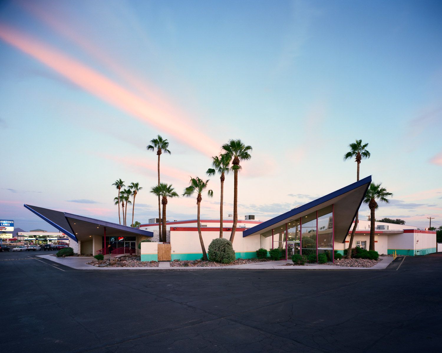
The mid-20th century saw the emergence of the Googie architectural movement in the United States, primarily in Southern California’s Los Angeles region and its neighboring areas. Sturdy geometric shapes, curved& sloped roofs, the impression of motion, and various materials, including steel, glass, and jagged boulders, are typical features of Googie architecture.
Also Read: What Happens to Architecture When Form Follows Fashion?
A Quick Look at Googie Style:
Back then, in 1930, Streamline Moderne, an architectural style that used dramatic, arching lines and oceanic motifs, gave rise to Googie architecture. Architectural styles changed following how frequently vehicles and airplanes replaced boats and railways as the most dominant means of transportation. The Googie design originated and gained popularity following World War II.
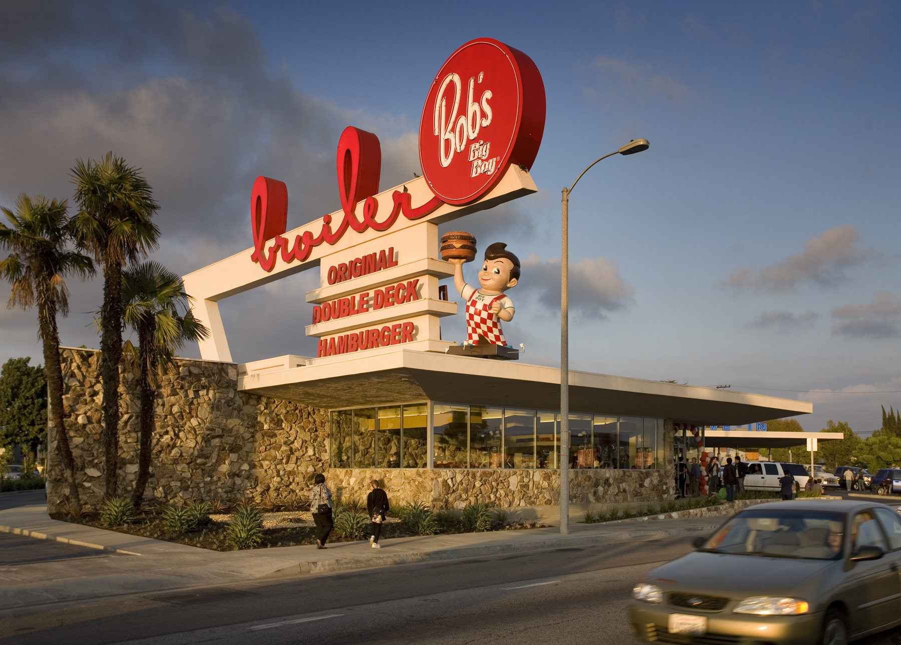
A Bob’s Big Boy restaurant in the Los Angeles neighborhood of Burbank, designed by Wayne McAllister and constructed in 1949, is one candidate for the title of the first Googie style design, according to architectural historian Alan Hess.
Southern California was a thriving region for Googie design in the 1950s, but the concept quickly extended across the country. Several locations, including Wildwood, New Jersey, Seattle, Colorado Springs, Phoenix, Miami, and the 1964 World’s Fair in New York, saw the construction of notable Googie architecture.
The Apollo missions of the 1960s and early 1970s arguably marked the zenith of the space era and the atomic age, and it was at this time Googie architecture started to lose momentum. Since then, many Googie structures have been demolished, and those still standing now serve as historical wonders that deserve recognition.
Also Read: 20 of The Strangest Sculpture Art Spots and Buildings Worldwide
Googie architecture characteristics:
Googie architects appreciated the promise of engineering in the middle of the twentieth century and produced works that had a sense of momentum. Notable Googie style components include:
1) Sloped Roofs:
Googie’s structures appeared to take off thanks to these upside-down roofs, primarily because they featured a curved roofline.
2) Boomerang Shapes:
Every facet of mid-century design, such as chairs, Formica, logos, pools, highway signs, and other pop culture, were all graphically associated with these. The designs resembled airplanes, flights, and WWII camouflage patterns.
3) Starbursts:
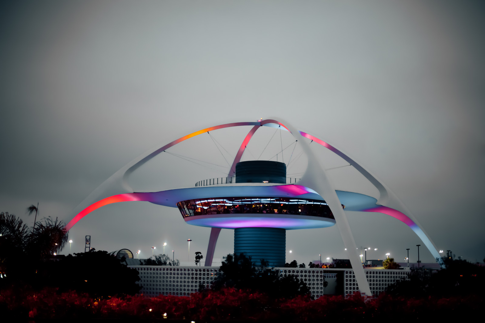
These shapes refer to the optimistic images of a promising future. All motivated by science and the Space Race hinted at a futuristic society. Other starbursts made whimsical allusions to space and the public fascination with space exploration.
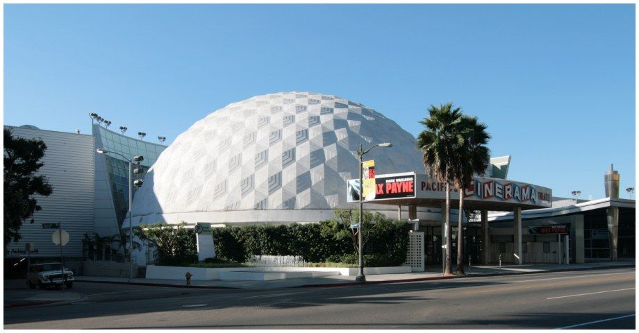
4) Massive Domes:
The dome embraced Googie’s standard architectural style as a result of new developments in concrete buildings.
Googie-style buildings in Los Angeles:
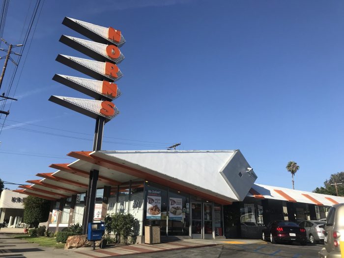
1) NORMS RESTAURANT
The renowned architecture firm Armet & Davis developed this restaurant to illustrate the Googie style. Lewis Armet and Eldon Davis designed one of the best creations, which later rose to prominence in the Googie movement in Los Angeles. The five-part sign of each location is a reflection of its elegant diamond roof.
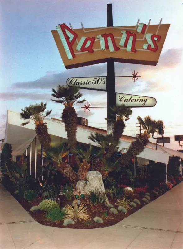
2) PANN’S
Another restaurant with a beautiful sign and roofing is Pann’s. This place still exudes the allure of the 1950s, thanks to the famed Armet & Davis, who designed this masterpiece. What’s so special about Pann’s is that it’s on the route to LAX, so it’s always a terrific way to say farewell or hello to Los Angeles.
3) Union 76 Station
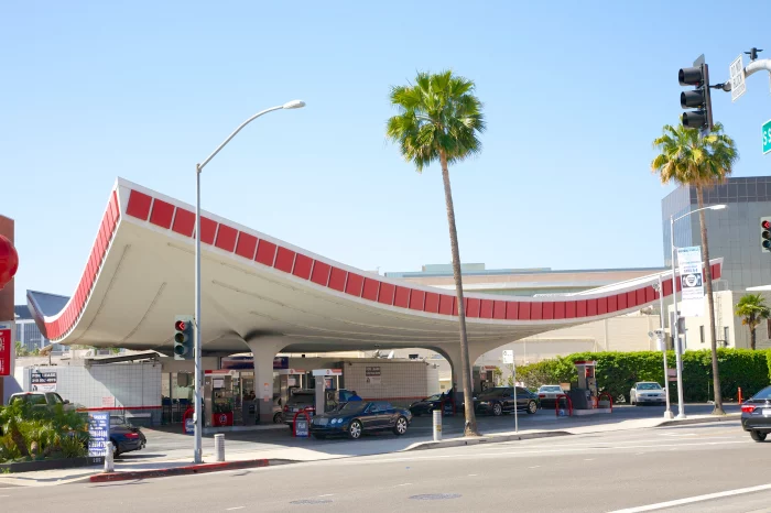
One of the most exquisite samples of Googie architecture is the Union 76 station in Beverly Hills. Its boomerang-shaped roof is both aesthetically pleasing and exciting; it is a space-age concept from the 20th century. Thanks to architect Gin Wong for his charming touches on this gas station.
4) Bob’s Big Boy Broiler
Harvey’s Broiler opened in Southern California in 1958 and was the most prominent drive-in establishment. The combination coffee shop, restaurant, and drive-in was designed by architect Paul B. Clayton and had extravagant Googie features, such as a 65-foot-long sign that stood out on busy Firestone Boulevard. “The Broiler” quickly became the center of Southern California’s blossoming cruising scene in the 1950s.
Also Read: 10 Buildings Show the Rich Diversity of Chicago Architecture
5) Covina Bowl
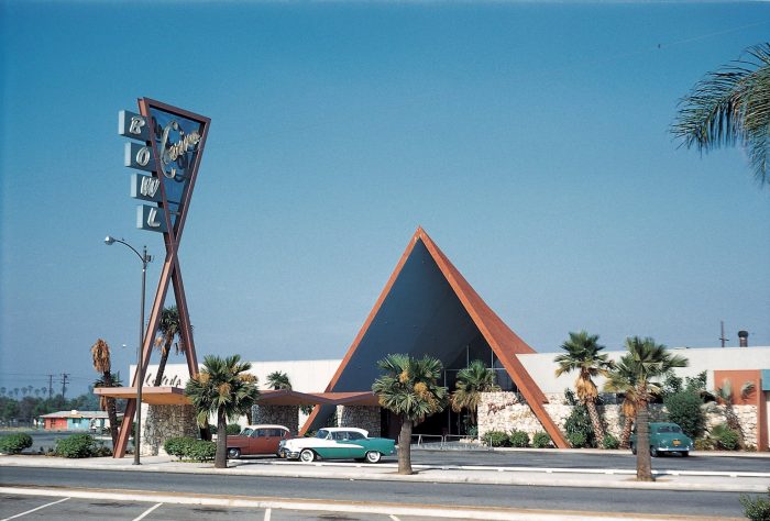
Back then, in the 1950s and 1960s, The Covina Bowl on San Bernardino Road was one of the most extraordinary Googie-style classics that invited bowlers, diners, and entertainers of all kinds to sample its unusual shows.
It is undoubtedly Googie, striking and fun at its best, with bright interior accents to match its rock cladding and towering rooftop. A cocktail lounge originally housed Egyptian statues inside the structure and lovely mid-century light fixtures and terrazzo flooring.
The Covina Bowl is a spectacular illustration of the Googie bowling alley designs that Powers, Daly, and DeRosa mastered and served as an inspiration for bowling alleys across the nation in the aftermath of World War.
6) Chips
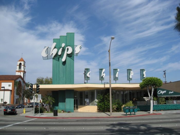
Extravagant rooflines, substantial windows, and eye-catching signage are characteristics of Googie coffee shops like Pann’s, Johnie’s, and Norms that pull in viewers. But, what makes Chips on Hawthorne Boulevard in Hawthorne stand out is its distinctive signage.
Chips, a Googie treasure that has been open continuously since it debuted in 1957, was designed by architect Harry Harrison. Its roof is unevenly curved in profile and inclined into a zig-zag pattern in the front view. However, it is not as showy as some other restaurants.
7) Johnie’s Coffee Shop:
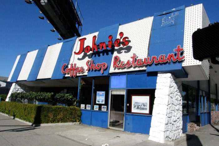
One of Los Angeles’ best representations of the Googie architectural style, which was prominent in the 1950s and 1960s, is Johnie’s Coffee Shop—located across from the May Company building at the intersection of Wilshire Boulevard and Fairfax Avenue and designed by architects Louis Armet and Eldon Davis.
Armet and Davis created many structures in Southern California. Still, they are best known for their Googie coffee shop designs, which drew attention from passing motorists with their use of futuristic architectural features, spectacular rooflines, glass walls, and bold signage. While Johnie’s future is questionable and mainly used for filming, it still stands proudly today.
The most frequently asked questions:-
