Fondazione Prada
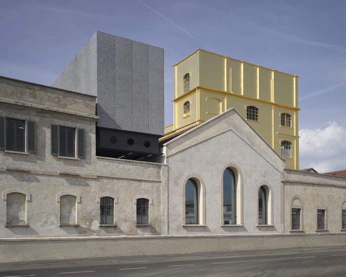
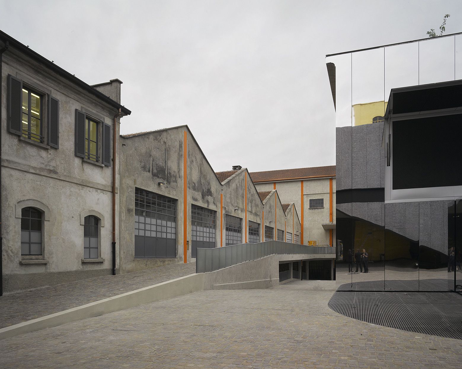
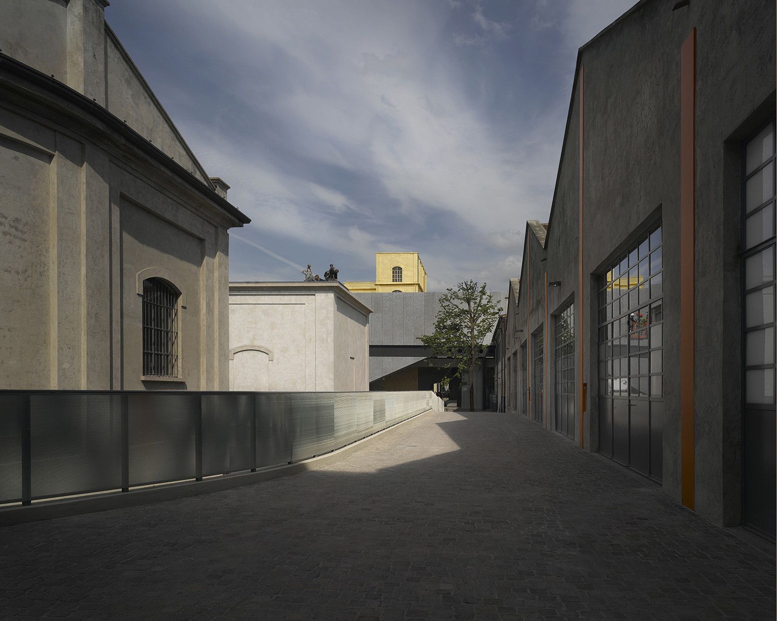
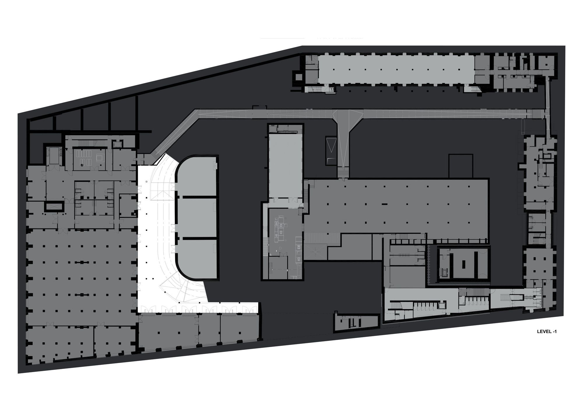
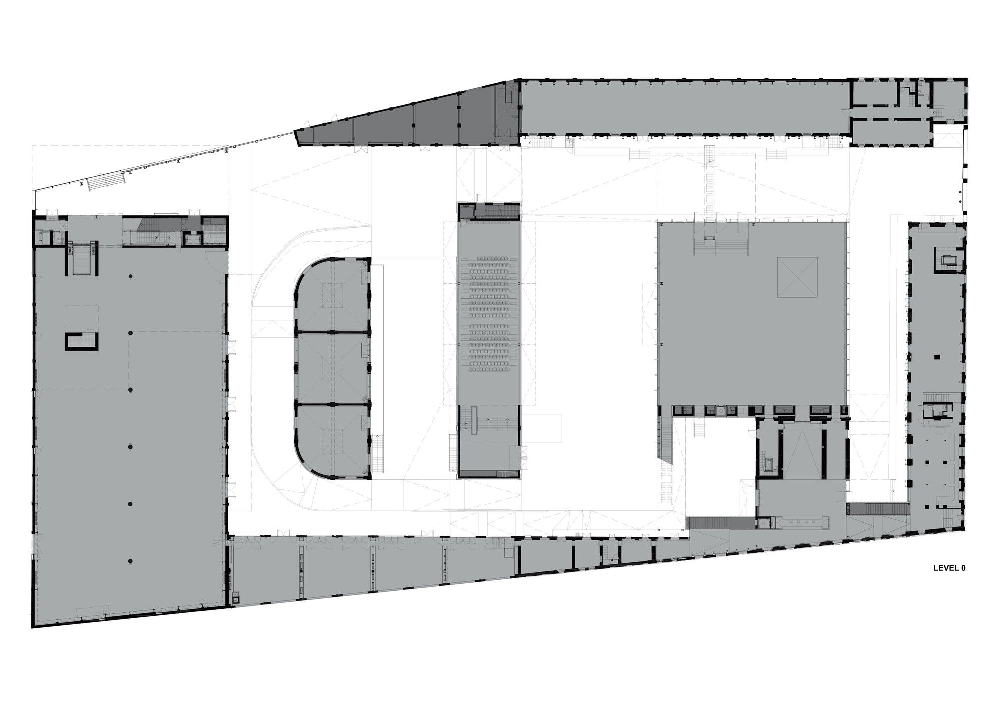
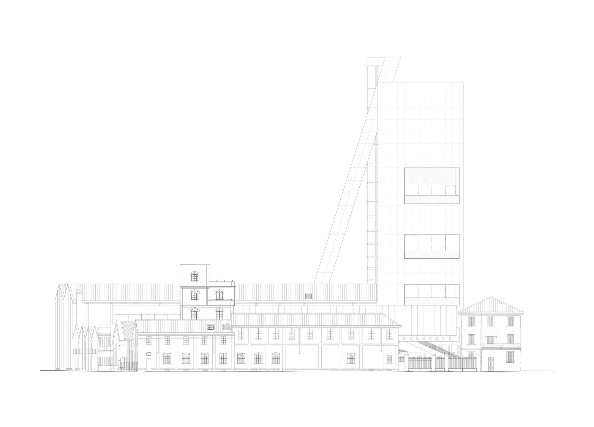
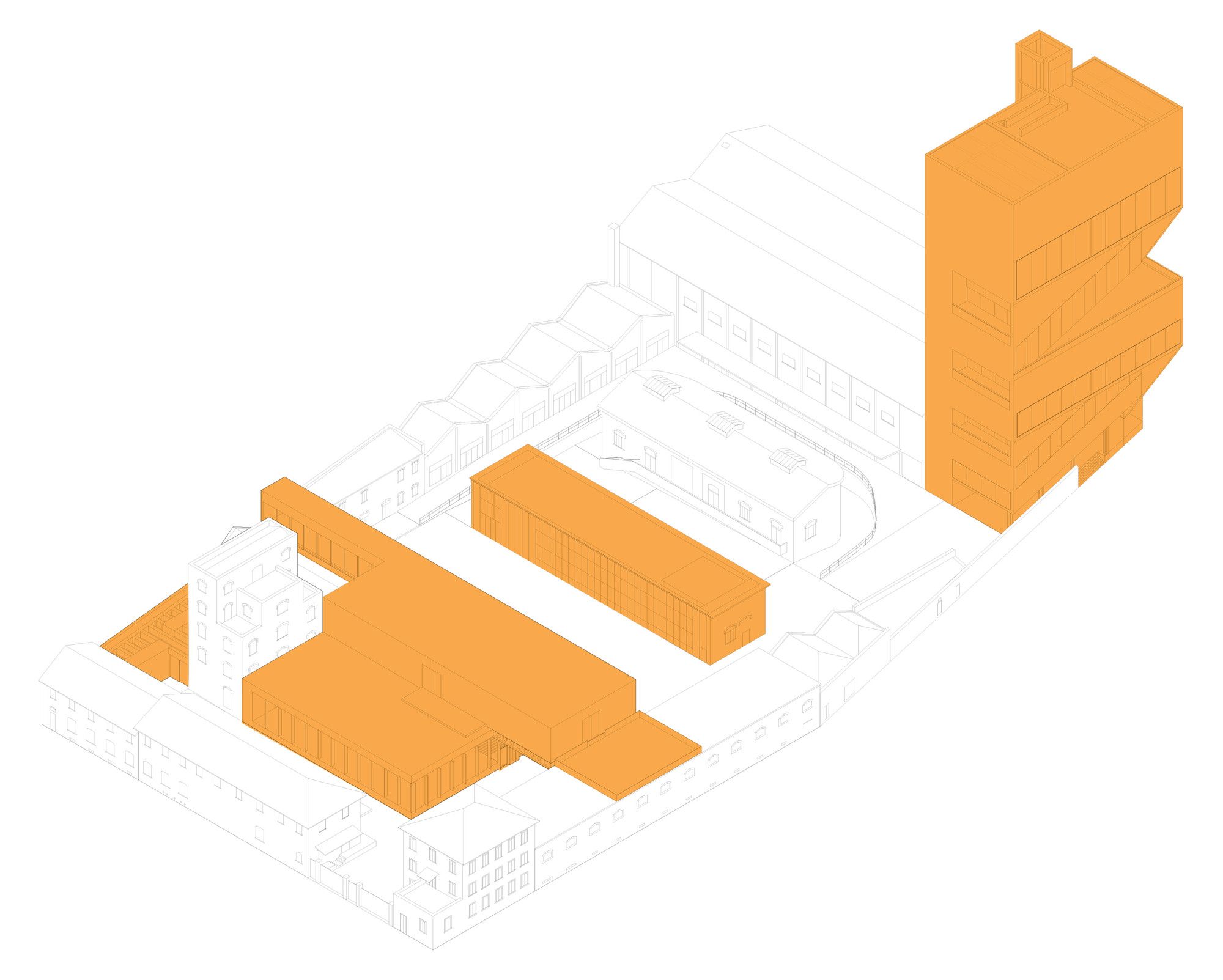
OMA’s project for Fondazione Prada embraces a coexistence of new architecture with the regeneration of an early 20th-century gin distillery that includes warehouses, laboratories and brewing silos, as well as new buildings surrounding a large courtyard. The collaboration between Prada and OMA has been an ongoing one for the past 15 years. Within this time they have produced flagship stores, catwalks that verge on theater performance and a shape-shifting pavilion in Seoul. It could be the trust and understanding forged throughout this unusually long client – architect relationship that has resulted in the incredible Fondazione Prada. Whatever the reason, it is undoubtedly the zenith of the collaboration between the two cultural powerhouses.
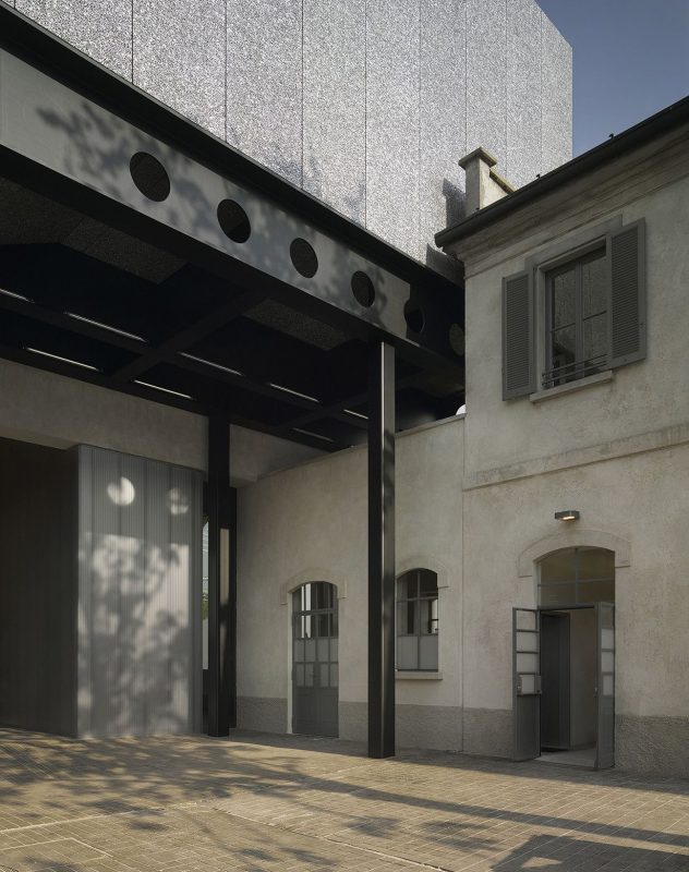
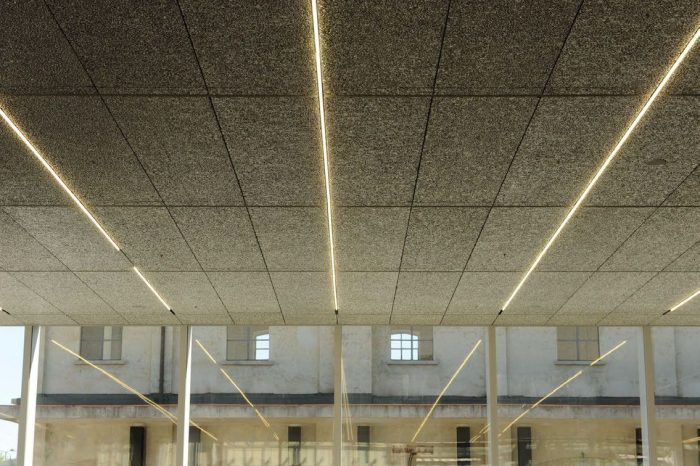
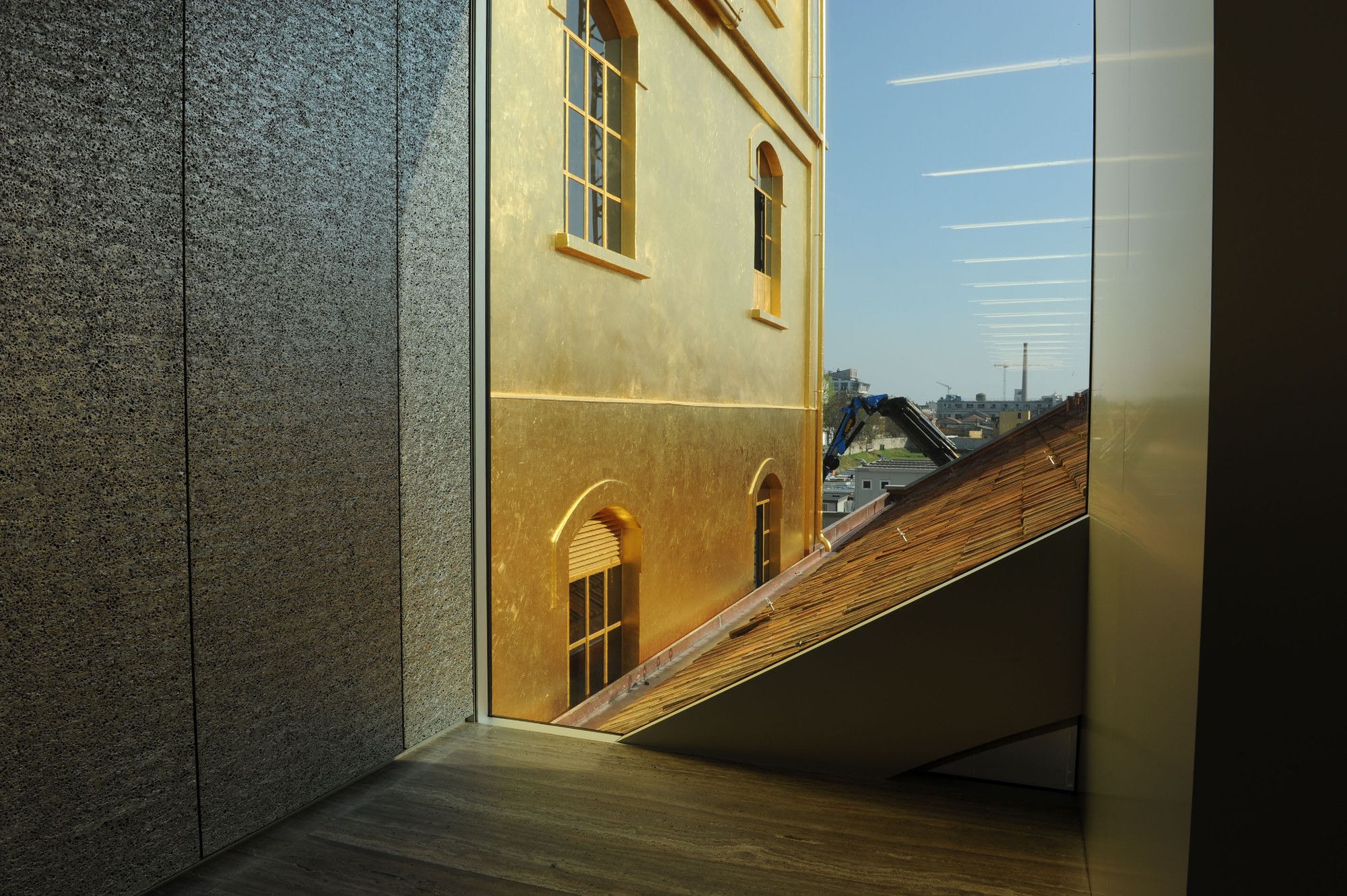
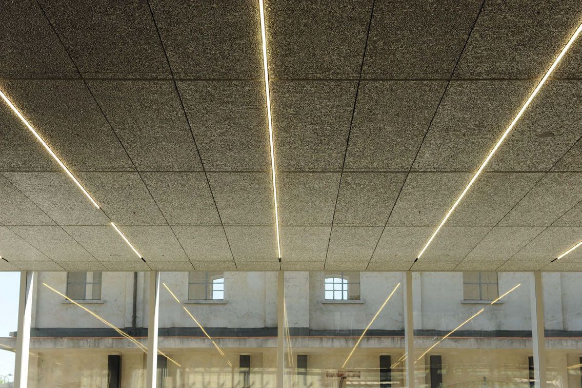
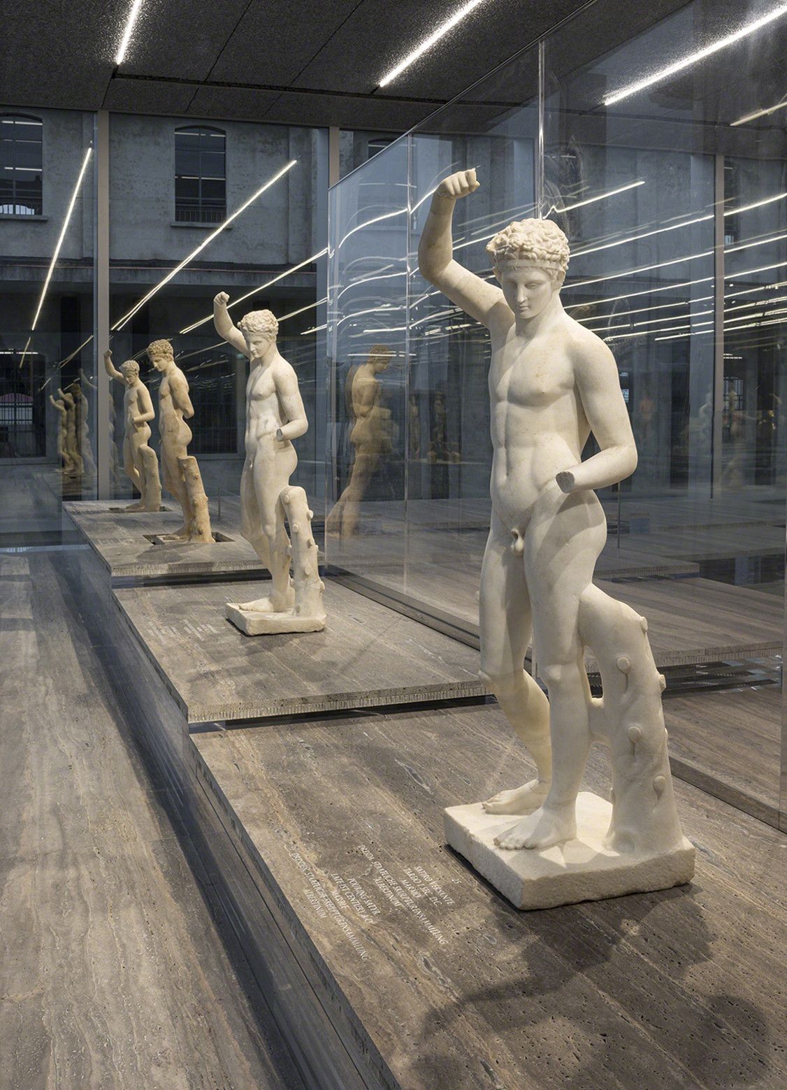
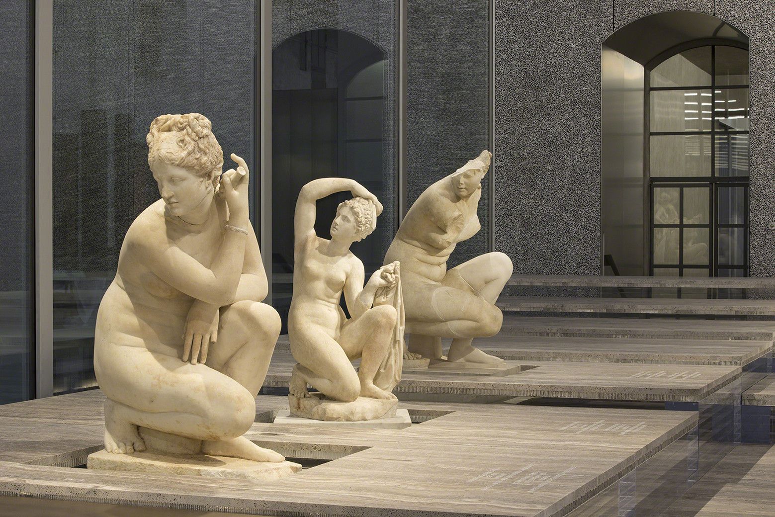
Rem Koolhaas explains: “The Fondazione is not a preservation project and not a new architecture. Two conditions that are usually kept separate here confront each other in a state of permanent interaction – offering an ensemble of fragments that will not congeal into a single image, or allow any part to dominate the others. New, old, horizontal, vertical, wide, narrow, white, black, open, enclosed – all these contrasts establish the range of oppositions that define the new Fondazione. By introducing so many spatial variables, the complexity of the architecture will promote an unstable, open programming, where art and architecture will benefit from each other’s challenges“. The old factory buildings and warehouses were upgraded with new finishes and fenestration. The new Fondazione Prada is projected in a former industrial complex too, but one with an unusual diversity of spatial environments. To this repertoire, three new buildings were added, a large exhibition pavilion, a tower and a cinema, so that the new Fondazione Prada represents a genuine collection of architectural spaces in addition to its holdings in art.
“We didn’t work with contrast but on the contrary, we tried to create a situation where old and new can work very seamlessly together and are sometimes actually merged together so that you cannot tell at any one moment whether you are in a new or an old situation”, said Koolhaas. “That was exactly our ambition“.
Some architectural and decorative details from the original structure have been preserved, such as the arched ceiling, which recreates a ‘miniature’ version of the vaulted glass roof of the Galleria Vittorio Emanuele, one of Milan’s symbolic buildings. Other key elements of the Galleria are replicated inside, creating a sort of patterned decoration for the top half of the bar.
In keeping with the interior design, the seats, formica furniture, floor, veneered wood wall panels and the range of colors employed are reminiscent of Italian popular culture and aesthetics from the 1950s and 1960s, echoing artistic decisions that Anderson made years earlier for his short film ‘Castello Cavalcanti‘. Other iconographic sources have been equally inspirational, notably two masterpieces of Italian Neorealism, both set in Milan: Miracolo a Milano (Miracle in Milan, 1951, Vittorio De Sica) and Rocco e i suoi fratelli (Rocco and His Brothers, 1960, Luchino Visconti).
“It is surprising that the enormous expansion of the art system has taken place in a reduced number of typologies for art’s display. To apparently everybody’s satisfaction, the abandoned industrial space has become art’s default preference — attractive because its predictable conditions do not challenge the artist’s intentions — enlivened occasionally with exceptional architectural gestures”, said Rem Koolhaas
Project Information :


