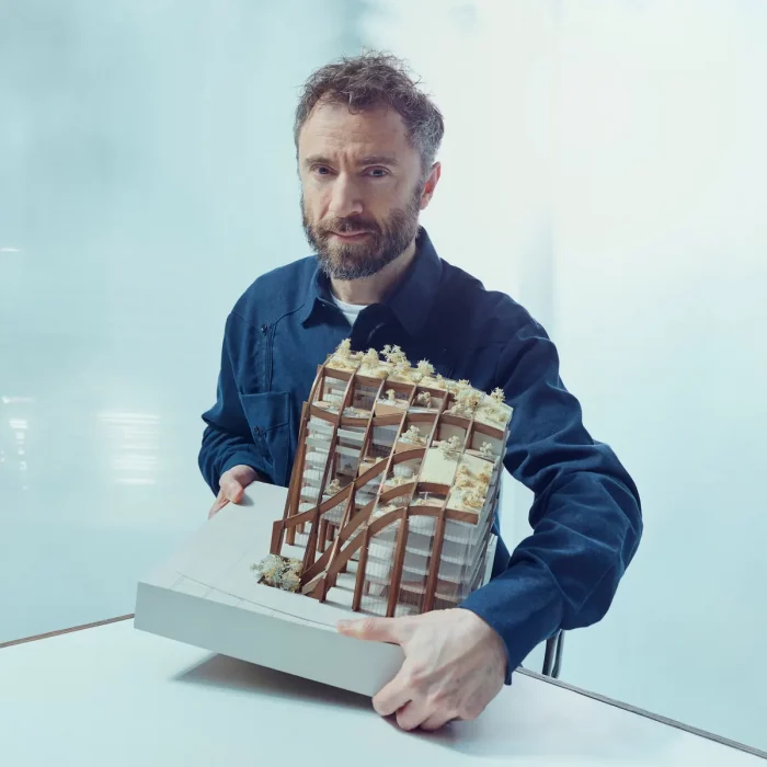
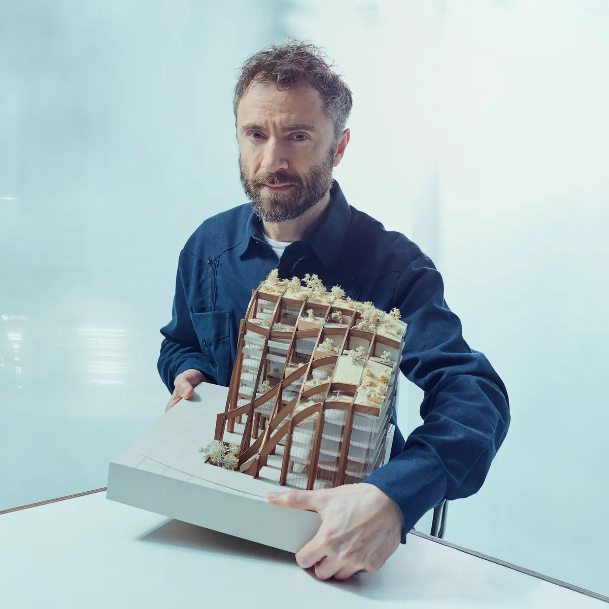
As one of the GQ’s 50 best-dressed British men, Thomas Alexander Heatherwick is an English designer born on 17 February 1970 in London, England. He studied three three-dimensional designs at Manchester Polytechnic and the Royal College of Art, where he met his mentor Terence Conran, who called him “The Leonardo da Vinci” of our times.
Heatherwick Studio was established in 1994, right after He graduated from RCA. The studio is notable for its work in industrial design, sculptures, installations, architecture, urban infrastructure, strategic thinking, fashion, embroidery, metalwork, product and furniture design, engineering, transport, urban planning, and product design. Located in Kings Cross in London, the joined studio and workshop occupied about 180 architects, designers, and makers to cooperate.
Unlike many design firms, their work doesn’t define by style but by solving problems. All designs are worked in a three-dimensional discipline as a single discipline. The studio’s work is defined as finding alternative solutions creatively and innovatively through a series of rational experimentation and research, integral design solutions, texture, and material.
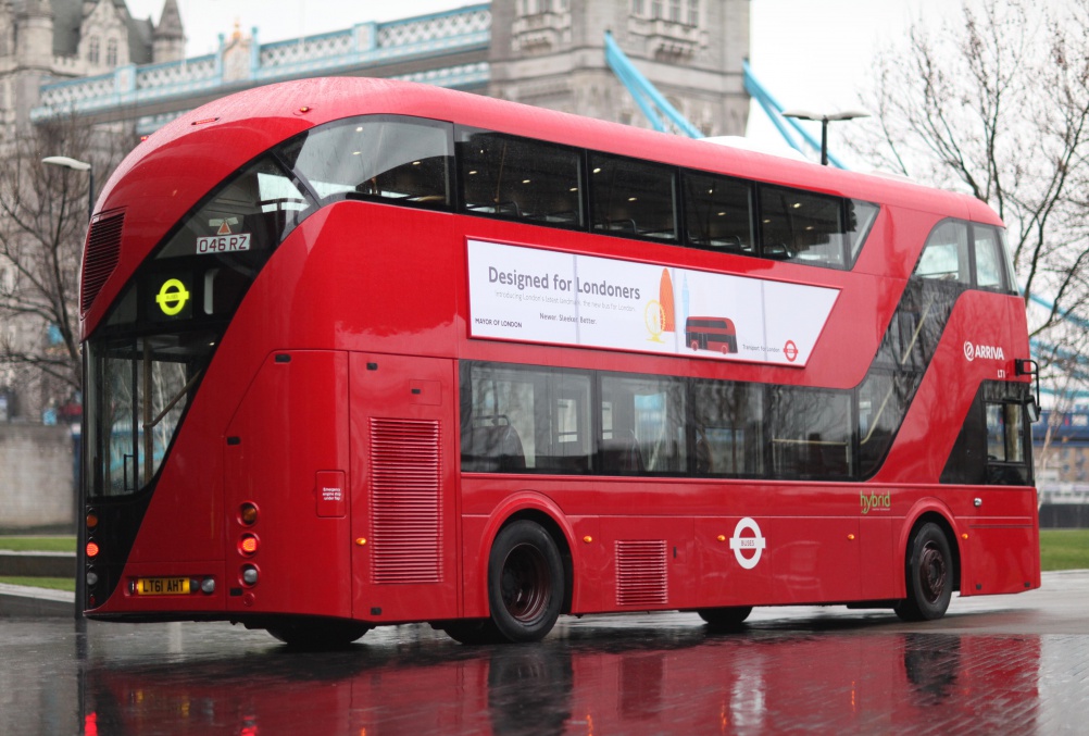
Also, their imaginative and extraordinary projects developed a fame for their career. These projects include the 2012 Summer Olympic and Paralympic Games cauldron, seed cathedral, UK pavilion at Expo 2010 in Shanghai, Garden Bridge, the biomass power station in BEI-Teesside, and the new Routemaster double Decker buses designed to replace the older version of London’s red buses.
A series of awards were given to Heatherwick for their enormous satisfying works, which includes the Prince Philip Designers Prize (2006), the London Design Medal (2010), and the RIBA Lubetkin Prize (2010) for the UK Pavilion at Shanghai World Expo.
A series of Honorary Doctorates awarded to him are from the University of the Arts London, the Royal College of Art, the University of Dundee, the University of Brighton, Sheffield Hallam University, and Manchester Metropolitan University. Thomas was appointed to many honorary titles, which include the Royal Institute of British Architects and Royal Designer for Industry, in 2004, making him the youngest to achieve this. Also, due to his services to the design industry, in 2013, he was appointed Commander of the Order of the British Empire (CBE) as a gift for his birthday.
1. NTU Learning Hub
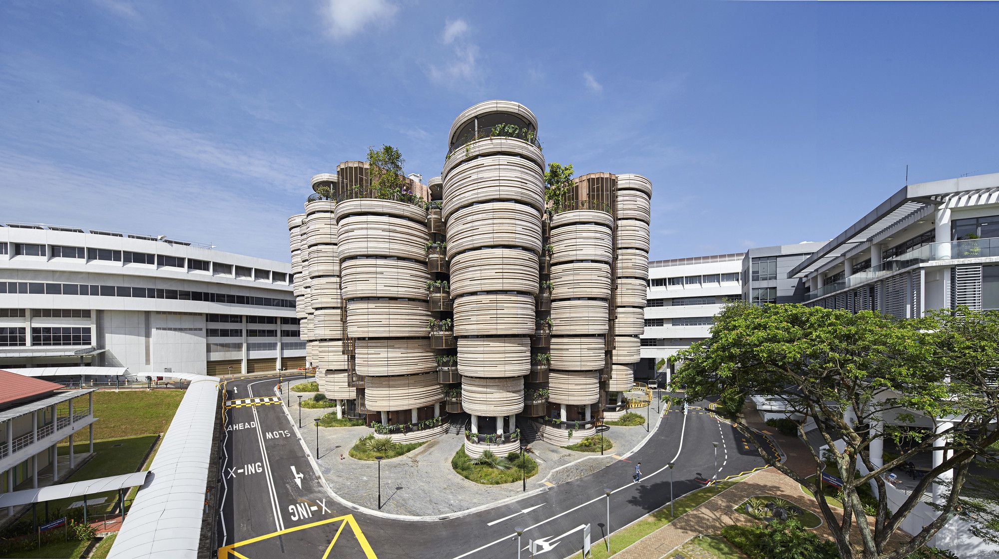
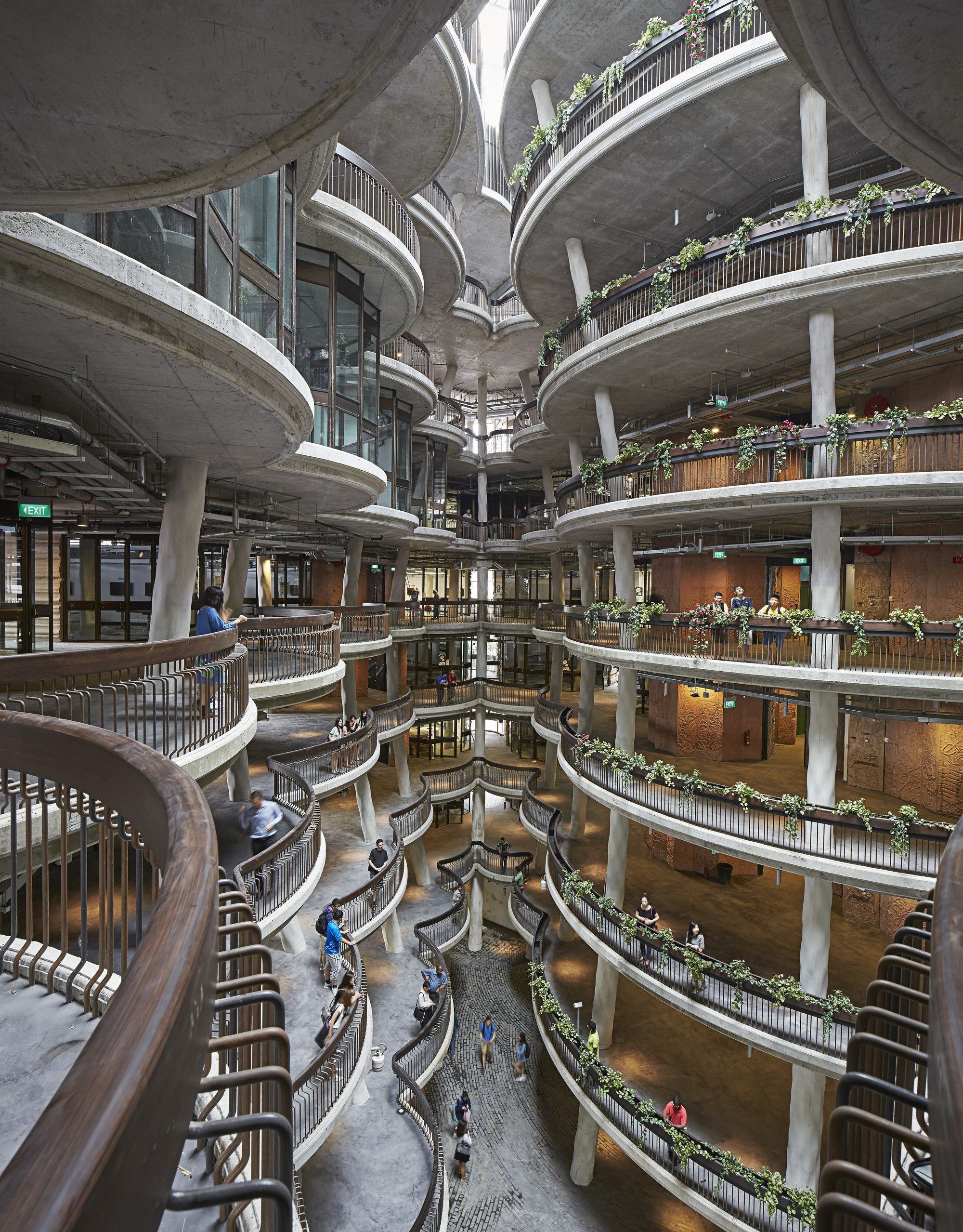
Or The Hive is a learning center and the competition winner for Nanyang Technological University in Singapore. Completed in March of 2015, the hive is the first of the series of redevelopments- with a budget of £360 million- in the university’s campus in 20 years. The local architecture firm GPC worked with the studio as a consultant. The Singaporean government gave the BCA Green Mark Platinum Award to the learning hub in 2013 due to its best environmental design and performance practices.
In today’s world, due to the usage of the internet for educational purposes, university facilities become tedious spaces, creating unattractive areas for students. The main goal of this project is to bring hope back to the facilities, making them a social and essential part of the educational experience. Also, the designers broke the tradition of square-formed classes. They created corner-less rooms to achieve equality and sharing spirit between students and teachers as partners, rather than a master and apprentice leveling model.
This building is a form follows function; to connect the different activities for the students, each of the 56 tutorial rooms faces an ample shared central space, without any corridors as separators. Also, the passable building makes it possible for the students to enter from all around the building and enter the spacious central space, which also acts as a link between separated towers. These towers are made up of classrooms gradually, with specific gardens on some levels.
2. Garden Bridge
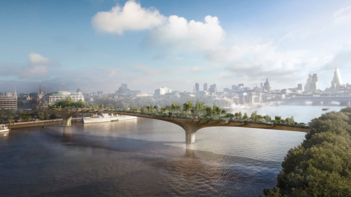
Heatherwick Studio and the actor and campaigner Joanna Lumley joined as a team for the development of an idea to improve pedestrian movement across the Thames River through a garden. This idea not also adds an exceptional landscape for one of the greenest cities with a rich horticultural heritage on earth but also connects the more isolated Temple and North Bank area east of Somerset House and Waterloo Bridge with the more vibrant and artistic South Bank of London, to and from the Convent garden and Soho, while creating a safe walkway and public space with magnificent views, quite incomparable to anything seen before.
Currently, the studio cooperates with Arup engineering consultant and Transport for London (TfL) to develop the scheme.
3. East Beach Cafe
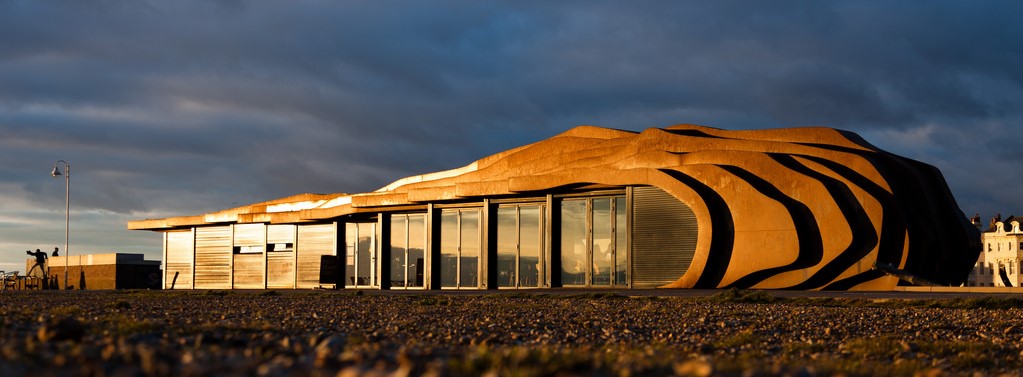
As for the Littlehampton residents, Jane Wood and Sophie Murray, it was essential to revive a tradition of visitation of thousands of tourists to the seaside towns like Blackpool and Skegness, which started in the 19th century of Britain and ended after the 1970s, which brought success and fame for the cities. To do that, they decided to change their selling chips, burgers, and ice cream business for a new Cafe building. And that’s where Heatherwick comes to the story.
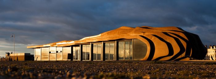
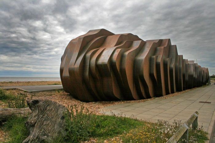
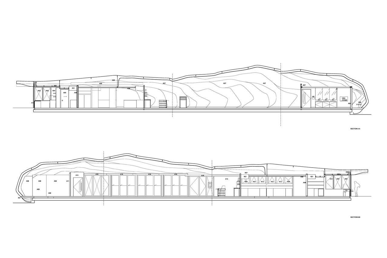
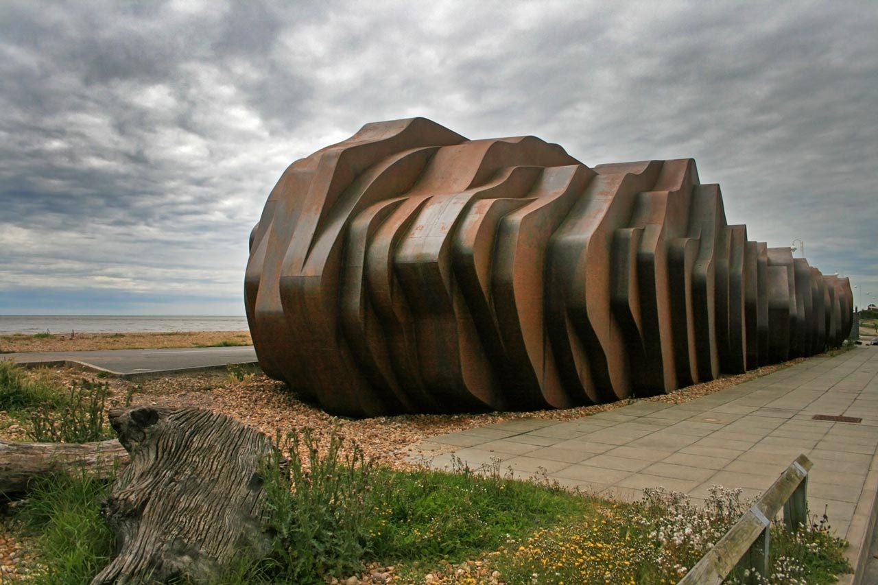
The design was quite a challenge for the studio; a narrow cigarette shape site, with a forty-meter-long strip of land, surrounded by a public walk in the front and a line of high-pressure sewage in the back which couldn’t be built over, in an exposed location; By this, the views and the privacy both became necessary. The building had to be opened to the sea and kept solid in the back to achieve that. For more challenges, the architects must deal with two more things: avoiding the windowless façade becoming dead and dull on the rear elevation and protecting the forty meters of glass facing the sea.
The designers used roller shutters to protect the windows. And instead of sticking them on like eyelids, they used long, undulating steel strips to make the building out of shutter boxes in steel. The strips wrapped around the space to form the roof and walls. The articulation of the rear façade is defined by angling the geometry of the box strips. It is achievable to hide the roller shutters daily without any unnecessary adjustments. Entirely in Metal and in sectional fabrication, the structure was manufactured by Littlehampton, wielding only two workers. The rigid insulated foam was applied to the interiors of It, while the outside is raw, weathered material.
4. Teesside Power Station
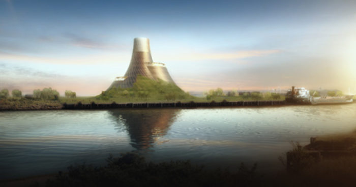
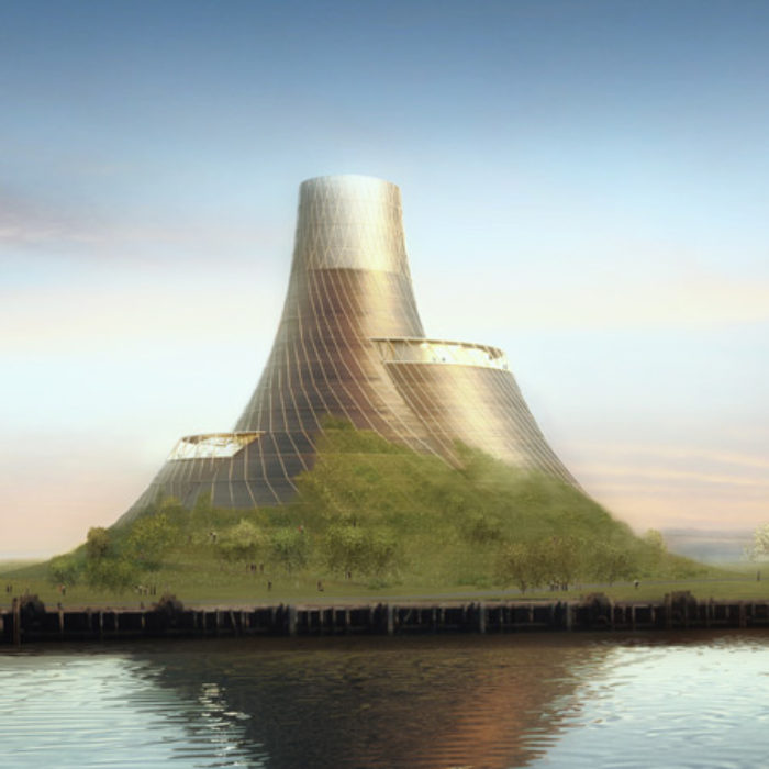
The responsibility to design a biomass-fueled power station was put on the shoulders of Heatherwick Studio. This station will power the Middlesbrough new houses, once a thriving industrial zone in Northern England.
Despite constructing cultural facilities to achieve economic stagnation, the studio came to the idea of using the power station as a catalyst for economic development. Also, the studio considered the contrast between earlier and contemporary power-generating facilities, usually box-like structures, in their design process.
Due to the unique features of the Middlesbrough, or the Land of Giants, such as the Transporter bridge, The studio wanted a structure to be more closely acquainted with the ground rather than placing the building as an object.
Usual biomass-fueled power plants consist of 85-meter-high chimney stacks on the top of the ground and simple sheds.
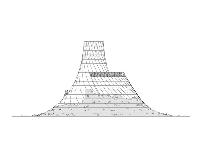
To improve the functional efficiency of the station and simplify the composition, the team worked with engineers to bring the pieces around the chimneys. Also, a massive amount of soil has been piled up around the structure on the site due to its ability of noise reduction.
The studio used plants and grasses around the deployed soil on the landscape to create a power park rather than using tightly controlled security. The park is planned for social activities, such as walking, sunbathing, picnics, or tobogganing. Heatherwick even designed the visitor center as a living museum or school of power, to b a local resource, a tourism attraction, and a public venue to hold weddings. The project connects to an industrial past and a new definition of an older functionality.
5. Temple
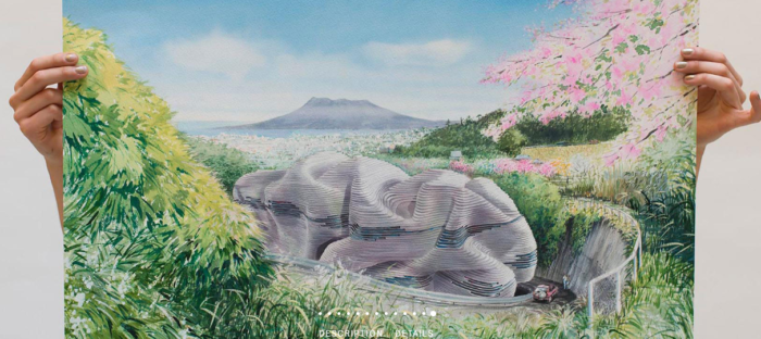
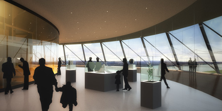
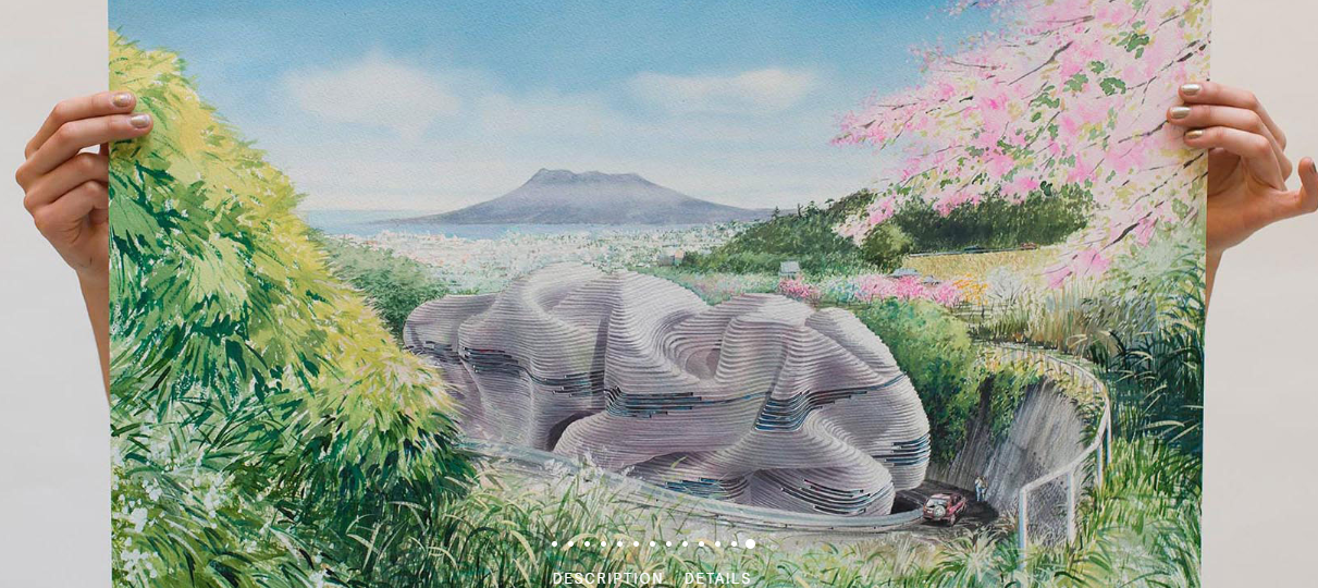
In Japan, overlooking the city of Kagoshima and Mount Sakurajima volcano, there’s a place where the last samurai, Saigo Takamori, was defeated by imperial forces in 1877. Dedicated to Saigo, this place now has the functionality of worshiping and a deposit of cremated remains.
Heatherwick Studio accepted the design of a Buddhist temple for this site. Since a temple shouldn’t be seen straight ahead, the designers placed it as far as possible on the back of the site while creating a good relationship between the accesses and parking with public worship elements, such as the positioning of the Buddha statue and other features.
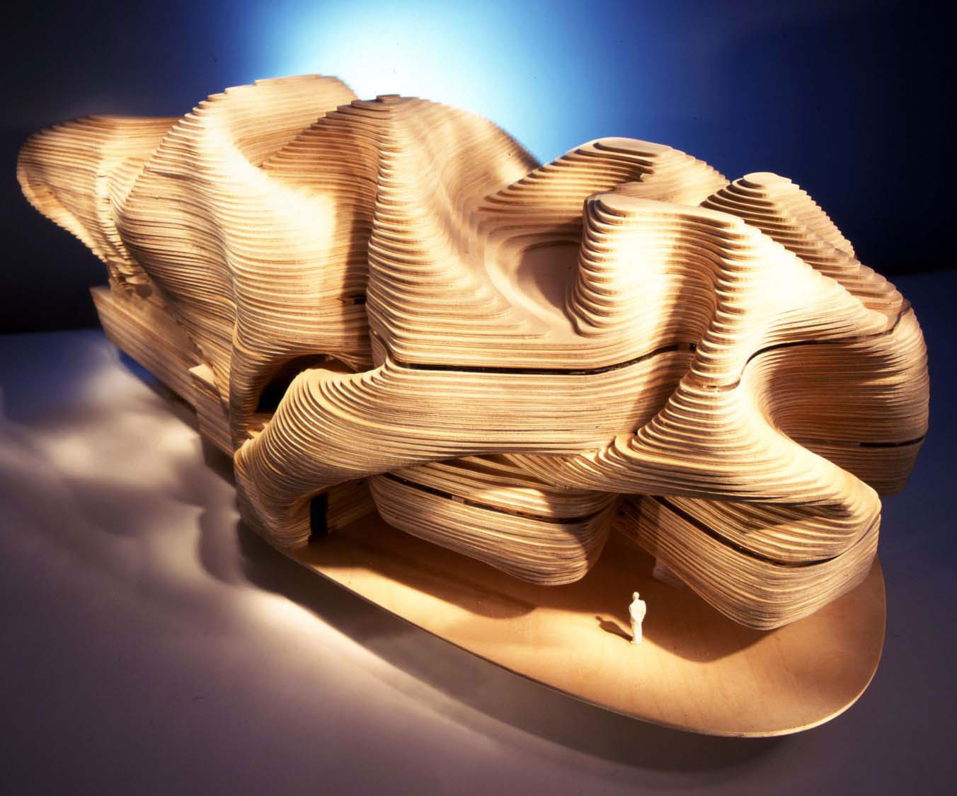
The studio had to find a way to hold the building together to unify the functions. To do so, They started the design with clay and colored blocks, which, as they suggested, went wrong. Then another material was put to the test: fabrics.
Inspired by the thick silk fabrics used in Japanese priest robes, the designers used their sophistication and flexibility for their building design. Finally, the rubberized foam was chosen as the material that creases and undulates, suitable for designing spaces such as escape stairs and monks’ cells, which as an adaptive material, turns itself into the temple.
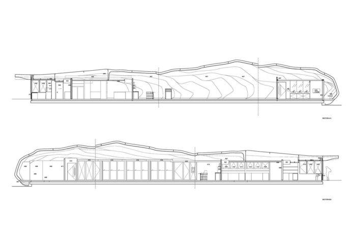
The studio used local hospital equipment to scan and capture the temple model as a virtual model because the technology isn’t widely common and spread. The result was transformed into a constructive form buildable with armature-secured and waterproofed plywood by defining its shape into horizontal contours at a step’s height. The design is extendable to combine stairs and furniture with the building.
6. UK Pavilion- The Seed Cathedral
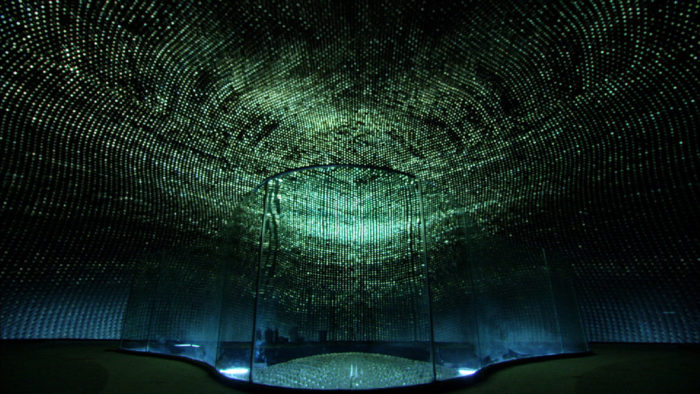
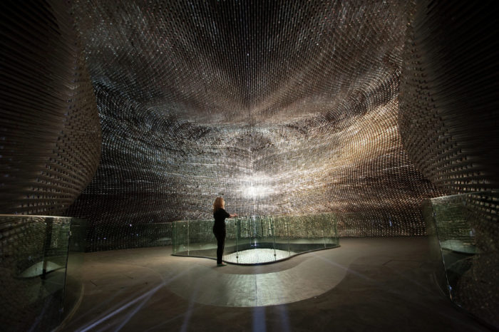
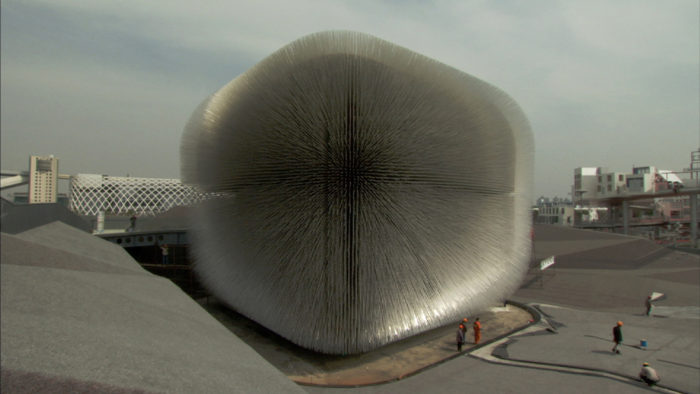
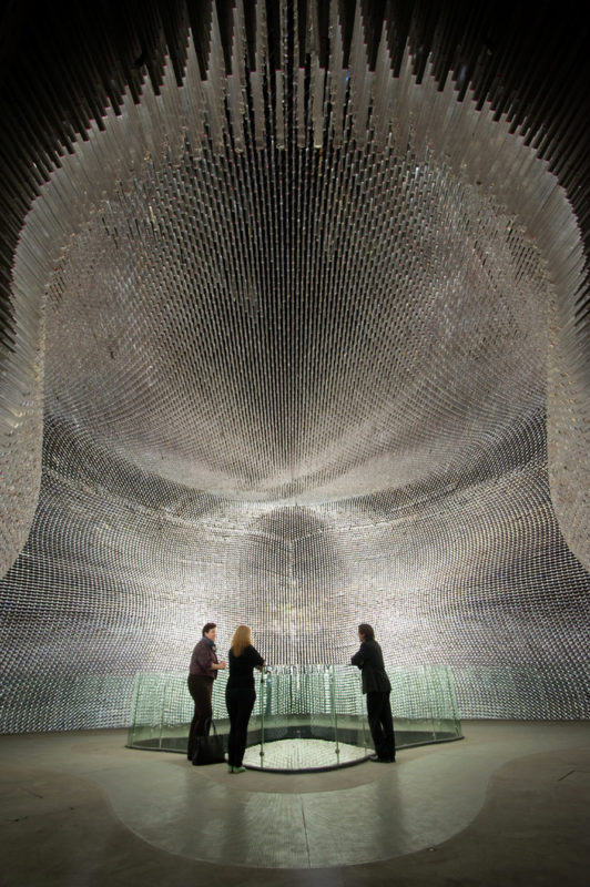
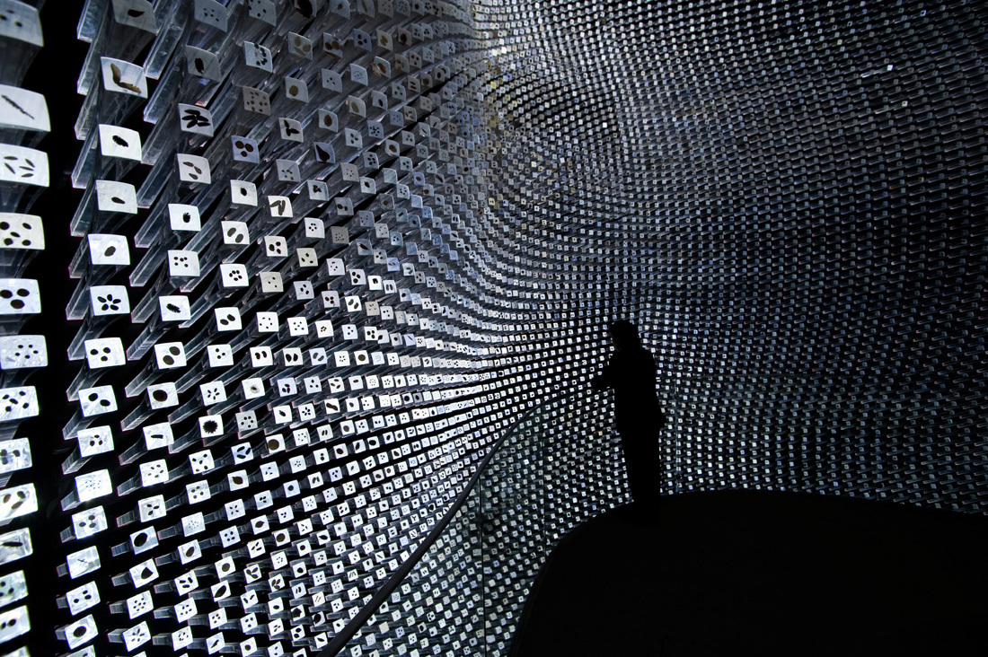
It debuted in 1852; Expo is an international fair where different countries show their technologies, culture, technology, and so on in their specific pavilions. In 2010, 200 countries attended the Expo held in Shanghai, China, making it the largest Expo ever. The seed cathedral is a box-shaped building 15 meters high and 10 meters tall, consisting of 60000 clear acrylic rods with 7.5 meters long, extended from the box’s exterior to the open air. The glassy tips of the rods were filled with 250000 seeds.
To be the gift of the UK to China, the landscape was crumpled and folded to represent a sheet of wrapping paper, which also created a theater on It. To present the softness of the seed cathedral with a smooth touch on the ground, the landscape was carpeted in silver-grey Astroturf. Also, a sloped terrain created ramps to the pavilion resulting in a walking gallery for the installations of the Troika with the theme of nature and cities. 1500 meters of required spaces, such as VIP suites, hospitality facilities, and offices, were provided under the landscape.
The exterior rods’ geometry formed a curvy and wavy interior. This also shaped the lighting of the interior, which was provided with sunlight that moves through the rods into the seeds on their heads, creating a glowing atmosphere as you move on the pavilion. Also, the light sources of each rod light up both the interior and exterior heads of the rods at night.
The Design Process
The sites are the size of a football pitch for most Westerners, including the United Kingdom. The UK wanted to be one of the top 5 Expo attractions while keeping it on a low budget. The winner of the competition to design the UK pavilion was Heatherwick Studio. Rather than other pavilions, their design was based on simplicity, clarity, and, surprisingly, the absence of technological equipment.
Because of many experiences outside the pavilion, the exterior had become a screen for its interior. Also, the creativity of contemporary British life challenged the cliches of a British city due to the Expo of the future of cities( better city, better life).
Because of the low budget, It was a strategic choice to occupy one-fifth of the site for the project while creating a cost-effective memorable architectural space. This strategy follows by creating public space and putting the functions under the focal object. The object was defined to be framed against its chaotic surroundings.
It was predictable that many of the designs would focus on the form of their pavilions. Instead, the studio focused on a texture to be experienced. The windy Riverside site created the idea of a façade with grass-like behavior. This was introduced from the previous works of the studio.
By magnifying this texture, they created the form of the building. Another exciting part of this is the face; it is intersected and combined with the sky. The developed idea came to a relationship between nature and human environments. Its usage of wildlife for food and medicine led to the design use of seeds as a symbol of potential and promise.
©Phil Fisk
2012 Olympic Cauldron / Thomas Heatherwick. ©STA,Sportal
Routemaster double Decker buses .©James O Jenkins for TfL
©Hufton+Crow
©Hufton+Crow
©Heatherwick Studio
©The Captains Guide
©Heatherwick Studio
©Heatherwick Studio
©Heatherwick Studio
©Heatherwick Studio
©Heatherwick Studio
©Heatherwick Studio
©Heatherwick Studio
©Heatherwick Studio
©Heatherwick Studio
©Heatherwick Studio
©Daniele Mattioli
©Daniele Mattioli
©Daniele Mattioli
©Heatherwick Studio


