The New Mechanics Hall at the EPFL campus has been designed by Dominique Perrault Architecture. The orginal ME building was designed by Zweifel + Stricker + Associates in the 70s while the first phase of the campus was being developed. The building followed a three-dimensional grid (23’-7” length by 12’-9” height) irrespective of the purpose and usage of space. Over a period of time the original master plan was revised several times, catering to more visitors and new usages. The buildings were also refurbished to cater to the immaculate research activities of EPFL. The ME building became small for its larger purpose and started deteriorating with age.
Dominique Perrault Architecture won a competition in 2011 to design the New hall while demolishing the old halls. The new building would not only serve a renewed purpose but also “preserve the connecting axes that bridge the campus,” said Dominique Perrault.
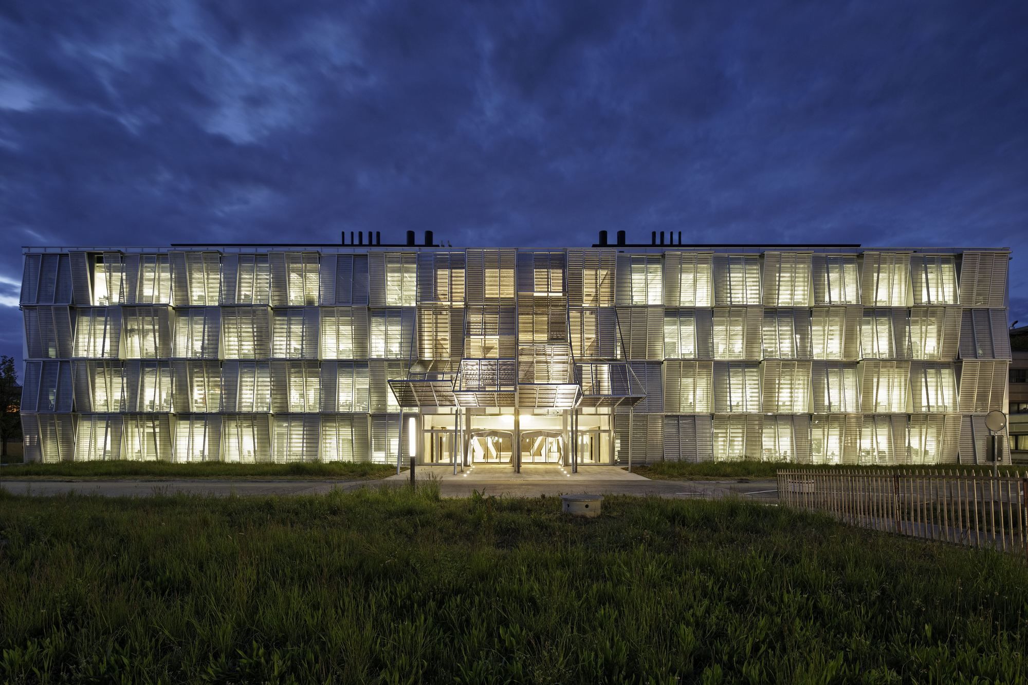
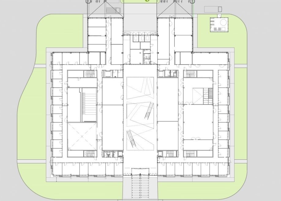
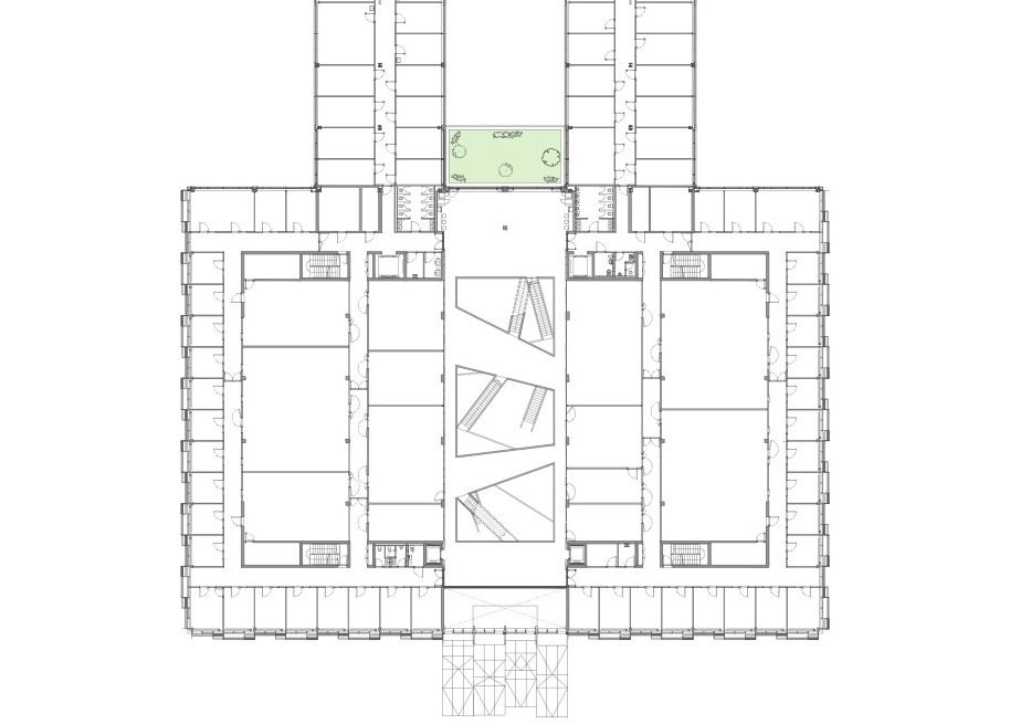
A large scale experimental playground for scientists is how it would be perceived, and thus the architecture of the building itself had to reflect and inspire this identity. The building has been designed with two large wings and a central atrium. The architects came up with a new design, sub-divisions and double height spaces while preserving the original grid.
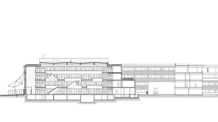
Lining the periphery of the building are individual offices which bring in views from the outside and natural light- a conducive work environment. Covering a total area of 223,000 sq. ft., “the building is spread over four superstructure levels and one infrastructure level. It houses the administrative offices of the department of Engineering (Sciences et Techniques de l’Ingénieur, or STI), consisting of offices and research laboratories, as well as some office spaces for the department of Biology (Sciences de la Vie, or SV).”
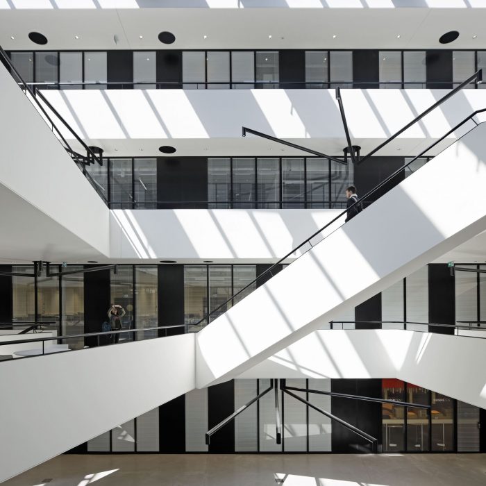
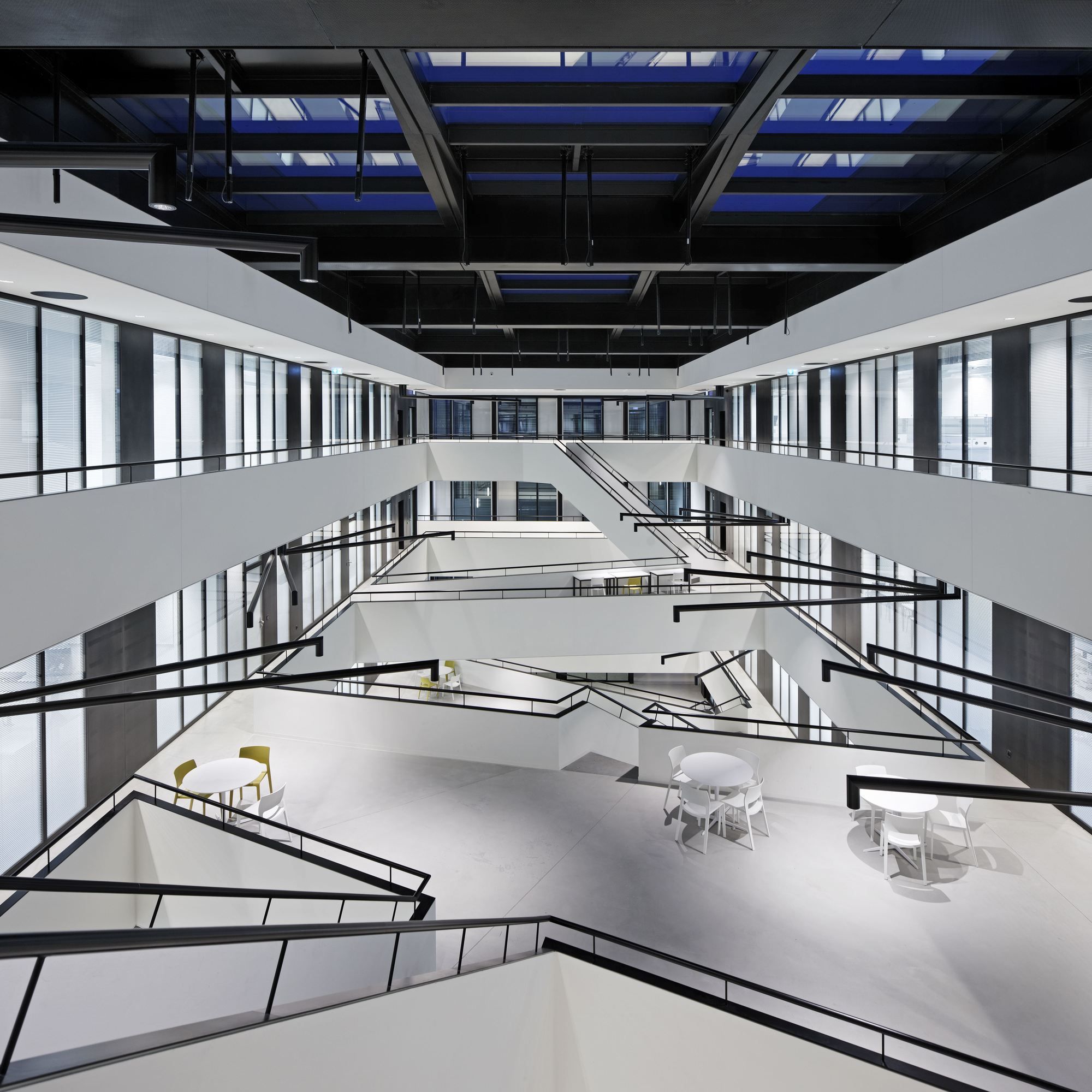
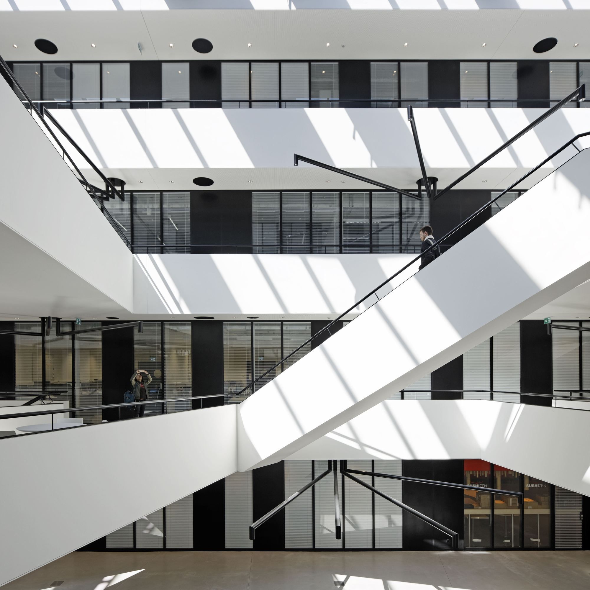
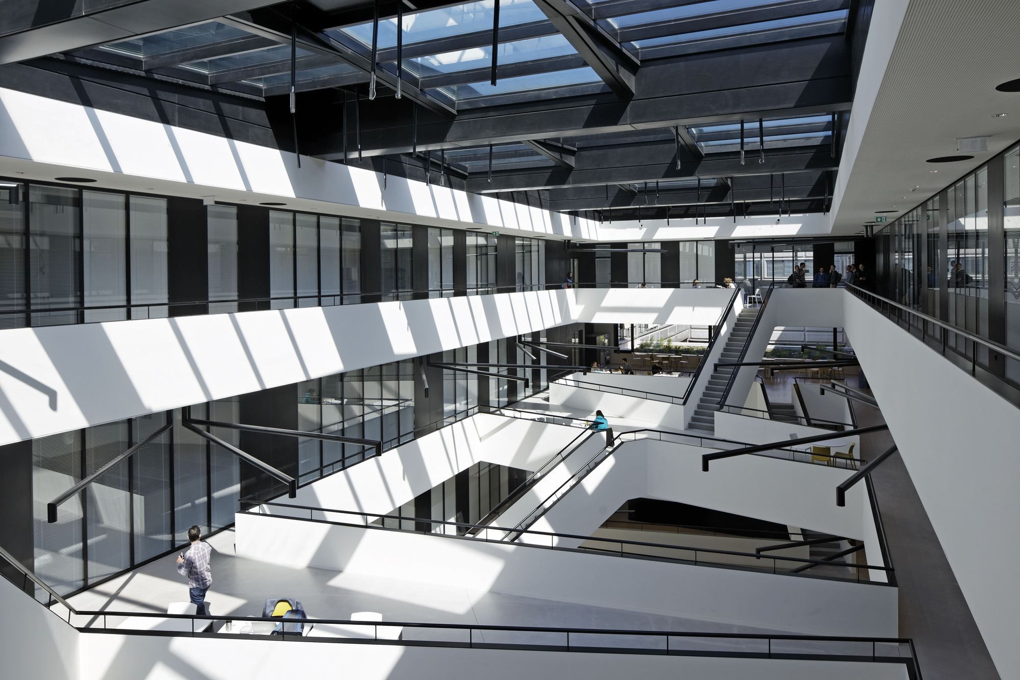
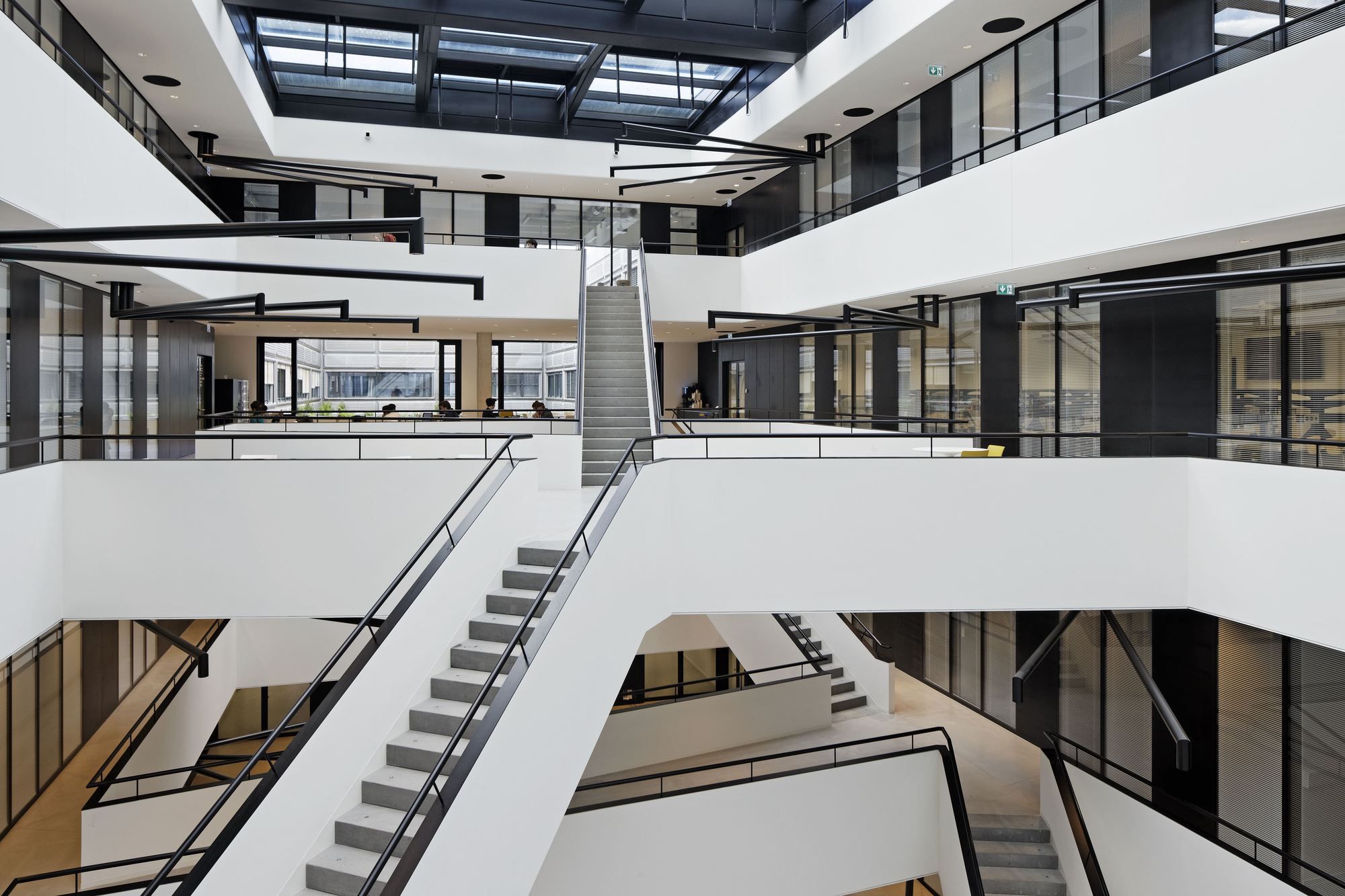
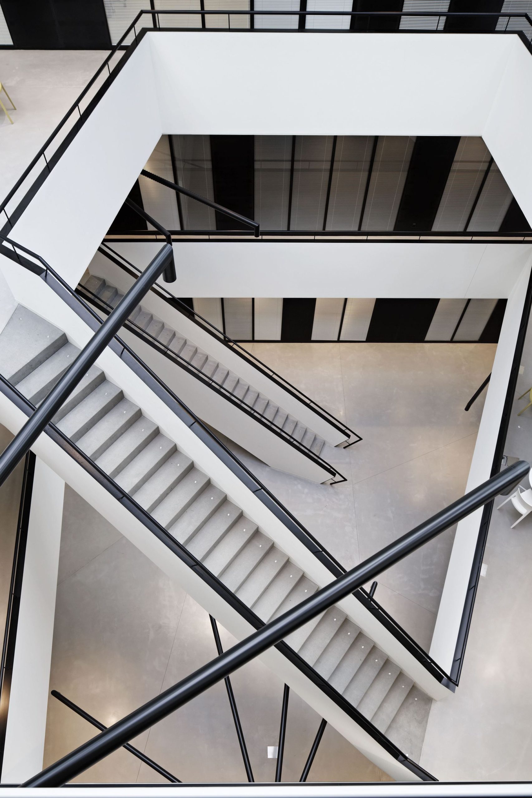
“The atrium, a reception and social area serving the office spaces, is the beating heart of the building. Straight stairways and flared corridors flow diagonally from one level to the next and from one side to another, filling the central void with a blur of lines. Handrails and tubular wall-mounted lamps, accented in black, add to an overall graphic effect inspired by Piranese’s Capricci. Superimposed planes and criss-crossing lines create a dynamic tridimensional picture, which is deconstructed and reconstructed by each visitor passing through it. This plan turns the atrium into a fantastic spatial experience, while reinforcing its social function, by favoring chance encounters without impeding circulation. With its wide open plan and high ceilings, the atrium goes above and beyond its primary purpose as a reception area, turning into a space for experimentation. Placed at a crossroads position on the campus, between different disciplinary fields and as an entrance point for hyper specialized technical laboratories, the atrium is conceived as an accessible door to knowledge and an empirical, experiential space.”
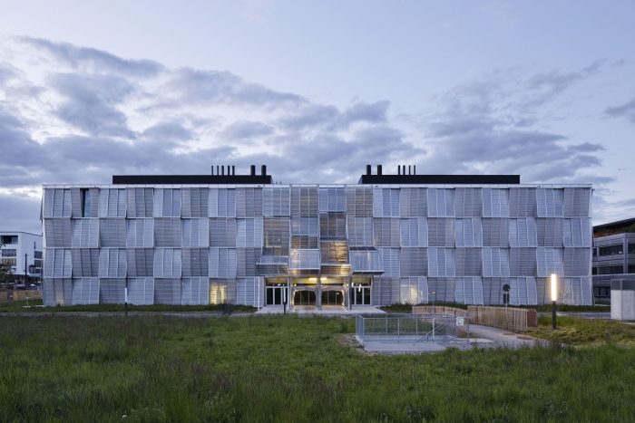
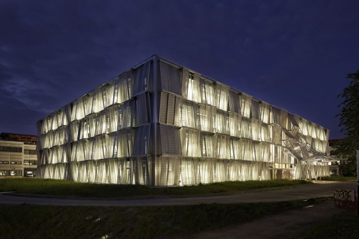
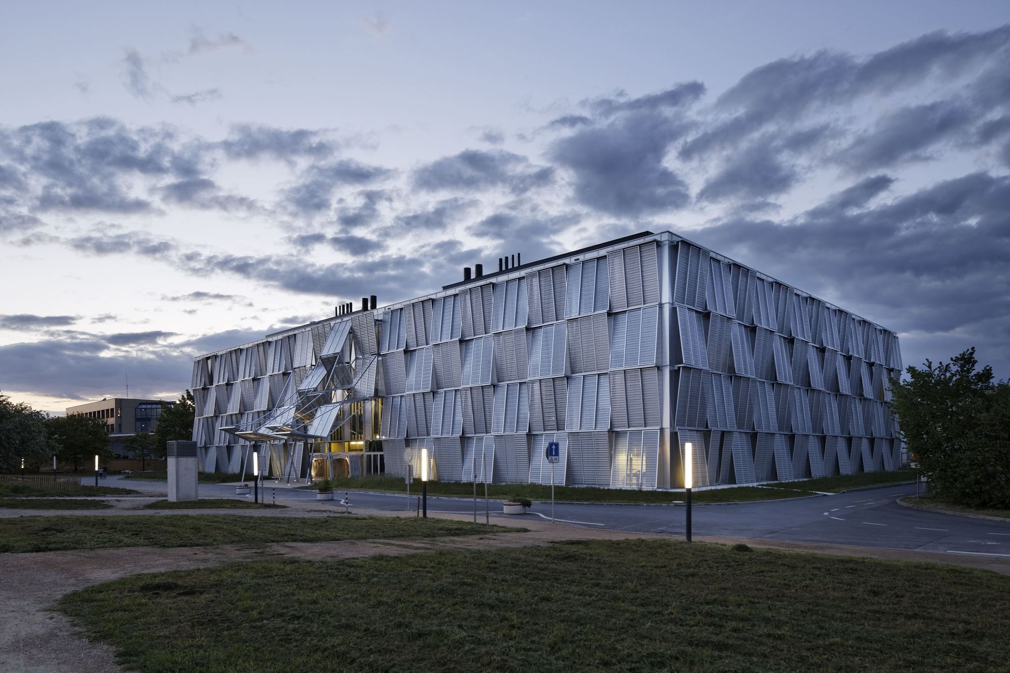
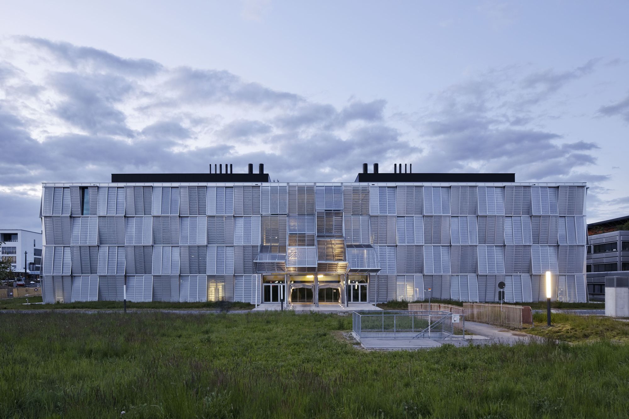
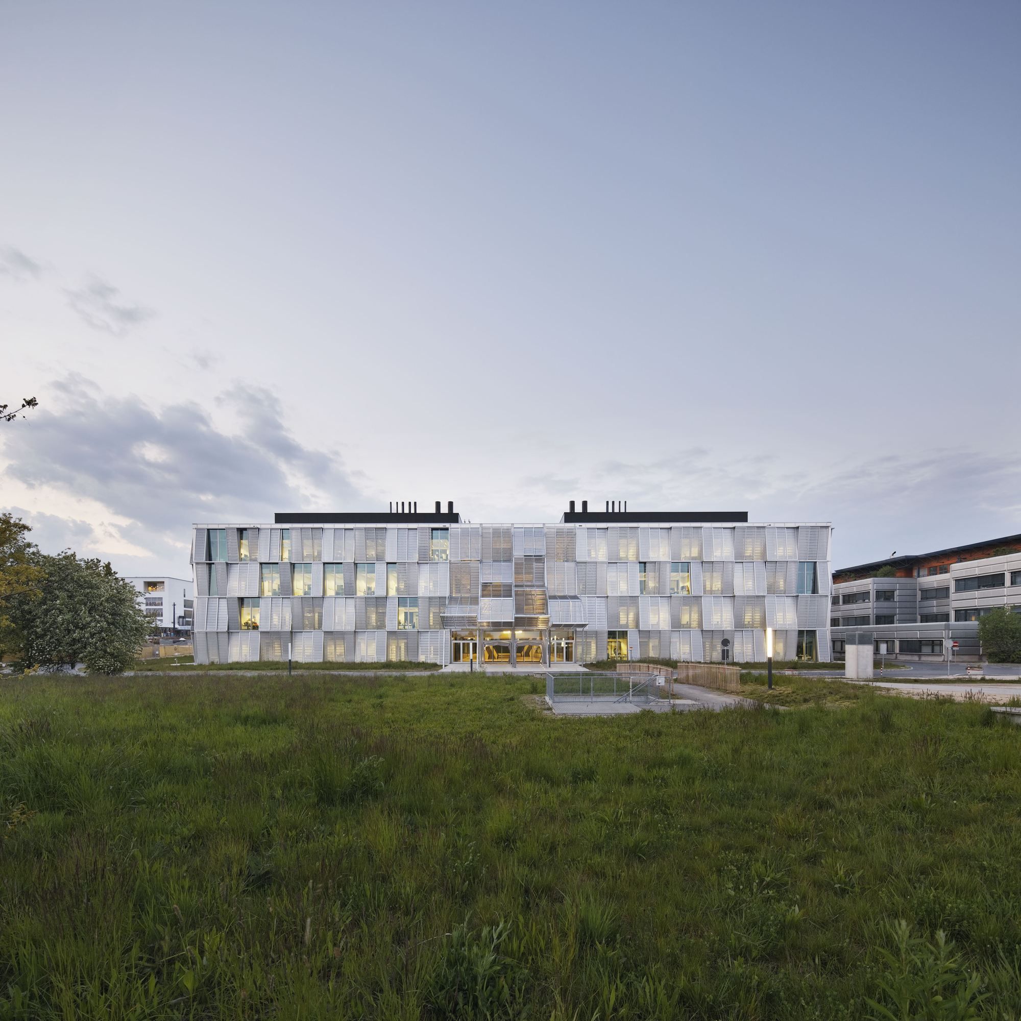
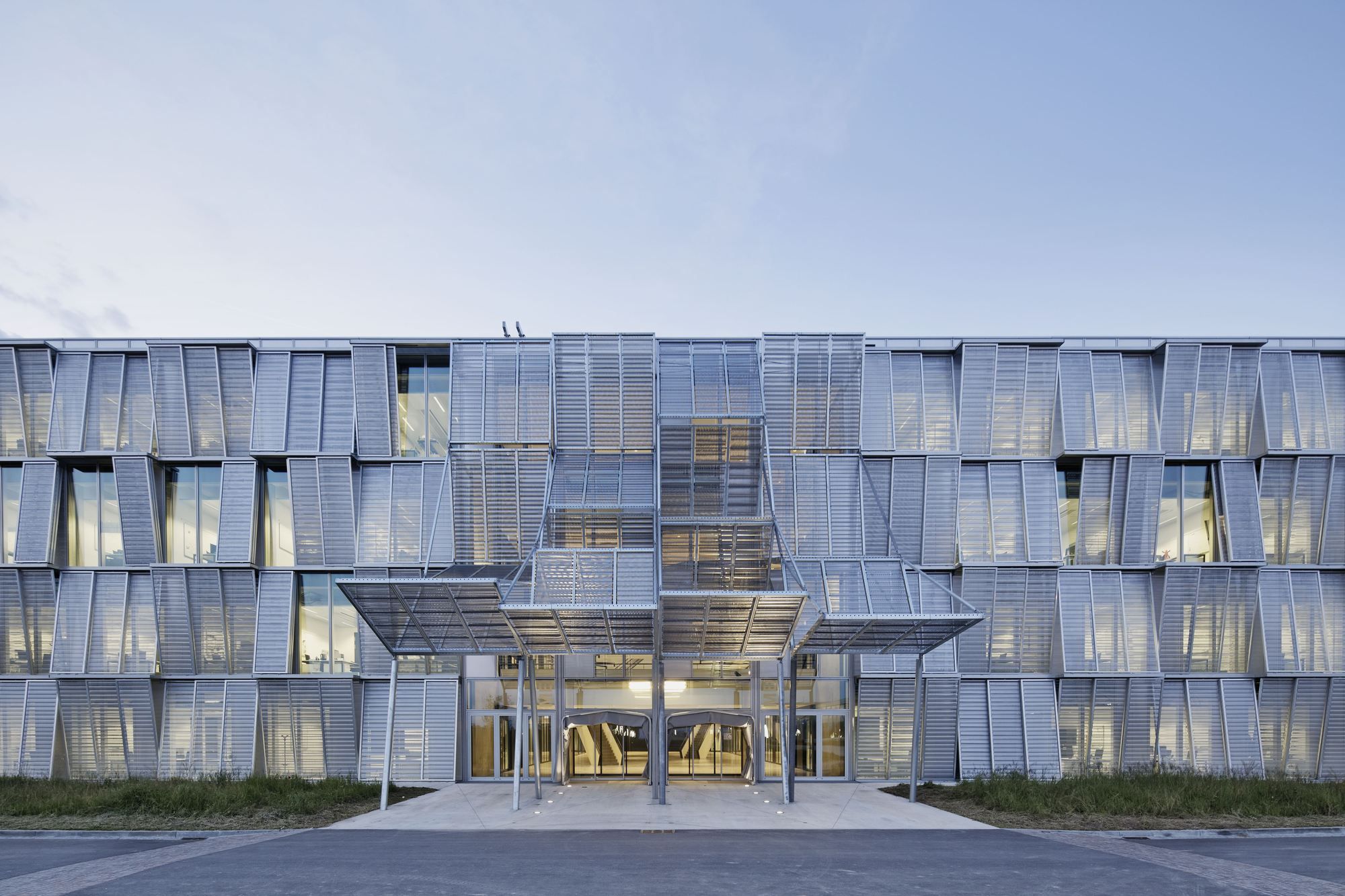
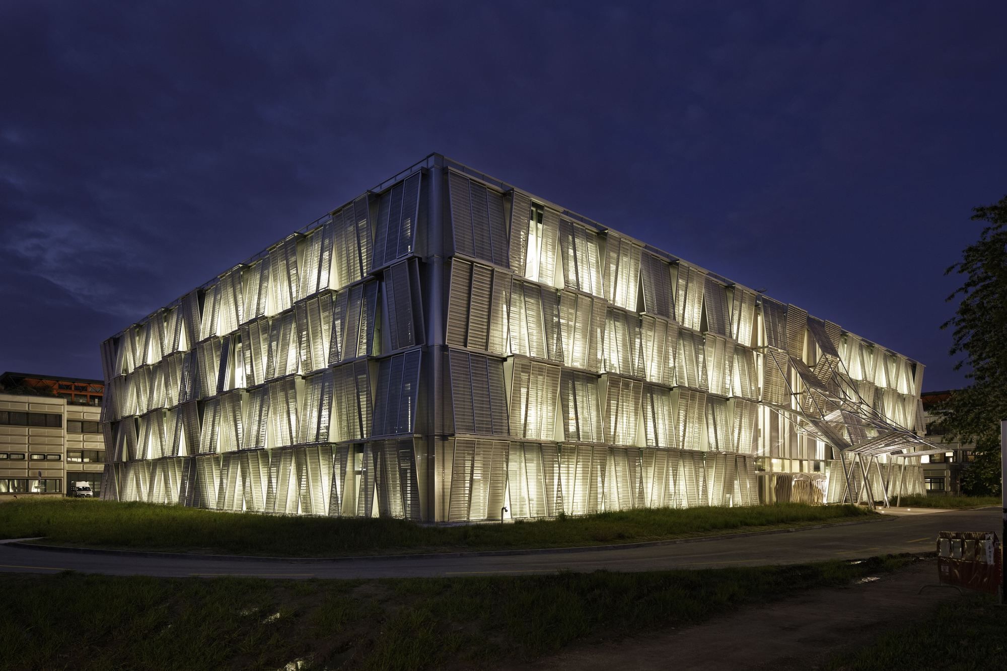
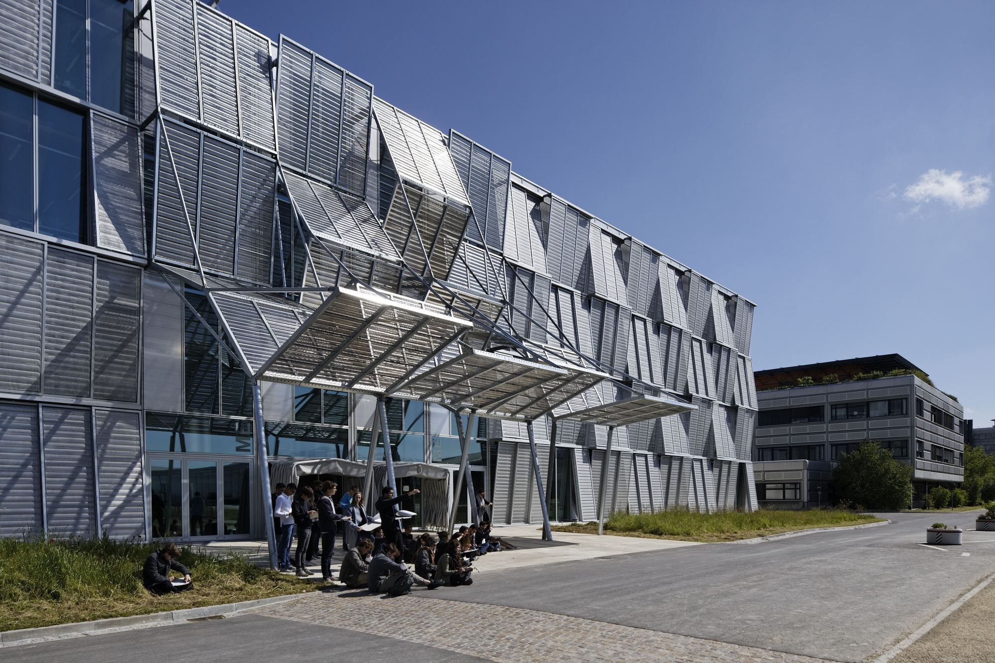
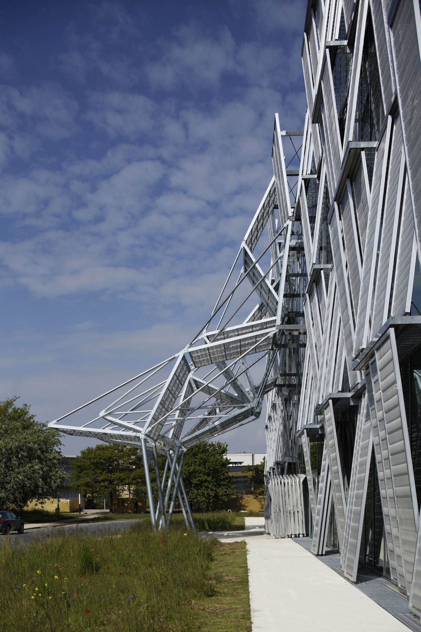
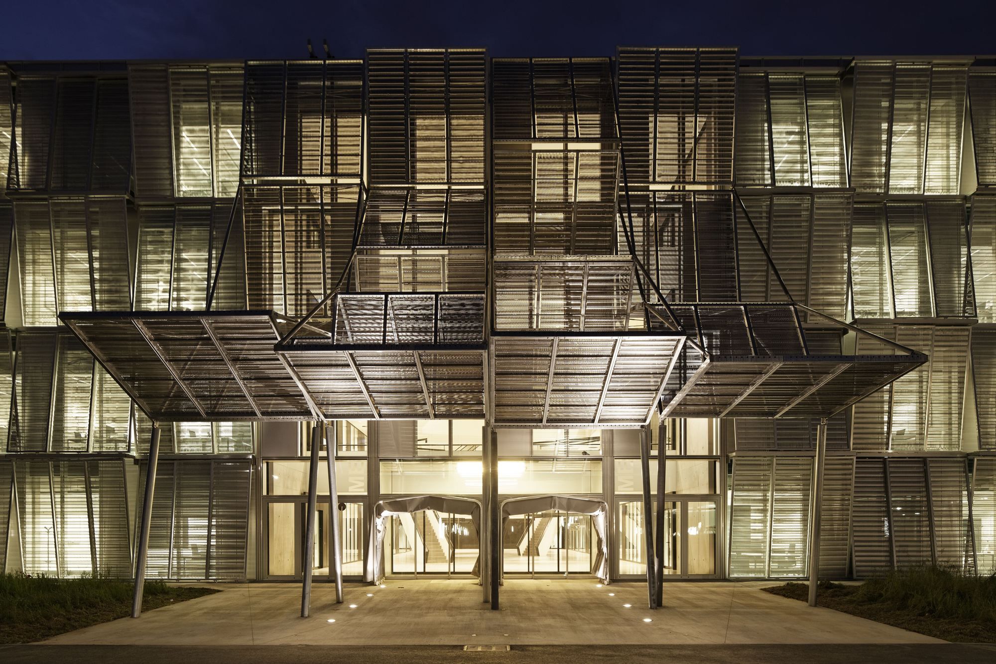
However, all these characteristics are nothing out of the ordinary. The most apparent aspect of the building, the reason why it arouses curiosity and deserves to be discussed and talked about is its hinged façade. The architect has attempted to give the building an edge that reflects science and technology without taking away the sanctity of its 1970s identity. The metallic mesh with glass is striking, poetic and fluid, and at the same time cold and mechanical.
Describing it, the architect says, “The façades combine two distinct architectural styles in one common material, giving the building a contemporary allure while paying tribute the legacy of the 1970s. The metallic mesh, on the one hand, evokes the scope of mechanical engineering, while the northern façade is a direct reference to the molding envelopes of the neighboring buildings.”
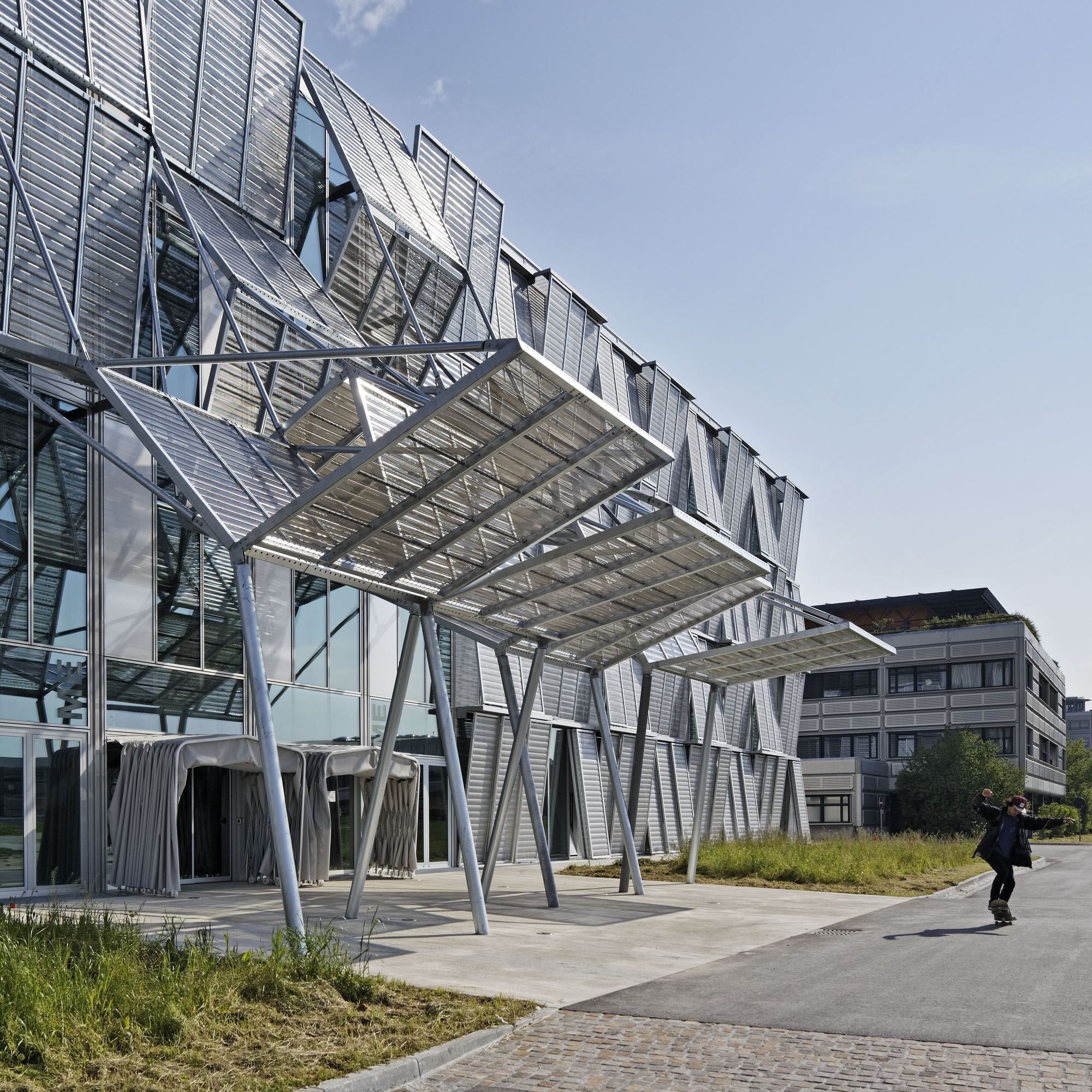
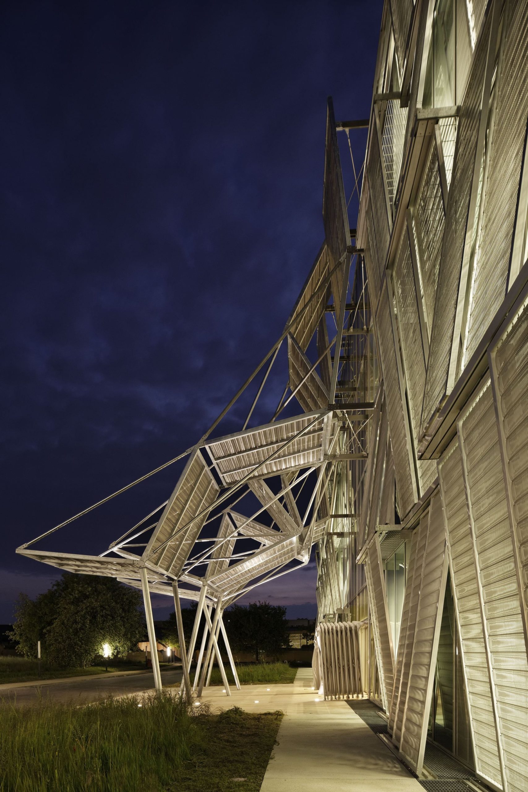
At the entrance the mesh opens up to form a portico, seeming as if it has been lifted and opened to welcome everyone.
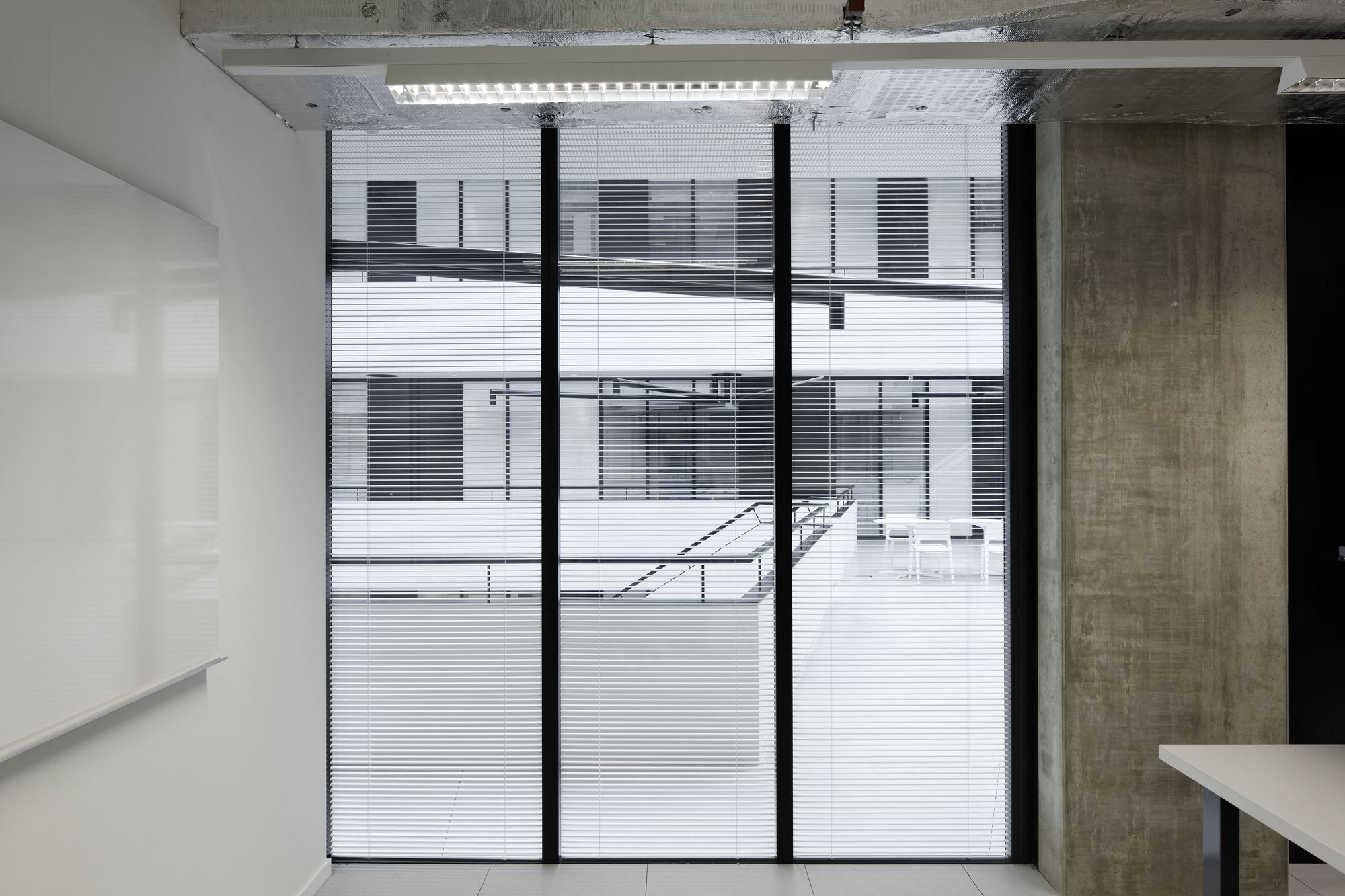
“For the historic façade, to the North of the building, the outer coating of the existing facades of the campus was adapted to meet current Minergie® energy standards. Wide horizontal glazings (4’-11” x 9’-10”) are mounted above an opaque apron made of horizontal stamped sheet metal. The outer shell provides insulation, while blinds serve as solar protection for the windows.”
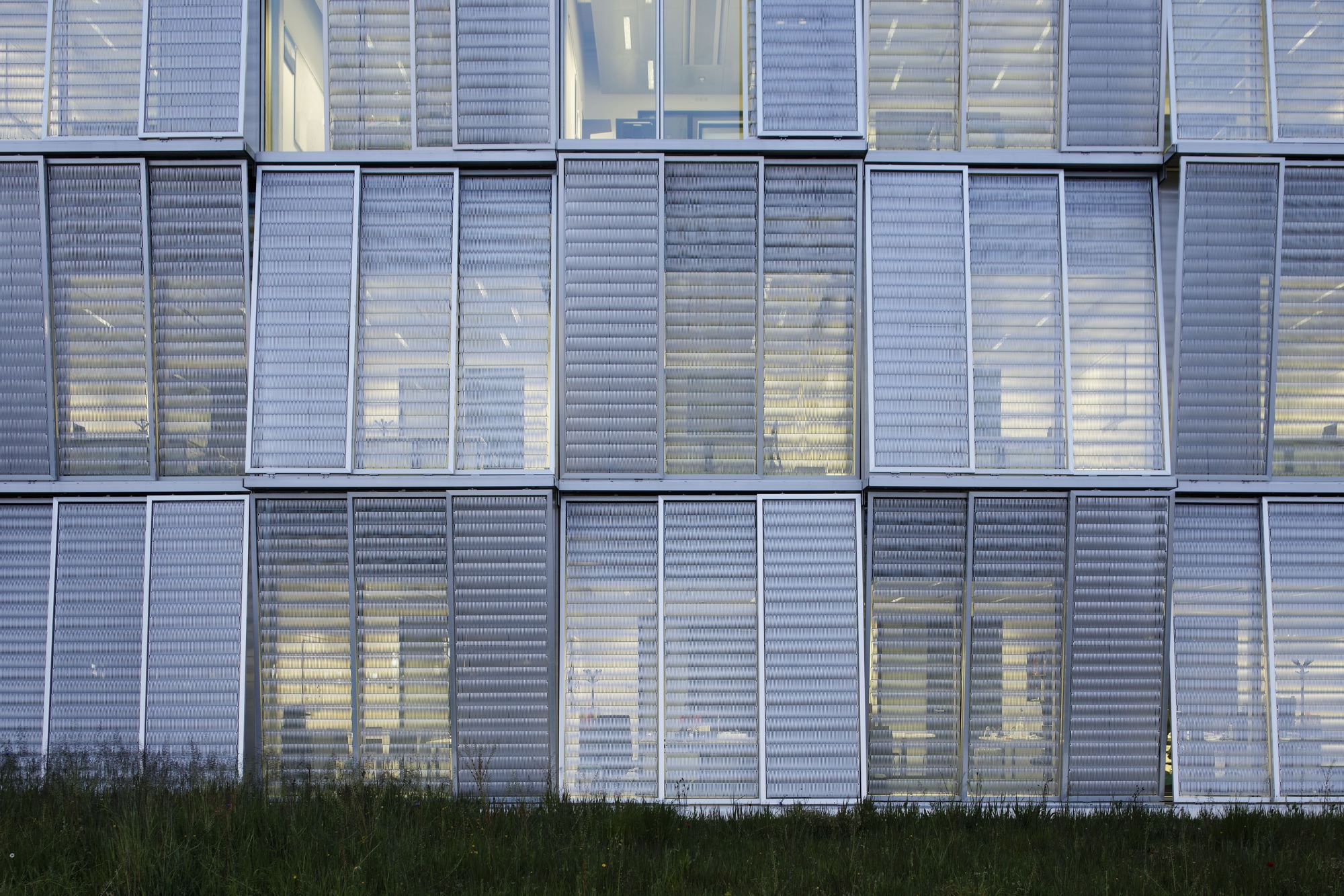
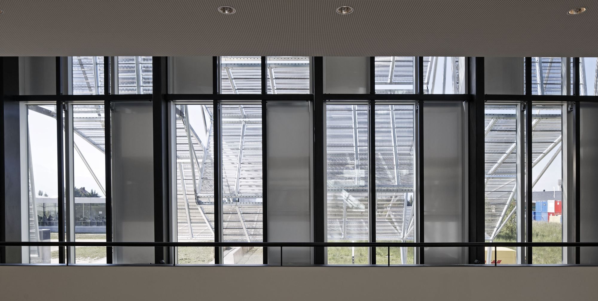
“The mechanical façade stands to the East, South and West of the building. The shape and dimensions of its modules, which were prebuilt in a factory before assembly, were determined by the EPFL’s historic master plan. Each module is made up of two superimposed layers: an inner skin offering thermal insulation and soundproofing, and an outer solar protection, consisting of a frame holding the signature metallic mesh used by DPA since the Bibliothèque nationale de France. The modules are divided into three vertical panels, two of which are sliding and one static. The sliding modules can be deployed in front of the glass panes or superimposed on the third one. For thermal optimization purposes, the mobile panels are generally operated through building automation system, but they can also be maneuvered manually. The third module remains in a fixed position on top of the opaque façade panel.”
“The metallic mesh panels are tilted away from the façade by a 5° angle, with different slants; this juxtaposition of oblique planes looks like a woven pattern, or a hinge seen on a macro level. The raw material used to build these automated components denotes the building’s purpose as a space for scientific experiment. At night, the indoor lighting system amplifies these contrasts by showing the general layout, turning the hall into a lighthouse for the campus. With its blinds that shift and and turn with the Lausanne skies, the slant of the frames and the weave of the mesh, and the visual clash between the threshold and the outer panels, the building offers a range of rich and contrasting perceptions.”
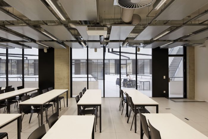
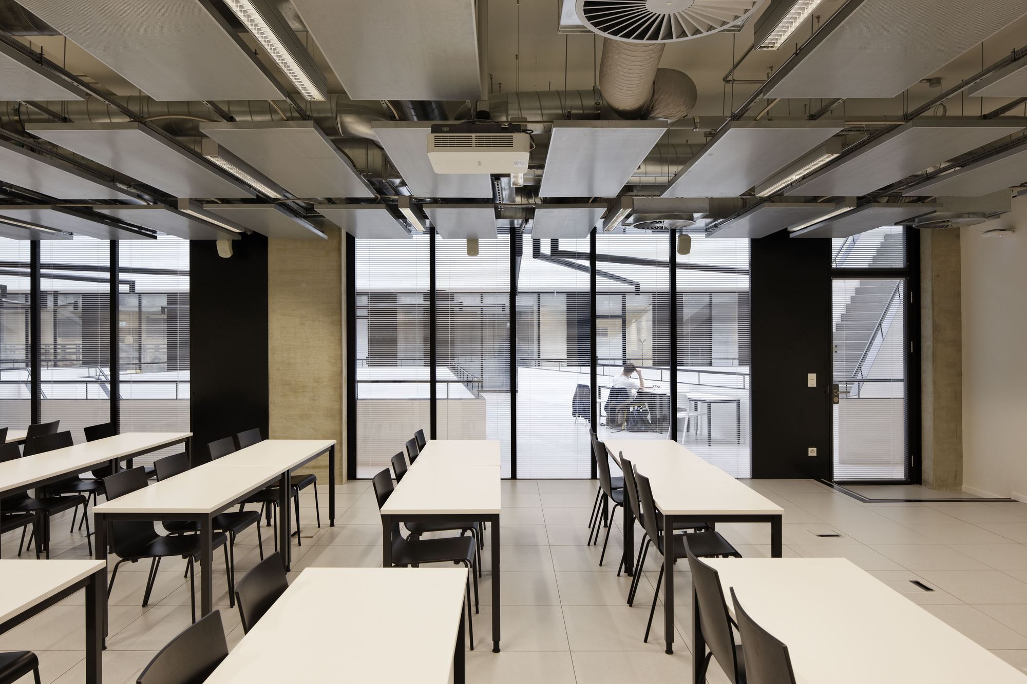
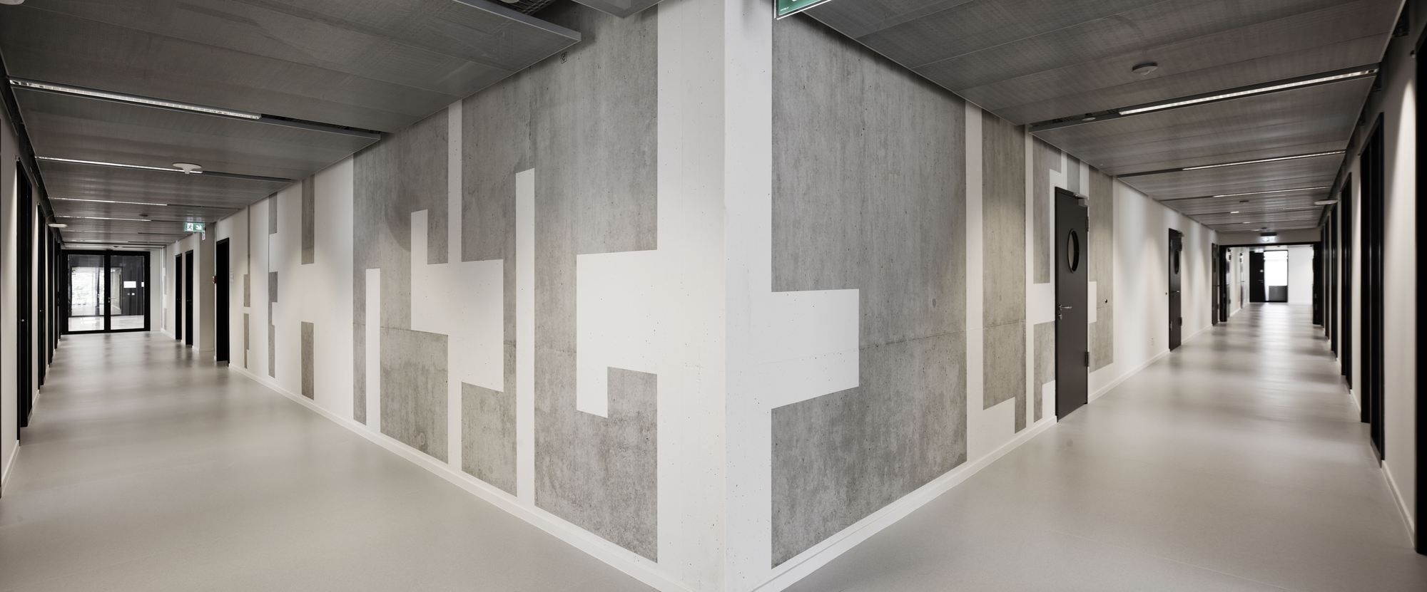
While the unique façade impresses, the white and black interiors seem bare and lacklustre. Though the architect designed this keeping in mind the scientific nature of the building, perhaps a less clinical environment would have been more successful in inspiring curiosity in the scientists. “The materials used – raw concrete and metal walls, cement and PVC floors – favor a simple black-and-white palette in matt and glossy finishes. The opaque walls and glass screens create a set of perspectives into the depths of the building, turning any walk along the corridors into an original experience. The technical networks, left apparent on the walls and ceilings, are a nod to the scientific purpose of the building,” said the architect.
Project Information :
Architect : Dominique Perrault Architecture
Client: Swiss Confederation represented by the Council of Polytechnic Schools, delegation for the operations: EPFL – Ecole Polytechnique Fédérale de Lausanne
Location : EPFL, 1015 Lausanne, Switzerland
Project Year : 2016
Total Area : 223000 sq.ft
Designed-Build Project with: Steiner SA
By: Sahiba Gulati
Photography by © Vincent Fillon
Photography by © Vincent Fillon
Photography by © Vincent Fillon
Photography by © Vincent Fillon
Photography by © Vincent Fillon
Photography by © Vincent Fillon
Photography by © Vincent Fillon
Photography by © Vincent Fillon
Photography by © Vincent Fillon
Photography by © Vincent Fillon
Photography by © Vincent Fillon
Photography by © Vincent Fillon
Photography by © Vincent Fillon
Photography by © Vincent Fillon
Photography by © Vincent Fillon
Photography by © Vincent Fillon
Photography by © Vincent Fillon
Photography by © Vincent Fillon
Photography by © Vincent Fillon
Photography by © Vincent Fillon
Photography by © Vincent Fillon
Plan
Plan
Section


