Pierre Lassonde Pavilion
The Pierre Lassonde Pavilion—the Musée national des beaux-arts du Québec’s will be opened to the public this week. The Pavilion, designed by OMA, is the major addition to the museum, and it increases the floor space by 90%.
The scheme rather than creating an iconic imposition, it also forms new links between the park and the city, and brings coherence to the MNBAQ. “The world heritage site of Québec City now has a new landmark. Lucid and ingenious, the Pierre Lassonde Pavilion simultaneously stands out on its site and weaves itself into its surroundings, bringing out the potential of the urban situation with a logic that is as impeccable as it is unexpected.” said the MNBAQ’s Executive Director and Chief Curator, Line Ouellet.
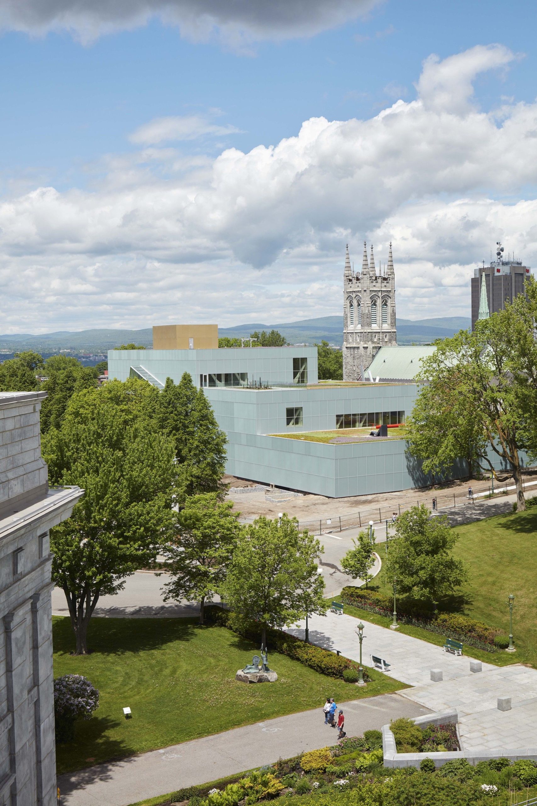
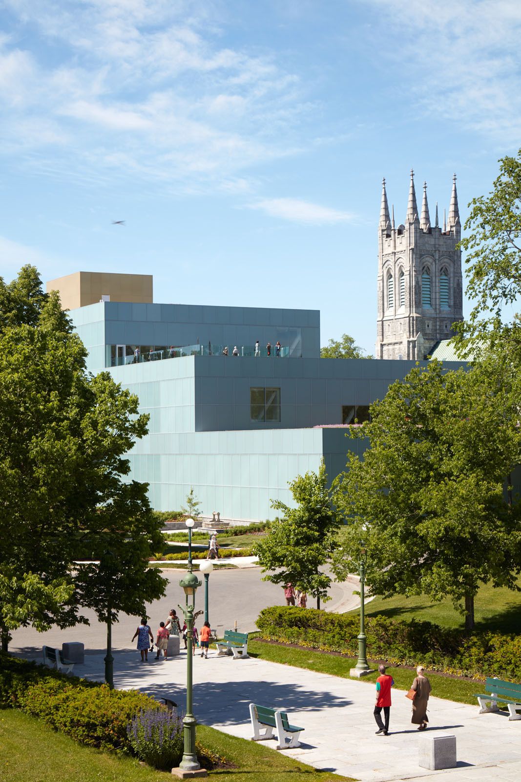
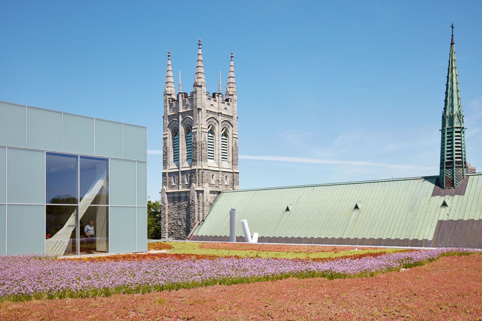
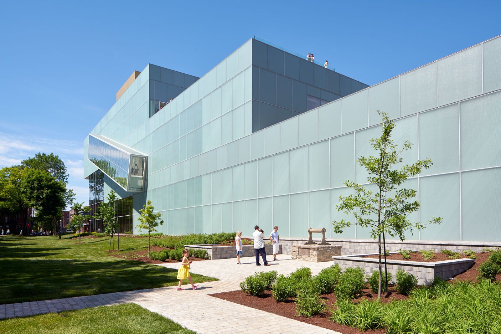
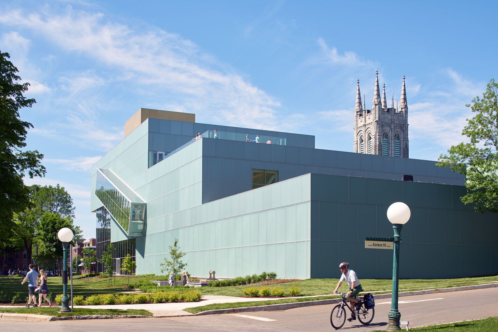
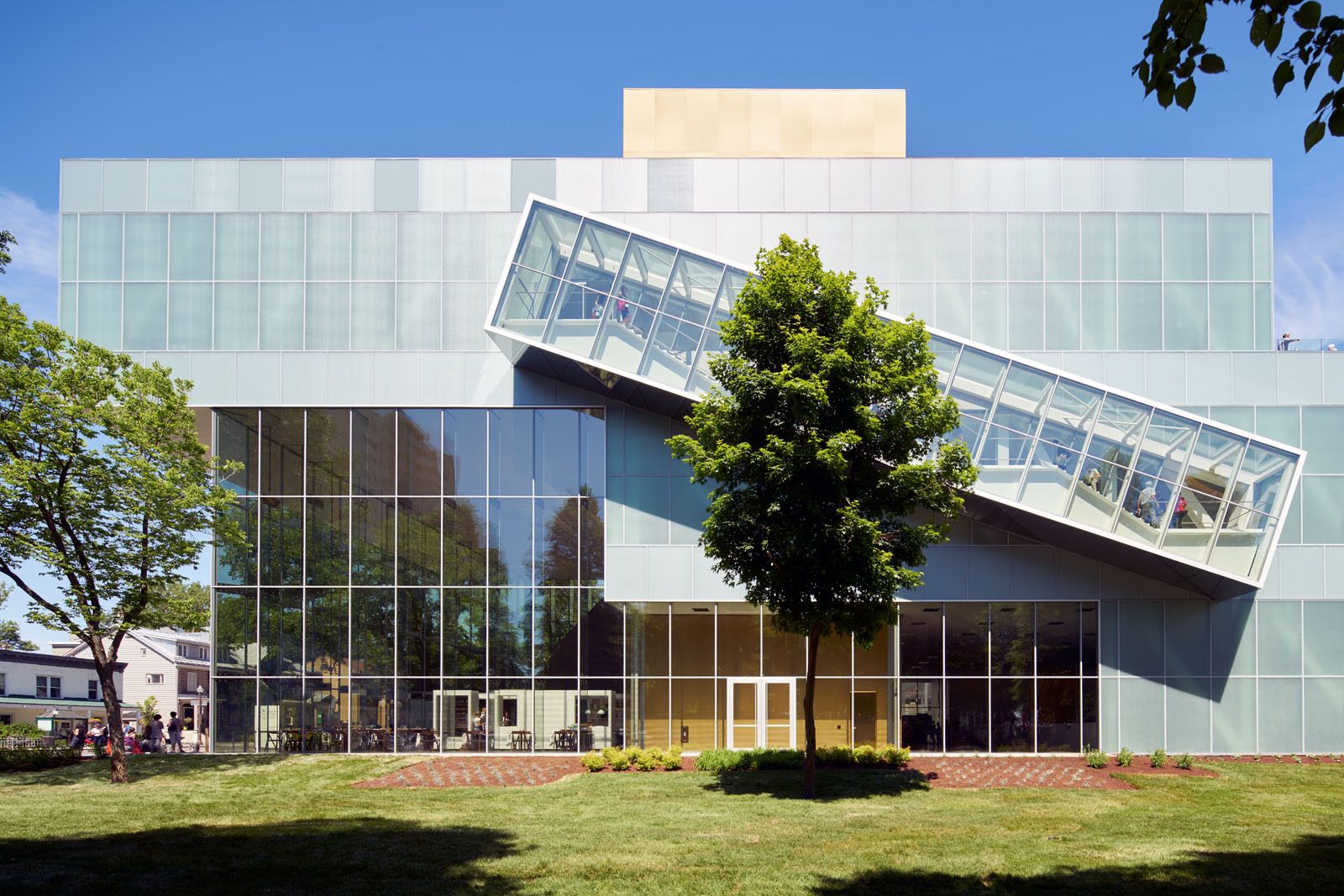
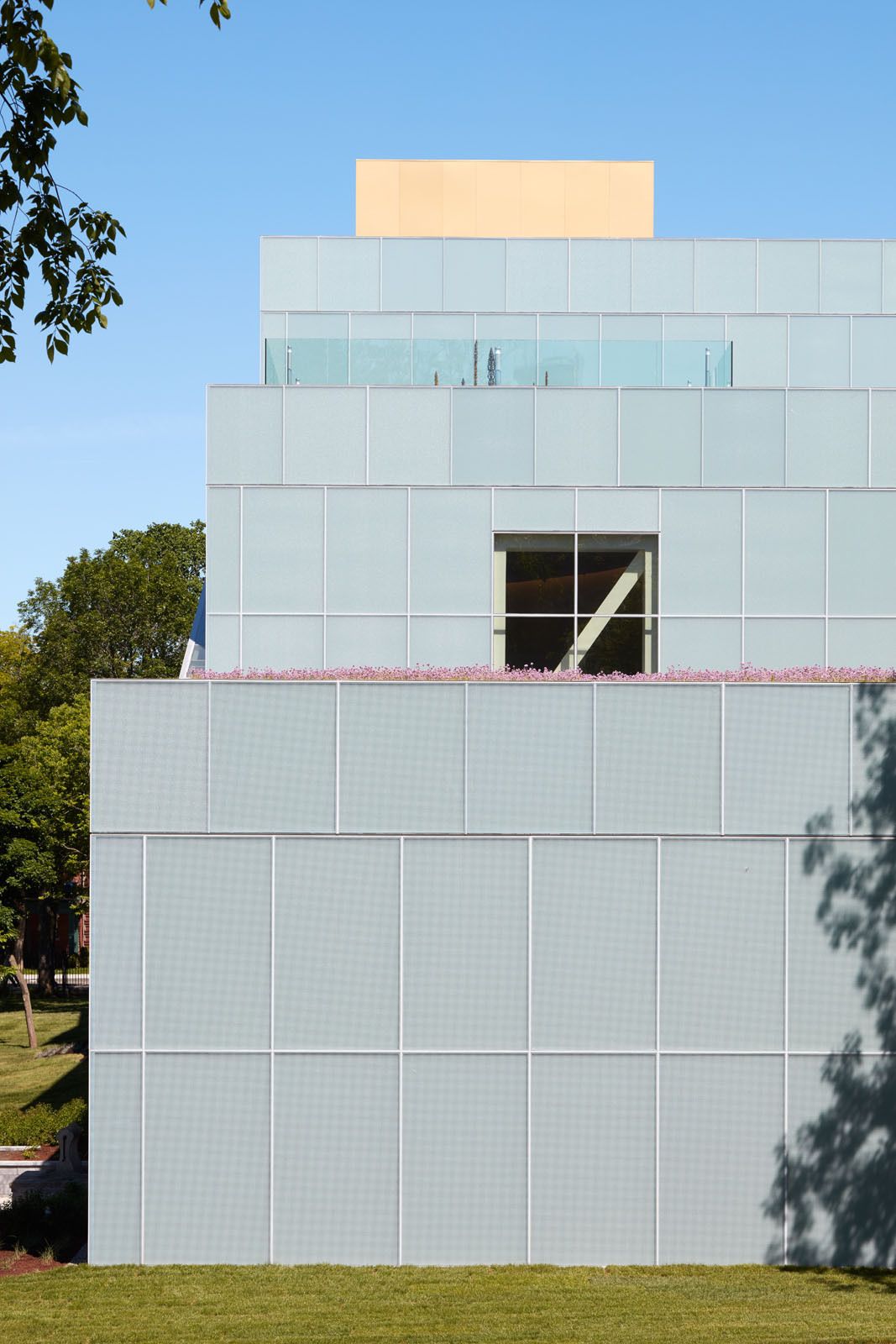
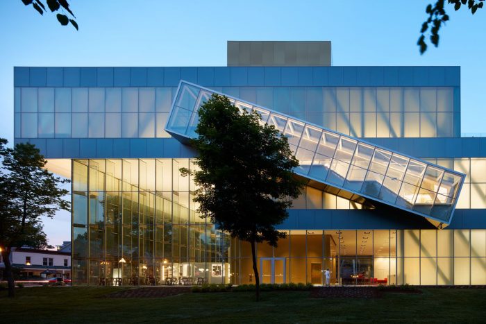
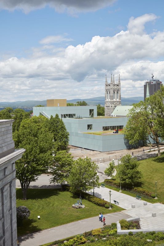
The intricate and sensitive context of the new building generated the central questions underpinning the design: How to extend Parc des Champs-de-Bataille while inviting the city in? How to respect and preserve Saint Dominique church while creating a persuasive presence on Grande Allée? How to clarify the museum’s organization while simultaneously adding to its scale? OMA’s solution was to stack the required new galleries in three volumes of decreasing size to house temporary exhibitions, permanent modern and contemporary collections, and Decorative Arts and design, as well as Inuit artworks, creating a cascade ascending from the park towards the city. The building aims to weave together the city, the park and the museum as an extension of all three simultaneously.
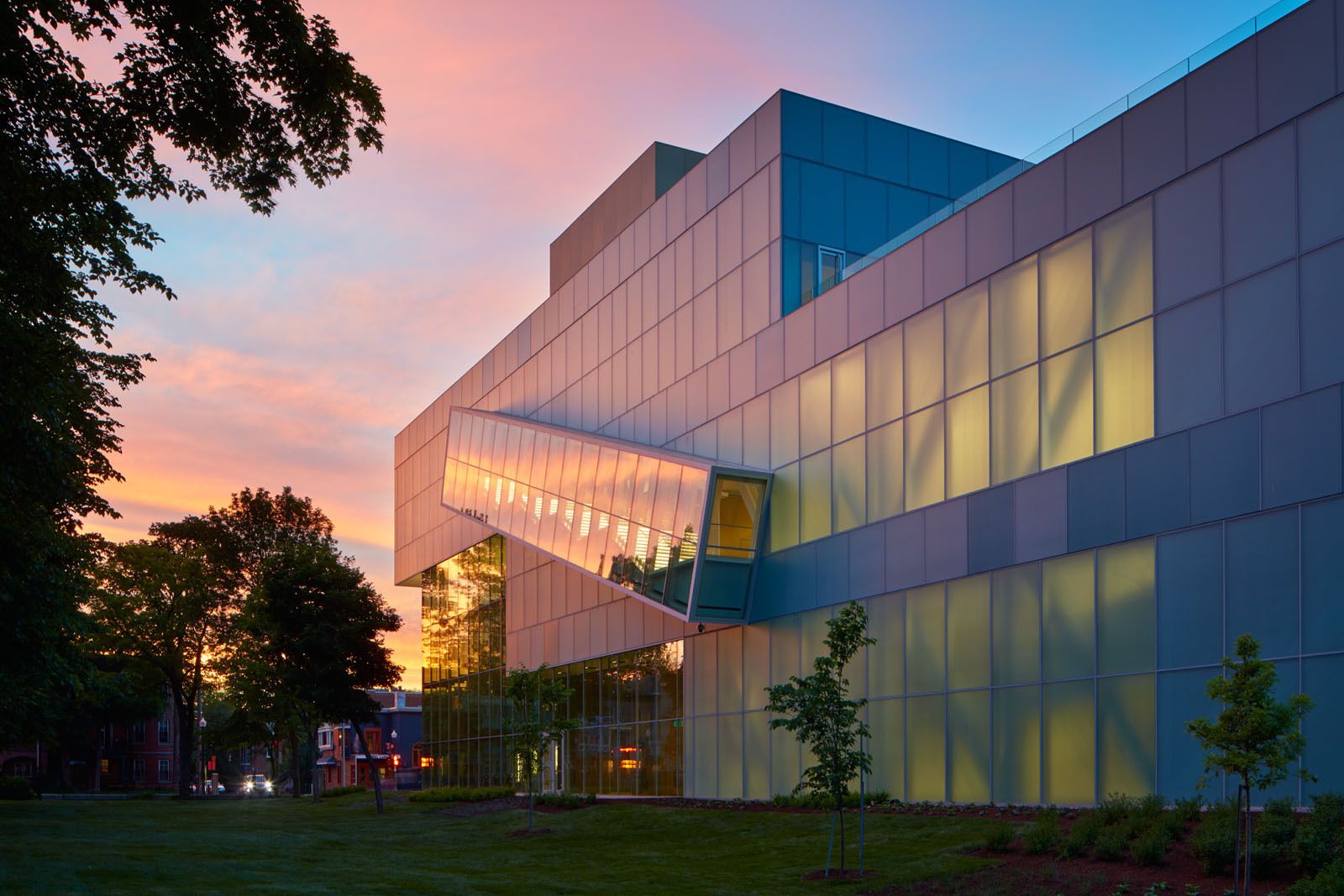
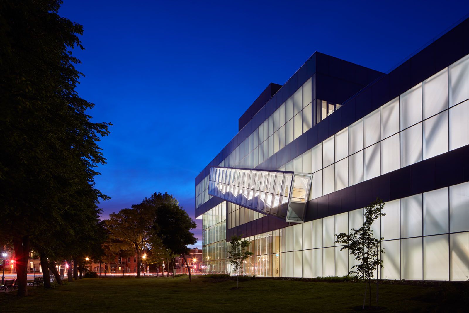
While they step down in section, the gallery boxes step out in plan, framing the existing courtyard of the church cloister and orienting the building towards the park. The park spills into the museum (through skylights and carefully curated windows) and the museum into the park (though the extension of exhibitions to the terraces and the outdoor pop-out staircase). The stacking creates a 12.6m-high (42 ft) Grand Hall, sheltered under a dramatic 20m (66 ft) large cantilever. The Grand Hall serves as an interface to the Grande Allée, an urban plaza for the museum’s public functions, and a series of gateways into the galleries, courtyard and auditorium.
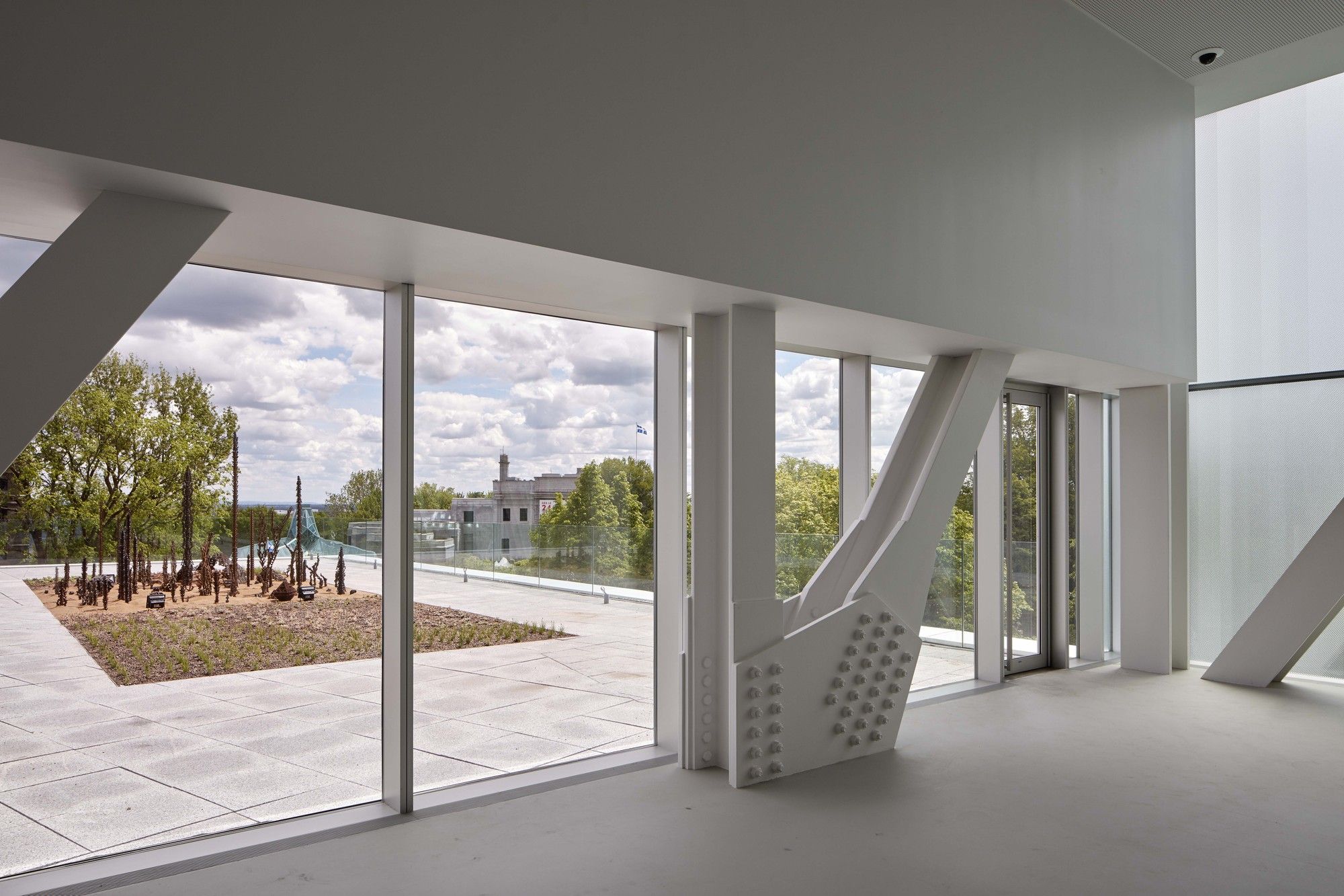
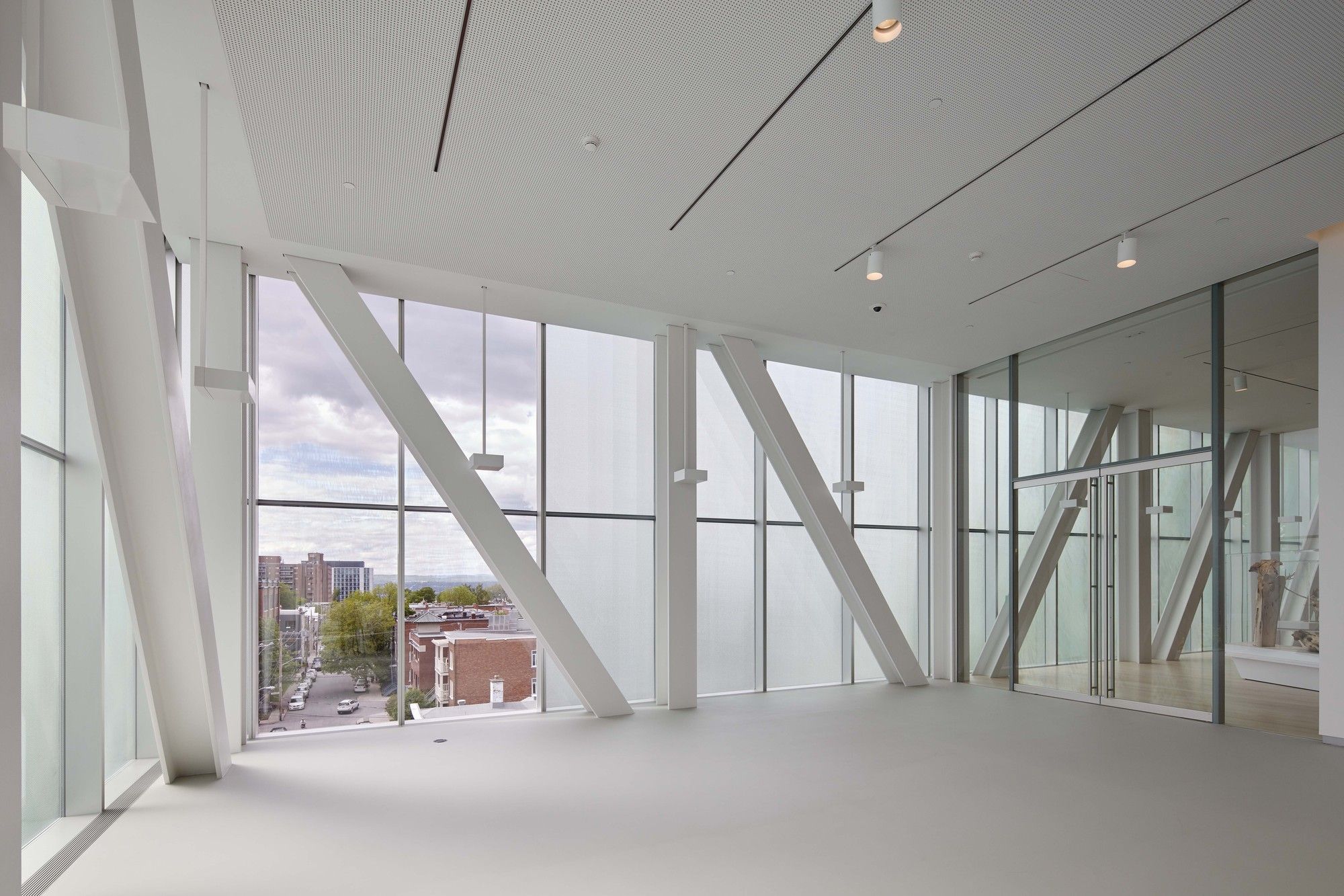
The cantilevered structure is supported by a hybrid steel truss system and accommodates galleries uninterrupted by columns. The layered façade is simultaneously structural, thermal and solar, addressing the seemingly contradictory needs of natural light and thermal insulation for Québec’s harsh winter climate. The triple layered glass façade is composed of a 2D printed frit that pattern mimics the truss structure, a 3D embossed glass, and a layer of diffuser glass. In the galleries, insulated walls are located behind the translucent glass system, with a gap between that lights the building at night like a lantern in the park. The Grand Hall is enclosed by a glass curtain wall with glass fins that allow virtually unobstructed and inviting views to the Charles Baillairgé pavilion through a glass wall and ceiling. The contrast between the translucent gallery boxes and clear grand hall reinforces the reading of the building’s stacking and cantilevering massing.
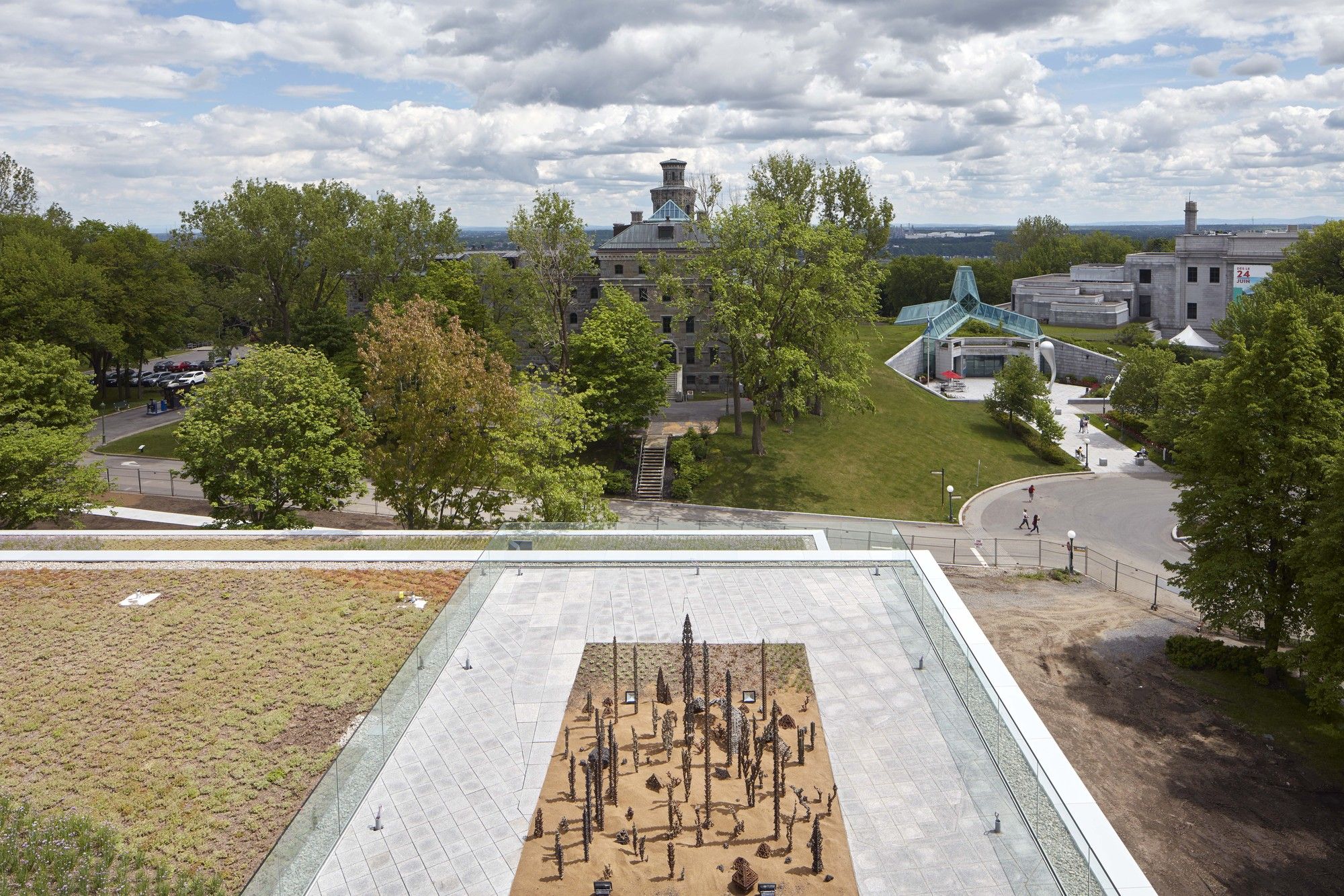
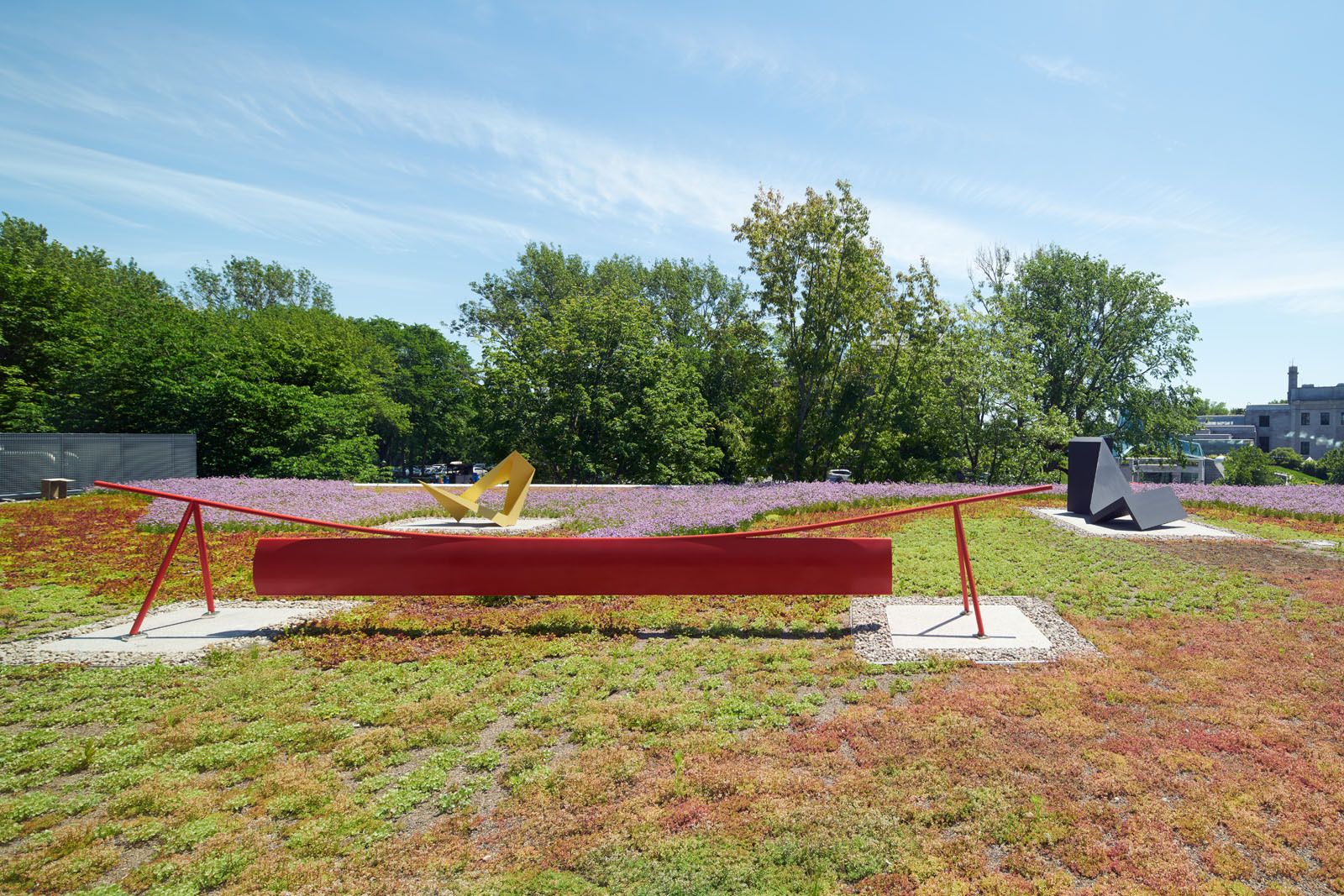
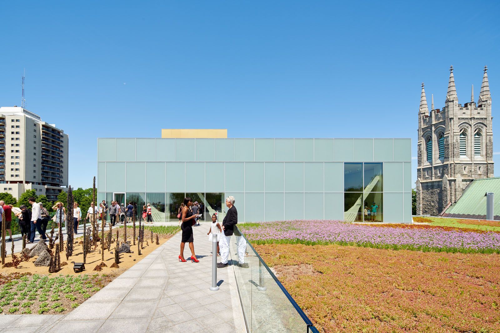
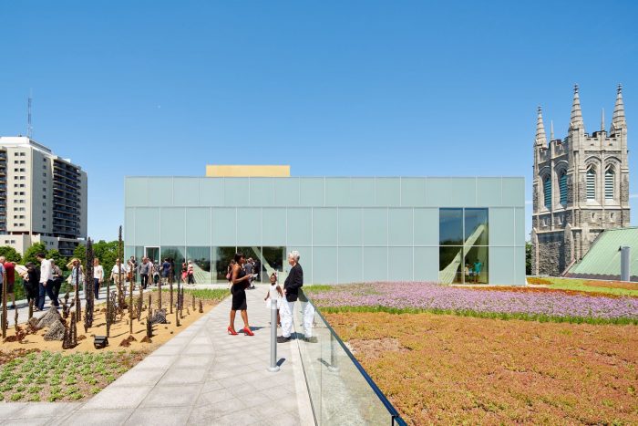
Complementing the quiet reflection of the gallery spaces, a chain of programs along the museum’s edge—foyers, lounges, shops, bridges, gardens—offer a hybrid of activities, art and public promenades. Along the way, orchestrated views from a monumental spiral stair and an exterior pop out stair reconnect the visitor with the park, the city, and the rest of the museum. Within the boxes, mezzanines and overlooks link the temporary and permanent exhibition spaces. On top of each of the gallery boxes, roof terraces provide space for outdoor displays and activities.
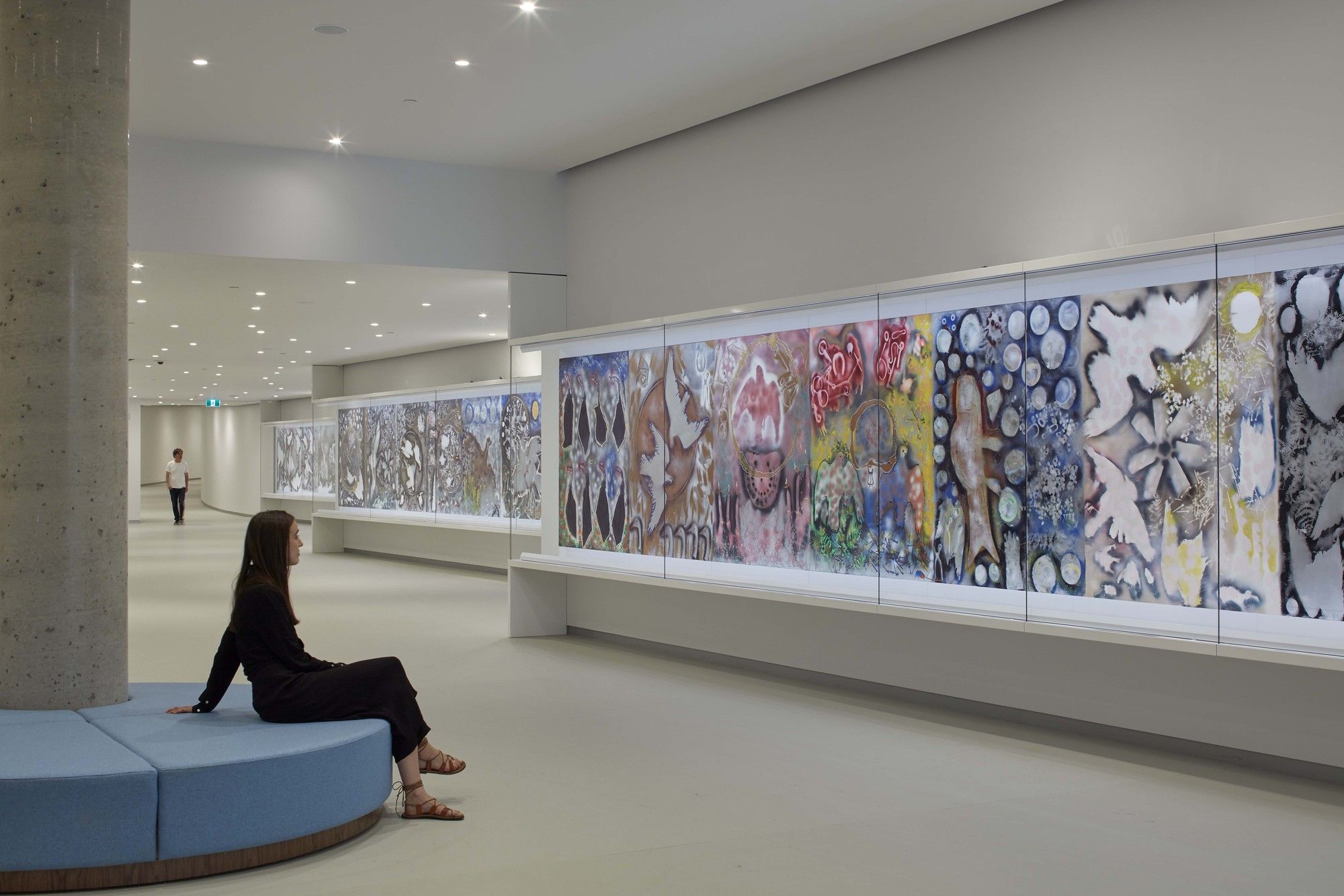
New exhibition spaces are connected to the museum’s existing buildings by a 130m (427 ft) long passageway, creating a permanent home for the museum’s 40m (132 ft) “Hommage à Rosa Luxemburg” by Jean-Paul Riopelle. Through its sheer length and changes in elevation, the passage creates a surprising mixture of gallery spaces that lead the visitor, as if by chance, to the rest of the museum complex.

