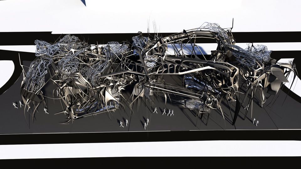
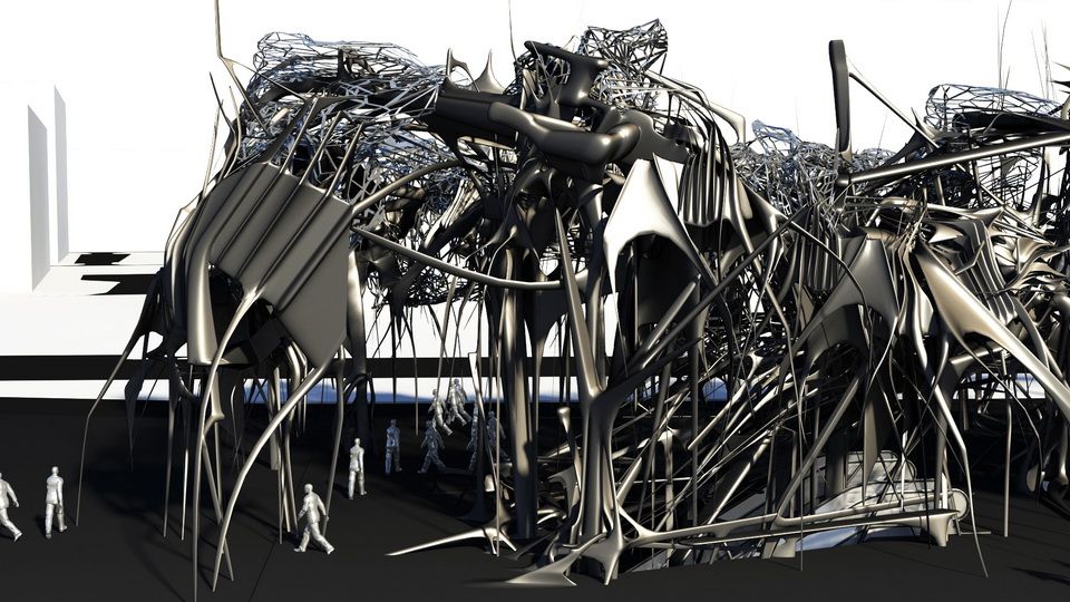
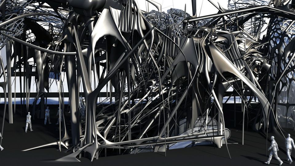
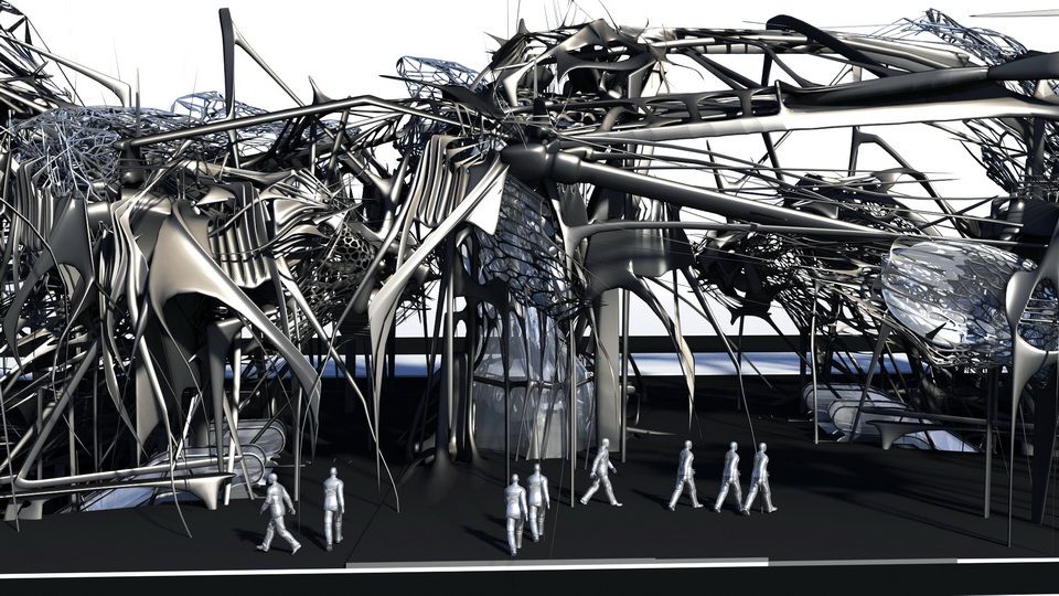
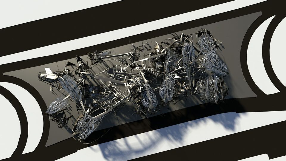
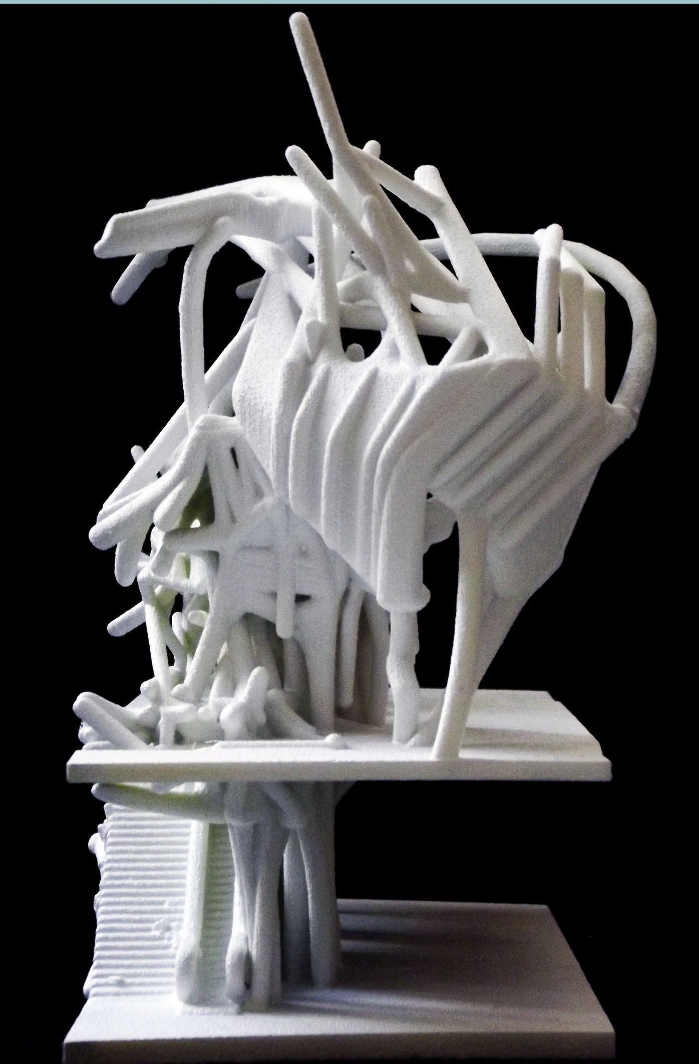
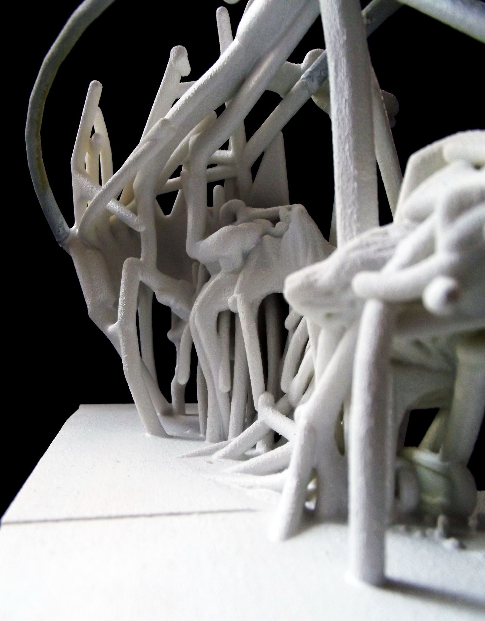
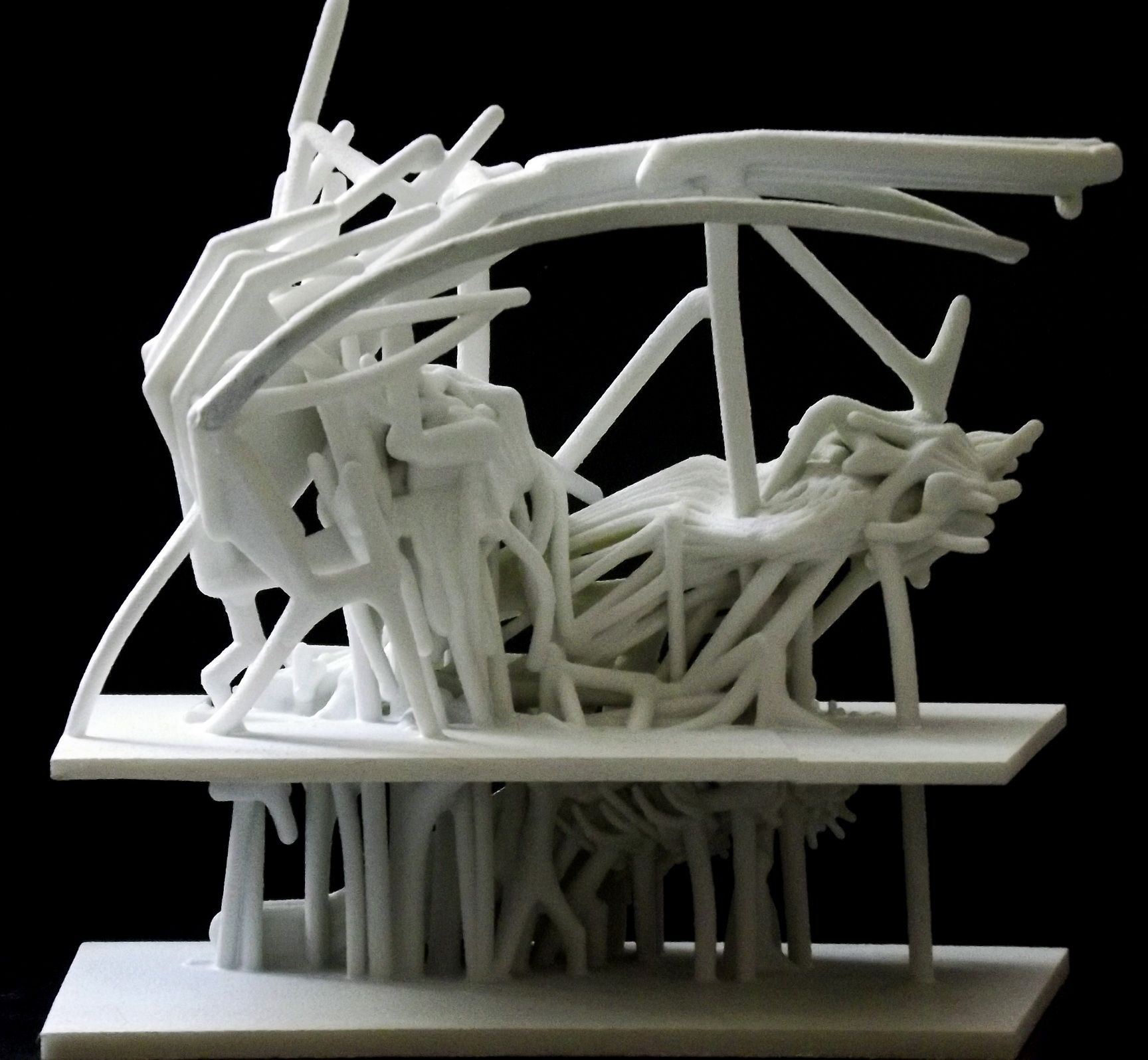
How to design a subway station…?
Should it just be a utilitarian structure, devoid of any attributes besides offering a roof and some walls and a platform or two…?
I decided to make a statement: to “confuse” in order to provoke emotions not normally associated with a subway station.
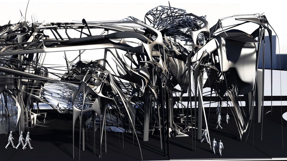
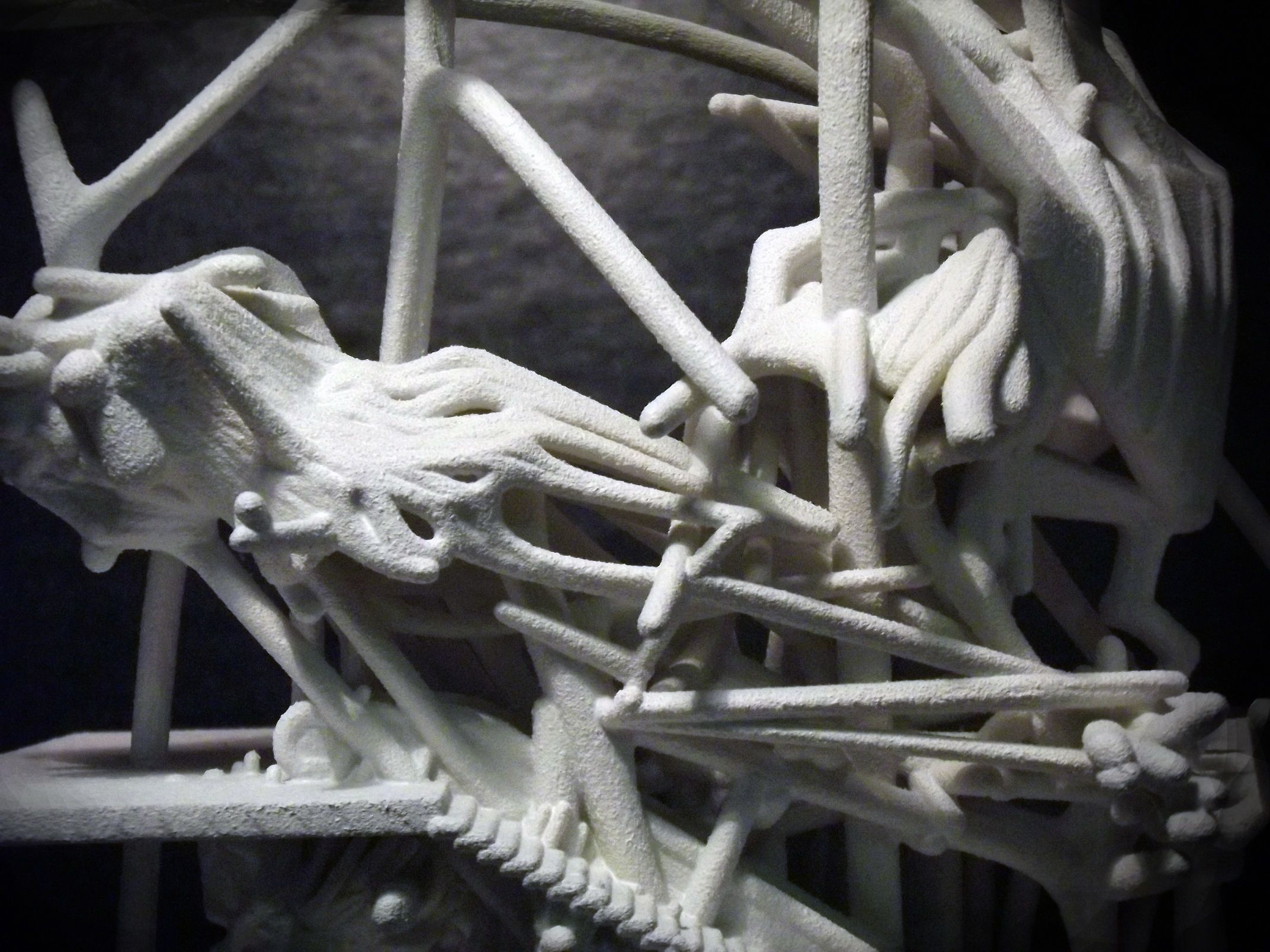
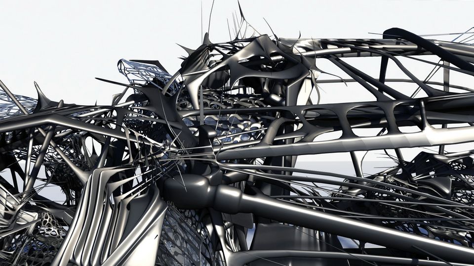
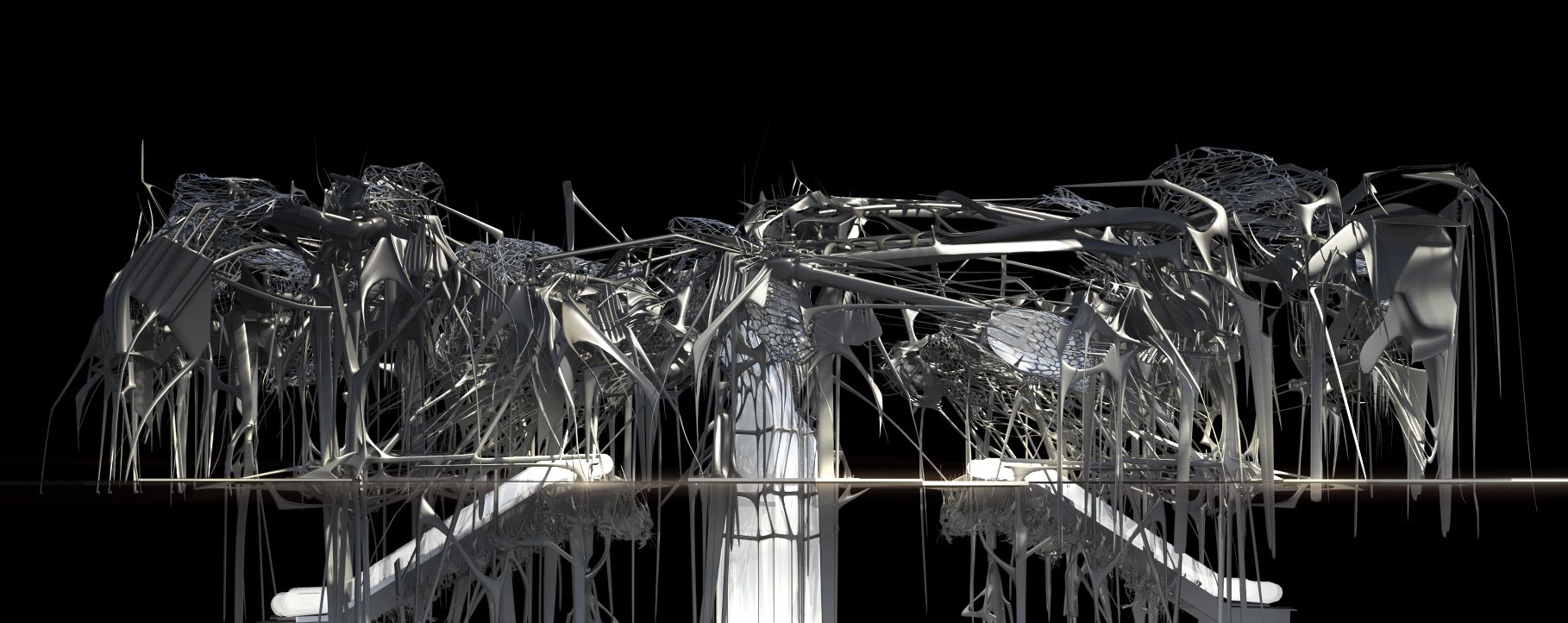
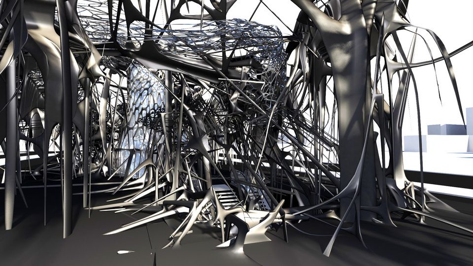
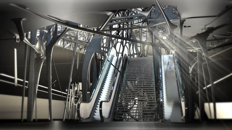
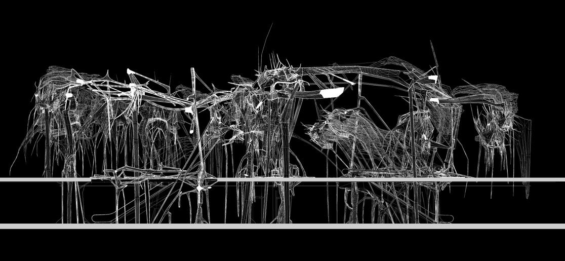
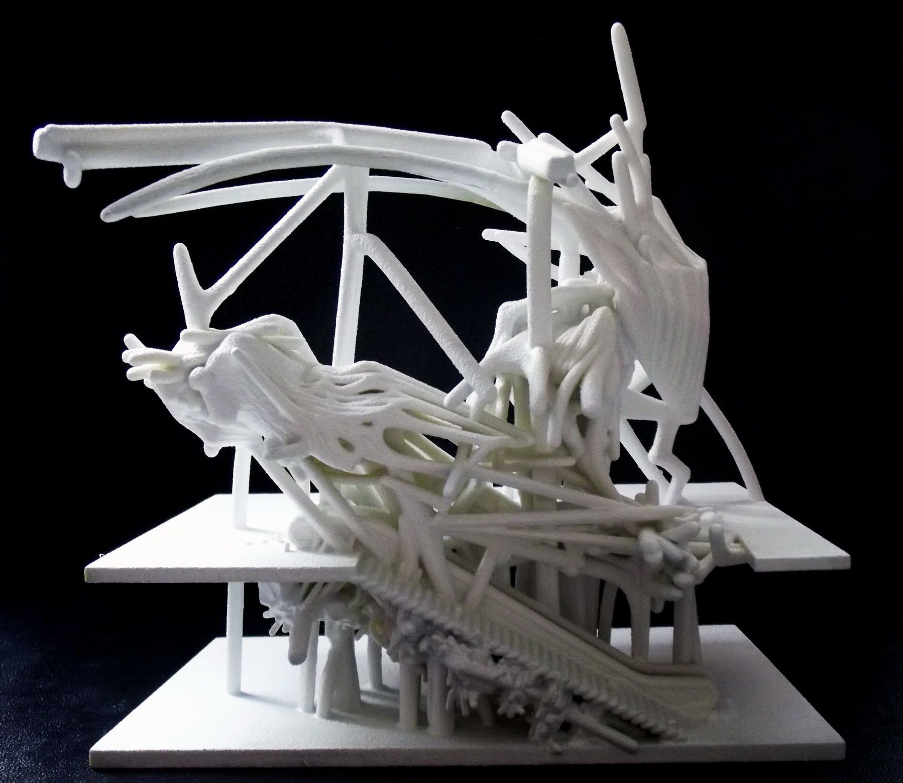
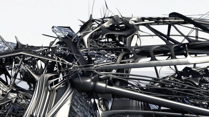
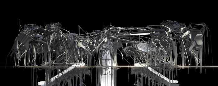
My early studies were based on the morphologies and behaviors of insects and plants. Through a series of experiments and spontaneous compositions the work evolved into a field….a web of structures, meshes and sculptural elements.
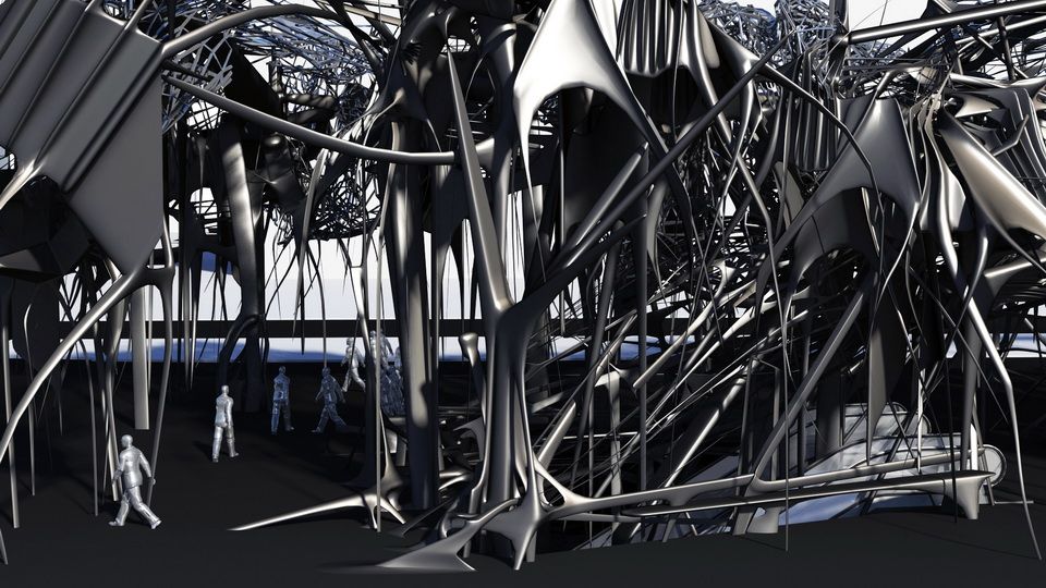
This intricate, complex web tries to create that locus most subways stations are not.
In a way it is the very opposite of an “oasis.”
An oasis is a patch of light, serenity and open space.
My subway station is dark, dense, and almost capable of generating claustrophobia.
It is a physical space, but also a psychic space.
It is a labyrinth.
It is an image of our / my mind, perhaps, living in a world with many contradictions, in a non-linear world, in a world as-a-knot.”
