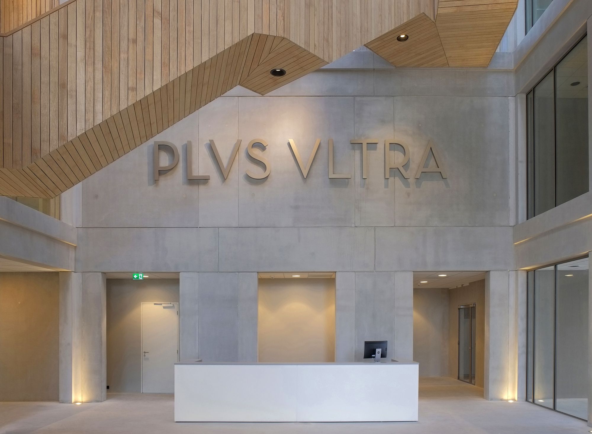
PLVS VLTRA
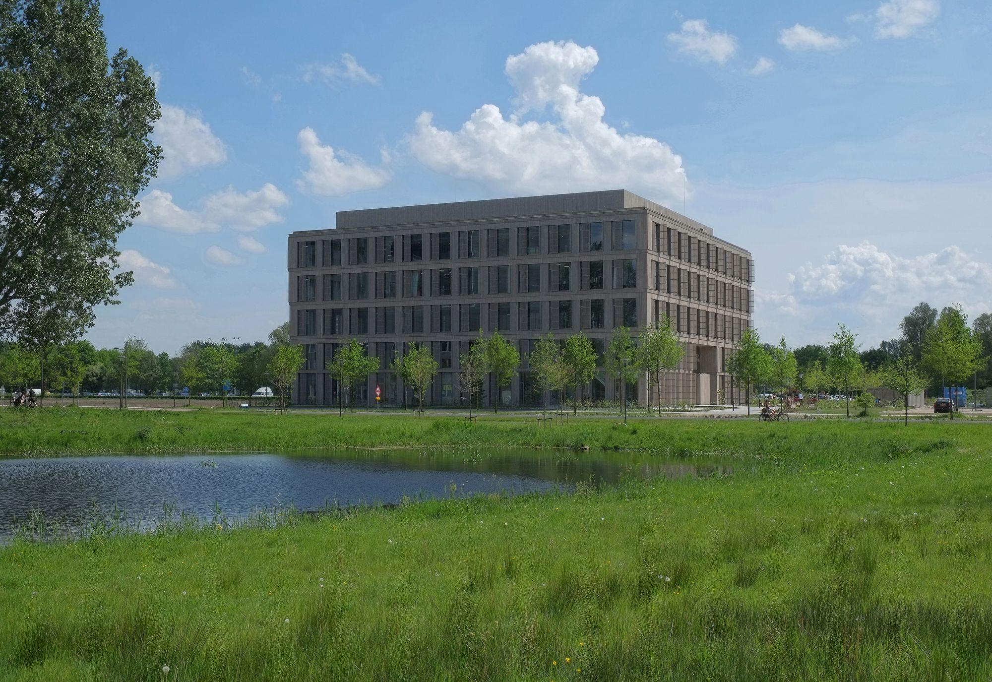
The design for the new incubator and multi-tenant building on the university campus in Wageningen, start-ups and knowledge-intensive technological businesses in the agro and food sectors will have a place for research and open innovation.
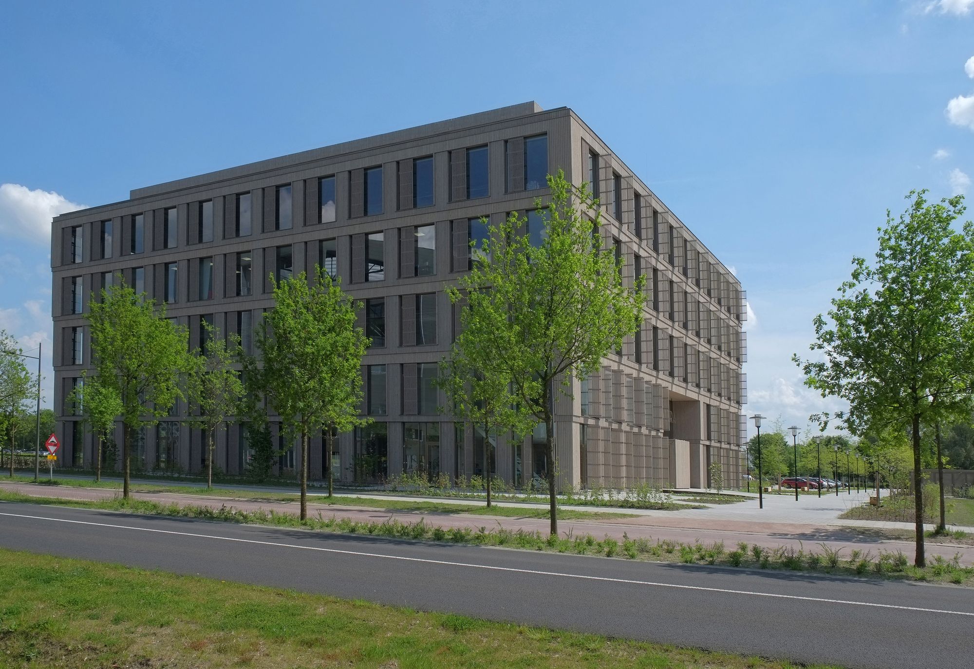
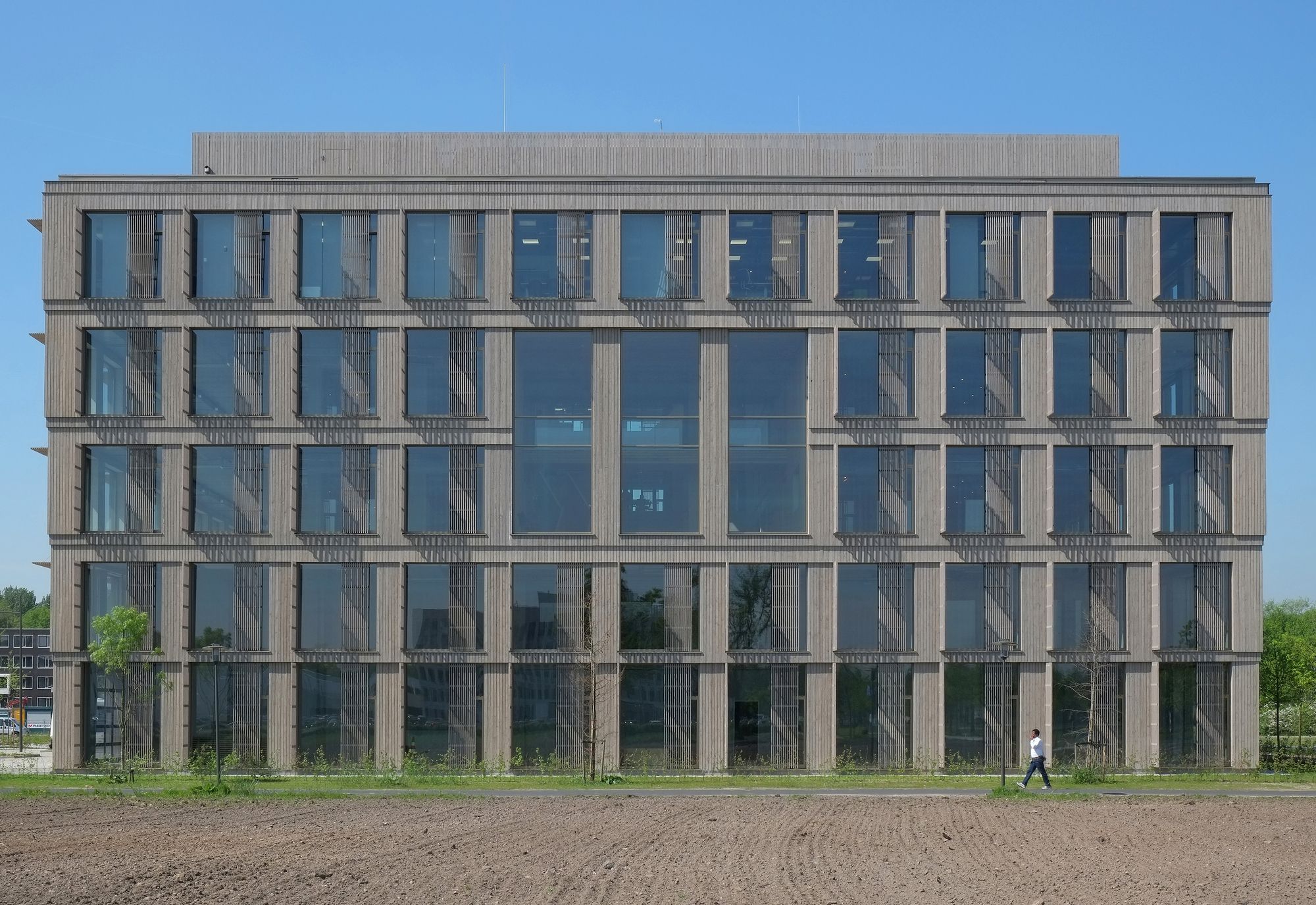
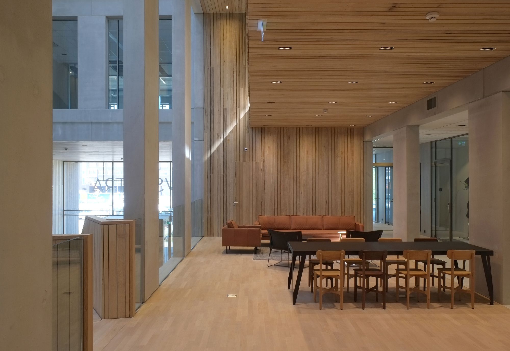
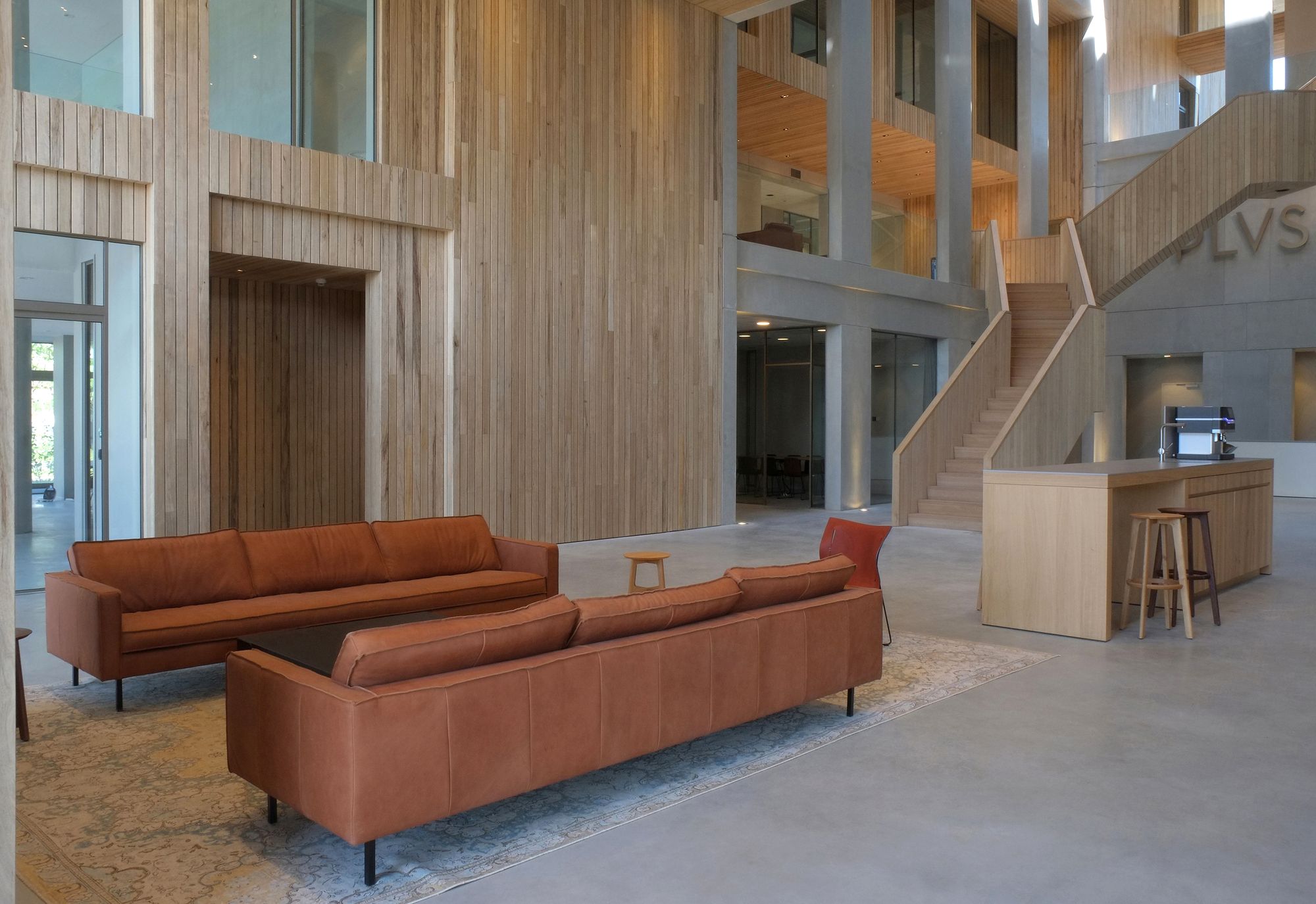
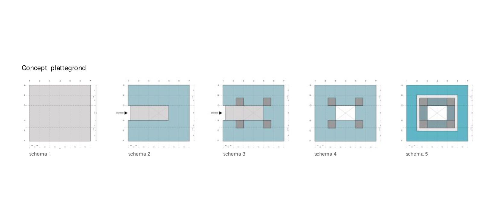
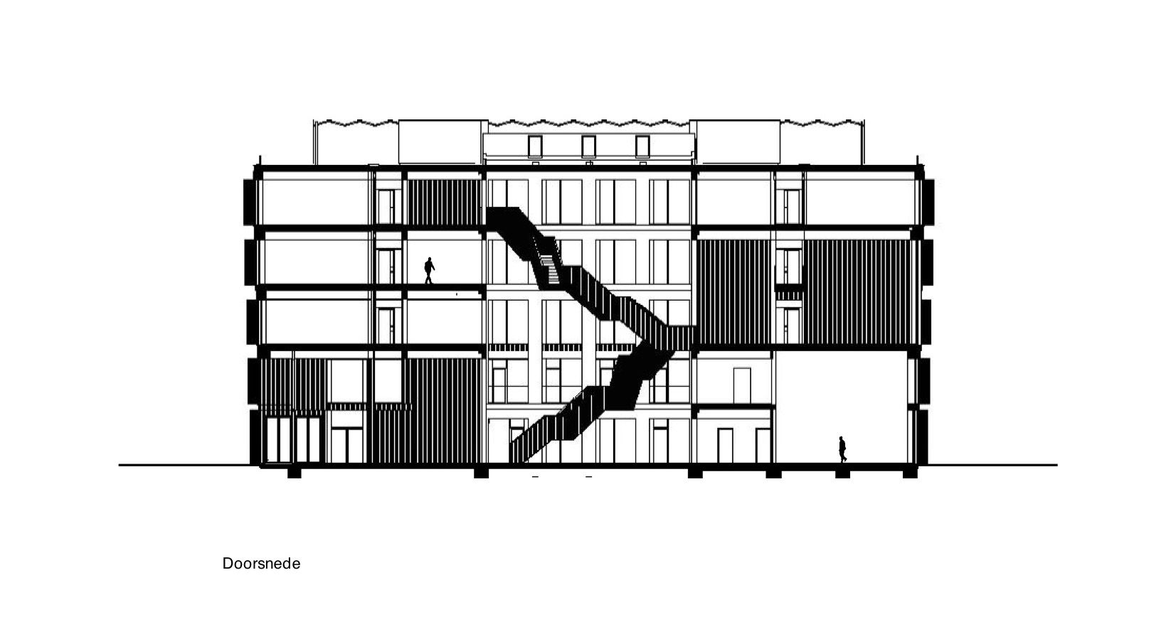
Kadans Biofacilities develops Plus Ultra in cooperation with Wageningen University & Research Centre on the southern end of the university campus. The building offers more than 7,000 m2 of floor space for offices, laboratories, (partly)) multipurpose techno halls and various spaces for encounters and informal contacts. The design of Wiegerinck architectuur stedenbouw (Wiegerinck architecture and urban planning) aims at synergy, encounters, cooperation and innovation through a maximally sustainable and robust design that aspires a Bream Excellent certificate. The design of Plus Ultra is as compact and transparent as possible with a virtually square floor plan with 5 floors. The bottom two floors offer space to a varied range of functions: entrance, reception, catering facilities, high “techno halls/labs” and office space. The top three floors are the laboratory/office layers.
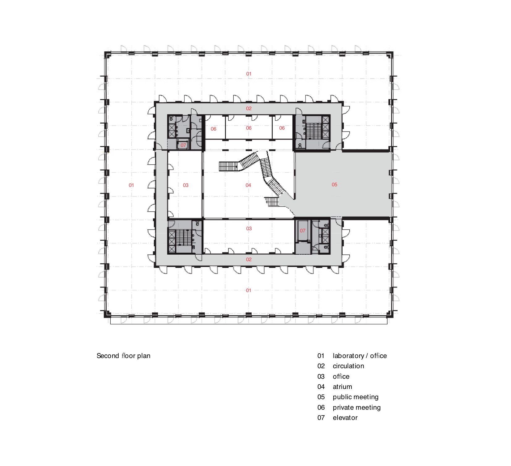
 The floor plans have been realized around a central atrium; on the lab/office levels, the floors between the exterior and interior facades of the atrium have been divided into three “rings”. The outer ring (on the facades) constitutes a flexible-use zone that is equipped for use both as laboratory and office space. The central ring is the circulation area that gives access to the interior and exterior rings. Office, meeting or encounter spaces on the atrium facade open up on the inner ring.
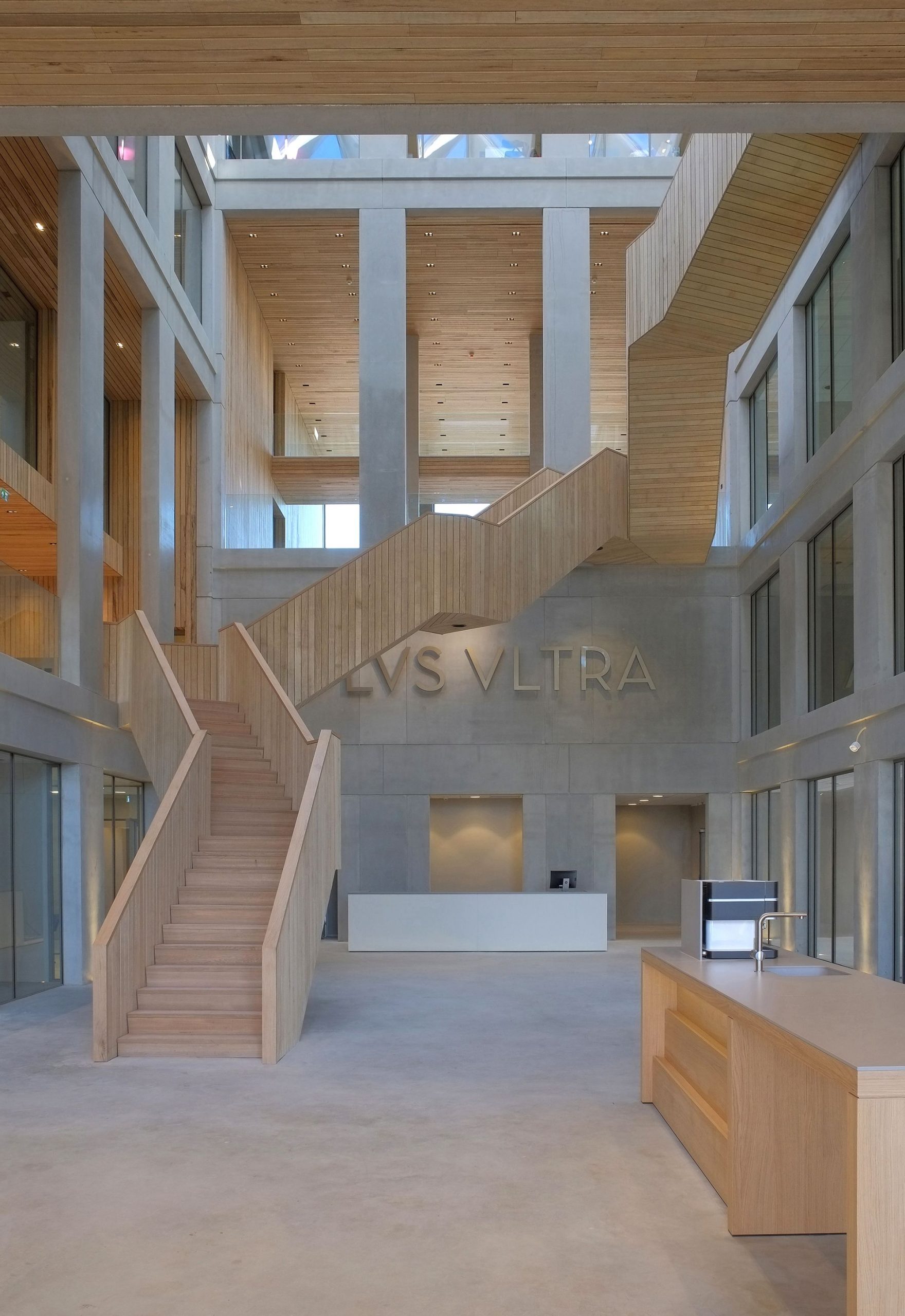
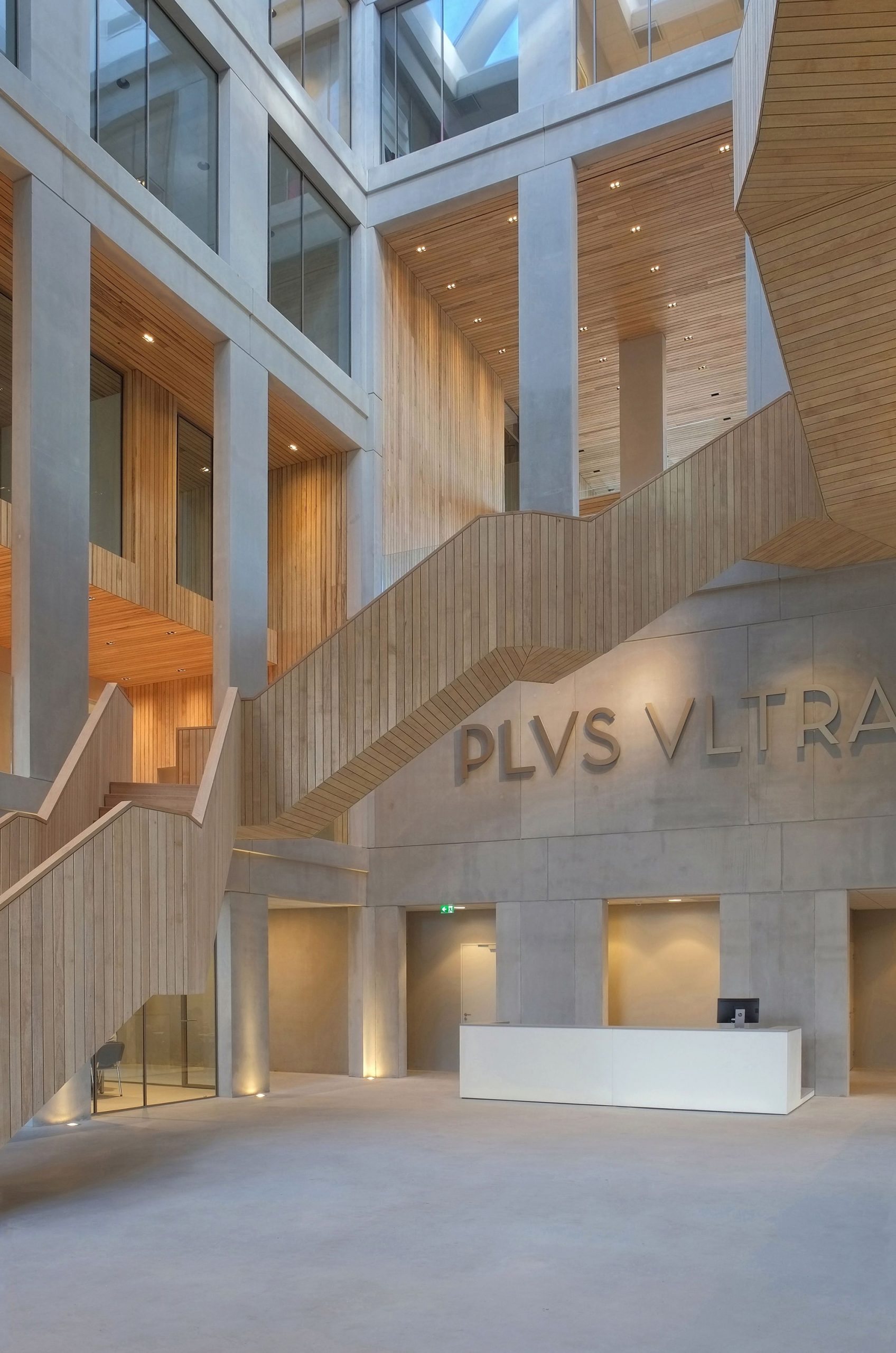
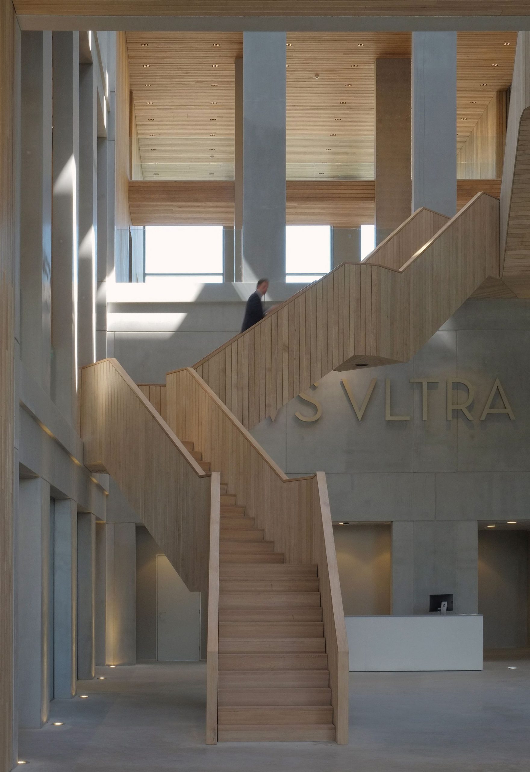
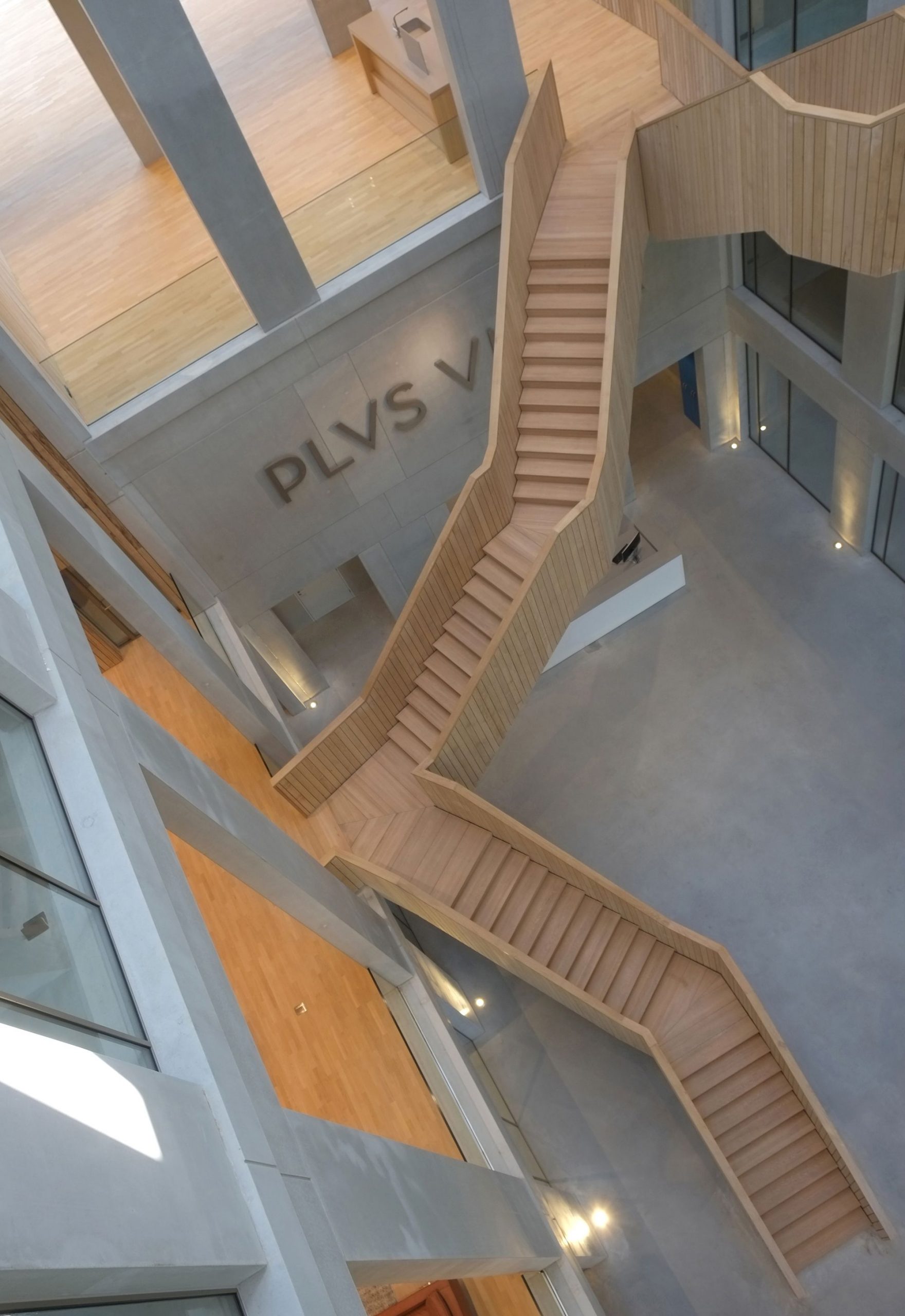
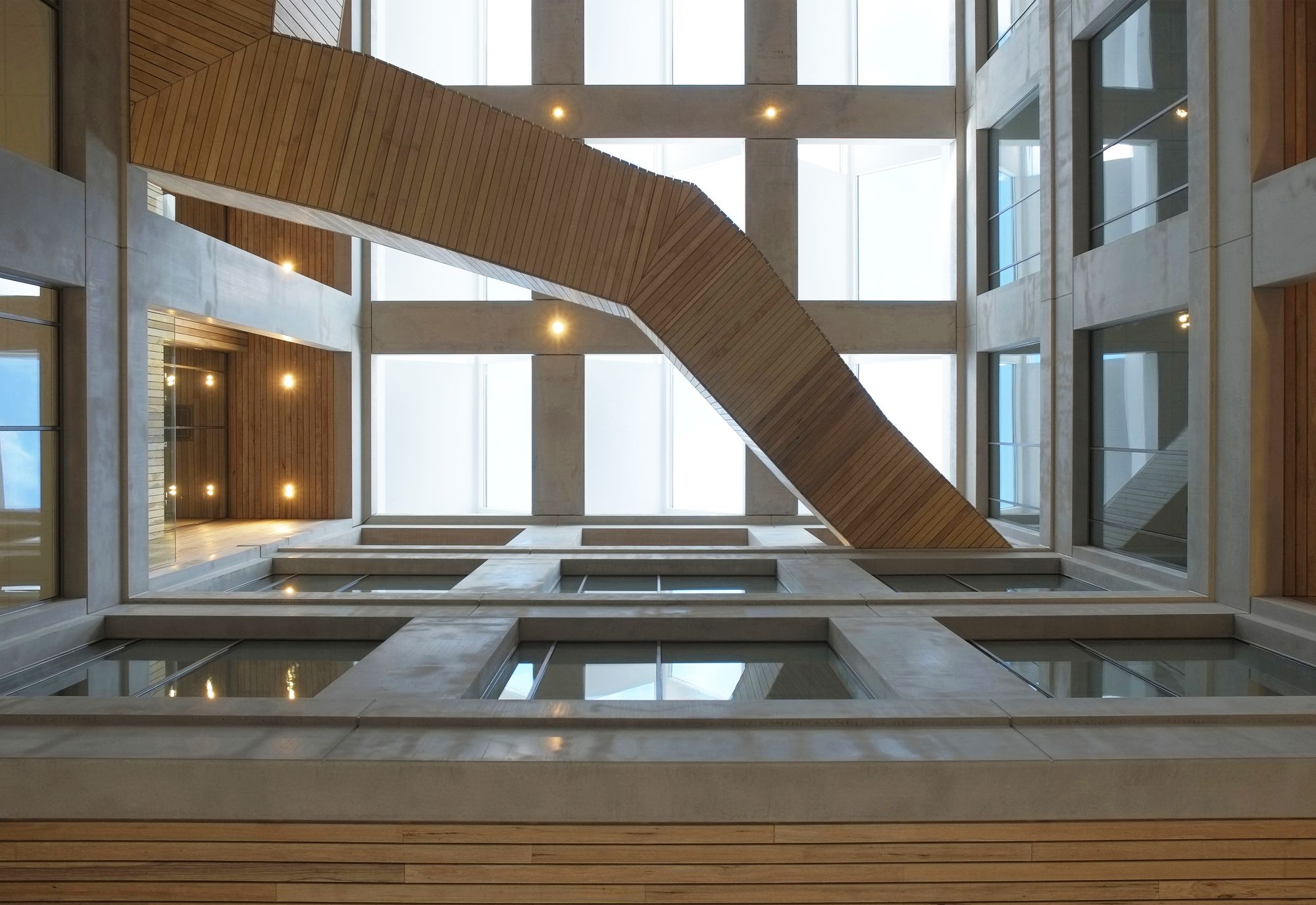
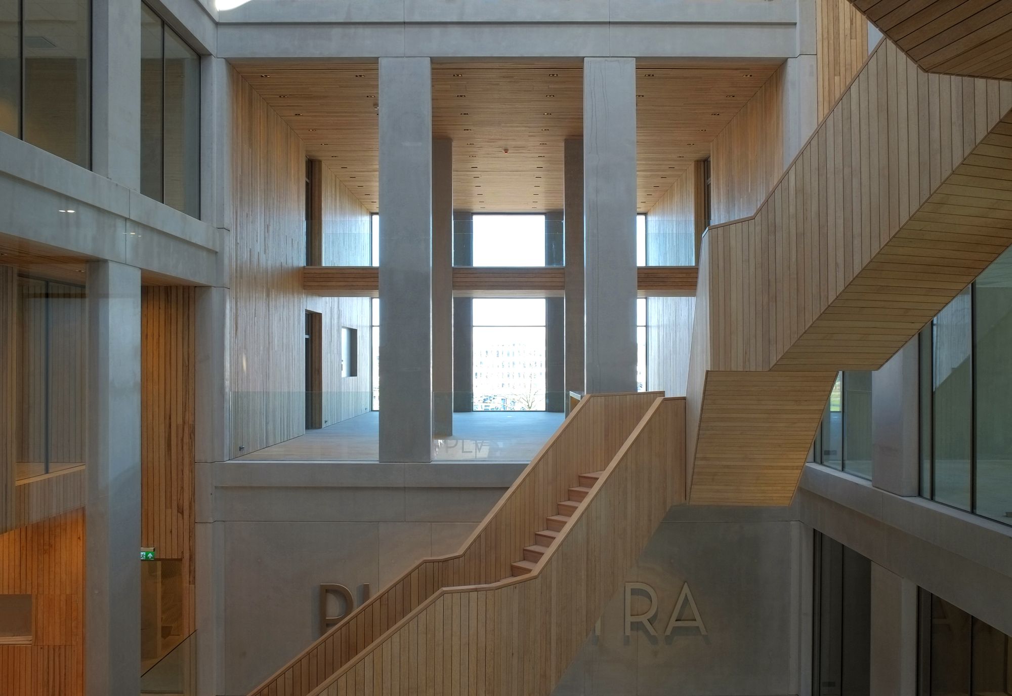
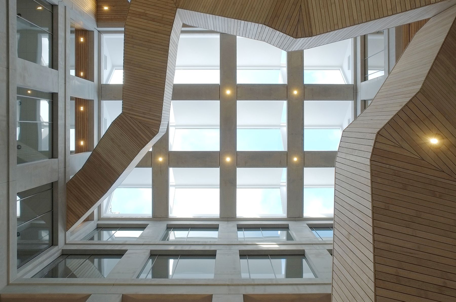
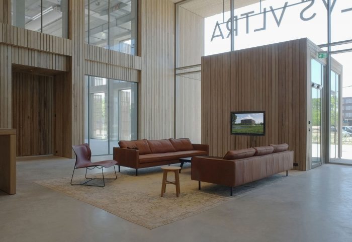
 In the atrium, an elegant wooden staircase spirals upwards from ground level to the atrium facade. On each floor, the stairs lead to a double-height meeting space finished in wood with an open connection to the central atrium. Faced from the atrium, the stairs, and the high meeting spaces spiral up into space. Plus Ultra.
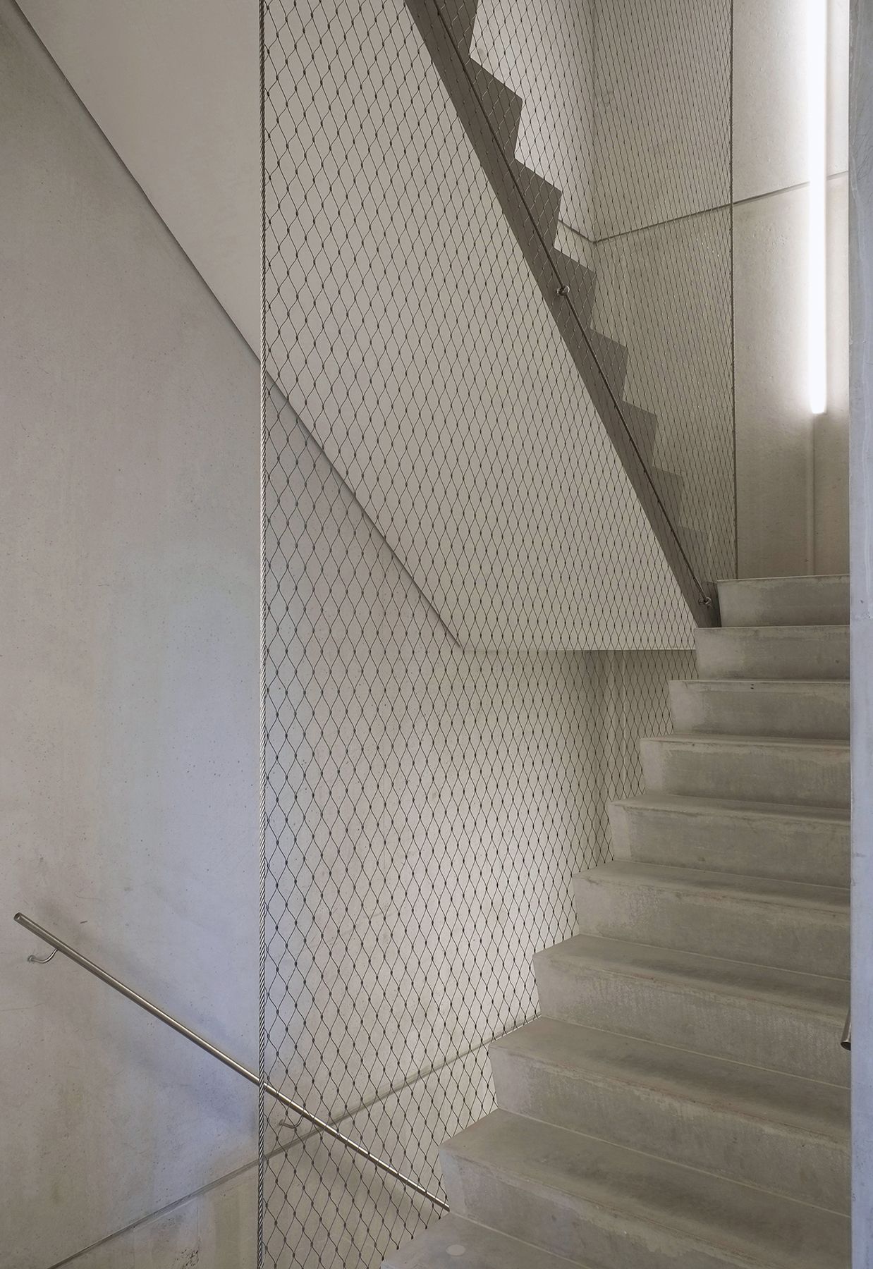
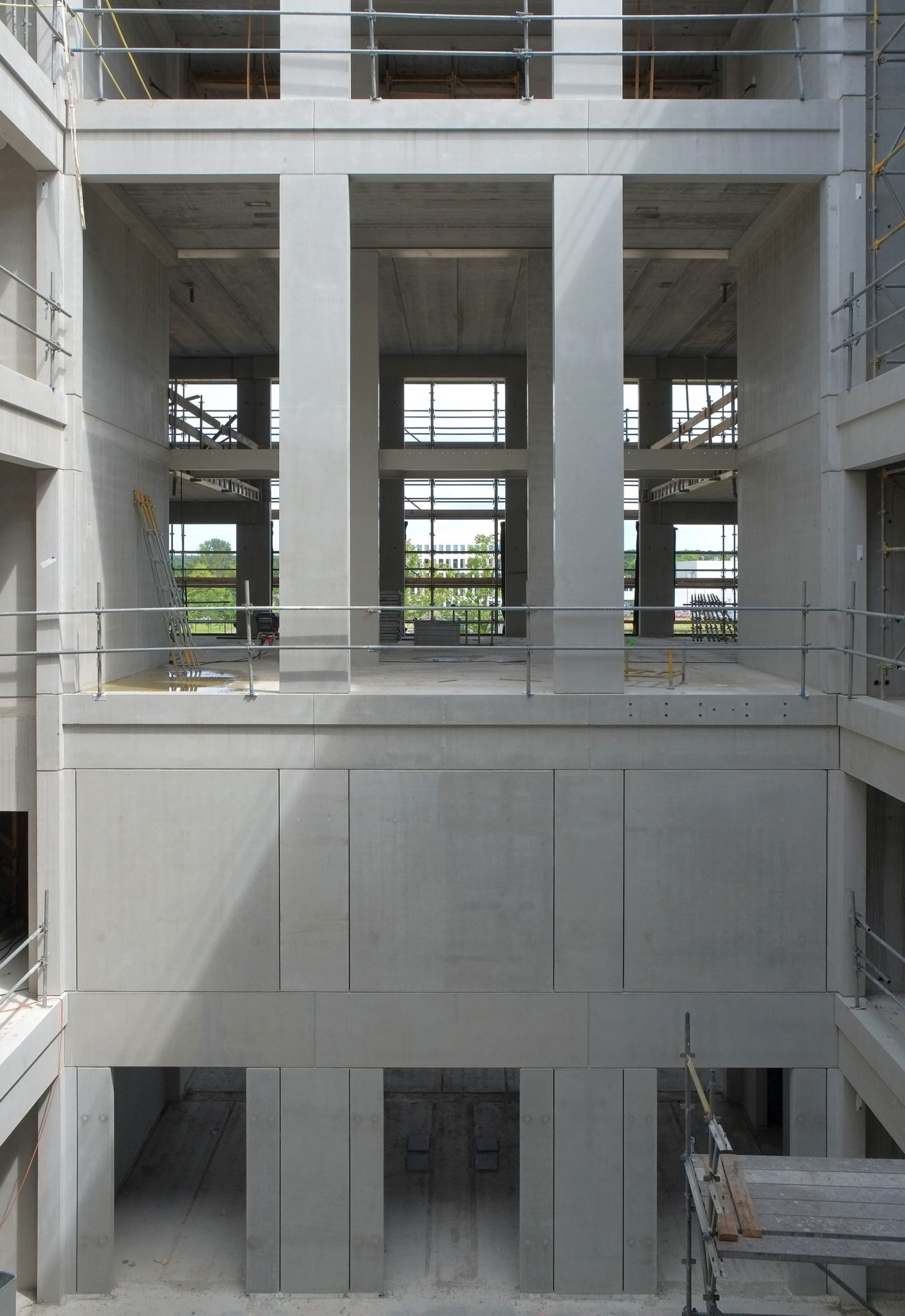
Four building cores have been incorporated at the corners of the interior ring. All “fixed” facilities (vents, ducts, toilets, elevators and technical features) are housed in the building cores so that all other available space is open and suited for a wide range of layout options. The cores also ensure the constructional stability of the building. The use of material is quite discreet. The entire construction consists of concrete, wood, glass and metal. Where possible, the structure is the actual finishing. Only the central stairs and the double-height meeting spaces have wood slats cladding. The wood offers warmth and color to counterbalance the concrete; it creates pleasant acoustics in the meeting areas and the atrium and offers the option to place installations behind the panels.
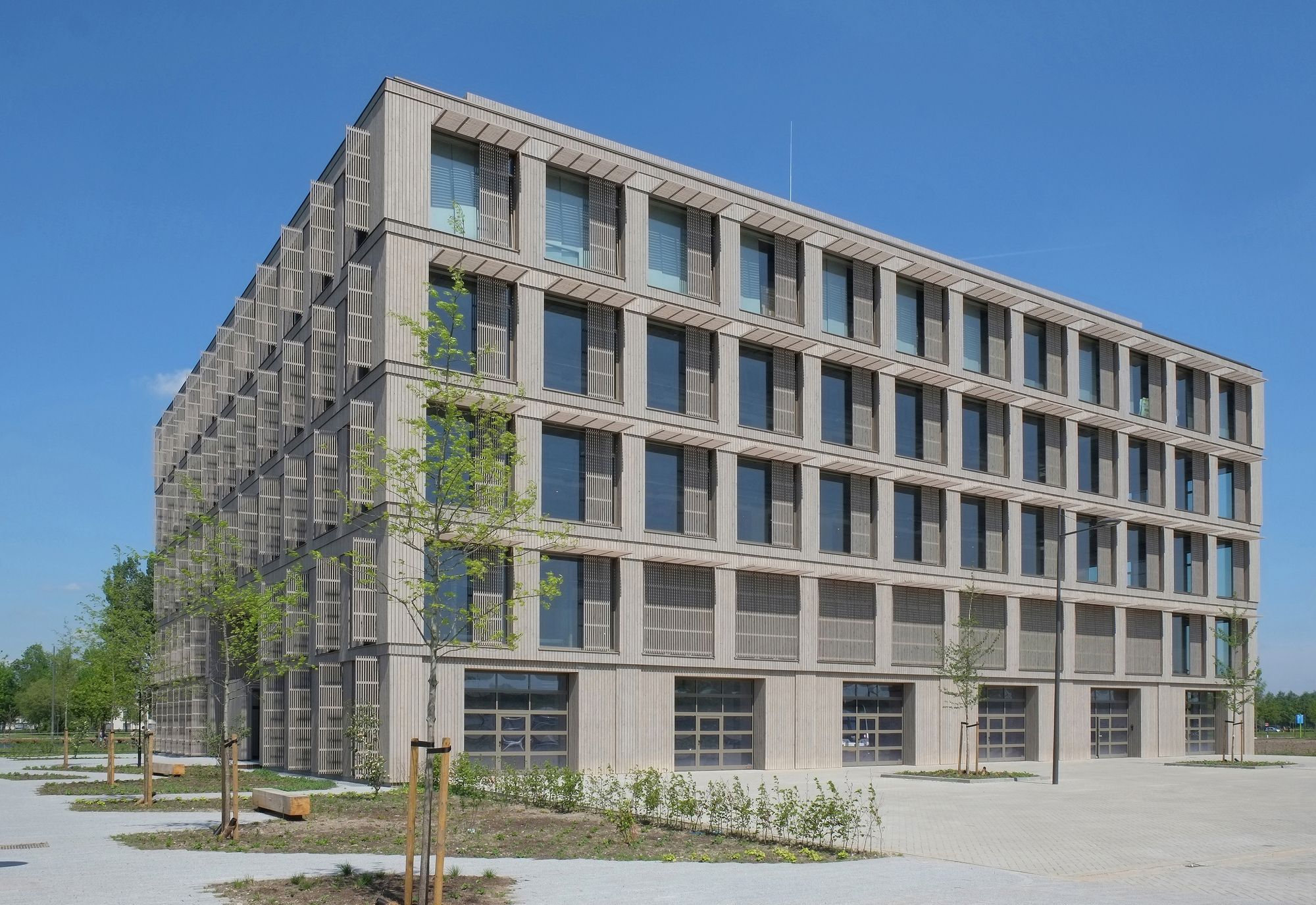
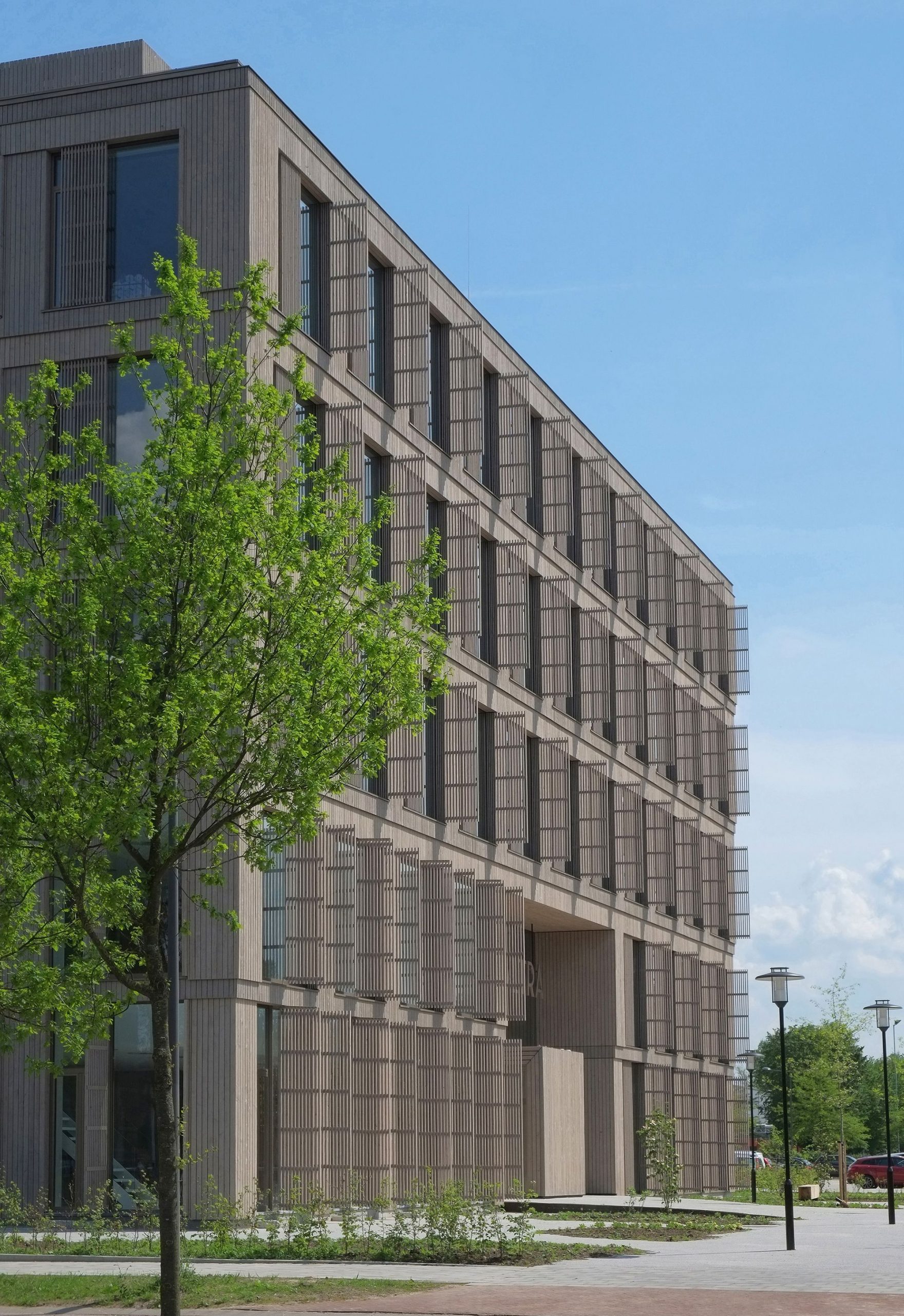
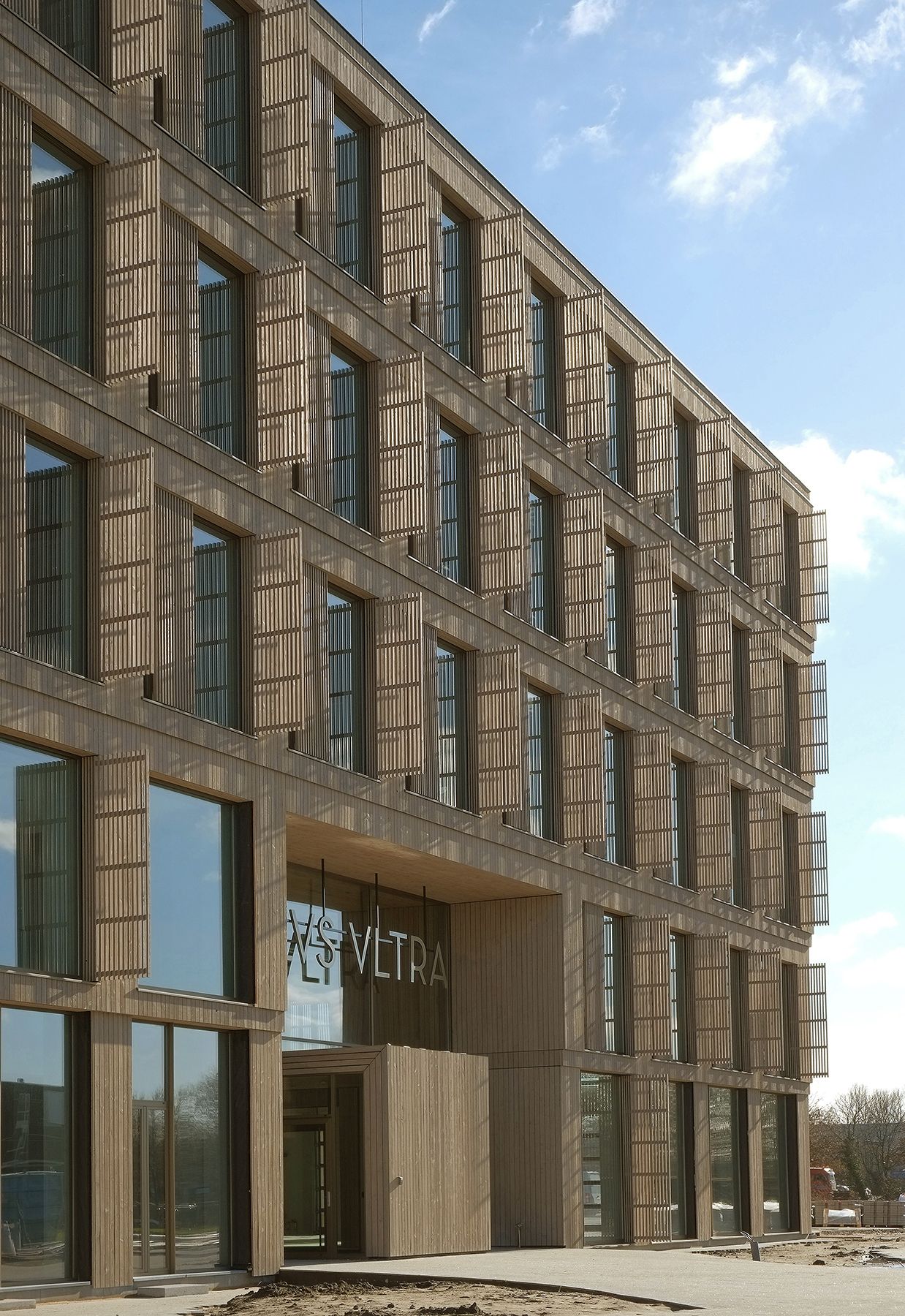
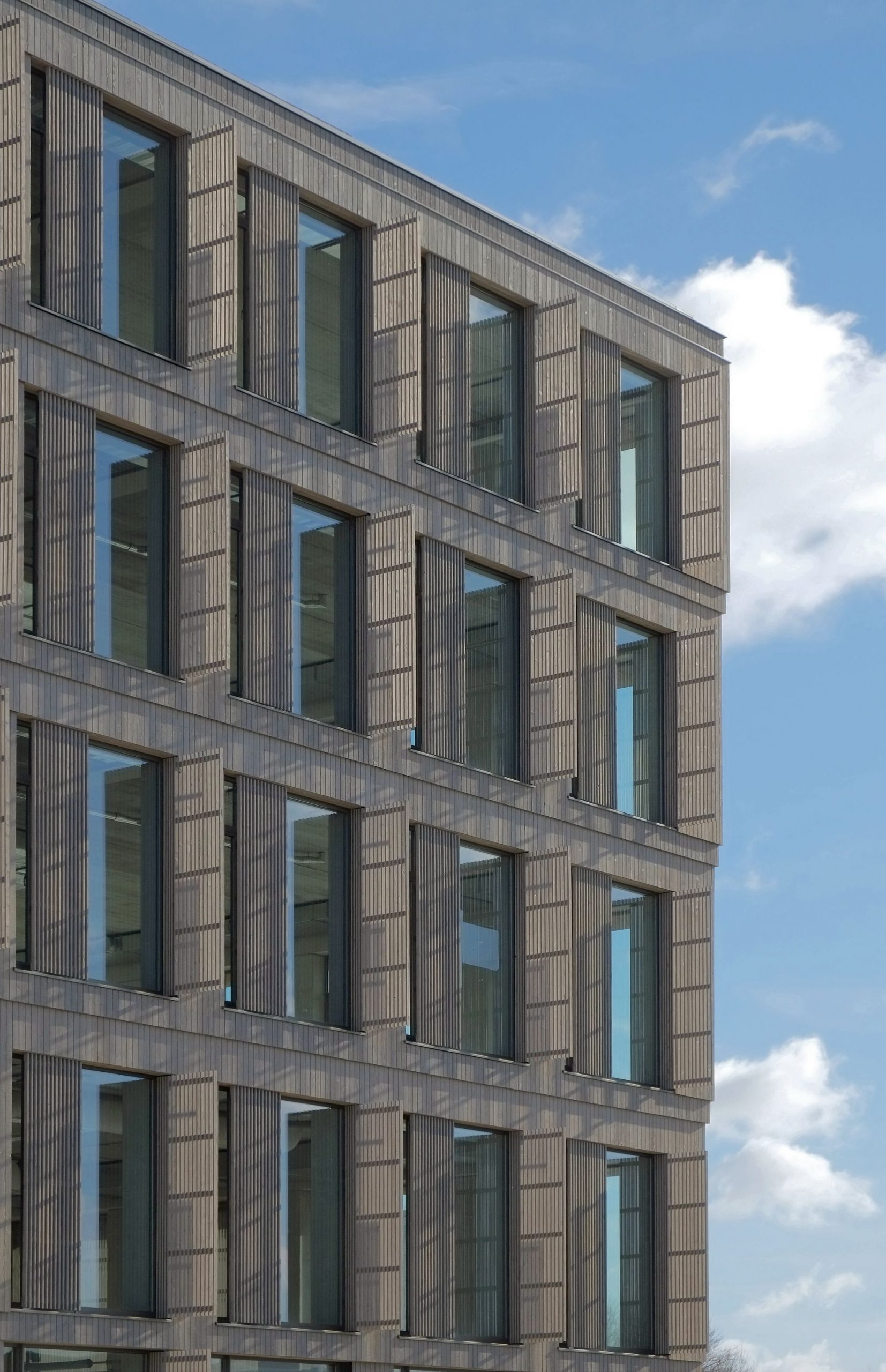
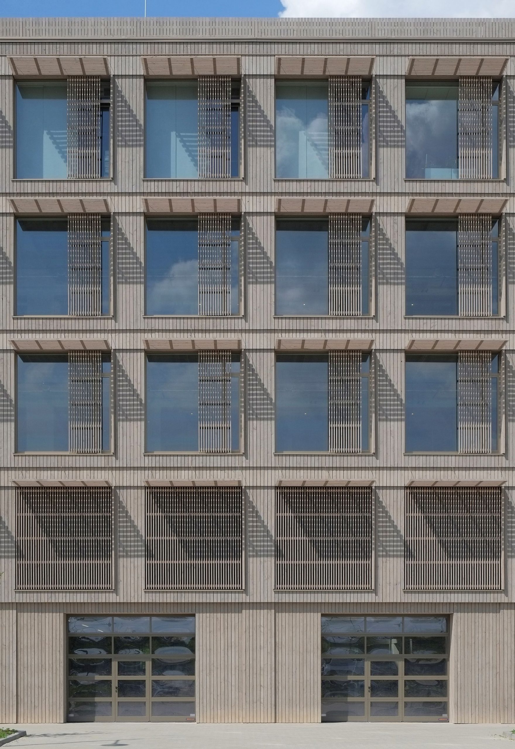
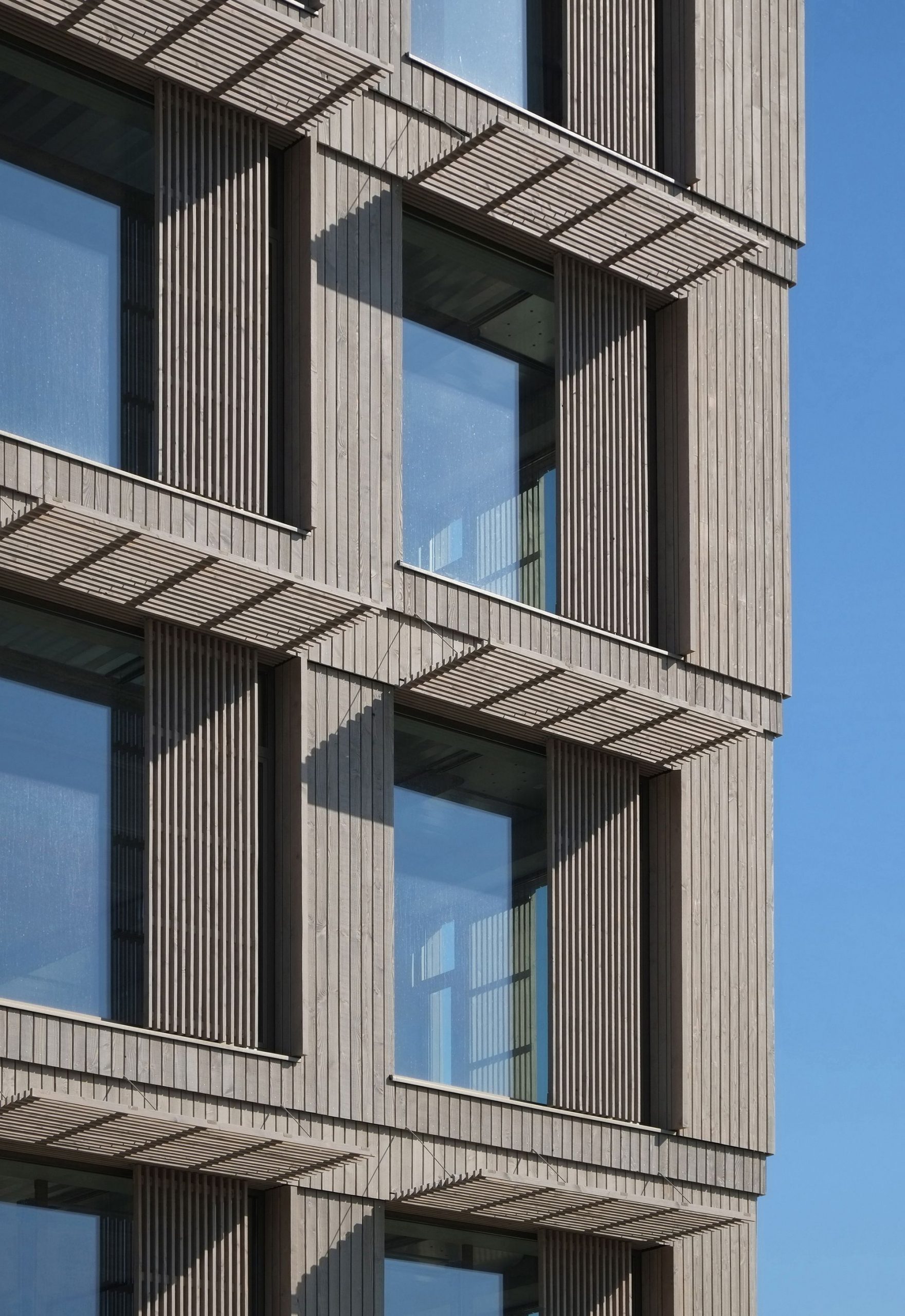
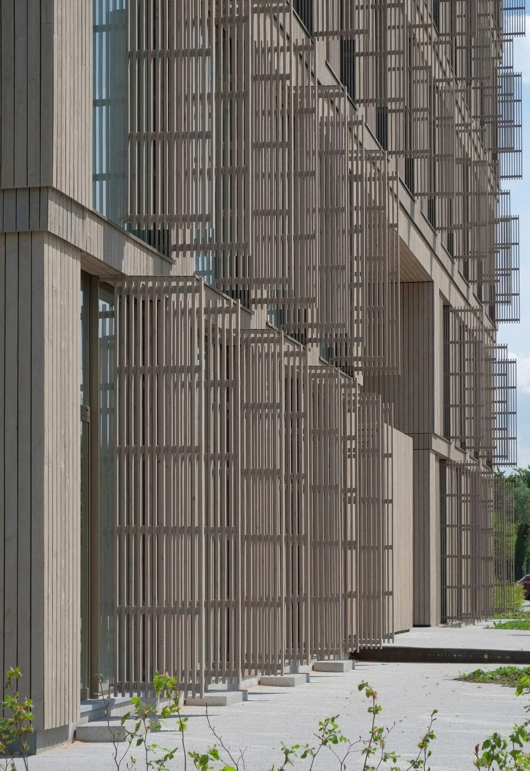
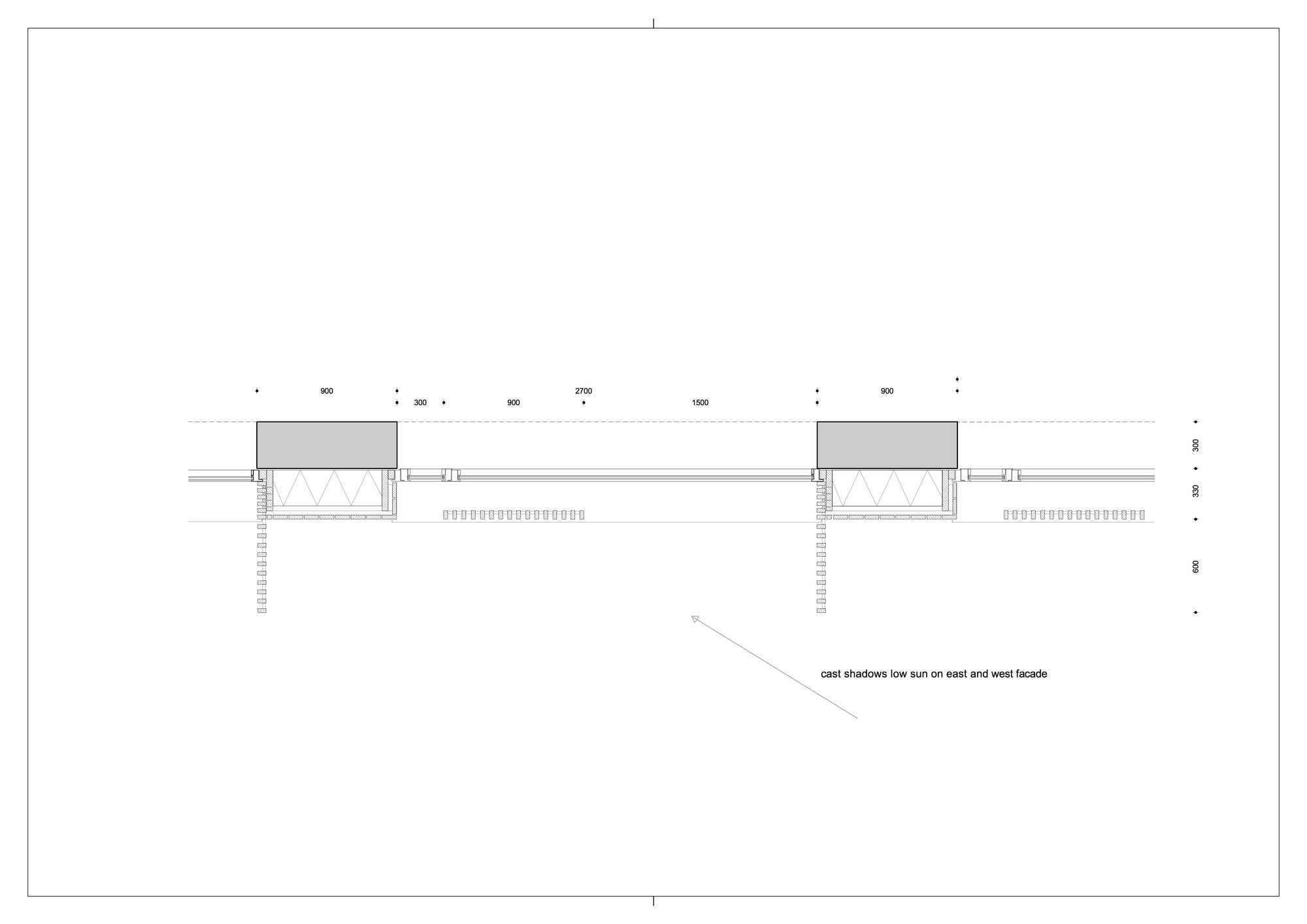
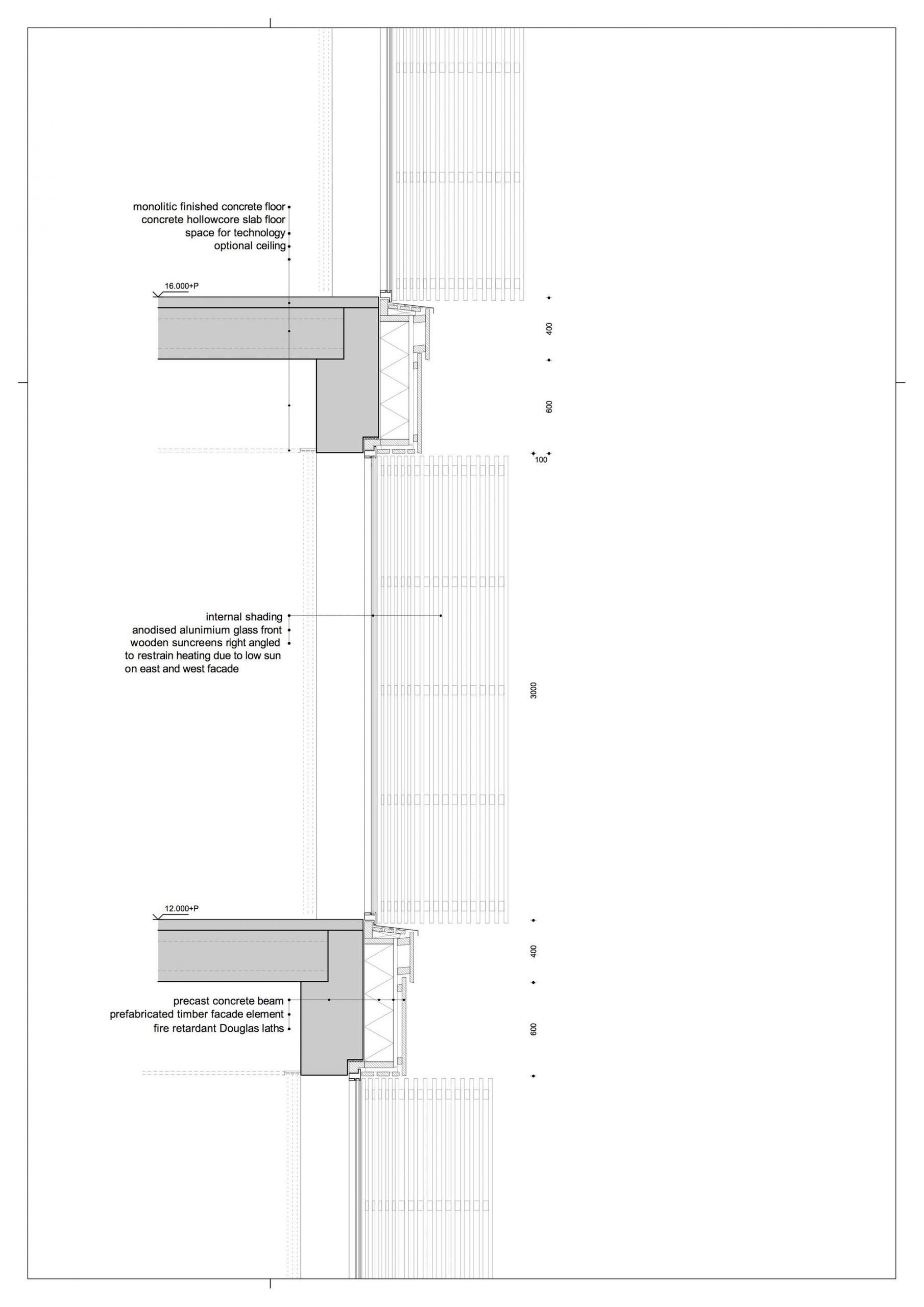
The design is based on a crystal clear methodology. The floor plans have consistently been realized with a modular width of 3,6 meters. This measure is always divided in piers of 0,9 meters with openings of 2,7 meter wide in between. Vertically, the building consists of floors with a height of 4 meters. This measure is subdivided into floors of 40 cm thick with 60 cm space for technical facilities and 3 meters of free height. This harmonic dimensioning methodology stands out in all interior and exteriors facades and has been turned into a defining feature through facade jumps of 5 cm deep to create shadow lines and to ensure proper drainage from the wood elements. The facades are realized in treated wood and anodized frames. Elegant wood slat screens limit the access of direct sunlight into the building, naturally reducing the cooling load. The screens that run parallel to the glass, also function as visual filters between (the laboratory set-ups) in and outside the building. The east and west facades are fitted with wood screens perpendicular to the windows. These limit heating up by low sun angles in the morning and evening. The screens on the south facade have been designed as canopies to offer protection from the midday sun for the same purpose. The north facade has been realized more level because of the absence of solar load.
The facade wood is finished in two wood tones with a subtle difference to emphasize the horizontality of the facade and to make it more dominant than the vertical elements – fitting in with the campus image quality plan. The vertical methodology of floors, technical zones, and free space is also reflected in the facades in facade jumps of 5 cm. As a result, the building expands 10 cm on each layer with a vertical widening of the structure. This way, the building – both in outer appearance and through the integrated atrium – refers to its name “Plus Ultra” as well as to the innovation that it will facilitate.
 Project Info
Architects : Wiegerinck
Location : Wageningen, Netherlands
Year : 2016
Type : Office Buildings
Photographs : Kim Zwarts
