Eight Tenths Garden
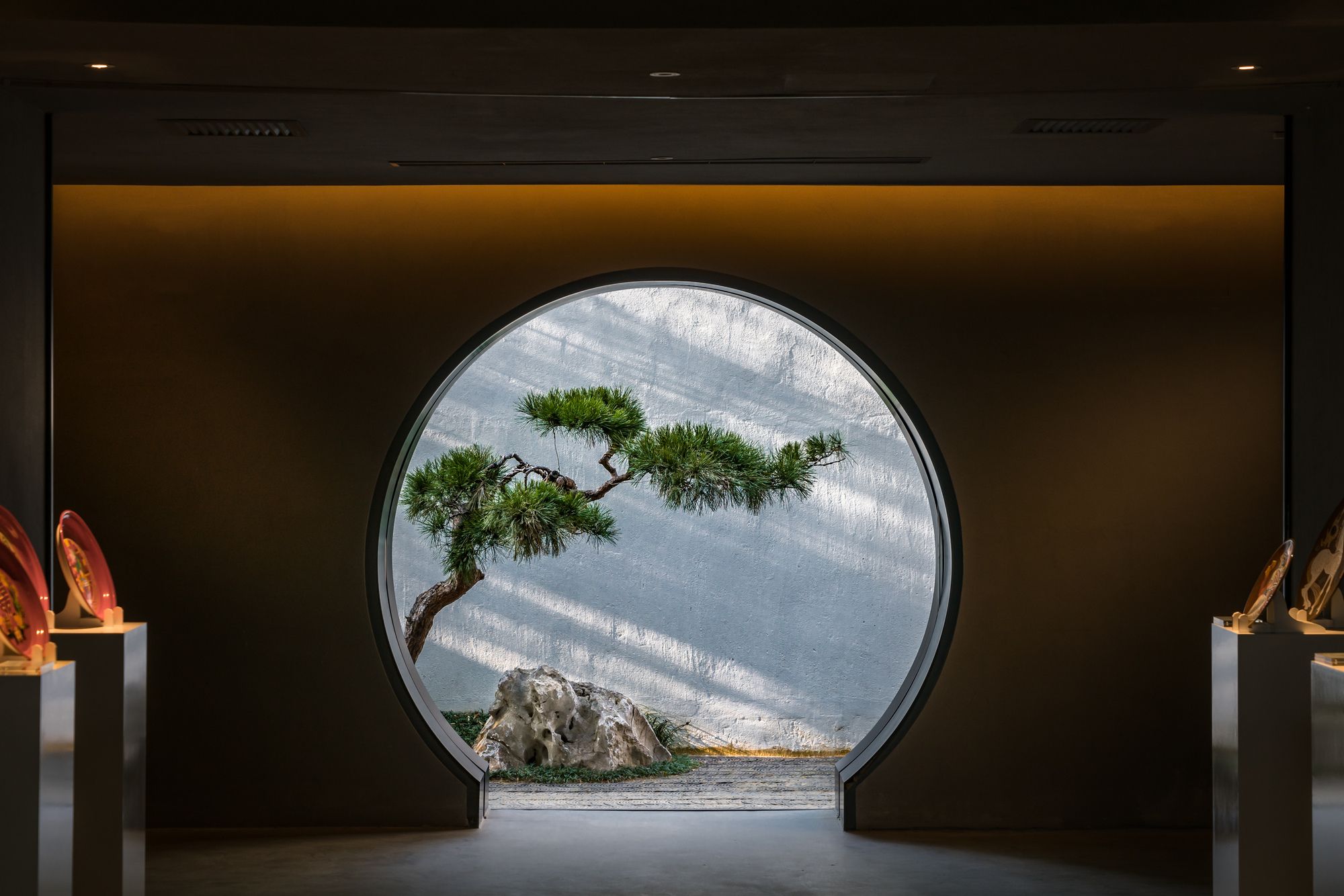
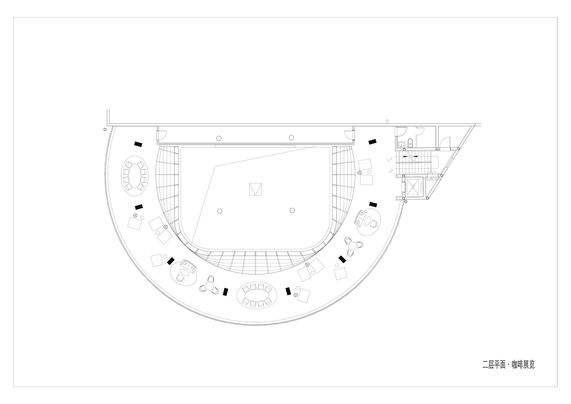
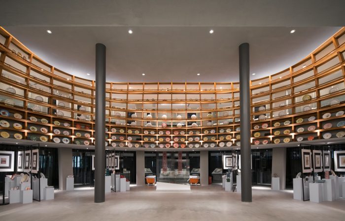
Eight tenths Garden is an art museum dedicated to arts and crafts, which can also be used as a venue for the conference in the idle hours. It has a coffee shop, a library, offices, bed, and breakfasts, as well as a restaurant, study rooms and chess rooms. It is a micro-cultural complex in all.
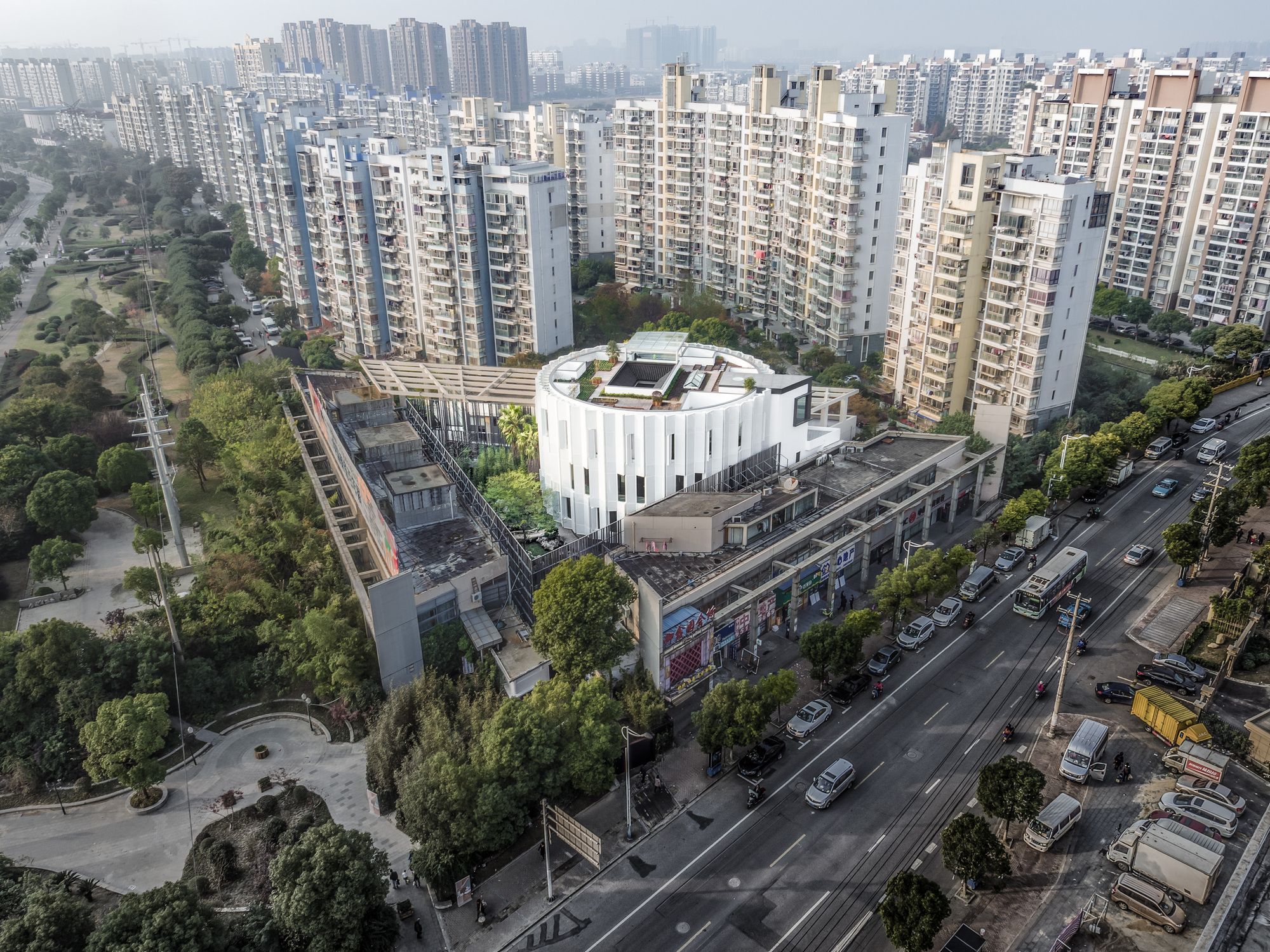
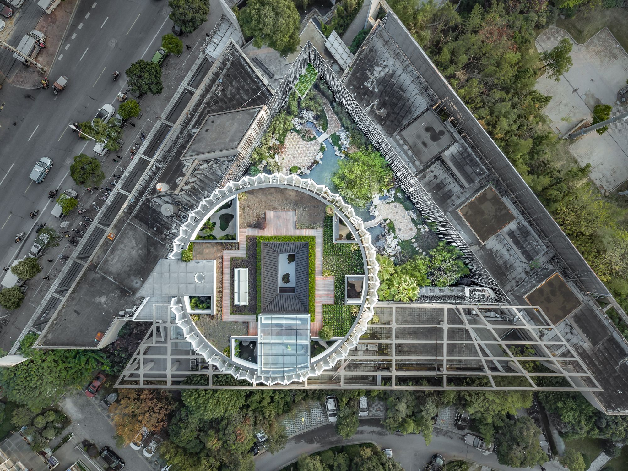
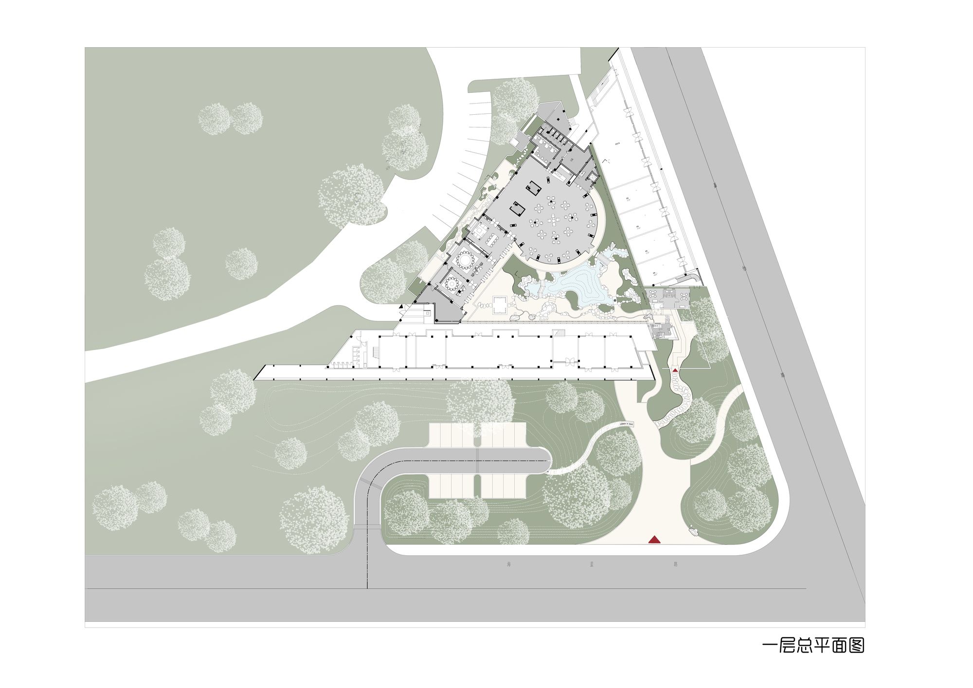
Eight tenths garden was originally a sales center. The sales center was one of the two-story buildings on the street’s triangular corner, with a four-story circular hall embedded on the top of it. The entrance is located on the garth of the triangle. The other two sides of the building were the neighborhood committee and shops along the street.
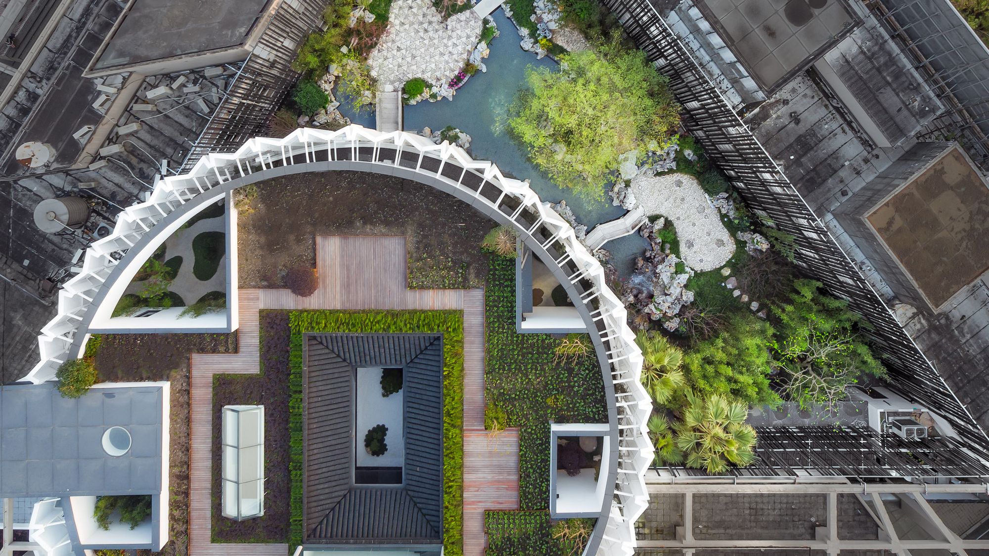
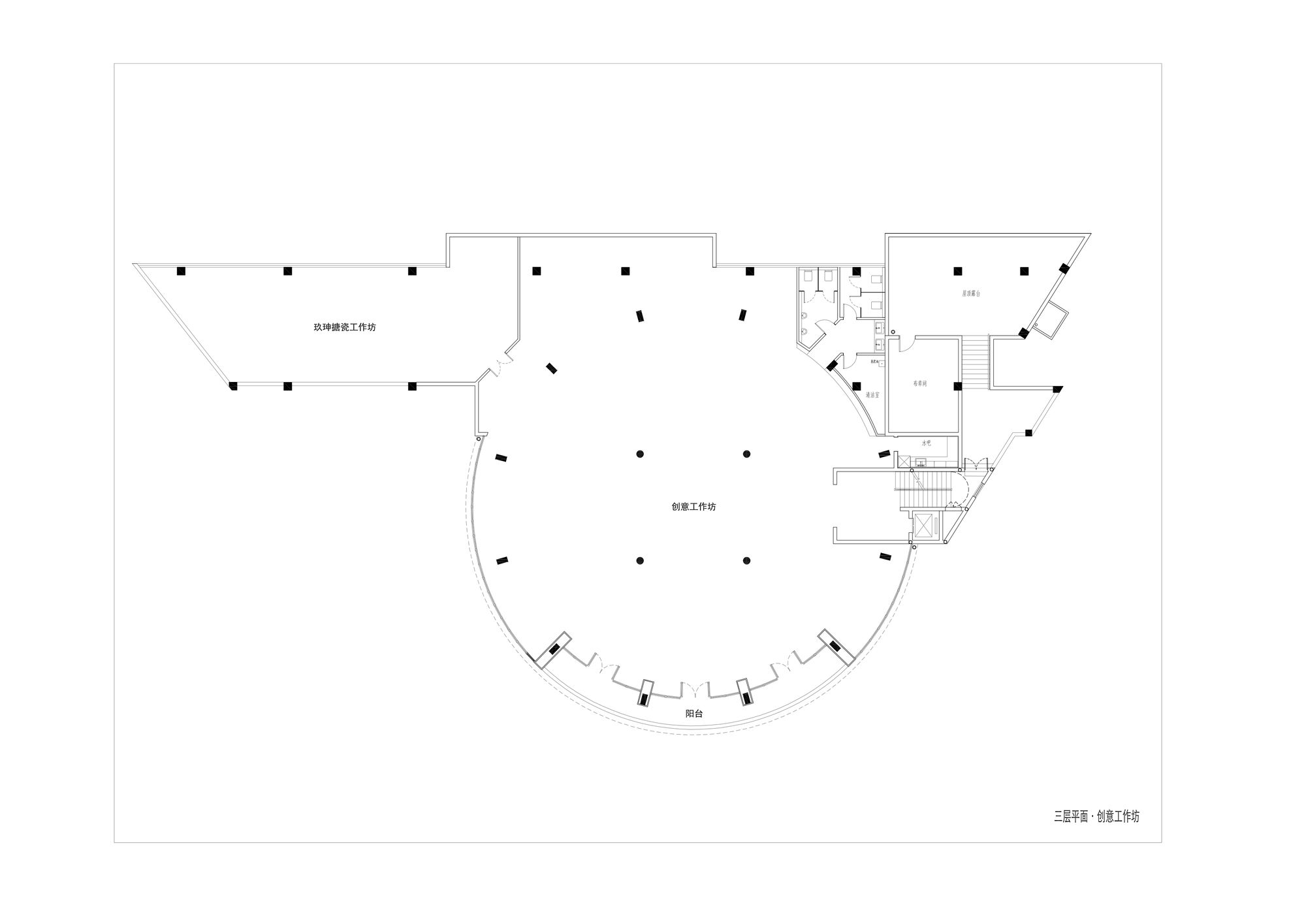
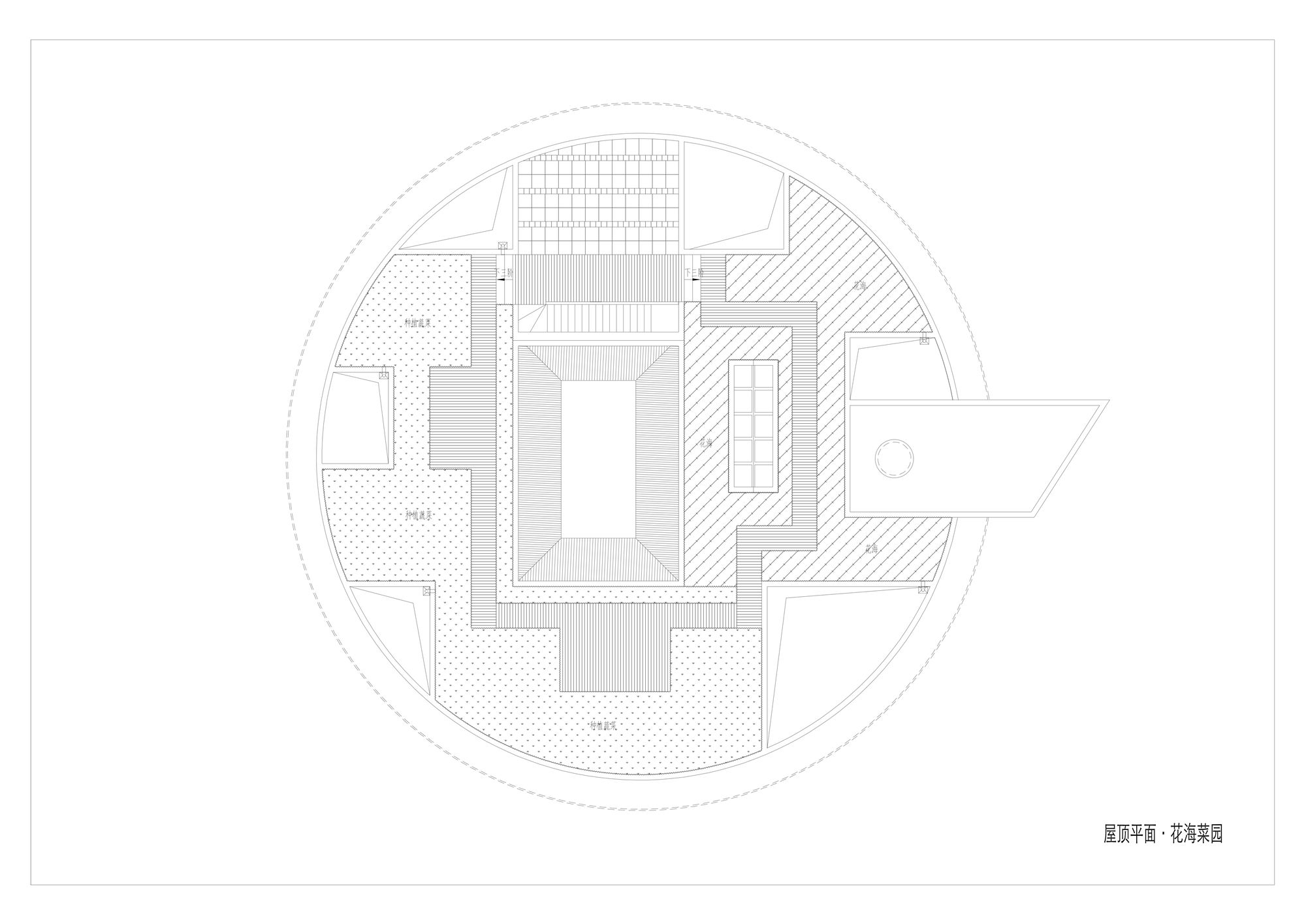
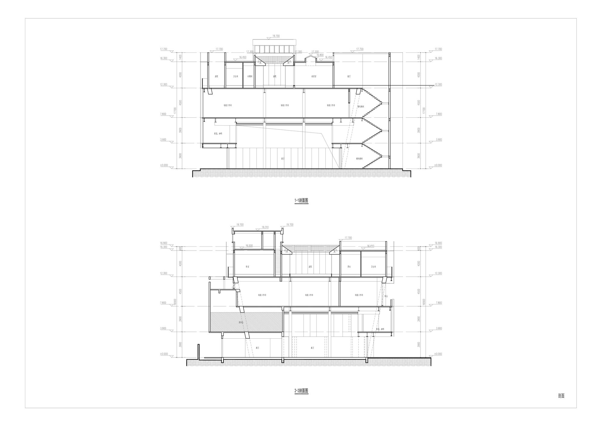
We hope the building could reveal the spirit of Shanghai. The spirit of Shanghai is life-based, which is a richness not only pleasant but also restrained. Thus, the space of this 2000 square meters’ building should be abundant in variation but also has a connection with each other. We do not want the obsessive minimalism, nor do we want an exaggerated scene which lacks connections. We used antithesis to unfold the space. The garden in the outside represents complexity, inside building, on the other hand, shows simplicity. But these simplicities are somewhat different. The art museum should be contracted and powerful, but the study room and the restaurant next to it should be warm and soft. The joint offices on the third floor would be close to rough, and the bed and breakfast on the fourth floor go back to a restraint of elegance. People could easily read a spirituality from it. On the top of the roof, we pay tribute to the ancient literati garden by placing a vegetation garden.
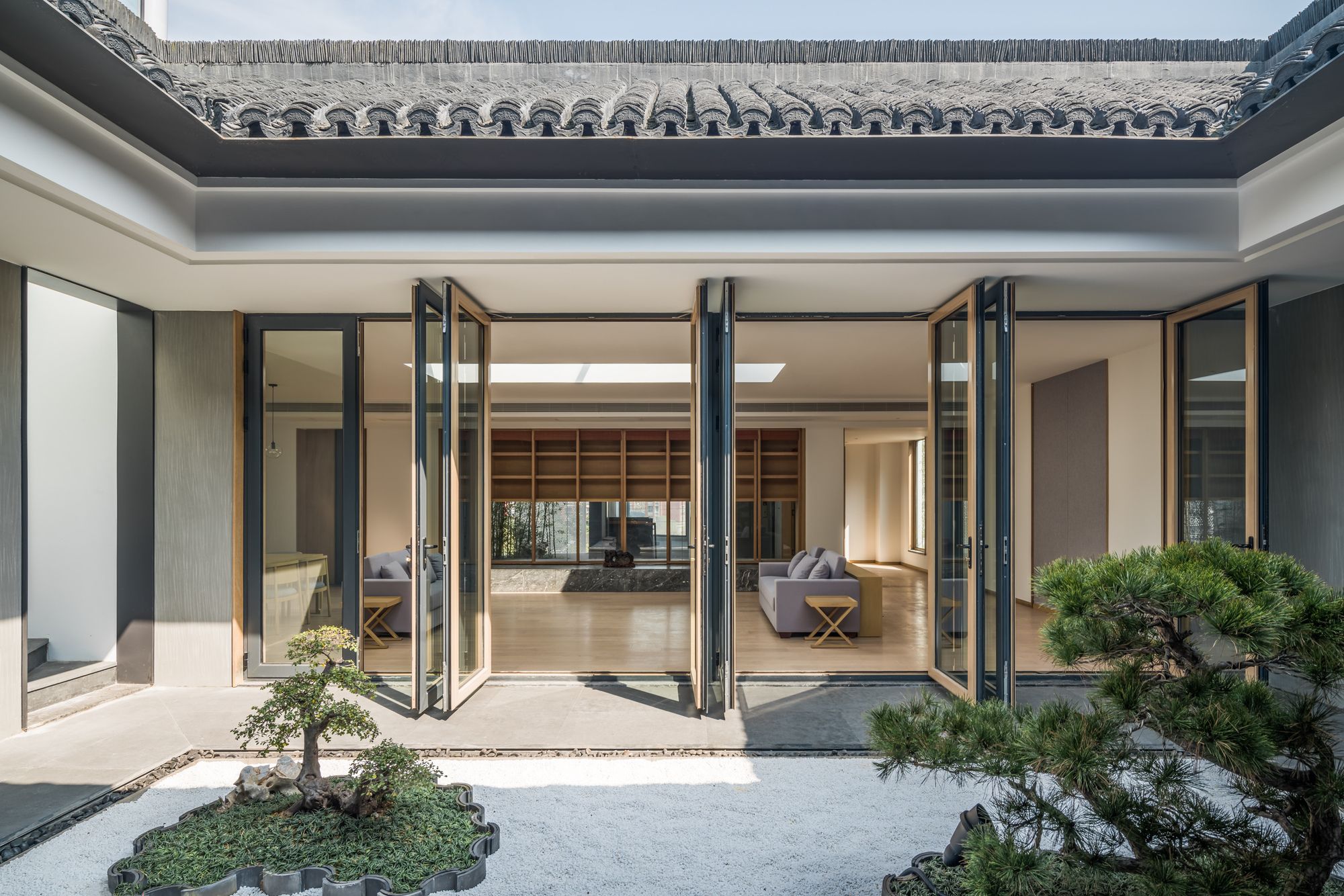
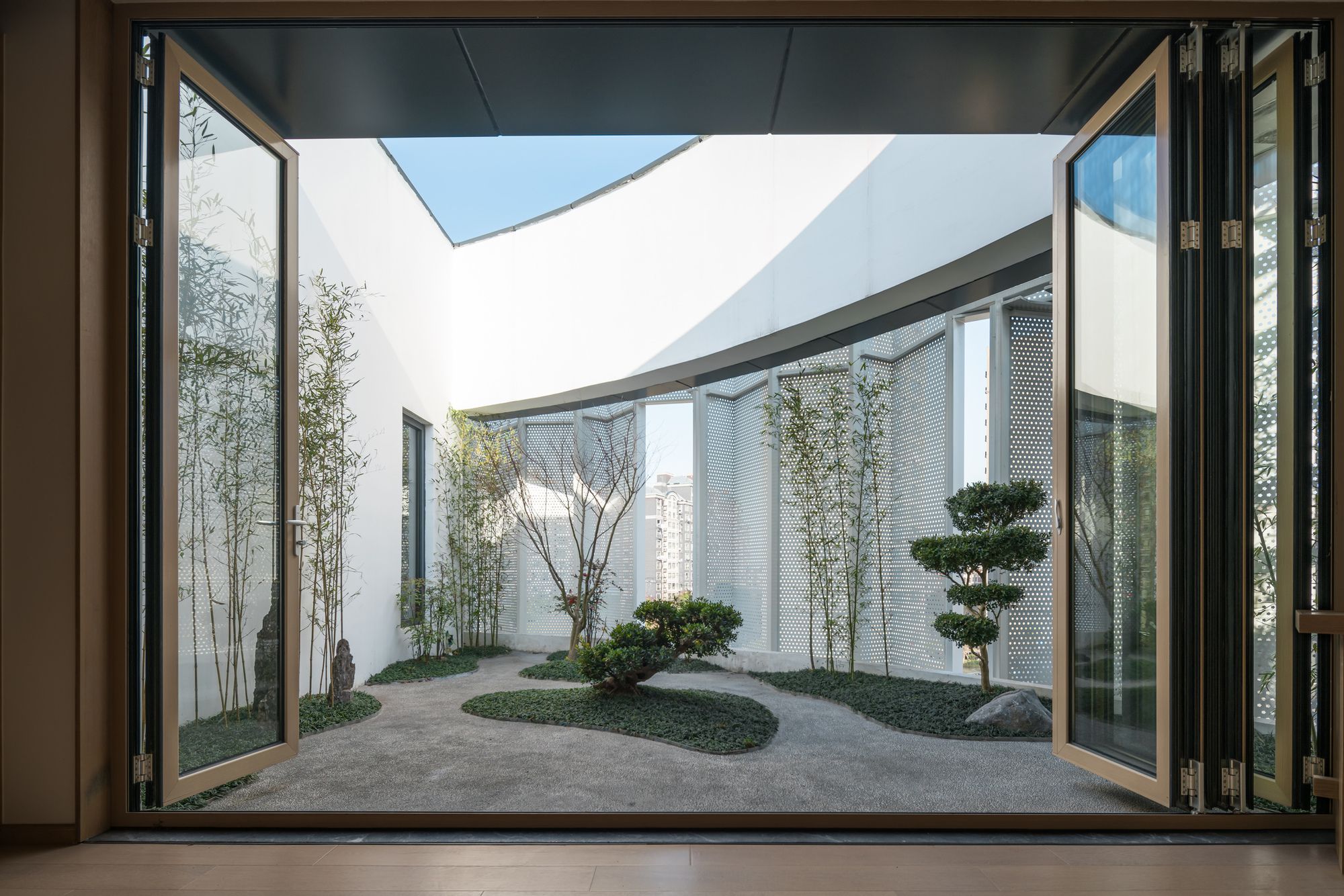
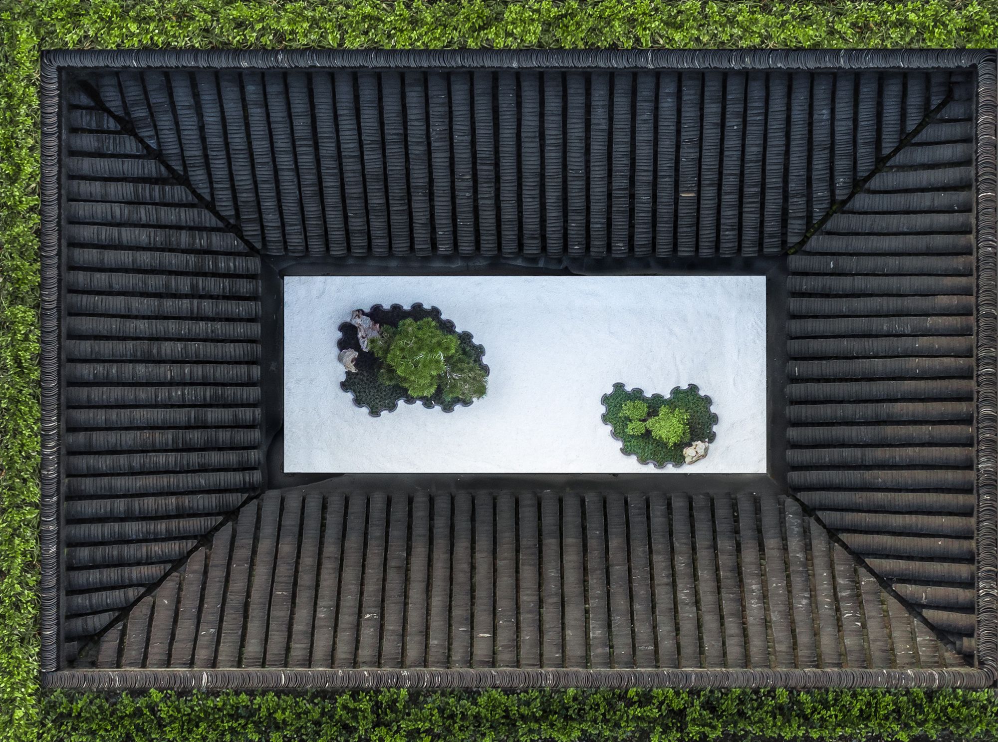
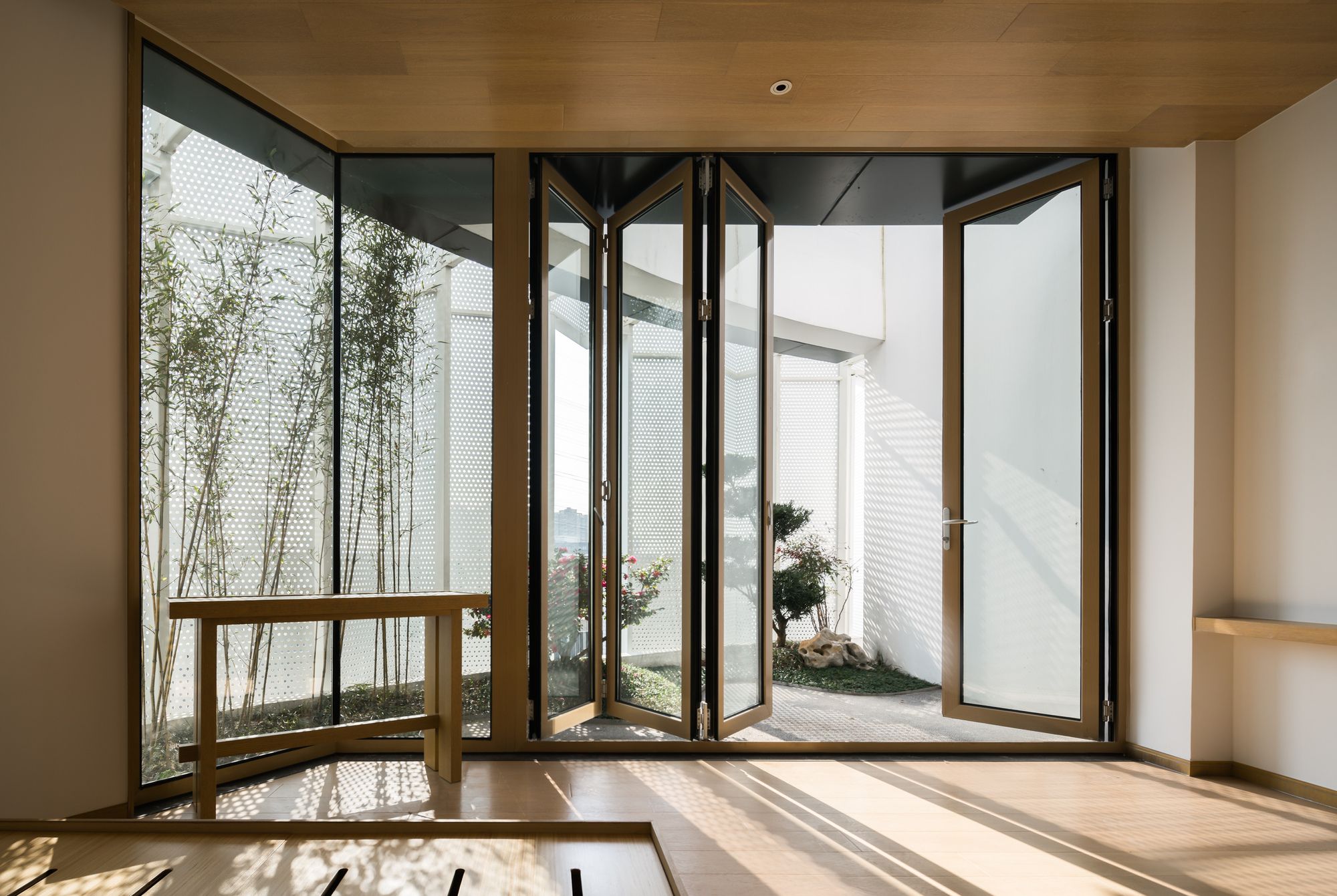
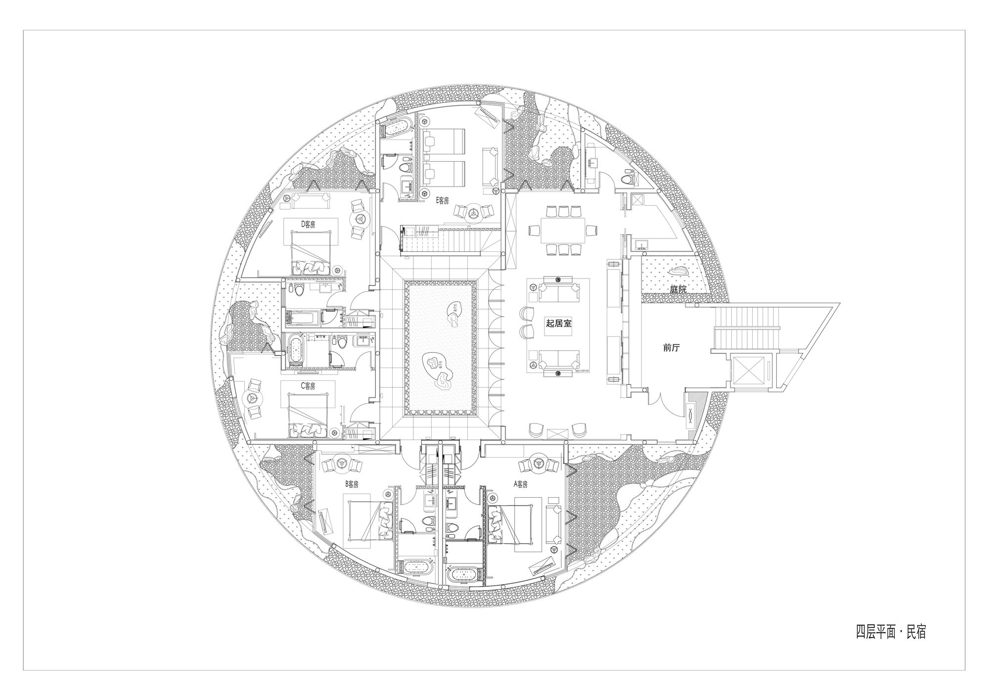
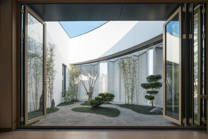
The bed and breakfasts on the fourth floor are hidden surprise of the whole Eight tenths Garden. Each BNB has a courtyard in the air. There settles a “four water belongs to the hall” patio in the public area. The courtyards are contemporary Chinese courtyards, originated and refined from the painting of Chou Ying, which is a practice of the vertical city, trying to build a real villa in the air.
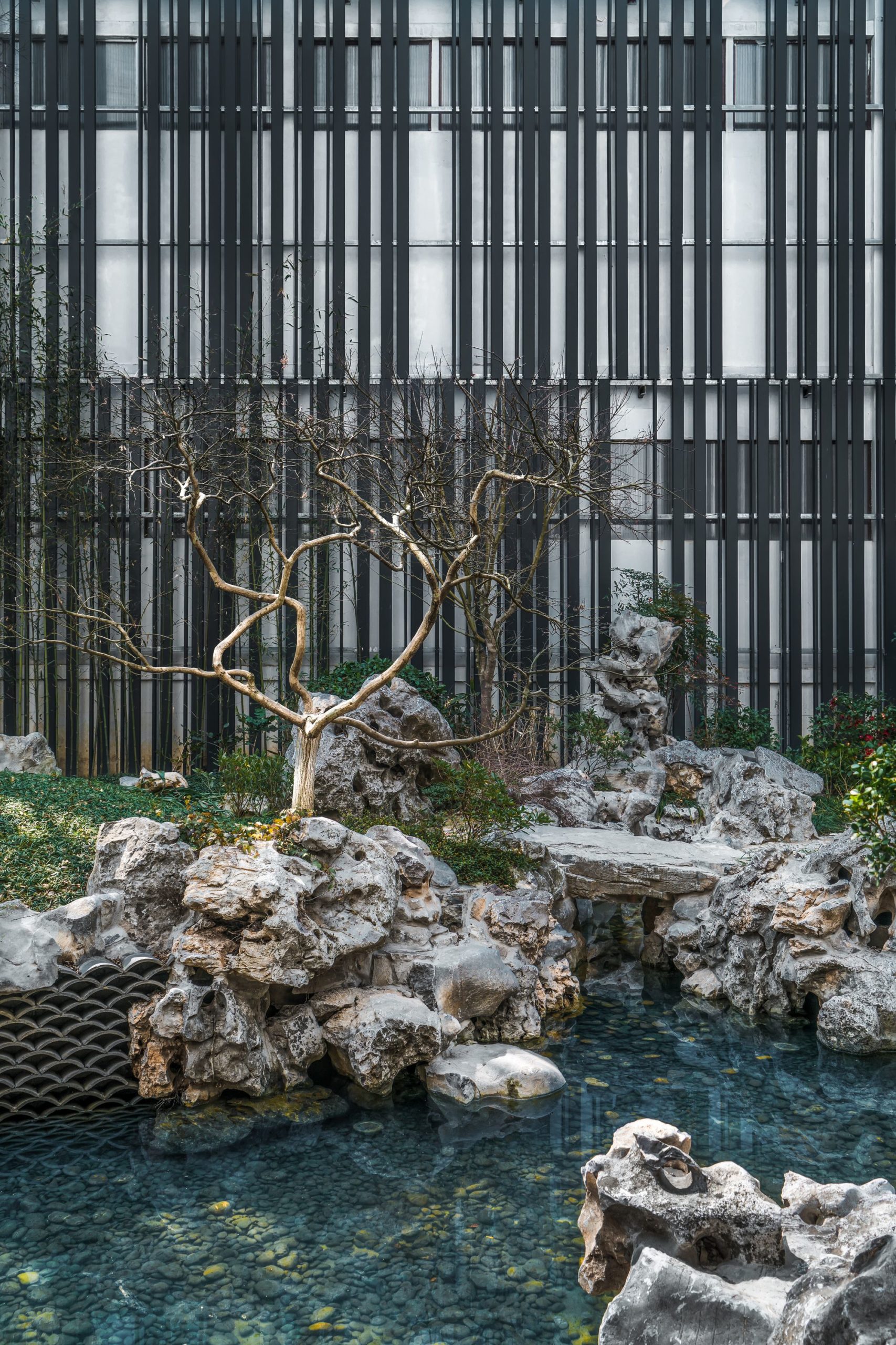
Our design is adhering to the neighborhood committee and the street shops. Inside the courtyard, we have two back walls in addition to the garden hall, which hangs plenty of air conditioning and a variety of pipes. We used a curtain as a fencing wall to insulate this cluttered environment from the Eight tenths Garden.
For the fencing wall, we tried the corrugated board, glazed tile, perforated aluminum (pattern is the pixel style of the “thousands of miles mountains and rivers”), aluminum grille with vertical green. We refused to use the vine green wall, cause the style of the wall is not important but must be black and must not be completely sealed. Only this kind of fencing wall could give a contrast from the surroundings to the Eight tenths Garden, making it a rebirth place raised from the old place. The galvanized frame is also part of the old thing, while the black grille is new. The pattern is not important, but the final size of the pattern should be study case it determines the aesthetic details. Only black can split the fencing walls and old things and become the background of the central gorgeous round curtain modestly.
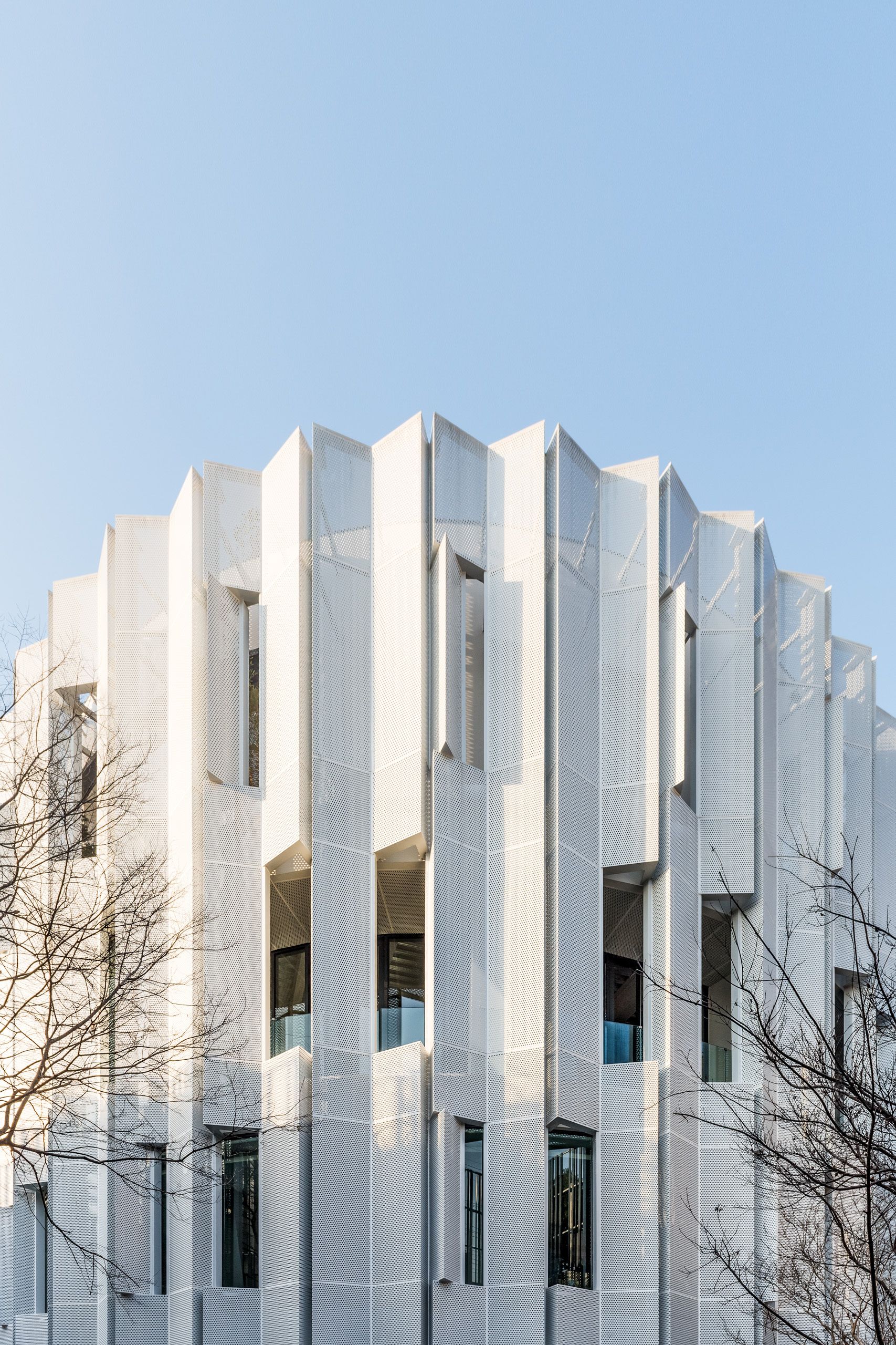
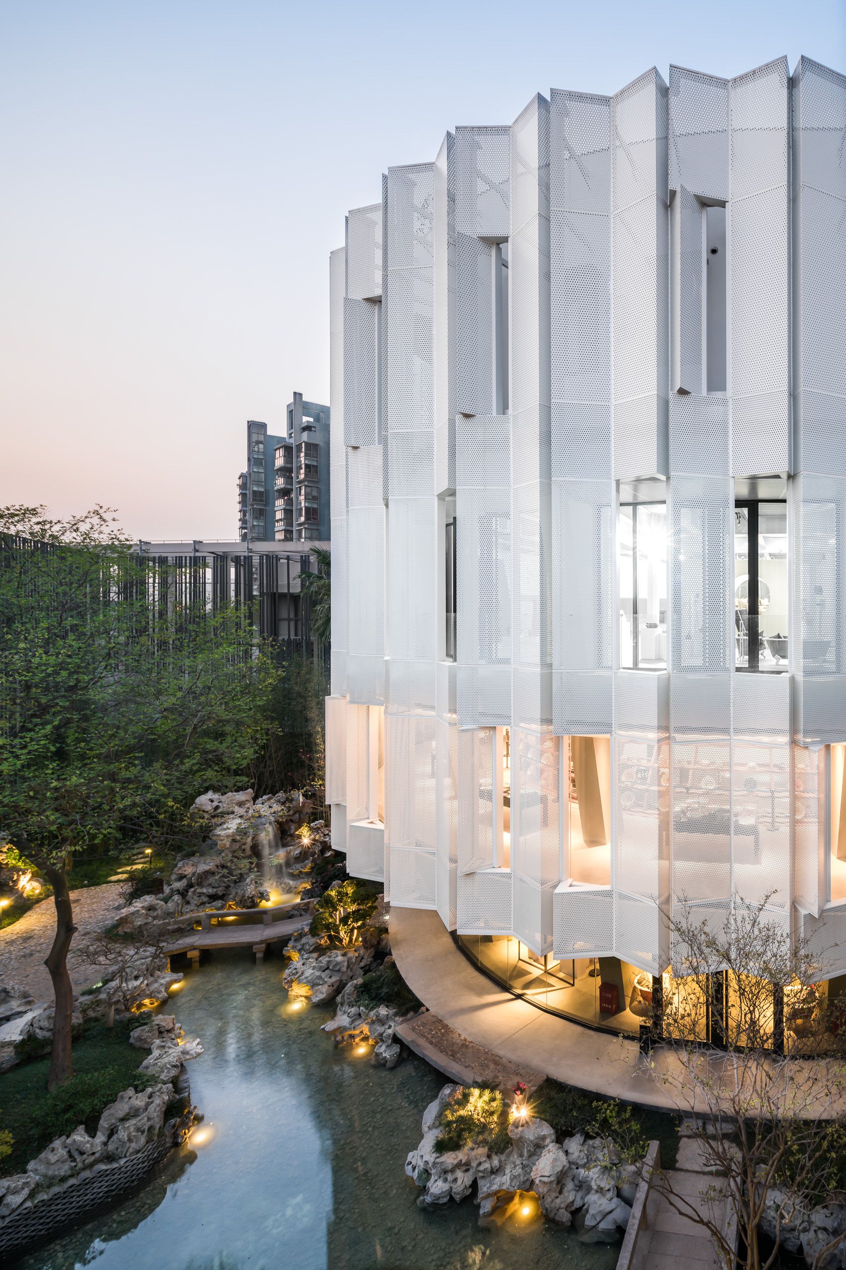
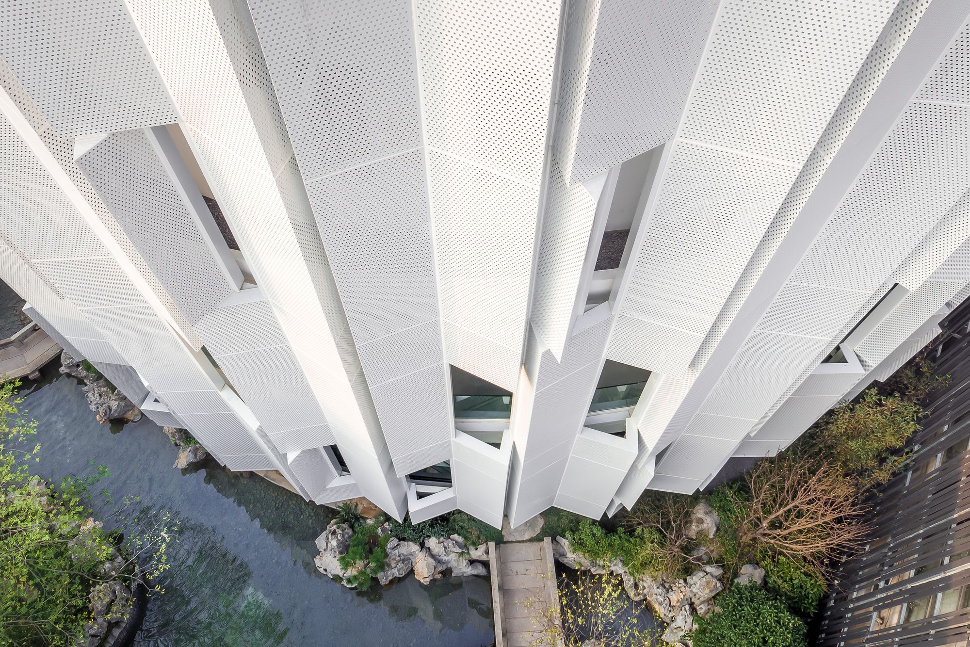
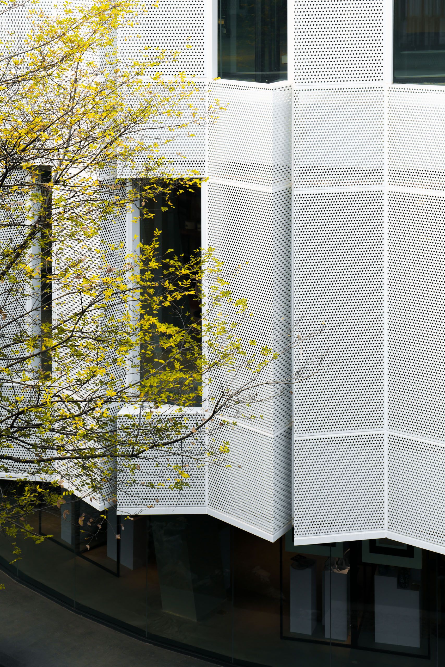
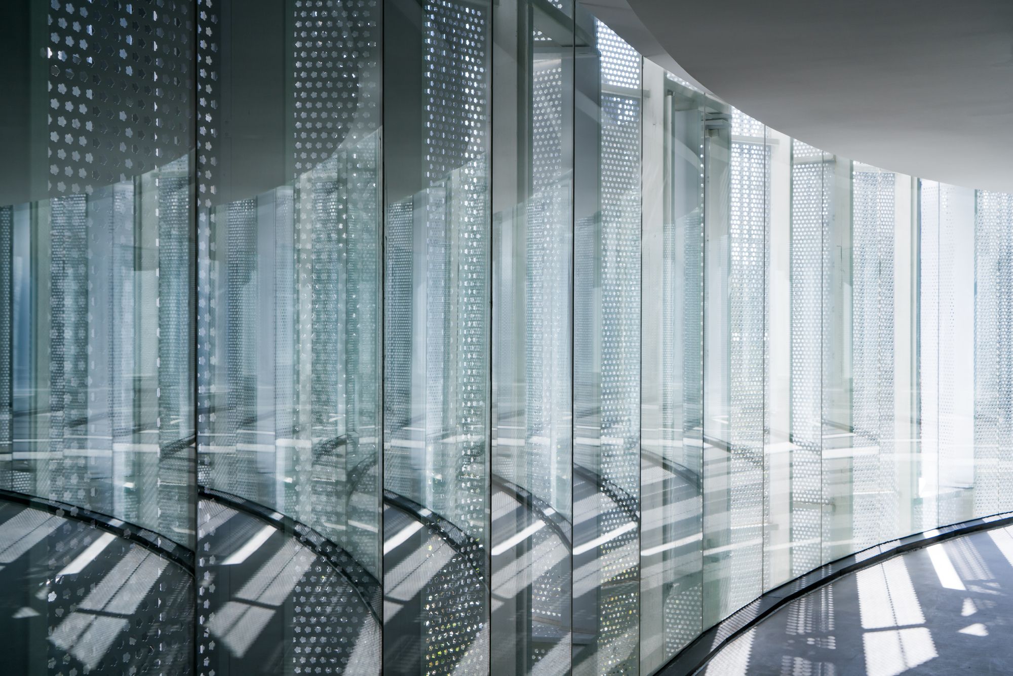
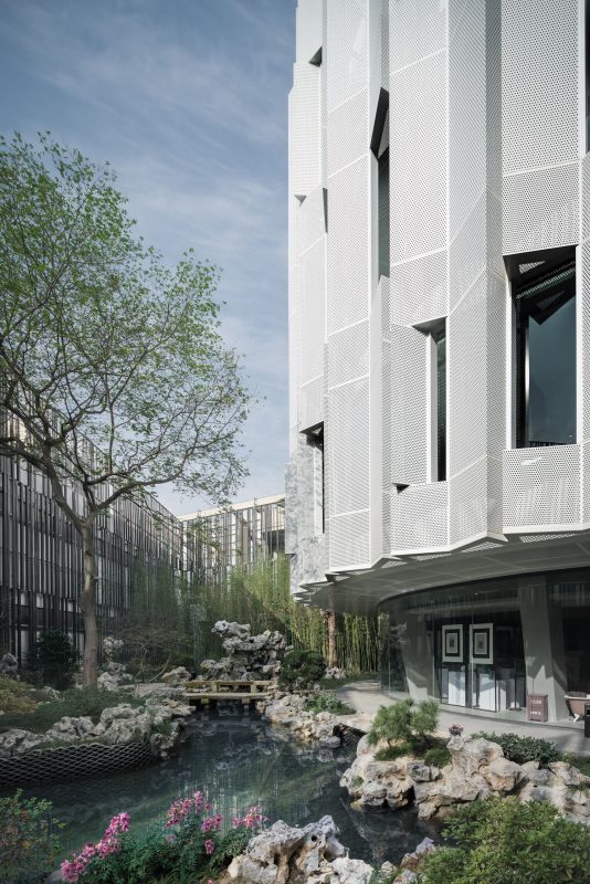
We use perforated aluminum plates in the folding fan style to create a veil on the facade. This veil is not the climate border, it has a glass curtain wall, a yard as well as a balcony behind. We created a blur between the facade and the climate border.
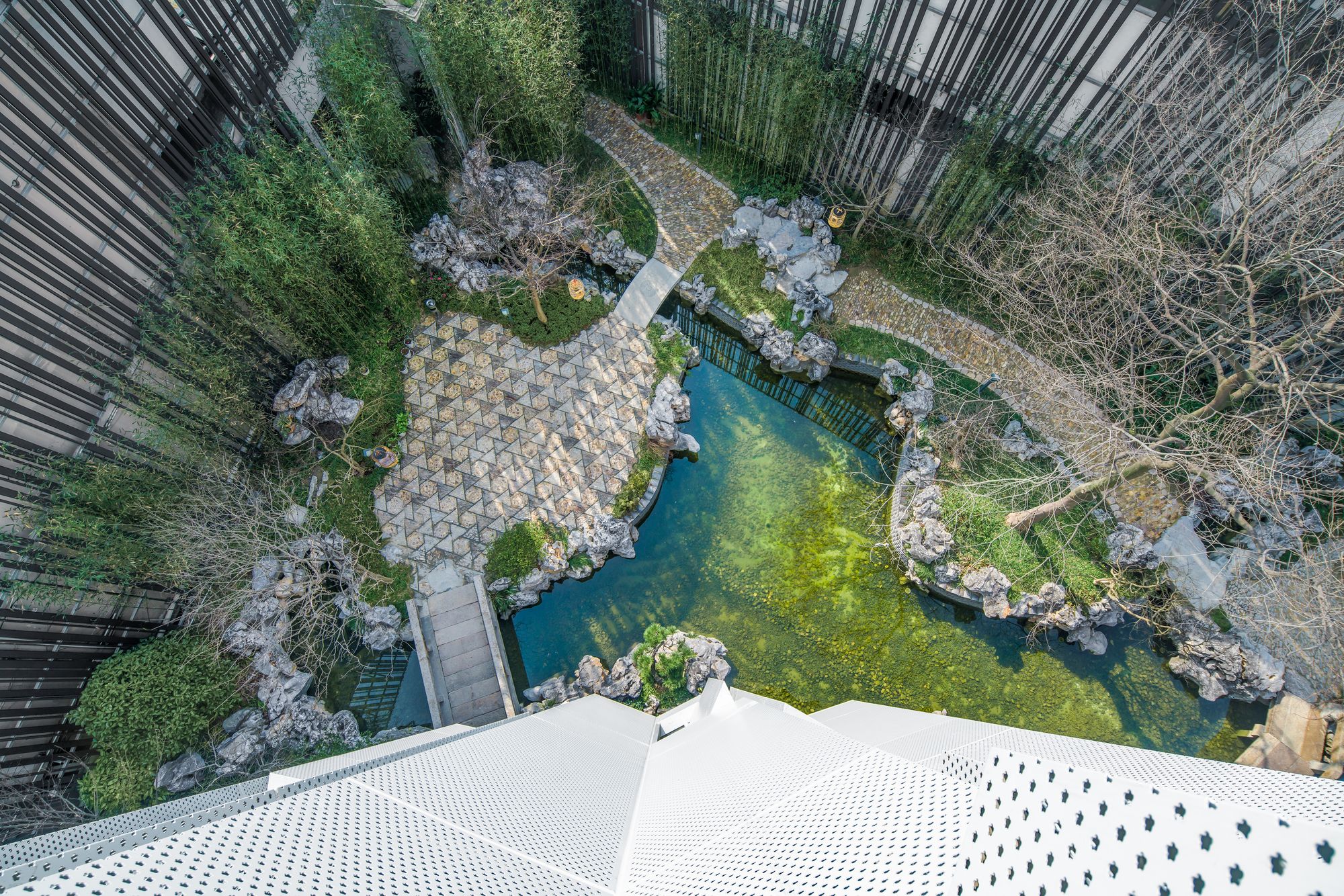
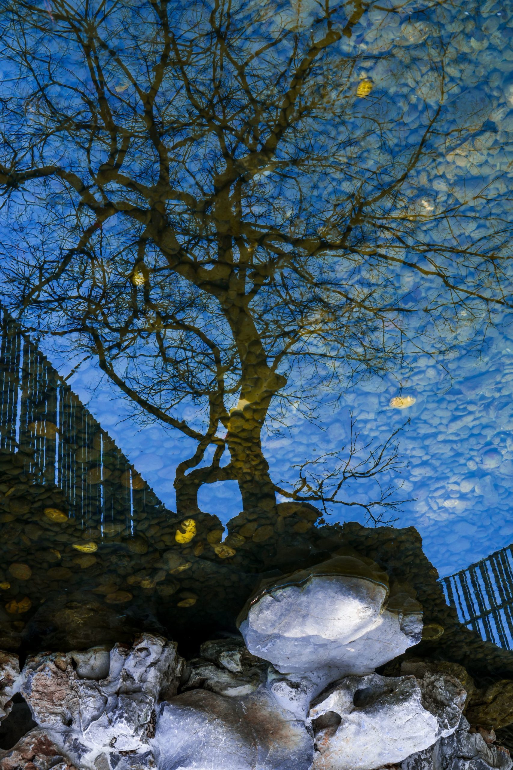
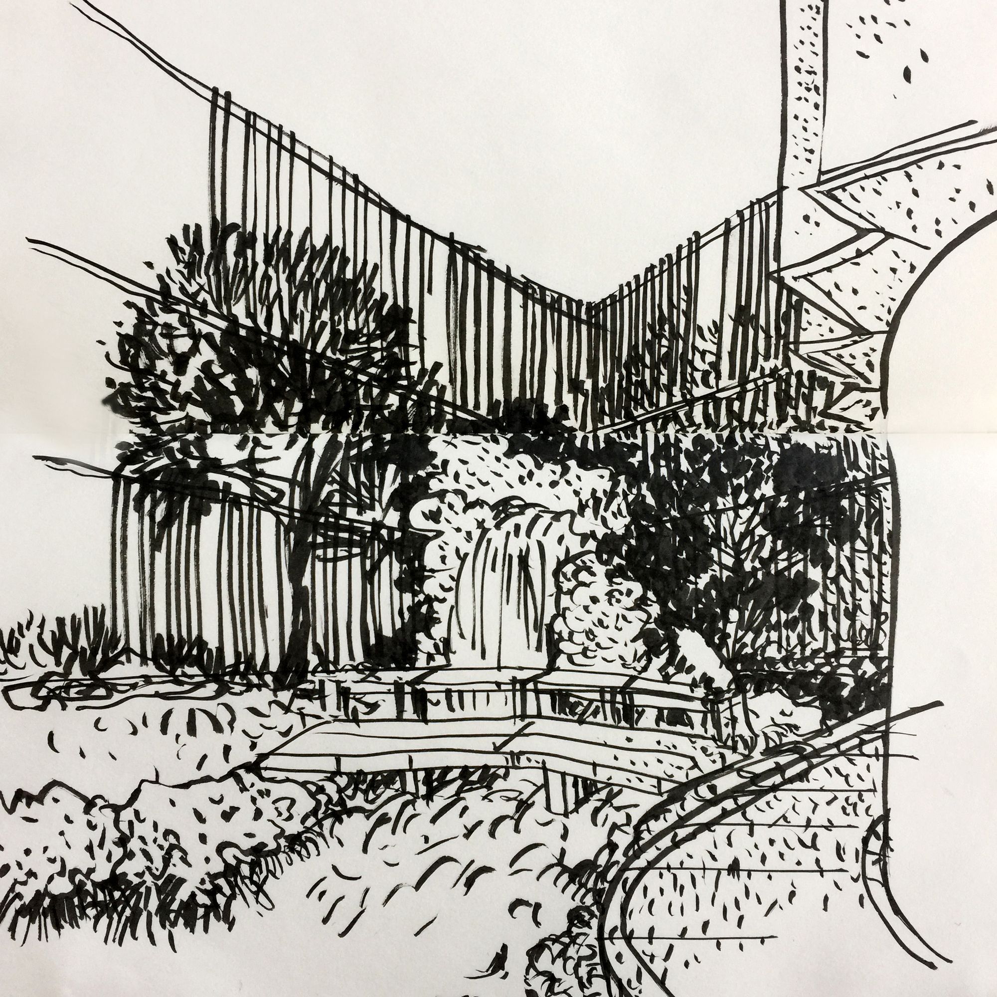
We hope to build a garden which pays tribute to the Shanghai street park in its 70s, as well as to the local garden history. Let the garden and the building fuse together into one. The entirety of building and garden is architecture. We designed the bamboo entrance in the front yard, makes the Eight tenths Garden independent. But the Eight tenths garden is not a private garden, it is freely open to the surrounding residents, which makes the garden approved by the surrounding residents. They cherish the garden, feeling satisfied to walk quietly in the garden a few steps to meet. We are rebuilding the space in a complex neighborhood, this is the only time which won the neighborhood a letter of praise of the project. This is why we put the front yard design into the urban micro-space revival plan. The street was once a simple aisle, the original landscape was worn-out, but our front yard changed the corner, making it lively again. The sociological meaning of architecture is revealed.
Project Info
Architects: Wutopia Lab
Location: Shanghai, China
Chief Architect: Yu Ting
Project Architect: Ge JunDesignDai Xinyang
Area: 2000.0 m2
Project Year: 2016
Type: Museum
Photographs: CreatAR
