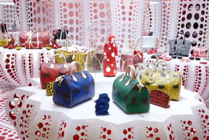
This is architecture. Say what you want about structural beams and fenestration, but this right here, this concept store created out of a collaboration between Louis Vuitton and the artist Yayoi Kusama, makes space and creates atmosphere. Show me a better definition of architecture than ‘making space and creating atmosphere.’ The Japanese artist Yayoi Kusama is best known for her works featuring seeming infinities of polka dots, but is also a poet and a performer. An interesting aspect is her home life- more specifically her home. Since 1977, she has lived voluntarily in a psychiatric institution after battling with obsessions from an early age. Now if only those obsessed with twitter and social media could find a way to use that obsession to make things half as great as her. There’s an idea. Quick someone write up a grant proposal.  Well, earlier this year Louis Vuitton sponsored Kusama’s exhibition at the Tate in London. Following this, the iconic fashion brand released materials, shoes and bags inspired by her works- covered in red, yellow and black polka dots.”] So to the architecture. This concept store located in Selfridges in London is accordingly covered in dots. Dots that are dots, dots that are perforations, dots just about everywhere that a dot can find a place to go. It is dot architecture. They cover display tables, floors, walls (which arch over the space, creating a sense of being held), lights, clothes. The dots are of many sizes. Where no colour is ascribed to the dot itself- say a perforation dot- the backing will feature a colour which is given second-hand to the dot. Inside the store (Selfridges) dots on the floor lead customers to the concept store located within and a life-sized model of Kusama herself, located within this. The architecture is the dot.

