Shanghai Baoye Center
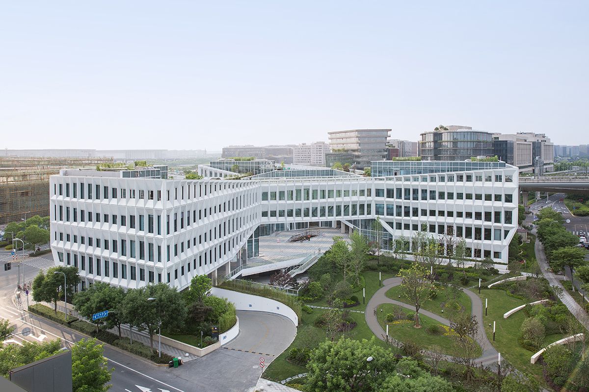
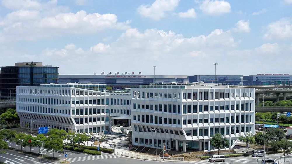
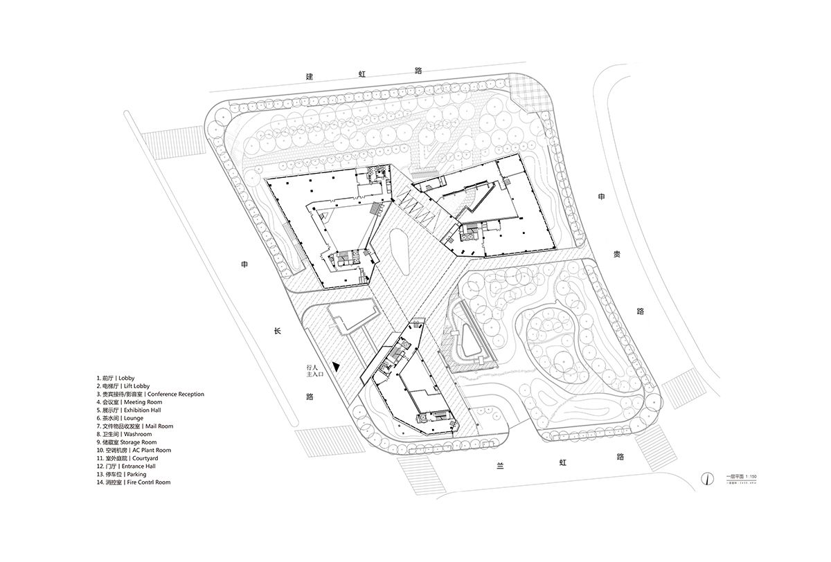
Shanghai Baoye Center is part of the phase-2 urban development scheme for the new Central Business District in Hongqiao, a rapidly developing piece of western Shanghai. The location of the project puts it at the center of the car, train, and jet transportation, and is, in fact, the last building one sees before entering the busy Hongqiao High-Speed Rail Terminal from the south by bullet train, granting the project a significant urban presence.The site has several challenging conditions: sandwiched by two city-designated temporary green spaces into an L shape, with a 60% frontage ratio requirement to the east, west and south, and a 24m tall highway overpass running adjacent to its north face, the building must respond to a maximum FAR of 1.60 and a height of 24m.In dealing with these conditions, There are many attempts within the design process, it’s more like finding breakthroughs within the limitations.The breakthroughs mainly are 1. The breakthrough in site limitations; 2. The breakthrough in the rule of “maximum office space availability”; 3. The breakthrough in the standardized elevation design.
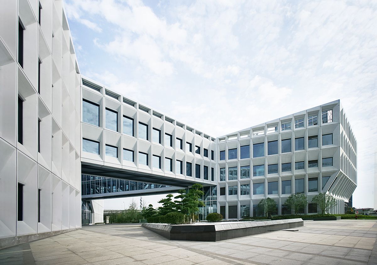
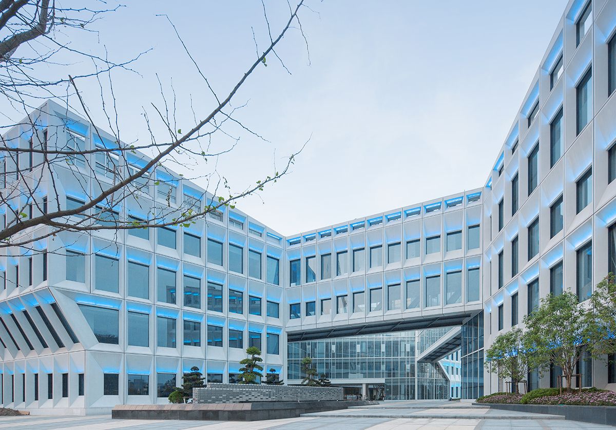
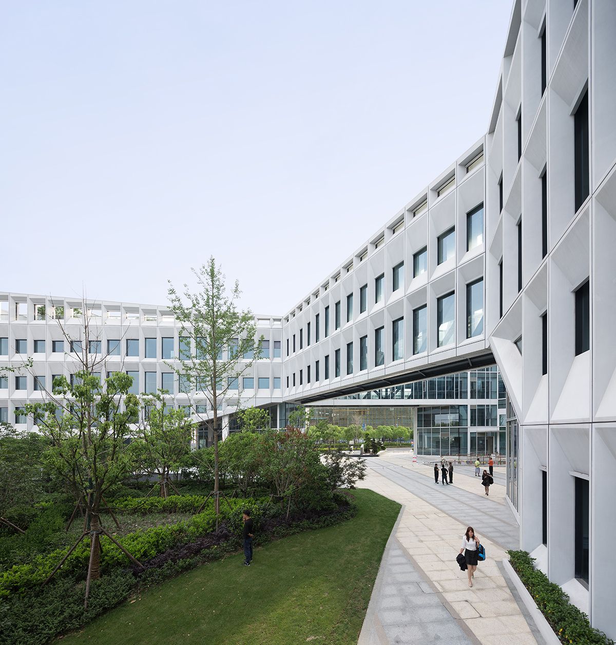
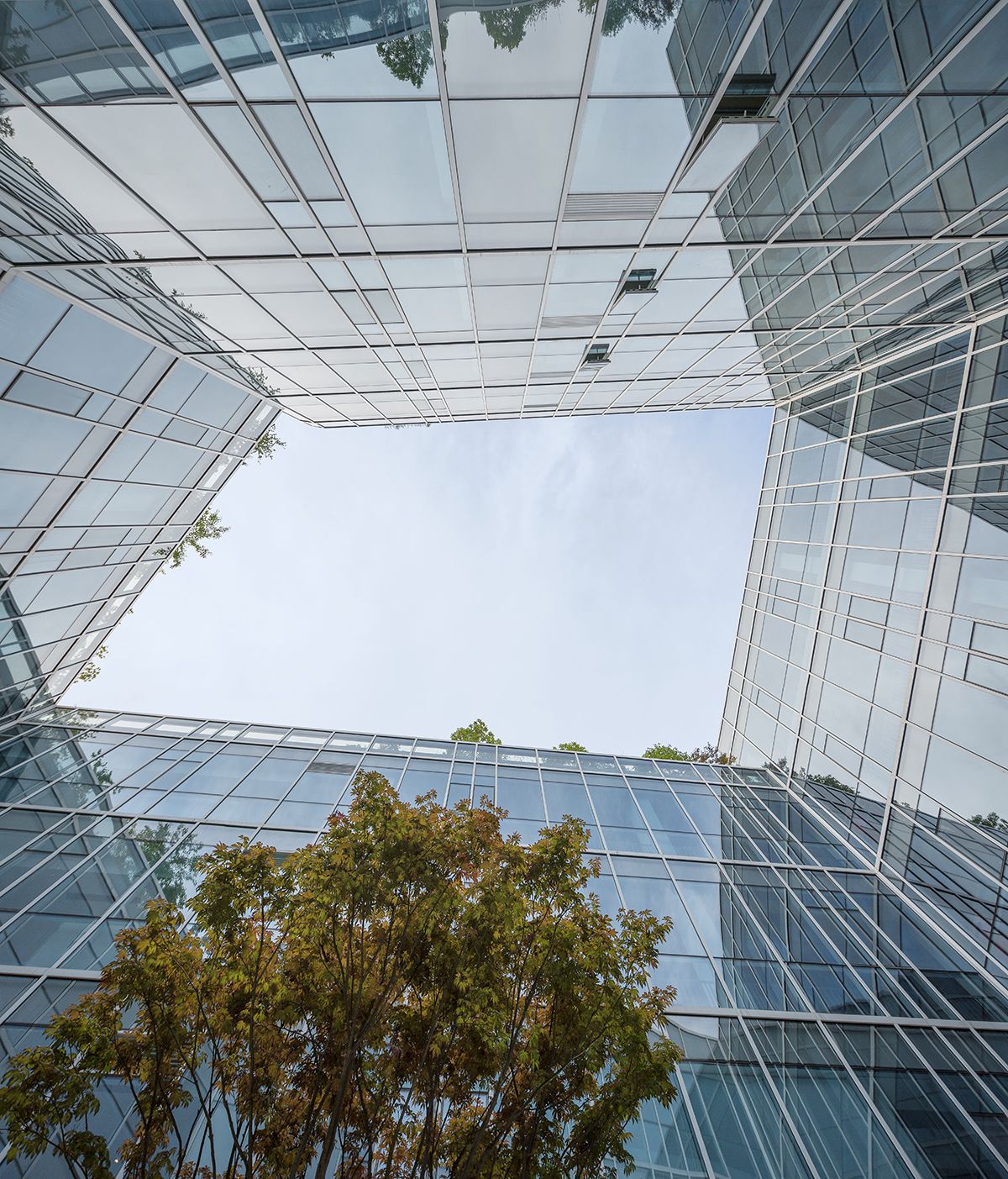
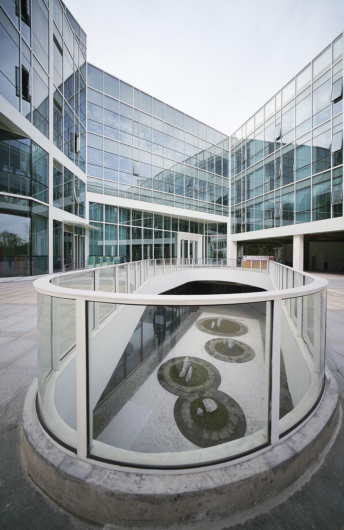
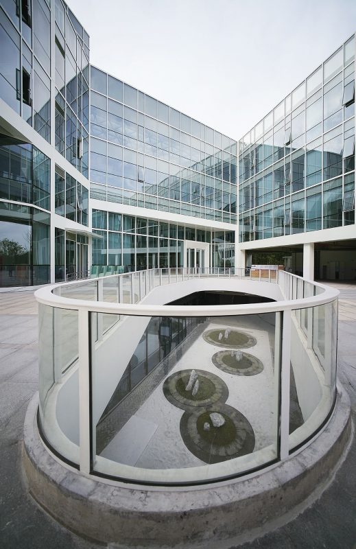
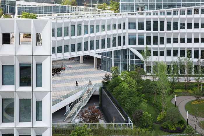
The L-shaped site was first filled into its maximum extents as a perimeter block, then lofted up 4 stories to the building height limit while satisfying the desired program area of 13,000 sqm. The perimeter is then pushed and manipulated to create three exterior-facing spaces and three distinct interior courtyards, defining the spatial structure of the project. The three main office volumes, designated A, B, and C, can function independently or in combination. The three pieces are linked by suspended bridges on the 2nd, 3rd and 4th floors. which generate hinged internal courtyards, to satisfy the internal circulation.The enclosing corridors also attract people into the central courtyard and then lead people entering three office buildings. The lift operation creates a depressive space, which creates a spatial sequence as open-depress-open again when people walking from outside via three lifted corridors into the center courtyard. This sequence will indicate people of a sense of entering and creating the richer spatial experience in the limited site. In this way, form, circulation and the spatial sequence are highly unified.
The result of these operations, which brings the balance between massing and spatial sequence, between program and promenade experience, is an innovation to the rule of “maximum office space availability”. Since the open floor plan office first introduced in Bloomberg headquarters office building in New York, which significantly increases the efficiency of office working model, how to maximize the area of office space is the major principle of office design. Here we are challenging this by proposing a new idea of” maximizing the quality of office space”, which is organizing outdoor landscape and green space integrated with indoor space, bringing more natural light and ventilation., and enhancing the user’s spatial experience, to create a creative working environment. We believe compare with maximum office areas, this will bring more efficiency to the users in the office.
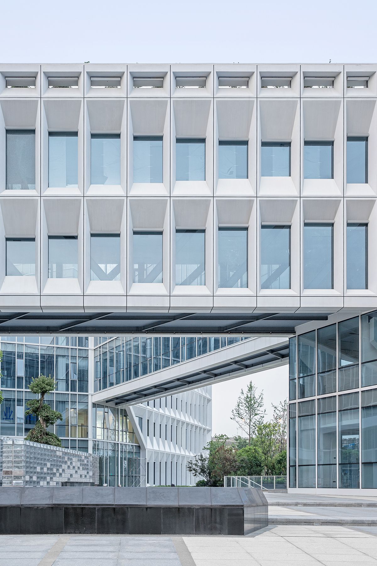
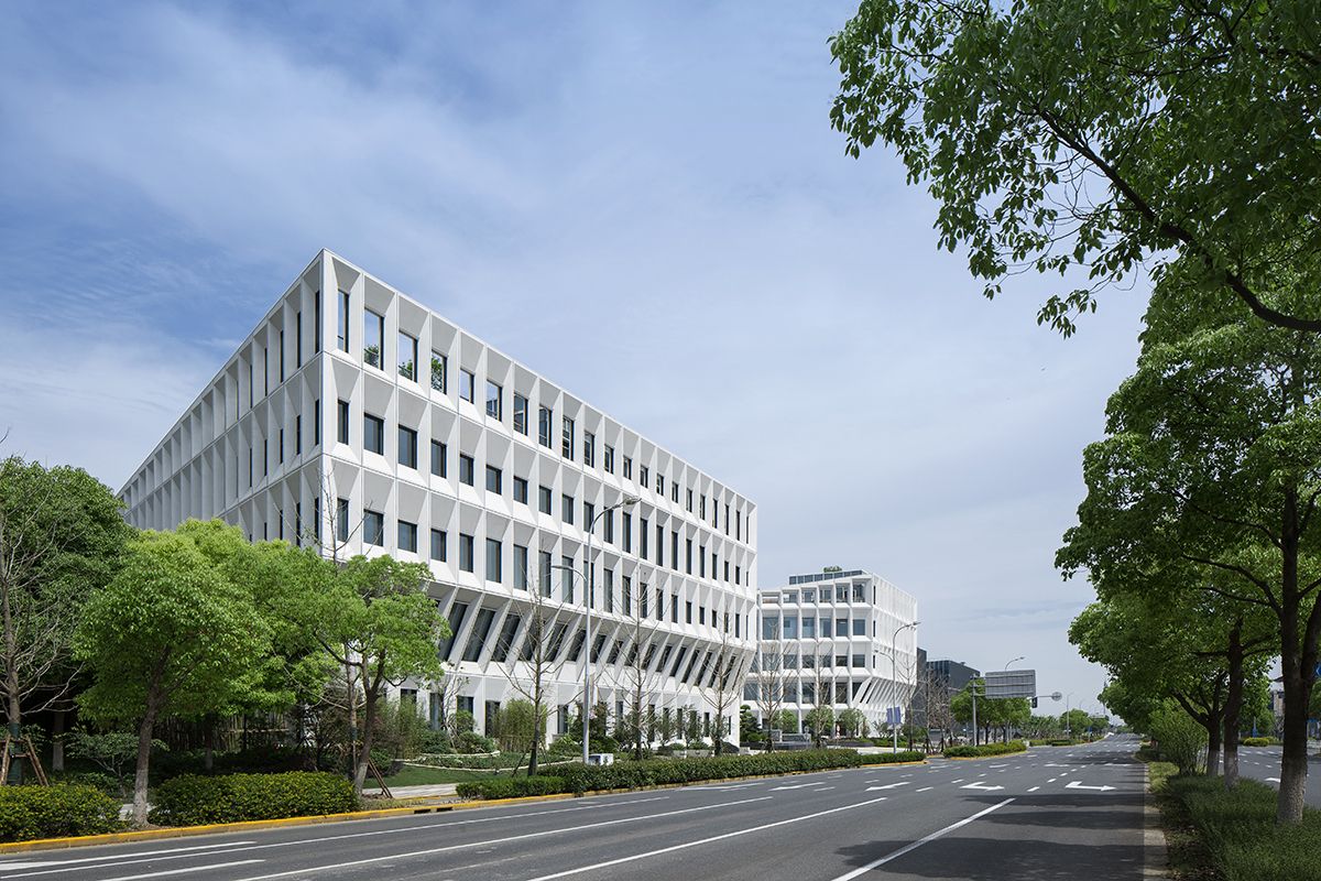
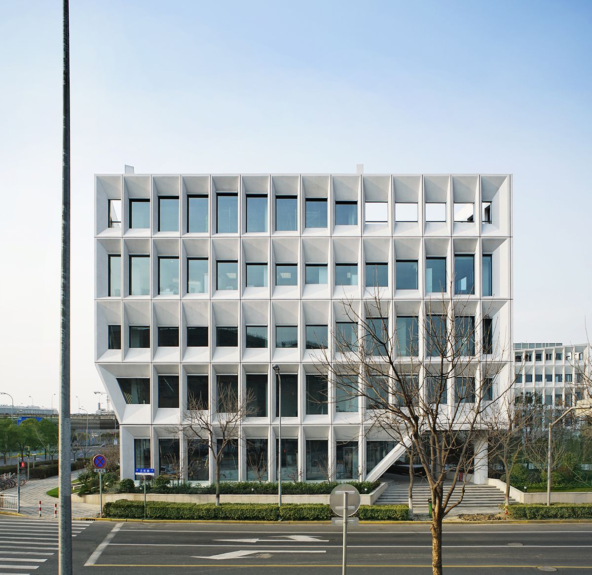
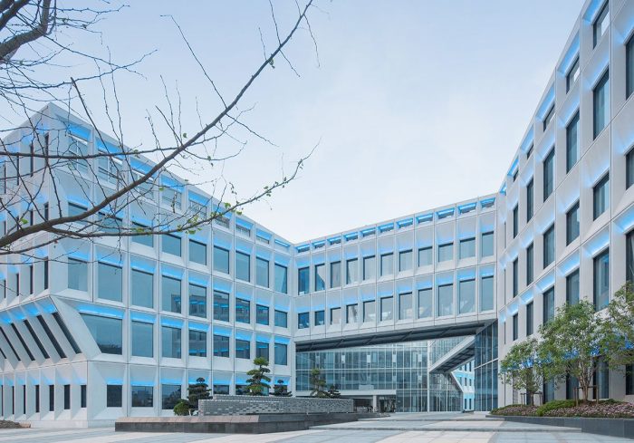
Besides, the elevation design is a breakthrough to the standardized uniformed elevation of the contemporary office building. Under the “maximum office space availability”, office buildings nowadays are always stacked by standardized plan and elevation. In this project, besides the “promenade plan” that mention before, the elevation consists of modularized shading panels. There’re around 26 kinds of different panels gradually flows on each level. These panels have different slopes, which changes the height of windows and controls the interior daylight condition.
 Project Info
Architects: LYCS Architecture
Location: Shanghai, China
Year: 2017
Type: Office Building
