Foster and Partners Wins Competition for New Tower at 425 Park Avenue, NY:
Between some of the world’s most high-profile designers, the British Pritzker Prize winner Lord Norman Foster beat out fellow architects Rem Koolhaas, Zaha Hadid Architects and Richard Rogers in a competition poses an unusual challenge. The new building as currently conceived will reach 687 feet, considerably taller than the 370-foot structure it will be replacing. The design by Foster and Partners is interesting in part because it looks somewhat like a midcentury office tower in the Seagrams/425 Park vein, except that it has been judo-chopped in two spots and is now held up by giant trusses.
Lord Foster said:
“I have a personal connection with New York, which has been a source of inspiration since my time at Yale, when the new towers on Park Avenue and its neighbourhoods were a magnet for every young architect. Seeing first-hand the works of Mies van der Rohe, Gordon Bunshaft, Eero Saarinen and Philip Johnson was tremendously exciting then – I am delighted to have this very special opportunity to design a contemporary tower to stand alongside them. Our aim is to create an exceptional building, both of its time and timeless, as well as being respectful of this context – a tower that is for the City and for the people that will work in it, setting a new standard for office design and providing an enduring landmark that befits its world-famous location.”
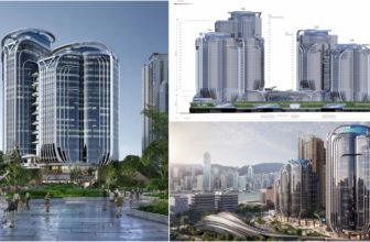
Each design was its own: Foster’s was a series of three floating towers all connected with a central spine. Another finalist, Rem Koolhaas, proposed a twist-shaped building. Richard Rogers proposed a design for a building supported by an orange exoskeleton with park spaces. And Zaha Hadid Architects’s building resembled a budded flower.
 “We are grateful to each of the firms for the thoughtfulness and creativity they demonstrated throughout the process,” Mr. Levinson said in a release. “There is no doubt that each group was fully capable of helping us realize our vision of a 425 Park Avenue tower that redefines the modern office environment while also respecting and enhancing the timeless allure of the Plaza district.”
It is important to mention that construction won’t start until 2015, when the existing building’s land lease and office leases expire. And zoning regulations allow Levinson to keep the 18-to-1 floor ratio if 25 percent of the original building — the base — gets preserved. Levinson told the Observer he’s eager for the Midtown East rezoning, which could allow for him to make a better building base.
Foster and Partners
Height: 687 feet; Stories: 41
“Our aim is to create an exceptional building, both of its time and timeless, as well as being respectful of its context and celebrated Modernist neighbours—a tower that is for the City and for the people that will work in it, setting a new standard for office design and providing an enduring landmark that befits its world-famous location. Clearly expressing the geometry of its structure, the tapered steel-frame tower rises to meet three shear walls that will be illuminated, adding to the vibrant New York City skyline. Its elegant facade seamlessly integrates with an innovative internal arrangement that allows for three gradated tiers of column-free floors. Offering world-class, sustainable office accommodation, the new building anticipates changing needs in the workplace with large, flexible open floor plates. Each of the three tiers—low, medium and high-rise—is defined by a landscaped terrace with panoramic views across Manhattan and Central Park. To maximize the Park Avenue frontage, the core is placed to the rear, where glazed stairwells reveal long views towards the East River, while at street level, there is potential for a large civic plaza with significant works of art.”
OMA
Height: 648 feet; Stories: 38
“For Commercial Buildings, Manhattan’s zoning laws prescribe a silhouette from which there is no escape (yet): a stretched pyramid. Our current aesthetics oscillate between nearly exhausted orthogonality and a still immature curvaceousness. Our building is an intersection of these two observations: it proposes a stack of three cubes —the lower one a full solid block on Park Avenue, the smallest on top, rotated 45 degrees vis-a-vis the Manhattan grid, oriented beyond its mere location in a sweep from Midtown to Central Park. The three cubes are connected by curved planes to create a subtle alternation of flat and 3 dimensional places, each reflecting sky and city in their own way. The shape is at the same time highly artistic and highly efficient, a diagram of maximum beauty and maximum rentability, combined in a single, Brancusi-like shape. Its geometry at the same time reinforces and escapes the existing city. It resonates with each of its famous neighbors—Seagram, Lever, AT&T, Racquet Club—yet it is emphatically futuristic.”
Height: 665 feet; Stories: 44
“We have created a contemporary homage to the quintessential New York skyscraper, by designing a tower that will define the next chapter in their illustrious story. Our solution acknowledges the design attributes of its neighbours on Park Avenue, but brings new qualities: honest expression; generosity; efficiency and humanity. The clear expression of the process of construction is evident from the huge 43 storey steel frame down to the smallest detail, this gives the building a human scale. In designing sky gardens, we are reconnecting workers and the city with nature, by using different American landscape ecologies, from forest to alpine, to suit the different altitudes of each garden. These spaces also offer great views of the park and the metropolis. A generous open space at ground level gives users and passing public a retreat from the urban bustle. The exterior glass elevators create both a dynamism and an extremely flexible interior. It is a tower that works both at the skyline and the street line, has a unique rhythm, and sets a new architectural bench mark for both Park Avenue and the great American skyscraper.”
Height: 669 feet; Stories: 40
“The design challenge for 425 Park Avenue lies in producing a structure of timeless elegance, yet with a strong identity that reflects the complex and sophisticated age in which it was created and mirrors the exceptional setting in which it is placed. Our approach has been to unite the four fundamental qualities for the project — Function, Design, Culture and Value — and fuse them into a single seamless design which incorporates these characteristics in a harmonious and unified architectural concept. With its breezy views up and down Park Avenue and breath-taking vistas of Central Park, the new building is quintessentially “New York” in its very definition. Its sleek verticality breathes the very essence of the city, while its gentle curves evoke a new dynamism of form which is both distinctly contemporary and ageless. This harmony is equally reflected in the building’s openness, flexible design and technological efficiency, providing an adaptable architectural context that allows it to accommodate its tenants’ requirements and desires. Together, these qualities make the new 425 Park Avenue a unique landmark for New York City.”


