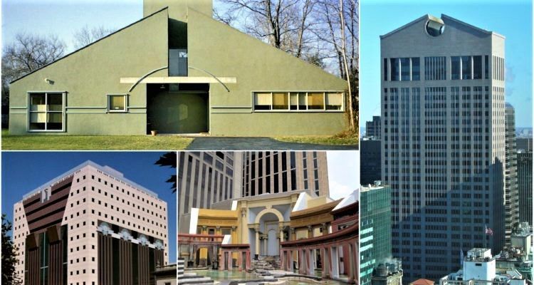
There is always the argument that Postmodernism is not a trend or a style on its own but simply a reaction to modernism, and hence its name. The movement is regarded as an inevitable consequence of the firm restrictions of the International Style. However, and whether we like it or not, that reaction has left us plenty of global architecture icons, and its influence lives up to this day.
Mies Van Der Rohe said, “Less is more,” but then came Robert Venturi and said, “Less is a bore;” this was the conflict in a nutshell. Modernism called for worldwide strict unity, a form of Utopia that only modernist pioneers seemed to perceive and in which they ignored all forms of historical and cultural context. The lack of identity caused the eventual fall of modernism, and then came postmodernism which brought back more color, details, and symbolism. However, that did not exactly bring back “Identity” to architecture, for postmodernism has come along with globalization.
Once upon a time, you would see the Pyramids and the Sphinx and think: “This is Egypt”, but now, you would have to look twice to make sure this is not the replica in Las Vegas. Porticos and classic orders are no longer courtesy of former Roman territories, now you can find them anywhere and in any proportions. What any of these architectural elements used to mean once before is long gone now. Was this the way postmodernism originated though? And is this what it truly stands for? You be the judge of that after checking these 10 postmodern architecture icons designed in the past century by pioneers of the movement including The Legendary Advocate of Postmodernism, Michael Grave.
What is the main idea of postmodernism?
The postmodernism movement resembles several complex concepts and ideas, including:
- Cultural Equality
- Deconstruction
- More attention to the actual users and audience.
- Fragmentation and disorder.
- Rejecting the idea of absolute knowledge.
List of Architecture Icons That Define Postmodernism
1. AT&T Building in New York, USA
© David Shankbone
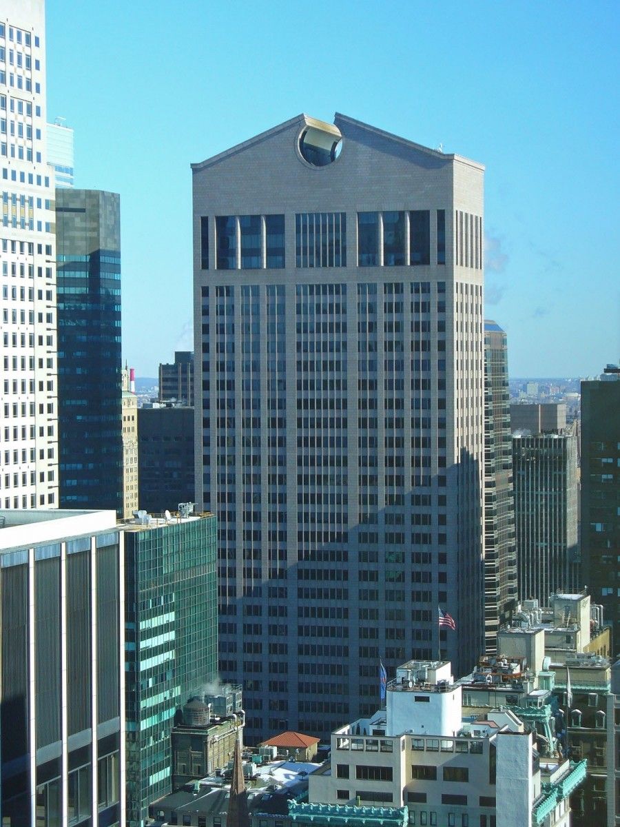
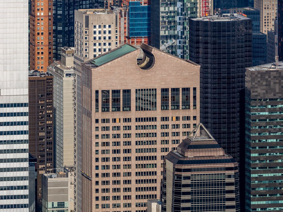
Now called 550 Madison Avenue, the building was designed by Philip Johnson and John Burgee, and its construction was complete in 1984. The former Sony Tower holds on its top one of the earliest symbols of defiance to modernism which is the open pediment, or as some would call it “the Chippendale.”The arched entrance to the building which extends, in height, up to 7-storeys, was also another historical reference, reminiscent of grand Roman Archways. The building stood out between Manhattan’s modern skyscrapers. It was criticized and a subject of mockery; nonetheless, it announced the beginning of a new era.
2. The Portland Building in Portland – Oregon, USA
Photo by flickr.com
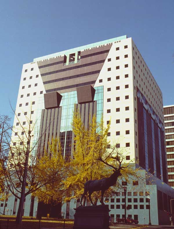
Believing that modernism has made American city centers look “boring, Michael Graves decided to break the cycle and design the Portland Municipal Services Building like no other office building seen before. The governmental office building opened in 1982, two years before the opening of the AT&T Building. The building’s façade featured classical architectural elements with a twist and colored materials, which was quite unconventional back in the time. The colors were supposed to make the building feel as one with the environment, while the oversized keystones and pilasters were meant to refer to the past. However, the building was criticized for carrying too much symbolism.
3. Vanna Venturi House in Philadelphia – Pennsylvania, USA
Courtesy of Wikiarquitectura
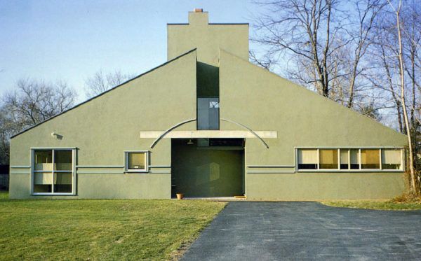
The famous yet controversial postmodernist pioneer Robert Venturi designed this house for his mother Vanna Venturi. The house was completed in 1964, and it is considered the first postmodern building, rising more than 10 years before the movement gained momentum. In the design of this house, Venturi broke the most one of the most important roles of modernism: “Form follows function.”
The house features a gabled roof, on one of its two longer sides, with a vertical opening at its center. Below the opening is a square-shaped doorway, yet the door is on the side and not at the center as it would be expected. The house is also remarkable for its large-scaled chimney at the center, behind the gabled roof.
4. Piazza D’Italia in New Orleans – Louisiana, USA
Courtesy Charles Moore Foundation
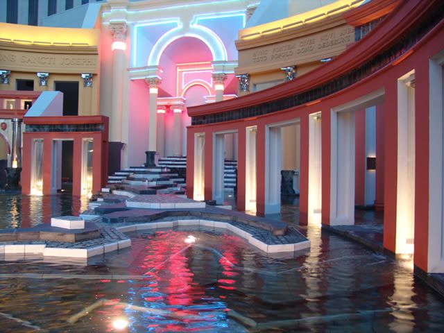
Piazza D’Italia is a public plaza, behind the American Italian Cultural Center, at the intersection of Lafayette and Commerce streets in Downtown New Orleans. It was designed by American postmodernist architect Charles Moore in 1974 and opened in 1978. It utilizes elements from Roman Architecture like arches and colonnades which curve around a water fountain and feature bold colors like red and yellow.
The capitals of the adopted classical orders are ornamented in reflective metal for pleasant night effects. Although the plaza was regarded as a “masterpiece” back then, it ended up abandoned because of its undeveloped surroundings. Much later, in 2003, it was fully restored when the adjacent Lykes Center was transformed into Loews Hotel.
5. National Gallery of London Sainsbury Wing – London, UK
courtesy of the National Gallery
More than 25 years after building the Vanna Venturi House, Robert Venturi designed another edifice fit to be an icon of postmodernism but, this time, in collaboration with his life partner Denise Scott Brown. The Venturi-Scott Brown proposal for the National Gallery of London’s Sainsbury Wing was the winner of a second design contest held for the building. A Hi-tech design proposal by Ahrends, Burton, and Koralek had won the first competition, but Prince Charles of Wales harshly criticized the scheme and described it as a “monstrous carbuncle on the face of a much loved and elegant friend.”
The Venturi-Scott Brown design for the wing draws from the National Gallery’s neoclassical style, but the influence fades gradually to reveal modern architectural elements. The plain stone façade with a classic entablature and lavishly ornamented pilaster capitals co-exist with the extended glass surfaces, English brick walls, and polychromatic cast-iron columns.
6. Neue Staatsgalerie – Stuttgart, Germany
Staatsgalerie museum, Stuttgart, Germany
In 1977, it was decided that Stuttgart’s Staatsgalerie would get a new neighbor, the Neue Staatsgalerie. A competition was held and won by English architect James Sterling of Michael Wilford & Associates. The competition called for a connection between the new gallery and its older neighbor from 1843, and that is what the architect exactly did. He combined classical materials like travertine and sandstone, in addition to elements like architraves, arches, and columns, with modern glass surfaces and colored industrial steel.
Blue and pink steel pipes guide the visitors from the gates of the travertine-clad entrance to the different galleries and the atrium. The gallery spaces adopt the classic U-shaped format of the older gallery while introducing a modern sense to space. The atrium, on the other hand, is circled by massive sandstone walls, arches, and columns. It features the 19th-century style and spirit of the Staatsgalerie like no other place in the new building.
© David Shankbone
photography by © David Shankbone
© Maria Buszek
Photo by flickr.com
Photo by flickr.com
Courtesy Charles Moore Foundation


