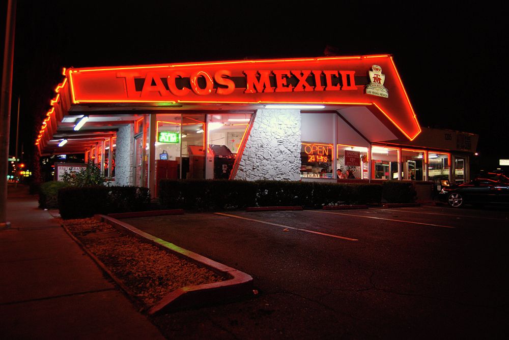
If you are an average American in the 1950s, you would probably be having your breakfast in one of those space-like coffee shops which usually serve tasty comfort food. The Visions of Futuristic Architecture Have Transformed in Many Directions Over The Past Century. You have most likely noticed the spaceship-like roofs, the futuristic elements, and the antenna signs that characterize Googie architecture. However, have you ever given thought to how this architectural style evolved?
Googie is a distinctive architectural style that was the center of attention for many years. Looking at Googie architecture, you may get a sense of nostalgia for the 1950s American coffee shops and restaurants. On the other hand, you may find it too exaggerated or tacky.
Who started Googie architecture?
John Lautner designed three Coffee Dan’s shops in the early 1940s in southern California, creating an innovative futuristic style that featured a space-age theme. He has become famous for this style after applying it again in a coffee shop called “Googies” – after that the name was used to describe this style of architecture.
Whether you hate it or appreciate it, here is what you need to know about Googie architecture:
1. It Represented the Future
Known as South California’s signature style, “Googie” symbolized the future, bringing it to the present. This theory emerged post-war. As time went by, it came to reflect the 1950s and 60s’ perception of the future and what it meant.
Historically speaking, “Googie” is not considered an official architectural style by most architects. It is usually classified as post-modern architecture and whimsical architecture.
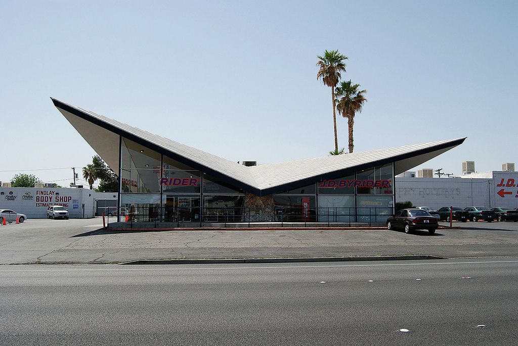
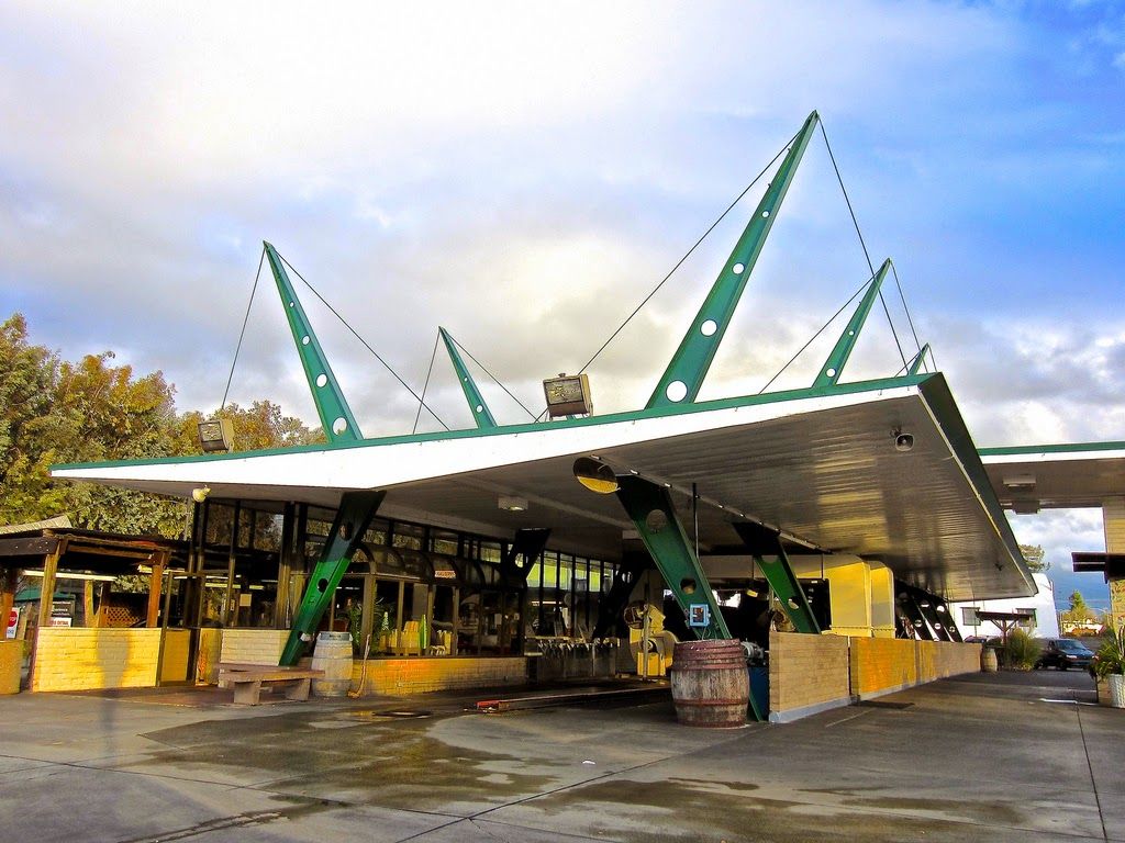
In the 1950s, traveling to the moon was a new event that made quite a buzz. It got people obsessed with the future and space, and architects went with the flow. Their designs featured cantilevering slabs which almost defied gravity. They also displayed Jetson’s aesthetic arches and angled roofs, which are also futuristic elements reminiscent of space. However, after Neil Armstrong landed on the moon in 1969, that infatuation slowly decreased.
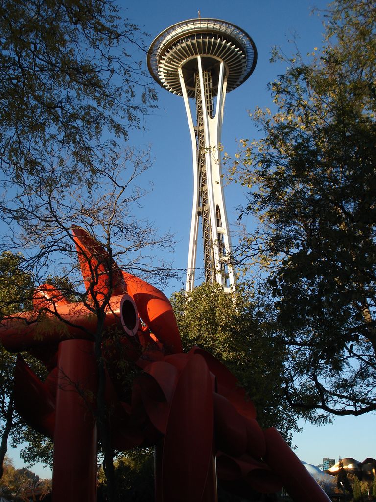
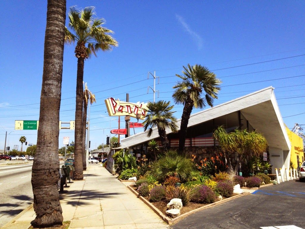
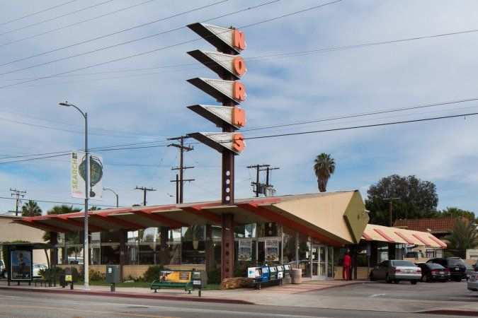
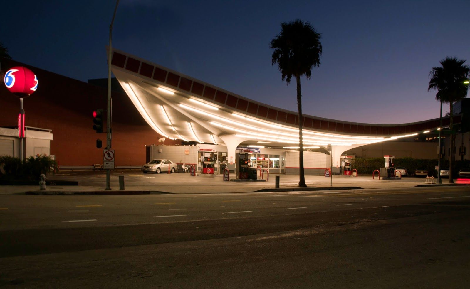
2. Everybody can “Googie”
Photography by Flickr user Charles Hathaway
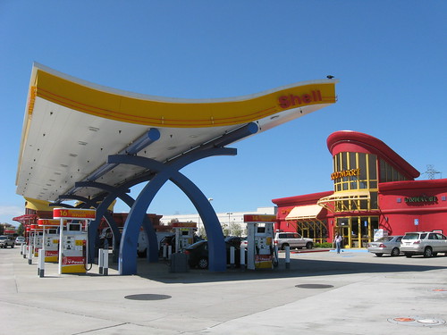
Googie architecture was not about making custom houses for wealthy people. Instead, it was for coffee shops, gas stations, and car washes; the average buildings of those people of that period used in their daily life. Although it seems vintage now, it has brought that spirit of the modern age to their daily lives.
3. It is very debatable
Googie is controversial and has many enemies. Many designers perceived this whimsical quirky style as “fake” and exaggerated, and critics debated it.
4. It’s a business after all

Photography: Flickr user Andy Callahan
Architects intentionally design Googie-style coffee shops for customers to come, eat, and leave as quickly as they can. Designers extensively used that style as a marketing campaign. In fact, this is what made it successful.
Designers used the tall signs as landmarks that act as visual attractions with their spacey exterior, allowing people to then enjoy the retro-looking furniture and interior. However, the design intentionally does not allow them to get too comfy, prompting them to leave. This allows more people to visit the building in a short amount of time. Therefore, it increases sales. Accordingly, even the McDonalds of the 1950s and 60s famously adopted the Googie style. The tremendous marketing effect of the style, back in the time, is undeniable.
5. The world’s first McDonalds was Googie
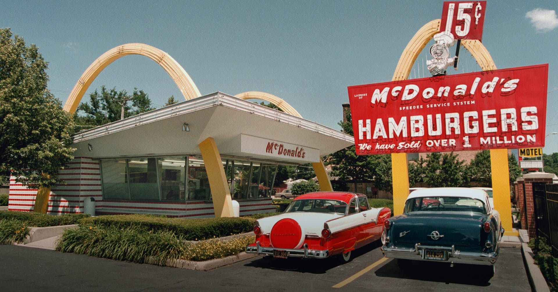
The 1953 McDonald’s in Downey is the oldest restaurant in the massive chain. Its designers, then, incorporated the famous golden (M) shaped arches into the building’s structure itself, intentionally making the exterior very eye-catching, and it could easily be seen from the road. Typical Googie!
Established in 1953, this Googie icon housed two parabolic arches, every thirty feet in length (about 9.2 meters). Each of these catchy structures is made of sheet metal pieces. Flashy pink neon outlines the roof and compliments the futuristic vibes. Since the McDonald’s brothers were so fond of their food preparation techniques, they exposed them to the public. They commissioned Stanley Clark Meston, a commercial architect from Fontana to design the new building in Downey so that it could be replicated by the franchises. The architect specialized in auto showrooms and used to work for architect Wayne McAllister—father of Googie architecture.
He employed a unique approach that is based on exposing some of the cooking processes to the public. The design included transparent glass around the kitchen. This consequently permits a view from all sides so outsiders can observe the food preparation in the process.
In 1959, they replaced the original pink neon sign with a custom model. It features the original mascot Speedee running atop a 60-foot golden arch.
6. It represents South Californian Culture
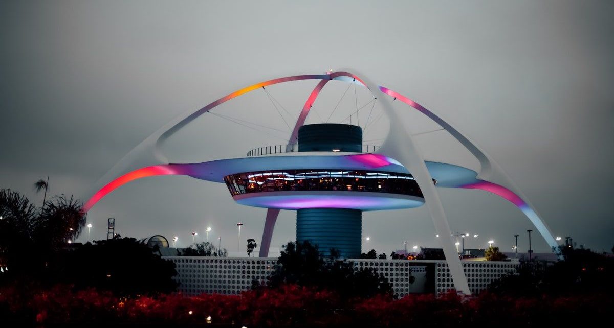
While Southern California is rich in architectural variation, Googie gives it a new dimension. It is deeply affected by the innovations of cars at that time as well. Certainly, Googie largely represents the cultural identity of Southern California. No one can deny that it is the signature style of the region. One of the prominent Googie landmarks must be LAX’s flying-saucer-like Theme Building.
Part spaceship, part flying saucer, the unusual-looking circular structure, some mistake it as the LAX control tower. No doubt this Theme Building is now one of L.A.’s most iconic buildings. For L. A inhabitants it represents childhood memories. This is because it aired the futuristic animated show with fictional characters; “The Jetsons” for the first time.
Over the years, the Theme Building became as much an iconic symbol of Los Angeles as the Hollywood sign. The LAX Theme Building lifts up the whole character of the area and attracts a lot of tourists.
In terms of architecture, it represents part of a major postwar expansion of the airport and represents the scaled-down version of an original vision. The original LAX is an enormous glass dome that served as the central hub for the terminal buildings and parking structures.
The architectural firm Pereira and Luckman designed both the original and revised designs. Accordingly, they have become well known for designing their master plans as well as institutional buildings both public and private. Built-in 1961, the Theme Building features a UFO-like restaurant suspended from the center of two massive crossed arches of stucco-covered steel. A screen wall of decorative concrete block surrounds the building, adding another Mid-Century Modern touch.
Intentionally, the spider-like Theme Building is playful and futuristic. It sheds away constrictions of the past signaling Los Angeles’ mid-century drive to be the city of tomorrow. Surely, this style’s whimsical, space-age modern look strongly compliments Southern California’s fun-loving lifestyle and culture.


