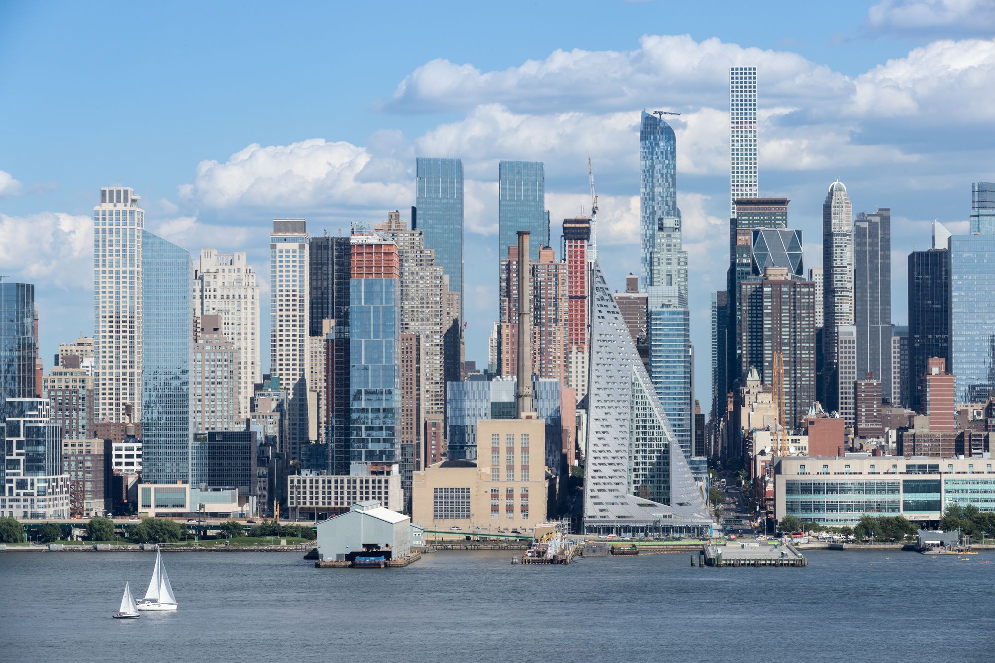
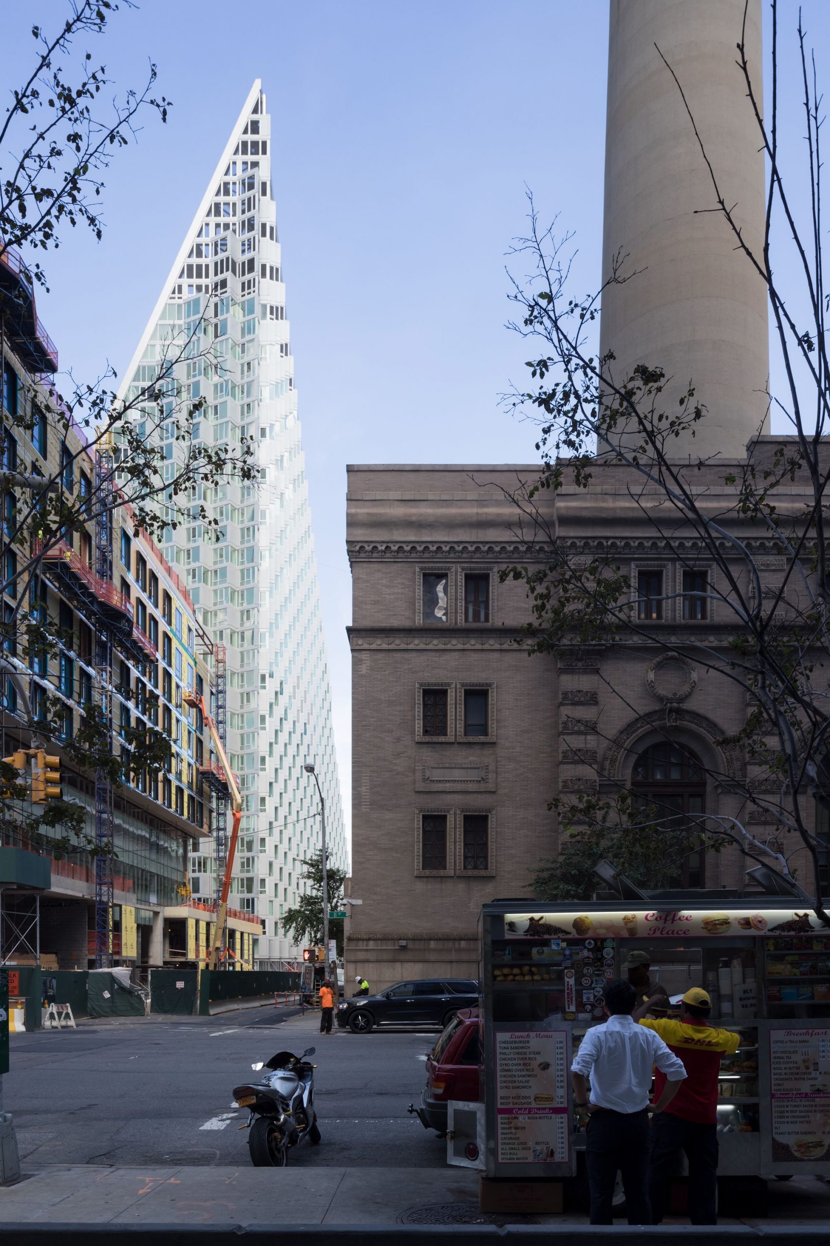
West 57, currently under construction in New York City between 11th and 12th Avenues adjacent to the Hudson River, and designed by BIG (Bjarke Ingels Group), is both an inspiration and a disappointment.
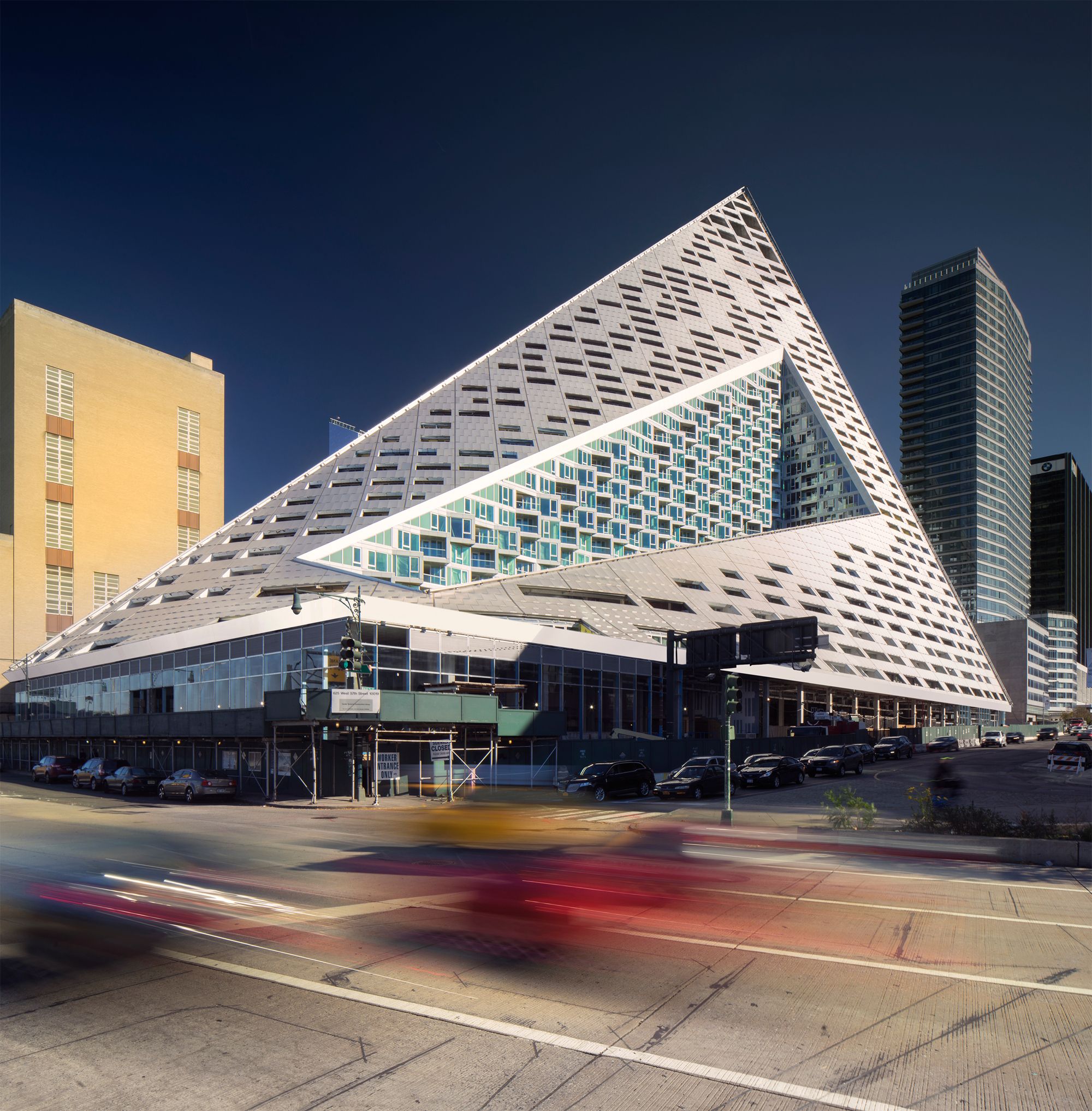
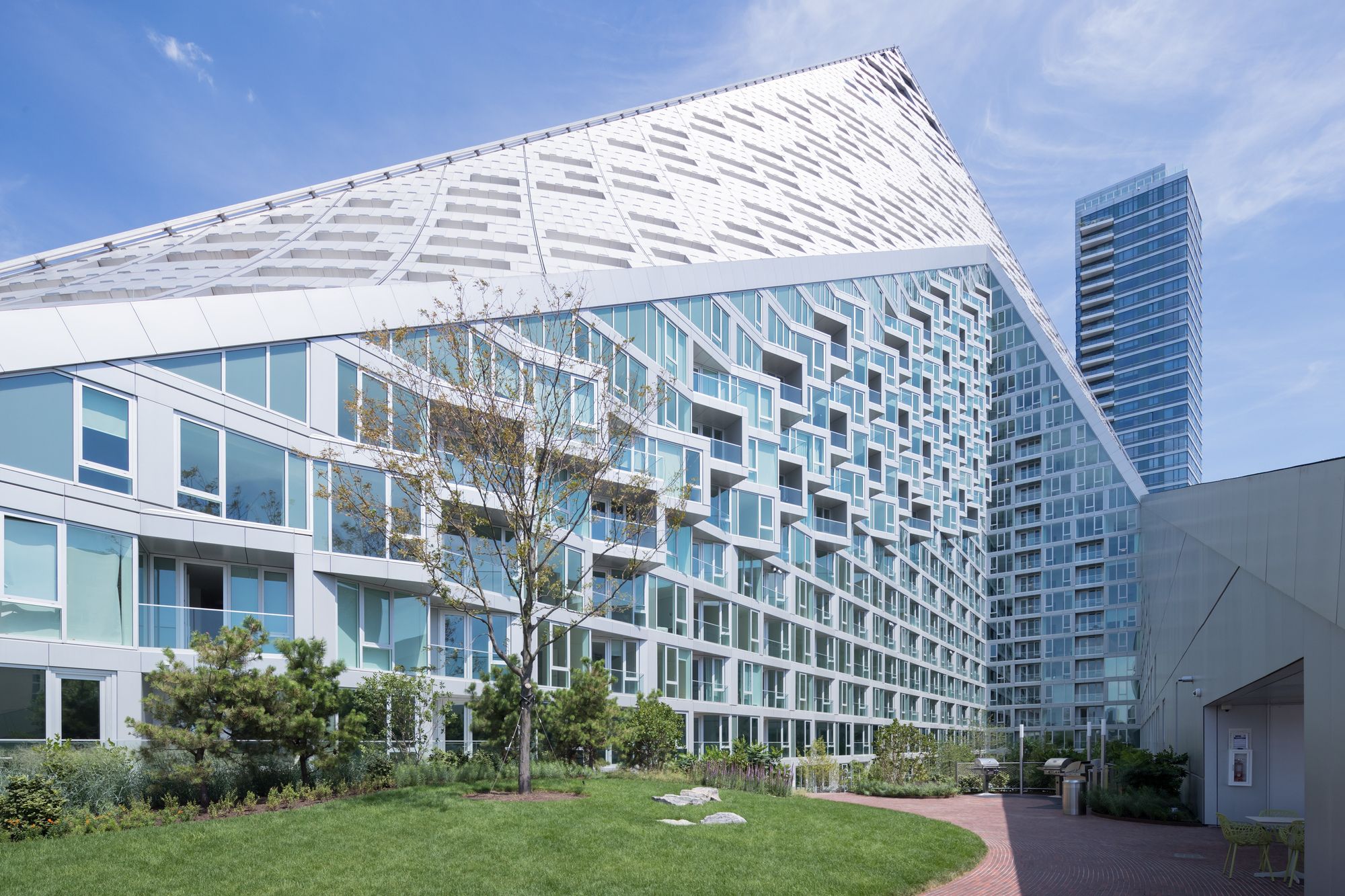
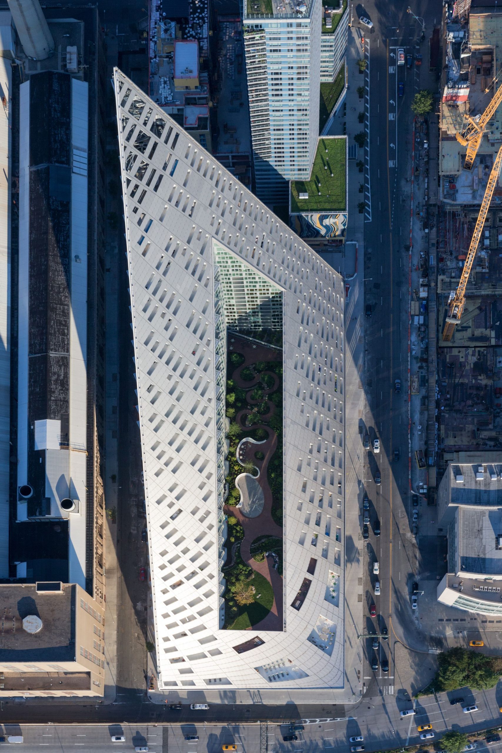
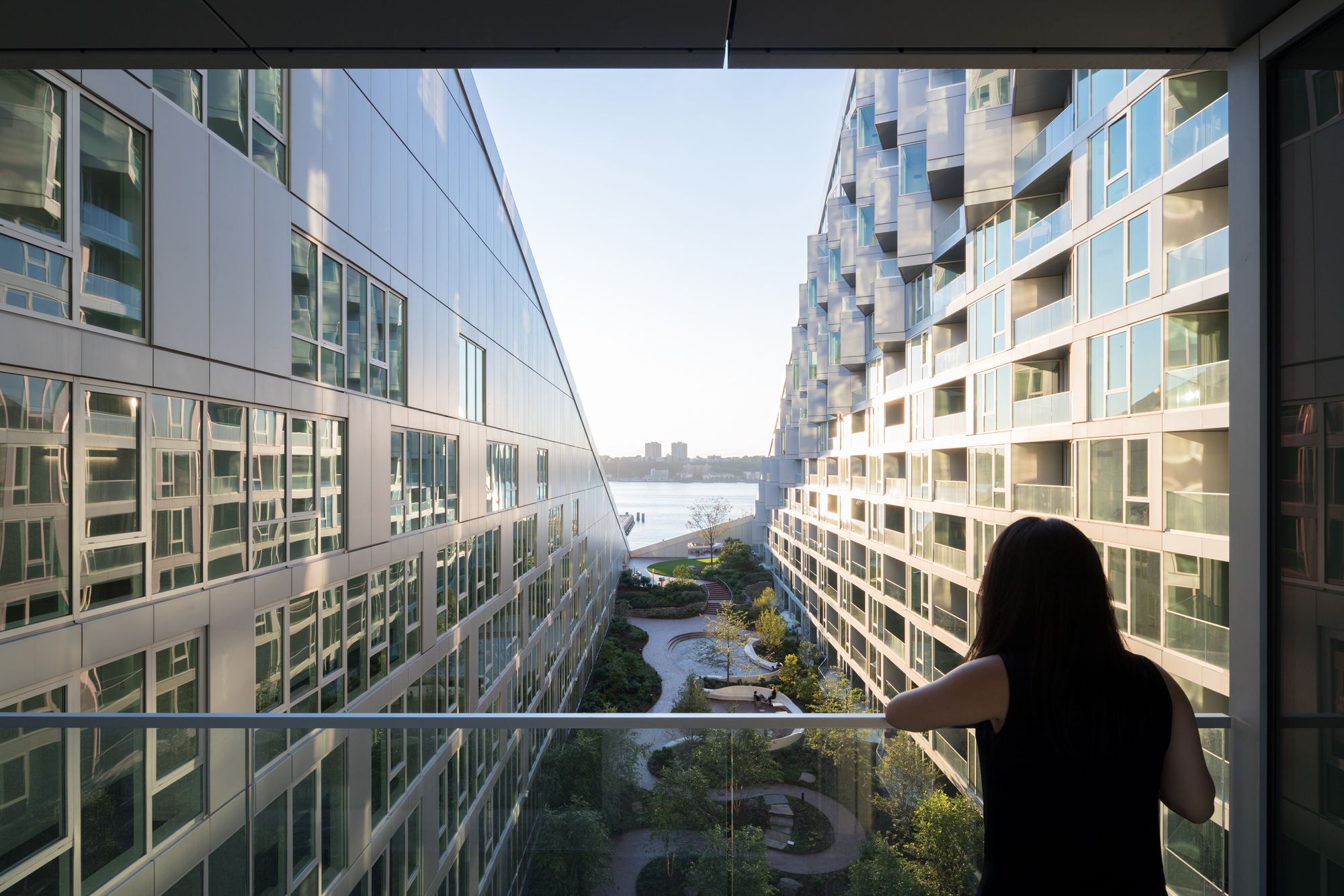
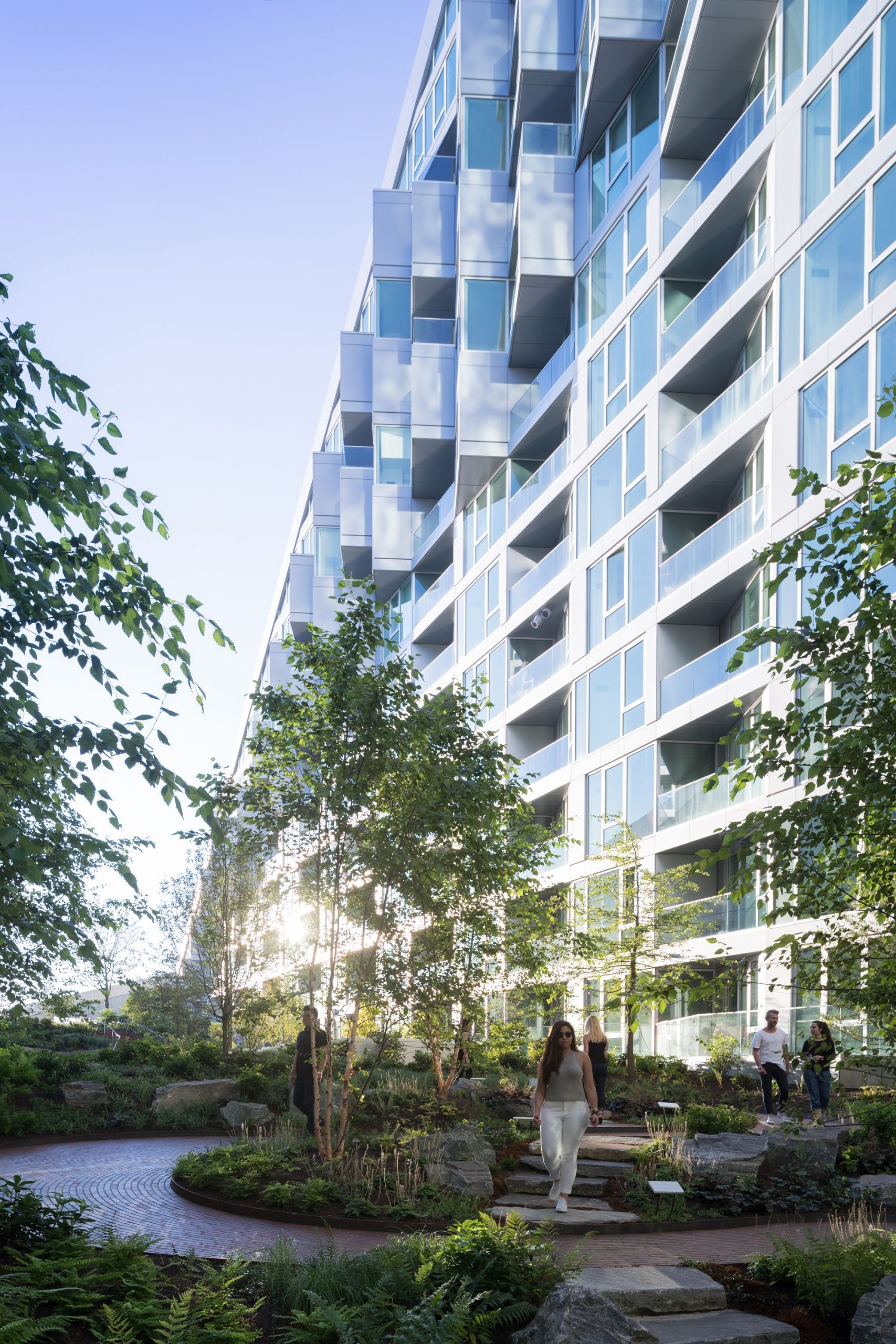
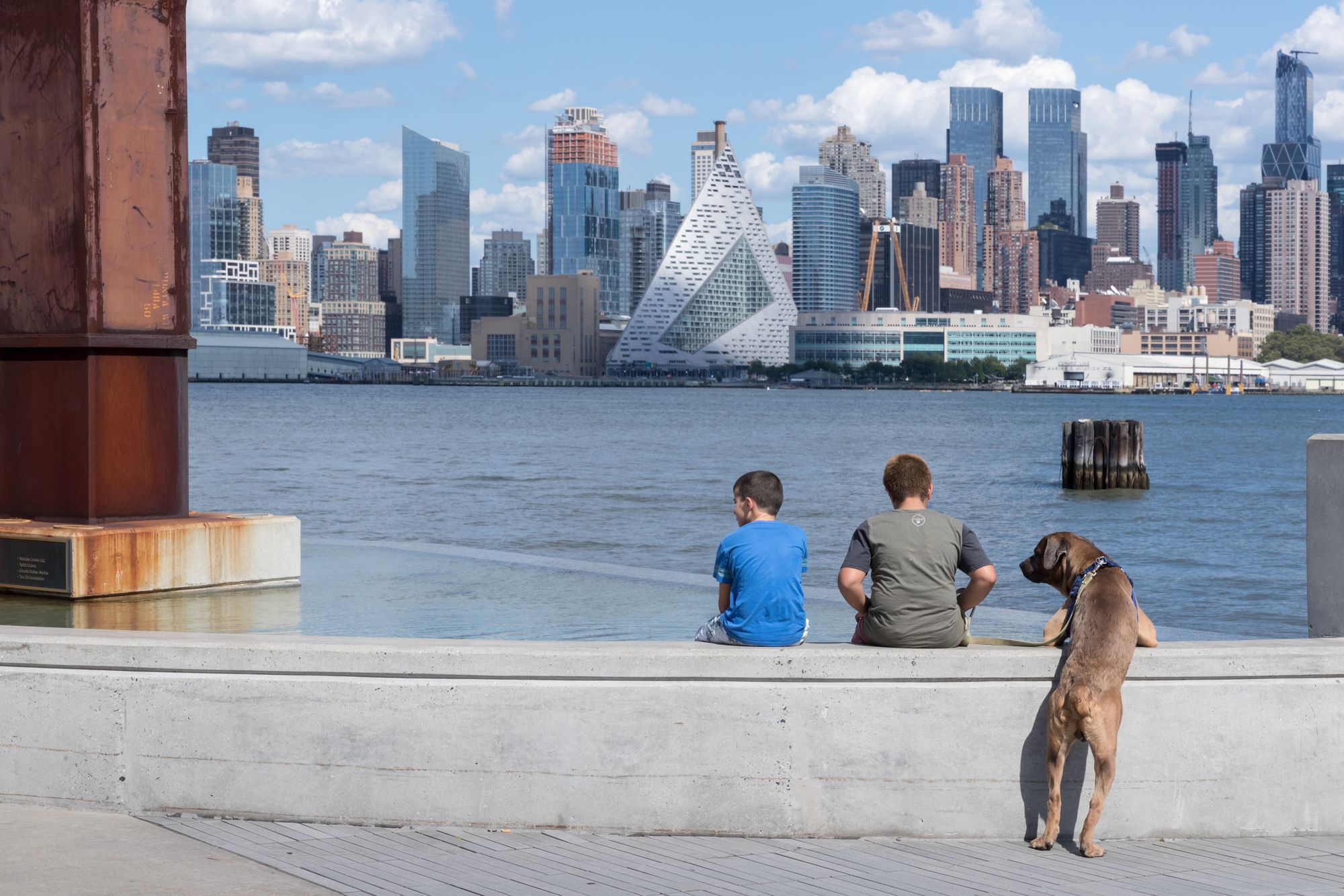
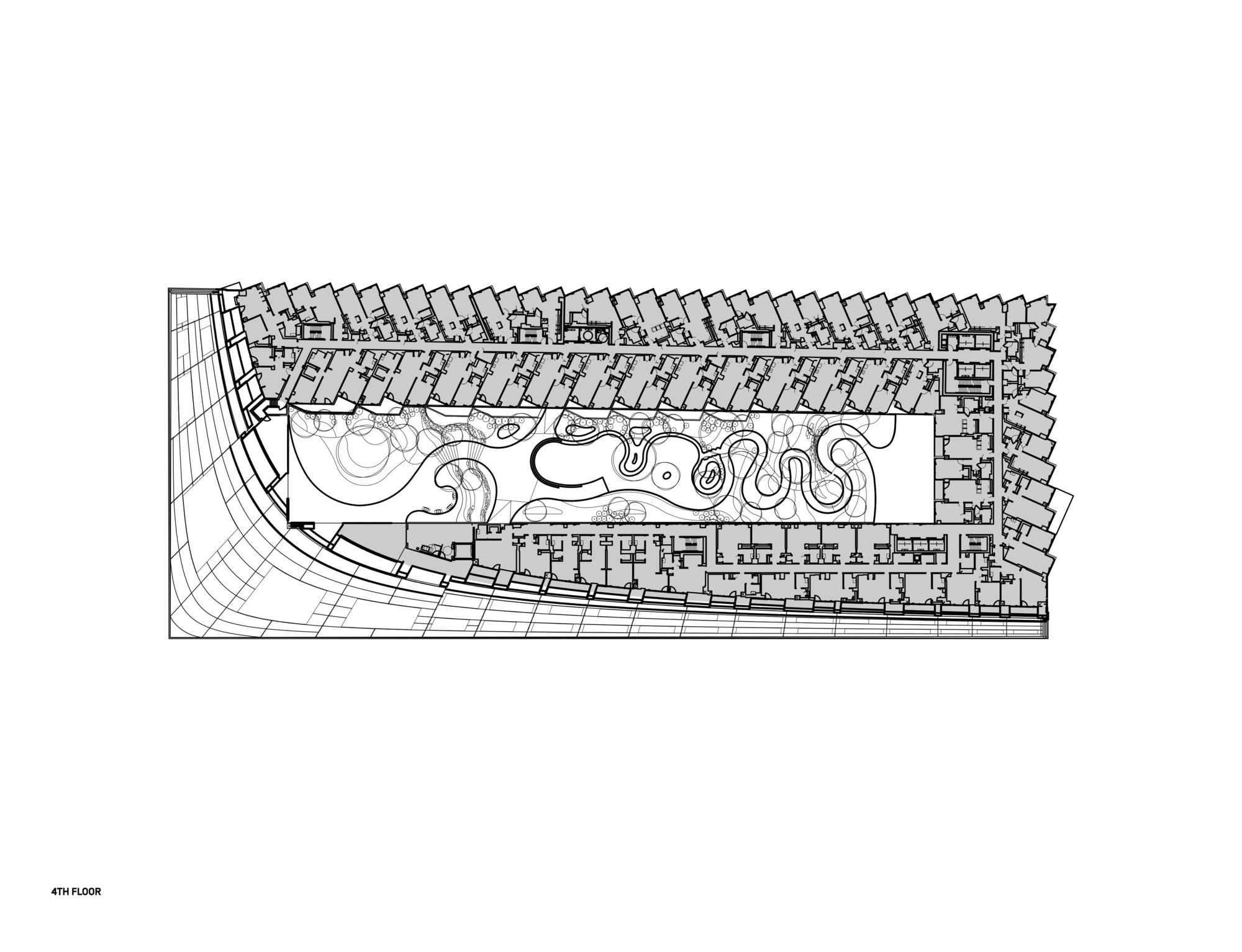
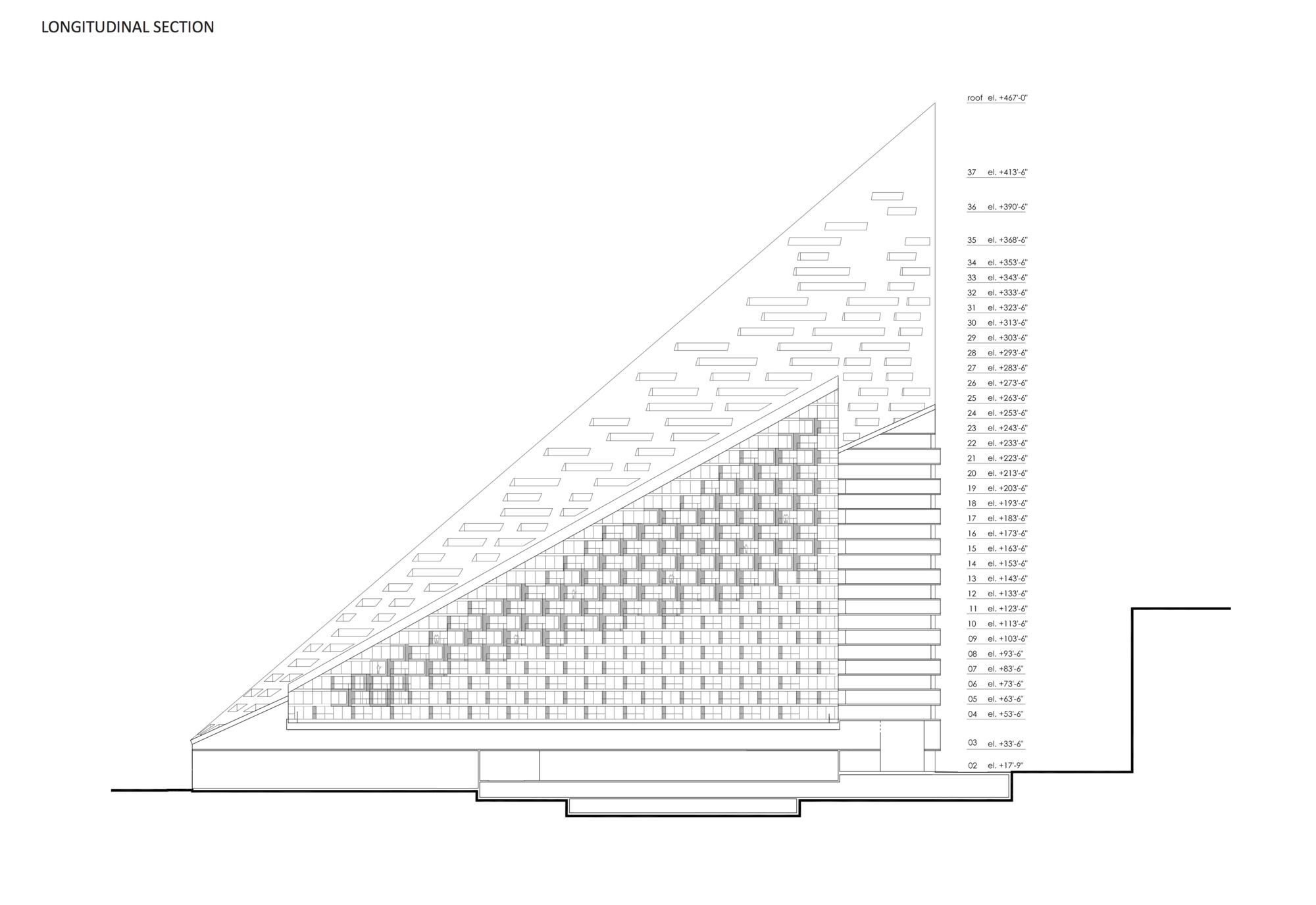
The building’s iconic main mass is and more intrinsically, the problems it addresses and the intelligent cohesive solutions it offers, are the inspiring bit. It combines elements from both european and american takes on density housing; the courtyard building with the urban highrise. The north-east corner of the plan is pulled up to 142 meters, and from this point, the building sweeps down to the other three corners which lie above street level, creating the opportunity for a garden courtyard to be cut into the mass, providing sunlight and views to every unit.
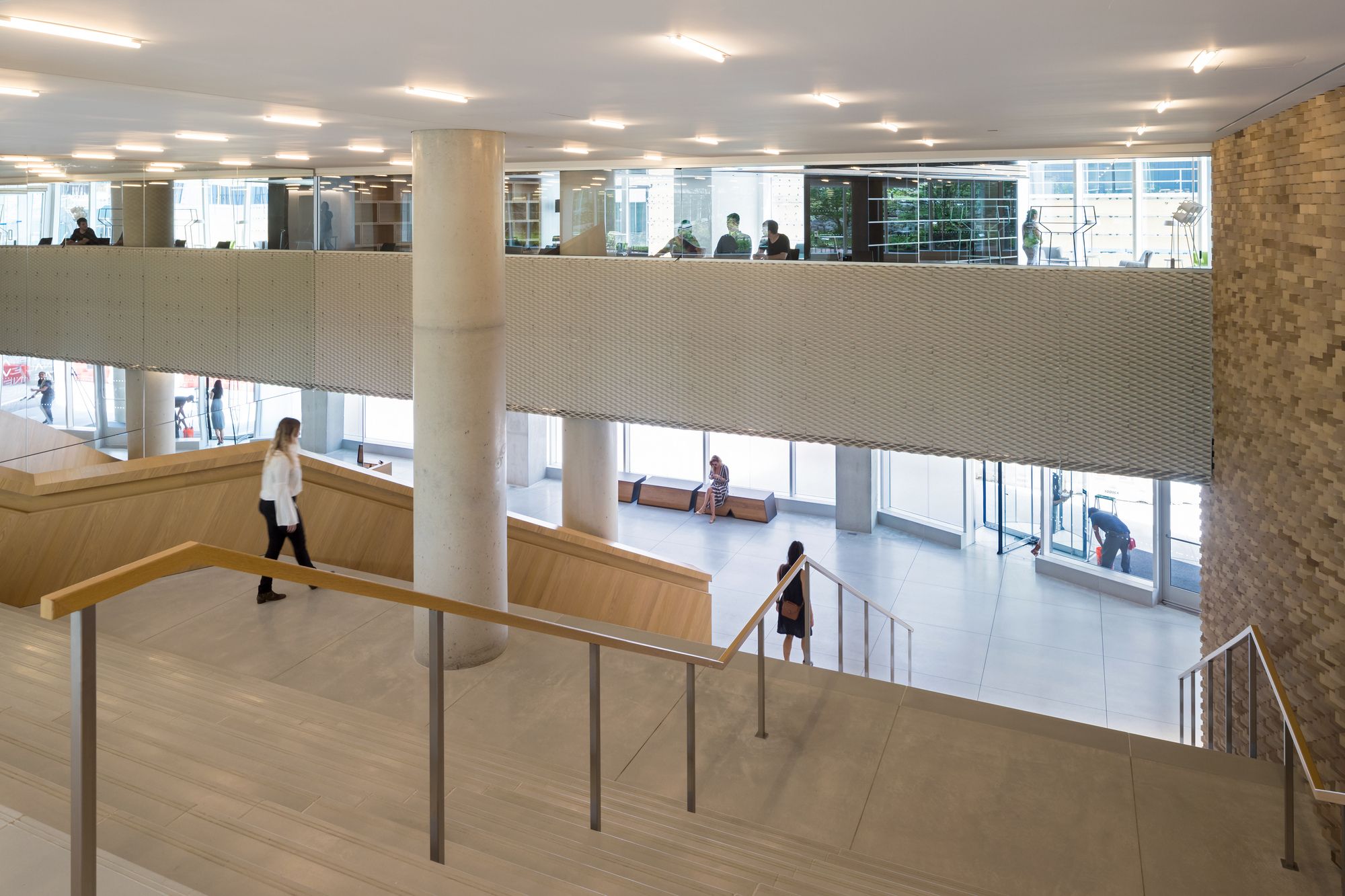
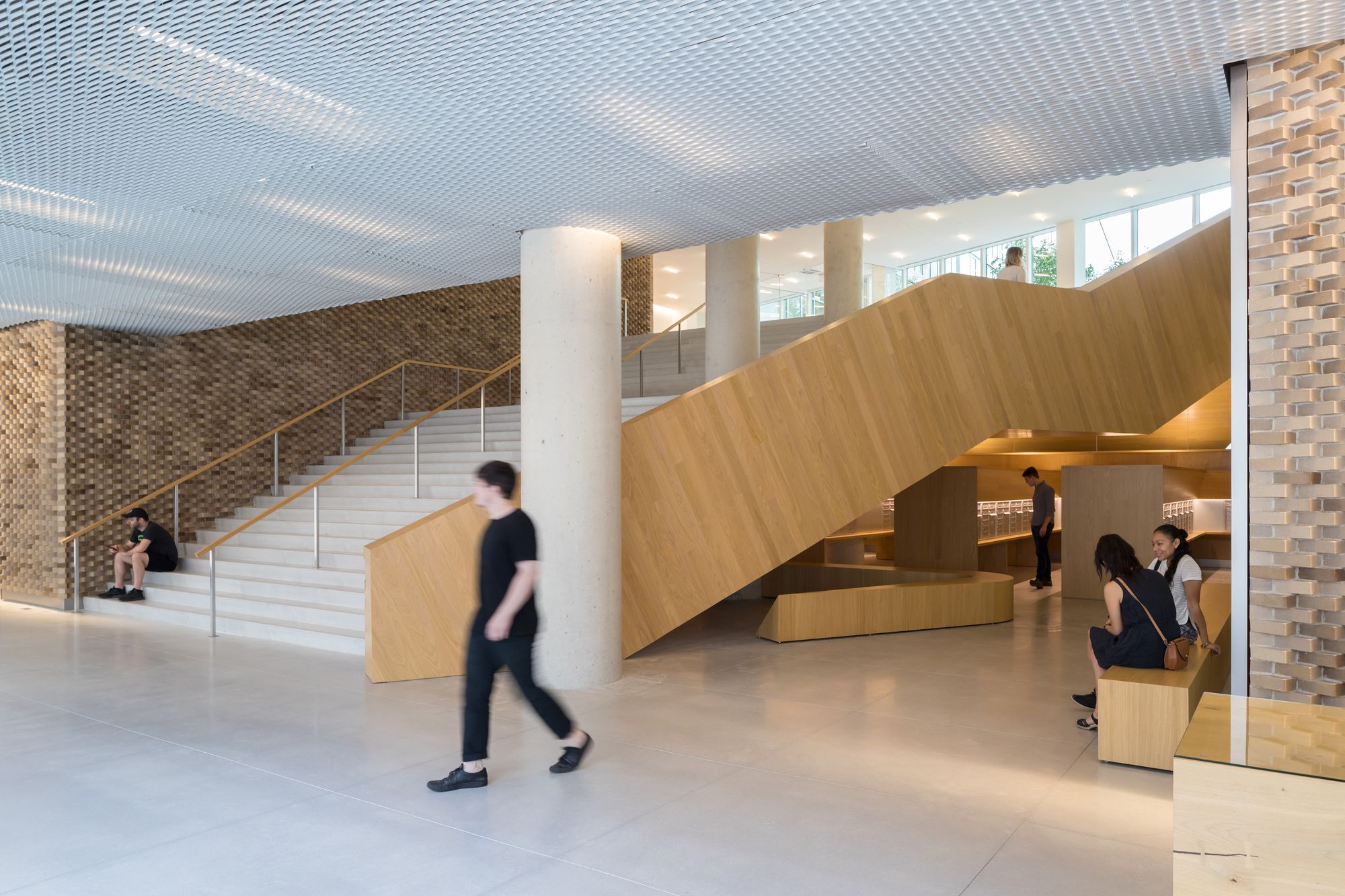
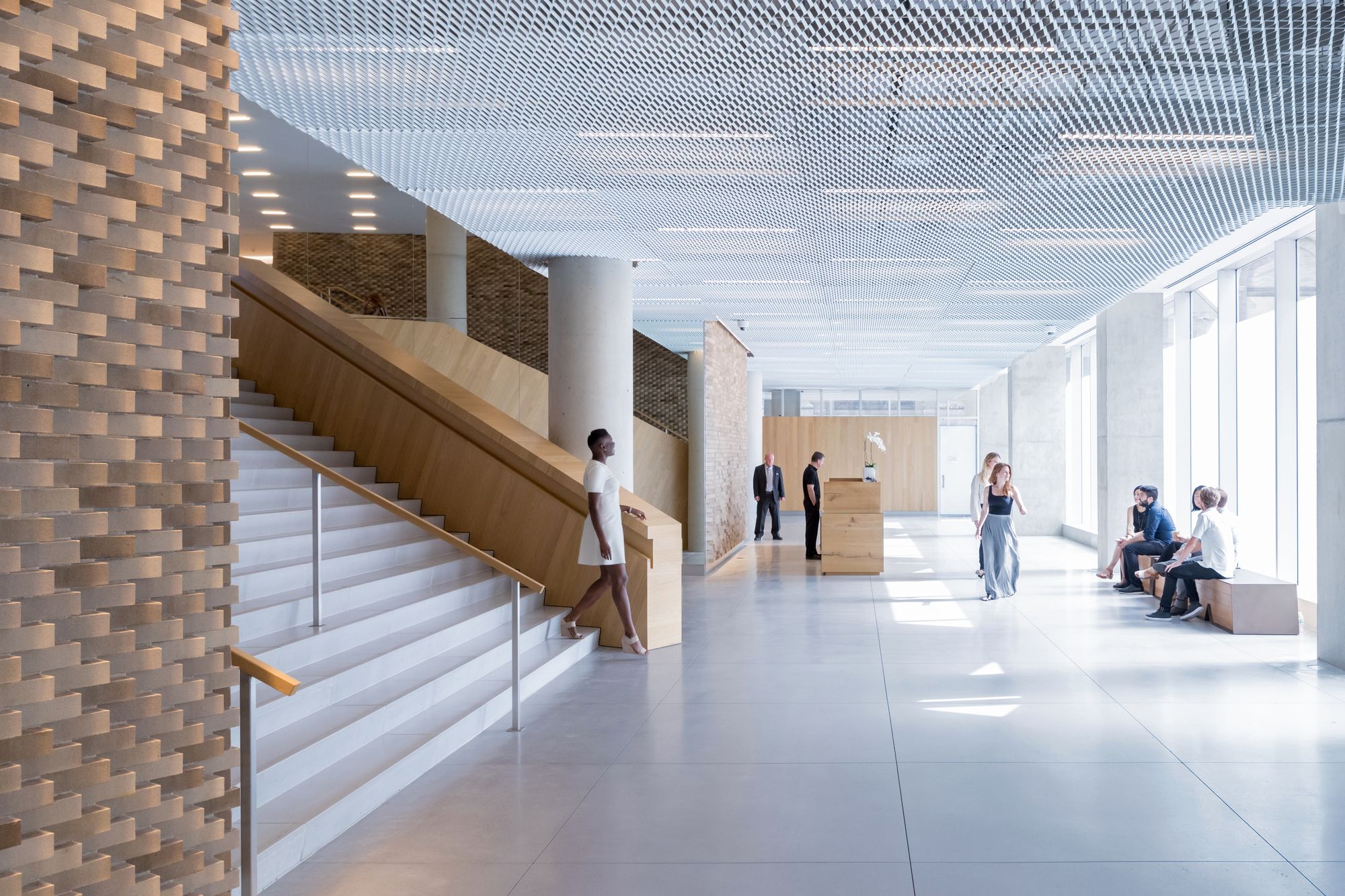
The disappointment is in the base and how this really quite refreshing urban highrise hybrid meets the ground. I mean you just drew a line! And then there’s a vertical glass storefront. Didn’t someone critique that point? Shouldn’t someone have? No meaningful deviations, the building mass gives a slight solid feeling overhang of maybe half a meter, but who cares. The building is great and says something about working things out rather than just saying ‘fuck you too, my friend!‘ and putting up a building that blocks someone else’s nice view. That’s right, as I recall, West 57 is shaped the way it is, to maintain the view for the building pictured behind it in the renders showing the skyline. That’s what good architecture can do. Now why on earth is this wonderful achievement for the people! presented to them as if someone didn’t care.
Good form. Good solutions. Overall good building. Should have had a mezzanine walk on its two street level sides, you know liven up the street side.
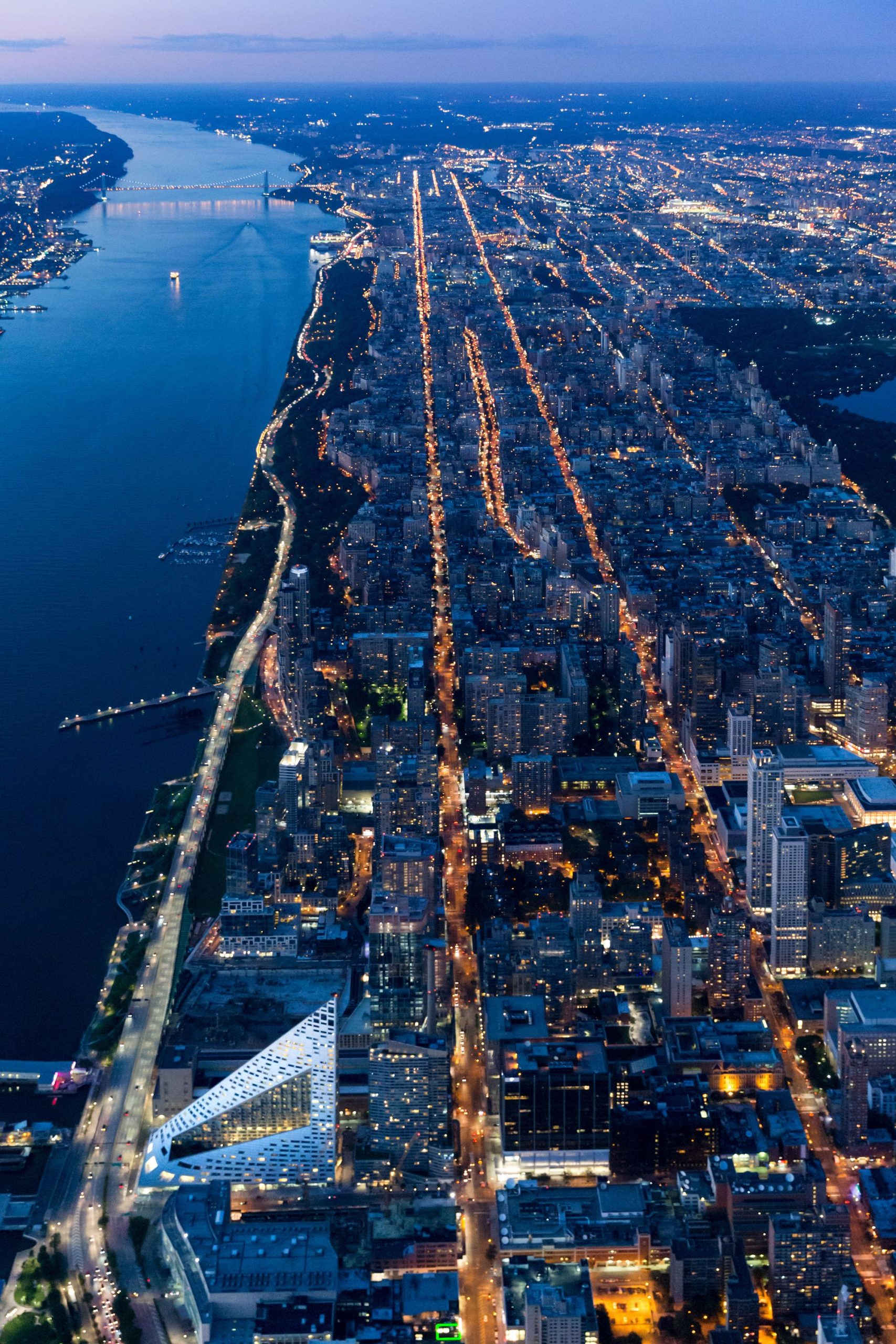
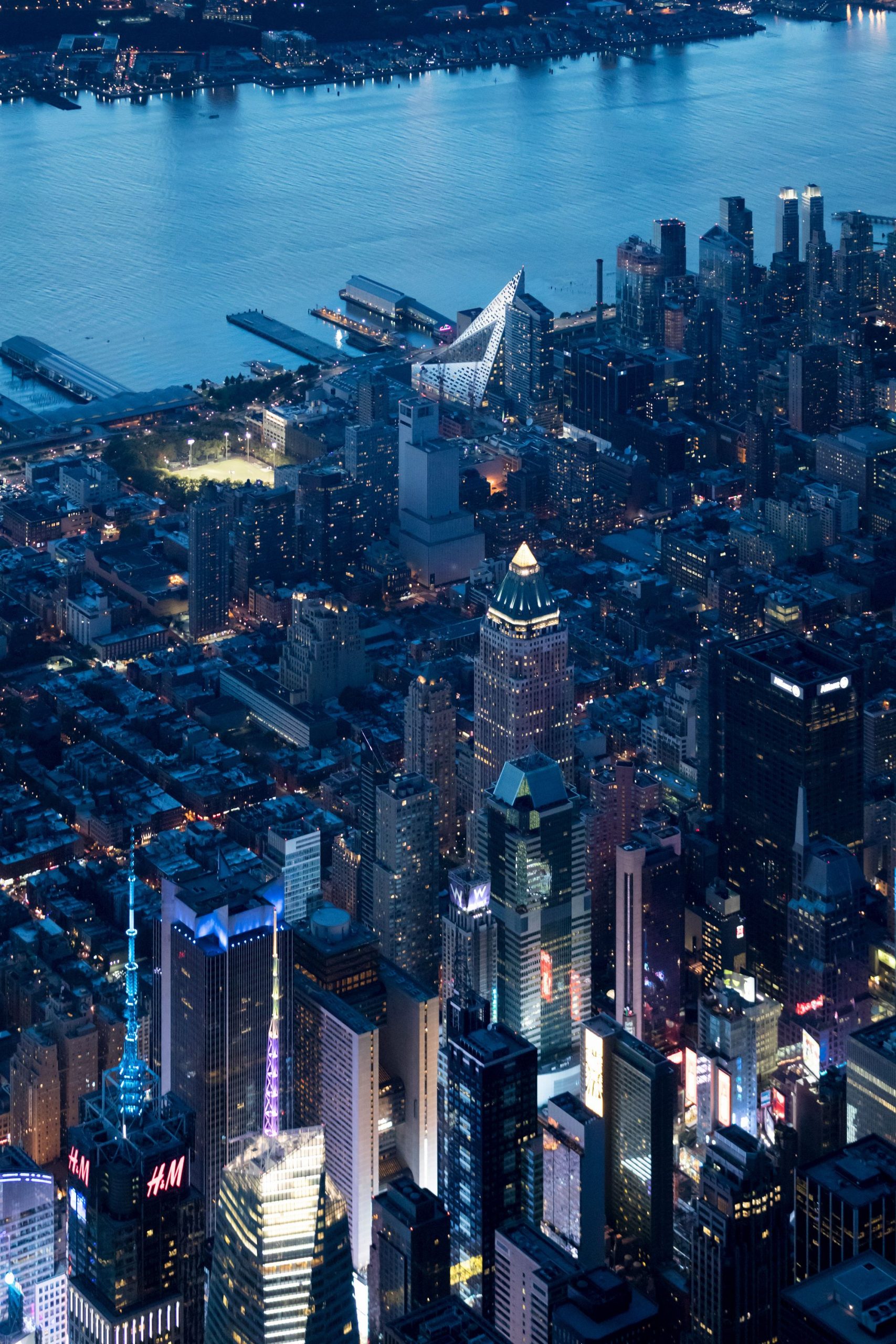
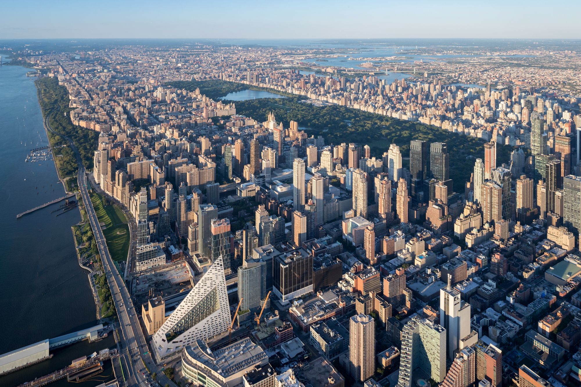
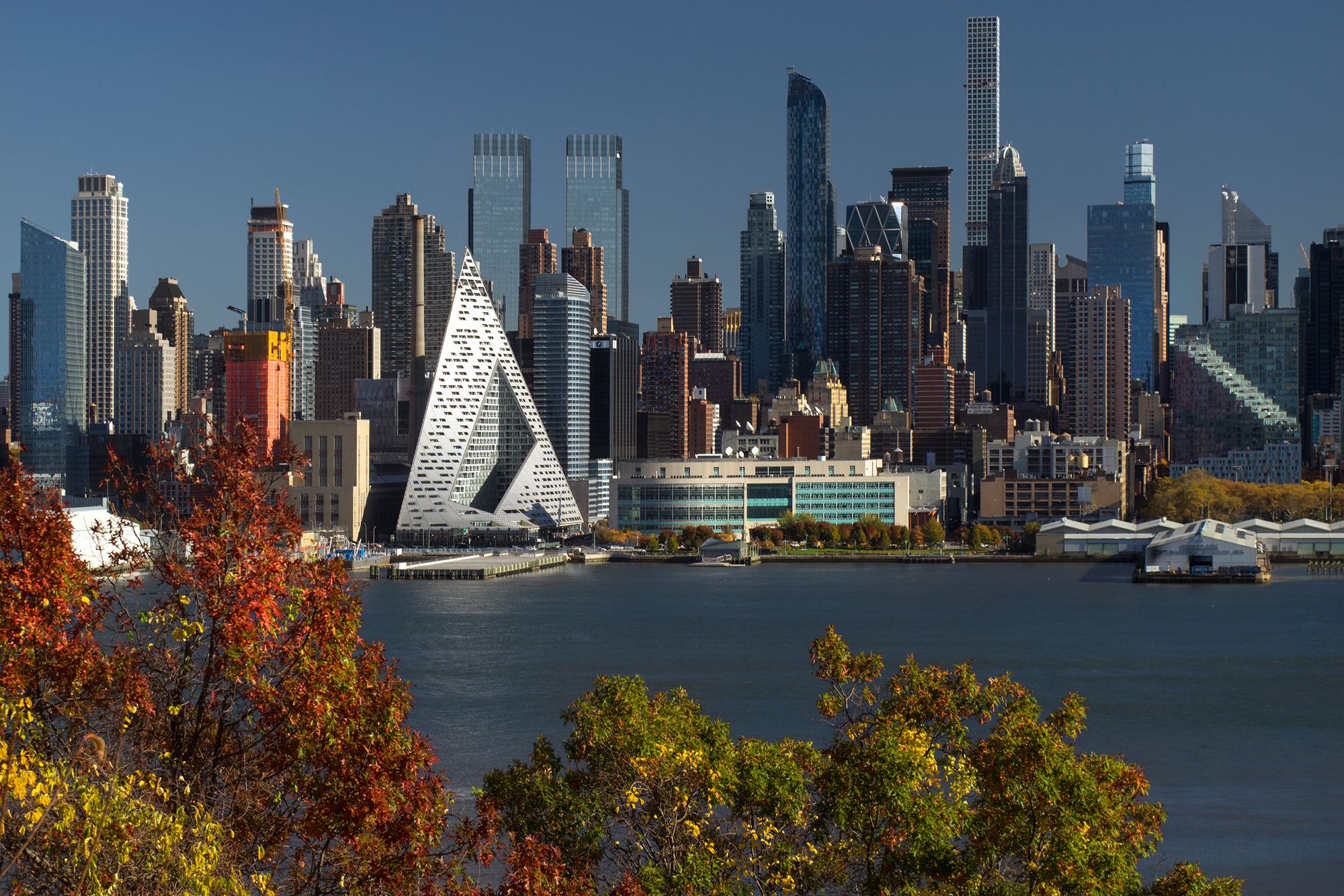
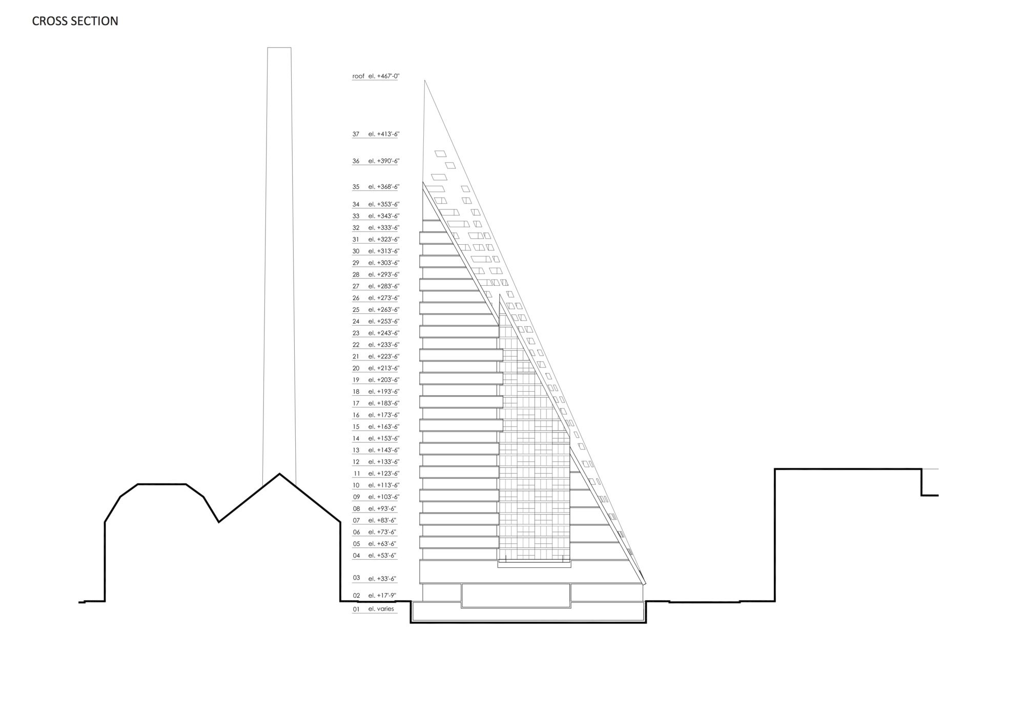
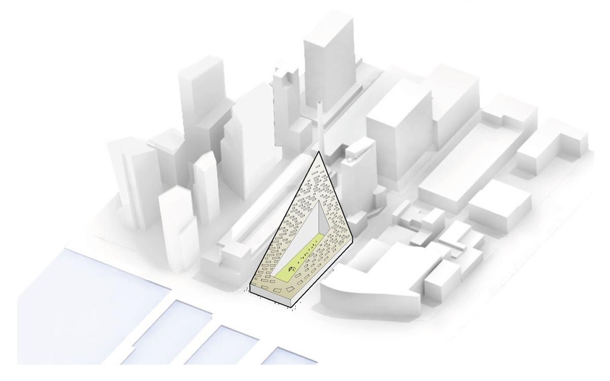
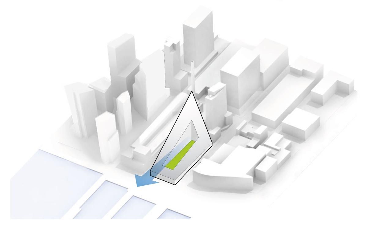
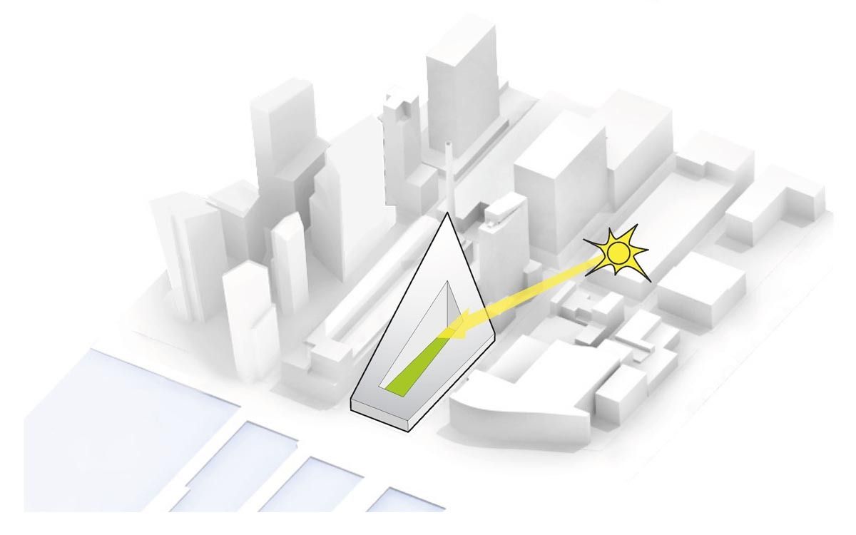
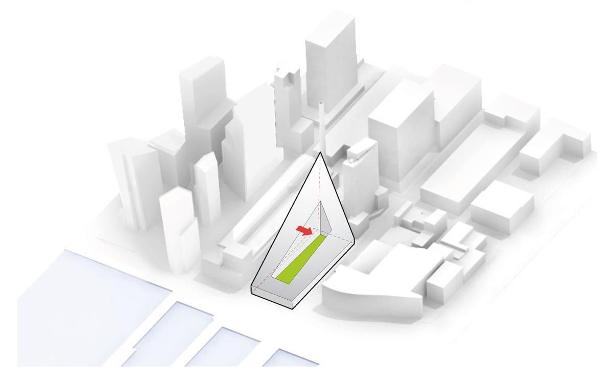
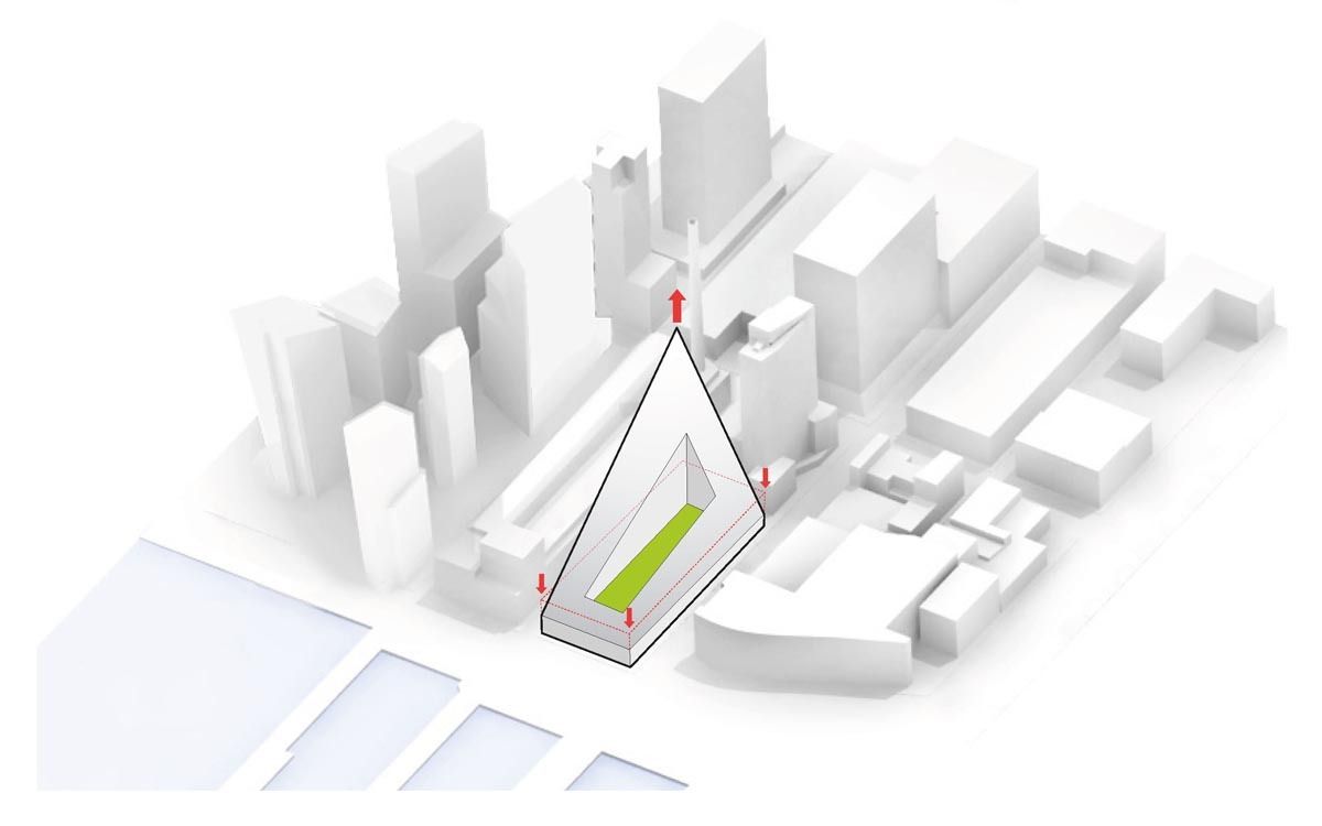
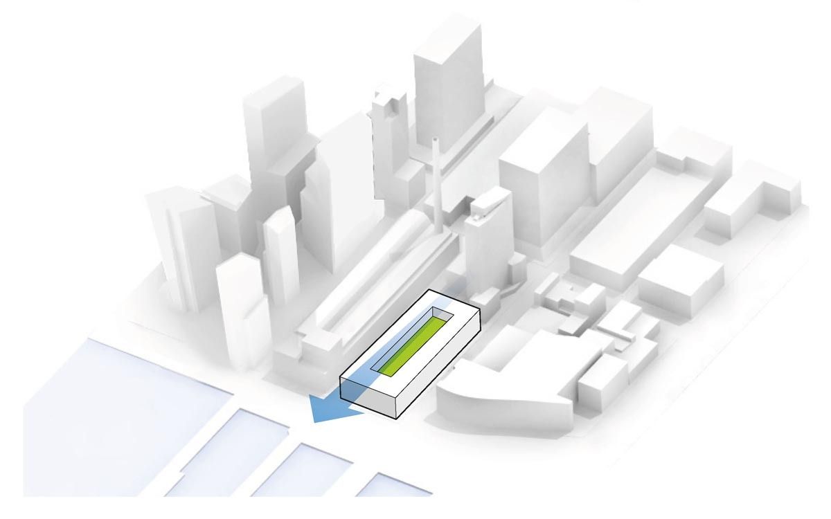
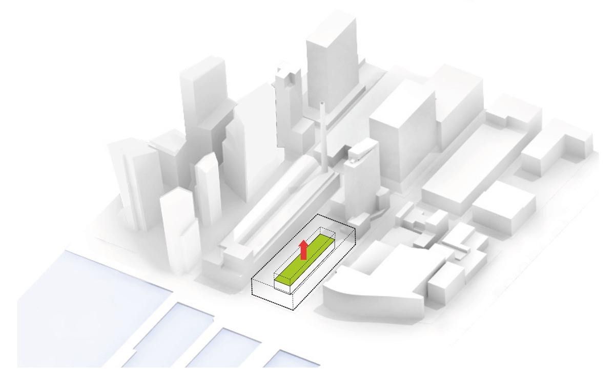
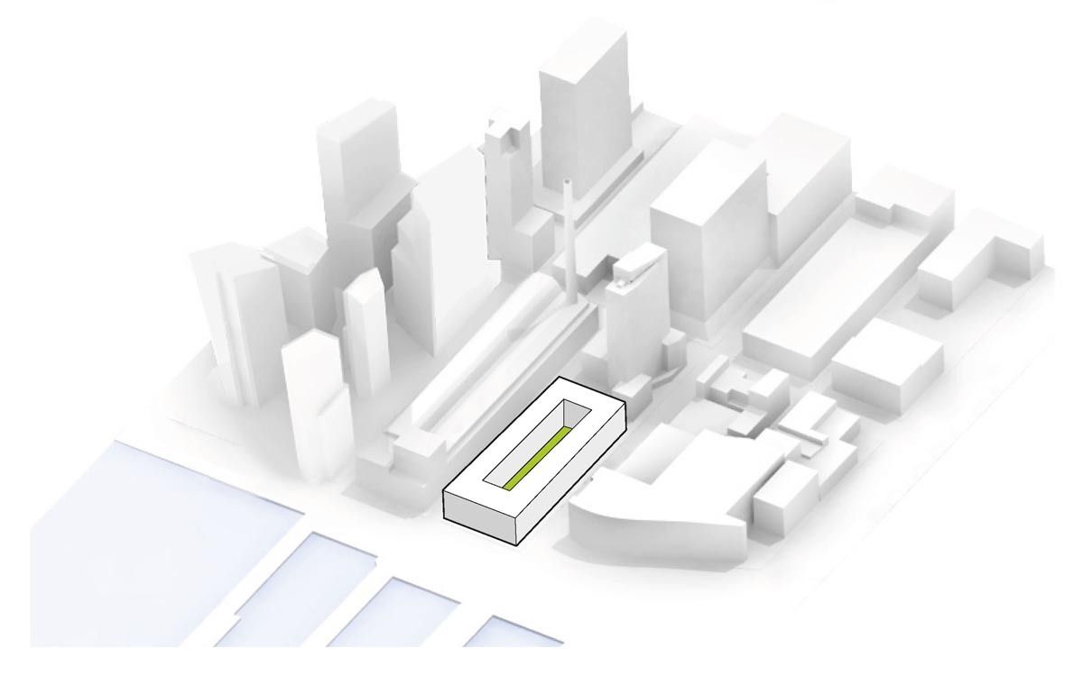
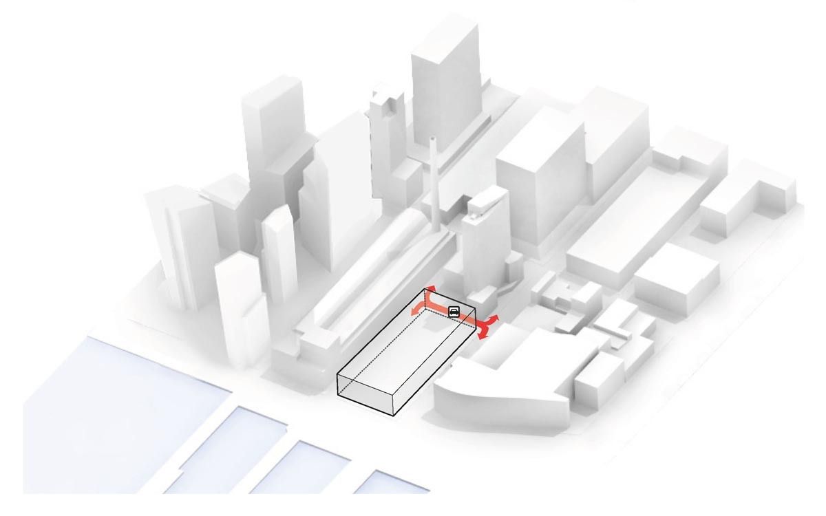
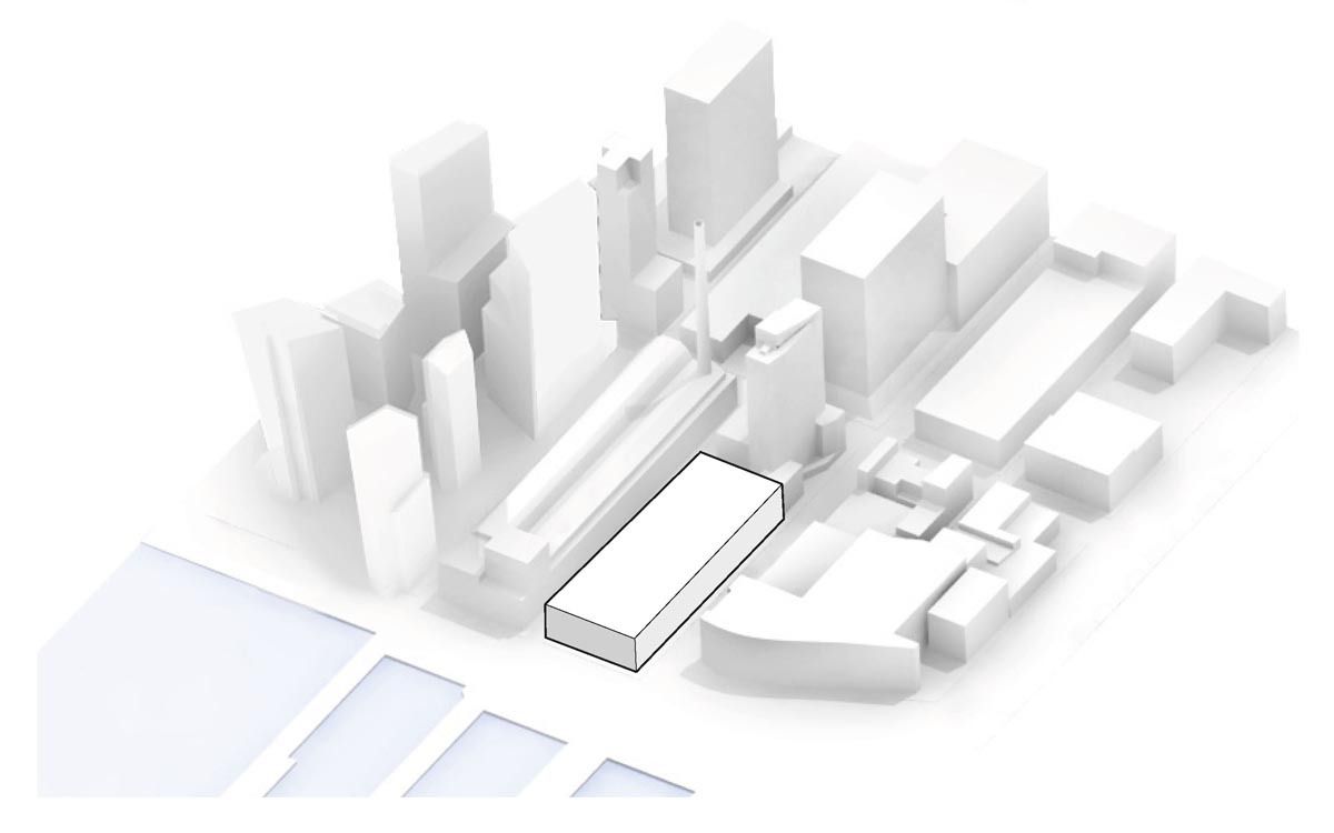
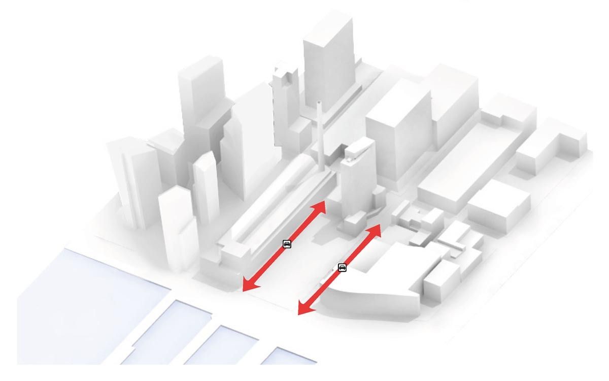
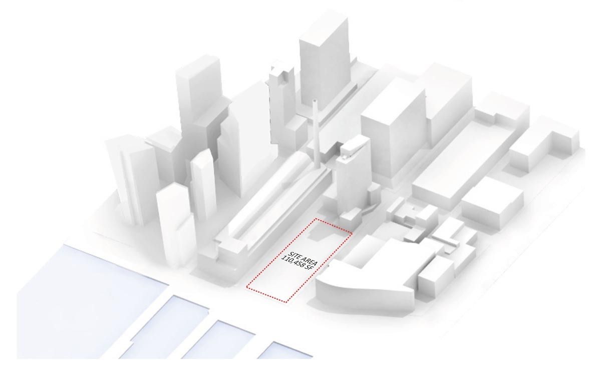
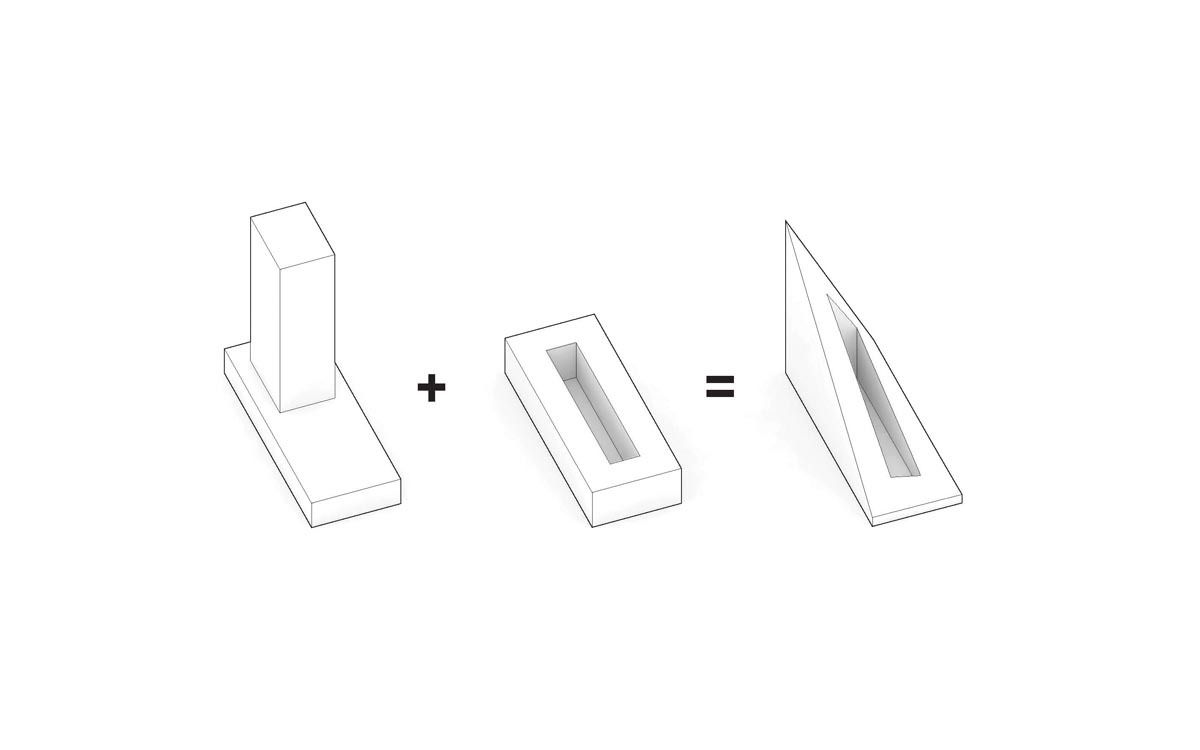
Courtesy of BIG


