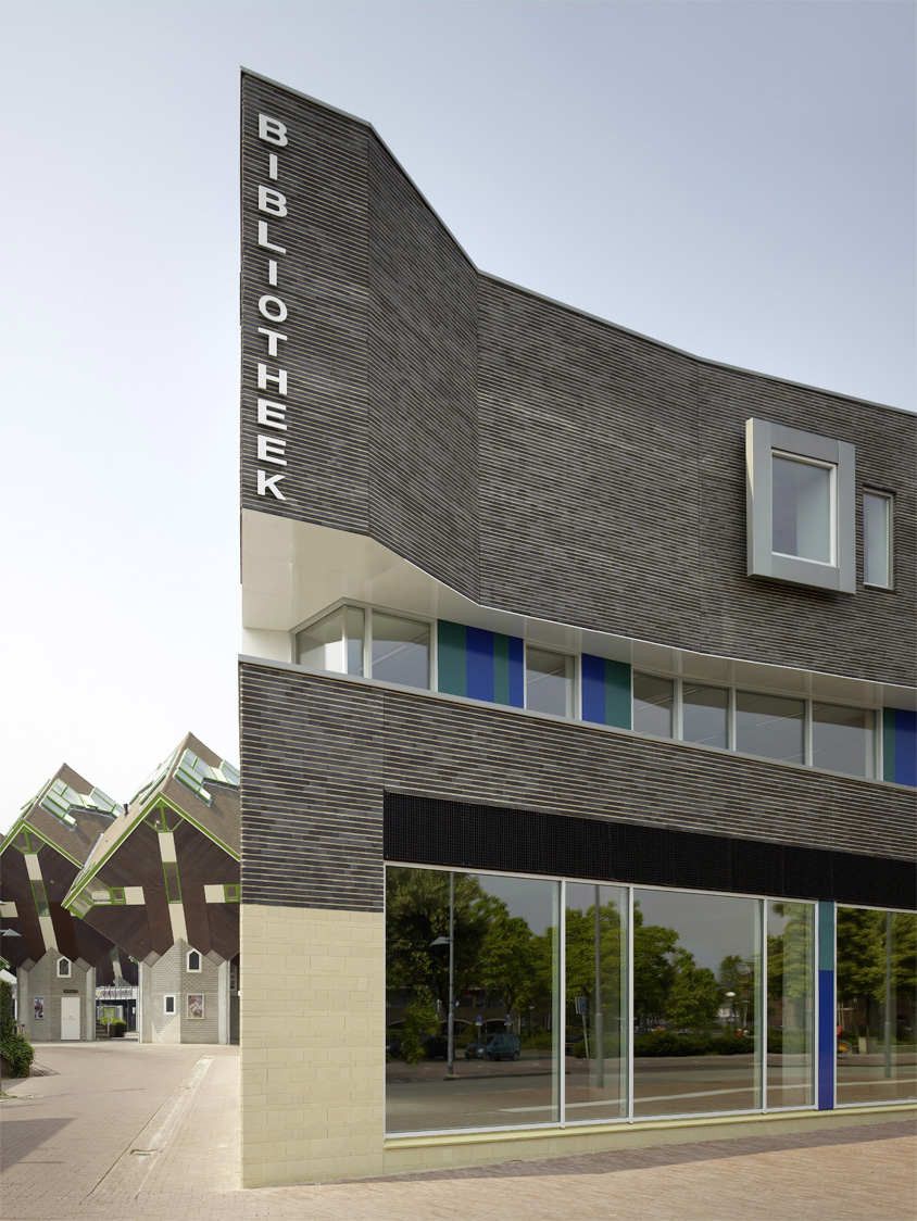
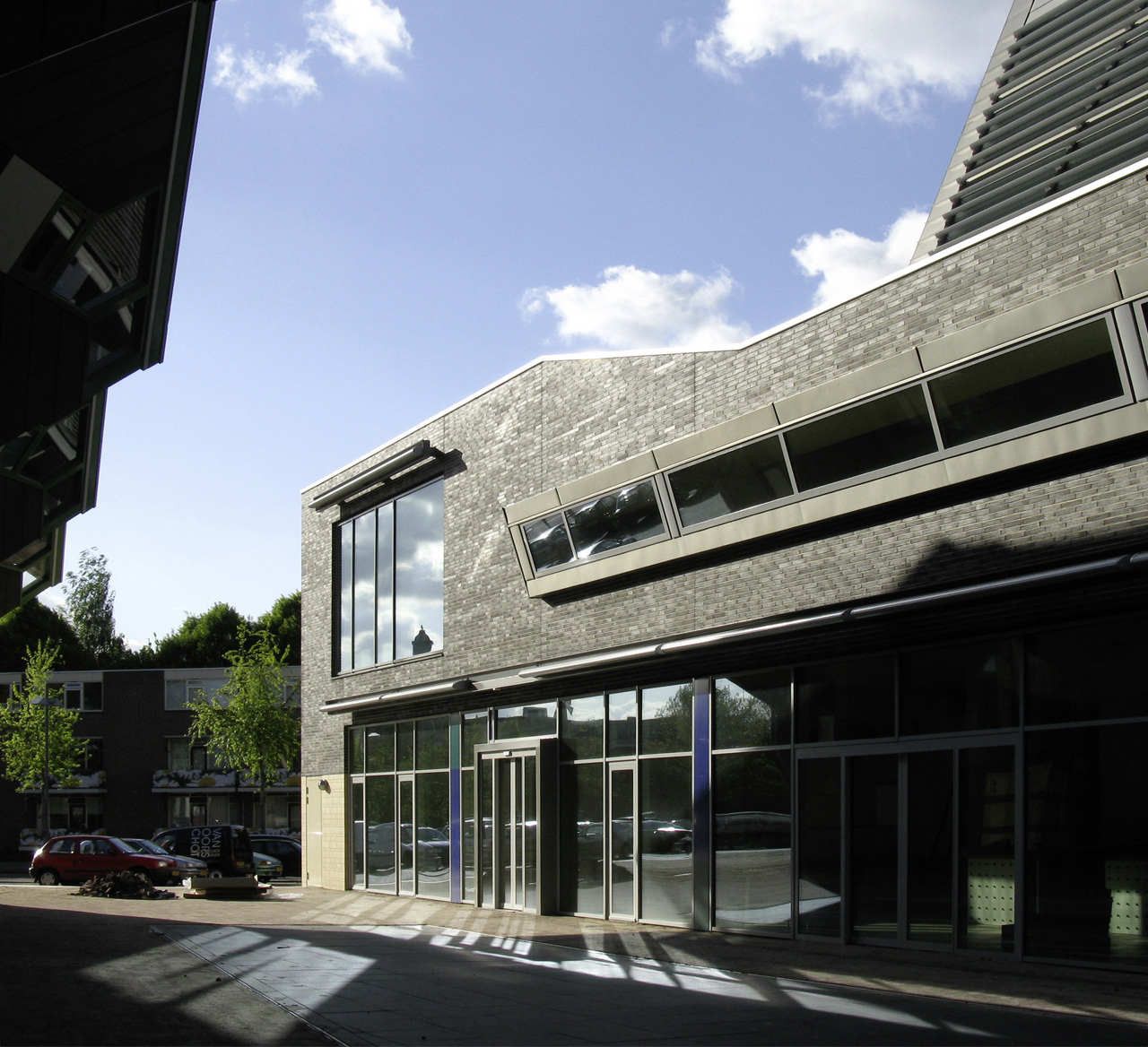
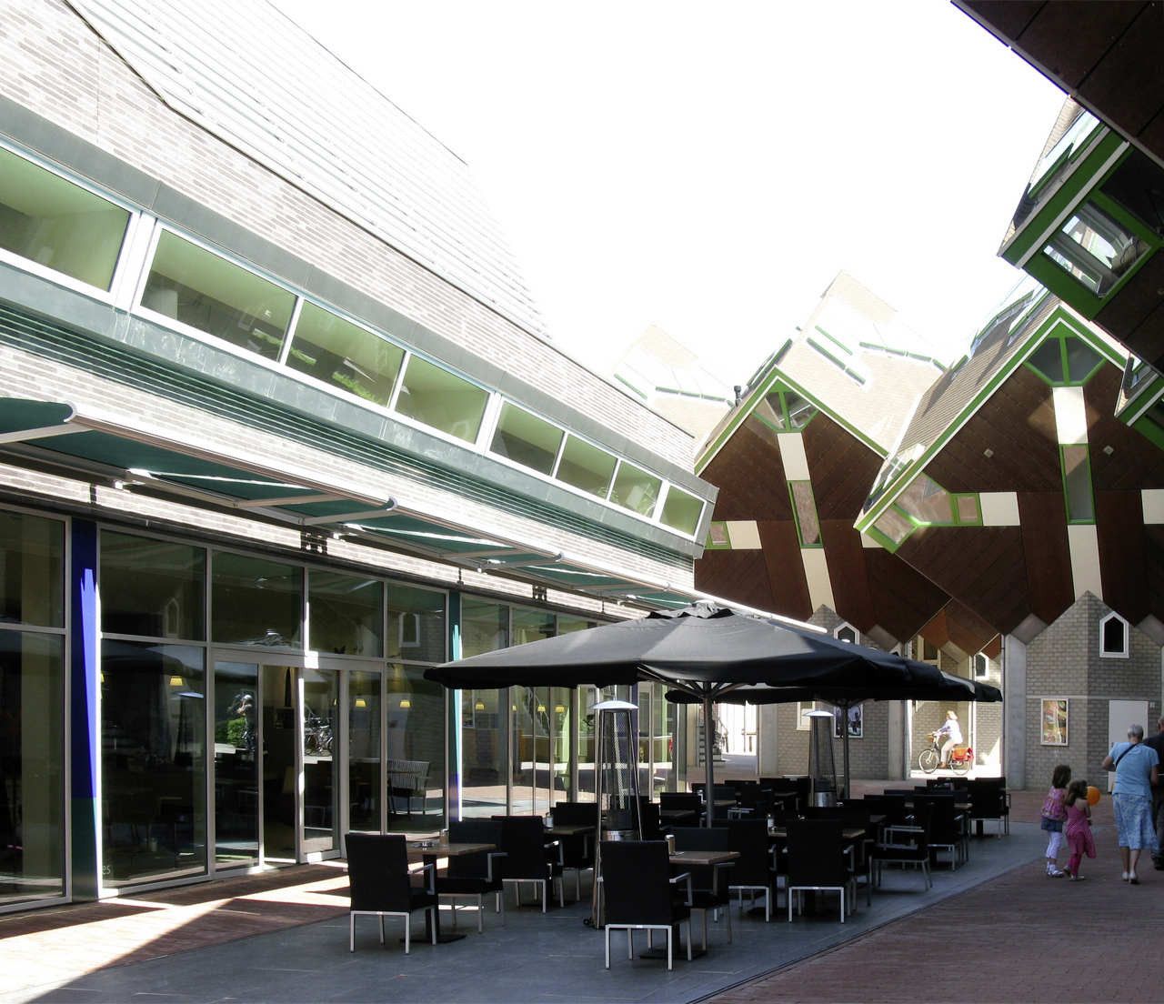
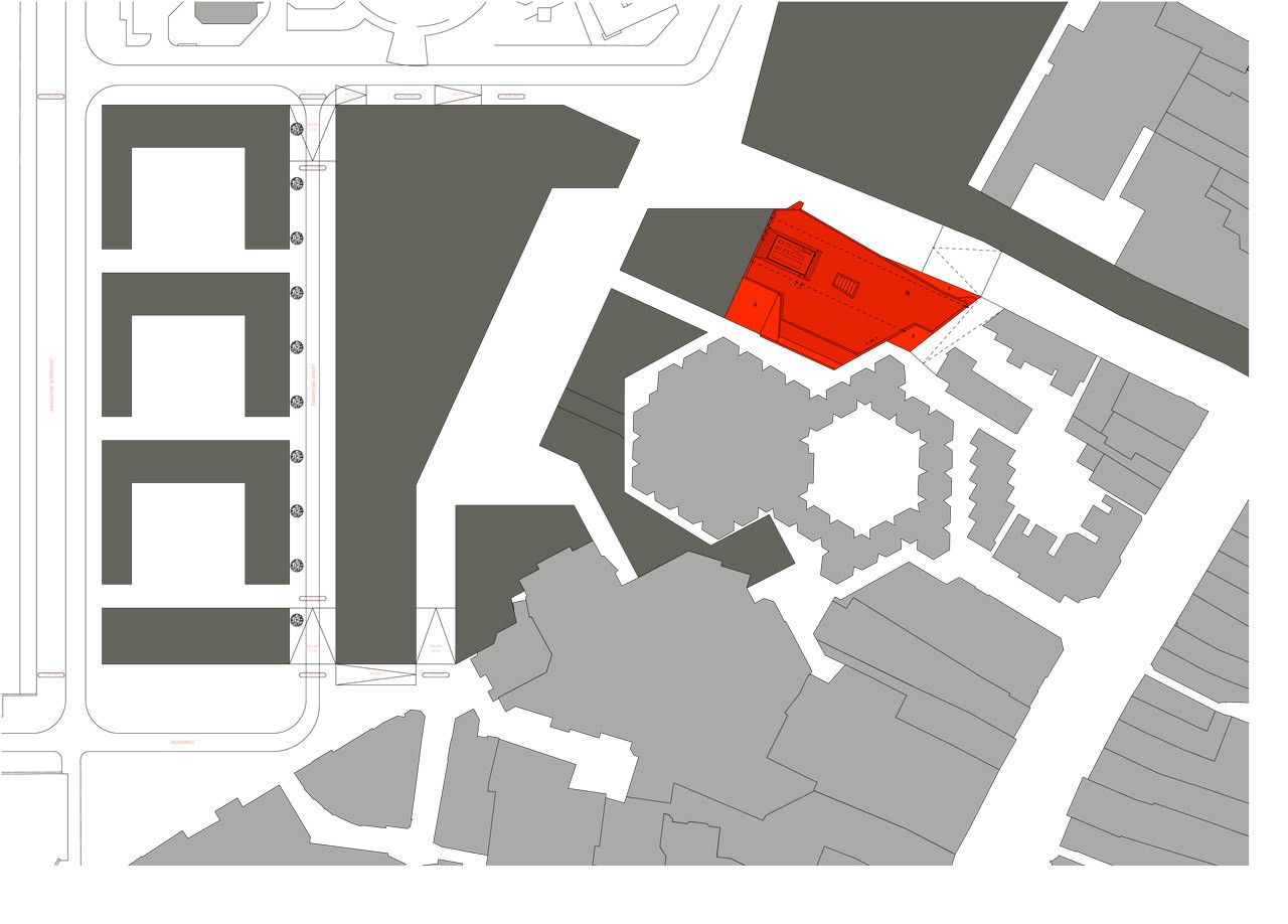
Designed by BOLLES+WILSON, Like most Dutch cities Helmond is busy reinventing itself. The new City Library is the first component of a comprehensive new inner-city shopping zone (master plan: Prof. Joan Busquets). Directly adjacent to the new City Library are the 1970’s Tree Houses and Theatre by Piet Blom. Here the new library facade is molded and sloped in dialogue with its dramatic neighbor. A between space, a block internal café terrace, a comfortable and dramatic extension of the existing enclosed Theatre Square is the result of this spatial symbiosis.
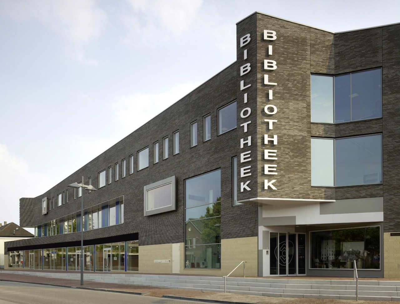
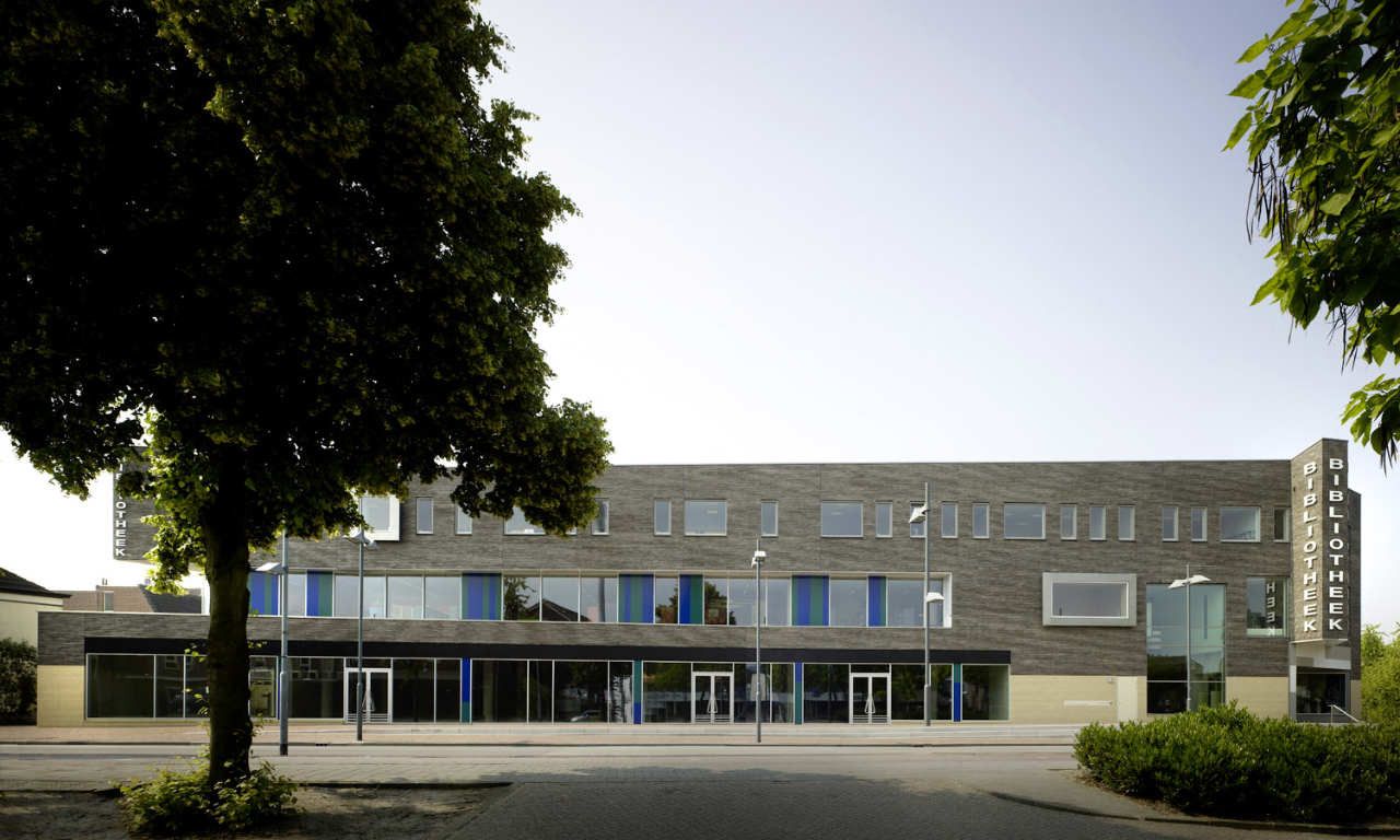
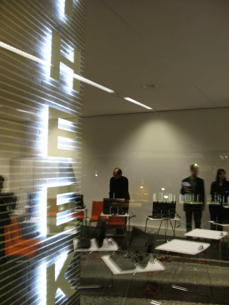
The outer, street-facing facade is the representative face and entrance of the new library. Upper-level projections mark the extremities, brackets (ears) carrying large-format ‘Bibliotheek’ letters. A horizontal facade articulation differentiates ground level shops from glazed and setback first floor (Children’s Library) and the brick surface of the upper office level.
A careful detailing and material choice for external surfaces provide a ‘tactility’ fitting to the historic Helmond city center. Rough dark brown and unusually horizontal bricks (Hilversum format 50 x 290 mm) on upper levels have open vertical joints and a beige horizontal mortar joint, stressing the layered grain of the brickwork. In contrast, the base is in a flat beige brick (in 3 different heights – 50, 100, 140 mm). These are not laid in the mortar but glued together – resulting in a stone-like solidity and homogeneity.
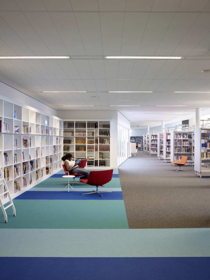
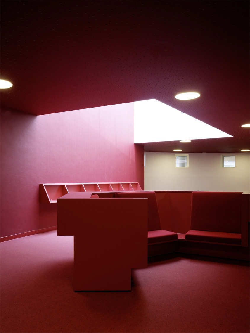
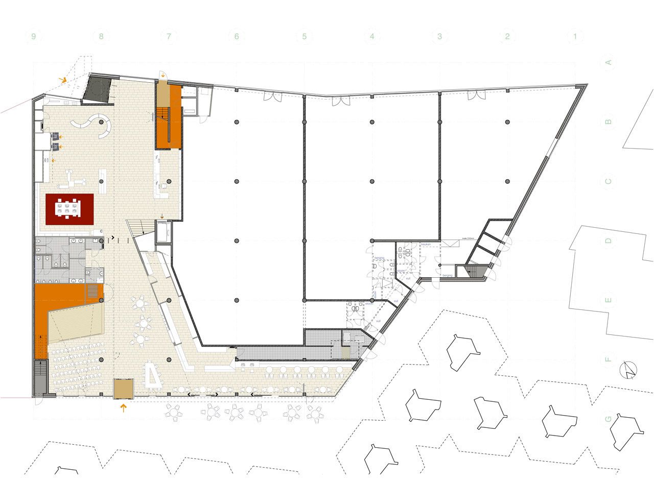
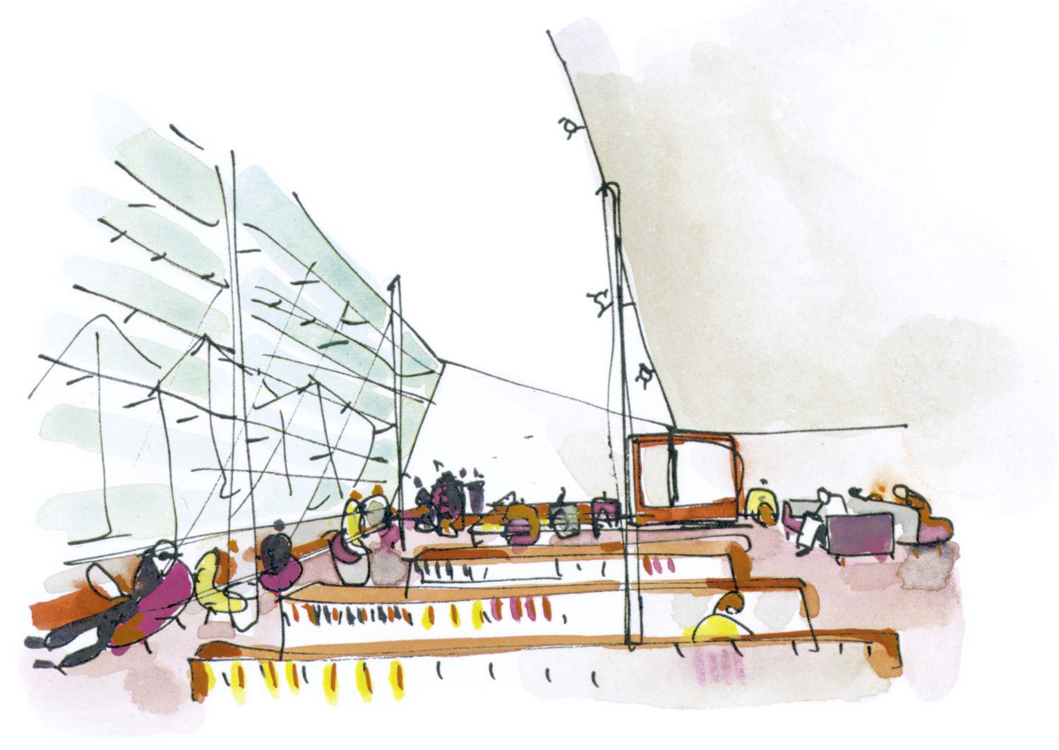
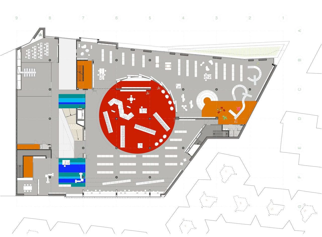
The internal spaces of the library are developed as an unfolding spatial sequence. Much of the ground floor is given over to retail. Entry is from both sides – via a generous double height entrance hall to the street side and via the more intimate café and event corner facing the Theatre Court. The upward sequence is announced by a grand stair, which arrives at a first-floor exhibition deck and the ‘piano nobile’ of the library. Here information stations, bookshelves and children/teenager zones are arranged around a central media Hot Spot: precisely circular, a Chinese-red sandwich. The Hot Spot offers the digital latest.
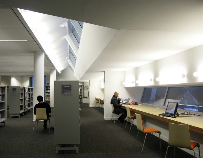
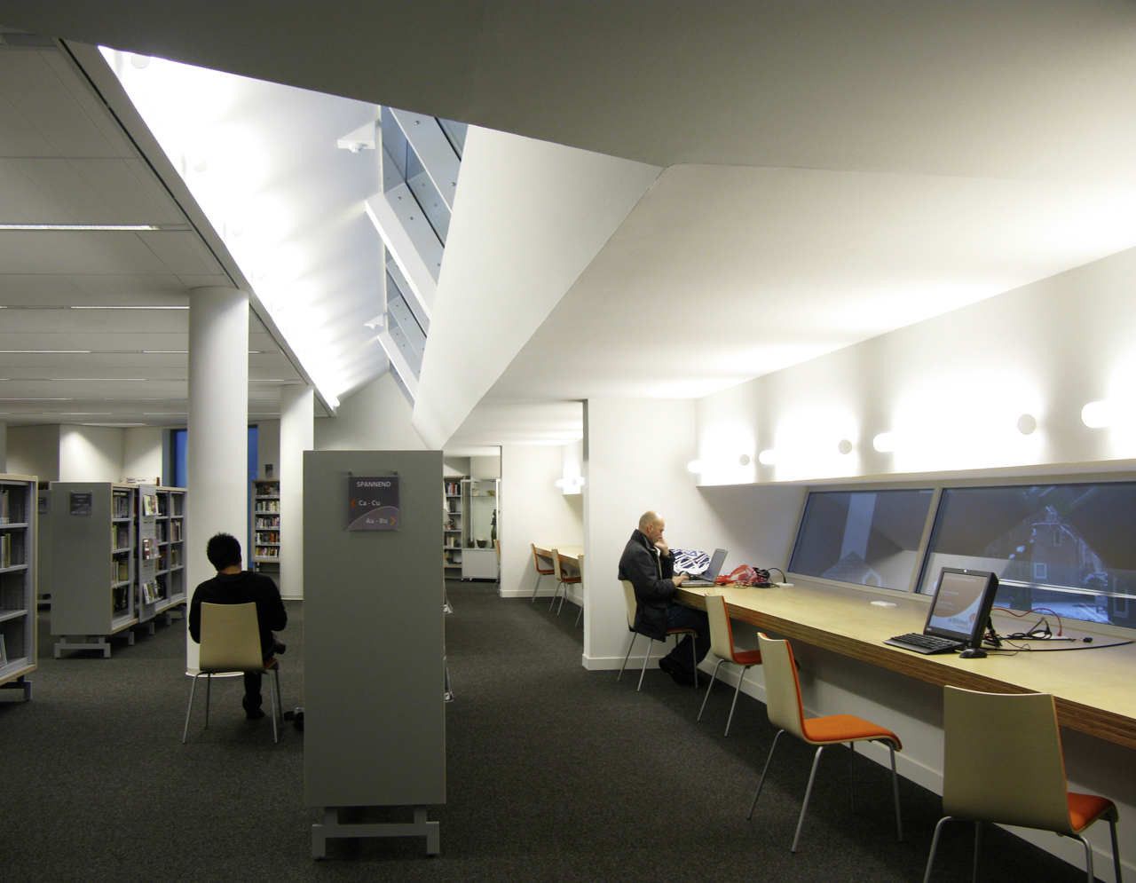
The route continues upward concluding in the light-filled upper level with a long working bench integrated into the long ‘tree house-facing’ window. BOLLES+WILSON’s commission also included furniture and lighting elements, the choreographing of atmosphere and character. Lanterns in the foyer, a newspaper reading table, a striped and upholstered café bench seat with Scandinavian lighting, information counters and a group study room with fragments of a 1950’s mural mounted on the wall, are among the long list of localized detail. The philosophy is one of multiplicity, a user-friendly comfort already much appreciated by librarians and reading Helmonders.
Project Info:
Architects: BOLLES+WILSON
Location: Helmond, The Netherlands
Area: 5630.0 m2
Project Year: 2010
Photographs: Christian Richters
Project Name: New City Library
photography by © Christian Richters
photography by © Christian Richters
photography by © Christian Richters
photography by © Christian Richters
photography by © Christian Richters
photography by © Christian Richters
photography by © Christian Richters
photography by © Christian Richters
photography by © Christian Richters
photography by © Christian Richters
photography by © Christian Richters
photography by © Christian Richters
plan 01
plan 02
sketch 01
sketch 02
plan 03
section
location plan
elevation


