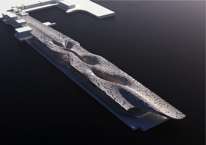
Below, is a project description given by its creator, Dave Edwards, for his entry to the Thinkspace Competition 2012: Yokohama Ferry Terminal. It is based in Yokohama, Japan. I could offer some quippy words and snap judgements, but it is perhaps better to hear it from the architect’s mouth- the one who knows it best.
Concept:
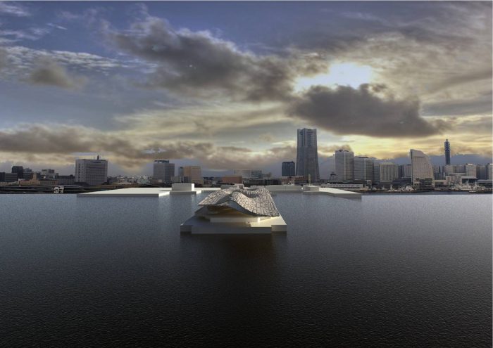
The new proposal is imagined as a piece of urban topography that has been lifted and split into a series of folded layers, in some places it is read as a piece of extruded groundscape. embedded with functions. In other places it hovers over the port-side, stretching out into the sea. In some respects in mirrors the range of experiences associated with the travelers it houses both mundane commuter facility and visionary landscape for journeys not yet taken. At its heart is an interest in how this mega structure supports its present function, how it could be adapted and how the fabric itself can be harnessed to support both itself and potentially its wider urban context.
Urban Strategy:
The building’s urban strategy is to create a continuous inhabitable surface from the existing parks on the main land, all the way out onto the pier. This allows Yokohama citizens to enjoy the panoramic views of the city by lifting this civic amenity off the ground, while not interfering with the function of the port terminal itself. The central three columns that support the roof act as more than structure; on an urban level they provide the connection between the public parking and the roof top garden- accessed via a winding stair inside the roof depth itself. At this point the roof sides are permeable allowing both ferry users and citizens to overlap whilst never touching.
Structural Concept.
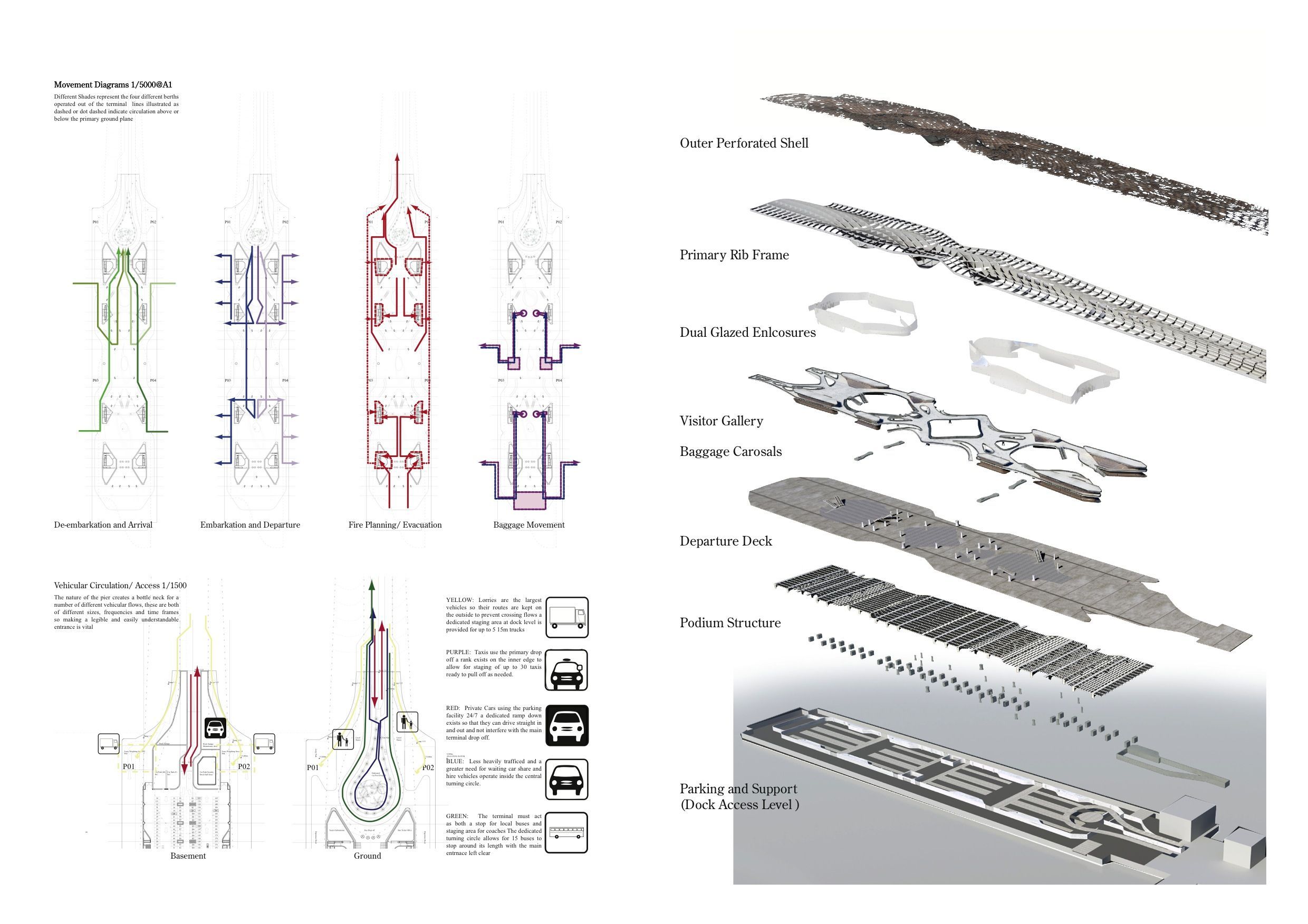
The scheme proposed is highly specific in its form but also highly flexible in its use and potential reuse. The podium which houses the storage and car parking is a series of long span concrete arches with secondary coffer slabs spanning between them, the perimeter box houses all the vertical circulation and itself buttresses the whole construction. This leads to a flexible use space of 15m clear spans in both directions. The exposed concrete super structure is allowed to absorbed heat from the vehicular activity, which is then harvested, via a network or water filled pipes. This supplies all the required heating for the building.
The building above works as a series of fixed blocks with bridging elements between the structural blocks housing vertical circulation are mean as fixed units while the bridging elements can be changed as time and use requires changes.
The main feature of the building is the mega structural roof, which is inspired by the ships themselves. It is a monocock construction of a number of steel ribs. The surface mesh panels are supported and fixed to this primary skeleton and act as a stress skin on both sides. This allows the roof to hover in places with out the need for additional supports. The length of the port terminal has allowed for a large feature cantilever to extend out over the end of the pier. This feature welcomes visitors but also offers shelter for those boarding the domestic and water taxi services at the pier’s end. The roof construction is hollow, allowing it to be embedded with a number of technological features.
Environmental Concepts:
The building by its nature and scale is a highly energy intensive object to construct and maintain. Extensive thinking was done on how the form of the fabric can be used to passively minimize running costs, and how the intensive activity of the buildings function and site might be activated to provide the building with necessary heating and cooling.
The roof itself acts as a giant environmental control mechanism. Its surface catches and stores rainwater in the three super columns, which run into the basement. These are then circulated around the basement to absorb heat which can be condensed for use as building heating it can also function to actively cool spaces by dumping the heat into the sea beneath the pier. Air ducts can supply air to internal spaces which has been cooled by routing through the edges of the roof or by heat exchange with the water piping. The water can also be used within the building for WCs and general usage/cleaning etc.
The roof is also meant to act as a garden space for local people to enjoy and inhabit. It extends right down into the city to directly connect the existing gardens to the pier. As it rises up it is partially planted and partially open, allowing a variable and interesting light to fall on those in the terminal. The depth of the structure performs as all the shading the building needs.
Circulation Strategy:
The brief highlights three key user groups with distinct needs, the users of the domestic ferry and international cruise liners, those citizens of Yokohama who wish to enjoy the port-side, and people who wish to use the building for parking. The building stacks these groups vertically: the cars go below, passengers for the ferries are kept at grade, visitors run above them, and urban citizens go on the roof. This fairly conventional diagram is then distorted by pulling the notional planes which each group inhabits up and down creating a distorted topography that begins to connect different user groups. These planes are always retained allowing for connection but not contortion, of the groups, avoiding confused patterns criss-crossing, which would interfere with the use of the building.


