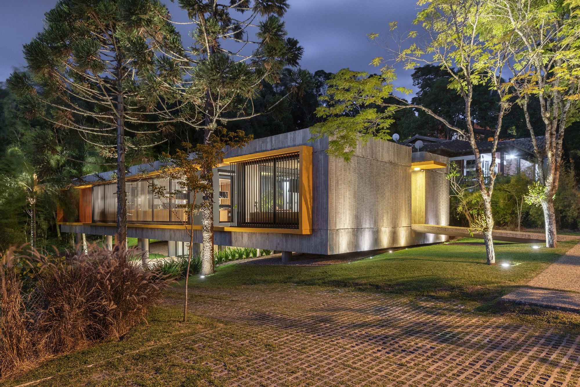
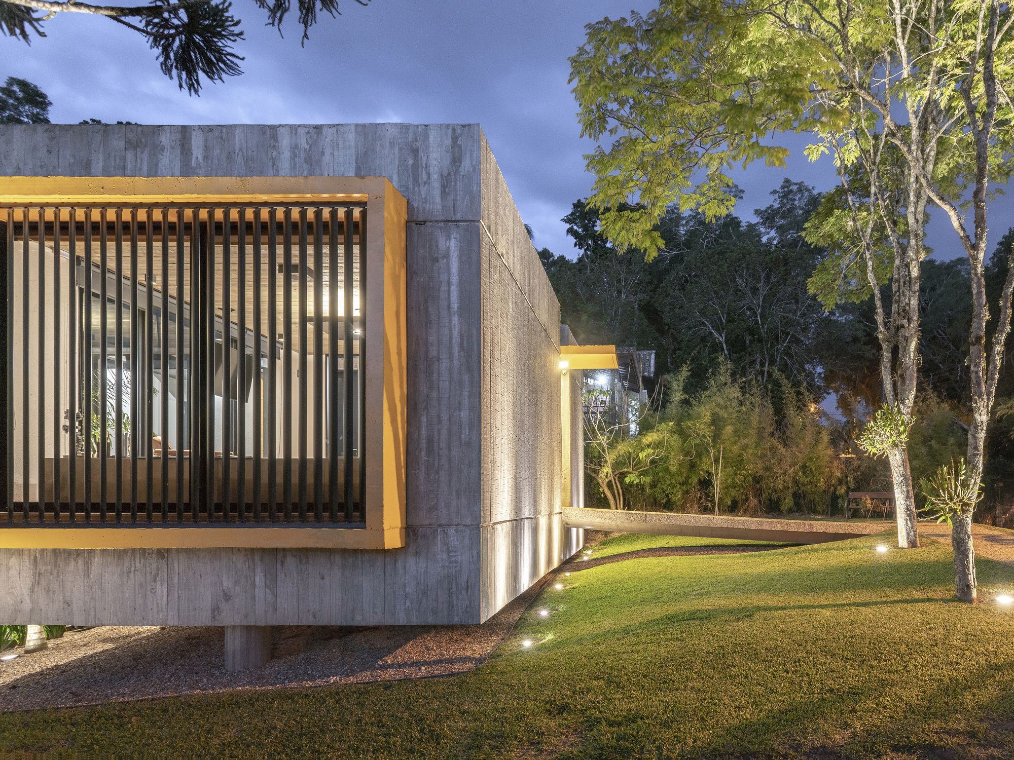
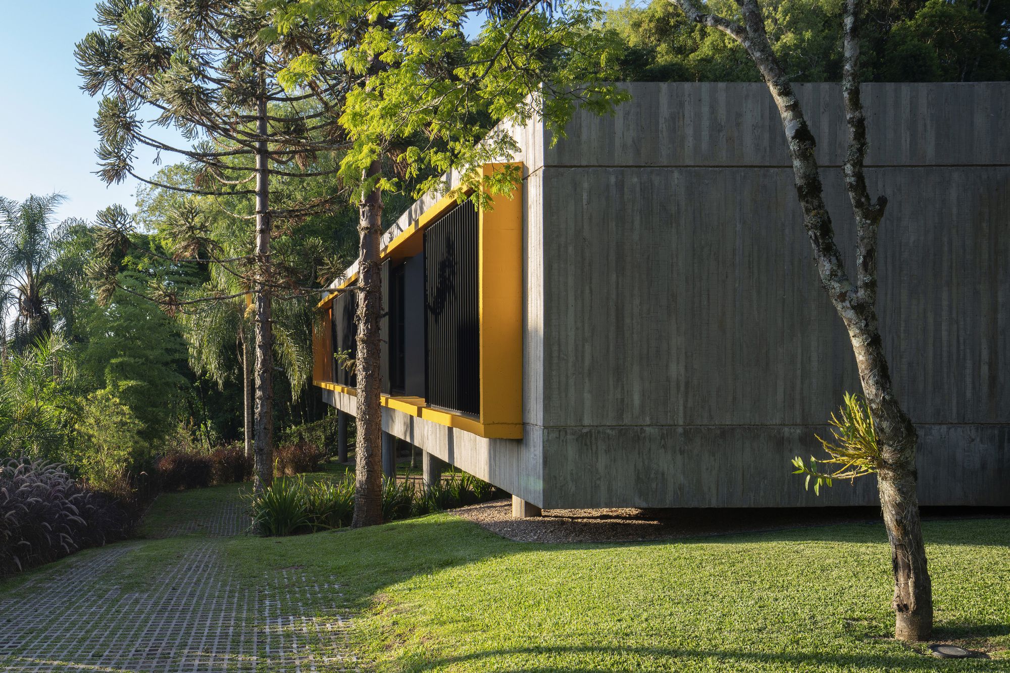
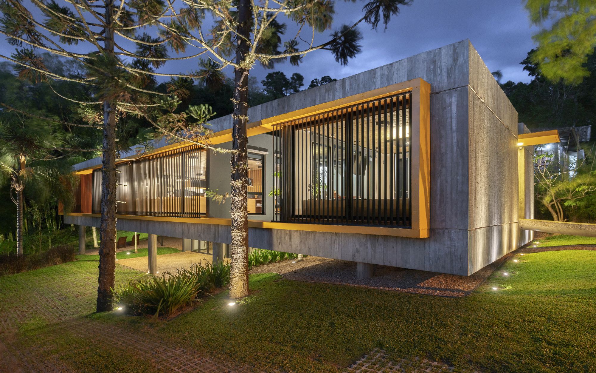
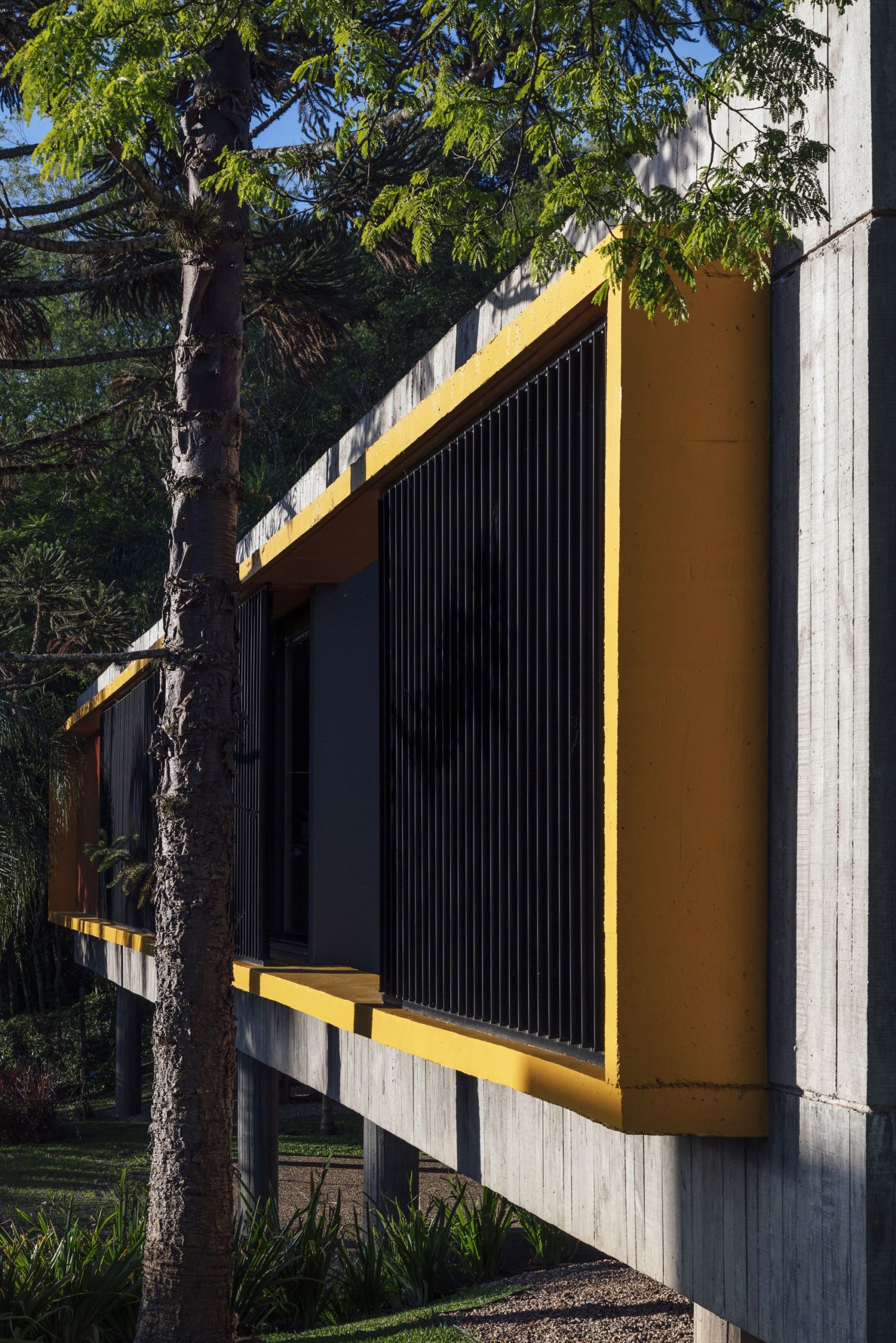
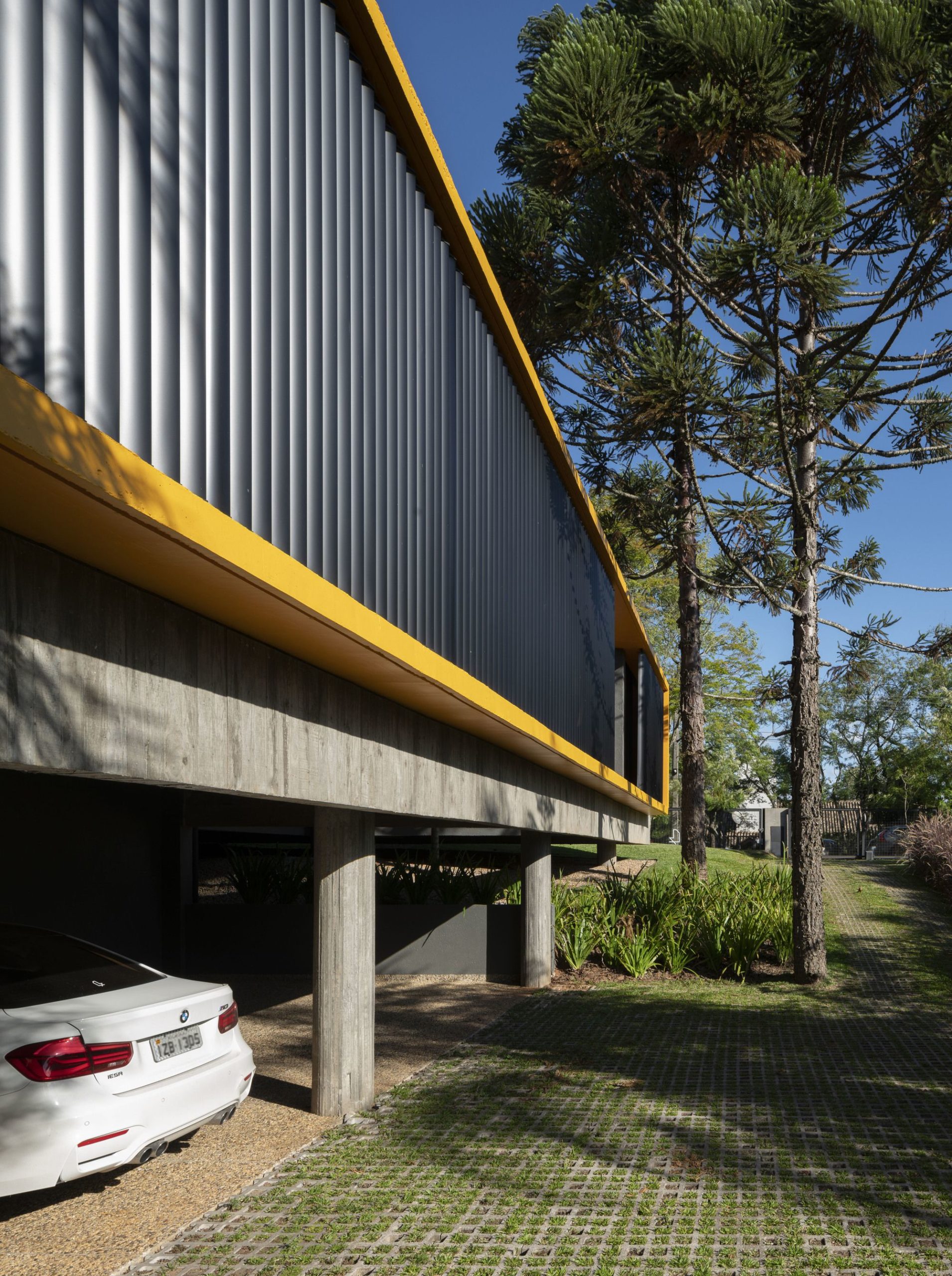
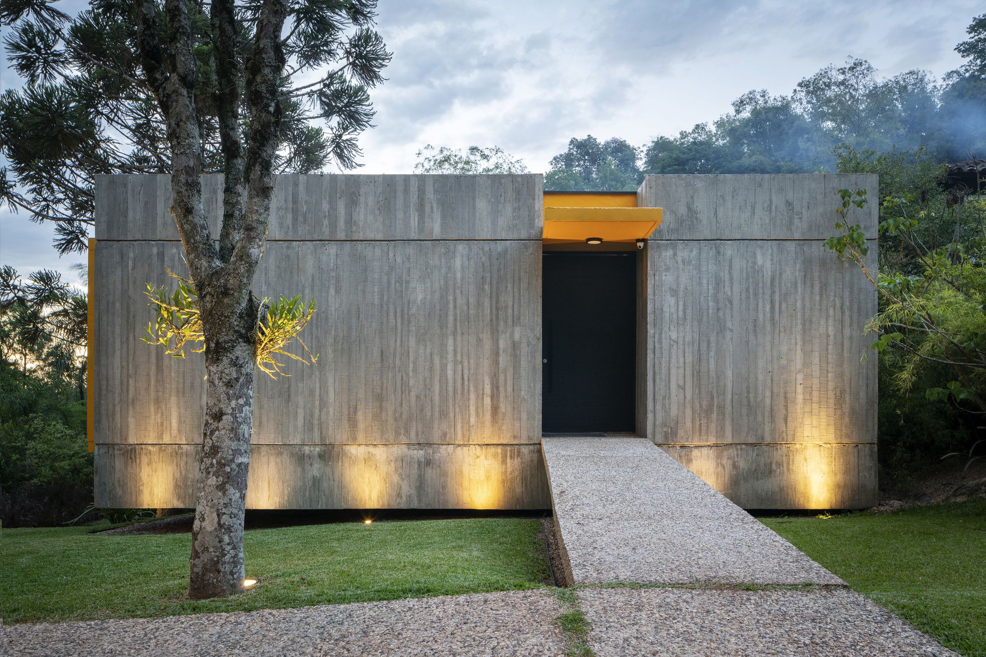
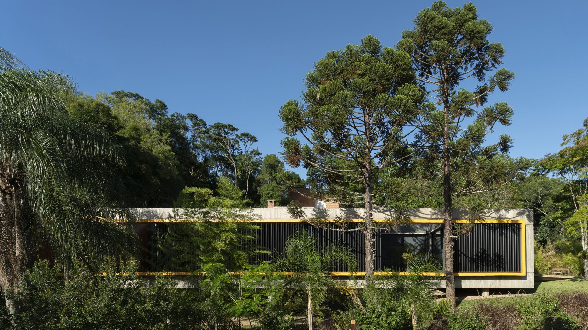
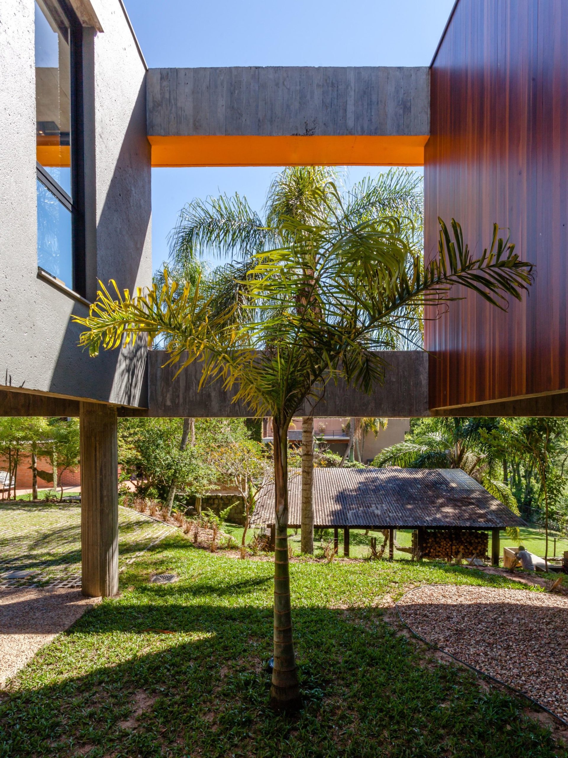
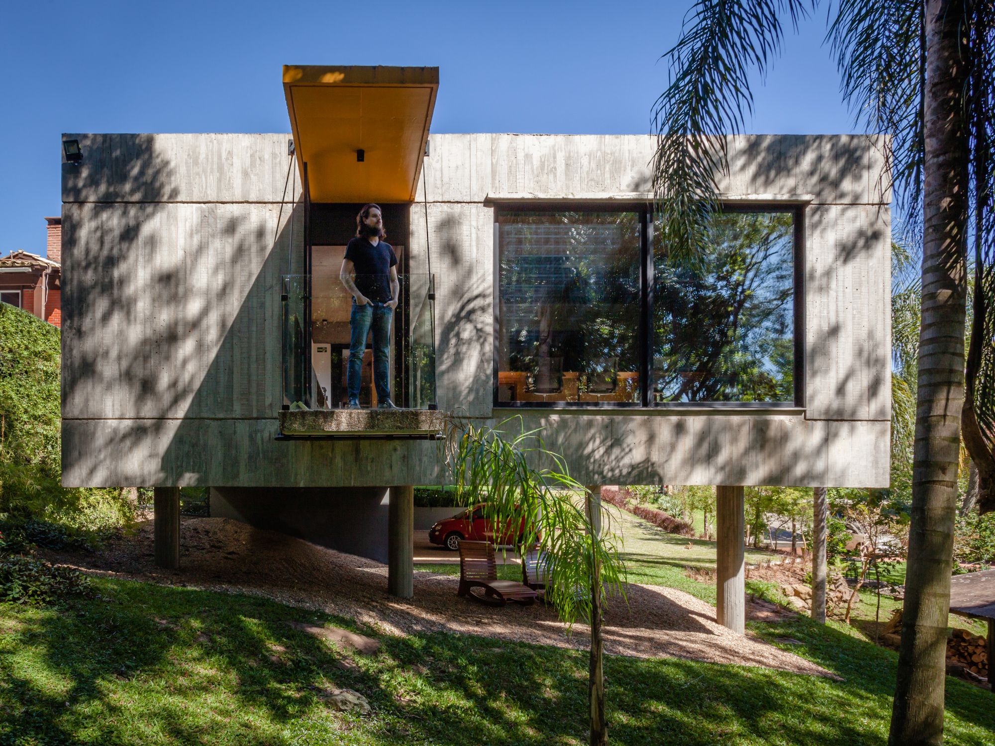
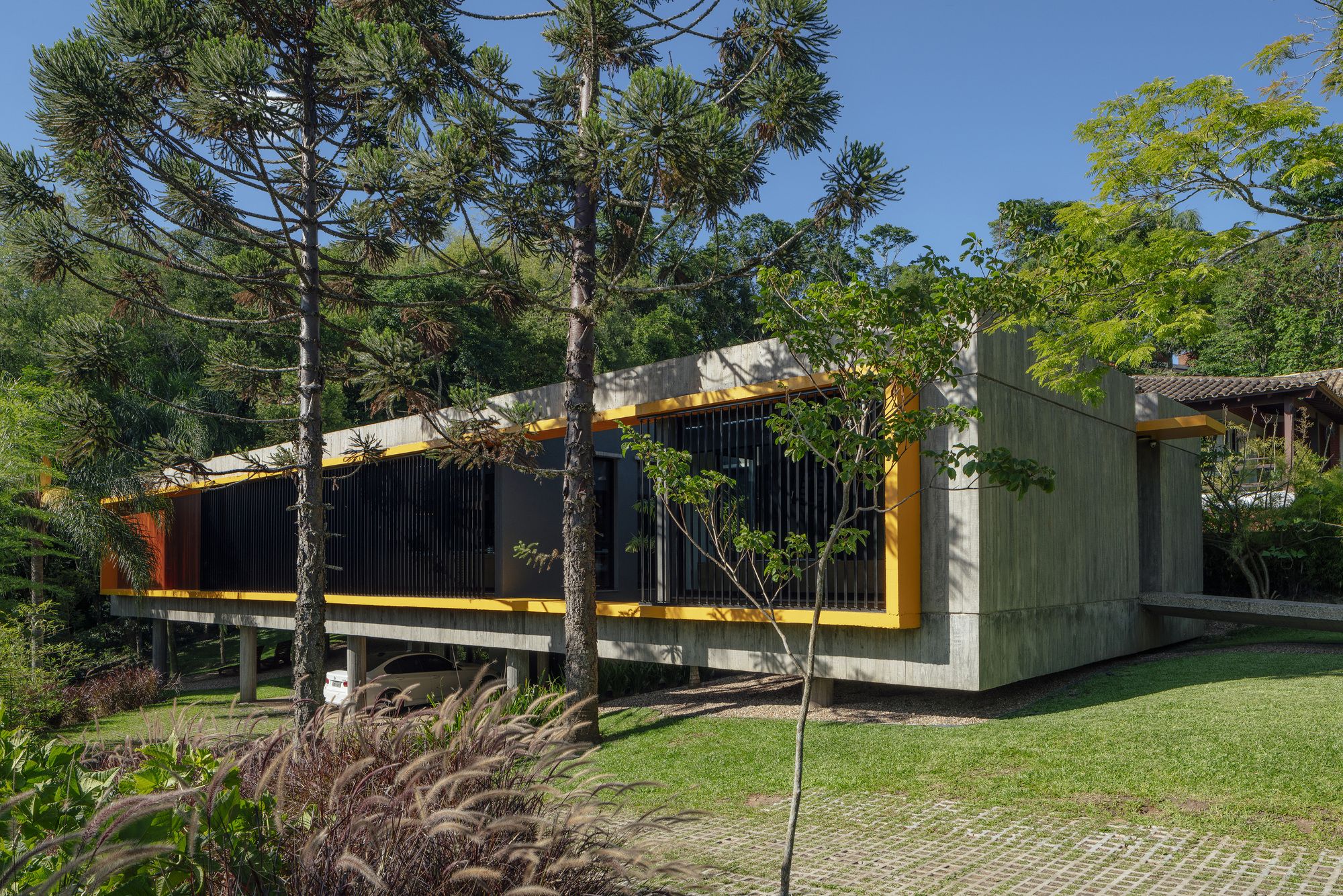
Framed by the green of the Cerrito hill, the concept headquarters of Lineastudio Arquiteturas, in the city of Santa Maria/RS, was design respecting the original terrain topography and the nature of the environment, resulting in a minimalist building on pilotis, in the natural landscape.
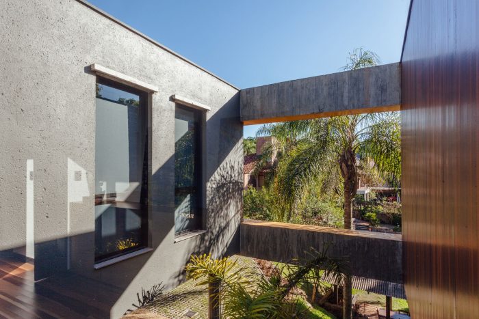
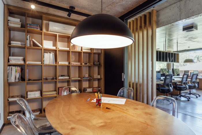
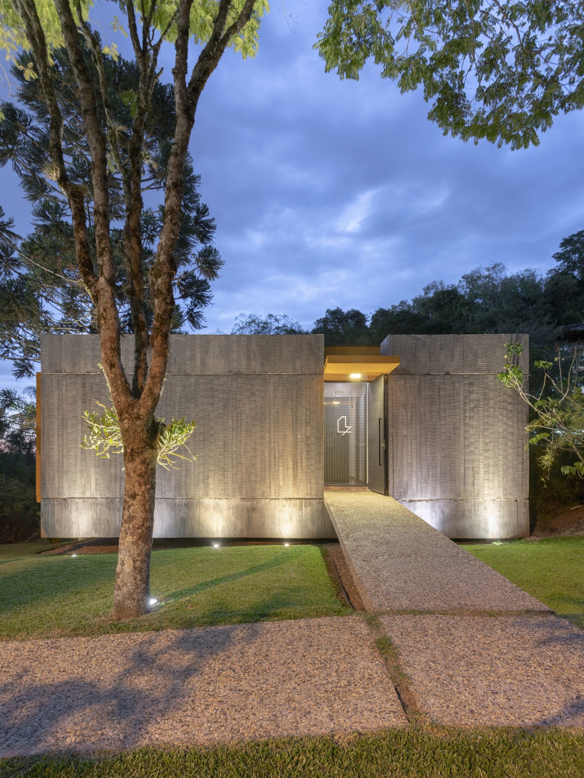
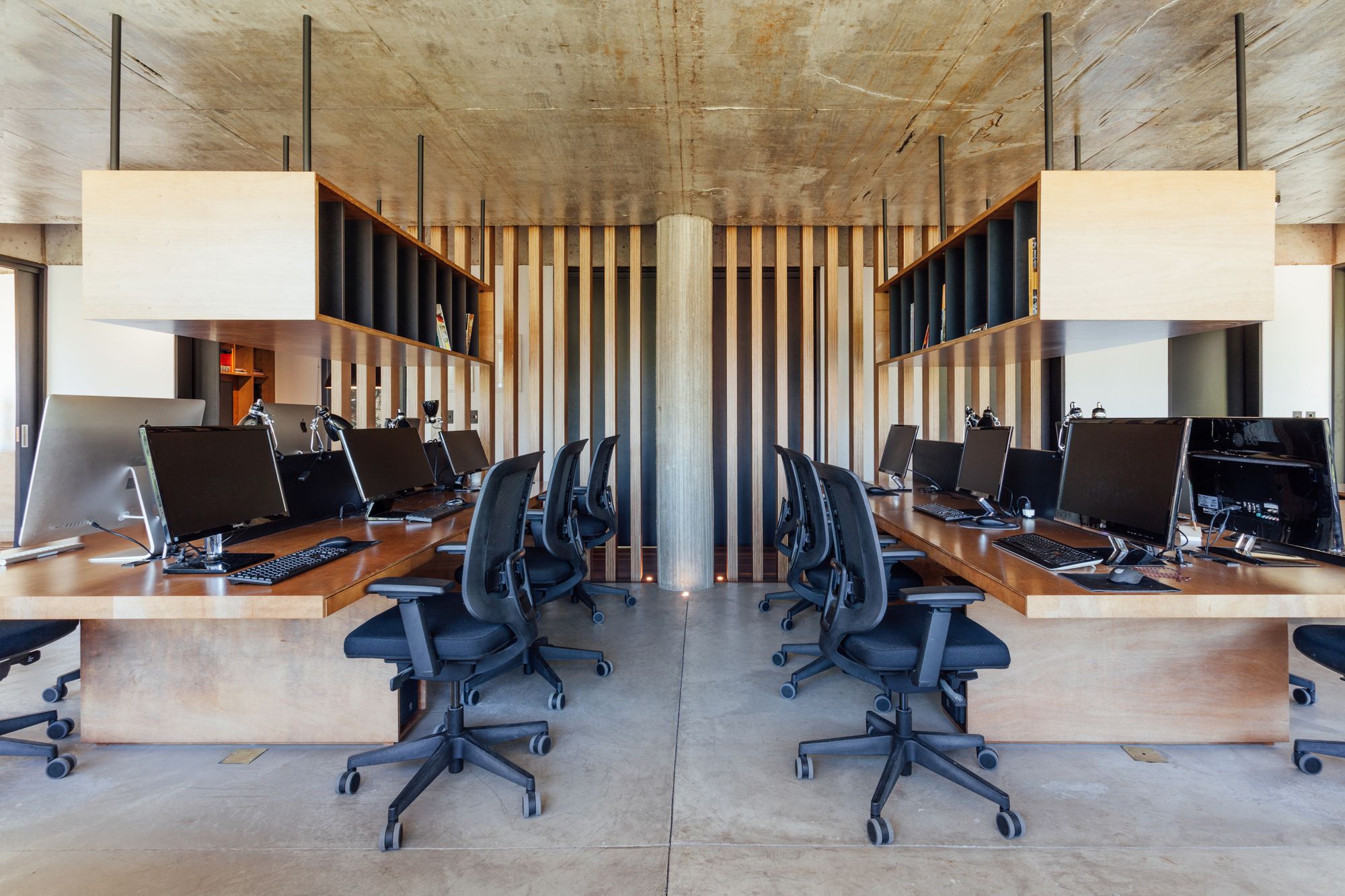
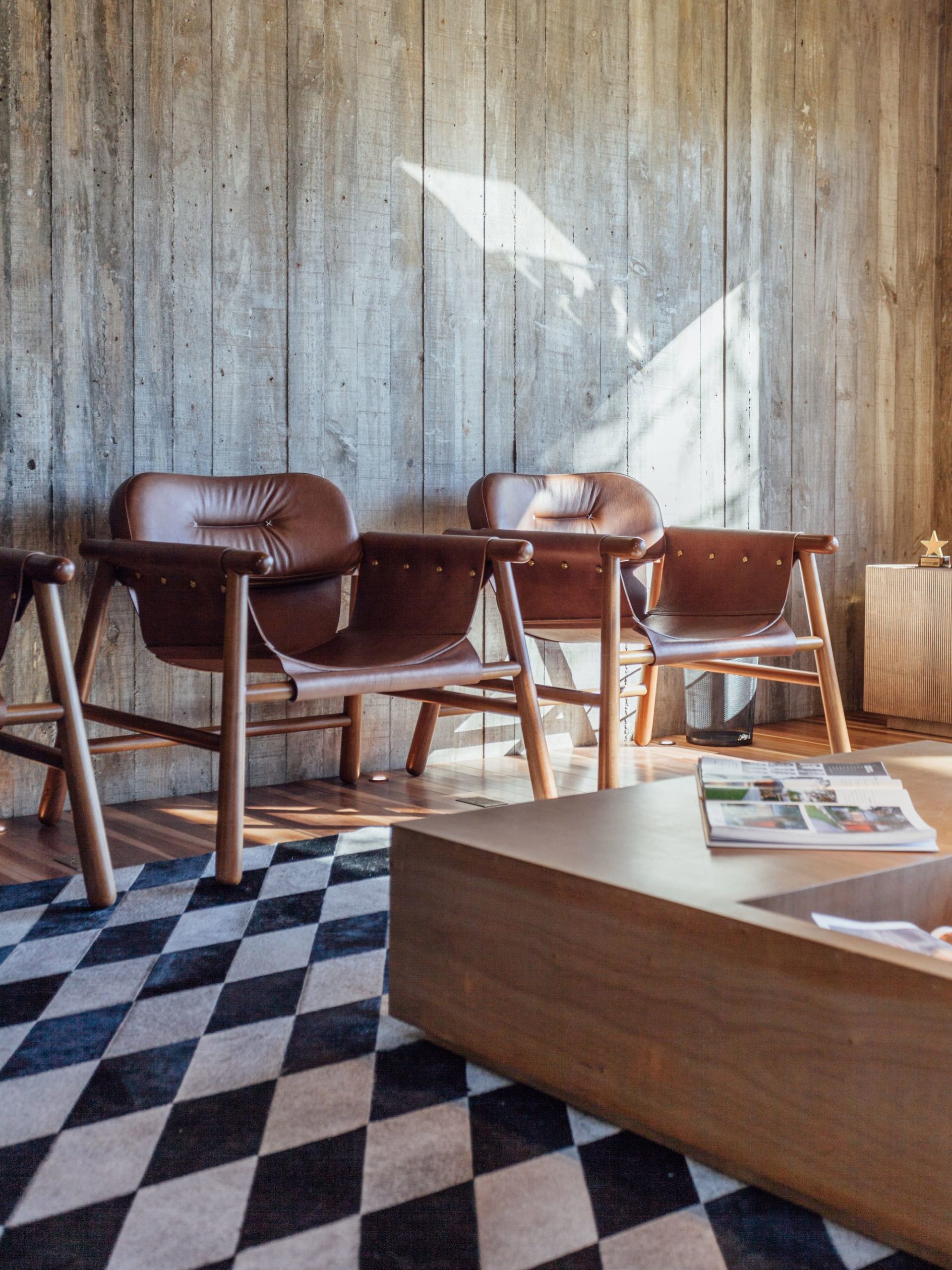
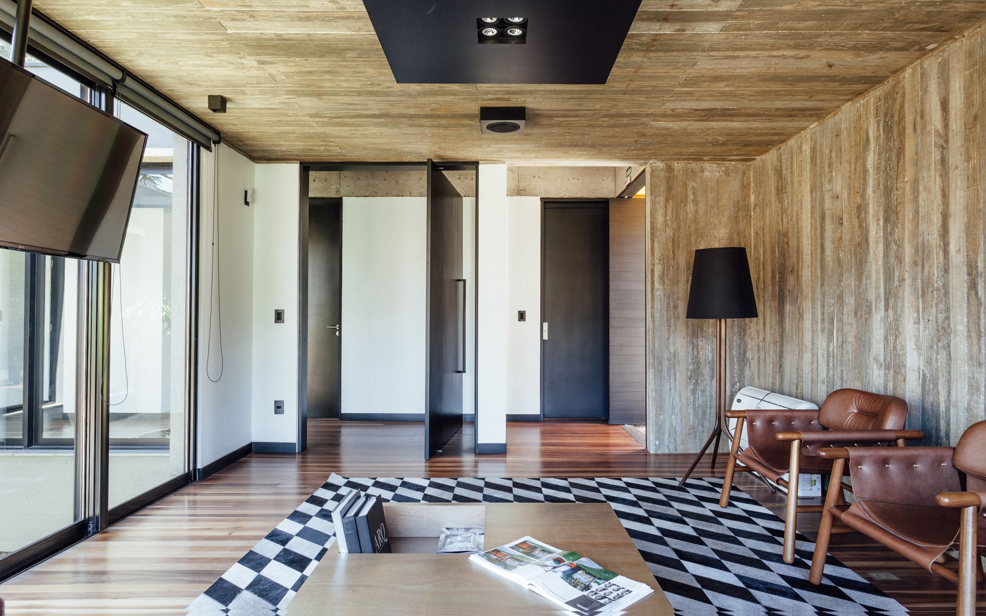
With the influence of modernist architecture, and seeking the authenticity of materials, was chosen for the use of the apparent concrete, polished and washed, certified timber and, in interior design, naval compensation.
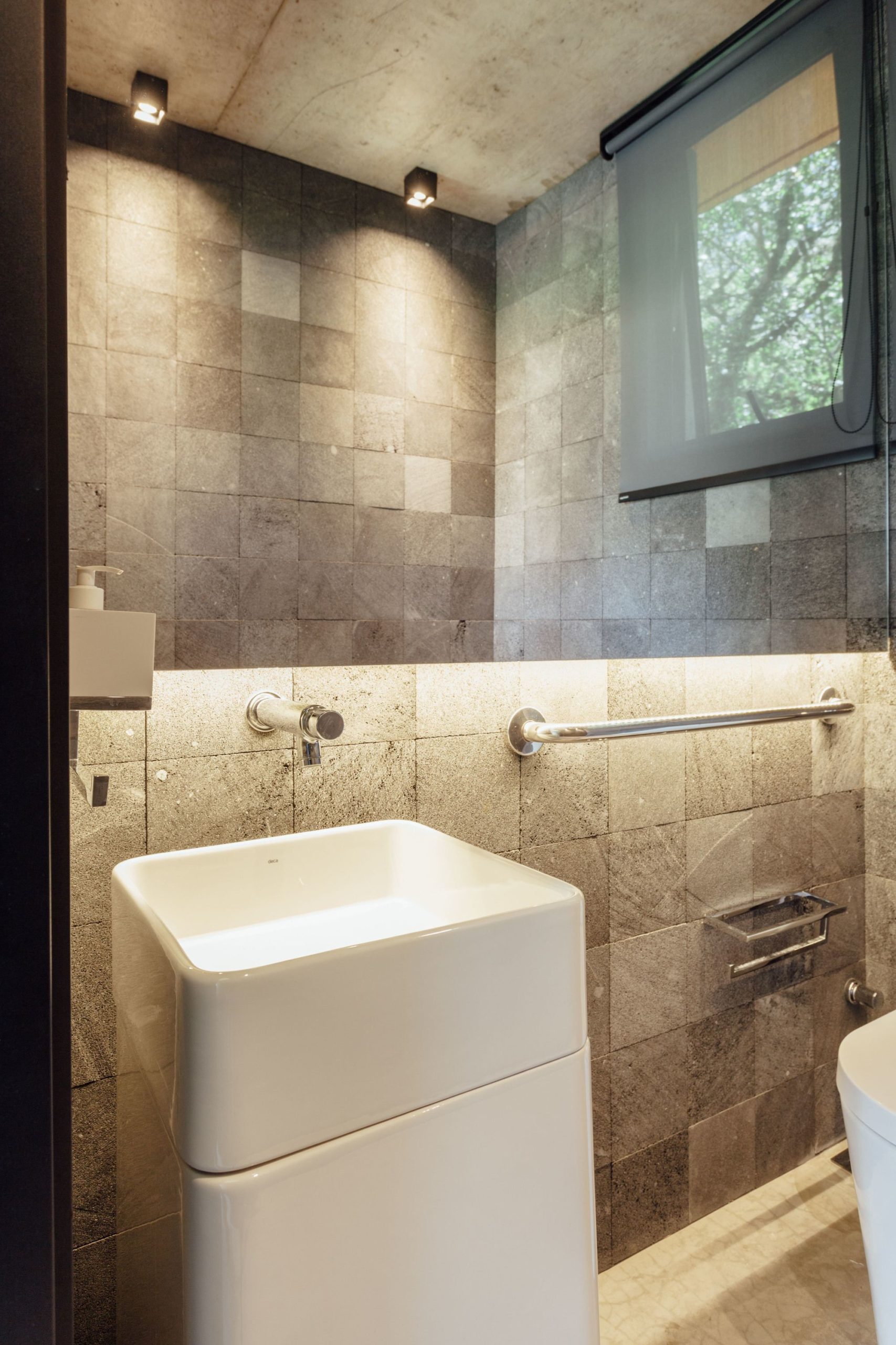
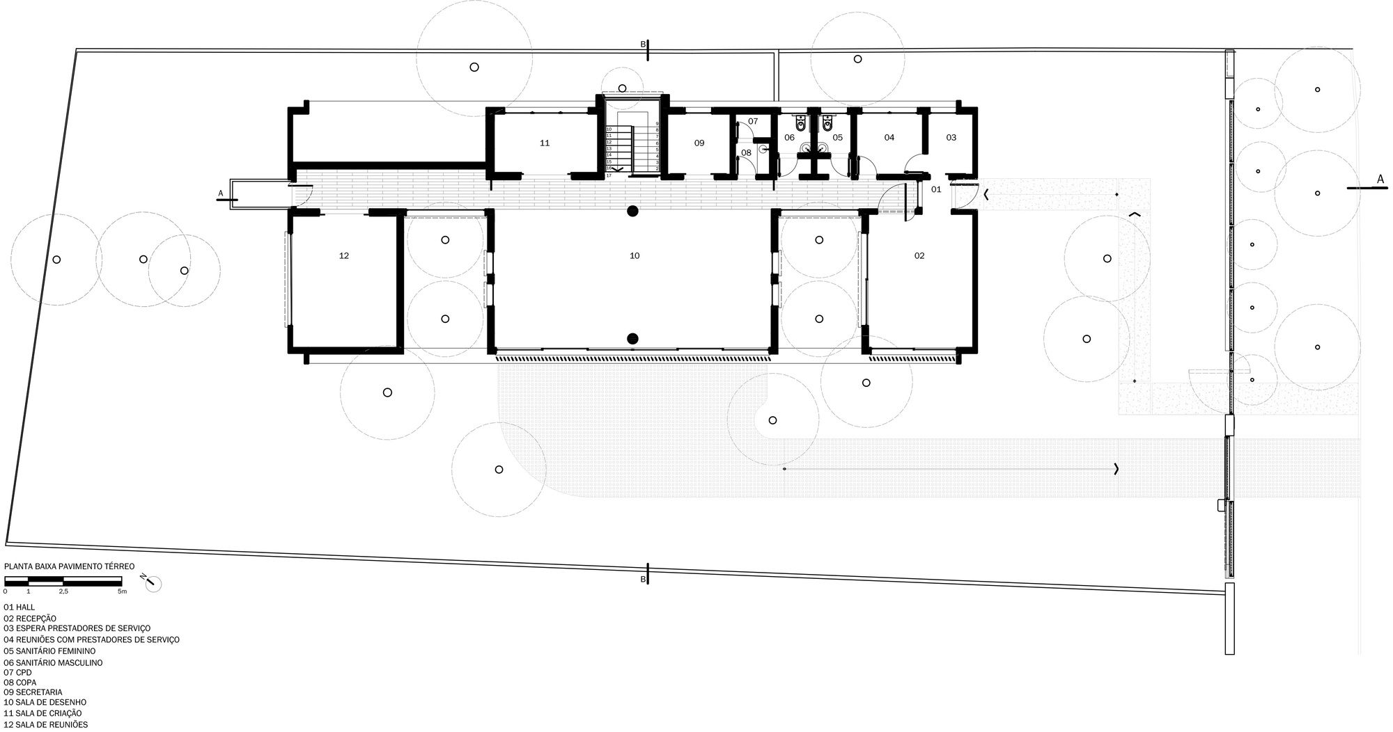
The building plan was developed from an axis of circulation that integrates the spaces. The program comprises two waiting rooms, meeting rooms, creation and production room, art gallery, gourmet space, and toilet.
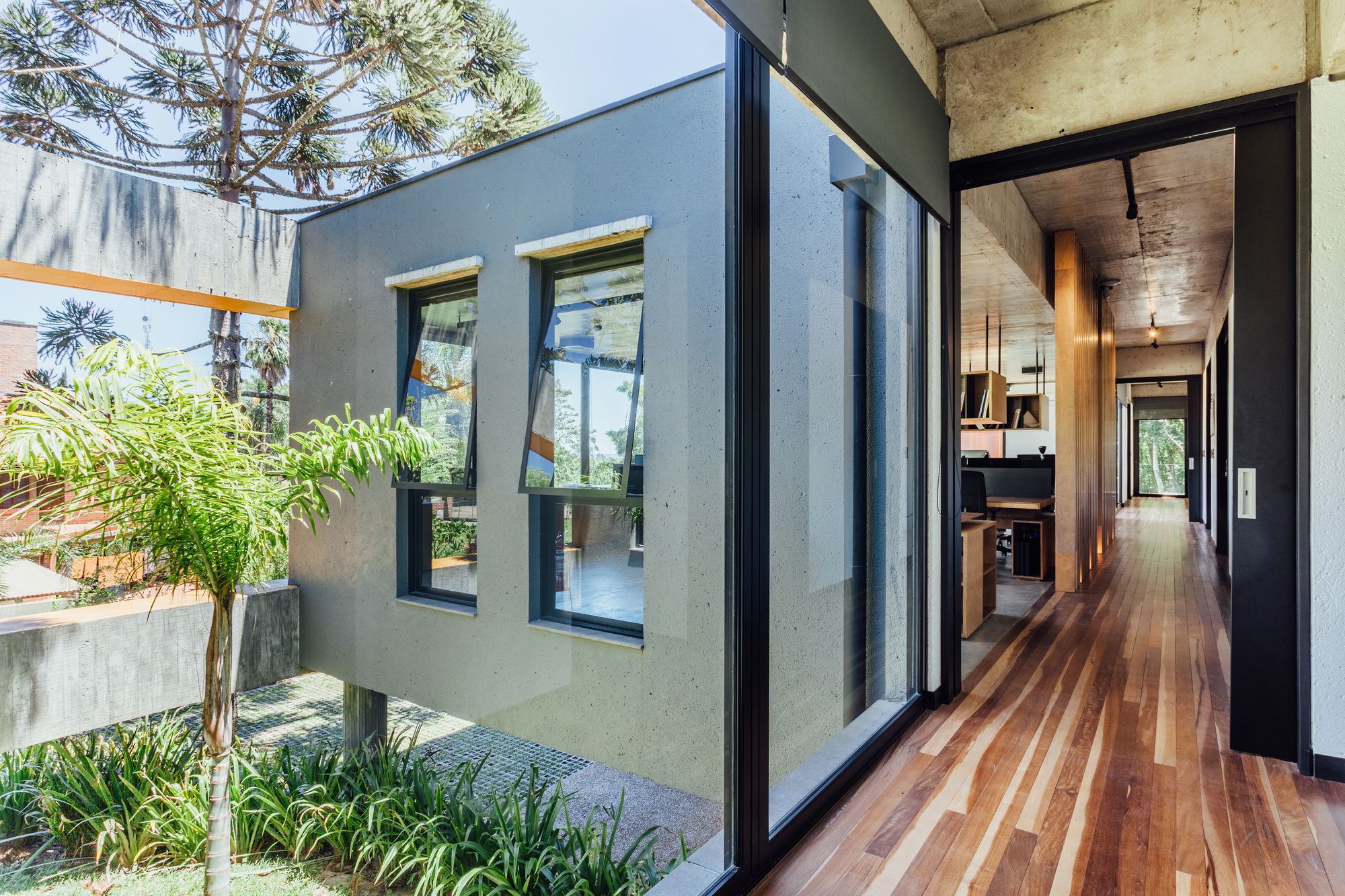
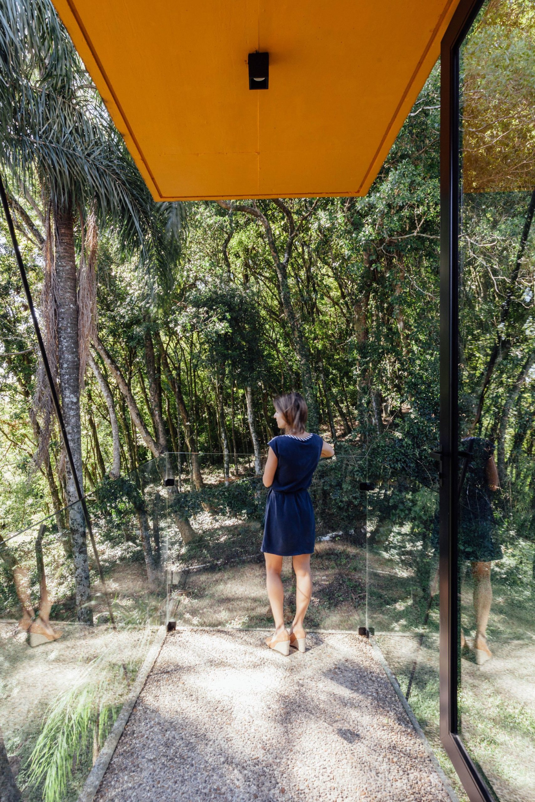
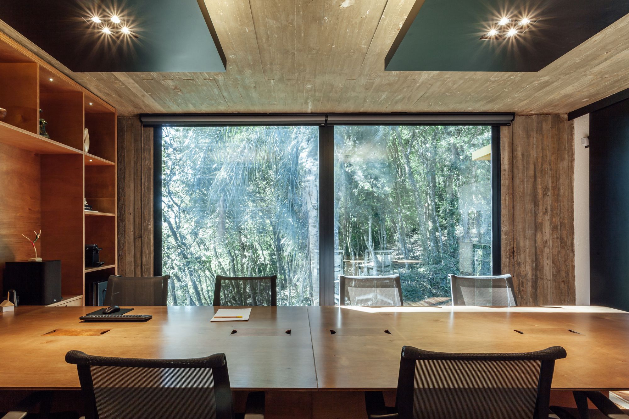
The path that connects the waiting room to the meeting room passes along the main axis, reveling gardens and the creation room, culminating in a belvedere that has the native forest as a focal point. The purpose of the course is to bring the customer closer to the team and the process behind each project.
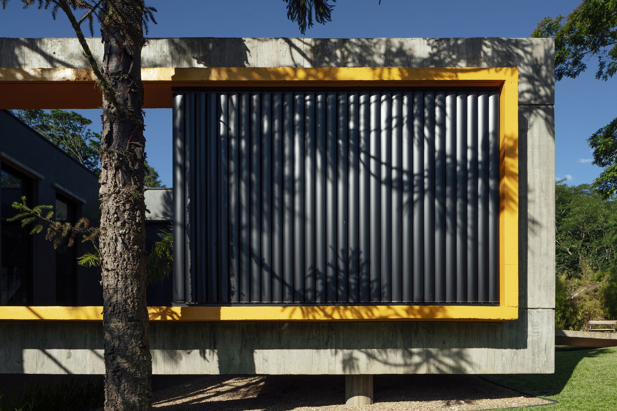
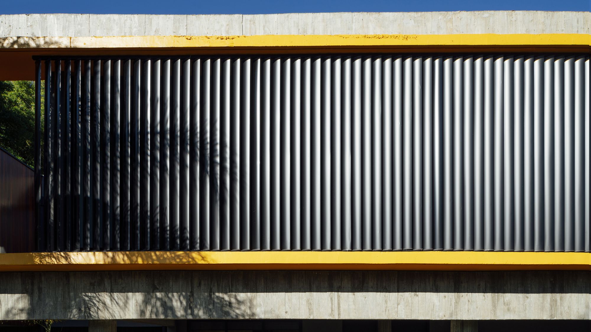
The internal gardens reinforce the use of the building sector and surprise the user, bringing the green into the interior through large glass planes. The continuity of the main volume forming a parallelepiped, with subtractions that conform the gardens, it is maintained by the apparent concrete shell and the yellow frame that delimits the frames.
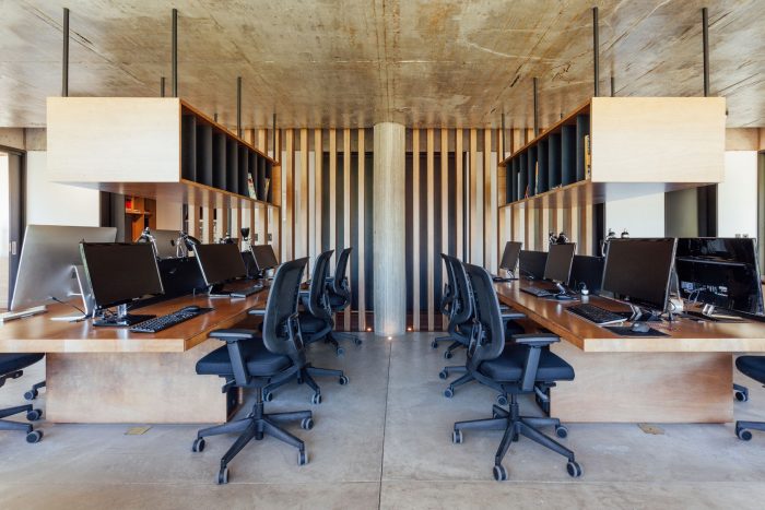
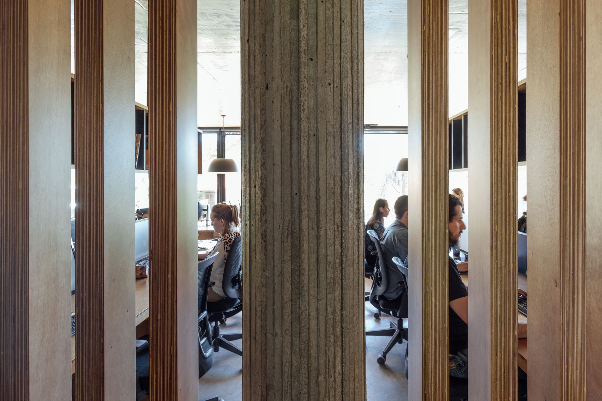
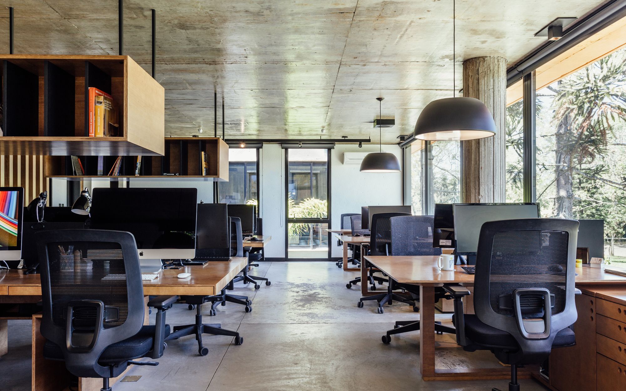
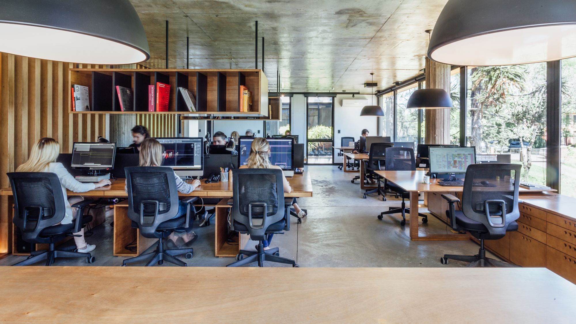
In the creation room, highlight for the slatted in navel compensation that subtly separates the work area. Functionally, the benches are organized according to the areas of operation, integrating architects and collaborators, creating a collaborative work environment, where the exchange of ideas between the teams are dynamic and positive.
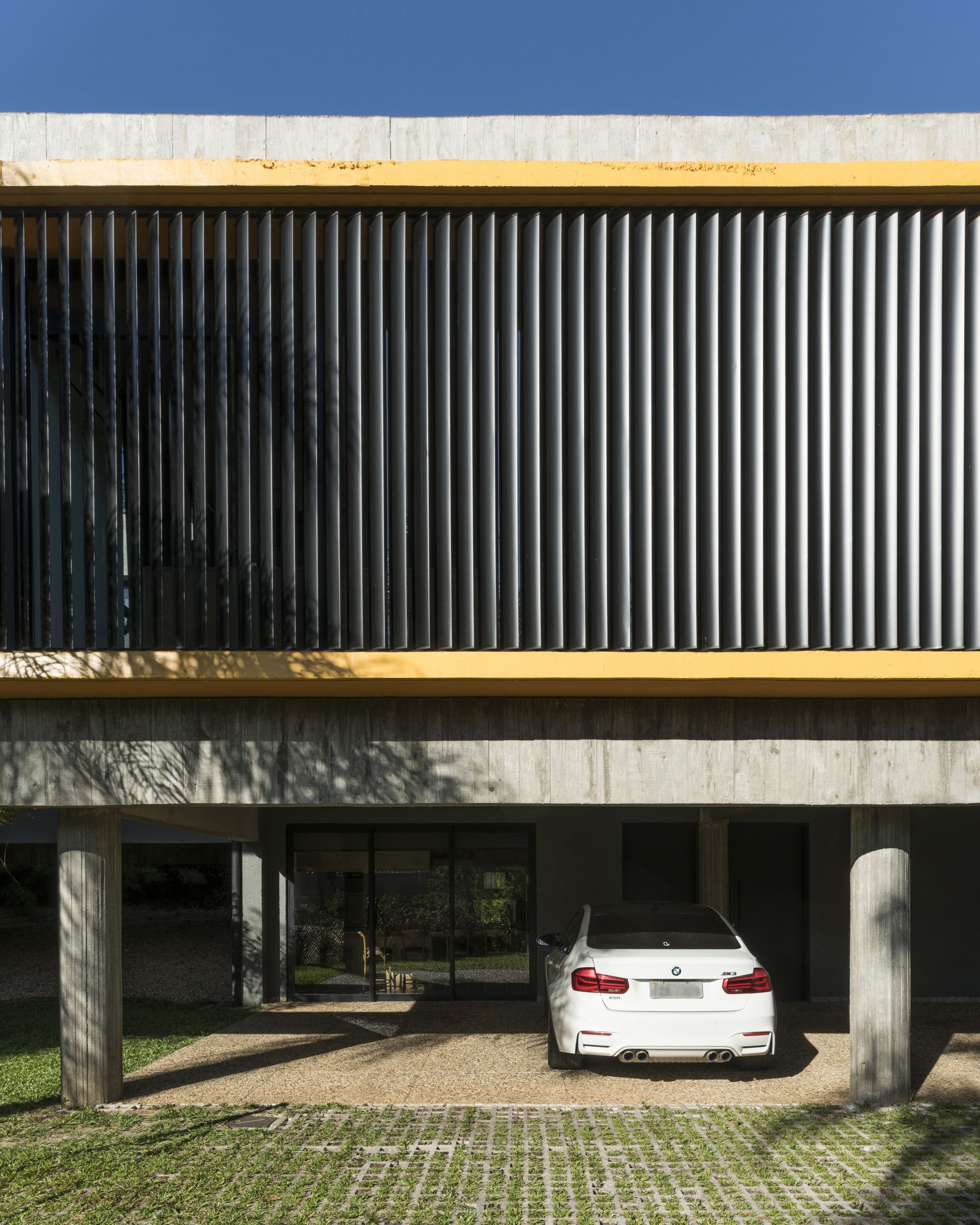
The large openings guarantee transparency and total visual permeability between the internal and external areas, taking advantage of the natural lighting and the privileged landscape. To guarantee thermal and visual comfort as well as optimize the use of natural resources, the arrangement of the openings provides cross ventilation in the working environment and control of sunlight and light intensity is done through the use of motorized brises soleils and blinds with sunscreen.
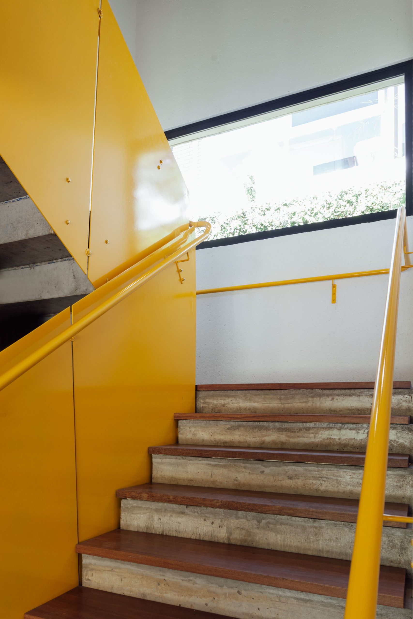
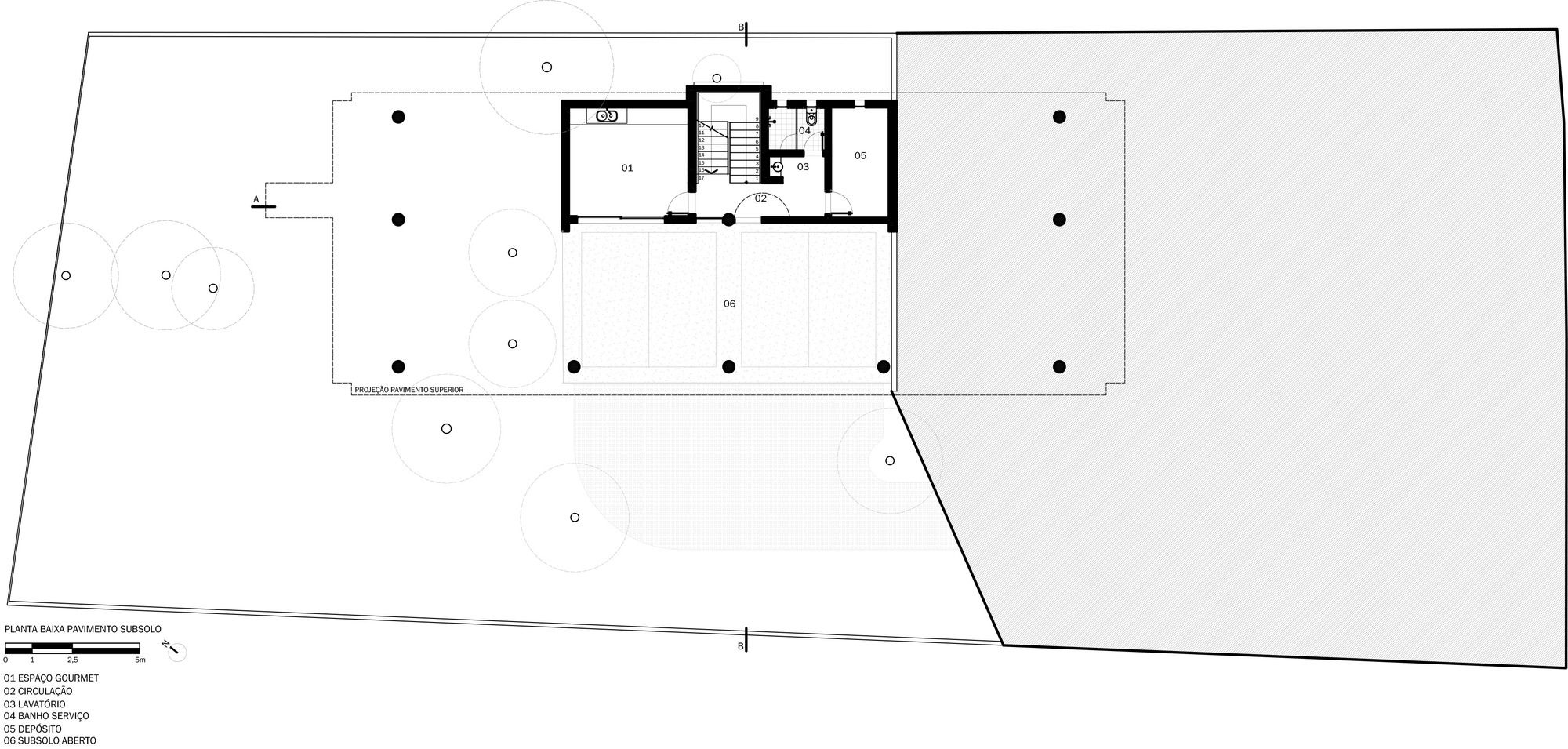
Underground, the garage – between the pilotis that support the main volume – and the gourmet space were designed for use by the employees and for small receptions. In the staircase, the metallic guardrails in yellow finish refer to the industrial language, present in interior design details. The use of color refers to the brand of Lineastudio and appears relaxed in contrast to the sobriety of concrete.
In the landscape, preservation of existing vegetation and new interventions value the environment and topography, invading the perimeter of the building and integrating it into the landscape. In the area of parking and circulation of vehicles was used grass floor, to obtain a sturdy floor without giving up the subtlety, permeability and green.
Imposing, two araucarias stand out on the side of the building, whose presence was decisive in the implementation of the architectural project and enrich the landscape and built space.
Project Info:
Architects: Lineastudio Arquiteturas
Location: Alameda Timbaúva, 347, Santa Maria, Rio Grande do Sul, Brazil
Authors: Zé Barbosa, Luara Mayer, Ronald Jung, Roberta Noal, Lísian Ceolin e Verônica Viero.
Area: 3013.89 ft2
Project Year: 2016
Photographs: Cristiano Bauce
Manufacturers: Hunter Douglas Architectural, Ampla Moveis&Decor, Hydronorth, Andrea Feine, Attuale, Pasinato, Ilumine, Móveis Watchmann, Móveis Kieling, Vidraçaria Visual, MP Metalúrgica, Tradesign, Alcoa, Screeny Design
Project Name: Sede Lineastudio Arquiteturas
photography by © Cristiano Bauce
photography by © Cristiano Bauce
photography by © Cristiano Bauce
photography by © Cristiano Bauce
photography by © Cristiano Bauce
photography by © Cristiano Bauce
photography by © Cristiano Bauce
photography by © Cristiano Bauce
photography by © Cristiano Bauce
photography by © Cristiano Bauce
photography by © Cristiano Bauce
photography by © Cristiano Bauce
photography by © Cristiano Bauce
photography by © Cristiano Bauce
photography by © Cristiano Bauce
photography by © Cristiano Bauce
photography by © Cristiano Bauce
photography by © Cristiano Bauce
photography by © Cristiano Bauce
photography by © Cristiano Bauce
photography by © Cristiano Bauce
photography by © Cristiano Bauce
photography by © Cristiano Bauce
photography by © Cristiano Bauce
photography by © Cristiano Bauce
photography by © Cristiano Bauce
photography by © Cristiano Bauce
photography by © Cristiano Bauce
Plan - Ground floor plan
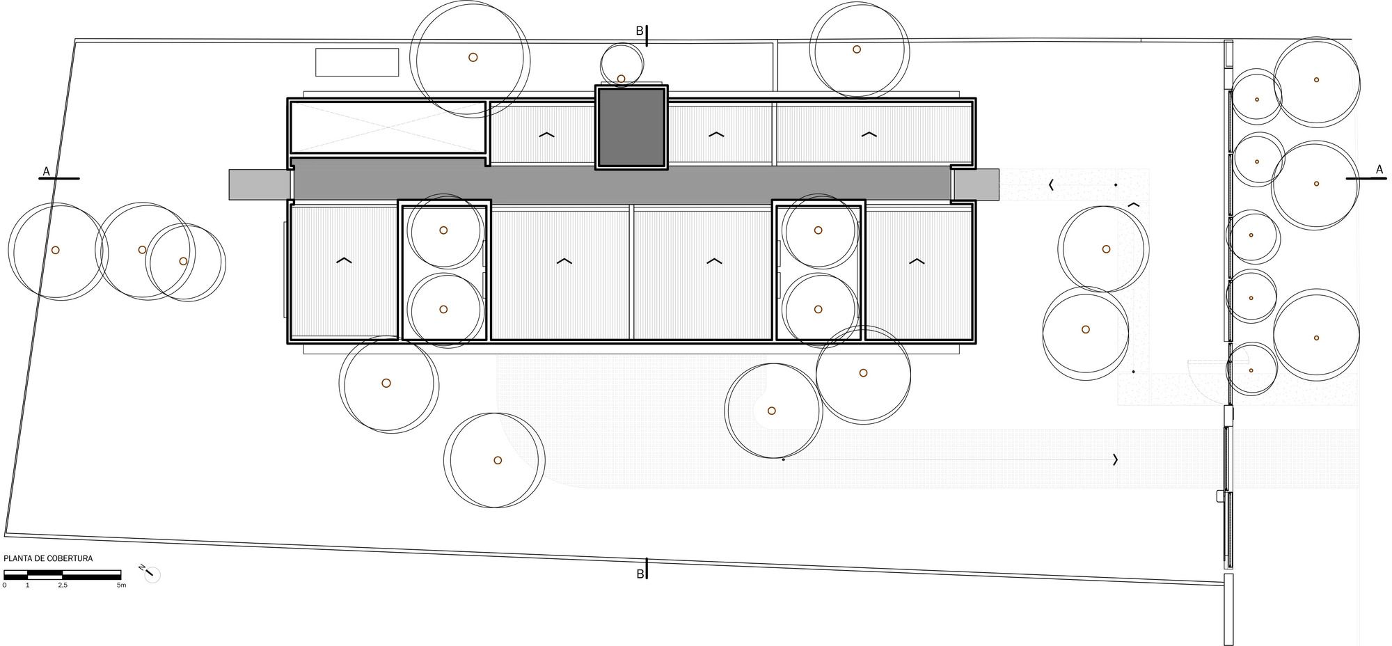
Plan - Roof
Plan - Subsoil
Section AA e BB
Elevations


