Designed by Alejandro Aravena, We were asked to build a glass tower to host everything that had to do with computers in the university.
The university asked us to question the type of architecture required for teaching now that everything depends on digital technology. Should architecture change now that we have computers? Does the notion of room (be it for work or for attending a class) still make sense? Our answer was, of course, Yes and No.
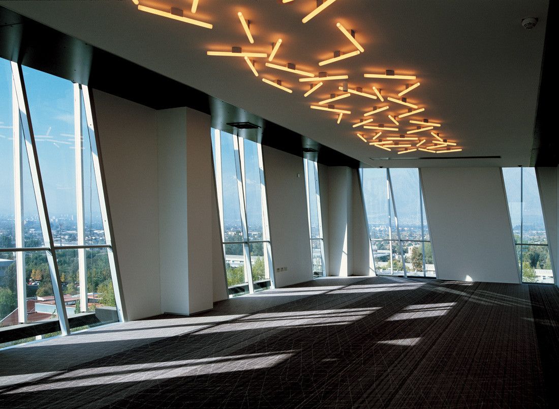
Yes because the paradigm for working spaces has been reversed; if until now a good room, was the one that had a good natural light (library, classroom, etc), now that we work on screens, a good space is the one that has achieved a good half-light (to avoid uncomfortable reflections). This fact led us to explore a relatively hermetic volume, with very controlled perforations towards the outside.
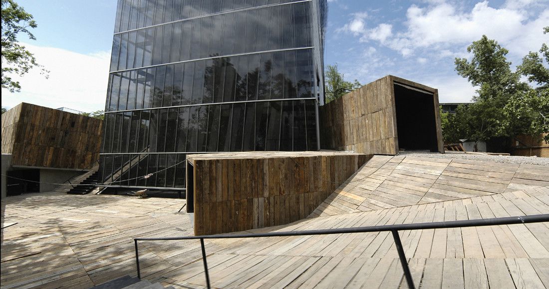
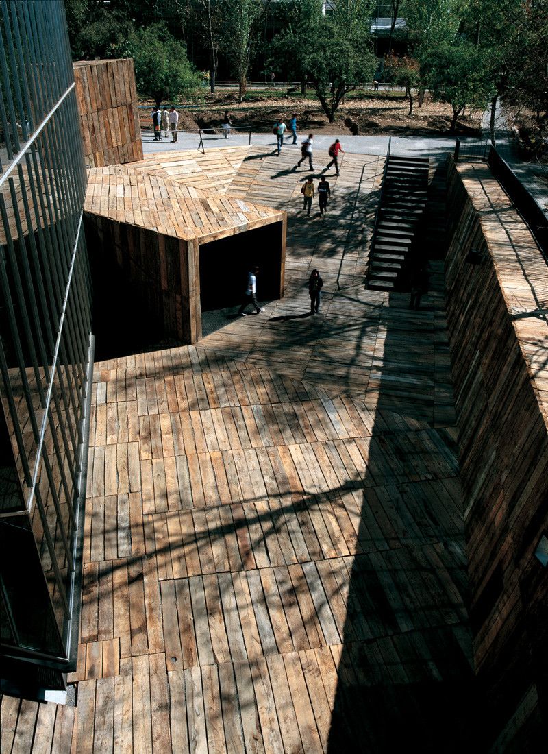
But on the other hand, we were not that optimistic regarding computers and their influence in education, or the transmission of knowledge; in the end nothing will defeat a good conversation of two persons (be it between a professor and a student, or between students) under a good shadow, drinking a nice cup of coffee or having a casual conversation in a corridor. In a way, formal education is taken care of by building codes: light, acoustics, ventilation, etc. but nobody takes care of informal education and there we saw a design opportunity. So, instead of moving forward thinking about the next step in education, we thought we had to move back as much as possible, to more archaic and primitive ways of being.
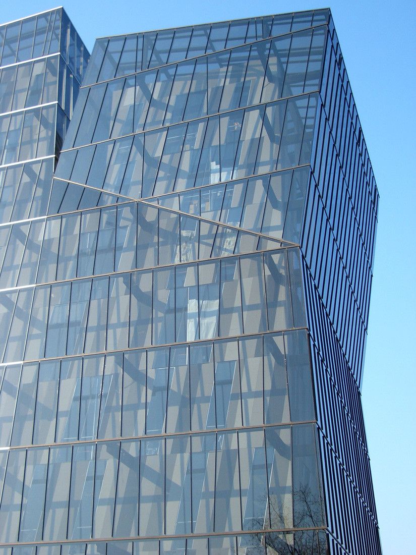
Regarding the glass, the problem was that building a glass tower in Santiago, means automatically to take care of the greenhouse effect. We had no money for a curtain-wall, able to solve all the issues in one single skin (double, effective and colored glass). Even if we had the money, the amount of energy that has to be spent afterward for air conditioning is obscene. Finally, we did not like mirror glass for the façade, because it is vulgar.
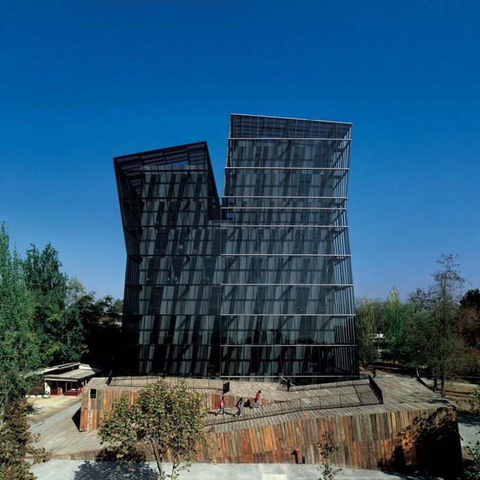
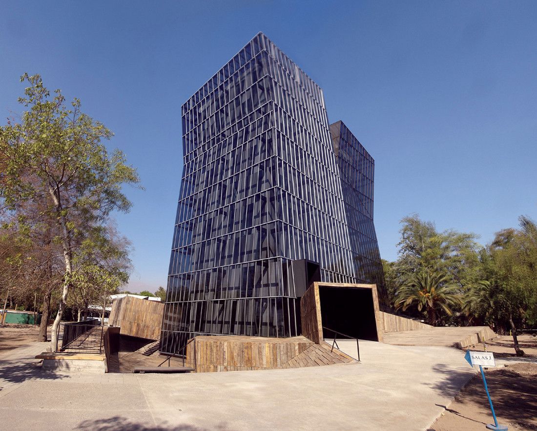
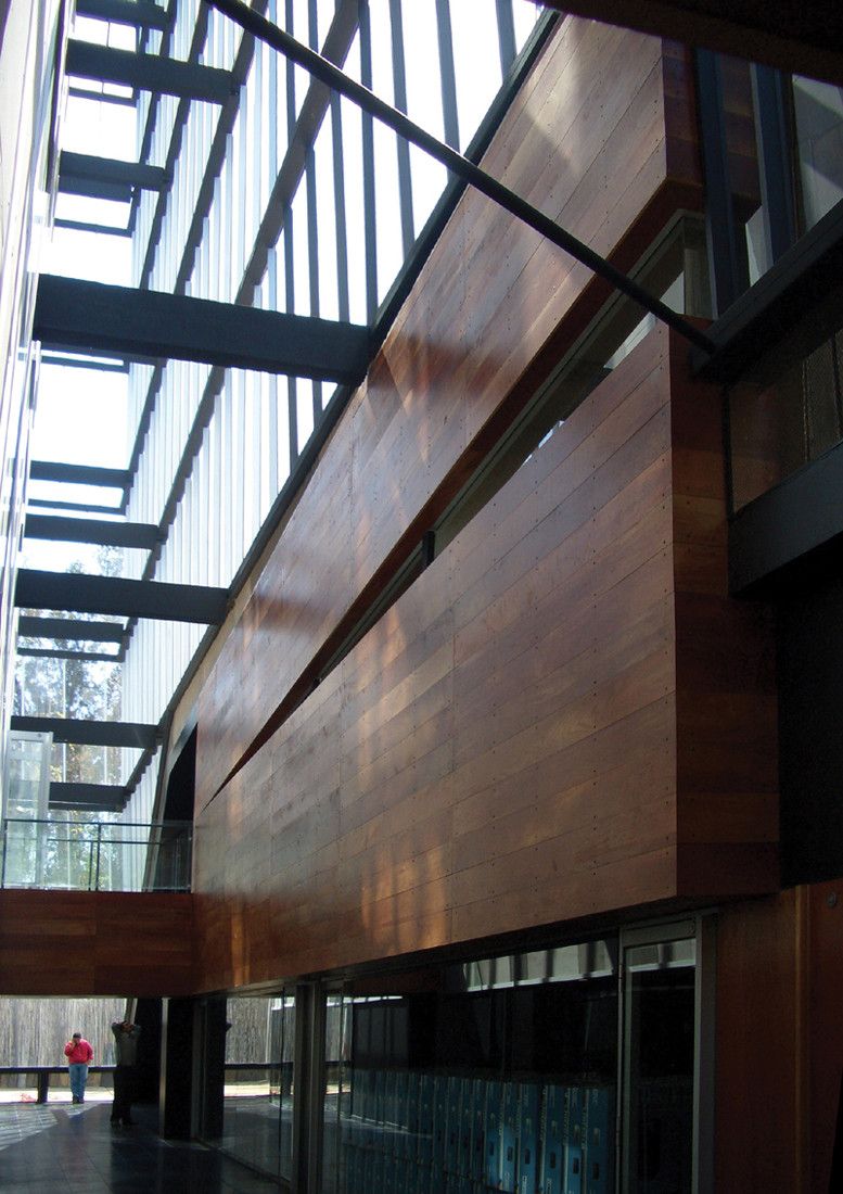
So instead of thinking about a skin capable of doing all the job (protection against dust, rain, smog, weathering and greenhouse effect) which costs around US$ 120 x sqm, we thought that it would be cheaper to do several skins, each of them doing 1 thing at a time. So we designed an outer single glass skin, very bad in energetic terms, but very good against weathering. Then an internal building made out of fiber-cement, bad against weathering but energetic wise. In between them: air. All we had to do, was to avoid the greenhouse effect generated after the sun trespassing the glass, to reach the second building inside. So we allowed the space in between the two buildings to perform as a perimeter chimney, letting the hot air to leave the system ascending by convection to a void in the top. A constant and natural vertical wind, helped by the Venturi effect created by the waists will eliminate the greenhouse effect. The sum of the two buildings, because they were more specific in their performances, was 30% cheaper. We also expect to spend much less energy during its useful life.
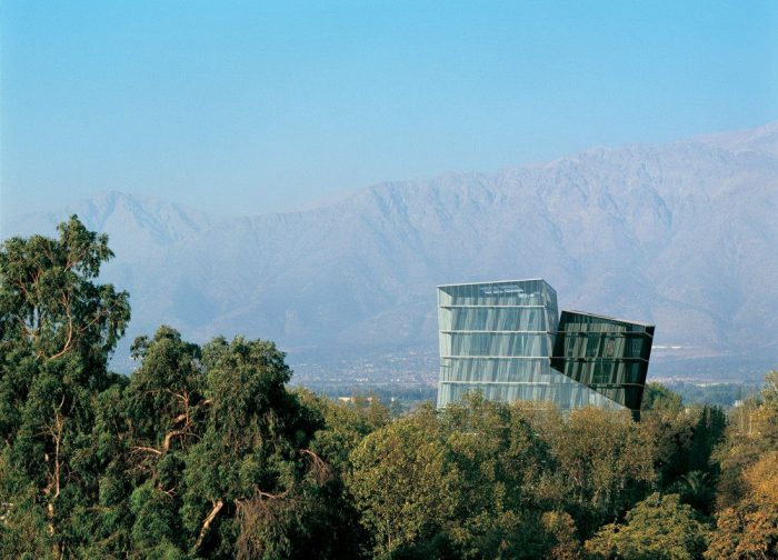
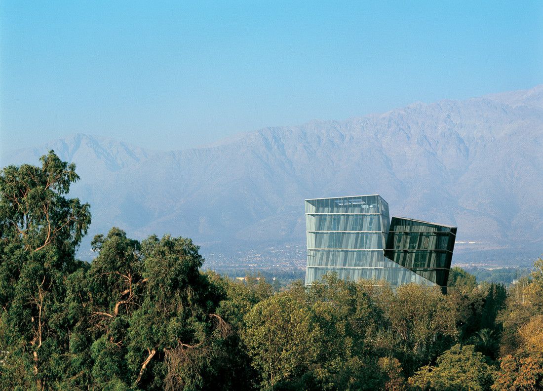
Finally, there was the problem of trying to have a tower, because we had just 5.000 sqm to achieve it. Didn’t matter how much we reduce the surface of each floor, the resulting figure was pretty chubby; it was a high building, but it didn’t look like a tower. So the only solution we thought of, was to cut the volume in two from the 7th floor up. For each of the resulting parts, we used almost width-less aluminum pieces of slightly different colors. So if seen from the front, the building has a unique bi-chepalus volume, but seen as a foreshortened figure, the color difference could show a couple of really vertical figures, that happened to share great part of their bodies, as if they were Siamese criatures.
Project Info:
Architects: Alejandro Aravena
Location: Camino Privado, Macul, Región Metropolitana, Chile
Collaborator: Emilio de la Cerda
Structure: Concrete
Area: 5000.0 m2
Project Year: 2003
Photographs: Cristobal Palma
Project Name: Siamese Towers
photography by © Cristobal Palma
photography by © Cristobal Palma
photography by © Cristobal Palma
photography by © Cristobal Palma
photography by © Cristobal Palma
photography by © Cristobal Palma
photography by © Cristobal Palma
photography by © Cristobal Palma
photography by © Cristobal Palma
photography by © Cristobal Palma
photography by © Cristobal Palma
Site Plan
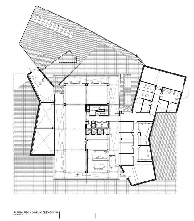
Ground Floor Plan
Elevations
Sections


