When designing an exhibition space there has to be a balance. The architect’s job is to design spaces in which the items being exhibited are able to look their best and be displayed in a way that highlights the item to its fullest potential; however there is no easy solution to this matter. Even though it is important to create appealing spaces the architecture of the entire building needs to be eye catching and impactful as well, otherwise we’d design a white box with a door, place the object inside and call it a day.
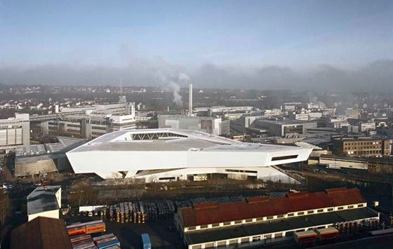
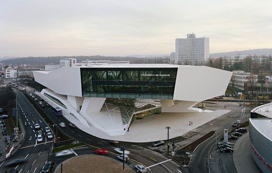
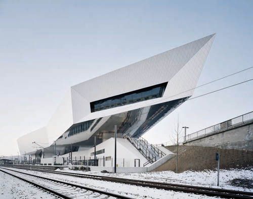
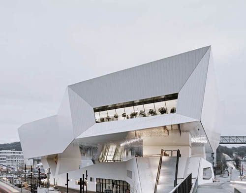
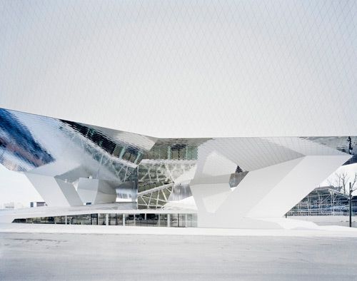
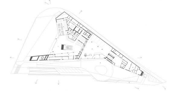
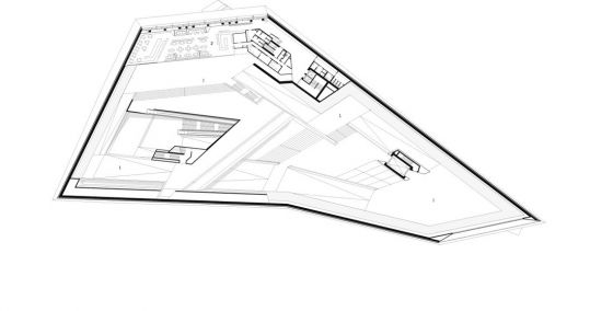
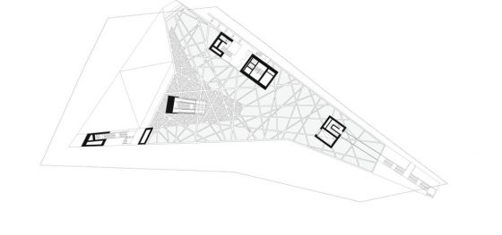
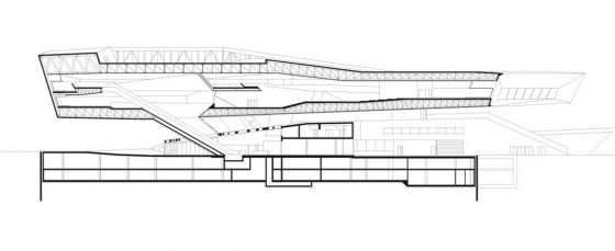
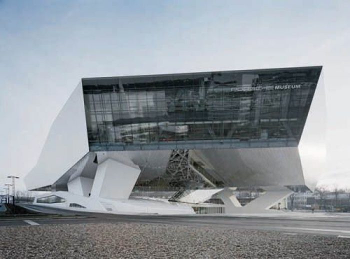
 The Porsche Museum designed by Delugan-Meissl is located directly next to the headquarters of Dr. Ing. h.c. F. Porsche AG in Stuttgart-Zuffenhausen. The building was completed in 2008 after being awarded first prize in a two-stage competition in 2005. What can be seen from the outside is a bold avant-garde monolithic structure being supported by a steel structure consisting of three V-shaped columns floating above a platform. The volume of both the monolith and the base landscape is designed to look different from every angle through the use of polygonal geometry.
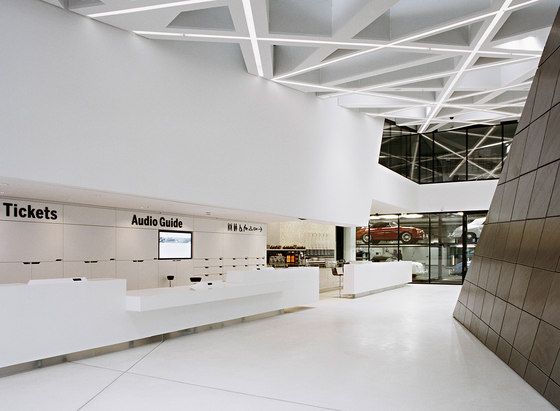
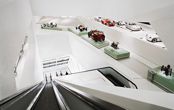
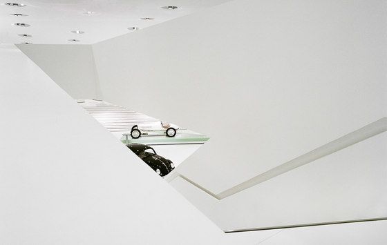
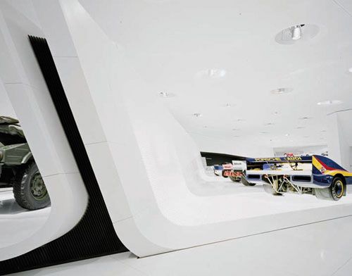
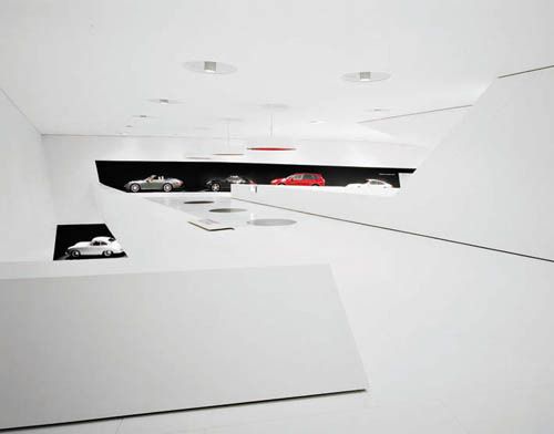
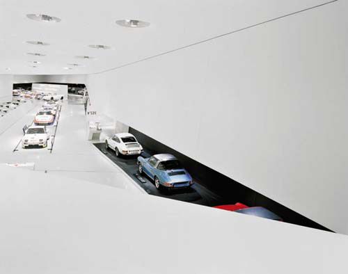
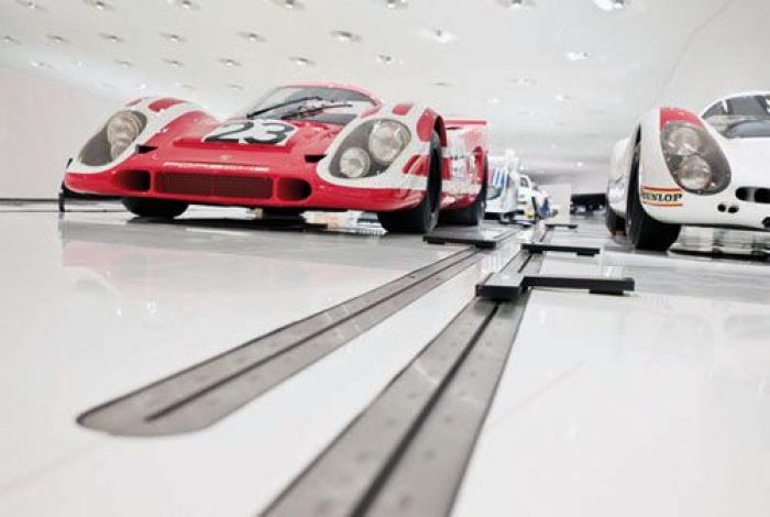
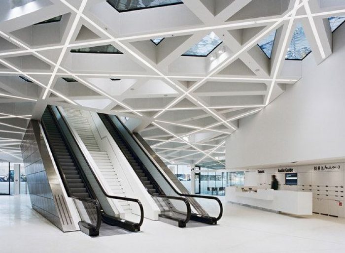
The ground level consists of the main entrance and other various facilities and amenities forming a sort of pedestal for the monolithic structure above it, inside of which is an exhibition space of 5,600 square meters. The entire structure has a cool and dramatic, possibly even futuristic or sci-fi quality to it that plays well with the legendary automotive icon that is Porsche. One of the most successful and interesting architectural decisions made in this project I believe can be found in the interior detailing. The large white spaces provide clean backdrops for the cars on display, while subtle black pin stripes help define edges, breaking up the solid while environment and defining the separation of architectural elements such as where the wall touches the floor and the ceiling.
