Panorama House
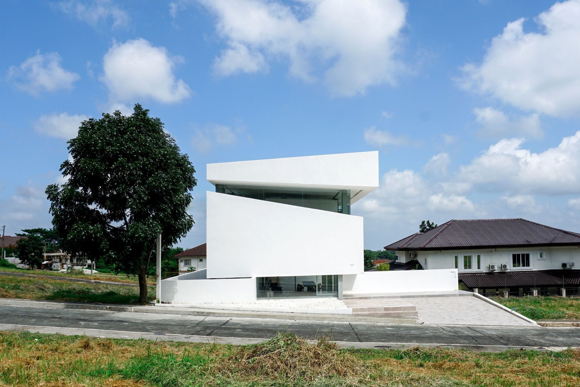
The house Is a weekend retreat 3 hours away from busy Manila. The client wanted a place where they can rest during weekend as a form of escape from the city. The project is located in a typical Filipino gated community of mostly Mediterranean-style homes. The client asked Jim Caumeron to design the home different from its neighbors on a limited budget. The area of the property is 300 square meters. In order to lessen the cost of the project, the building footprint was reduced to 100 square meters. There were two challenges for the project.
First, the setting is not different from the client’s Manila suburban house. You have to drive outside of the village to enjoy the scenic views Tagaytay and Tall volcano offer. The second dilemma is how the house can feel like a weekend home when the area of the building footprint is just 100 square meters. I’ve called it the Panorama idea. Since there are no redeeming views in the surrounding area, other than the park across the property, the architect proposed that the house will have its own “world,” he termed it introverted context, done by isolating some outside views.
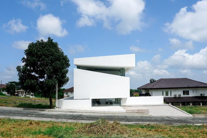
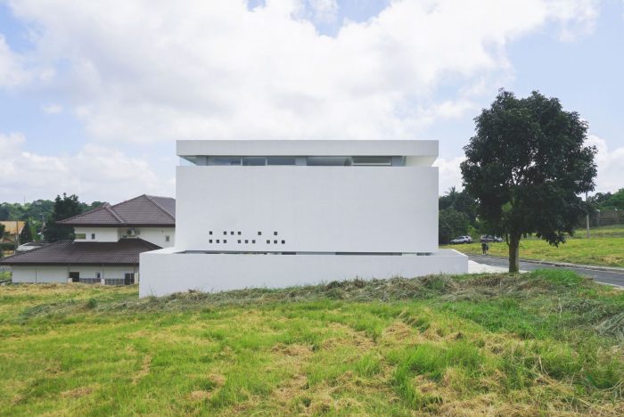
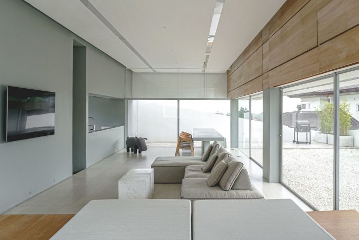
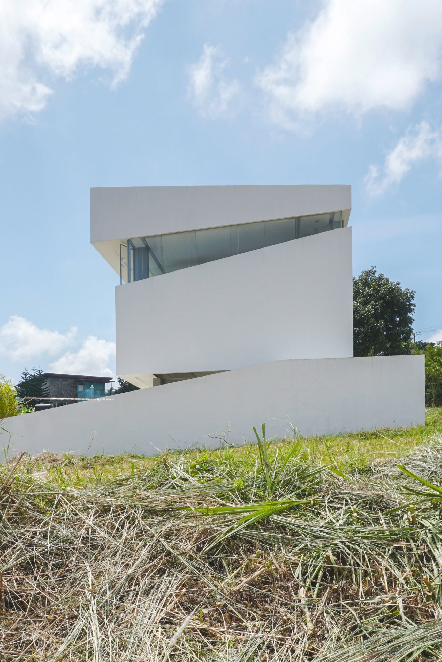
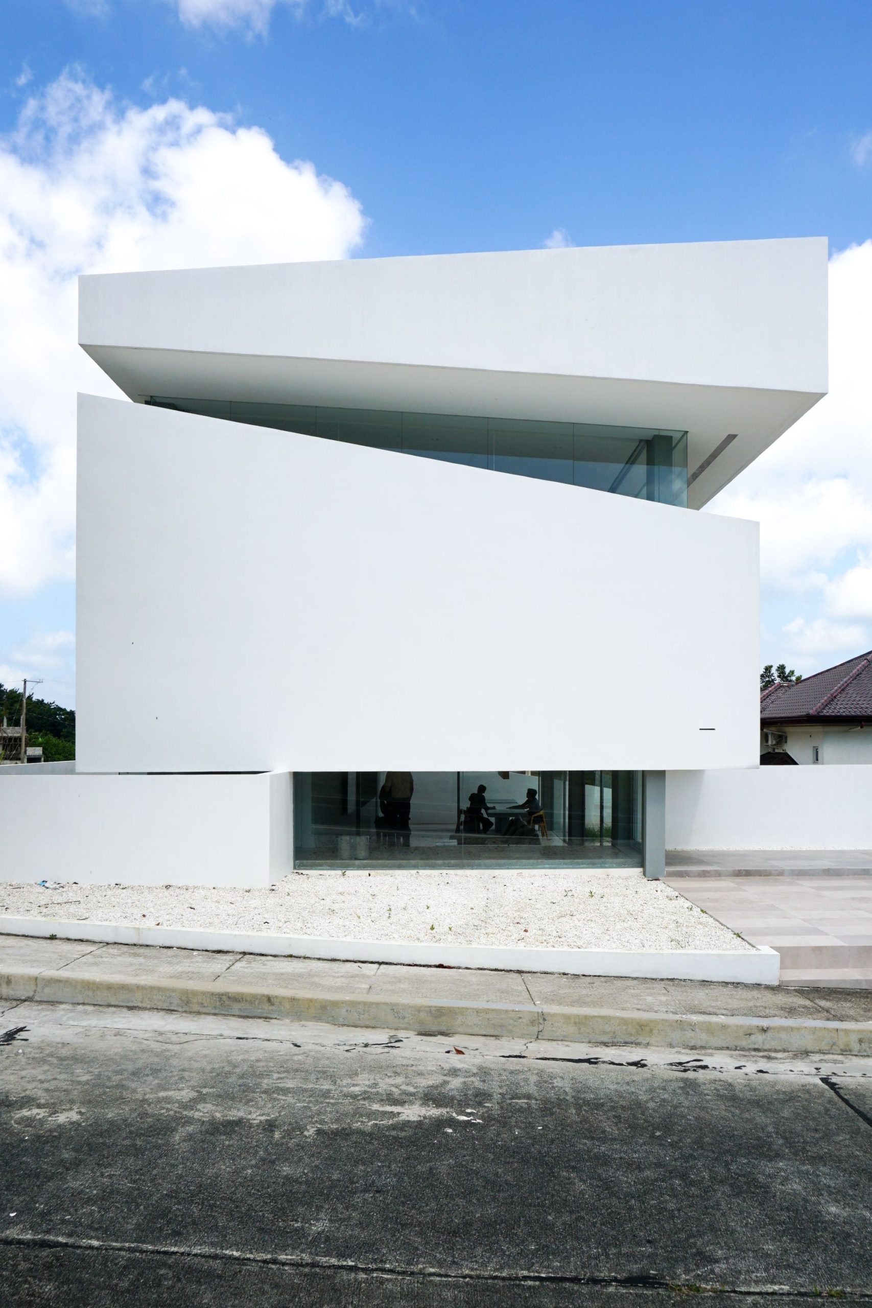
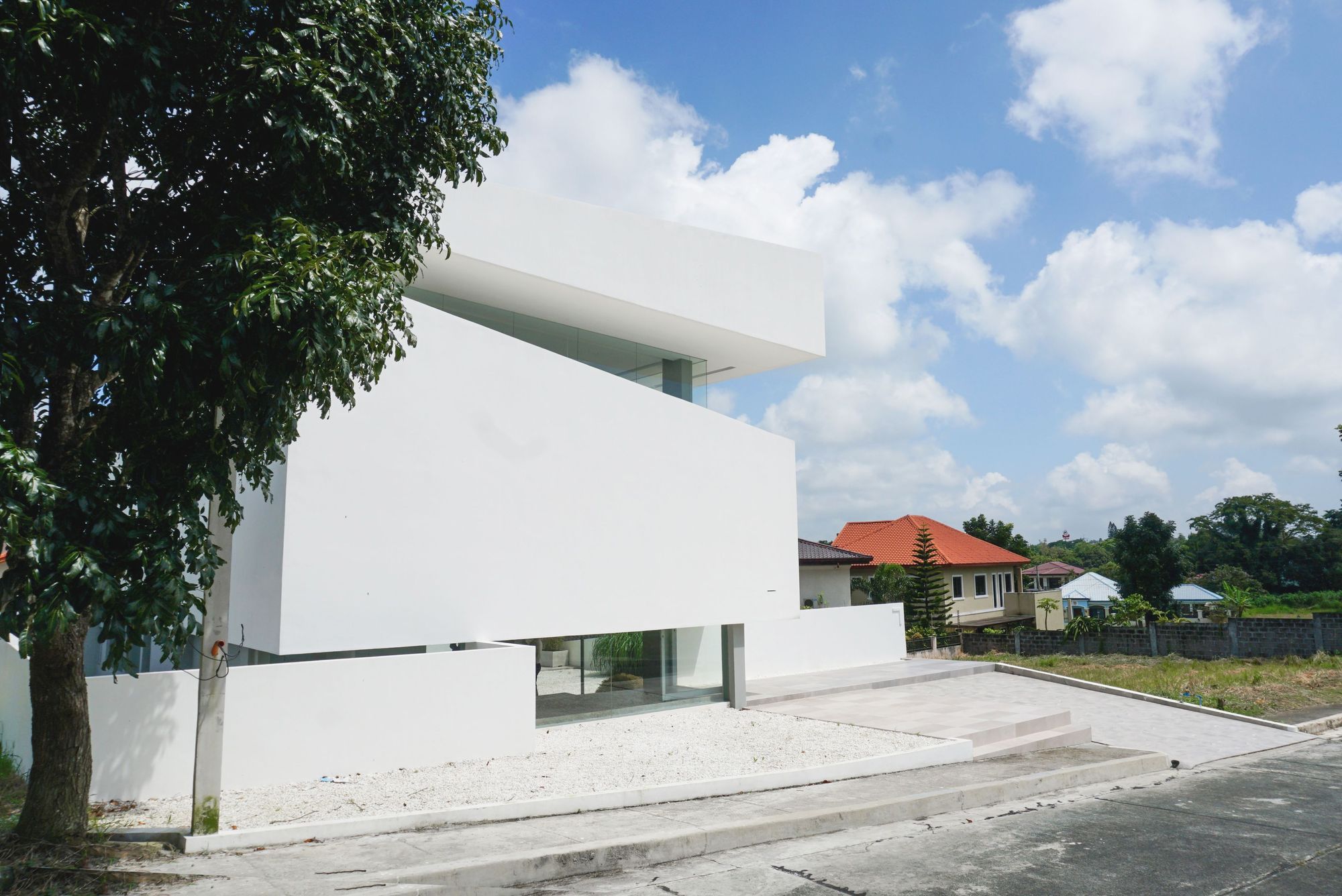
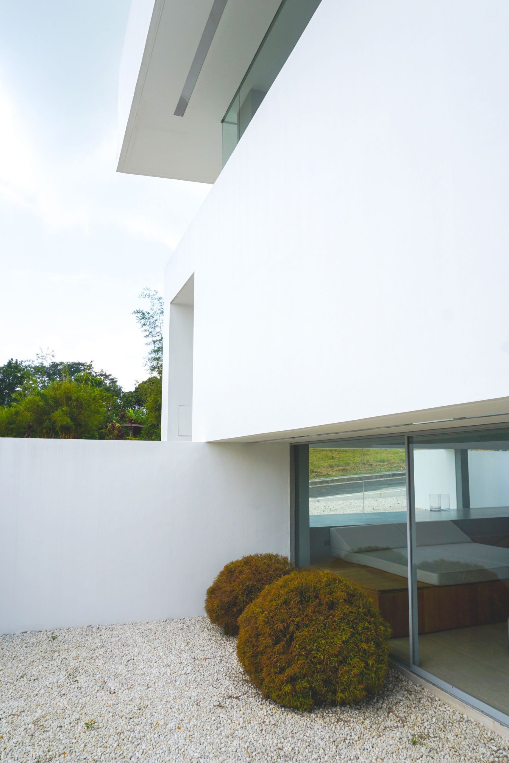
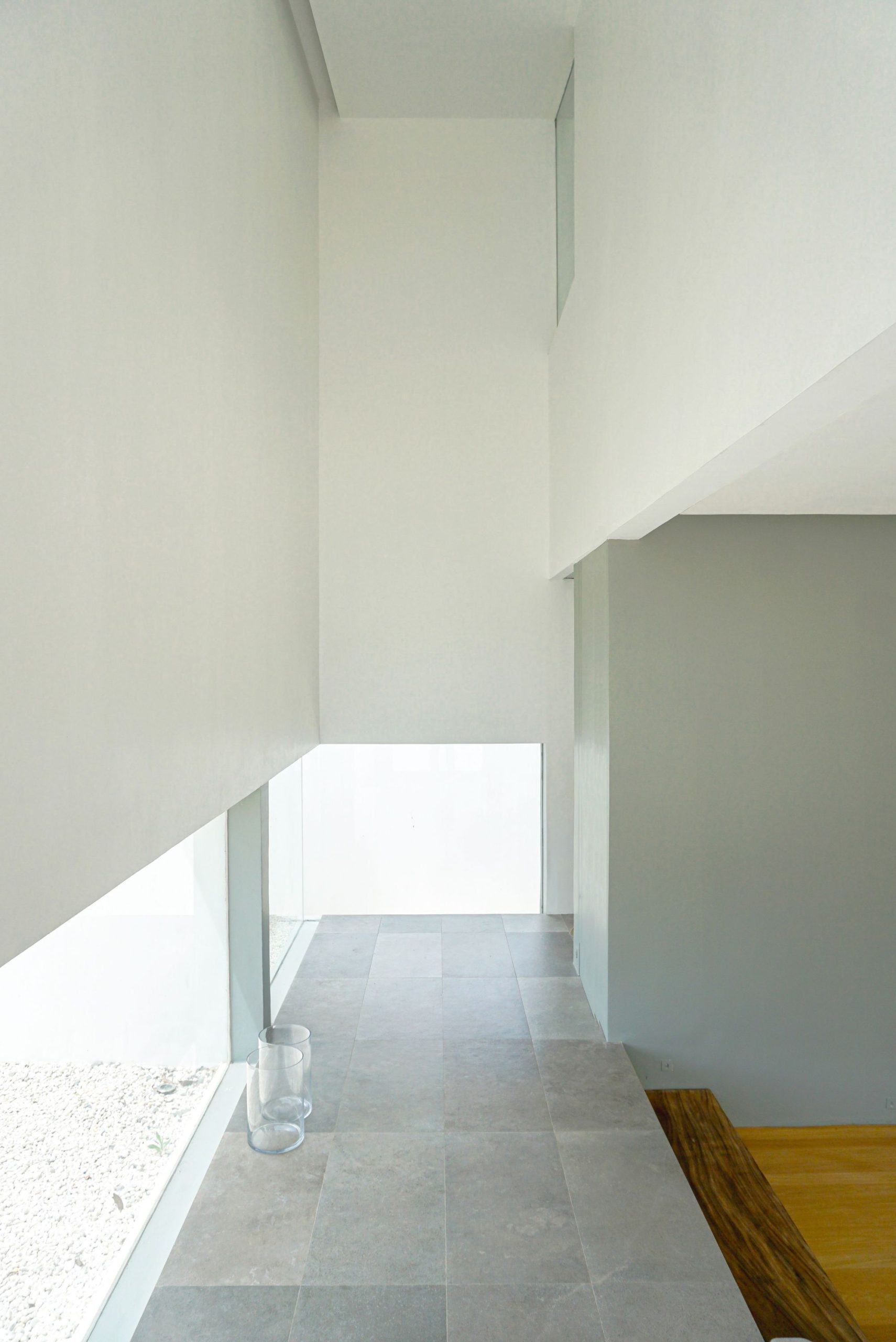
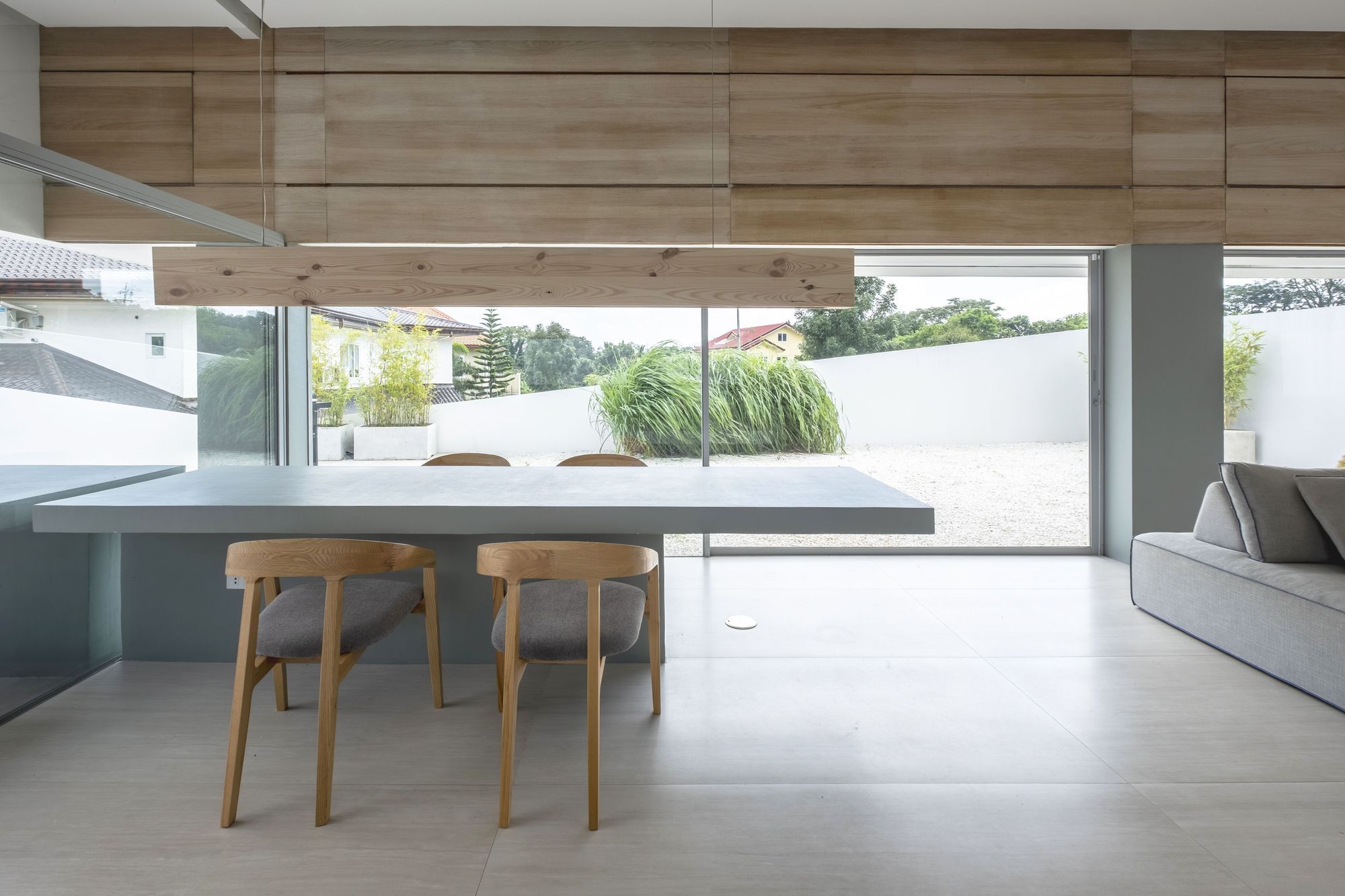
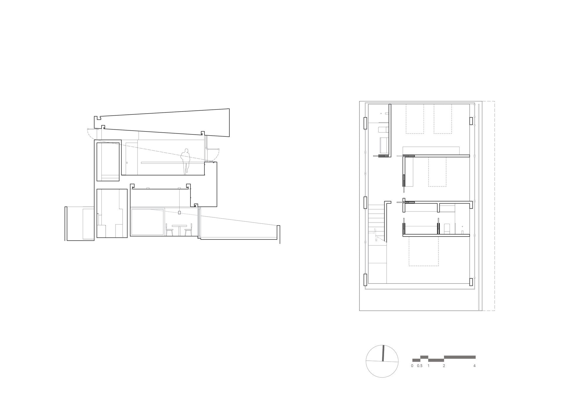
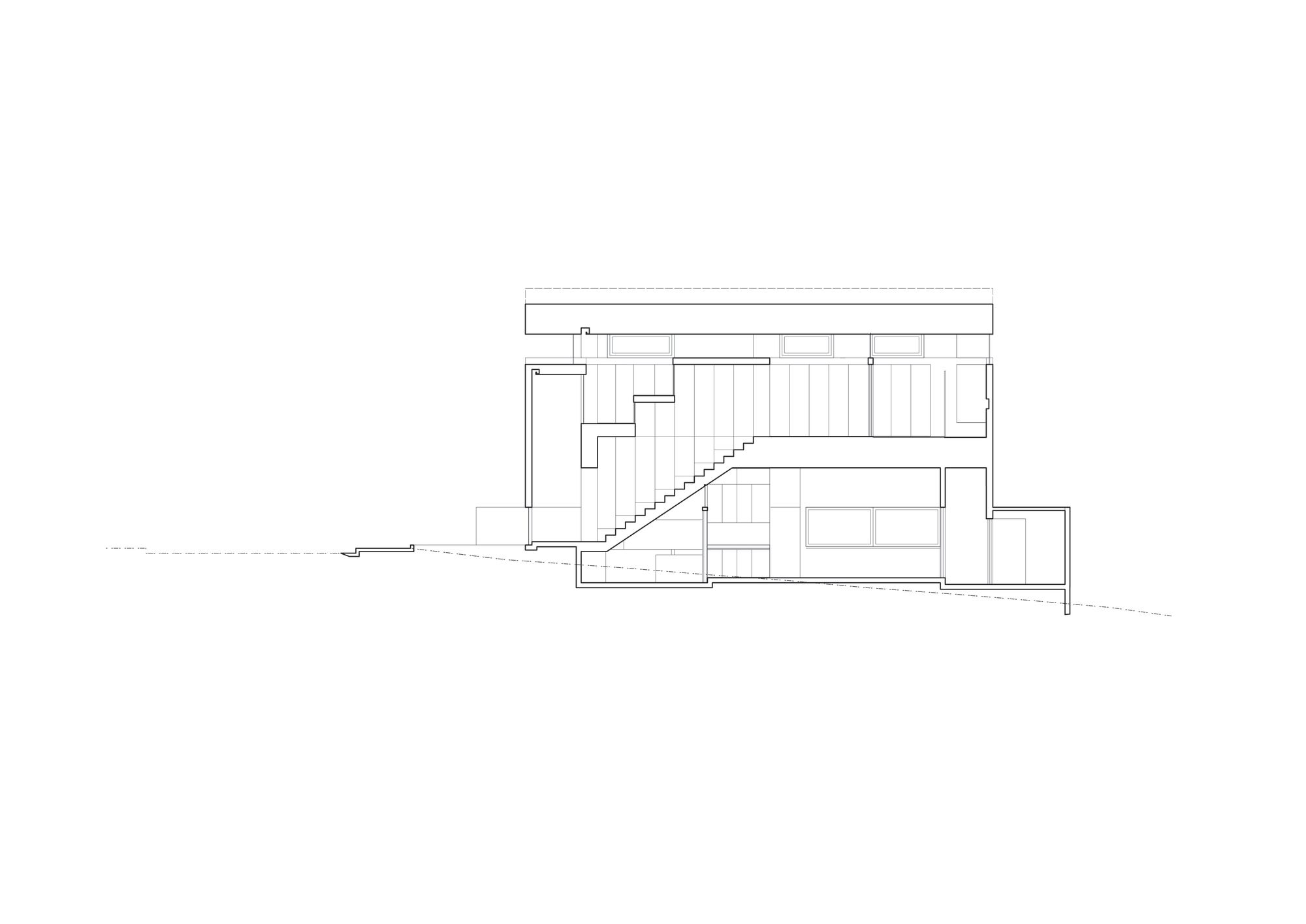
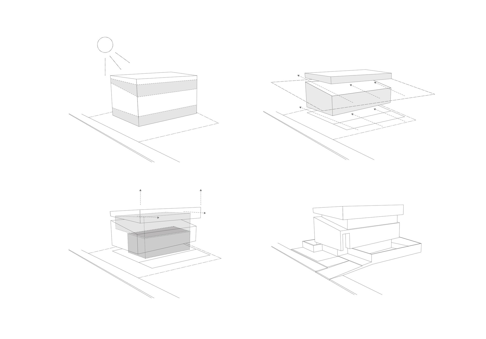
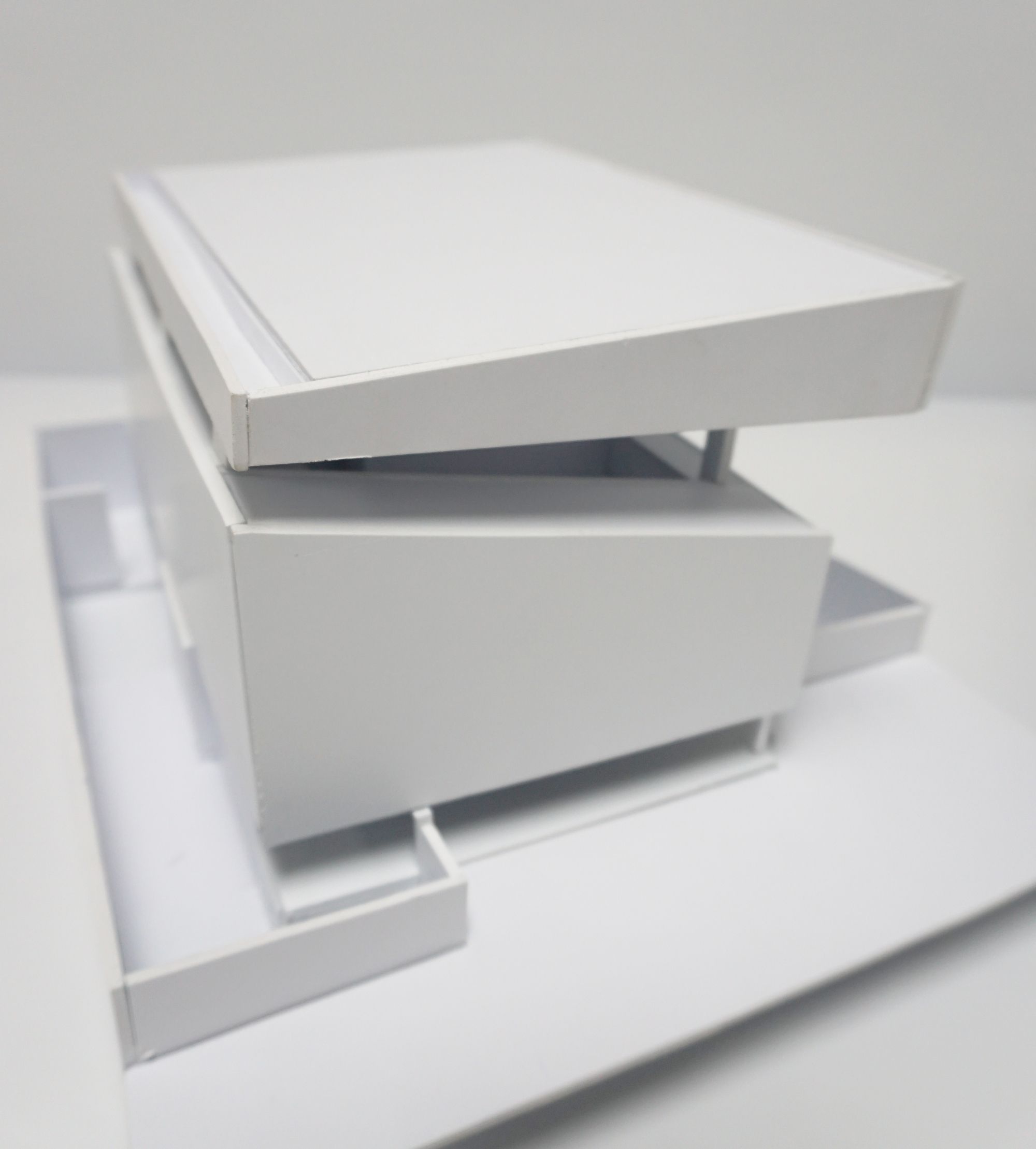
The Architect imagined it as a volume with two horizontal cuts. One cut for the ground level for views, ventilation and extended space, and the second level for wind circulation and views to the outside. In the Philippines, wind circulation is paramount as it gets very hot during the summer months. The site is slightly sloping, with a 1.5 meter drop when you reach the other end of the property line. This gave an opportunity to sink the living and dining areas 1 meter down, making the park across the lot visually-framed on eye-level. The steps that connect the entrance space to the living area was made into an afternoon nap space as it is a common practice for Filipinos to make their kids sleep in the afternoon.
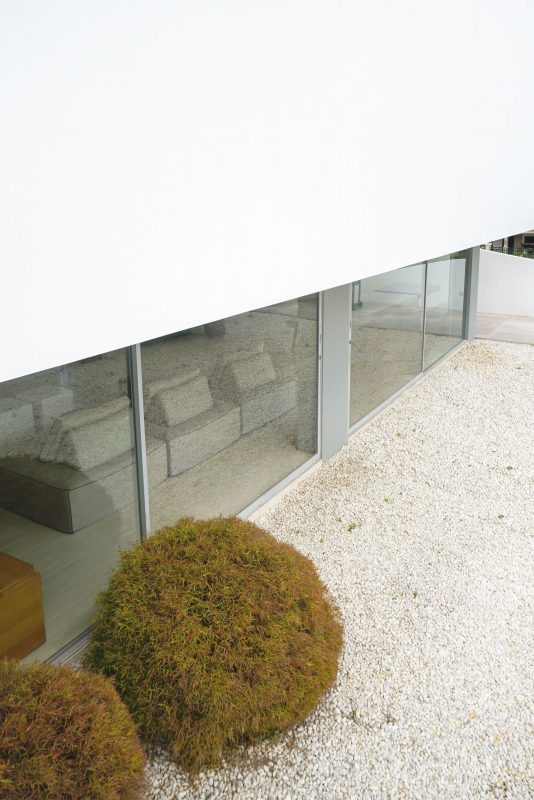
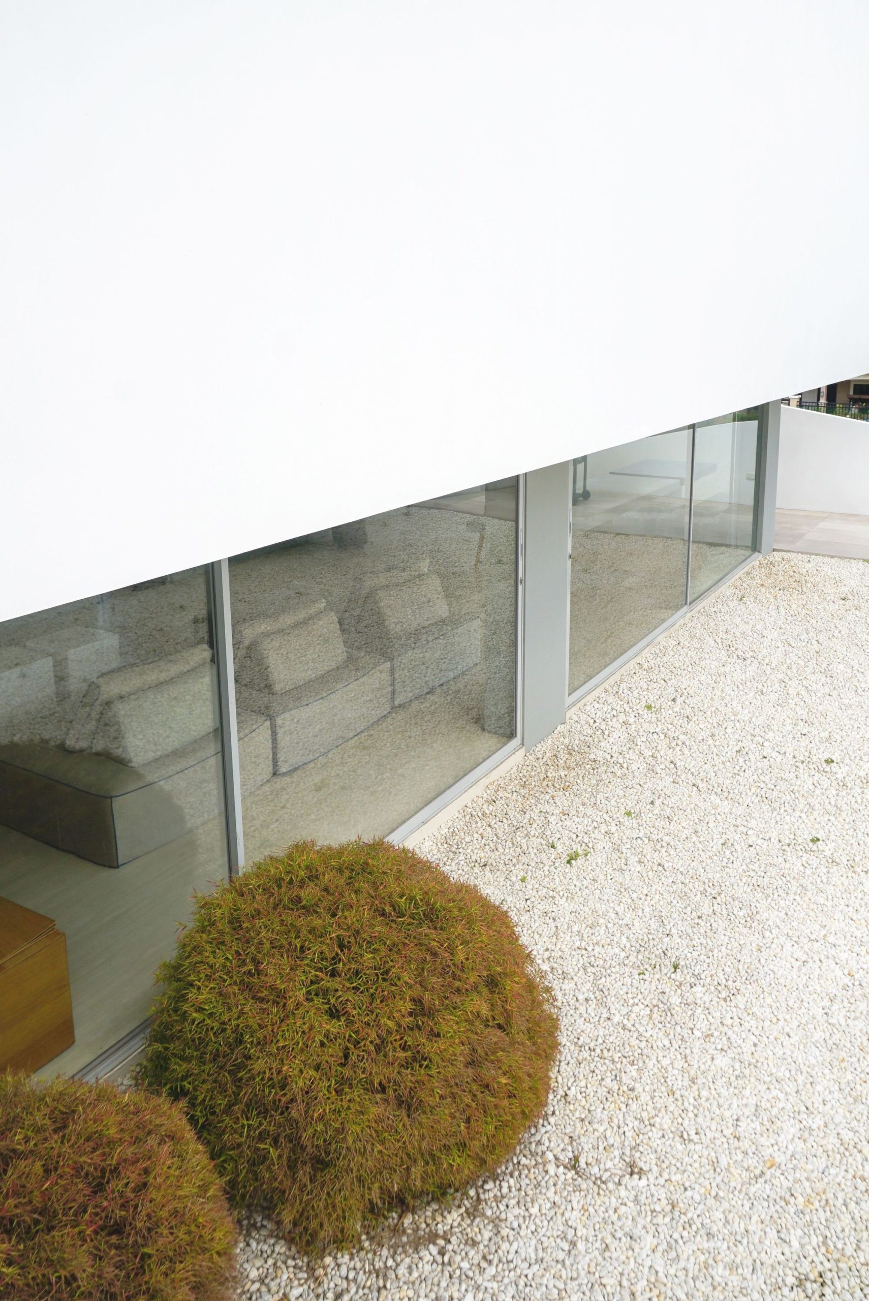
The living space expands to the garden area for breeze and view of the white-pebbled garden. The choice of using rocks instead of grass was because of daily maintenance issues. This resulted into a more other-worldly effect of the ground living areas as the white rocks bounce light that brighten the atmosphere. The west side of the ground floor is walled up to protect the living space from the heat of the 2 pm-4pm sun. This is where the service areas were located. The living area also has a high ceiling allowing room for rising warm air. The space is also shielded from the warming morning with the ground floor’s deep recessed canopy.
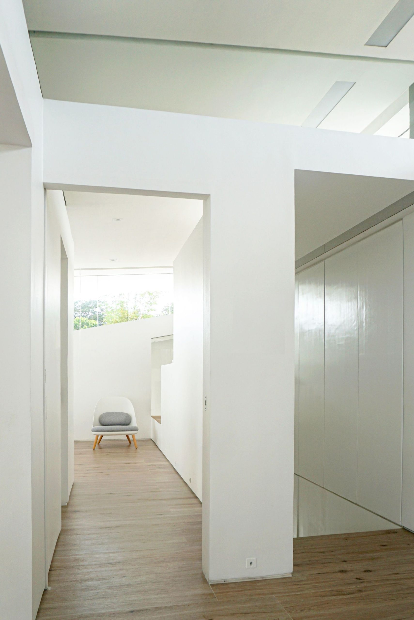
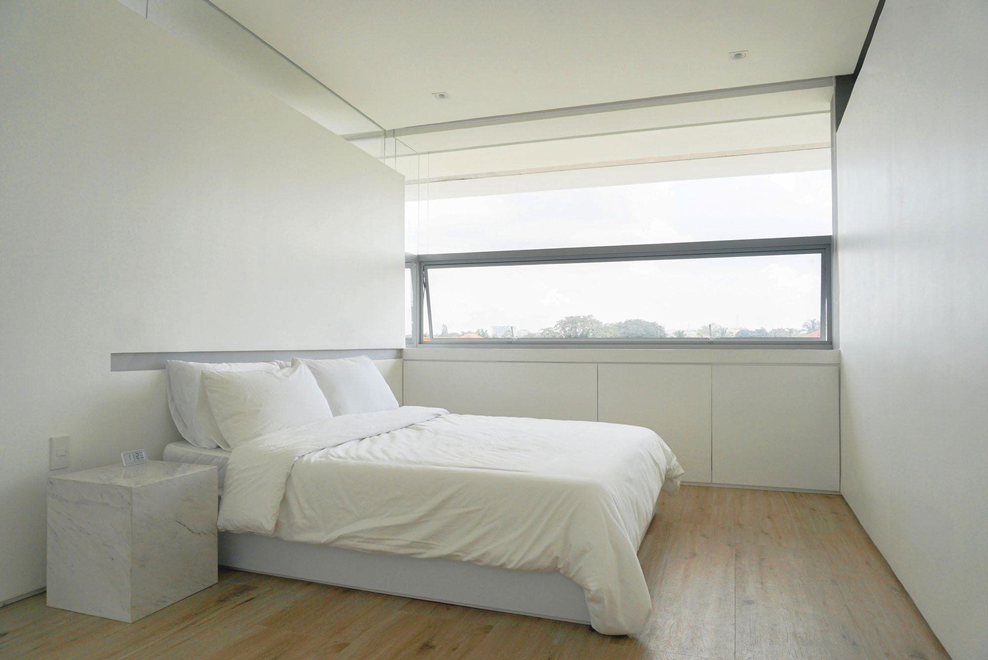
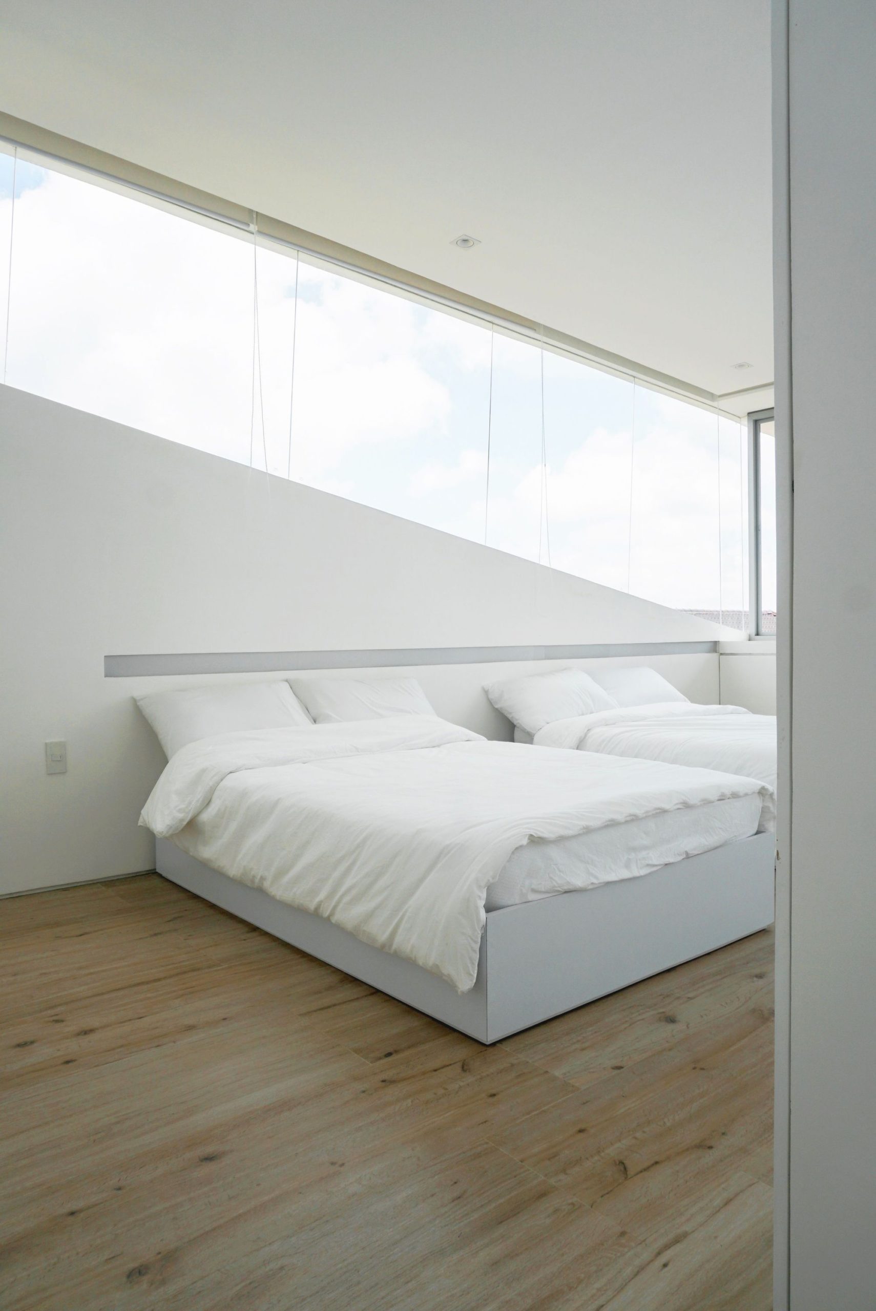
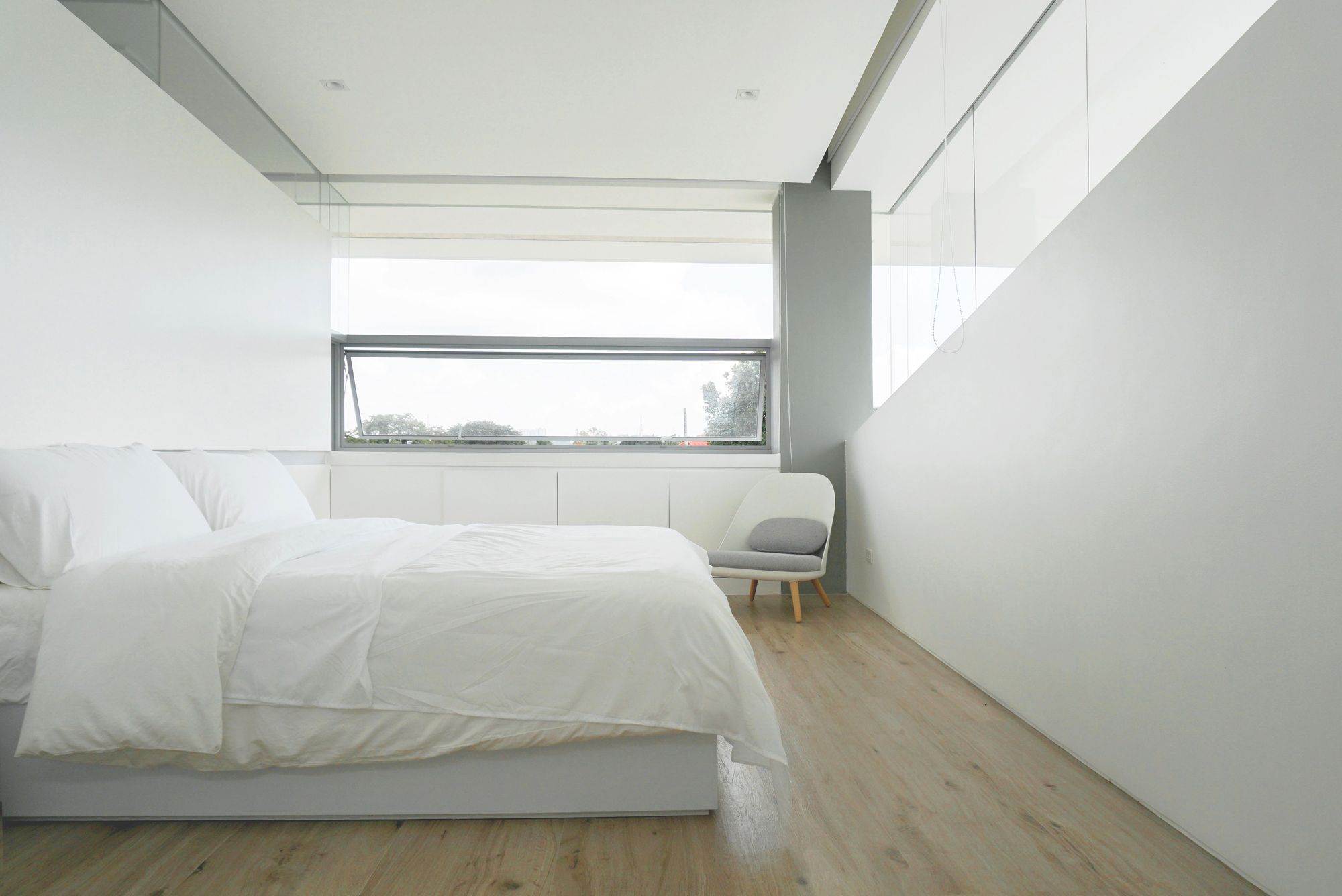
The location of the main glass door frames a tree nearby, visible when one standing at the atrium space. The second level has a combination of horizontal and diagonal cuts that run around the structure’s envelope. One side has a bigger opening to embrace sunrise and breeze, and the west side where the sun is stronger, has smaller windows meant to pull out the air for passive cooling. The west and east windows are connected by diagonal windows on the north and south side that provide a strong profile of the cut-volume design on the facade. The ceiling slope was also meant to influence the behavior of air to cross from one side to the other.
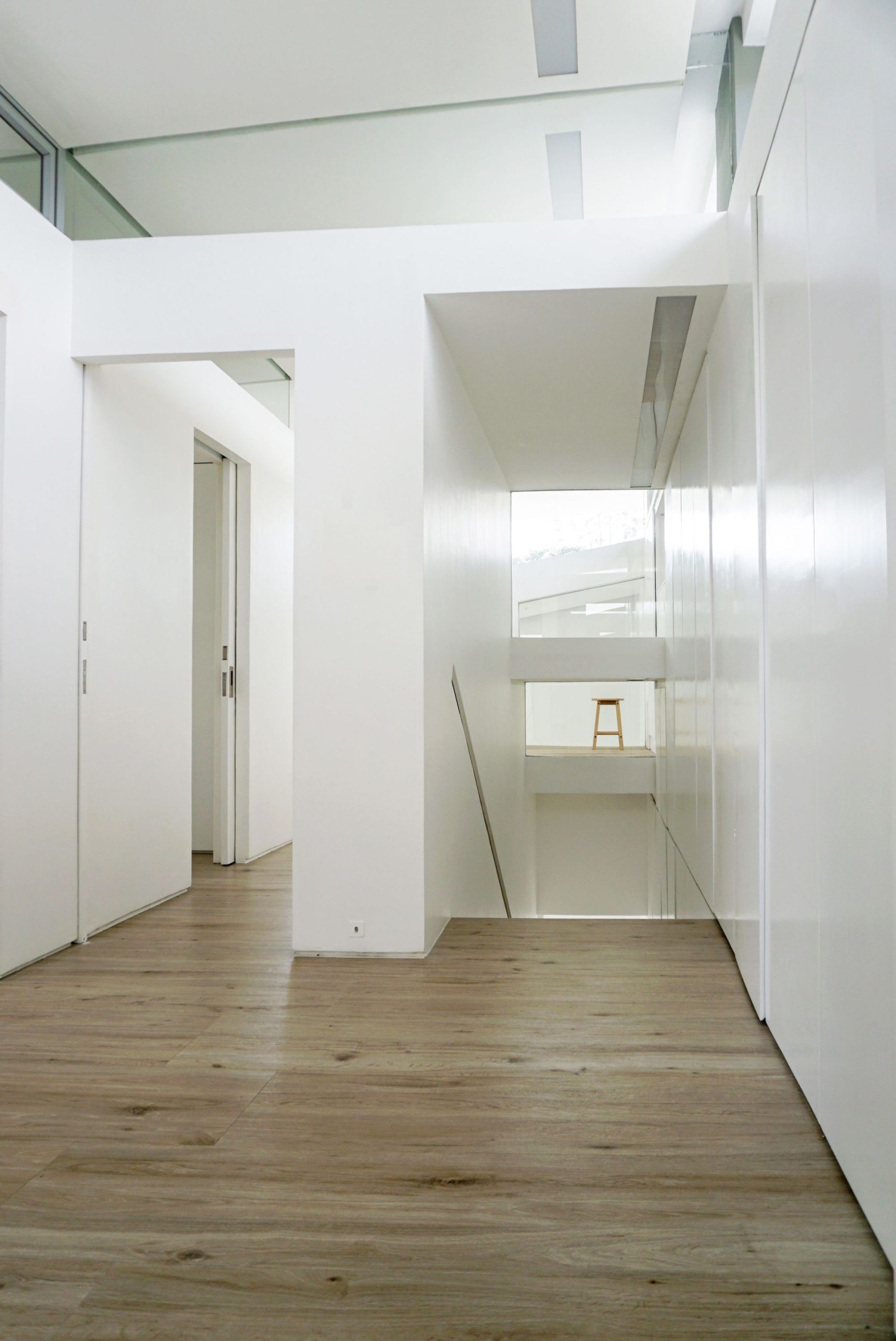
Room partitions were limited to a certain height to accommodate clerestory windows and allow the passage of air. The master’s bedroom dimension was expanded by occupying some space at the stair-well. This became a play area for the client’s 4 year old daughter. The windows of this play area look out to the stair well that is spatially concealed allowing a wind-tunnel effect that cools down the 2nd floor common areas. Air can be felt when one is going up and down the stairs as the wind circulates toward the small ribbon windows of the west walls.
Project Info:
Architects: Jim Caumeron Design
Location: Tagaytay, Philippines
Area: 200 m²
Project Year: 2019
Photographs: Jim Caumeron
Manufacturers: AutoDesk, ABK, Blanco, Caesarstone, Catalano, Gessi, Boysen, Daaz, Geotech Tiles, Trimble
Photography by © Jim Caumeron
Photography by © Jim Caumeron
Photography by © Jim Caumeron
Photography by © Jim Caumeron
Photography by © Jim Caumeron
Photography by © Jim Caumeron
Photography by © Jim Caumeron
Photography by © Jim Caumeron
Photography by © Jim Caumeron
Photography by © Jim Caumeron
Photography by © Jim Caumeron
Photography by © Jim Caumeron
Photography by © Jim Caumeron
Photography by © Jim Caumeron
Photography by © Jim Caumeron
Photography by © Jim Caumeron
Photography by © Jim Caumeron
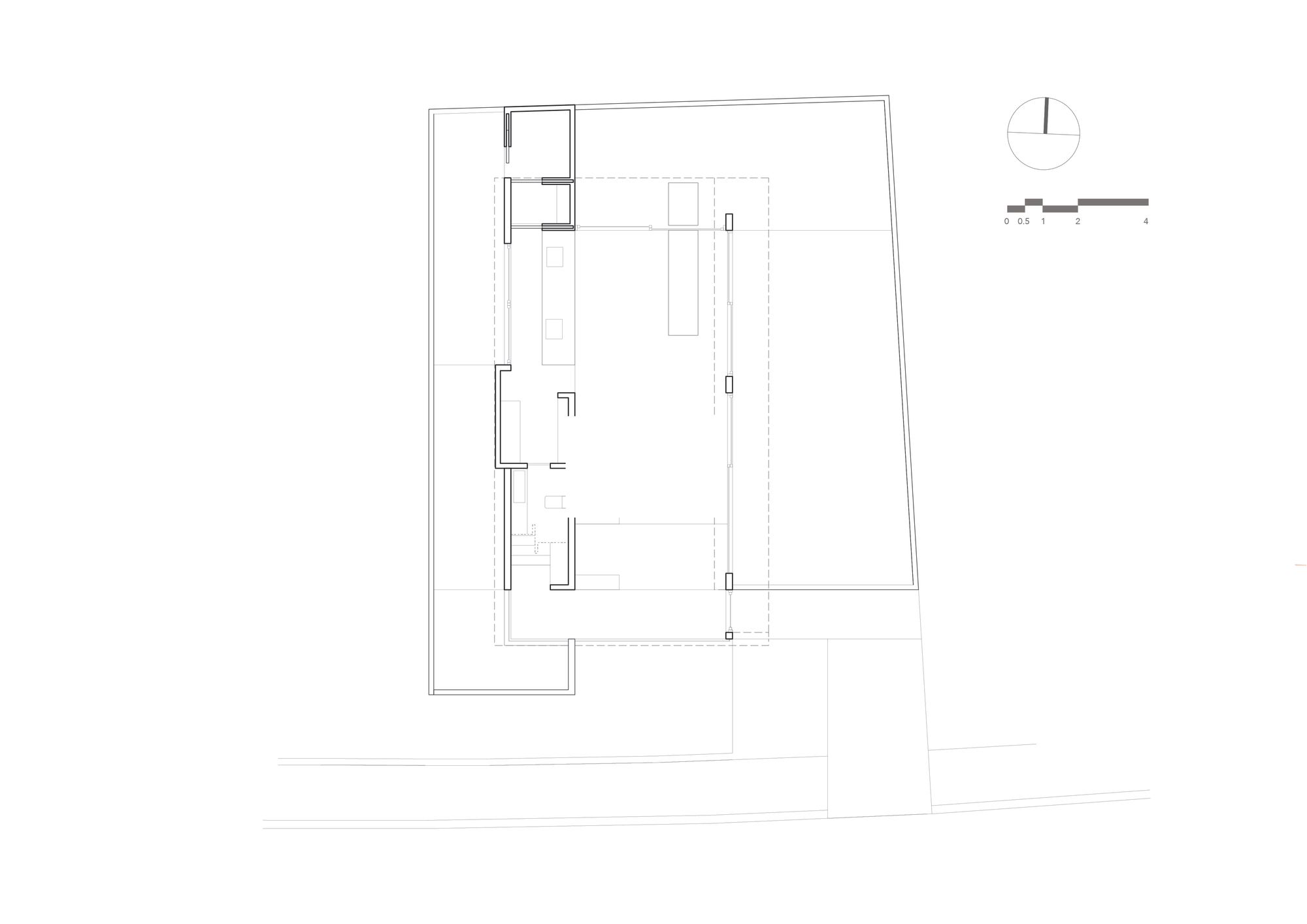
First Floor Plan
Second Floor Plan
Section
Diagram
Model


