JOLOR Showroom
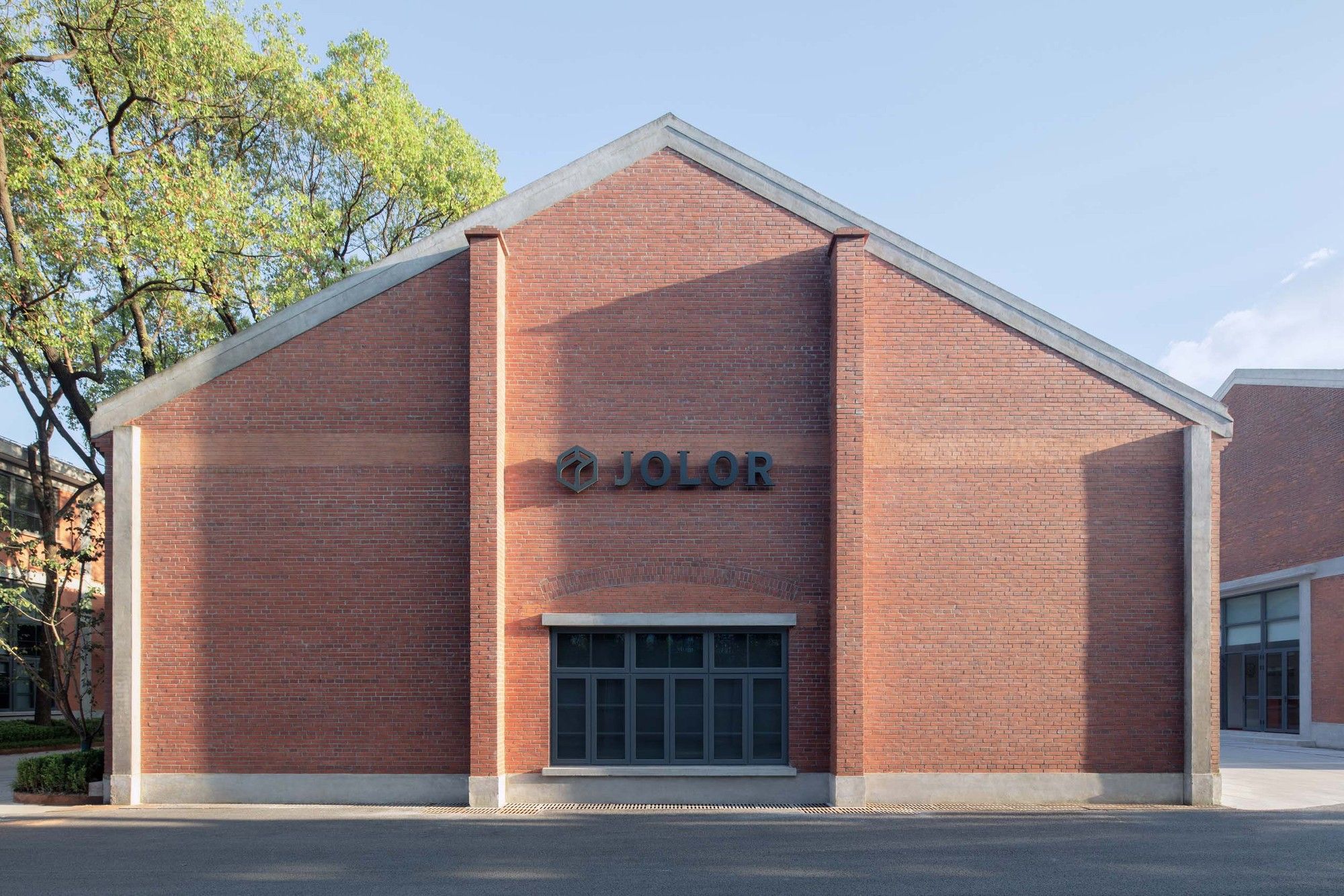
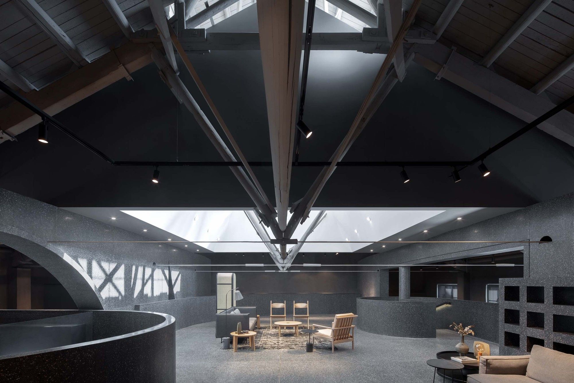
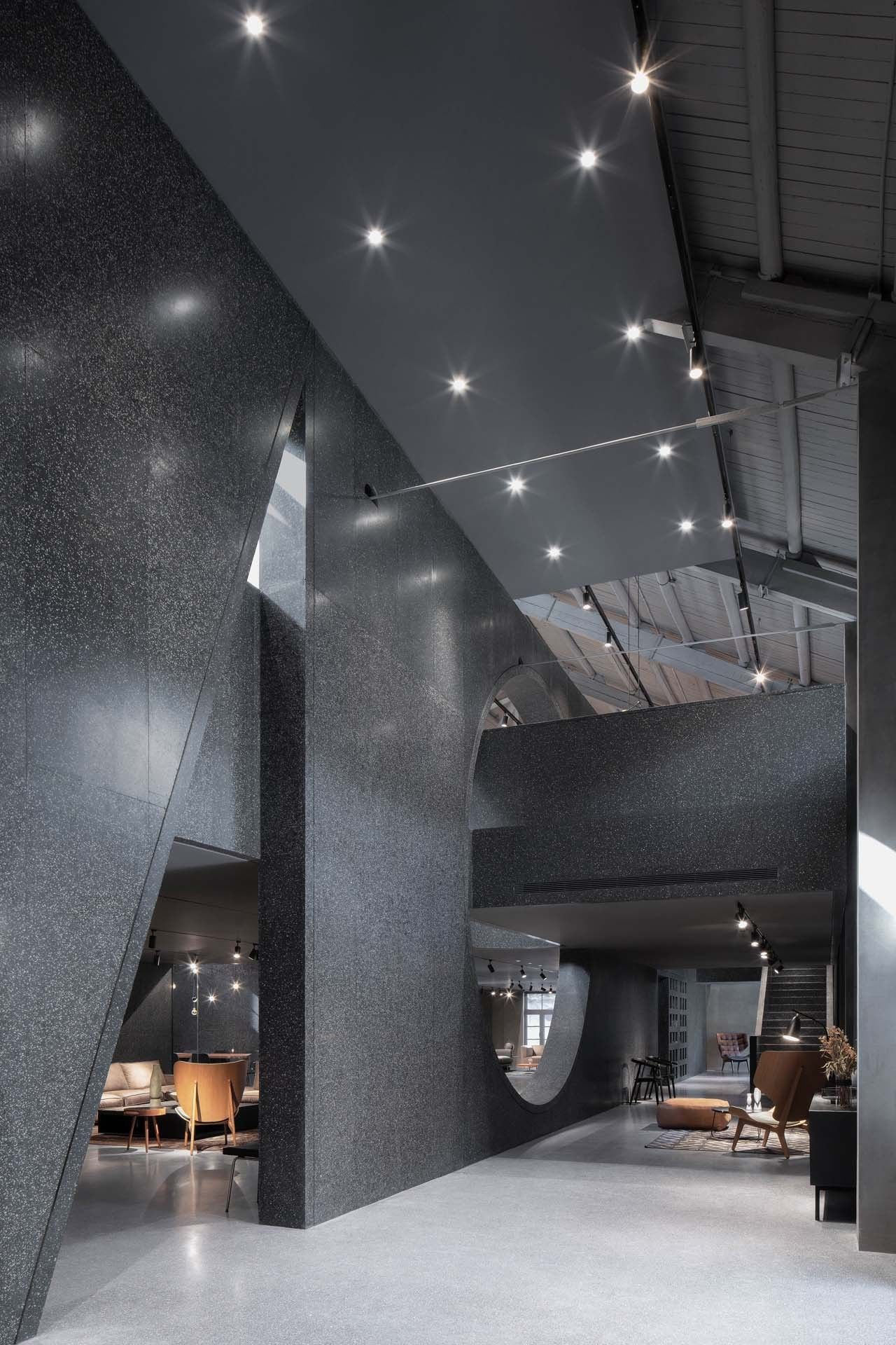
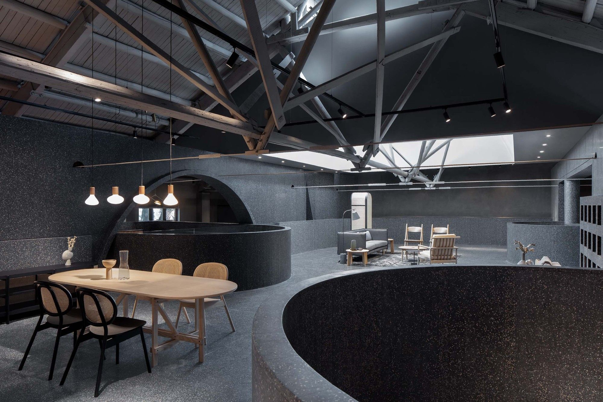
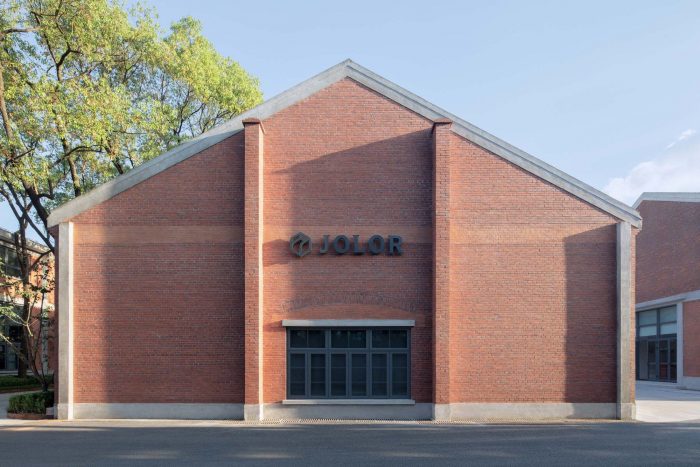
Located within the site of an old minery factory in Shanghai, Atelier tao+c has transformed an old 435 square-meter warehouse into a minimal, yet unique continuum with open spatial design. The one-storey building had undergone many shifts in function since 1958, during which much of the original industrial characters were stripped away. Only the triangular roof trusses and the dormer window over the roof still have the hints of what factory building look like within that period.
As an emerging furniture brand in China, like the other new brands in different industries nowadays, JOLOR started their business with its e-commerce market, and then stepped into the next chapter by opening a retail space to showcase their products for people to experience. The concept of the JOLOR Showroom was to design a place which is not just a furniture store, but also a place that can function as an undefined multi-purpose exhibition space, also as a platform for pop-up events.
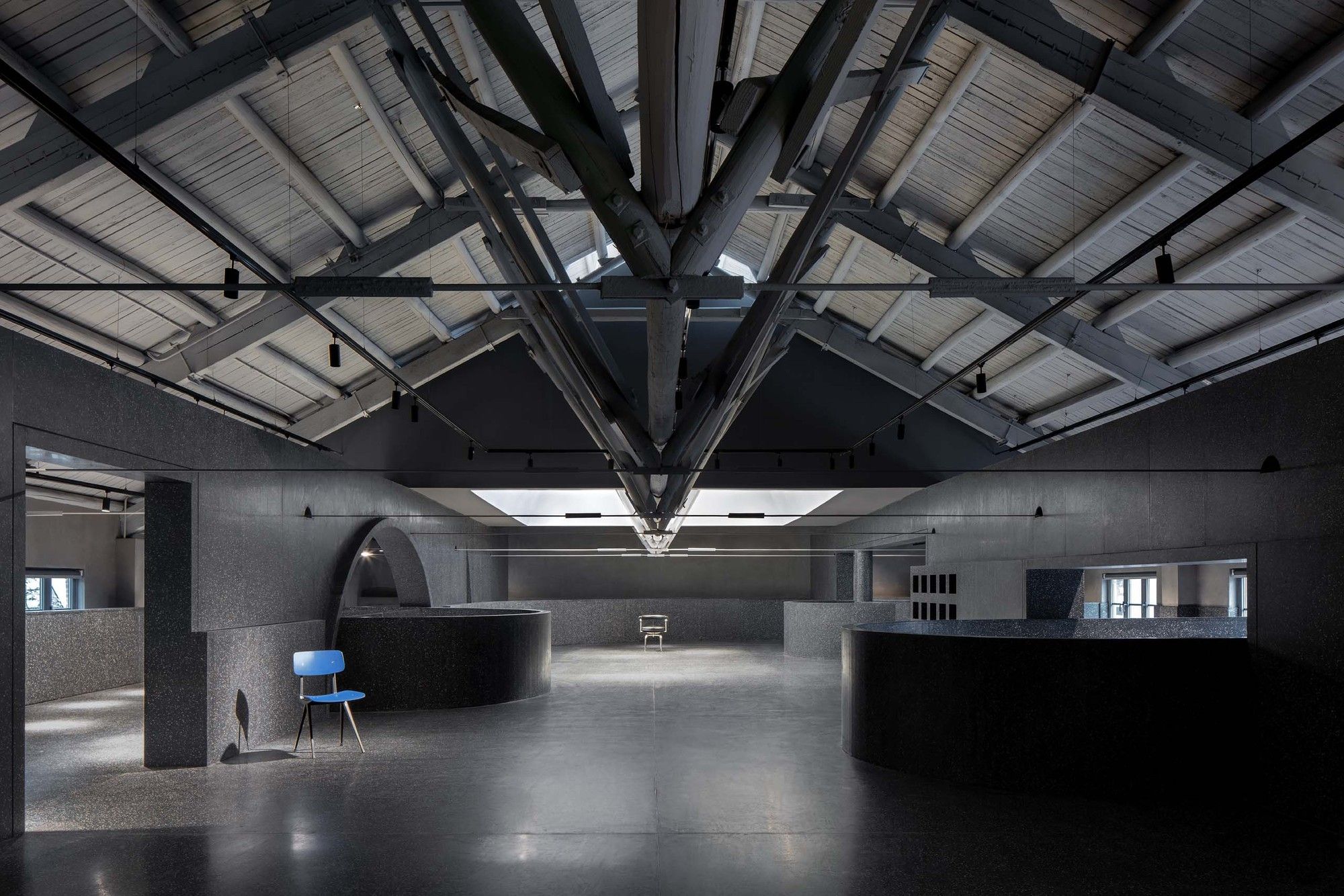
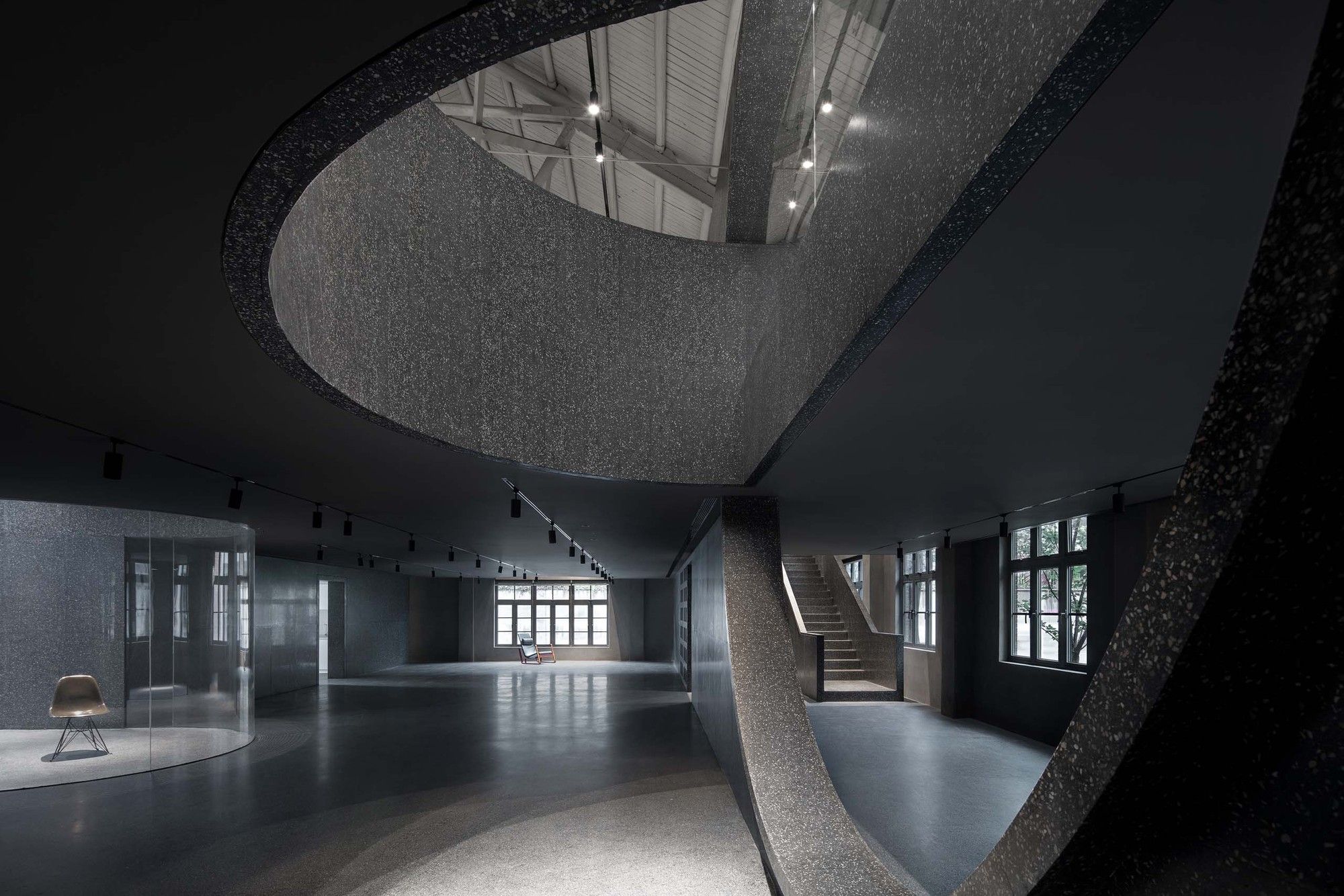
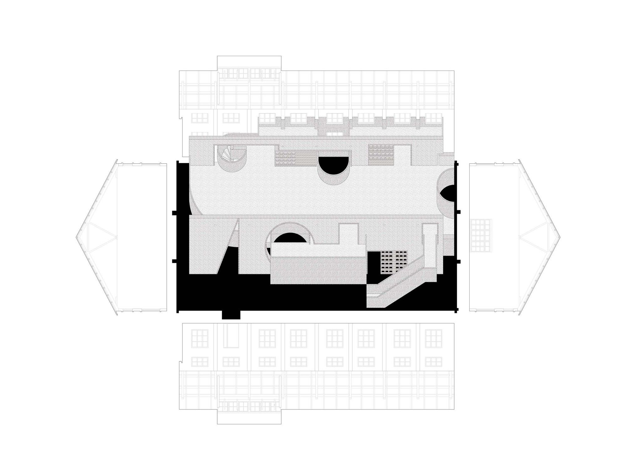
In thinking about how to add layers to the original interior of which was just a rectangular structure with no features, the designer’s strategy was to erect two walls that run across the full length of the interior so the space was divided into three bays in 1: 2: 1 scale. In the end, the central exhibition hall and two side aisles was formed to adapt to various furniture settings.
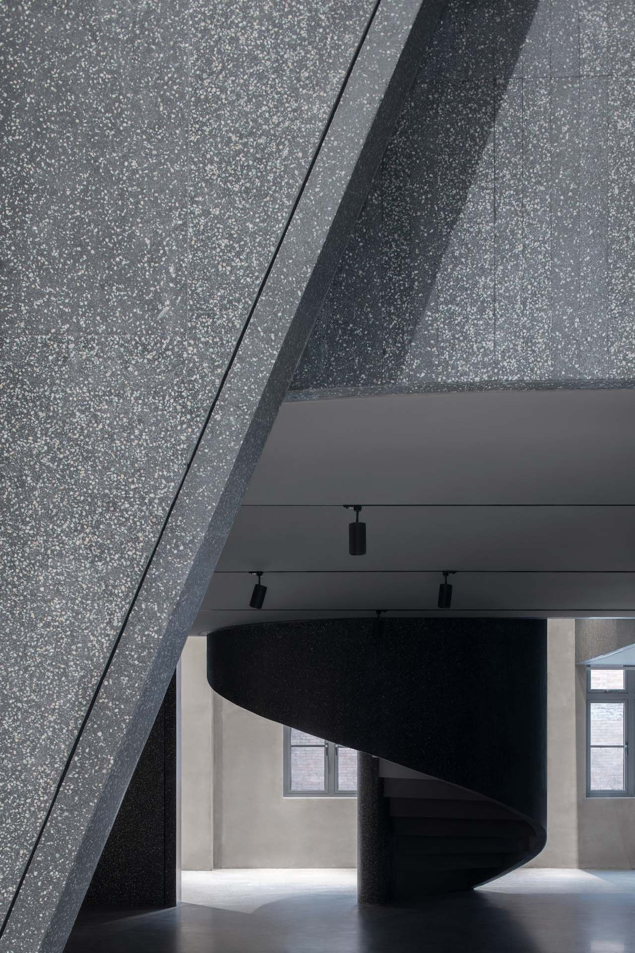
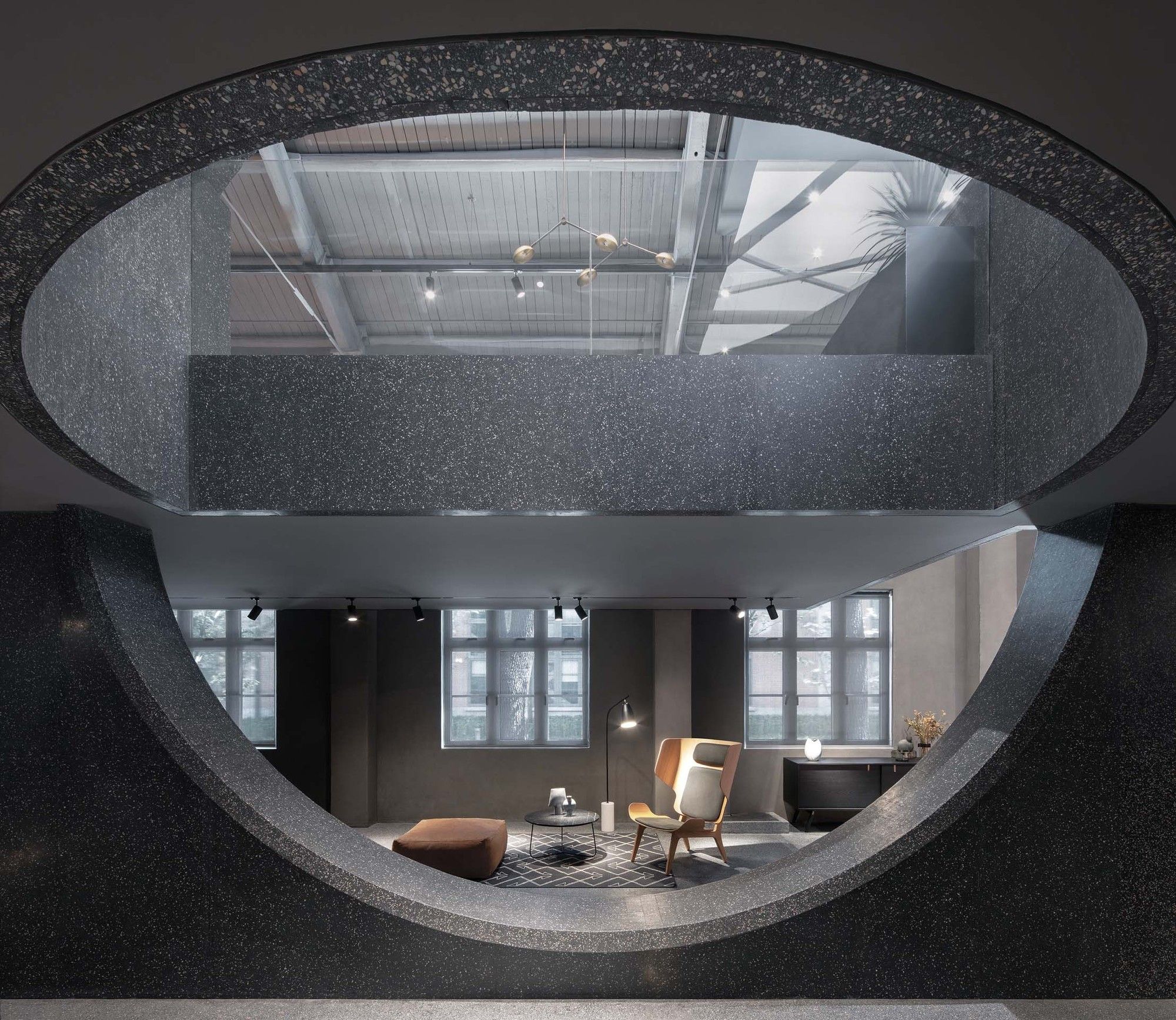
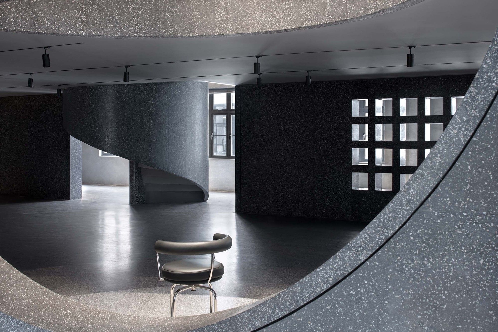
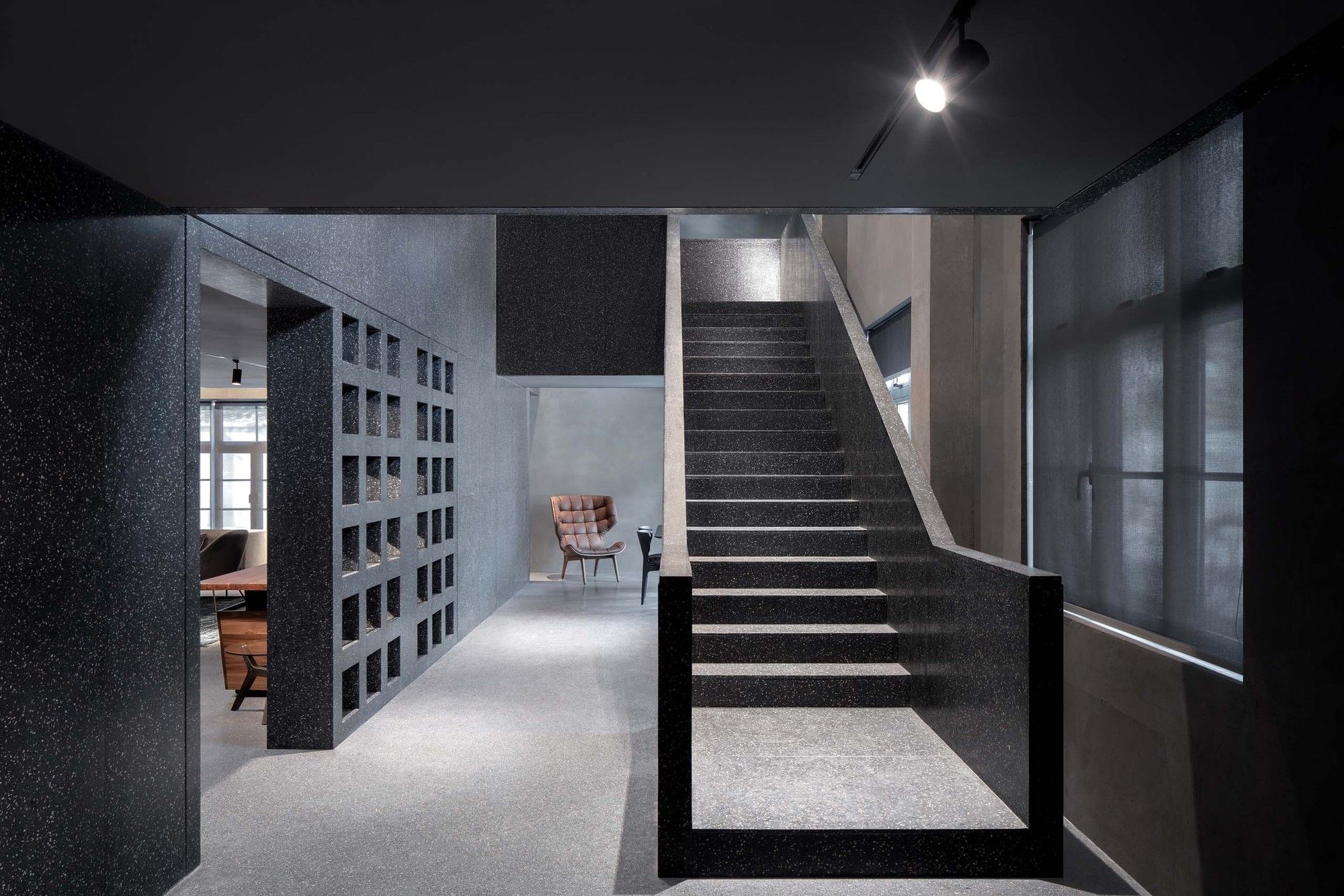
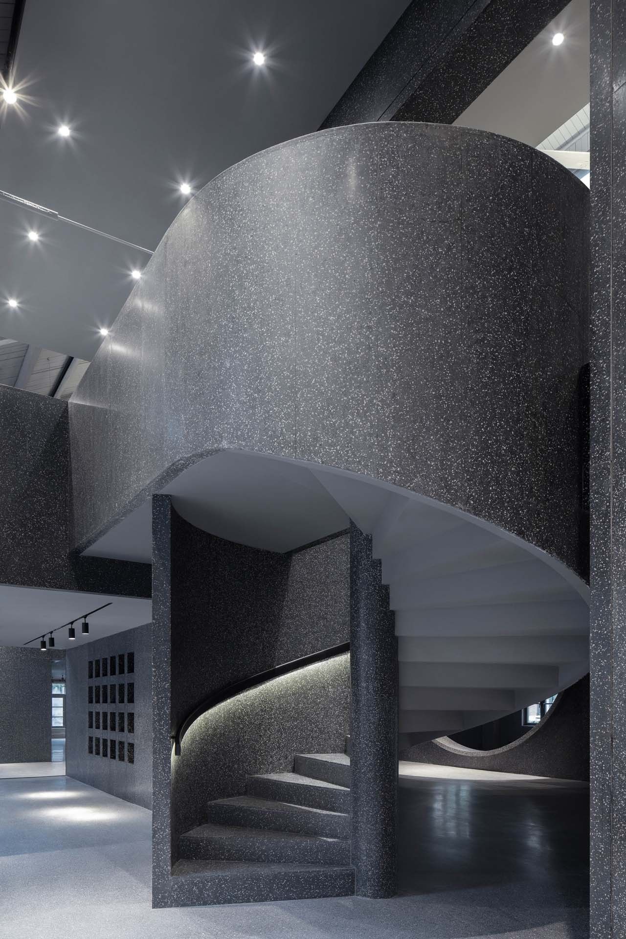
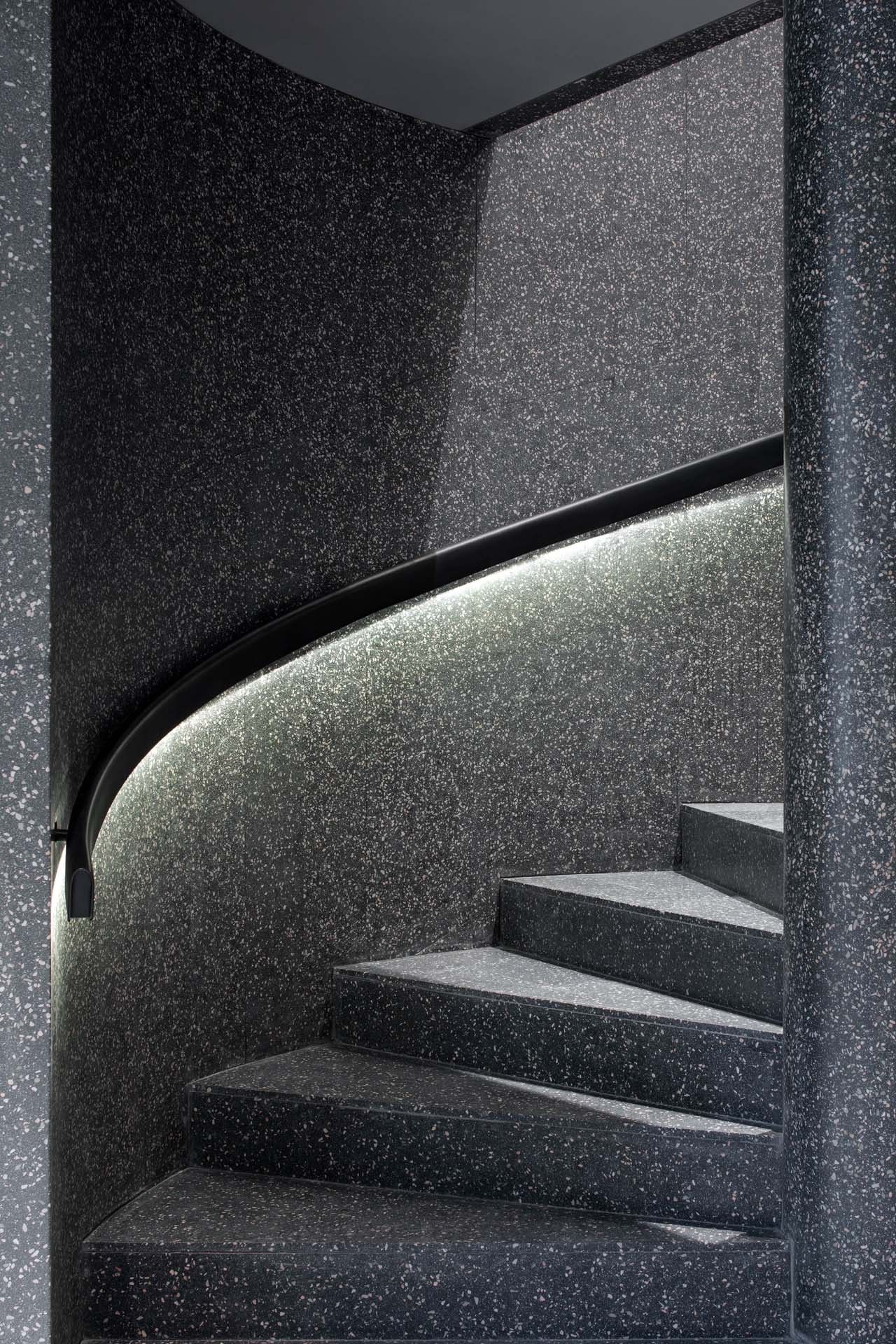
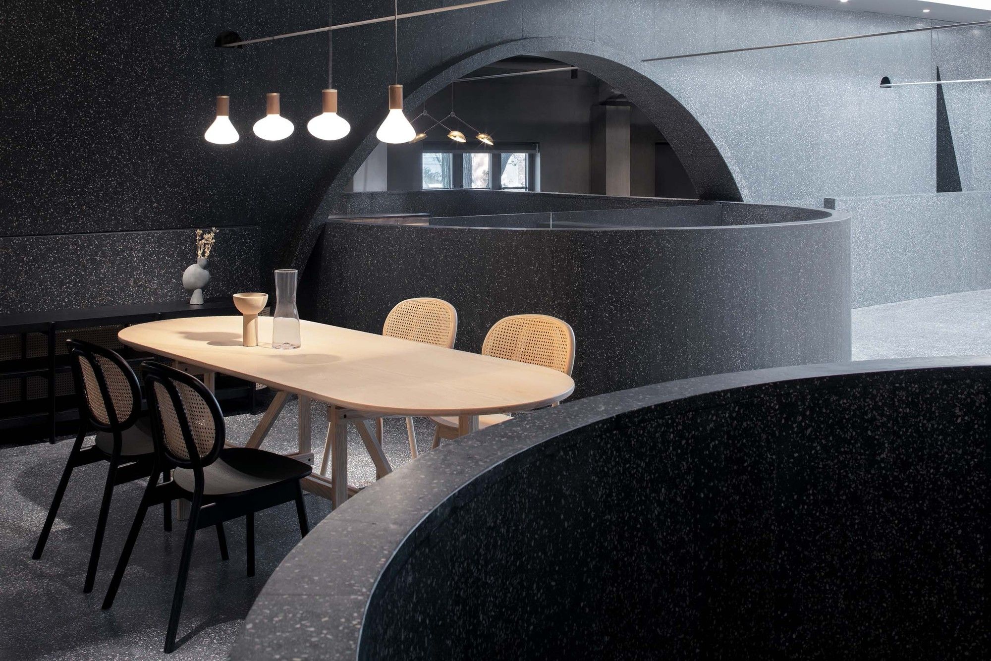
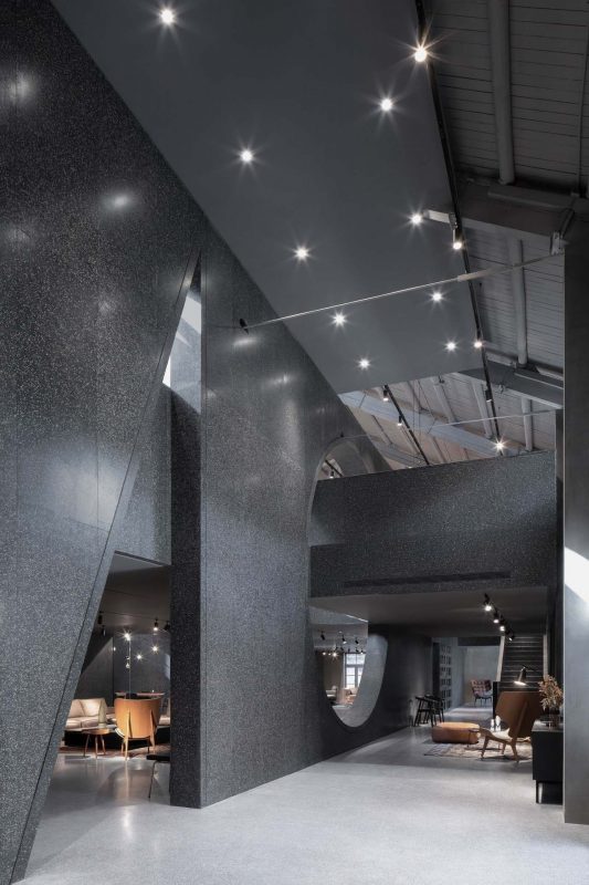
These two 25 – meters, continuous walls can also provide sufficient background for small exhibitions and events. The mezzanine floor between the two newly-built walls was designed to accommodate the furniture display and can be reached by two sets of stairs in different shapes – one in spiral and one straight.
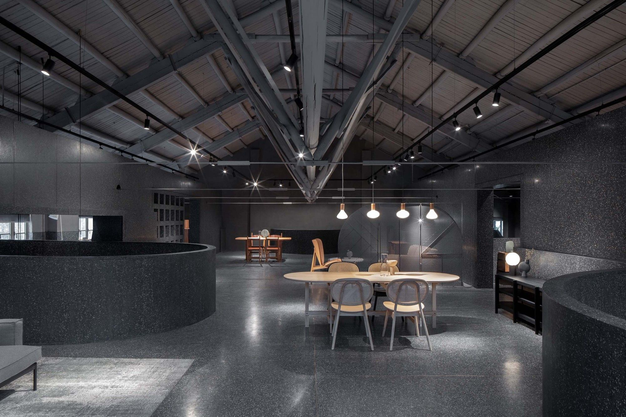
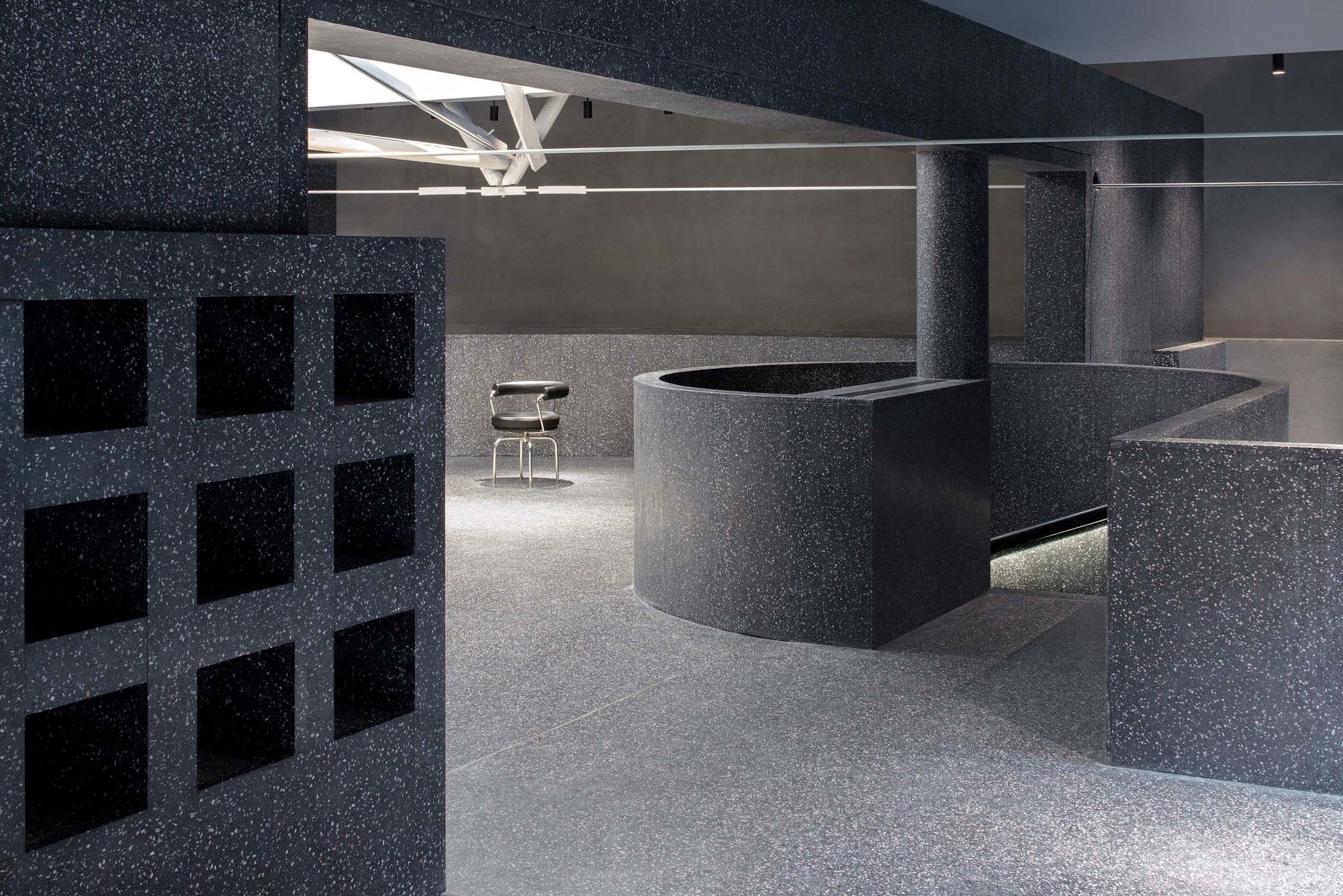
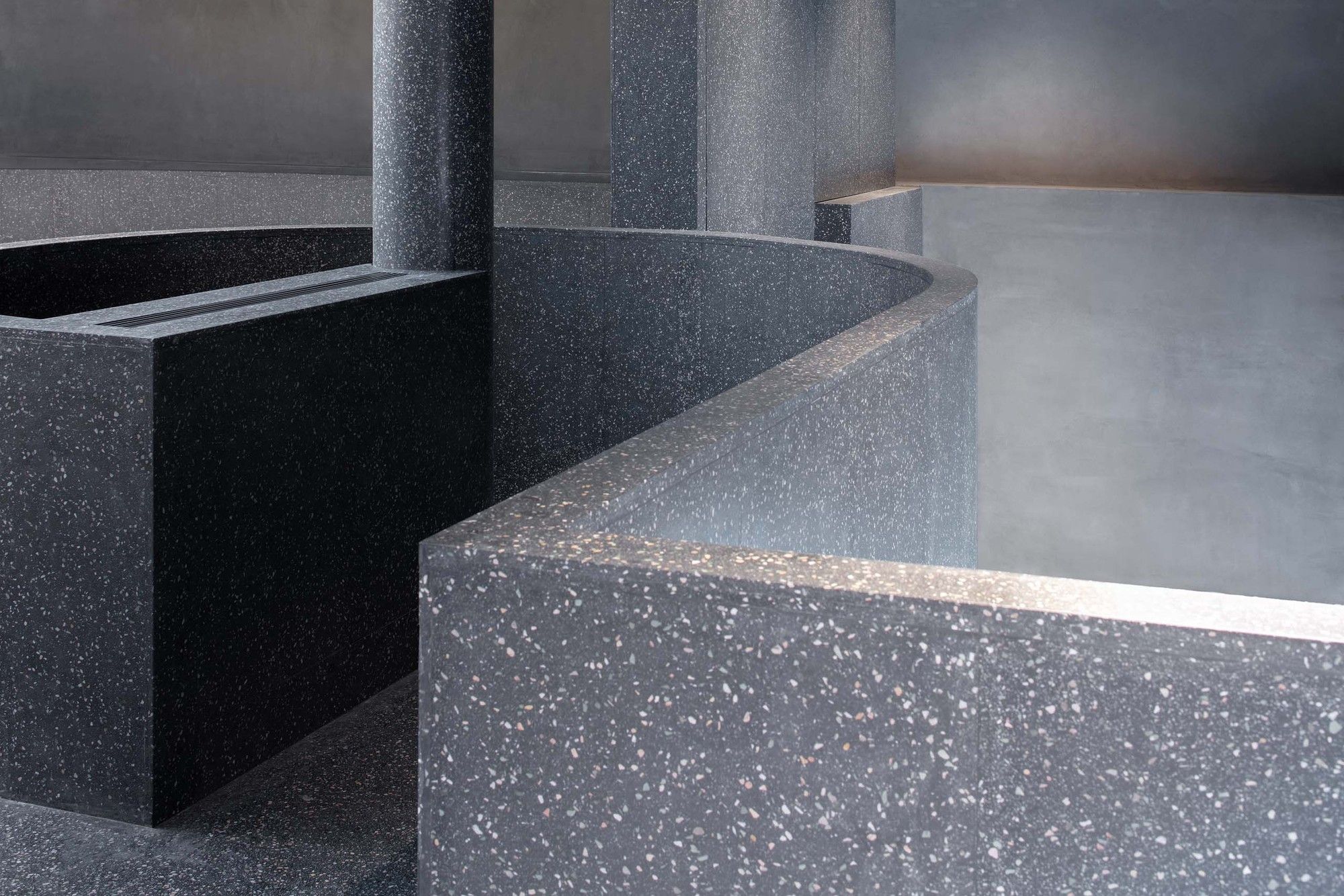
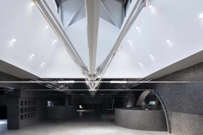
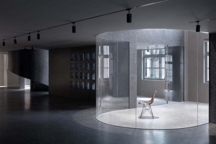
The floor slab cantilevered out from the openings on the wall forms the indoor balconies situated on both sides of the aisles. All the newly inserted walls and floors are lined with black terrazzo. Some circle and semi-circle shapes are carved out of the floor and the walls, which can give the hints of the entrance and cast some light through the route for one’s journey in the showroom.
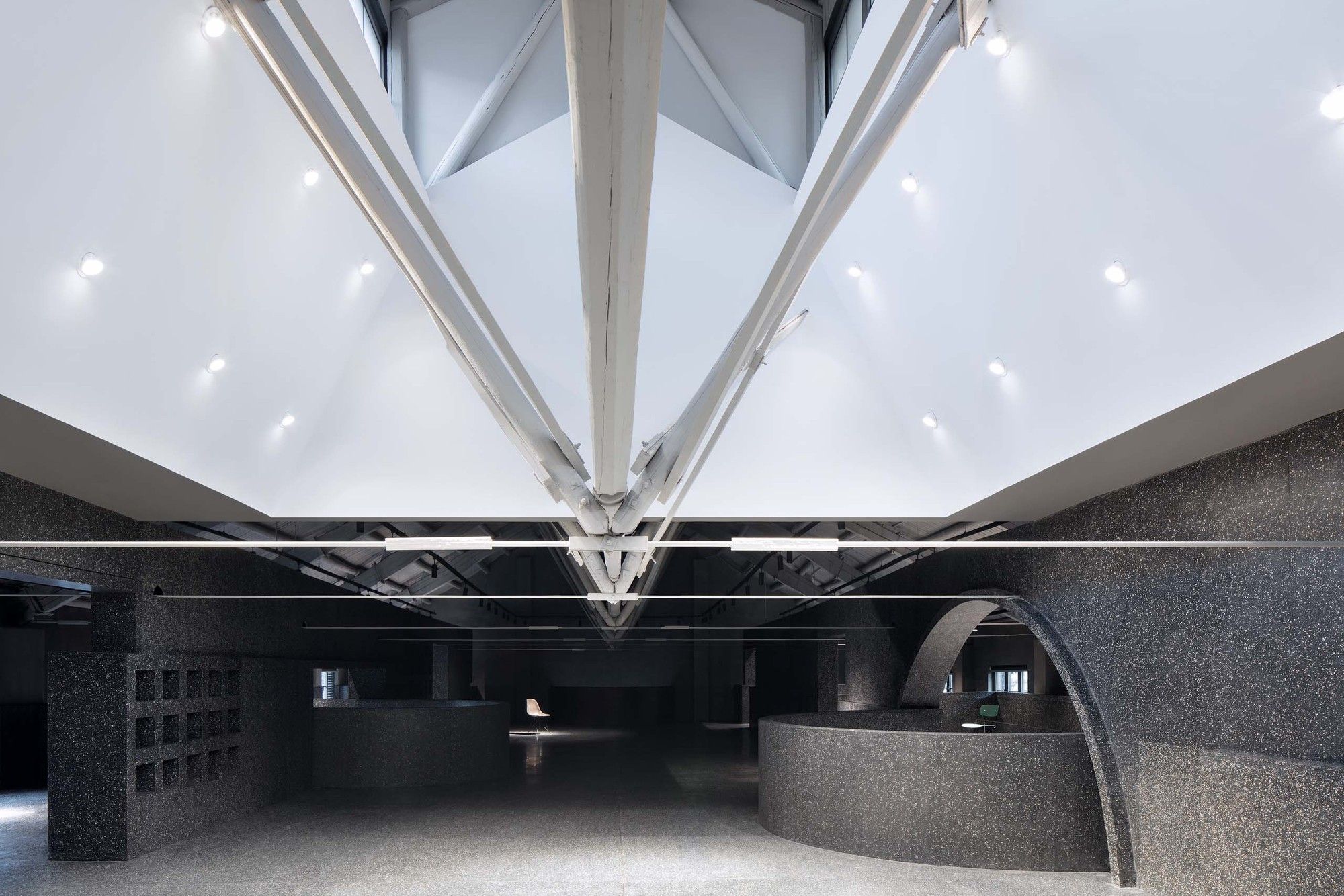
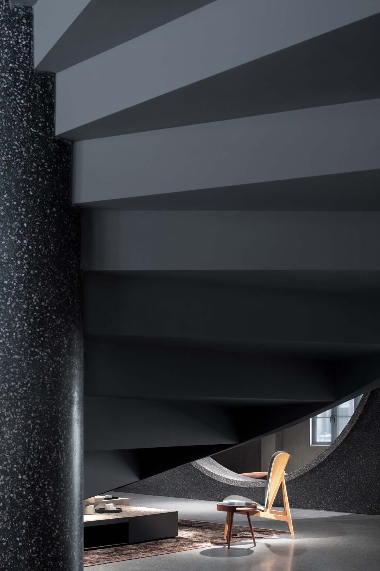
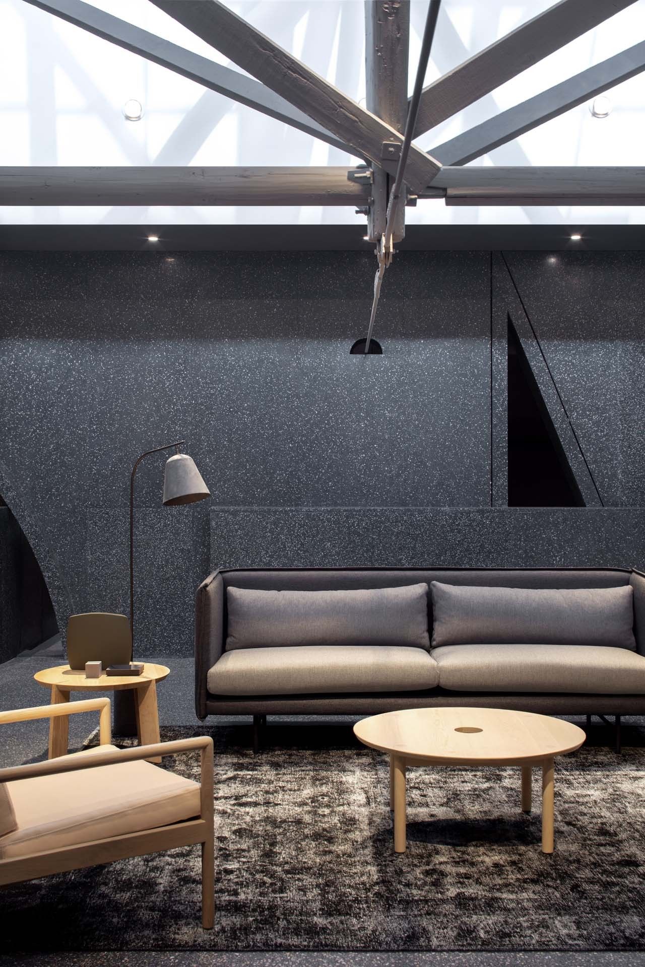
Along the original narrow bomber windows on the roof, the designer added a white cone volume to support the roof and draw the sunlight into the space, which makes the windows become a skylight amplification device. From time to time, sunlight penetrates through the bomber window, hit on the inclined planes on the inner sides of the cone and reflected into the center of space.
Walking up the spiral staircase upstairs, guests will see the sunlight casting shadows on the furniture or some exhibits below. The carefully placed products and furniture are illuminated, floating in the dark background, and create an immersed journey for the visitors.
Project Info:
Architects: Atelier tao+c
Location: Shanghai, China
Area: 740 m²
Project Year: 2019
Photographs: Zhi Xia
Manufacturers: Cassina, Modernica, NORR11, VitrA, JOLOR, JOLOR CANE collection, SUN AT SIX, Tala
