The Book Room
The client’s aspiration was to provide a library as an additional amenity for his project in this small double height space carved out of the parking lot. The client’s vision, his good intent and the budgetary constraints became the under lining factors for our line of thought. Our effort was to address the spatial attributes and create a multi-functional reading space. We wanted this space to be equally interesting for adults as well as kids. Idea of promoting reading and sharing knowledge was seen as an integral aspect of our design thinking.
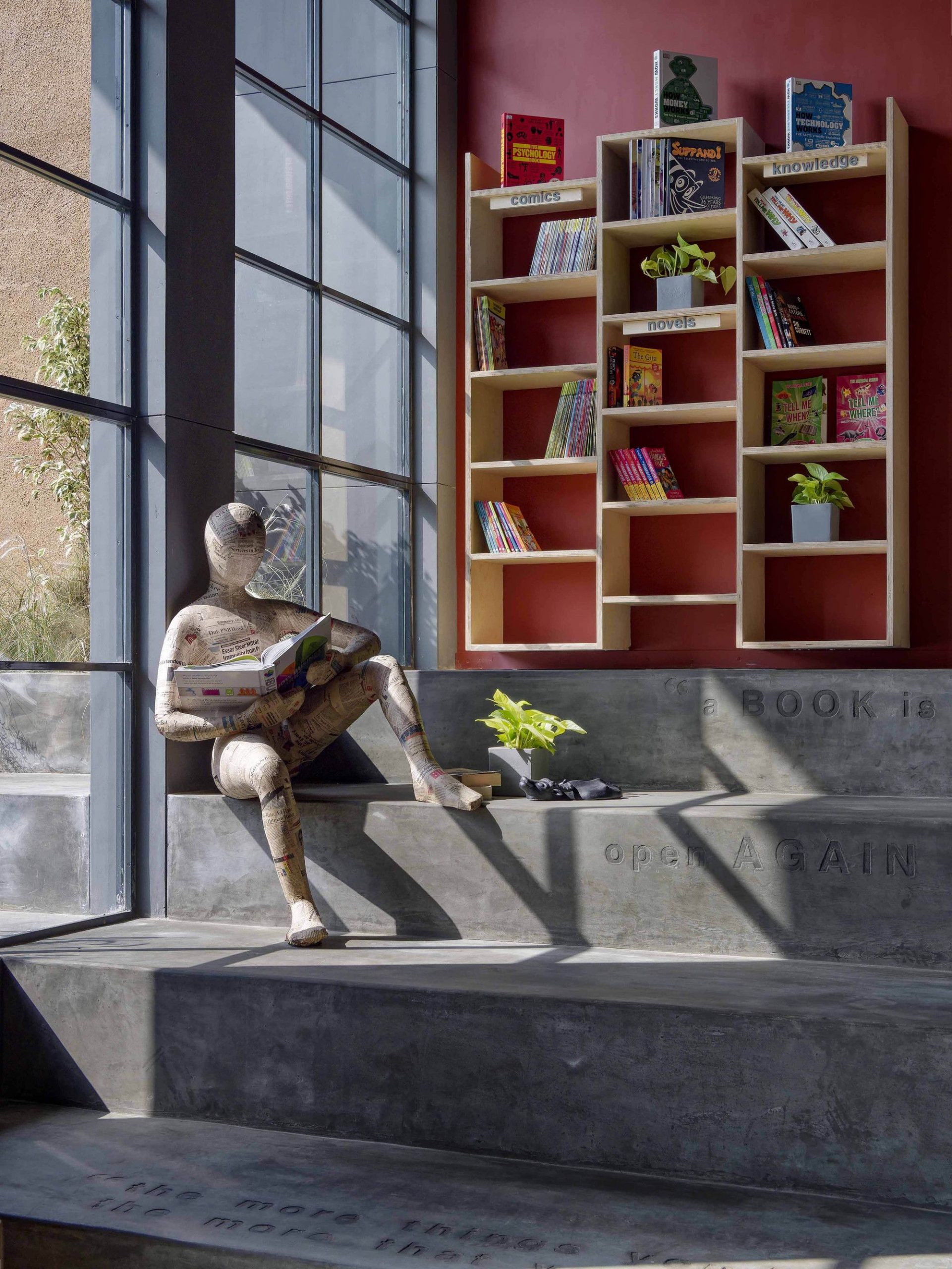
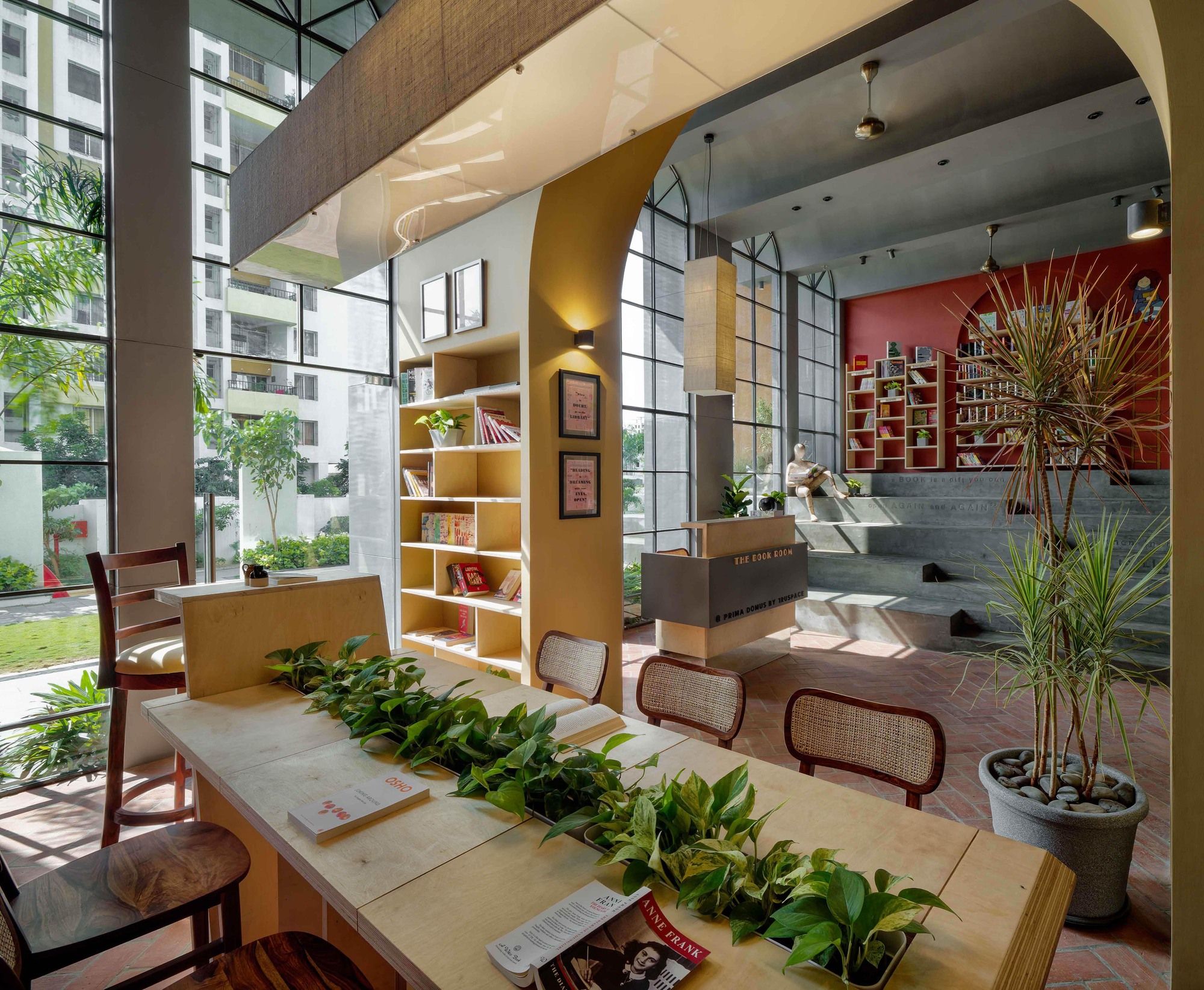
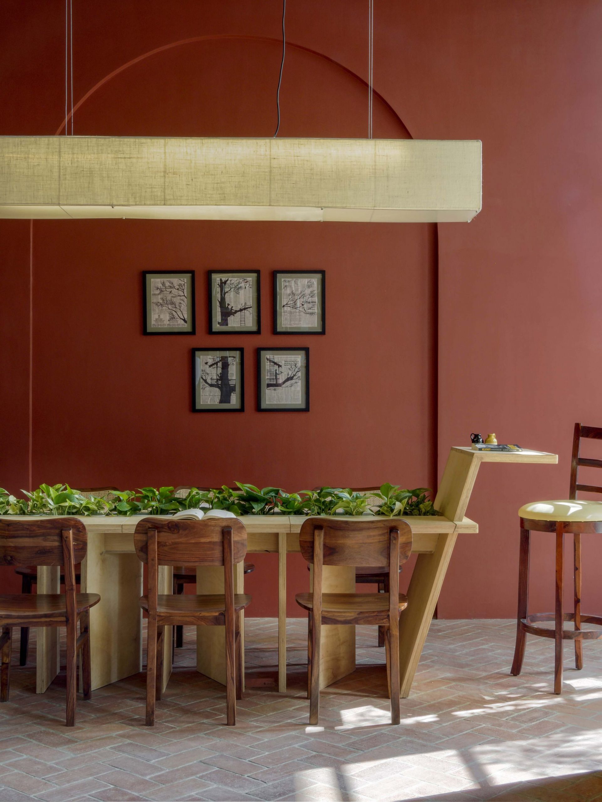
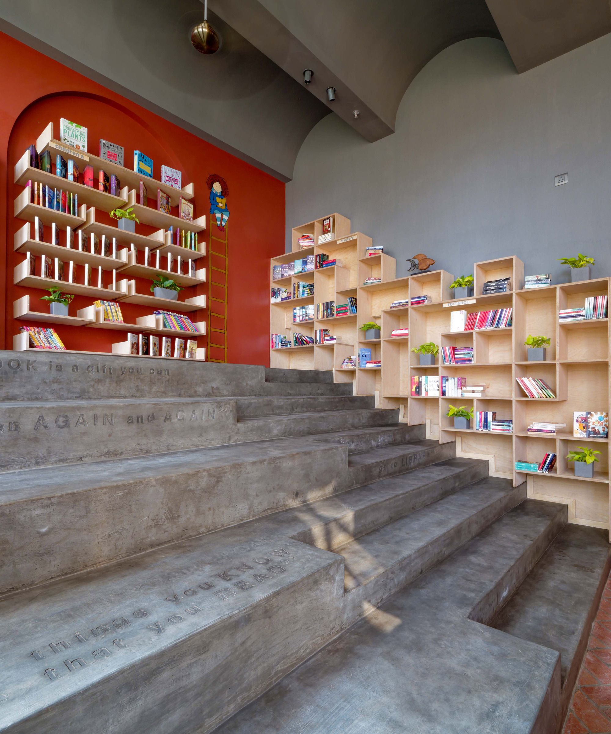
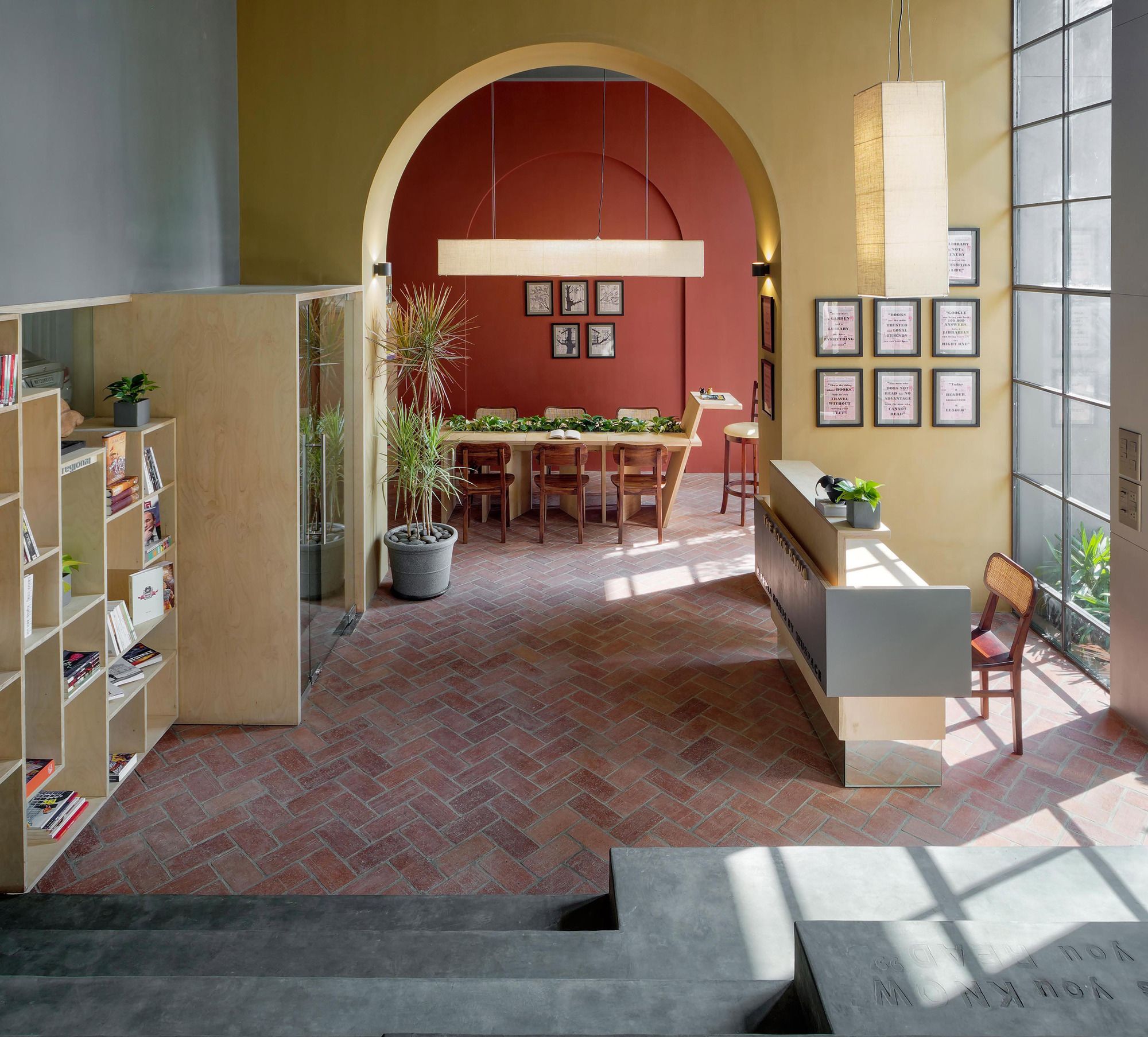
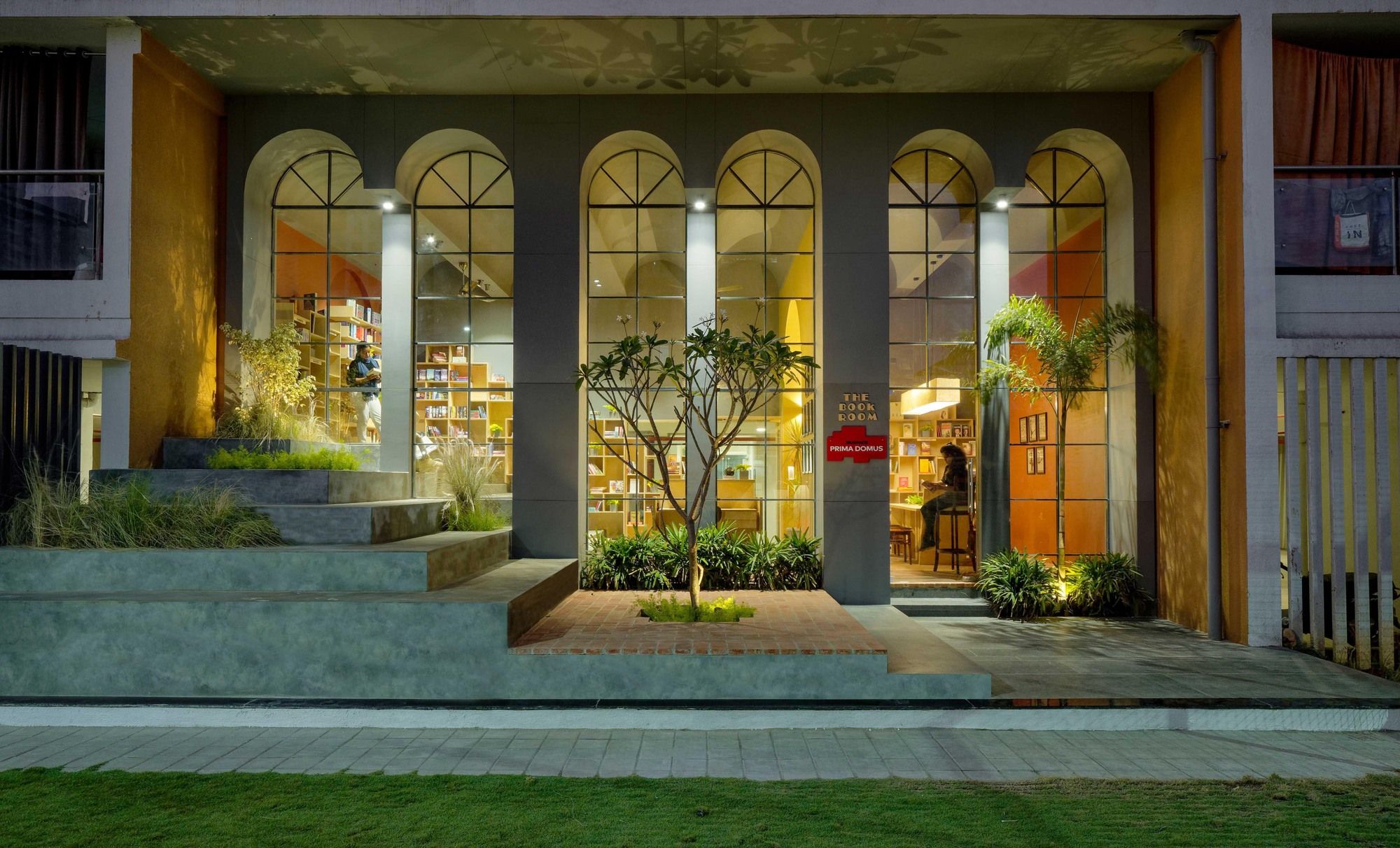
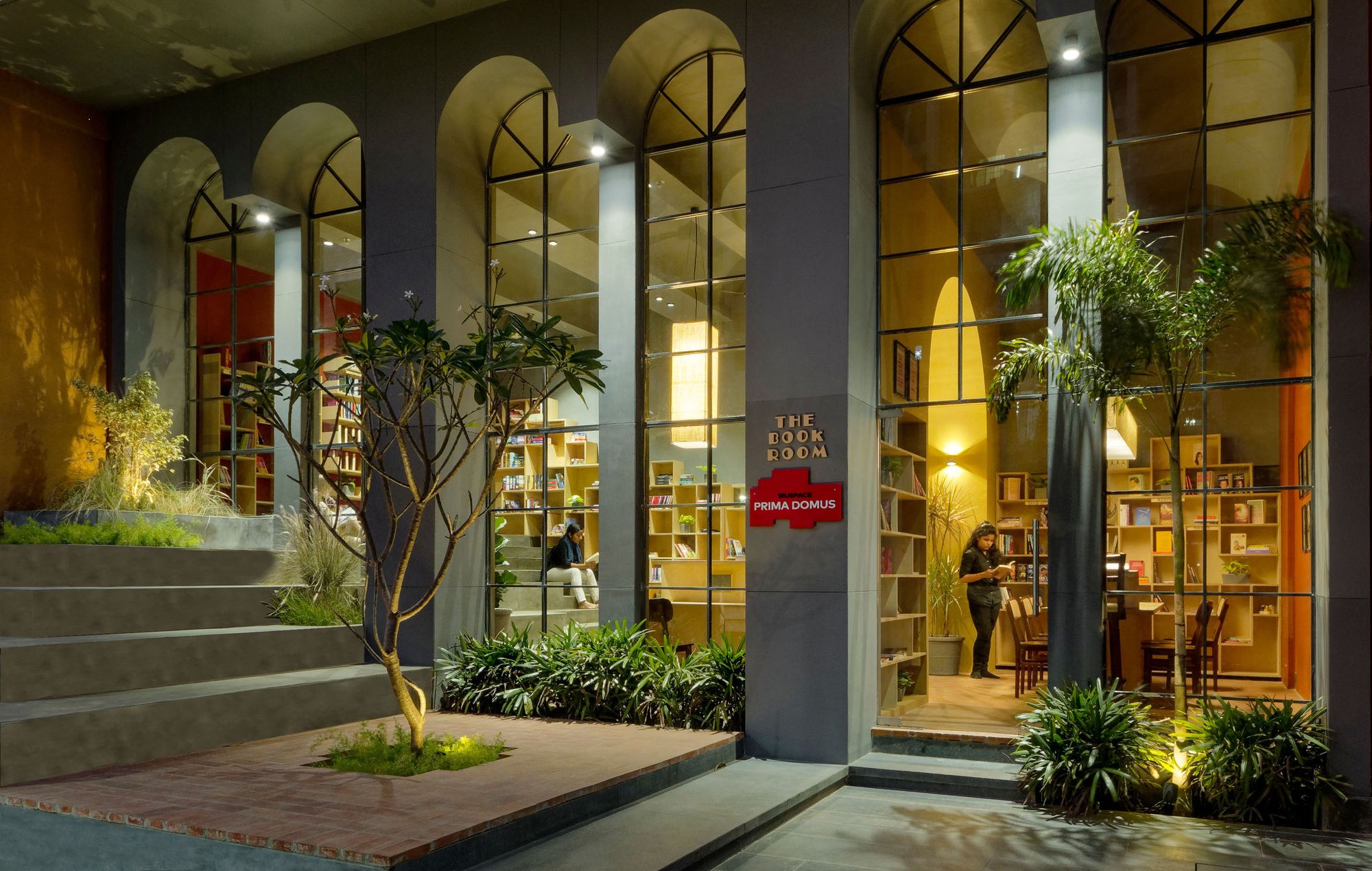
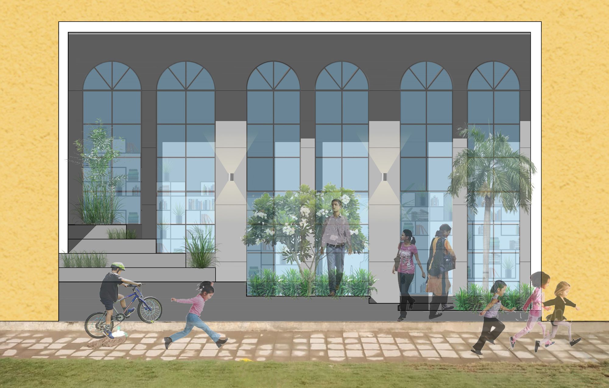
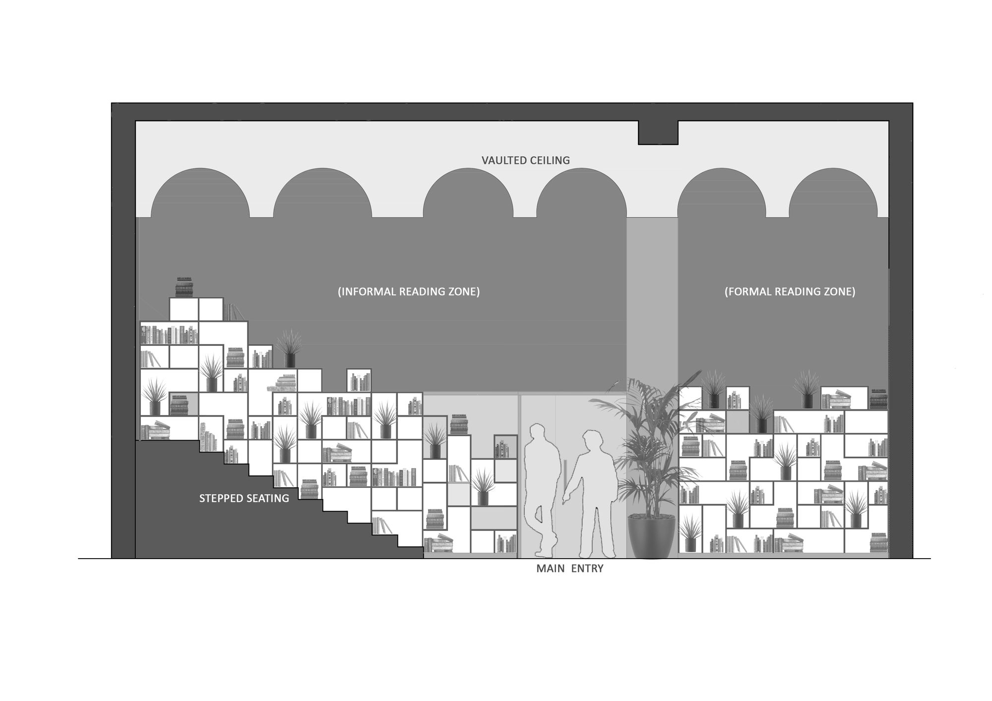
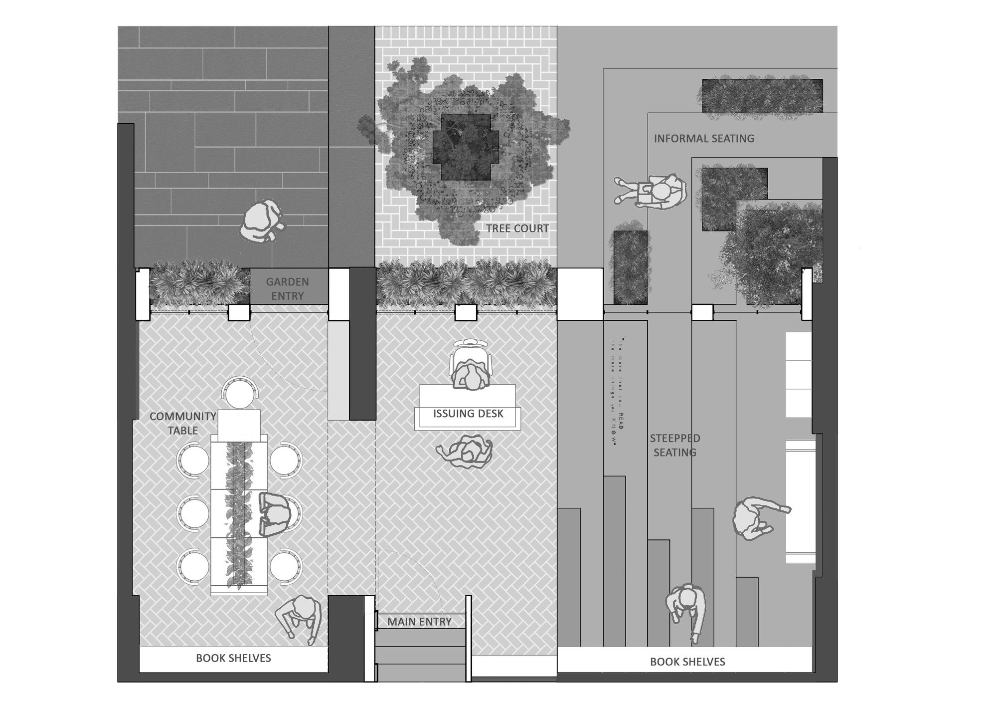
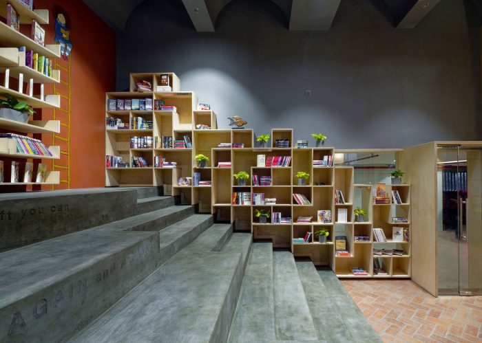
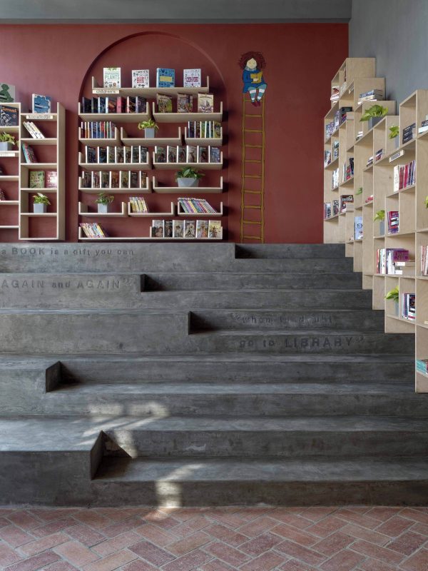
Efforts were taken to optimize expenses and create a multi utility learning space for adults and kids. Vaulted ceiling & arched external facade helped us in defining the volumetric modifications. Since, only one side of this space could get natural light, we had to make best use of this and draw in required amount of light into the interior space. A stepped amphitheater kind of informal seating on one side is proposed to help this space have the flexibility to be used in many different ways. A community reading table on the other end is designed to enable interactions & exchange of knowledge with different people using it at the same time.
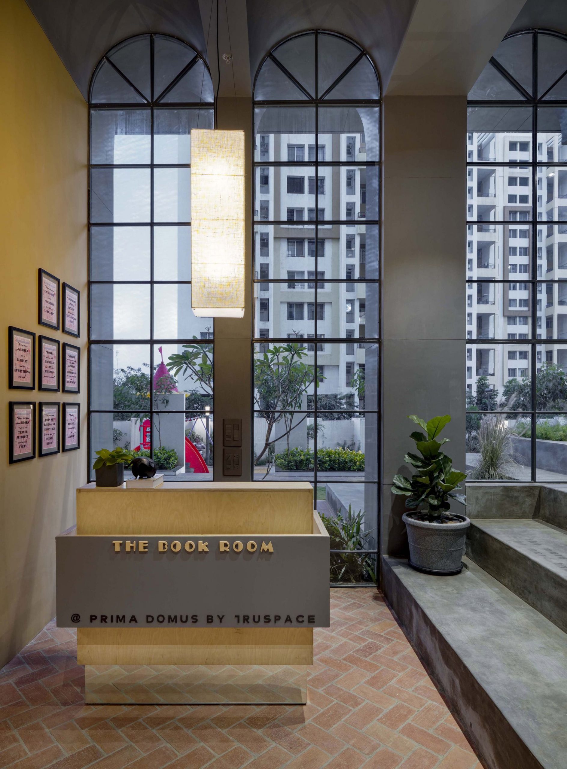
Within the set constraints of space, budget & nature of work, we have consciously tried to work on aspects for an environmentally responsible design approach. The space does not rely upon mechanical ventilation. East – West cross ventilation serves the purpose. Due to the full height glass facade, interior space is flooded with natural day light till late evening, reducing use of artificial lights for major part of the day. A material palette comprising of locally available brick, concrete and green rated plywood helped in a controlled usage of materials. Detailing & modules further helped in the overall optimization of resources & reduction in wastage.
Colours and textures are kept on an earthier tone simply to make this space more humane & move away from the typical formal setup of such activities. Natural plants have been used thru ‘out the indoors and outdoors. They are integrated within book shelves, reading tables, seating and landscape pockets, with an intention to cast a soothing effect into the spaces & break away from the monotony of long furniture pieces. Lastly, each detail and design input is focused on making the space more user friendly, so that reading becomes a happy time and sharing knowledge becomes a reason for interaction.
Project Info:
Architects: Studio Infinity
Location: Pune, India
Area: 940 ft²
Project Year: 2020
Photographs: Hemant Patil
Manufacturers: AutoDesk, Adobe, Asian Paints, Fab India, GM Veneers, Hybec, Kalyan Associates, Prashant Dhuri, Trimble Navigation
