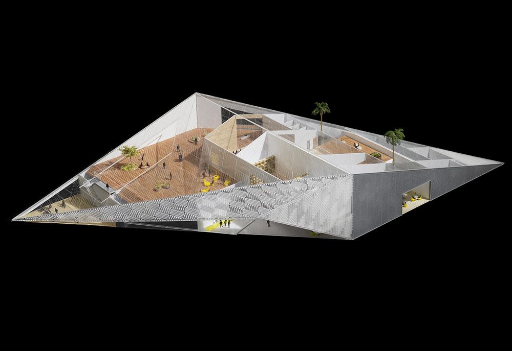
WORKac unveiled one proposal of its two submissions from the competition of University of California new museums. The competition was lunched the last year for a $30 million art museum that is planned to open in 2016. Although The University of California has selected the emerging New York-based practice SO-IL to design the museum, which can be found here, but we found WORKac proposal deserves to be in our website collection. More details about the project come after the jump.
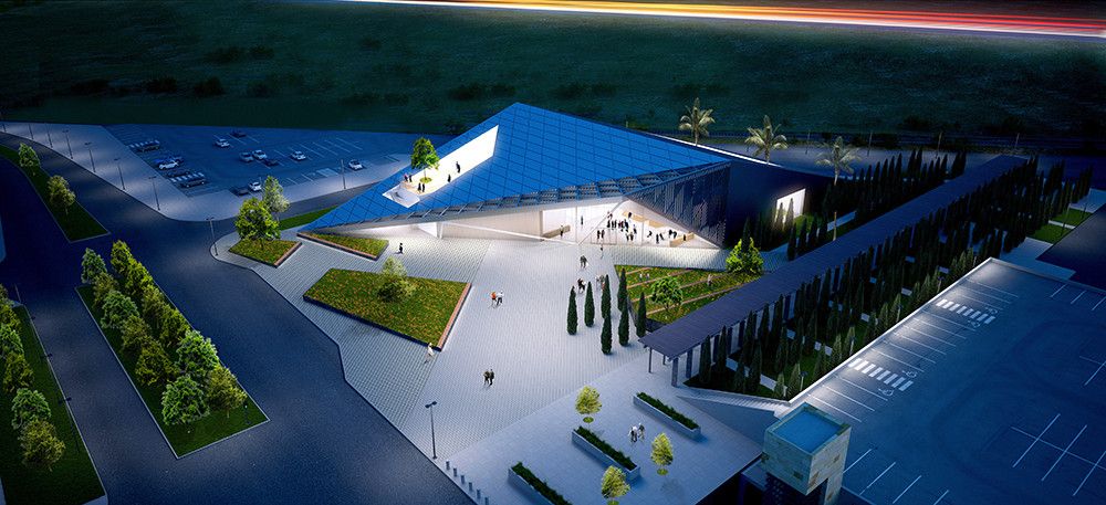
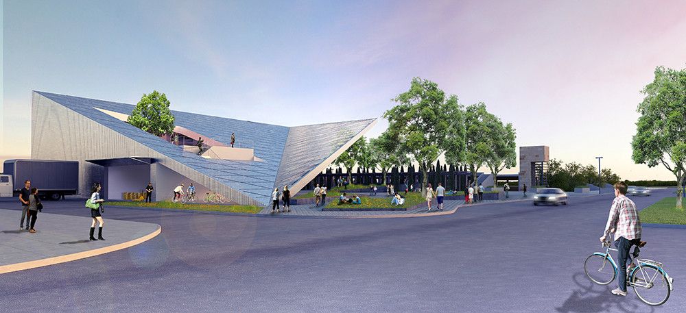
A bold, open-faced icon along an outermost edge of UC Davis’ campus, the JSMMS Museum re-imagines the intersections among art, higher education, and everyday life. A beacon to students and visitors alike, the building renders UC Davis’ long history of engagement with the arts visible to the campus and city beyond.Through a careful and innovative reordering of traditional museum conventions, the highly-accessible building becomes a platform for collective learning, creation, and experimentation—a showcase for UC Davis’ artistic legacy and its evolution as a cutting-edge cultural force, and an integral and vibrant hub for future student generations.
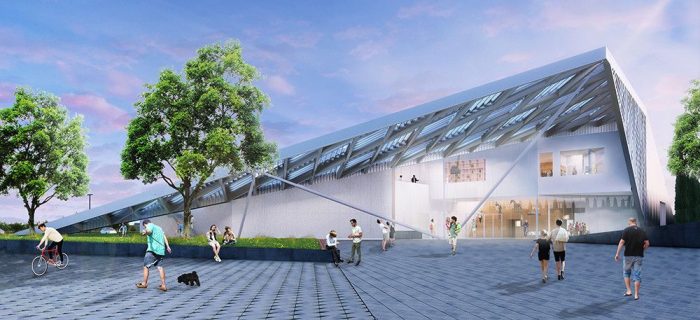
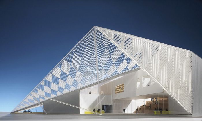
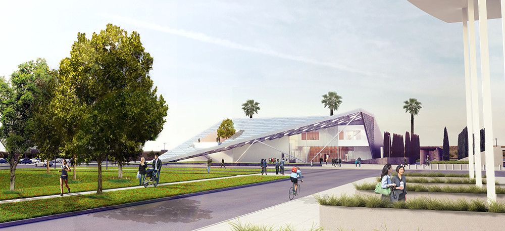
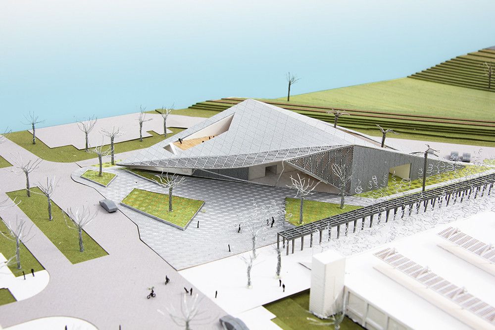
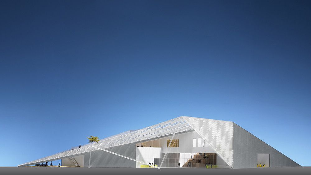
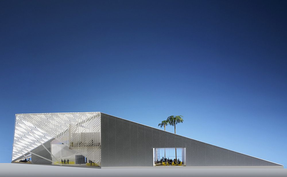
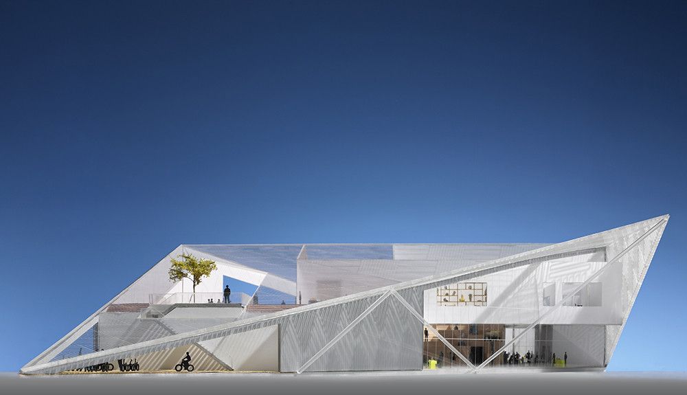
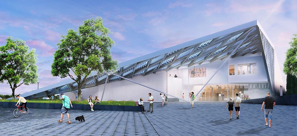
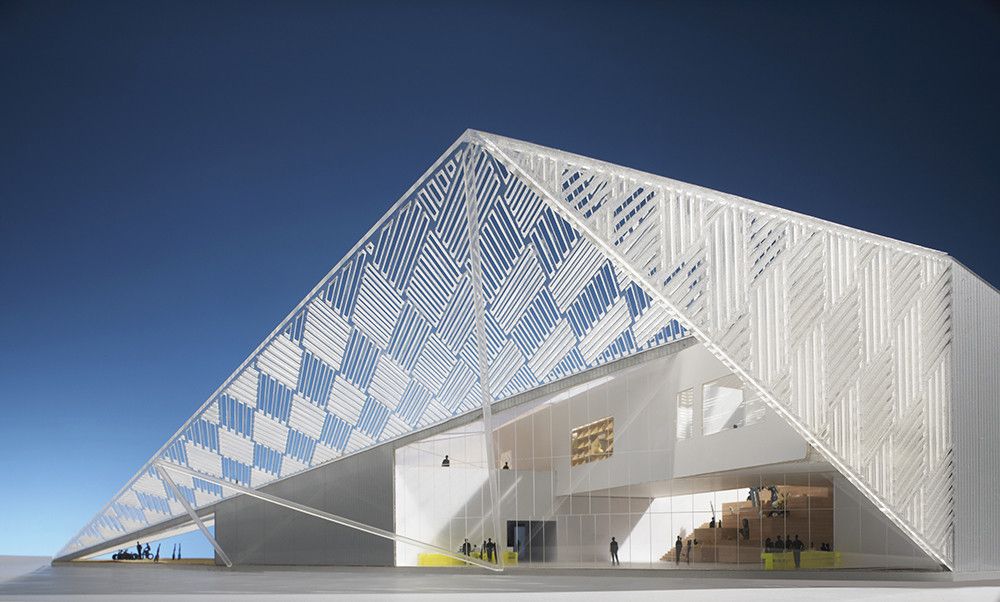
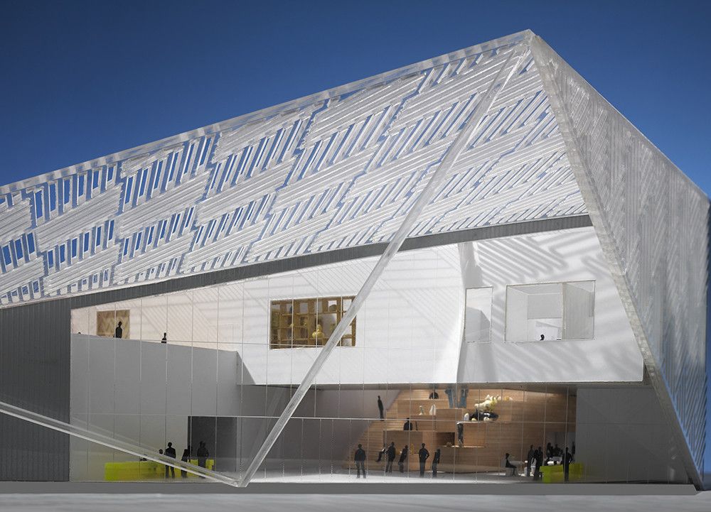
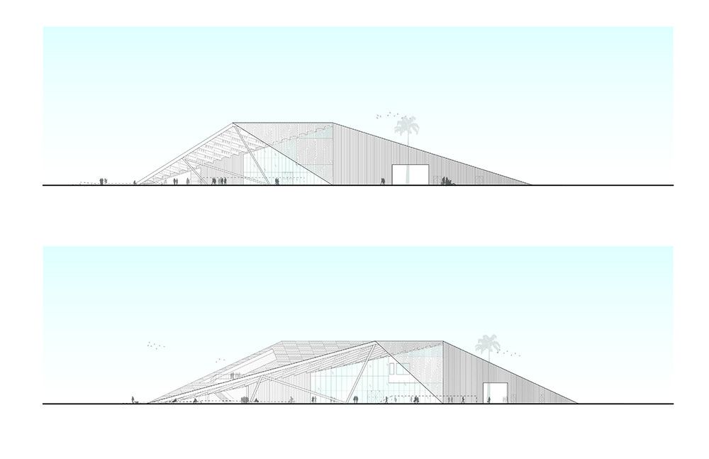
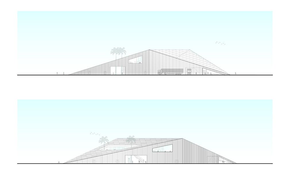
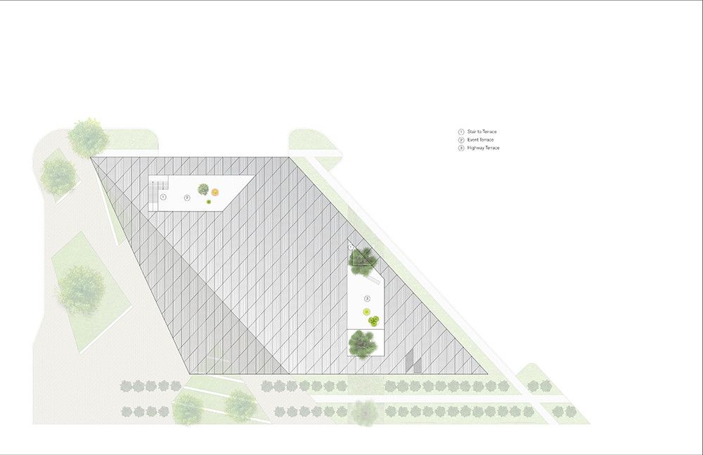
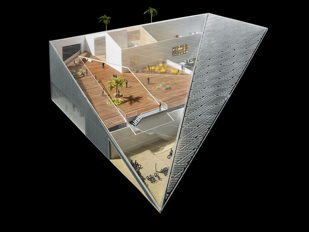
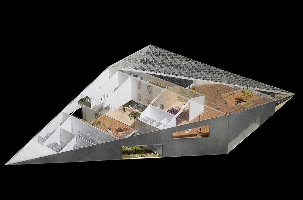
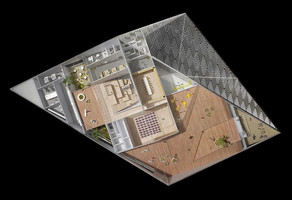
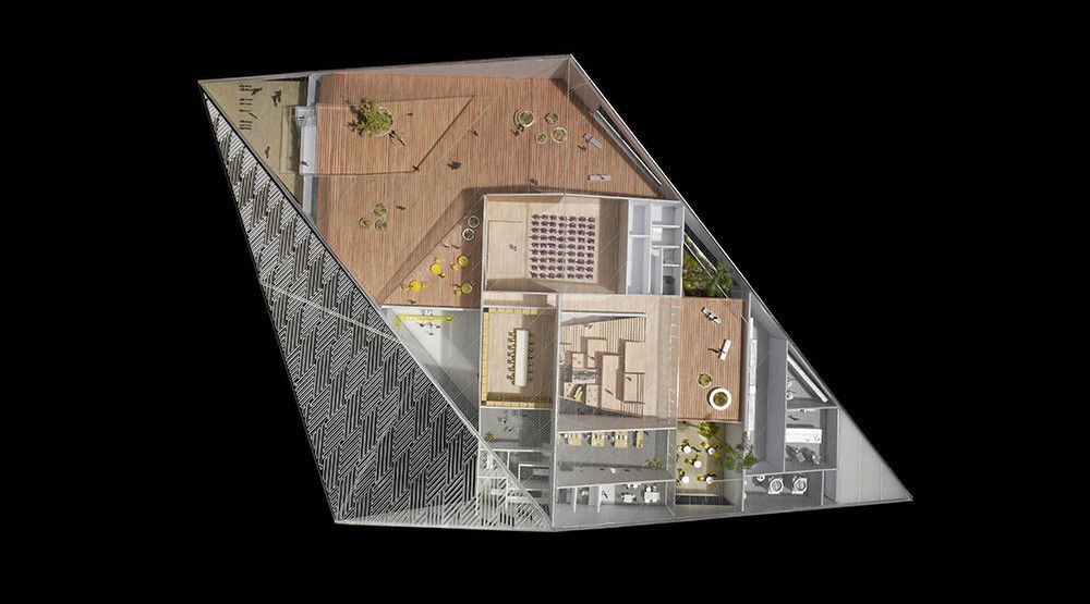
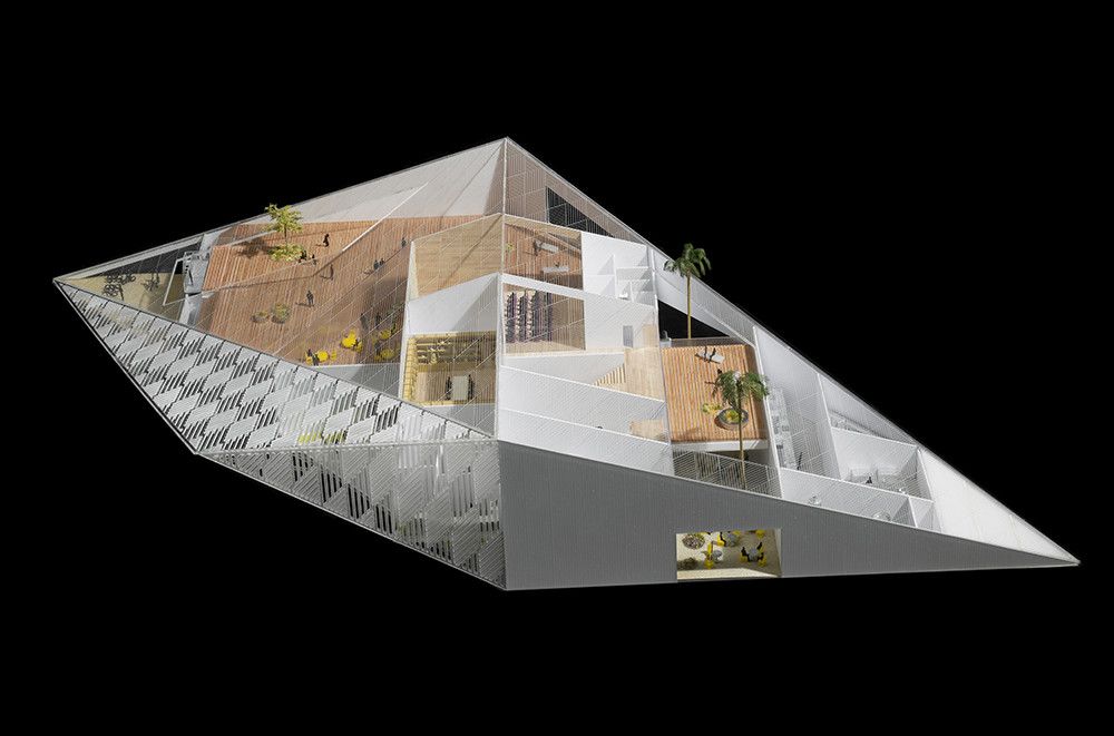
To emphasize the building’s role as a destination for multiple audiences, the team devised a simple and striking parallelogram form that maximizes opportunities for public space throughout the site. Two corners of the building are lifted to create distinct facades facing the campus and the adjacent highway, forming a dramatic sloping roof that houses an array of spaces, views, and experiences. The slope of this roof, its orientation, and its light metal cladding together produce an inherently efficient envelope that minimizes solar heat gain and the energy needed to cool the building.
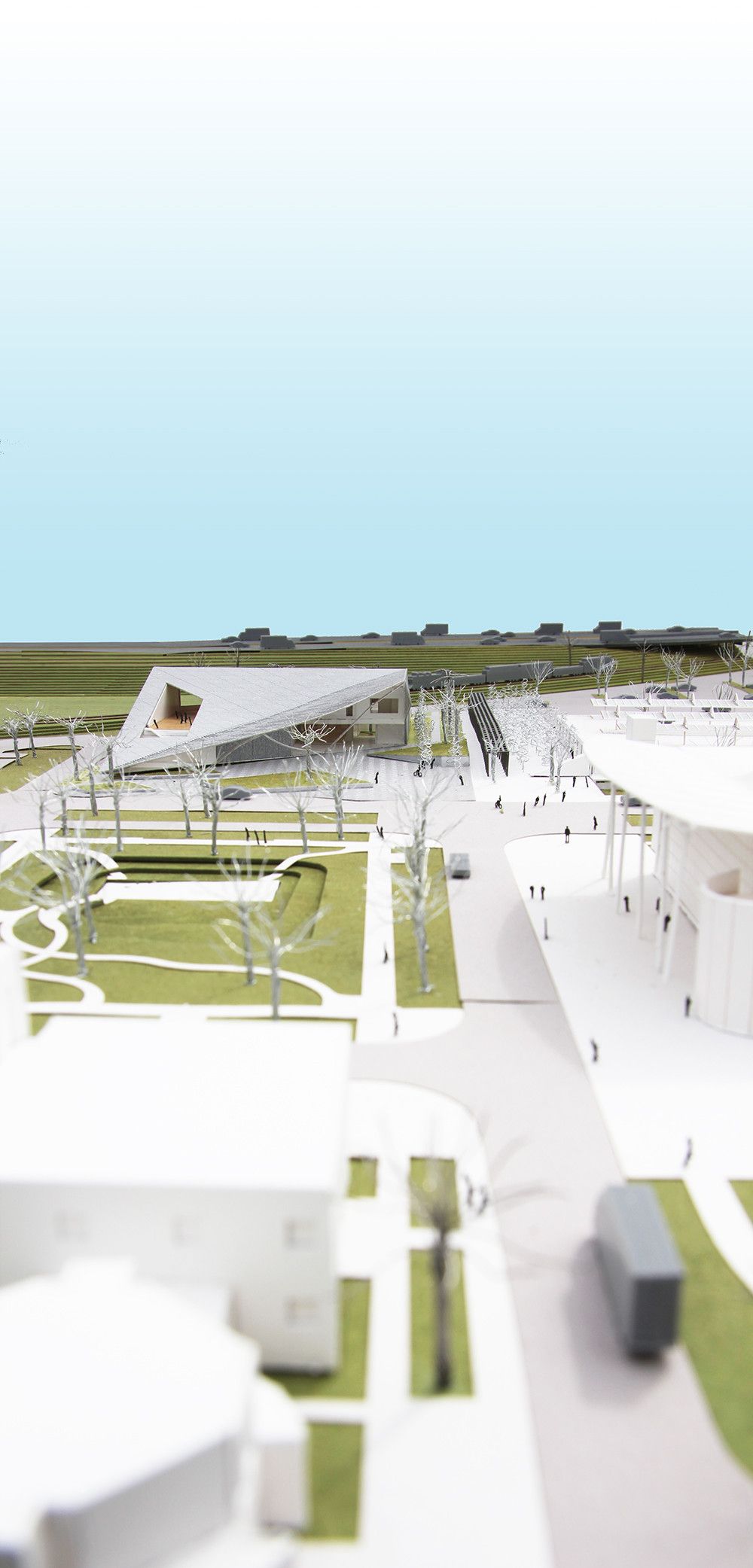
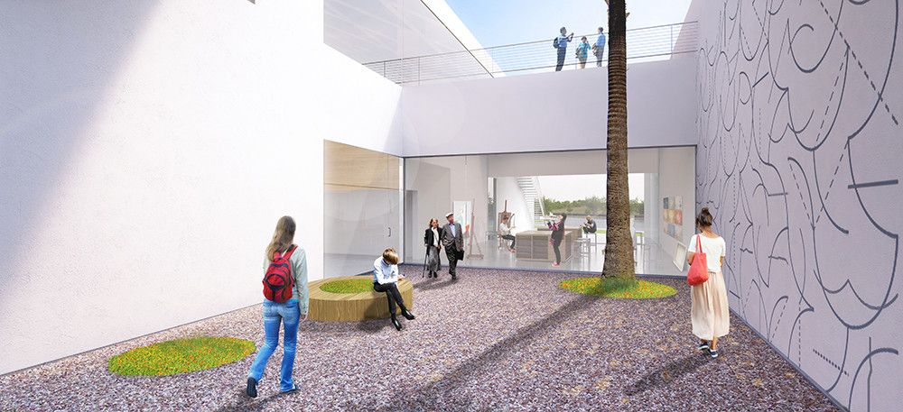
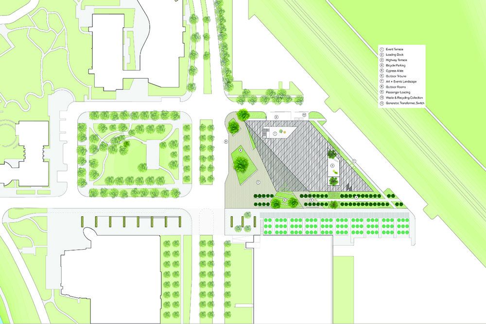
To further underscore the public nature of the Museum and to provide a large shaded outdoor space, a striking canopy extends over a new plaza, opening northward toward the larger campus. Continuing upon the theme of connecting the Museum’s activities to the surrounding campus, the proposed landscape is strategically designed to ‘stitch’ the new building to the site through a series of outdoor rooms, courtyards, and terraces that complement and blend with the Museum’s interior while providing opportunities for ample natural light and ventilation.
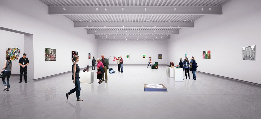
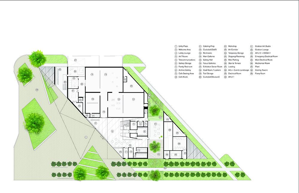
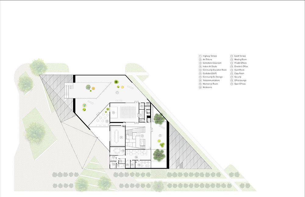
The Museum’s programming offers a spectrum of art experiences to accommodate a wide variety of interests and guests. In addition to formal exhibition spaces, the building also features innovative art-making and education resources. Within the parallelogram plan, these experiences are organized along two axes, ranging from most formal to the least formal or experimental spaces.

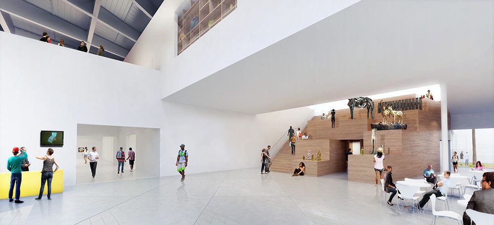
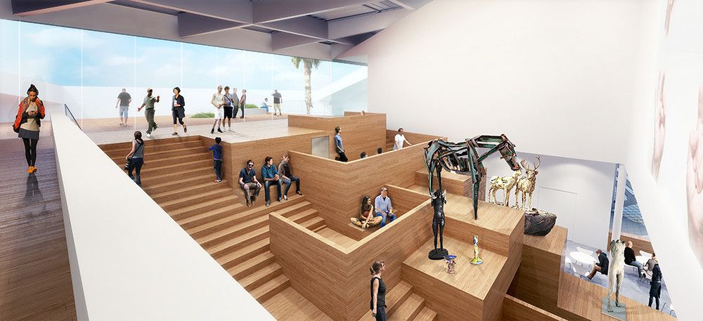
Upon entering, visitors can proceed directly ahead into the formal, east-west axis of the Main and Focus Galleries—a collection of flexible, carefully-proportioned ‘white boxes’. Alternatively, the north-south axis leads to more informal or intimate art experiences, beginning at the Museum’s entrance and extending to the second level and to many outdoor spaces. A light-filled common area at the intersection of the two axes, the double- height Lobby Lounge gives way to the Art Tribune: a rising sequence of casework displays, art platforms and seating areas integrated with the main stair. Tucked within the Art Tribune, the vault-like Archive Gallery provides a counterpoint to the adjacent Outdoor Art Studio and Outdoor Lounge. Expansive terraces on the second floor link to the Indoor Art Studio and Community Education Space. Passing over the Art Tribune and Lobby Lounge is a bridge that contains the Collections Classroom, a central ‘jewel-box’ feature that showcases glimpses of permanent collection items displayed within–inviting the public to ascend the Art Tribune and explore the Museum in its entirety.
Courtesy of WORKac Architecture
Courtesy of WORKac Architecture
Courtesy of WORKac Architecture
Courtesy of WORKac Architecture
Courtesy of WORKac Architecture
Courtesy of WORKac Architecture
Courtesy of WORKac Architecture
Courtesy of WORKac Architecture
Courtesy of WORKac Architecture
Courtesy of WORKac Architecture
Courtesy of WORKac Architecture
Courtesy of WORKac Architecture
Courtesy of WORKac Architecture
Courtesy of WORKac Architecture
Courtesy of WORKac Architecture
Courtesy of WORKac Architecture
Courtesy of WORKac Architecture
Courtesy of WORKac Architecture
Courtesy of WORKac Architecture
Courtesy of WORKac Architecture
Courtesy of WORKac Architecture
Courtesy of WORKac Architecture
Courtesy of WORKac Architecture
Courtesy of WORKac Architecture
Courtesy of WORKac Architecture
Courtesy of WORKac Architecture
Courtesy of WORKac Architecture


