Recently, one of Melbourne’s most iconic locations got a major refit and makeover. The Myer store on Bourke Street, a department store which has watched the city develop and evolve around it since the 1920’s, had in recent years begun to show its age and fall prey to poor stylistic decisions, eroding the overall character of one of the city’s oldest symbols. In 2007, NH Architecture won a commission to rejuvenate the aging icon. Below are words from the architects describing what was done.
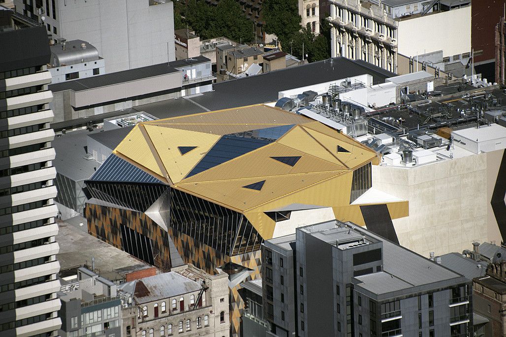
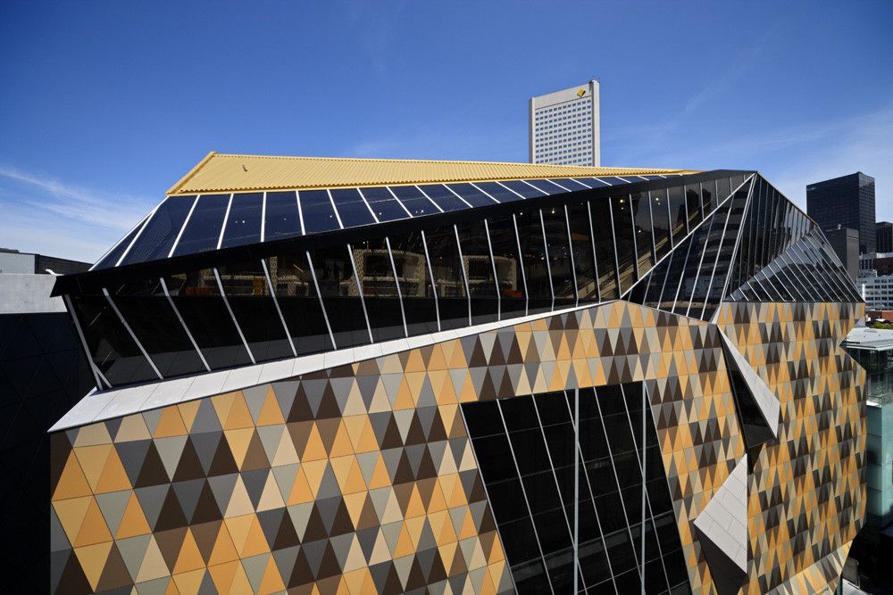
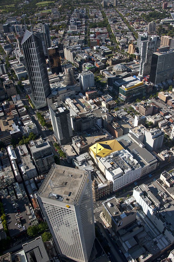
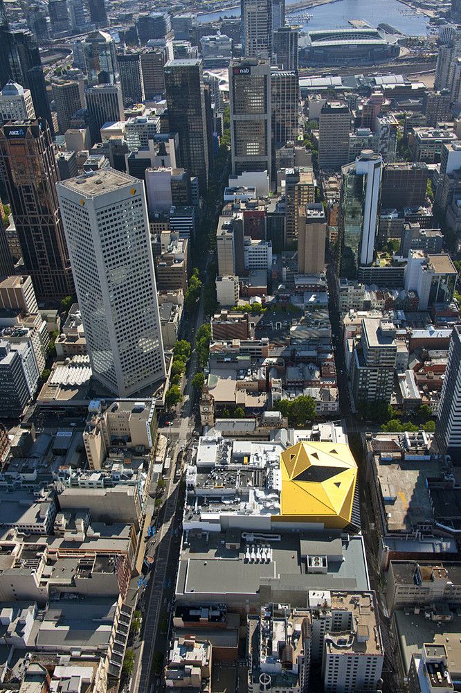
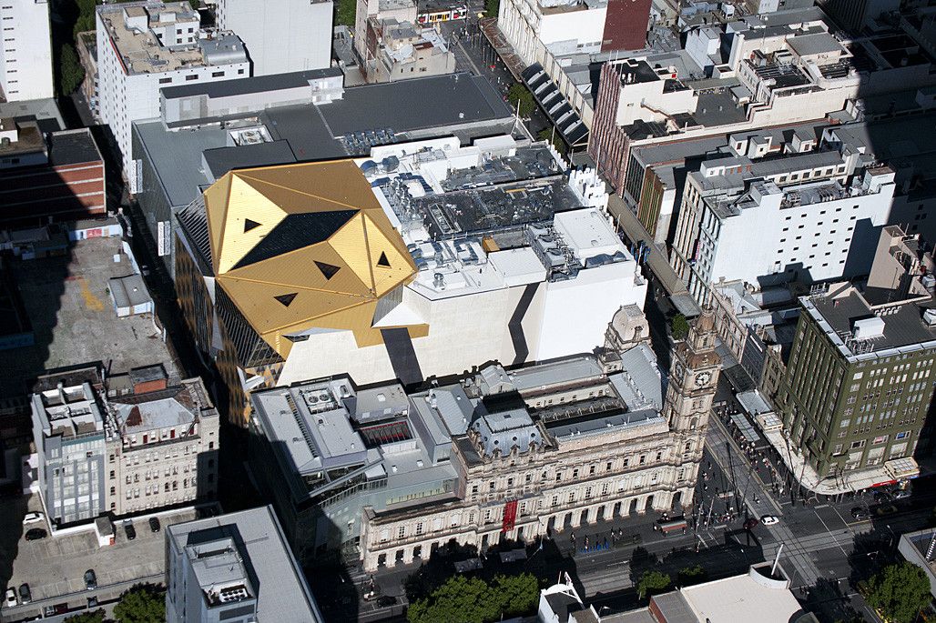
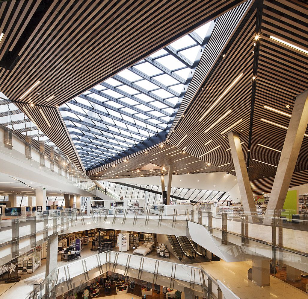
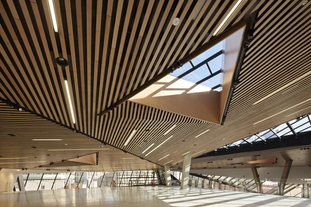
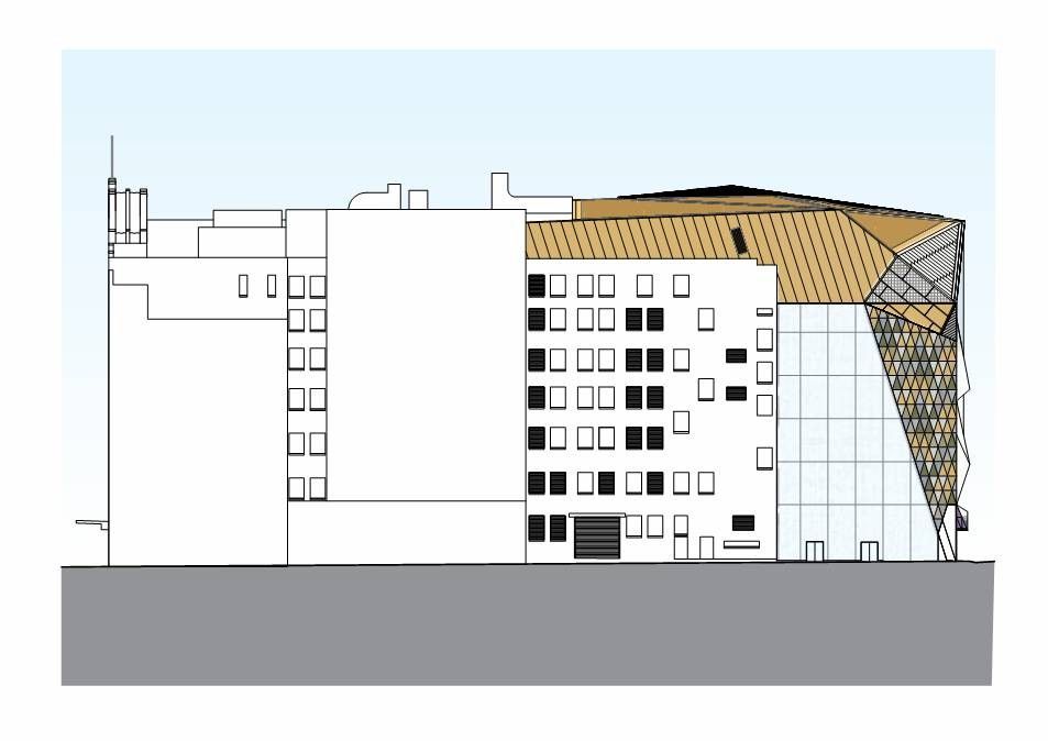
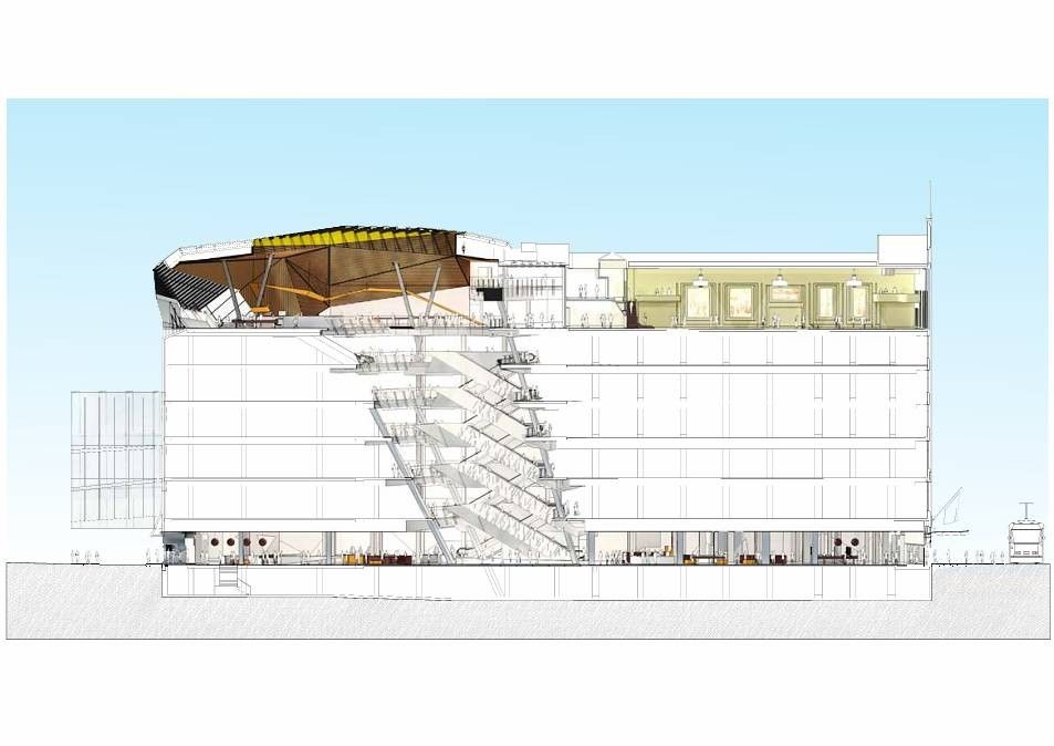
The most striking emblem of Myer’s new face to the city, visible from many surrounding buildings, is its faceted gold roof. The pavilion roof has been architecturally sculpted with gold metal and glass to choreograph certain city views from within and to bring the cityscape of Melbourne into the heart of the store.
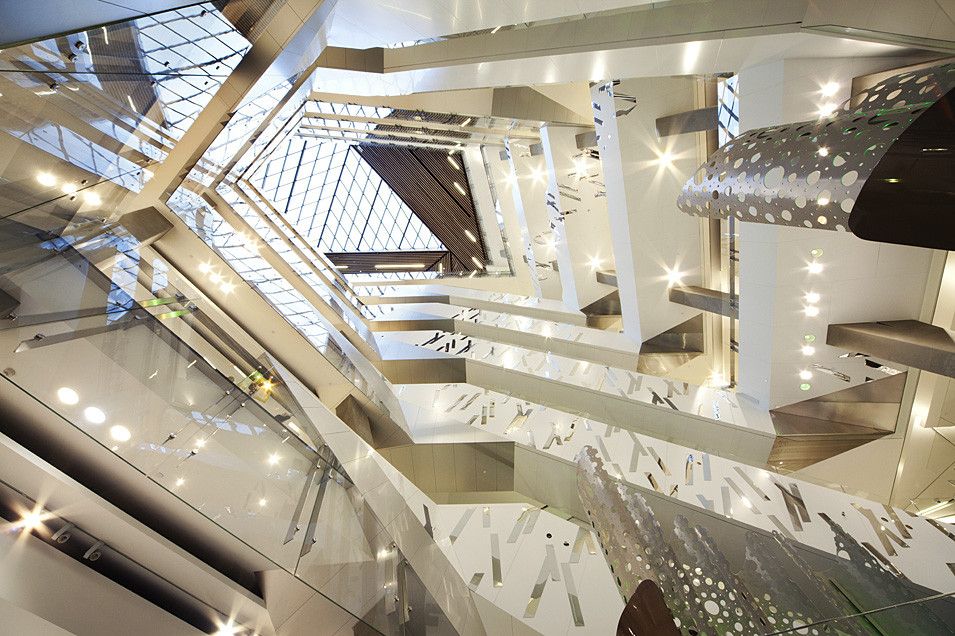
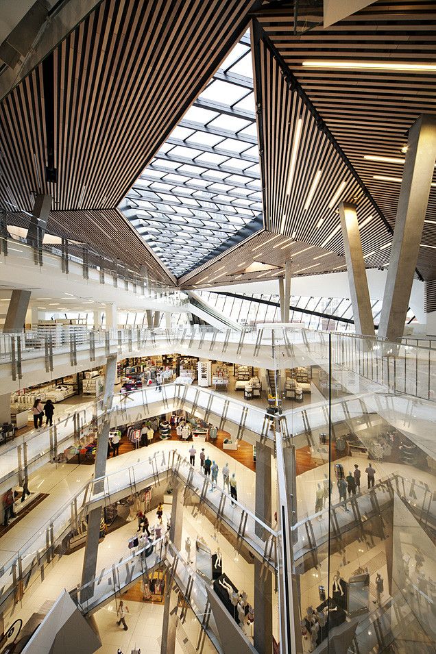
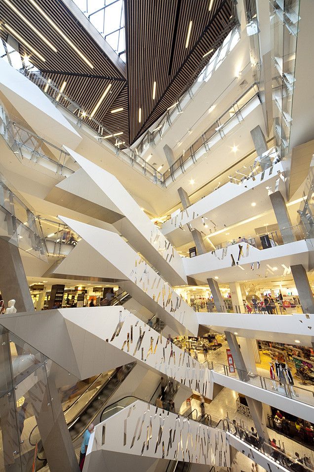
The new upper level event space is the culmination of the store’s new retail experience and is accessed via a dramatic eight level atrium. The shopper is first greeted by the inclined and tapering atrium at the centre point of the busy ground floor of the store. From here, the eye is led upward through a visually and spatially dynamic volume to a large diamond skylight bringing daylight into the depths of the store. Meanwhile a busy flow of customers on the vertically stacked escalators play their part in this kinetic connection.
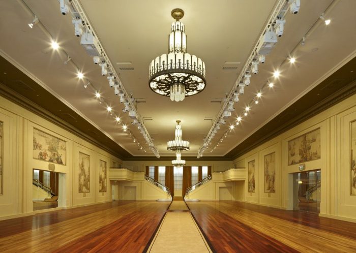
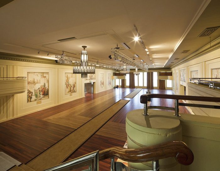
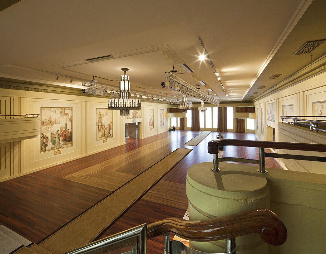
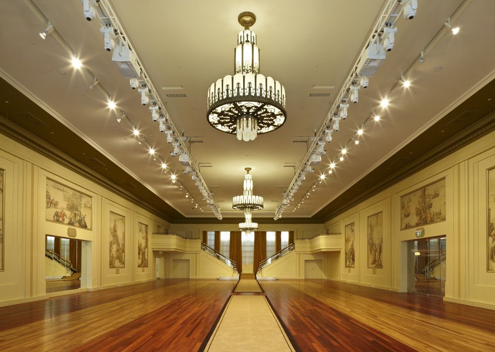
The project also offered the opportunity to carefully restore the significant heritage features of the original store, including the 1930’s Art Deco façade on the Bourke Street Mall and the famous Mural Hall complete with its major paintings by the artist Napier Waller. The Bourke Street façade had undergone many alterations over the last century most noticeably with the painting-over of the upper level windows and the addition of a dark and sombre street canopy. The heritage restoration of the façade has reopened all the upper level windows to allow the inner life of the store to be revealed to the city while a new transparent street canopy ensures an uninterrupted view of the façade from the Bourke Street Mall.
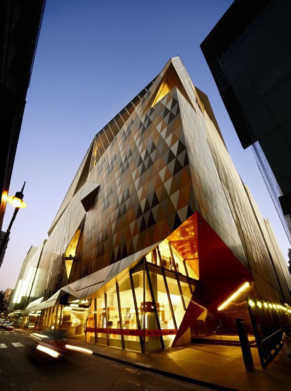
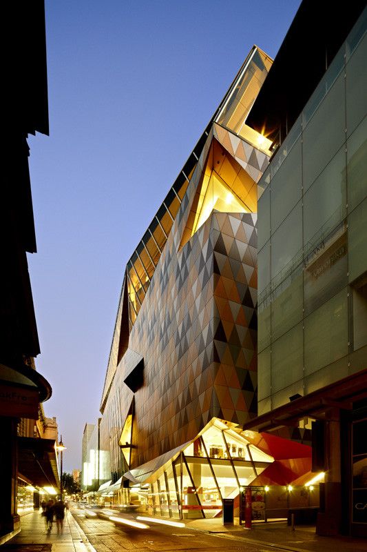
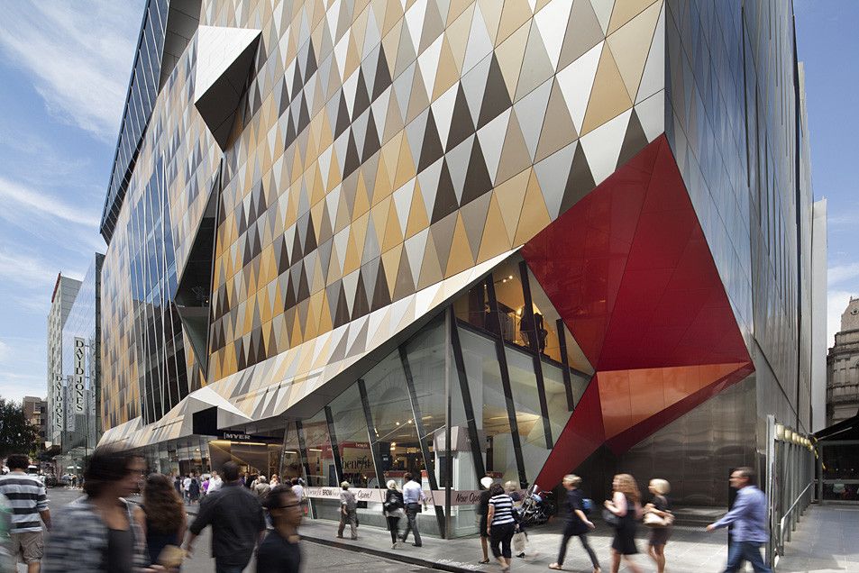
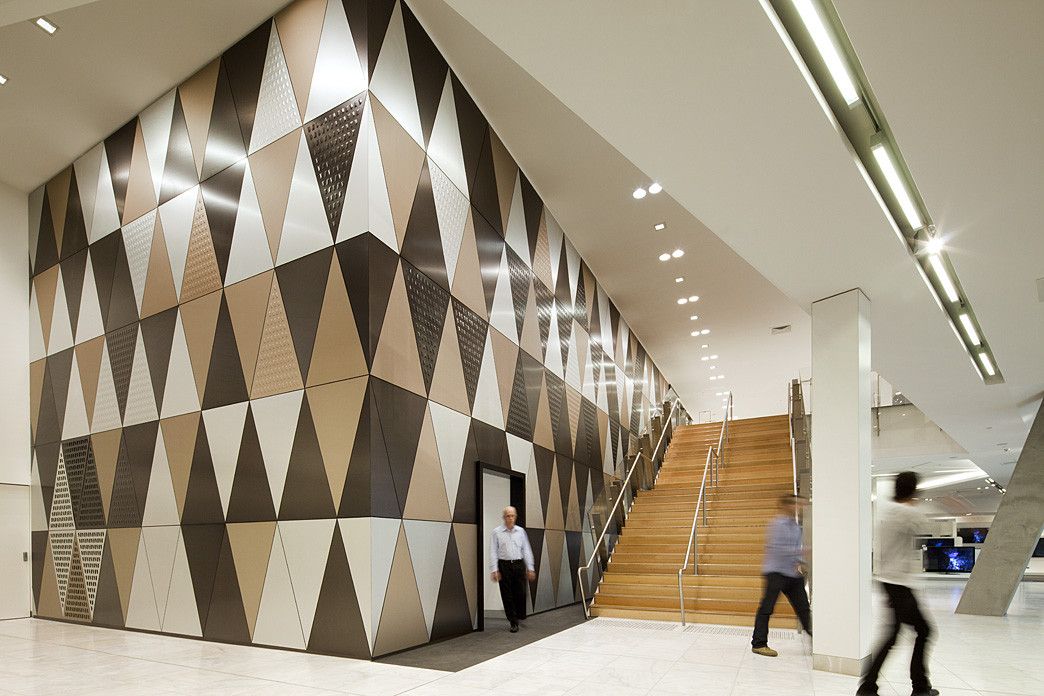
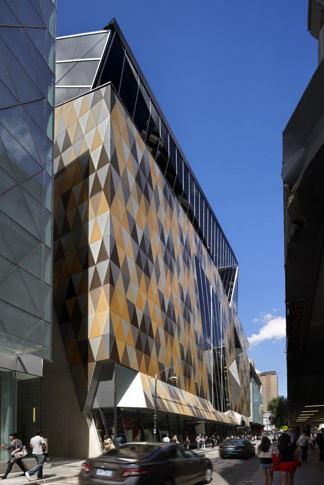
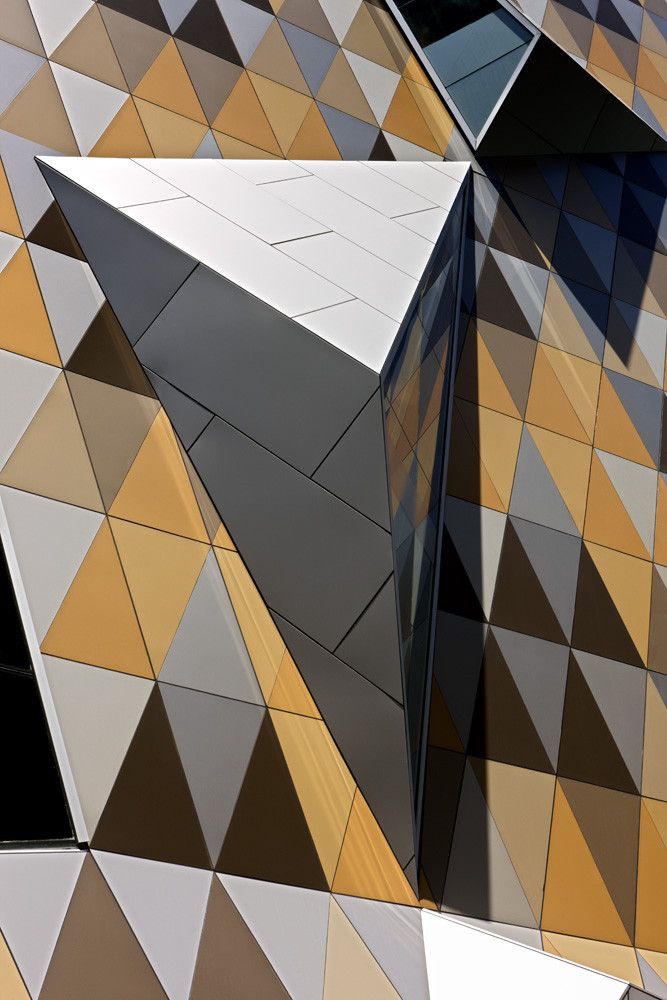
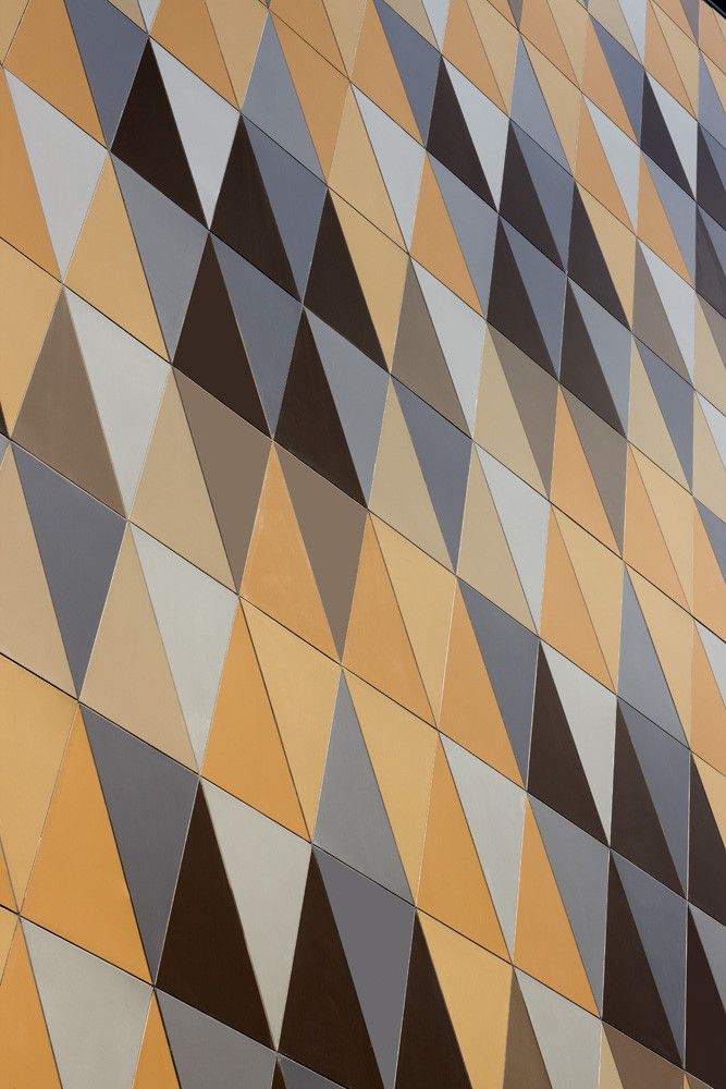
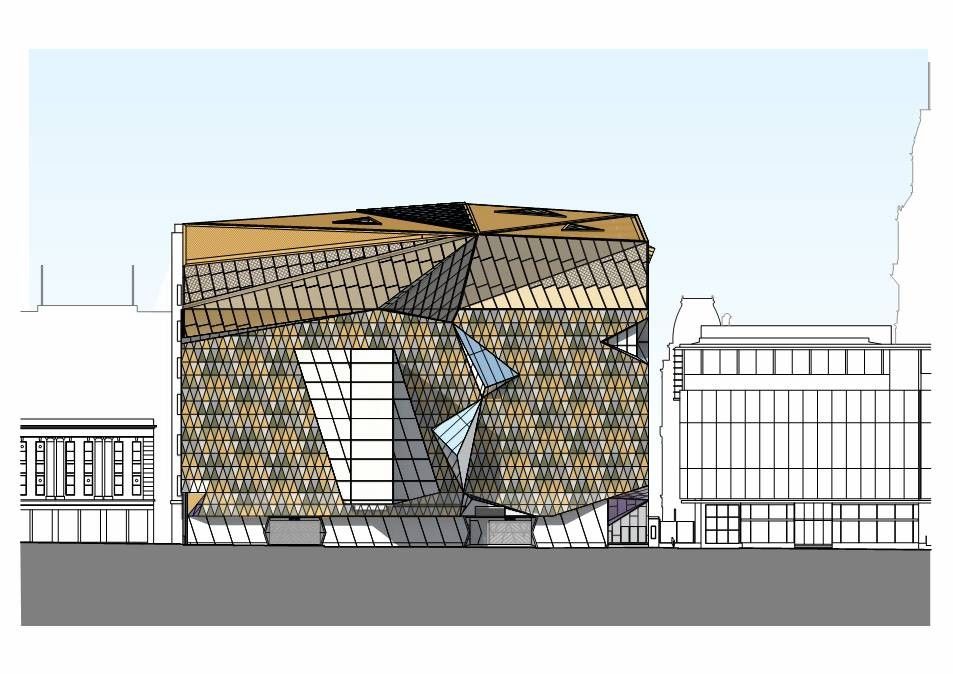
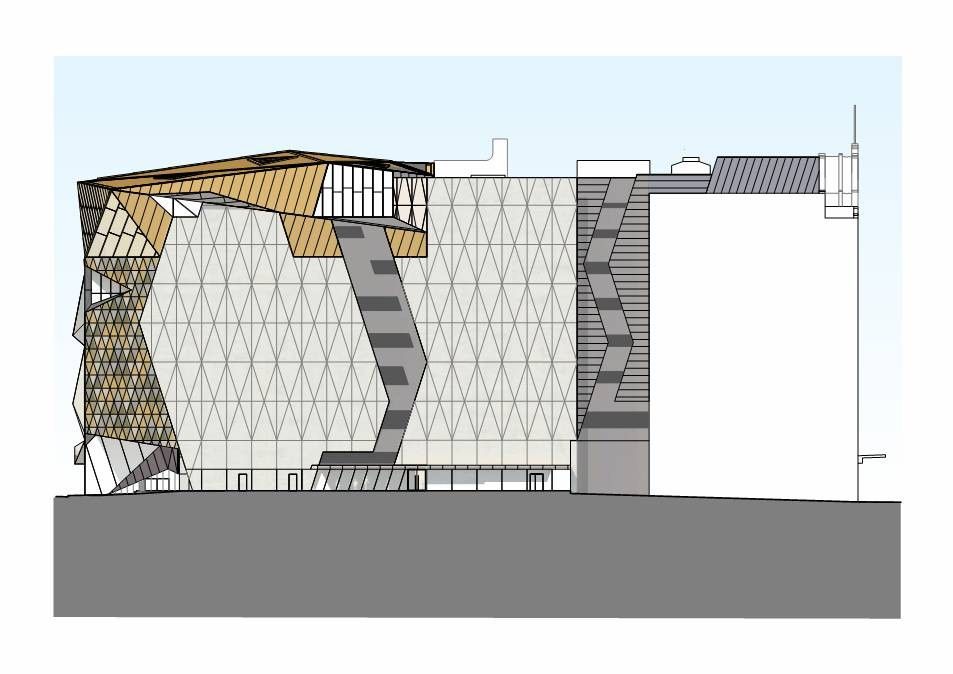
The Little Bourke Street façade has been completely rebuilt as a contemporary counterpoint to its 1920’s Bourke Street companion. The distinctive harlequin pattern across the façade is a geometric interpretation of the Art Deco motifs found throughout the old store. The façade pattern is further extended into a series of three dimensional display windows designed to allow views into the upper levels of the store from the narrow street below.
The redevelopment of Myer’s city store represents a vision of a contemporary department store for a new generation of Melbournians and ensures it will continue to be a contributor to the life and times of the city.

Courtesy of NH Architecture


