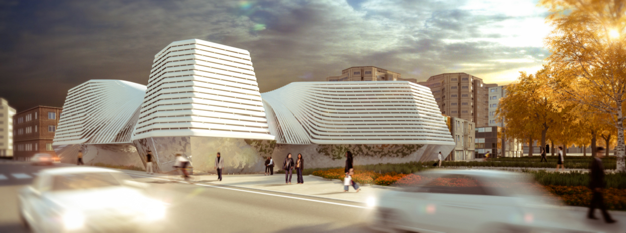
Moving away from the standardized homogeneity of the surrounding built environment, the proposal of Daegu Public Library Competition by Disguincio & Co + Opensystems establishes a subtle resonance with the pre-existing urban texture. The articulation of its volumes, the proportions and its height establish a critical and yet interesting dialogue with the surrounding buildings in the attempt to reconnect the chaotic nature of the site within one coherent synthetic gesture. More details from the architects come after the jump.
The library:
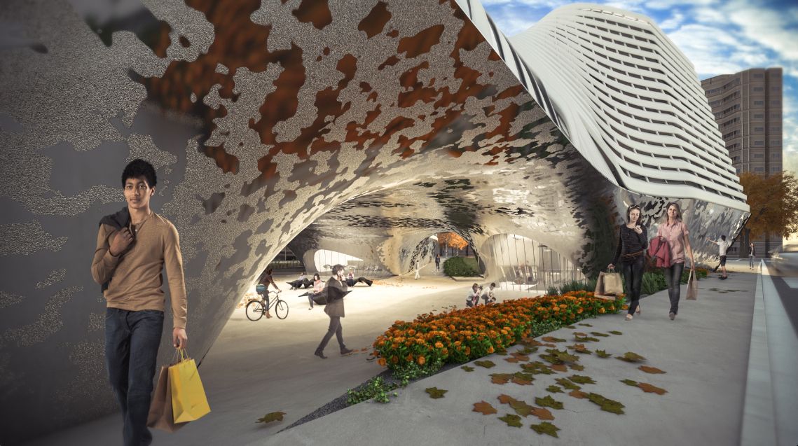
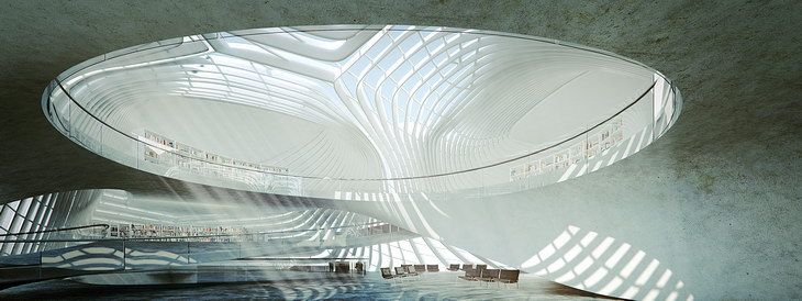
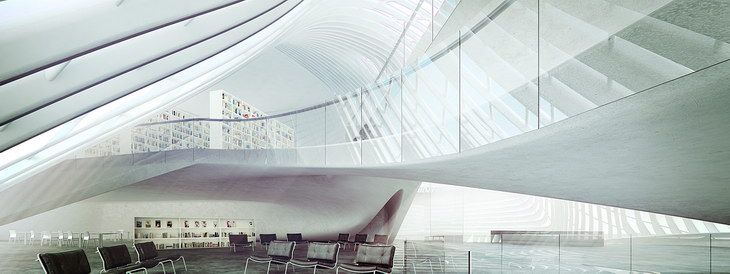
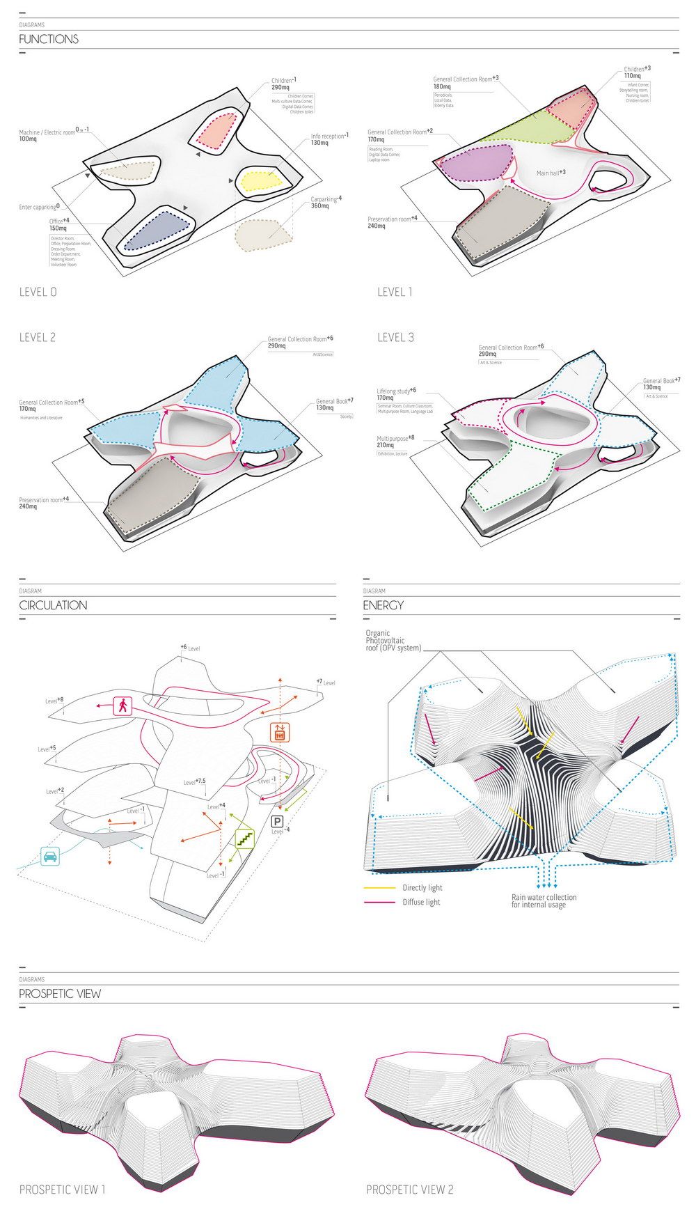
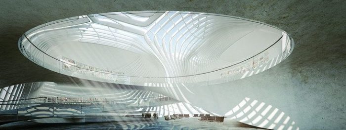
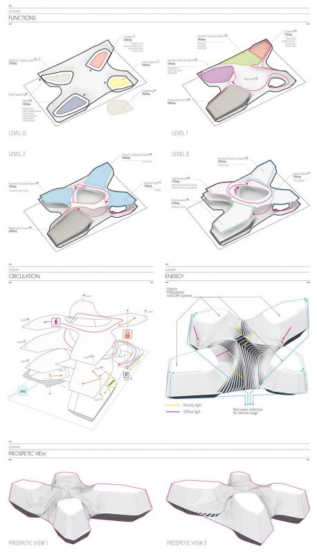
The entire mass of the new library is split into four distinctive volumes of approximately the same footprint of the adjacent low-rise urban plots. This organization offers a clear visual and volumetric connection with the scale of the adjacent building and provides a welcoming and inclusive new structure for the local community. These four bodies are distinct and separate at ground floor where an inclusive public space is articulated as an extension of the local public garden. The main lobby of the building is located at level +3. At this level the lobby is wrapped by a stretching surface connecting the four bodies of the building and forming a gently curved roof structure. From the lobby space a spiral circulation serves the different areas of the building while visually connecting the various spaces located at the four corner of the structure. The internal spiral organization facilitates the navigation throughout the building and provides spectacular views between levels. The different functions of the building, while connected with the spiral circulatory ramp, are placed at the four corner of the building in correspondence with the free standing volumes: there a more intimate and quite space provides the ideal set for reading and studying.
Site
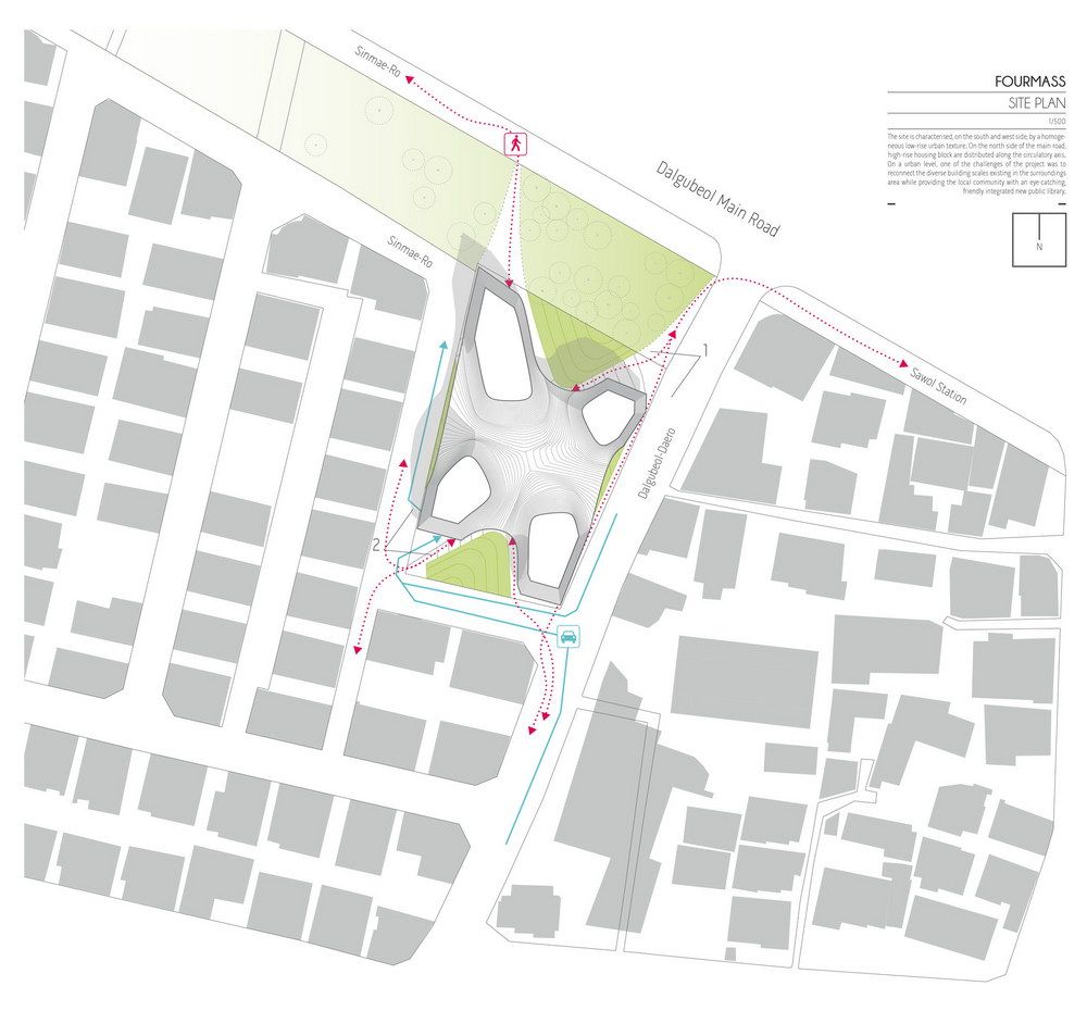
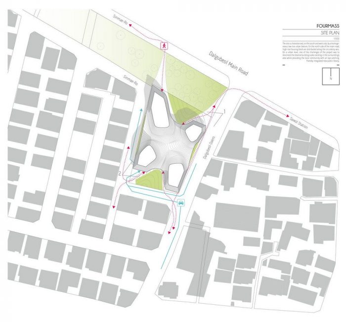
The site is characterized, on the south and west side, by a homogeneous low-rise urban texture. To the north side, the site faces a long and narrow urban park which is stretched along a major circulatory artery. On the north side of the main road, high-rise housing block are distributed along the circulatory axis.
On a urban level, one of the challenges of the project was to reconnect the diverse building scales existing in the surroundings area while providing the local community with an eye-catching, friendly integrated new public library.
Landscape
One of the main features of the project is the organization of the ground level as the natural continuation of the adjacent public park. By splitting the library in four volumes -which are then reconnected at the level of the lobby- the ground floor is freed and kept public as an extension of the urban landscape. By doing so, the building offers at the level of the street a welcoming public space for the community to interact with the building while not necessarily using its facilities. This sheltered space underneath the main lobby of the library can be used in multiple way by the local community: as a space for gathering and interplay.
Program
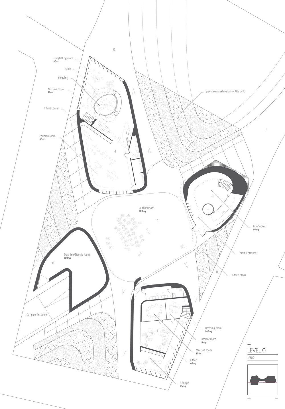
At the ground floor the building is slip into four main core volumes. This subdivision allow for the public use of the space below the main lobby to be used for informal gathering and for (cultural and recreational) activities to take place.
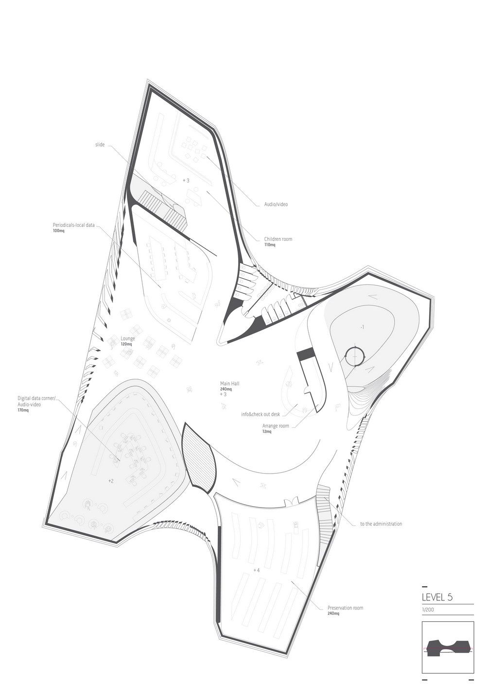
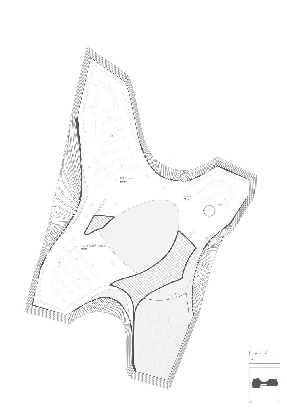
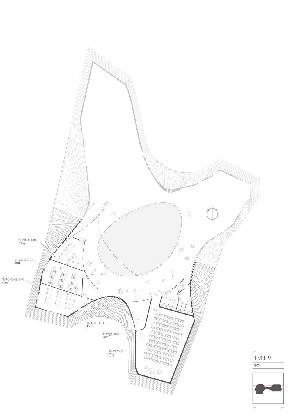
In this area the four volumes host respectively: the main access lobby where the main reception, administration offices and information point is located; the children corner which take advantage of this location to access to and accessed from the external public garden; the plant room to ease external access. At level +3 is located the main lobby space, the periodicals room, local data and children room at level. From here a spiral circulatory ramp serves the various areas of the library. The ramp revolves around a main empty atrium allowing for a simple visual navigation throughout the building and its functional areas. Following the ramp onwards, the following areas unfold: the preservation room at level +4; the reading room, the digital room at level +5; humanities, society and linguistic room at level +5, +6 and +7; the exhibition and lecture room at level + 8.
Structure & Cladding
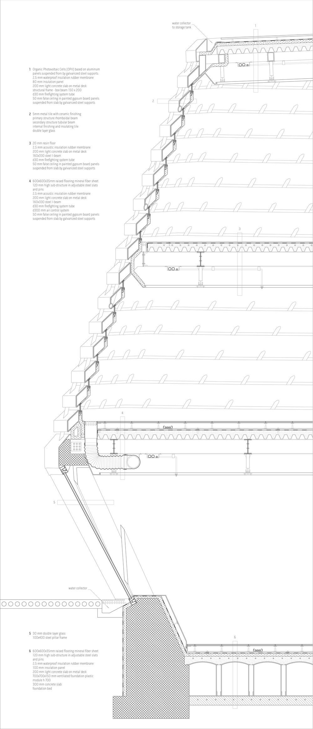
The building is formed by four free standing independent volumes which are connected at level +3 by a spanning slab. The main structure of the four volumes is made of reinforced concrete frame from the ground level to the lobby level. From level +3 onwards the exterior structure is designed as a light weight steel diagrid tied back to the concrete core by the steel slabs.
The cladding is made by thin steel fins that follow the geometry of the pods by drawing the contours of their very geometry.
This organization of the cladding provides shadowing to the interior space while allowing effective filter to the passage of natural light.
Credits and Info:
Project: Daegu public library competition
Location: South Korea
Year: 2012
Designer: Disguincio & co + OPENSYSTEMS
Mirko Daneluzzo , Mirco Bianchini, Marco Vannucci
Visuals: Telegram 71
Giacomo Dodich, Sergio Bortolussi
Plan design: Paola Tonizzo (D&co)
