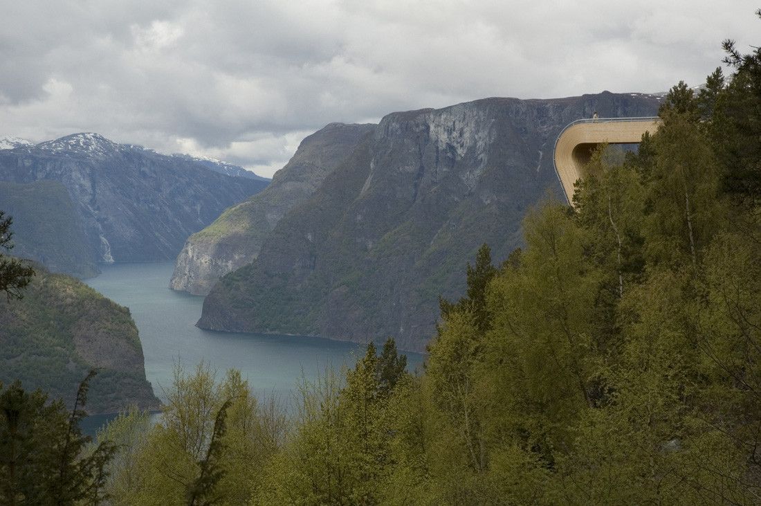
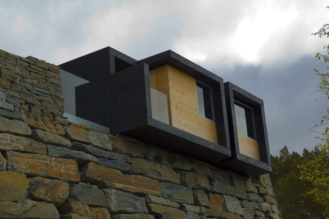
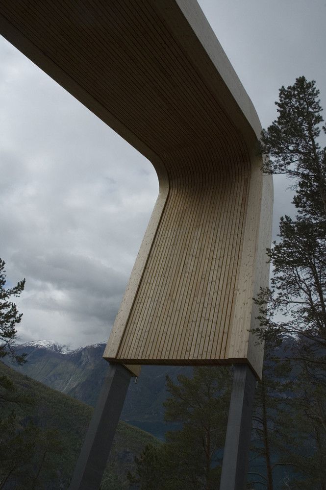
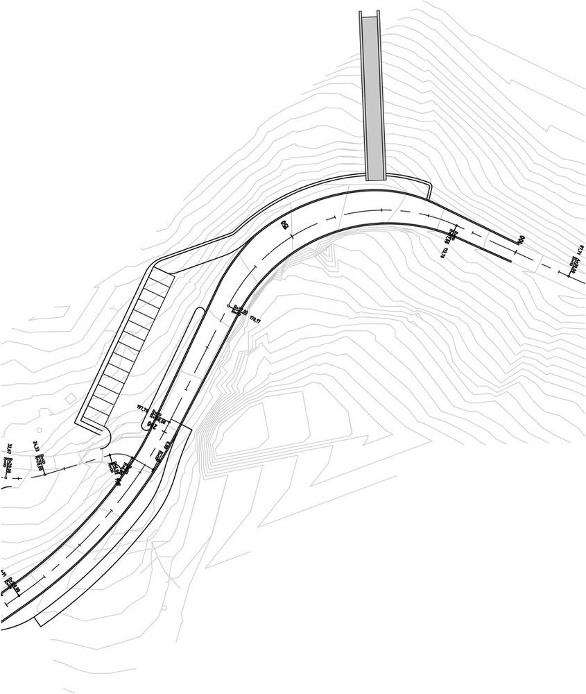
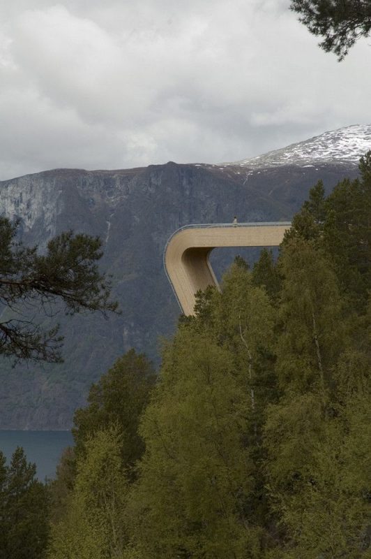
Can we start this article off with a collective ‘Oh Damn!’? This amazing work of bent-lamination boggles the mind. The Aurland Lookout, designed by Saunders Architecture, was the winning entry for an invited competition for the Norwegian Highway Department. Completed in 2006, it spans breathtakingly out over the Aurland Fjord.
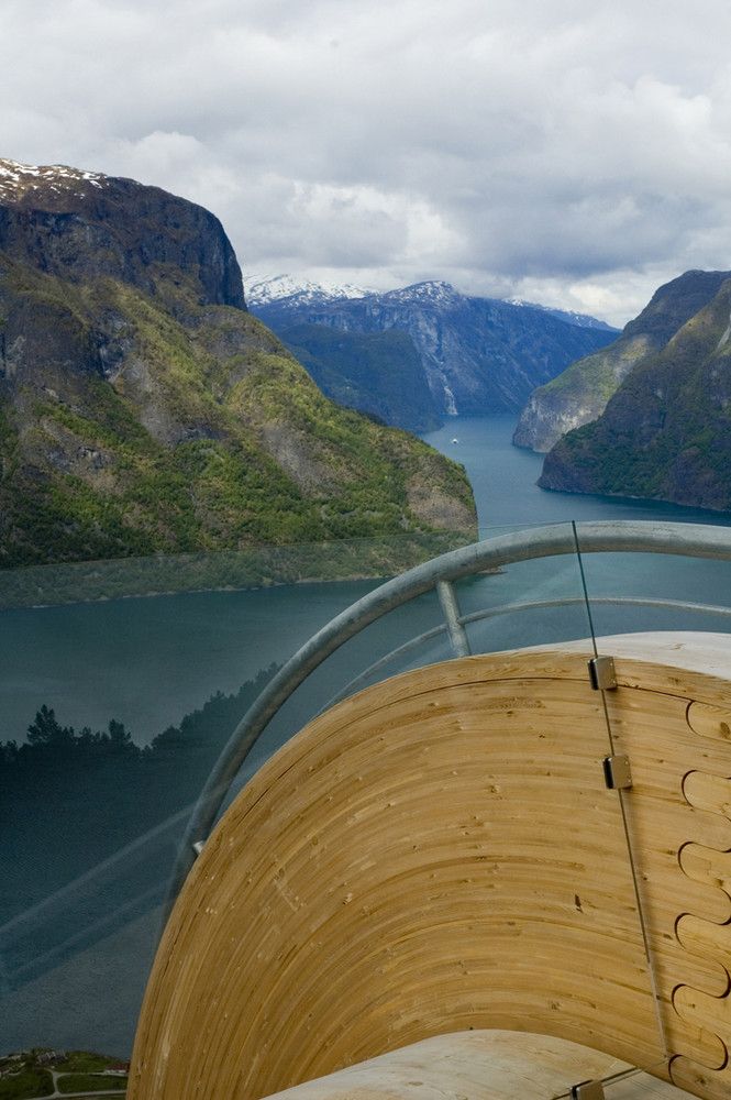
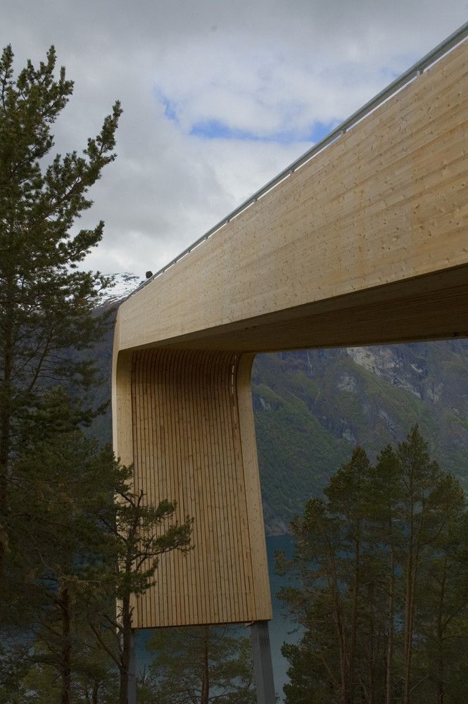
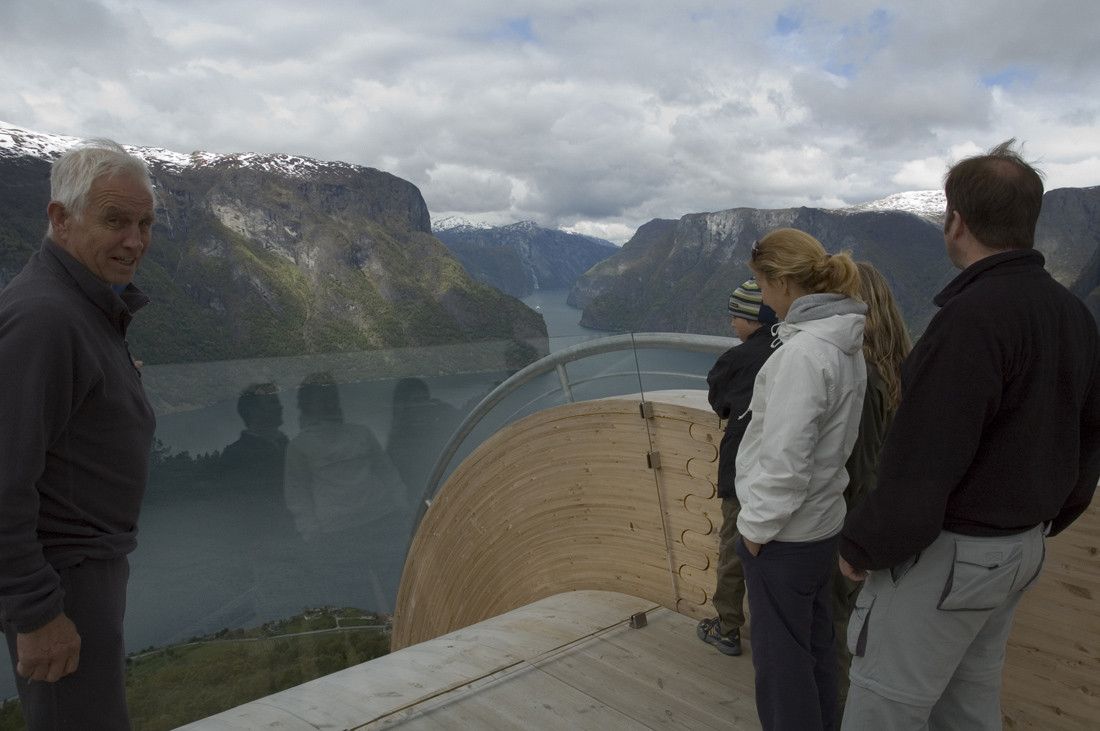
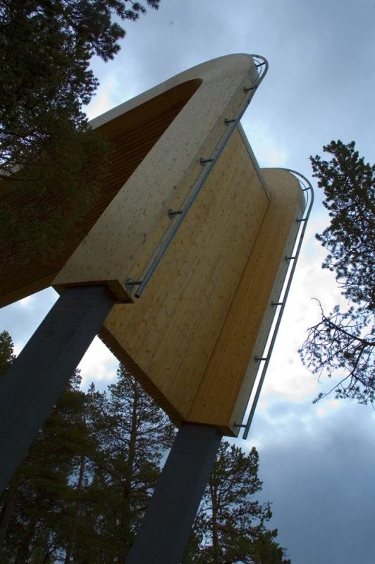
 A bent-laminated form nearly a meter thick extends from the highway and fluidly makes a plunging turn downwards to massive steel support columns that brace the lookout up from the slope. It occurs to me that I am using an awful lot of adjectives but what can I say? This thing deserves adjectives. Two details that really make this project occur at the terminus of the journey into space. These are the connecting joint between the two bent forms and the safety-glass barrier. The connection detail is just so… fitting. It just feels right and I can’t think of another way to do it. This I think is the purest demonstration of good design- when it just cannot be imagined occurring any other way. The subtly redefined finger joint relates back to the form while clearly introducing itself as a break in the form and demanding acknowledgement of its autonomy and importance to the construct’s feasibility as a structure.
 The safety-glass barrier leans out at what appears to be a 15-20 degree incline, encouraging exploration and a bit of courage to lean out and take in the view. The glass acts as a physical barrier while doing nothing to diminish the visuals the lookout seeks to curate. In a world where everything big is man-made and everything big that is man-made is made from man-made materials, this is a wonderful reminder to designers and the public-at-large of the stalwart material that is wood and that not everything big must be black or white.
