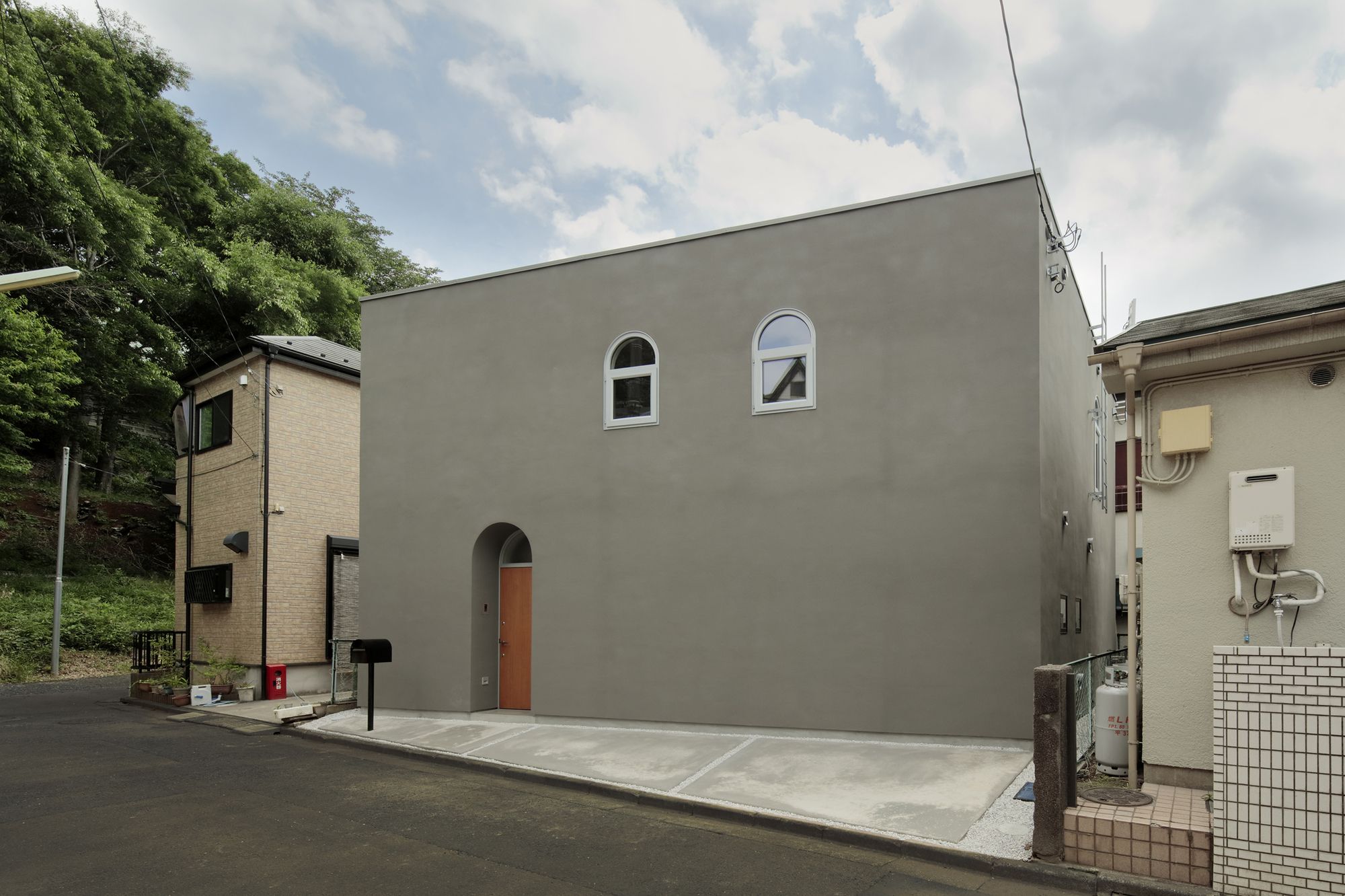
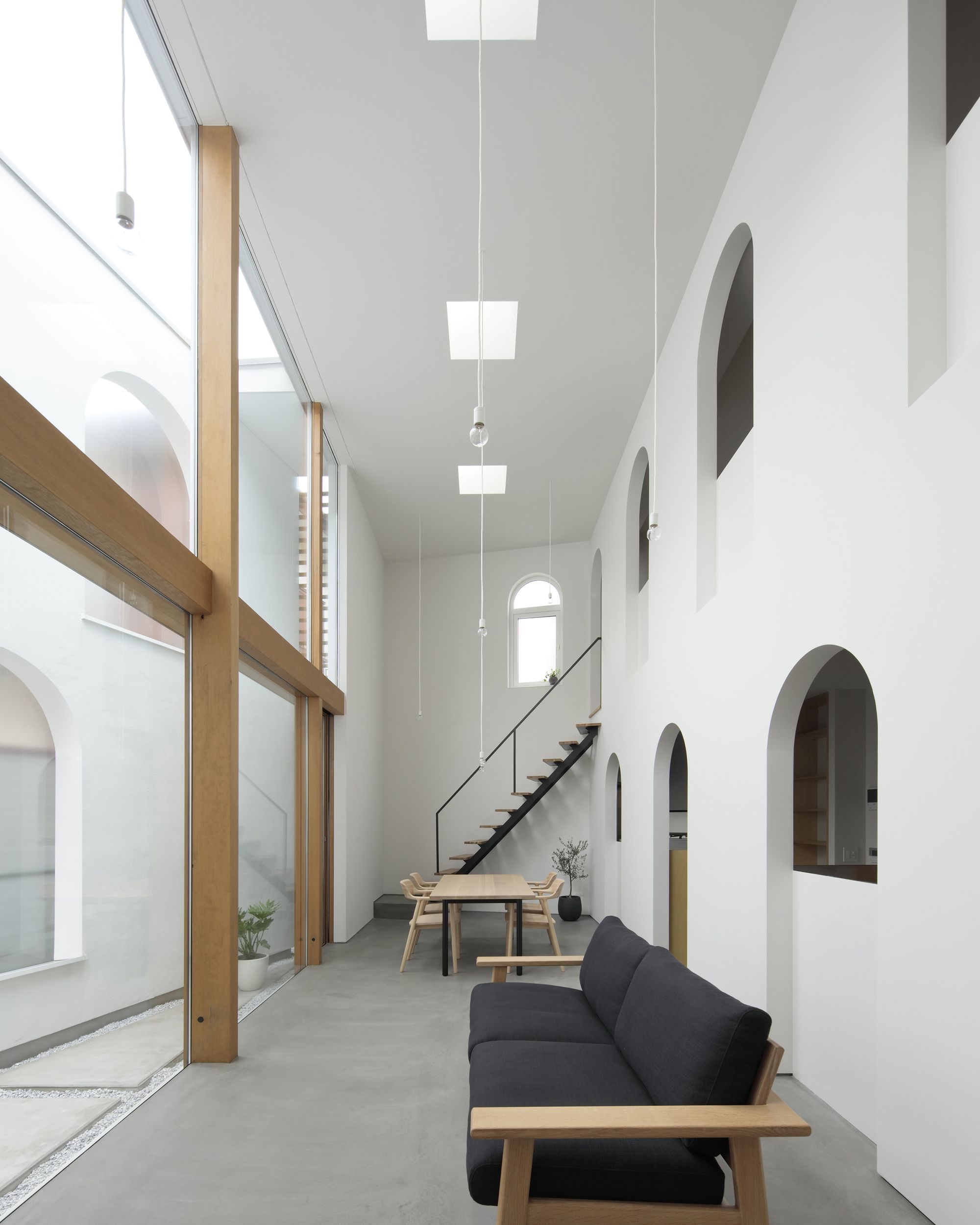
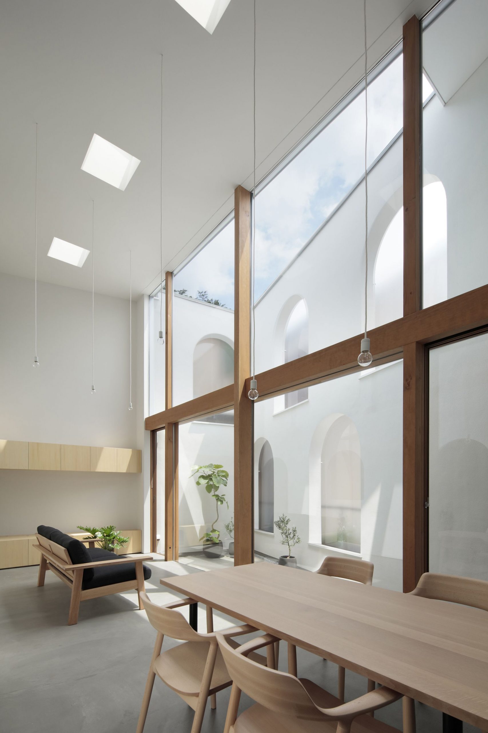
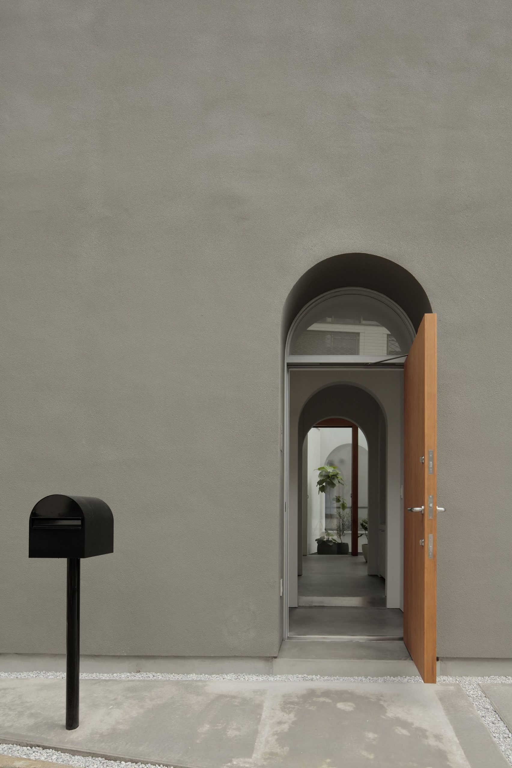
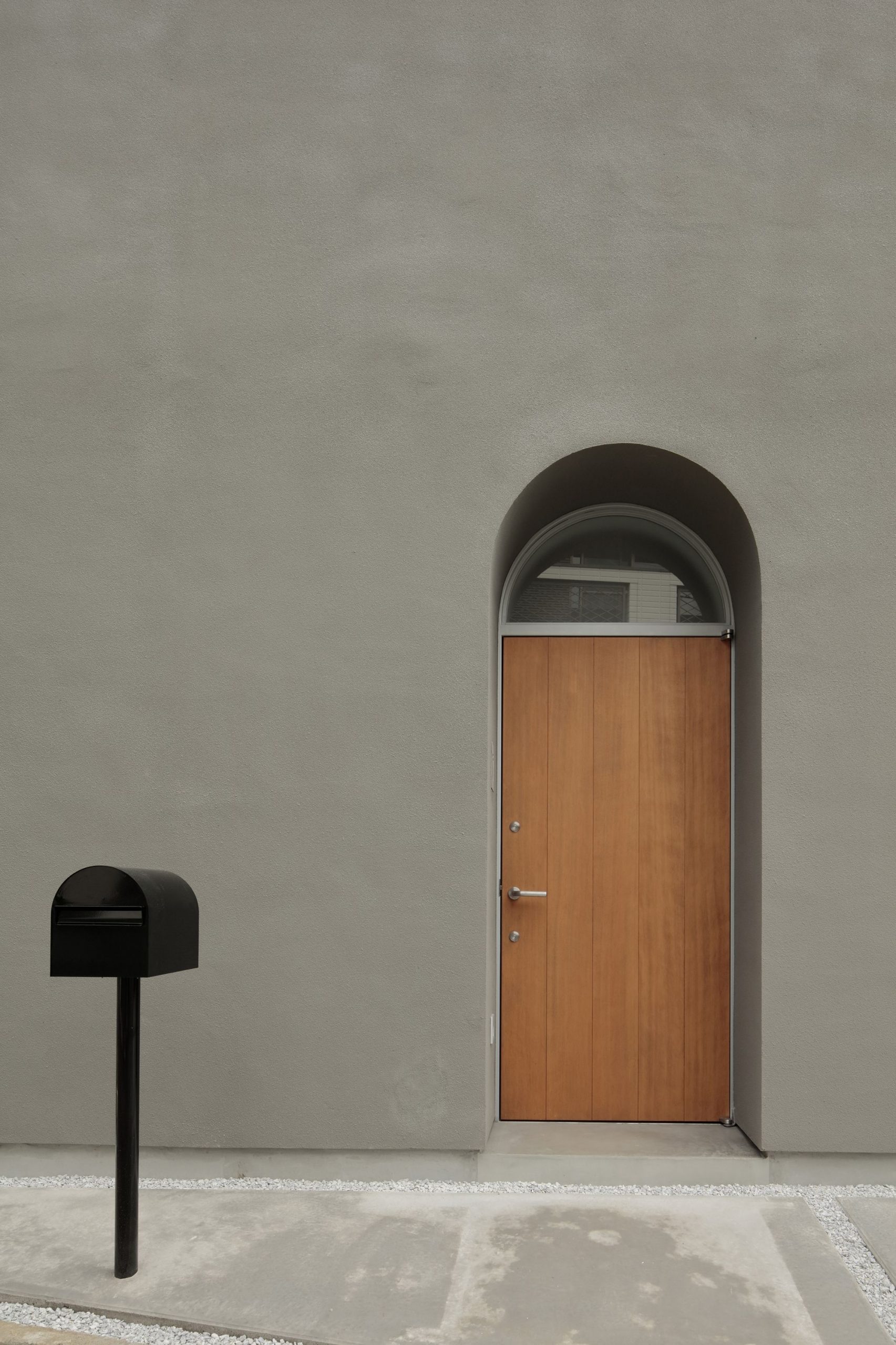
The House in Asaka is the first detached house for a family of four who has long been living in a rental apartment. “We would love to have peace and quiet and a cozy feeling in our new home, and yet, we would also like to have a garden that brings an open feeling to the house.” This was the wish list my client shared with me when I received an order for designing their first family house.
Location of the house in Asaka:
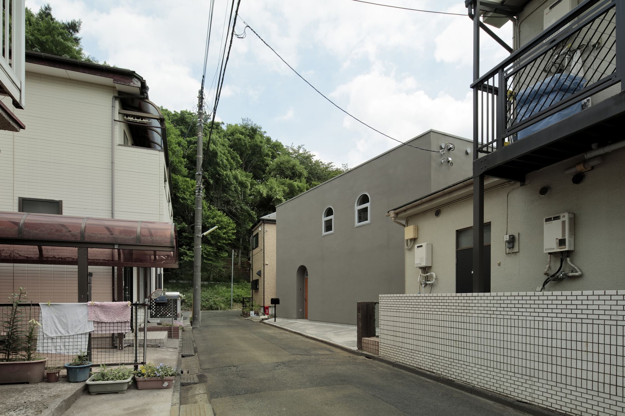
The House in Asaka is located in a dense residential area about 10 minutes walk from the nearest train station in Asaka city, Saitama prefecture which is adjacent to the northern border of Metropolitan Tokyo. A regular-shaped, 10-meter wide and 10-meter deep lot lies in a Category 1 exclusively low-rise residential zone with a building coverage ratio of 60% and a floor-area ratio of 100%.
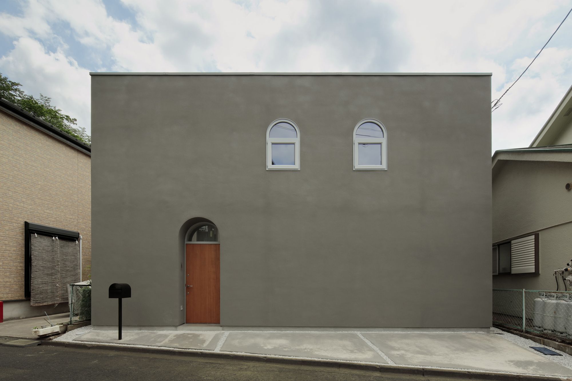
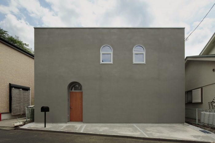
A narrow, 4-meter width cul-de-sac to the north in front of the house with neighboring houses built in very close proximity on all four sides of the plot makes it difficult to set a wide frontage to the house. A two-story, 100 square meter (approx.) house with parking will not fit the kind of garden my client wishes to have. Under the given environmental restrictions, I have set a goal to design a house where my client can enjoy both “closed and open” feelings.
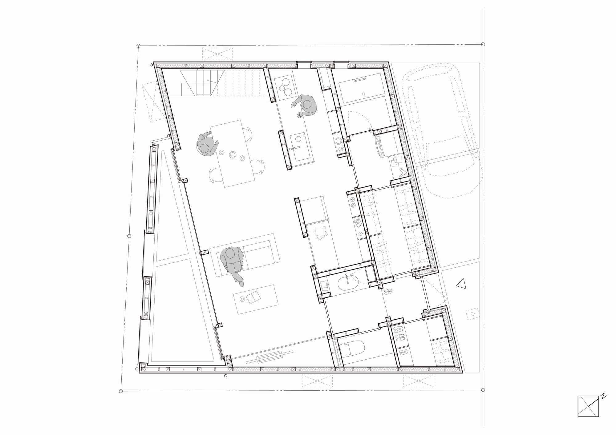
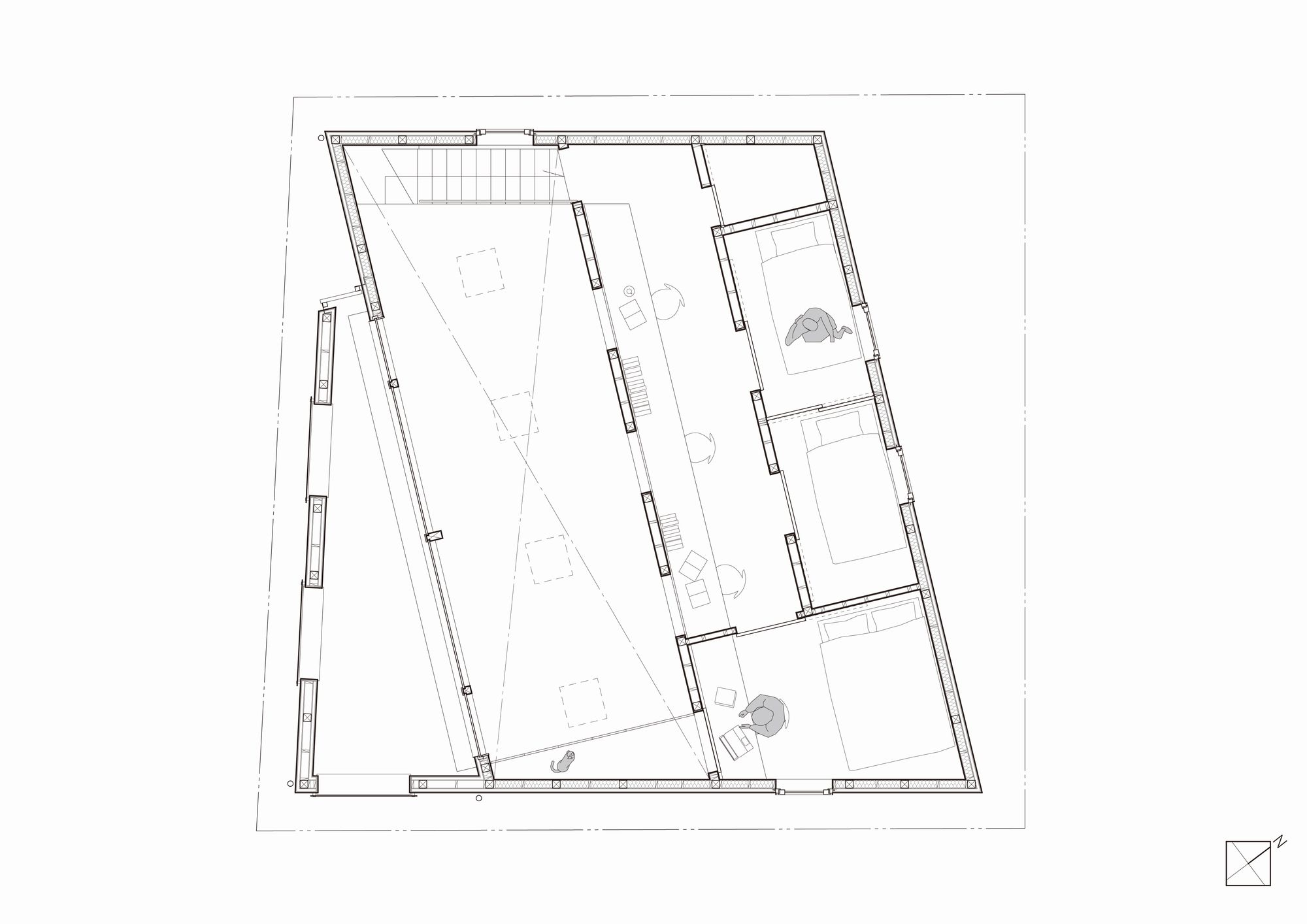
By placing the building out of alignment with the street in front of the house and making the house into a parallelogram, House in Asaka does not face the exterior walls and windows of neighboring houses directly. The parallelogram shape creates two triangular-shaped vacant areas in the plot, giving more space between the house and the neighbors whilst bringing in natural light and letting fresh air flow in and out.
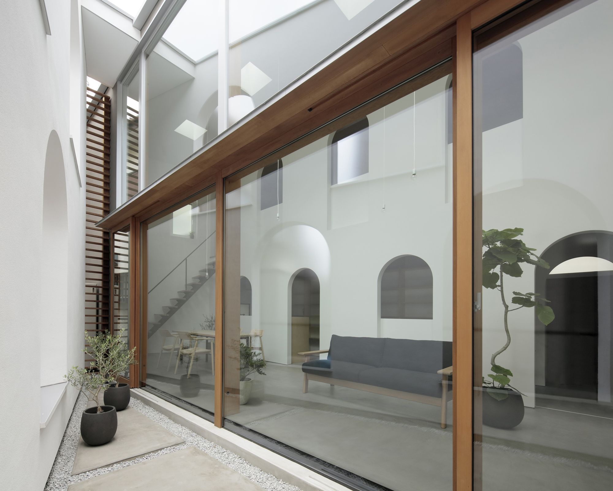
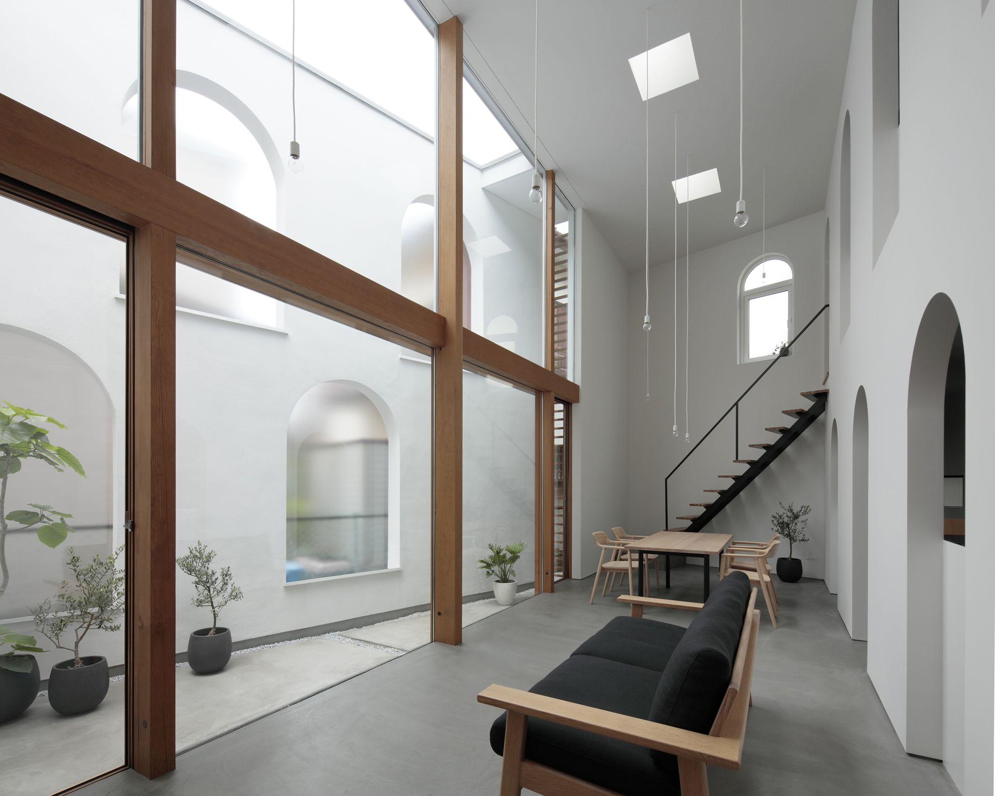
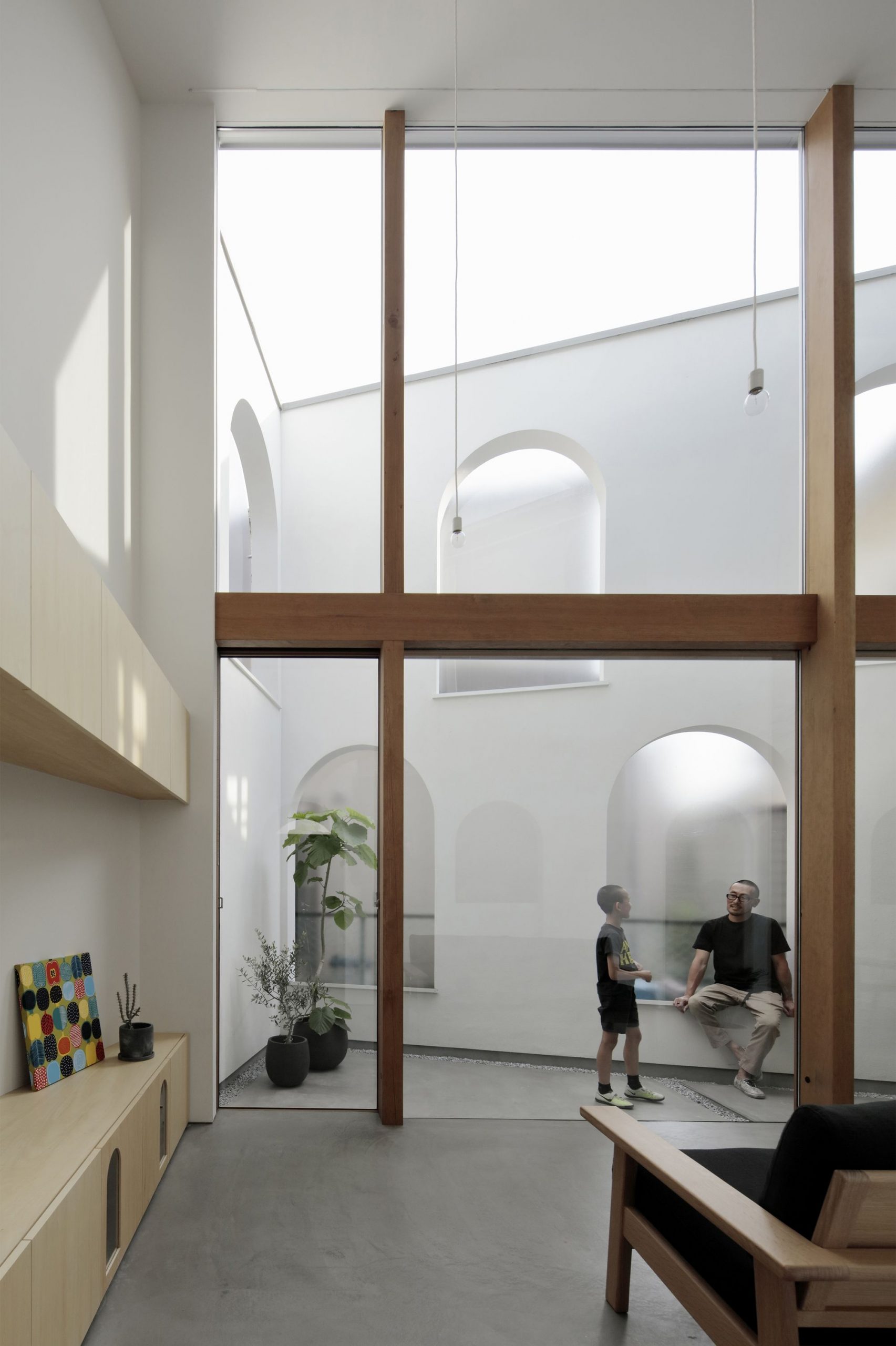
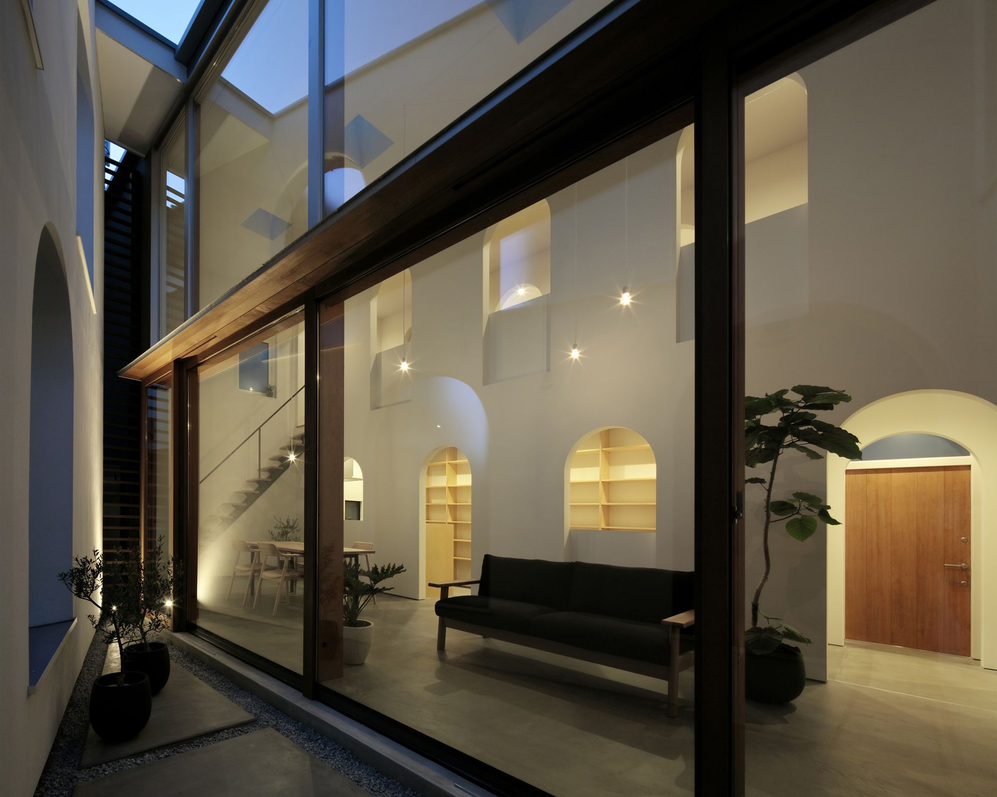
A triangular-shaped area that is adjacent to the neighbor on the back becomes a backyard garden, creating additional space between the two houses. By extending one side of the triangle along the angled exterior wall, the garden feels more spacious than its actual size.
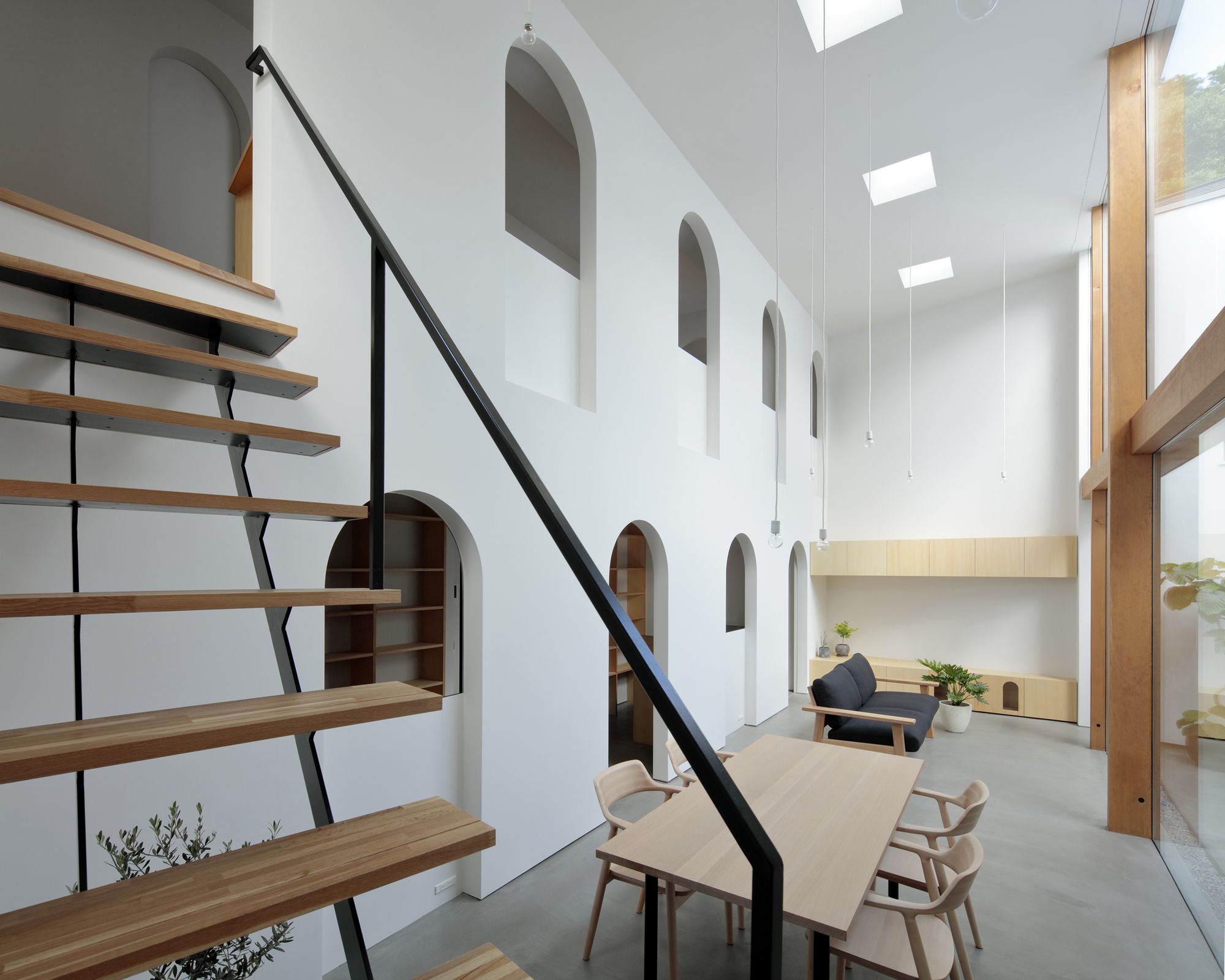
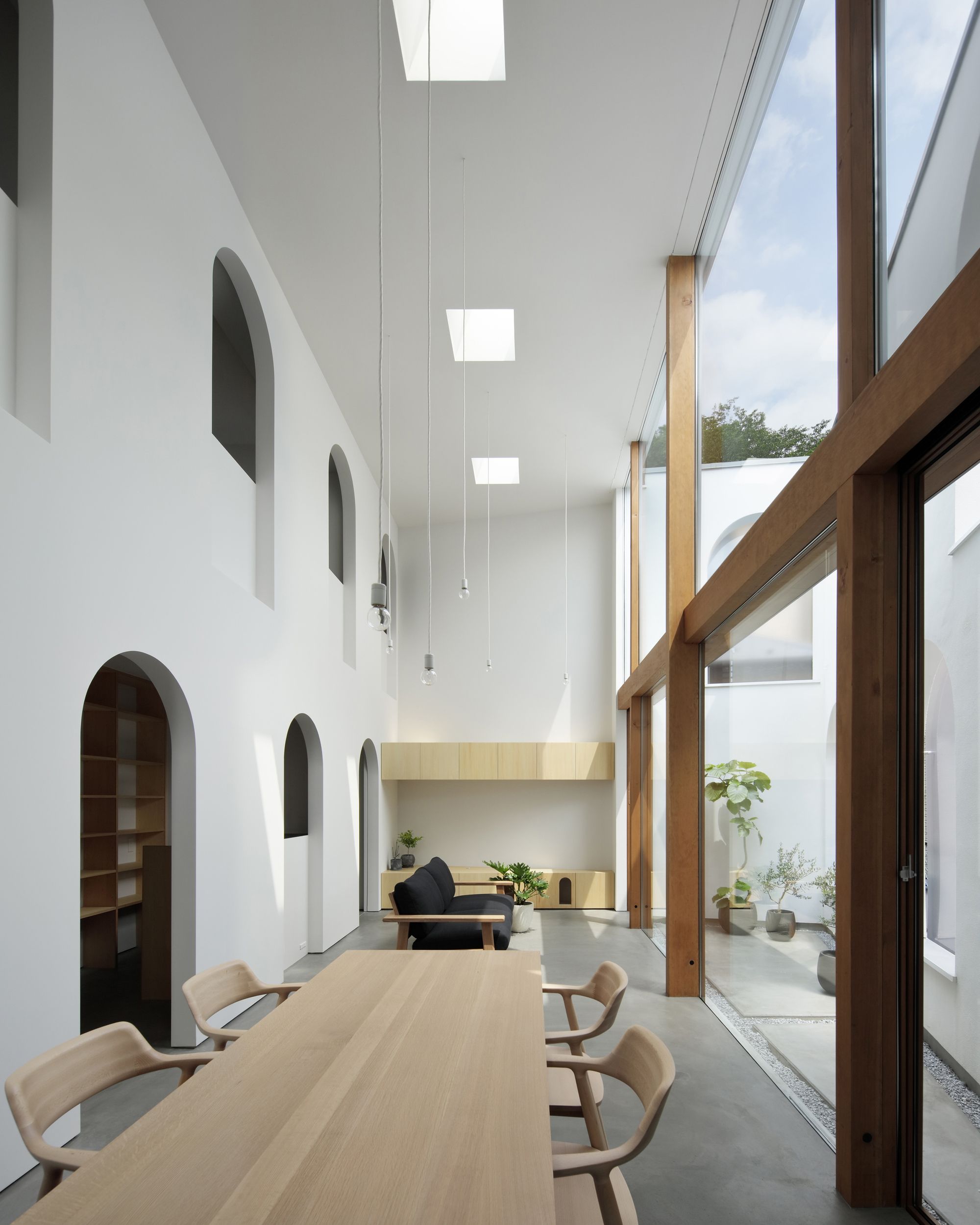
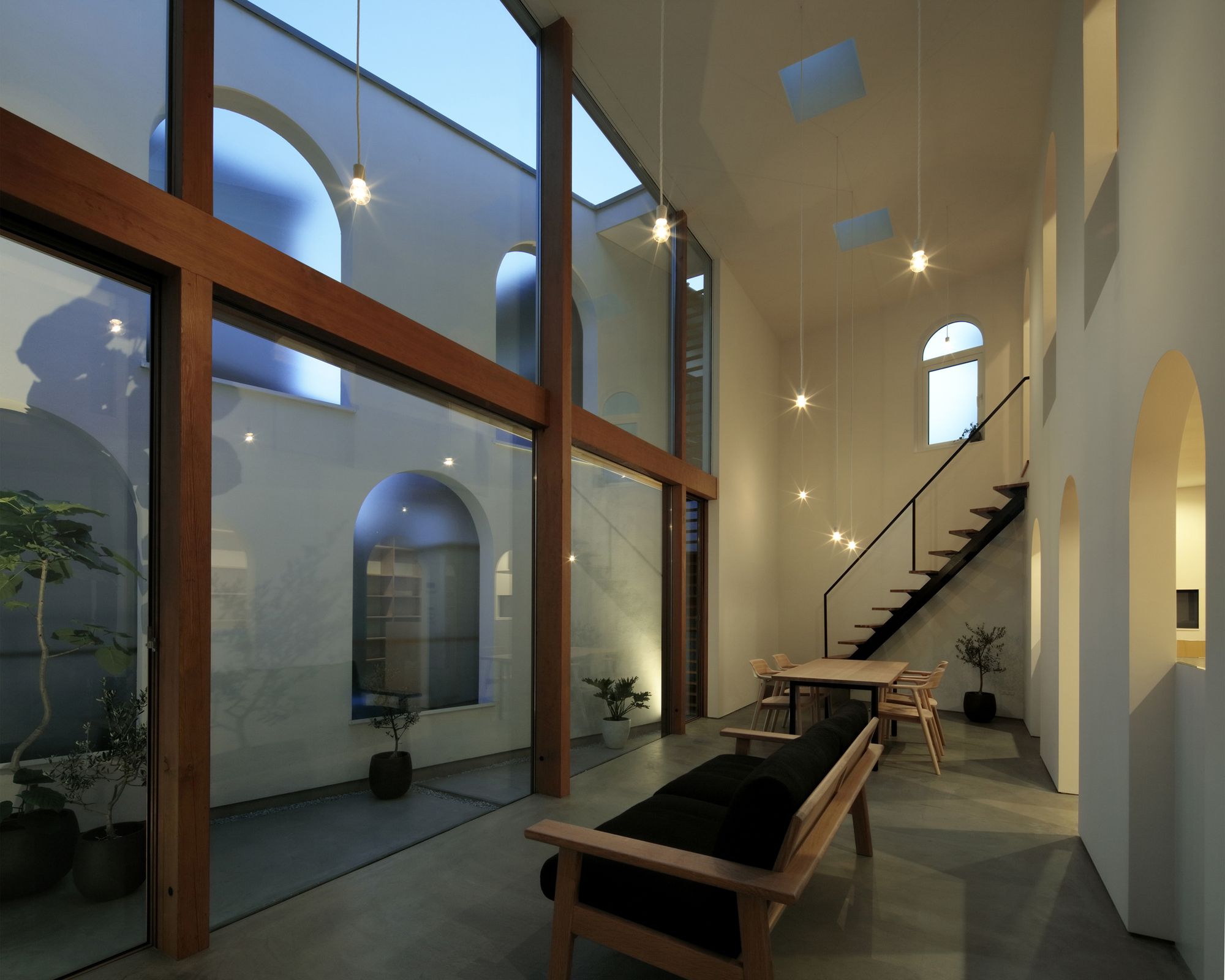
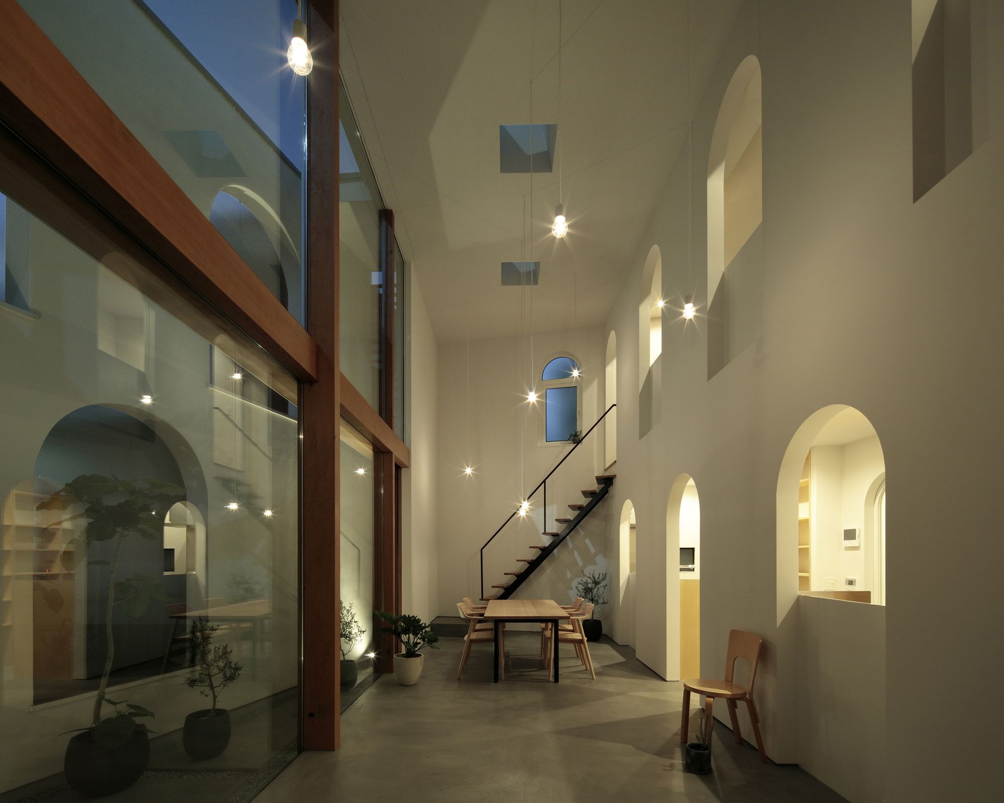
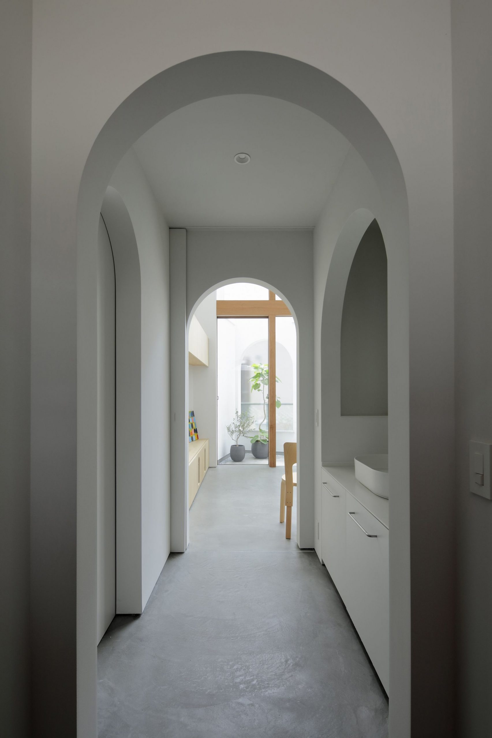
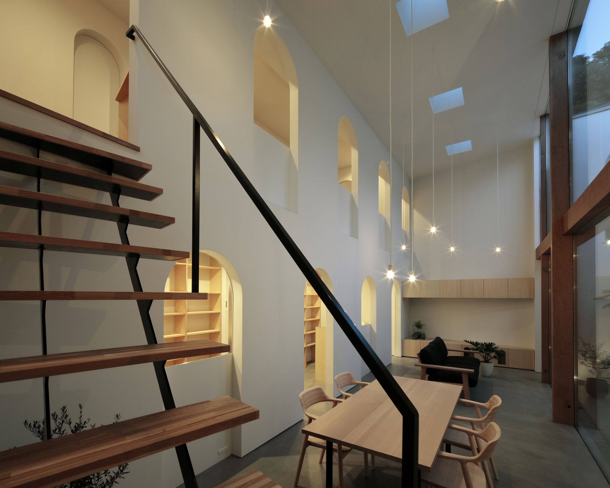
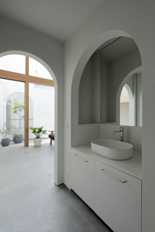
The inner wall is laid in parallel with the exterior walls in a parallelogram shape that matches the volume of the building. As you enter the front door and move from a closed room that connects to a similar shaped, more spacious room without any corridor or orthogonal wall, the house gradually opens up to the backyard, giving the feel that you are further away from the street. A wide
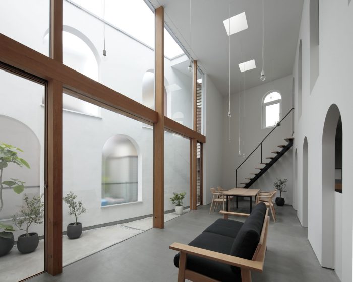
opening connects a double-height open-plan living and dining space to the backyard, turning the entire space into a large garden.
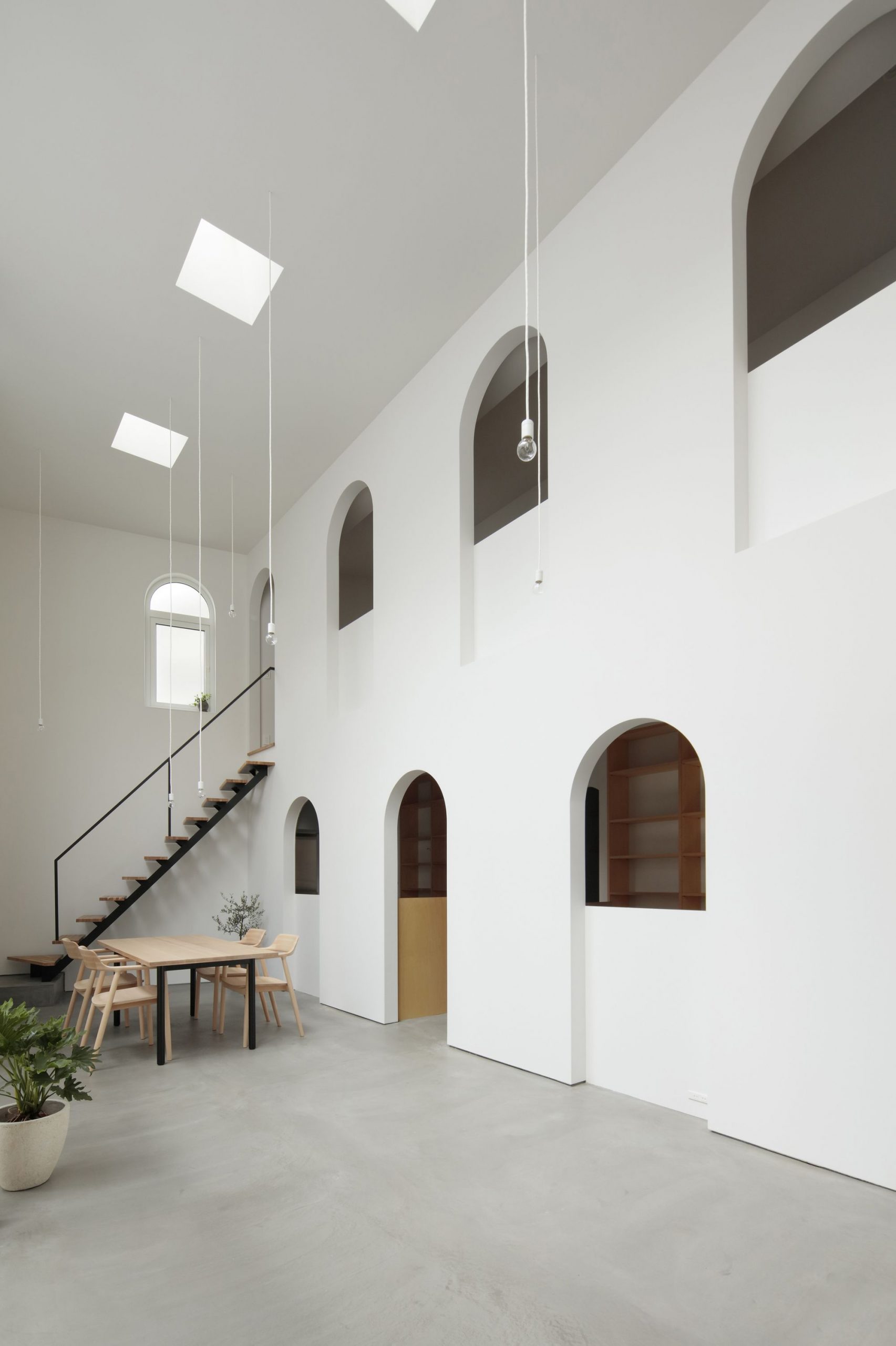
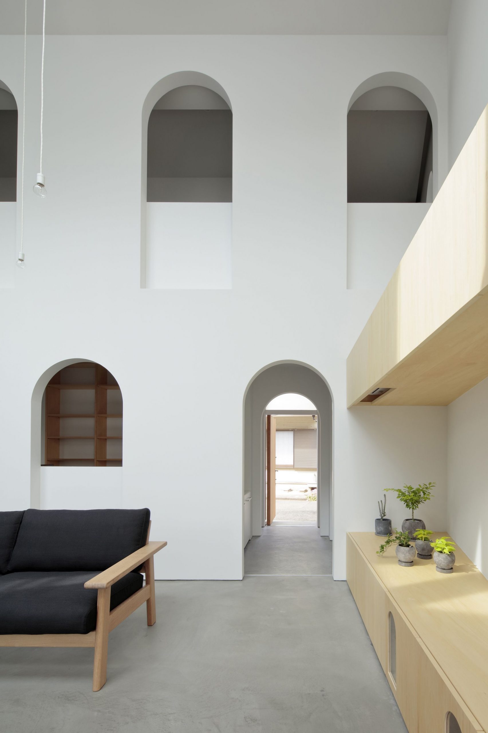
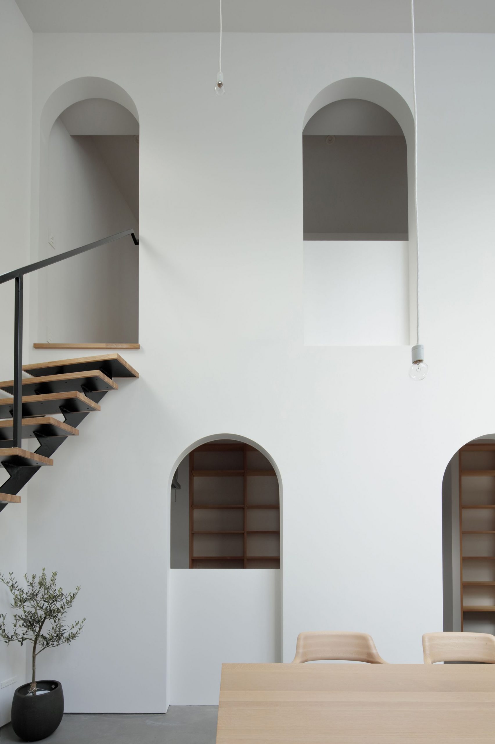
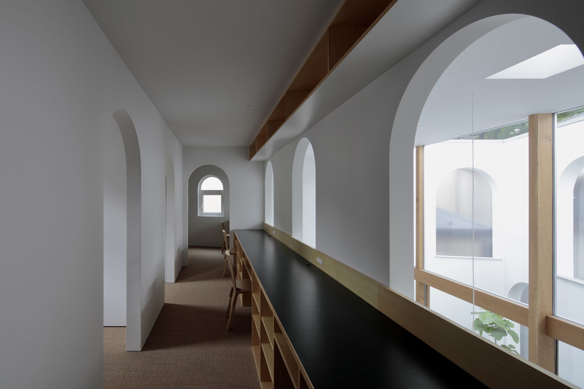
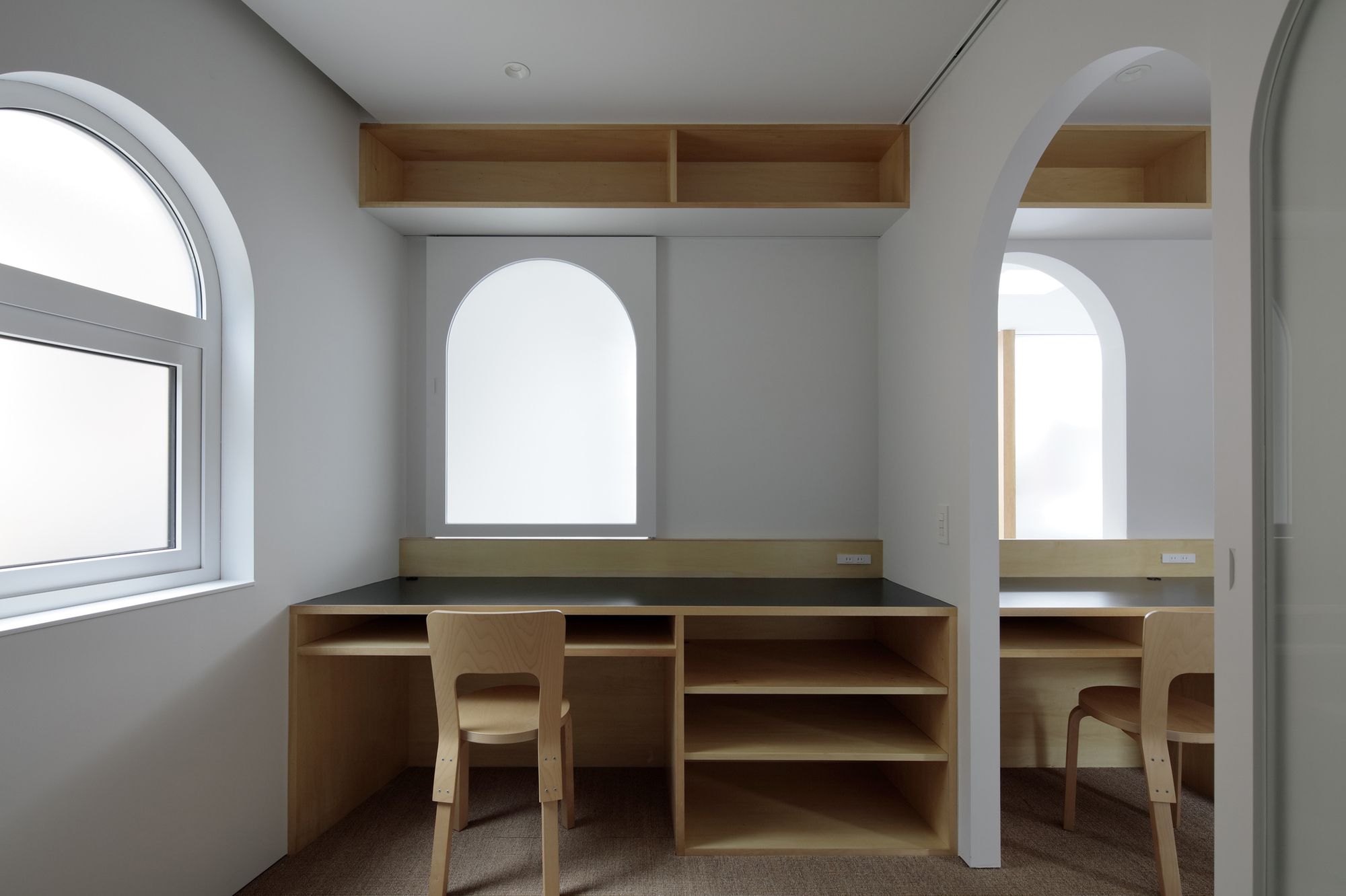
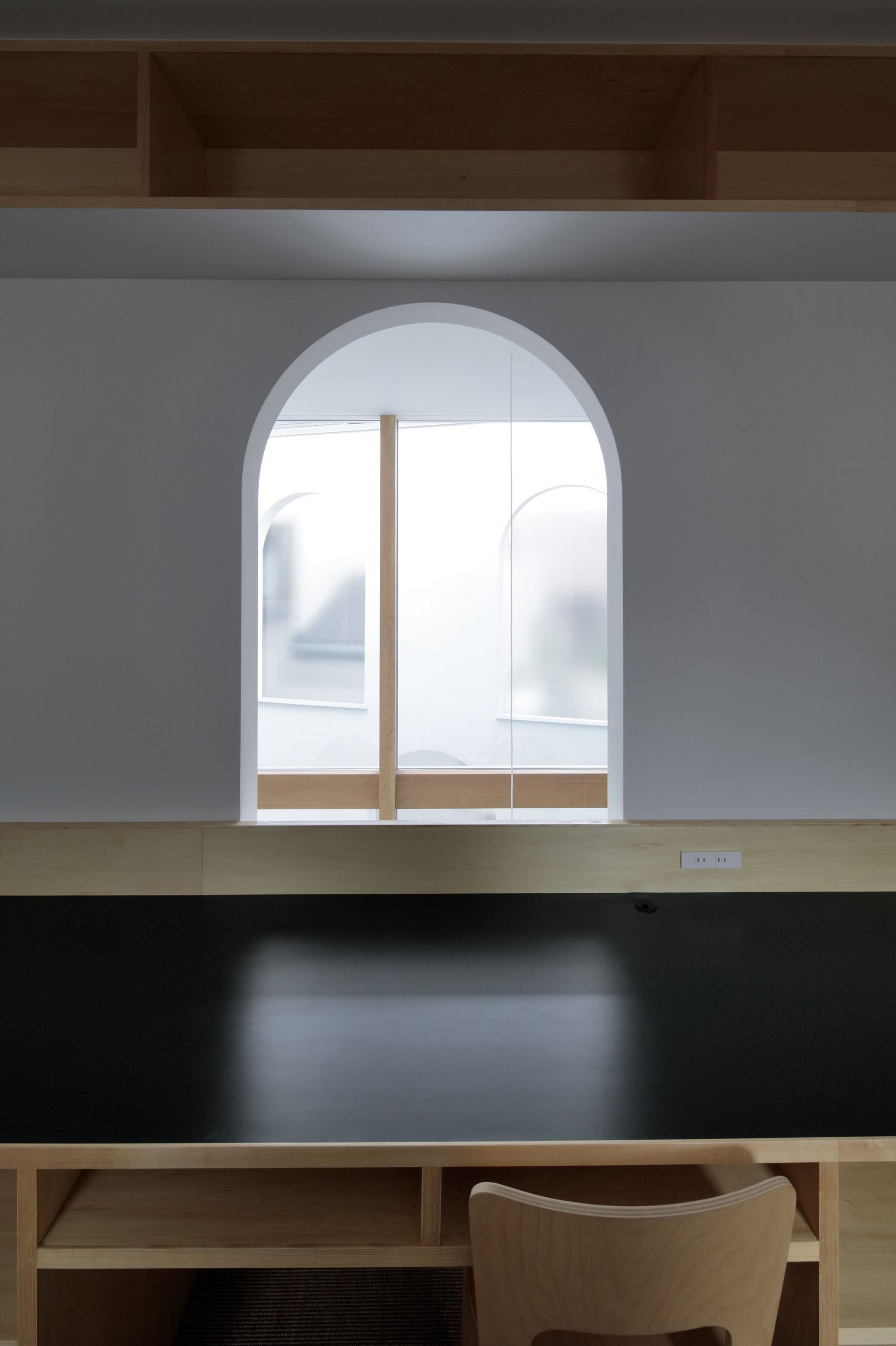
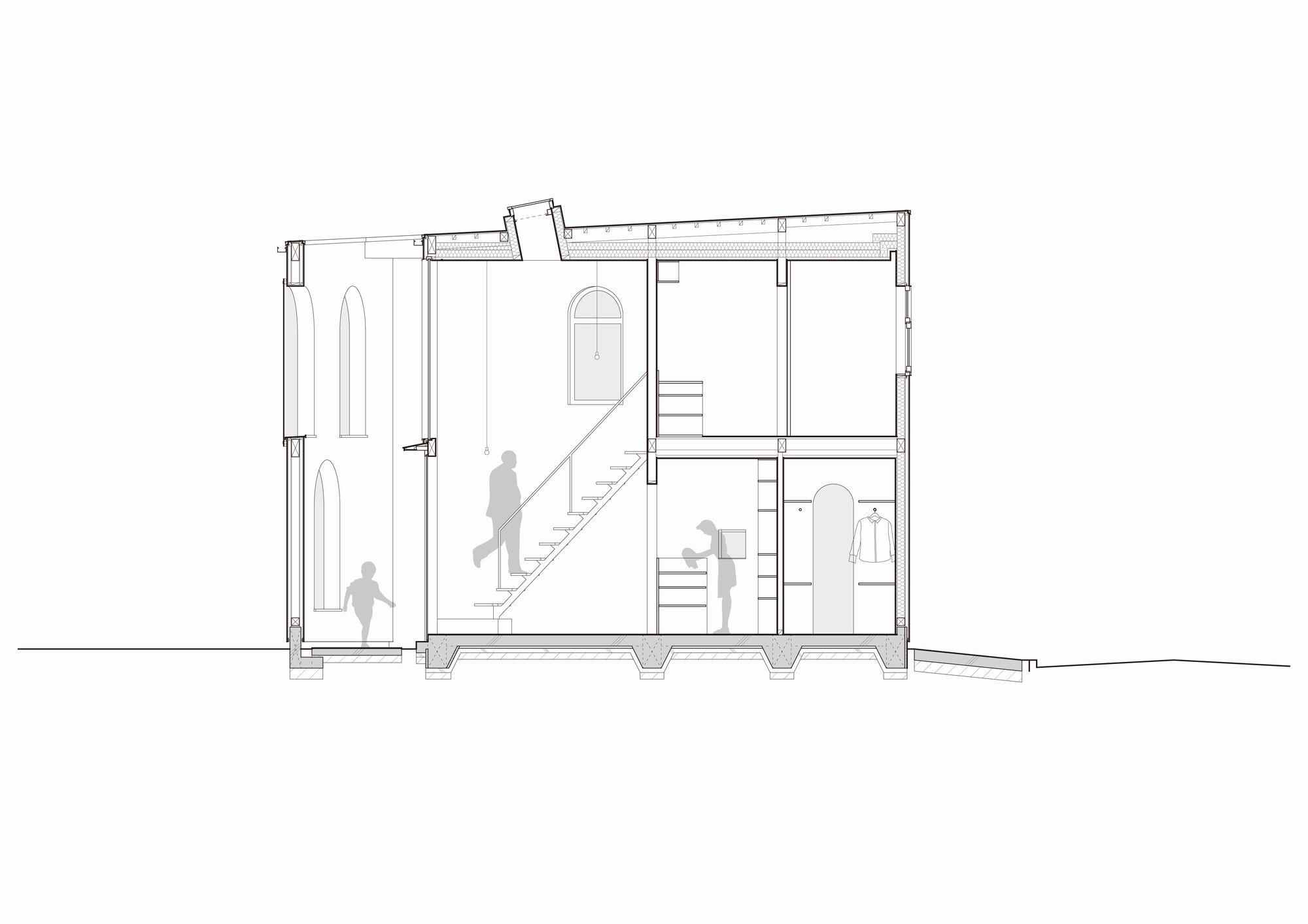
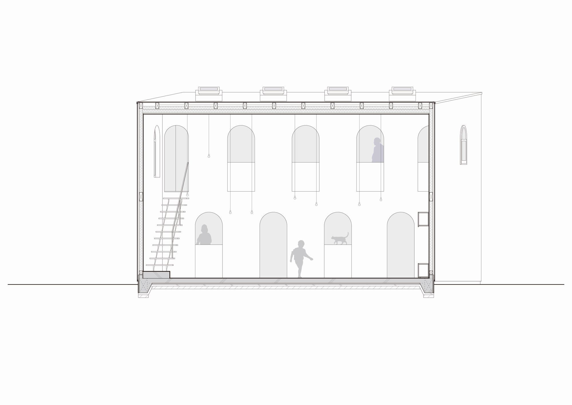
All windows, doors and frames, and other openings are arch-shaped, not squared, intentionally out of alignment with the everyday landscape and industry standards. As with Japanese igloos and caves from ancient times, an arch shape functions as an opening that vaguely connects inside and outside.
A series of arch-shaped openings arranged in various locations both inside and outside of the house blur boundaries between inside and outside, the open-style living and dining space and the backyard, and between the rooms, thereby creating diverse flows of light, air, people, and vibes whilst broadening the view and the interior space as if walking in a town.
By aligning out-of-alignment “parallelograms and arch-shaped openings,” the house successfully overcomes the environmental restrictions posed by the location – a house in a densely residential area – and makes my client’s wish list come true; securing privacy in a cozy, open house with lots of light and fresh air passing through.
In designing the House in Asaka under the theme of “Alignment and Out-of-Alignment,” I wanted to showcase my way of delivering a cozy, open, and airy feeling to a closed house.
Project Info:
Architects: Toshihiro Aso Design Office
Location: ASAKA, JAPAN
Area: 90 m²
Project Year: 2017
Photographs: Koichi Torimura
Manufacturers: Aica
Project Name: House in Asaka
