Tongzhou SINLOON Canal Creative District
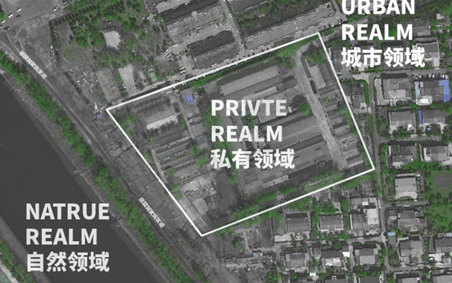
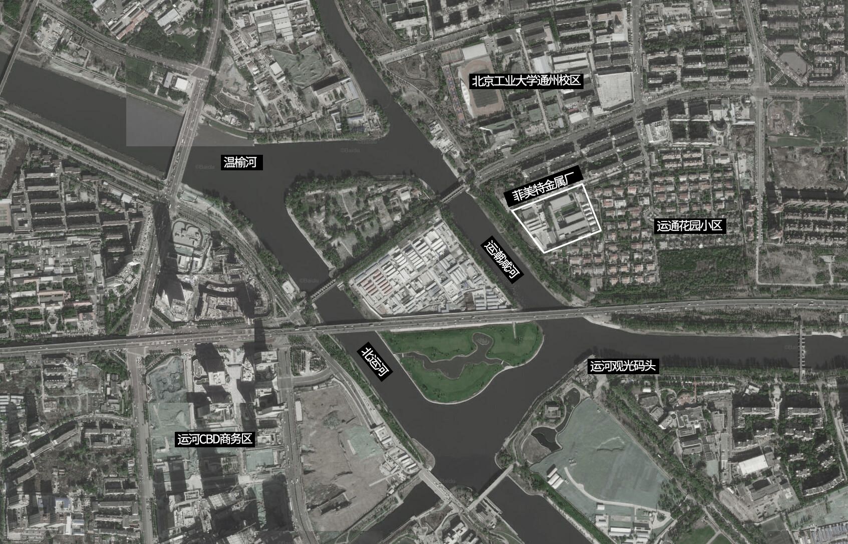
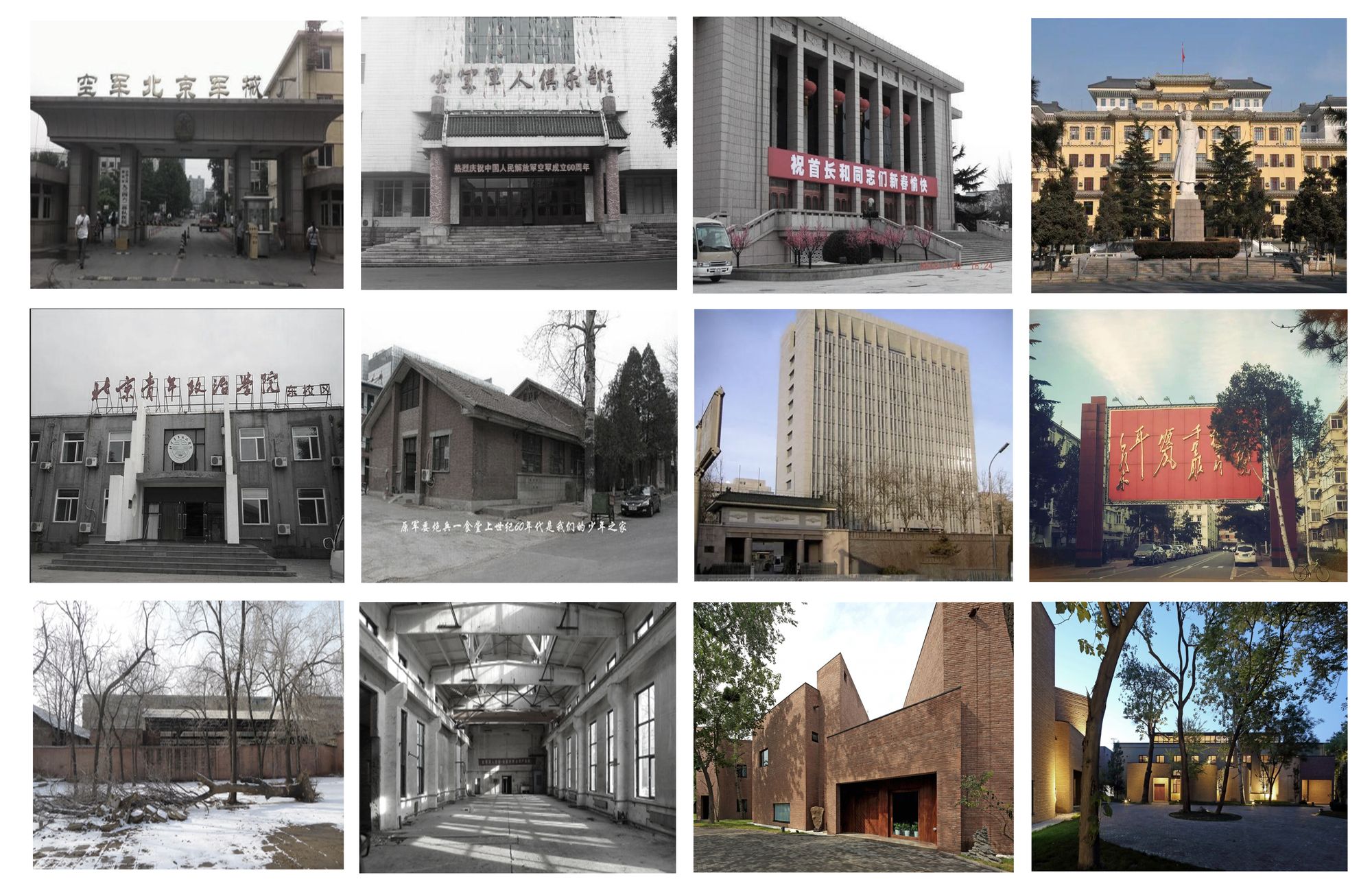
Restrictions and great opportunities – opening a 30 years old compound in Tongzhou CBD. The project is based in North gate, Tongzhou. Tongzhou is a typically urbanized, yet low-density area with suburban texture, this area not only has a complex social system but also has a unique, independent natural atmosphere surrounding it. Our base formerly known as Fimet Metal Fabrication is located at this geographical point that it looks out across the river from the Tongzhou Canal CBD. But our bases are less accessible, submerged in a residential area.
Photography by © Zhi Xia
The owner gave us only two design principles. Firstly, due to the restrictions of the property rights, all building renovations had to follow the outline of the original old building and no changes in location were allowed. Secondly, the site needs to be transformed into a high-end and unique office park. Apart from these two clear design principles, the rest of the design was left to us. This gave us a great deal of design freedom to create the miniature ‘Puro City’ that we wanted to create.
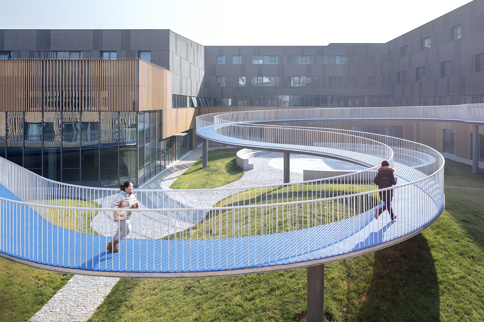
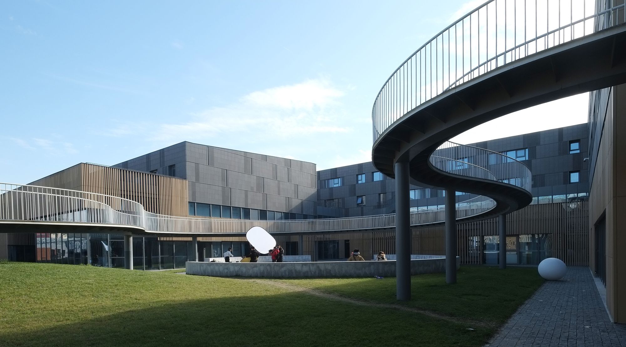
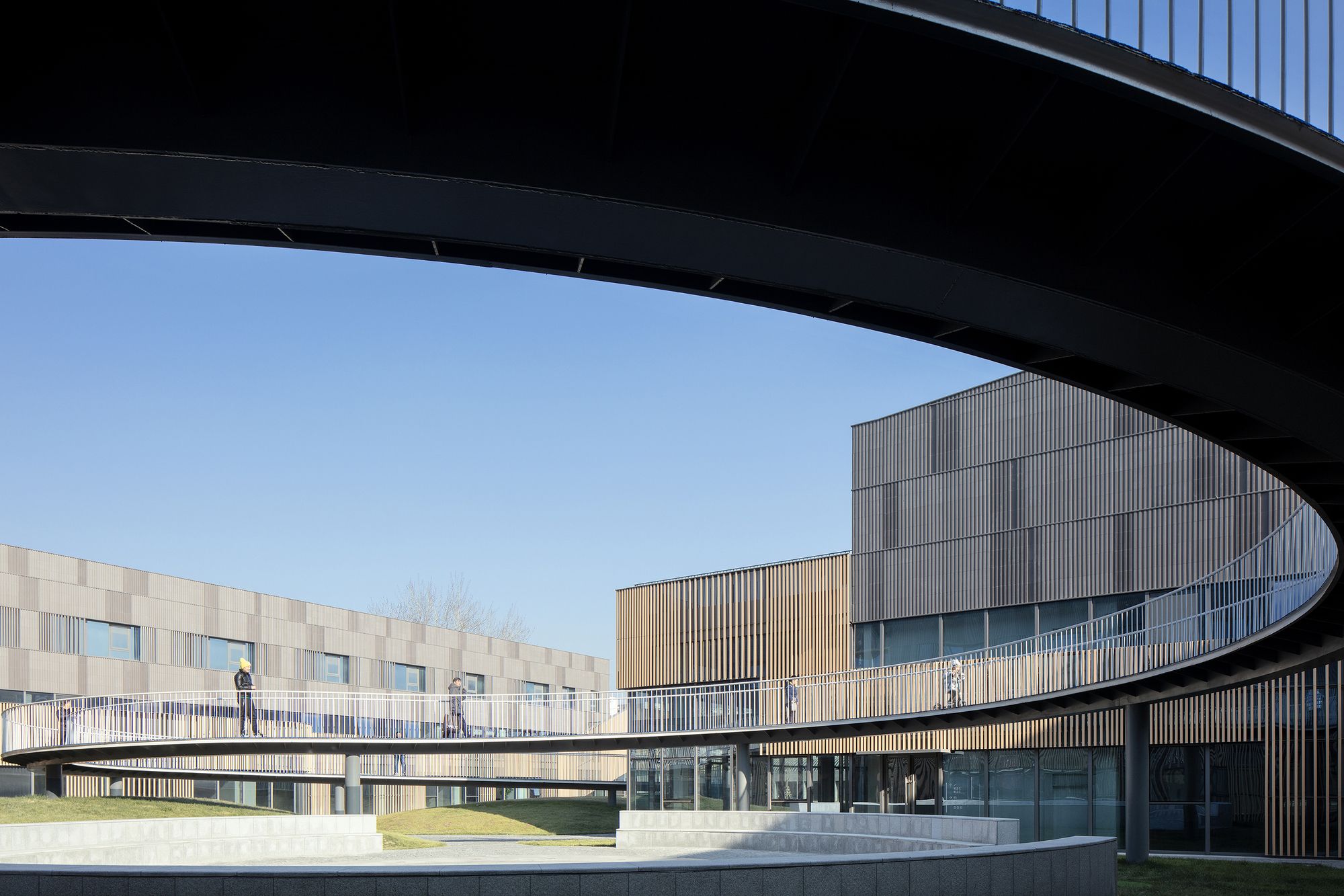
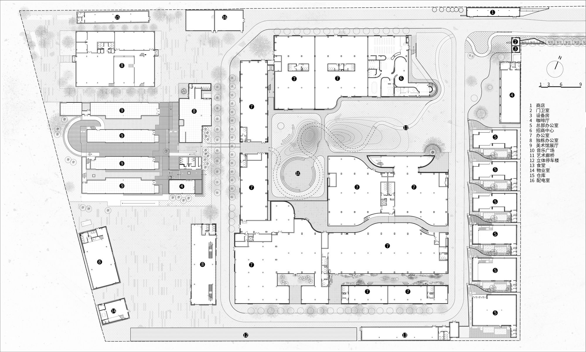
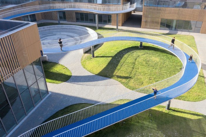
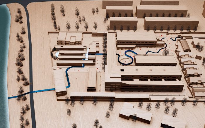
City Bridge – an important core to open the public of the park. The new office park cannot remove the walls and gates. If we can regard the park as an intermediate area from the residential area to the riverbank, rather than an independent site, then it can be better identified as an integral part of the city, thus mending the urban fabric.

Photography by © Zhi Xia
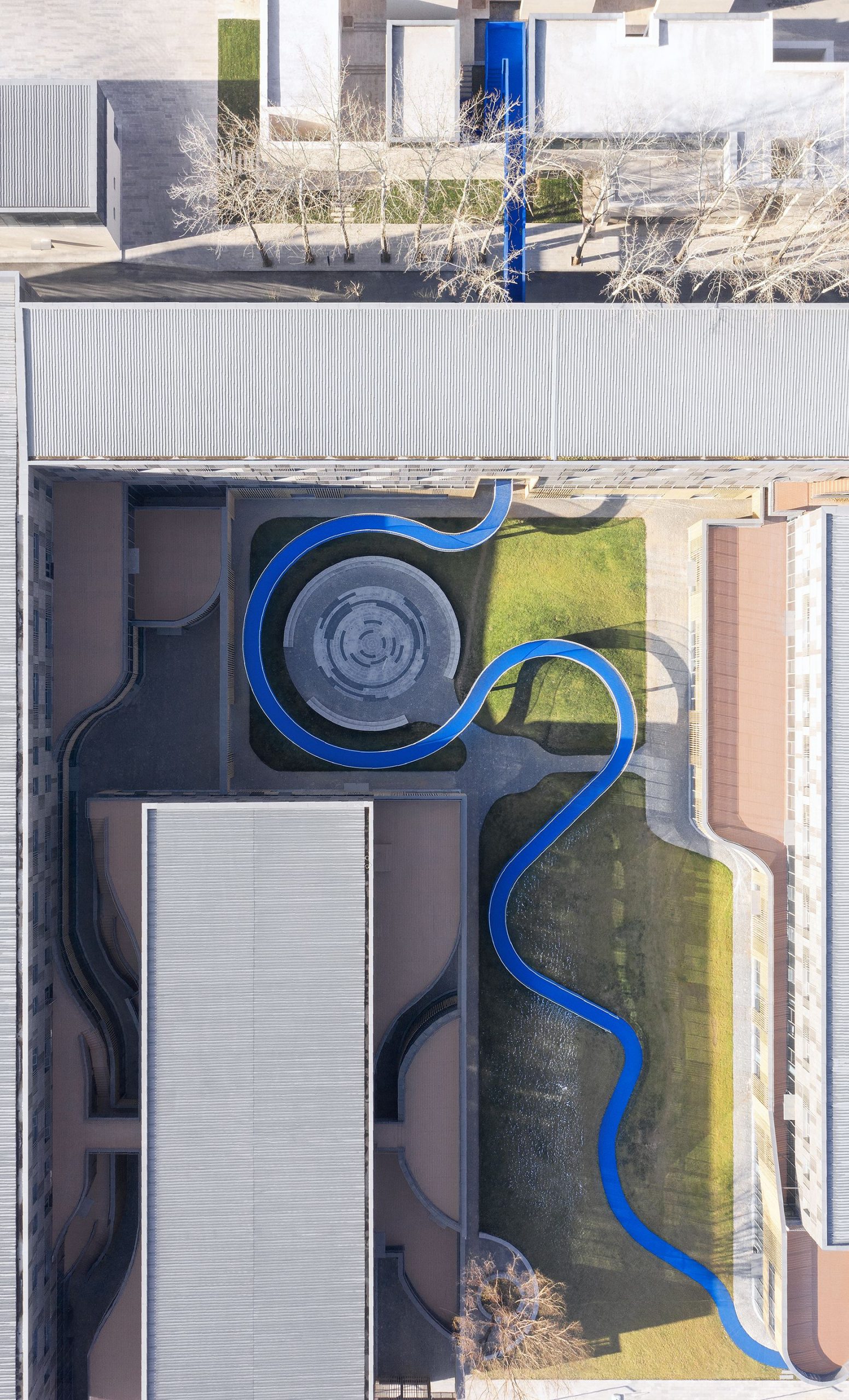
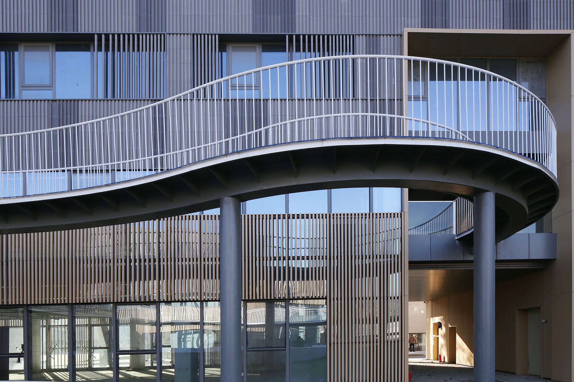
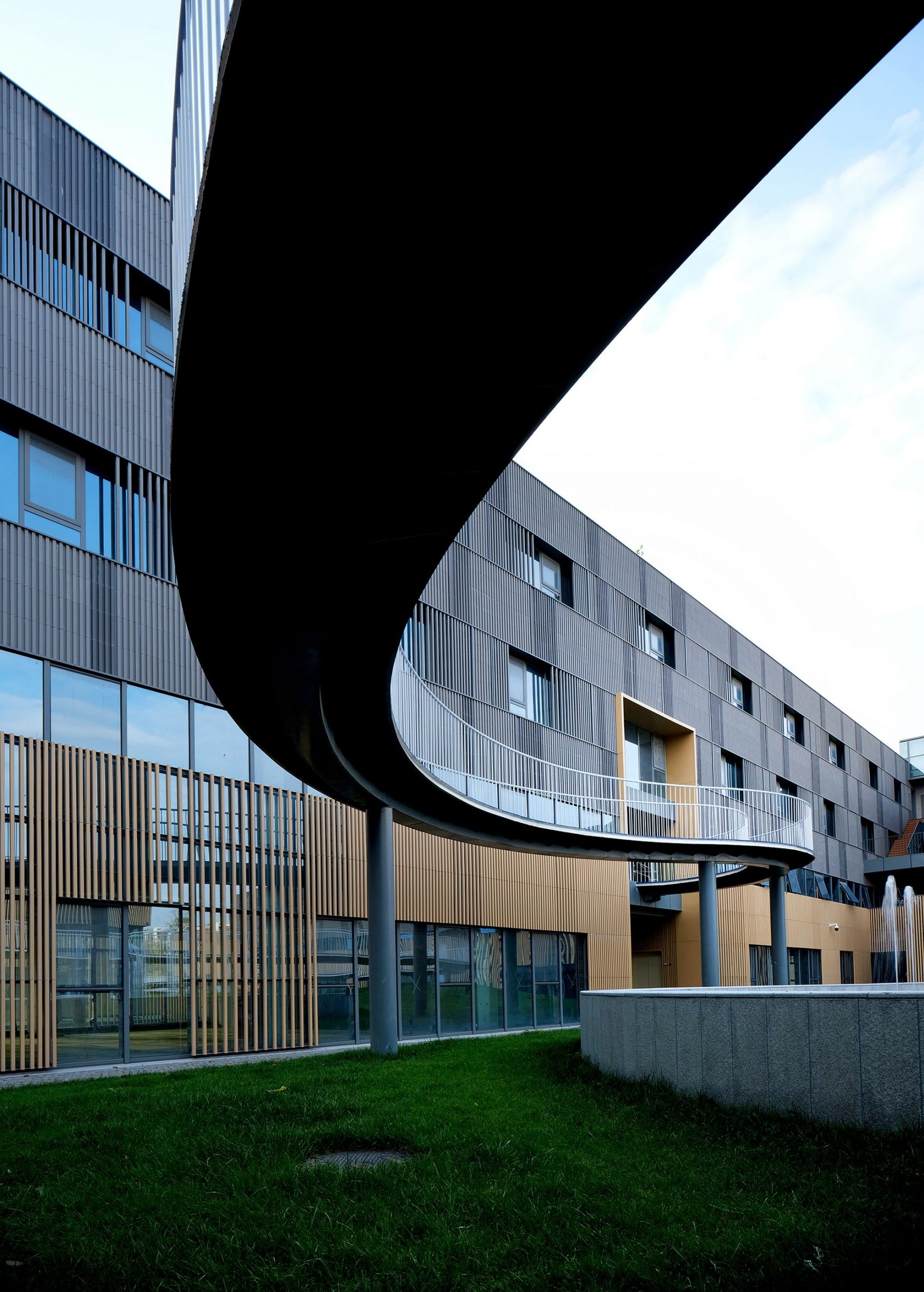
Finally, reach the spiritual publicity. By designing an urban bridge through the park and connecting the entrance to the park near the residential area with the entrance on the canal bank, the bridge is recognized as a public system of the city. The effect of this is that the whole park becomes a background to the bridge, a transitional space between the natural and the artificial in the city.
The park becomes a natural urban place that naturally dispels the negative effect of closure. The bridge itself becomes a work of landscape art. This two-way identification creates an interesting relationship. Through this strategic and lightweight landscape intervention, an action achieves what we expect to achieve the urbanity that it didn’t have before, and achieves the true meaning of urban renewal.
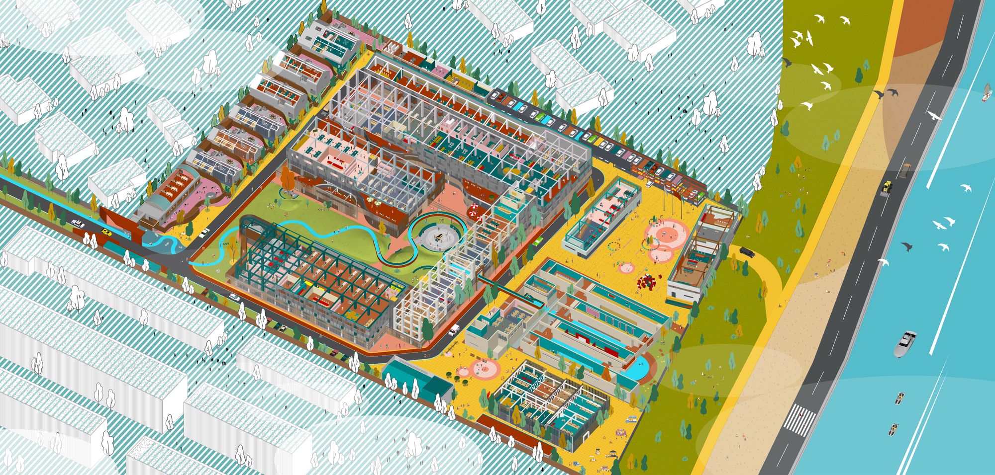
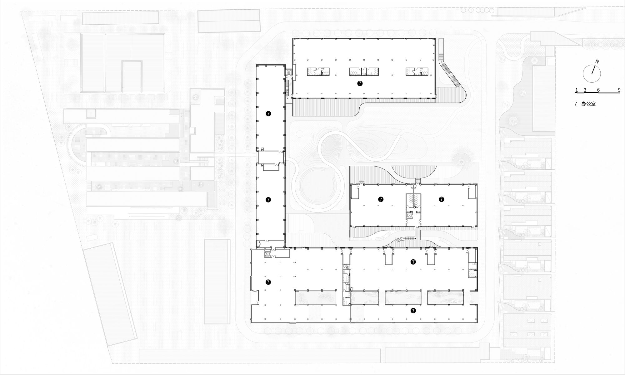
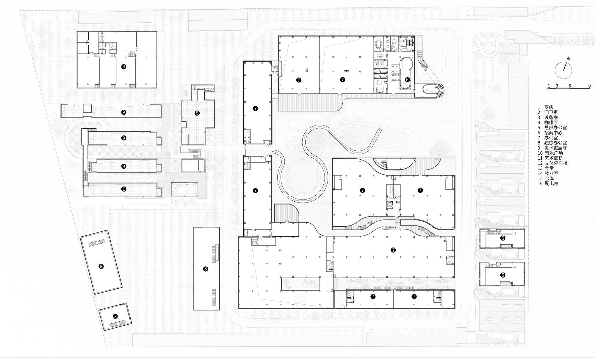
Reverse planning from dramatic “monolithic design” to an “Office aggregation of urban scenes.” We tried to abandon the traditional top-down overall planning, started from each individual or group in reverse, and gave the most suitable design for each functional area.
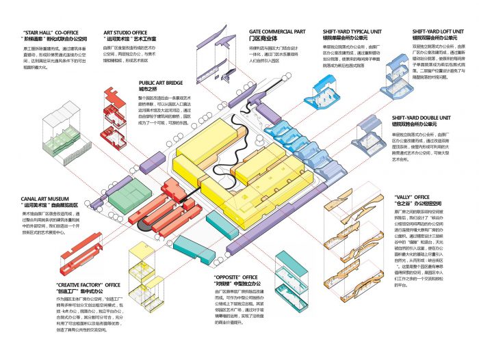
Urban Scene Office Collection. Image Courtesy of officePROJECT
Finally, we converged them into a unique park naturally. Based on this concept, we gave different names to these colorful office models, such as “Scattered Courtyard & Socket Home”, “Store·Valley·Court”, “An Art Gallery without a Gate”, “Step Headquarters” and so on. Through these natural assemblages, the whole office space of urbanization is formed, gradually simulating real urban life.
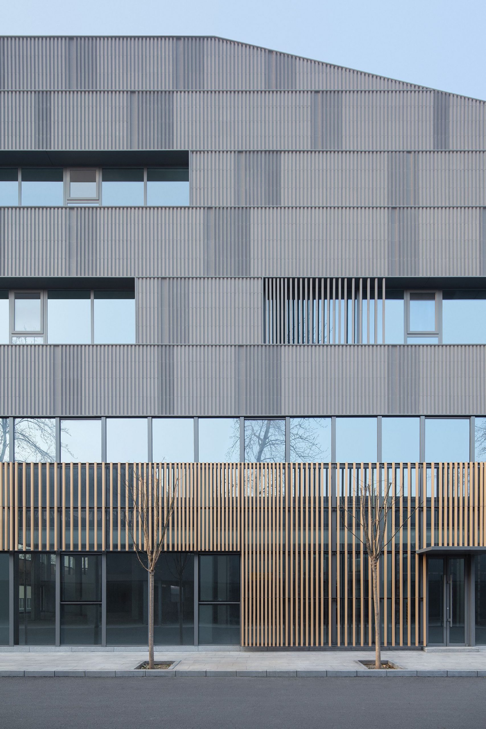
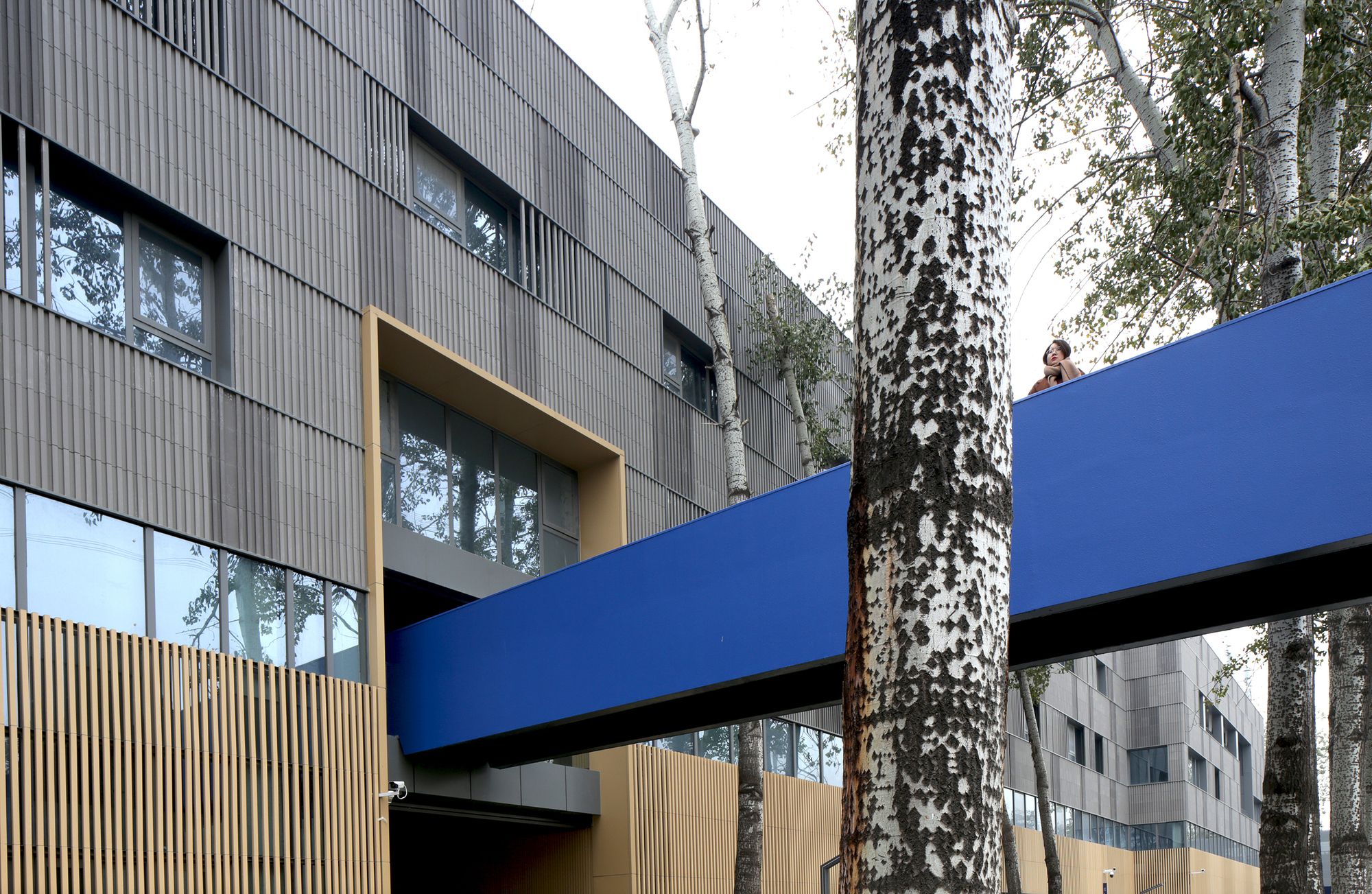
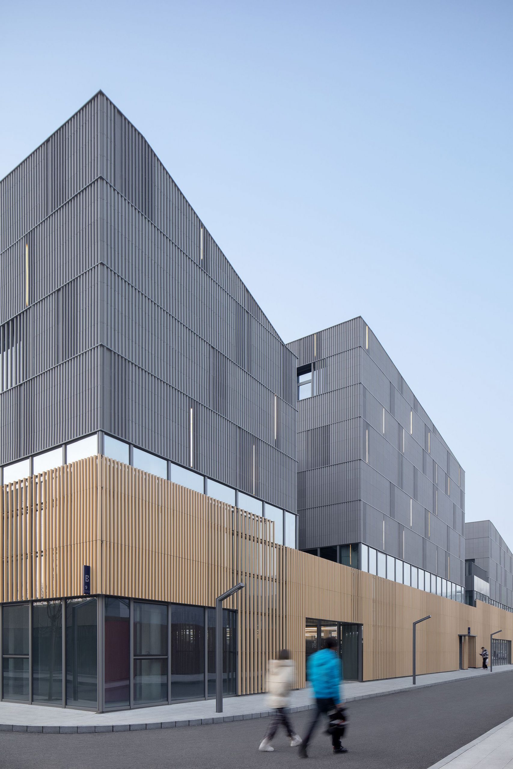
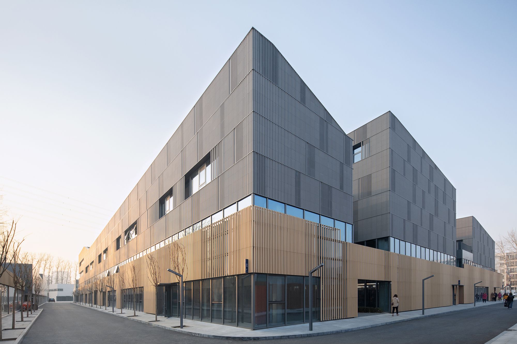
Central District “Store. Valley. Court” design – From disused workshop to popular office. Throughout the campus buildings, we have adopted a fading strategy for Area B because the central area needs to have a volume of offices, but we expect the offices to be garden-like rather than boring workshops. The façade is not only varied but not overwhelming, by covering it with a harmonious and different ceramic panel. The office barn façade is divided into three sections.
Photography by © Zhi Xia
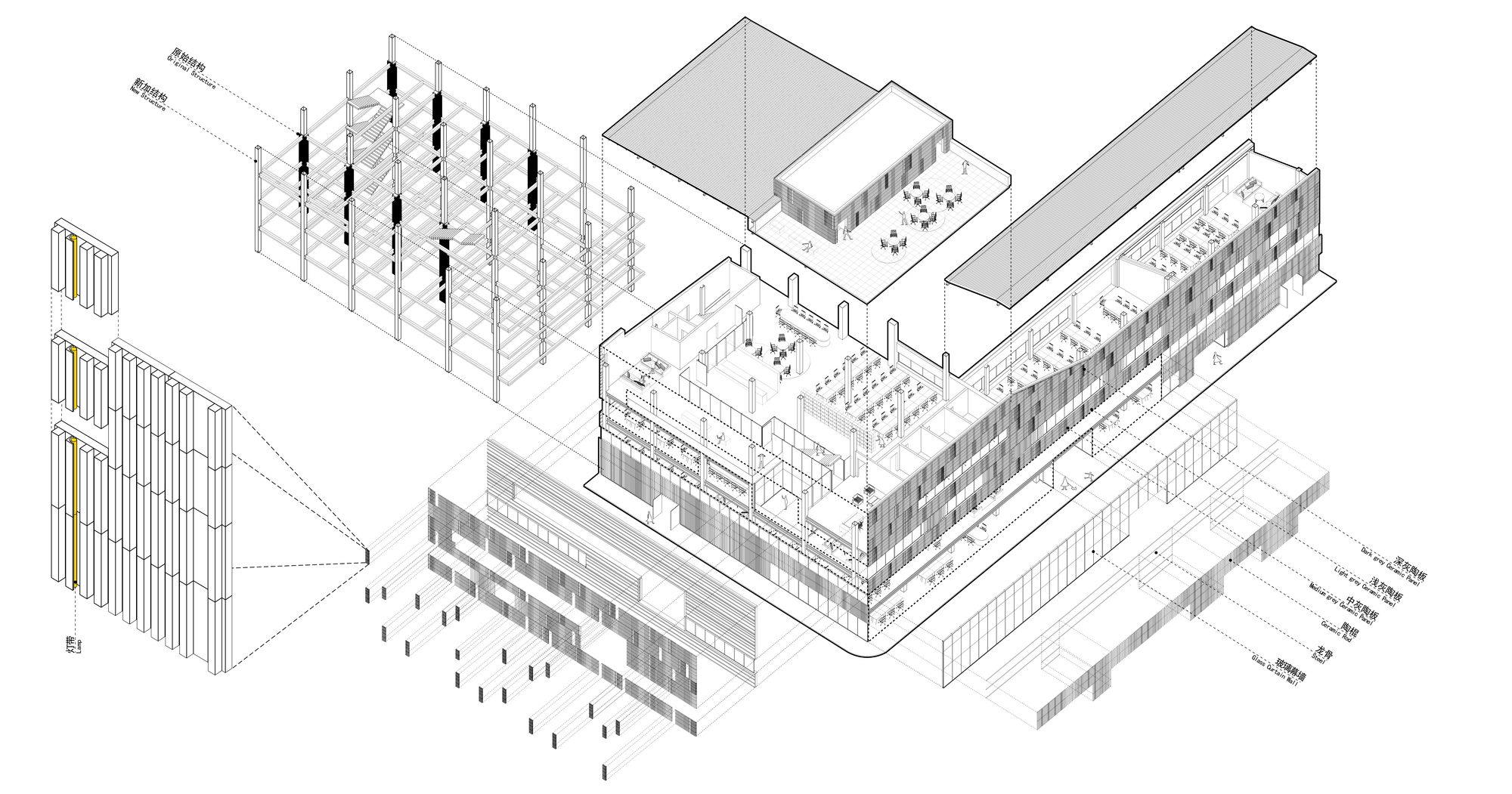
The first section is connected to the street, which uses a yellow ceramic stick grille, with glass windows in the middle section and gray ceramic panels in the upper section. This design keeps the building at a reasonable scale and dissolves the oppressiveness of large buildings on the street. The upper terracotta slab is a complex but unified texture created by the combination of four different bespoke units and three shades of gray.
The light design is integrated into the material design by means of customized hidden light slots in each panel, creating a high level and rhythmic light drainage bin effect. Whenever the surrounding tree shadows hit the façade, the façade presents a unique and delicate pixel texture.
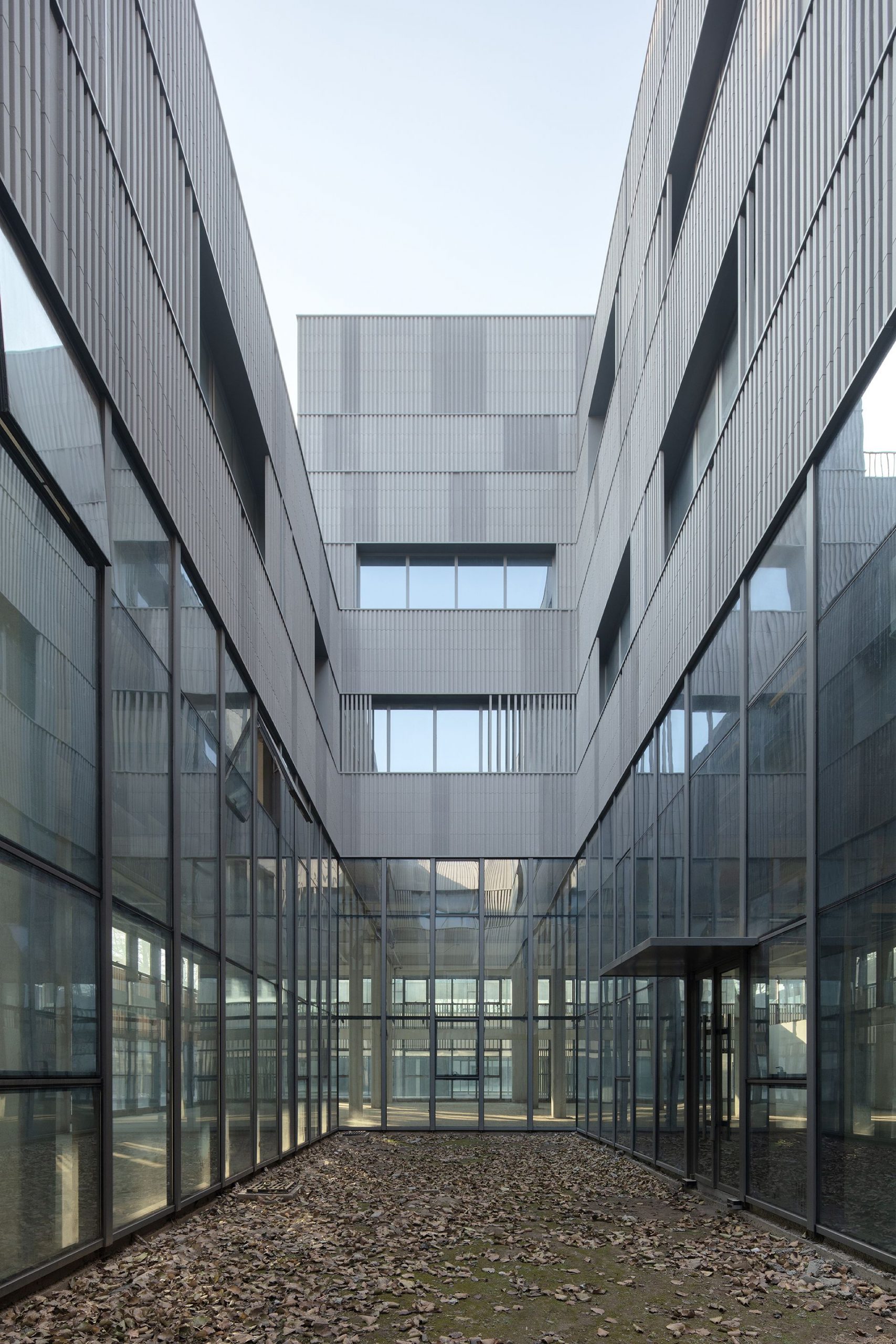
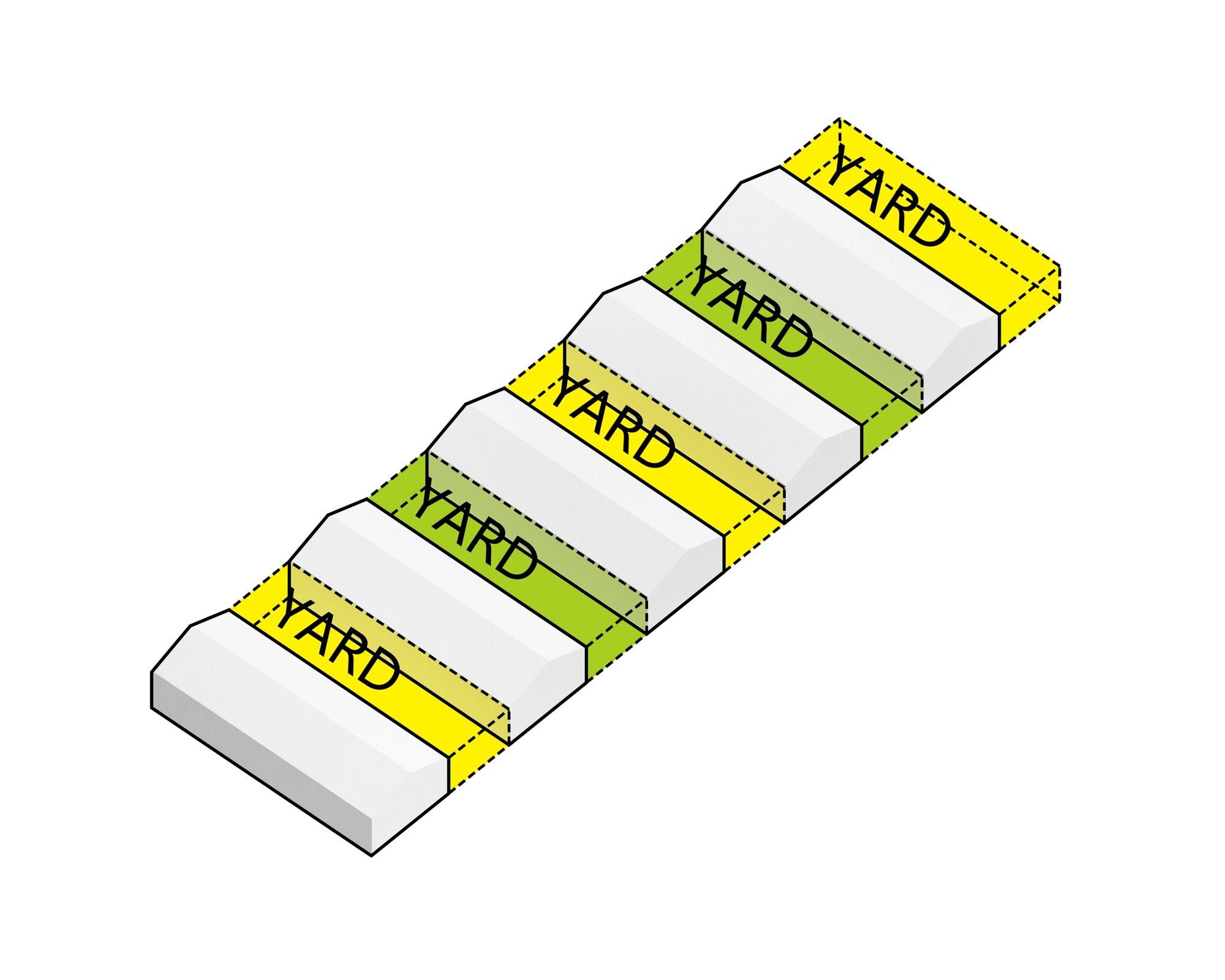
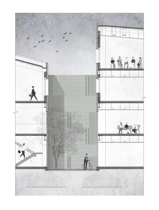
Between the main buildings in the central area, there were many problems dealing with the transitional space. We should not only maintain their original outline but also solve the lighting problem of long and deep sides of the building. So we designed the embankment in the barn. The valley-like neighborhood offers multiple levels of intimate terraces where people can walk on the terraces and communicate with each other at the same time. In this way, the worst areas of the building are turned into the most active areas, increasing the experience of the park greatly.
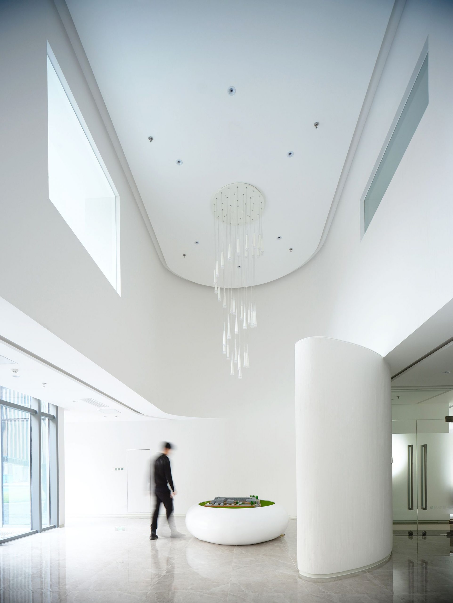
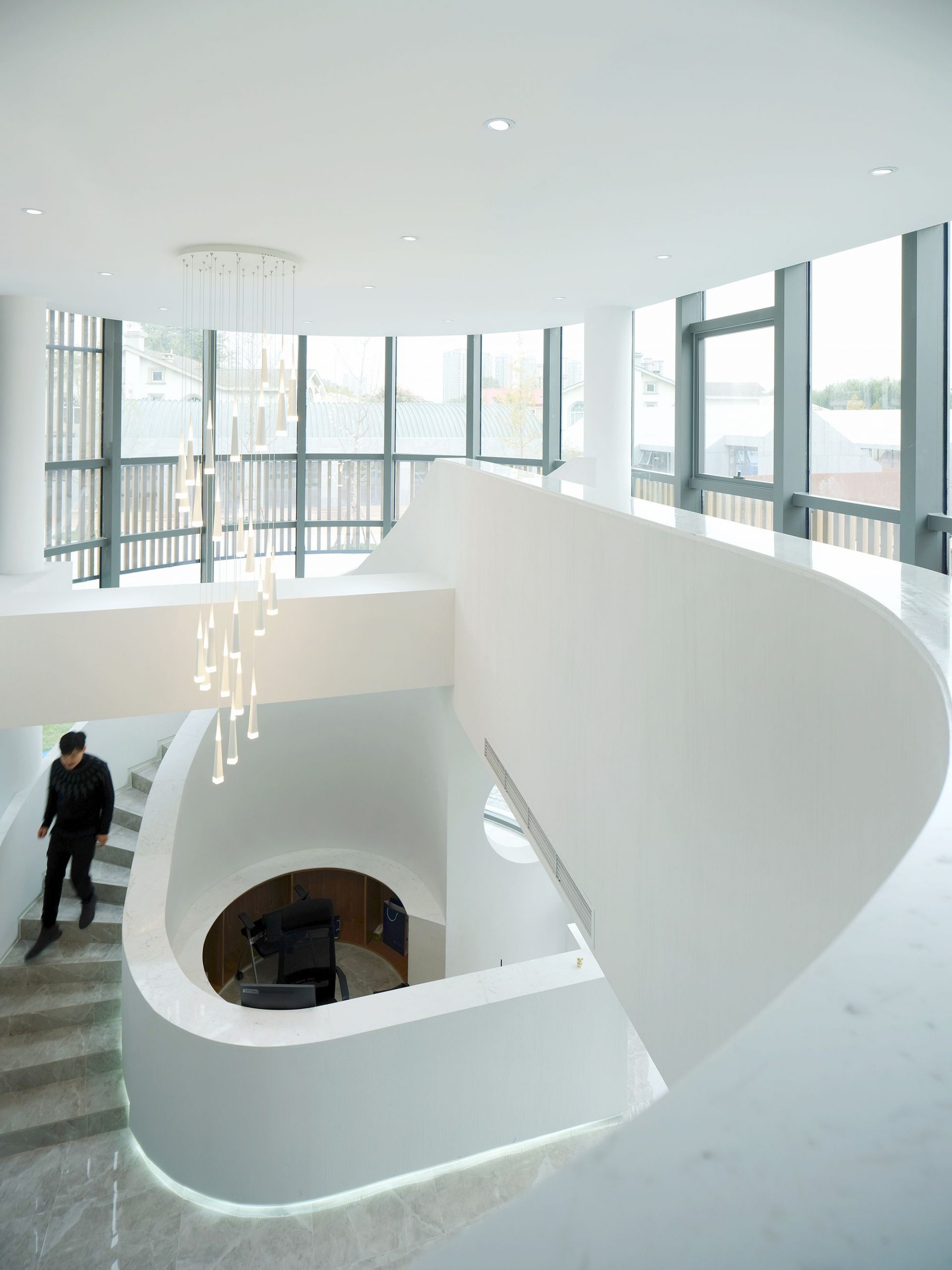
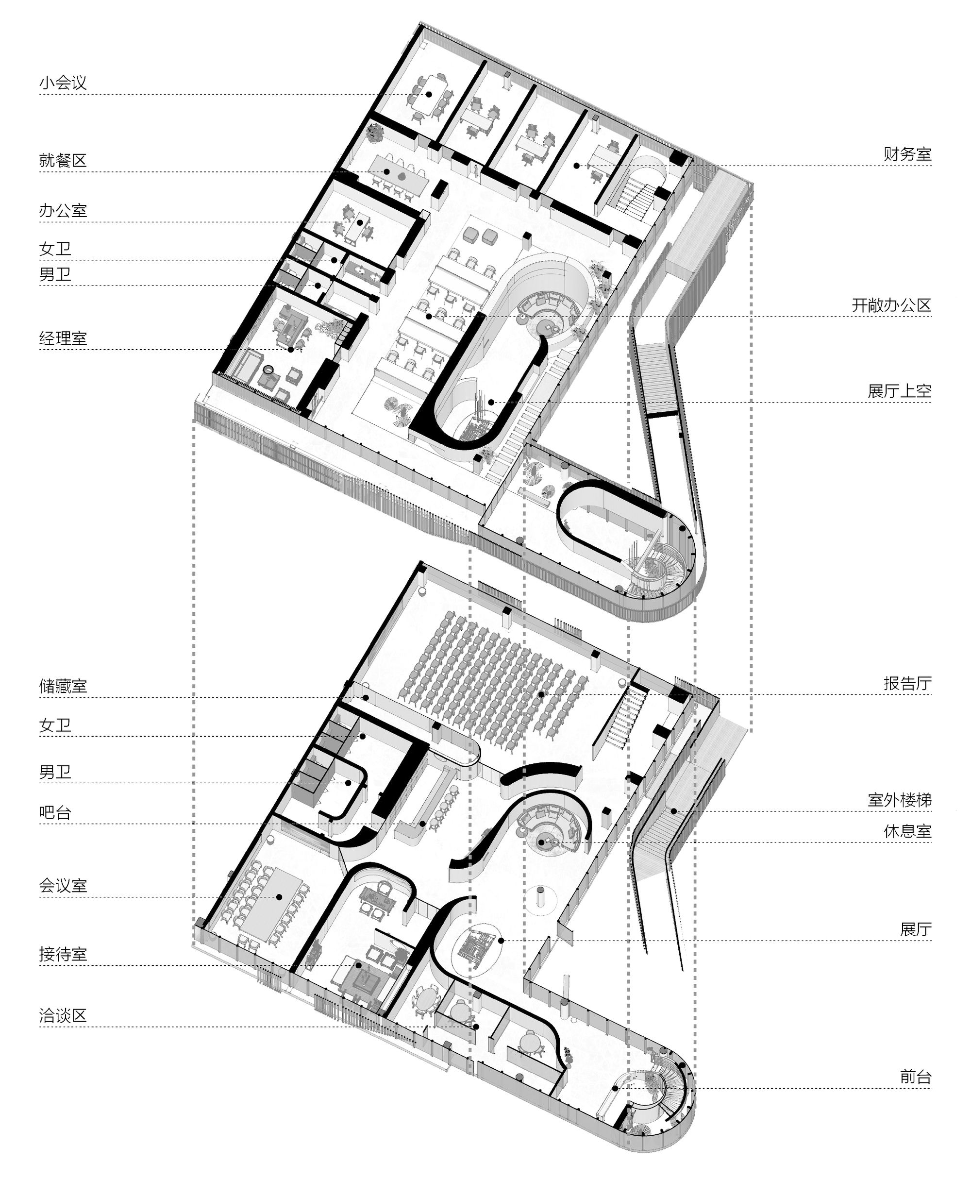
Design of the core space, the “Court of Wraps” – the engine inside the office barn. As the showcase and sales office for the whole campus, we have developed a detailed interior design for the “Court of Wraps”. A white curved wall wraps around the space, separating and integrating the exhibition space in the office space.
At the same time, it will be served as a public communication platform for the park in the future, with its atrium and lecture hall hosting various events for the resident companies. “Wrapped Garden” is also a further enhanced design of”Store.Valley.Court”. This tall duplex space of the whole central area offers a type of spatial experience.
Photography by © Zhi Xia
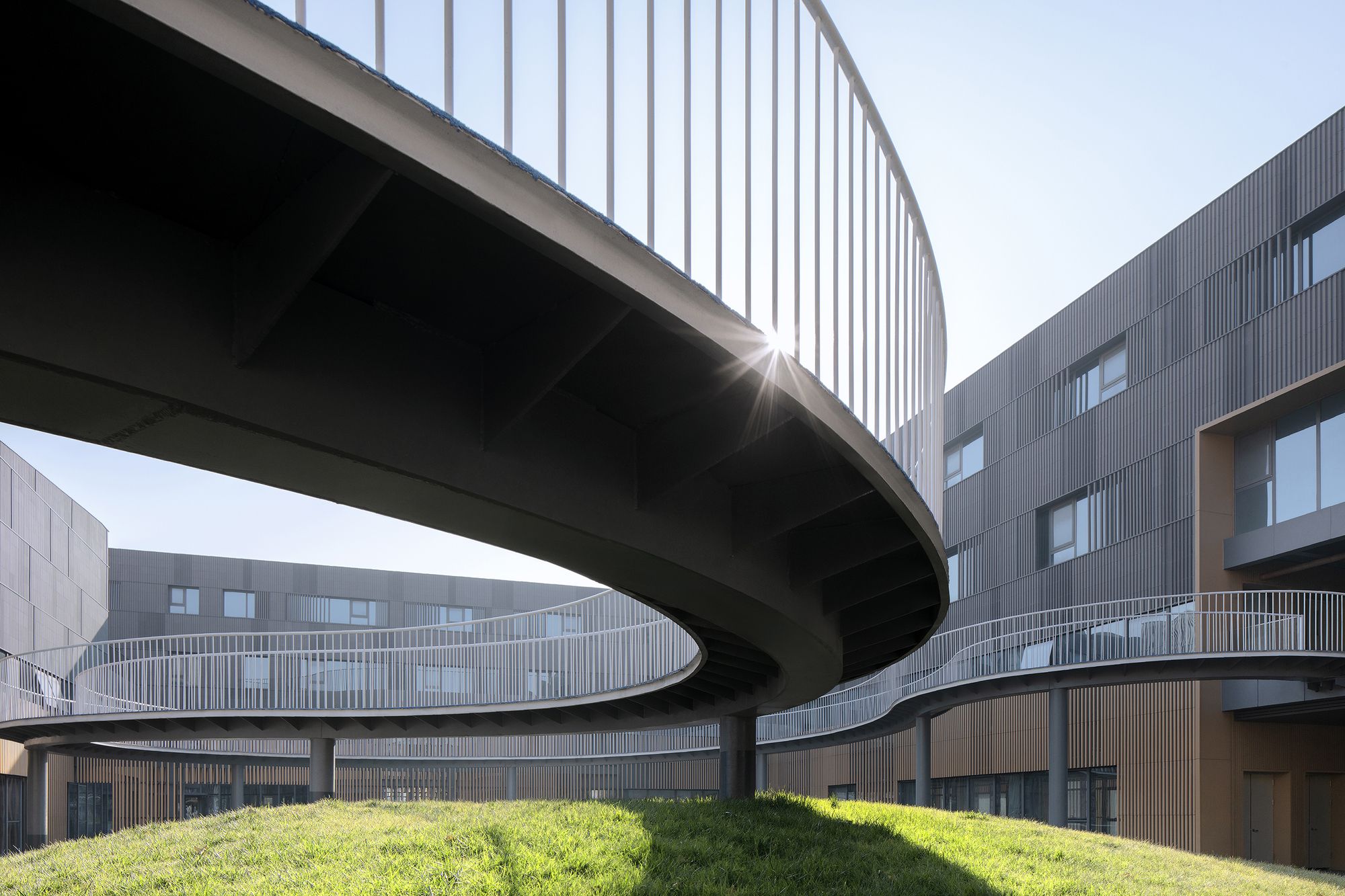
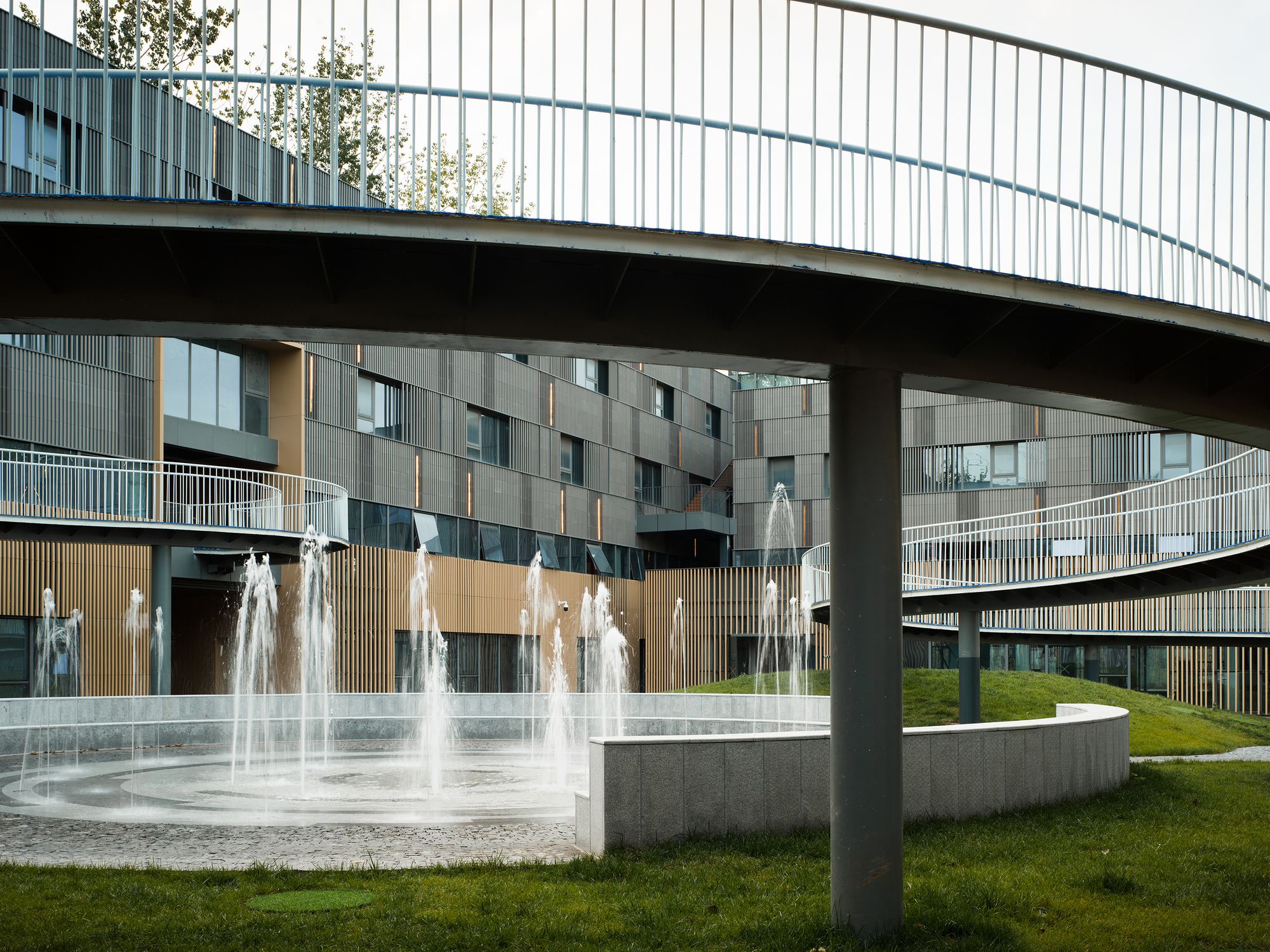
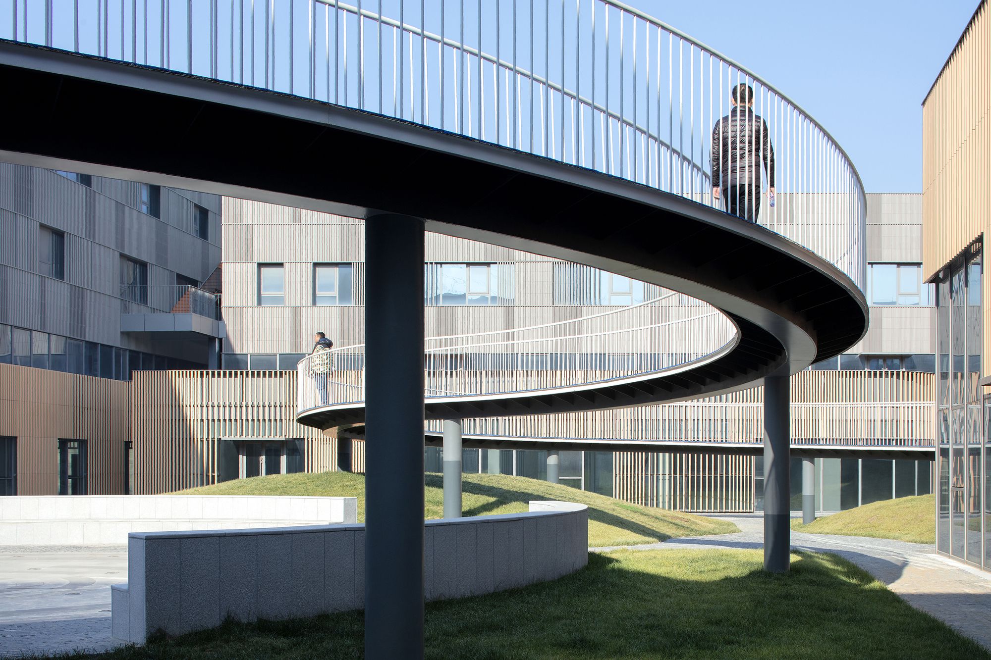
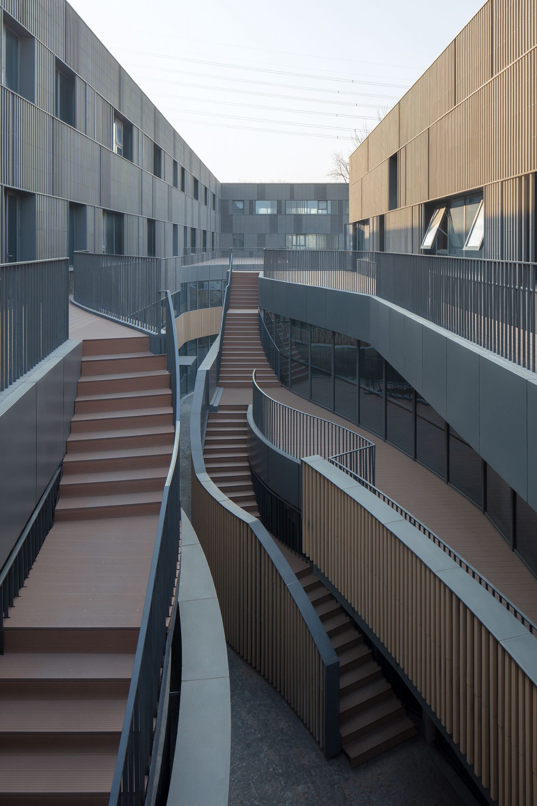
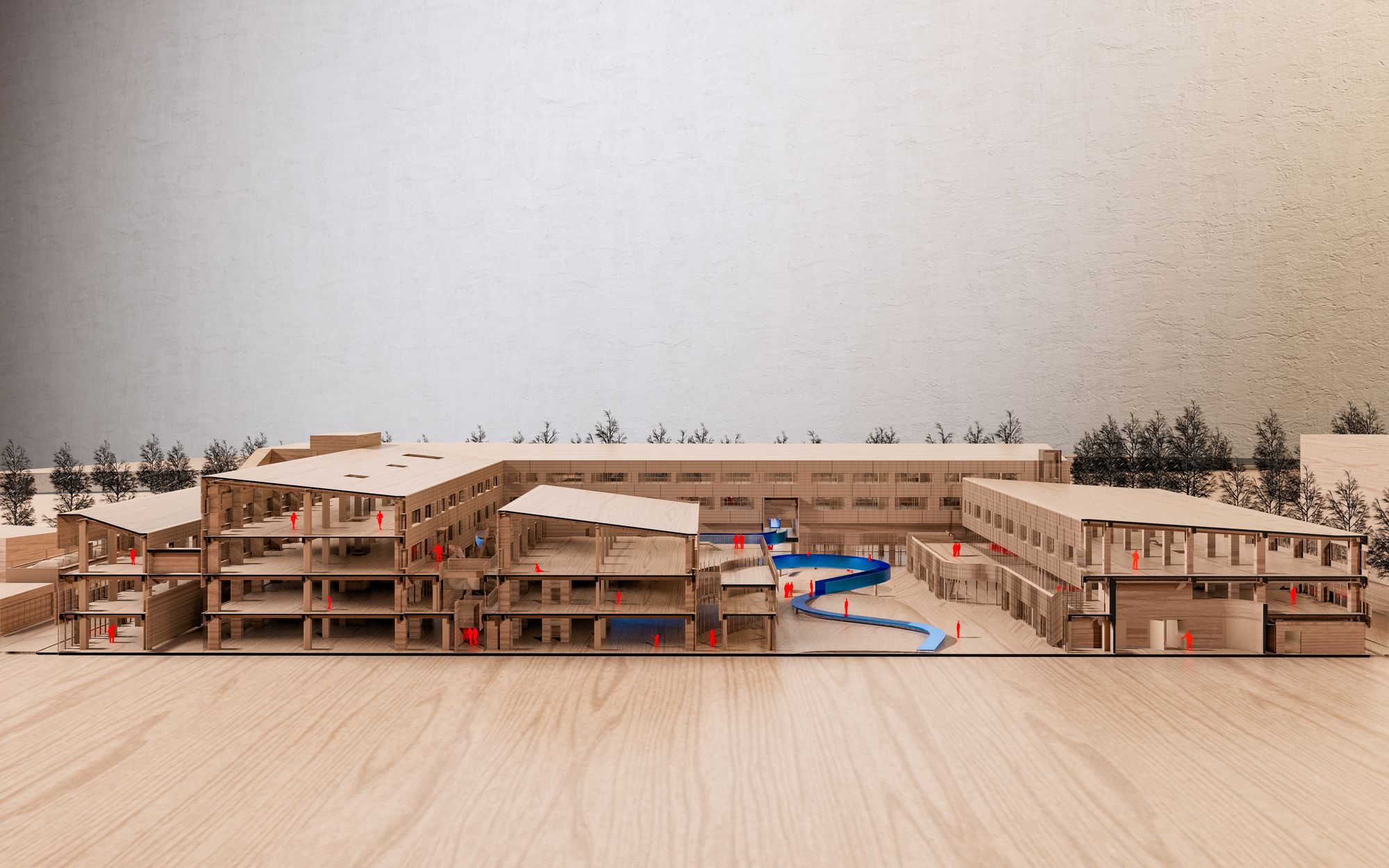
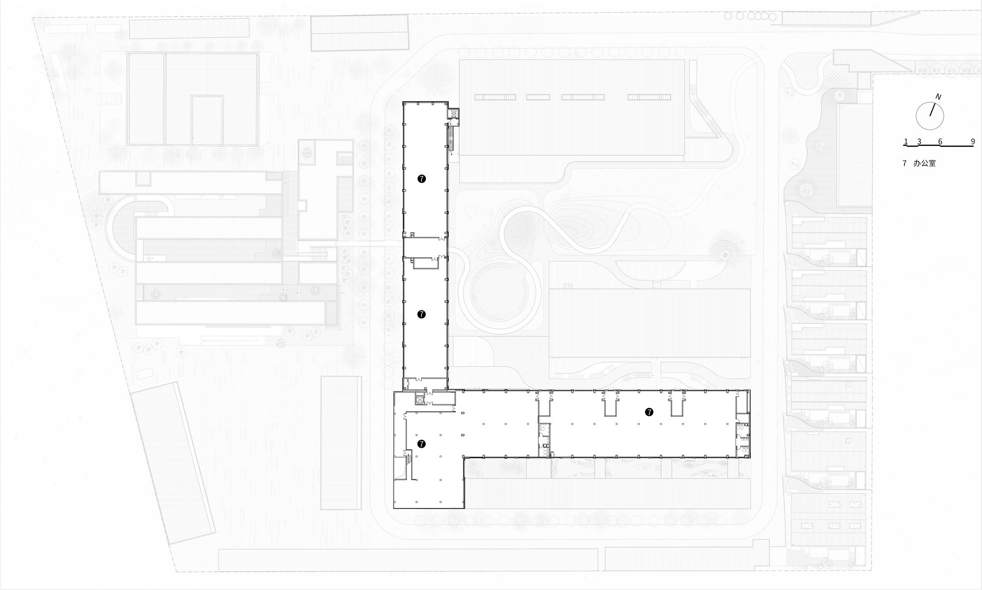
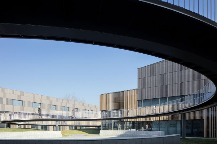
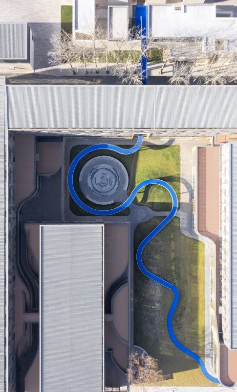
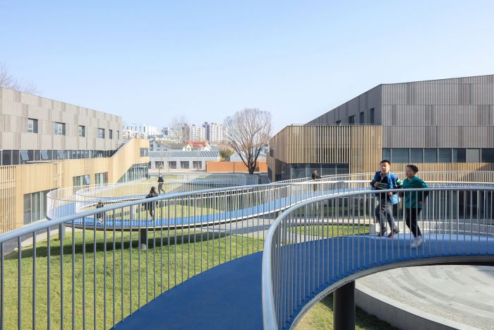
“Bridge of Courts” Landscape Design – A Bridge of Communication and a Harbour of Fun. Through the intervention of the urban bridge, the courtyard within the park is completely activated and the negative space becomes the central landscape of the park. The urban bridge circles up through the courtyard, from the grass at ground floor level and eventually through the first floor of the B area to the gallery. A large S-shape is formed in the inner courtyard and encloses a small fountain square.
The undulating ground and aerial bridges together form an enclosed activity space. People move between the two spaces as if it were no longer an office park, but a park. People walk unconsciously on the connecting bridge, passing buildings as if they were walking on clouds.
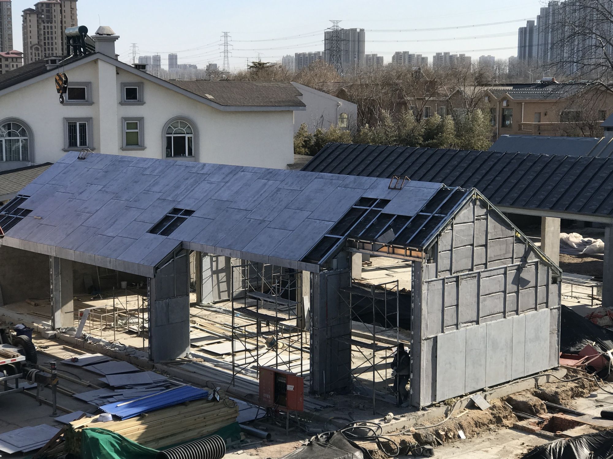
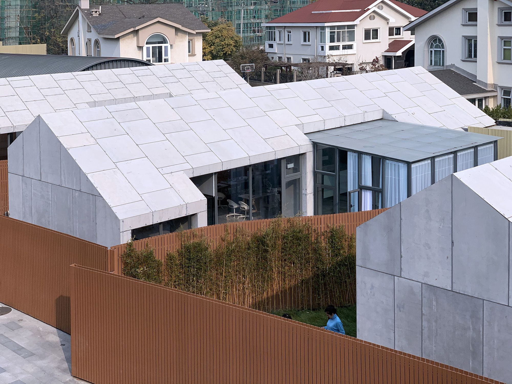
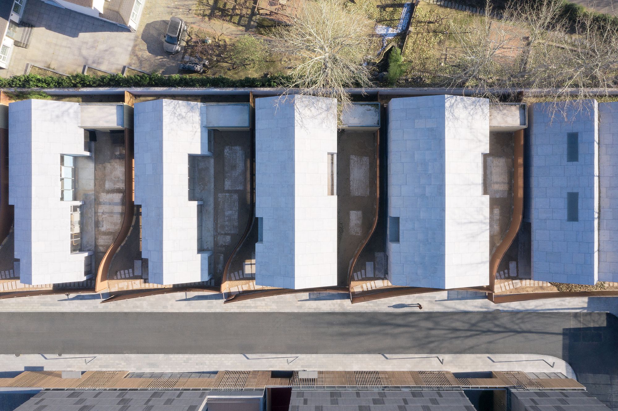
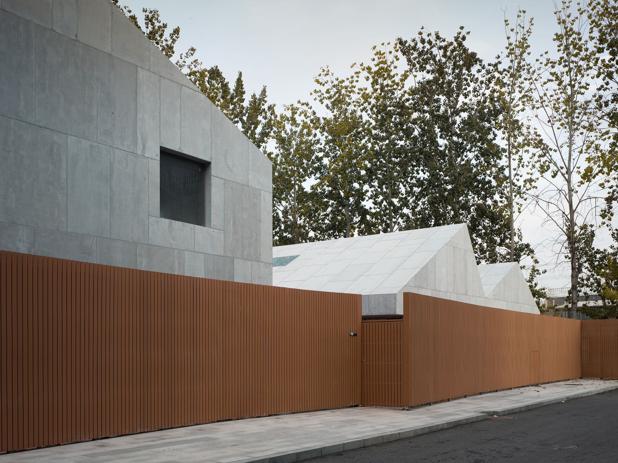
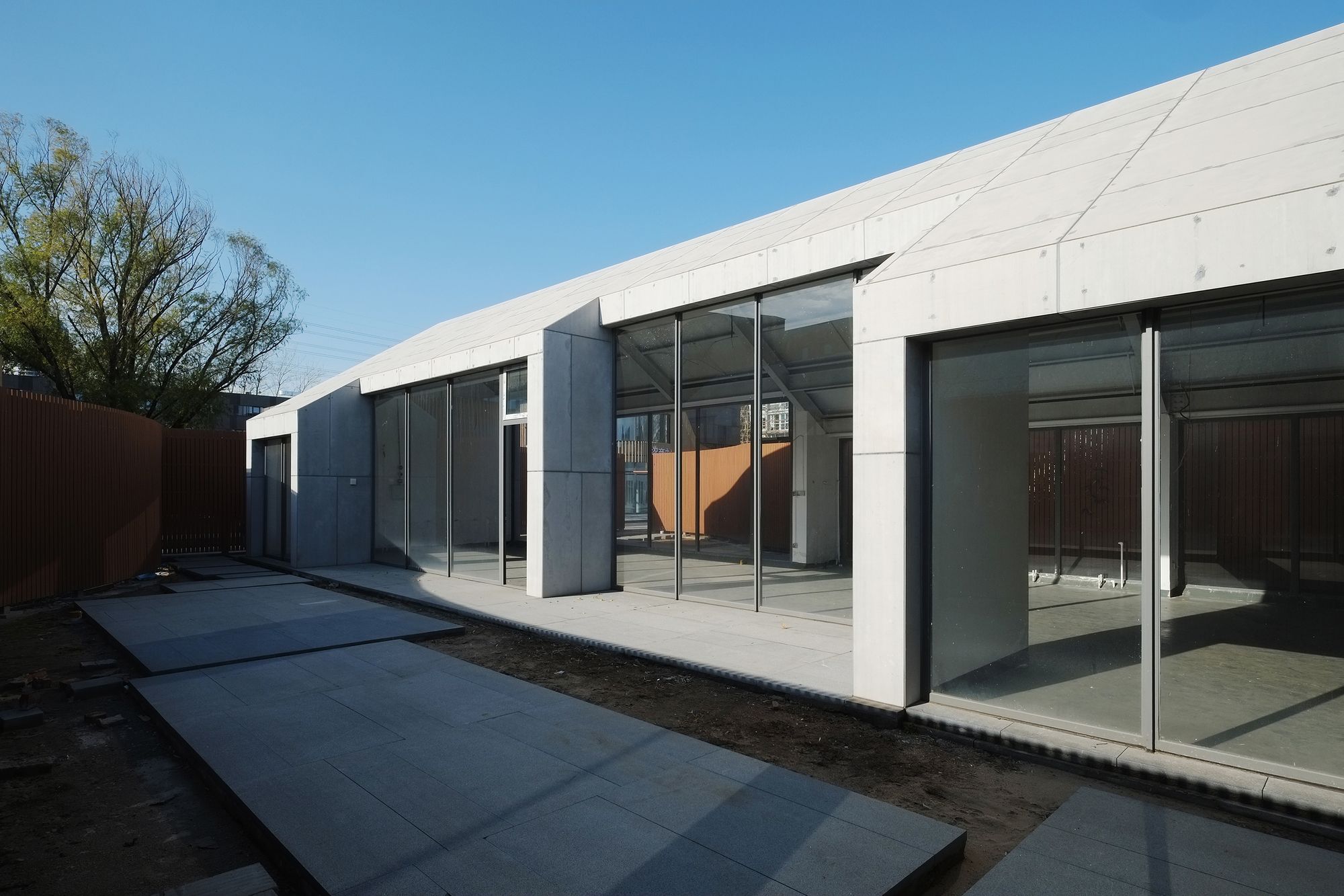
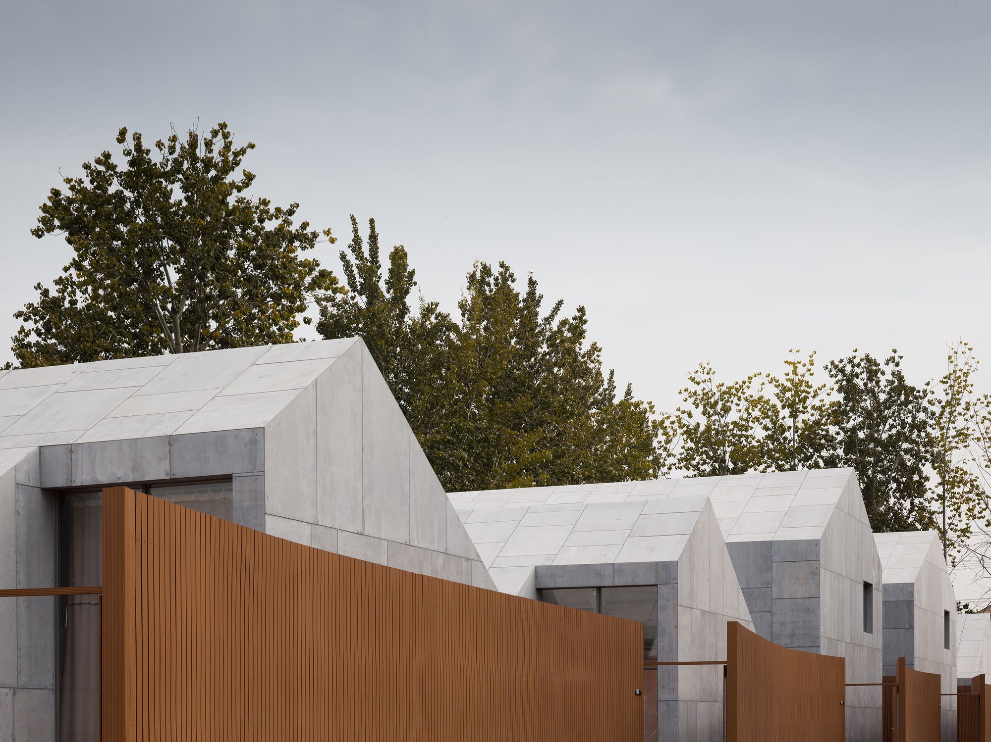
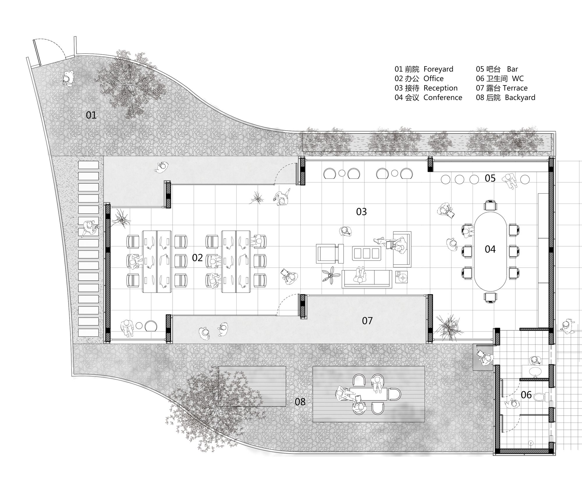
The northern part of the park was originally a group of old bungalows with a courtyard. The outdated pattern made it difficult to create a more spacious level and feel. So we have redrawn the layout of the courtyard while retaining the original location of the building. By having each courtyard share a corner with an adjacent courtyard, the structure of each courtyard is changed and an additional level is added.
Turning an inherently stagnant building into a nested double courtyard pattern without changing the layout. At the same time, we have given the building and the courtyard the same subtle dislocated, making the design language more unified and allowing the concept of renewable to be embedded in it.
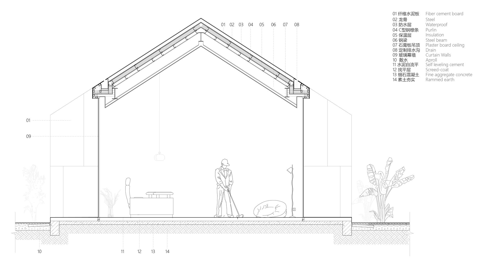
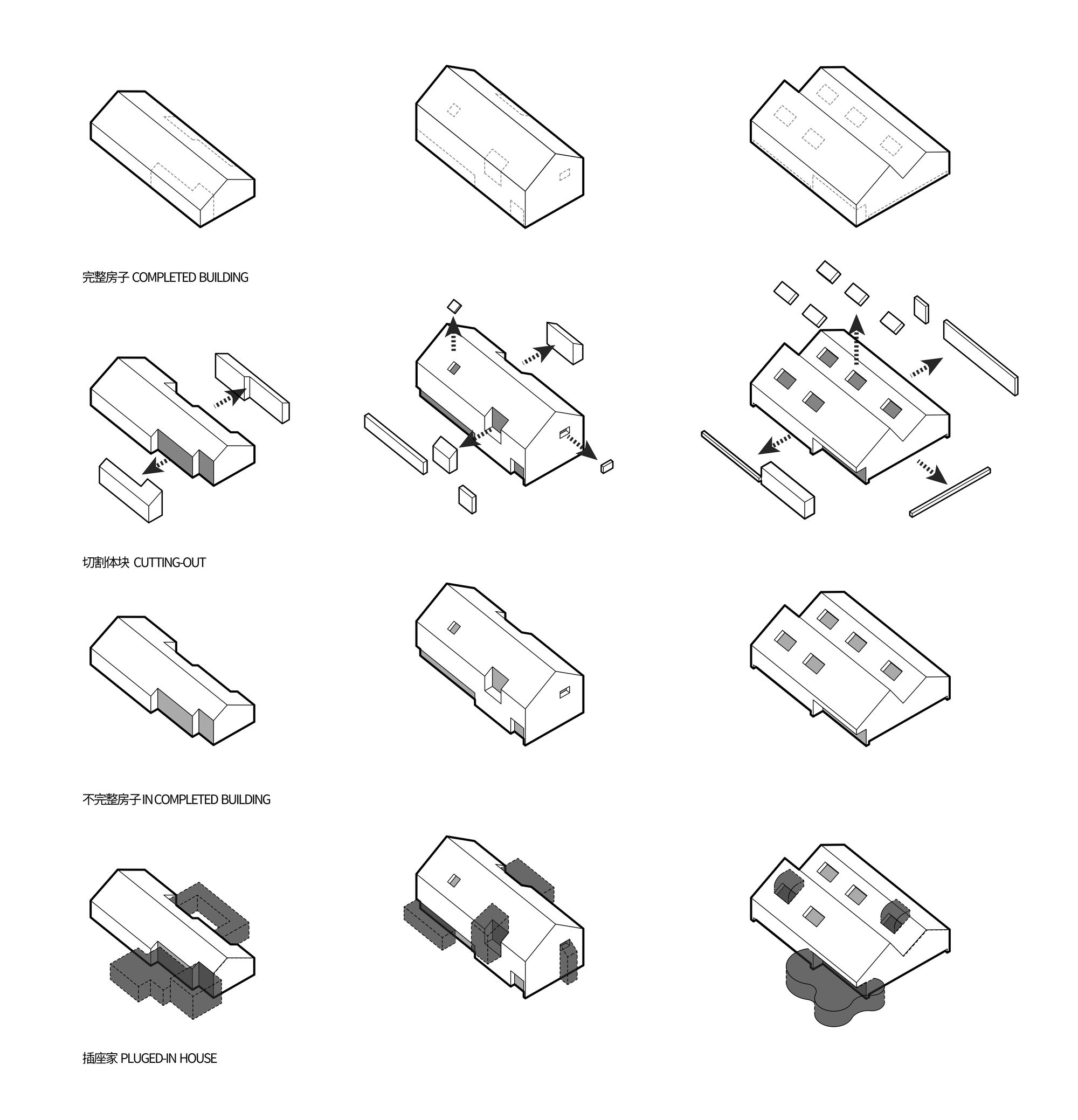
We cut a series of notches in the finished houses. The future owners can add or redefine the relationship between the house and the hospital according to their own preferences. It is like a socket waiting to be inserted into a different new structure to become a complete building. As the owners change, the inserts change, resulting in a changing building.
Photography by © Zhi Xia
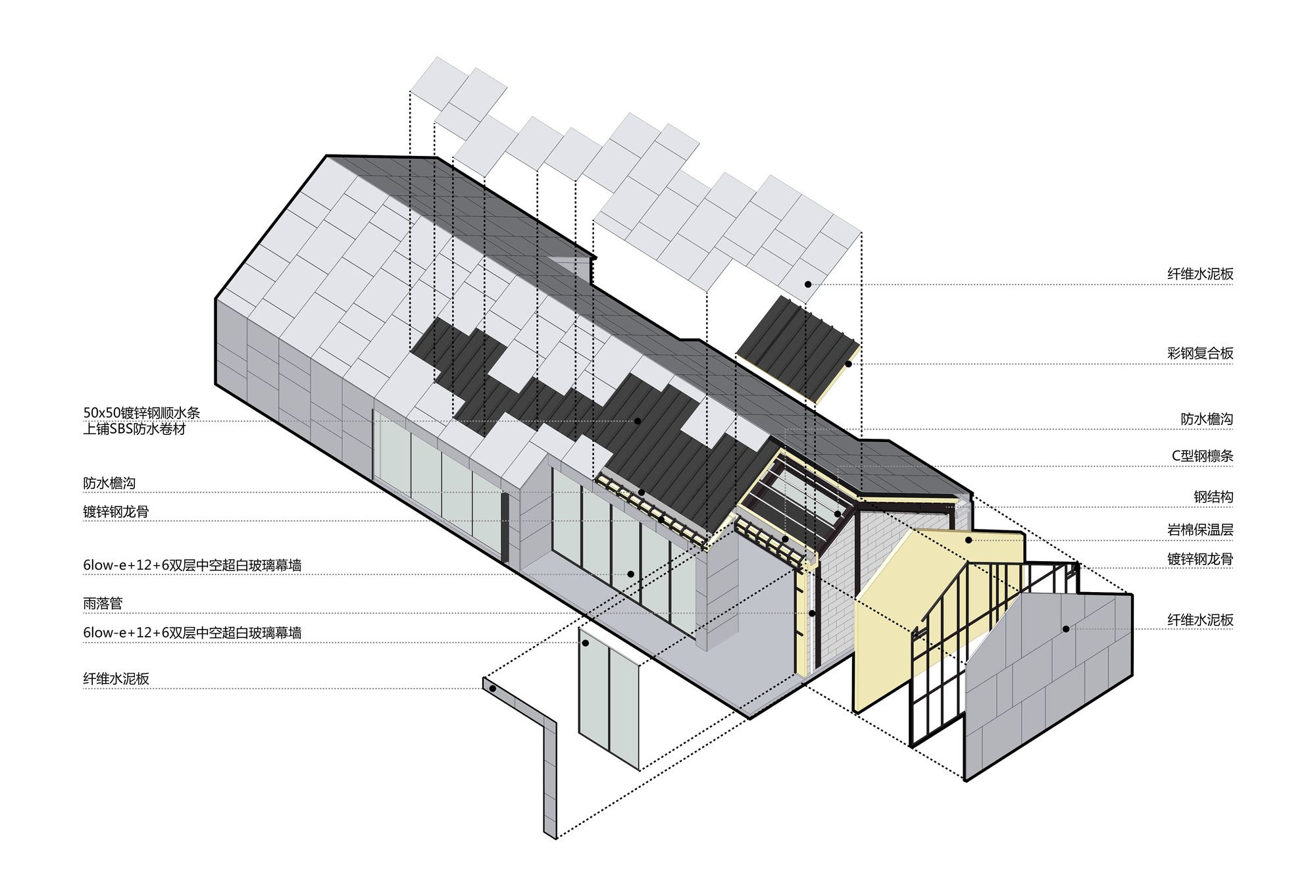
For the skin of “Borrowed Yard & Socket Home,” we have adopted the non-standard construction method of dry hanging cement pressure plates. By treating it in this way, a new type of finish material is created, bringing a contrasting look and feel to the before and after, and giving us a valuable additional experience with the material.
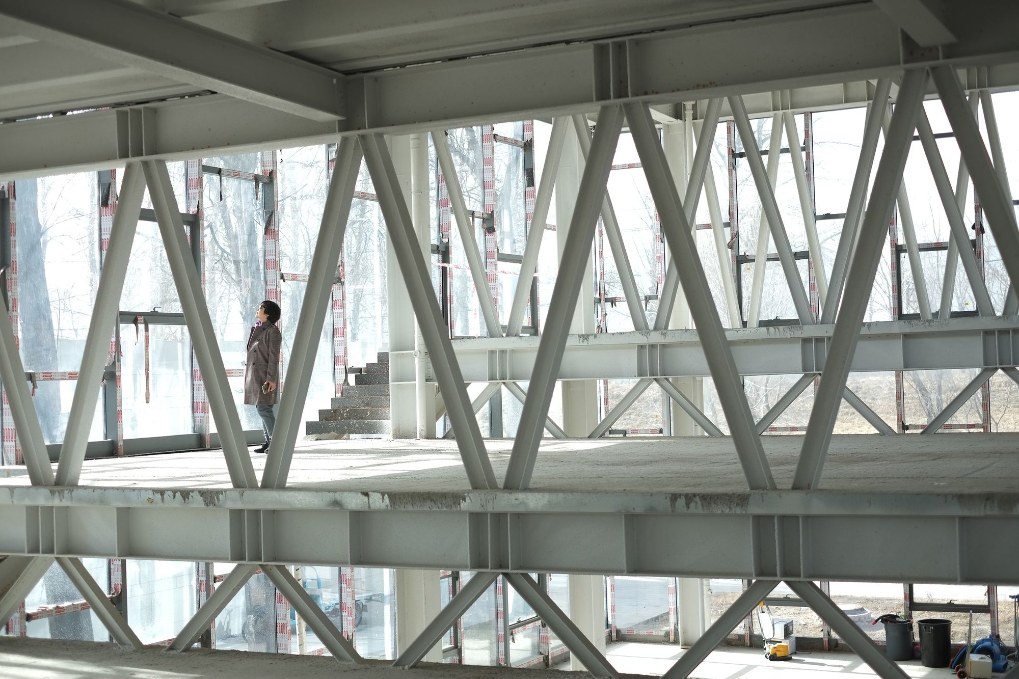
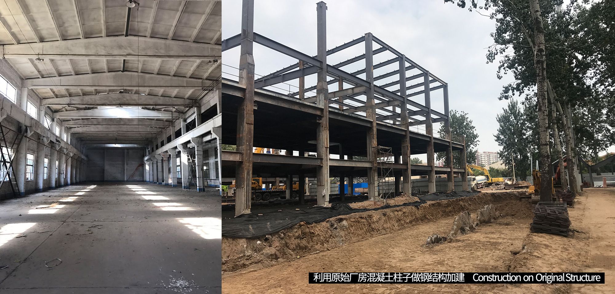
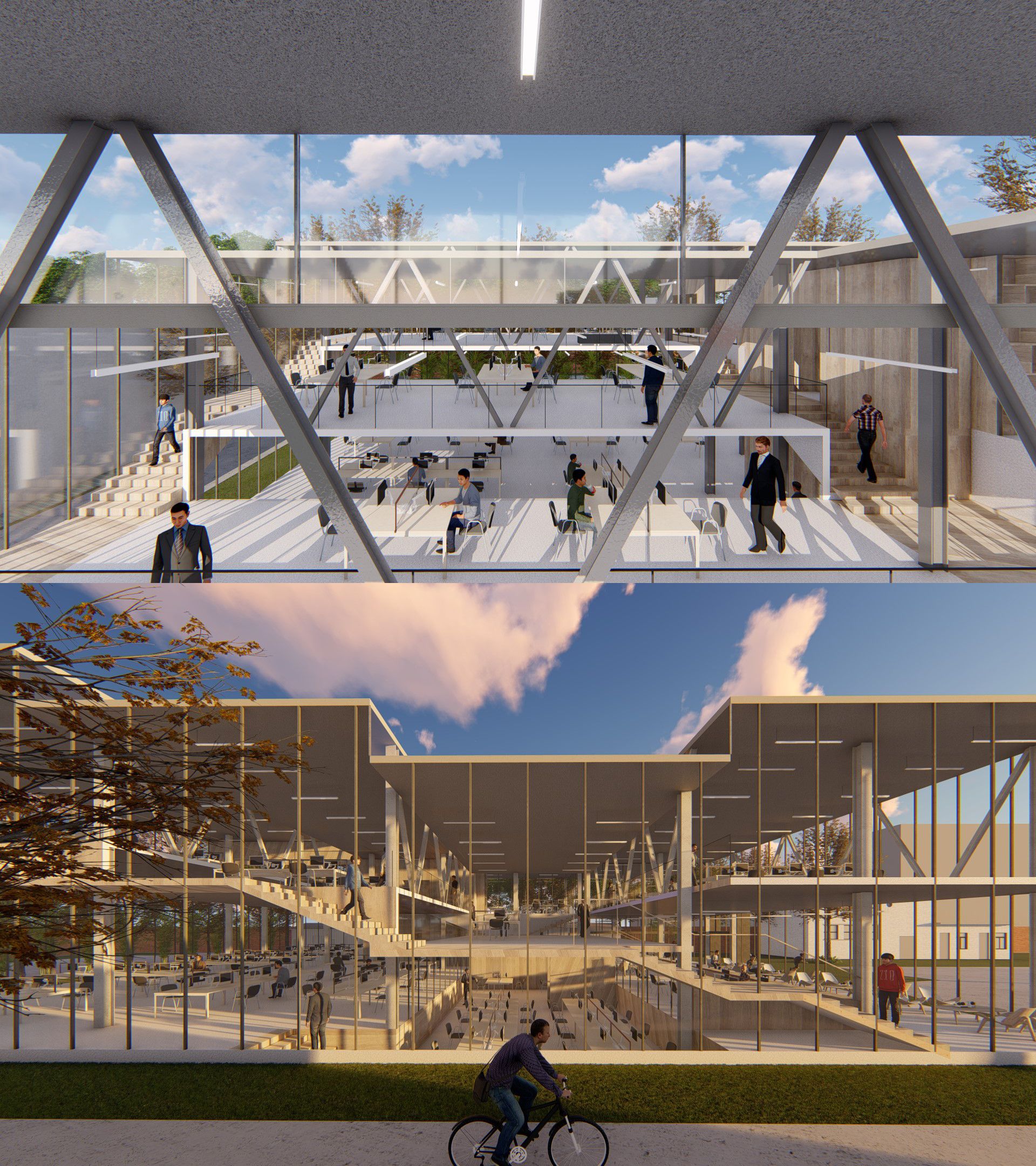
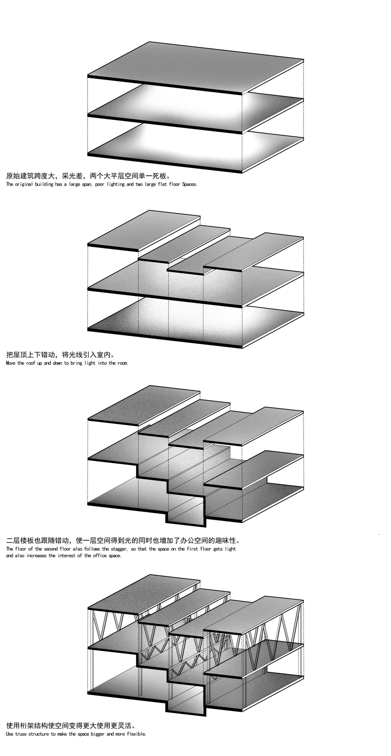
South “Stepped Headquarters” design – The shared space created by staggered floors. “Steps HQ” is the only stand-alone office building. It is unique in that it is a renovation of the original parking garage. The original building is very deep. We have adopted a way to solve the problem through section design.
The original building is divided into sections and staggered, with high lateral windows opening in the roof and ground floor slabs of the building to allow for interior light. At the same time, office spaces of different heights are created, and the permeable glass curtain wall around the building makes the “Stepped Headquarters” a dynamic office space.

Photography by © Ke Chang
Public- City – a dramatic city where the universal and the inclusive coexist. The project demonstrates that in an urban regeneration development, the architects can implement and execute the ideal concept when they are able to unify all aspects of the design from planning, programming, architecture, interior, landscape, lighting, and building inspection.
This practice meets the function and use requirements of the project itself, and provides a direct response and dialogue to the proposition of urban renewal. Meanwhile, This practice blends the compromises of development, the disorder of future change, and the design vision on an urban level into a positive design response. In this sense, we would like to call it direct poetry.
City Bridge Concept. Image Courtesy of officePROJECT
Project Info:
Architects: officePROJECT
Location: Tongzhou, Beijing, China
Area: 31384 m²
Project Year: 2019
Photographs: Zhi Xia, Ke Chang, Haiting Sun, Shibo Chang
