Miss Hai’s Rose Cake’s Concept:
“love letters delivered by taste buds” is the cultural concept underlying all offerings from Miss Hai’s Cake. Each cake from Miss Hai’s is accompanied by an exclusively designed love letter. Love needs media, Miss Hai’s Cake could be the perfect one, as memories of taste and love are both irreplaceable.
“Hello, Nan Luo !” is the late evolution of Miss Hai’s Cake’s business model. The idea intends to create a “bazaar”, where the customers could indulge their sense of taste with a variety of offerings: rose cake that could refresh your love memories, “Huo Shao Yun” rice noodles, and the shop’s signature cool drinks.
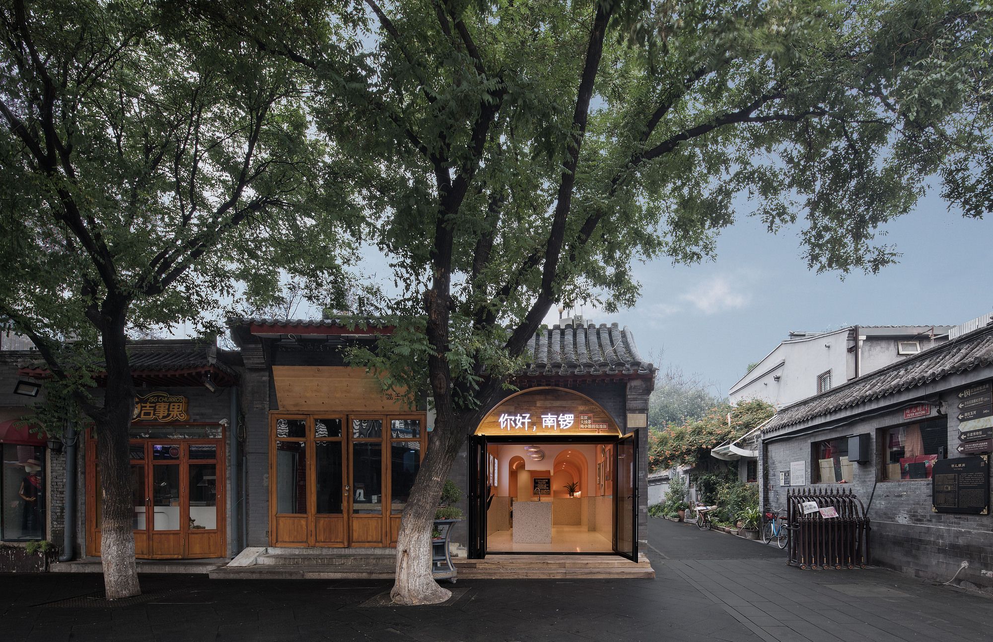
The shop is located deep in an old lane, however, its business is blooming all year, thanks to the commercial environment of Nan Luo. The architect needs to balance the dynamic and tranquility of the surroundings. The design intends to retain the ancient taste while enhancing the shopping experience.
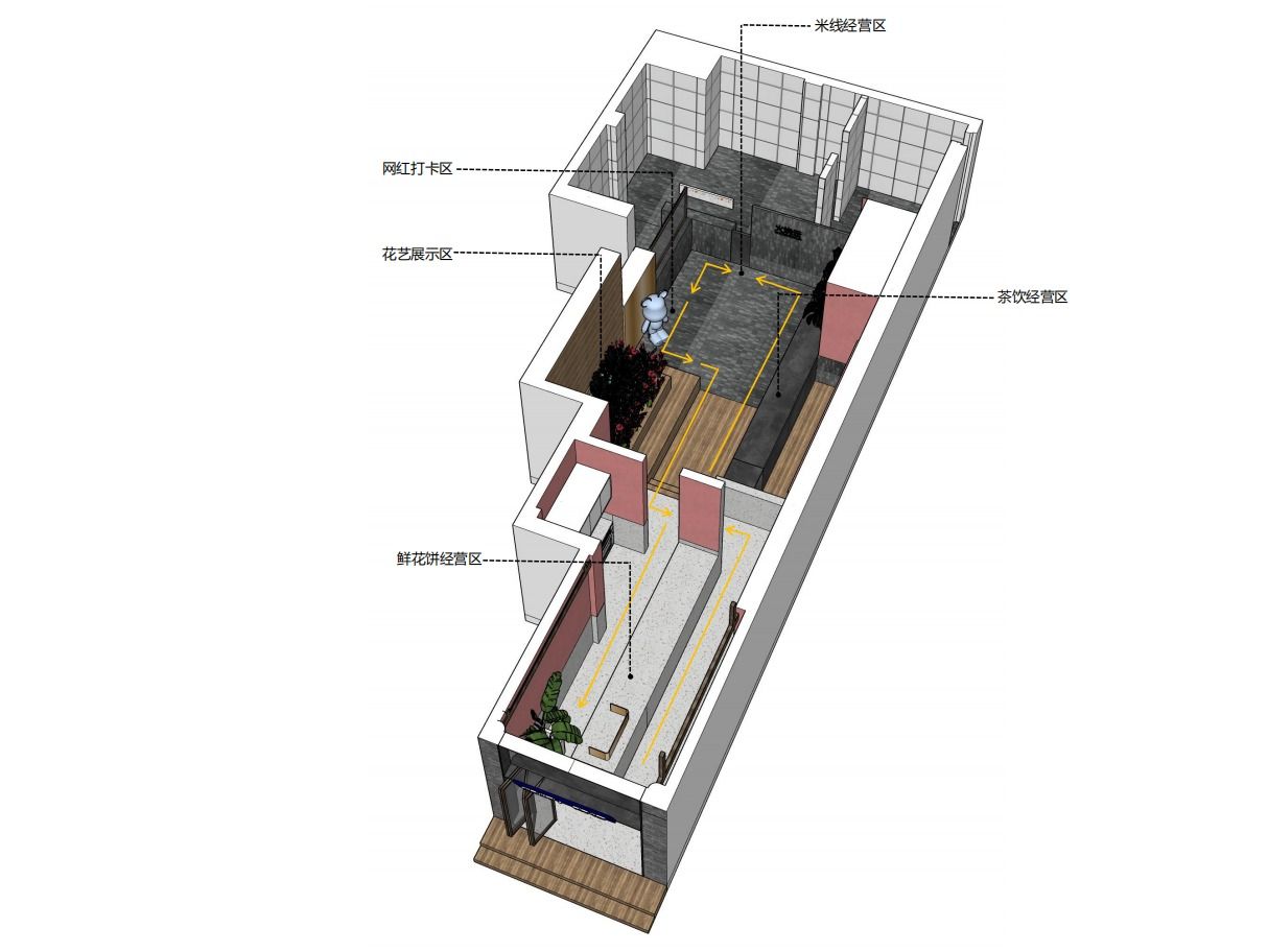
As to interior space, different functional areas shall interact in perfect harmony, yet with a clear identity. And the design aims to highlight the cultural heritage and in the meantime inject new “life” into the building.
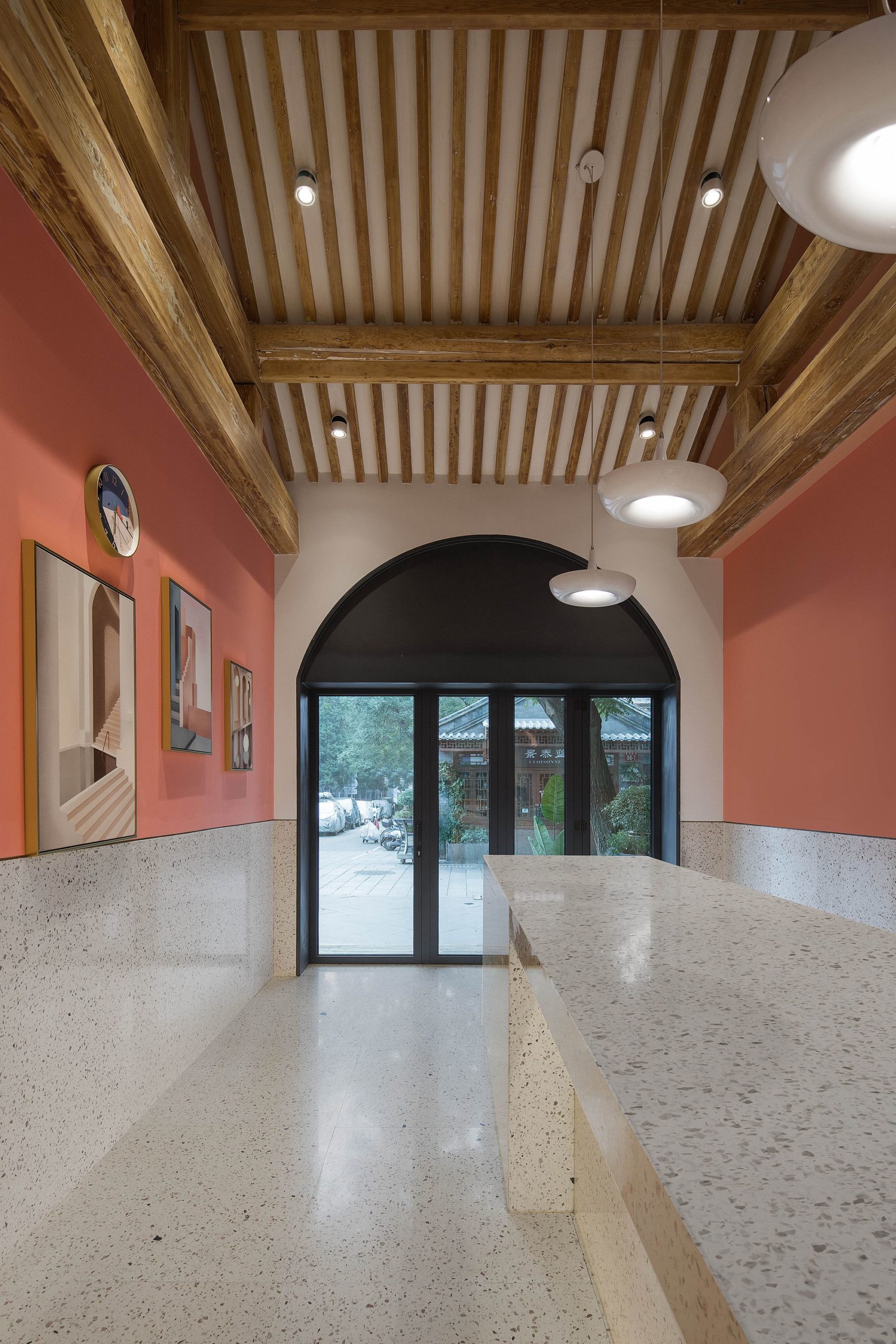
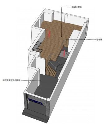
Structure before renovation: two floors, low floor height at each level, low utilization of space;
New elements are required to contrast with the antique exterior of the building and its surroundings, so as to create new life and “memories of the taste of love”, which features Miss Hai’s Cake.
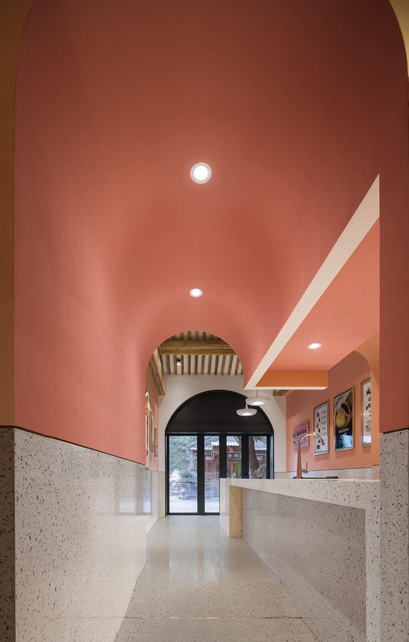
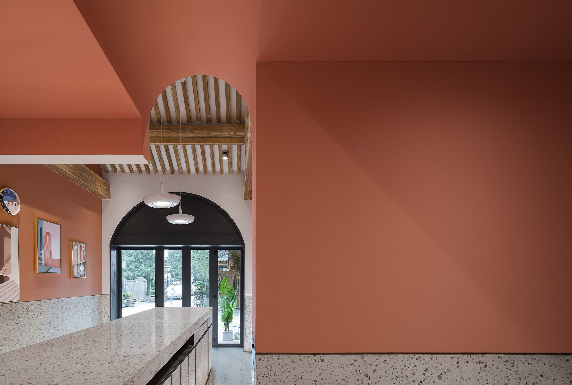
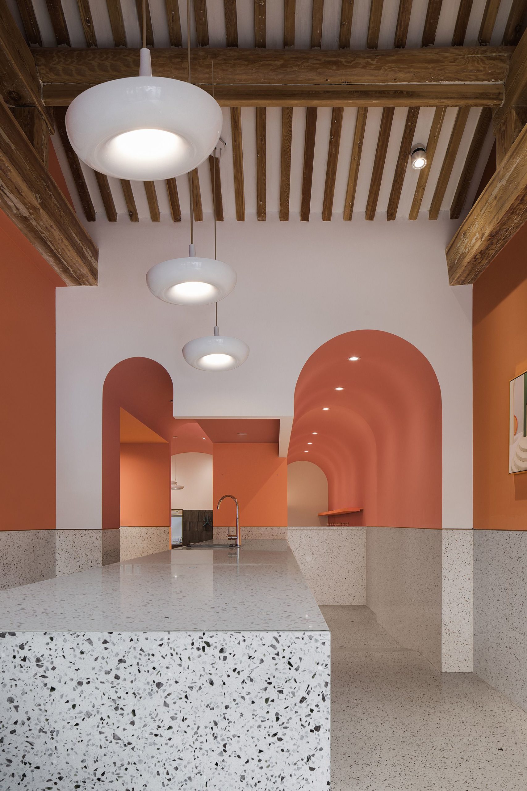
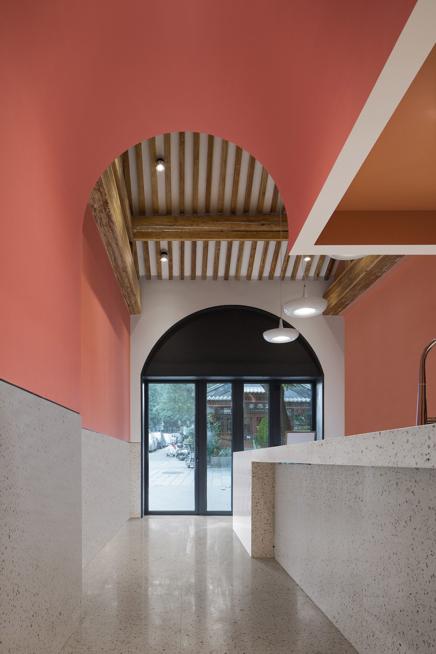
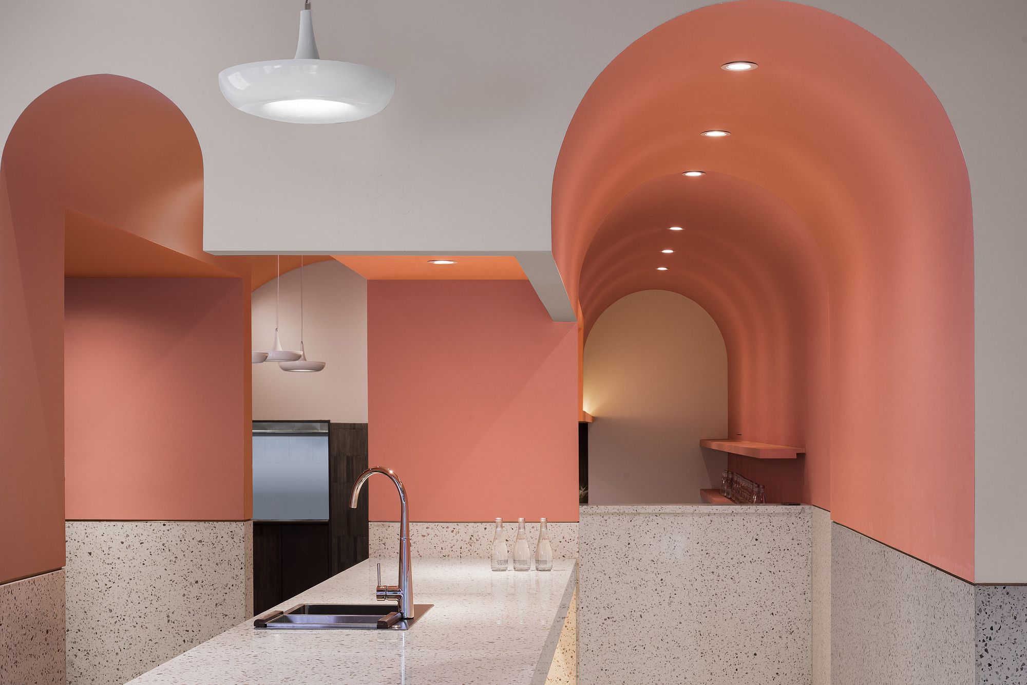
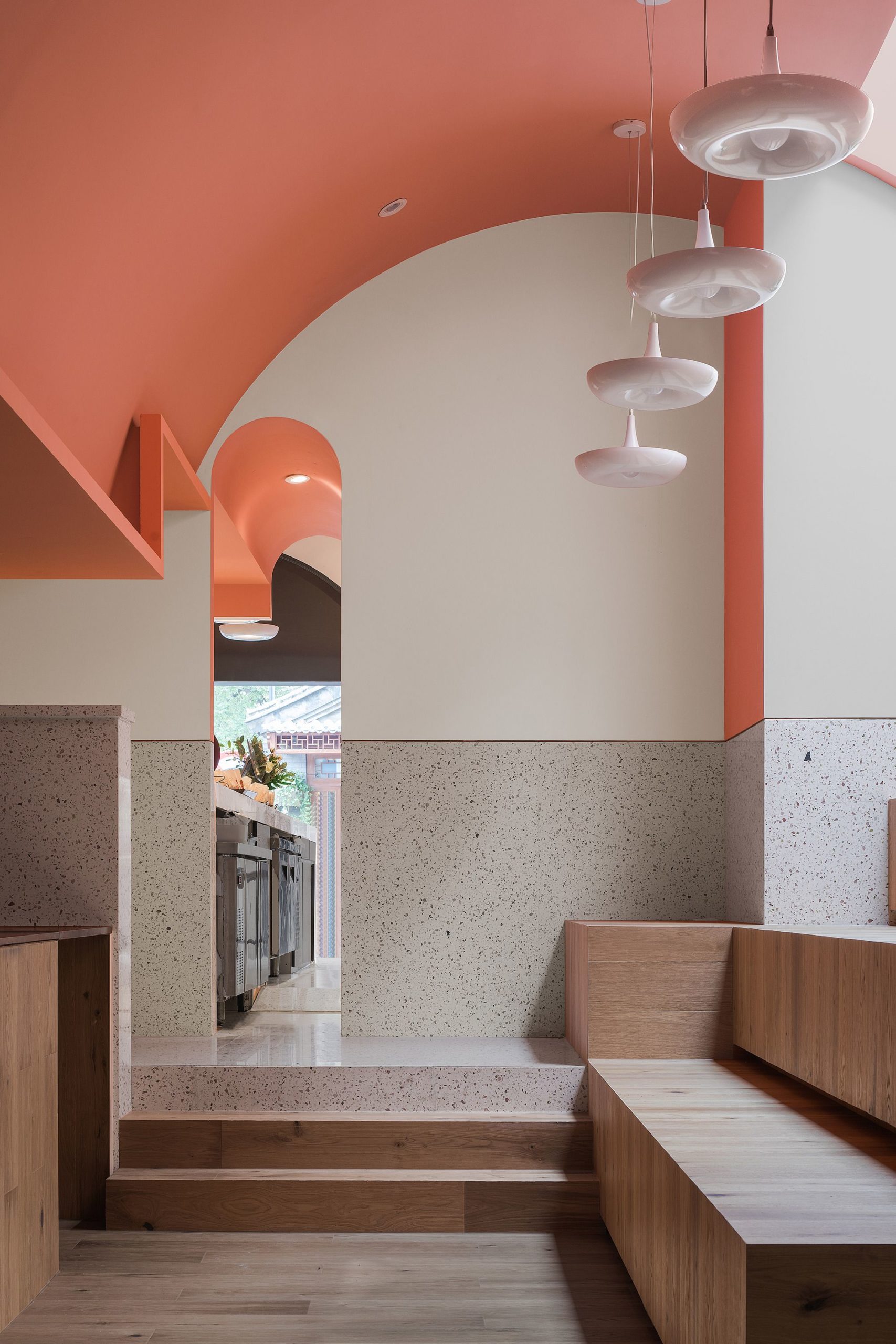
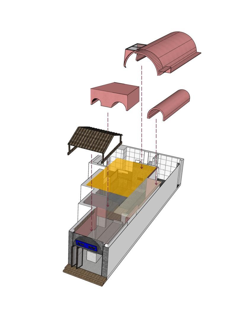
Inspired by this, the ancient Roman arch is deployed to separate the space into different functional areas, since the arch is seen as a witness of the “memories of love”, as it is often used in wedding ceremonies. The entrance is formed by an arch-shaped door header made of gray-colored steel and a folding door, which can meet different needs through the northern seasons.
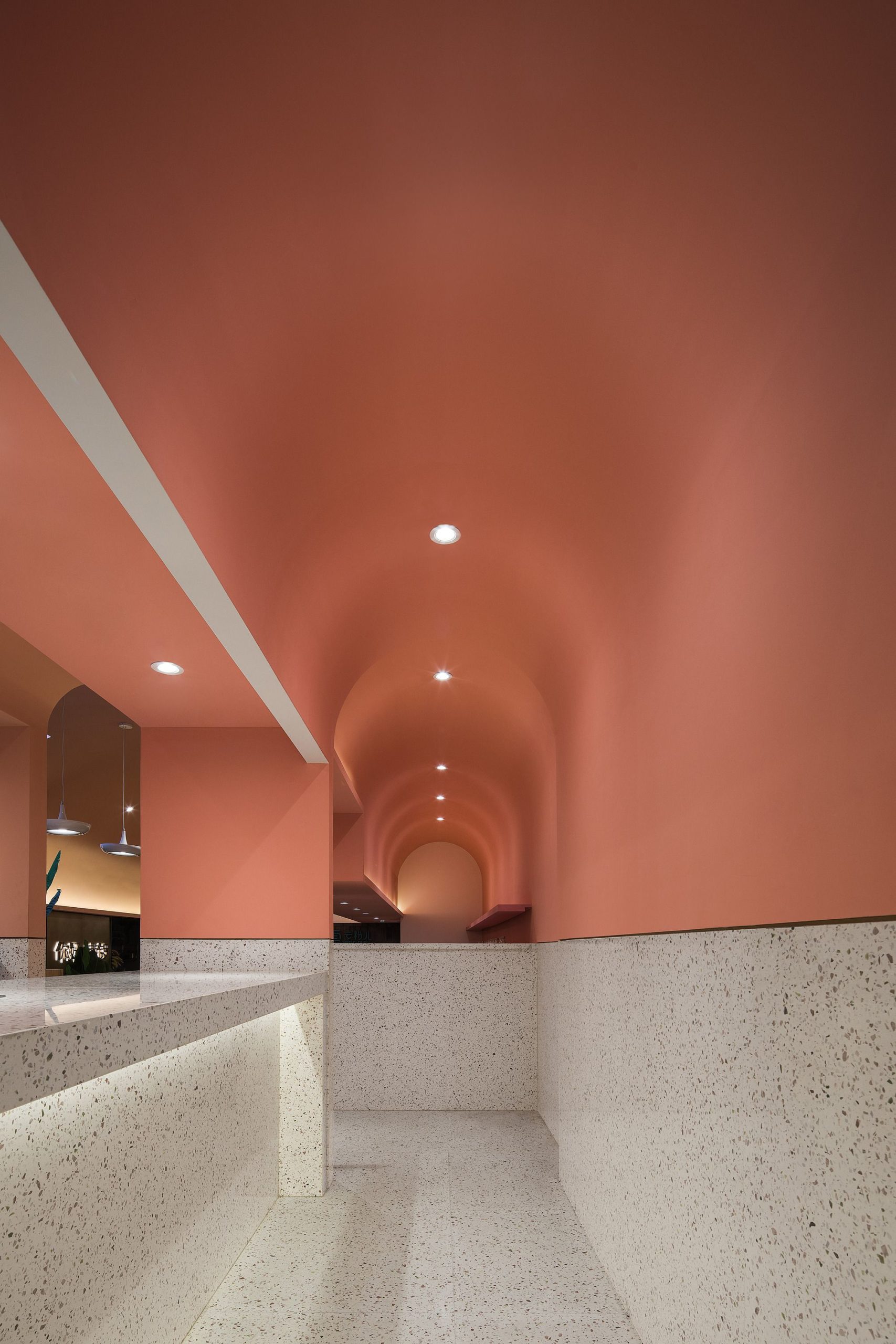
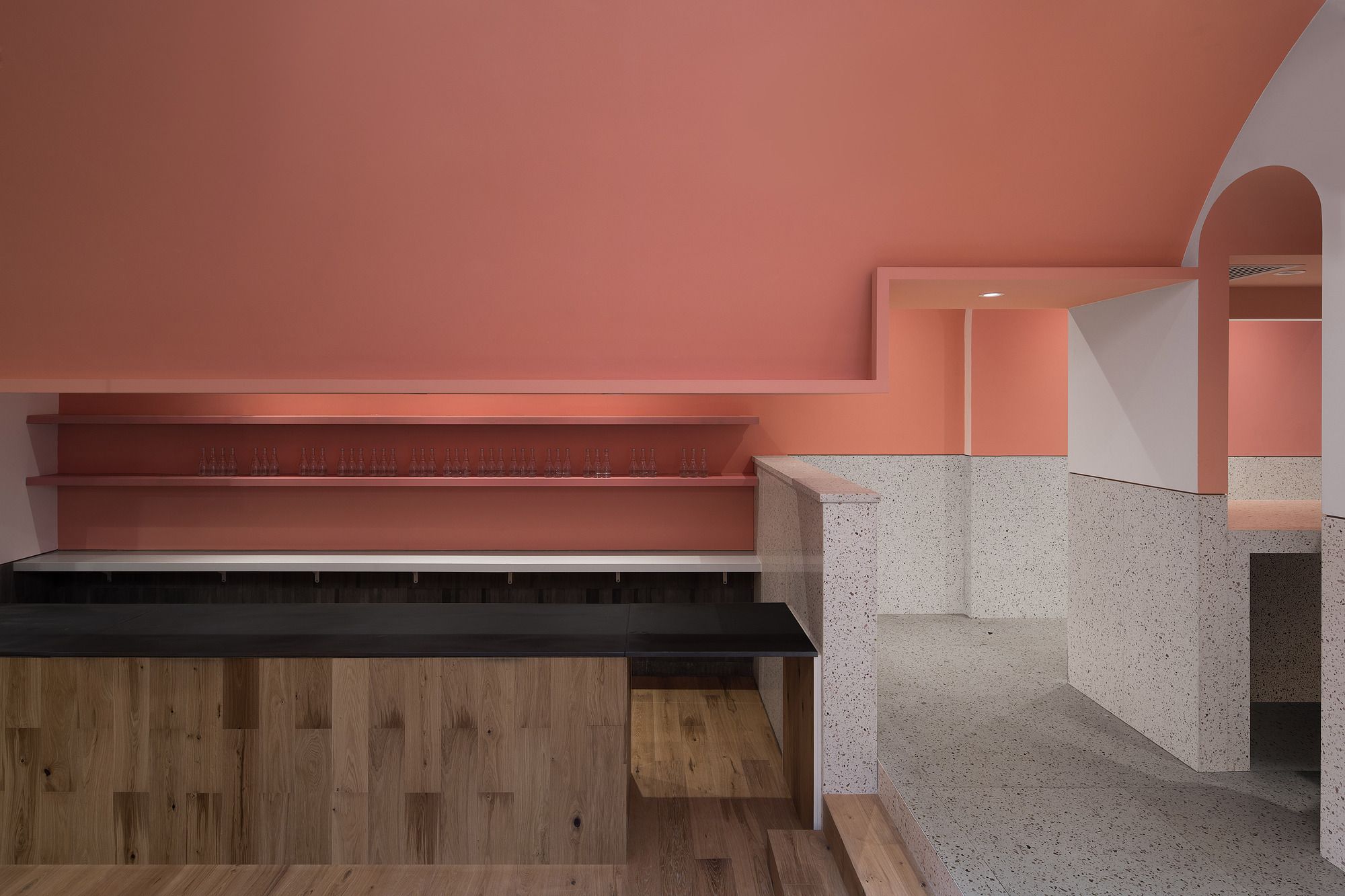
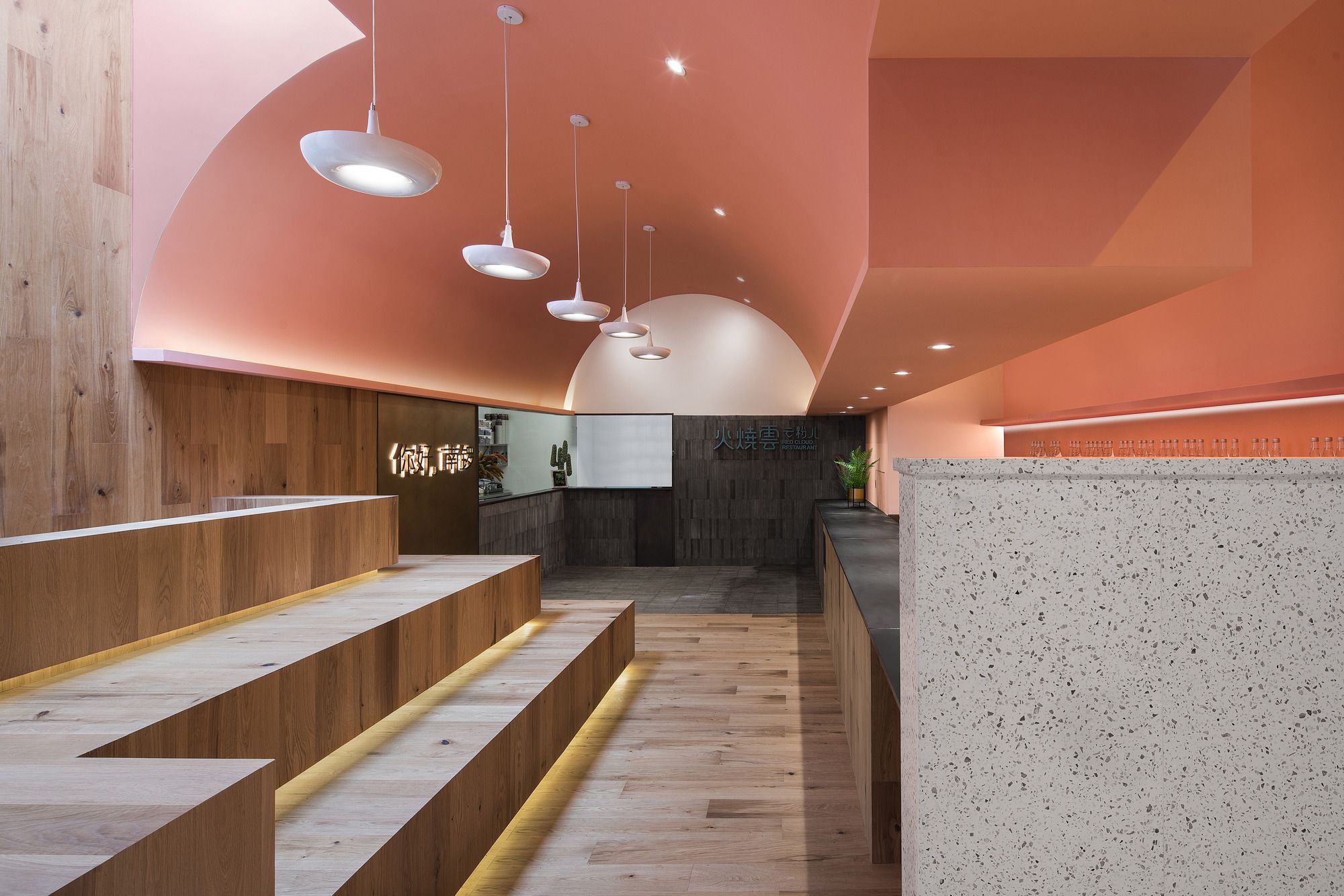
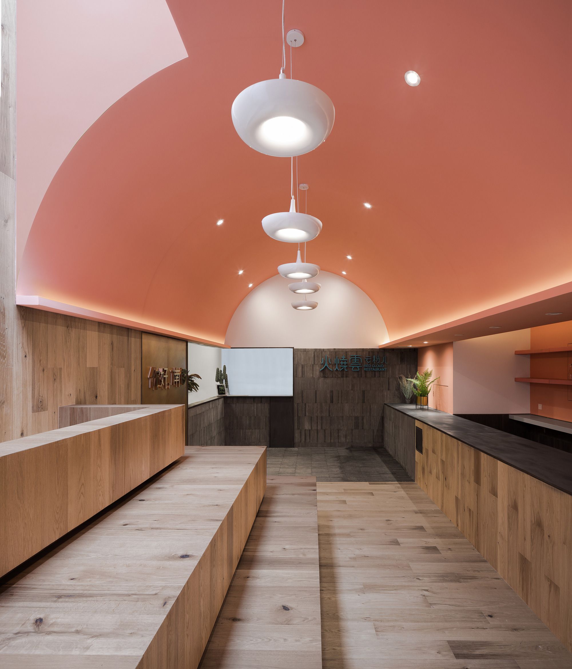
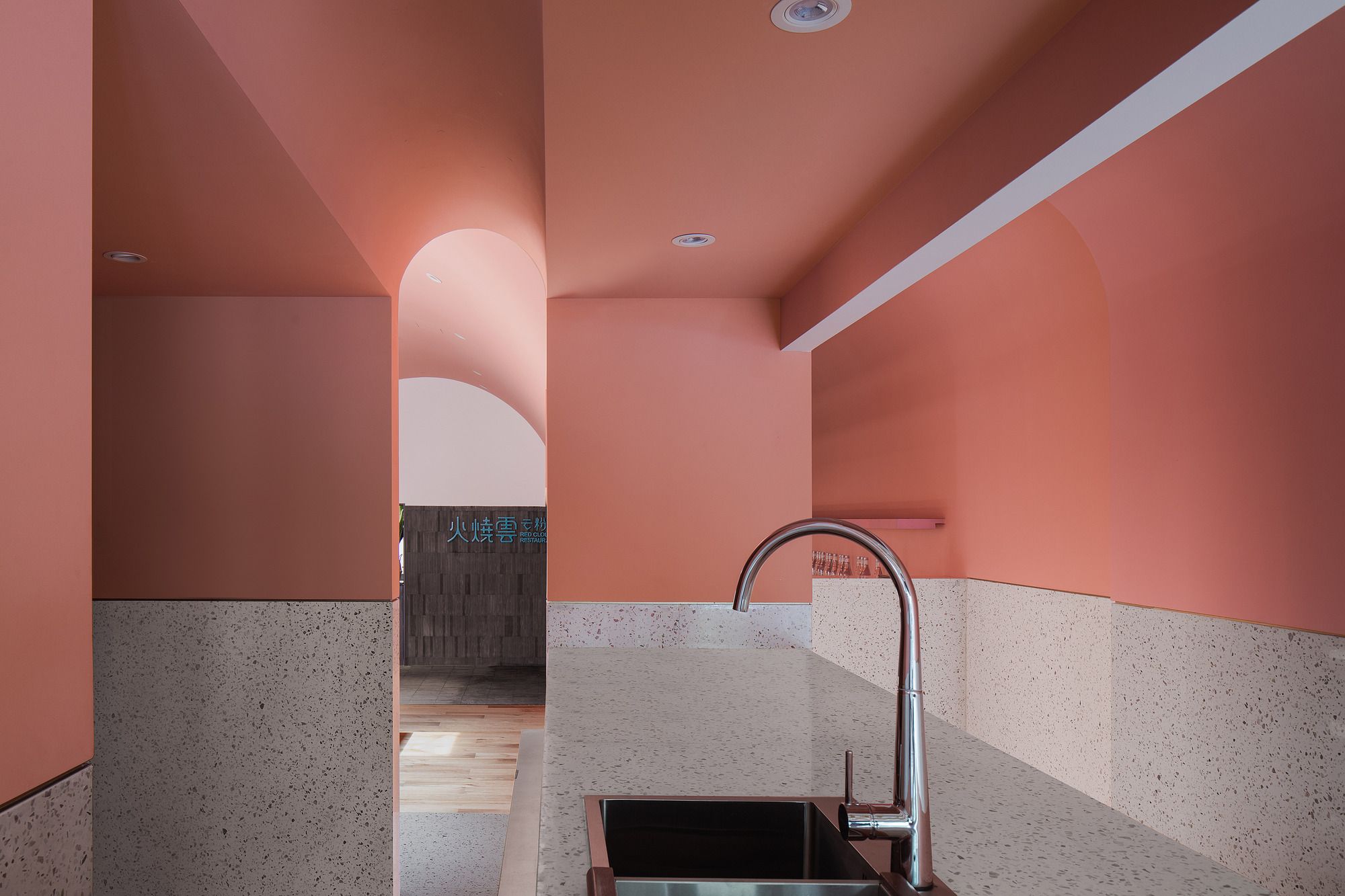
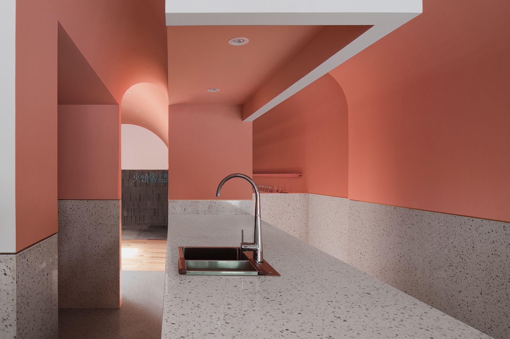
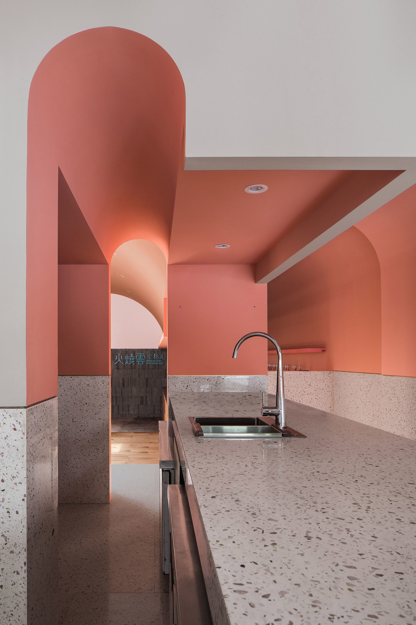
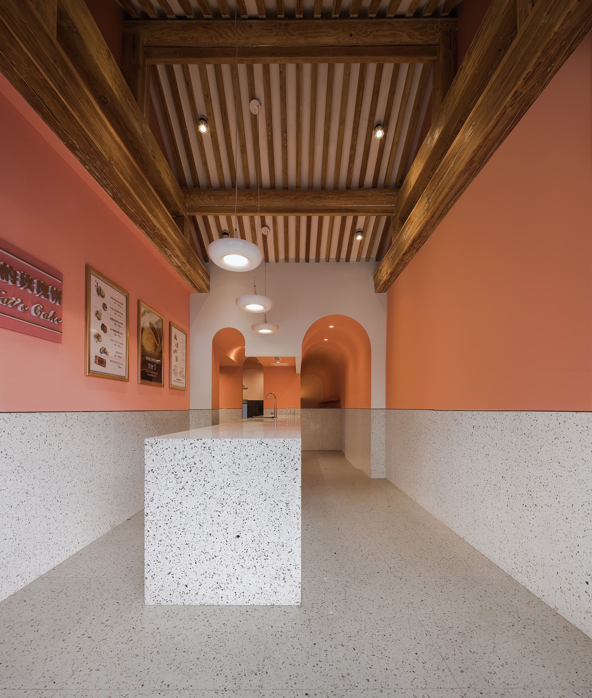
When you step into the door, you see arch corridors at the end of the front hall and a double-pitch roof overhead, here, the best representation of western architecture collides with its Chinese counterpart. The pink paint on the upper wall blends with the time-tamed wood color from the roof and complements well with the white marble color on the lower wall. All elements create a soft, pure, warm, attractive, and healing atmosphere. And they co-exist naturally, despite the obvious differences.
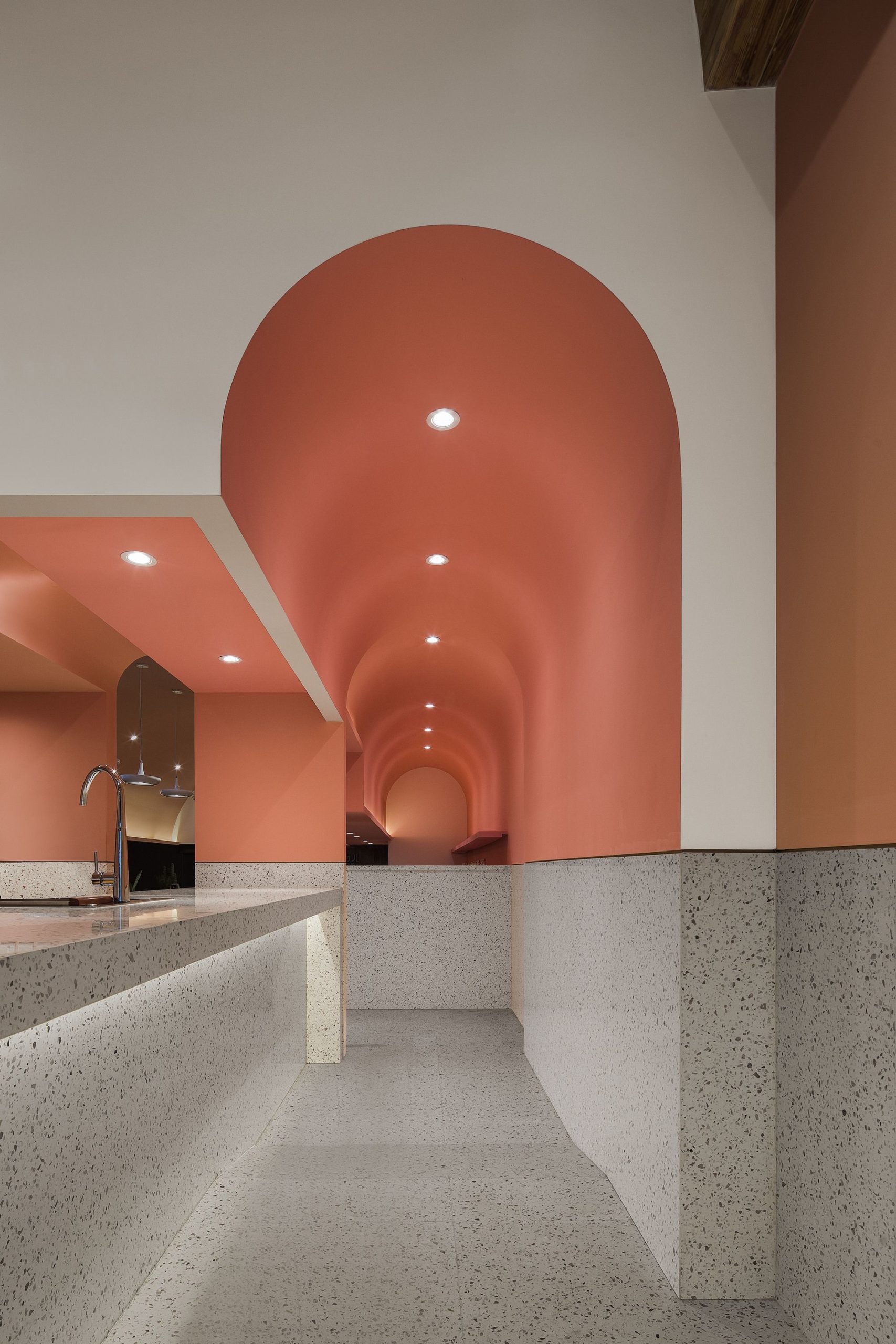
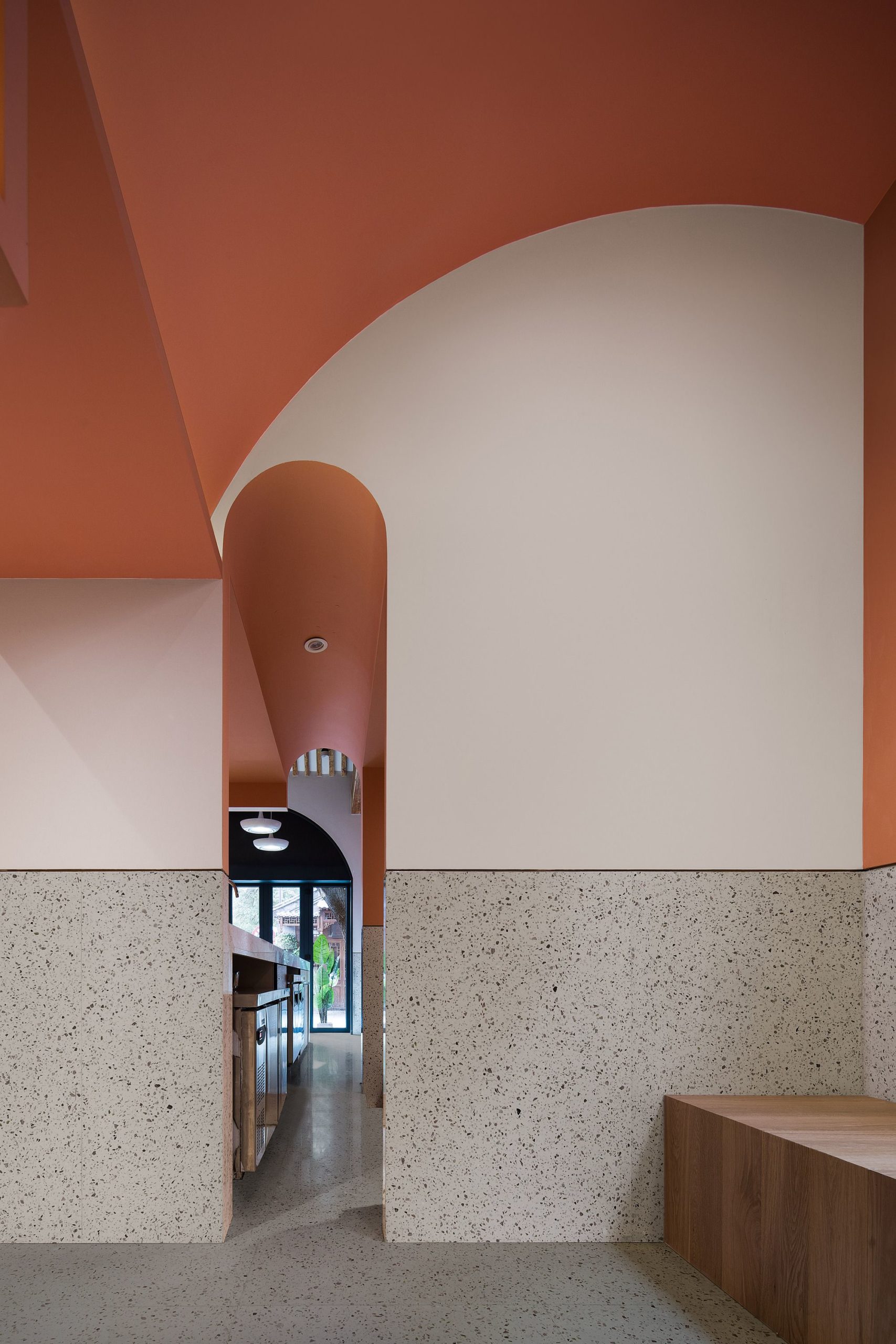
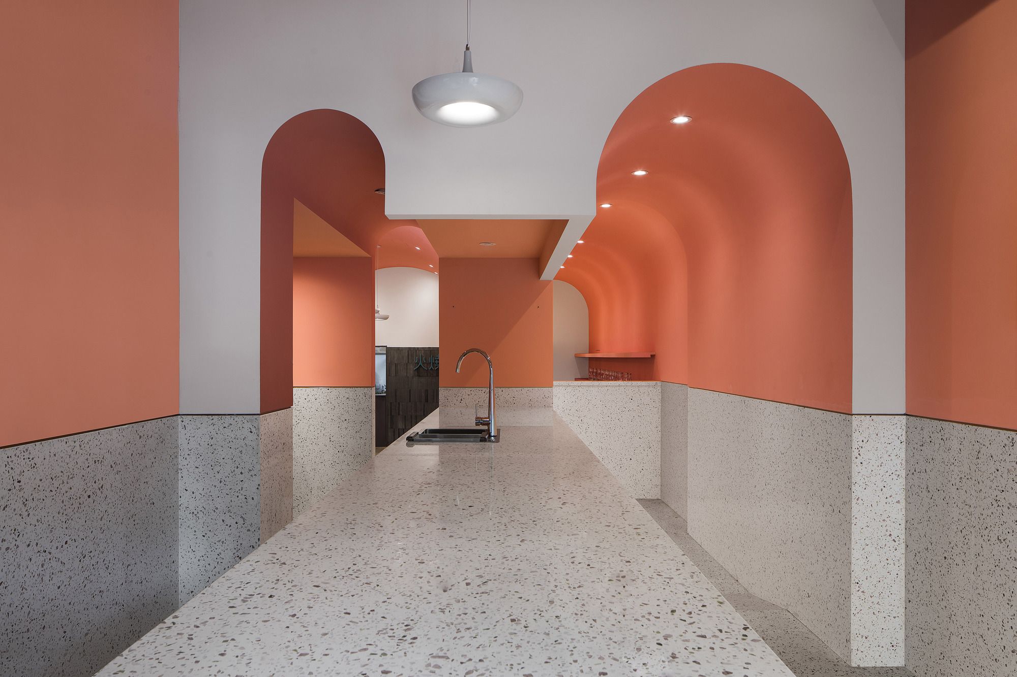
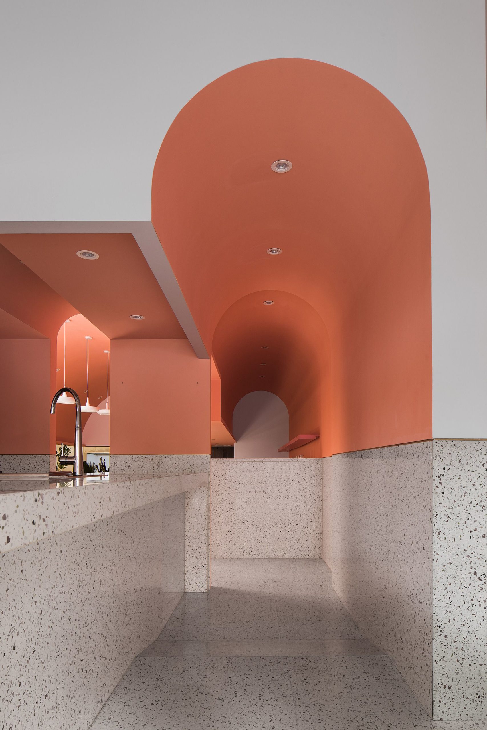
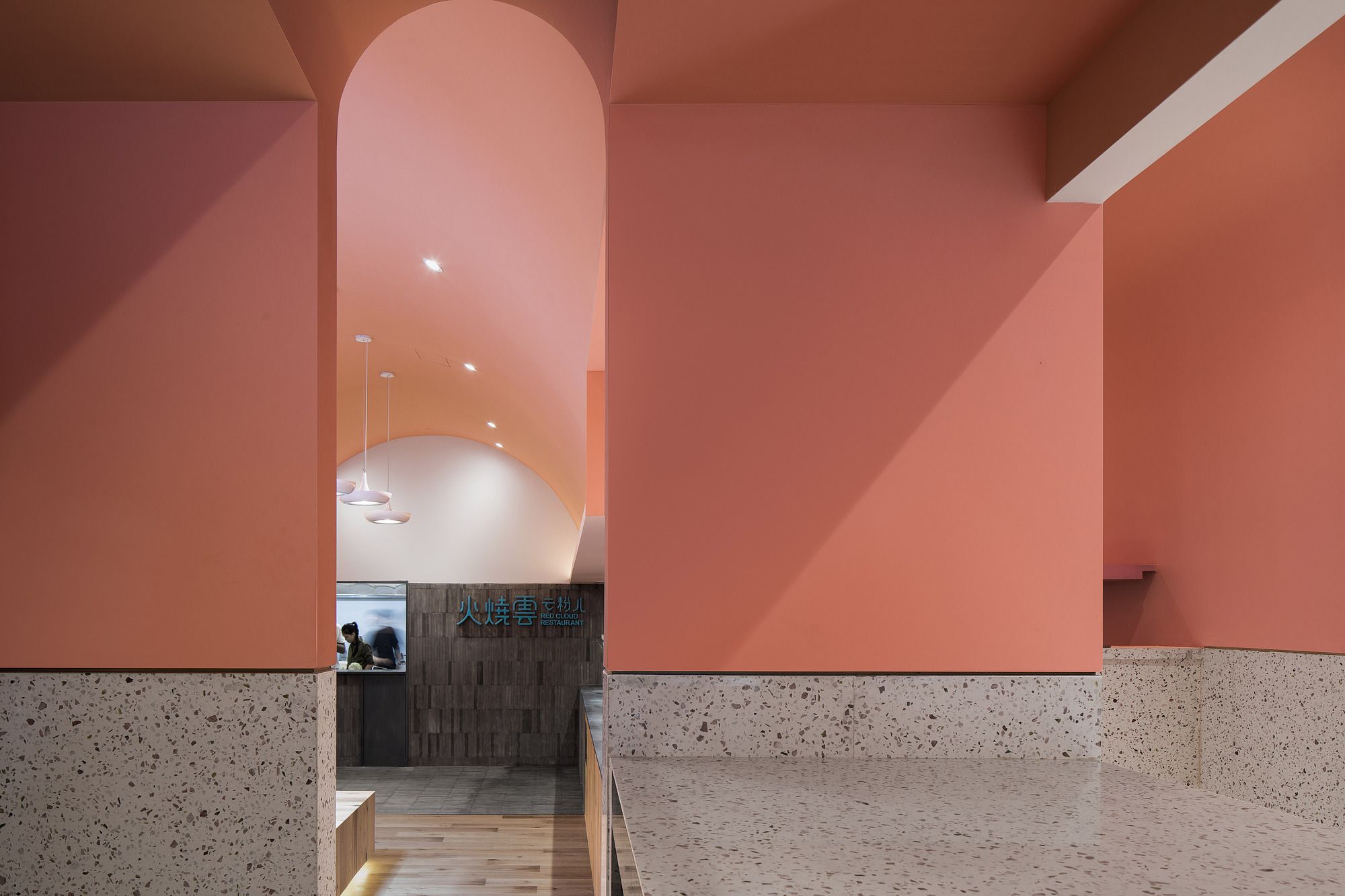
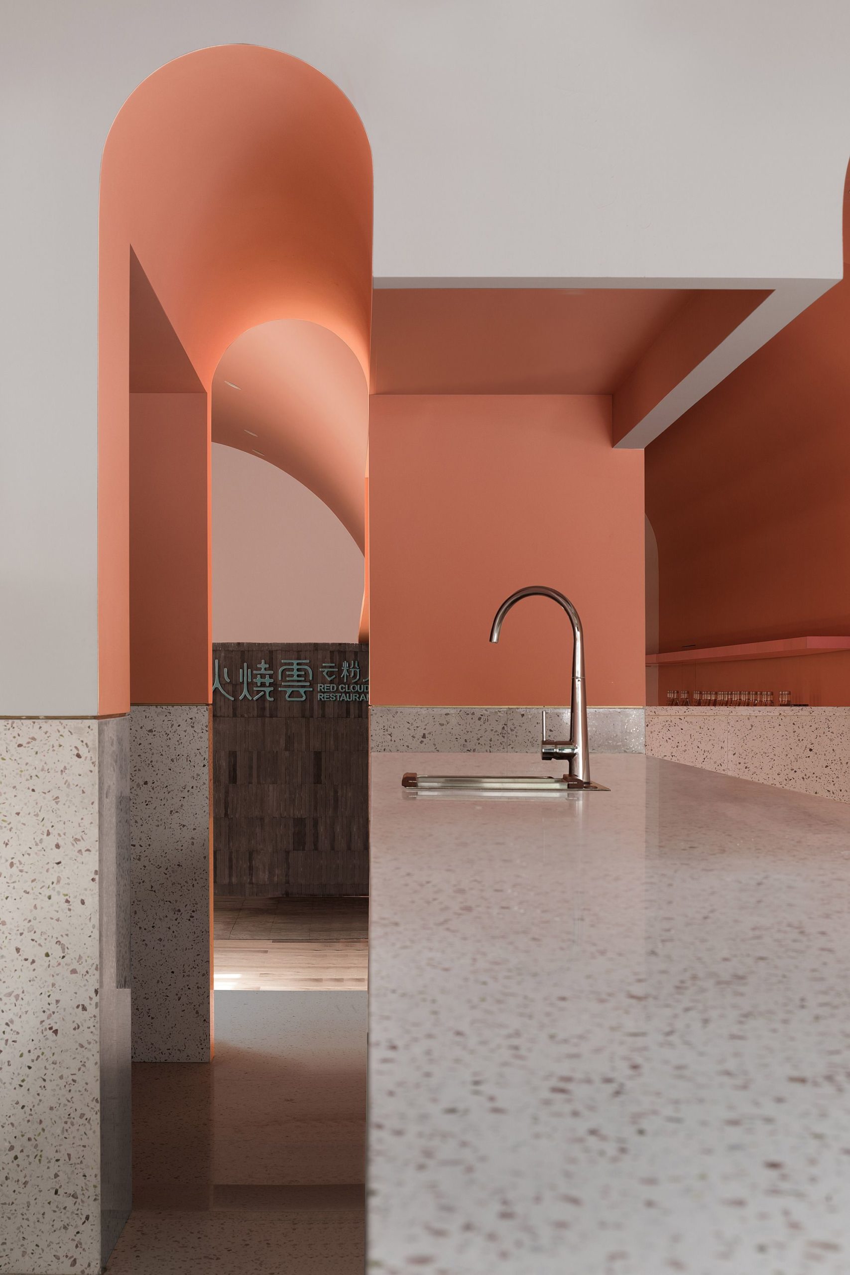
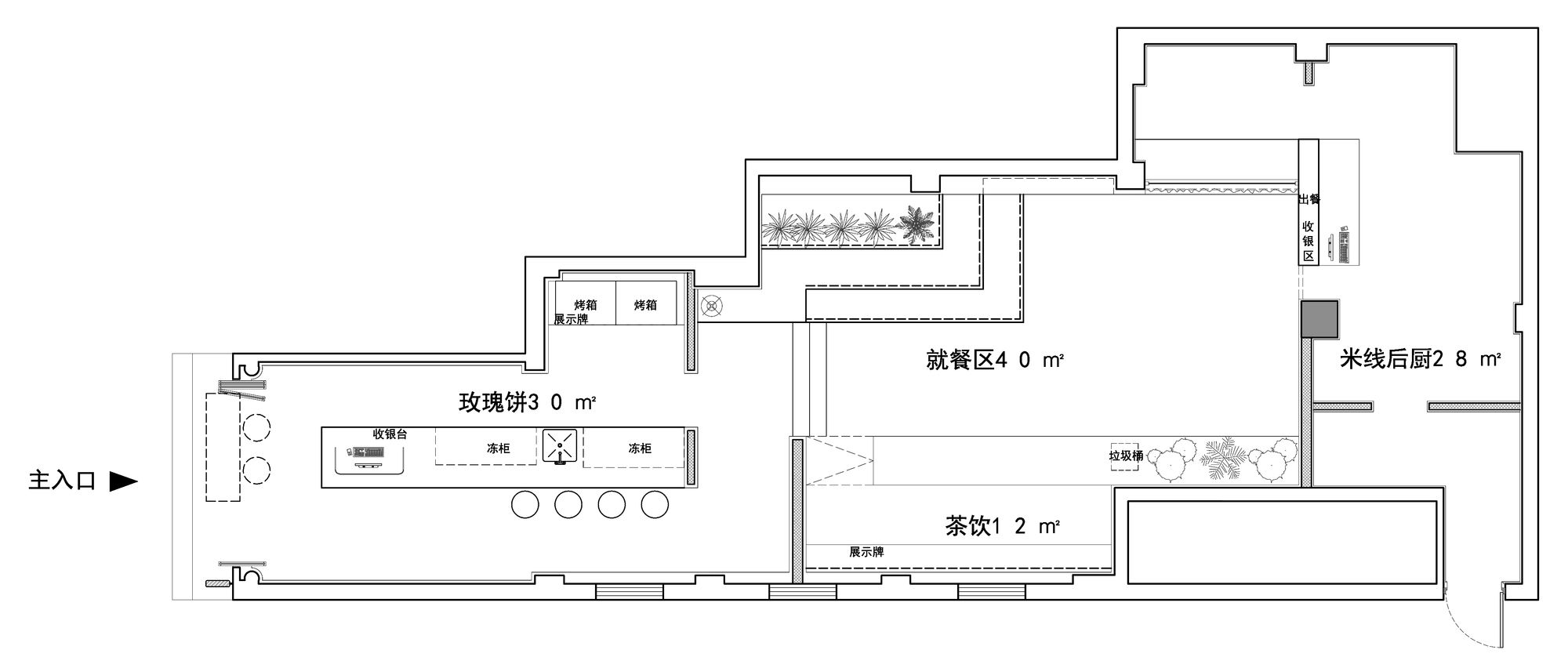
The dual arch corridors hide the back hall from the front hall, which clearly distinguishes the shop from bazaars with open space. The dual arch creates a partly hidden partly visible view of the space, makes the transition from the front hall to the back hall mysterious, and arouses the curiosity of customers to explore further into the rear.
Before setting feet into the arch corridor, customers could see the beverage area and the “Huo Shao Yun” sign in the back hall through the arch. It is so inviting for customers in the front hall when they view the back hall partly, and they will subconsciously decide to continue the tour.
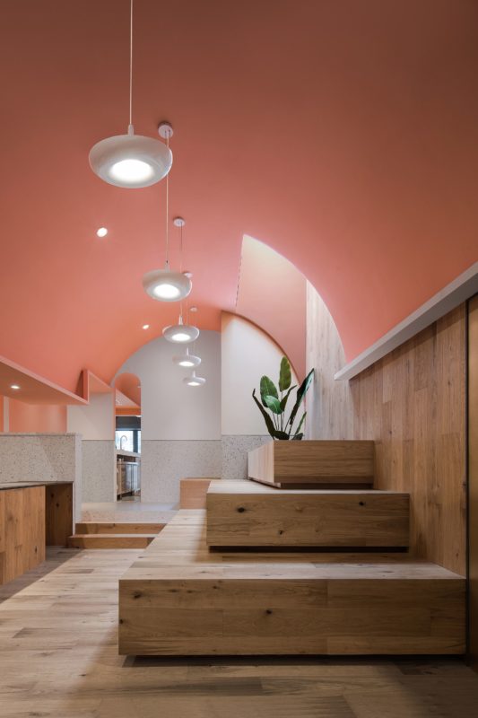
Going through the turning arch corridor, lighting projected from the ceiling shines up the space, as if you enter into a completely new place, secluded and entertaining. Originally, there is a height difference in the floor, which seems to be a disadvantage. However, we turned the floor into two sections connected by a slope, to distinguish the space naturally and weaken the height difference.
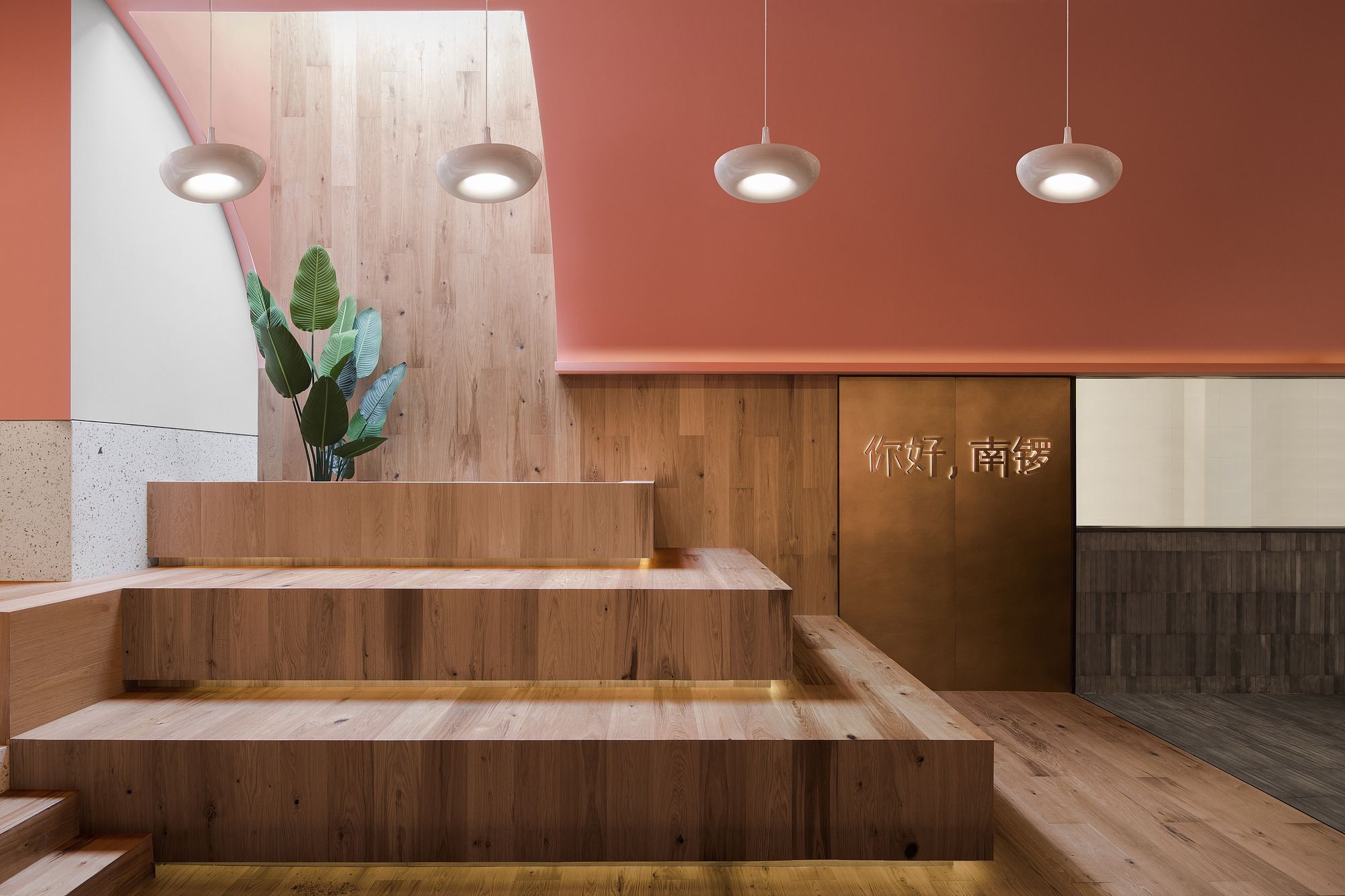
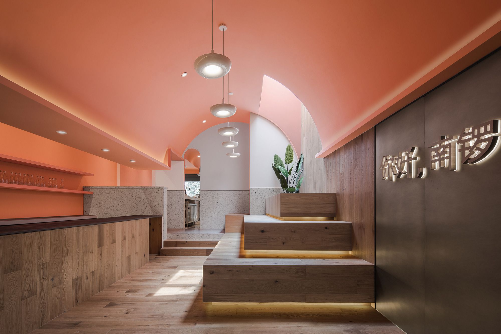
The staircases at the end of the back hall create different elevations of the space and form a natural show stage, which could be used to display flowers or souvenirs. So as the saying goes, the back hall is really “a hidden but beautiful spot in the bustling street”. Therefore, in some cases, design is not only to meet needs but also to create more value out of space.
In the back hall, all functional areas meet together under a mega arch roof. Different functions need their own space and have their own business attributes. Separation of space is achieved by different floor and wall materials. At the end of the hall, the floor and wall are made of hand-made grey-colored bricks, to emphasize the unadorned Yun Nan character of the “Huo Shao Yun” rice noddle.
The stairs and the walls behind are finished with wooden flooring, which set boundaries for the front hall and back hall in a natural and pleasant way. Pink, grey, and wood color is woven into the space, creating another visual language.
Achieve diversified functions without physically splitting space, this is exactly the balance and mixture we pursue.
Each taste could recall its unique memories. Sour, sweet, or spicy… every taste has its own story. Regardless of where you are from, we hope, “You” and “Me” could meet among the madding crowd and befriend the world through delicacy.
Finally, when you stand in front of the sign “Hello, Nan Luo!”, you feel as if the antique roofs, the pink walls, and the green plants are all speaking to you, saying goodbye to the past and hello to the future.


