About Qianshao Weaving Factory
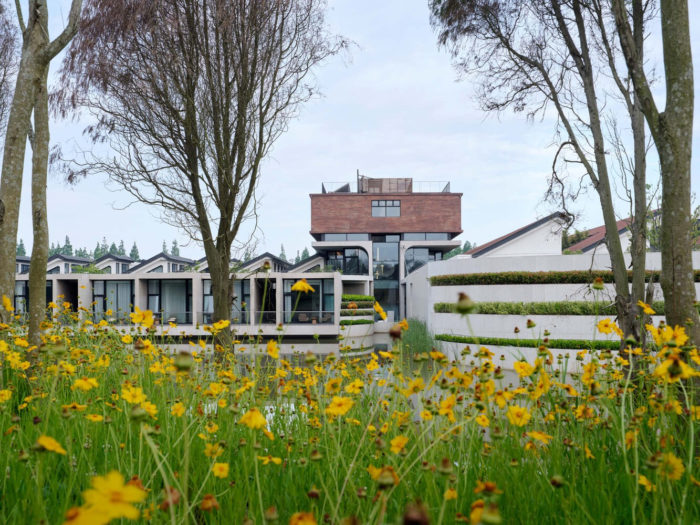
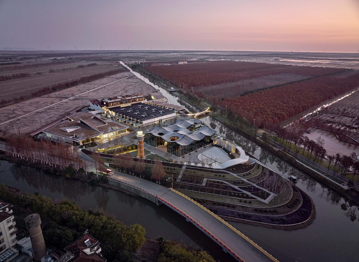
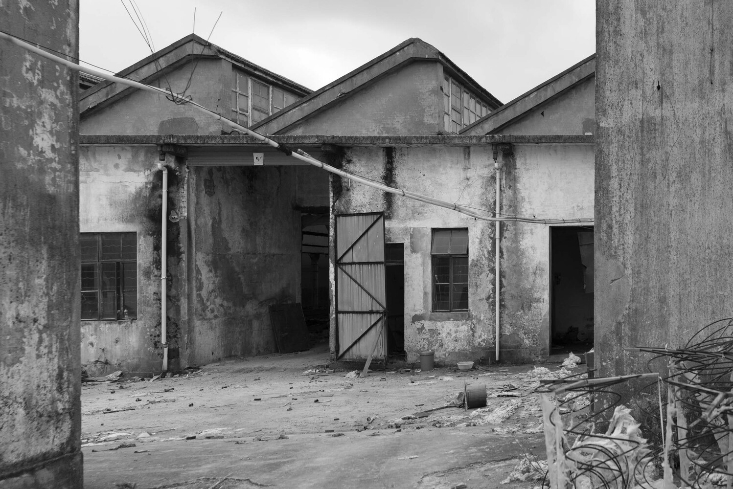
Our first visit to Qianshao Weaving Factory was on a warm summer afternoon. As we walked down Qianshao Road, neatly arranged by sequoias beside it, the water tower appeared, nestled in the lush foliage. As we entered Qianshao Weaving Factory compound, a collection of large buildings cut above the floor immediately caught our attention. The rooms were scattered amongst the overgrown foliage, blending into the surroundings. Qianshao Weaving Factory buildings and water towers were preserved as poignant reminders of the site’s history, carefully isolated from their natural surroundings.
Concept Of The Transformation of the Former Qianshao Weaving Factory
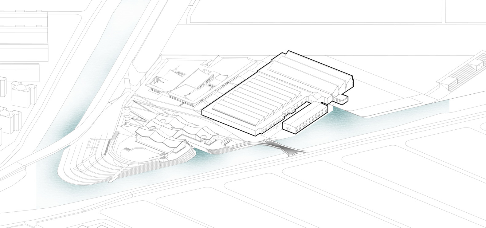
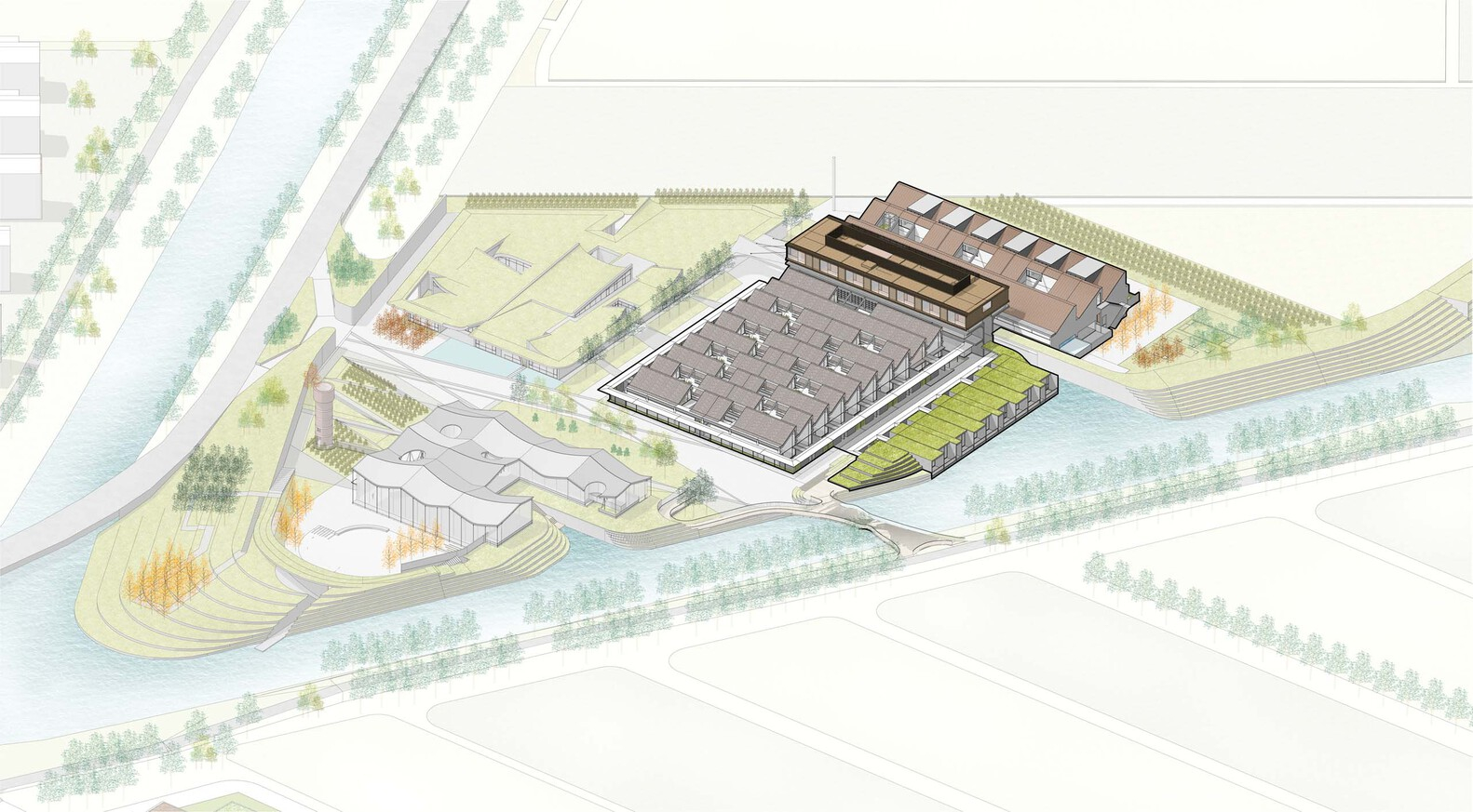
In order to deal with the necessities of flood management, we constructed a dike to encircle the site, creating an ecological barrier. This ecologically inexperienced dike machine expands at particular points at the eastern and western sides of the sawtooth-formed factory, forming two wonderful clusters of panorama systems that interact with the primary plant. The structure possesses a unique presence in the area, and its spatial characteristics regularly make it outward, influencing the encompassing areas like ripples in water. The juxtaposition of various fields generates an overlapping impact, giving rise to fascinating and attractive areas with a heightened experience of interest and diversity.
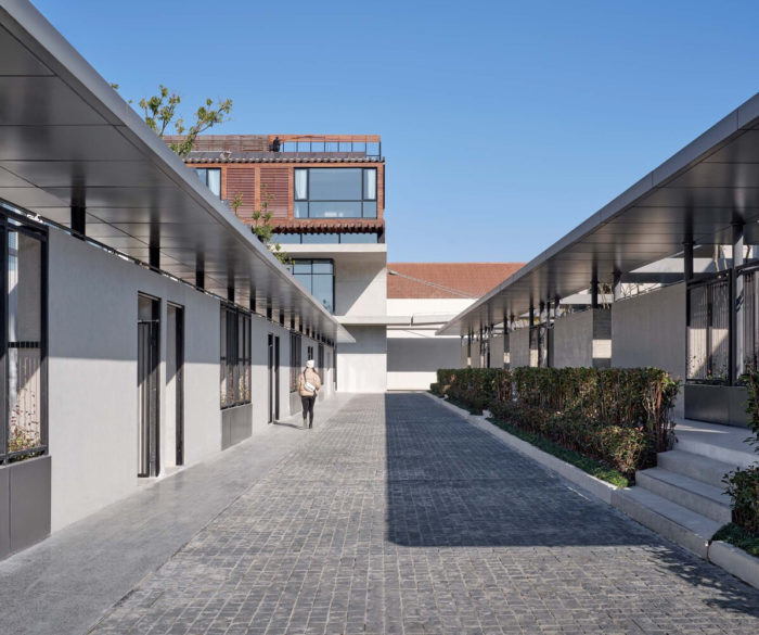
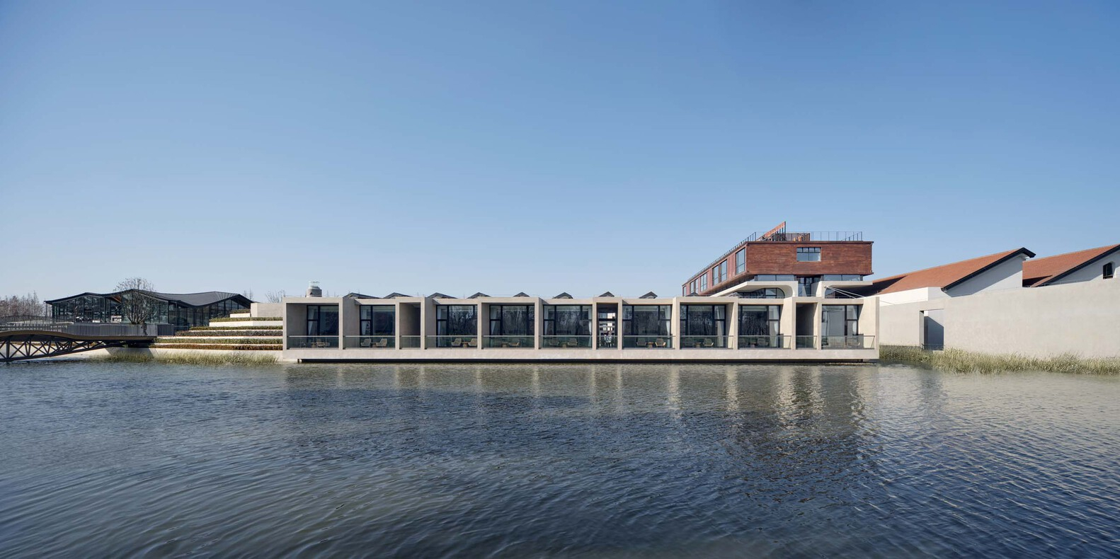
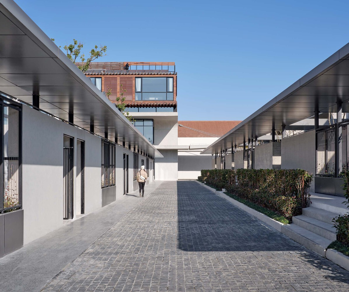
The decision to develop two new additions adjacent to the main offices was made as landscape features to simplify the formal appearance of the new buildings, and this approach included keeping the exterior smooth and diversifying the interior spaces. An assembly area set on either side of the existing offices in the grounds runs along the west, while a group of flexible buildings overlooking the river lies to the east. This layout offers street spaces facilitating dialogue between old and new products, including archived workstations into the entire catalog.
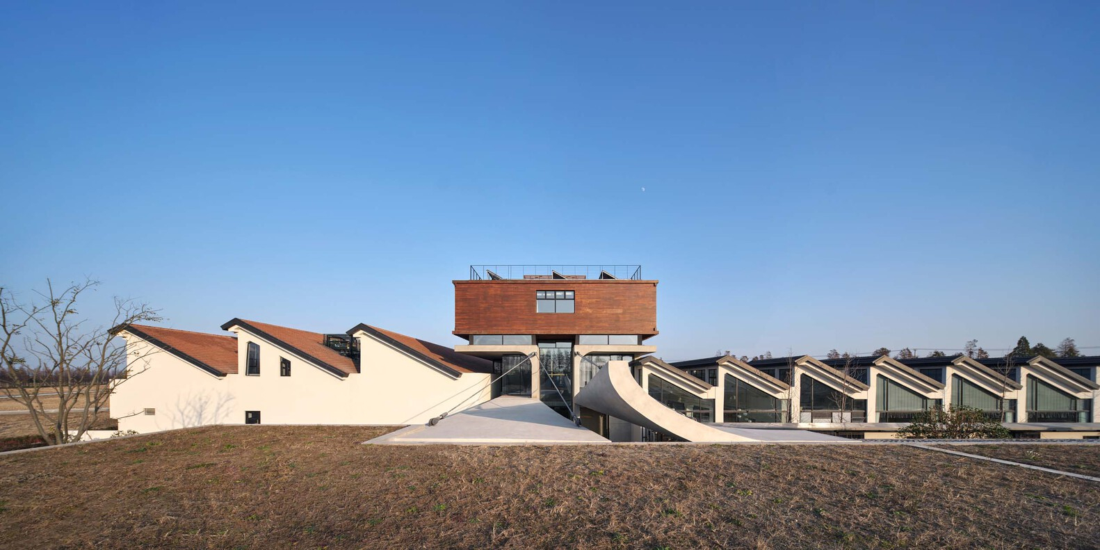
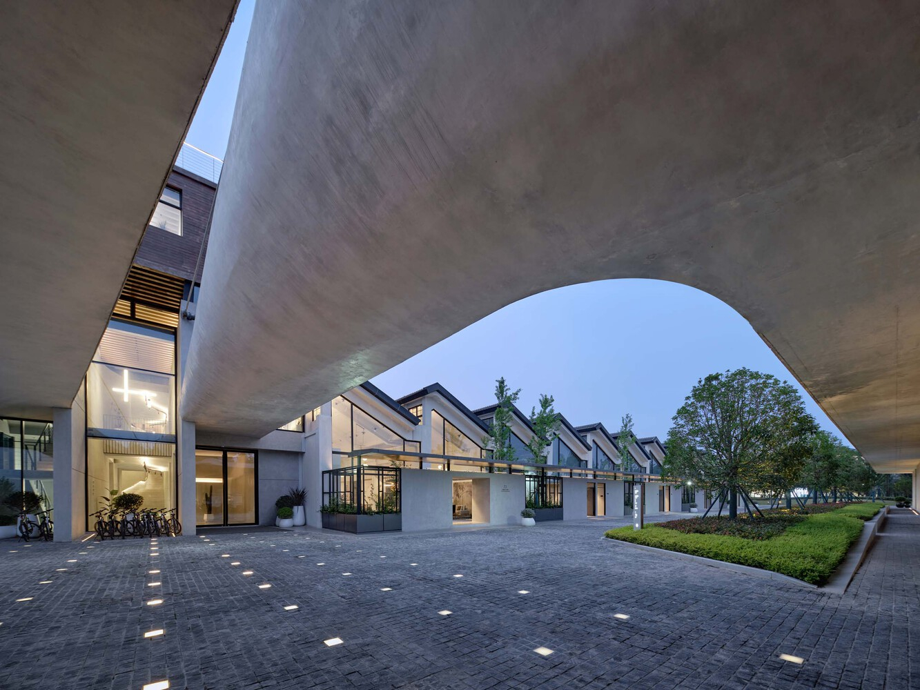
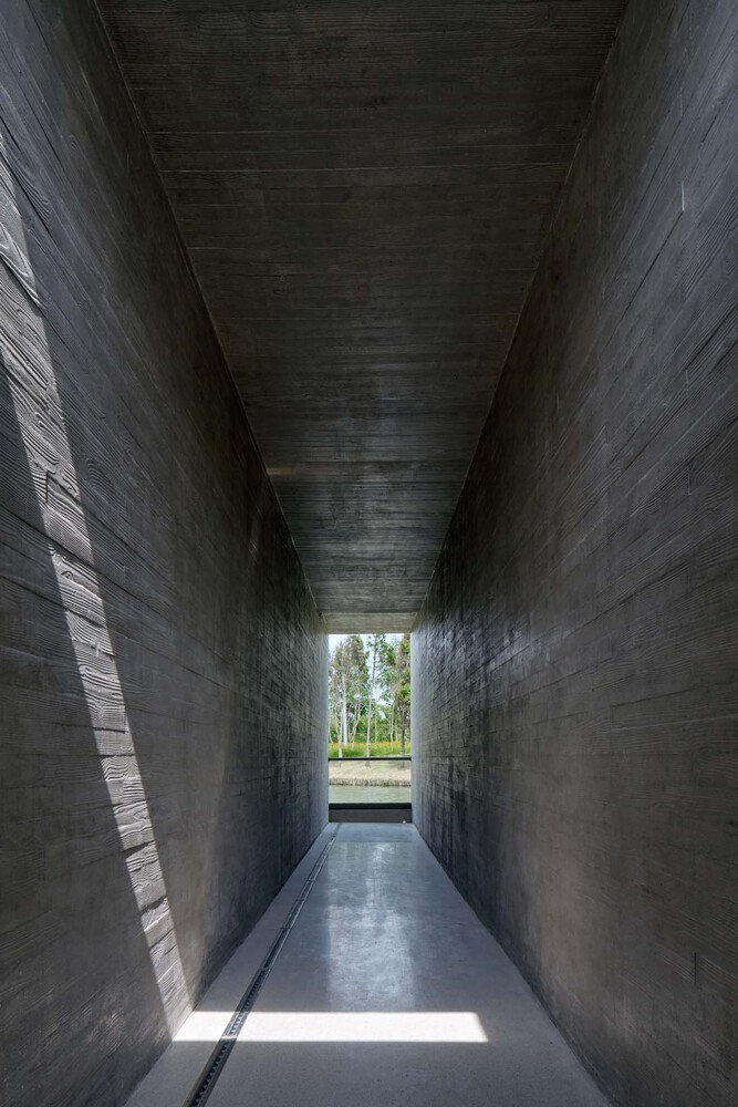
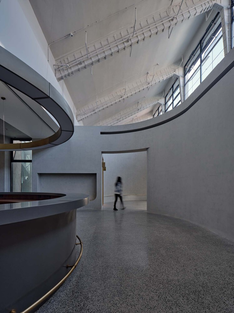
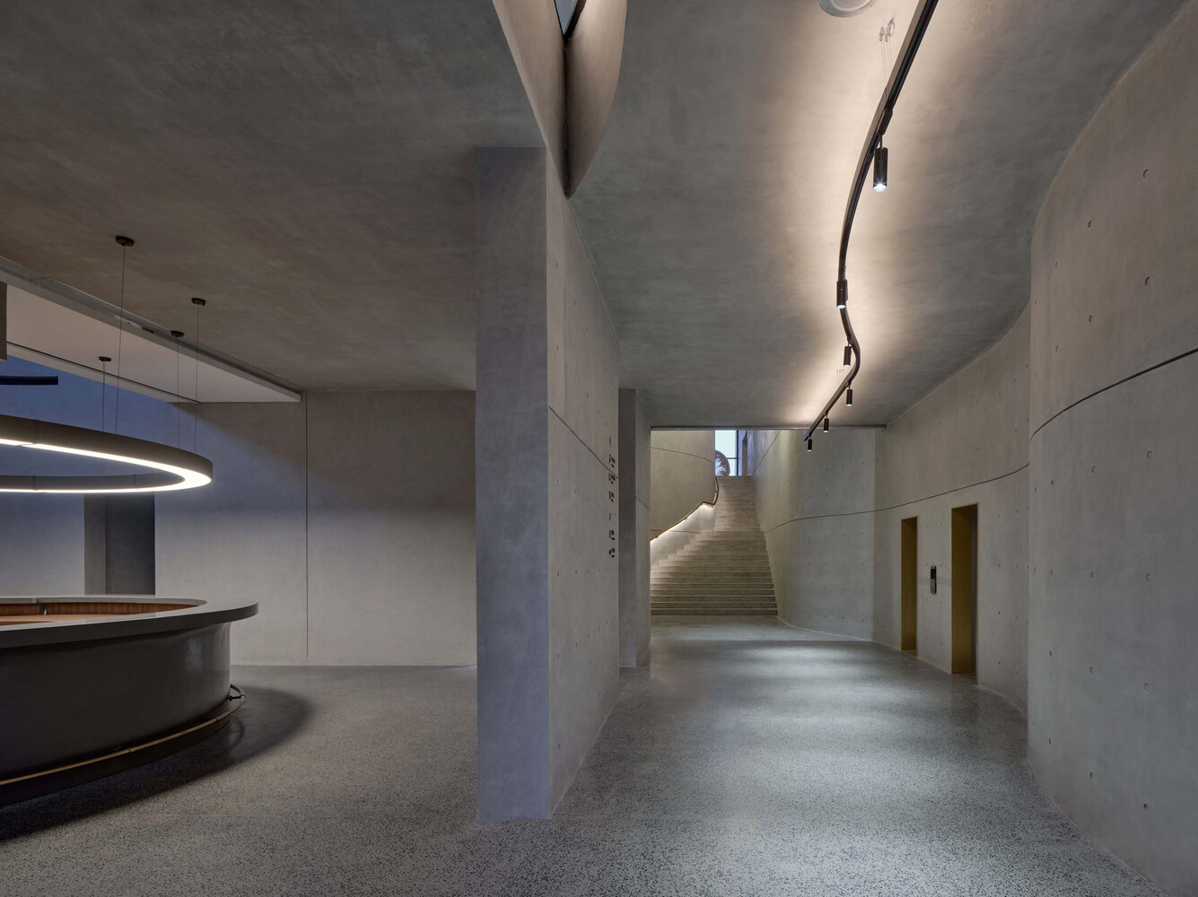
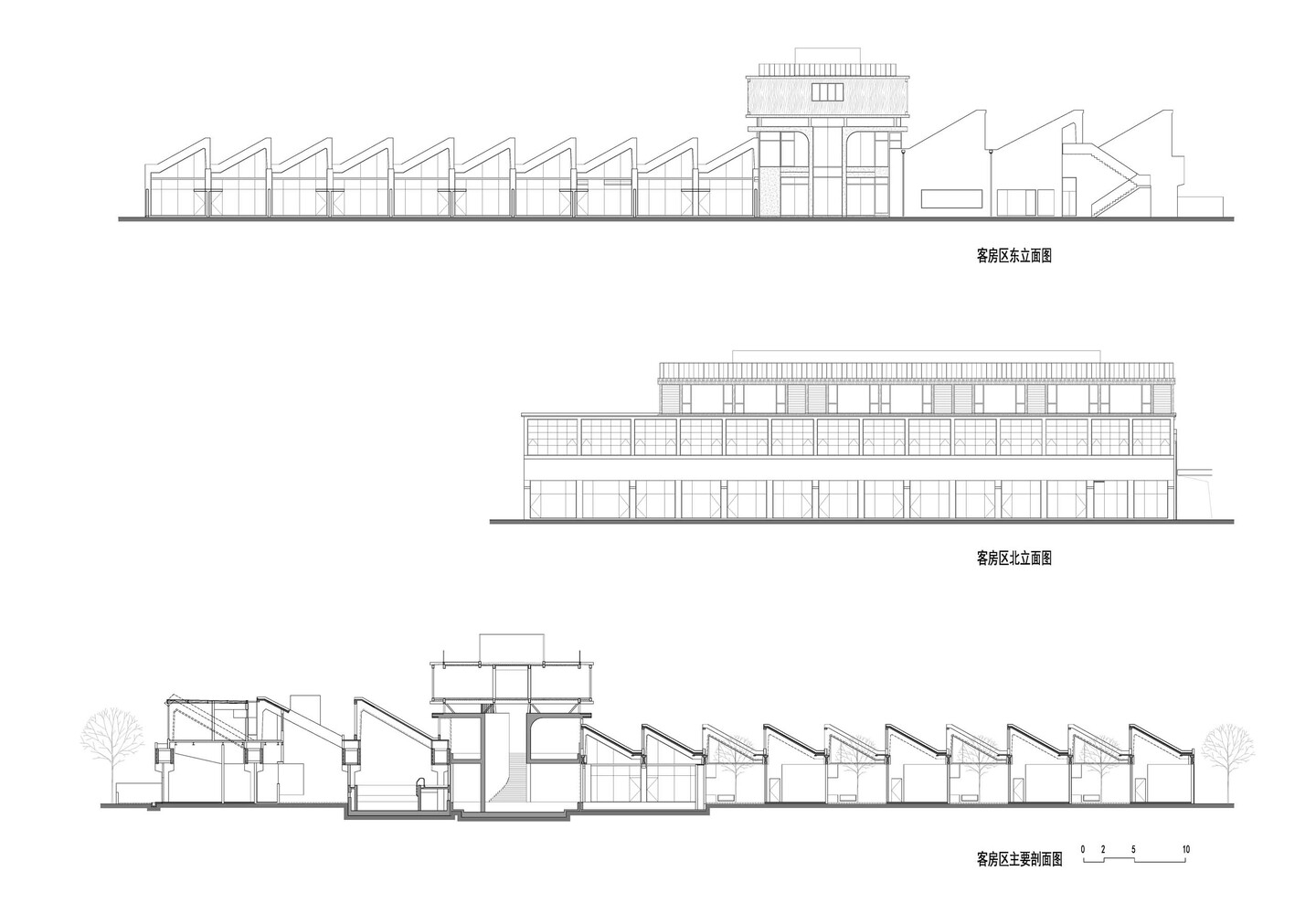
The expansive green embankment device continues to spread, and a new juxtaposition strategy emerges inside the middle organizations of sawtooth-formed manufacturing unit rooms. Two concrete walls emerge from the dike device, seamlessly placing themselves among the two units of existing factory rooms. These walls push and fold upward, guiding suspended metal and wooden volumes. When considered from a distance, it creates the ghost of a wooden container suspended from the sawtooth-fashioned roof of the vintage manufacturing facility, imbuing it with an experience of intrigue and surprise. From the viewing room on the top floor, you can gaze out over the roof beneath, connecting the brand-new space and the recollections associated with the area.
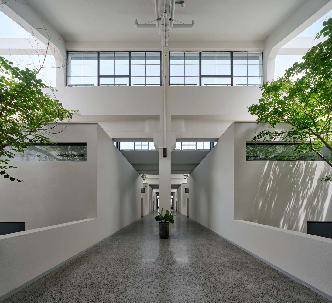
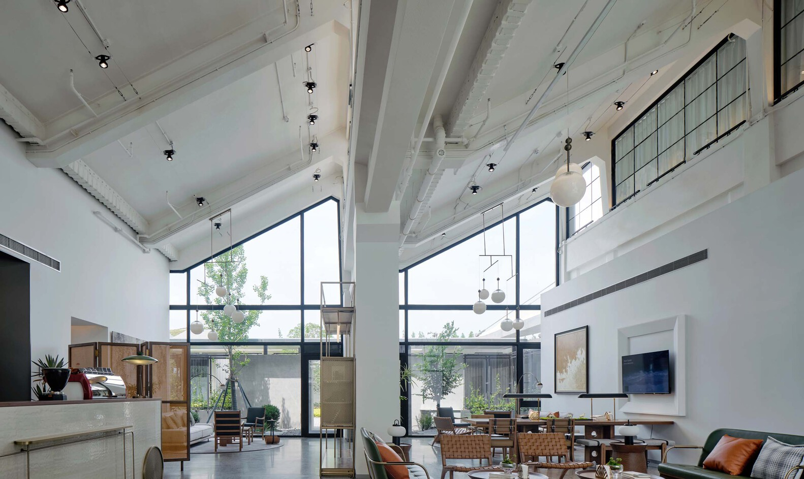
In the assessment of the aforementioned horizontal juxtaposition, the juxtaposition of the vintage and new factors in this scenario takes on a vertical orientation because of spatial boundaries. The space between the decreased part of the new volume and the present buildings’ bureaucracy is the intersection of this juxtaposition, resulting in a good, extra-captivating composition. To enclose this location, we have utilized an obvious glass interface to create an important lobby and shared area for the lodge.
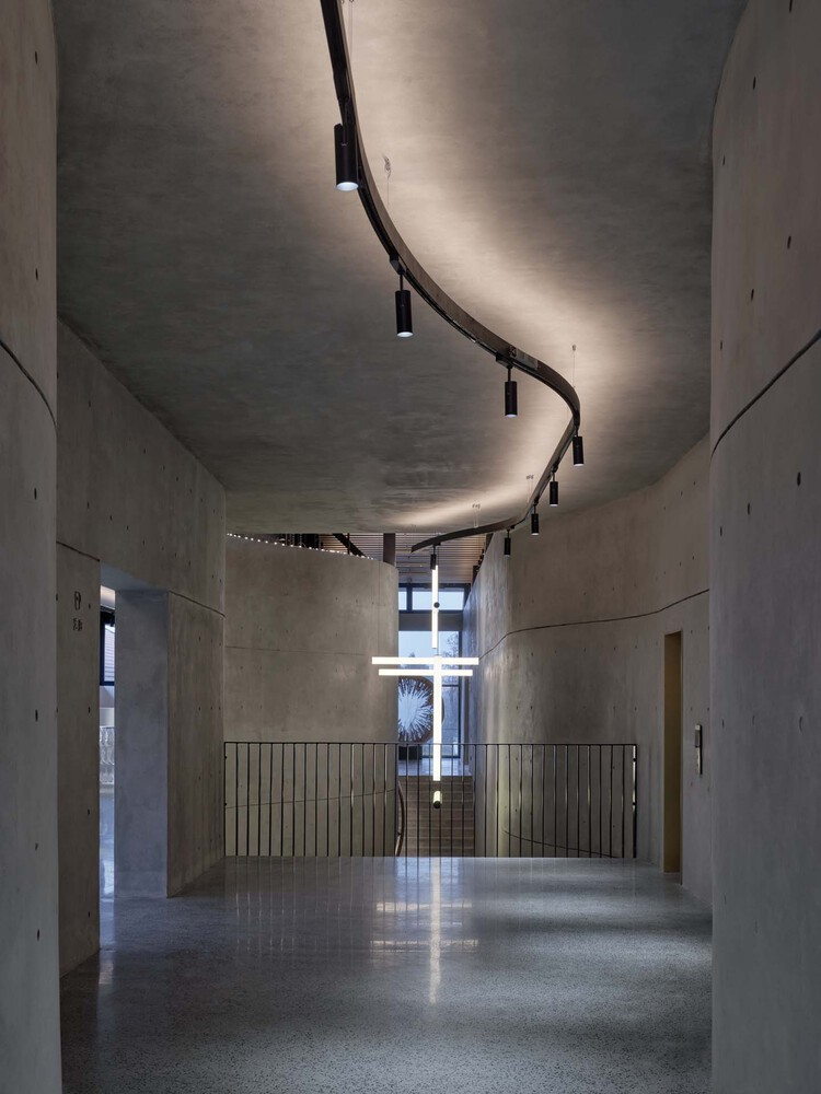
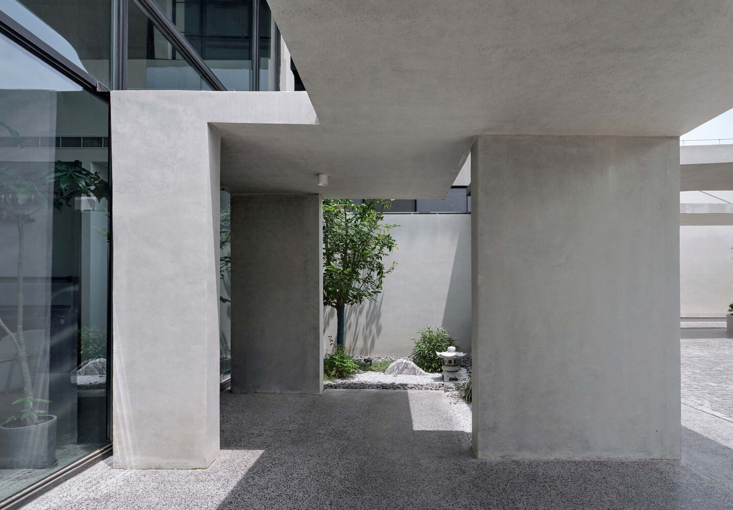
To enhance the creative and fascinating qualities of the gap, we’ve got a similarly more advantageous design of the two concrete partitions. These walls twist and curve inside the area, introducing a rhythmic retraction that provides dynamism to the, in any other case, regular-scale region. The curved walls also open up possibilities for additional functions, such as art displays, similarly enriching the overall revel in of the space.
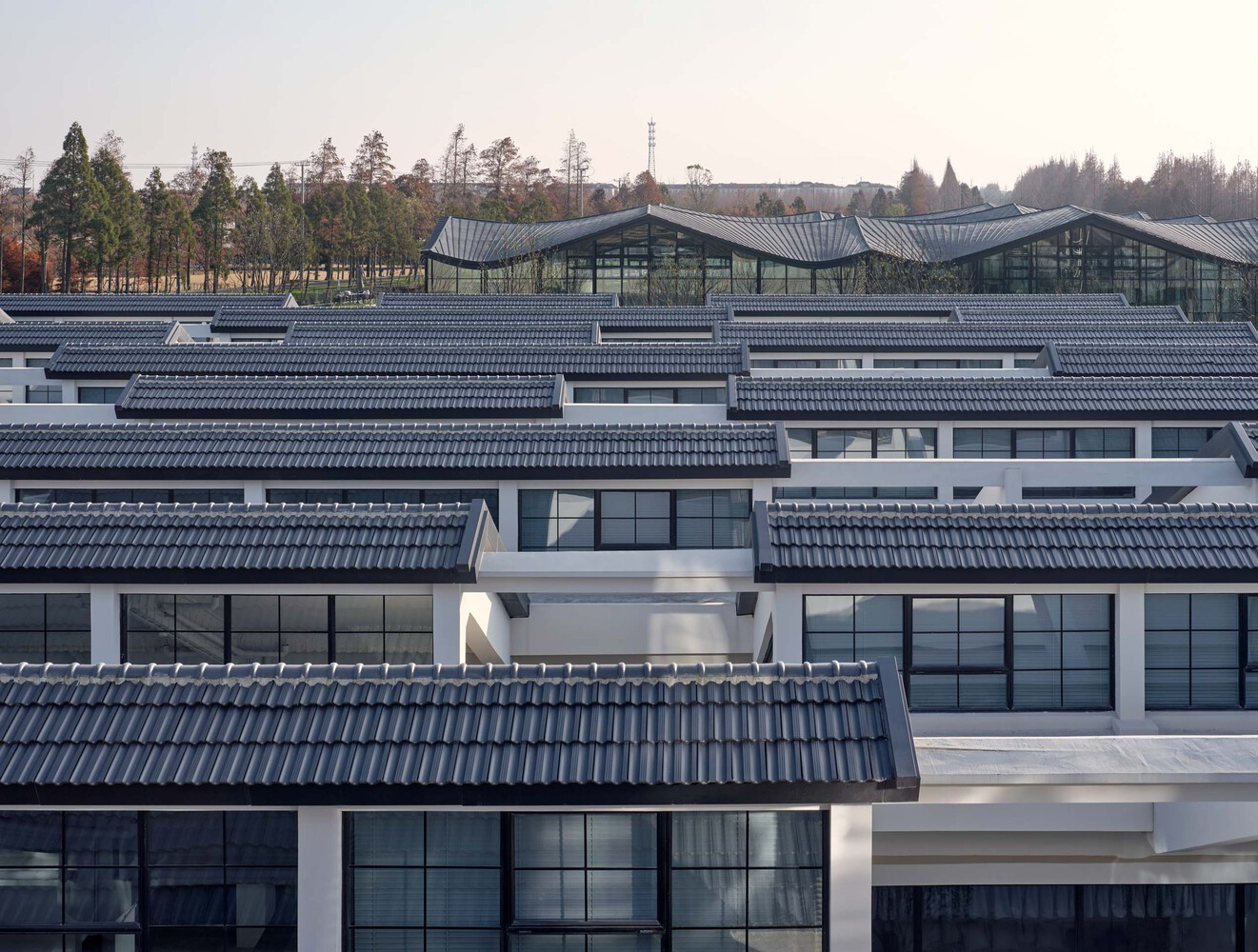
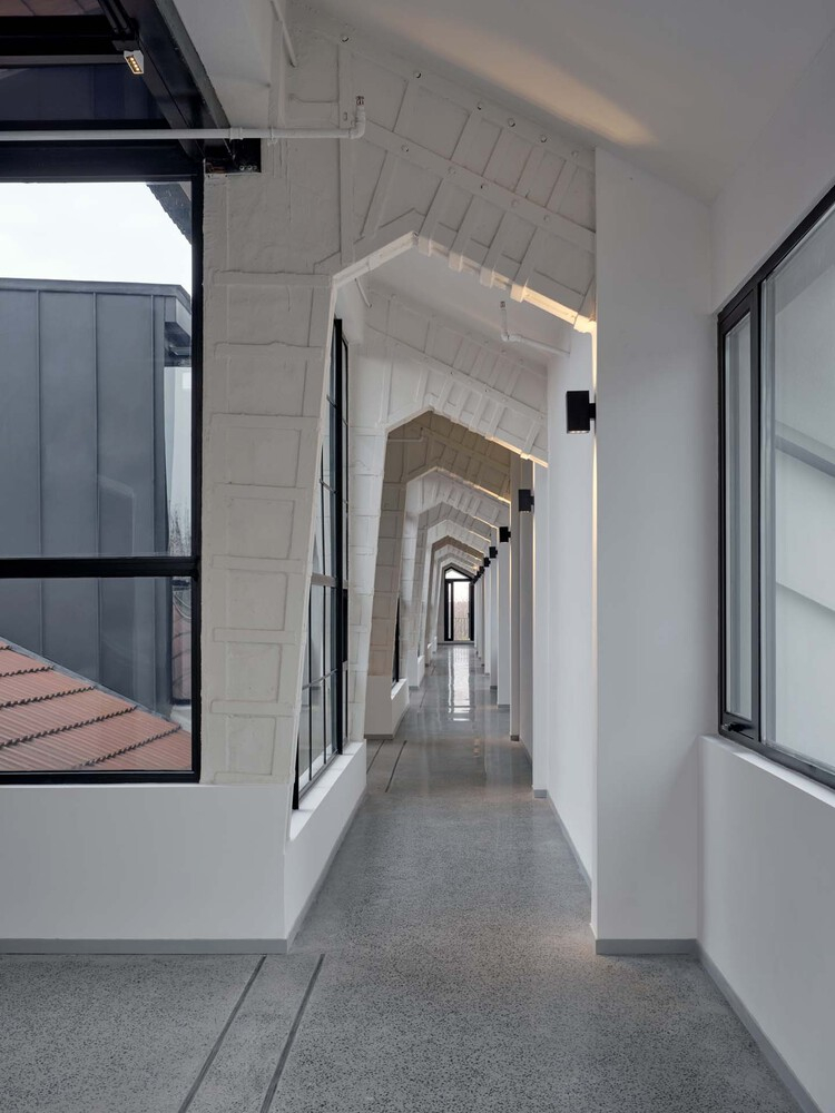
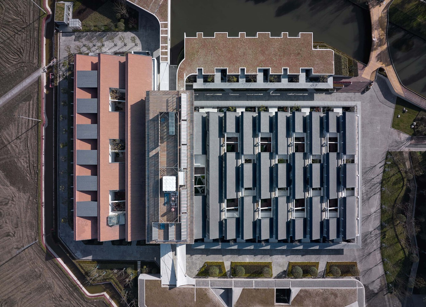
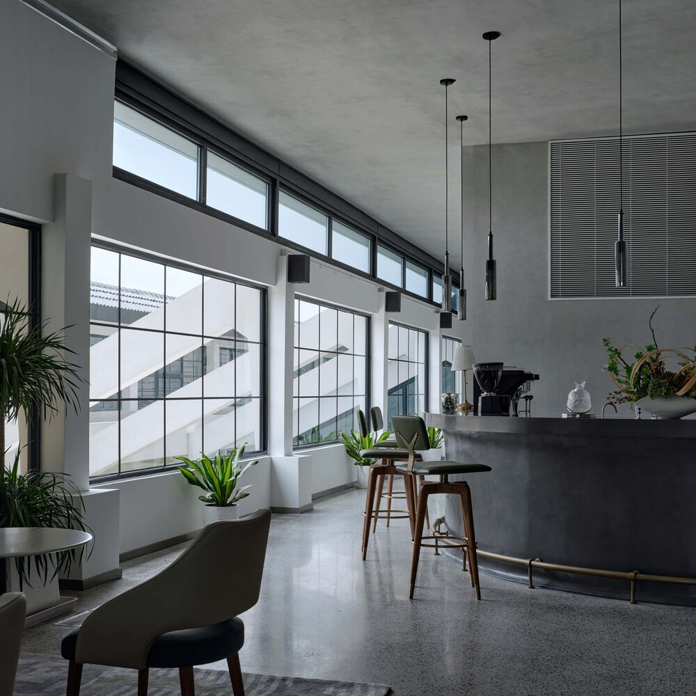
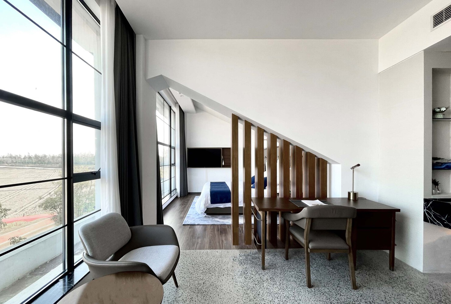
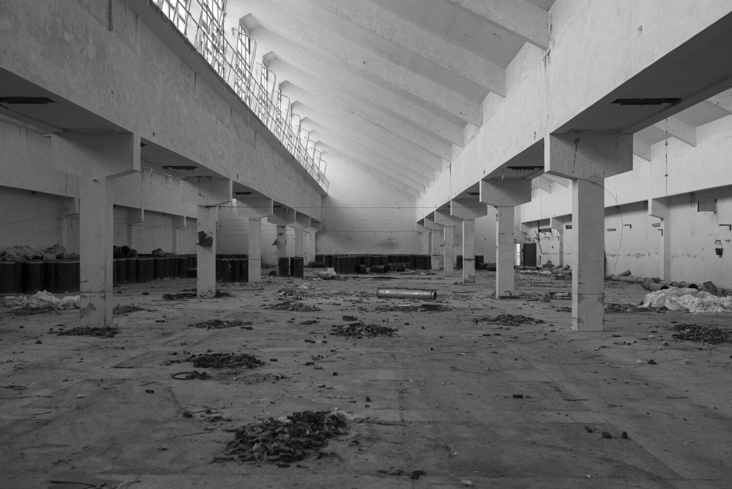
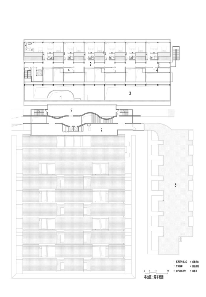
The northern organization, located alongside a massive rice field panorama, provides adequate internal space within the two preserved groups of sawtooth-fashioned factories. To decorate its usage efficiency, we determined to convert it into a two-tale shape. However, the second-floor space did not meet the customers’ needs because of present beam constraints. As a solution, we changed the authentic sloped roof with a steel flat roof, developing progressed situations for the second-ground visitor rooms. This alteration additionally ended in an awesome visual rhythm at the roof, adding an experience of time and man or woman to the overall design.
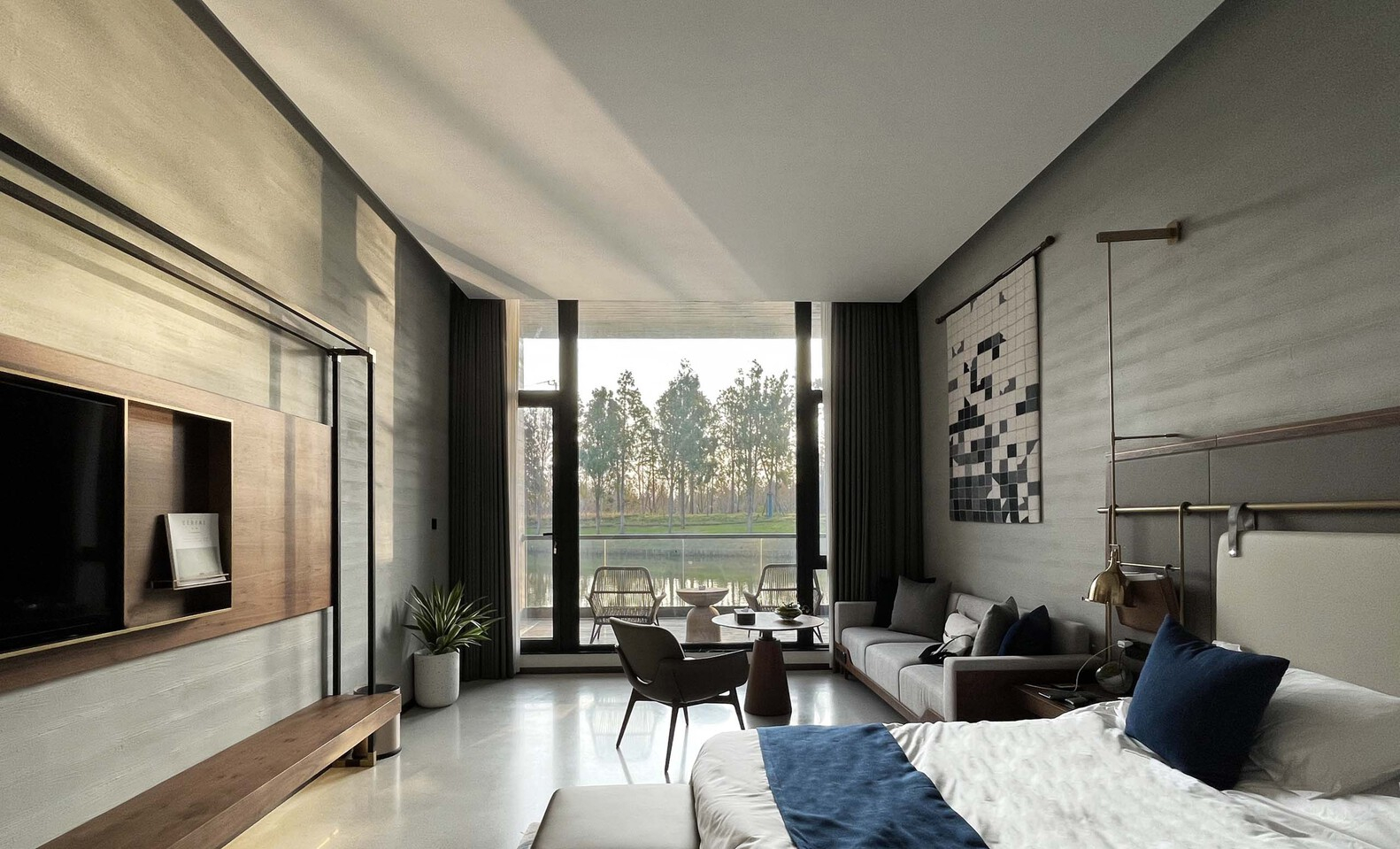
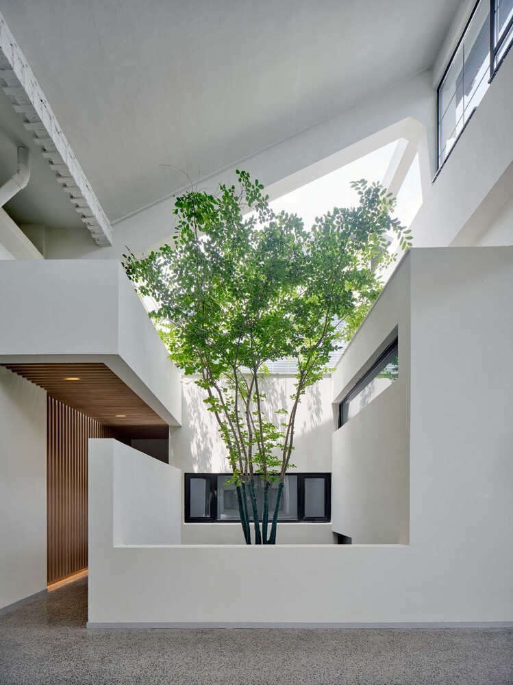
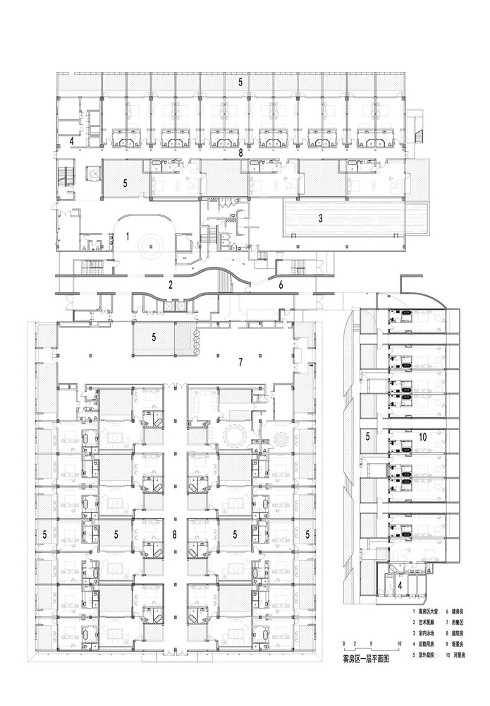
On the southern side, a set of lower-level factories provided larger scales. To transform those homes into particular courtyard visitor rooms, we implemented comprehensive structural reinforcement and, in part, removed the roofs to create open courtyards. This allowed us to preserve the roof frames’ patina, reflecting the courtyard landscape’s charm. Simultaneously, we introduced new volumes in numerous architectural fashions to house non-public areas, generating a juxtaposition between the old and the new. This space serves as a medium that connects the different varieties of creation, seamlessly integrating the various elements into a cohesive entire.
Project Info:
Architects: TJAD Original Design Studio
Area: 7267 m²
Year: 2021
Photographs: ZY Architectural Photography
Lead Architects: Ming Zhang, Zi Zhang
Interior Design: Interspace
Construction: Shanghai Qianyi Agricultural Development Co., Ltd.
Design Team: Lei Xiao, Weidong Xi, Si Pan, Shanshan Feng, Xiaoqian Huang, Liju Fei
Facility Design: Changzhao Guo, Tao Fang, Hanqian Li, Bingchun Shen, Jiapeng Yang
Lighting Design: Xiu Yang, Xinghua Gu, Chen Bian, Yang Wu, Yu Liu, Wenjing Ge
Structure Design: Rui Wang
Logo Design: des:glory
City: Shanghai
Country: China
© ZY Architectural Photography
© ZY Architectural Photography
© ZY Architectural Photography
© ZY Architectural Photography
© ZY Architectural Photography
© ZY Architectural Photography
© ZY Architectural Photography
© ZY Architectural Photography
© ZY Architectural Photography
guestroom rendering
original site
© ZY Architectural Photography
© ZY Architectural Photography
© ZY Architectural Photography
© ZY Architectural Photography
© ZY Architectural Photography
© ZY Architectural Photography
© ZY Architectural Photography
© ZY Architectural Photography
© ZY Architectural Photography
© ZY Architectural Photography
guestroom rendering
original site
original site
1F plan
2F plan
3F plan
section
form generation
axonometric


