About Upcycled House
Upcycled House was originally built in the early 1980s by a local architect and builder who drew inspiration from the sudden modernization prevalent at the time, with practices such as Merchants Builders and Fasham Johnson Houses. This, often designed as low-maintenance family beach houses, is an example; they are found scattered along the Bellarine Peninsula and surf beaches, reflecting the growth of the area in the 1970s and ’80s, but the current expansion and development phase in this area has replaced many of these homes with luxury villas and townhouses.
Concept Of Upcycled House
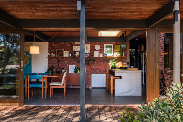
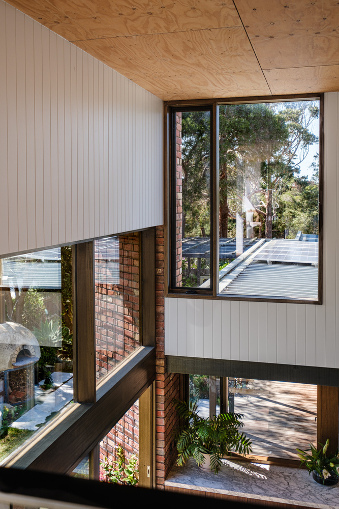
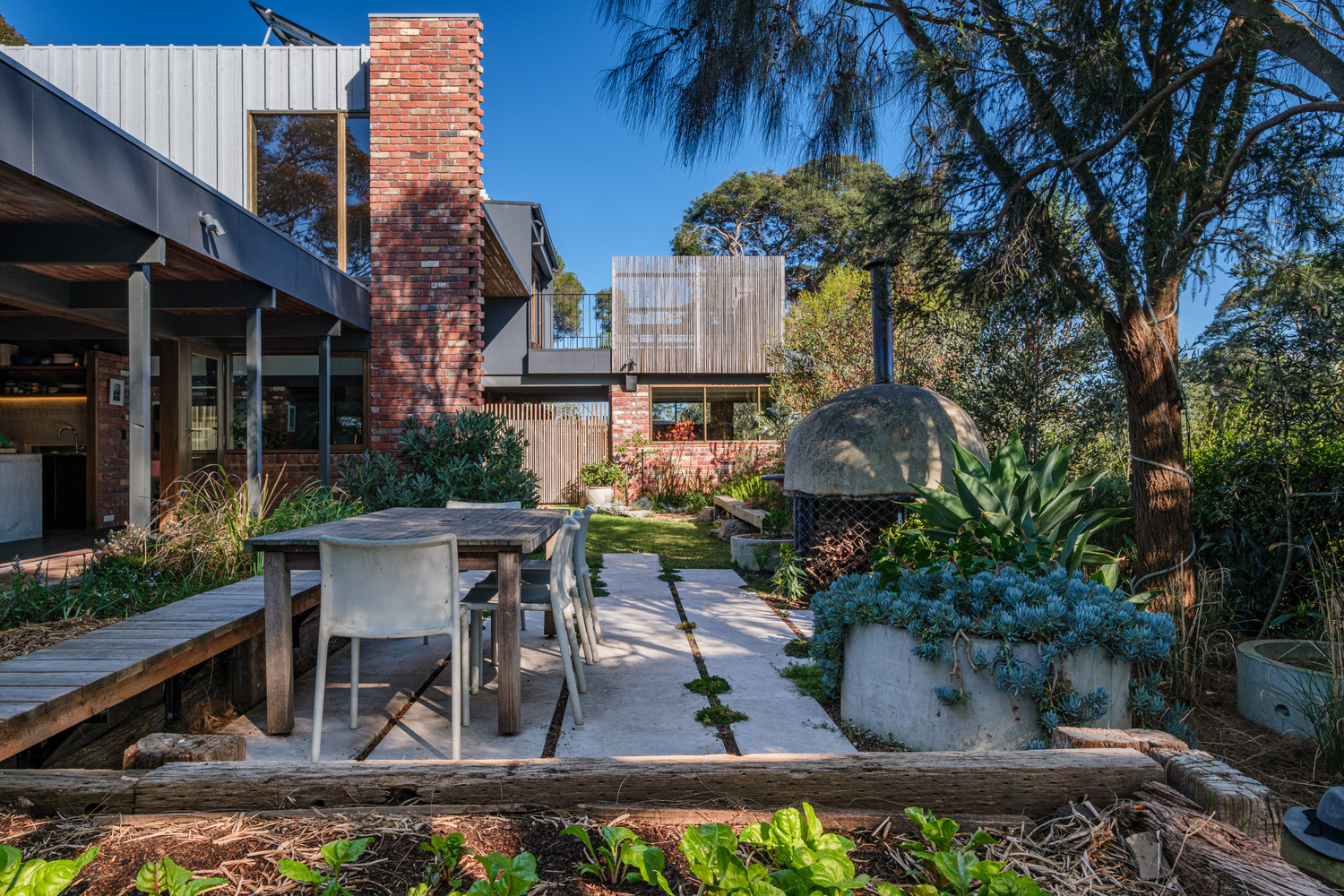
Generally, the design of Upcycled House is compact layout, vertical structure, and low height. The north façade has expansive full-height windows and is sheltered by a wide, deep terrace overlooking the landscaped garden in the courtyard. Choosing lightweight and durable building materials, including warm concrete floors, double brick walls, and low-strength steel tray tops with Oregon wood supports.
These choices help them get a simple and beautiful interior with a view and a façade of brick and pine lines. The owners have lived in the house since 2010, cultivating a thriving permaculture garden with chickens, vegetables, and small fruit trees, so the house has a solid foundation and benefits from excellent solar energy. As their family expanded, the owners wanted to add additional bedrooms and create spacious living spaces that contrasted with the already low ceilings to provide comfort.
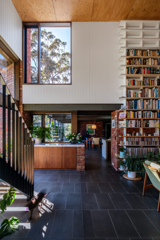
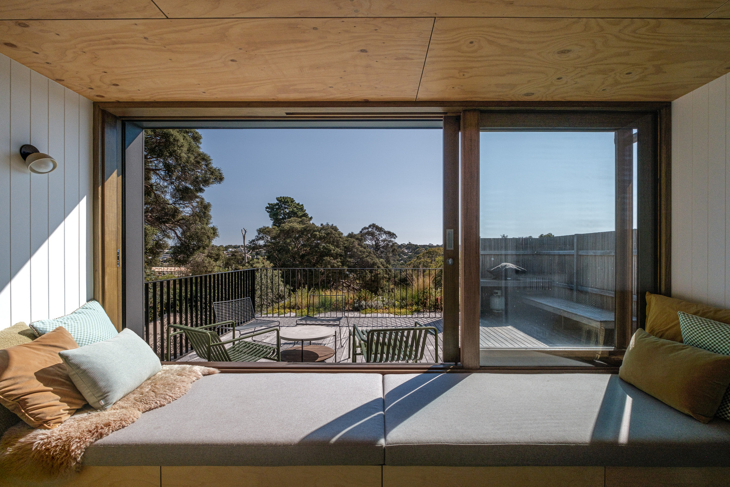
A comprehensive master plan was drawn up to extend the house, incorporating various improvements. These additions included the creation of a master bedroom, adding two vacant floors to the main living area, raising the ceiling, a new front entrance and extension of stairs, living extensions, garage replacements, sunrooms, and new rooftop docks.
Throughout the process, each psychometric probe was carefully considered while adhering to several informal guidelines. These guidelines include keeping the number of alterations to a minimum, preserving the existing garden, maintaining the simplicity and elegance of the original house, and putting quality and flow quantity first to avoid excessive maintenance.
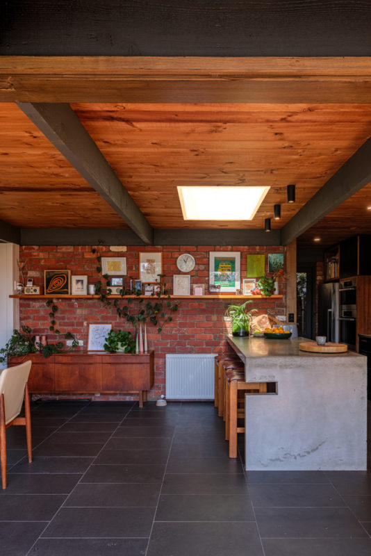
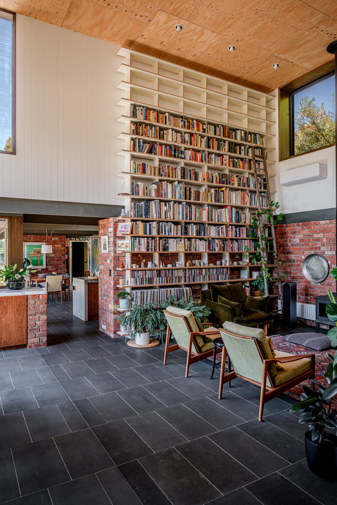
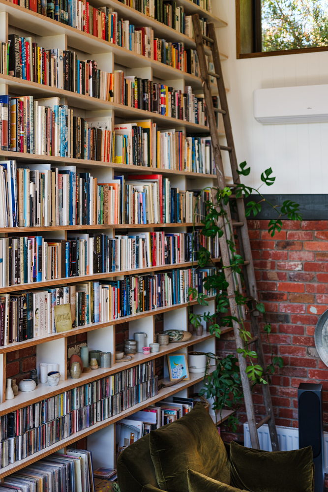
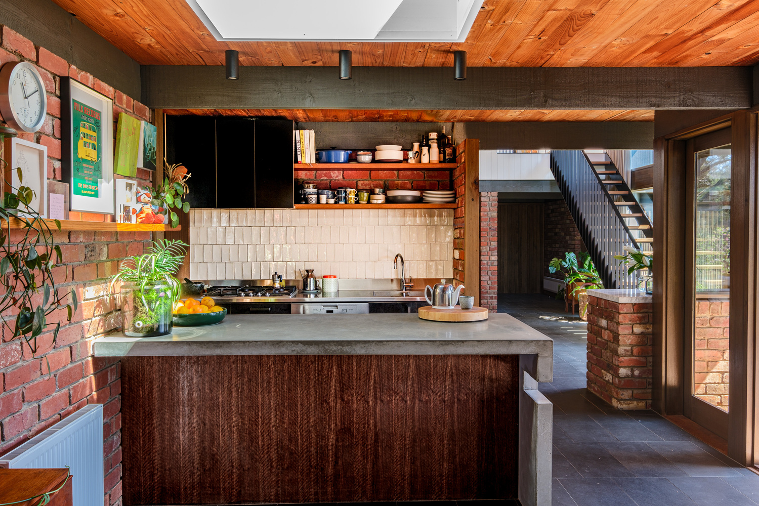
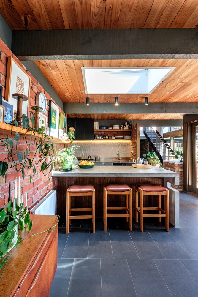
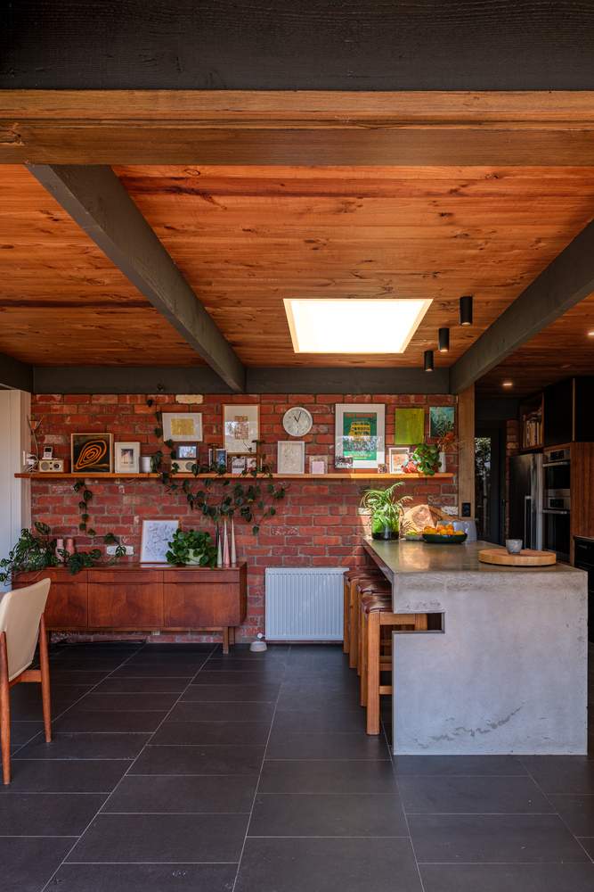
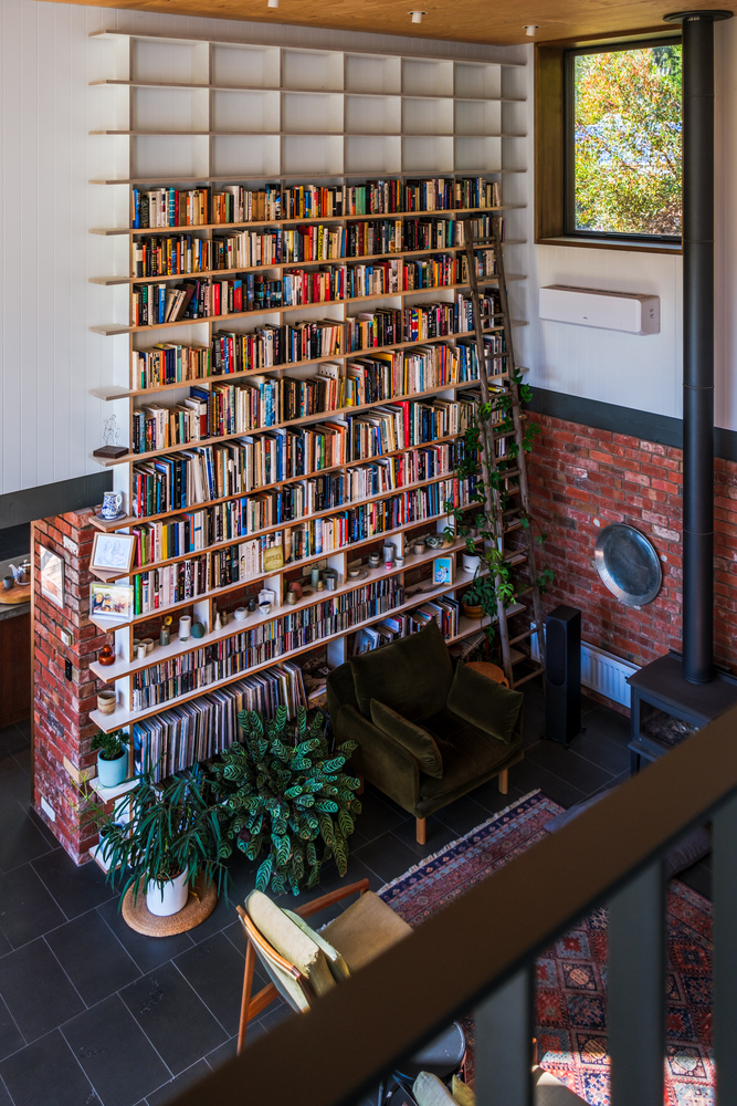
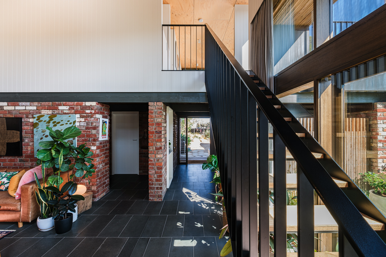
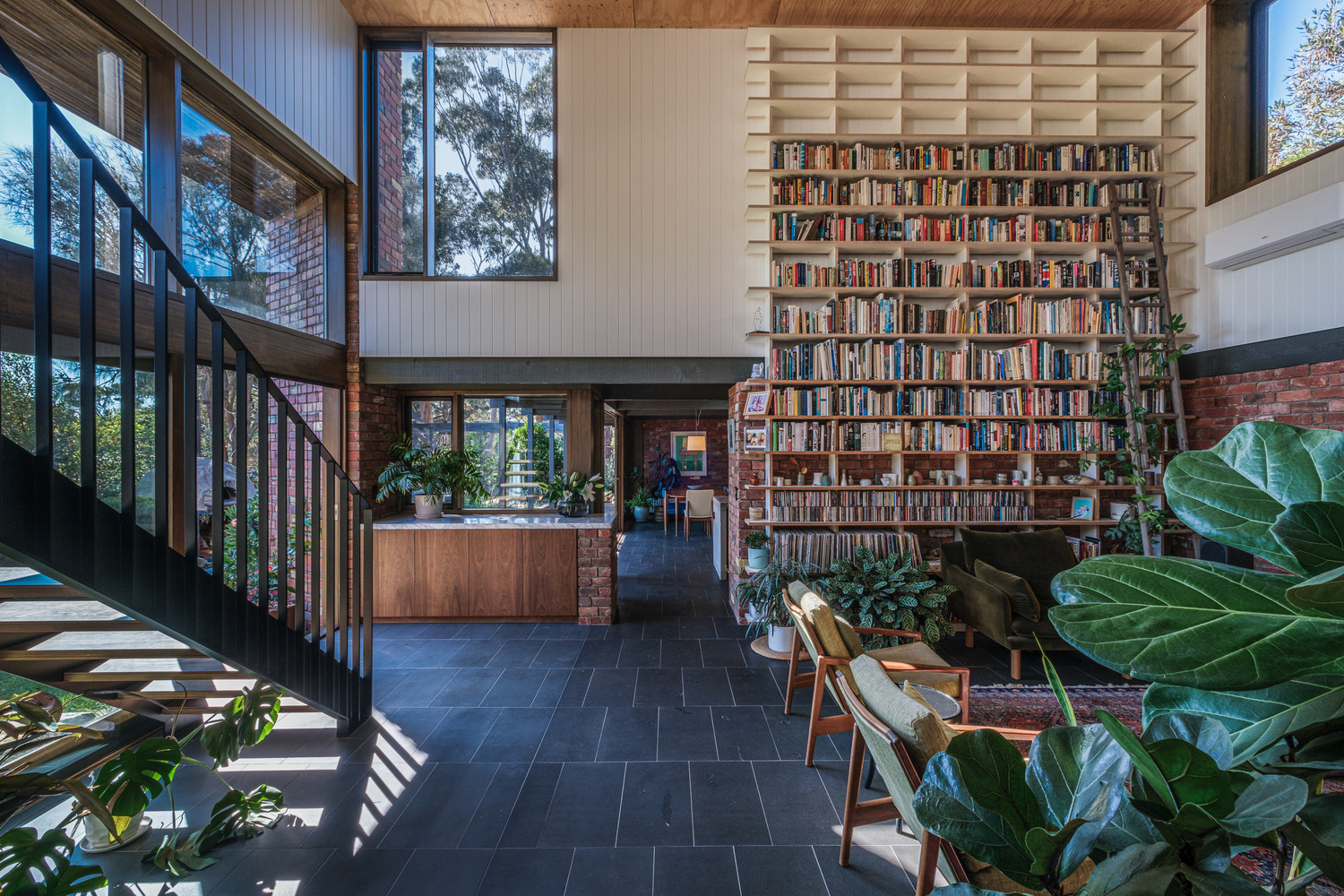
The choices intentionally focused on maintaining a simple and strong aesthetic in harmony with the existing home. In a gesture of sustainability and continuity, the original recycled reinforced red brick was carefully excavated, repaired, and restored to create new masonry walls. Notably, that brick is a rectangular brick pier that acts as a focal point in the living room, creating a garden look. Interestingly, this is the third iteration of this brick, hand-picked and maliciously restored by the original owner from old houses demolished in Geelong in the 1970s and painstakingly cleaned by hand. In recognition of this effort, Freehand Projects respected the historical significance of the bricks and seamlessly incorporated them into the new design.
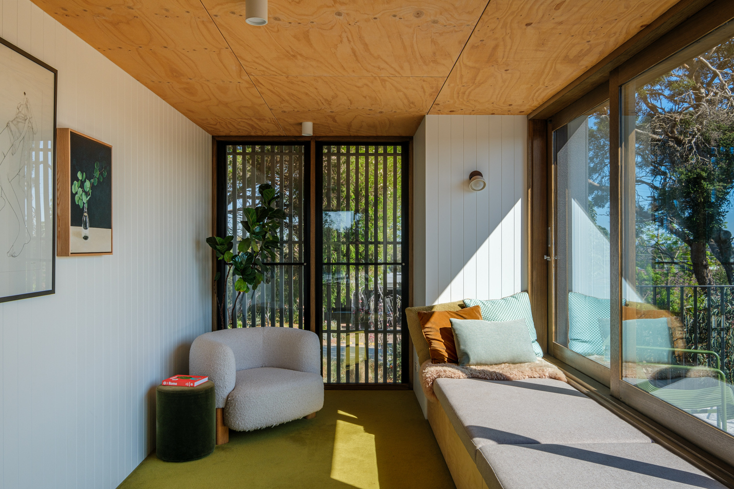
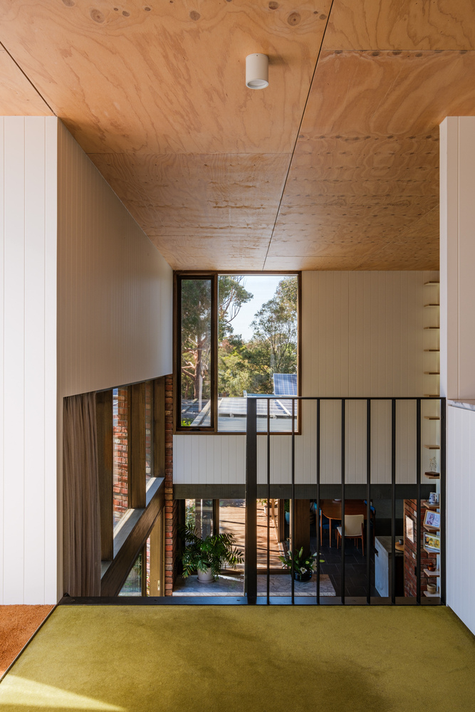
To address the issue of removing old slate floorboards, they replaced them with bluestone slabs, paying homage to the NGV design by Roy Ground, which happens to be the owner’s favorite building, one of the View by freehand projects, instead of using plasterboard for interior wall lining -A grooved wall was chosen to bring texture, and as for the ceiling, scrap plywood was chosen to have timber warm without the high cost to complement the original pine lining boards found elsewhere cohesively.
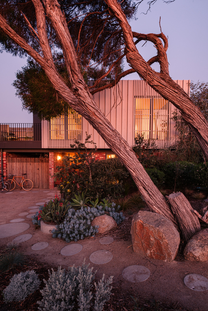
Weathertex Weathergrove Woodsman panels, a naturally sustainable and 100% natural material from wood waste and bee pollen, were used for the outdoor details. Oregon rods were added permanently, though they improved the face and brought depth and energy to the overall design. Pale white was chosen to match the melaleucas on the façade of the house, creating rich shadows in the golden hours of the evening where the hardwood windows were stained to match the ancient moon, the roots of the trees will be uniform so that when viewed from the inside they may blend easily into the landscape.
Project Info:
Architects: Freehand Projects
Area: 294 m²
Year: 2022
Photographs: Steph McGlenchy
Manufacturers: Big River Group, Dulux, Easycraft, Polytec, Supertuft, Weathertex
Builders: Chris Cowley Builders
Structural Engineers: Simon Anderson Consultants
Roof Garden: Fytogreen Australia
Joinery: Pavilion Joinery
Windows: Concept Timber Windows
Curtains: Champion Blinds
Balustrades: Ore Designs
City: Ocean Grove
Country: Australia
© Steph McGlenchy
© Steph McGlenchy
© Steph McGlenchy
© Steph McGlenchy
© Steph McGlenchy
© Steph McGlenchy
© Steph McGlenchy
© Steph McGlenchy
© Steph McGlenchy
© Steph McGlenchy
© Steph McGlenchy
© Steph McGlenchy
© Steph McGlenchy
© Steph McGlenchy
© Steph McGlenchy
© Steph McGlenchy
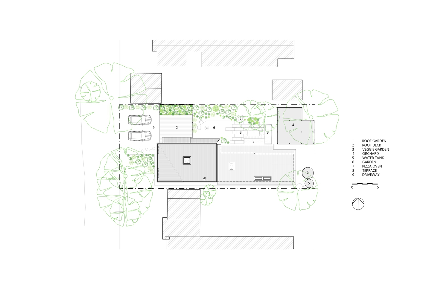
Plan - Site
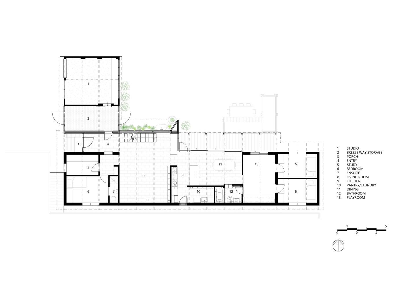
Plan - 1nd Floor
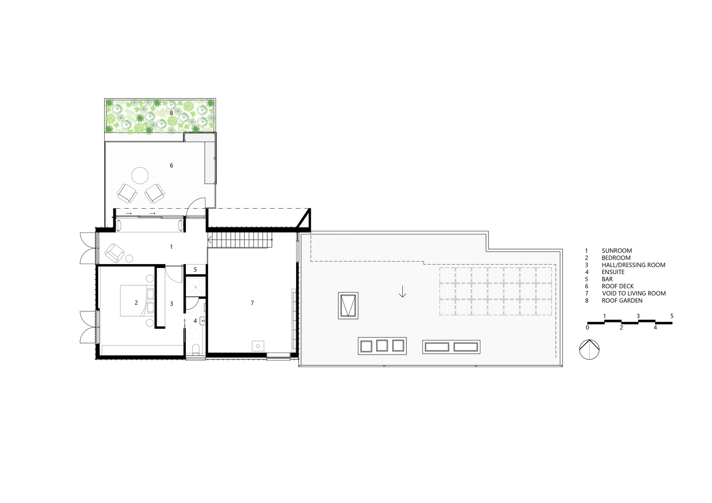
Plan - 2nd Floor


