About Sideway Apartment
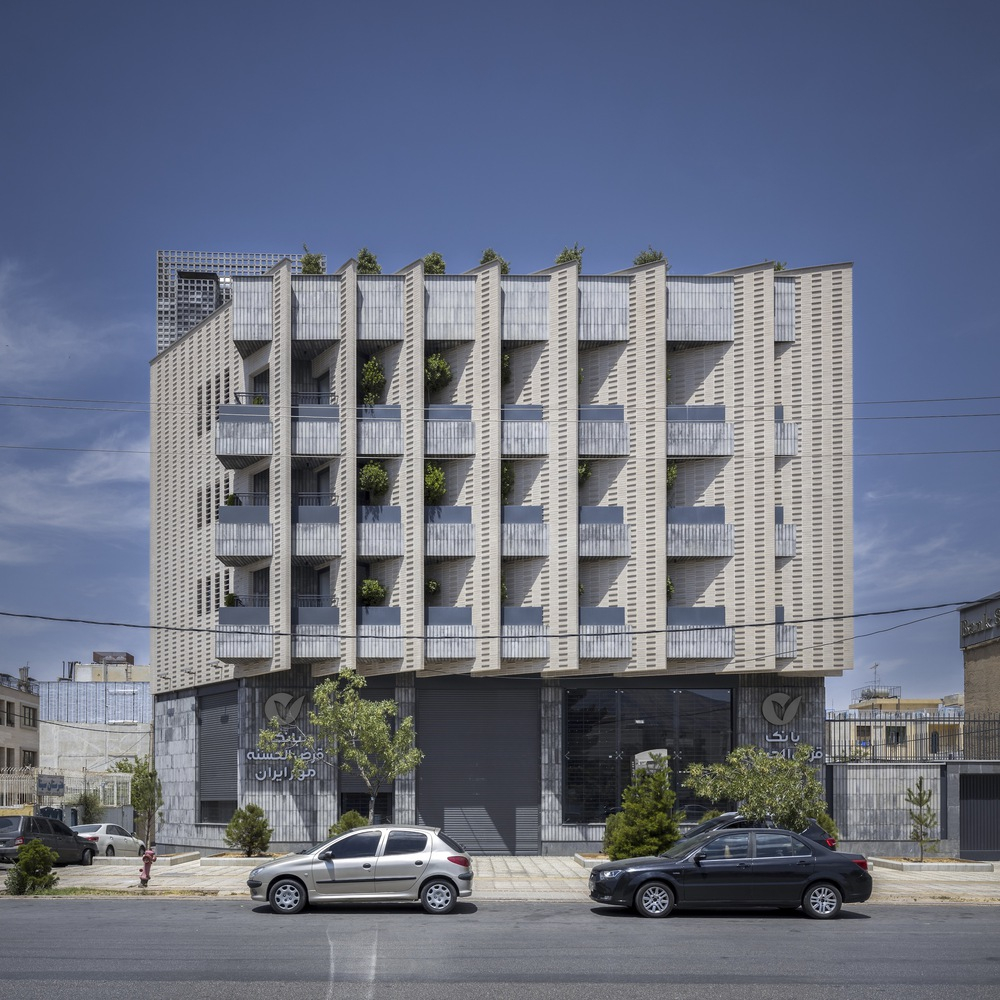
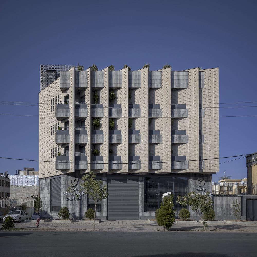
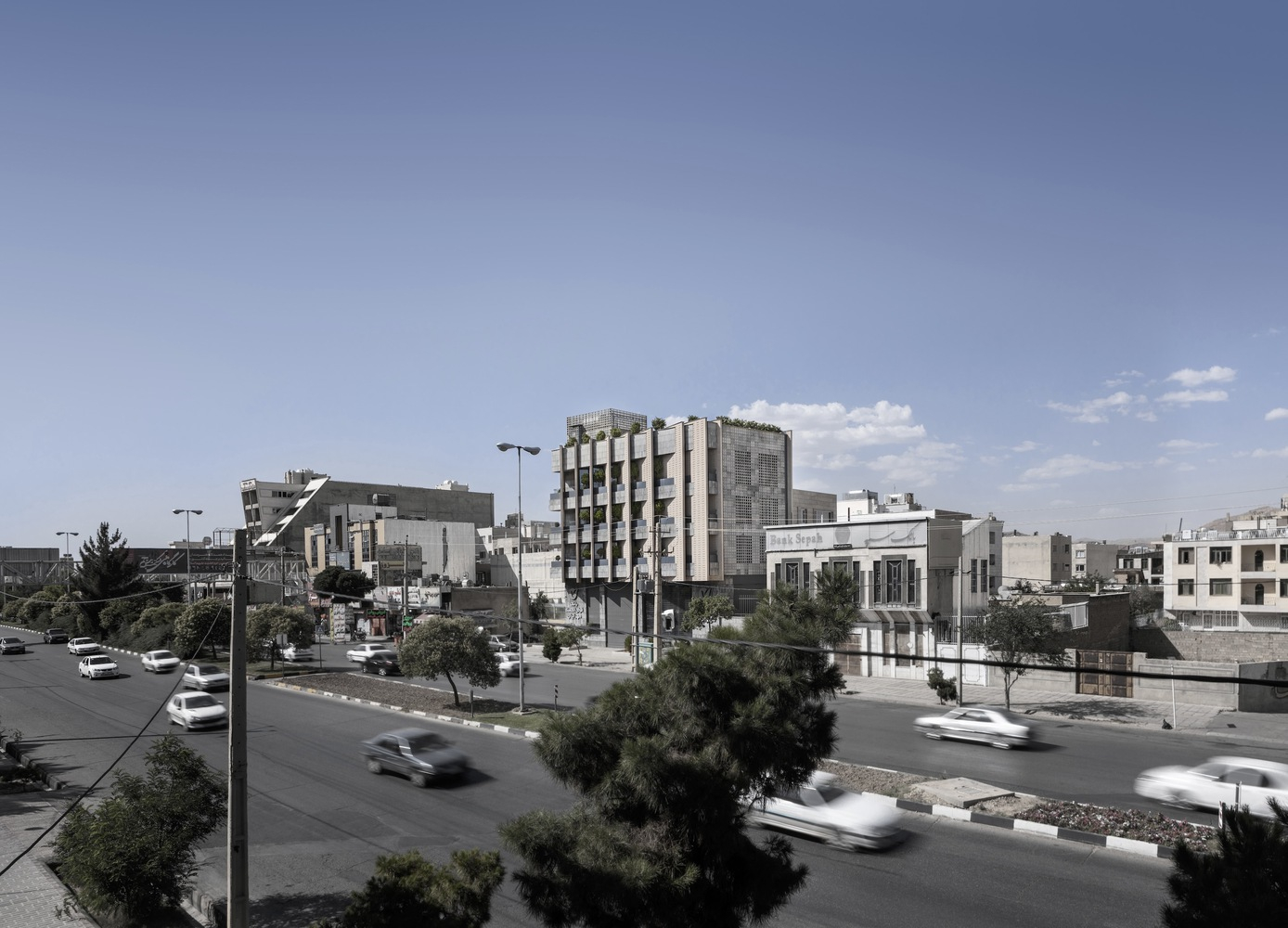
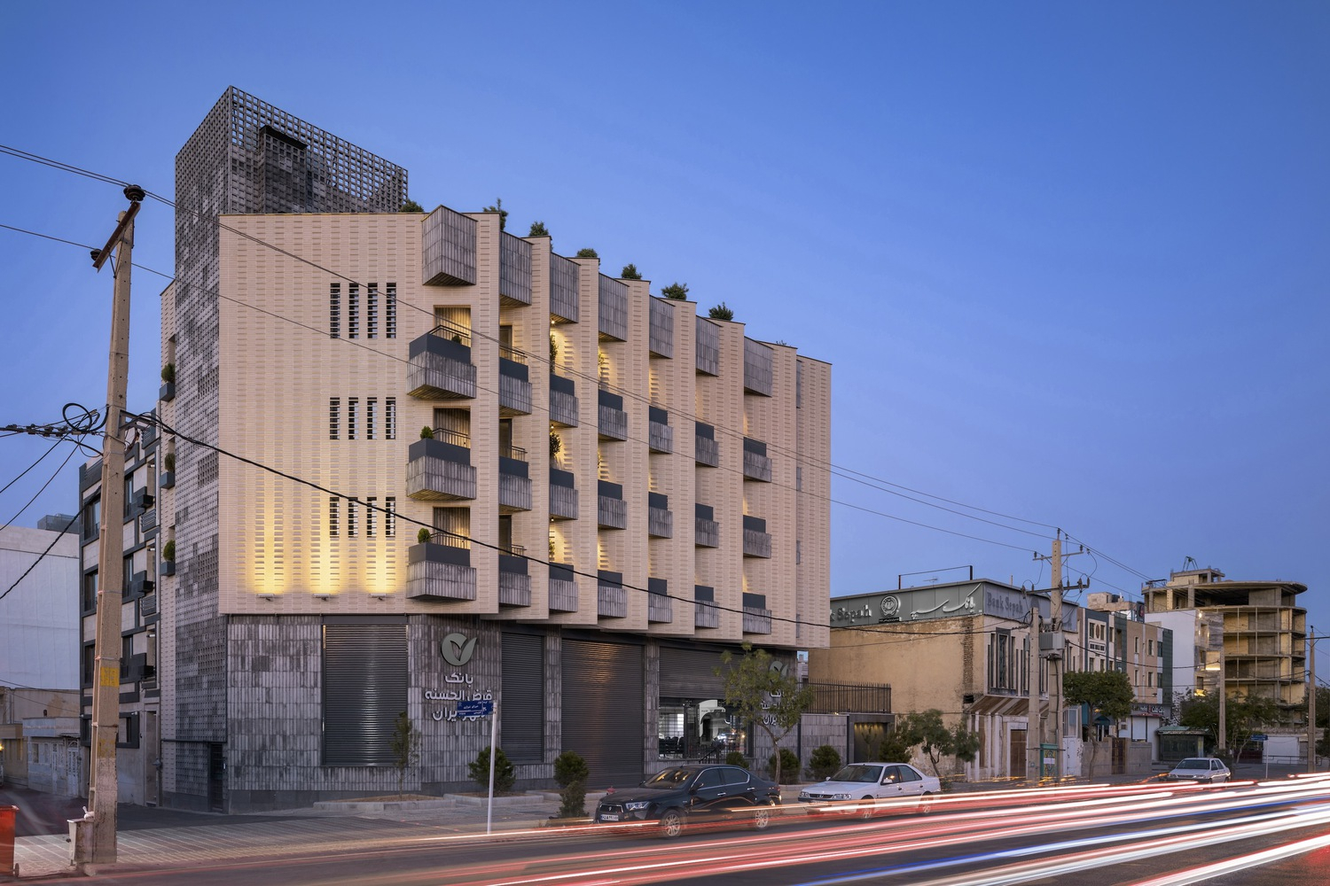
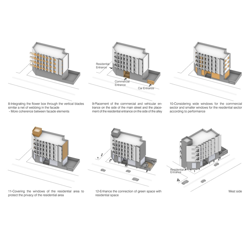
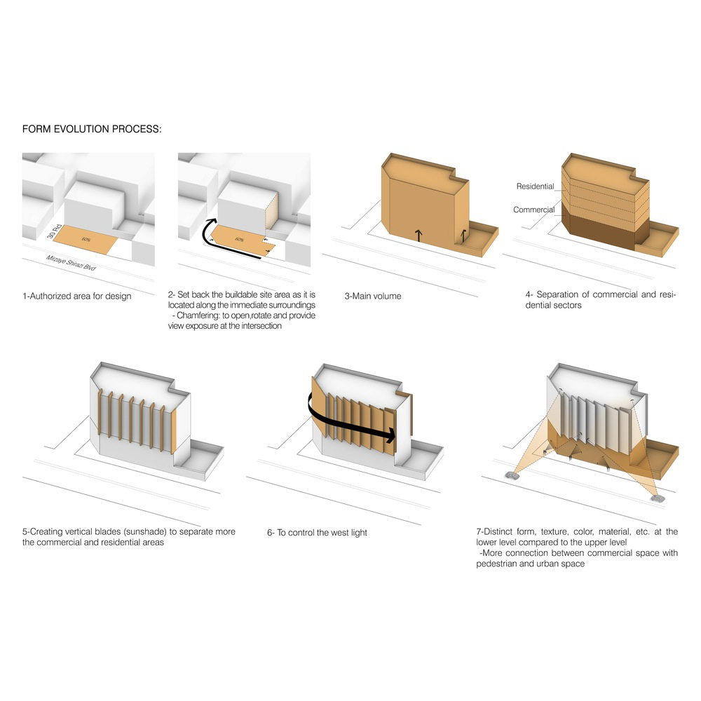
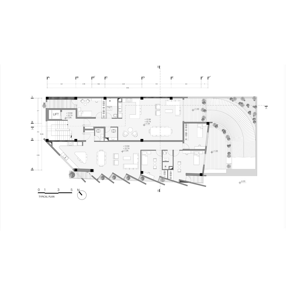
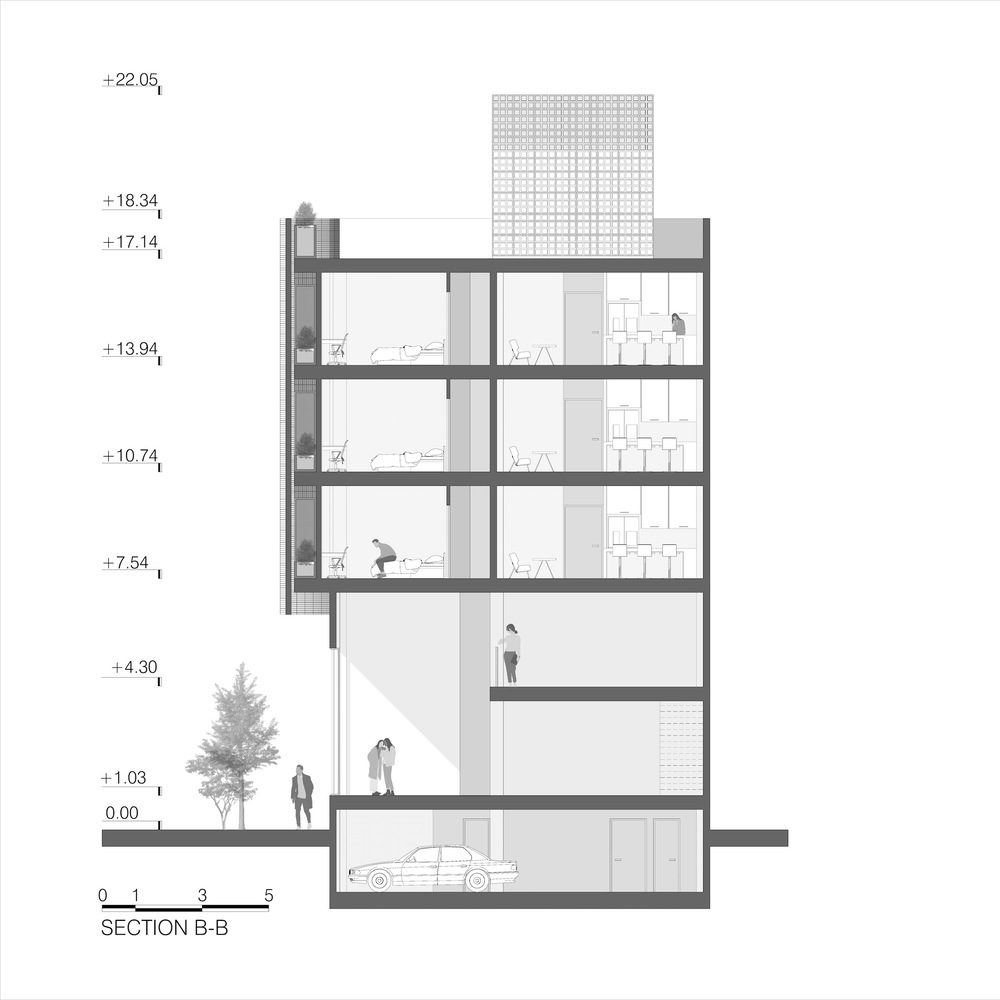
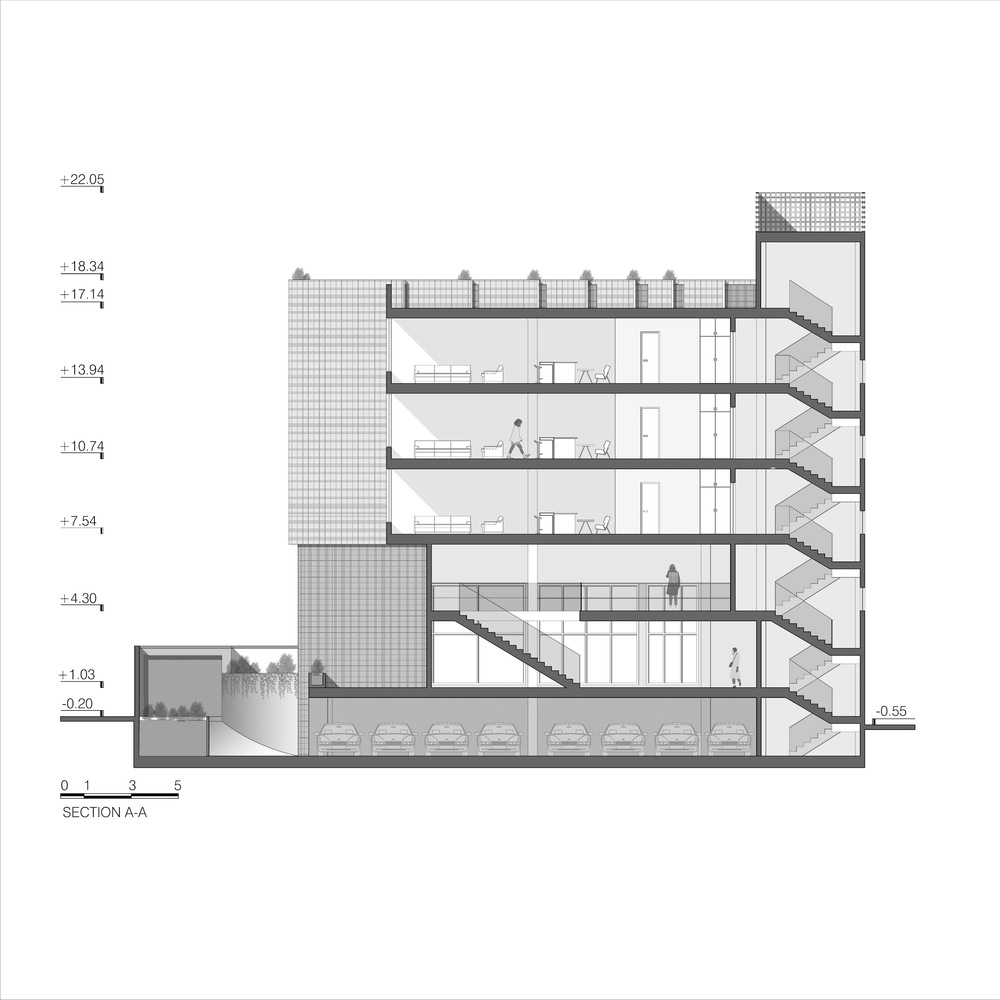
Sideway Apartment project is located at the west entrance of the city of Shiraz, extending along the main boulevard. Our main focus was to ensure a smooth interaction between pedestrians on the ground level and drivers on the elevated roads in relation to the building’s design. The ground floor is intended for commercial use, while the upper floors are dedicated to residential purposes.
Concept Of Sideway Apartment
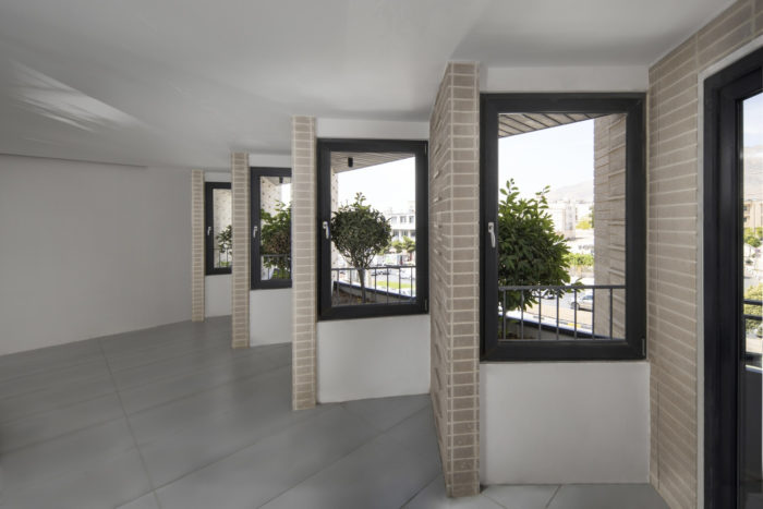
Our main objective was to create a building that blends in well with the surrounding urban environment. To achieve this, we focused on designing a visually balanced and unobtrusive base that seamlessly integrates the commercial area with the pedestrian and passerby traffic. This approach helped us reduce visual distractions and create a harmonious connection between the building and its surroundings. We also carefully considered the viewpoint and movement of people on higher floors and used a distinct design language to differentiate the upper floors from the base.
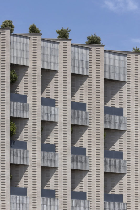
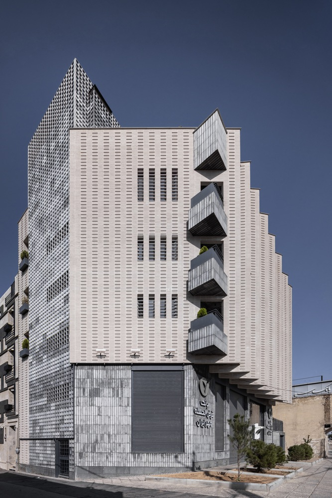
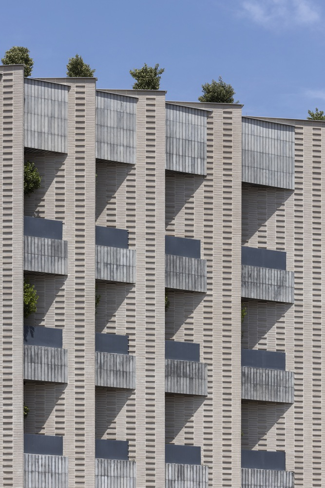
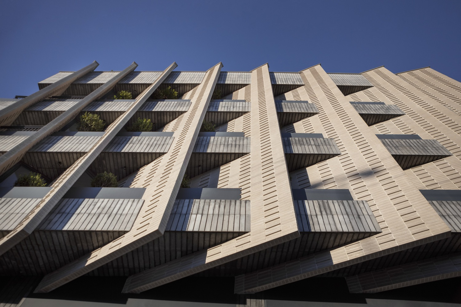
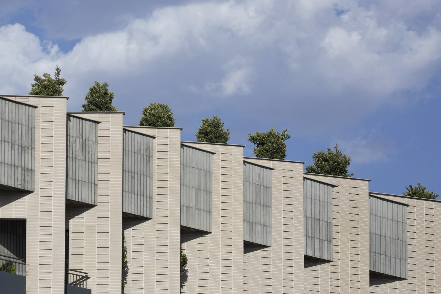
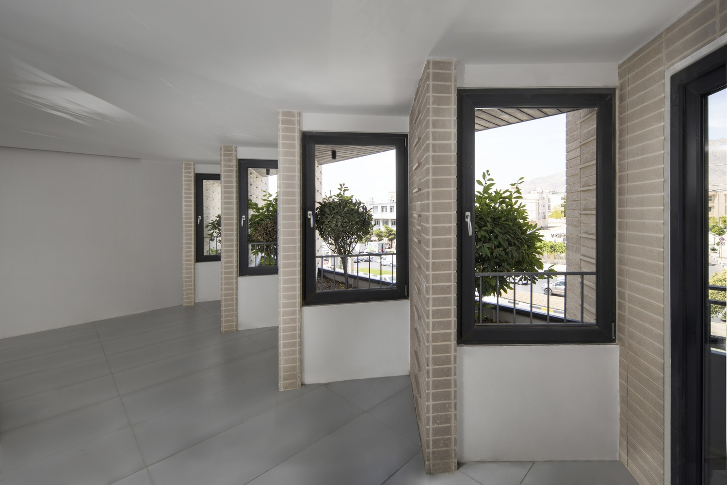
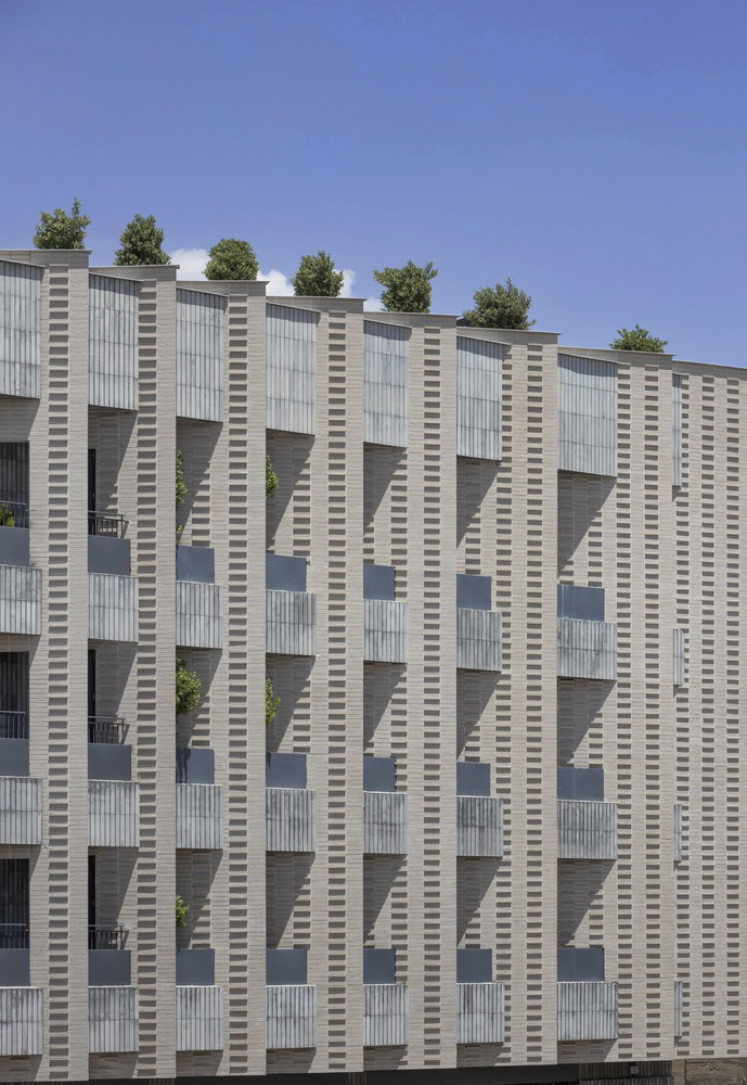
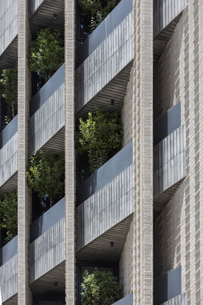
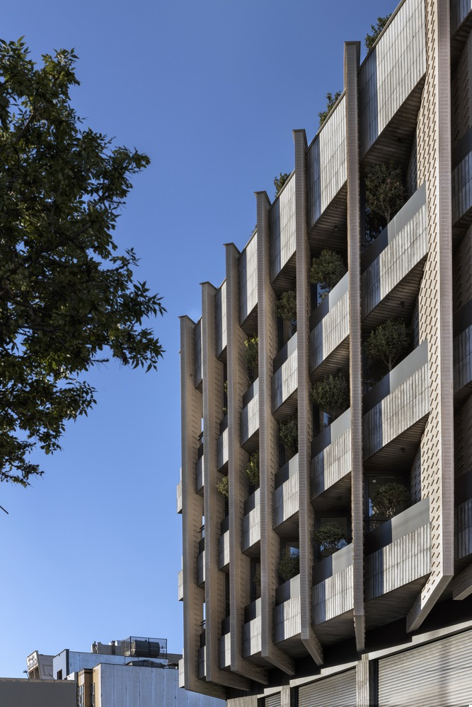
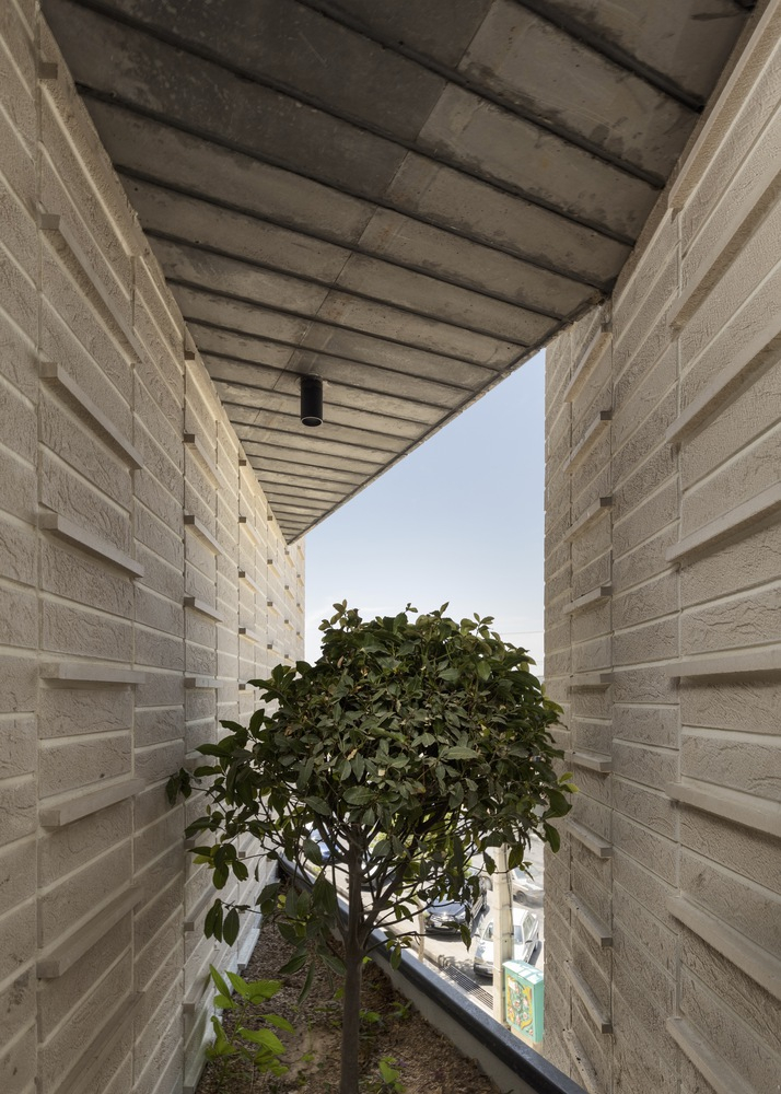
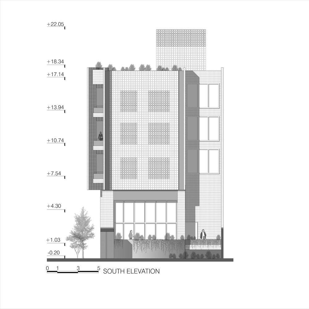
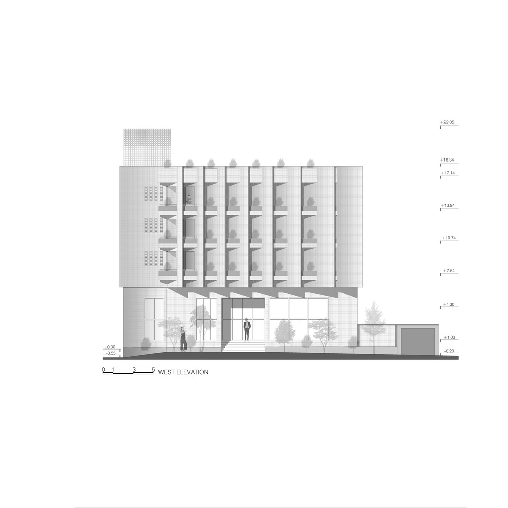
We took into consideration how to effectively manage the western sunlight that falls on the main structure. To address this, we incorporated vertical blades that were strategically angled to favour the southern light. These blades create a rhythmic pattern on the primary façade, giving the building a sense of dynamism and vitality as it overlooks the city. The terraced floors on each level, which face the main street, seamlessly intertwine with the vertical elements of the façade, resembling the interwoven threads of fabric. This integration enhances the overall texture and harmony of the façade.
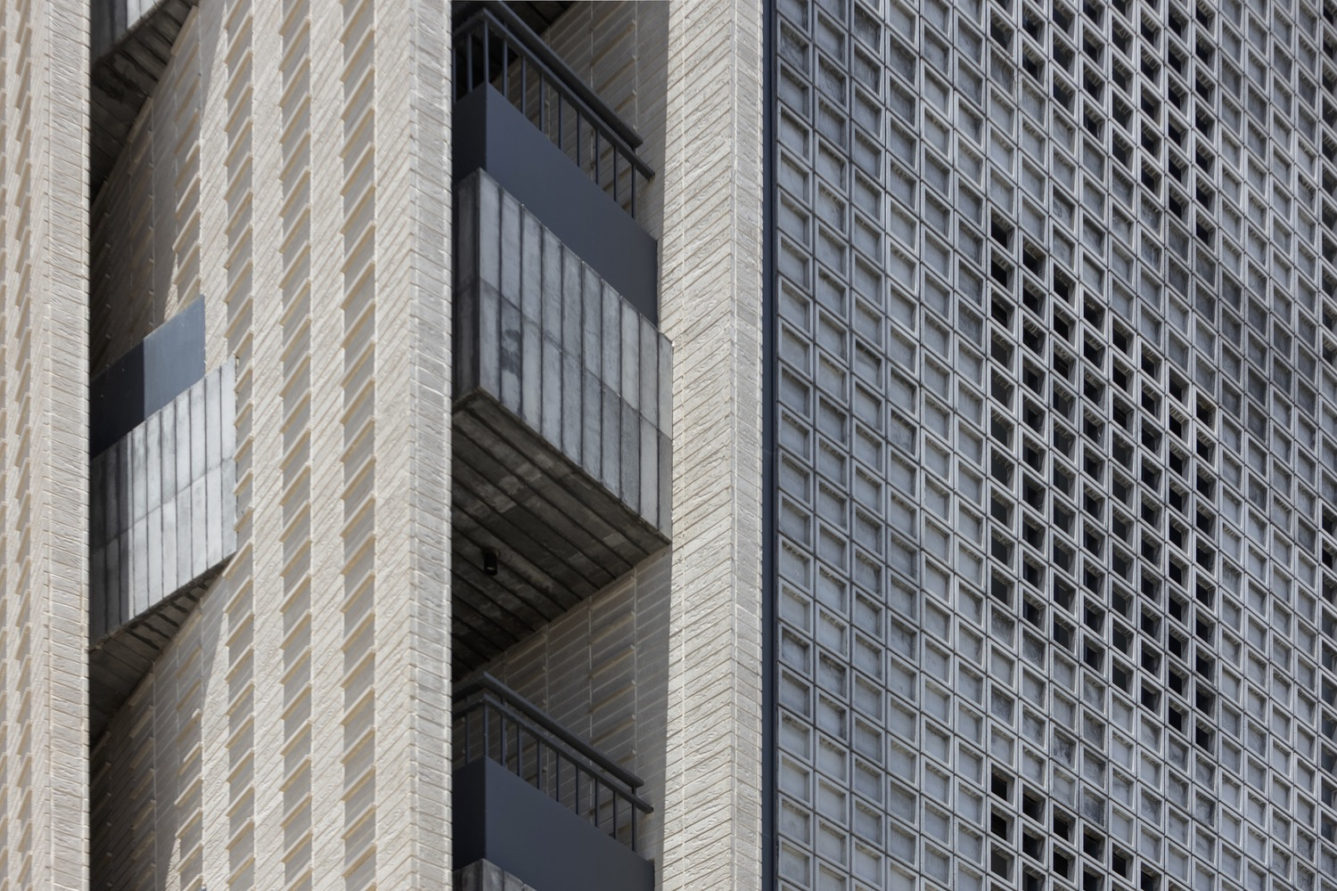
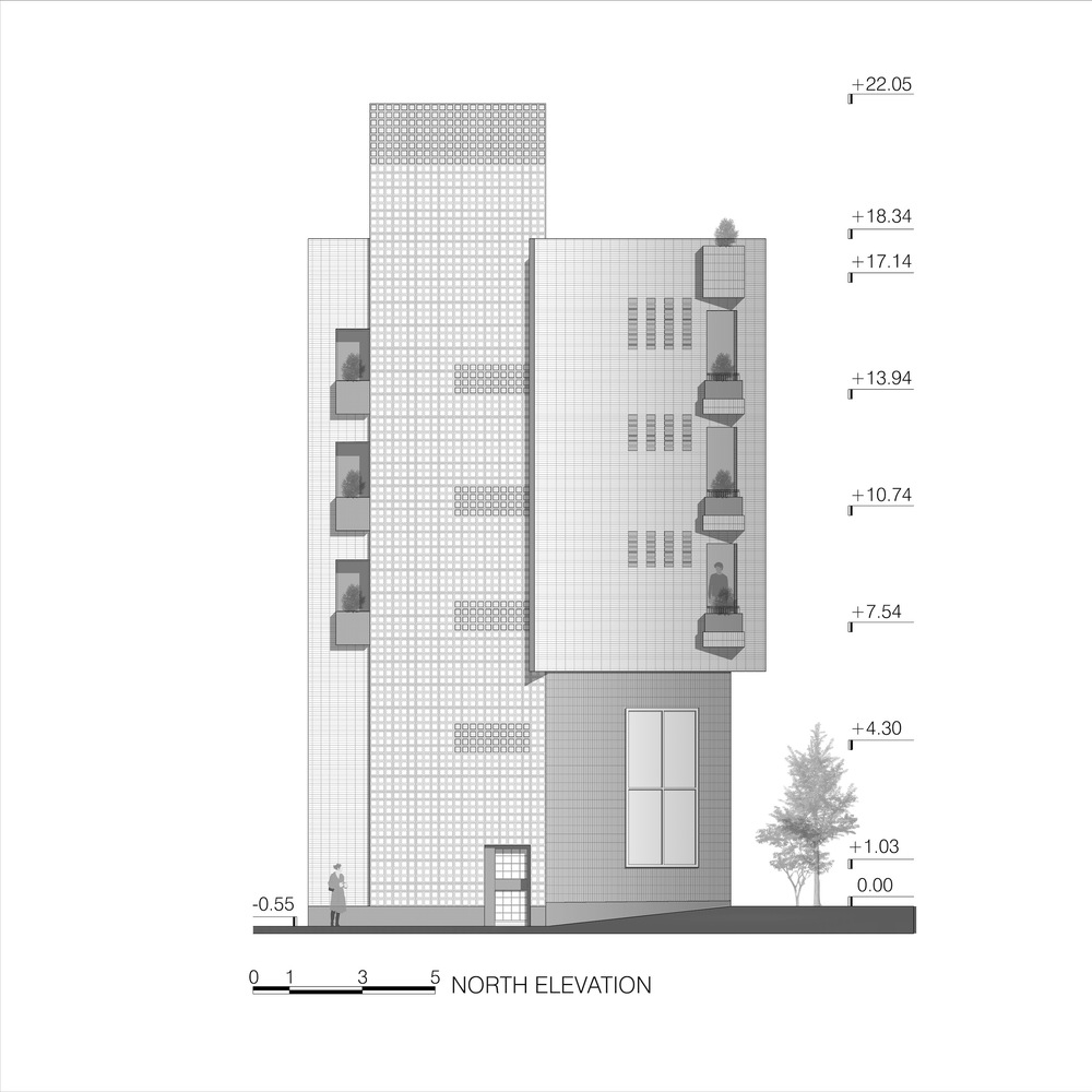
We placed great importance on maintaining a cohesive design across all facades of the project, considering that it can be seen from multiple external perspectives. The chamfered side of the building is aligned with the vertical blades to create a seamless and unified appearance for those approaching from the left. This alignment between the chamfered and primary facades ensures a consistent and harmonious visual experience for all viewers.
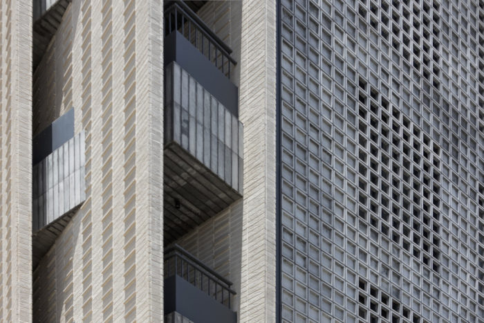
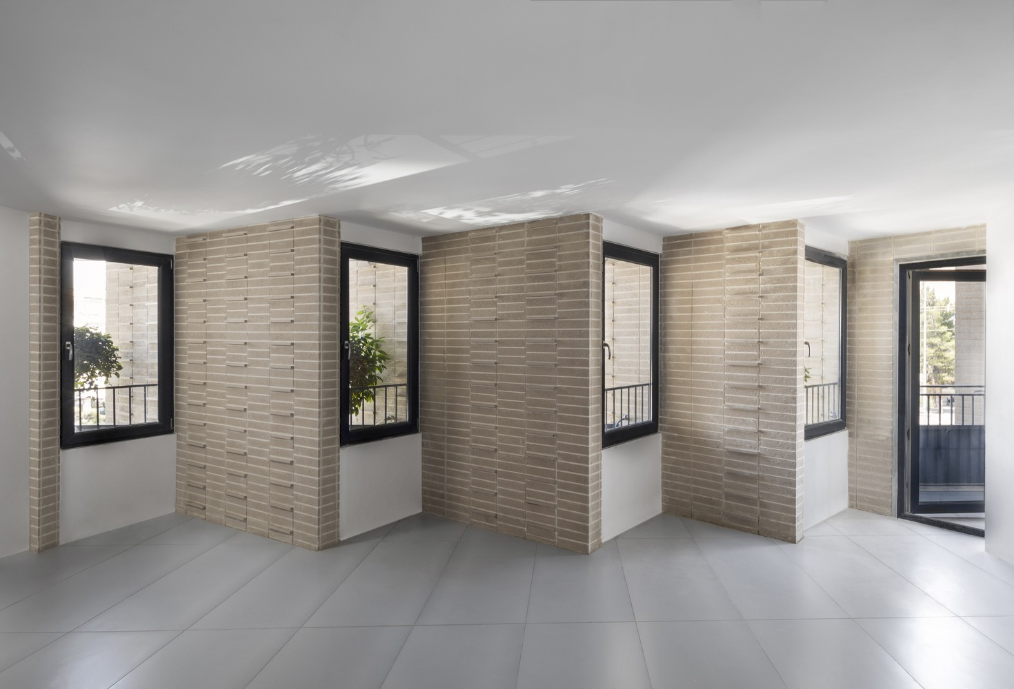
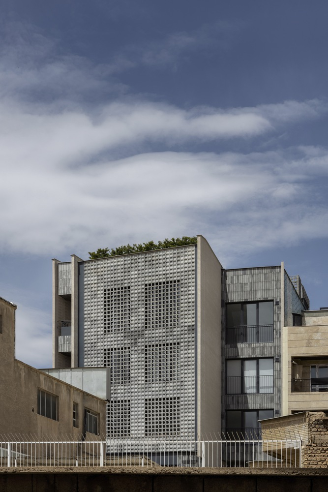
To address the challenges of light control and visibility on the other sides of the building, we took a different approach. We designed the north-western and south-eastern facades with integrated hollow concrete modules. Despite their porous appearance, these modules maintain a simple and cohesive aesthetic, ensuring that the main façade remains the focal point. We recognized the importance of a square-framed, hollow texture with improved visibility, which led us to create versatile square concrete modules. These modules can be expanded in different directions and used in both solid and hollow states while preserving the distinctive texture of the façade.
Project Info:
Architects: Mad arkitekter
Area: 16500 m²
Year: 2022
Photographs: Kyrre Sundal
Manufacturers: Gustafs
Lead Architects: Karen Selmer
Landscape Architect: Landskaperiet
Advisor: Metier OEC AS
Structure Engineers: Skanska AB
Acoustics Consultants: Rambøll
Partner In Charge, Architect: Torkel Njå
Architect: Ewelina Wylaź, Matthew Fentem, Kimberly Wolf, Atdhe Illyrian Belegu, Tea Hranj, Siri Jæger Brudvik, Martin Wesley-Holand
Architect, Partner: Kyrre Sundal
Lead Technologist: Ole Grødem
Interior Architect: KrohnArk, Radius Design, Cadi interiørarkitekter
Client: Entra ASA
Fire Consultant: Fokus Rådgivning
City: Oslo
Country: Norway
© Kyrre Sundal
© Kyrre Sundal
© Kyrre Sundal
© Kyrre Sundal
© Kyrre Sundal
© Kyrre Sundal
© Kyrre Sundal
© Kyrre Sundal
© Kyrre Sundal
© Kyrre Sundal
© Kyrre Sundal
© Kyrre Sundal
© Kyrre Sundal
© Kyrre Sundal
© Kyrre Sundal
© Kyrre Sundal
© Kyrre Sundal
Diagram
Diagram
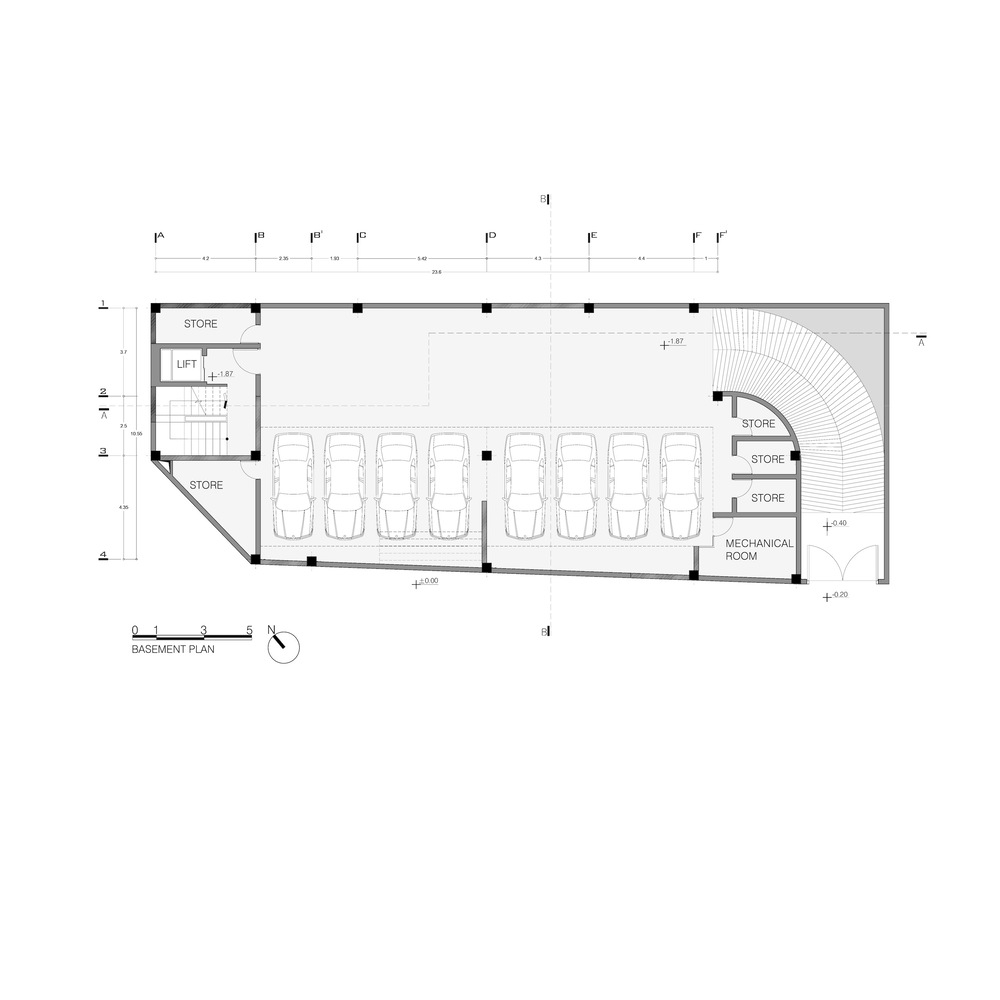
Basement Floor Plan
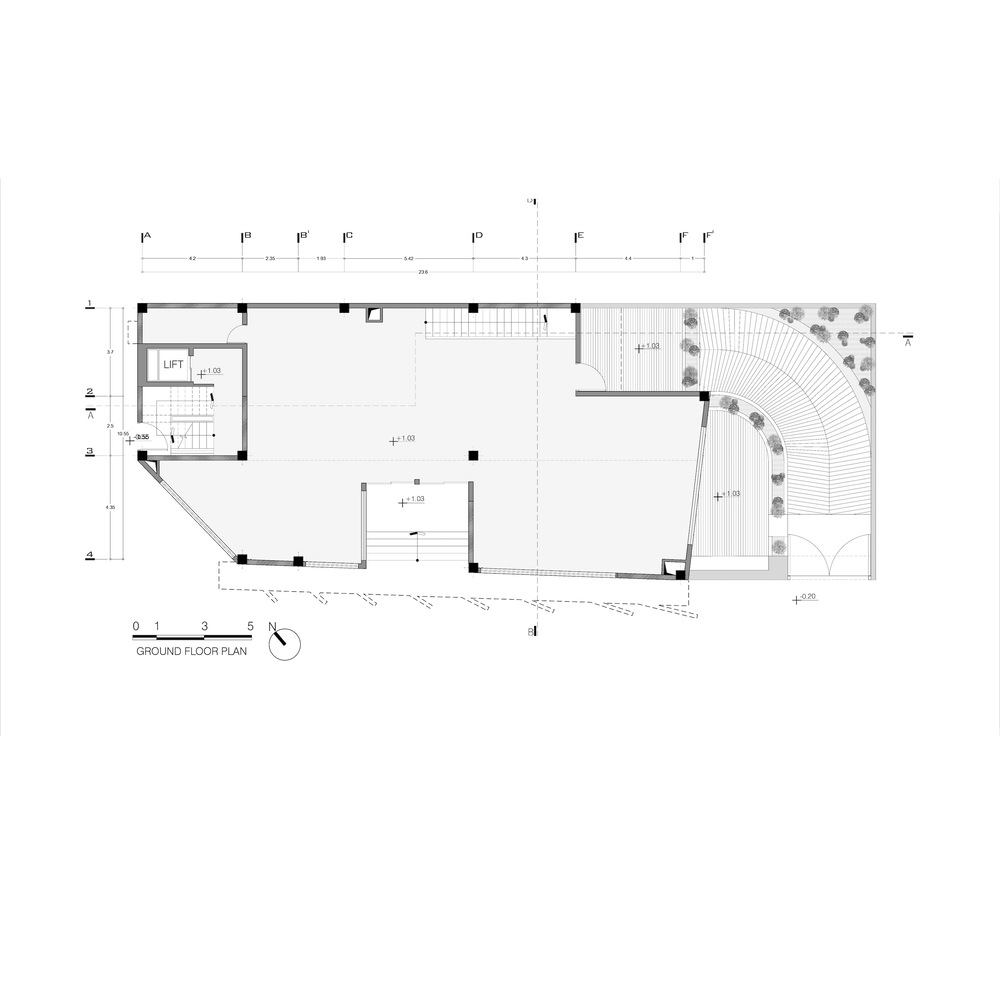
Floor Plan
Typical Floor Plan
Section
Section
Elevation
Elevation
Elevation


