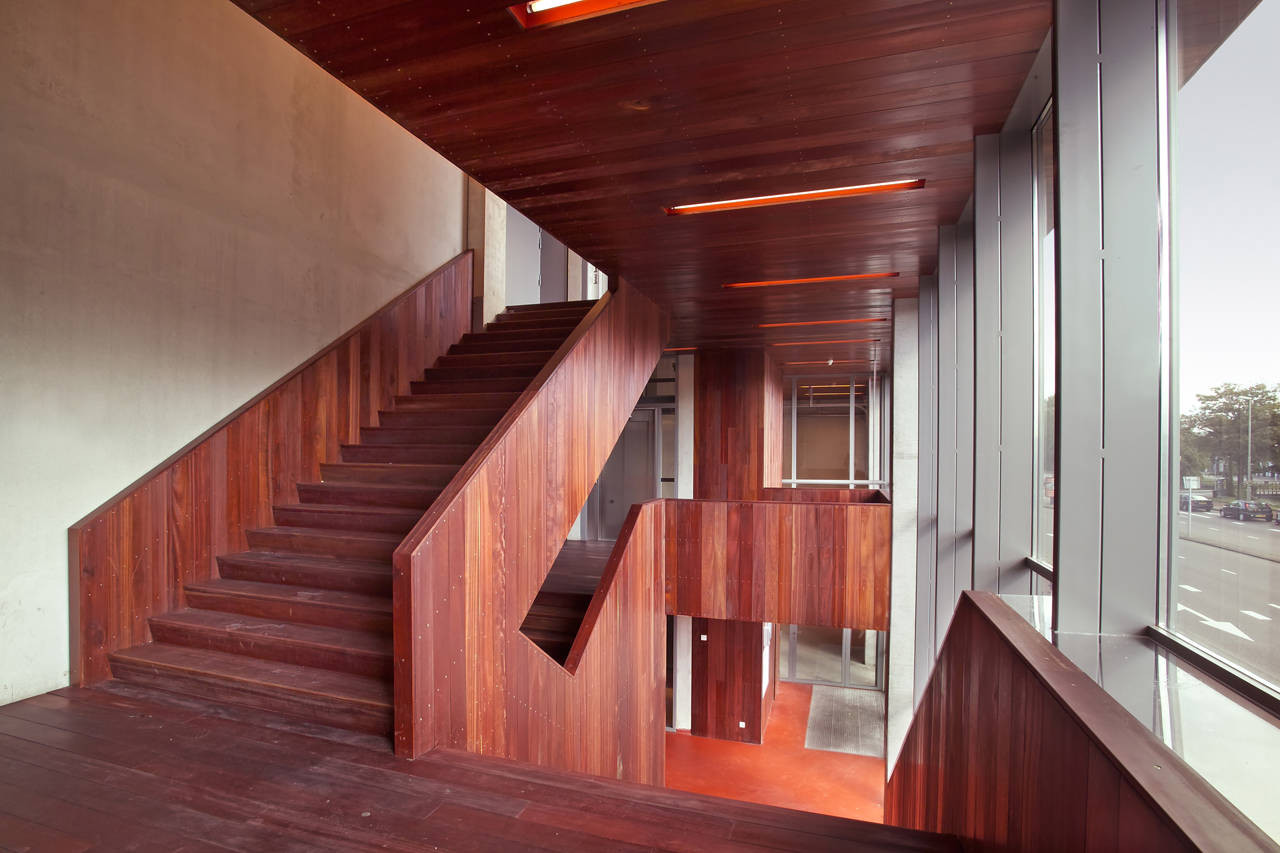
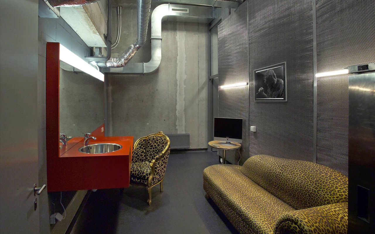
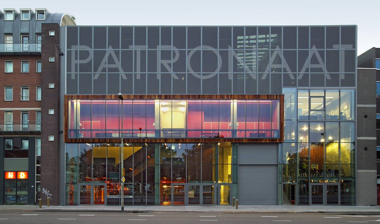
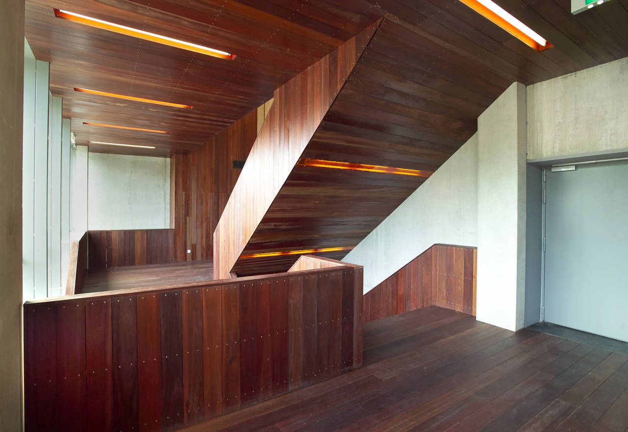
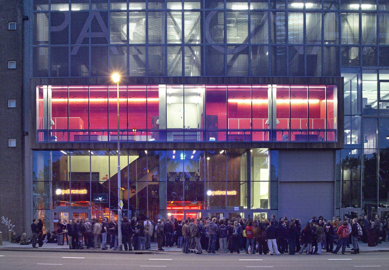
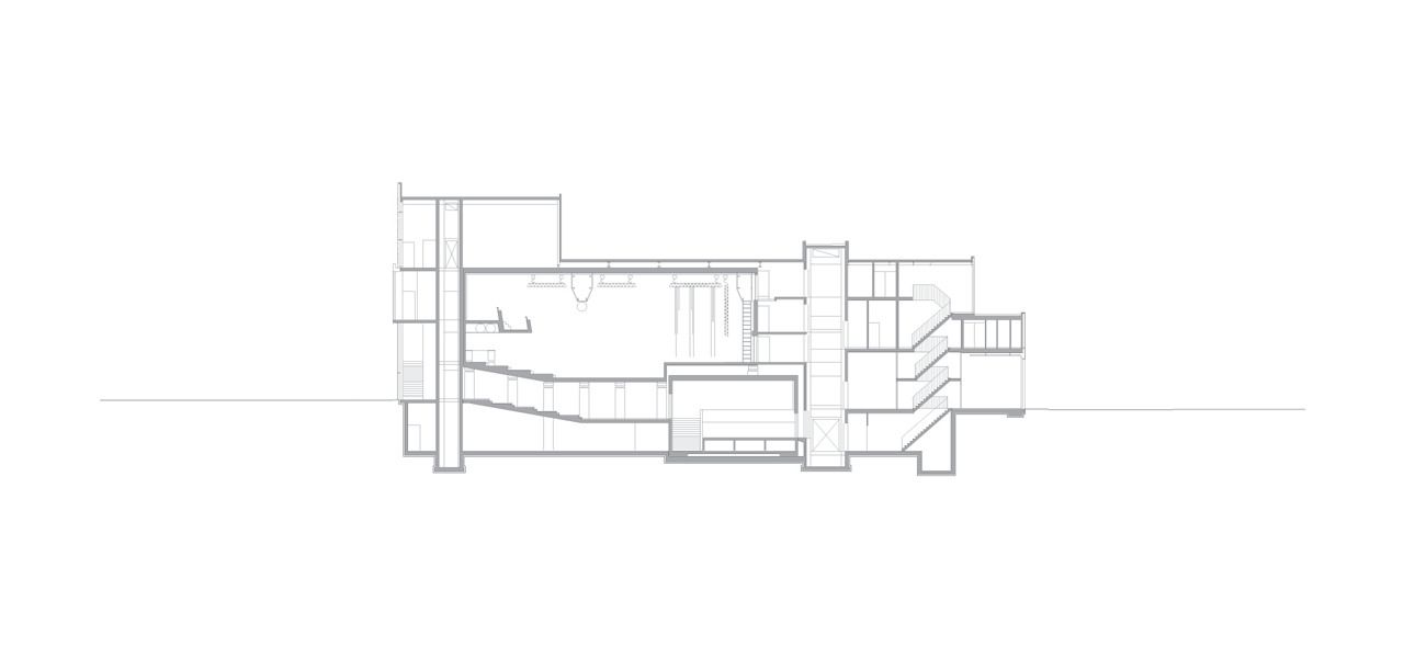
Eclectic is almost not strong enough of a word for Patronaat, Haarlem’s pop music venue designed by the Dutch firm Diederendirrix. Ballsy and fun-loving might be better fits. The programmatic elements which fill the space are set back ever-so-slightly from the bounding walls, giving a sense of openness throughout. And these programmatic elements are detailed so wonderfully and cleanly that they would make Mies cry. A motif of warmth (both materially and atmospherically) is juxtaposed against cool, industrial lines and concrete surfaces. This is most apparent in the jaw-droopingly clean form of the main staircase, executed in a red toned hardwood, which climbs up- seemingly growing out of the space’s concrete walls.
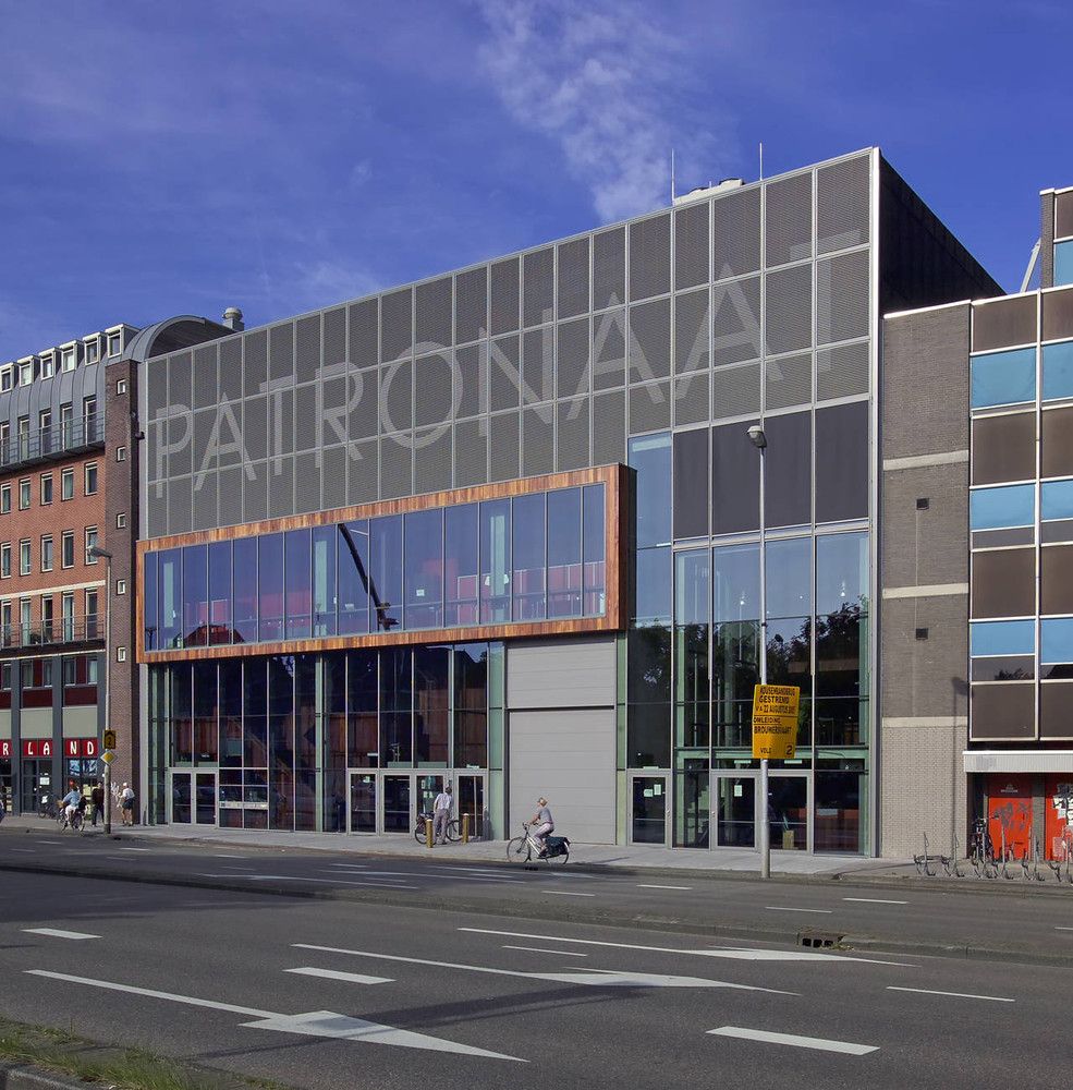
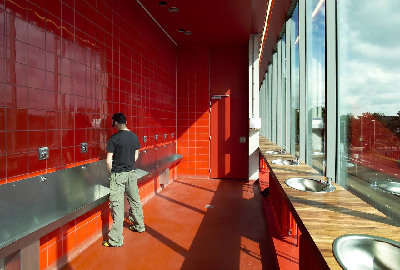
Oh, and something which just cannot be ignored- and this is where the ballsy comes in- the WCs are located on the first floor (european floor labeling), directly behind the glass facade. The architects describe this move in this way: ‘The toilets have a very prominent place in the building directly behind the glass facade to maximize the visibility of movement and liveliness inside the building, particularly in the evenings.’ Fantastic. The world needs more great toilets and this certainly qualifies.
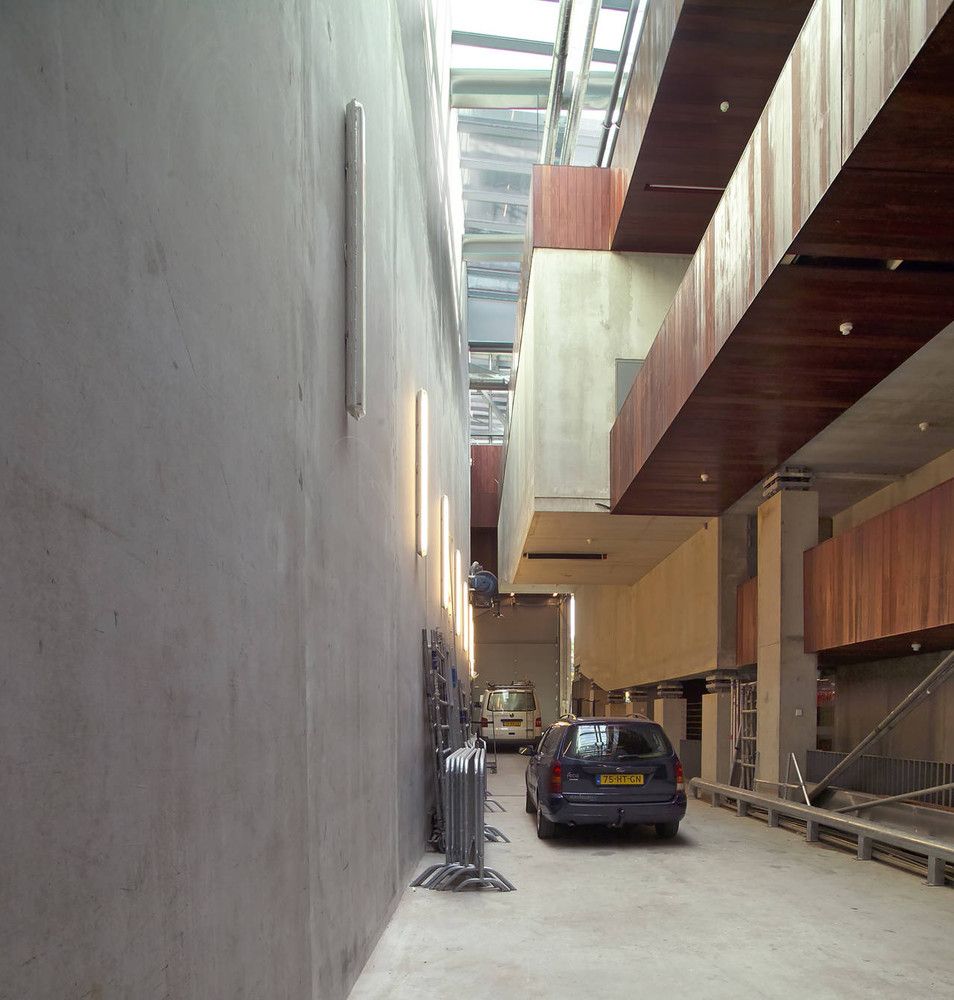
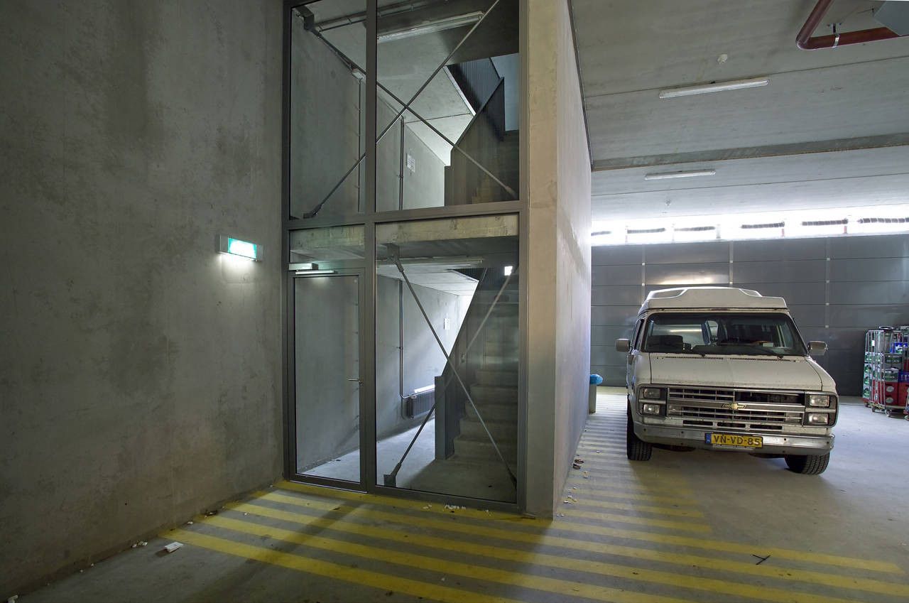
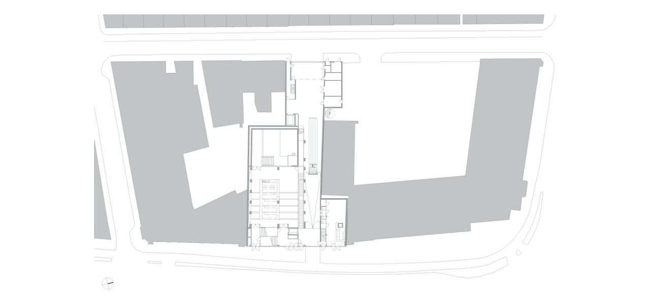
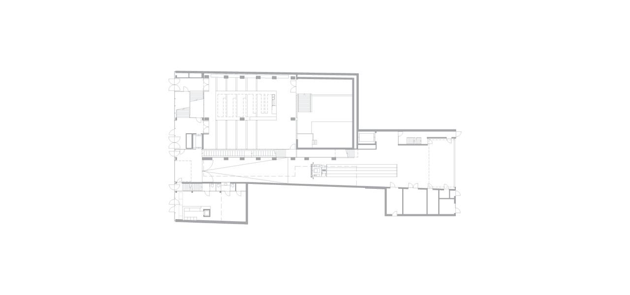
 The architects point out that in a cultural venue such as this, apart from the auditoria, there is should be no distinct line between front and back stage. As such, an internal service ‘street’ for loading and unloading runs through the building. Activity in this space is fully visible to the occupants, which in cooperation with elements such as the exposed toilets, places an emphasis on the visual relationships and routes through the building.

Courtesy of Diederendirrix


