Guggenheim Helsinki entry
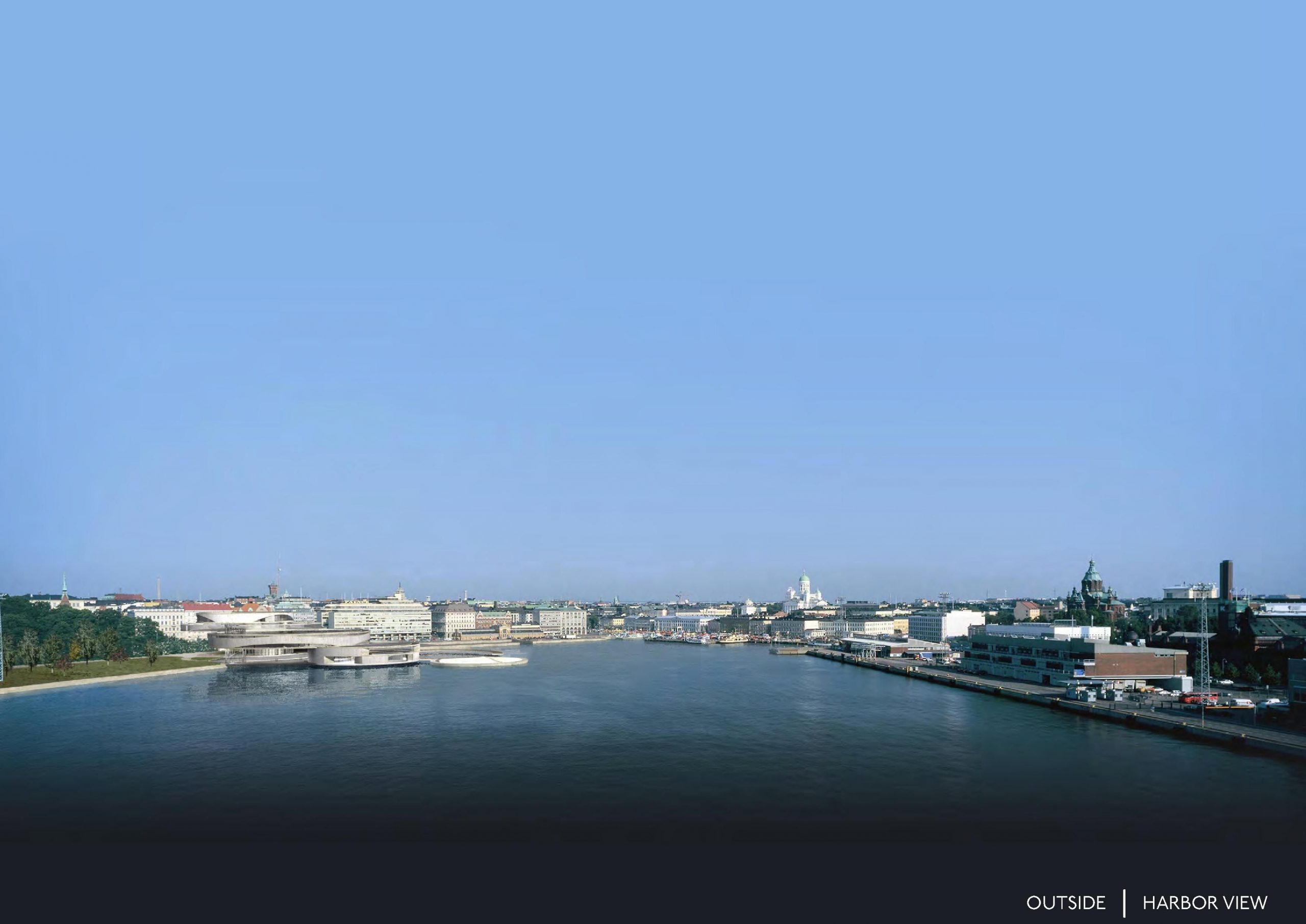
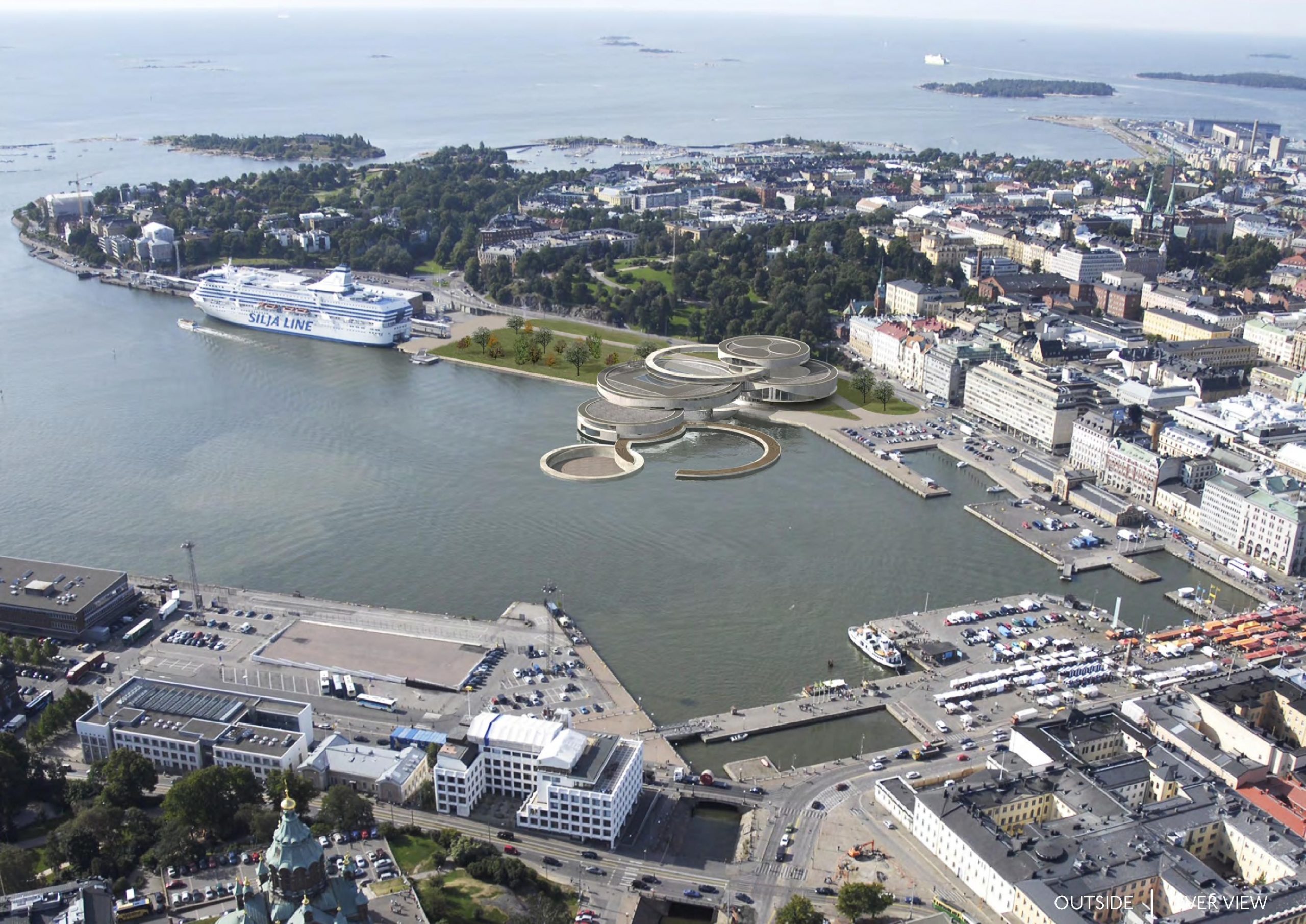
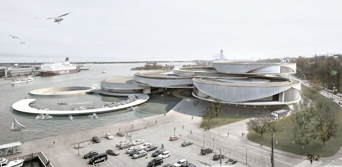
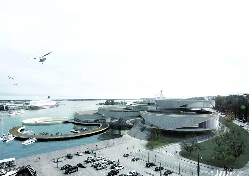
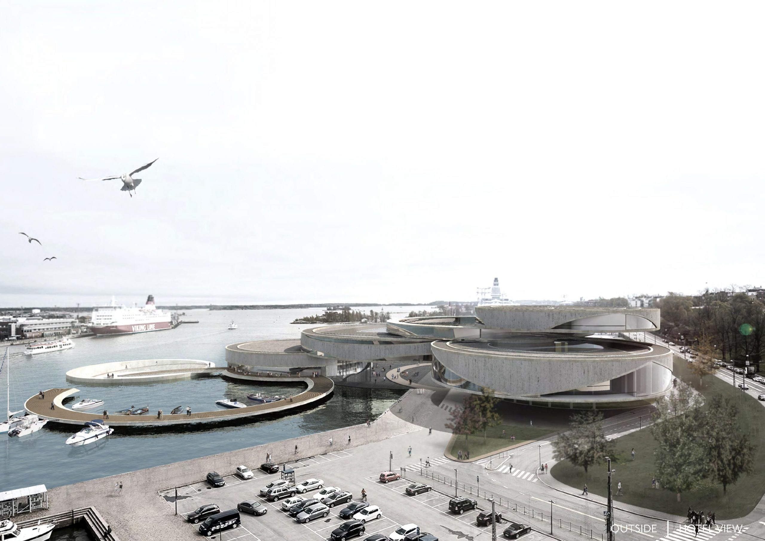
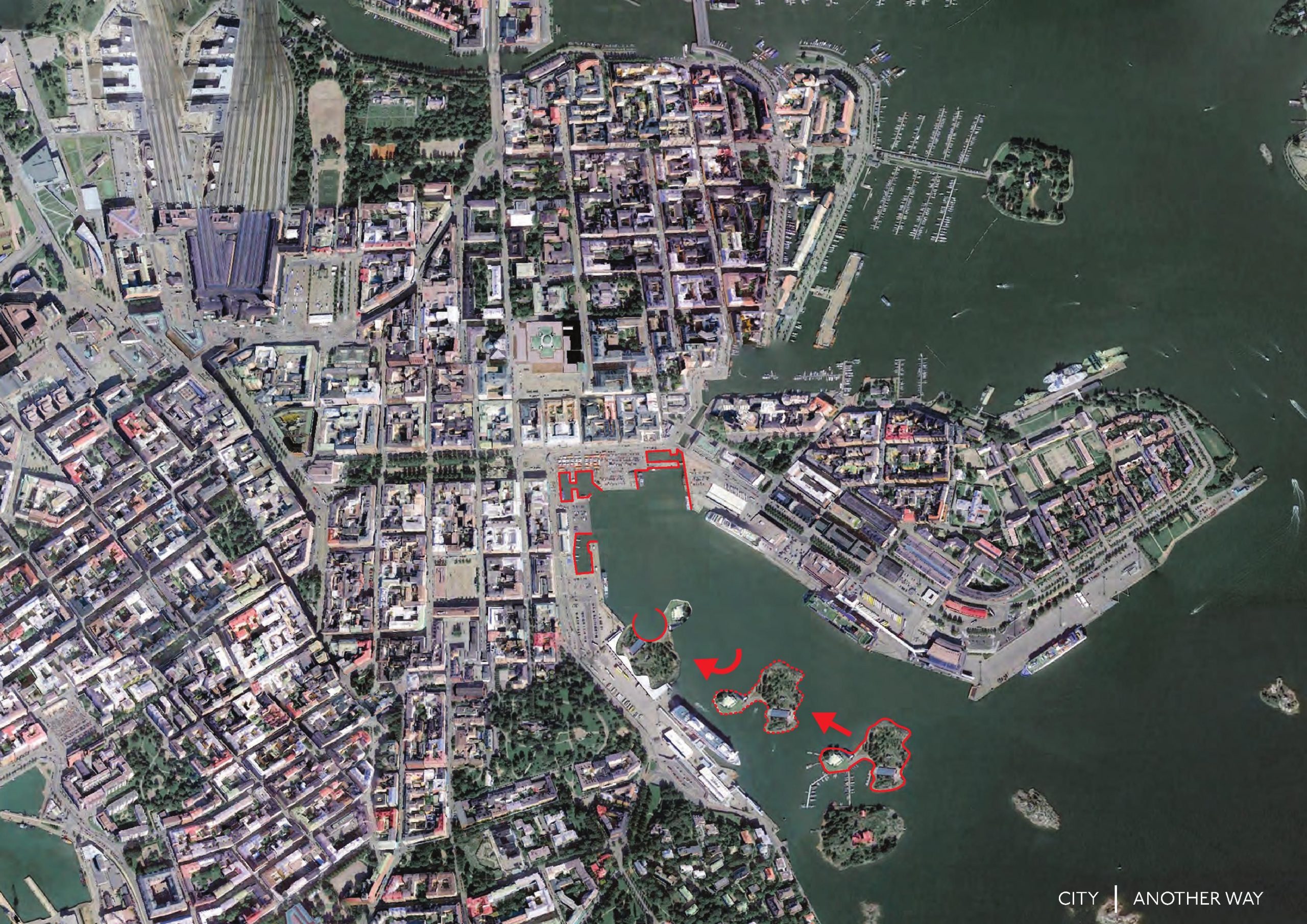
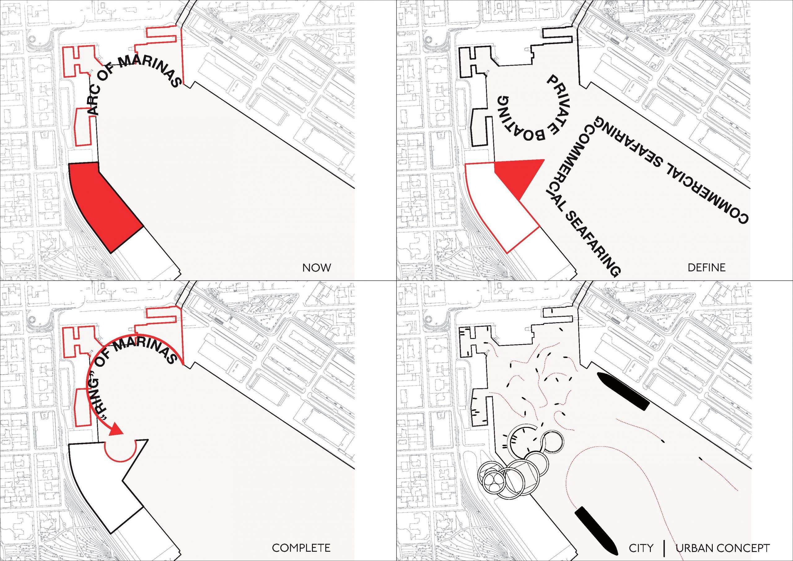
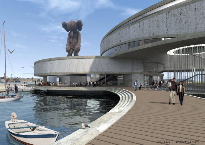
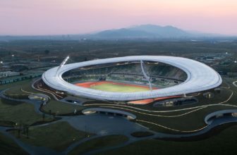
Tammo Prinz Architects’ starting part was to generate an iconic design relating to the rich Finnish nature and culture, and it should contribute to the urban structure of Eteläsatama. The Eteläsatama is separated into areas mostly for private boating and large commercial seafaring. Most conspicuous is an arc of Marinas defining its appearance and identity. In addition, the architects established an additional Marina and by this completed the existing arc of Marinas at the inner end of Eteläsatama to almost a “ring”, amplifying the individual areas of more private boating and large commercial seafaring. Inspired by the Finnish islands in general, the Valkosaari Island lying in front of Eteläsatama was literally copied, moved, rotated and docked into the site. Finally a new marina was cut into it.
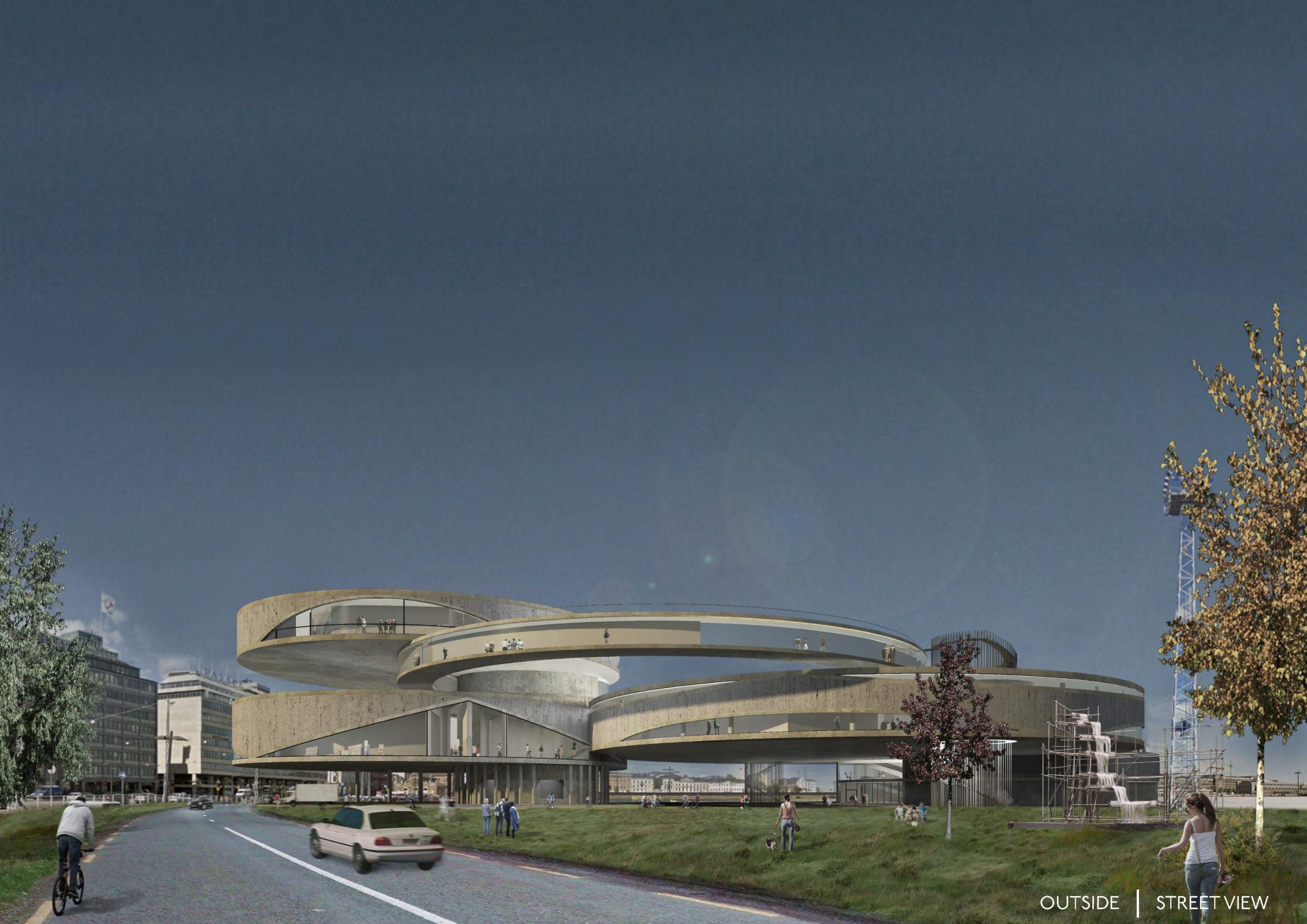
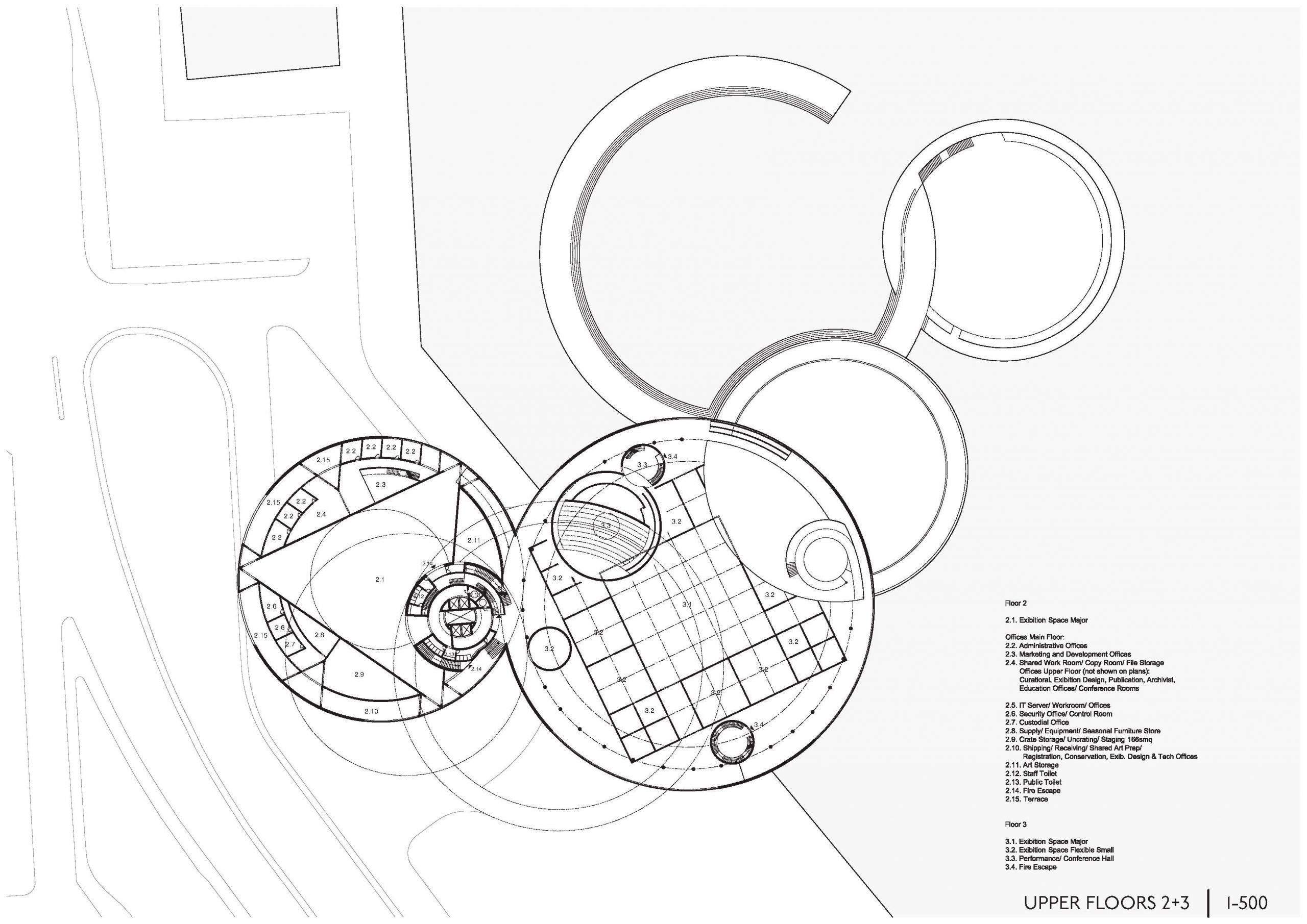
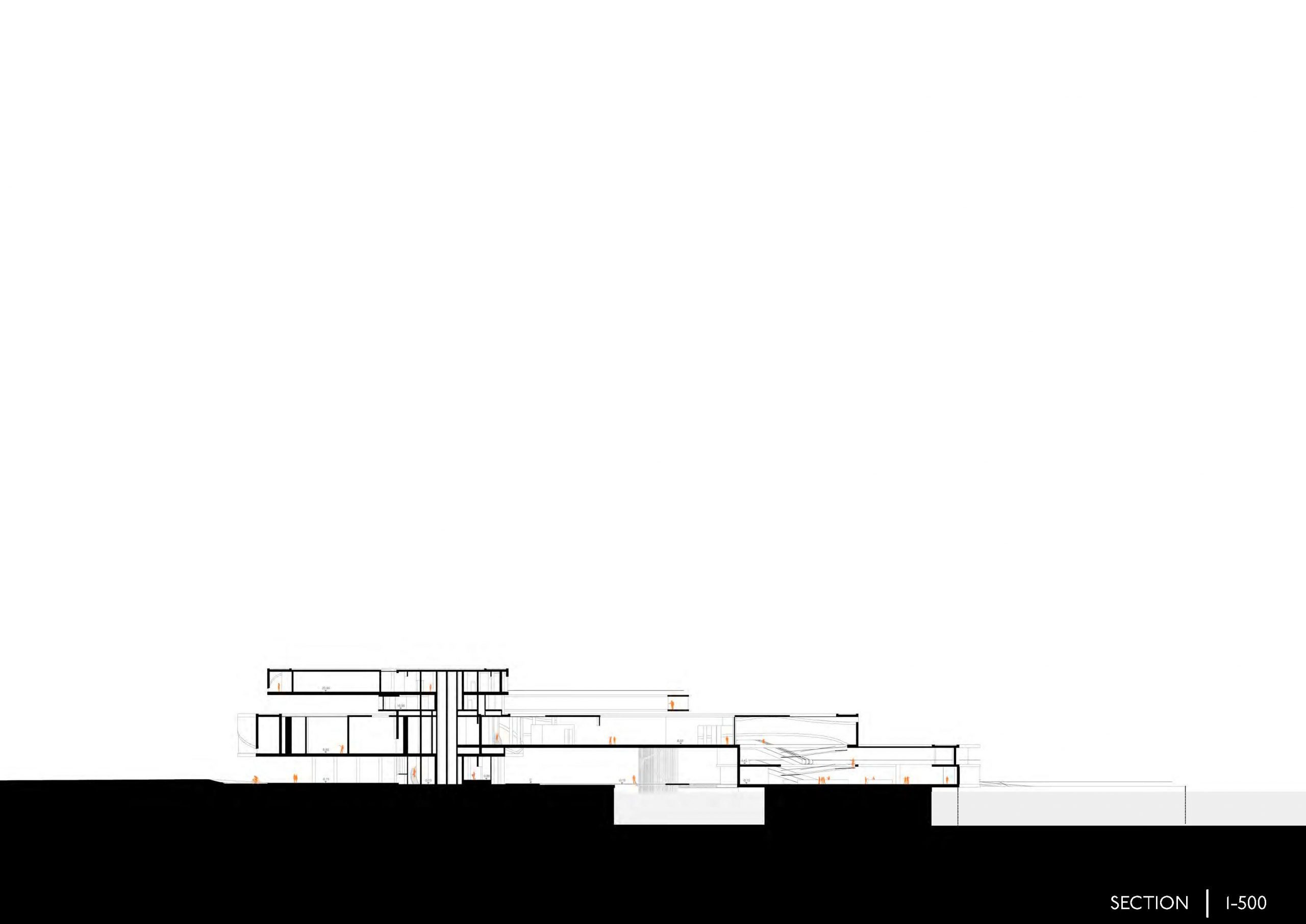
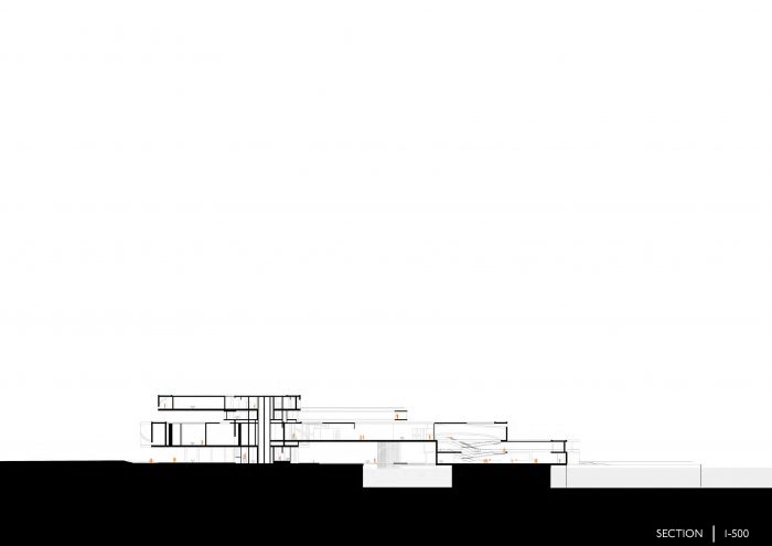
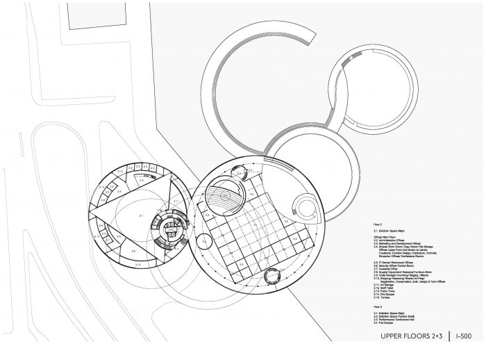
The spatial concept is based on a stacked, spiraling circulation along the envelope of the building. In contrast, the architects enclose the exhibition with the circulation spaces for ideal lighting conditions, by this keeping the possibility of an open façade. In a next step the spiral is cut into slices. The single slices were shifted apart, for the circulation to be rejoined at the opposite side. The consequential volume was arched and is bridging into the water, concluding with a new marina and a sunken plaza, serving as sculpture garden as well as for outside events. A massive core is holding everything together. It serves mostly as circulation, for supportive functions and as the main escape route.
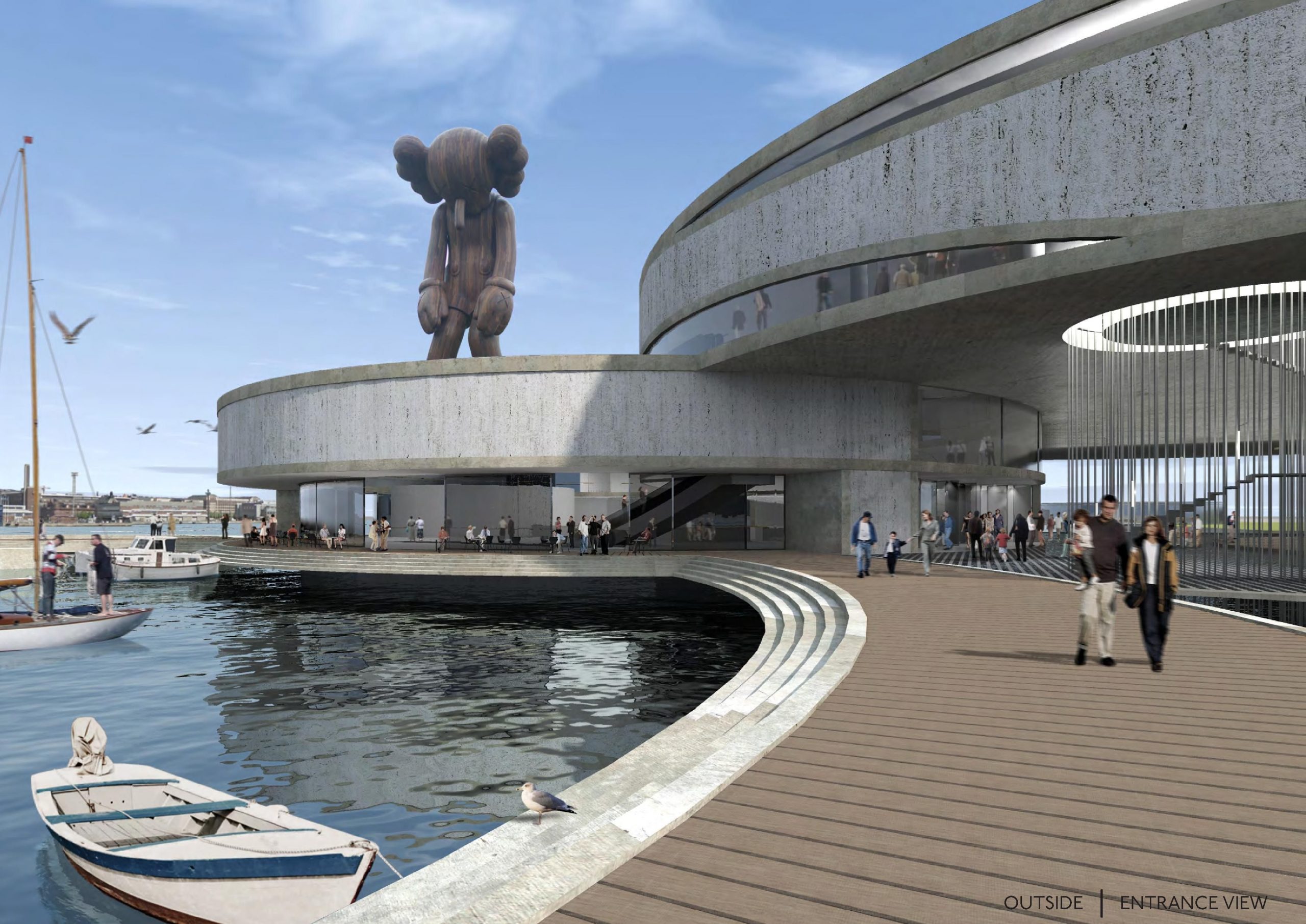
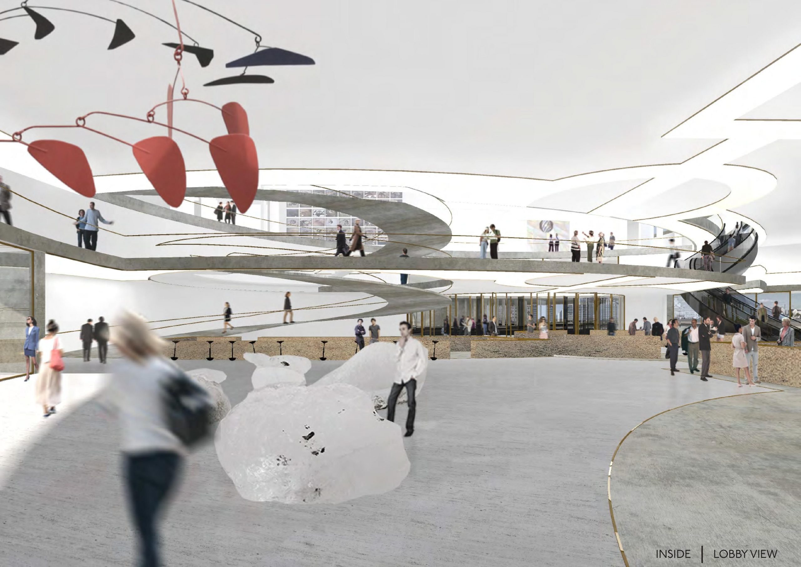
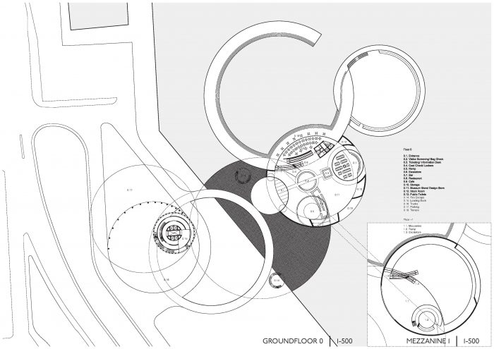
The circulation starts from the water, giving the lobby a most representative location with its views over Eteläsatama and a connection to the sunken plaza and new marina with its public function. Via a small mezzanine floor there is already a broad visual connection from the lobby to the main exhibition area, giving an intuitive sense of the natural flow through the museum.
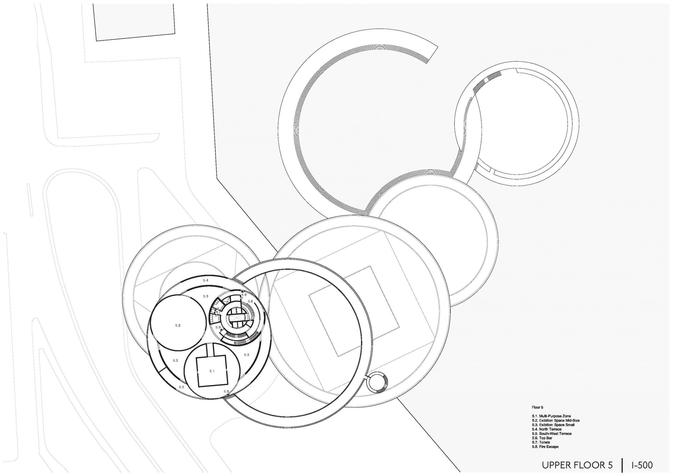
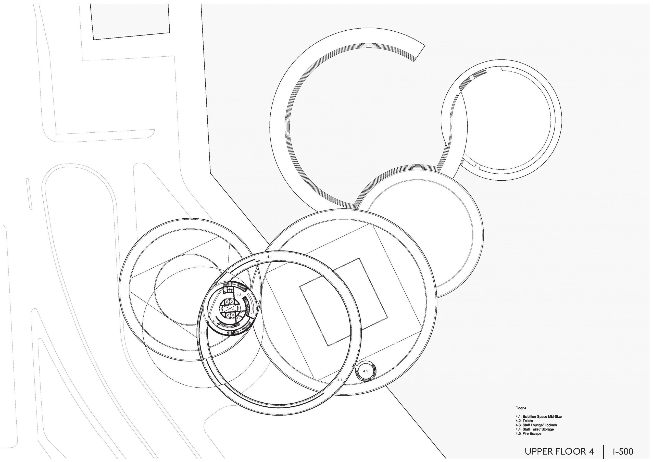
The exhibition spaces contrive from basic geometrical shapes for ideal exhibition conditions, enclosed by a floating space for circulation and alternative possibilities of displaying art. A classical museum layout was dropped into the main exhibition area and its previously defined shape. Each level or single volume shares exhibition spaces and further supporting museum function, to prevent from a clear separation between public and nonpublic areas. In the second last floor a fully glassed pure ring was introduced as a special exhibition area, allowing a different form of viewing art at the same time as the complete bay and most of Helsinki.
Connected to the lobby, the marina and therefore the public, is a “sunken plaza” for outside events and sculpture display. This sunken plaza is meant to be fully public. It is connected to the museum by a small inside space, serving as bar for events.
The rings are designed as a minimum two layered massive structures. Collectively with floors and ceilings they build fully stiff ring elements, which are stacked, interconnected and hold together by the massive core. The complete structure is resting on the Lobby volume, the core and a few additional pillars. By this they build a bridge into the water.
By:Delia Chang
