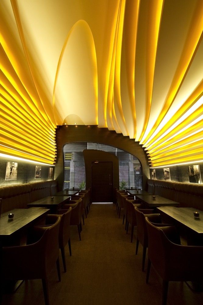
Coffee shops got it good. All the cool people are there. The conversation’s good- always sharp, never slurred. The product is the best beverage in the world. And the interiors are always at the very least eclectic, while some such as this, are just downright great. Oh and Starbucks is disqualified from all of the above- they burn their coffee for uniformity and all of their spaces and people follow suit.
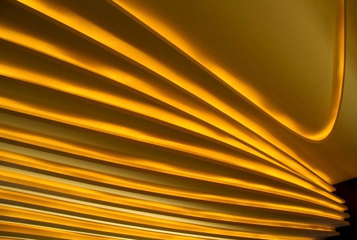
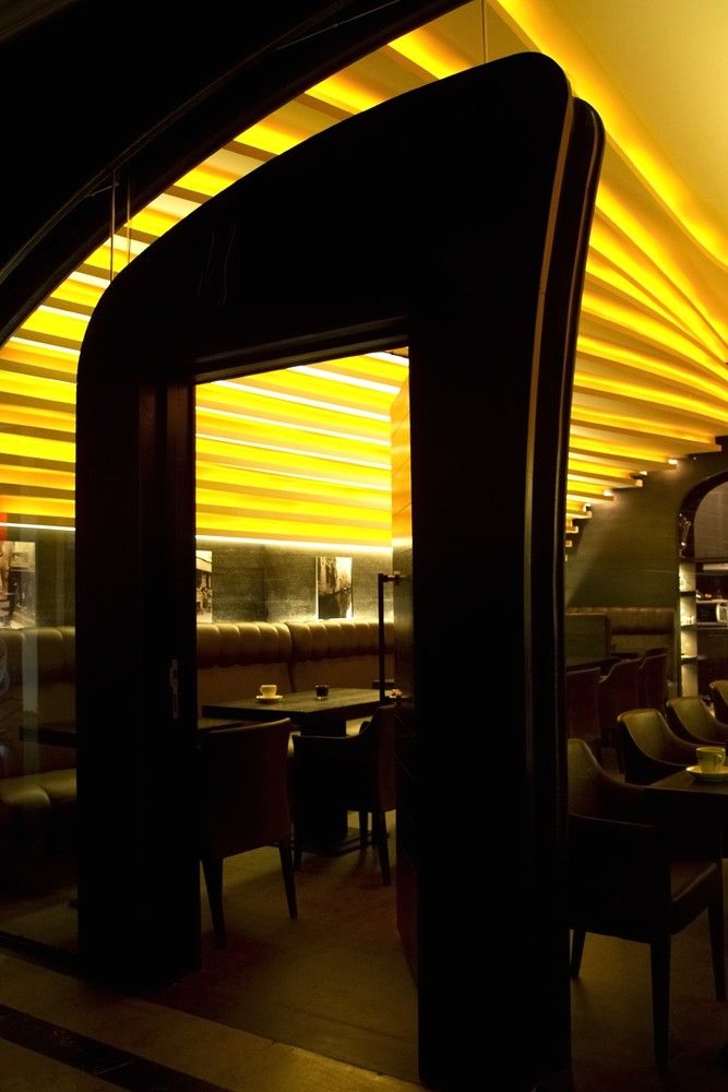
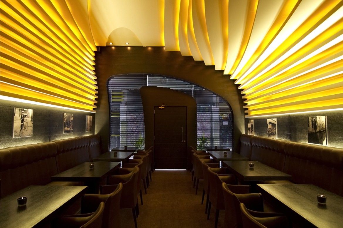
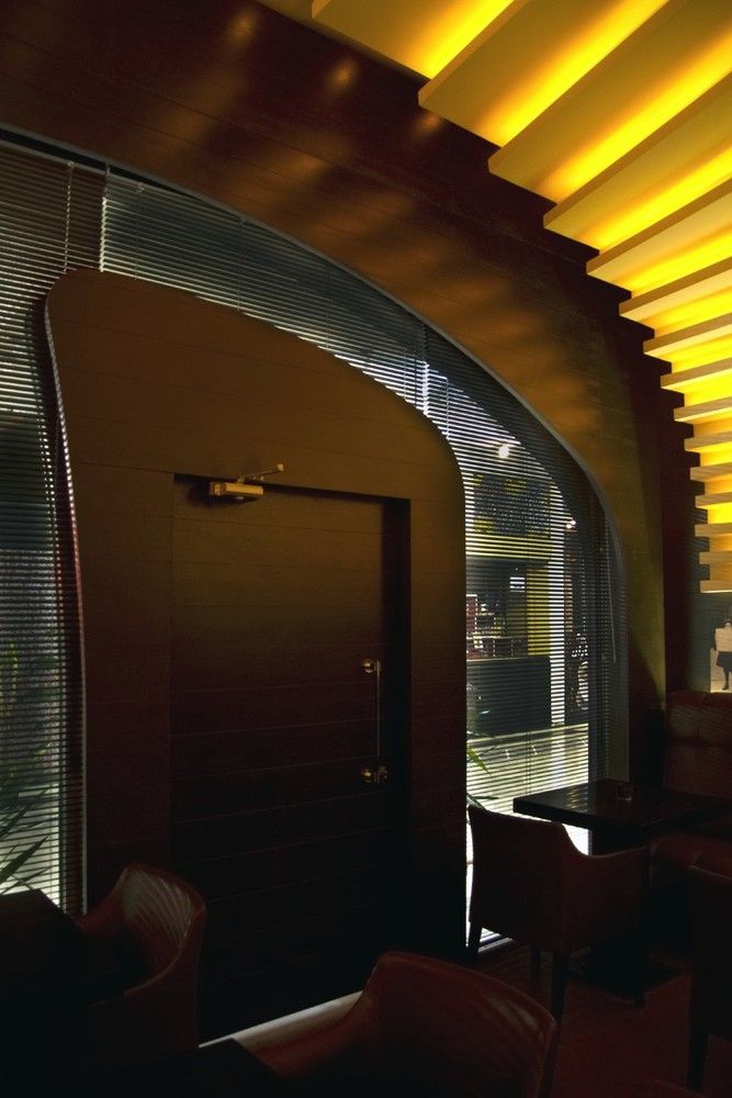
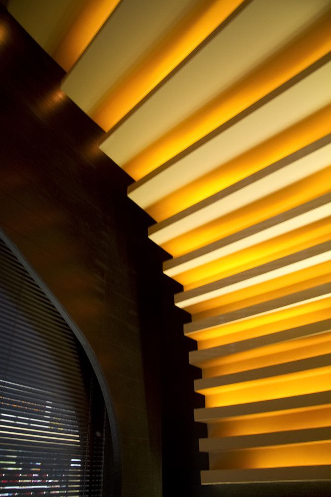
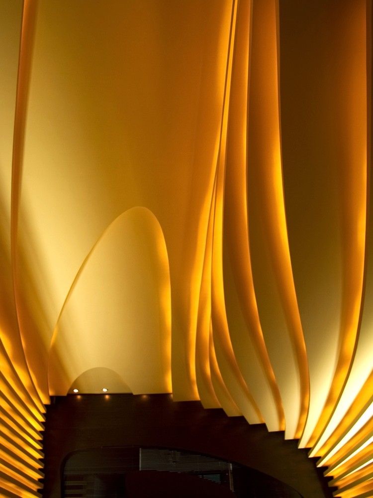
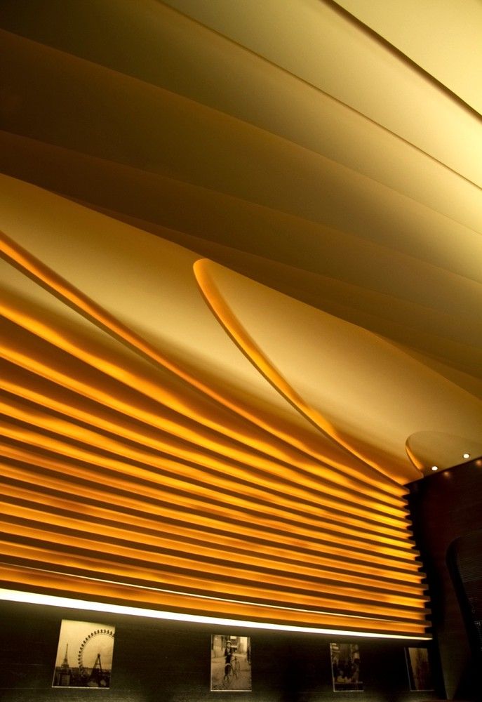
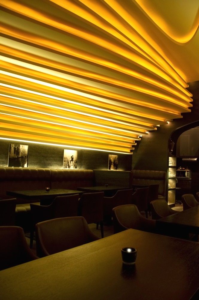
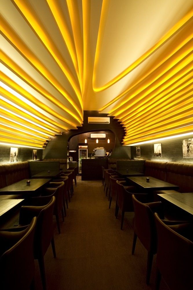
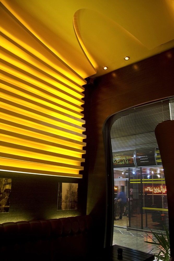
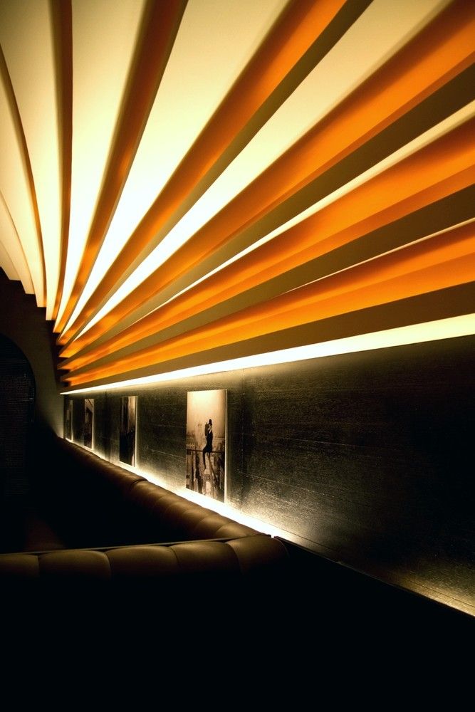
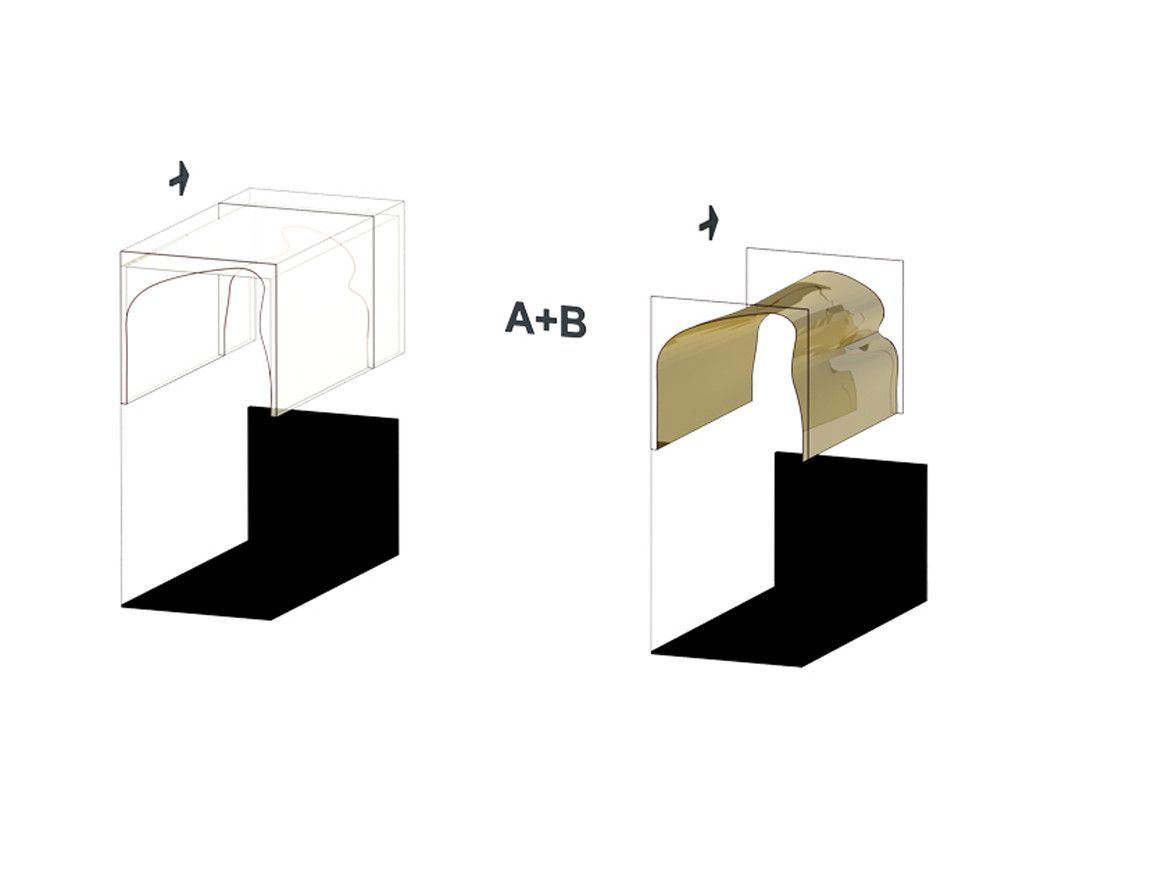
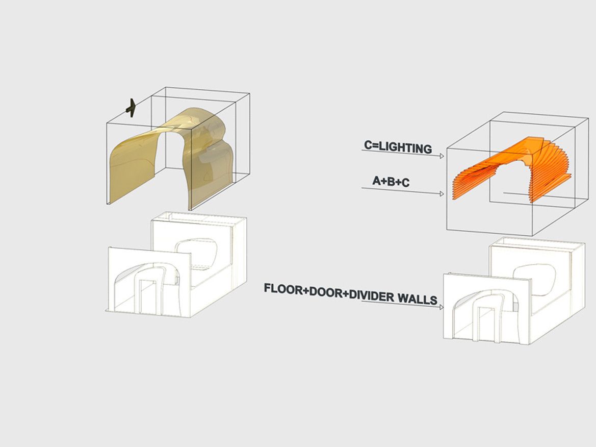
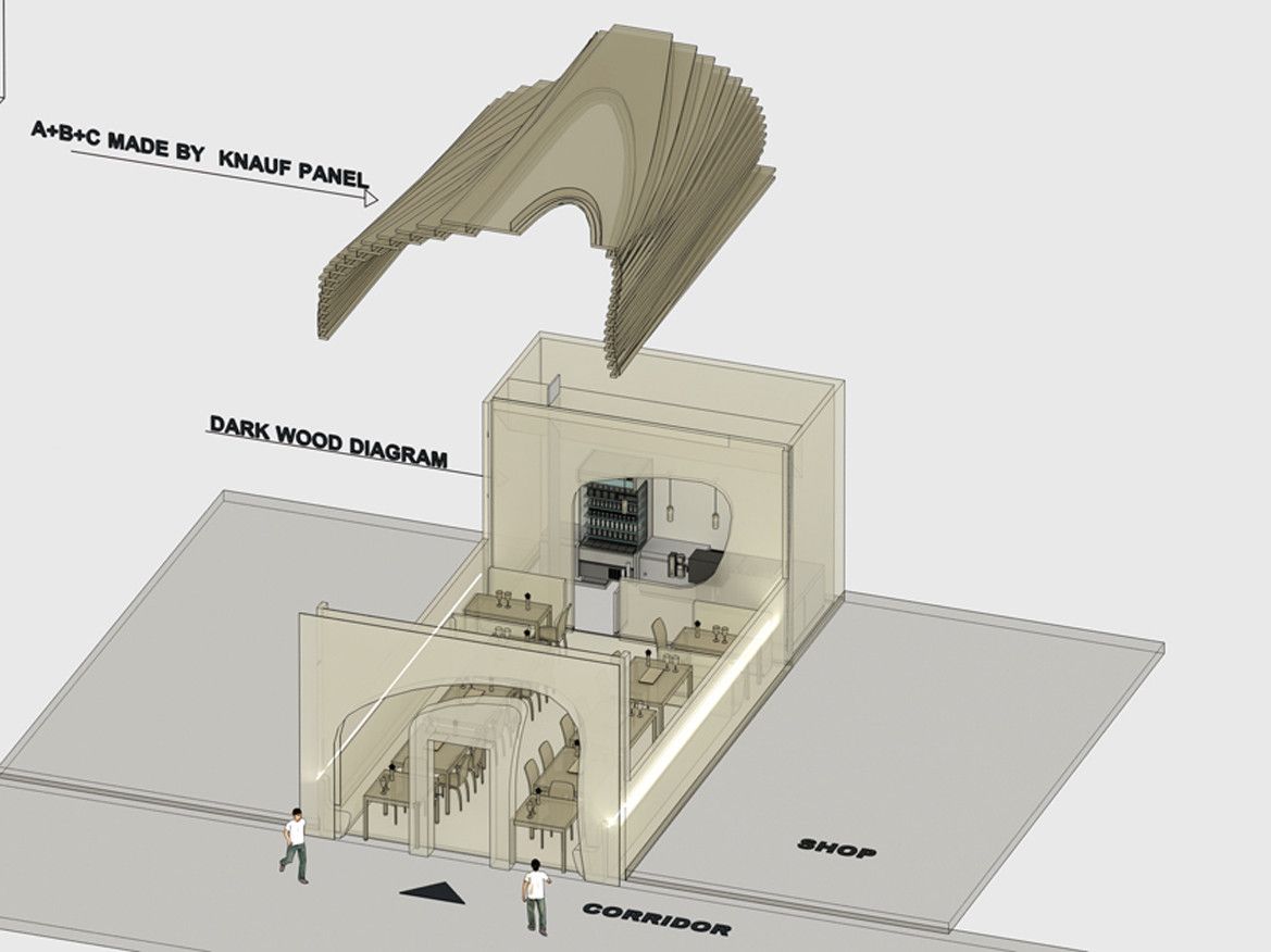
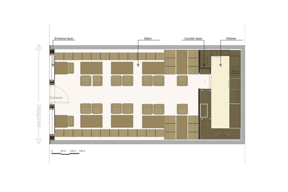
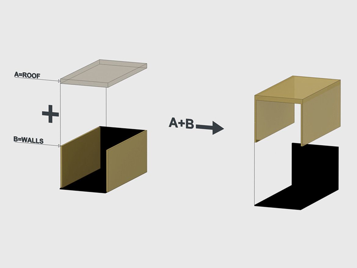
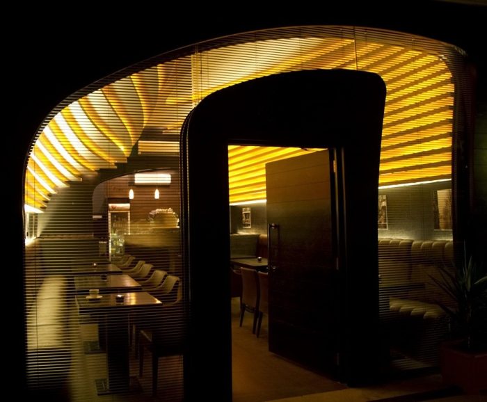
 M Coffee is located in Tehran, Iran and designed by the Iranian firm Hooman Balazadeh. Two materials and thus colours were chosen for the space to avoid visual clutter and create quality of space and light and most importantly, where the two meet. The sweeping ceiling, generated from the morphing of two curves, is executed in a light crème colour, over which light from recessed, hidden lights flows into the space. This mitigates the lighting of the space, providing only indirect light and thus preventing glare or harshness from exposed elements. This flowing cap to the space spans from entrance to serving counter. Along the side walls it reaches down to meet dark coloured woods. Out of this dark wood, everything else in the space, is constructed or clad. There is an incredible sense of calmness to the space, yet it is also subconsciously exceedingly strong and vibrant.
