Academie MWD by Carlos Arroyo
The question was how to harmonize the different situations, and at the same time produce a building with a quality of its own.
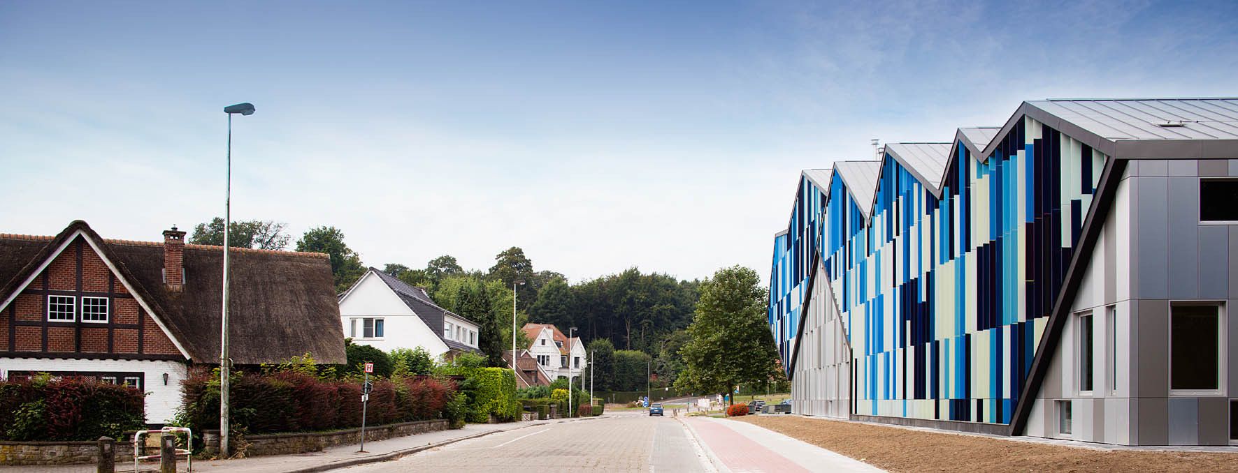
First, with the volume. The new building is a soft transition between the scale of the houses and the imposing presence of CC Westrand. More detilas comes from the architect after the jump.
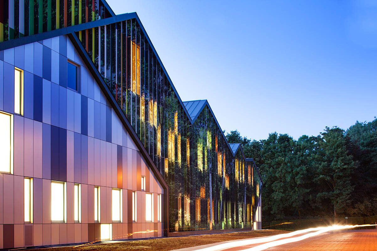
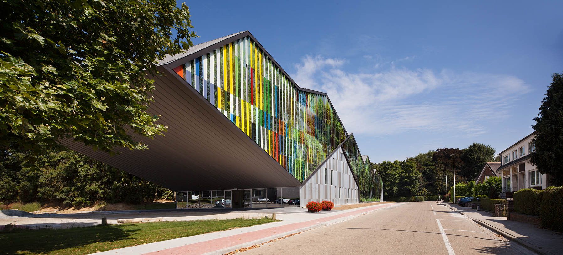
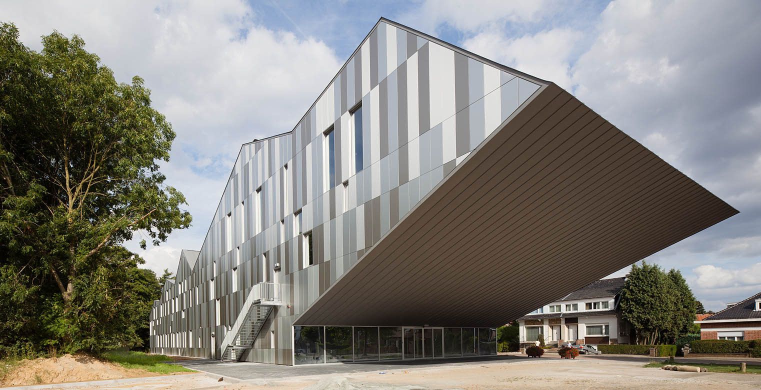
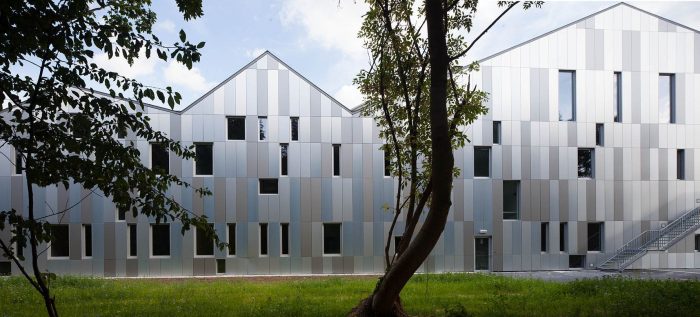
Then form. The gables along the street reflect the houses on the other side, but then become a great cantilever that looks CC Westrand face to face.
Thirdly, with function. The only entrance is on the side of Westrand. Nothing happens in the other perimeters, being either domestic or natural. It is only on the side facing the cultural centre, where the auditorium rises from the ground, creating a covered public space leading to the academy entrance.
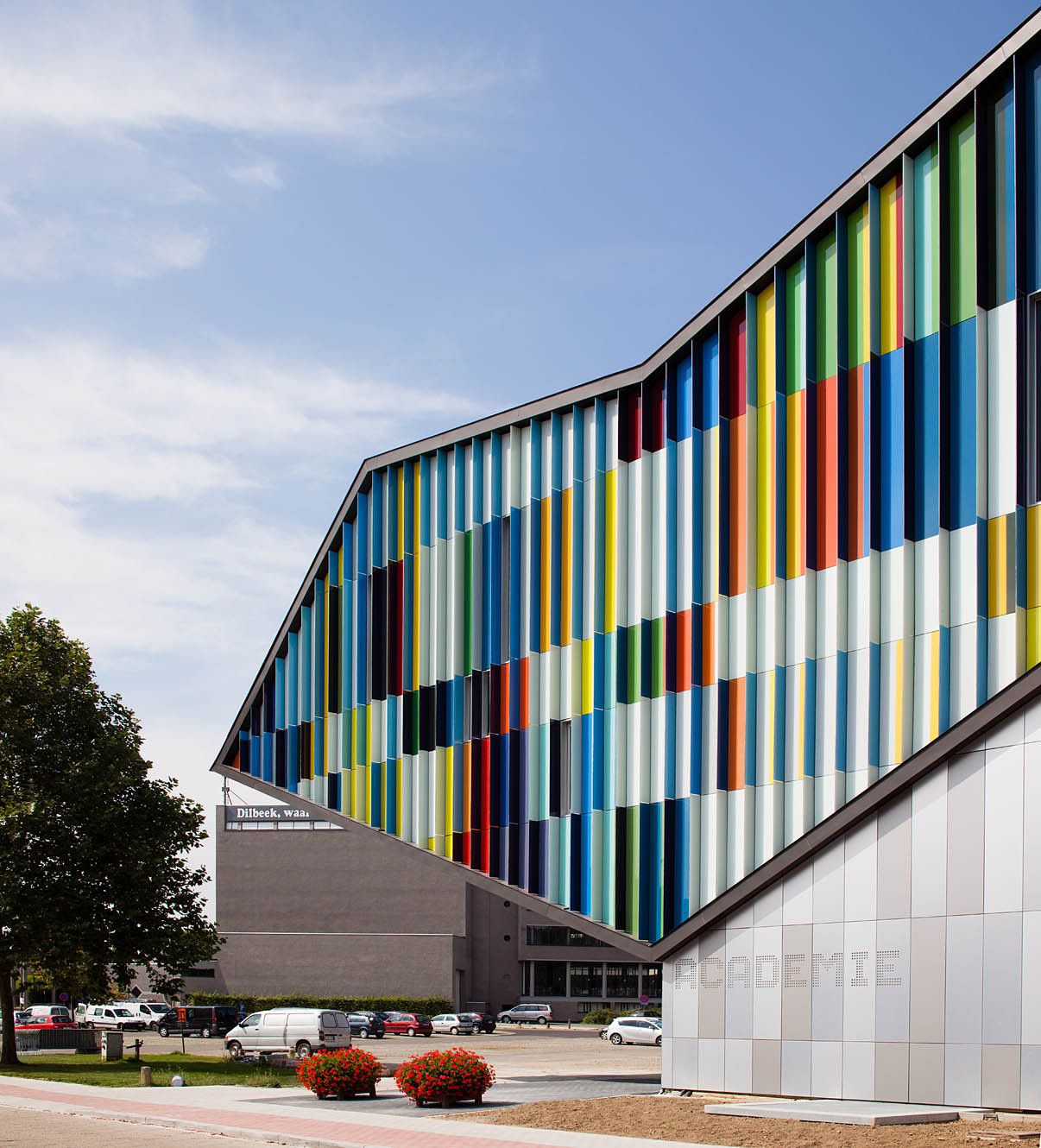
Finally, with image. The dynamic facade creates an optic effect. If you walk towards trees you see trees. It is an image of Wolfsputten. If you walk in the opposite direction, see the colours Hoppenbrouwers.
Alfons Hoppenbrouwers, architect of CC Westrand, was a colour expert. He spent much of its time painting, and in fact, the facade of the new building, as you walk towards that of Hoppenbrouwers is based on one of his paintings. His two-dimensional work is a combination of mathematics and colour. Lines, measure, proportion, geometry, rhythms, colour and texture. Those are also the ingredients of the music, and in fact several of his paintings are interpretations of musical pieces, e.g. the one that composes the elevation of the Academie. It is the Canon for 36 voices by the 15th century Flemish polyphonist Johannes Ockeghem.
The rest of the elevations reproduce the same rhythms, but in metal panels with different finishing textures, reflecting the sky and the forest.
Function and Flexibility
As the cantilevered auditorium rises above the covered public space, a transparent entrance leads to the main lobby. This is therefore at the centre of the building, which facilitates the separation of the public functions of the auditorium and the more intimate function of the Academy. Both share the main services, reception, cloakroom, toilets and dressing rooms, which are also connected directly to the auditorium stage at the top level.
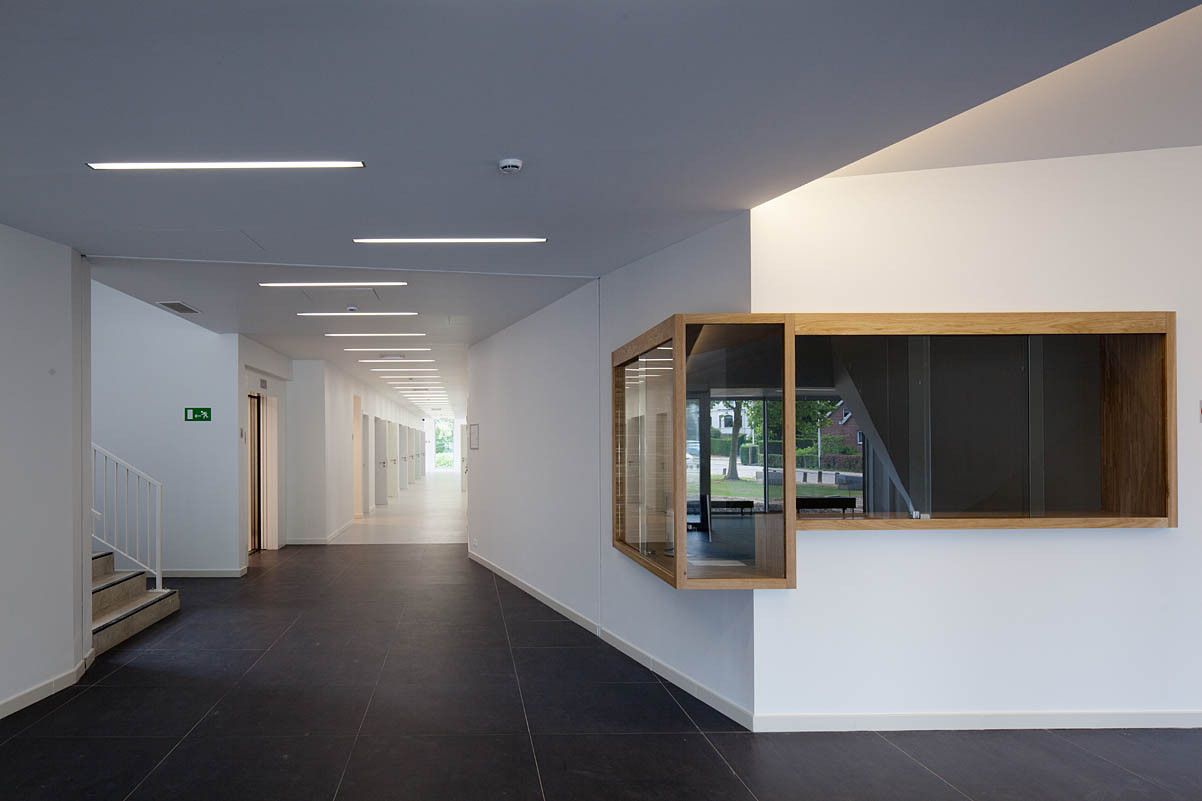
The classrooms, ballet and orchestra room are arranged on two levels with a central spine which includes the structure, technical services, and circulation, along a corridor that is wide enough to manoeuvre grand pianos and reorganize the function of the classrooms.
People
Place making is one of the keys of the project. The covered public space below the auditorium is a clear example: even before the building was finished, this space has been used by local associations in weekend activities. Inside, the lobby can be used for receptions, which may be supported from the teacher’s kitchen through a direct door.
At the other end of the building there is another clearly recognizable place, a double staircase with benches and forest views. It’s easy to imagine people sitting on the benches, perhaps waiting for a lesson to start, or for someone to finish their practice, or just talking.
Energy and resources
Volume and thermal inertia. The compact form reduces the surface/volume ratio and energy loss. The thin load-bearing walls are visible inside the building, providing good thermal inertia, and covered with a thick blanket of continuous insulation on the outside, where it is most efficient. The separating walls between classes are also massive both for the thermal inertia as for necessary soundproofing.
Natural light. The windows are arranged to provide just the right amount of diffuse daylight, while minimizing thermal losses. The fins on the southeast facade capture light, reflecting it inwards with different angles. The interiors are white so as to reflect light in all directions. Even the auditorium can function with only natural light.
Construction materials were selected to ensure maximum respect for the environment. The horizontal structure is laminated wood, fully FSC certified. The construction details are simple, no covering materials: the finish is simply white paint, showing the texture of the material on which it is applied.
Rainwater is harvested on the roofs and used for the flushing toilets.

