Admirant e 18 September Plein
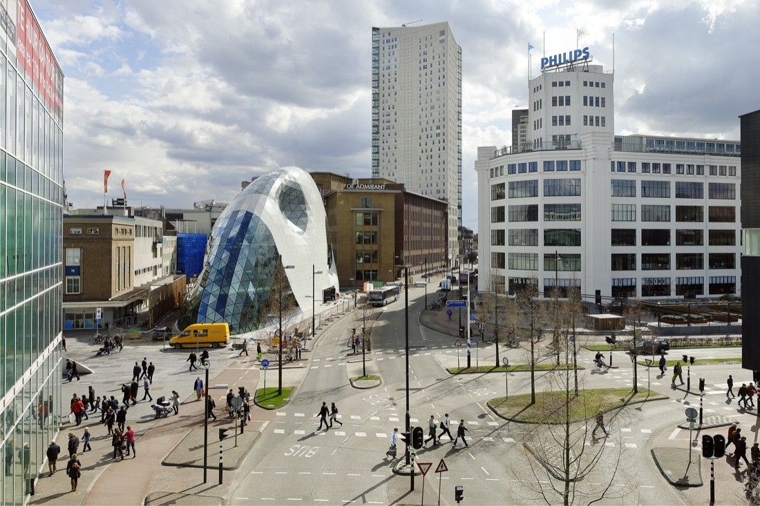
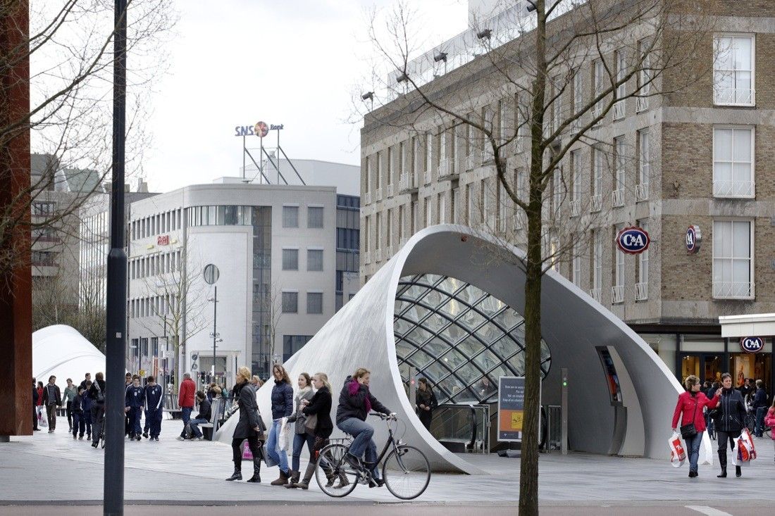
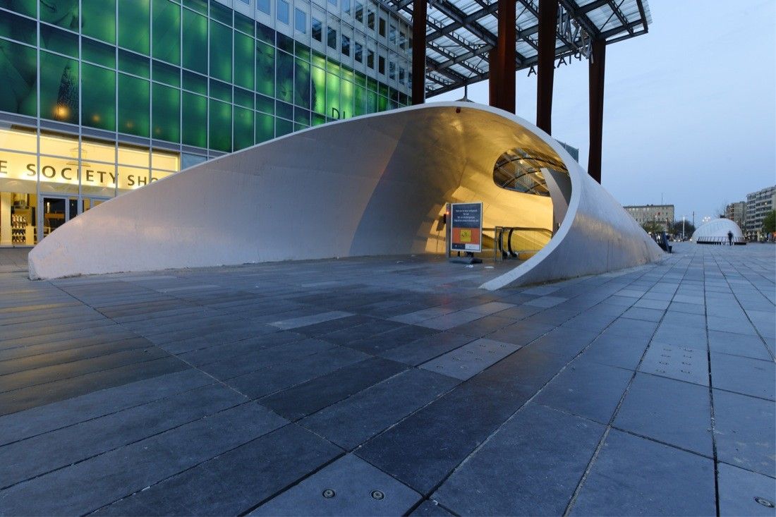
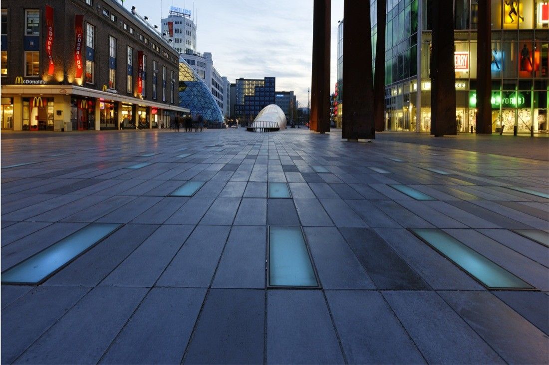
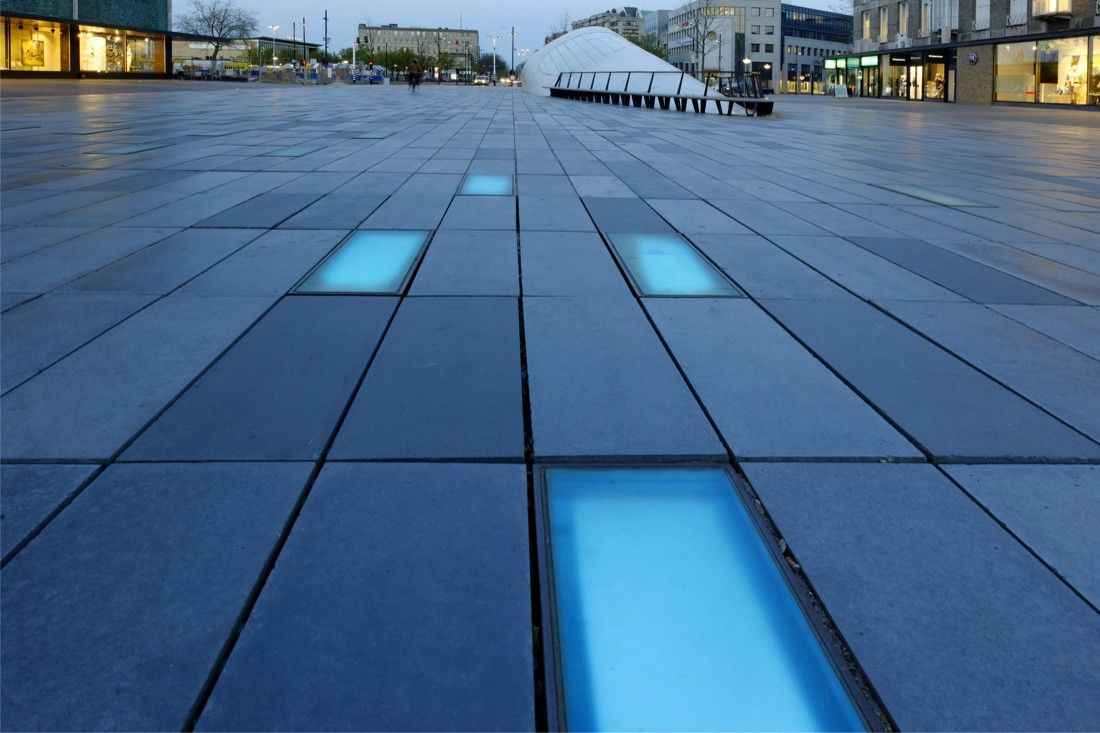
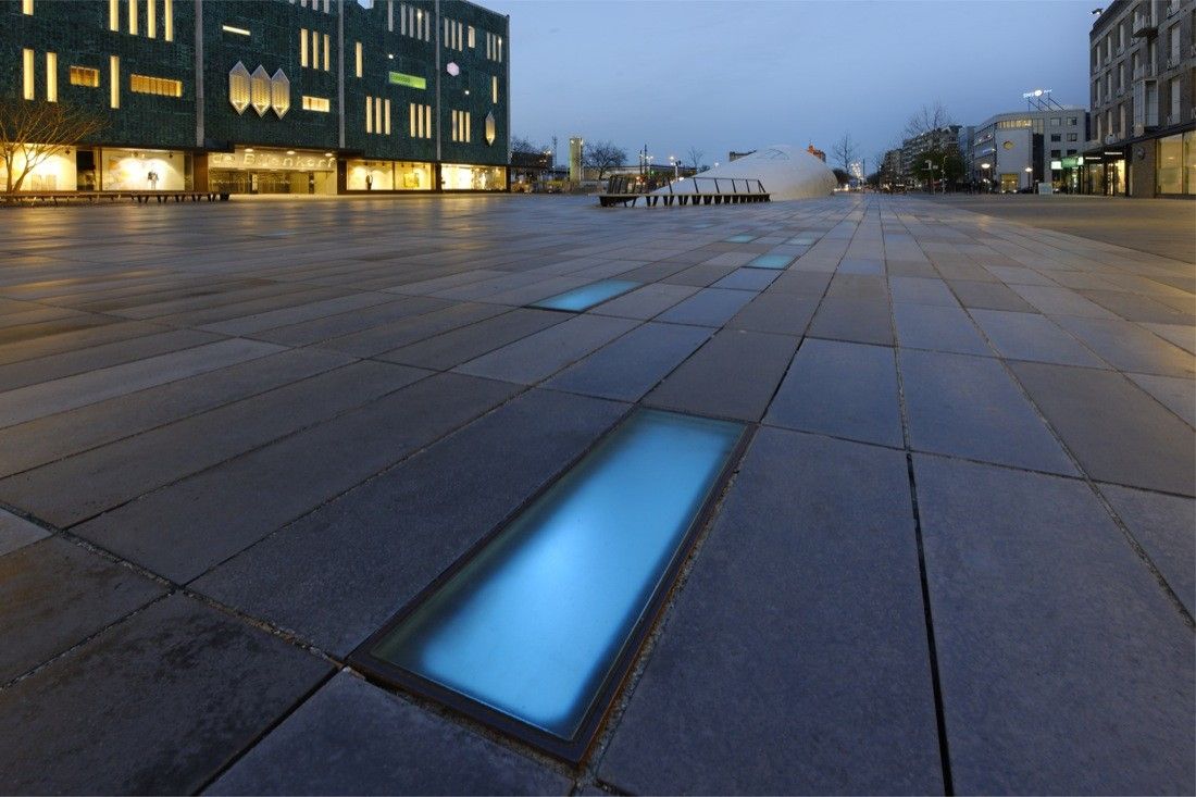
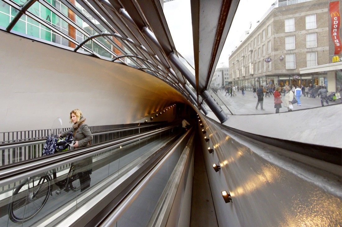
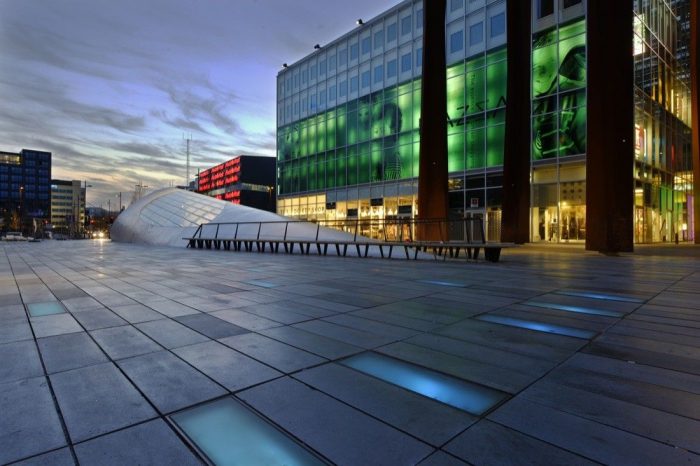
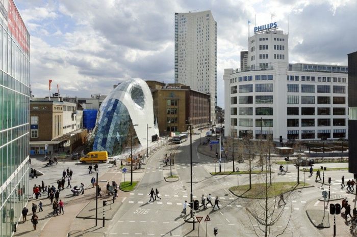
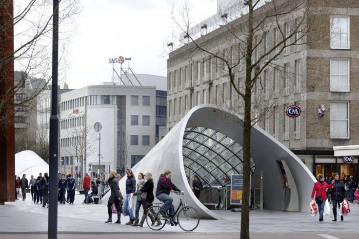
Following the definition of the Masterplan in 1998 for the center of Eindhoven in Holland, studio Fuksas developed the four projects associated with it: the 18-Septemberplein, a square of 7.000 m² with an underground parking lot of 2.300m² for 1.700 bicycles, the Piazza Shopping Mall, a shopping center covering approximately 20.000m² with 6.000m² of office space, the Media Market, a store for sales of electrical appliances and electronic equipment and the Admirant Entrance Building. The Admirant entrance building is at the same time part of a newly developed shopping area by Heijmans Real Estate, a prominent Dutch building developer. It is located just at the border between the new area and the 18th September square, forming the main gateway to a new shopping axis.
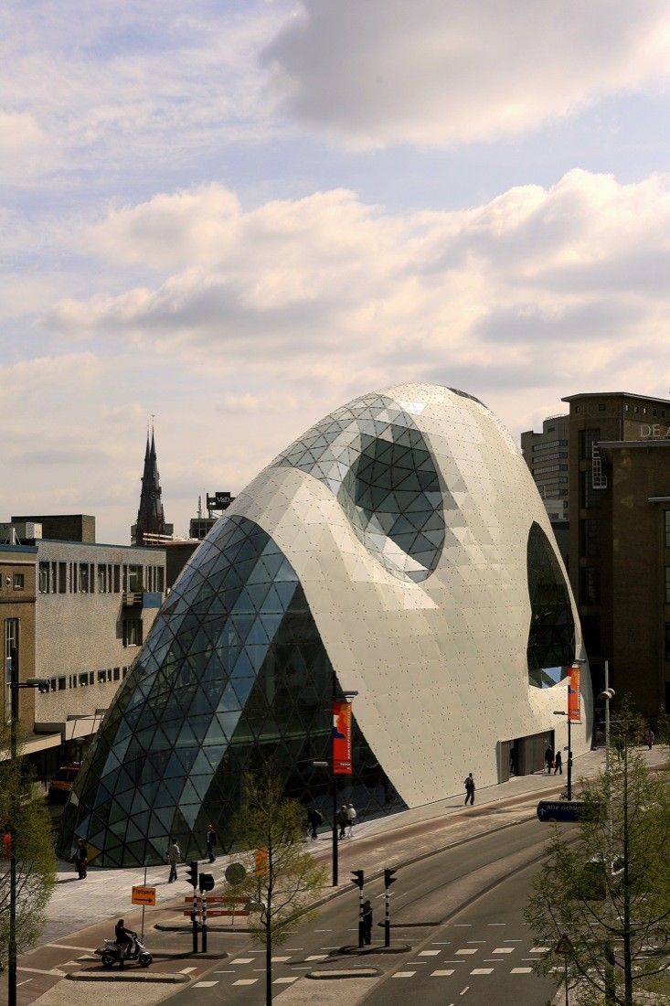
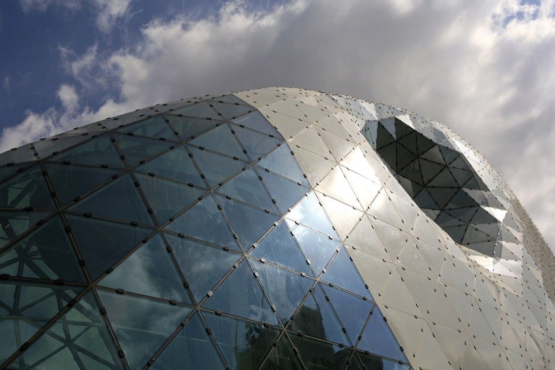
This prominent position called for an iconic building, a request that the Admirant entrance building fulfills entirely. It is like a precious jewel, which attracts the public’s attention and leads pedestrians to the heart of the new district. Due to the non-orthogonal shape, the Admirant is non-directional. If we compared the facades of ordinary buildings to billboards one would refer to the Admirant as more of an advertisement column. Its smooth curves allow a dynamic flow around it. There is no front- or back side; the building envelope is experienced continuously.
The building consists of two elements: the 5-story high primary concrete structure and the glass/steel envelope. Commercial spaces are located on the ground and first level and office spaces on level three and four (plus an additional technical level). The shape of the floor slabs being determined by the form of the façade reaches from 950m² on the ground floor to 250m² on the highest office level. Except for the staircase, no vertical elements block the visual connections on the inside of the building.
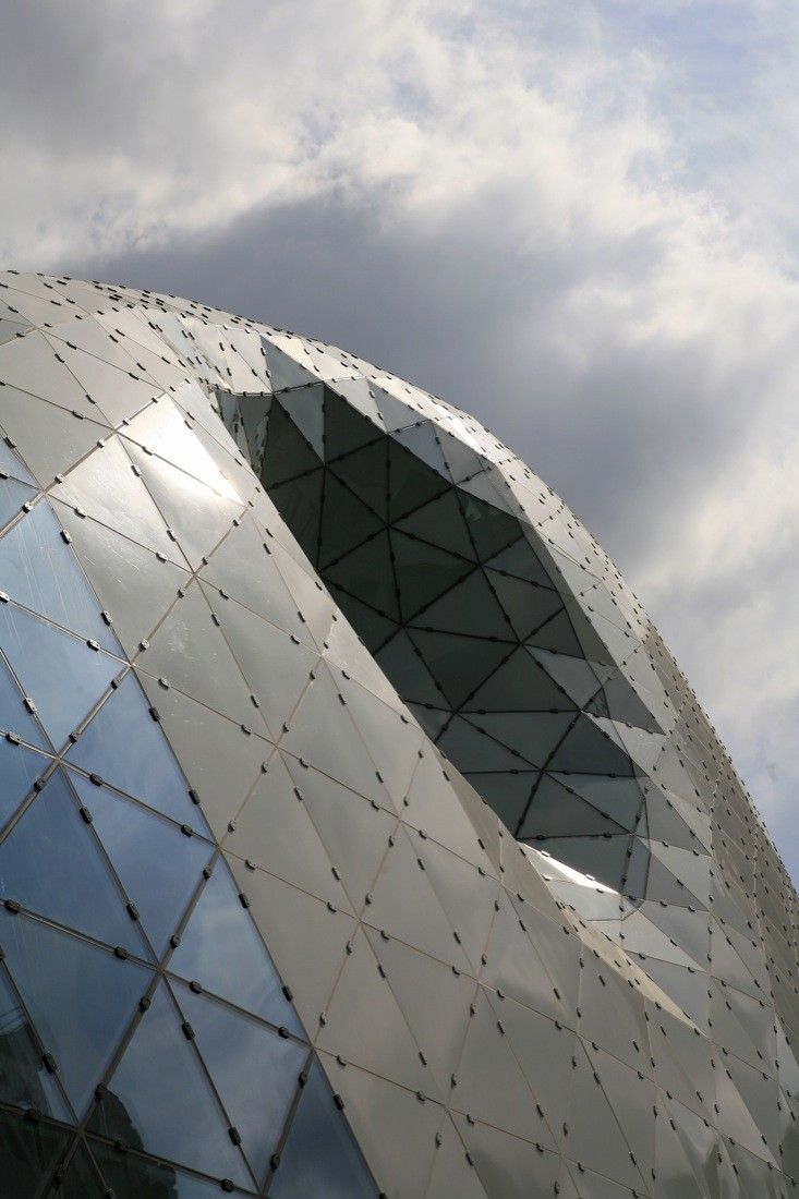
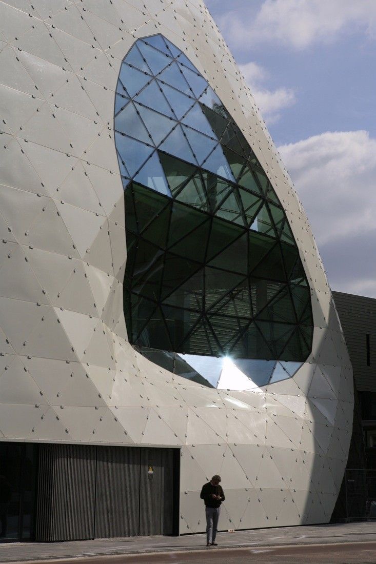
Four big indents of the building envelope create a fascinating diversity of spatial configurations on the inside of the building. The geometry of the façade varies from vertical surfaces to amorphous shapes, which create a dynamic inside of the building and allow an experience of the facade completely detached from the floor levels. Sophisticated details of the connection of the floor edge to the facade underline this experience.
The facade built as today is a result of intensive form finding during the conceptual phase and subsequent form optimization in the later stages. Its system consists of triangulated glass-faces ported by rectangular, hollow steel profiles. The outstanding design made an exceptionally high-quality structural design and precise fabrication essential.
Project Info
Architects: Studio Fuksas
Location: Eindhoven, Netherlands
Architects: Massimiliano & Doriana Fuksas
Roof Engineering: Knippers Helbig – Advanced Engineering
Client: Heijmans
Area: 3000.0 sqm
Year: 2010
Type: Mixed use, Retail, Office Building
Photographs: Rob Hoekstra

