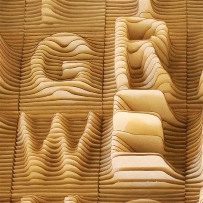
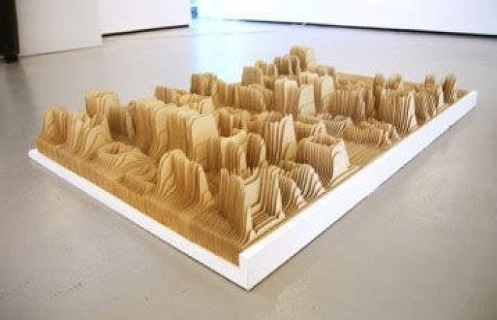
These strikingly amazing pieces of Alphabet Topography which are created by Yale-graduates Caspar Lam and YuJune Park of Synoptic Office. Their artwork of Alphabet Topography is a physical examination of letterforms relating them to usage frequency. Vowels and consonants like “R” and “T” were shown with a prominent vertical altitude while lesserused letters like “W” and “G” are almost fallen flat.
YuJune tells about their artwork of Alphabet Topography;
“I modelled the letters individually in Rhino and exported sections of each letter to AutoCad and based this alphabet on word frequency as defined by the University of Cambridge Computer Laboratory, which interestingly enough, is almost identical to word frequency as defined by old linotype machines. I wanted a total variable of 6″ from the most often used to least often used letter, which gave each letter a height difference of .23 inches. I used architectural butter board and laser cut each letter in sections, and there was no client for this project—we developed it from a desire to explore the idea of language landscapes—visualizing language and the ebb and flow of spoken English.”


