AMORE Sulwhasoo Flagship Store
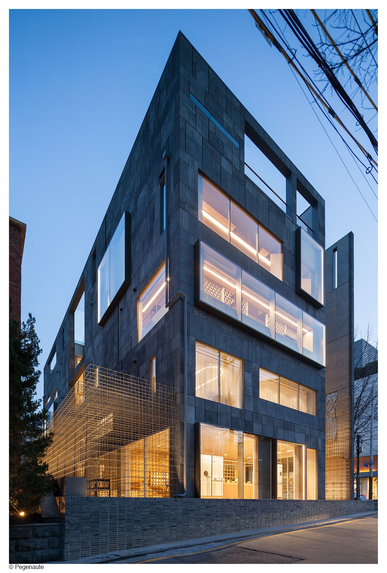
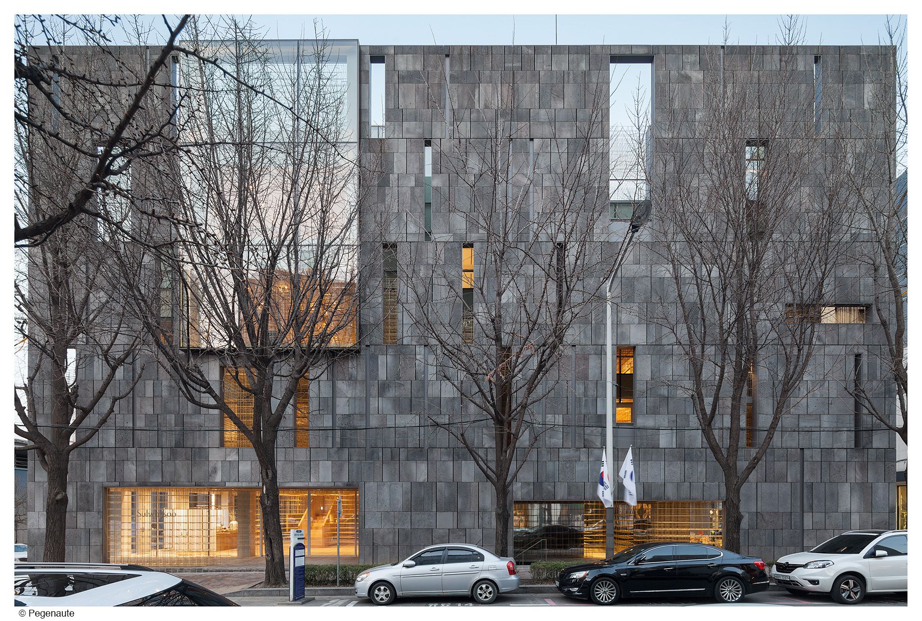
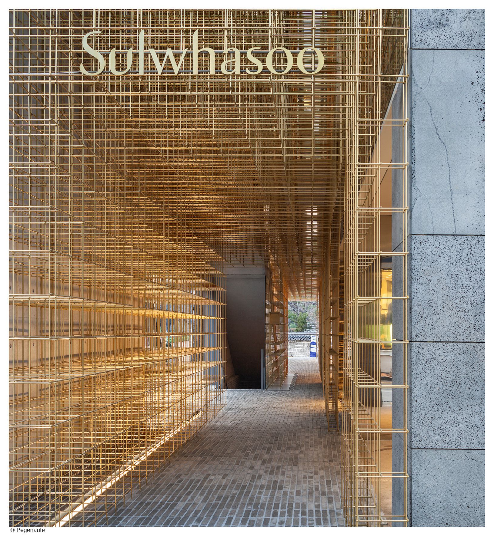
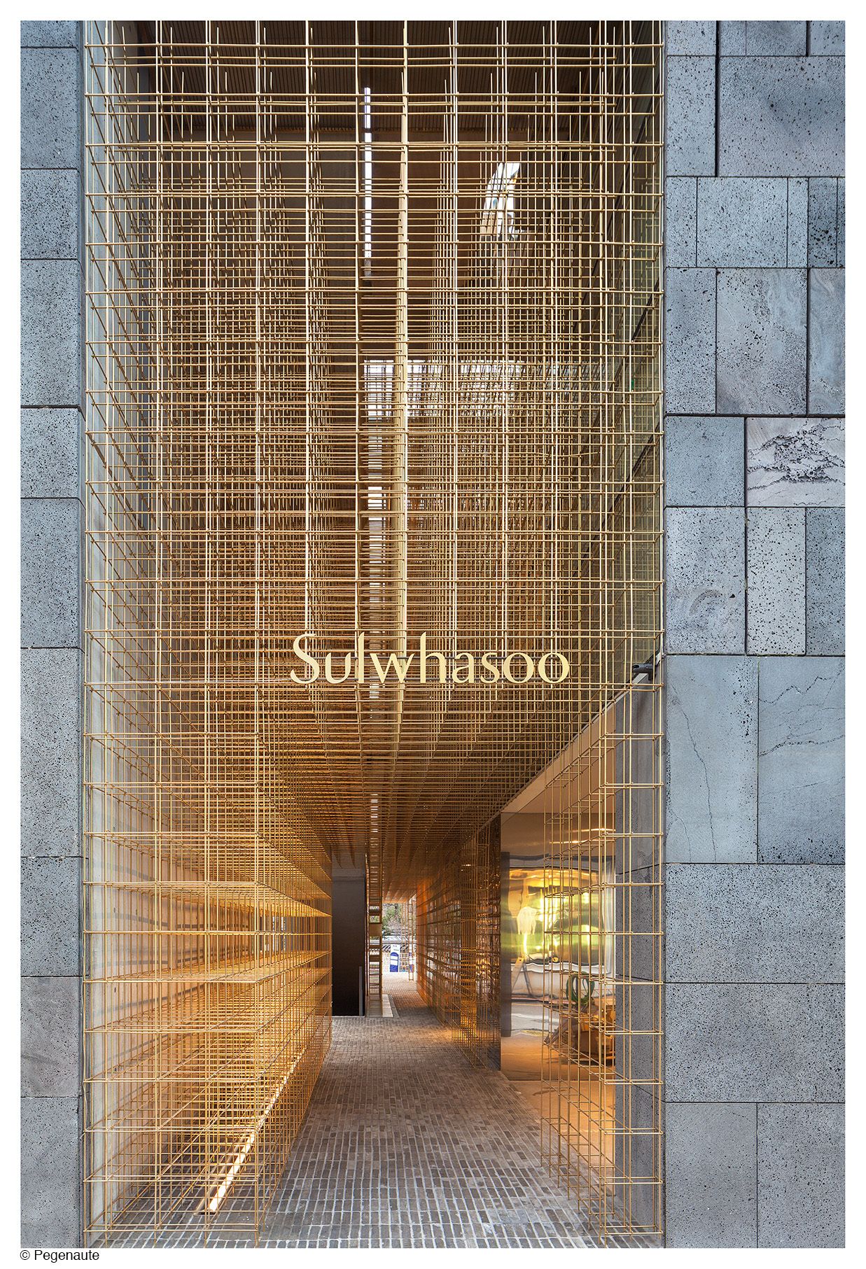
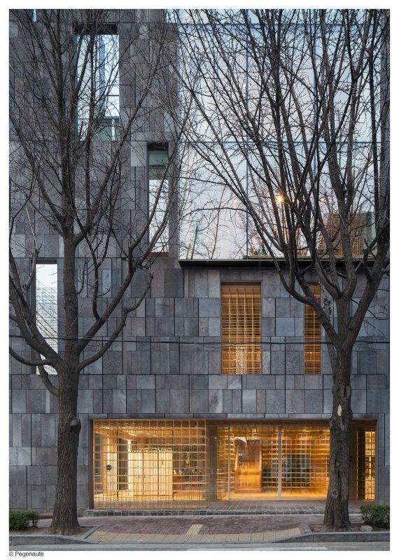
It is a lantern – the AMORE Sulwhasoo Flagship Store designed by Neri&Hu Design and Research Office. “The literal and mythological meaning of the lantern is highly significant throughout Asian history—it leads you through the dark, showing you the way and indicating the beginning and end of a journey.” Inspirited by this ability and belief surrounding a lantern, this majestic store born from an existing five storey building in South Korea has built a new identity for the leading Asian skincare brand Sulwhasoo. The building itself was designed by Korean architect IROJE in 2003. “Celebrating the roots of the brand, Neri&Hu wanted to develop a concept with strong connections to Asian culture and traditions, ultimately allowing customers to discover the wealth of Asian wisdom that underpins the Sulwhasoz ethos.”
Three key requirements were at the heart of the design from the very beginning – Identity, Journey and Memory. “Neri&Hu aspired to create a space that appeals to all the senses, that captures the customer immediately as they approach the building, creates an experience that continues to unfold during the journey through the store, and leaves a strong impression with visitors long after they have left.”
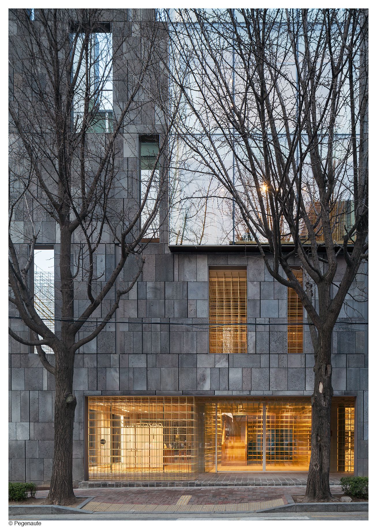
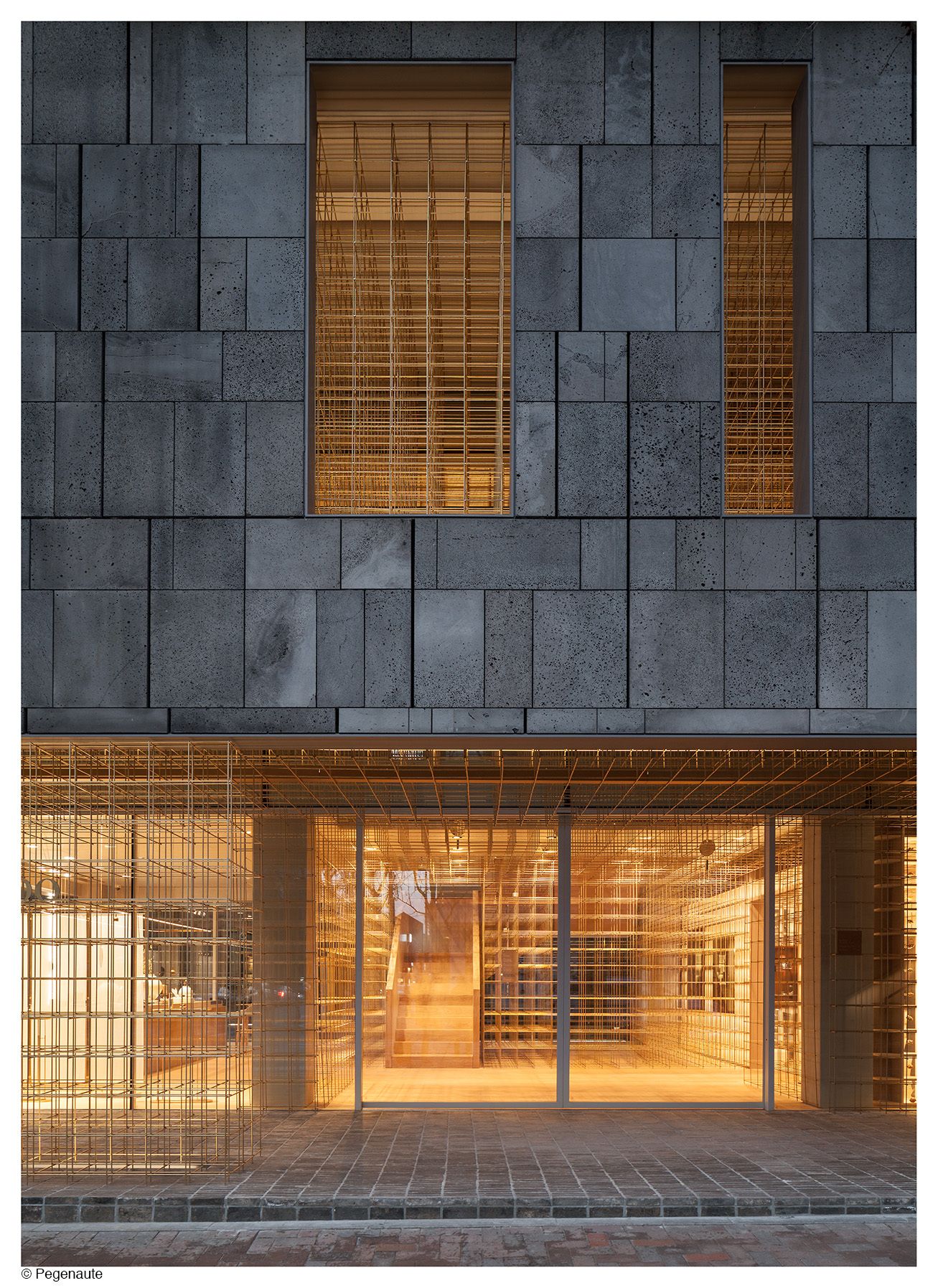
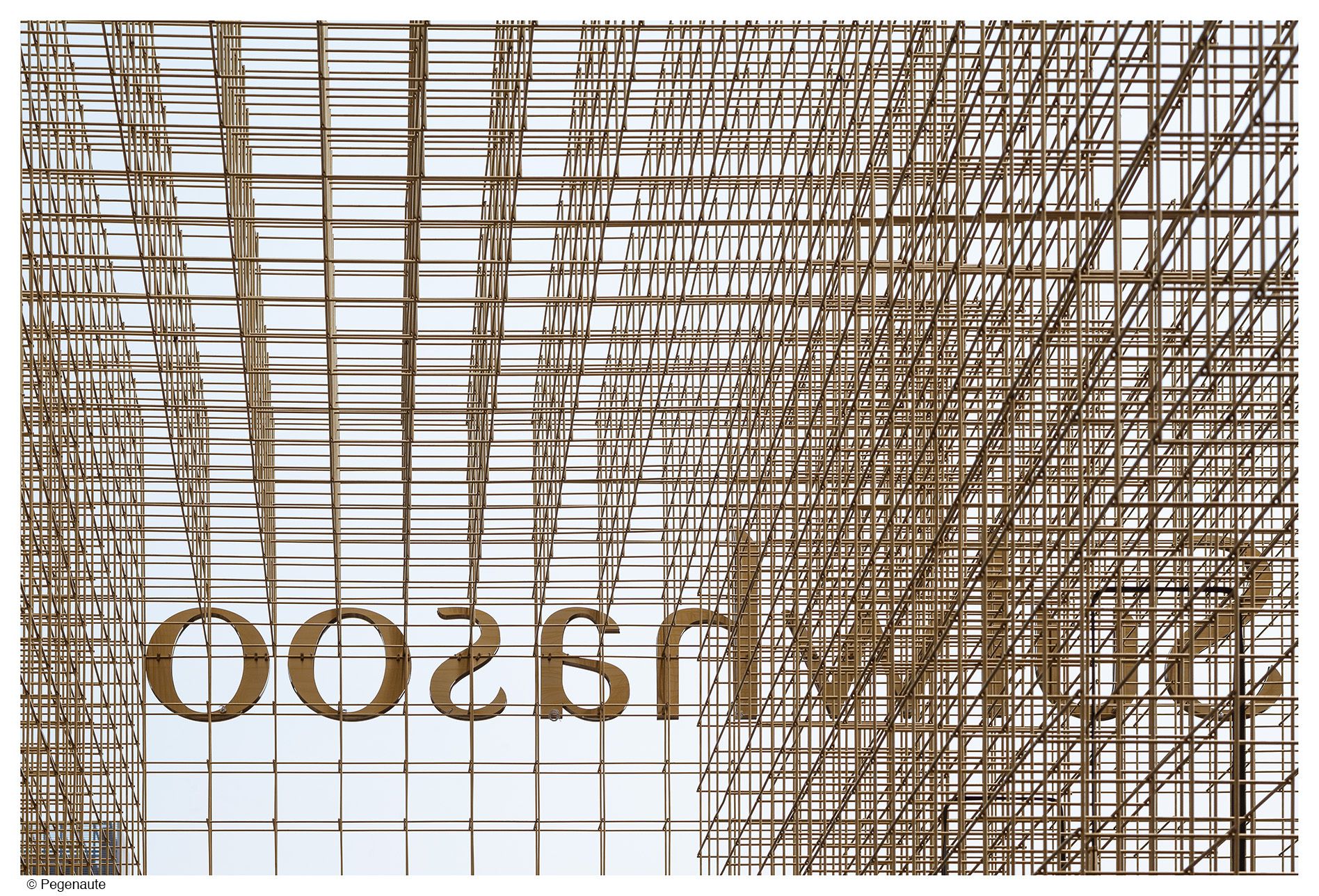
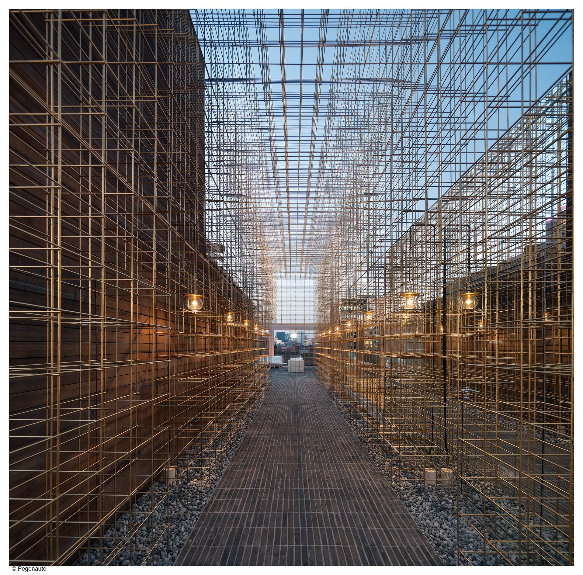
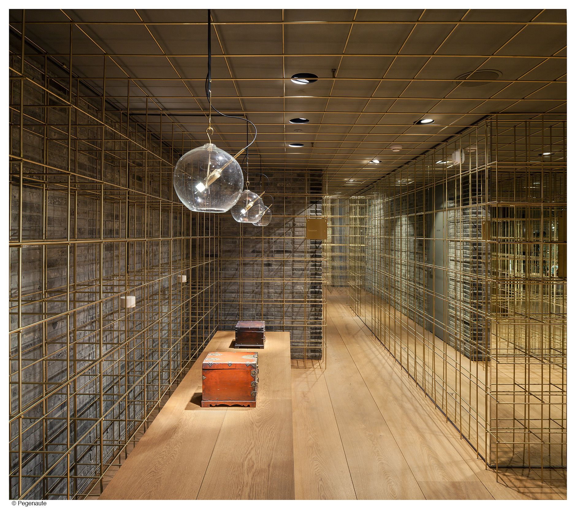
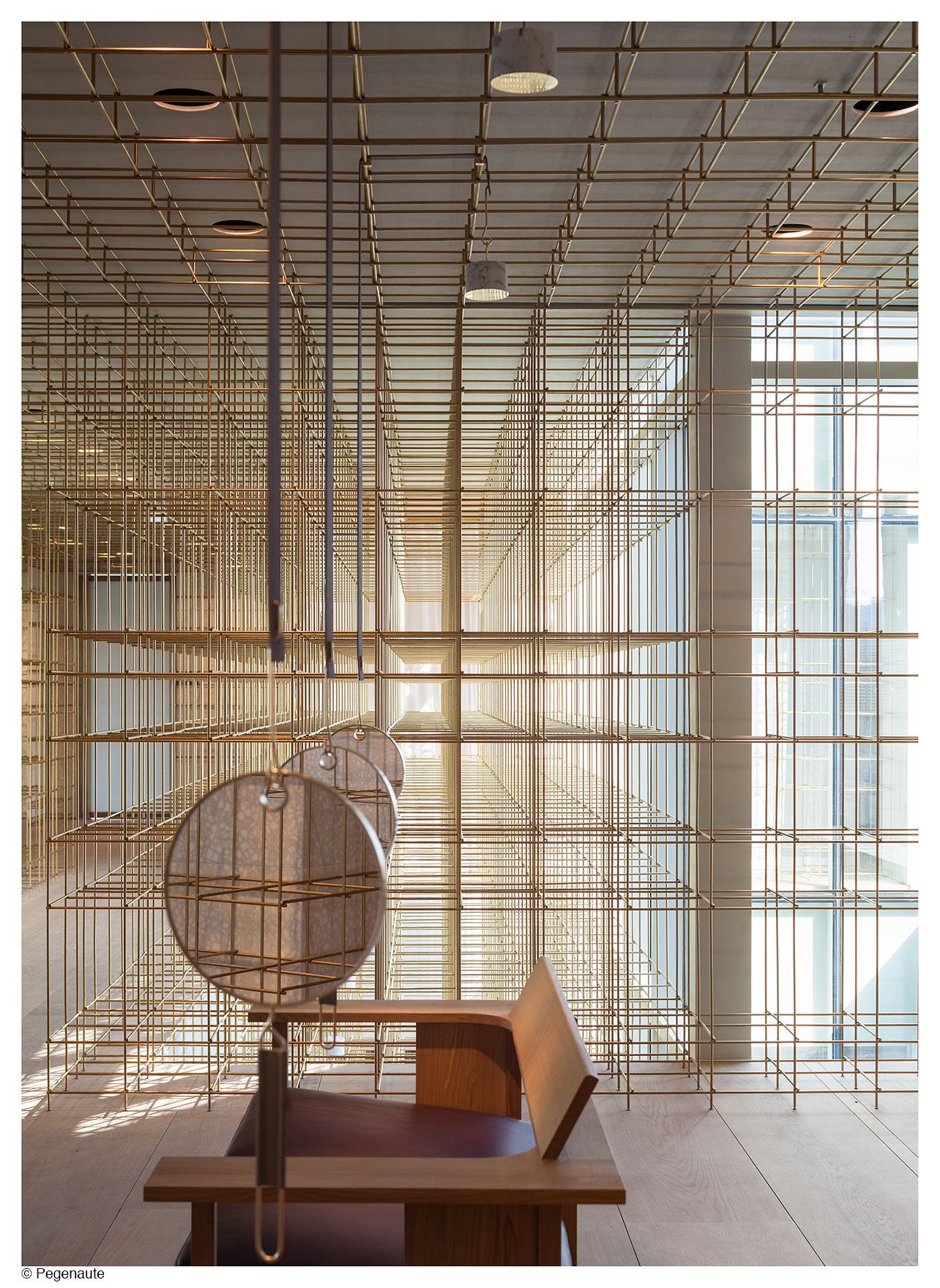
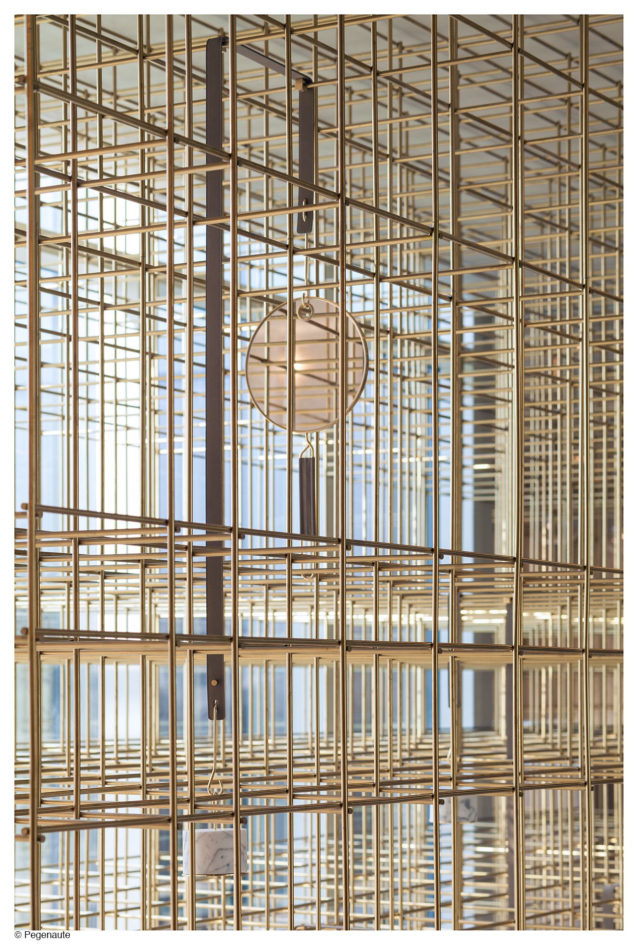
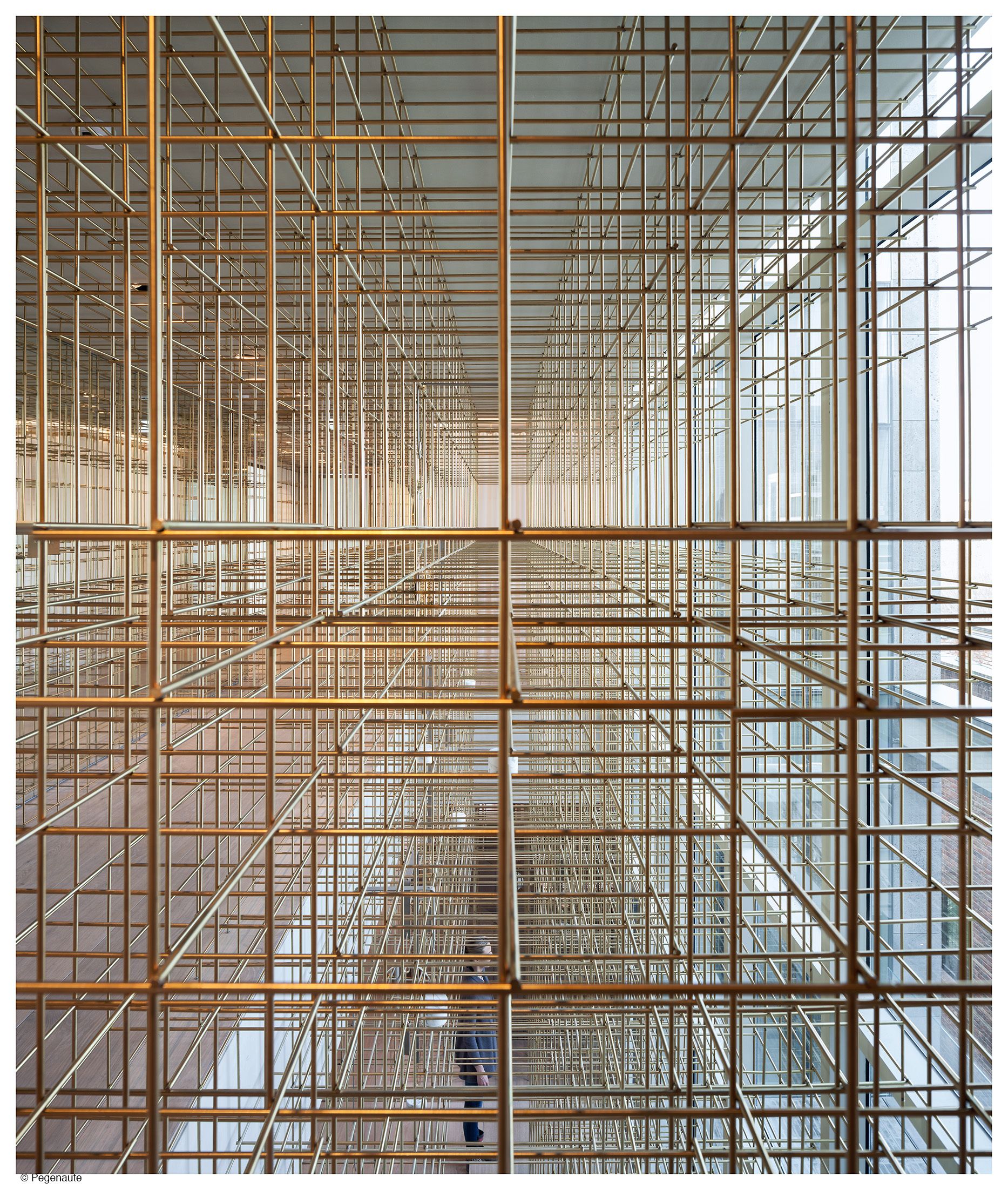
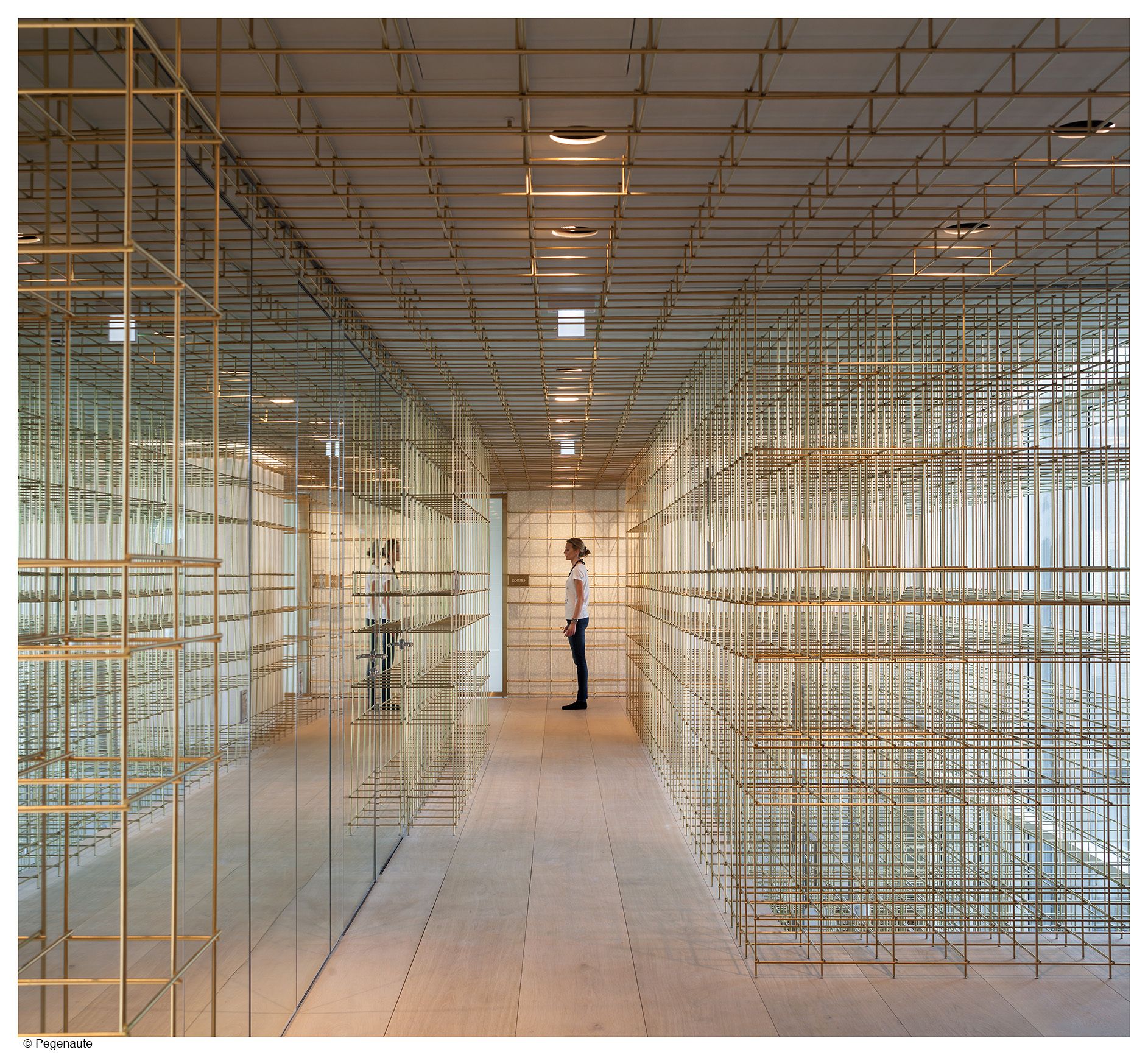
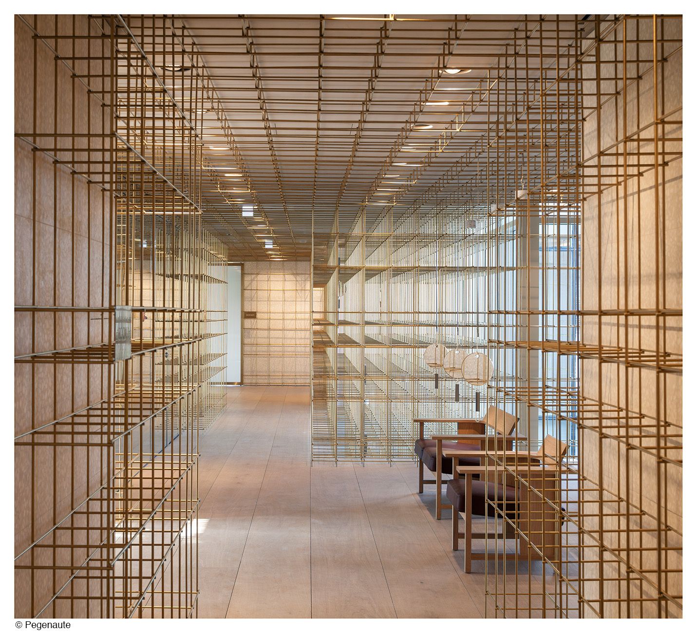
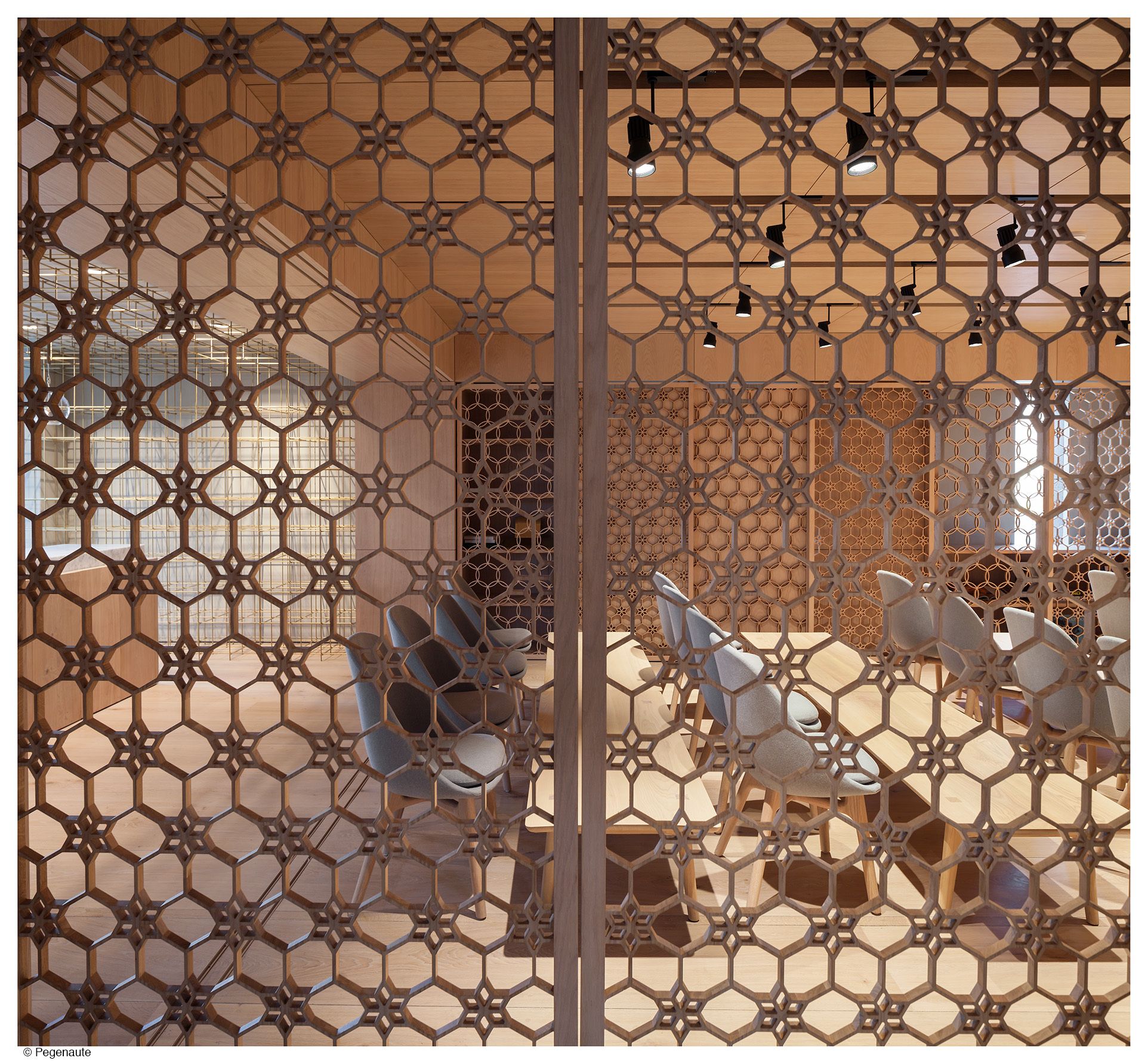
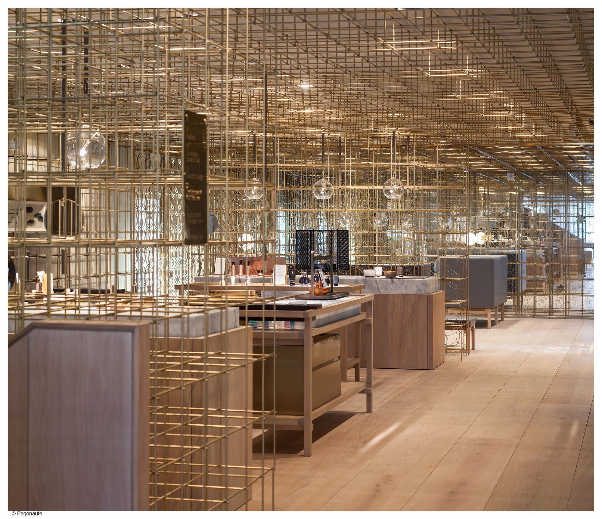
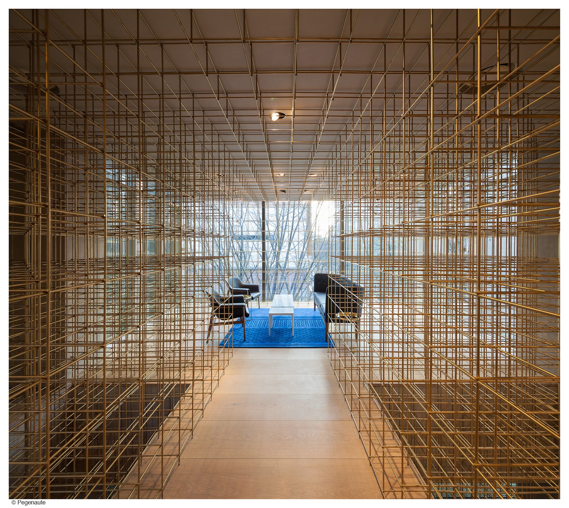
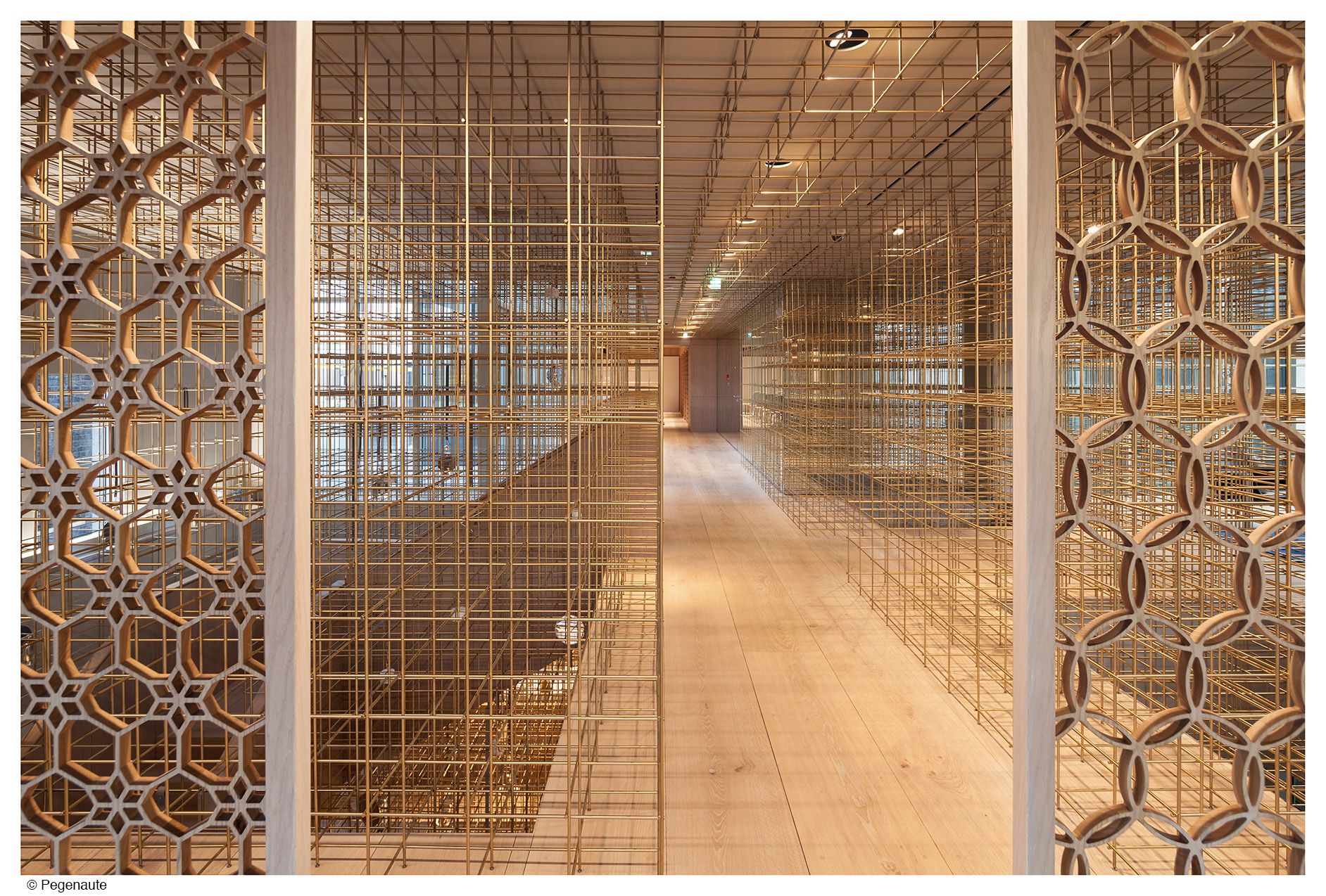
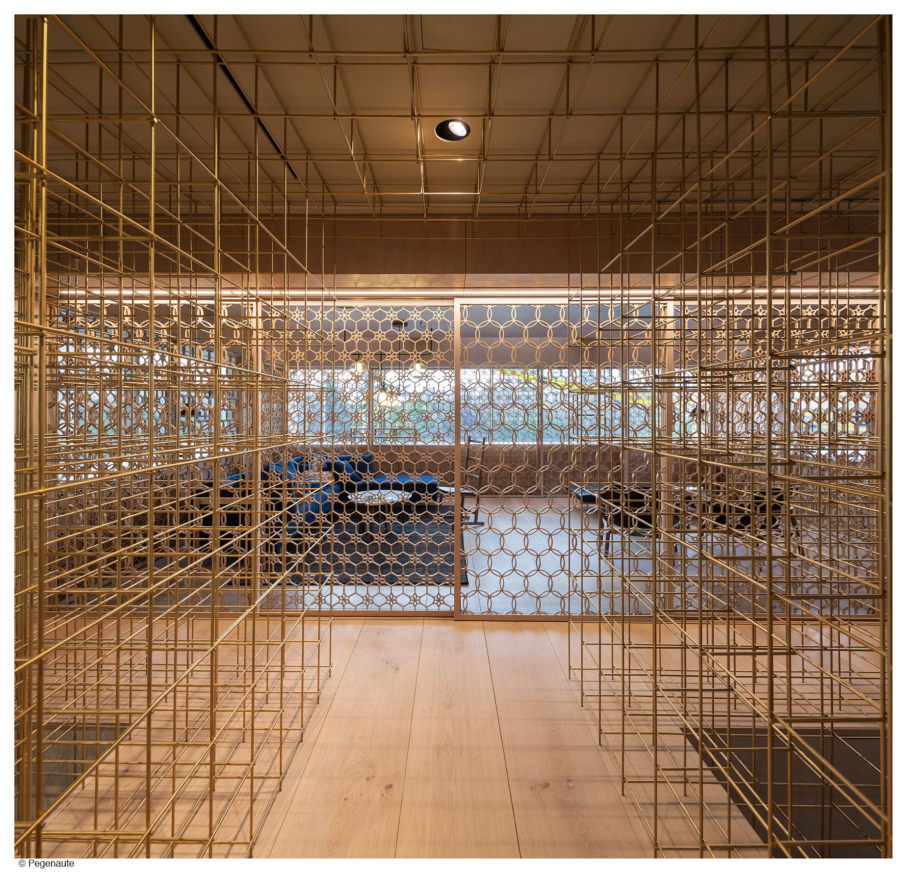
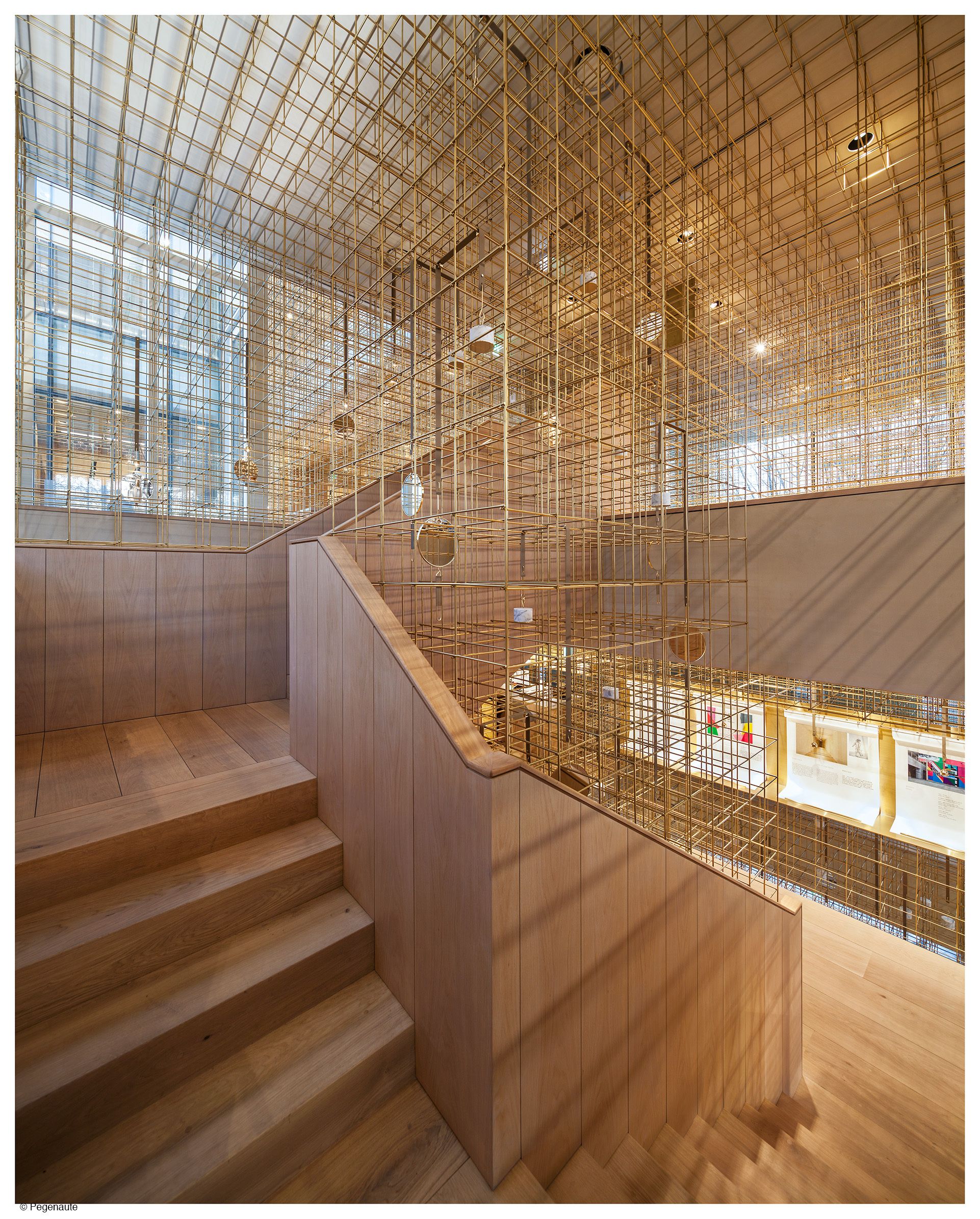
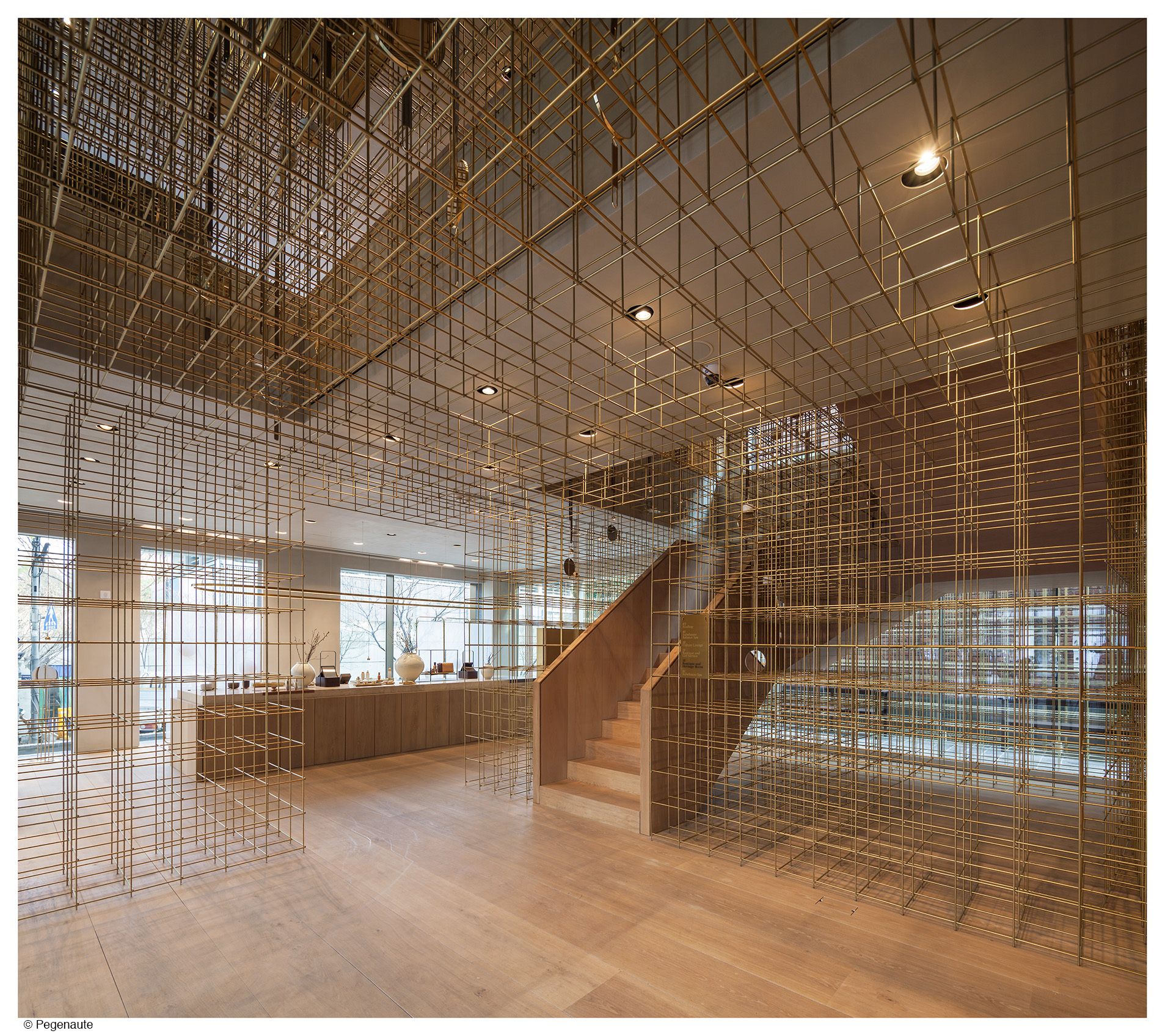
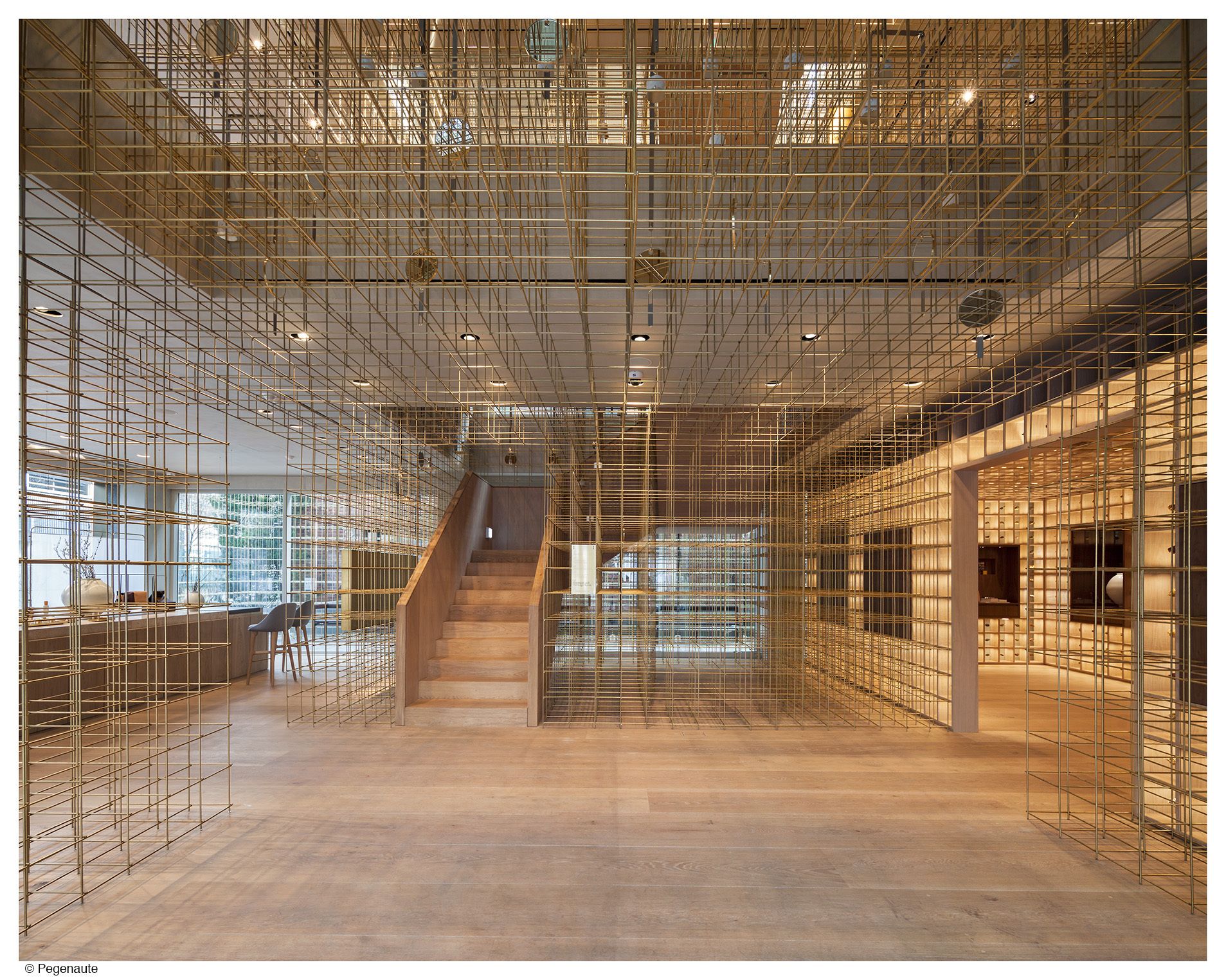
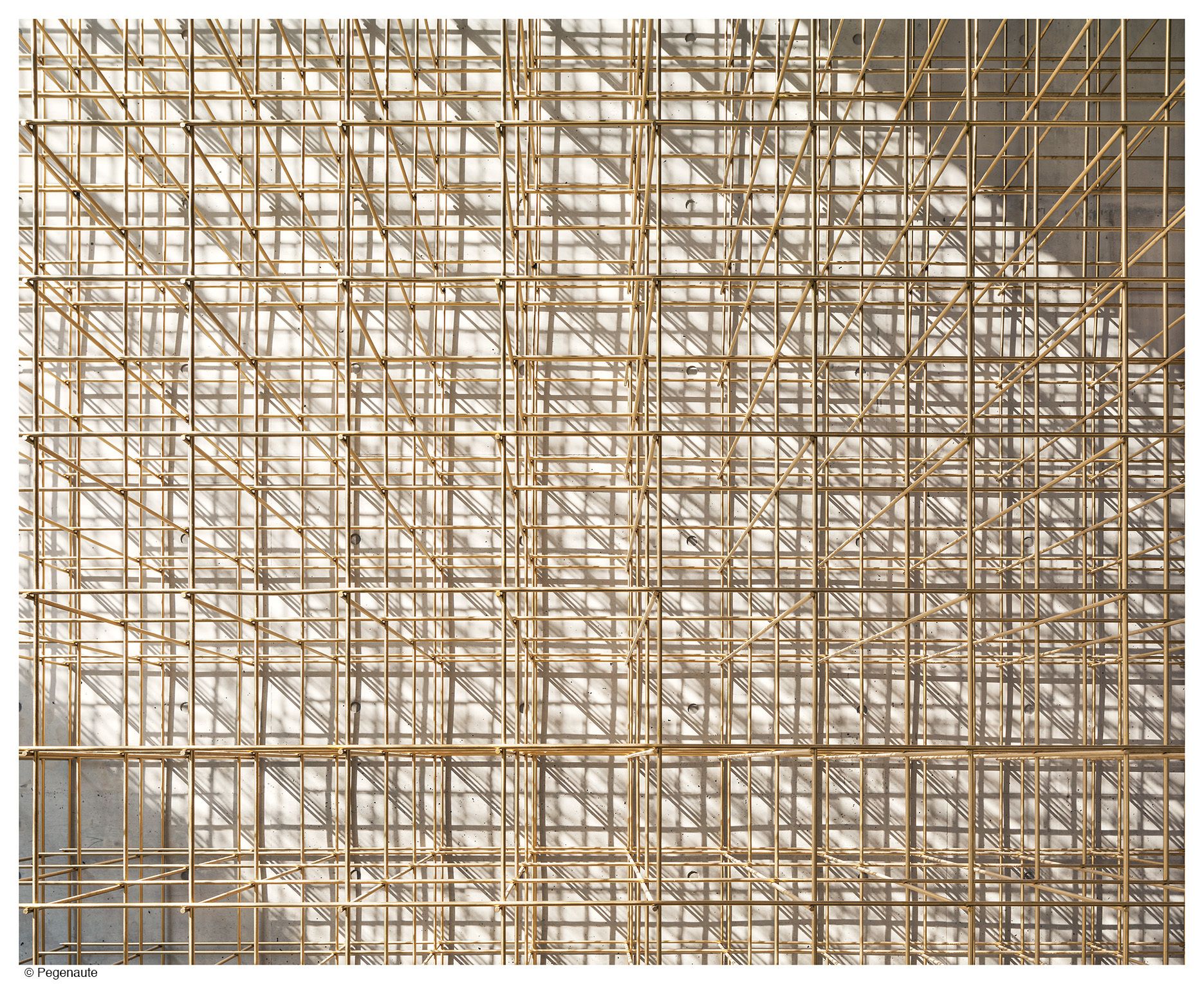
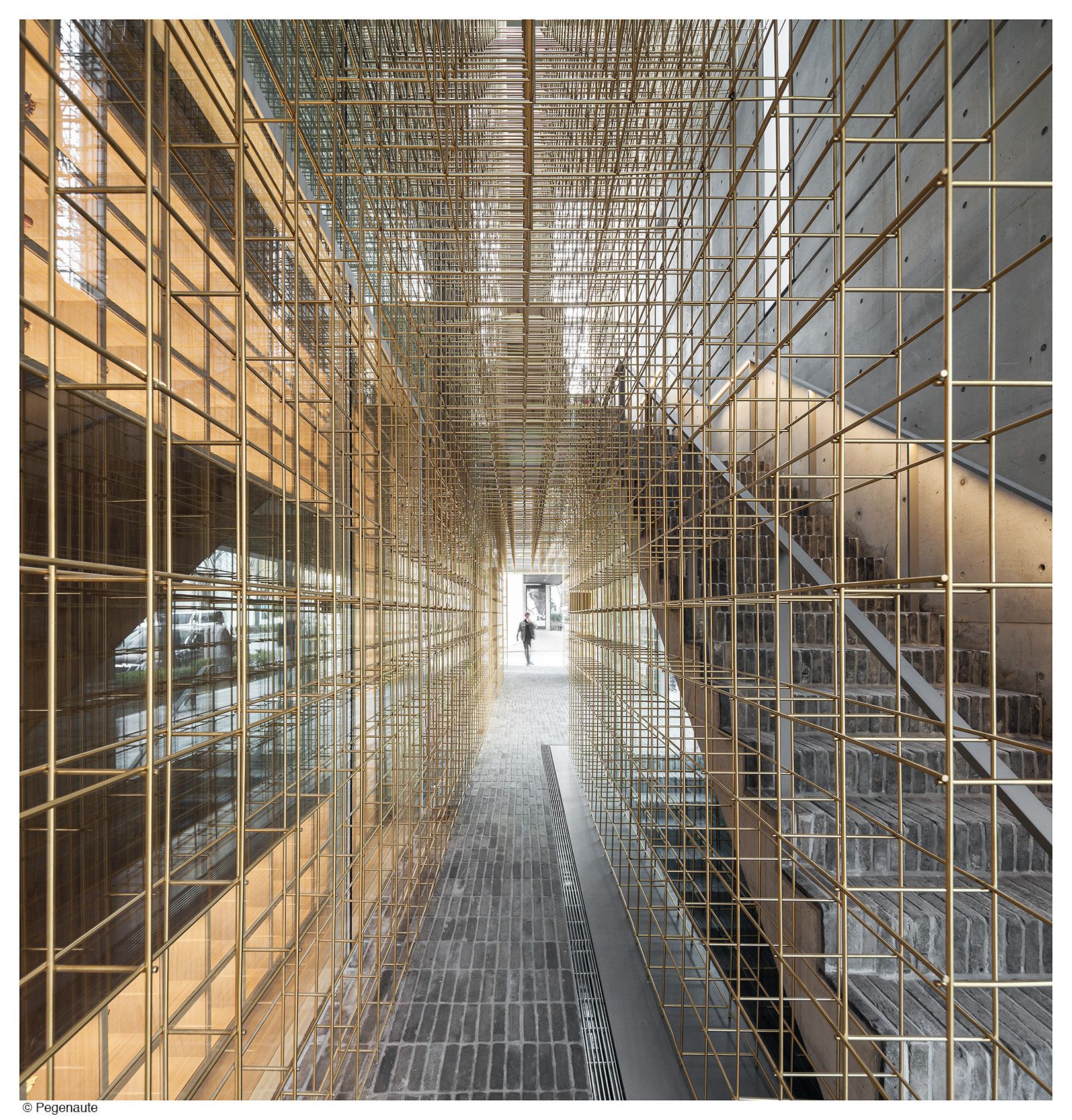
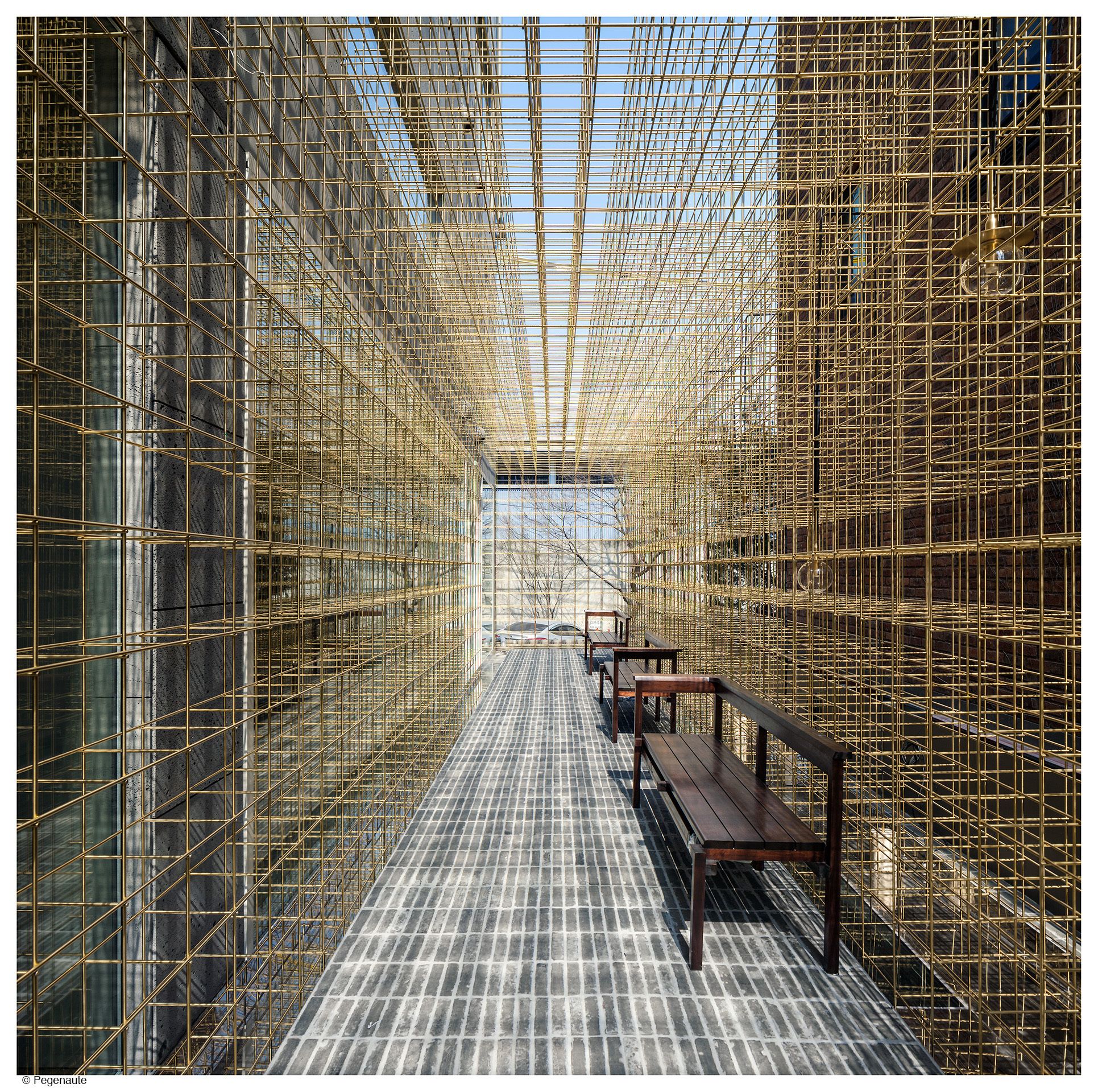
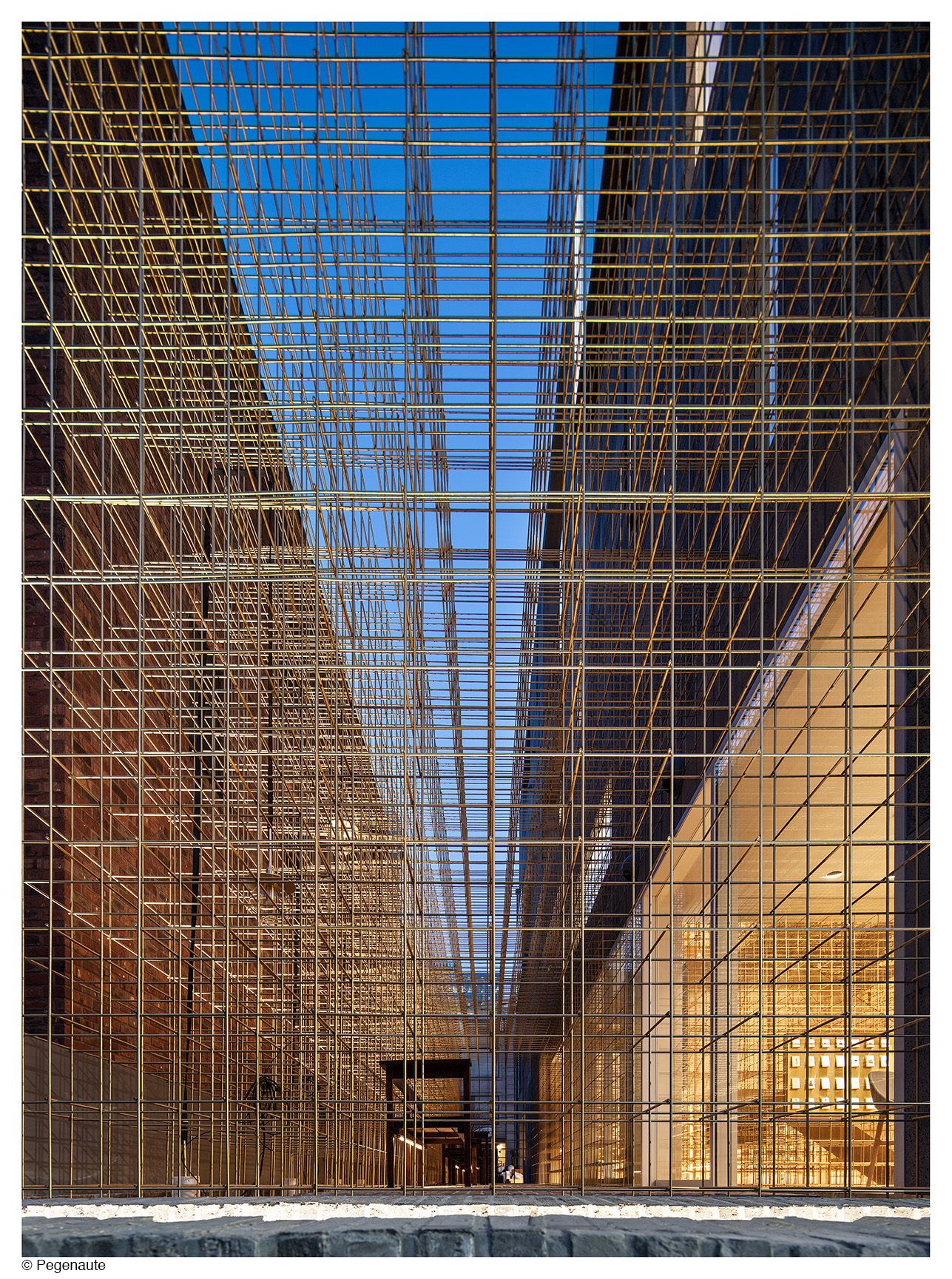
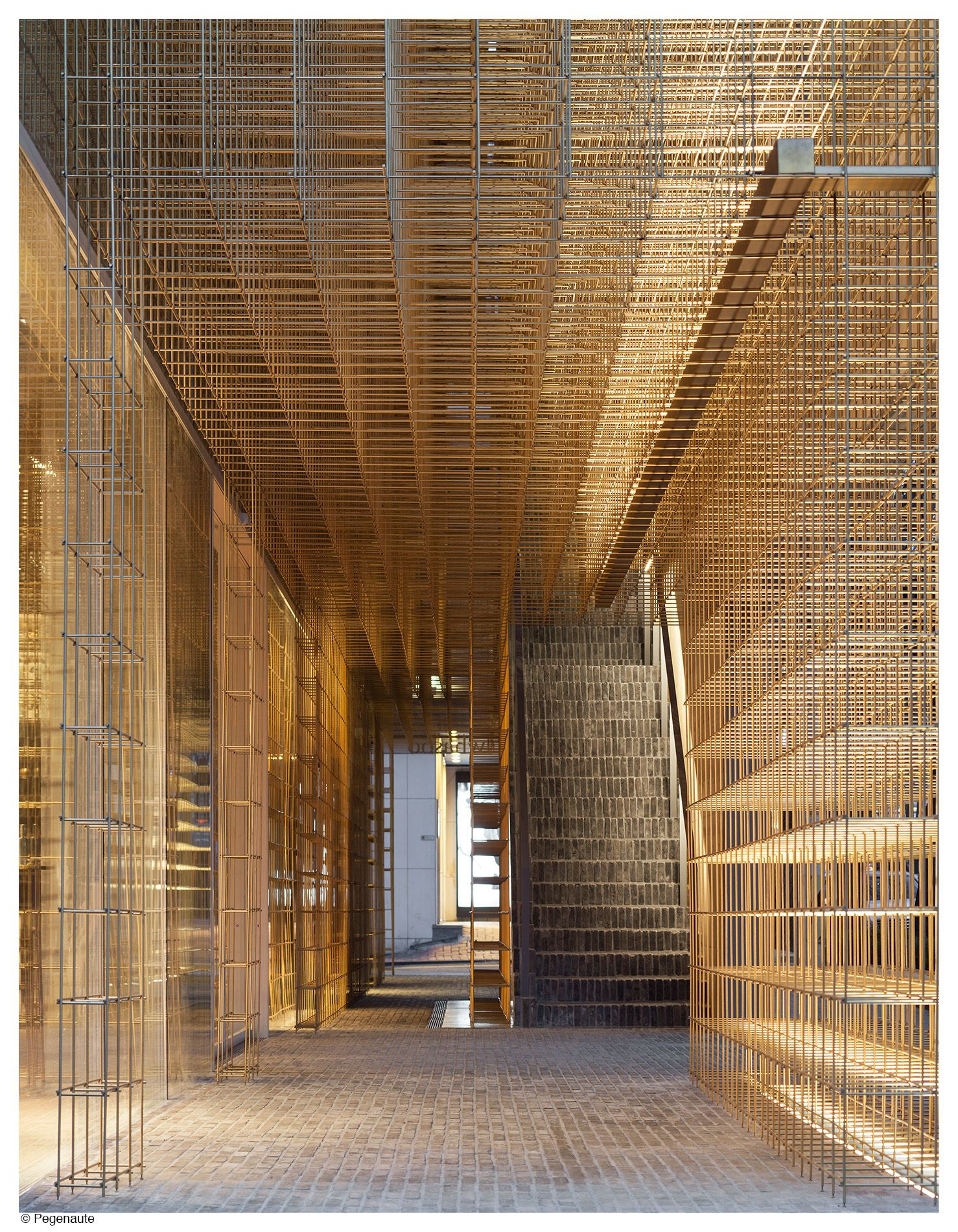
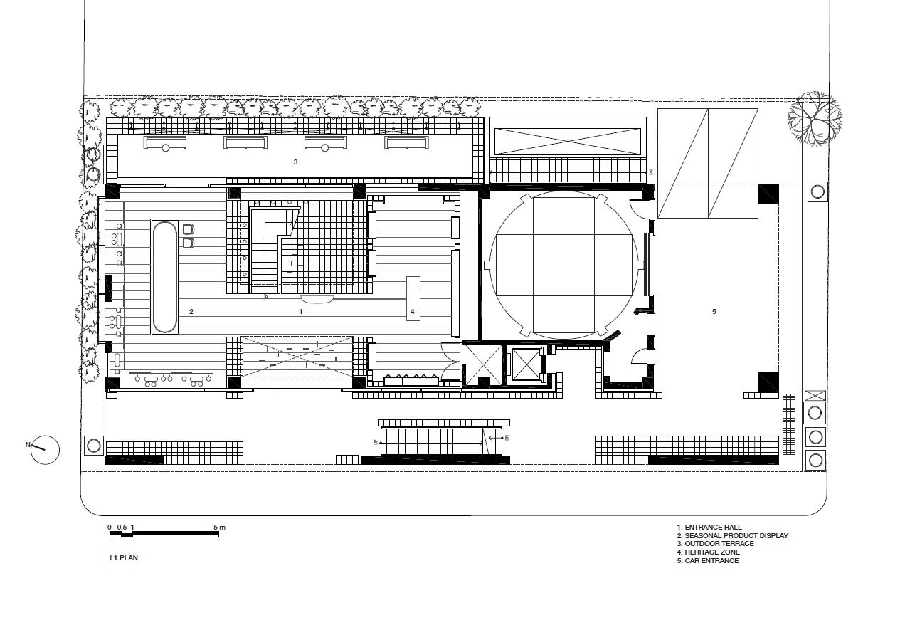
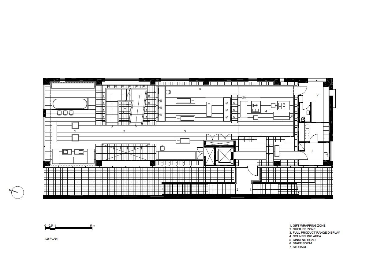
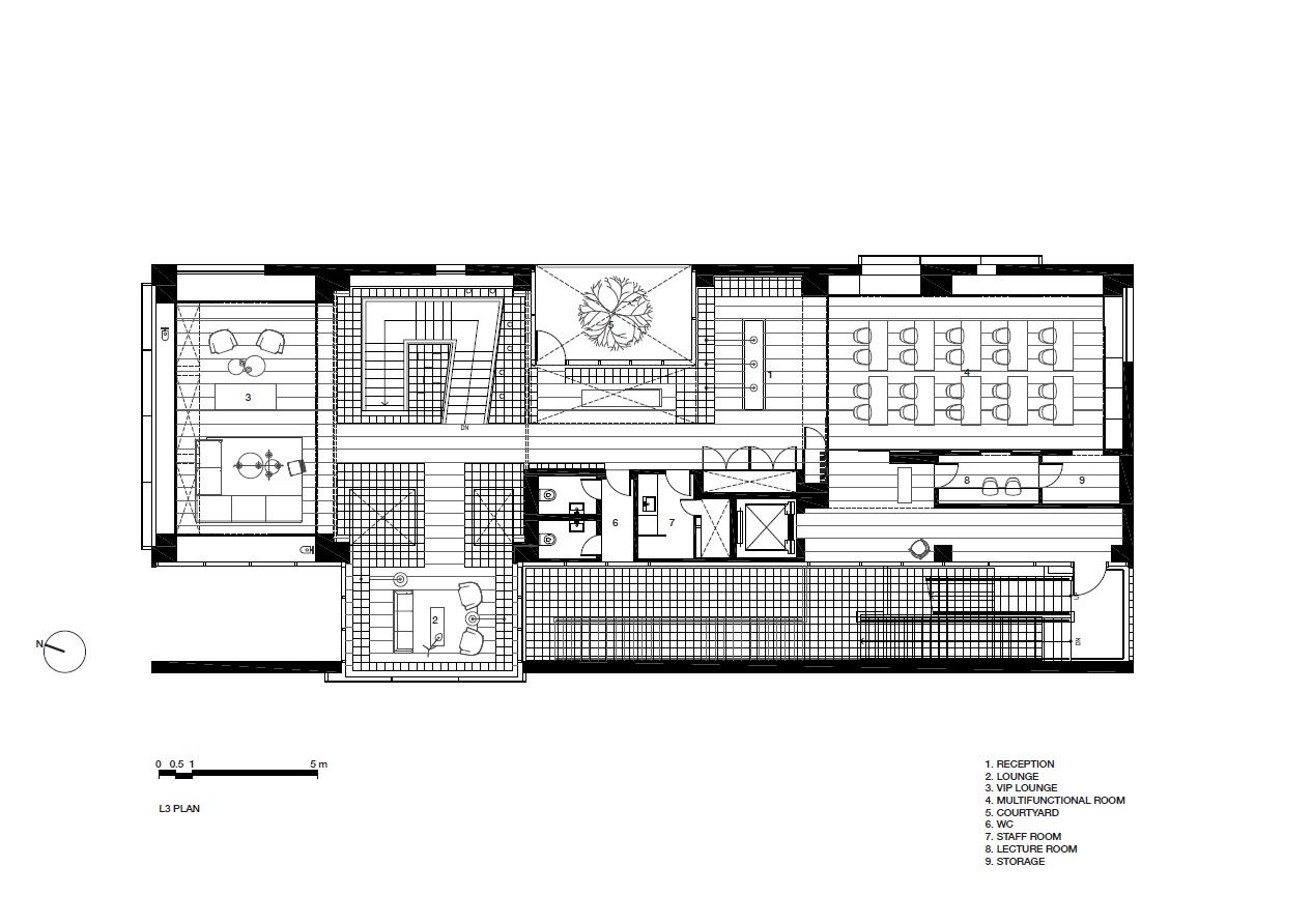
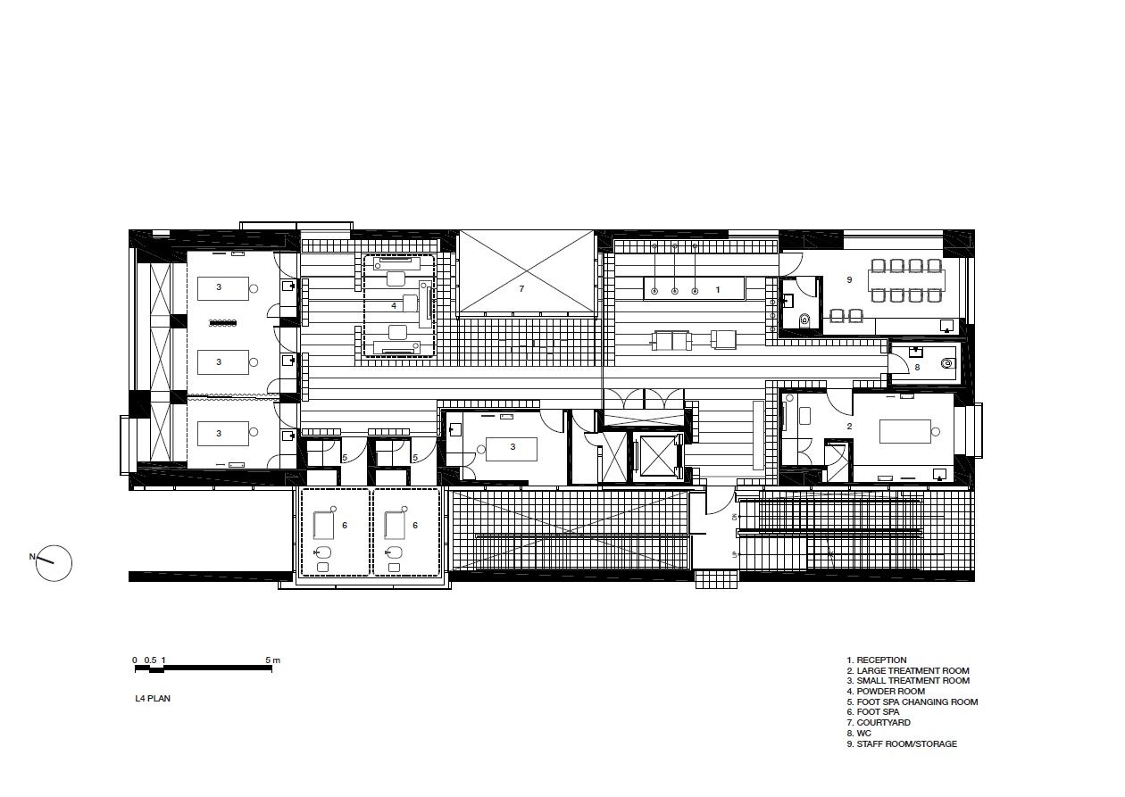
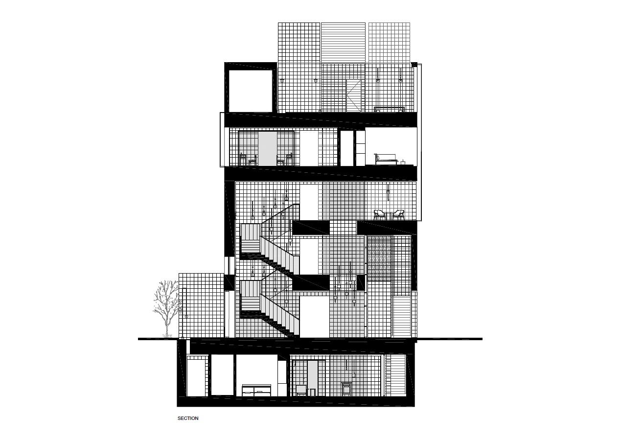
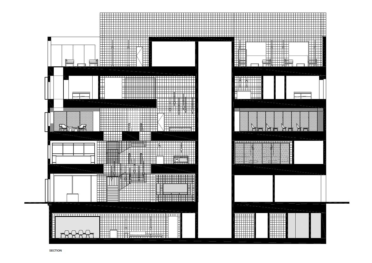
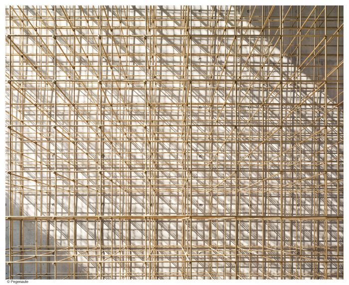
The concept of the lantern arose from this sentiment; sleek brass rods flow continuously throughout the five floors tying the entire store together. The store is experienced as a series of voids and openings embracing different programs and materials as one moves through it. In a wooden landscape mirrors are inserted, “reflect and amplify the seemingly endless structure.” The brass structure seems delicate and robust all at once. It is intriguing yet simple, tantalizing one to explore further. The structure begins from a ground of wide timber floor boards that is interspersed with wooden counters designed with insertions of solid stone blocks.
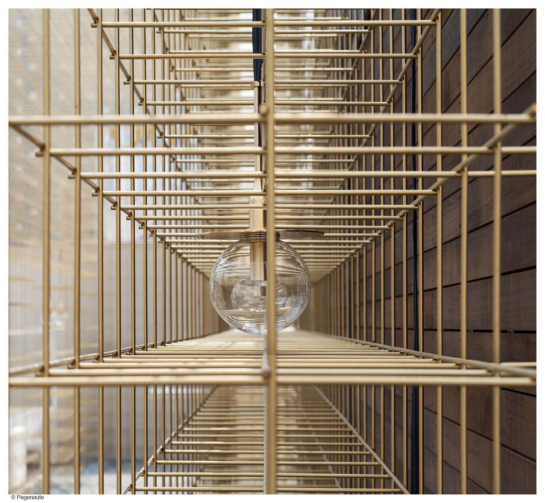
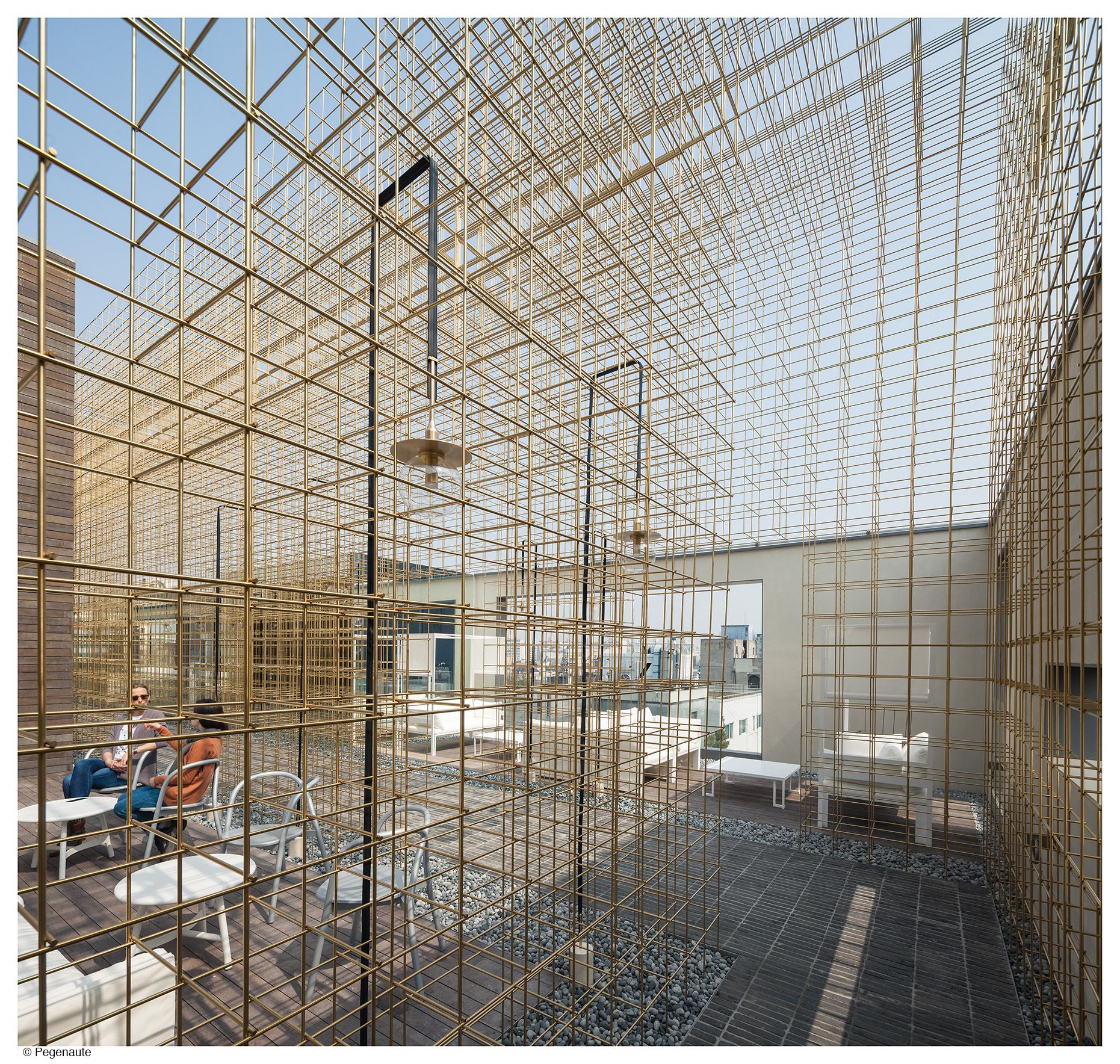
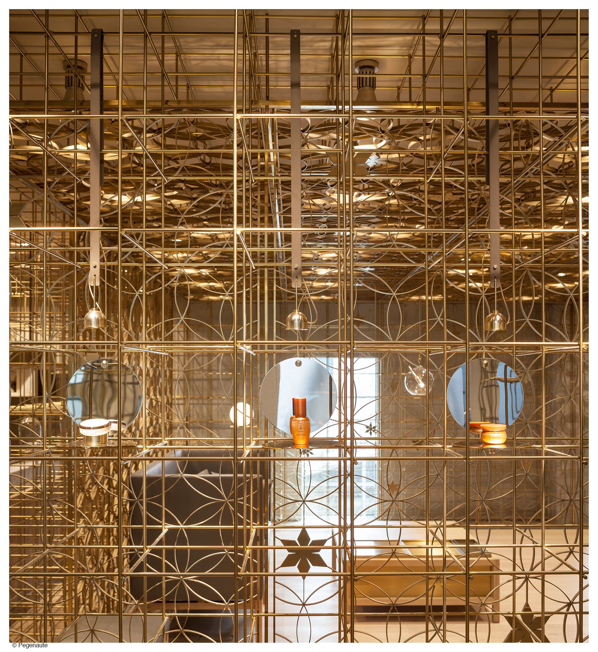
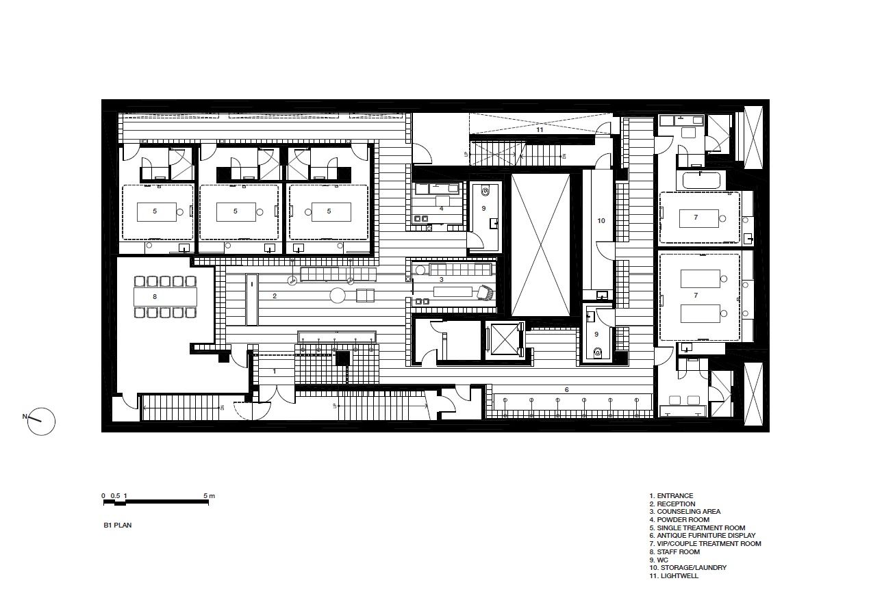
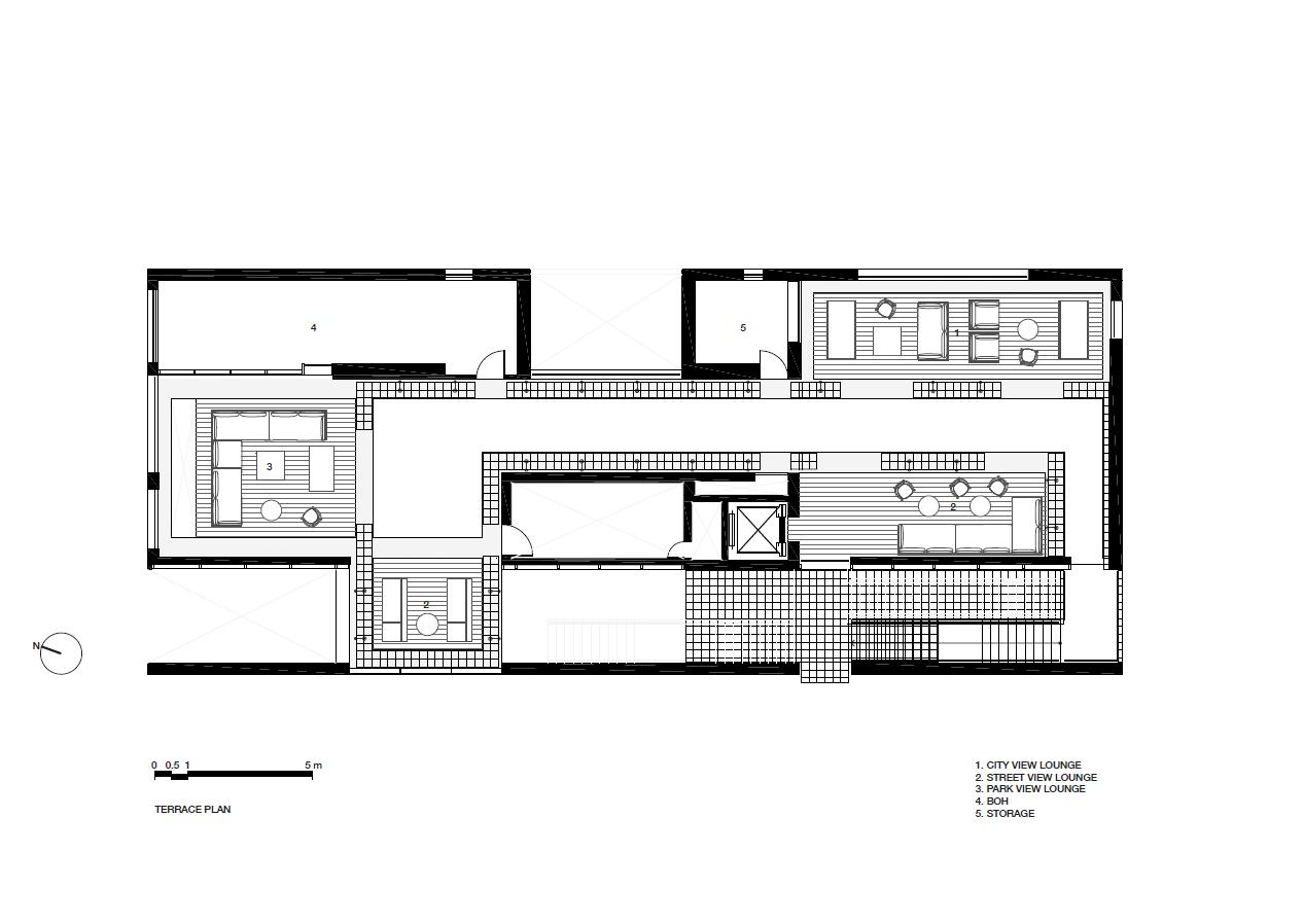
It is a lantern that guides, and a lantern that provides light. Here and there, customised light fixtures can be spotted dangling from the slender frames. They act to highlight the products on display. The changes in atmosphere from bottom to top define the concept itself. Dark walls grace the basement spa, treatments rooms are finished with an earthy grey stone, while the warm crafted wood floors impart a sense of intimacy. As one moves up, the materiality becomes lighter in colour, more open , “inviting visitors to interact with the space.” The climax is a roof terrace “with its free-flowing brass structure canopy that frames vast views of the surrounding city.”
“The journey is a constant contradiction between two counterparts: enclosed to open, dark to light, delicate to massive. The holistic approach to the lantern concept—from space-making to lighting to display to signage—gives visitors a sense of endless intrigue and urges them to explore the spaces and products with passion and delight.”
Project Information :
Architect : Neri&Hu Design and Research Office
Location : 650, Sinsadong, Gangnam-gu, Seoul, South Korea
Principal Architects: Lyndon Neri & Rossana Hu
Associate In-charge: Anne-Charlotte Wiklander
Manufacturers: Arne Jacobsen, Carl Hansen, Classicon, Dela Espada, E15, Flos, Fritz Hansen, Gandia Blasco, Kvadrat, Labo, Mattiazzi, Parachilna, Roll&Hill, Serge Mouille, Stellar works, VITRA, Viabizzuno, Vola
Project Year: 2016
Total Area: 1949.0 sqm
By: Sahiba Gulati
