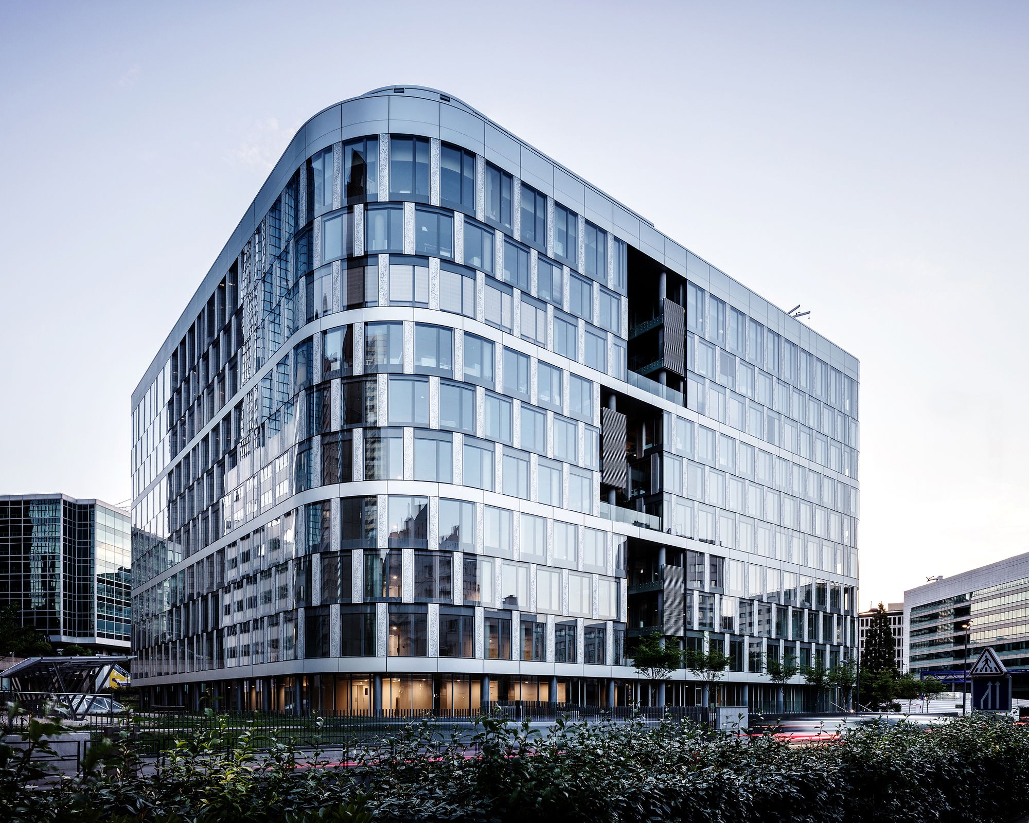
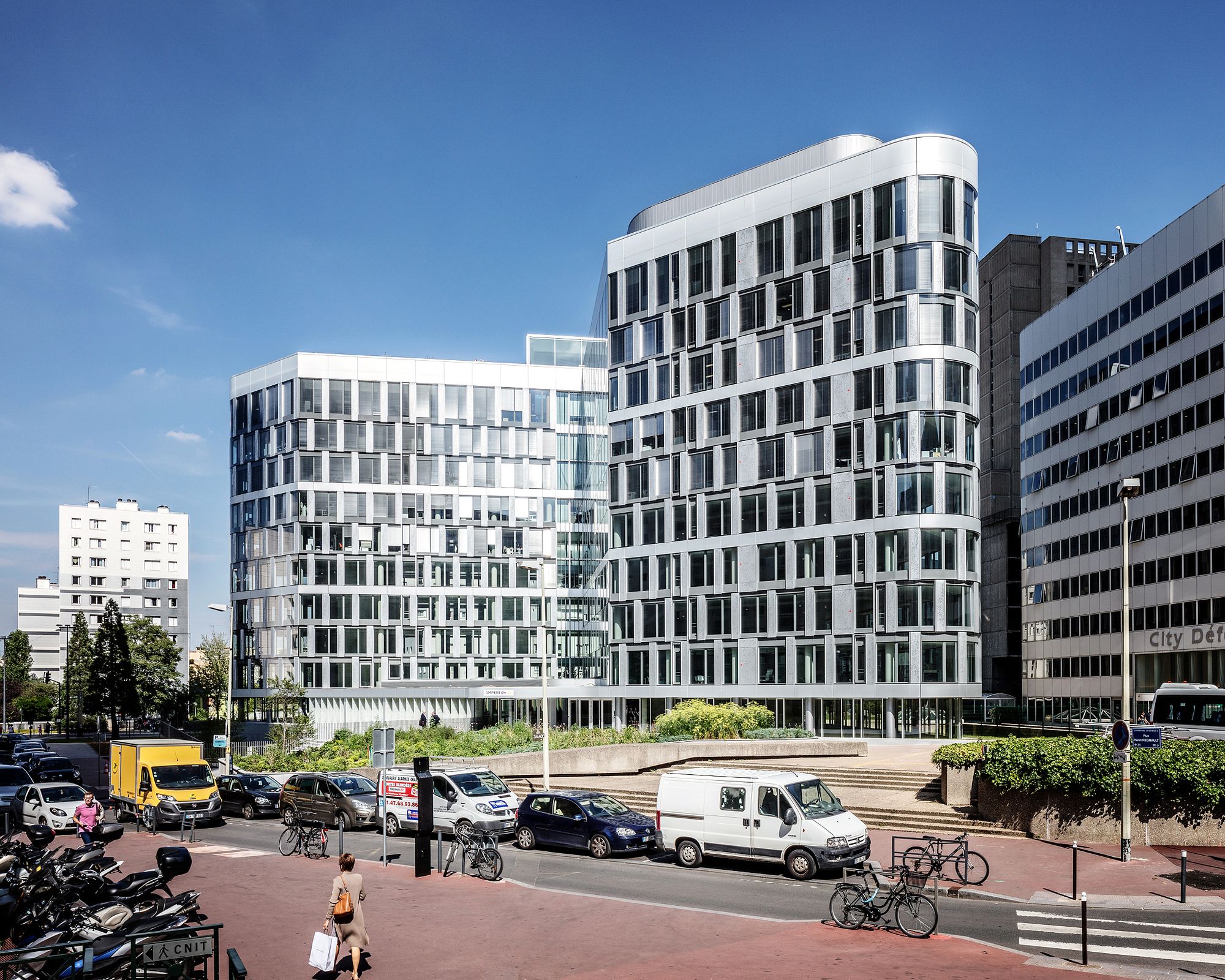
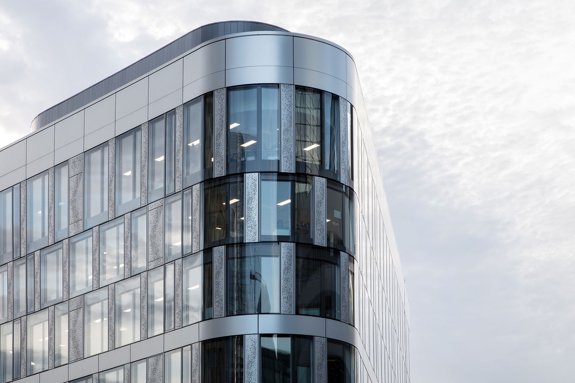
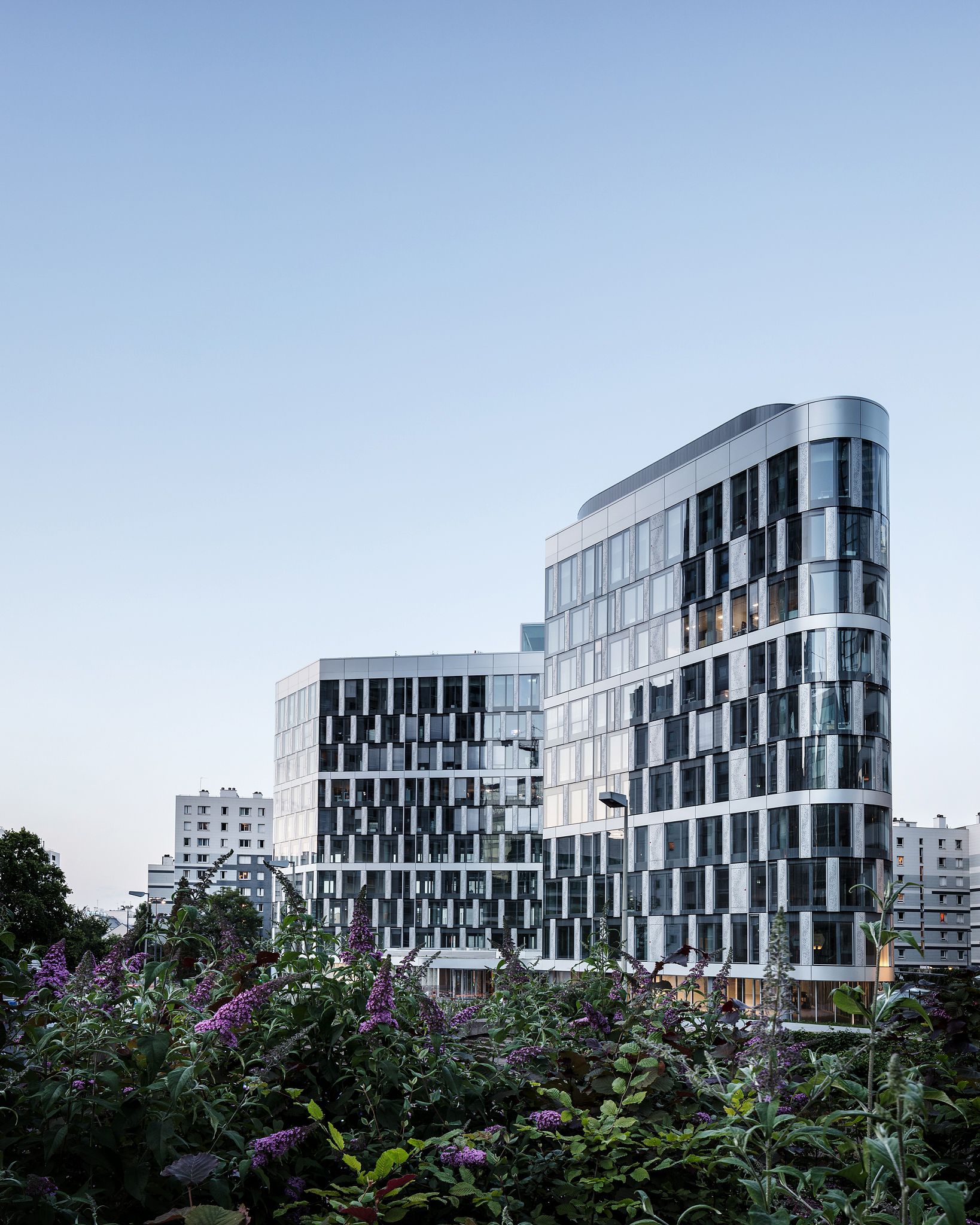
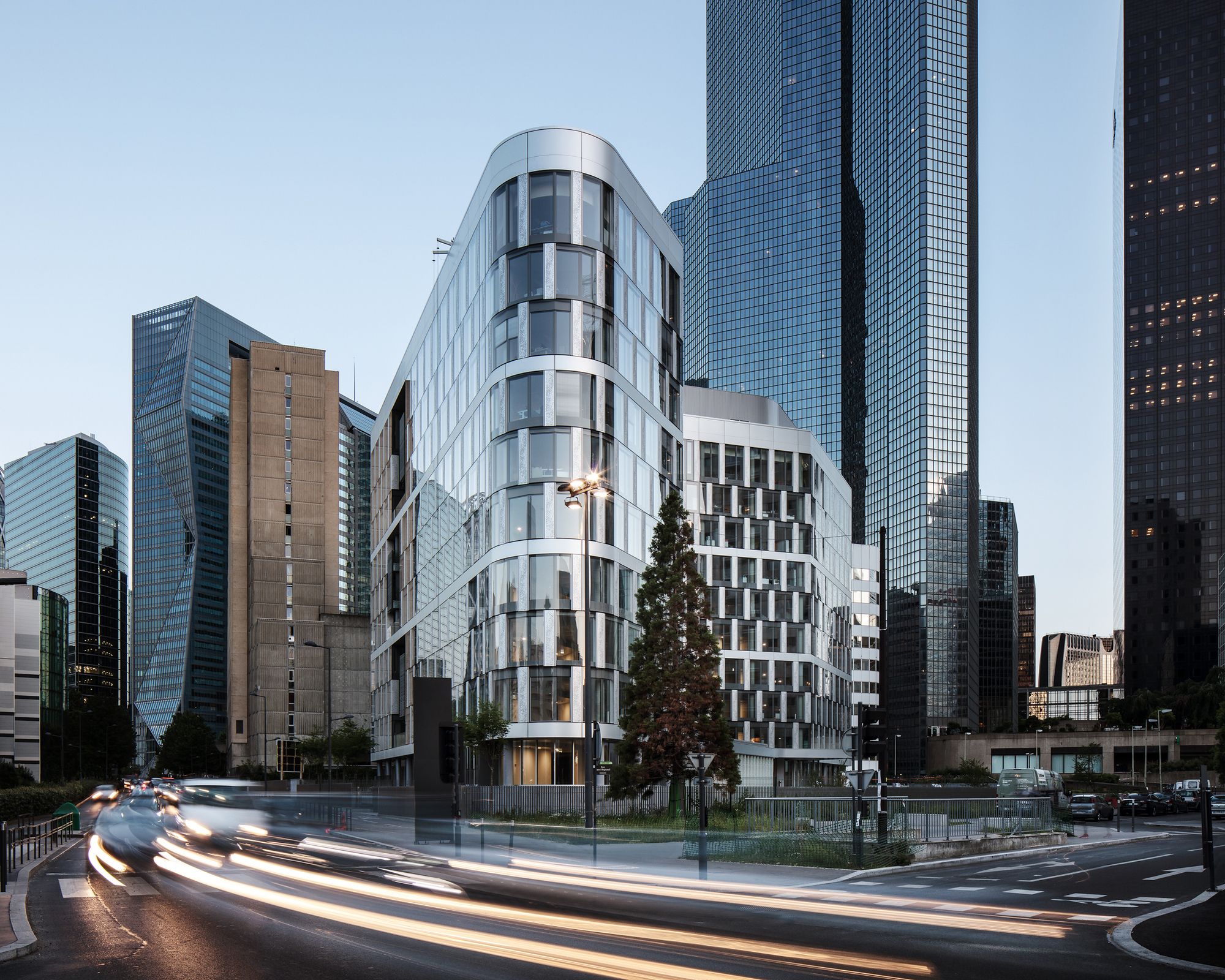
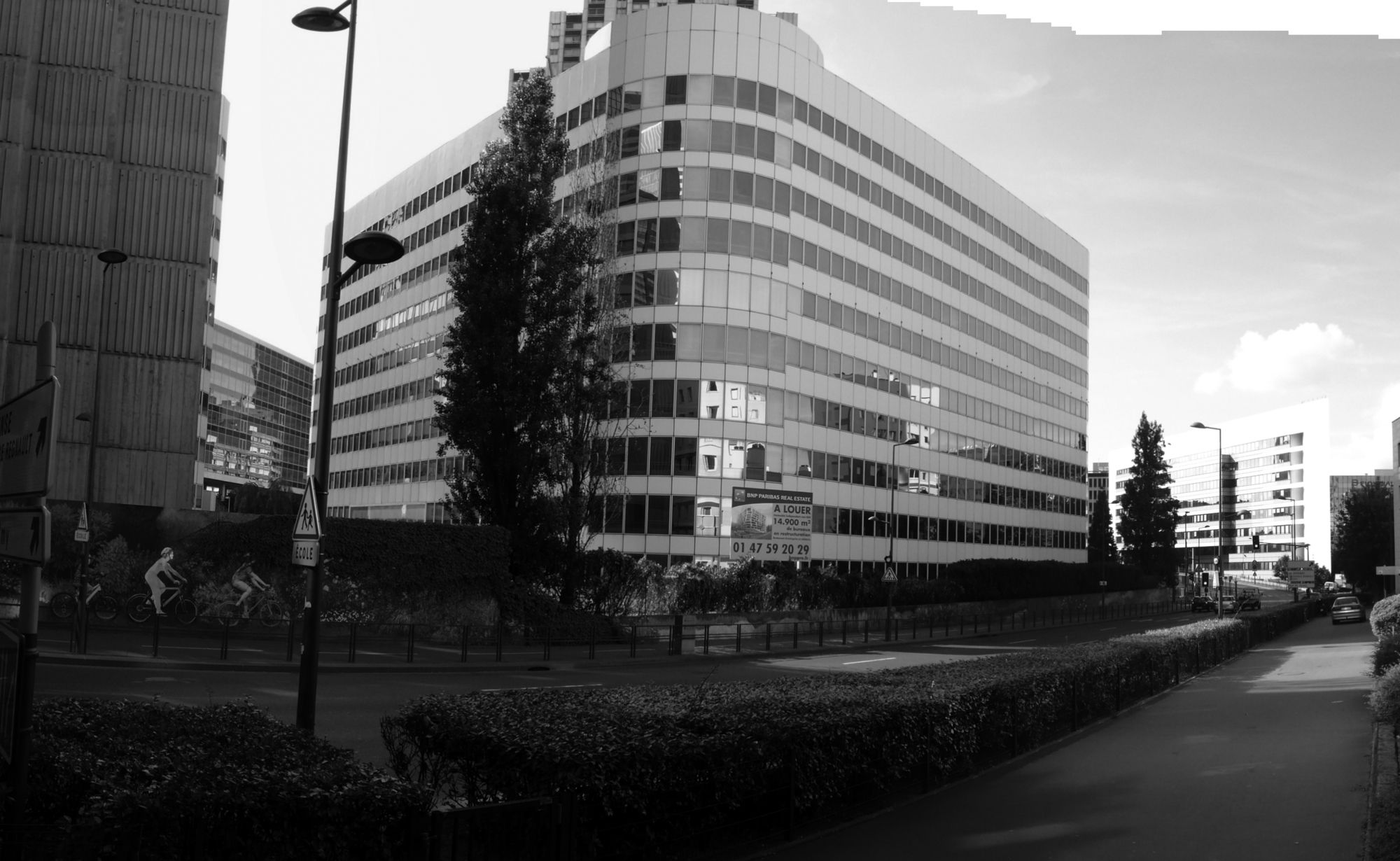
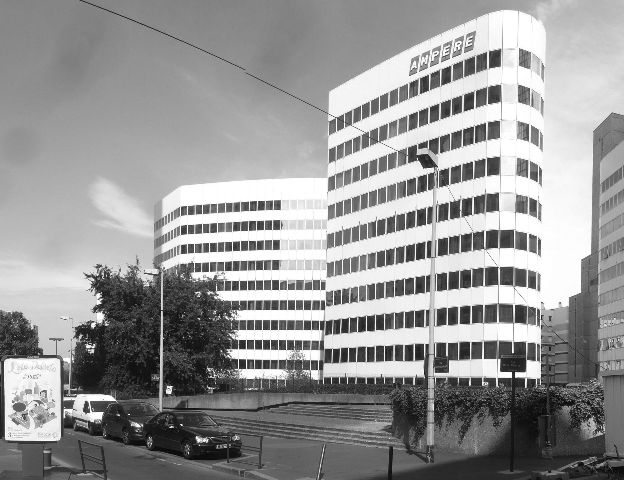
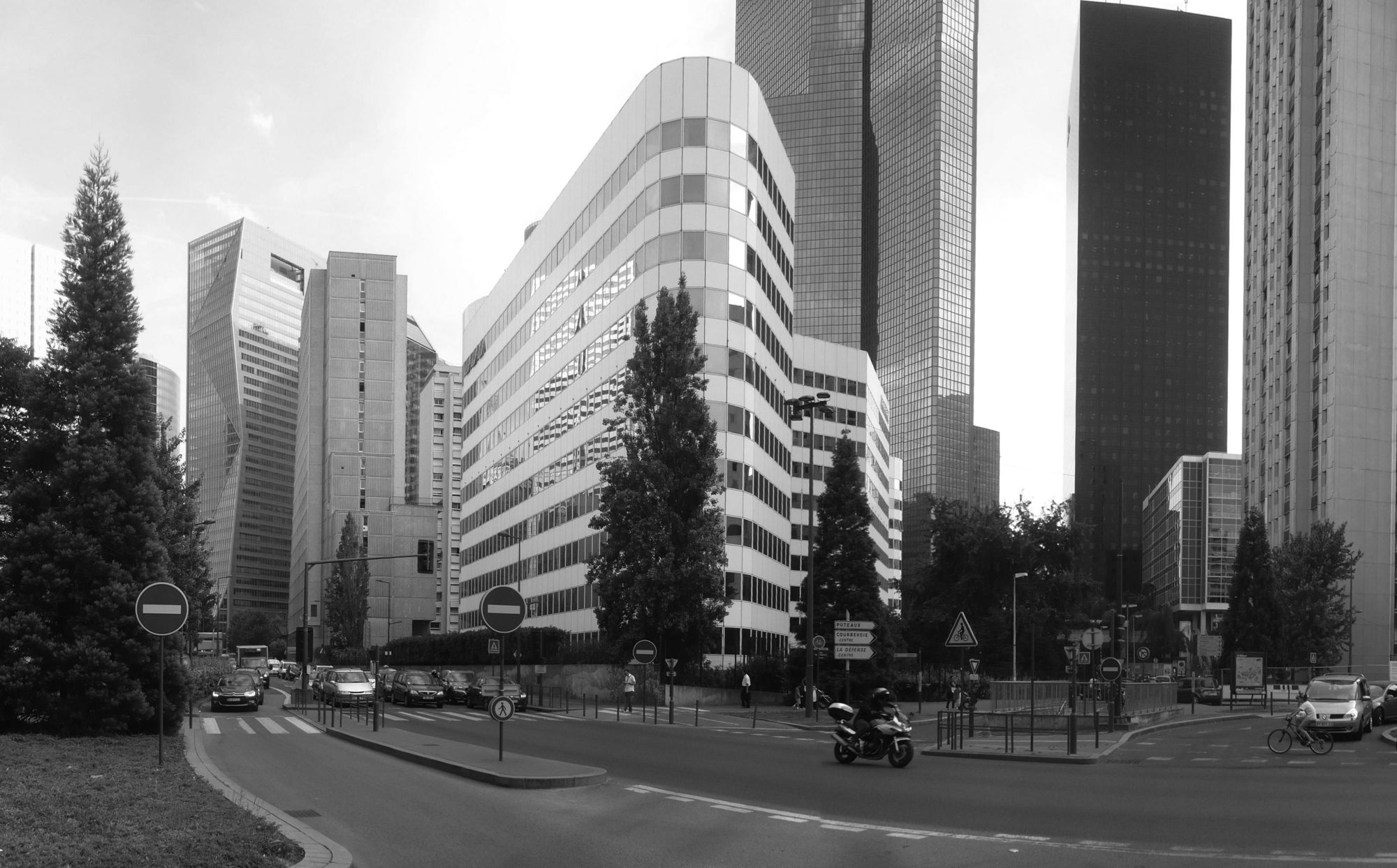
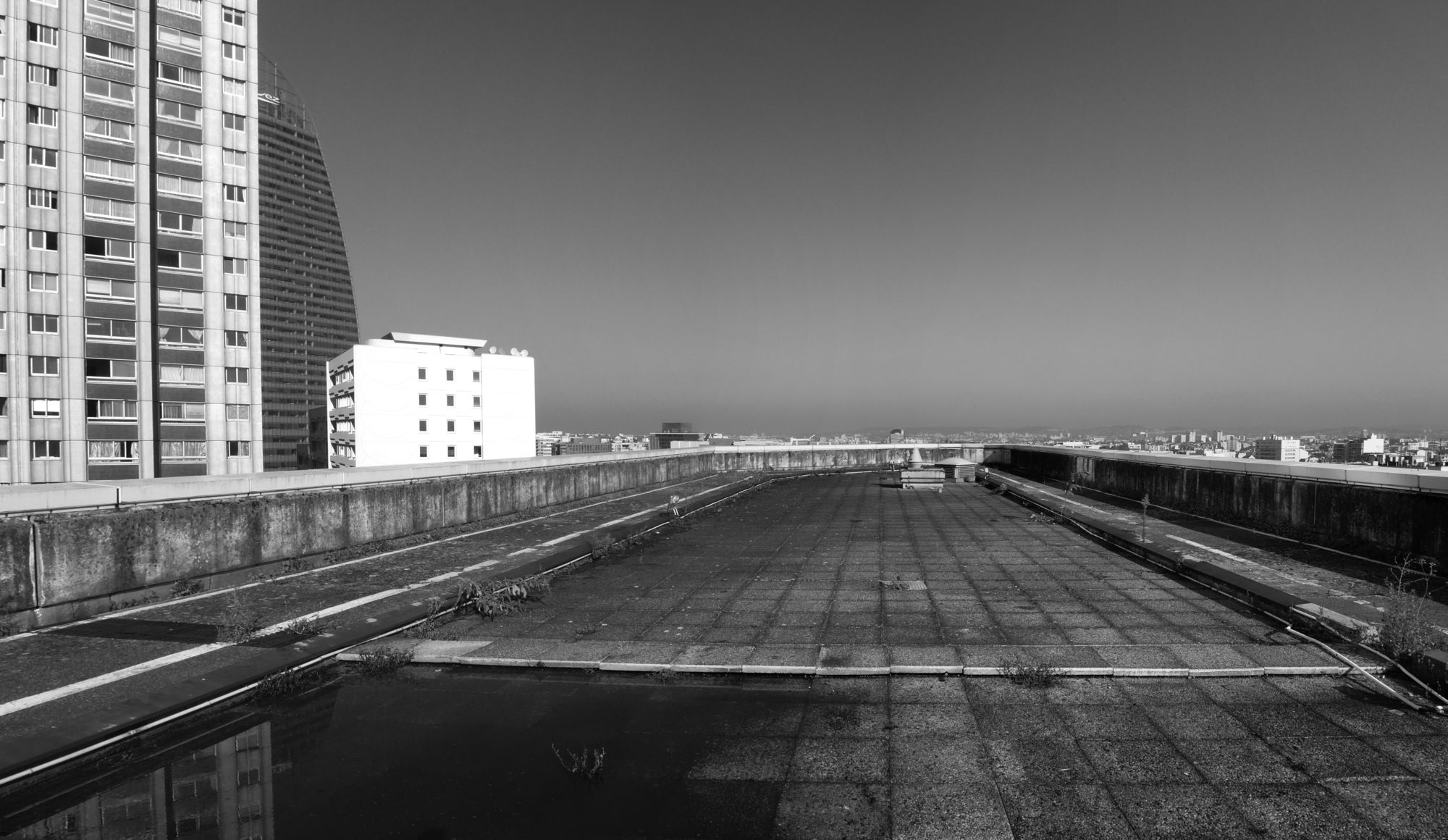
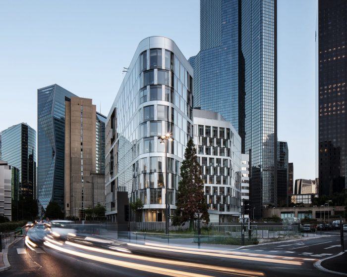
Refurbishment of Sogeprom Headquarters designed by Ateliers 2/3/4/, The present building is showing off a typical facade of the eighties office towers’ architecture, with a less satisfying relationship with the soil, a heightened repeat of a floor standard, of a window type, with a simple and smooth façade thus a kind of autism to its own context.
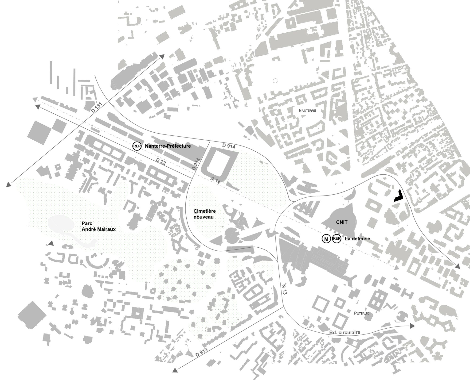
The building wanted to be a tower, but it’s not. Its small length didn’t allow it to compete with its close sisters. Its location, on the fringes of La Defense’s slab, makes it belong more to the “domestic” city and its codes. Thus, he should renounce to his solitary object status.
The project is trying to rectify those miscommunications by making “Ampère e+” belong to the urban system of Courbevoie’s city, by supporting the transfer of the circular boulevard into an urban boulevard. Our task was also to shape and rank the present building, to make it comprehensible and careful to its urban context.
Entrench the building in the city
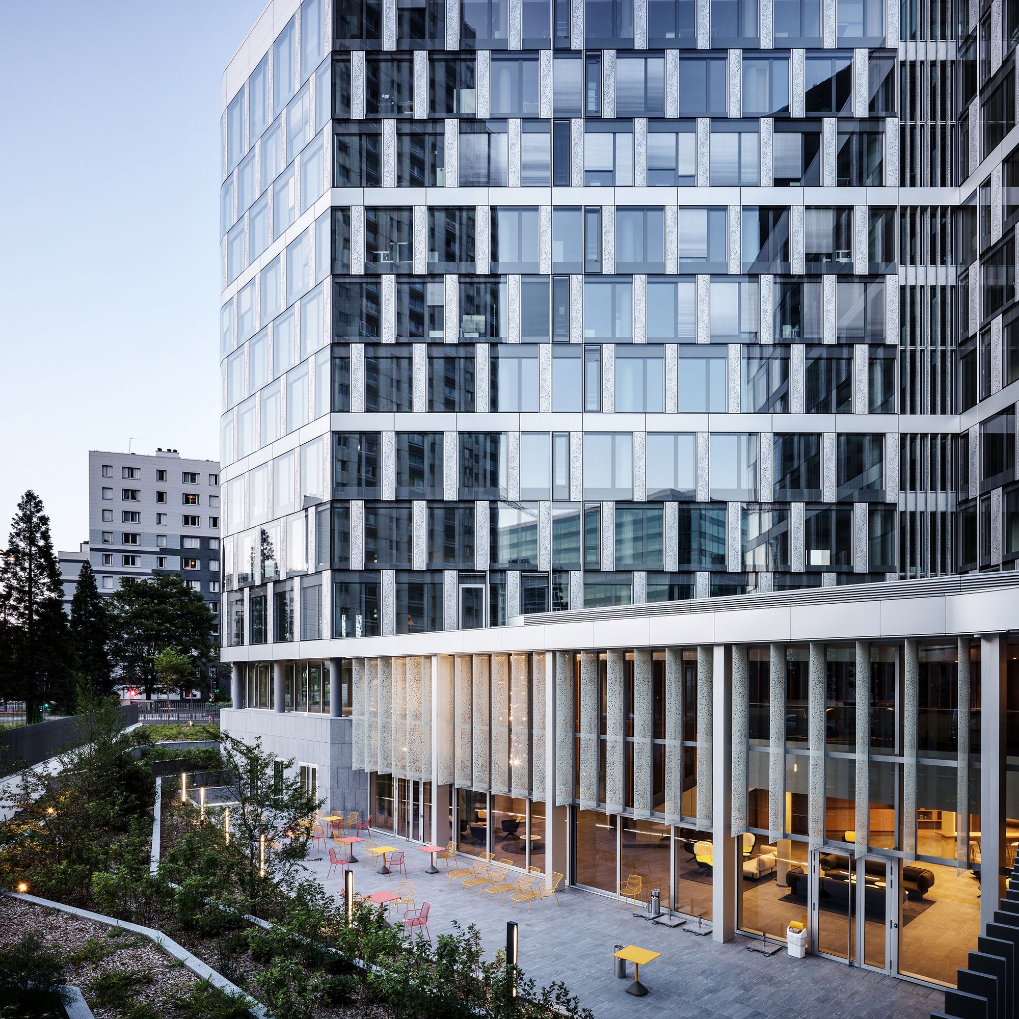
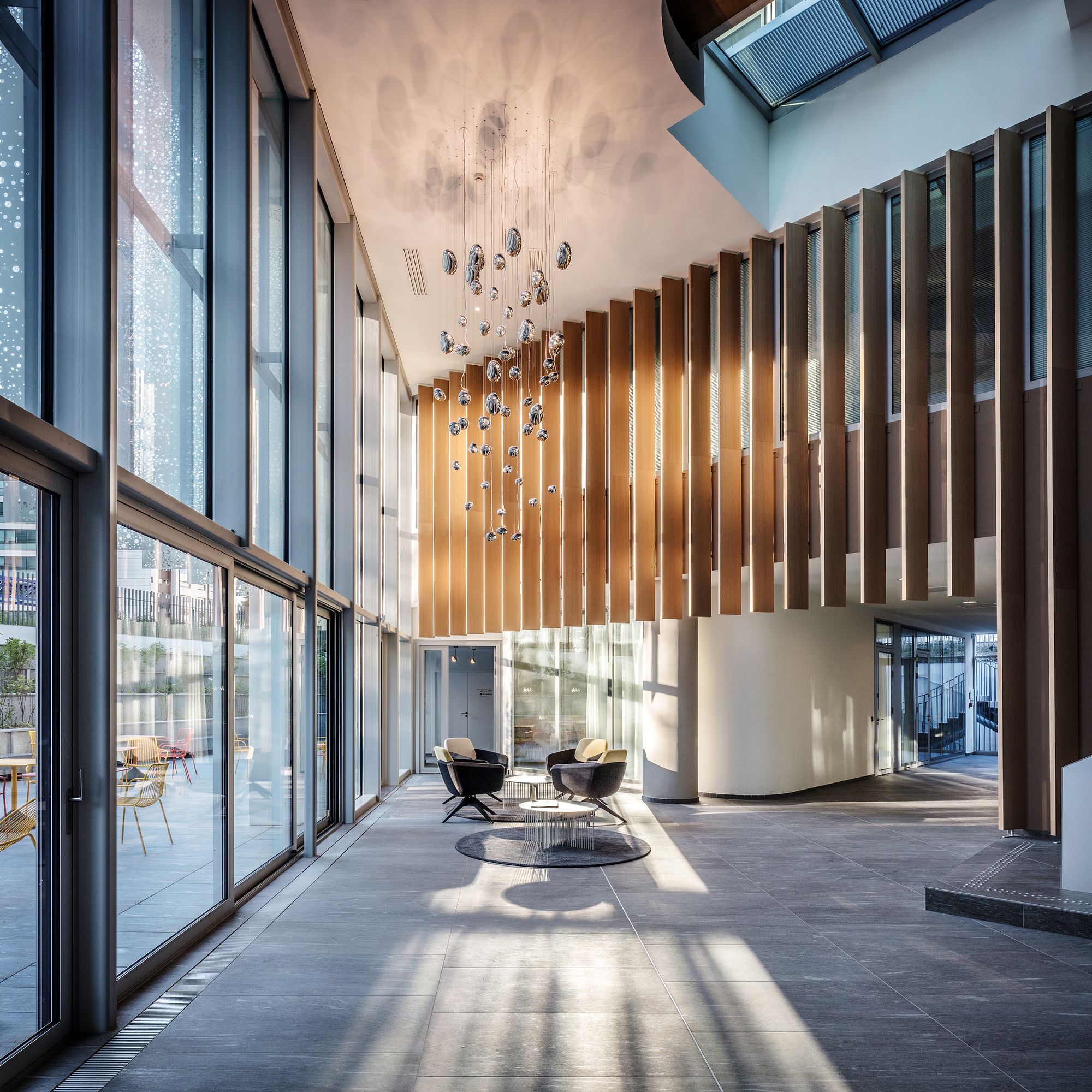
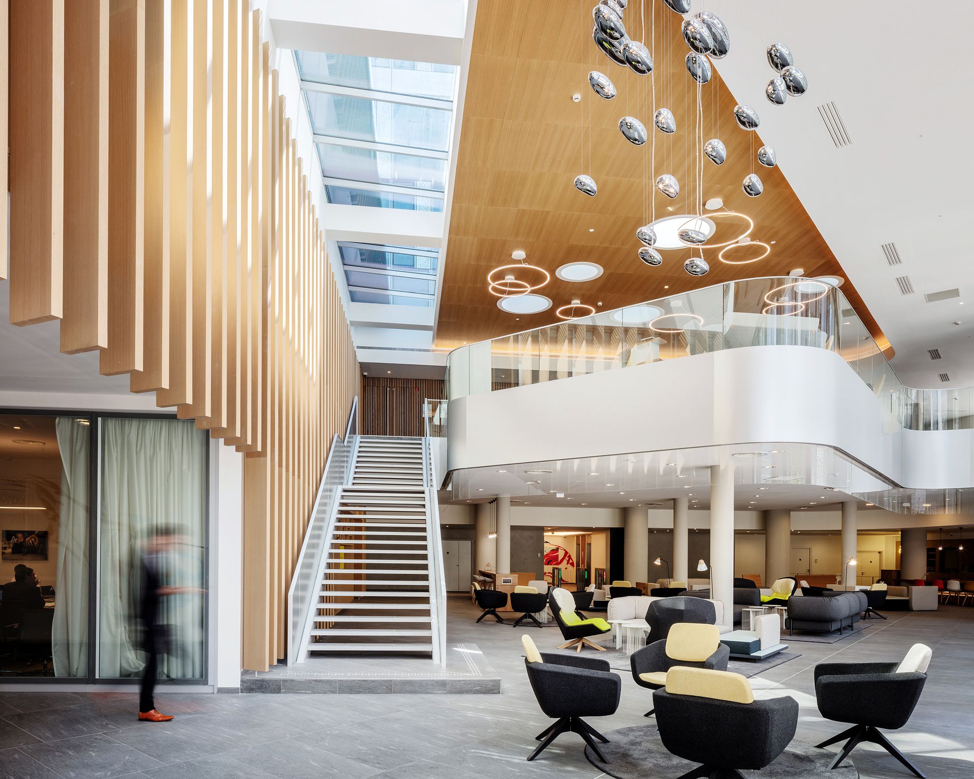
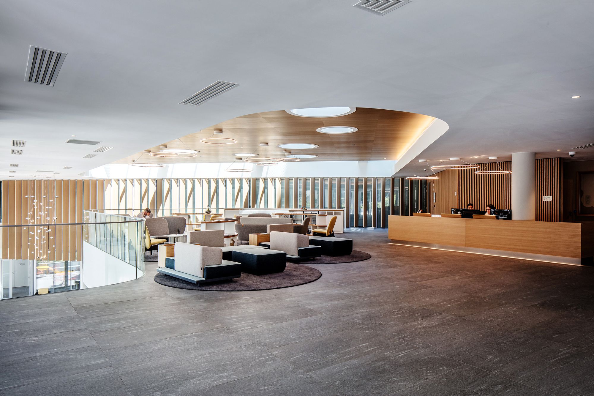
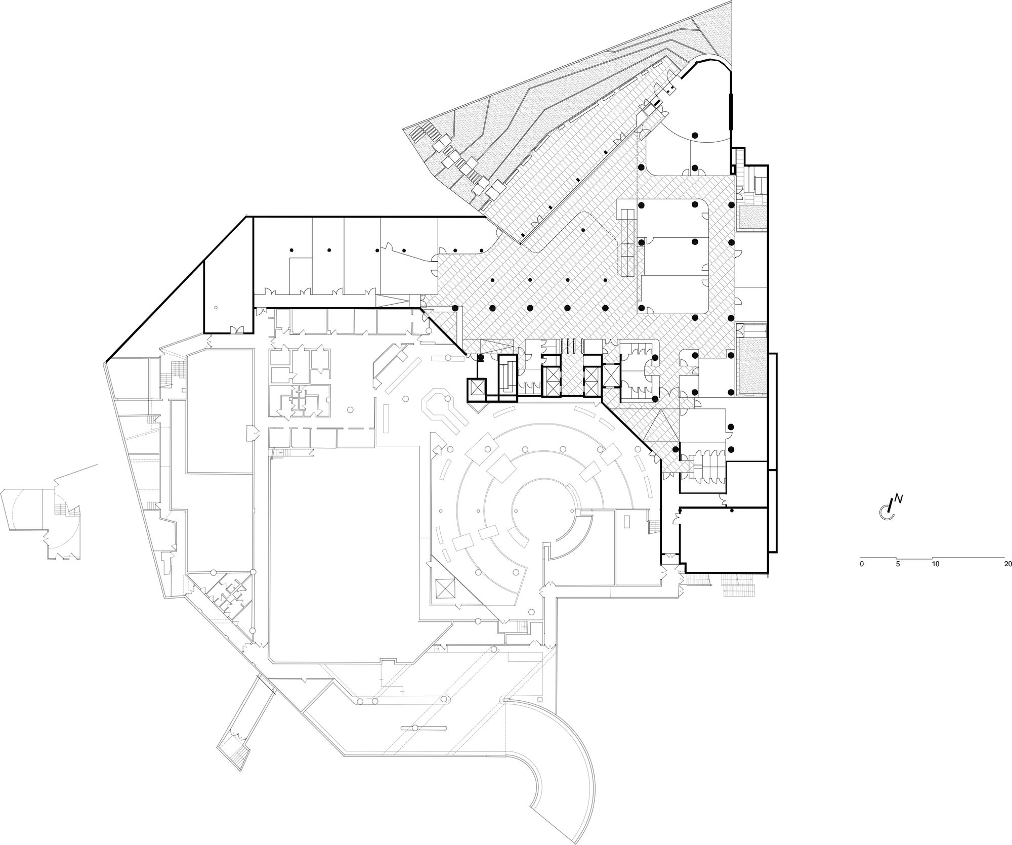
The building hold to the floor has been redesigned, as well as every access on the city. Lost amid towers, the building had to reinforce itself, mainly in its construction with a new planning of the ground floor, and a rebalance of the volumes between the ground floor and the minus one floor. The main entrance was also reviewed.
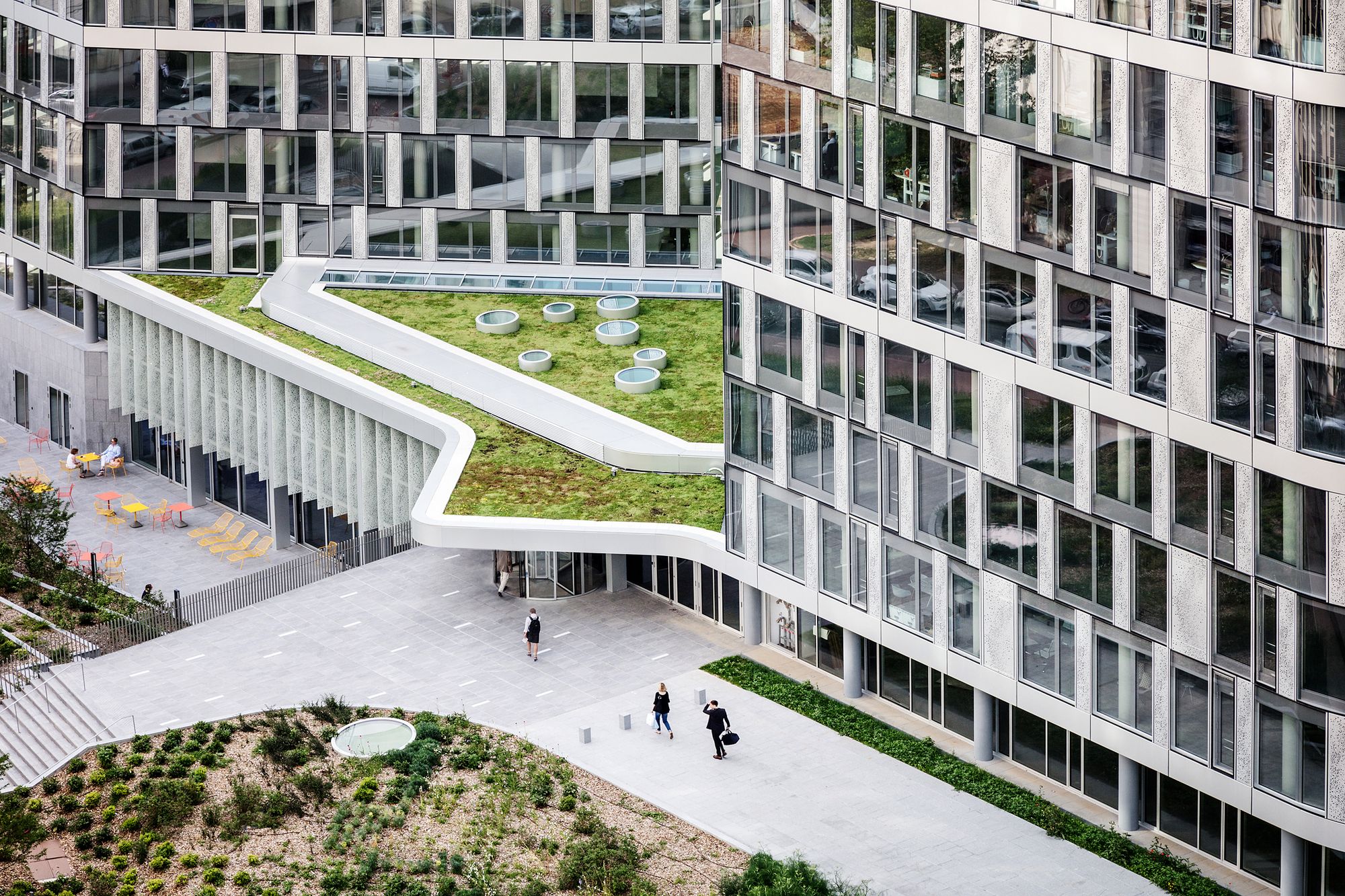
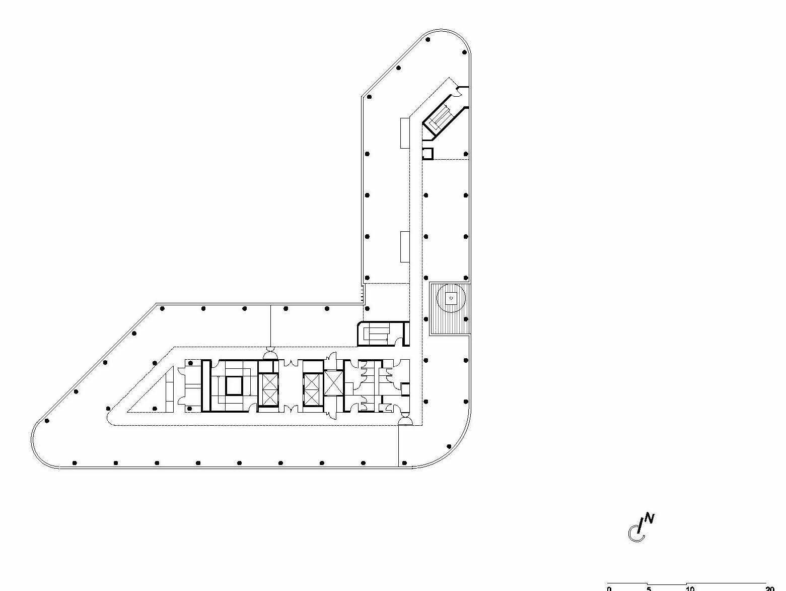
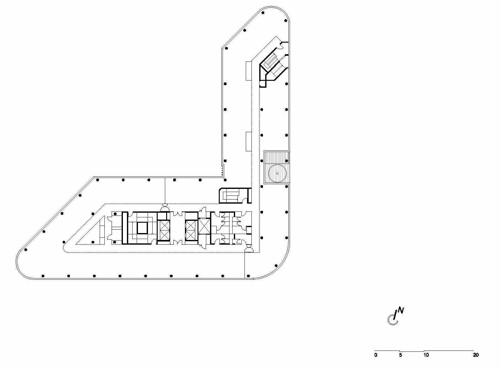
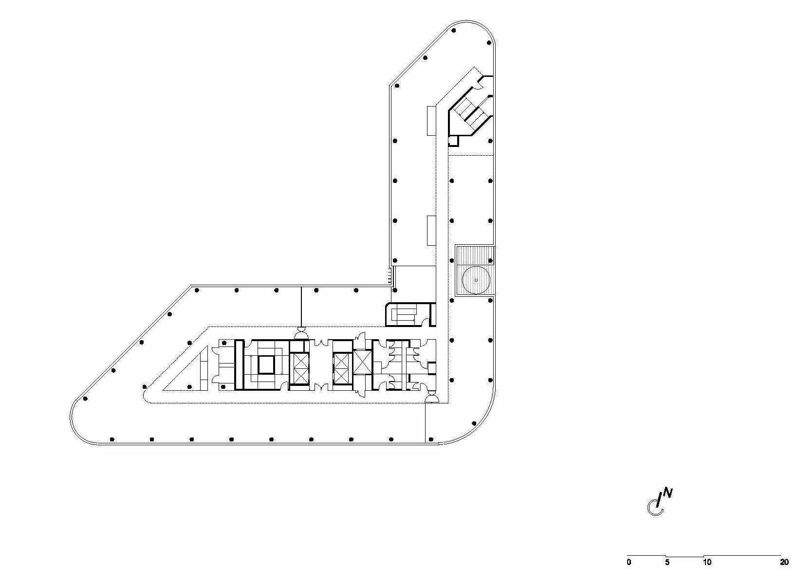
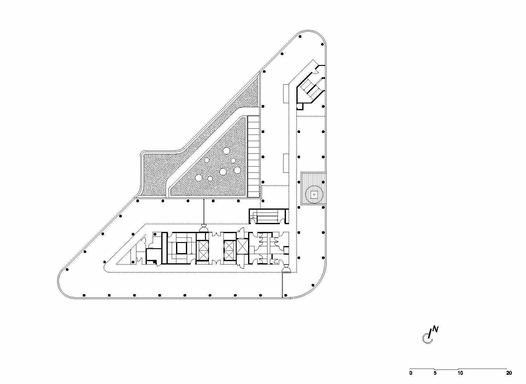
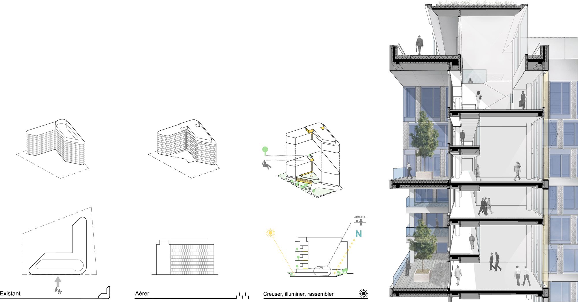
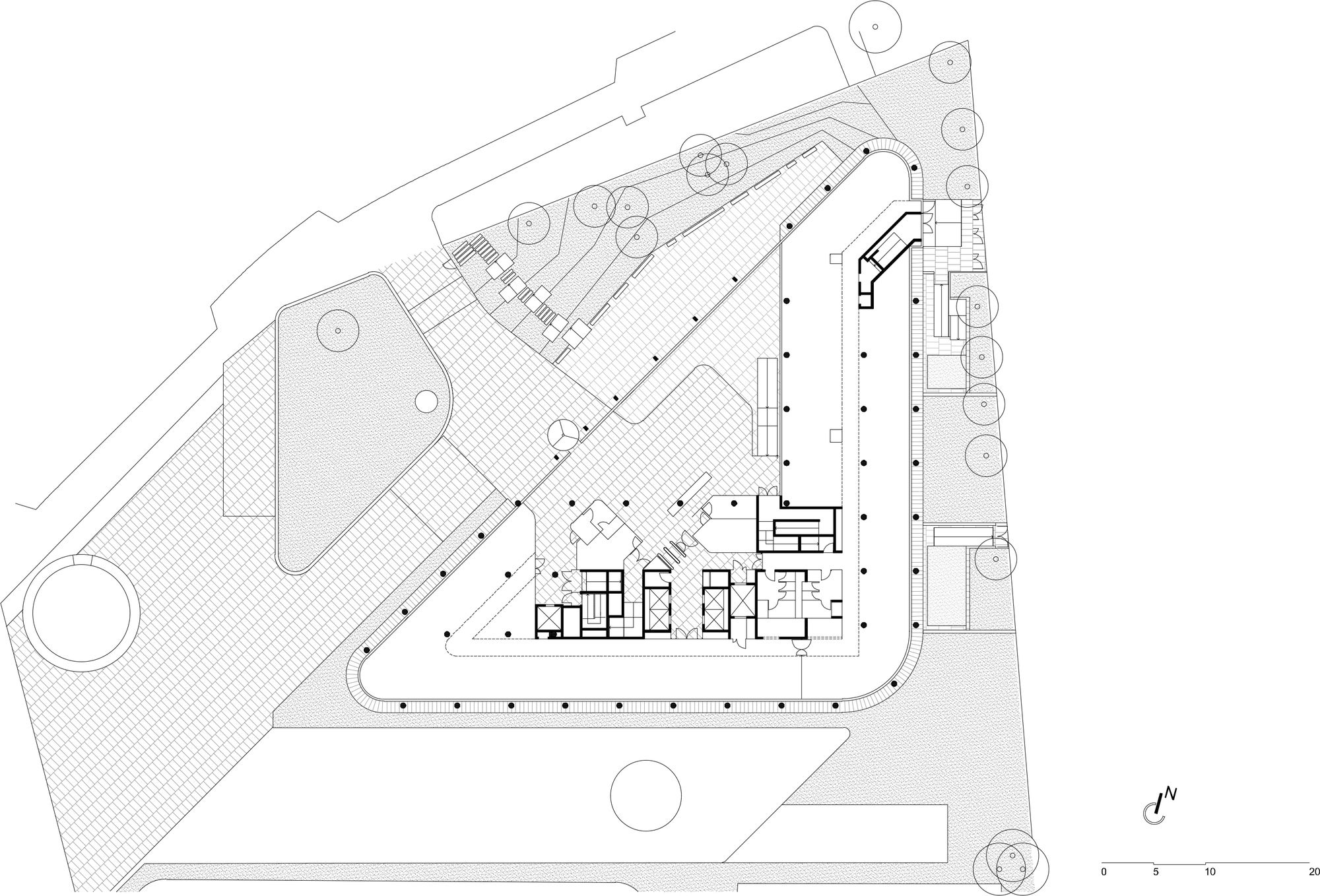
The project begins with the creation of a complementary volume on the ground floor. It’s coming to rebuild the unitary shape of an isosceles right-angled triangle, which is at the basis of the composition of the volumes on the plot. This modest volume allows to unite the ground floor and cancel the introversion created by the inside corner of the square building. The building is shining on its environment.
The present entrance of the building is invisible from the street, it appears unreachable. A reversal of the entrance was prescribed. The new volume is welcoming a totally rethought entrance and repositioned on the Henri Regnault street’s side to the North. The entrance is staged on public space and the building has a recovery of city life.
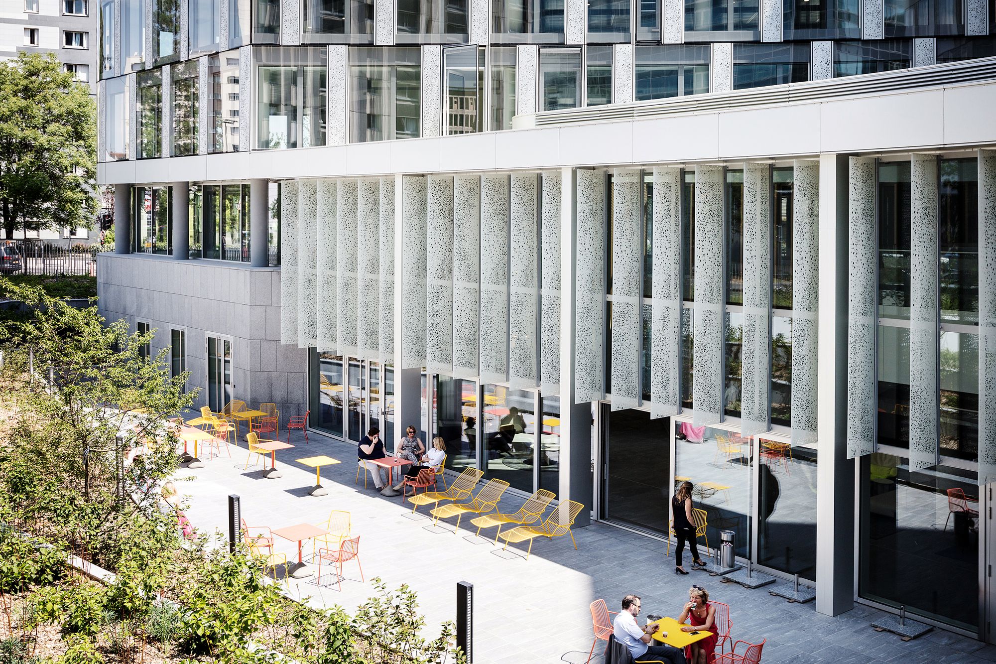
In the same « city life » goal, green and plant spaces are refurbished to be visible from the street. Their uses are redefined. To the North, they accompany the entrance expansion to the minor level where the meeting pole, the cafeteria, and the terrace are situated. In the east, a meticulous work on the topography allows to almost reset on an equal footing the plot and the circular boulevard. The east façade is no longer a back façade, it’s maintaining again functional and urban relationships, with a circular boulevard currently mutating.
Changing scale
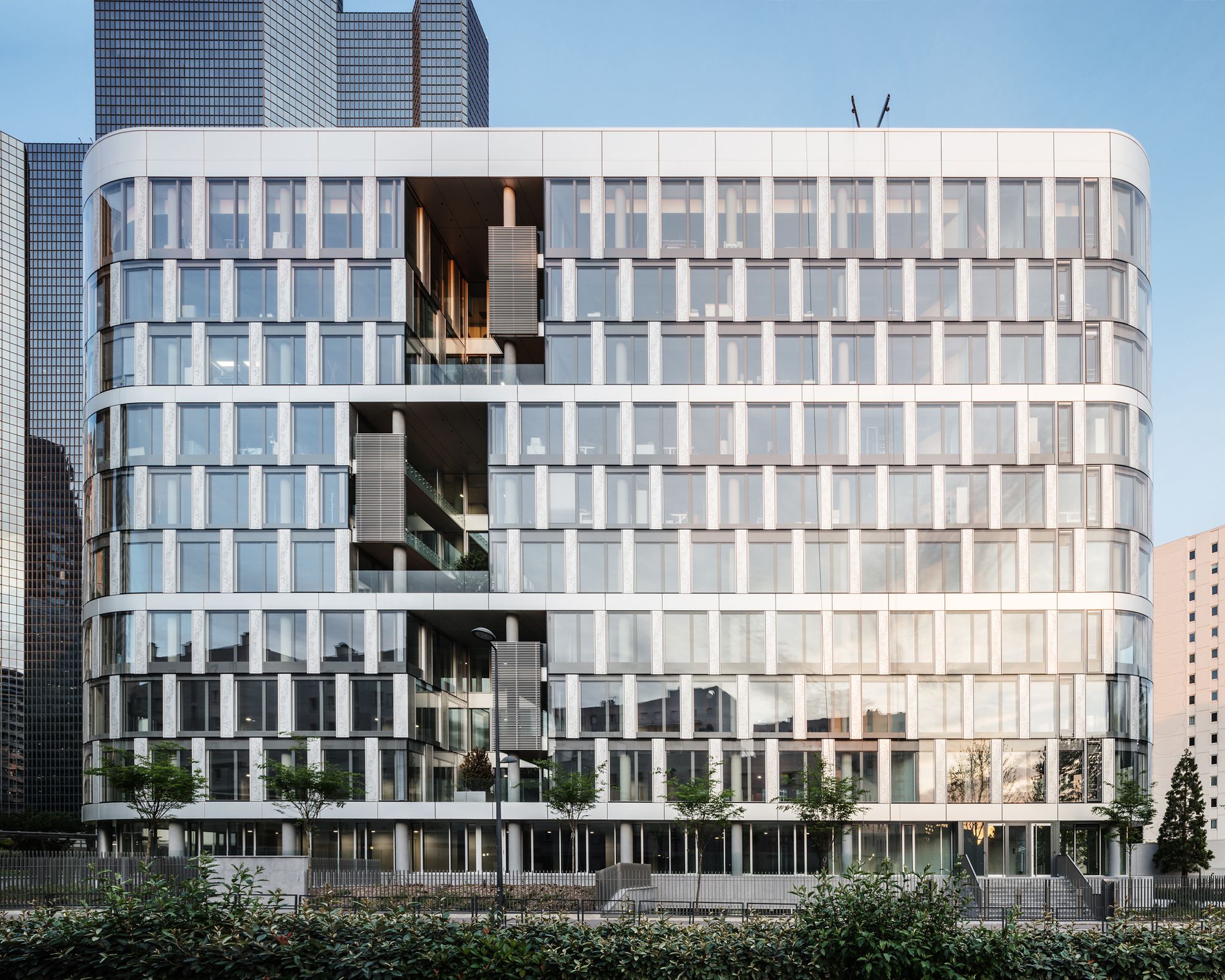
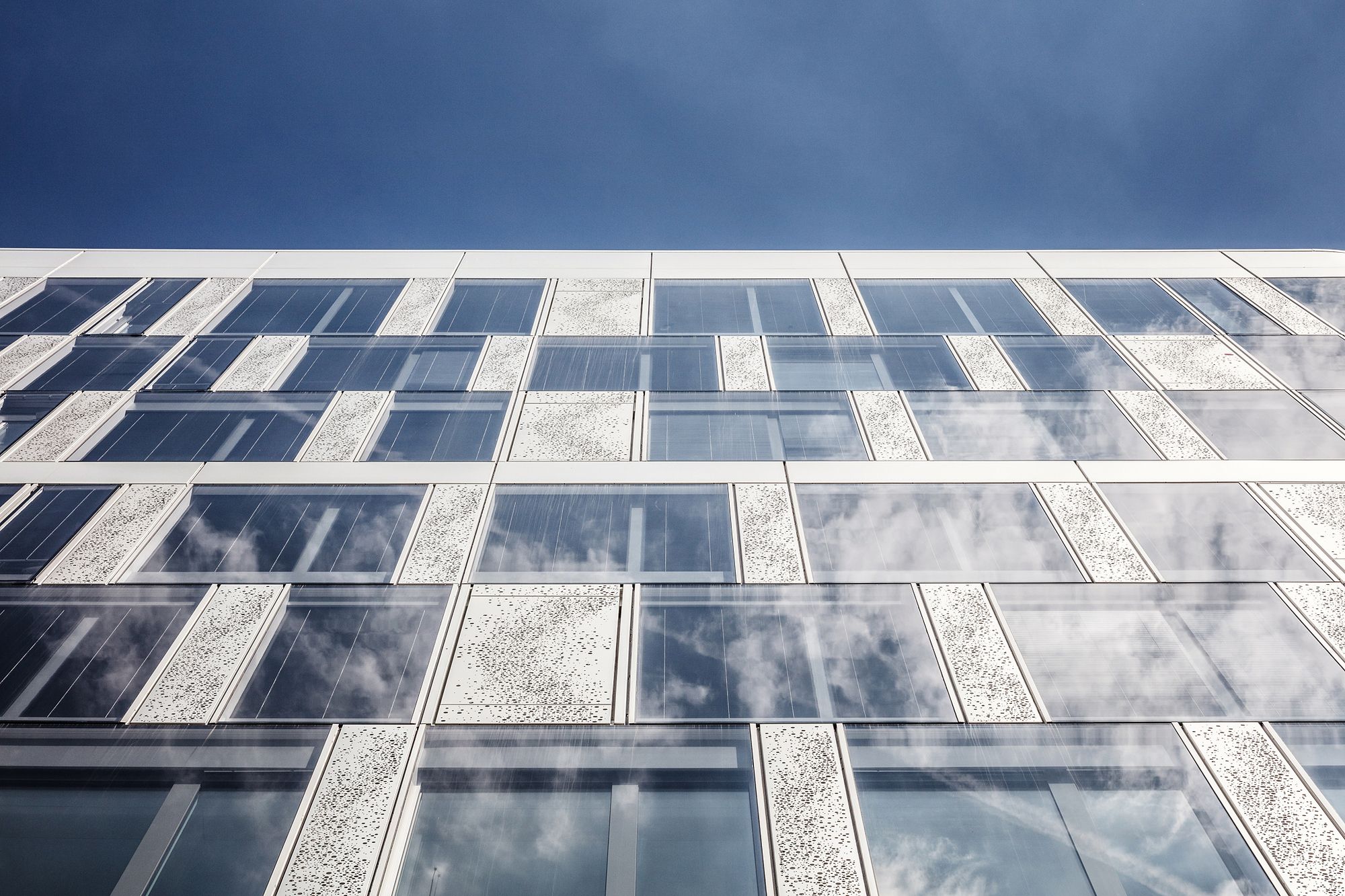
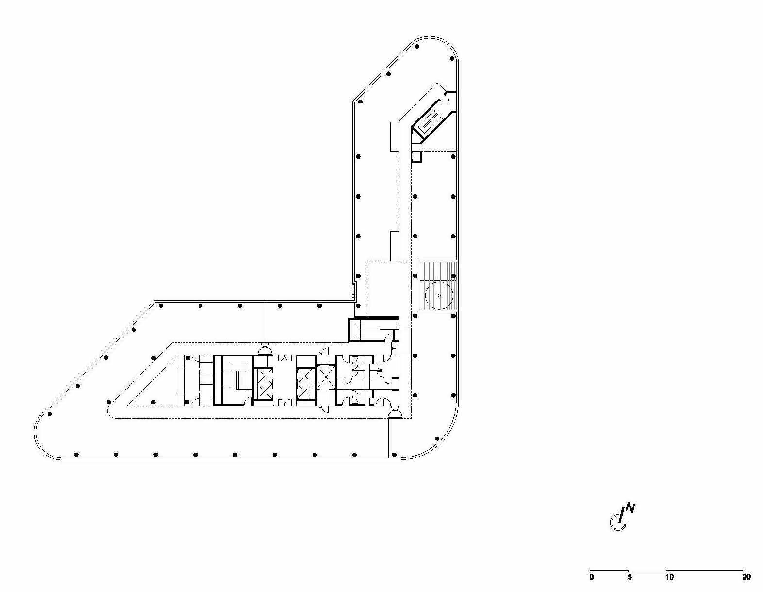
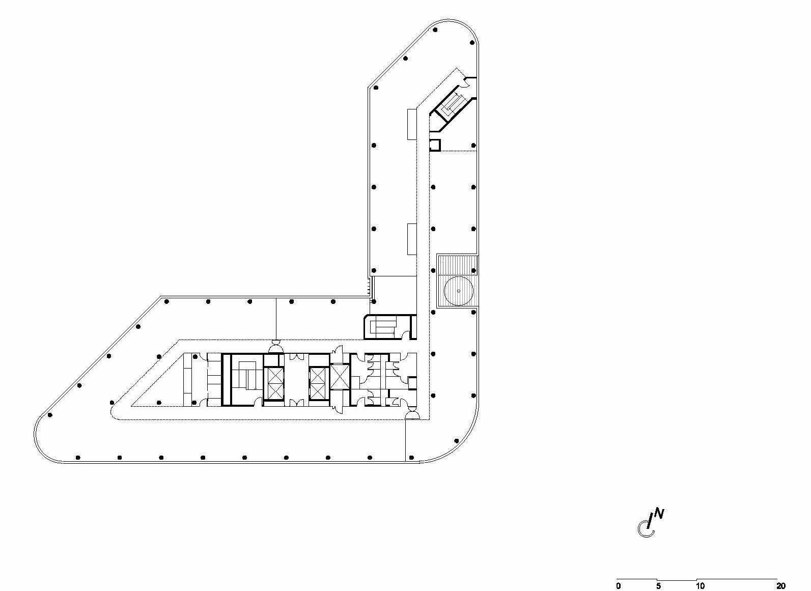
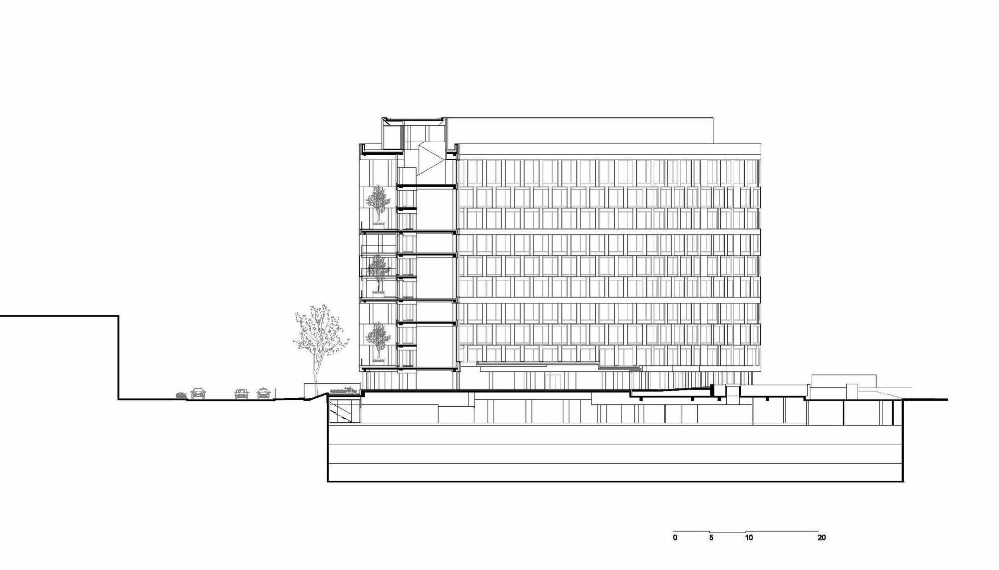
The ground-floor facade is indented to make the bearer structure reappearing and to identify an “arisen” volume, which means the building frame. We have chosen to organize this frame according to an explicit horizontal order, that is disassembling it into three layers superimposed with 3 levels. This order cancels the sensation of an interminable stack of levels, its scale is changing. We have made the choice of this reorganization, to boost the building, to stratify it, to enhance it.
Dig in
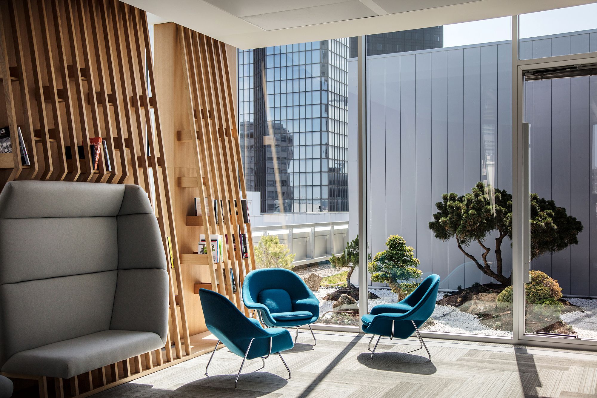
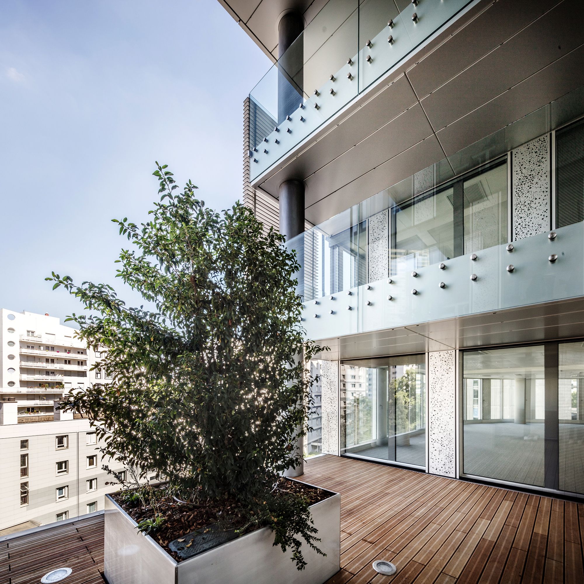
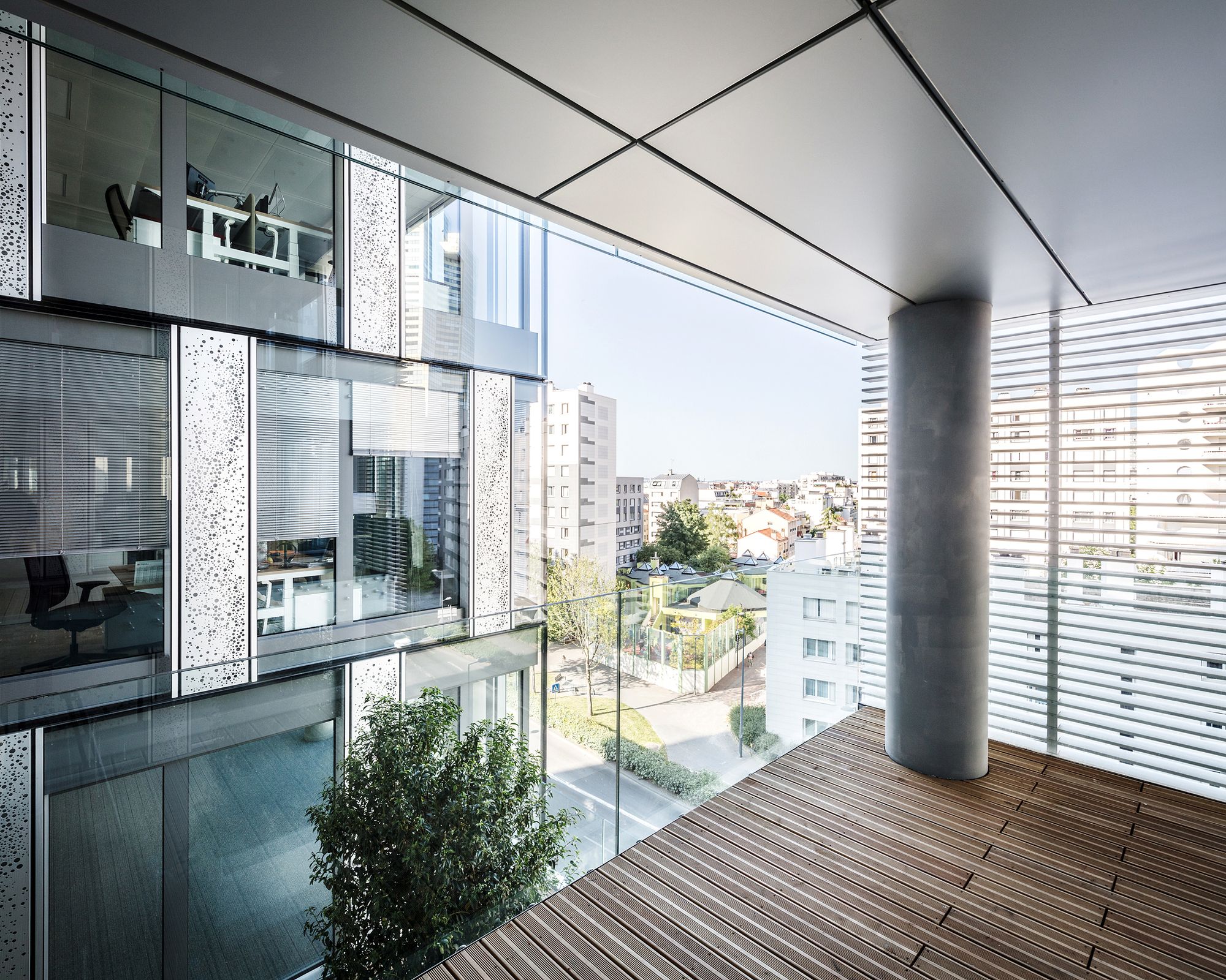
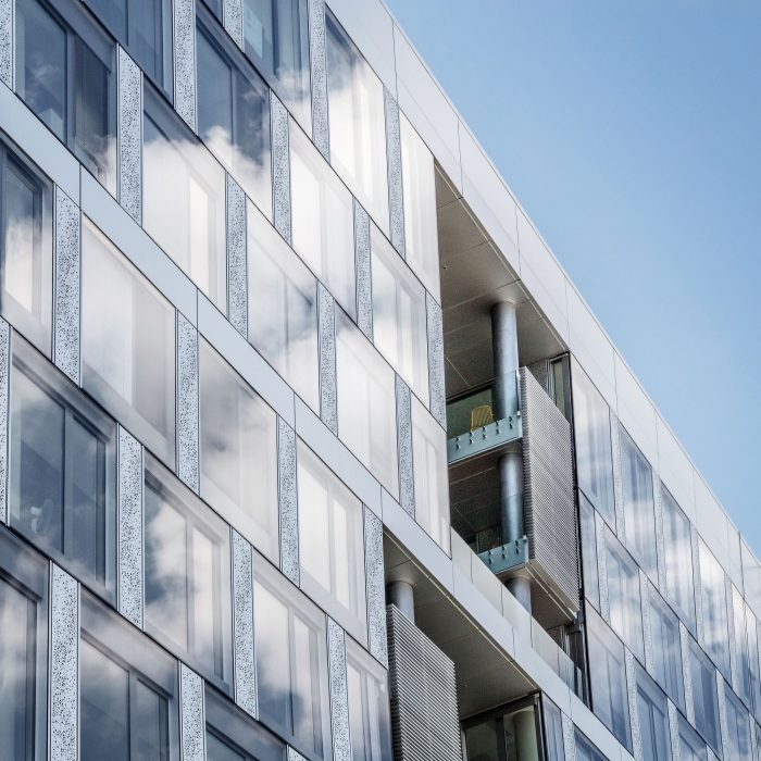
Often isolated from the traditional office buildings typology, we have chosen to put in roughness, adopted spaces, that could lead other uses. It comes to be three dug boxes in the horizontal order settled down. They’re welcoming three hanging gardens that are on one hand, redefining the urban scale of the building, and on the other hand, introducing an intermediary scale in the building itself. The hanging gardens are becoming a symbol of the urban commitment of the building.
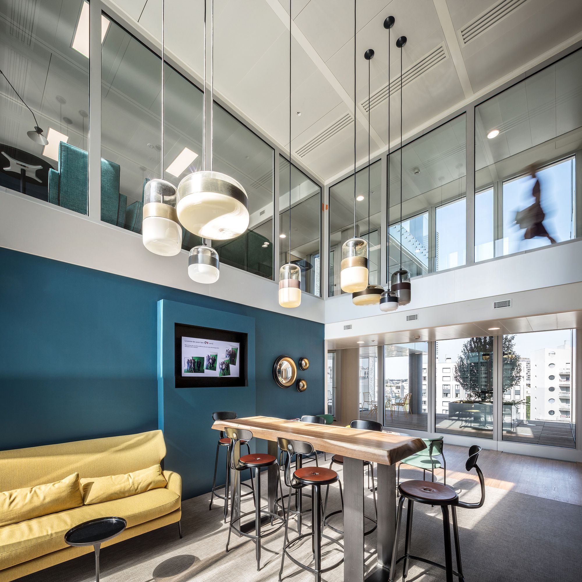
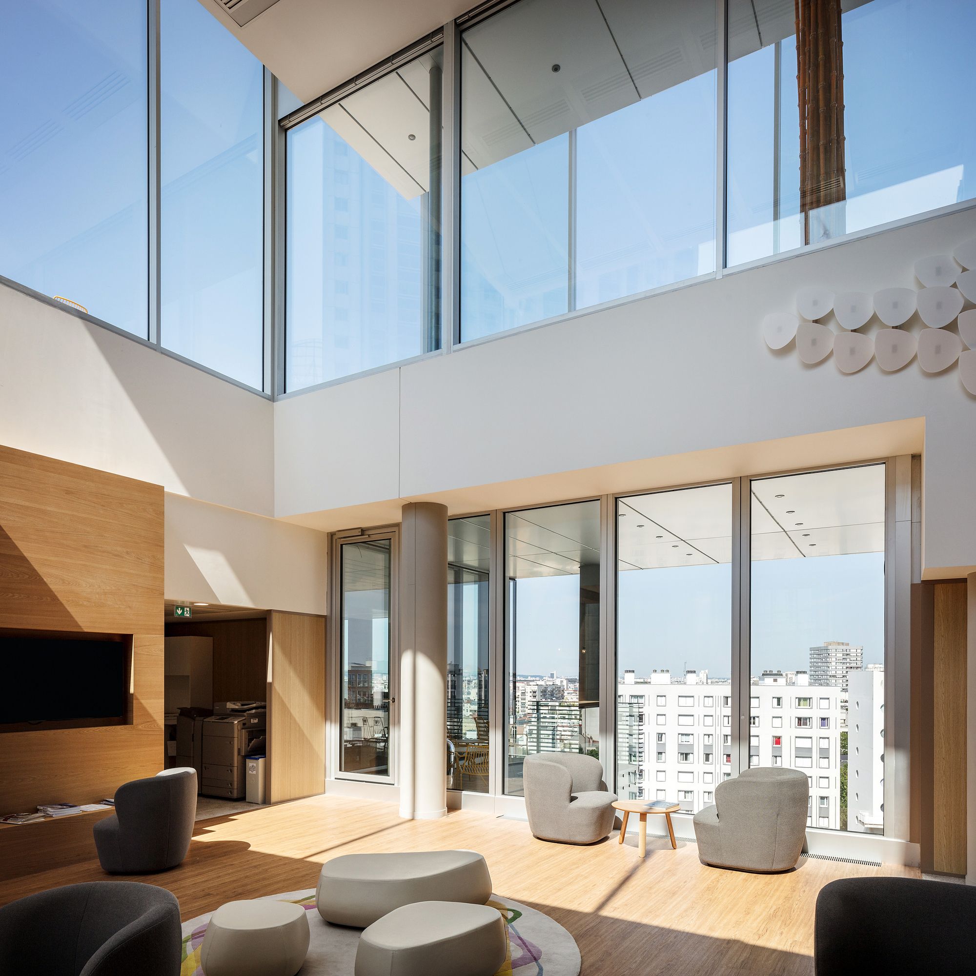
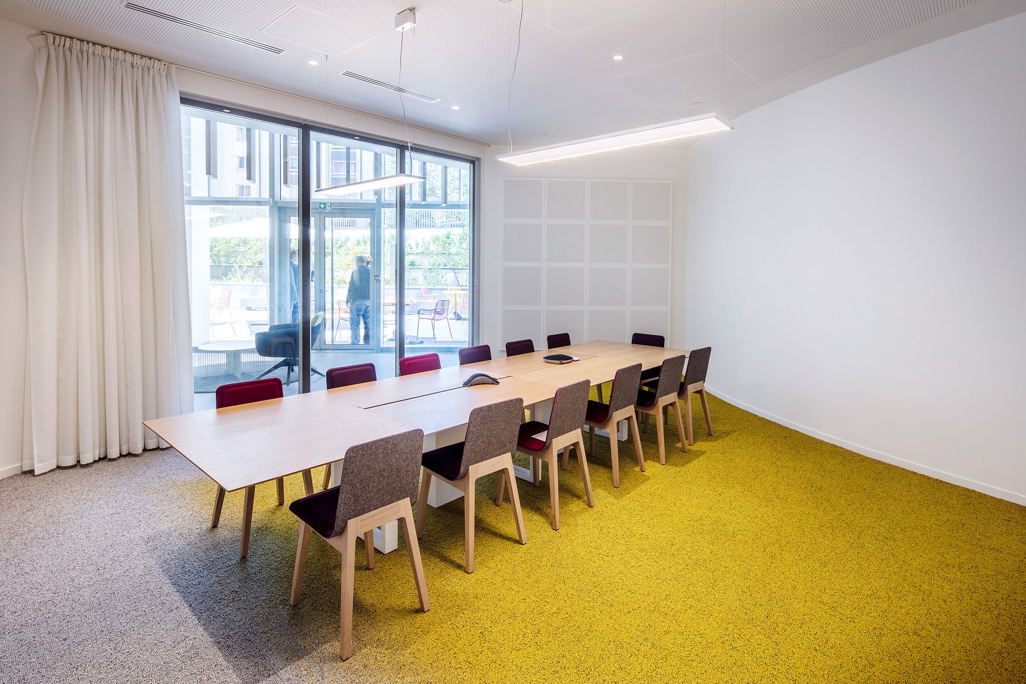
Interior double-height “lounges”, facing each of those hanging gardens and all possible associated uses, allow to make a welcomed transparency in the depth of the building and the plot.
The play made here on the insertion of roughness allows organizing the building “Ampère e+” by offering it diverse uses and new timescales. The creation of those hanging gardens, such as little shadowed bubbles, has allowed making a contrast between the outside area (shadowed one) and the openly inside areas.
Strategy in motion
The hanging gardens are showing a little time difference between themselves, emphasizing the autonomy of the three horizontal strata.
This « strategy in motion » is dealing with the vibrant nature of the Circular Boulevard, and makes a subtle signal on the adjacent Belfort and Carnot’s streets.
A sequence with the sky, a new relationship with the horizon
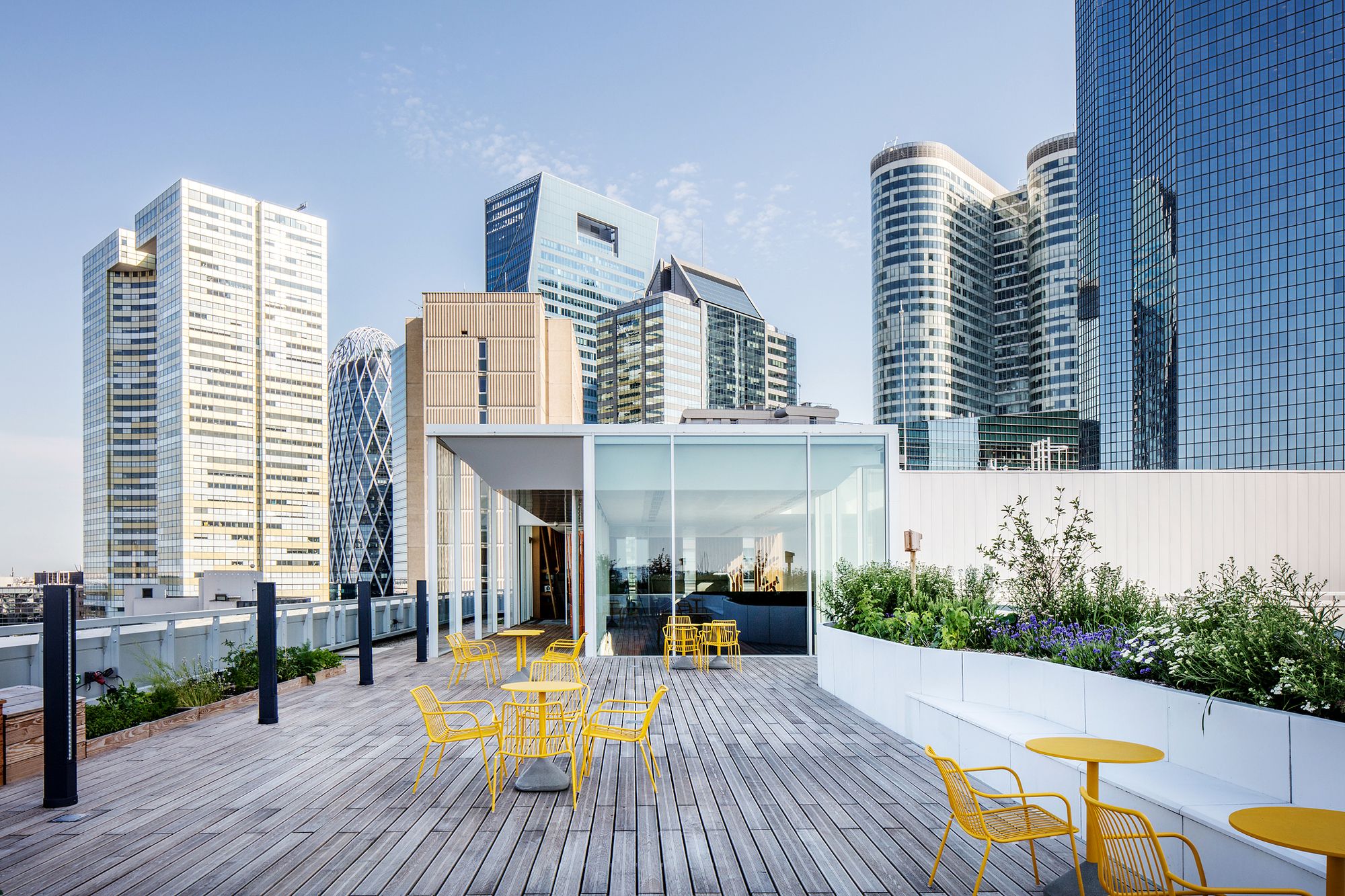
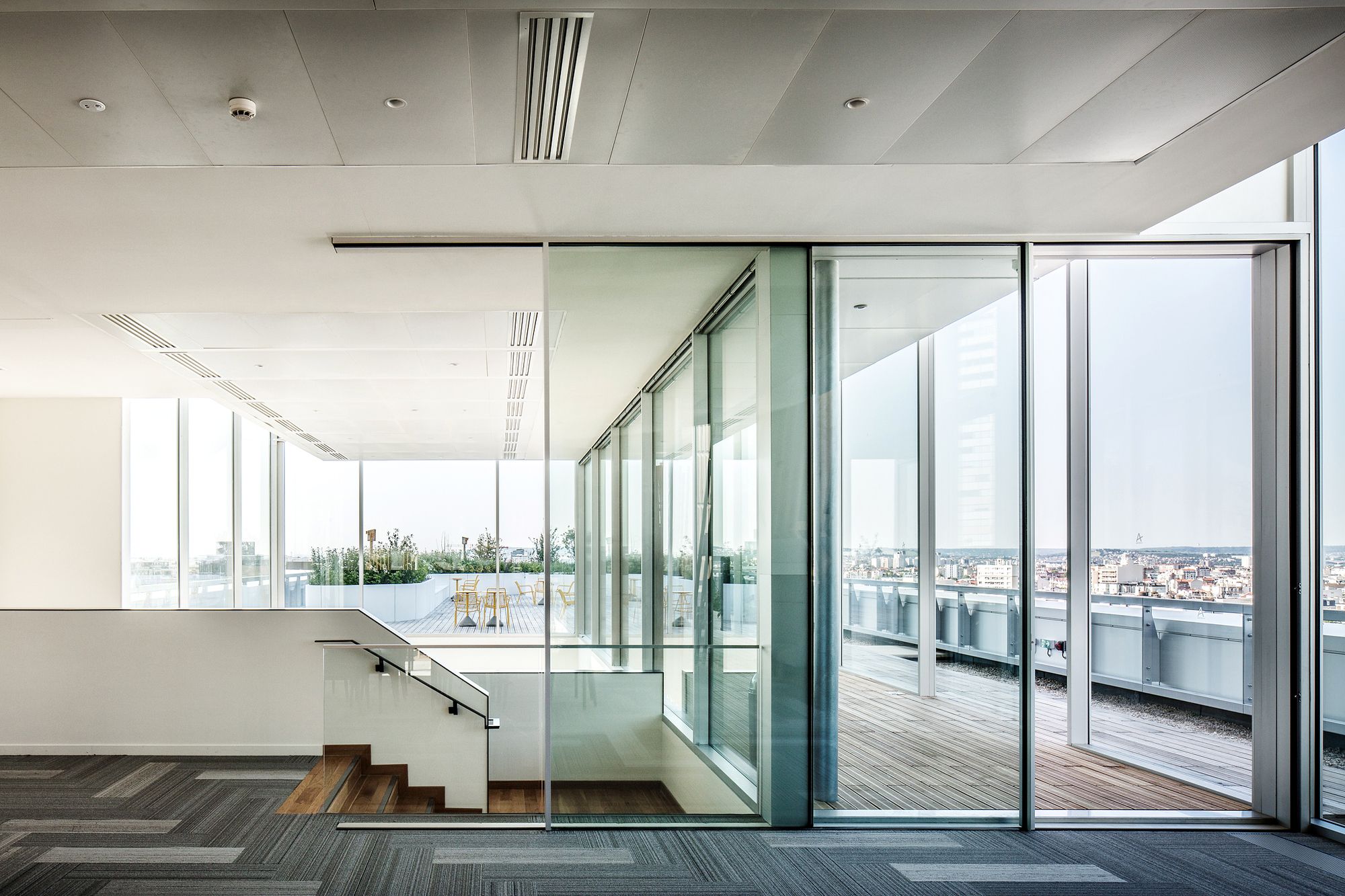
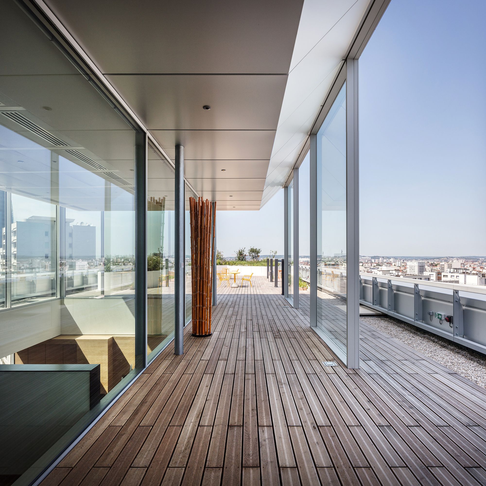
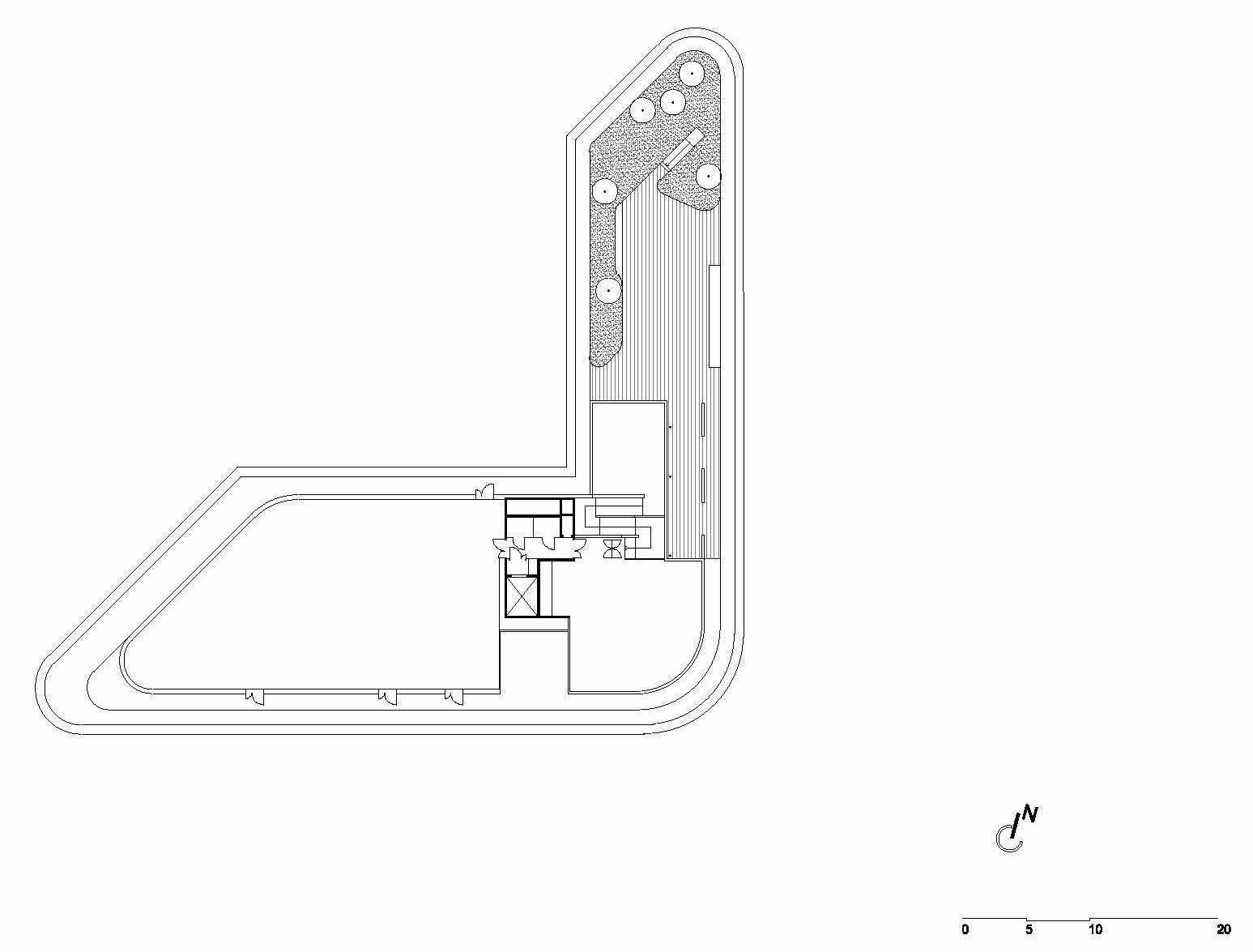
We have chosen to take the rooftop, to requalify the relationship between the building, the sky, and the horizon, to replace it in its skyline and to use this place as a unique one.
The work on the building relationship with the ground is extended with the roof, to “finish” the building. Beside the building’ small length (in relation with the surrounding towers), the terrace has a noticeable panorama on the Montmorency’s state-forest (North/East). This location allows the creation of a terrace/opened garden. Thus, the project provides the design of a mezzanine on the ninth floor, on the same level as the terrace/opened garden. This design and its purpose are responsible for a long-term and qualitative treatment of the visible roof from the surrounding towers. Furthermore, the technical equipment that’s needed for the functioning of the building is gathered in a technical enclosure, hedged by a privacy protection on the south side.
Project Info:
Architects: Ateliers 2/3/4/
Location: 34-40 Rue Henri Regnault, 92400 Courbevoie, France
Team: Jean Mas, Architect Partner, Fabienne Garrigues, Réda Mazouz and Agate Mordka (project directors), Manuel Afsar, Orion Anglade, Gabriel Garcia, Alice Heaney, Olivier Jacques, Adrien Petit
Area: 15000.0 m2
Project Year: 2017
Photographs: Charly Broyez
Manufacturers: Desso Hospitality Carpets, MARAZZI
Project Name: Ampère e+: Refurbishment of Sogeprom Headquarters
