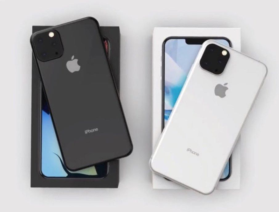
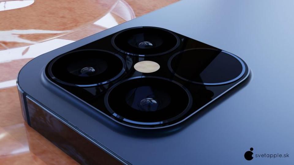
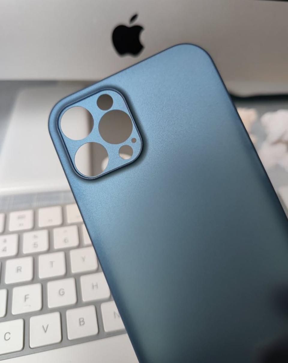
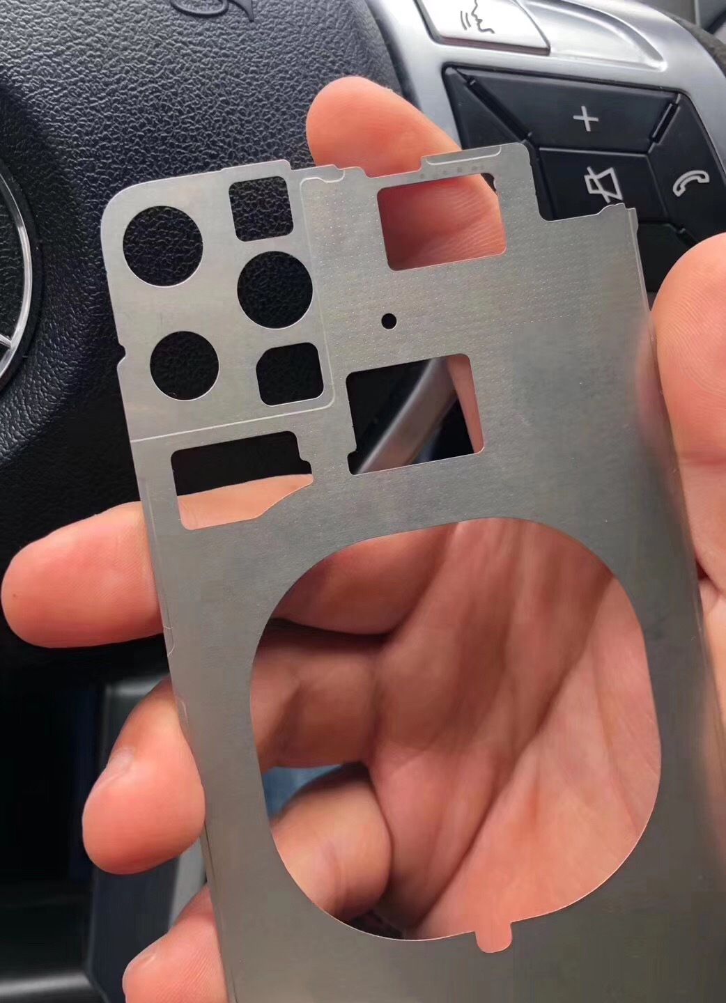
APPLE’S next iPhone could be its biggest yet, with experts predicting an enormous 6.7-inch screen. But the sized-up iPhone could spark fury among feminists who have complained massive mobiles are “sexist”. The new iPhone 11 is likely to be launched in September 2019 as the company is expected to stick to its usual pattern. It is confirmed that Apple will retain the design language of the iPhone X and iPhone XS for a third generation. While Concept Creator is true to Apple’s tactic of hiding the notch with wallpaper, it remains clearly visible and will be roughly the same size as previous generations. This despite rivals moving towards notch-less, bezel-less designs. Whether you’re a fan of the square camera bump or not, this is shaping up to be the final design for the 2019 iPhone lineup. Whether the new specifications justify the monstrous new camera bulge remains to be seen, but Apple has fallen behind its rivals in the photography stakes, so this substance-over-style approach could pay off if the leap in quality is big enough. The new images show pretty the same iPhone 11 design we’ve been hearing about for nearly six months now since long time leaker Steven Hemmerstoffer (@Onleaks on Twitter) published the first images of the three-lens camera square back in January.
According to the rumors, the 2019 iPhone 11 models will be a bit thicker than their predecessors, allowing the camera module to lie almost flush with the back of the phone despite its larger footprint. Looks aside, the iPhone’s camera is rumored to see big improvements in 2019. Those will include a new super-wide-angle option, a more powerful zoom, better night shots capabilities, and new software features with iOS 13. That said, whatever the new iPhone is called, it is another underwhelming iteration of the 2017 iPhone X. Yet, concept Creator has also highlighted Apple’s change to the iPhone 11 mute switch. This year it will drop the popular horizon mechanism used since the iPhone’s inception, to the polarising vertical slider used on iPads which has a much smaller area for your finger to push. I can understand Apple unifying its design language, but I’d have moved iPads to the iPhone switch, not the other way round. Yes, even in Concept Creator’s hands, the iPhone 11 still looks a long way off Apple’s best iPhone designs (hello iPhone 4), but a second transition year may just be worth it gave the company’s plans to step things up next year.


