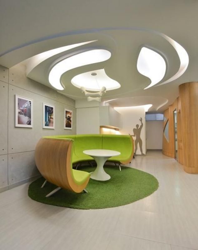
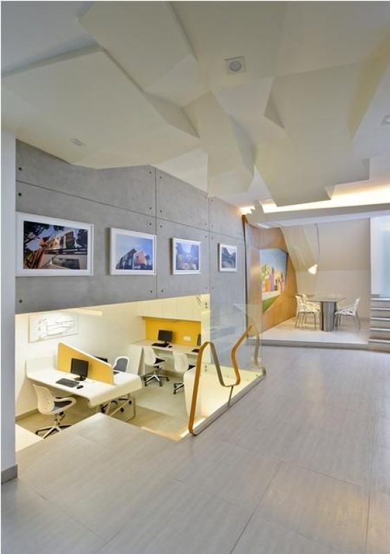
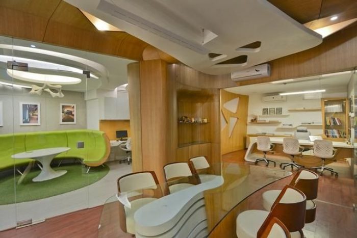
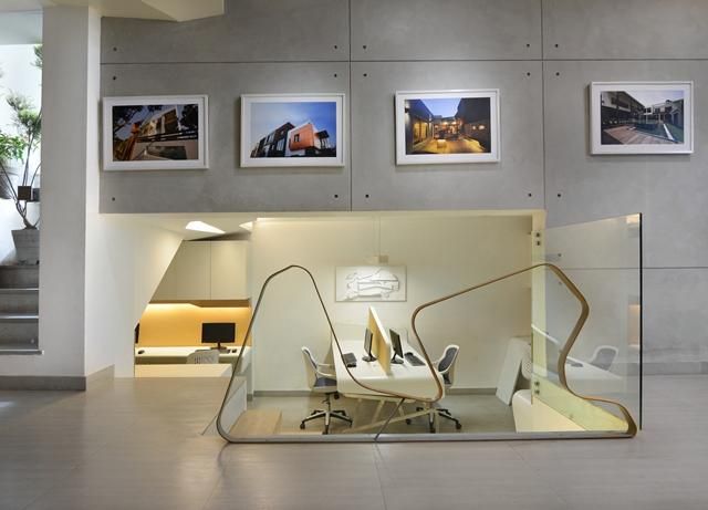
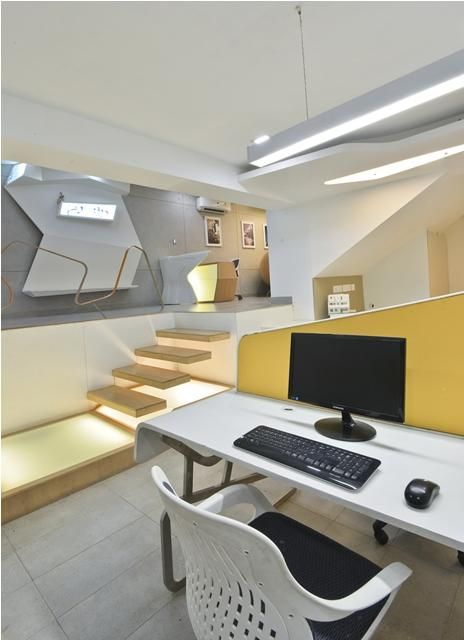
Architect ‘s studio design speaks of a strong zoning accentuated with unique and localized architectural features to create an efficient division of spaces. The 1500 sqft basement space is arranged in an open plan and divided into levels.
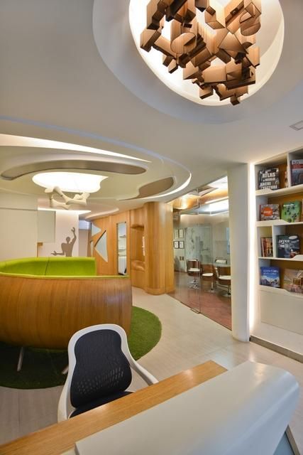
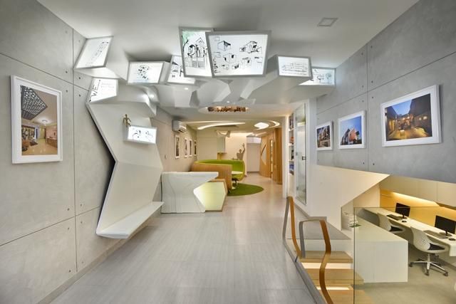
The main entrance is at the upper level opens up to a waiting area and a gallery which showcases the firm’s work. This part features a glass ceiling to provide ample of light and cement flooring and tiles to concentrate attention on the exhibits.
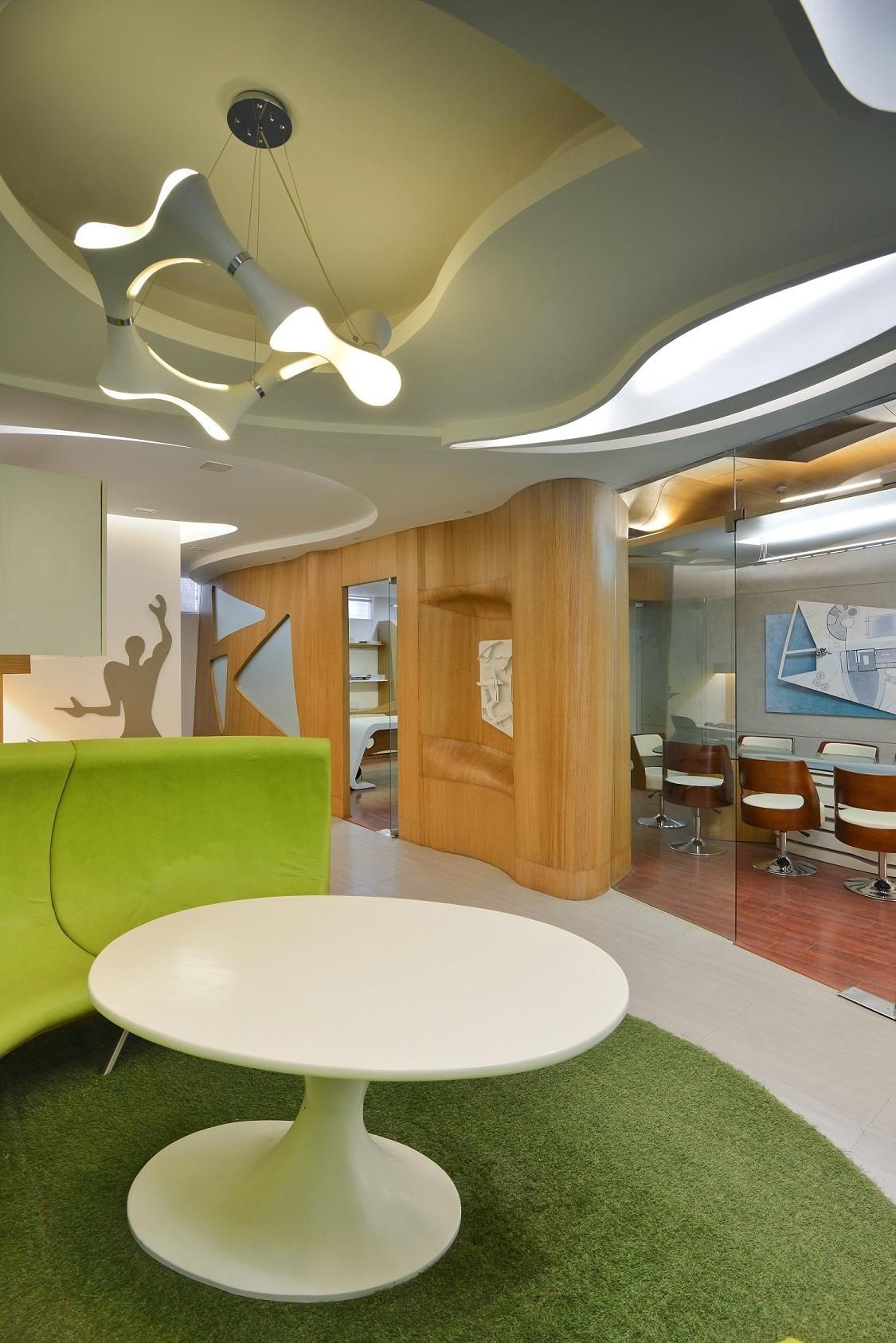
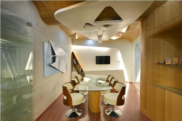
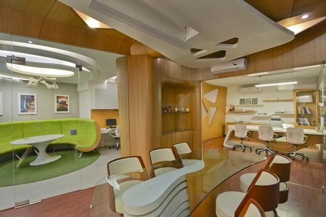
The lower level holds the workstations with the main cabin with an adjoining conference room towards the rear. The distinguishing factors in the space are the clever use of colors and partitions. Green is frequently used to break monotony and the levels are visually separated from each other by use of white tones.
Abstractions are used in a multifunctional manner i.e. ; in vertical partitions to depict company philosophy and on the ceiling as a warped imagery of the plan. The architect’s own thesis work pertained to intelligent use of space, which is readily visible in the design as an extreme efficiency is achieved in creating easy transitions and making the workspace lively and playful
Photography by © Bharat Aggarwal
Photography by © Bharat Aggarwal
Photography by © Bharat Aggarwal
Photography by © Bharat Aggarwal
Photography by © Bharat Aggarwal
Photography by © Bharat Aggarwal
Photography by © Bharat Aggarwal
Photography by © Bharat Aggarwal
Photography by © Bharat Aggarwal


