After getting married, some designer couples multiplied their design power and have set to build a lot more than relationships. These romantic love birds are totally on a roll with their groundbreaking projects. If you’re a single designer, you might want to consider a designer life partner after checking out our 5 Architectural Gems Built by Romantic Designer Couples.
List of 5 Architectural Gems by Designer Couples
1. Olympic Sculpture Park by Marion Weiss and Michael Manfredi
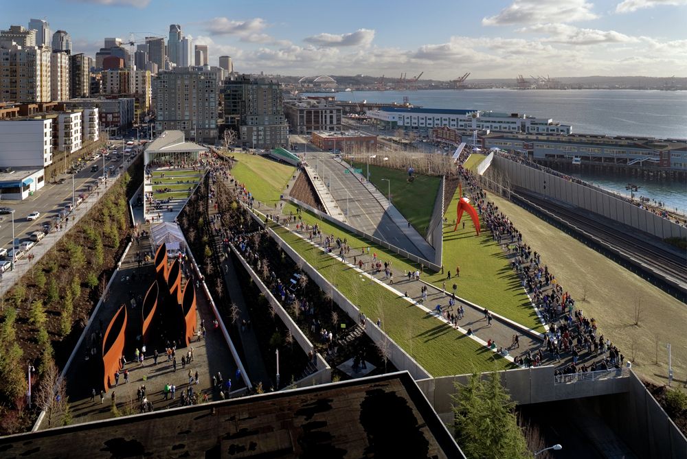
Married architects, Marion Weiss and Michael Manfredi are both left-handed. Their drawings are so similar that even they get confused about who drew what. Together, this couple built the Olympic Sculpture Park with the aim of reinventing the contaminated industrial site and establishing a connection between Seattle and its abandoned shoreline. They achieved this by transforming 8.5 acres of brownfields into an uninterrupted Z-shaped landscape. Moreover, this landscape slopes down from a height of 40 feet to meet the waterfront.
Their design turned art-observation into an adventure in the tilting open-air environment. Plus, the site offers marvelous mountainous views, making users’ experiences all the more fascinating. The couple did not just revitalize the site but also formed a lively public space where the harmonious coexistence of art, nature, and infrastructure is celebrated.
Ms. Weiss and Mr. Manfredi rejoiced at their success as they received the winner’s award in the International Design Competition.
2. Blur Building by Elizabeth Diller and Ricardo Scofidio
Another husband-wife team, Elizabeth Diller and Ricardo Scofidio were both trained as architects. Diller happened to be Scofidio’s student at the Cooper Union but the pair did not date nor marry until she graduated in 1979. After marriage, they became super architect-couple and won the genius grants award from the MacArthur Foundation. They shared the same ideas; both had the common goal of challenging the way people think about architecture. To this end, they decided to build an abstract building on top of Lake Neuchatel. Despite all the discouragement from other team members, the couple went ahead and produced the “Blur Building”.
Blur Building stands offshore on an elevated steel structure, vigorously breaking convention. It constantly emits steam fog which makes it appear as a 300-feet cloud hovering over the water. Visitors can enter it and wander in freakish vapors.
Some considered it outrageous while others (like Rem Koolhaas) admired it. Nevertheless, to the couple, it is a perfect platform for experimenting with new concepts of using space.
3. Recycled Window House by Nick Olson and Lilah Horwitz
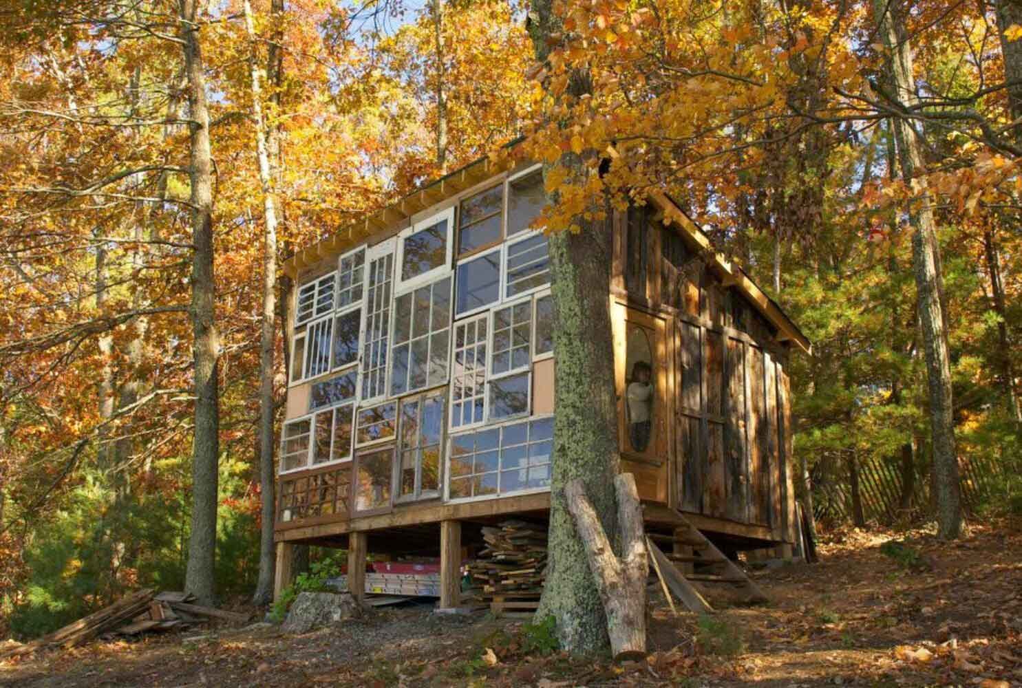
courtesy of Matt Glass & Jordan Wayne Long
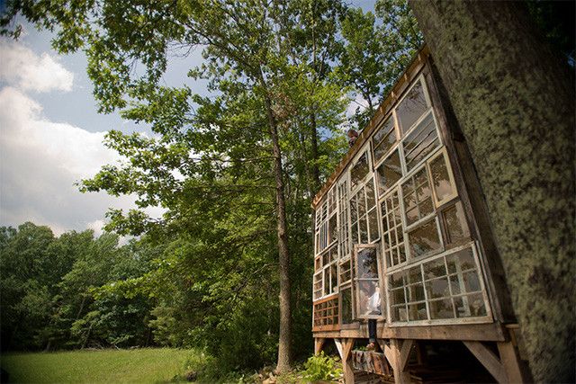
Nick and Lilah are not architects, yet they built an architectural marvel together. Nick Olson is a photographer and his life partner Lilah Horwitz is a fashion designer. Both currently work for a landscape company in Milwaukee. In 2012, this romantic couple set off to build their dream house in the woodlands of West Virginia. It is really applaudable that their top priority was to keep the design economic and sustainable. The adventurous duo was very keen to travel together. So, they took this project as an opportunity and went on a road trip to collect recycled material from garage sales and local antique shops.
Although the house is small, it is beautifully crafted. They built it on their favorite spot using the same hands-on technique they use in their artworks. To fulfill their dream of watching the sunset over the mountains, they built the whole front façade with repurposed windows. Thus, their home remains naturally lit throughout the day.
“Each window has a bit of a story to it. As an artist, I’ve learned over time that if you have an idea, you can find a way to make it” – Nick Olson
They finished the rest of the house in reused wood and complemented it with vintage furniture. They also got an old stove for heating wood during winters. Hats off to their brilliant design which took only about $500 to build.
4. Blaffer Art Museum by Dan Wood and Amale Andraos
Famously known as ‘Danamale’, married founders of WORKac, Dan and Amale, met while working at OMA. At first, Amale was kind of intimidated by Dan as he was 6 years her senior but soon they were married and started working as partners. They have two children, both with Arabic names due to Amale’s deep interest in Islamic architecture. Other than the children, the couple gave birth to several stunning and dramatic projects one of which is the Blaffer Art Museum in Houston.
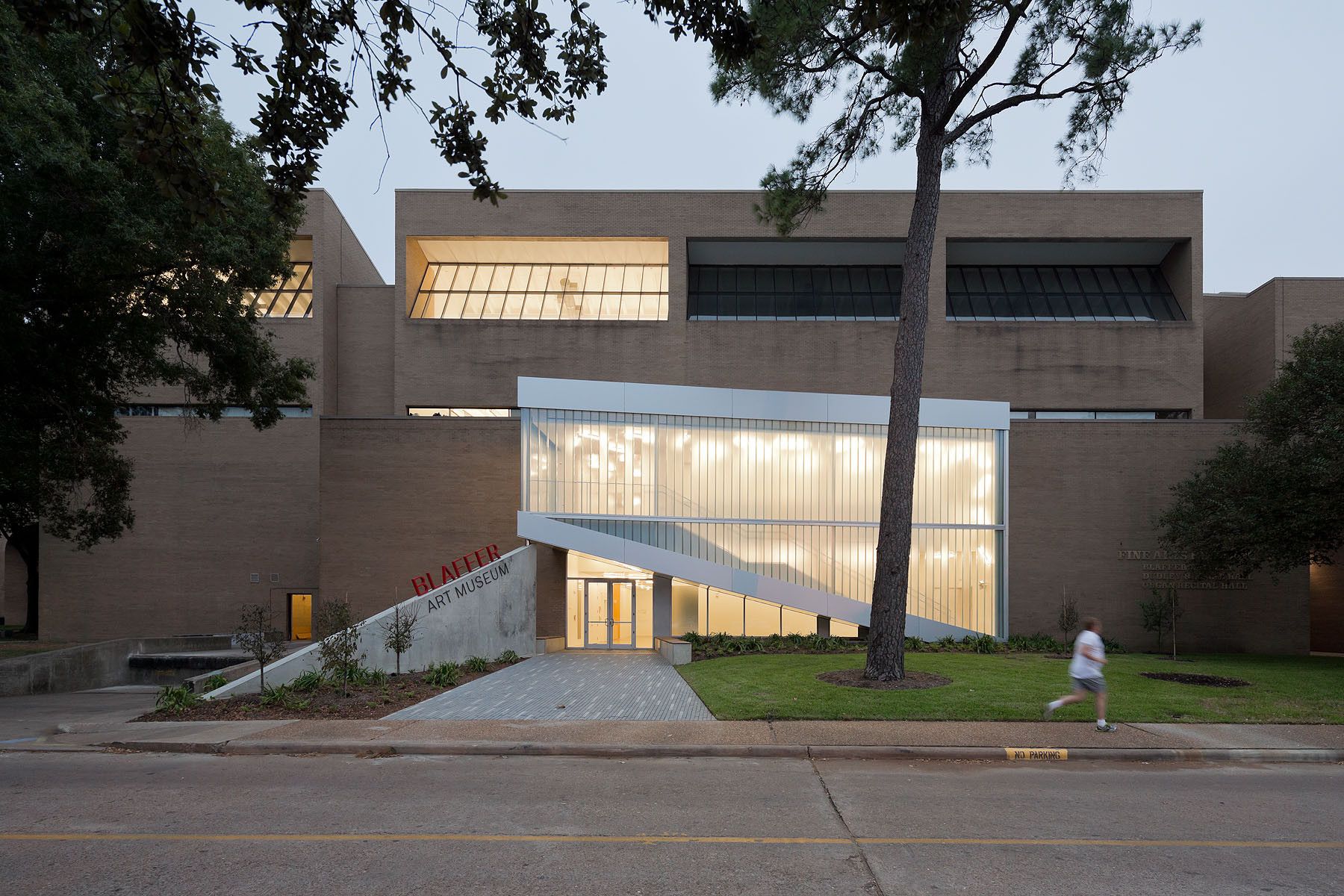
The Blaffer Art Museum is a renovation of a 1970’s building located on the university campus of Houston. The original building entrance was through an inner courtyard which failed to attract visitors. To counter this issue, ‘Danamale’ designed a glazed asymmetrical pavilion which relocated all the circulation towards the main façade. This pavilion shades the entrance with a triangular void, creating a glowing foyer for the building. They also added glass panels to the building so any passerby can observe the activities happening inside.
This new design increased visitor traffic tremendously.
5. Compact House by Michael Green and Sahra Samnani
Michael Green has established his reputation for advocating engineered-wood towers. However, his latest project is much smaller and personal; the Compact House he built with his interior-designer-companion, Sahra Samnani. Together, they solved the greatest challenge: how to comfortably live in a tiny space, in this case, a 140-square-meter house.
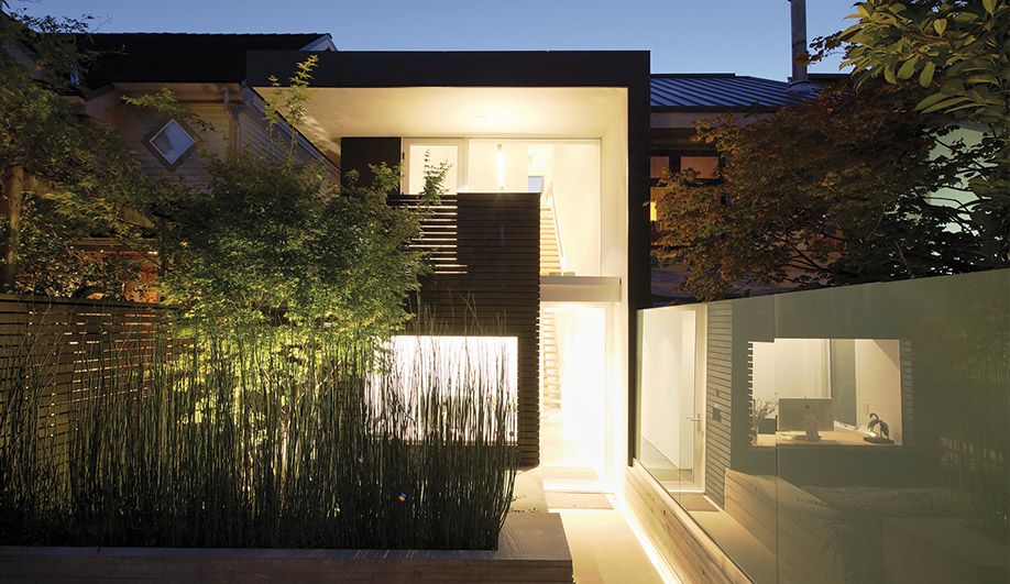
The couple transformed a 1980’s house in Vancouver for themselves and their two teenage kids. They used glass, concrete, steel, and wood for the revamp. The pair remodeled it from the shell by reinventing the existing stick-frame structure. In downsizing from their 325-square-meter suburban house to a duplex less than half the size, they had to devise built-in cabinetry to effectively fit all their stuff.
Green and Samnani made a few essential changes to the house, like moving the side entrance to the front, removing the stairways, and turning the interior into 3 vertically stacked zones. A jobbed descending path dramatizes the new entrance, and to add more to the drama, the couple took a gravity-defying step by cantilevering their glass-walled bedroom above the living space.
All in all, the design is based on simplicity, minimalism, and indoor/outdoor engagement.


