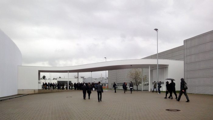
Factory Building on the Vitra Campus
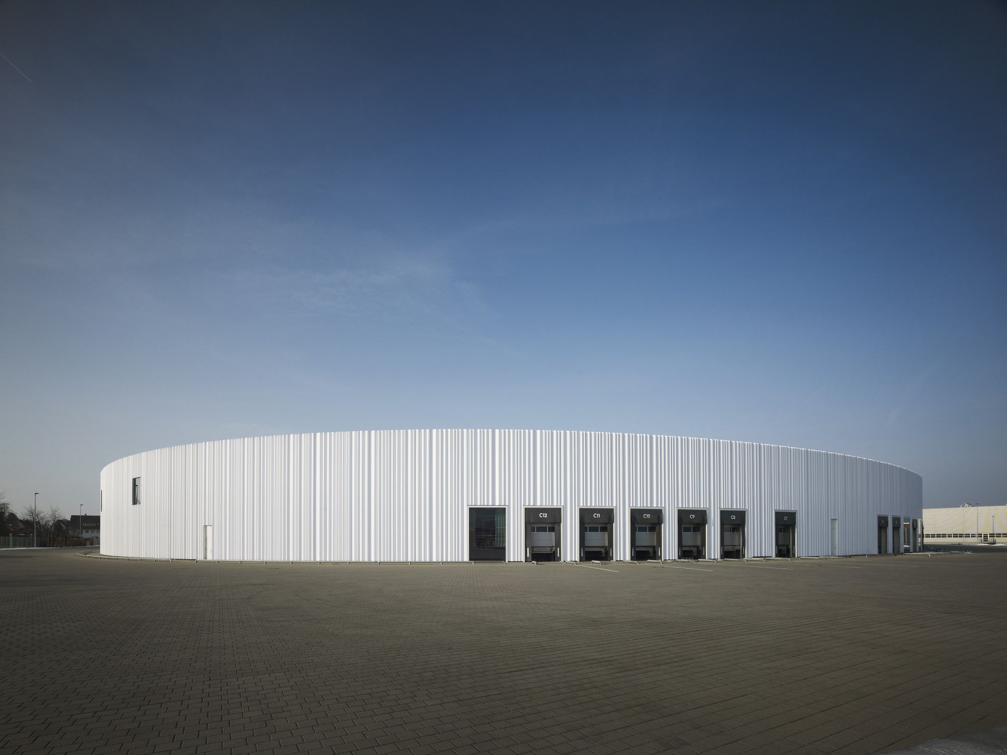
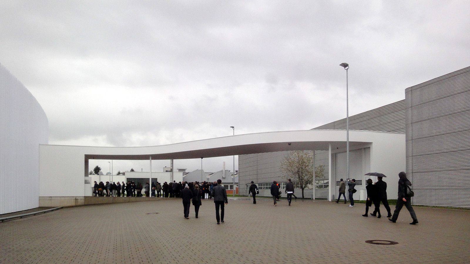
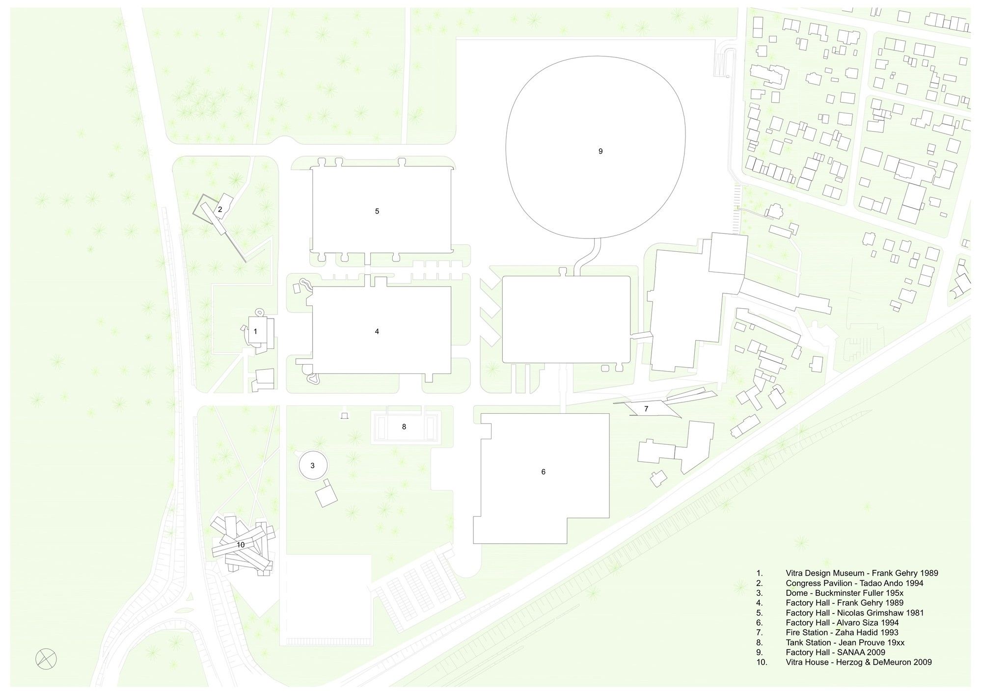
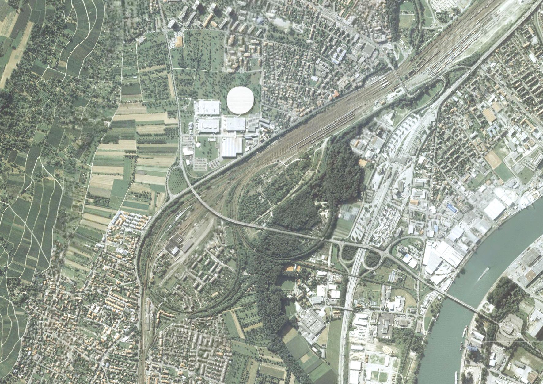
Almost all of the major projects that SANAA has completed up until now have been buildings for cultural institutions or universities. In Weil am Rhein – with the first industrial facility to be designed by SANAA – the idea was to apply a similar approach to the construction of a production hall.The plan for the new structure was initiated by the desire of Vitra’s management to replace an old factory building near the southern corner of the premises that had survived the great fire in 1981 with only minor damage. The extant building was not only showing its age, but was also too small for current demands. The new facility was to provide 20,000 square metres of floor area – compared to 12,000 square metres in the old structure.The architectural brief presented to SANAA by the company management specified a division of the total space into four separate areas that could operate independently from one another, but would also provide optimal conditions for operations that required use of the entire space. After making a detailed analysis of the brief, SANAA suggested that the preliminary decisions be revised, replacing the four orthogonal volumes that were correlated to the existing grid of the Campus with a single circular building. This proposal, which at first seemed unusual, was based on the realization that logistics and production methods no longer adhere to strictly hierarchical principles, but require flexibility. This was especially true in the case of the future occupants of the new facility, the shop fitting company Vitrashop.
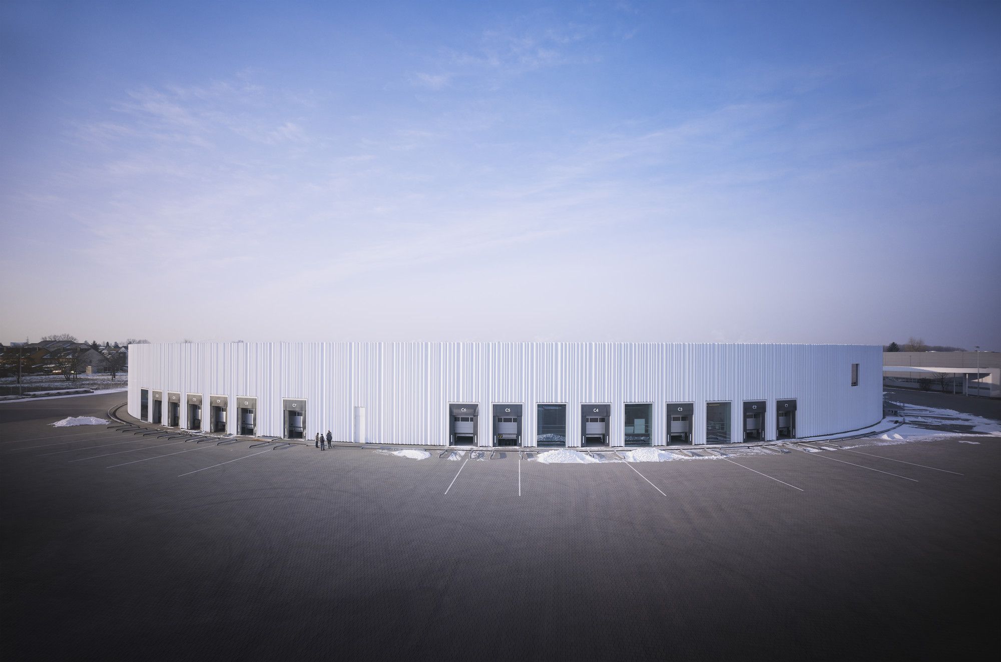
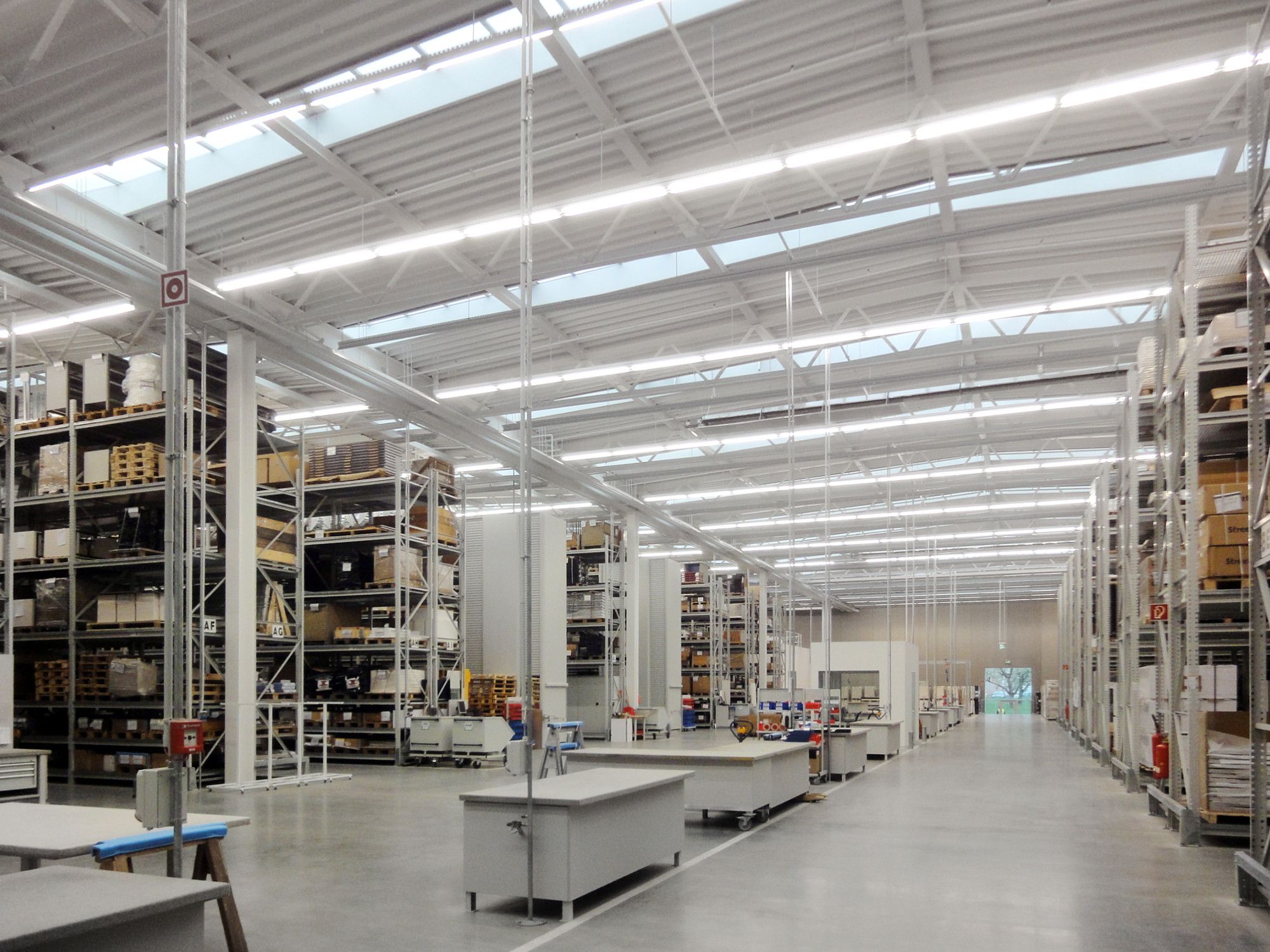
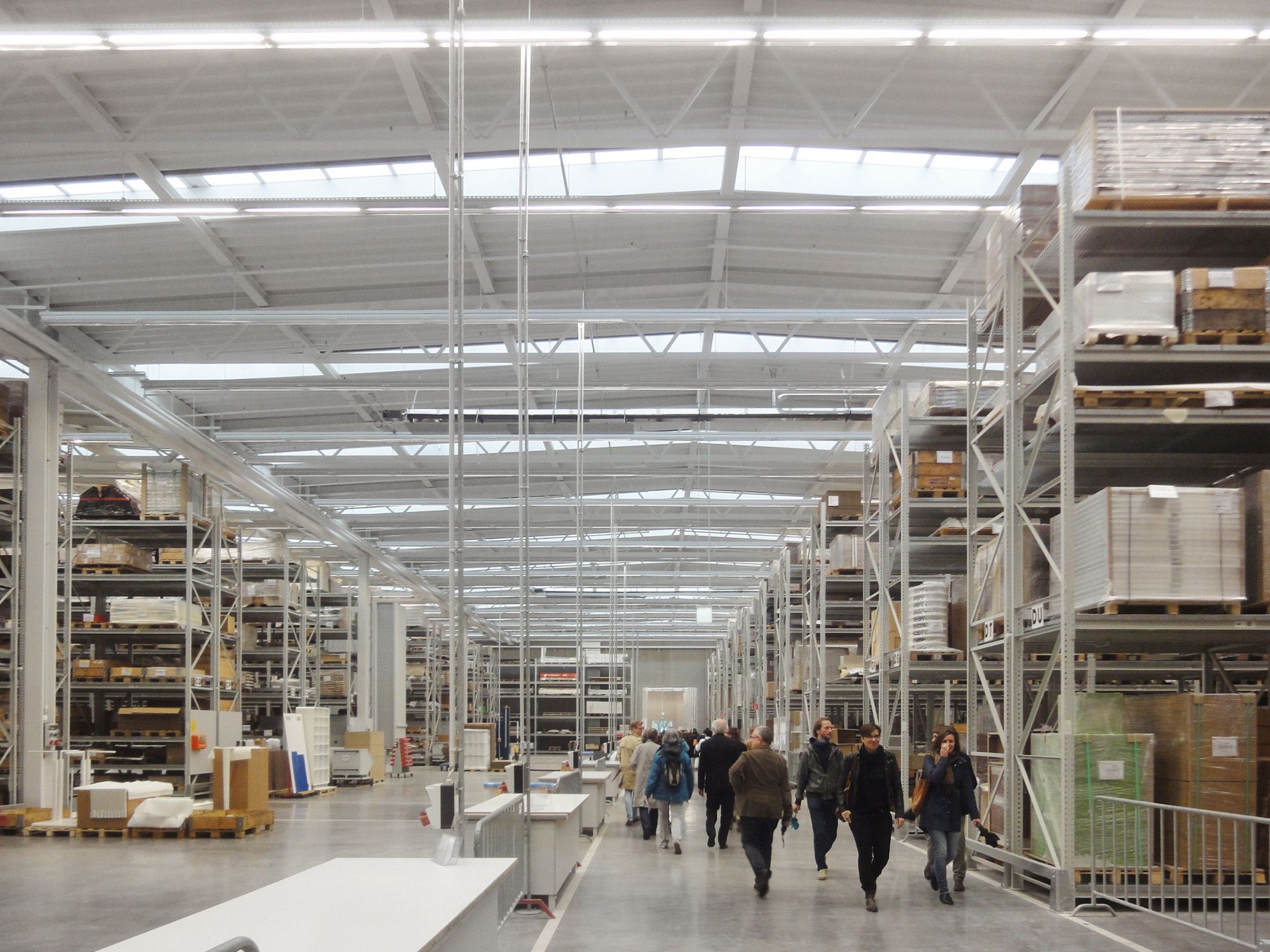
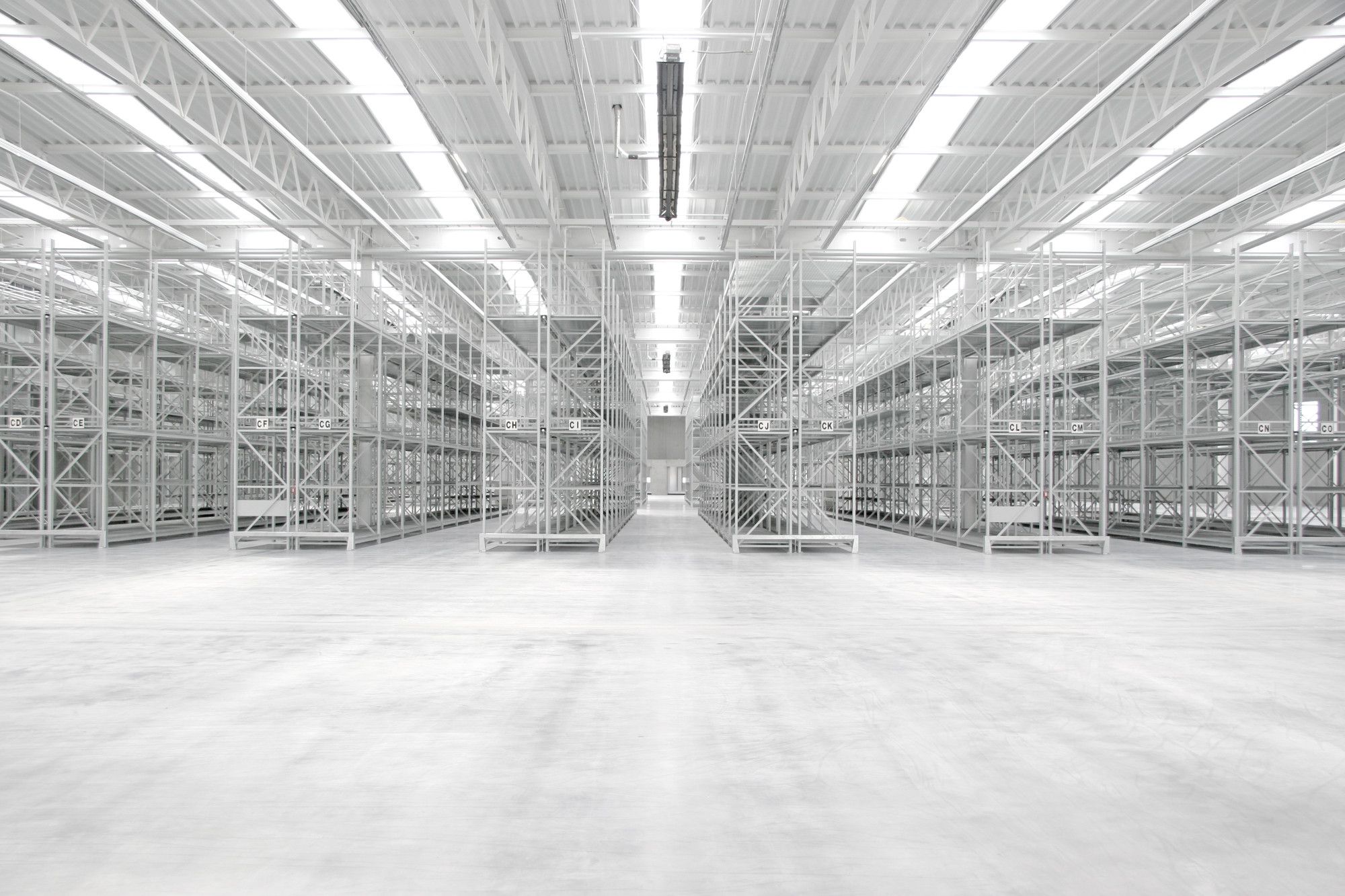
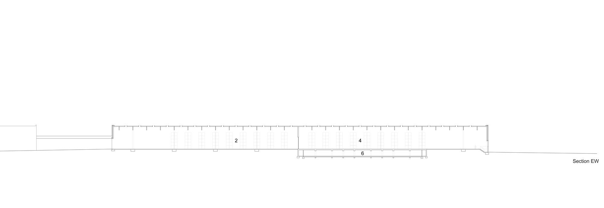
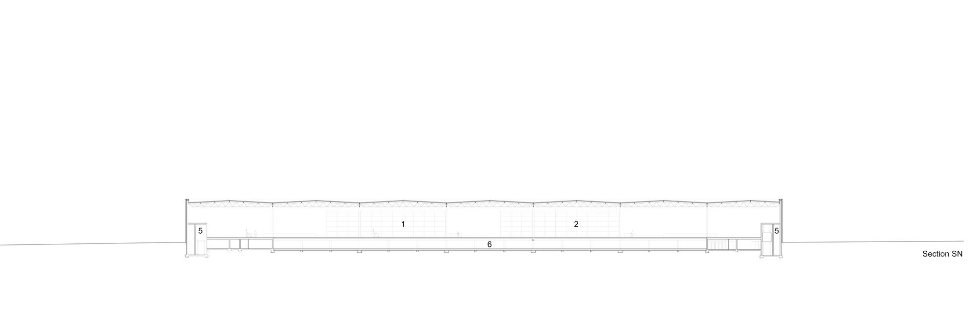
Although Vitrashop primarily utilizes standard components in the interiors that it creates for retail and commercial customers, the elements are customized to suit the specifications and desires of the individual clients. This contradicts a strictly linear flow of goods and fabrication methods. Consequently, the interior of the hall is divided into different zones: the northern section provides high rack storage for delivered materials and semi-finished goods; the central zone is reserved for assembly operations; and the southern section contains the storage area for finished products prior to shipping. The circular footprint of the building permits the delivery and loading of goods in completely different locations, so that the flow of traffic inside the hall is reduced, optimized and simplified. The assembly zone in the middle of the building can also be variably configured to meet new requirements based on current orders. A circular footprint is unusual for a factory building, but all of the conditions in Weil favoured this solution, so that SANAA was able to convince the client to accept their proposal.
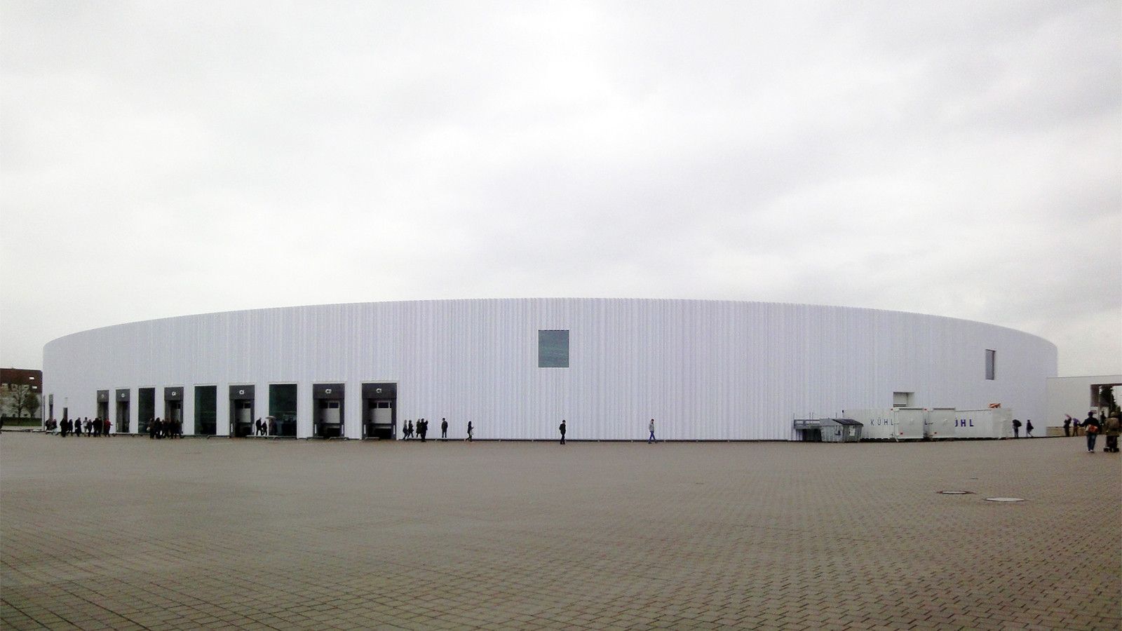
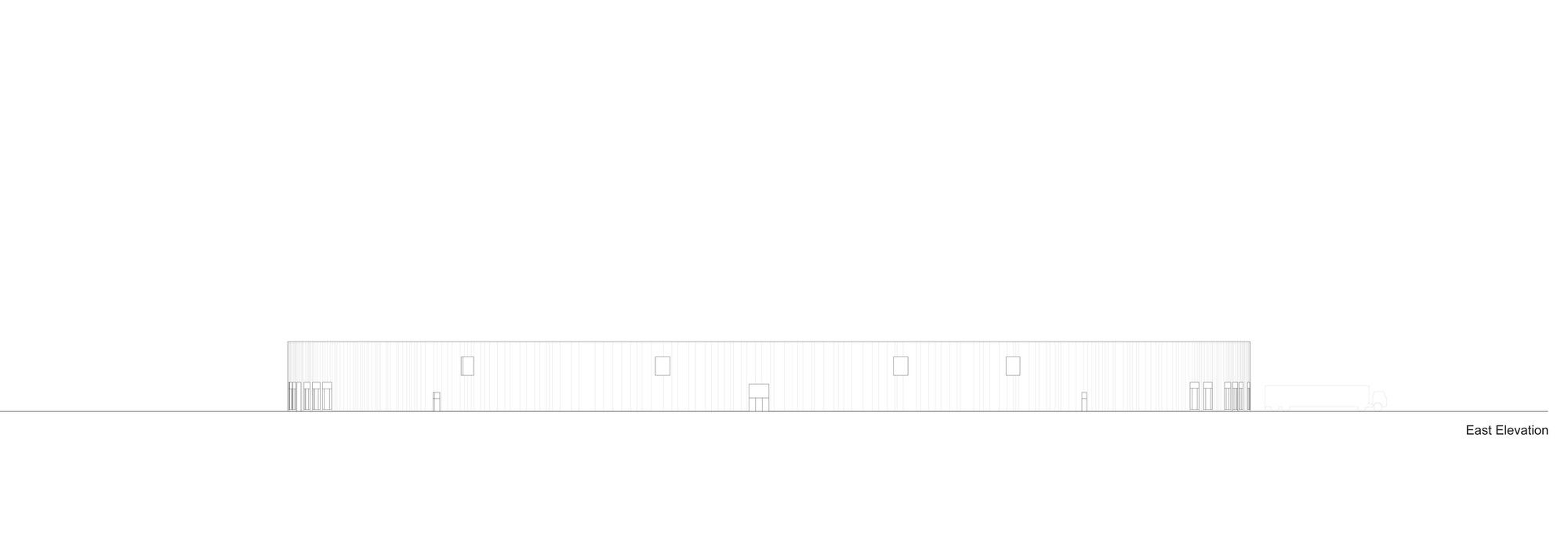
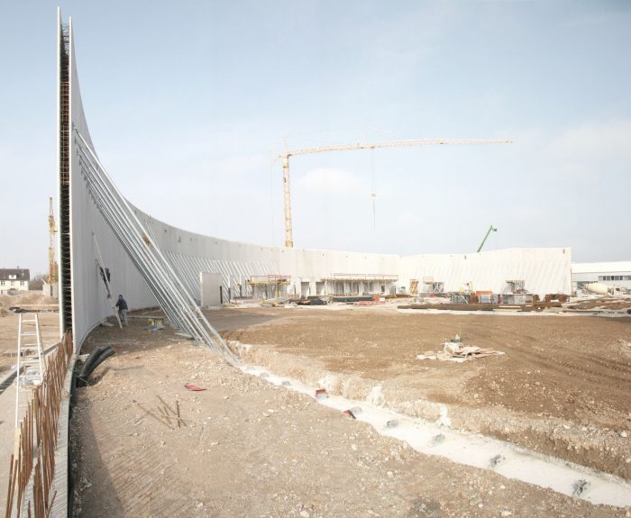
Another ideal feature of the circular structure is the proportional relationship of the façade’s surface area to the volume of the interior space. With a diameter of more than 160 metres, the round production hall – which in fact does not circumscribe an exact circle – covers a greater surface area than any other building on the Vitra Campus. Measuring 11.4 metres in height, the hall contains a basement storey in the southeastern half with a spacious underground parking garage and several auxiliary rooms. The building was erected in two stages in order to minimize interference with daily operations. The first semi-circular structure was erected next to the old factory, which was subsequently demolished to make room for the corresponding second half that completed the plan. The façade and the diameter wall that separates the two halves of the building are made of prefabricated concrete elements. Positioned as upright rectangles, the double-walled concrete elements were filled on site, thereby connecting them with one another.
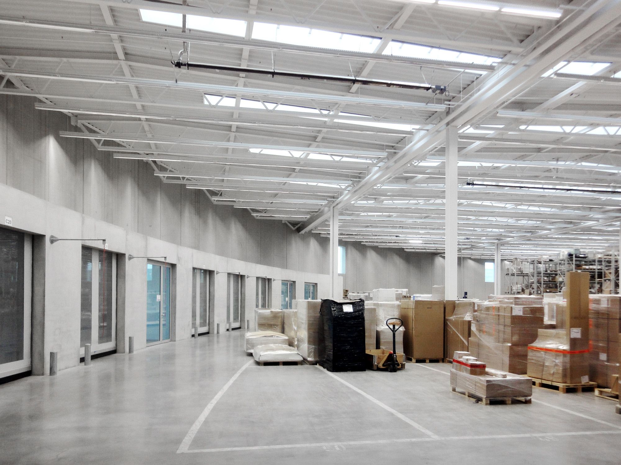
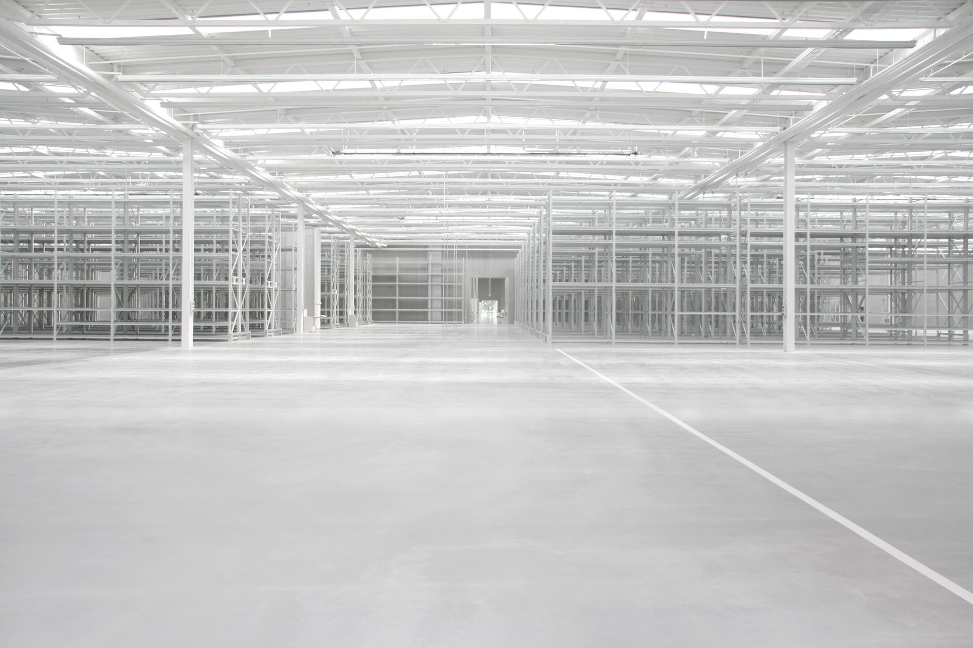
Due to the enormous dimensions of the perimeter, it was unnecessary for the individual elements to be curved. Together with the central wall, the round shape creates a perfect, rigid structure, which contains an orthogonal steel framework in its interior. The roof construction is supported by 9.5 metre-high steel columns positioned in a grid based on units of 17.5 x 22.8 metres. Since the exterior concrete walls brace the structure, it was possible to minimize the dimensions of the interior columns. One of the major challenges for the architects was to find a solution for the installation of complex building technology – electronics, ventilation, roof drainage, fire sprinklers etc., which are distributed in different configurations throughout the interior space – that was compatible with the filigree components of the hall’s support structure. This problem was solved with astonishing precision, resulting in an interior that is clearly different from typical factory spaces. The architects did not treat this interior as a multifunctional, flexible empty space within the shell of a façade, but as a central aspect of the architectural task. Every detail, right down to the screws in the high rack storage shelving, reveals the design intentions of the architects, who left nothing to chance.
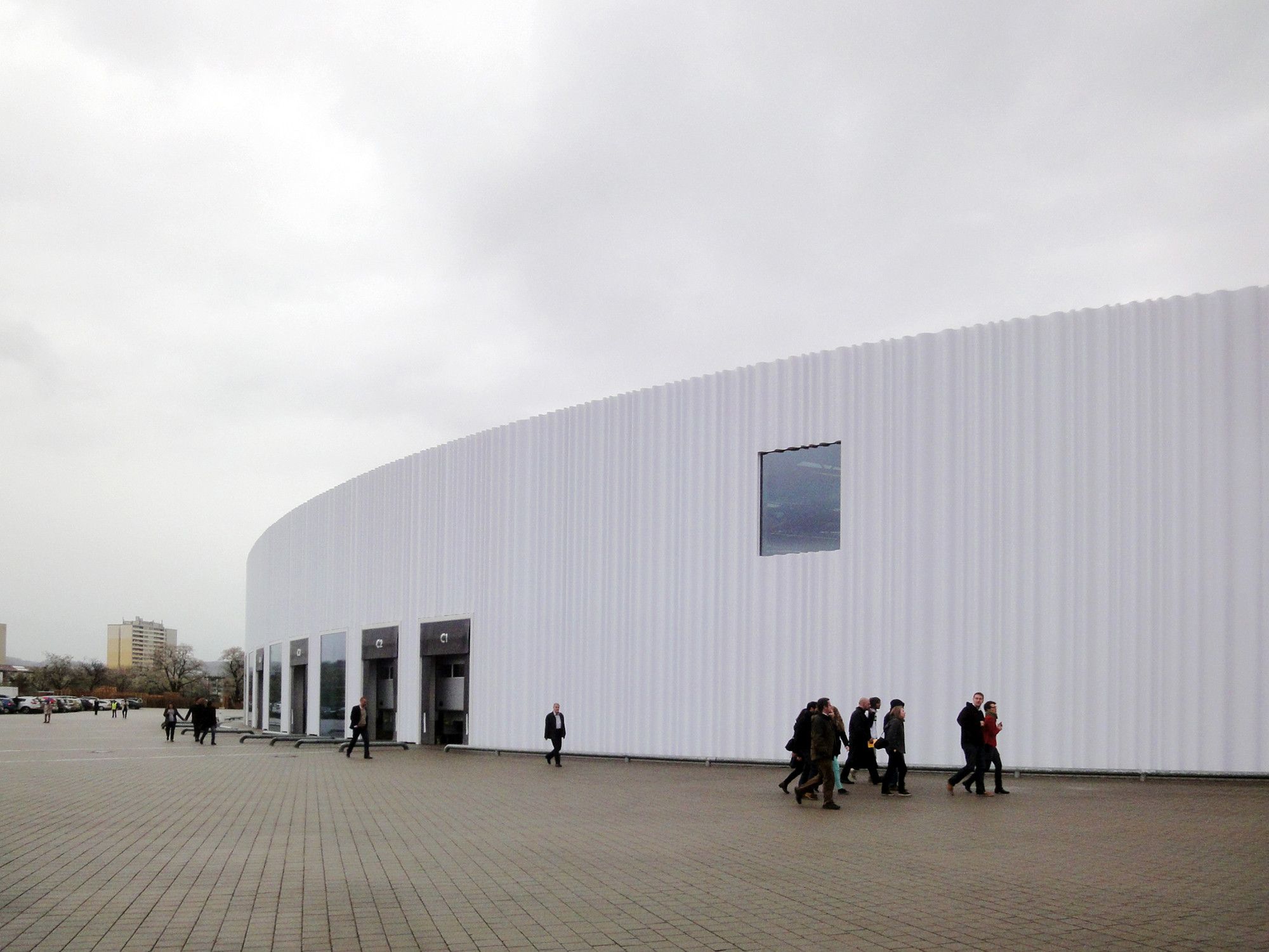
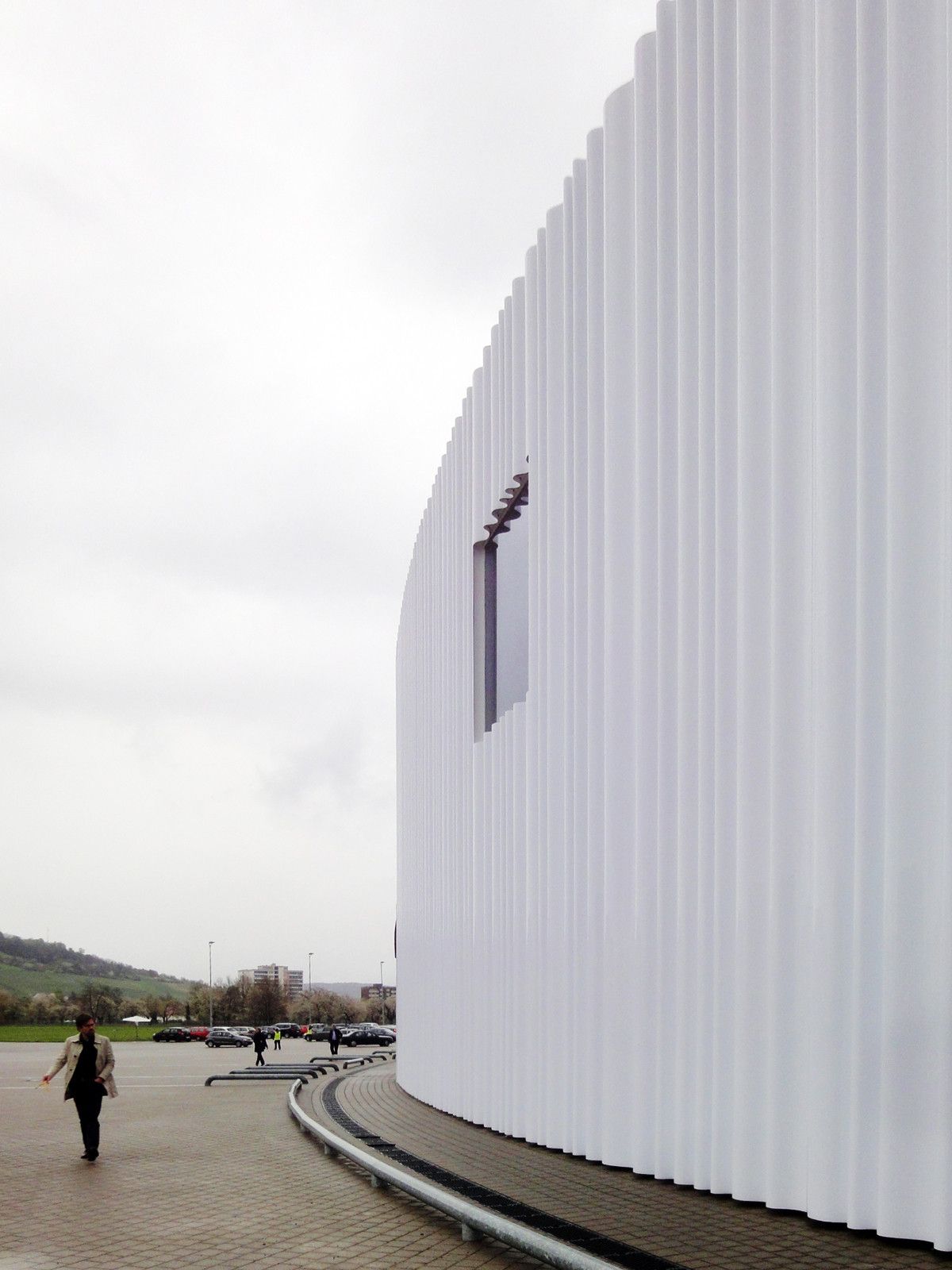
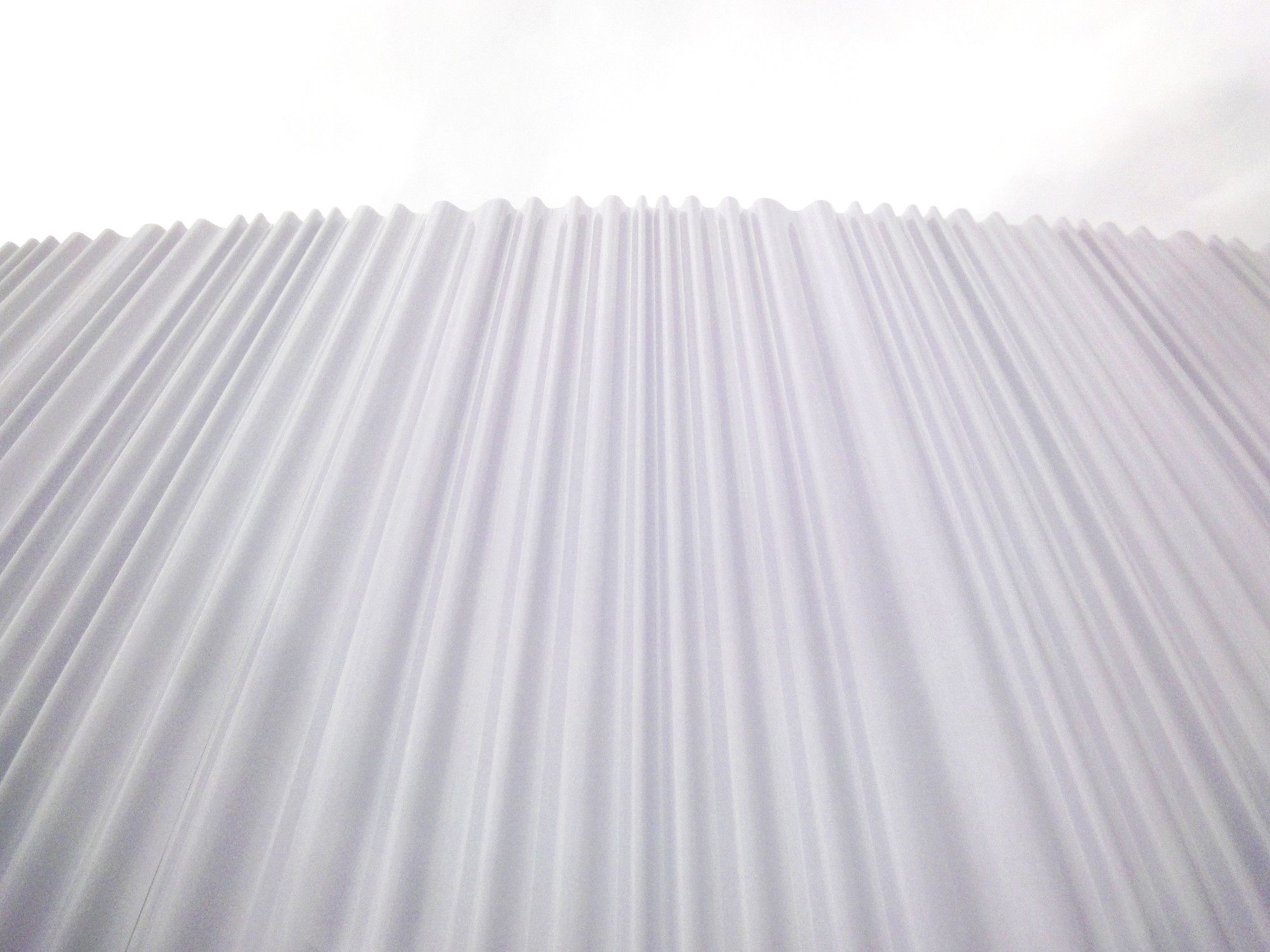
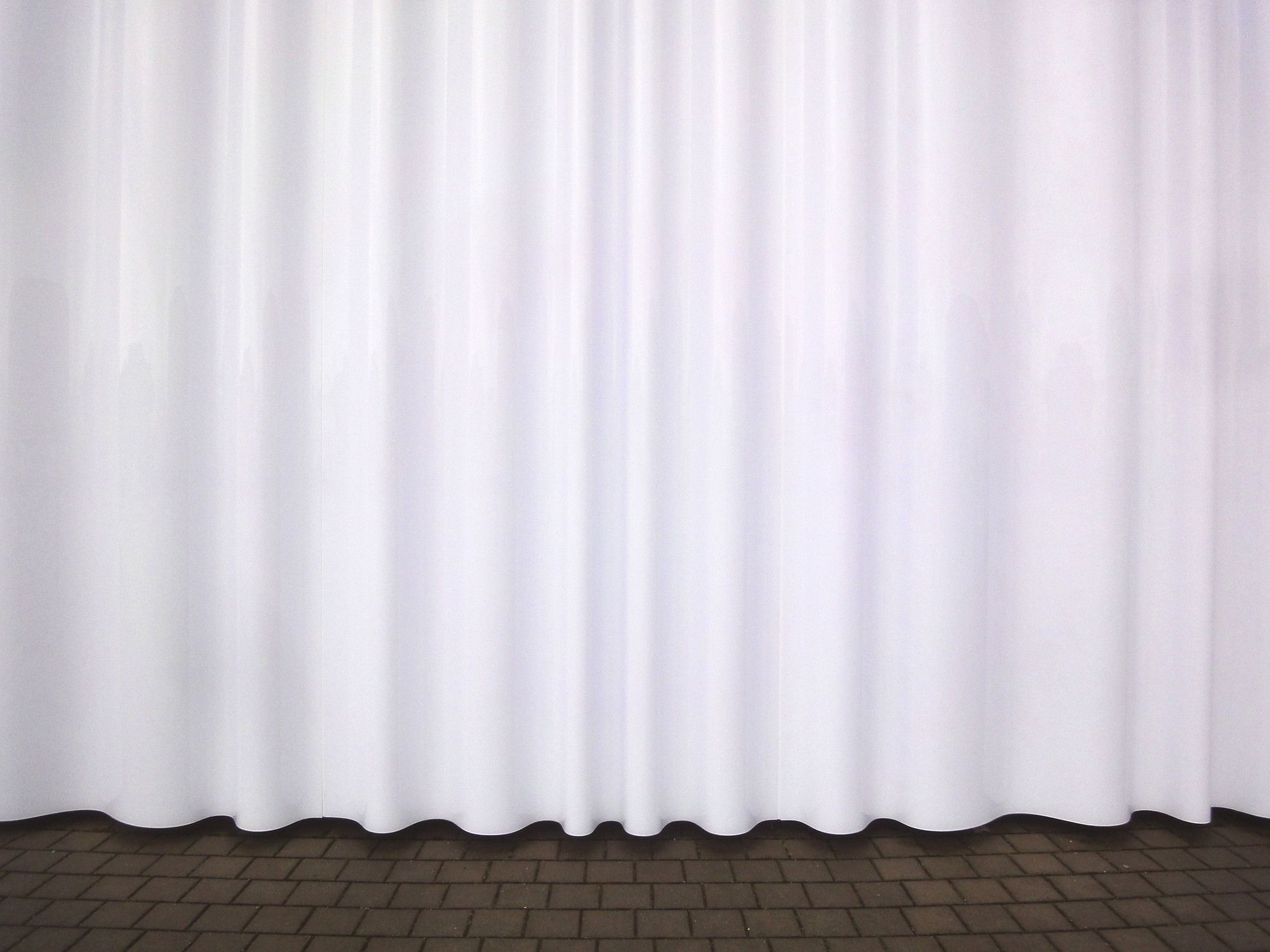
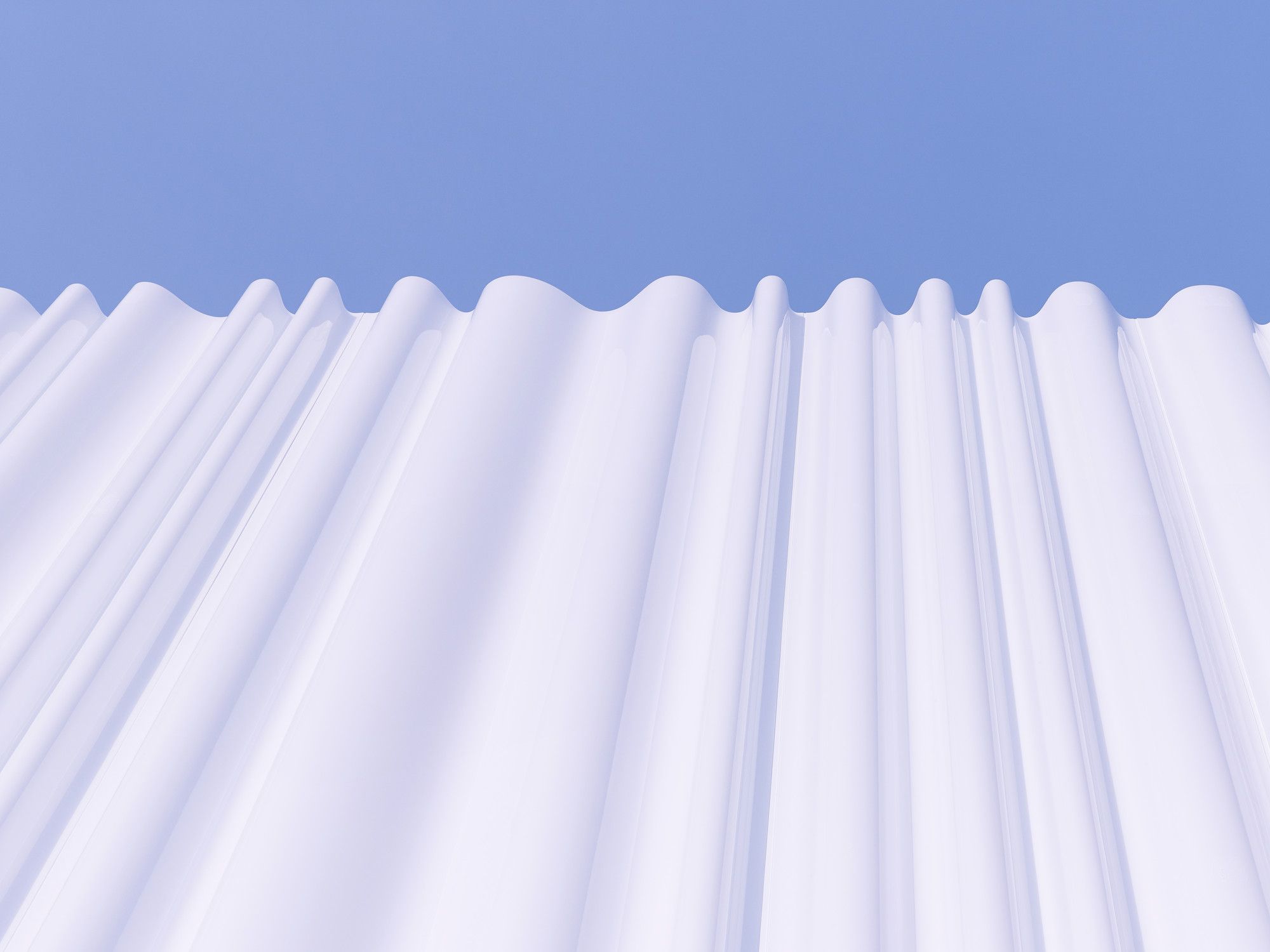
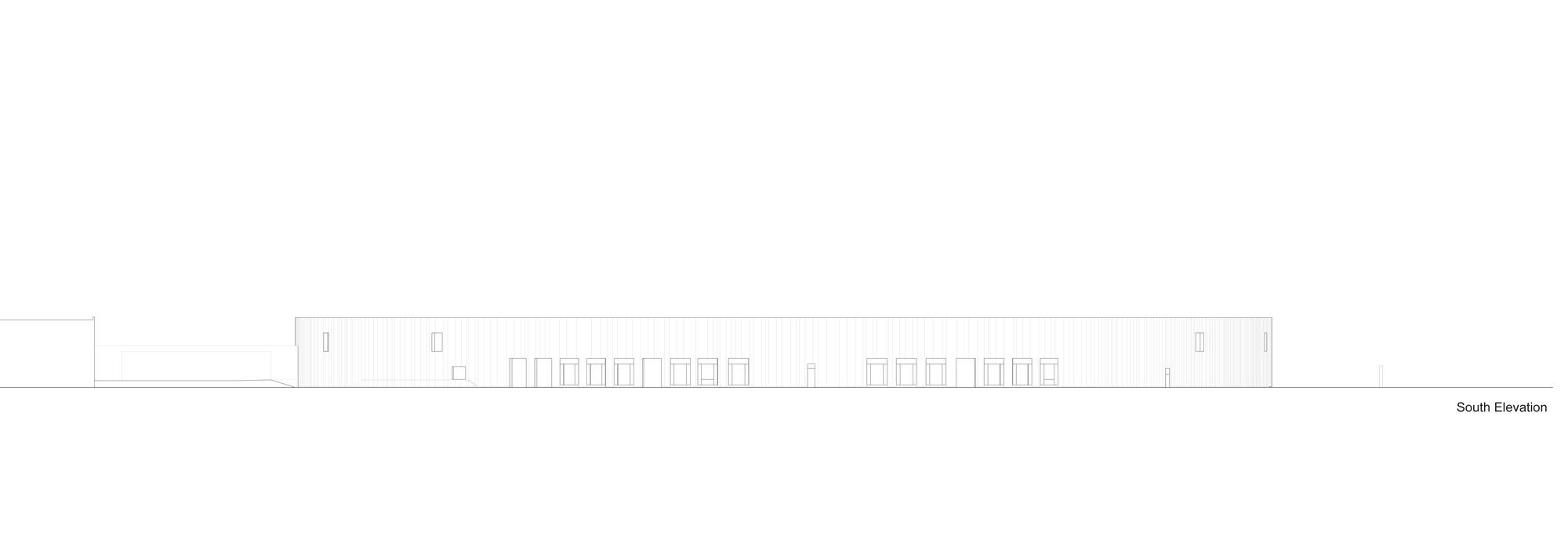
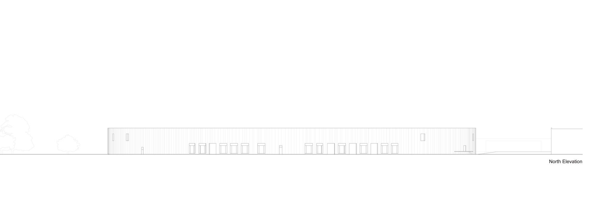
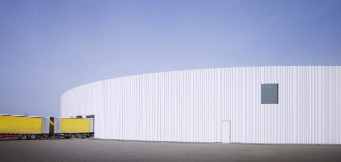
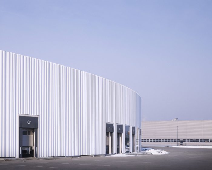
Excellent lighting conditions contribute to the pleasant work atmosphere in the hall, provided by the close rhythm of parallel rooflights in the ceiling. They are augmented by individual windows in the upper part of the façade. Another essential element of the interior’s atmospheric quality is the radically reductive use of colour. Various shades of grey and white define the interior space, while the signal colours so common to typical industrial interiors are completely absent. The shelving system, which is positioned in parallel rows that follow the structural grid of the interior – along with the central wall and sparingly distributed windows – provides a means of orientation in a building with enormous dimensions. The high rack storage system can be removed or reconfigured as needed. The loading bays are arranged on both sides of the building in a space along the façade that also contains offices. The radial arrangement of the partition walls is almost imperceptible due to the huge diameter of the hall. Depending on future needs, loading bays can be transformed into offices or vice versa. A workshop for emission-intensive or high-decibel activities is the only other enclosed room on the eastern side of the hall; the open upper deck serves as a lounge area. Curtain façade The design of the façade, whose elements are suspended in front of the exterior insulation on the concrete walls and encompass the entire building volume, presented a great challenge. The façade elements are made of acrylic glass with an undulating surface, measuring 1.8 metres in width by 11 metres in height – equal to the height of the building. The outer layer of acrylic is completely transparent, while the inner layer is an opaque white colour. The individual panels were first cast in flat sheets, then heated to 60 degrees Celsius and vacuum moulded to create the wave structure. Since no manufacturer could be found who was capable of moulding such large pieces, an oven had to be specially constructed for the purpose. One of the architects’ main concerns was to avoid obvious visual repetition. For this reason, three different elements with varying wave patterns of narrower and wider folds were developed. Since the hanging panels – whose mounting hardware is concealed – can be rotated 180 degrees and mounted on either end, this resulted in a series of six distinct types.
The aim was to arrange them in a way that avoided a recognizably repetitive pattern and that also conformed perfectly to the openings in the façade (windows, loading bays, doors). Presenting a homogenous appearance from a distance, with an almost surreal aura due to its luminous white surface, the façade gains vivacity and depth the closer one approaches. Since it is only possible to see just a part of the entire volume, the building appears to be much smaller than it actually is. It gives an impression of lightness and transparency, even though it allows no views into the interior. On the contrary: the building remains an enigma, revealing almost nothing about its function. The almost immaterial character of the factory hall is emphasized by the fact that, from the outside, only the skin of the façade – suggestive of a textile covering – is visible, while the exterior walls, roof and structural framework remain concealed.Viewed from the outside, one does not recognize – or even suspect – that the geometry of the floor plan deviates from a perfect circle; yet perhaps this unconformity is unconsciously perceptible. Just as SANAA avoids the use of classical symmetry in their architecture, they frequently employ slightly distorted geometric figures. This may recall the aesthetic concept of wabi sabi, the Japanese notion that imperfection and aesthetic consummation are not necessarily contradictory. The subtle shape of the ‘Alessi Tea Set’ (2004) by SANAA points in this direction. In reference to their project for Vitra, Kazuyo Sejima and Ryue Nishizawa also spoke about transferring some of the liveliness inherent in freehand drawing, which always stands at the beginning of their design process, to the reality of computer calculations. Or in their own words: ‘My impression is that the circle, the perfect circle, is a bit too rigid.
Project Info:
Architects: Sanaa (Kazuyo Sejima – Ryue Nishizawa)
Location: Weil am Rhein / Germany
Photography: Christian Richters
Year: 2012
Work finished in: 2012
Client: Vitra Verwaltungs GmbH, Weil am Rhein, Germania
Status: Completed works
Type: Factories
