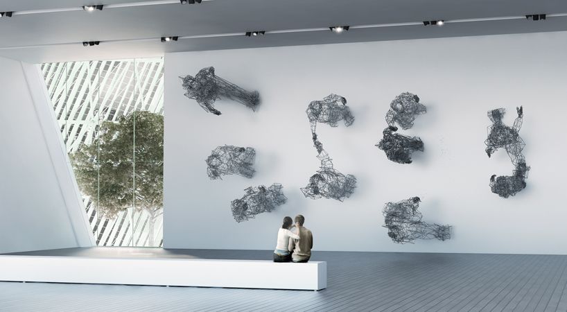
The new Art Museum designed by designhouse PRECHTECK for Buenos Aires, is a building I am personally excited for. And it ain’t just another one of them damned twisty buildings either.
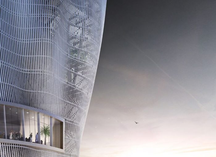
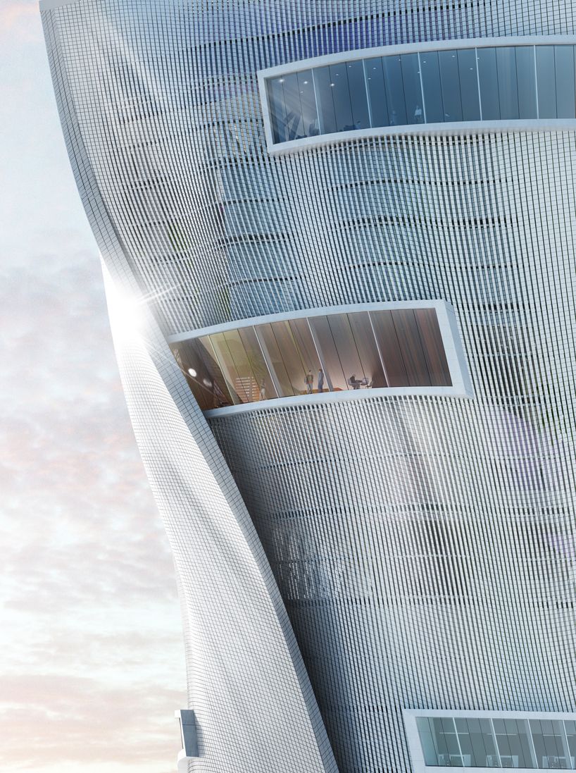
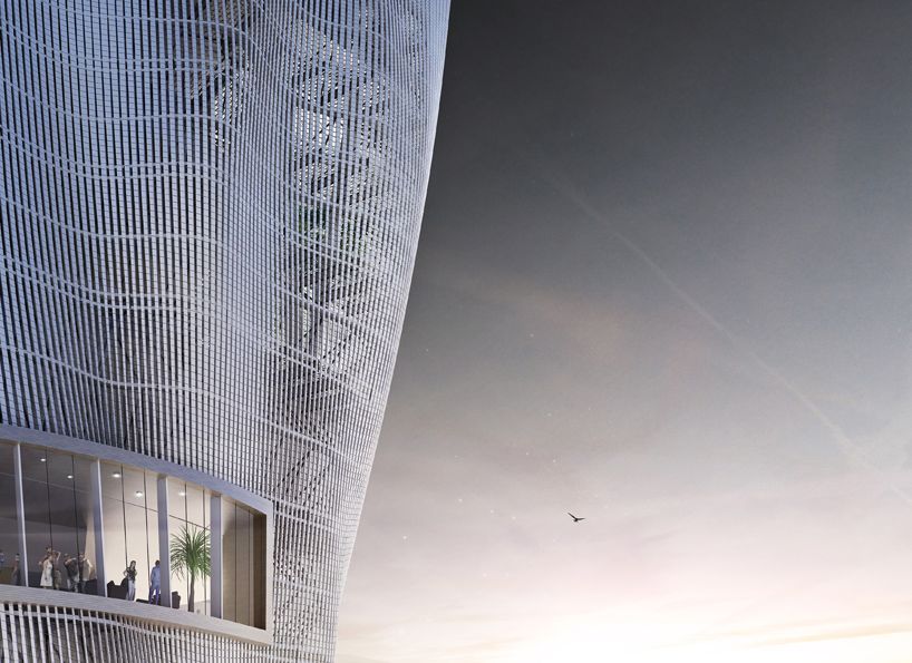
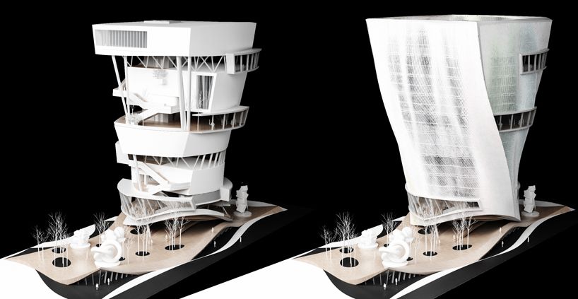
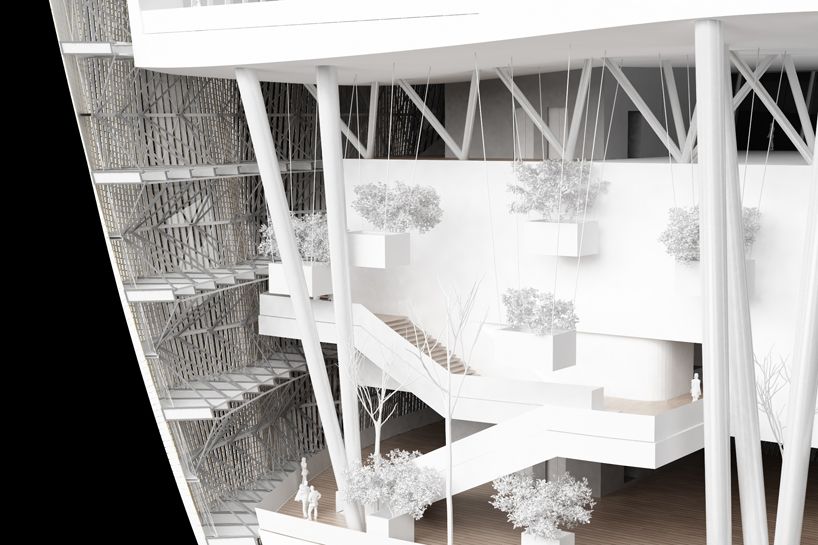
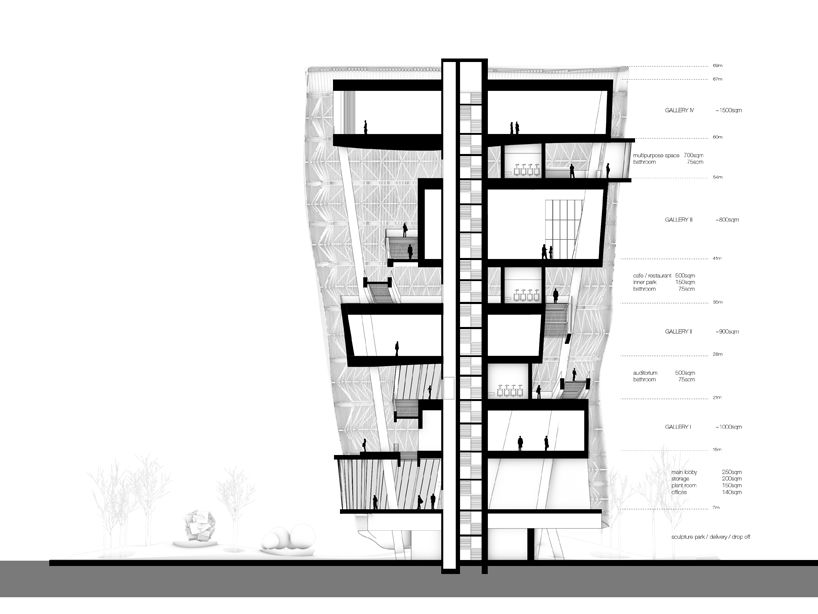
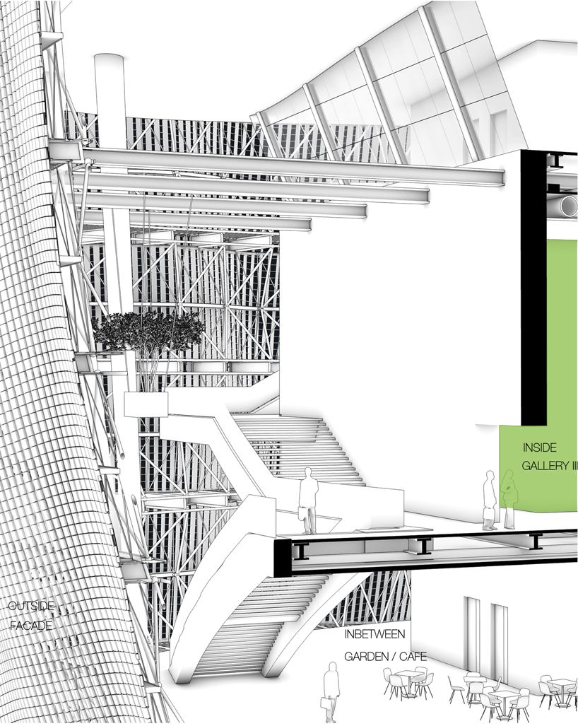
The section is, I think, particularly telling. There are moments of pause interspersed at ‘levels’. At half levels, services and support programs such as WCs and and an auditorium are slotted in. The building’s interesting shape is created no as a stale surface hat happens to be twisting, but as an aesthetically pleasing architectural facsimile of wrapped cloth. It is visible from one of the renders that the facade is, in fact, in an abstract way, appearing to be wrapped around the volume.
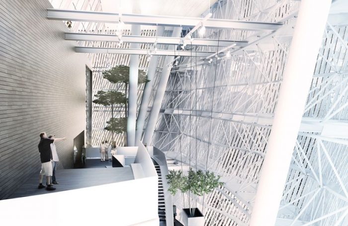
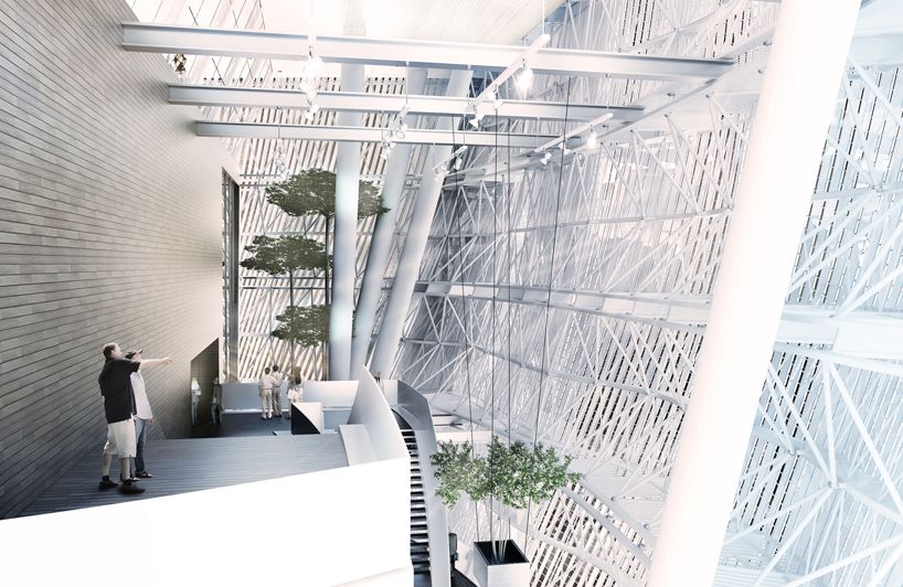
The volume is itself what particularly excites me. The building is itself one big space-frame truss. And the frame makes moves to create its own structural depth. Rather slender members work together, triangulating in elevation as well as plan and section. SO this building which seems to be emulating cloth, need not rely upon bulky, ‘idea-killing’ beams and braces, but instead looks to many small elements to do the work. Rather like cloth is a weaving of millions of small threads, not a single unified surface. Bam.
Courtesy Of prechteck
Courtesy Of prechteck
Courtesy Of prechteck
Courtesy Of prechteck
model view
modelview 2
section with 4 galleries and inbetween spaces
isometric section
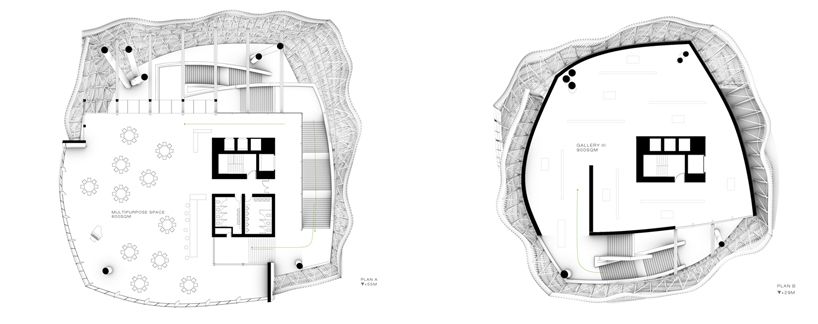
plans
the museum as a dance
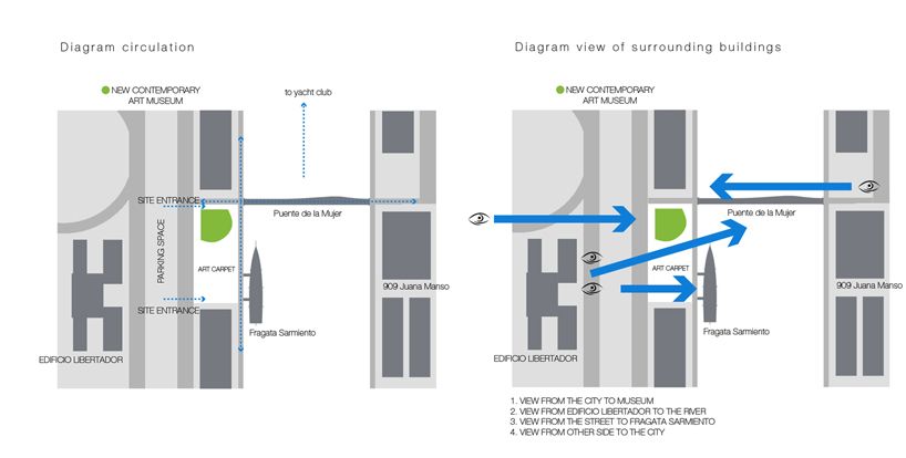
diagram view and circulation


