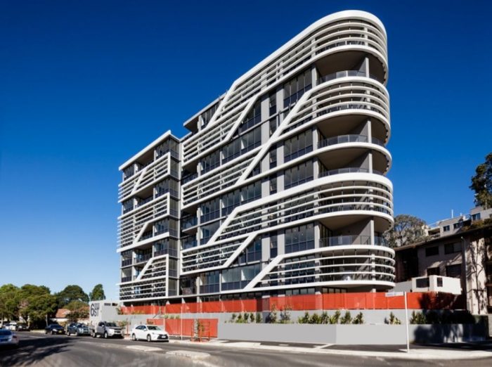
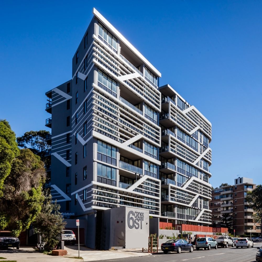
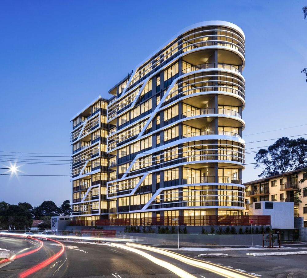
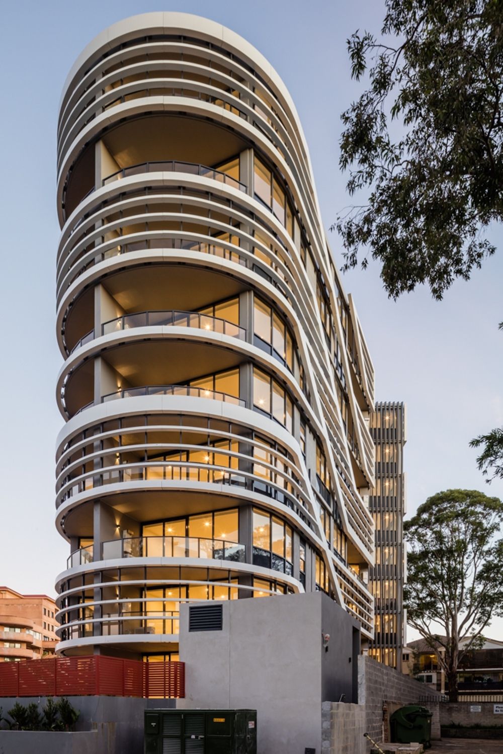
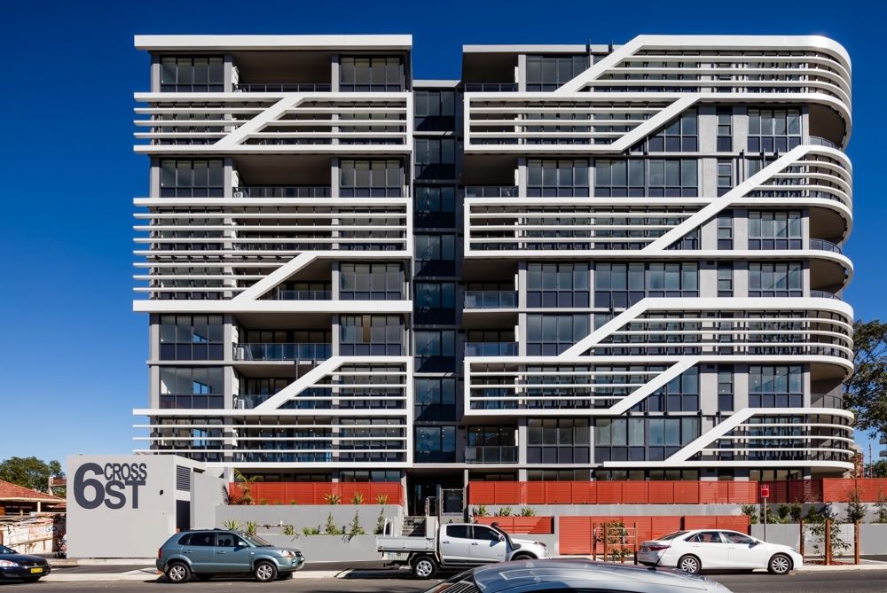
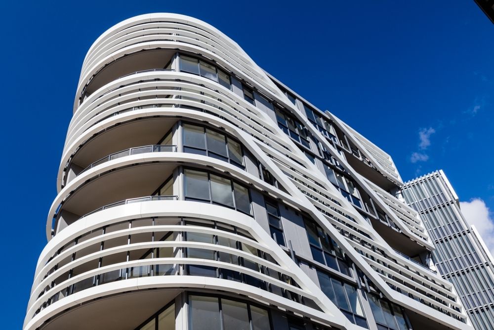
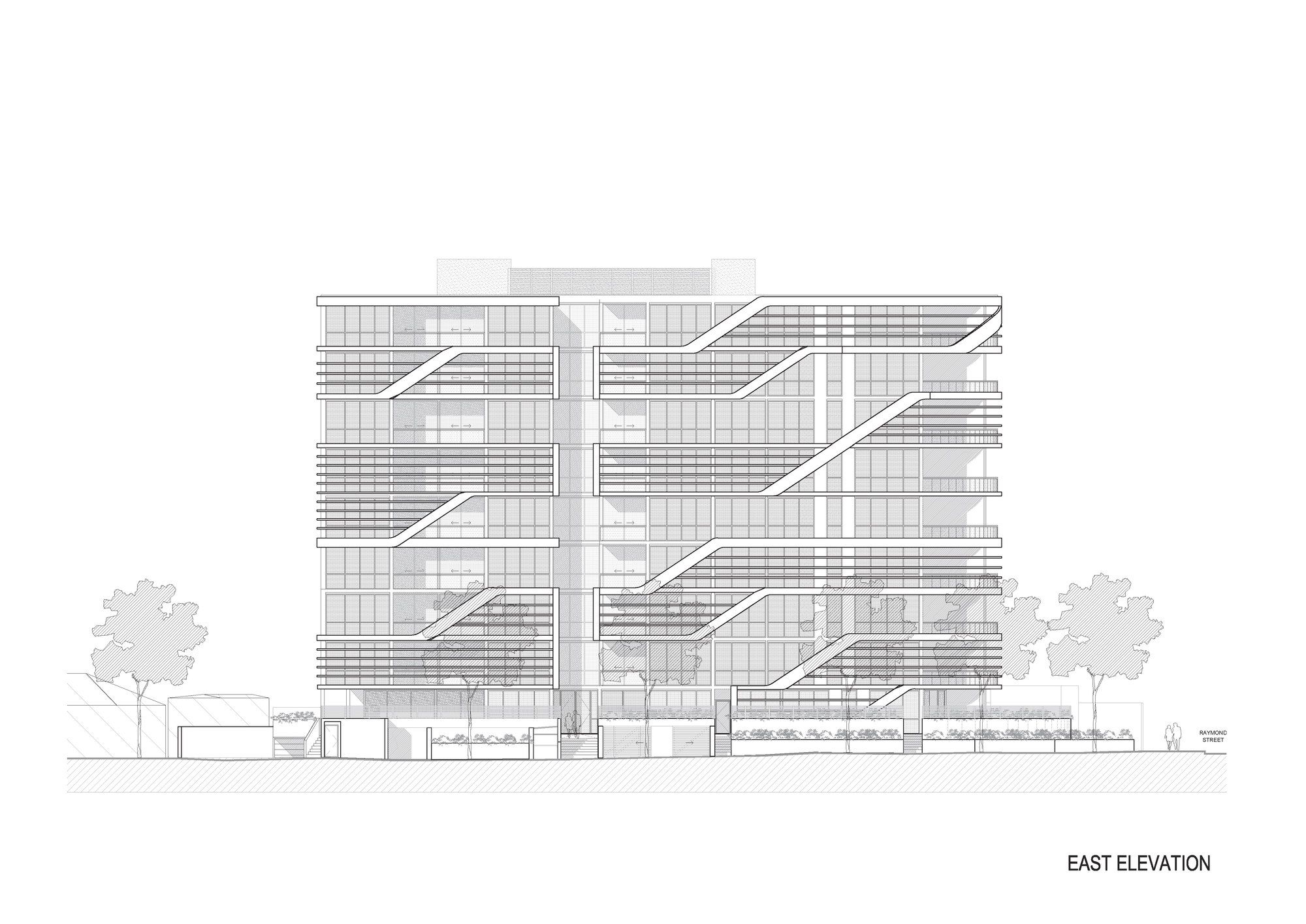
Bankstown Gardens is a 9 storey signature apartment development consisting of 54 units, landscaped garden setting. The site is close to Bankstown CBD, so it is on the door step of schools, restaurants and shops as well as bus, railway and transport facilities.The massing presents a flat plane that reinforces the streetscape. The building is located on a prominent corner. The building is curved at the corner to reinforce the corner and present as a gateway in the streetscape. Ventilation shafts are used to improve natural ventilation. These create vertical breaks in the massing reducing the apparent length of the facade.
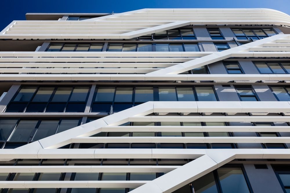
The dynamic design utilises a framework of sun control fins to create an exciting frieze on the facade. The diagonal geometry articulates the facade whilst allowing for large expanses of glazing. The transparency of this material is juxtaposed with the lightness of the white screens to create a vibrant and light facade. The frieze of solar fins is attached to provide shade for units. These screens create a patterning which is attractive to activate and add detail to the facade. This distinctive modern design sets it apart from its neighbors to create a distinctive and elegant address.The building has been conceived with an emphasis on environmentally sustainable design. Ventilation shafts are used on the facade to improve natural ventilation. All of the units are corner units or through units to maximise natural ventilation and minimize energy use. The use of louvers for many of the balconies creates a double facade. This creates a micro-climate and enhances thermal stability and minimizes energy use.The proposal contains water collection and recycling initiatives for the garden areas. This results in a series of green courtyard spaces into which the units look. These areas are lighter in character with extensive glazing. Perforated metal solar screens are used to ensure privacy between units and to neighbours and to maximize solar protection. These louvers are in a bright colour to enhance the facade. All windows which look onto adjoining properties are treated with shading devices including to the north. Windows which are less than 6m from the boundary are high light windows to ensure privacy to neighbours. The ground floor has extensive sunny communal open spaces.The density of the proposal is consistent with the controls and is consistent with recent proposed character of developments which characterise therefore surrounding area. In addition the density is appropriate for the area and results in a building of high architectural merit. The traffic study demonstrates that this proposal will have a very minor impact on the surrounding neighborhood The building has generous communal landscape spaces fronting the street which help moderate the impact of the building to the street. This consists of tiered planter zones. There are generous communal open spaces to the western side which receive full northern sun. These spaces include a children’s play area. There are also barbeque and dining areas with significant deep soil.
 The ground floor units have expansive private gardens among the terrace landscaped areas. It is surrounded by a mixture of commercial, residential and retail buildings as part of the Jannali local centre. The scale of the surrounding area is 2 storey, however the zoning allows for the construction of 3 storey buildings as part of the commercial zone and it is anticipated that the surroundings are to be re-developed accordingly. The site is bounded by a 2 storey Uniting Church building to the west, retail to the east and residential buildings to the north. The rear of the site adjoins a car park associated with the Church as well as a council car park. There are also a number of 3 storey apartment buildings in the neighborhood.
 The block is long and relatively narrow , There is a fall from east to west and south to north.The site is close to Jannali statiIn 2008 a development application was approved on this site of a very similar design. This application follows most of the design controls established in that approval. This DA seeks to modify some aspects of this consent without creating any additional impacts.
 The building is consistent with the following extract from the previously approved application design statement:
Context (SEPP 65 principle 1, clause 9) states that good design responds and contributes to its natural and built environment and the existing or future character of the place.
The proposal is located on two consolidated waterfront properties that slope steeply from St Georges Crescent to the water line. The site extends into the water by virtue of boating rails and a finger pier that houses a small marina and a workshop.
The traditional residence is seen to be a Federation two storey bungalow. Modern apartment blocks dating from the 60’s and 70’s that are common place along St Georges Crescent did not respond to this scale and are seen to be 4 or 5 storey and lacking in any individual expression. More recent apartment developments have responded to the height restrictions, but attempt to achieve commercial viability by increasing the number of floors, stepping down their sites to a 4 or 5 storey block when viewed from the waterfront.
The proposal responds to the scale of the original residences of the area as well as the need for commercial viability by putting forward a new typology that created two 2-storey volumes that are visually separated. As stated above, the scale of the surrounding area is 2 storey, however the zoning allows for the construction of 3 storey buildings as part of the commercial zone and it is anticipated that the surroundings are to be re-developed accordingly. The proposed development is 3 storeys with an additional attic space within the roof zone. This area complies with the definition of a loft as it falls inside the prescribed roof envelope and forms a part of the unit below . In addition, the maximum height of the ground floor never exceeds 1m to ensure that the design is compliant with the 3 storey control.
 The levels of the building step down across the site in accordance with the fall of the land. This ensures that the design has the minimum impact on the surrounding neighbours. The massing of the upper levels is set back to the rear of the property to minimize impact on adjoining residential properties. The controls provide for a 2m setback to the street above ground level. The design review panel noted that this control was at odds with the intention to reinforce the streetscape and proposed that a zero setback continue to level 1. this direction was adopted in the proposal with the extension of the L1 balcony.in 2008 a development application was approved on this site of a very similar design. This application follows most of the design controls established in that approval. This approval established key setbacks for this site. The front setback to St Georges Crescent matches the approved design which is consistent with the predominant street alignment. Similarly there is a predominant zero setback for garages. The proposal locates the double car lift similarly on the street in place of a garage.
 The building conforms to the foreshore set back line. The side setbacks match the approved DA. On the north ther is a 3m deep soil setback at B2 and B1 increasing to 5m at GL,L1,L2. This setback has no excavation. To the south there is a zero set back at B2, 3m set back at B! and 5m set back at LG, L1, L2. The massing is consistent with the approved design. This design was derived through an extensive analysis of the best massing to respond to the context of the site and surrounding buildings. Whilst it has an additional storey, this equates to an additional height of approx. 1.5m. However, this height is located to the west of the site increasing the set back to the foreshore. As a result the impact on the view to surrounding buildings is negligible. The view analysis and view sectional studies demonstrate that the key views from adjoining buildings are not significantly impacted. Is is noted that the proposal has been designed to comply with global warming sea levels as such it must meet more stringent standards than the approved DA. The proposal presents a 2 storey expression to the street which is consistent with buildings in the area. The building is consistent with the following extract from the previously approved application design statement:The site stepping allows for the form to be perceived from the St Georges Crescent (South Elevation) as a single storey element. This is in line with the existing scale to south along the St Georges Crescent which is comprised predominantly of the superimposition of garage structures and upper levels of residential buildings beyond.Like the approval, the proposal contains a modest commercial space associated with the marina. This space will contain marina offices, toilets and a small café. The design maintains the same shape and form as the approval.
 There is an additional half level and terrace area. This addition will have no impact on surrounding residents in terms of views, massing or bulk and scale.These courtyards also created shared green spaces which allowed for the provision of trees to replace those already on site. The result is a progressive solution to a unique site with a high level of amenity and low impact. Each module steps down with the fall of the land to minimise bulk and scale. This approach minimises massing and breaking up the facades and bulk whilst creating an attractive architectural response. This approach was recognised and supported by the ARAP and design review panels. The upper levels are expressed as a roof element to minimise the apparent bulk using inclinedroof sheeting applied to the walls. The roof line is broken up into a series of smaller elements to further minimise the scale of the development.As a result, although it is an apartment building itsexpression is m ore akin to town houses.Following from the above, the building has been designed to maximise solar and view performance as well as minimise impact to adjoining properties. The lower 3 levels are almost identical to the approved design. This includes the provision of the view slot between the units. This slot forms a void space which allows a view to the harbour from the entry lobby and for all of the corridors. This 3 storey void has a water pond at the base and is a significant improvement on the approval. This axial element is carried though to the street. The use of the car lift allows the removal of the porte coucher and curved driveways to the street. These are replaced by gardens. The result is a much more attractive entry area with less impact to the street.
 The lines of the building are generated by extending the lines of the slip ways on site to create the massing. The design derives from the differing views from the site. These views create different angles. The views to the front are of the harbour. The views to the city are further south. In addition there are views across the park which allow views from the rear units which creates an additional angle. These views generate different angled elements which, like fingers create a unique and beautiful massing. Following from this, the building has a curvilinear form to the street. This form creates a sculptural and beautiful expression for the streetscape. It also peels back the building allowing greater view sharing for the neighbours as well as pedestrians particularly on the southern street corner as pedestrians approach the park. This massing will become a significant positive element in the streetscape.
 The massing and scale is consistent with recent developments which characterise the surrounding area
The landscape plan maximises the available space for streetscape planting and resident amenity. Like the approval, the plan maximises the soft landscaping on the side boundaries for privacy and to soften the development. Also there is extensive landscaping at the foreshore. The loss of the extensive curved ramped driveway and parking at the street frontage significantly improves the streetscape presentation and the landscaping to the street.In the approved DA the street frontage contained a large expanse of paved driveway. In the proposal the streetscape consists of an extensive terraced planted area with terraced water features and a clear and direct entry sequence which orients the visitor directly to the lobby and on to the view. In addition the areas between the building and the street contain private open space for the amenity of the residents containing planning and terraces. Like the approval, the side boundary areas contain terraced planted areas and courtyards to bring light to side bedrooms. The waterside areas contain areas of lawn and privacy hedges for residents. Like the approval the commercial marina space contains a residents pool area, timber decking and outdoor dining. A new light weigh bridge is located in front of the building. This bridges over the slipways allowing public access to the foreshore and to the marina. It will touch the slipways lightly and may be removed and constructed such that if removed in the future will not impact the slipways. Similarly a new deck is located over the northern most slipways which will have minimal impact and can be removed in the future without impa The development with its disposition and additional amenities created by the marina component will provide a quality facility that is reflective of the needs of the social demographic in the area. Furthermore, the marina component will be easily accessed by the public and will add interest and amenity to the public spaces associated with the Peppercorn Reserve and the foreshore promenade.and has good access to public transport. The generous communal open space provisions within the development will further enhance facilities for residents and provide improved pedestrian networks.together with the additional amenity provided by the marina component of the Synopsis
Architects : Tony Owen Partners
Project Location : Sydney, Australia
photography by © Steve Back
photography by © Steve Back
photography by © Steve Back
photography by © Steve Back
photography by © Steve Back
photography by © Steve Back
photography by © Steve Back
photography by © Steve Back
photography by © Steve Back
photography by © Steve Back
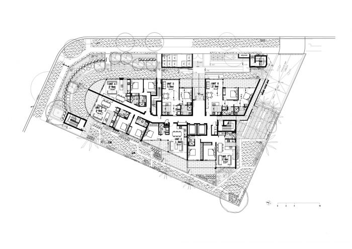
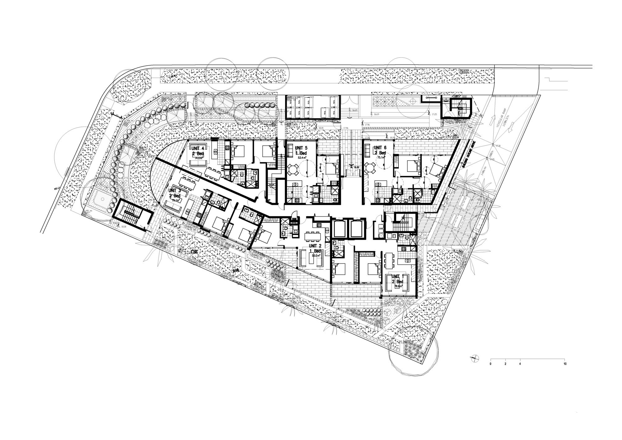
Ground Floor Plan
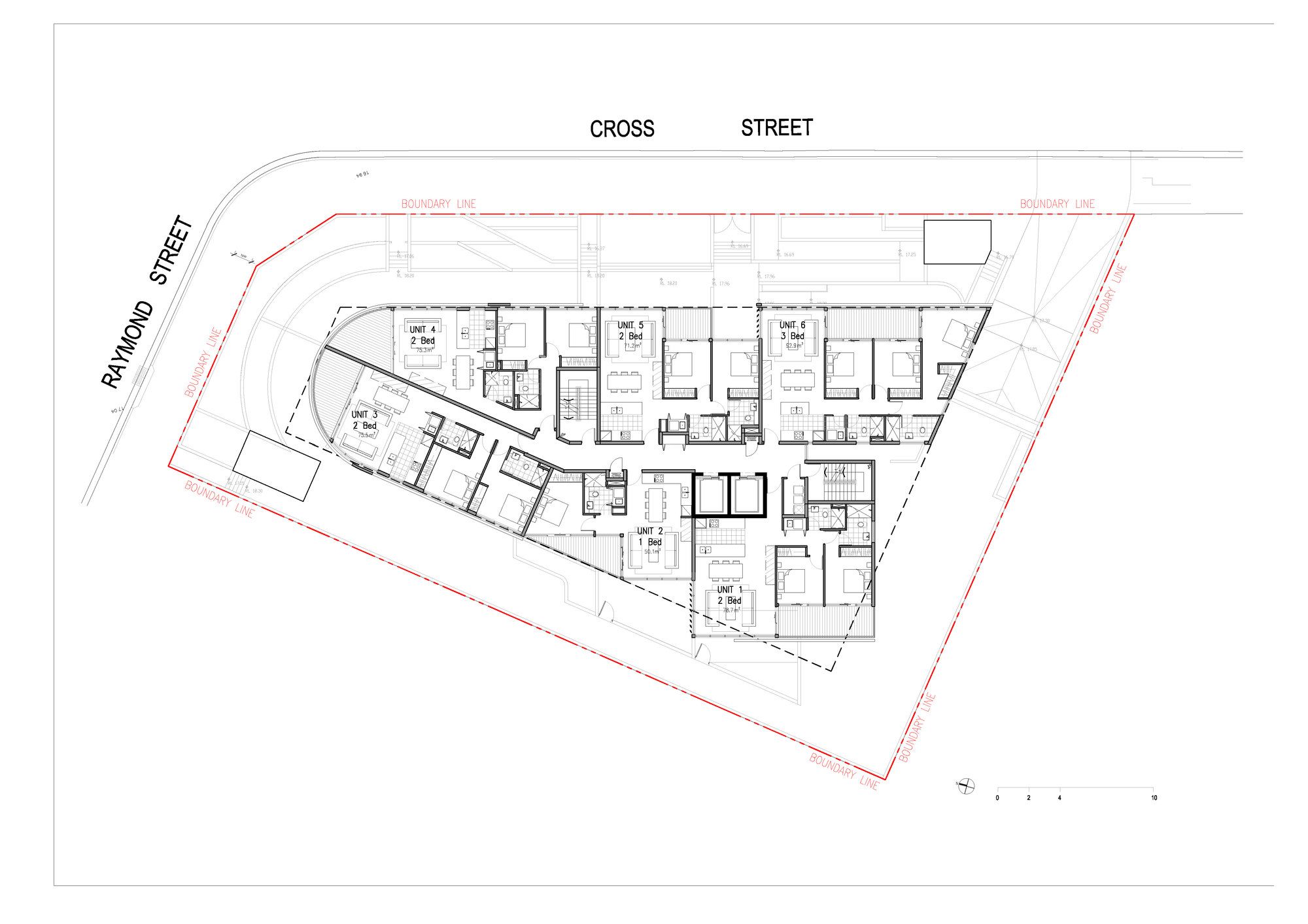
Type Floor Plan
Elevation


