Barbershop OWN
Barbershop OWN is a project with a different look at what a modern barbershop should be. We focused on removing all unnecessary details from the concept of a traditional barbershop and creating a clean, minimalistic interior, shifting the emphasis to the comfort of guests and people working in it.
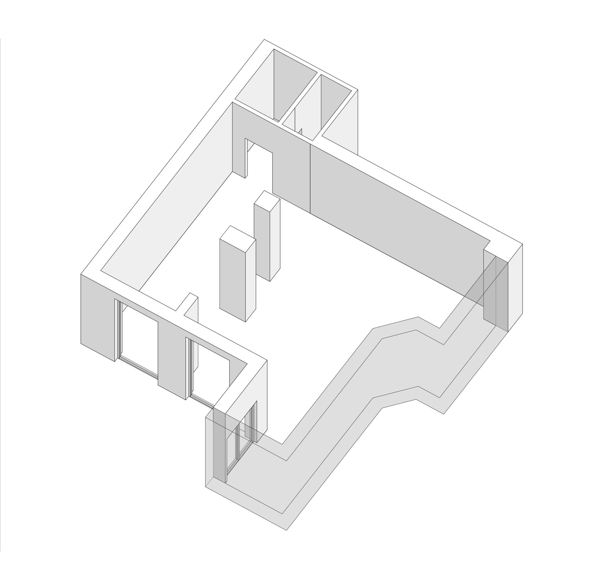
Initially, the space consisted of one irregular room with two monolithic columns in the center, a separate ledge at the entrance and a similar ledge in the main room. This configuration predetermined further interior zoning.

Courtesy of Line Design Studio
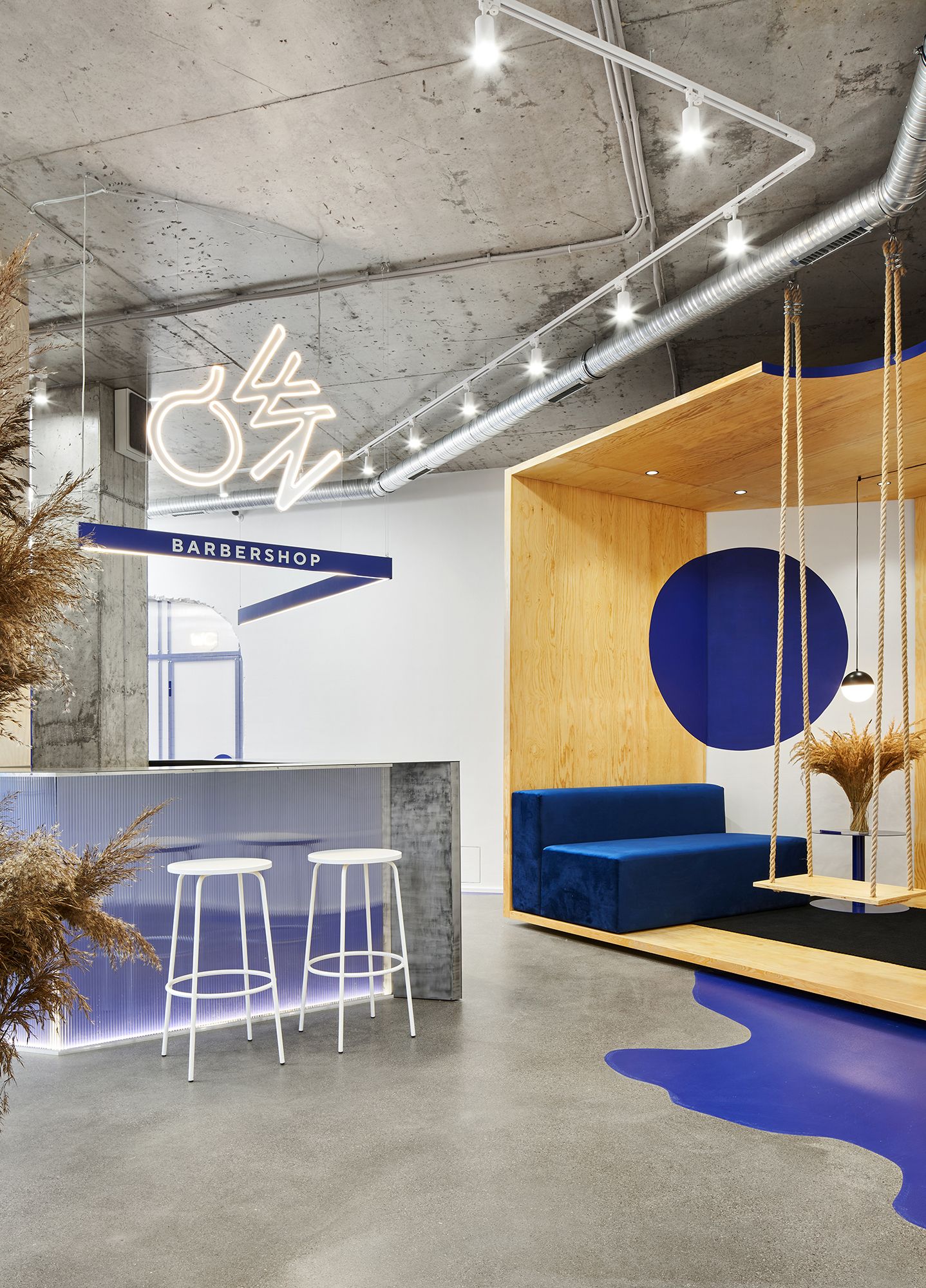
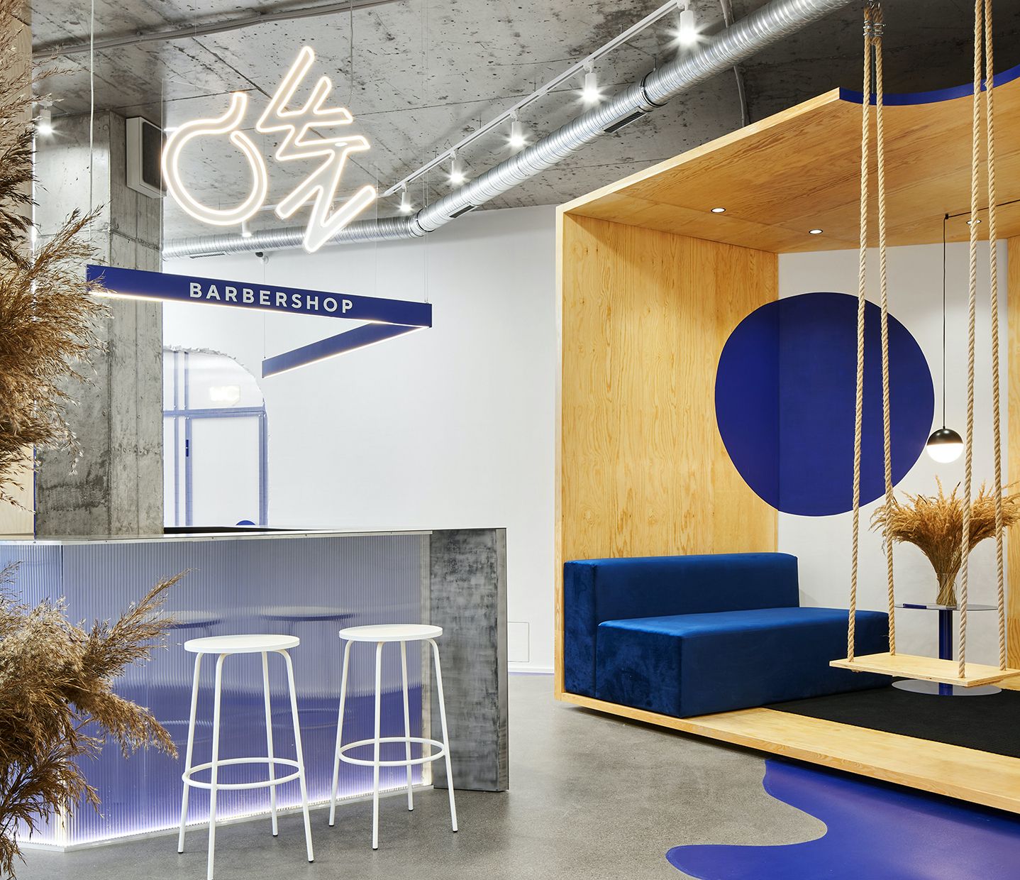
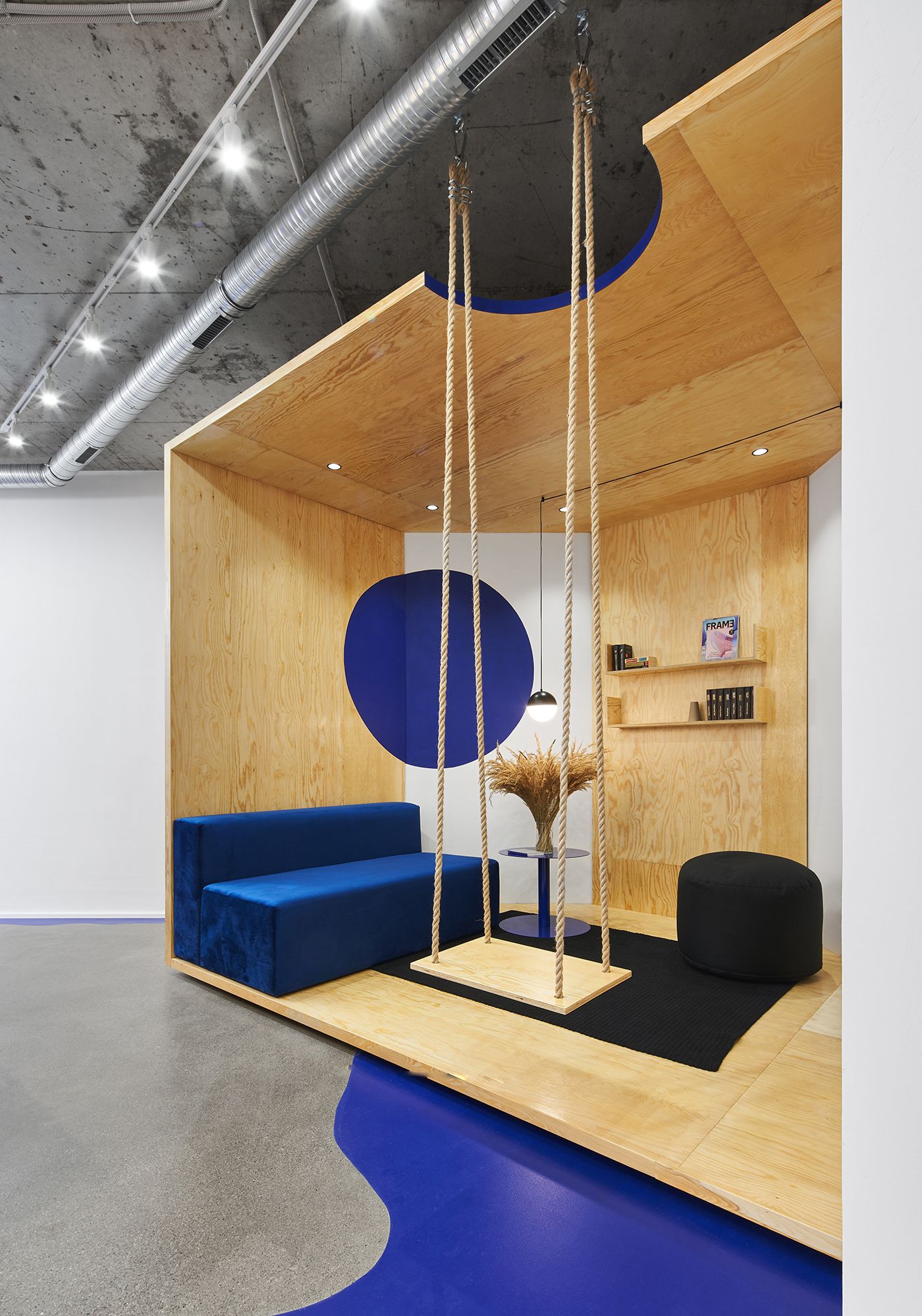
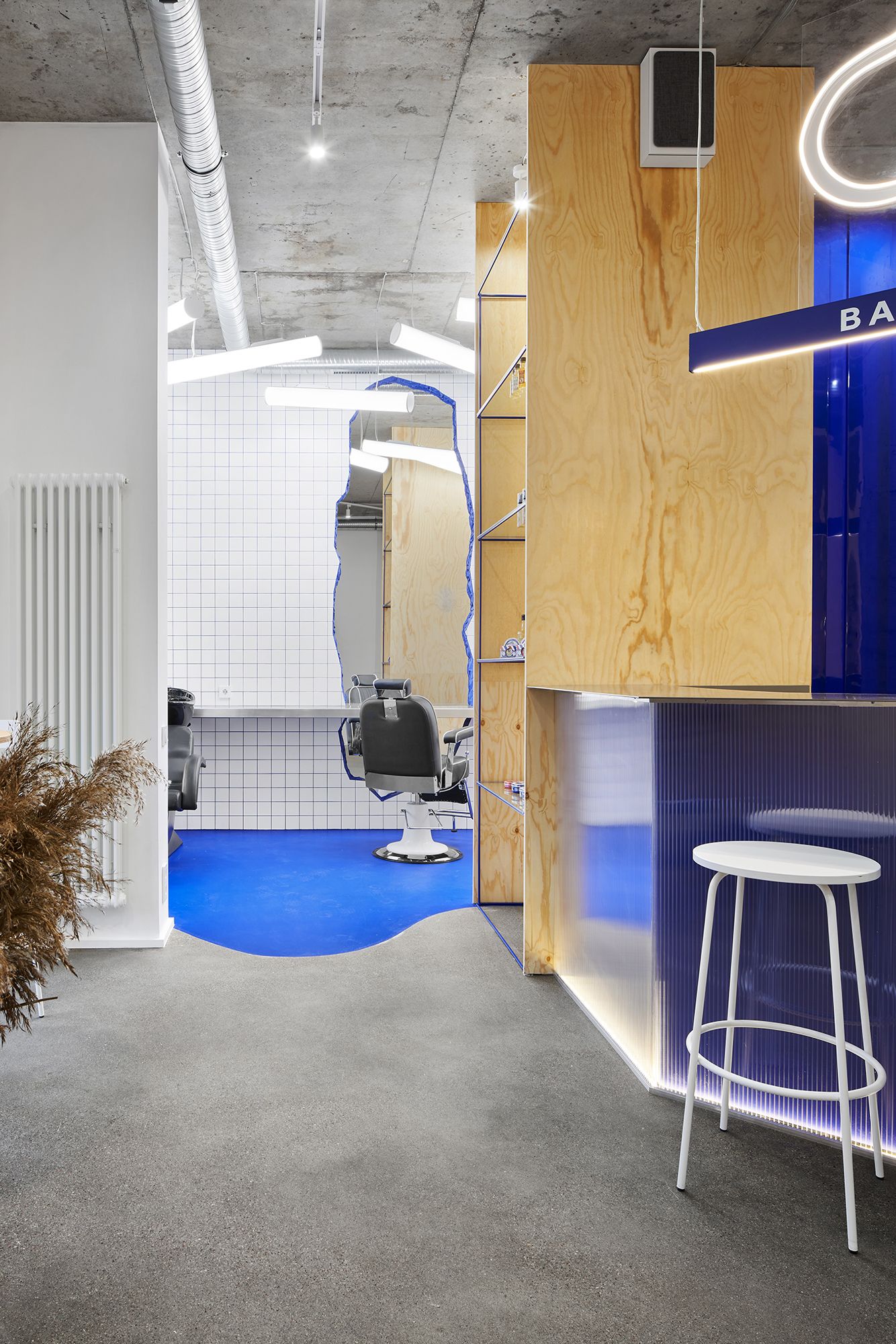
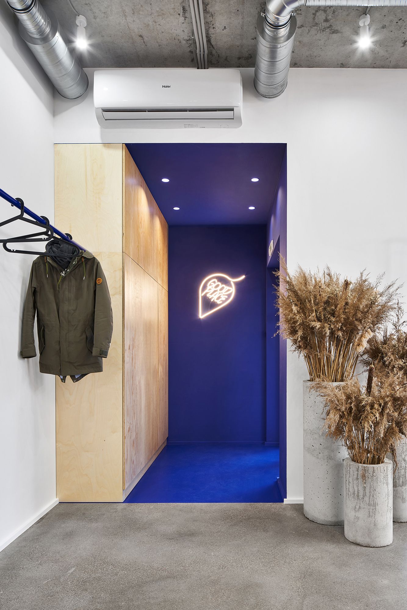
The protrusion of the room at the entrance area is highlighted with a monolithic fill of color; a wardrobe for things and work equipment is located in it. The recreation area in the form of a plywood cube is located in the second ledge of the room, by its location, setting the vector of movement towards the working area, along the reception desk – to the bathroom.
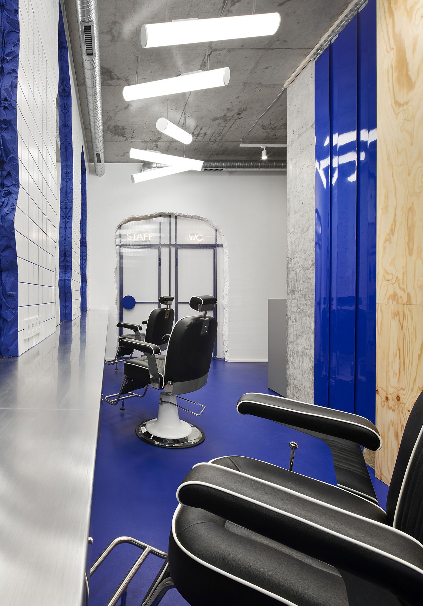
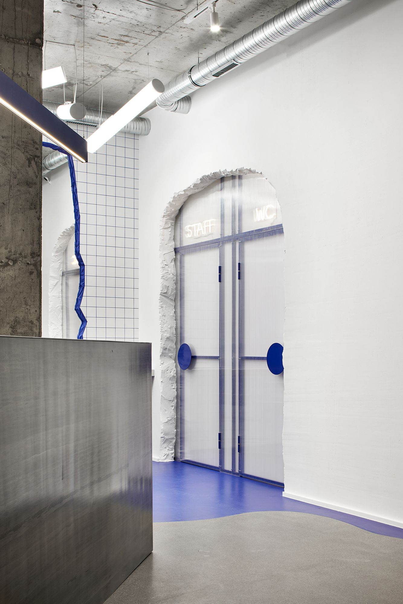
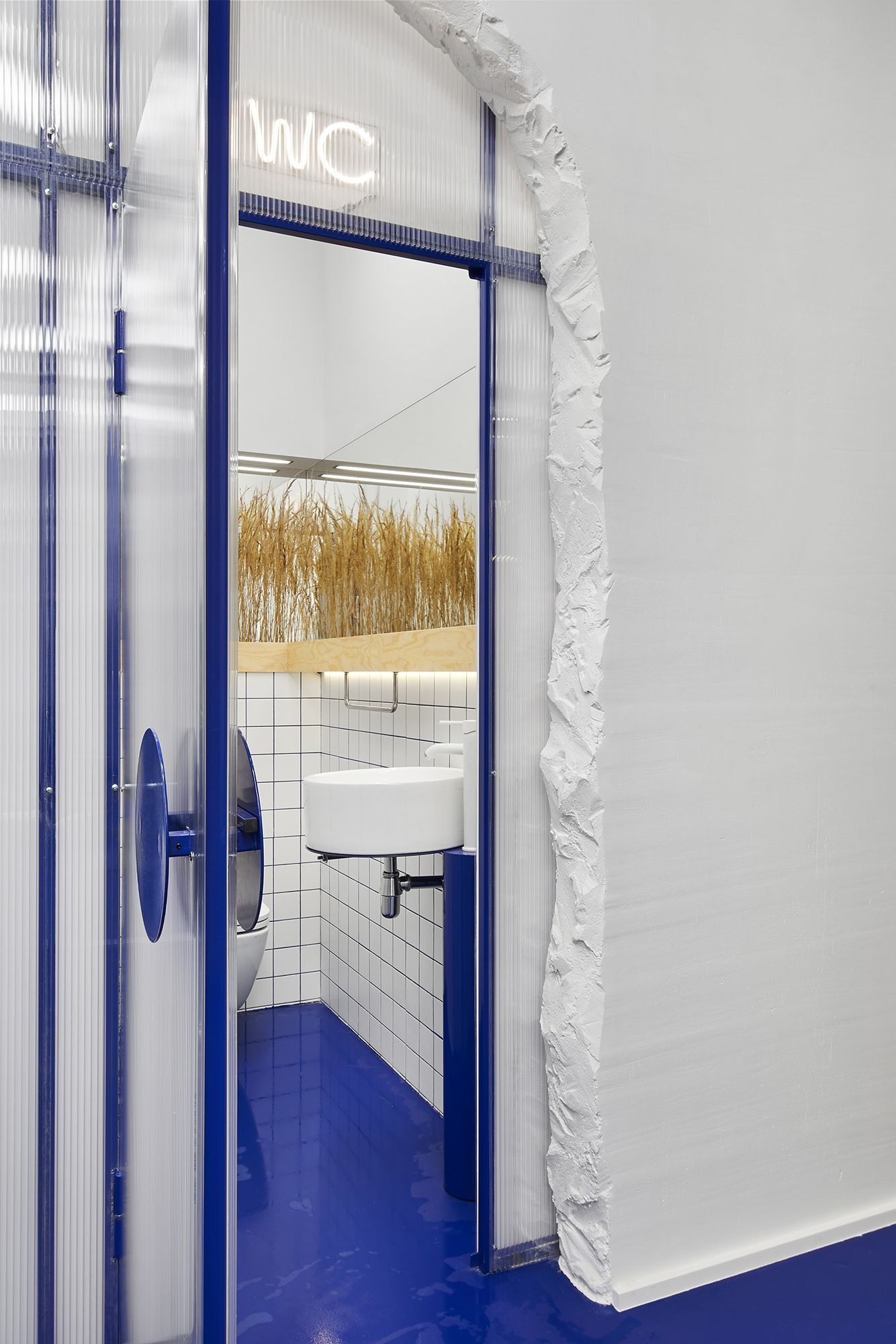
The reception, with its triangular shape, bends around two columns in the center of the room and divides the common area from the working area. From the working area, an irregularly shaped portal was cut through the wall for two doorways through which you can get to the bathroom and the staff room.
Courtesy of Line Design Studio
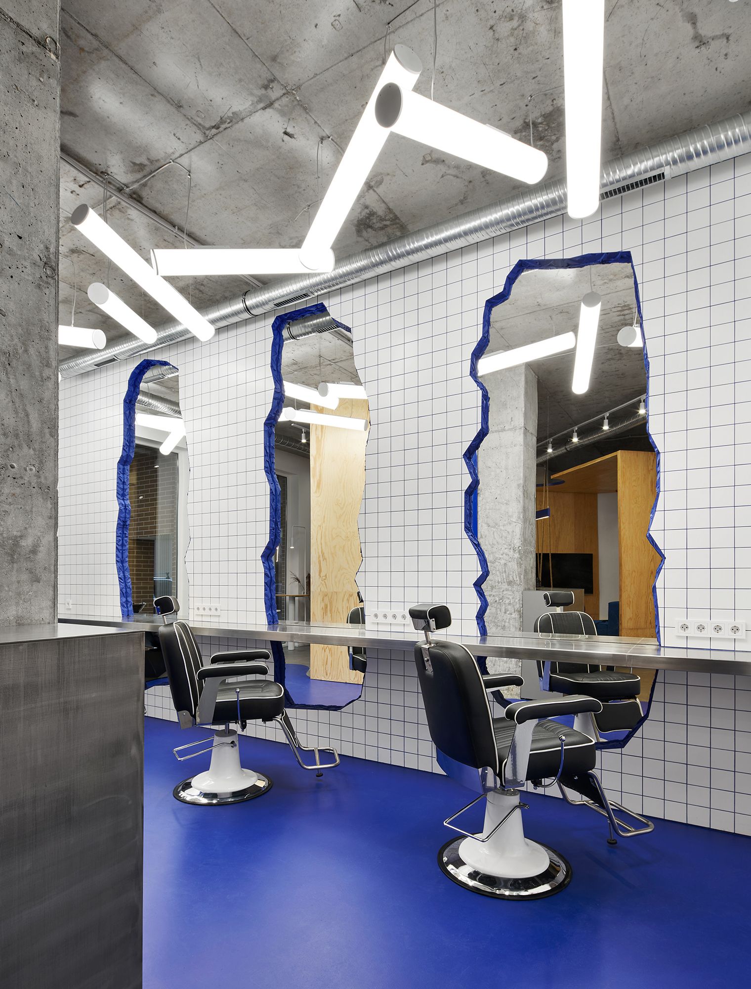
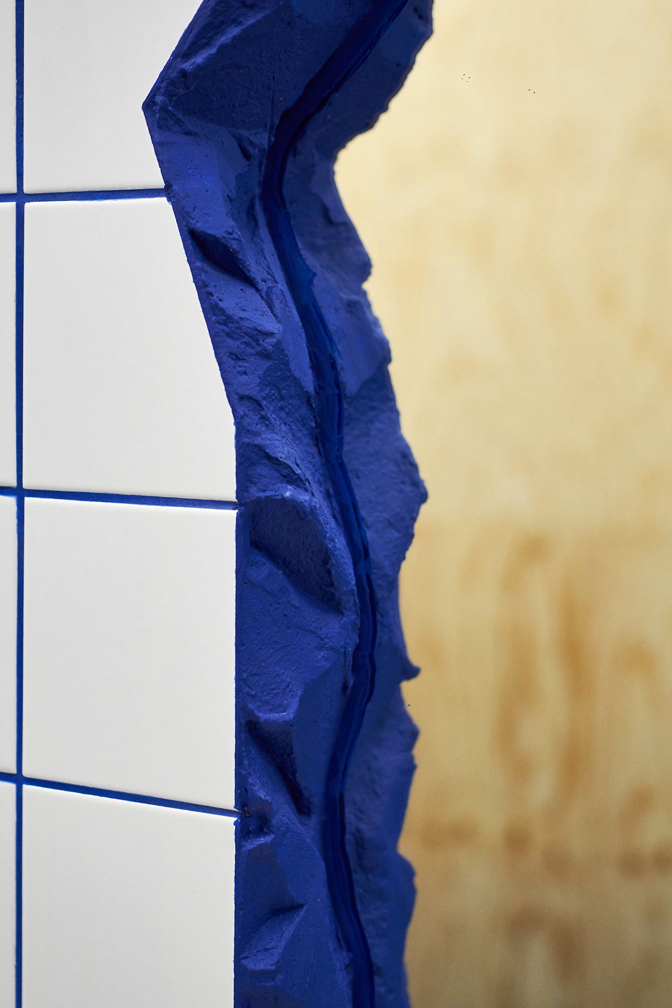
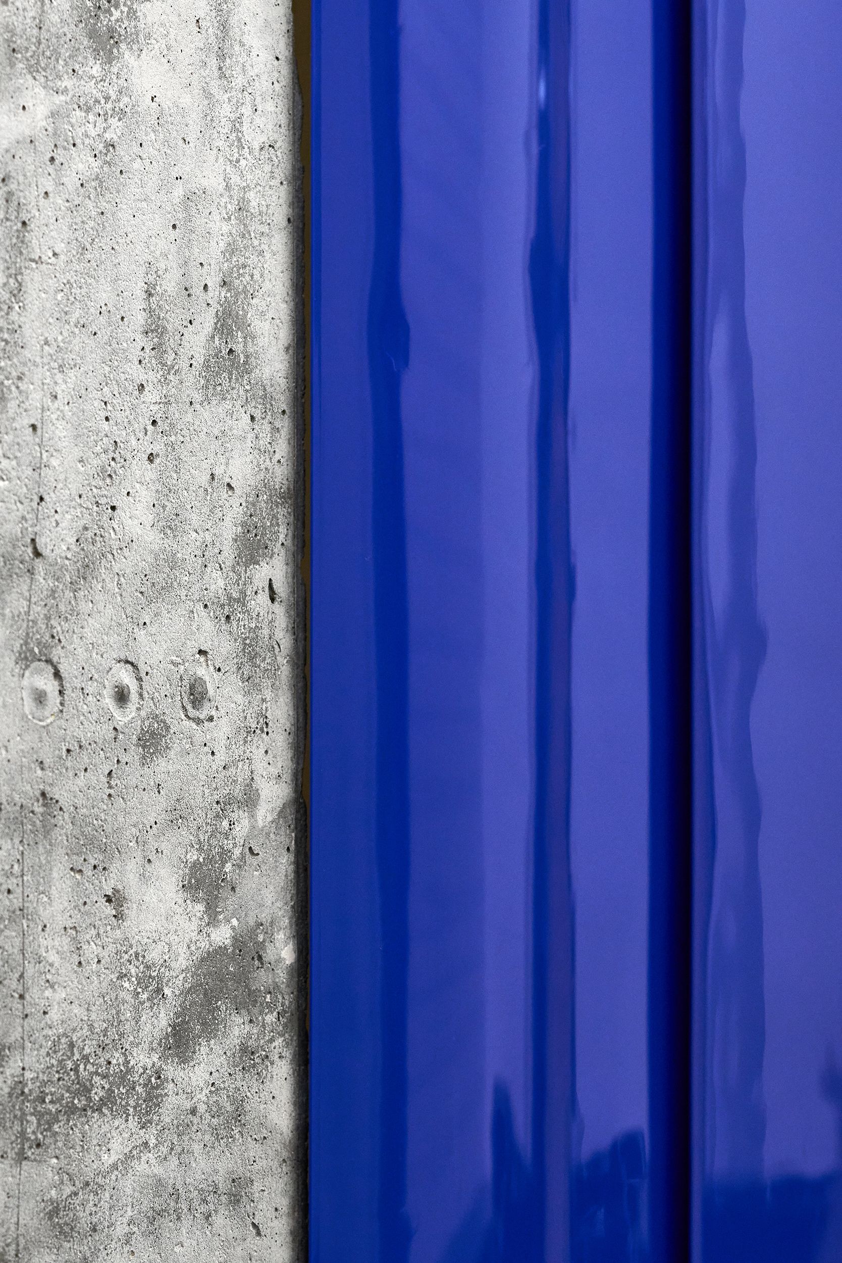
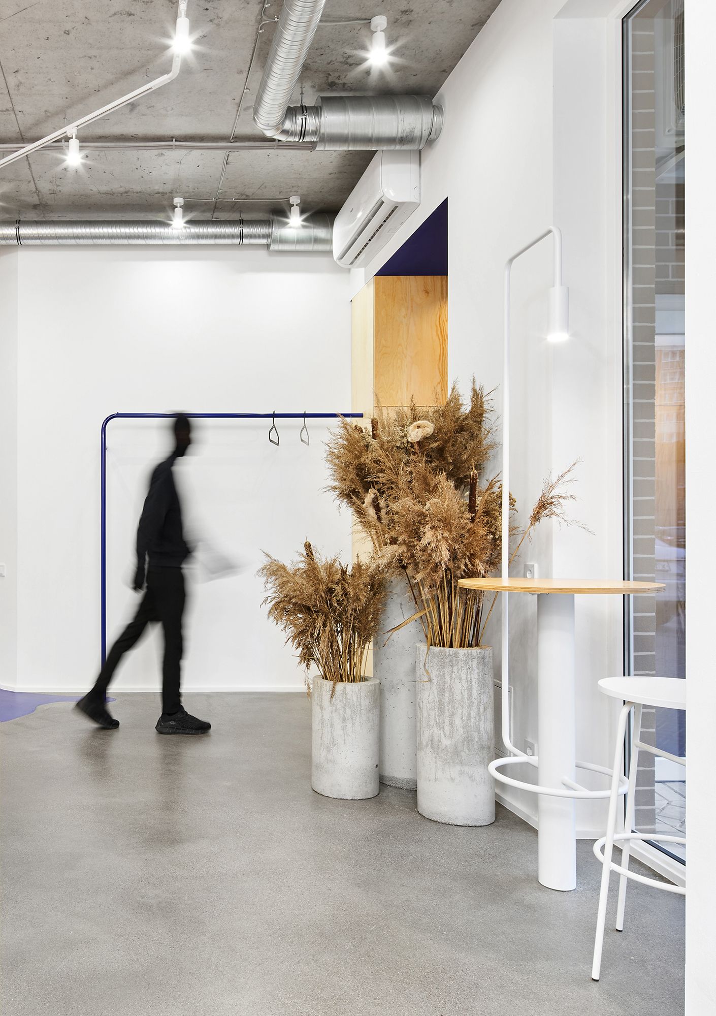
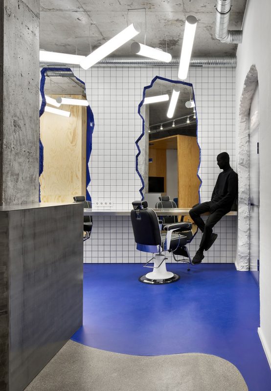
The approach to the choice of materials used in the project was also simple and straightforward – concrete, metal, 10/10 cm tiles create a cold barber atmosphere, but in conjunction with the dynamic texture of larch plywood they form a balance of materials and sensations in general.
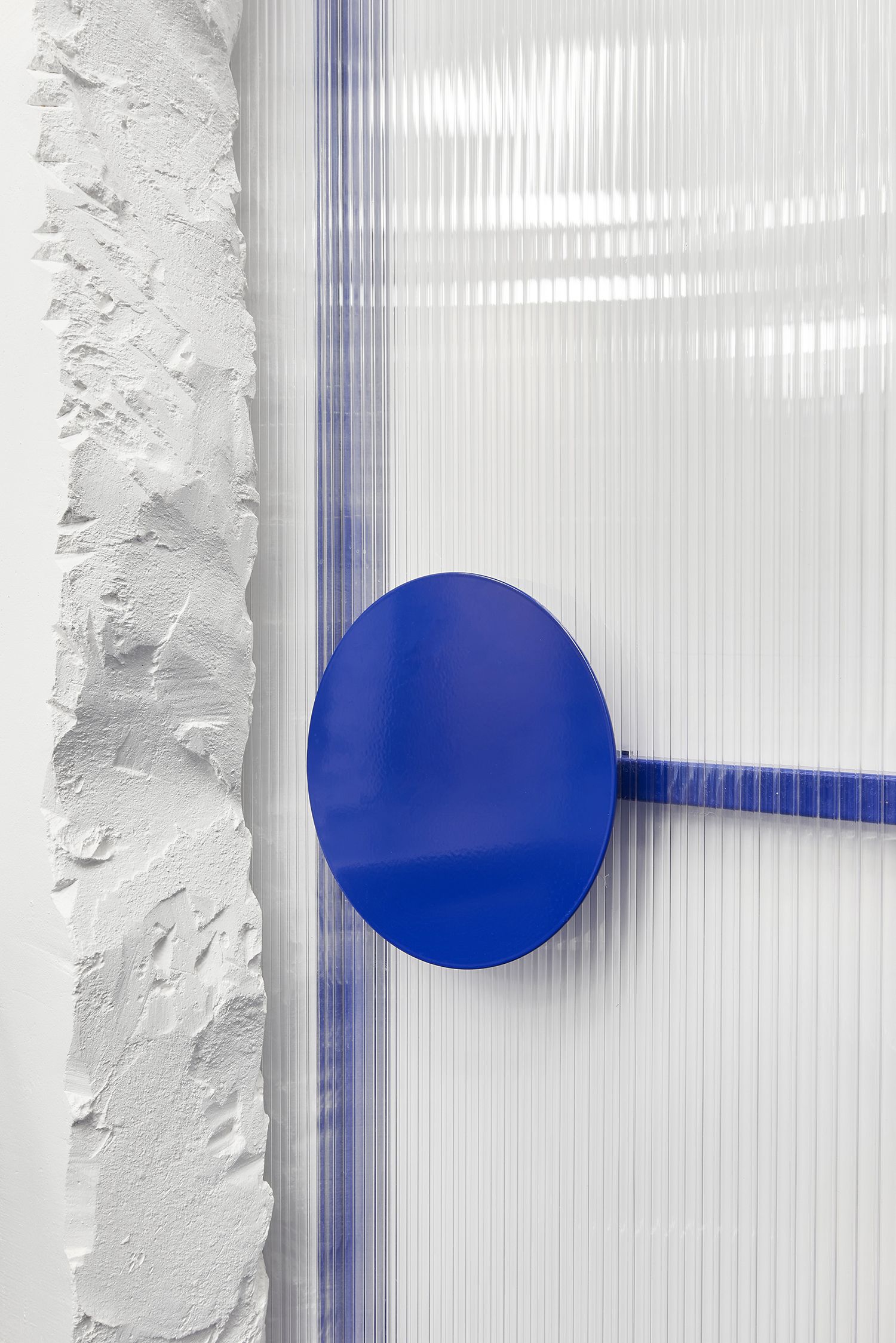
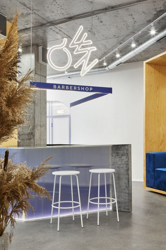
The main white walls with the texture of “starting plaster” are the background for all functional blocks of the interior from the above materials. The ceiling has remained unchanged in almost the entire interior – monolithic concrete. Another additional material was cellular polycarbonate – a partition with doors to the bathroom and the staff room, as well as one of the sides of the reception desk, was made of it. The structure of the stand itself is 4 mm brushed metal sheets.
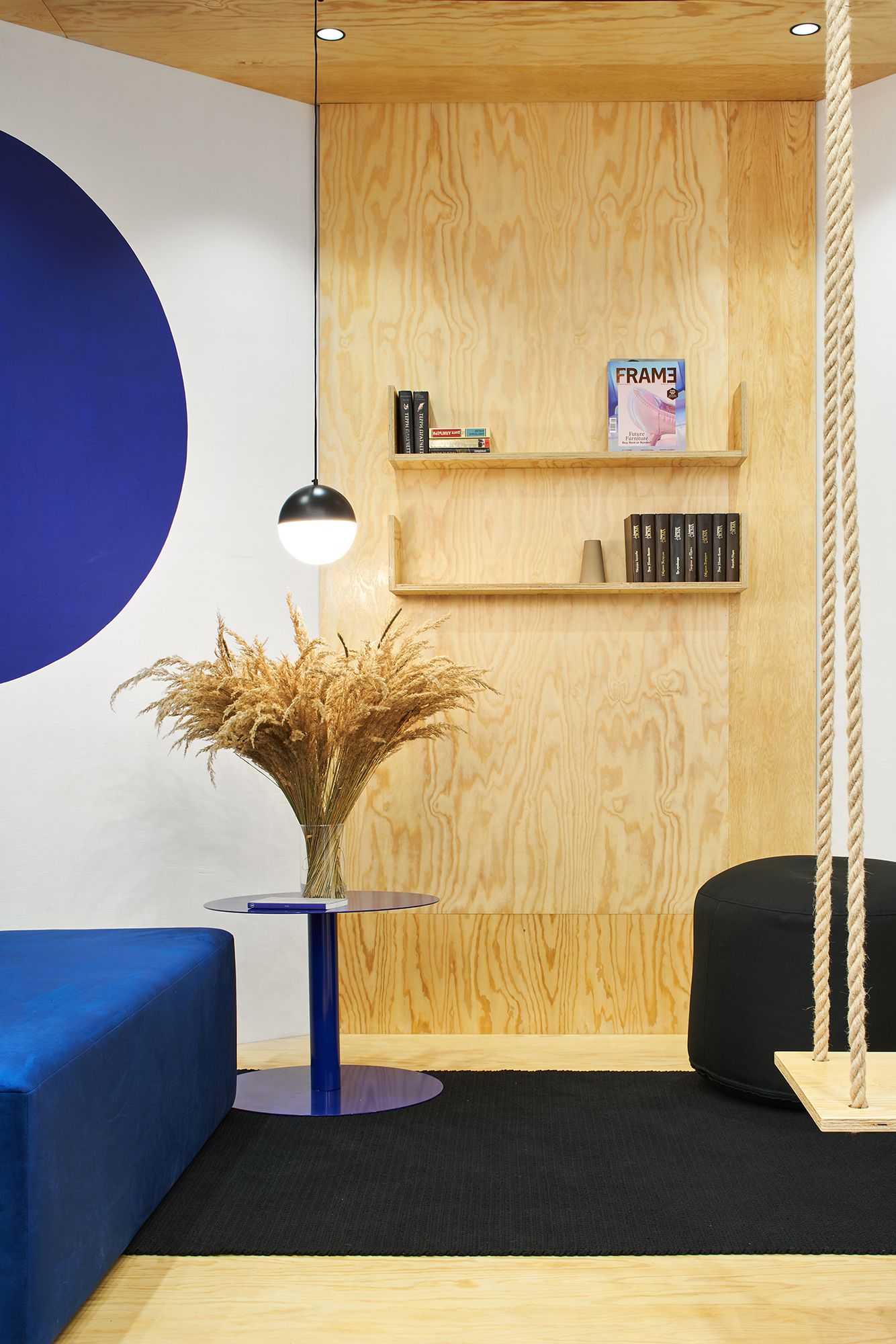
The working area has 3 places for hairdressers with a wall of 10/10 cm square tiles, in which mirrors are embedded – the effect of introducing materials into each other. These elements are united by a cantilever working surface made of stainless steel. The recreation area creates a sense of space in space, enveloping the visitor with its warm solidity of wood. A swing in this area hangs from the main ceiling, cutting its volume along the edge of the cube.

Courtesy of Line Design Studio
The circle in this interior is a reference to the shape of the clipper ears and appears in many functional and decorative elements. Large windows, almost the entire height of the room, illuminate the entire interior space. Artificial light plays a very important functional role in this interior.
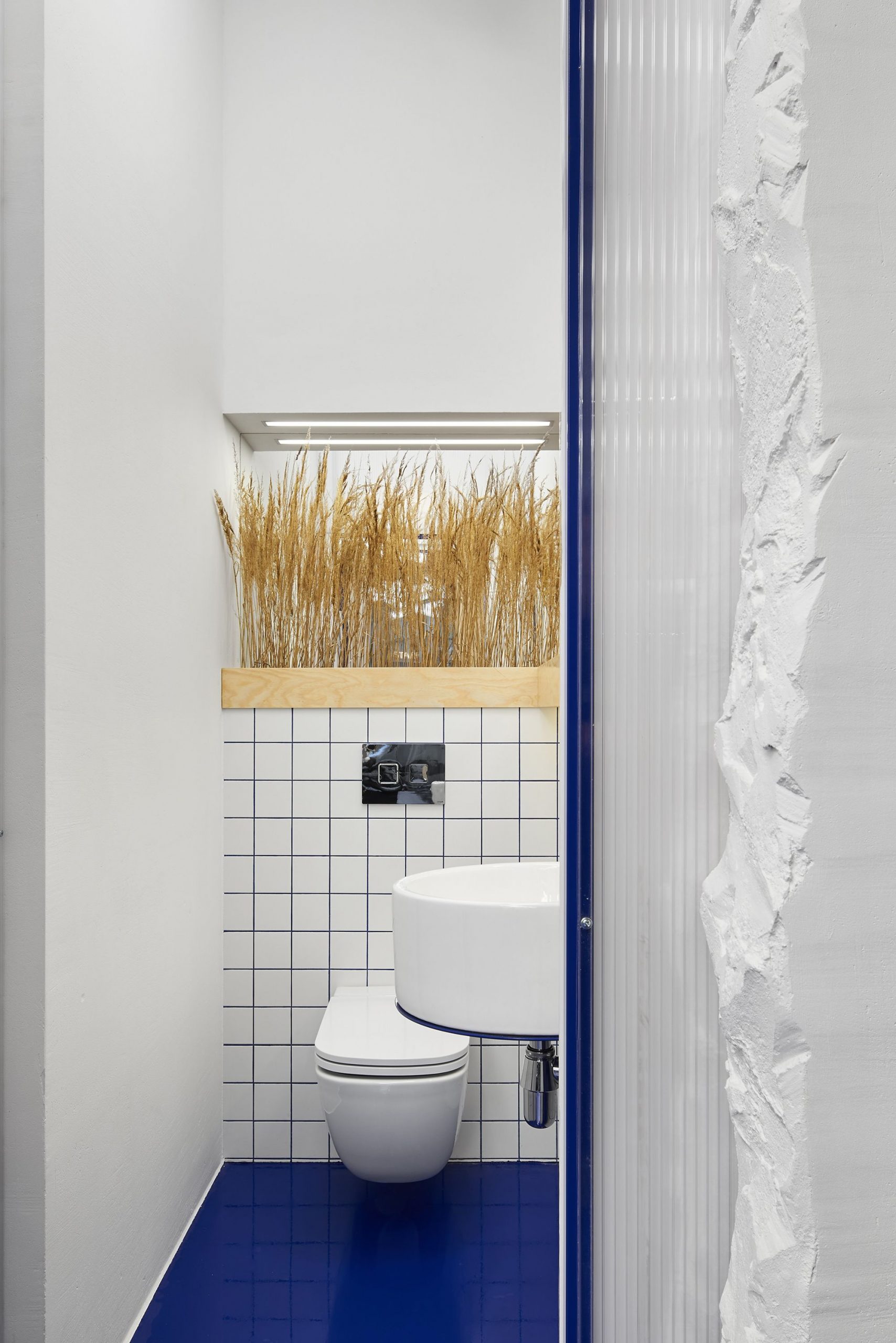
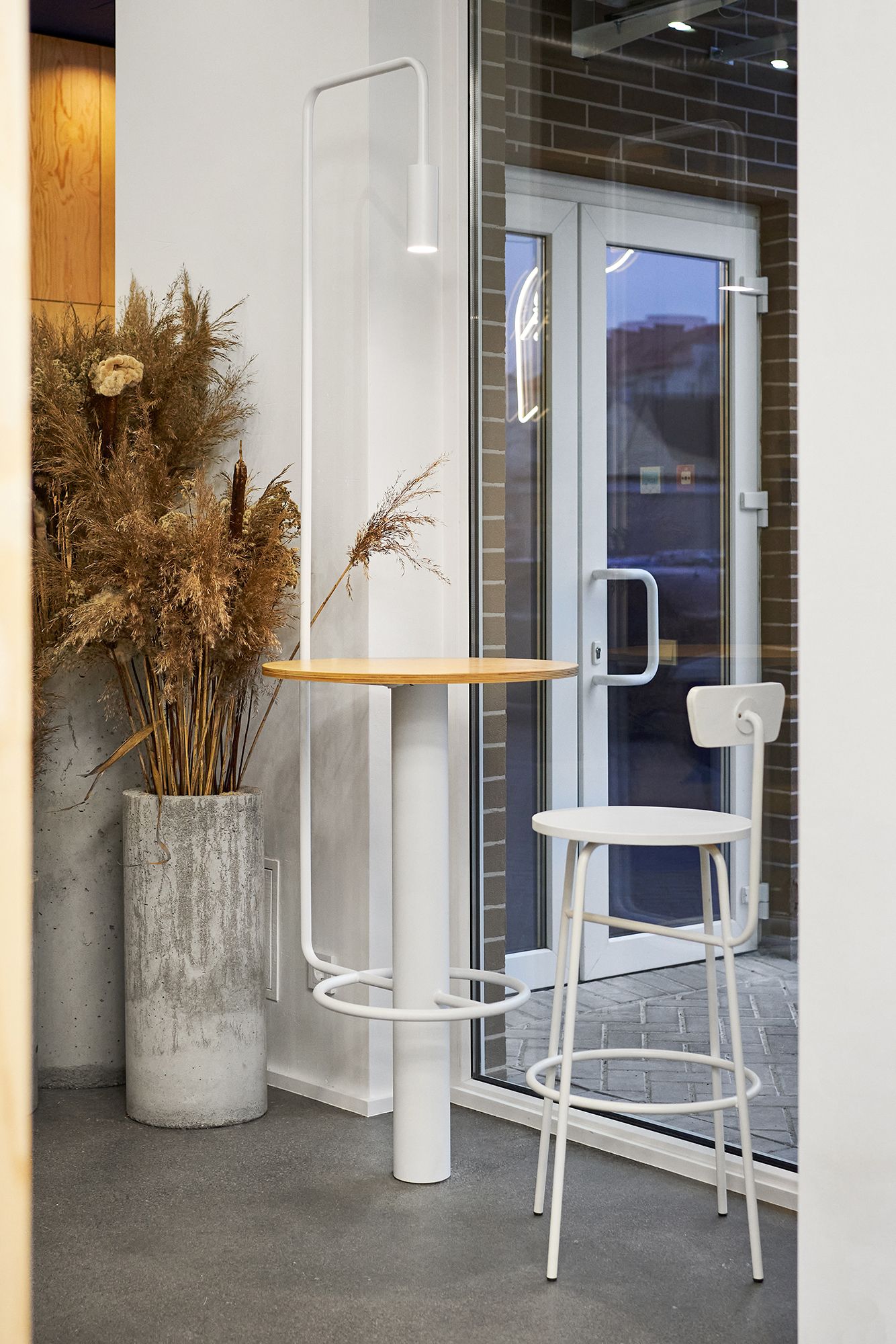
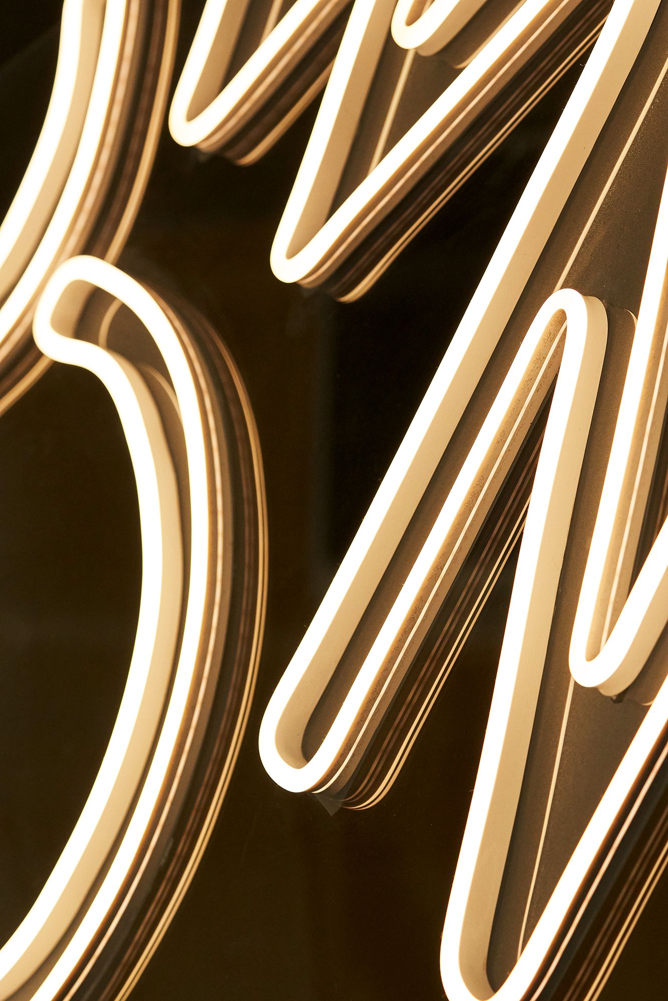
The working area is completely illuminated by light bulbs, chaotically suspended above the chairs. The reception is lit by a pendant light that follows the shape of the bar with the barbershop sign. Dried flowers in concrete pots, pots in the bathroom are picturesque blotches in the interior. Neon signs and symbols work as navigation, as well as decoration for individual zones in space. Atmosphere, function, details play a key role in the construction of the entire interior.
Courtesy of Line Design Studio
Project Info:
Architects: Line Design Studio
Location: Kaliningrad, Kaliningrad Oblast, Russia
Area: 68 m²
Project Year: 2020
Photographs: Courtesy of Line Design Studio
Courtesy of Line Design Studio
Courtesy of Line Design Studio
Courtesy of Line Design Studio
Courtesy of Line Design Studio
Courtesy of Line Design Studio
Courtesy of Line Design Studio
Courtesy of Line Design Studio
Courtesy of Line Design Studio
Courtesy of Line Design Studio
Courtesy of Line Design Studio
Courtesy of Line Design Studio
Courtesy of Line Design Studio
Courtesy of Line Design Studio
Courtesy of Line Design Studio
Courtesy of Line Design Studio
Courtesy of Line Design Studio
Courtesy of Line Design Studio
Courtesy of Line Design Studio
Courtesy of Line Design Studio
Plan
Courtesy of Line Design Studio


